#PrintAdverts
Text
"[THE ALBUM] WAS REFLECTING THE DECADENCE OF A TIME WHEN WE WERE LIVING FROM LIMOUSINE TO PENTHOUSE..."
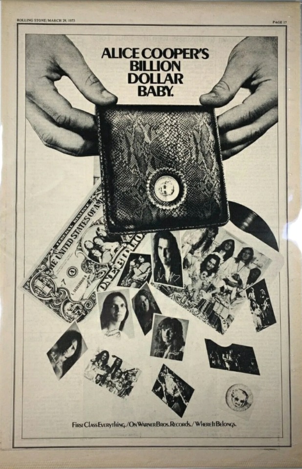
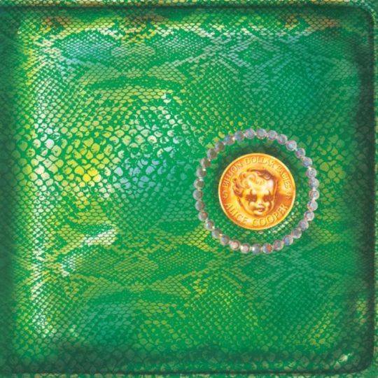
PIC(S) INFO: Spotlight on a March 1973 Rolling Stone print/promotional ad for the "Billion Dollar Babies" LP, the sixth studio album by American hard rock/shock rock band ALICE COOPER, and released on February 25, 1973.
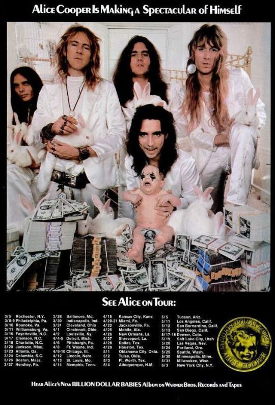
PIC #2: A concert poster for the "Billion Dollar Babies" 1973 continental U.S. tour, spanning 48 concerts in total. That's nearly one concert for every U.S. state!
"It was reflecting the decadence of a time when we were living from limousine to penthouse to the finest of everything including… well, the finest of everything. We couldn’t believe people were actually paying us to do this. We would have done it for free, because we were just a garage band who happened to be at the right place at the right time."
-- ALICE COOPER on "Billion Dollar Babies" being their most decadent album
BDB/FUN/TRIVIA FACT: A partial list of props from the tour, which required 40 tons of equipment, included a dentist’s drill, a surgical table for a sawing-in-half machine, four whips, six hatchets, 22,000 sparklers, 300 baby dolls, 58 mannequins, 14 bubble machines, 28 gallons of bubble juice, 6,000 mirror parts and 250,000 packages of bubble bath. As Cooper said at the time, “the sicker you kids get, the greater shows we’ll have for you.”
Sources: https://rockandrollglobe.com/rock/generation-landslide-alice-coopers-billion-dollar-babies-at-50, Heritage Auctions, & The Wayback Machine.
#ALICECOOPER#BillionDollarBabies1973#ALICECOOPERband#BillionDollarBabies#BillionDollarBabiesTour#SuperSeventies#BillionDollarBabiesLP#Adverts#1970s#BillionDollarBabies1973Tour#RetroAds#VintageAds#RecordAds#Rockandroll#PrintAdverts#RecordAdverts#Shockrock#ConcertPosters#TourPosters#PosterArt
0 notes
Photo


For this advert, I kept it simpler than the first as the photos were good enough I didn’t really have to add more designs and elements onto it. For this, I added a small description about my product along with my logo. For this logo, I changed the black down to w grey/ white so it’s seen more on the background. I didn’t want to keep it gold the same as the last one as gold had been used quite a lot within the design and I want the product to stand out. As the logo on this is seeable it doesn’t overpower and get direct attention. The products quite off centred which gave me space to add writing within.
Overall, I quite like this ad, I didn’t really have to change a lot for it letting it speak for itself. The writing on the side complimenting the candles not being too detailed so it didn’t shift the focus.
#advertising#candles#logos & branding#hennaartist#design#floral#products#photoshoot#printadverts#hand drawings#freehand#identity
2 notes
·
View notes
Photo
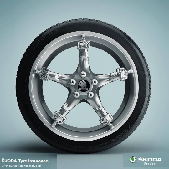
Tyre Insurance!
.
.
The tyre is protected by guards on the wheel indicating that at Skoda Service Center you not only get the tyres but also Skoda Tyre Insurance which includes all the required assistance.
.
.
Go to adaddictive.com.
You will find more awesome ads
#adaddictive#printadvertizing#Printmedia#socialmedia#socialmediaadvertising#socialmediaadvertizing#socialmediamarketing#thebestads#anxietyrelief#carlifestyle#carlovers#cheap#debris#driving#Insurance#italy#nails#nailsintyres#premiumtyres#road#roaddebris#roadtrip#rubberring#savemoney#skoda#skodatyres#tyre#tyreinsurance#tyrereviews#tyres
1 note
·
View note
Text
BRID: Heal the world with self-isolation!

BRID: Heal the world with self-isolation!
Credits
Advertising Agency: BRID, Tbilisi, Georgia
Creative Director: Ia Darakhvelidze
Art Director: Ia Darakhvelidze
Copywriter: Natali Burduli
Junior Art Director: Mariam Tevzadze
Graphic Design: Mariam Tevzadze
3D Artist: Iva Beriashvili
Tags:
Print Advertising, Print Advert, Coronavirus, COVID 19, Corona, Public Interest, BRID
Read the full article
0 notes
Photo

#screamyourownname #voilafeelbeautiful #upcycled #scarf #snood #tshirt #unisexaccessories #accessories #african #fashion #style #makeup #model #designs #designsthathitthespot #printad #printadvert #copywriting #copywriter #voila #advertising #greenfashion #consciousclothing #consiousfashion https://www.instagram.com/p/BzEGzxkDDeA/?igshid=1t70ltko3ijaz
#screamyourownname#voilafeelbeautiful#upcycled#scarf#snood#tshirt#unisexaccessories#accessories#african#fashion#style#makeup#model#designs#designsthathitthespot#printad#printadvert#copywriting#copywriter#voila#advertising#greenfashion#consciousclothing#consiousfashion
0 notes
Text

Yakuza PS2 US PrintAdvert ♡
2006
#yakuza#scans#game#video games#video game#video games art#video game art#videogame#videogames#videogame art#print scan#y2kcore#y2k aesthetic#y2k nostalgia#y2k anime
6 notes
·
View notes
Photo

Another ace TFL advert. #tfl #printadvertising #printadvert #hashtag
0 notes
Photo

Another campaign favourite from @diesel #MakeLoveNotWalls #billboard #equality #politics #advertising #adsappreciation #marketing #adverts #printad #printadvertising #ad #ads
#advertising#marketing#diesel#printad#printmarketing#billboard#equality#fashion#fashionmarketing#printadvert#printadvertising
0 notes
Photo

These are the first 2 Pages for the magazine both being adverts. I started with adverts as when I looked through many Fashion Lifestyle magazines, they all had many different pages for adverts before bringing in the main content. Because of the amount of pages I was planning to do I kept it to 2 adverts as I wanted mu magazine to include more content than adverts. I liked both of these together as the first car advert was really detailed and has a lot of information on which the second one contradicts it with just an image and brand logo. I like this combination as them both the pages don’t look really word heavy and them be ignored. I tried to use the same colours for both the adverts so the pages can merge between each other and look like a more combined double page spread instead of 2 different pages put randomly against each other.
#publication#magazine#printadverts#Digital Media#watch#carstagram#thought experiment#processing#pages#layouts#adobephotoshop
1 note
·
View note
Photo

This is the process to create my second Magazine Cover. I prefer this cover much more to my first attempt as it looks much better and can resemble to a fashion lifestyle magazine. As I wanted to base my magazine about Pakistani weddings, I thought this would be a much better picture to use as it related really well to my subject. For this image I didn’t make any changes except from blurring the face as the background gives it more of an original, authentic look of being at the wedding. I also liked the fact that the colours within this image are subtle and relate to the green and white of the Pakistani Flag.
For this cover, I decided to change the name to Aura, my next name idea. This one was much better as its one word and it means the atmosphere or quality that surrounds and be generated by a person, thing or place, which defines me as the Pakistani Culture is the atmosphere that I have grown up in and am mostly surrounded by. All the colours I used relates back to the topic of weddings and Pakistan as Red is the traditional colour for brides.
Along with this I followed the typical convention of Fashion Magazine with the writing being behind the main image. This is something I picked up on my research when looking at different Fashion Magazines to analyse. I quite liked this as it brings out more focus to the Cover image and what the magazine is going to be about. I didn’t really want to ruin the image by adding to many cover lines as the image really speaks for itself. So I only added the most important ones as it gives a- bit of an insight to what’s inside.
All the numbers that are included on the cover relate back to the theme of Pakistan, 14 is the day of independence that’s why I have try to use the number within the publication.
Overall, I really like the way this cover turned out as it perfectly explains the topic I am covering with just the image and the colours within added the extra detail.
#thought experiment#processing#magazine#pakistan#printadverts#pages#layouts#publication#digital art#trial and error#design#adobephotoshop#adobeindesign
1 note
·
View note
Photo
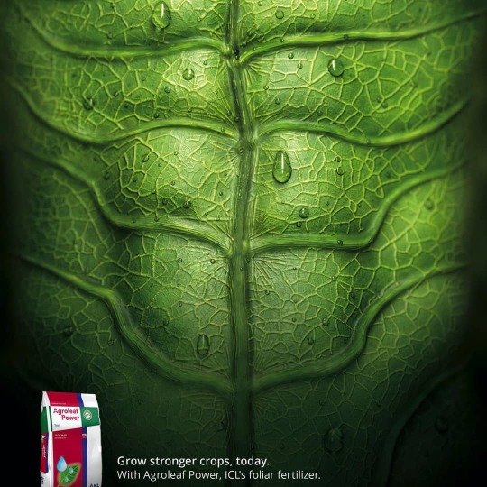
Fertilizer!
.
.
This is an ad for ICL’s fertilizer that protects the foliage. The leaf in the form of human abs depicts its strength and well being.
.
.
Go to adaddictive.com.
You will find more awesome ads
#adaddictive#printadvertizing#Printmedia#socialmedia#socialmediaadvertising#socialmediaadvertizing#socialmediamarketing#thebestads#agricultural#agriculture#agriculturelife#crop#crops#farming#farminglife#fertilizer#fertilizers#foliage#foliar#foliarfeed#foliarfeeding#foliarfertilizer#greenthumb#healthysoil#irrigation#manure#netherlands#organicfertilizer#soil#soilhealth
1 note
·
View note
Photo

McCafé!
This Billboard Ad for McDonald’s turns the iconic Arches into tired eyes – showing that there’s a simple solution to beat tiredness.
Go to adaddictive.com.
You will find more awesome ads
#adaddictive#printadvertizing#Printmedia#socialmedia#socialmediaadvertising#socialmediaadvertizing#socialmediamarketing#cappuccino#coffee#coffeeforbreakfast#coffeehouse#coffeehouses#coffeelove#coffeelover#coffeelovers#coffeeshop#coffeeshops#coffeetime#coffeetimes#frenchfries#lovecoffee#mccafe#mccafemoments#mccafé#mcdonalds#mcdonaldsbreakfast#mcflurry#mochalatte#stayawake
5 notes
·
View notes
Photo

Relief!
An ad for Plantolaxy, a fiber-based product from the Natulab laboratory.
Go to adaddictive.com.
You will find more awesome ads
#adaddictive#printadvertizing#Printmedia#socialmedia#socialmediaadvertising#socialmediaadvertizing#socialmediamarketing#thebestads#cleancolon#colon#colonhealth#colonhydrotherapy#colonics#constipation#constipationfree#constipationproblems#constipationrelief#constipationremedy#constipationsolution#constipationsucks#detoxification#digestionplus#digestive#digestiveenzymes#digestivehealth#digestivesystem#healthygut#highfibre#laxative#laxatives
2 notes
·
View notes
Photo
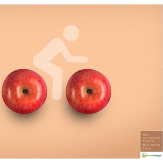
Agency Self-Promo!
An ad focusing on the fact that diet and exercise together can empower people to live better with chronic condition. Street Life Advertising trying to flaunt how creative they are when it comes to advertising.
Go to adaddictive.com.
You will find more awesome ads
#adaddictive#printadvertizing#Printmedia#socialmedia#socialmediaadvertising#socialmediaadvertizing#socialmediamarketing#thebestads#balanceddiet#balanceddietbalancedlife#balanceddieting#balanceddiets#balancediets#balancediet#diet#dietandexcercise#dietandexercise#dietandexercisecombined#dietandexerciselife#dietandexerciseworks#dieting#diets#fitness#fitnesslife#fitnessworld#gym#healthy#strong#weight#workout
3 notes
·
View notes
Photo

Tea!
MAGRO means "skinny" in Portuguese. This is an ad for tea which will help you strike a balance in daily life leading to weight loss and a healthy lifestyle.
Go to adaddictive.com.
You will find more awesome ads
#adaddictive#printadvertizing#Printmedia#socialmedia#socialmediaadvertising#socialmediaadvertizing#socialmediamarketing#thebestads#detoxifying#greentea#greenteafatburner#greenteafordays#greenteaforever#greenteaforhealth#greenteaforlife#greenteaforme#greentealife#greentealover#greentealovers💚#greentealovers😉#greentealover🍃#greentealover🍵#greentealover💚#greenteatime#greenteatime🍵#magro#magros#tea#teahealing
2 notes
·
View notes
Photo

Where’s your mouth been?
The pencil which is in your mouth now was behind someone’s sweaty ear, carrying with it all the germs and the grim. One swish with Listerine mouthwash takes care of it all says this ad.
Go to adaddictive.com.
You will find more awesome ads
#adaddictive#printadvertizing#Printmedia#socialmedia#socialmediaadvertising#socialmediaadvertizing#socialmediamarketing#thebestads#cavityfree#dentalcare#dentalhealth#dentalhygiene#dentalhygienelife#dentalhygienemonth#dentalrinse#freshbreath#freshbreathe#hygienetips#listerine#mouthrinse#mouthwash#mouthwashes#oralcare#oralcarepro#oralhygiene#oralhygieneisimportant#oralhygienetips#teethcleaning#teethsmile#toothpastealternative
1 note
·
View note
Last Seen Blogs

lesbianpoppins
we're all stories in the end

ice-cream-writes-stuff
Welcome To My Parlor!

faizhng
Percy Jackson Owns My Soul

jianxifashionjewelry-blog
Jianxi jewelry

winkyradish
required compare