#Proto Typeface
Text
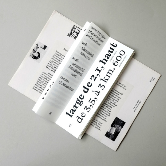
#Type Forms#fontstyle#graphic#graphic design#layout#Proto Typeface#typography#typeface#minimal#graphic inspiration#editorial
1 note
·
View note
Photo
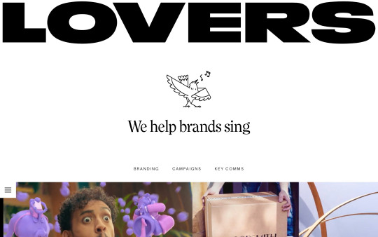
https://lovers.co/
#Lovers#design#studio#Certified B Corporation#portfolio#typography#type#typeface#font#Proto Grotesk#Lovers Clearface#2023#Week 14#website#web design#inspire#inspiration#happywebdesign
7 notes
·
View notes
Text
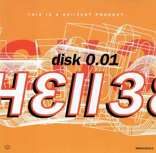
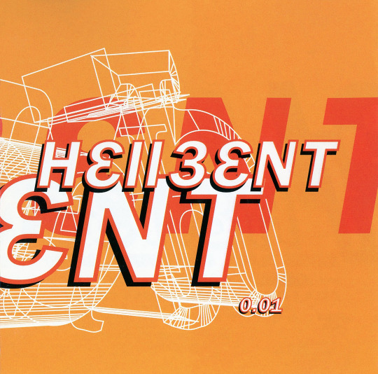

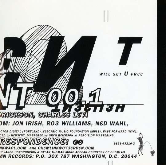

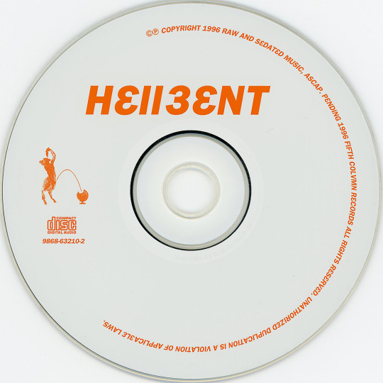
h3llb3nt - 0.01 (CD, 1996, Fifth Colvmn Records). First release from Hellbent (more often stylized h3llb3nt). A stellar collaboration between Bryan Black (haloblack, Motor, Black Asteroid), Eric Powell (16 Volt), Jared Louche (Chemlab), Charles Levi (Thrill Kill Kult) and Jordan Nogood (Nogooddesign).
Love all of h3llb3nt's releases. Their first release sets a great tone for the band with post-coldwave, literal whispers of cyberpunk and the clinical sounds of the digital, balanced nicely with Levi's signature funky basslines.
For 1996, the artwork seems to hint toward the digital precision a la The Designers Republic (95's Wipeout game/compilation) and typeface minimal-but-messy like Tomato (Underworld's '94 LP Dubnobasswithmyhead). Stuff we'd call today probably early Y2K Aesthetic or maybe even a smidge proto-Metalheart. (Nogood's design spans all of h3llb3nt releases but also recognizable in album artwork for haloblack's '94 LP >Tension Filter< and 16 Volt's '96 LP LetDownCrush).
The music is just as excellent. Few artists or releases sound much like this. Highly suggest starting with "Chromed", "3 Murders, 3 Nights" and "Burnout", but the entire album is stellar as a whole.
#my discogs scans#h3llb3nt#Hellbent#0.01#Fifth Colvmn Records#Bryan Black#Eric Powell#Jared Louche#Charles Levi#Nogooddesign#coldwave#industrial#post-industrial#y2k aesthetic#metalheart#highly recommended
15 notes
·
View notes
Text
33: Bernard Szajner // Some Deaths Take Forever

Some Deaths Take Forever
Bernard Szajner
1980, Pathé
Bernard Szajner’s Some Deaths Take Forever is probably the coolest ‘80s cold wave record in my collection, a frigid concept album (cool, cold, and frigid in this review already, ice to see you too I guess) about the inhumanity of the prison system sculpted from state-of-the-art synthesizer technology and continental prog. As Mark Fisher wrote in a 2009 retrospective, Szajner’s music “disassociated synthesizers from the hygienic purity found in Jean Michel Jarre’s work,” helping to pave the motorway for electronic music to become the grimy soundtrack to the next decade of cyberpunk dystopias.
As noted, Some Deaths is intended to be a concept album: side one follows a prisoner’s execution, while side 2 is about another prisoner’s life inside. Its mostly-instrumental music is a bit too kinetic to evoke the cramped physical conditions and intense boredom that constitutes prison life, but as an impression of a prisoner’s inner trauma… eh, sure, why not. Whatever it’s going for, it’s a work of pitiless psychic intensity.
youtube
The ‘execution’ side kicks off with “Welcome to Death Row,” a slab of proto-electro / prog built around a pulverizing arpeggiated synth. It’s striking how it comes out the gate with a sound so close to the pulsating techno of later acts like Drexciya (see 1993’s “Welcome to Drexciya” for example). Even as the song slowly gives way to a comparatively soothing cascade of Frippertronic-y guitars, that agitated loop continues to gnaw away underneath. These two modes, dark and let’s call it charcoal, define the opening suite, but it never grows wearying due to Szajner’s ahead-of-his-time experimentation. The ‘life in prison’ side is more diverse, opening with “Ressurector,” which goes from sounding like something off Eno’s Another Green World to a panic of stabbing, house-like synth riffs over shredding by Magma-affiliates Bernard Paganotti and Pierre Chereze. It segues into “The Memory,” an intricate sequencer and guitar duet that anticipates the stately improvisations of Manuel Göttsching’s groundbreaking E2-E4 by a good four years. It’s all extremely strong stuff.
Great cover here too, a mailed fist clenching a snuffed candle in the darkness, the thin plume of smoke bunching around the artist and title credit in the OCR-A typeface (an early computing standard you might recognize from your chequebook, or The Matrix). The typeface’s theme continues on the reverse, with the track list and credits mocked up like black-and-green command line text. It’s strewn with cyberpunky embellishments like “ALL HUMAN IS ERROR” and “:PHASES RADIO: TERMS OF REALITY 105 / NEW BODY FORM 36 / THE DIFFERENCEIS NOT ALL THAT GREAT 057.” Inside, we find a high-contrast black and white photo of Szajner surrounded by the towering banks of synthesizers and sequencers he used to produce the album. A reproduction of Amnesty International’s 1977 Declaration of Stockholm calling for the universal abolition of the death penalty and a short synopsis of the album’s storyline round out the package.
youtube
33/365
#bernard szajner#cold wave#music review#vinyl records#french music#electronic music#mark fisher#post punk#synth#'80s music
1 note
·
View note
Text
In the early days of printing, proto-influencers would distribute pamphlets responding to contemporary religious and political happenings—the image of an impassioned Martin Luther wielding the Ninety-five Theses and a hammer comes to mind. Much like in the pamphleteering days of yore, understanding the nuance and intention behind specific social media infographics requires an awareness of context. In other words, an infographic can’t present the whole picture or even an entire argument; rather, they work as tools for propaganda or consciousness-raising. They can point social media users toward additional information and resources. The fact that blackletter leapt beyond the realms of fashion and far right propaganda and back into digitally based print culture last year suggests that the typeface’s power never really diminished. So while it’s challenging to envision leftist protesters using blackletter on physical signage or publishers selecting Gothic font for long-form texts again, it appears the typeface’s iconoclastic history has charged it, at least for the time being, with a sense of urgency and aesthetic relevance.
#brb imagining martin luther shilling detox tea and hair gummies#media#mine#media studies#digital culture#readings
9 notes
·
View notes
Text
Applying Interaction Design Patterns to an e-Learning App
For this week’s project, I’ll be designing an e-Learning app for my proto-persona called Sofia.
So what about Sofia?
Sofia recently started working for a big company as a consultant. Typically she travels whenever she has a chance but hasn’t been able to with current travel restrictions. Recently she’s been looking for ways to bring the world into her home, to make the best of the situation.
Wants to learn
How to prepare meals from different cultures
Goals
Find her happiness
Meet new people, learn different languages, be in different cultures
Cook more meals at home from different cultures and cuisine.
Since Sofia is an Android user, I’ll keep in mind the following 5 Android’s Guidelines when designing this e-Learning app:
1. Nav bar at the bottom of the screen
This will allow Sofia to move around the app easily, going back, closing the app, and have a preview of all the tabs opened on her mobile.

2. App settings and options
I’ll use the hamburger icon as a secondary menu as is normally used in Android to hide setting options so in this way I’ll save screen space for another use.

3. Action buttons
I’ll use action buttons to highlight the most important action on a single screen placing a flotation button. As you can see in the below images the use of these kinds of buttons has to be as minimal as possible.

4. In-app Navigation patterns
I’ll organize the navigation menu as tabs at the top of the screen using an online icon.

5. Typography
Since Roboto is the typeface in Android. I’ll use the one at the left since in the below image which represents the main difference between typeface on iOS and Android.

2 notes
·
View notes
Text
Interaction Design Patterns: iOS vs Android:
This week, the project consists on designing a new mobile e-learning platform to be launched on both Android and iOS and we start the project with a proto-persona already defined. Mine is Matthew:
"Matthew has been freelancing and living a digital nomad lifestyle for the past 3 years. Most recently he has been based in Singapore while the pandemic has put a pause on his usual frequent travels. As a freelancer, he’s a jack of all trades: helping out small companies with marketing and advertising campaigns, and occasionally doing illustration work. Many of his clients request his help launching new websites, and in the past he’s either turned these clients to other freelancers he knows, or made small projects in Squarespace or Wix. As work has been slow the past months, he’s decided he’d like to build on what he knows by learning to make websites for his clients in Wordpress, to expand his service offering."
Since the app are going to be launched in both platforms these are the guidelines I will take into account when designing:
1. Navigation pattern
iOS uses navigation at the bottom of the screen, while Android uses tabs, often supplemented with swipe, to navigate.

2. Titles position
iOS titles tend to be centered whereas Android titles are placed on the left. Visual components such as lists, radio buttons, etc. may have their own visual styles.
3. Typography differences
San Francisco is the system typeface in iOS. Roboto is the standard typeface in Android.

4. Differences in navigation patterns
Moving between screens is a common action in mobile applications. There’s a universal navigation bar at the bottom of Android devices. Using the back button in the navigation bar is an easy way to go back to the previous screen or step, and it works in almost all Android apps.

On the other hand, the Apple design approach is quite different. There’s no global navigation bar, so we can’t move back using a global back button in native iOS app design. This affects the design of iOS mobile applications. Internal screens should have a native navigation bar with a back button in the top left corner.

5. Button styles
There are two styles of buttons in the Material Design Guidelines — flat and raised. These buttons are used in different situations. The text on buttons in Material Design is usually all uppercase. Sometimes we find uppercase button text in native iOS apps too, but most often we find title case.

2 notes
·
View notes
Text
iOS vs Android - Design Patterns
This week I will be focusing on designing an E-learning platform. For the project, I have chosen Alicia as my proto-persona:
“Alicia originally studied fashion which is how she wound up at Mango. As she’s learned more about the business, she’s become increasingly interested in moving onto the marketing team. She studied a bit of marketing at university, but hasn’t used it, and her manager told her she would need to improve her skills with digital marketing tools like Google Analytics and other platforms in order to be considered for a new role at Mango”.
Alicia is an iOS user that wants to improve her skills in Digital marketing and growth hacking so I will be highlighting the design patterns for this particular user. Here are some differences between iOS and Android:
1. iOS uses navigation at the bottom of the screen, while Android uses tabs, often supplemented with swipe, to navigate. Source

2. San Francisco is the system typeface in iOS, and Roboto is the standard typeface in Android. Source

3. Iconography
iOS uses “thinner” icons while Android use more “bold” icons. Source

4. Button styles
“There are two styles of buttons in the Material Design Guidelines — flat and raised. These buttons are used in different situations. The text on buttons in Material Design is usually all uppercase. Sometimes we find uppercase button text in native iOS apps too, but most often we find title case.” Source

5. “Other differences such as interaction patterns and visual styling of components. iOS titles tend to be centred whereas Android titles are placed on the left. Visual components such as lists, radio buttons, etc. may have their own visual styles.” - Source
As we can see, there are some differences that are larger than other, but some are quite similar. We also read the article “You don’t always need to follow native Android or iOS patterns when designing an app” which explains that:
“This thinking ultimately leads us to create a separation between iOS and Android users, rather than simply seeing them all as human beings.”
So in the end of the day, we should keep both type of “native” design patterns in mind and create applications that are intuitive for both iOS and Android users, to limit confusions and navigation issues.
2 notes
·
View notes
Photo

Some dots and some o’s… Available at www.draw-down.com Rafaël Rozendaal: Everything, Always, Everywhere Proto Grotesk Typeface Specimen A5/02 Philips – Twen: Realism is the Score #RafaëlRozendaal #ProtoGrotesk #TypefaceSpecimen #Twen #KarlGerstner #MaxBill #graphicdesign https://www.instagram.com/p/CBiTTCSH0YE/?igshid=15i86wuehxwac
3 notes
·
View notes
Photo
alcuin’s motto
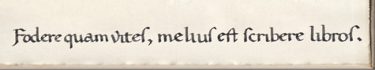
prof albert c. clark [fellow & tutor of queen’s college, oxford, late-19c–early-20c] tells us in «The Reappearence of the Texts of the Classics» [The Library, ser iv, vol ii, 1922, p15]: «In 782 Charlemagne, wishing to restore learning in his kingdom, summoned an Englishman, Alcuin of York, to act as his Minister of Education. Alcuin became Abbot of St. Martin at Tours, where he founded a scriptorium, in which the famous Caroline minuscule came into being. He taught his monks to write, instead of devoting themselves to the cultivation of the vine. His motto was: ‘Fodere quam vites, melius est scribere libros.’ His own studies lay chiefly in the direction of grammar and orthography. He succeeded in arresting the process of natural decay, and reintroduced classical Latin. Barbarous spellings disappeared as if by magic, and manuscripts were written by competent scribes.»
to which prof b. l. ullman adds: «There are those who deny that any existing manuscripts written in the ‘regular’ style of Tours, i.e. the characteristic Tours style with cursive elements all but eliminated, date from the time of Alcuin, and that Alcuin had any part in its development. Others believe that several manuscripts written in this style date from Alcuin’s time and that he was responsible at least for the encouragement of this script, although they admit that most of the examples, as well as those of the still better, ‘perfected’ style, were written after Alcuin’s death.» [Ancient Writing and its Influence, longmans, green & co, new york, 1932, p110].
humainist scholars (salutati, niccoli, poggio) evolved scripts for editorial & scribal work adapted from the carolingian script that they appraised highly for calrity & legibility—the only suitable script for copying latin literature. these ‘humanistic scripts’ were adapted, a mere half century later, by the proto-typographers for the types they evolved into the typefaces printers classify as roman & italic.
1st illustration: alcuin’s motto written emulating the neo-caroline, humanistic script. at one time poggio favored rustic «F» [stanley morison, «Early Humanistic Script and the First Roman Type», The Library, 4th series, vol xxiv, 1943, p15]; «ſ» [long-s] at the end of a word is humanist [b.l. ullman, The Origin and Development of Humanistic Script, edizioni di storia e letteratura, roma, 1960, p17]; «v» [minuscule] was introduced by poggio in 1425 [ibid, p53].
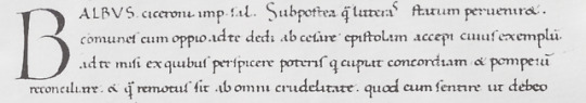
2nd illustration: poggio’s littera formata [florence, laur.49, col.125r, 1425; ibid, plate 23].
7 notes
·
View notes
Photo

https://www.protoeditions.co/
#ProtoÉditions#design#studio#portfolio#London#typography#type#typeface#font#Proto Edition#2022#Week 18#website#web design#inspire#inspiration#happywebdesign
2 notes
·
View notes
Text
Progress Report: May 1, 2019
Summary:
Switching the Progress Update date to the first Wednesday of every second month because previous schedule wasn’t working for me. This way I have more time to get more progress down on paper and off months don’t seem so glaringly obvious, and also I don’t have to repeat myself so much. In other news I am very close to being done with Proto-Changeling and ready to move on to Changeling proper. This language may or may not be called “Kweimiš” (ˈkweɪ.mɪʃ) in the future, we shall see if I can come up with something else in the meantime.
Progress Made, in no particular order:
Research;
I’ve continued researching and compiling data re: RL Germanic languages.
Phonology and Orthography;
I’m pretty confident with where I’m going regarding Proto-Changeling but have yet to finalise on Changeling Proper just yet. I am as of the moment tweaking the fiddly touches on the rules regarding that area.
Nouns and Companions;
I included two additional cases to the Proto-Changeling, Dative and Instrumental, with the intention of dropping them for the most part in Changeling Proper although I plan on keeping the cases around for words that would make sense for example locations for Dative and tools and food for Instrumental. These forms may very well be only used in poetic contexts but they’re being brought forward all the same.
I started work on a sample table to show off the cases and declensions. This table has words using the modern rune typeface friendly romanisation, the words in runes as they would appear in official documents, and the IPA for both the North West and South East dialects.
I started working on the final version of the Changeling noun declensions and started work on nouns I knew wouldn’t have much in the way of sound/spelling changes.
Verbs and Companions;
I added a metric tonne of Proto-Germanic Weak Verbs to work from, 279 exactly.
Misc Achievements;
I made a discord server to track my progress, this server is more personal than this blog so it will always be a closed server, but I will send invites to anyone who asks in and can confirm they are over 18. (It’s not gonna be a super nsfw server but I don’t necessarily want to have to pussyfoot around minors, hence the age limit.)
This is very minor regarding progress but I found a good Illustrator replacement and made some banners and logos for the the blog.
My Next Steps and Goals, in no particular order:
Research;
Finish recorded and transcribing Trollish from source material and post results online.
Continue researching and compiling data re: RL Germanic languages.
Phonology and Orthography;
Continue on with directing evolutionary sound changes.
Start work on a Defacto-Trollish with which to take loan words from (specifically wanting diverse and unique words for metals, minerals, and magic, although I want some abstract nouns and nature nouns to give things a more natural feel.)
Nouns and Companions;
Finalise all the sound changes so I can progress onto making actual words.
Verbs and Companions;
Finalise all the suffixes and sound changes so I can progress onto making actual words.
Grammar and Rules;
After I have the base words in place I want to get a start on grammar. I already have some ideas regarding this, but I want do more research to see how other languages with similar systems go about it first.
Misc Goals;
I need to actually make some tumblr friendly graphics to share with the people.
#progress report#conlang#tales of arcadia#changeling lang#I am so close to having stuff to share my friends#so close
1 note
·
View note
Photo

#dinosaur #trex #tyrannksaurus #jurassic #proto #pale #monster #free, #icon, #pictogram #freeicon #freepictogram available for free download, share, use for commercial purpose and/or modification 🦖 . Build a new business, business venture, brand identity, visual communication starting with an exclusive logo, custom design, custom typography, custom typeface, custom type ✒️ (στην τοποθεσία Petros Vasiadis Creative Design) https://www.instagram.com/p/CT40TRSj3xg/?utm_medium=tumblr
0 notes
Text
Week 6 exegesis requirements
Week 6
Exegesis
Requirements for week 6
Start Proto typing
Open critiques
Facilities
Hand in
Key notes
Review timeline. (Keep that in mind, print it out to keep track of what phase you are up to. )
Requirements for Exegesis
3,500 words
Wire bound
A4 page
What is it?
Framework to contextualize, Visually present and review your own work, reflective and an entry point. Something that explains your work. Create a framework. Scene it operates in. About your personal experience
a passion you’ve have since your 5 years old. Look into work and try to understand what those experiences and things that may be happening in the background that will help them understand better what you have done.
Needs to be clear, well structures, referencing, attention to detail. Needs to include articles you have read, about how to garden, different instructions, why it is good for you, benefits. Reference everything appropriately. Need to show you have done your research.
Format needs to be bound. Ideally around 3,500 words with a range of visual materials. (8 or 9 pages.)
Process photos
Photos about you, interesting to give us another view of things
Well design document
Appropriate typeface
Typography
Page structure
Reproduction
Possible components front matter
Abstract
Acknowledgements
context
Illustration image list
Introduction
Significance, why? position
Context and research
Where does it sit? Maybe in nz where it sits in a graphic design point of view. What questions, who does it talk to, why is it relevant, where did you find your research, did you look at other designer’s work and who is the audience?
Method
All methods how you assemble and collected the information. Did you have interview, did you do testing, how did you collect the context, did you have a prototype? Critique of practice. Field research.
Critical reflection
What made you think about the decisions you made. Why the colour, why the type, the style, what objects you looked at. Did you solve the problem? Use lots of photography’s, turning points. Any issues you fell into. Materials, branding? You can see that this is collecting all the stuff you are doing now. Do it now otherwise you might forget. Insights
Conclusion
What did you learn, summaries? Was it successful? Materials and format. Self-critique that would count as a conclusion. Help see things in a new way, other possibilities.
E.g. https://intern-mag.com/veronica-jones/
Writing about black women and queerness. There is also an interview where she explains her work. Doesn’t have to be like a magazine and can be quite different
0 notes
Photo


This Nightingale agency website is really interesting - static pics used here don’t do it justice - worth checking it out here.
They are a “progressive marketing and communications” agency based in Amsterdam and Antwerp.“ Green Chameleon lead designer Nathan Riley created a “futuristic digital showcase of their work; embellished by a unique particle system that forms the shape of the nightingale bird." The objective was to make a website that accurately reflects Nightingale’s forward thinking and the work they create for their own clients.
What also draws me in though is the paired typeface chosen. They are using Grand Slang in combination with Sequel 100 Wide and Steradian (pictured on the last image). For some reason I always expect brands to use a slight typeface and use it throughout their website. But the pairing actually triggers a lot more ideas for the viewer. The top line is strong, distinct and commanding while the second typeface-combo offers more flexibility, is more dynamic, and to me has a compelling touch of Sci Fi which really works with the particle nightingale. (actually just adding a PS to this note - I’ve since seen a episode of “The Expanse” in which the proto-molecule manifests itself as a shimmering hummingbird made up of blue particles - I wonder which is derivative of which!)
Thanks to fontsinuse for the head’s up on this site.
0 notes
Photo


Proto-Type Typeface Design
Alphabet based on mechanical objects which has been empowered by adding a blueprint aesthetic.
Zoomed out you will see each letterform and its structure implying motion, but zoomed in you can see each letter has unique characteristics; whether it be a power supply, spring, gear, electrical output, or just some simple screws.
Although I’m not completely sold on the look of the typeface I found it a fascinating find and relevant to my next test of creating an interior blueprint typeface. Really like the idea of how I could show my typeface on blueprint paper to match its concept and develop it further.
The typeface above showed me also the steps this designer took in developing the typeface from a sketches to being digital.
https://www.behance.net/gallery/63346431/Proto-Type-Typeface-Design?tracking_source=search_projects_recommended%7Cblueprint%20typeface
0 notes
Last Seen Blogs
blindh1-blog
Blindh 🕉

cavanavghs
unease.

sunflower-ker
Like Magic

rhythmrender
Rhythm Render
rhythmrender
Rhythm Render