#SectionEight
Explore tagged Tumblr posts
Visit Tumblr Blog
Explore Tumblr blogs with no restrictions, modern design and the best experience.
Last Seen Tumblr Blogs


Fun Fact
Tumblr was the first site to host the blog for President Barack Obama in 2011.
Link
Тринадцать друзей Оушена / Ocean's Thirteen - Jerry Weintraub, Section Eight - США - 2007 - #ТринадцатьДрузейОушена #OceansThirteen #СтивенСодерберг #БрайанКоппельман #ДэвидЛевин #ДжерриВайнтрауб #БрюсБерман #ДжорджКлуни #БрэдПитт #МэттДэймон #АльПачино #JerryWeintraub #SectionEight #США #Триллер #Криминал #CinematekaTv >> http://bit.ly/37kwA9s >> http://bit.ly/37kwA9s .............................................. http://cinemateka.tv
#ТринадцатьДрузейОушена#OceansThirteen#ДжорджКлуни#БрэдПитт#МэттДэймон#АльПачино#JerryWeintraub#SectionEight#Триллер#Криминал#CinematekaTv
1 note
·
View note
Text
S Class – SoundCloud
Hör dir S Class von sectioneight an auf #SoundCloud
0 notes
Photo

Another favorite from the pages of Hitman, the Section Eight member called... BUENO EXCELLENTE!!! BE is an overweight, Hispanic man, probably in his 40s, who uses the power of perversion to fight evil. We never see exactly how he does this but instead get to hear sound effects and see the looks of terror and disgust on the faces of the witnesses. Usually, we see him sneak up behind his intended victim, hear him say either,”Beuno,” or,”Excellente,” before we hear the screams off camera. As far as we know, there is nothing Bueno won’t use his powers of perversion on. Bueno, excellente indeed.
First appearance Hitman #18 September 1997. Created by Garth Ennis and John McCrea.
8 notes
·
View notes
Photo


Issues Three
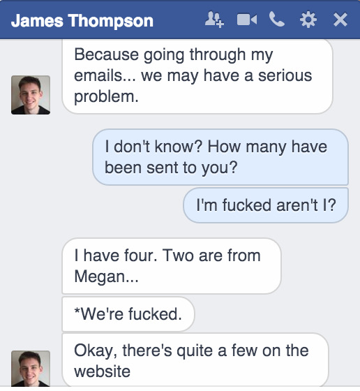
Complications With Content: Correcting Errors & Checking Assumptions
When checking what had been submitted for the next issue, after the writers deadline to ensure the project was running to plan, the client informed me that very few articles had been put forward. Unfortunately this turned out to be four articles that were suitable for print, as one of these was about ‘sex toys’ which I did not feel comfortable designing layouts for. I could have taken content from the website, but only three articles were current and I was reluctant to re use content so this left me with three articles for a 44 page document.
I asked the deputy editor, the writers and friends to create last min content for me over social media and in person. This all ate into the two week window for designing the issue. Thankfully all the articles were sent over speedily and I soon had almost enough for the issue.
At this point I turned to my design team, as I had postponed our weekly meet due to no content, to arrange another day to meet and any ideas for more content. They were all willing to be flexible and help out to ensure that there was enough quality content for the issue.
In the end, one of the design team had a friend who did not mind his personal blog content published and two of my design team were keen travellers so they undertook some travel articles as well as the illustrations for them.
Thanks to the help of the writers, committee and my design team I was able to collate enough content over two days, which left a good amount of time to get the design done .
1 note
·
View note
Text
Does the Artefact meet the needs of the client and user?
Initial Project Proposal;
Project Proposal
Client: Jack Munsch (A Monsters Ville/FAZE ONE Media) Brief Description: Jack is a music video producer & director who works for a company called FAZE ONE Media who produce short videos to promote smaller companies and up and coming artists. Assessed Artefact: Website, business card, logo, and social feeds. Financial: Cost for website ranges from free to £10 a month, and business cards can vary from £10 to £30 depending on quality. Client Specification: A functional website that shows and plays videos, a working gallery which showcases clients photography work. A simple yet sophisticated design to the website and the business cards. Software/Hardware: Adobe Photoshop, Adobe Illustrator, Adobe After Effects, Dreamweaver and Moo.com Copyright Issues: There should not be any copyright infringement however I will consistently check throughout the project to make sure there is no infringement. Possible Risks: There is a risk with Computers and Software, they tend to crash when used too much, I will make sure that I create regular backups of the clients work to prevent this risk. There also could be problems with the business cards, not printing properly. Skills: Photoshop/Illustrator to design the website and logo for the client. Time Scale: December 2014 – March 2015
The client and I have agreed that the artefacts produced in this project have met the requirements stated in the start of the project, even though one artefact of the initial proposal was removed, the client is very happy with all the other artefacts. The only other differences that are not on the initial proposal are the types of software and hardware that were and were not used. For the website development Dreamweaver was not used however www.Wix.com was used instead to create the website. As the videos were also already fully edited by the client, no further work had to be carried out, so Adobe After Effects was not used throughout the process of this project.
There are also no copy right issues with the project, Jack has the copyright for his videos and images, and once the end of project sign off has been signed the website will be Jack’s and he will be responsible for the copyright of the website.
The time scale of the project has also met the needs of the client, with plenty of time in between to make sufficient changes to the website, logo and business card, ready for the completion date. Below shows the fourth and final version of the Gantt chart;


Furthermore, at the end of the project sign off, the client will be handed the rights to the website, logo and business cards. I have also written up a manual for the client to help him with the basics of the website and how to make changes onto it. A copy of the hand over manual will be provided in the documentation hand in, with the Gantt charts.

0 notes
Photo

Yet another member of Hitman’s Section Eight... FRIENDLY FIRE!!! FF is the most powerful member of the team with a truly dangerous power. He is a pyrotech who can shoot flames from his hands. The problem is his aim. It’s so bad he usually hits a teammate or an innocent bystander. He died by accidentally shooting his own head off with his flame.
First appearance Hitman #18 September 1997. Created by Garth Ennis and John McCrea.
5 notes
·
View notes
Photo

Is the project up to the client’s standards
I phoned my client to inform them that I had completed all artefacts listed at the beginning and now with all the changes having been made. I asked my client to have a look through everything that had been created and let me know how they felt about everything and how the project has gone. This is the email I received back an hour or so after the call.
0 notes
Photo
Artefact: Meeting the needs of the client
Even with the last minute change of client, the whole committee expressed their satisfaction with the artefacts created, especially the obvious improvements and improving quality that they had seen.
As the whole committee had tested each issue, been involved in the processes, they were able to comment on the aspects of the designs. This made them feel involved and valued.
While the conventional design processes were not strictly followed with the making of the issues, due to time constrains meaning research was minimal, the help and expertise of the design team ensured the last two issues were of a much higher quality than the first.
The client also commented on this, and was overall very happy with the finished issues.
0 notes
Text
Section 8: Testing- Any Errors or Admissions and Correcting Faults
Image Size:
I had to edit the photos of my clients, as they were too big to fit onto the website. I couldn’t upload the original files as they would be horrible quality as they would have to be repressed to a certain size. I did this by individually editing the size of the photographs on Clikpic:
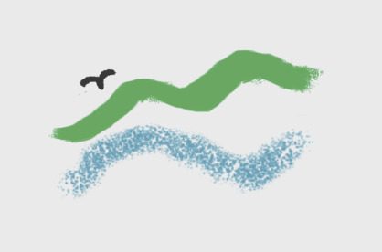
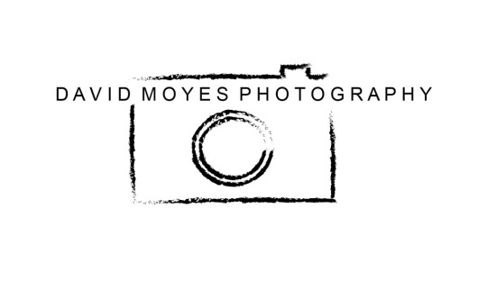
The Logo:
The logo was a big error in this project. I originally started making the logo on Adobe Photoshop, despite knowing that Adobe Illustrator was the best software to create a logo on. I did this because I was more familiar with Photoshop so I thought it would be the easiest option. However once I did a few drawings and realised it looked too much like an artist logo instead of a photographers. Therefore i decided last minute to change my logo and develop it on Adobe Illustrator. This turned out to be the right decision as my client much preferred this logo that I created.
Original Logo (created on Photoshop):
Final Logo (Created on Illustrator):
0 notes
Text
Testing - Does the Artefact Meet the Needs of the Client and User
Here is the proposal made at the start of the project:
Introduction: A website will be built as a platform for the advertisement of Lauren Riley’s artwork. The website will be minimalist but effective. As the designer, I will contact Lauren regularly to ensure things meet her needs. Statement of what the client wants: 1. Portfolio style website 2. Instagram account 3. Business cards 4. Logo created 5. Email Statement of what is gained: Users will be able to contact Lauren via email created by myself so that Lauren can receive feedback from consumers. Lauren can use both the website and Instagram account to show employers her work clearly and effectively. This will be a portfolio for people to view and consumer as well as something for Lauren to submit when considering her future beyond University. Resources required: 1. Tumblr 2. Moo.com 3. Instagram 4. 123 Reg 5. Adobe Illustrator 6. Adobe Photoshop
On reflection everything seems to be as first proposed. Nothing mentioned here has not been done and there is more to the project than mentioned in this proposal making the overall project exceed initial expectations.To add, I have also used PicMonkey as a resource to edit some images. I have created what my client requested without many problems. Nothing has failed. Despite being a little behind schedule and an overspend in the budget this project has met the clients needs.
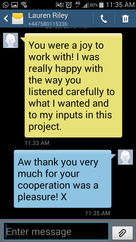
Here is my final client feedback. As stated it was difficult to show communication professionally as my client is a housemate, but here is a quick finalisation of the project.
0 notes
Photo

Sorry, my computer is at the Apple Store so I have been slowed down the last few days. This is the first time I have finished a super team in a long time. Here is the final member of the glorious losers known as Section Eight. From the pages of Hitman, I give you SHAKES!!! He has no super powers to speak of. Shakes is a homeless man who suffers form extreme non fatal tourette’s and parkinson’s diseases which leaves him shaking and stammering constantly. Fuh!-Fuh!-Fuh!-Fuh!-etc, is pretty much all he can say. Shakes is good pals with the rest of Section Eight, all buddies who hang out at Noonan’s bar. Shakes sacrifices himself by taking a live grenade from Six Pack, which goes off because elf his inability to throw it away. RIP shakes.
First appearance Hitman #18 September 1997. Created by Garth Ennis and John McCrea.
0 notes
Text
Feedback of Video Testing
Here are some quotes I picked out from the response sheets along with the ratings of what the video got.
.
“The video looks really good, I think it could help the owner with sales as it really shows what she sells and the image she wants to portray, 7/10″
.
“Those cupcakes look super yummy, I like that she has passion for what she does. I reckon she’s good at what she does, 7/10″
.
“The video has been filmed well although I would say it’s a little shaky, other than that you’ve put a great video together, 6/10″
.
“Such a cute video, the music fits in so well! I actually just checked her instagram out to see more of what she does. Good job, 8/10″
0 notes
Photo

Testing
For feedback on the video, I sent this via email to 5 people. I received feedback from 4. This was done in order to get an insight of what people think of this video and if they think it presents the business well.
0 notes
Photo
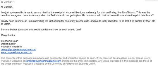
Correcting Errors: Checking the deadline for issue 3
Closer to the deadline the client informed me that he was unsure if he had updated the union on the new deadlines decided in January. This was obviously a major concern, so I decided to email Connar to double check.
He replied to say that the printers had space and would be willing to change the deadline short notice.
0 notes
Photo

Testing
As it was previously mentioned that hyphenated text was hard to read, I went through the whole document to hunt down orphan lines and ensure it was all easy to read.
In InDesign, this tool was quite hard to track down, but I eventually worked out that the ‘hyphenate’ check box had to be un ticked and this was in the spacing toolbar, not the first text toolbar.
0 notes
Photo

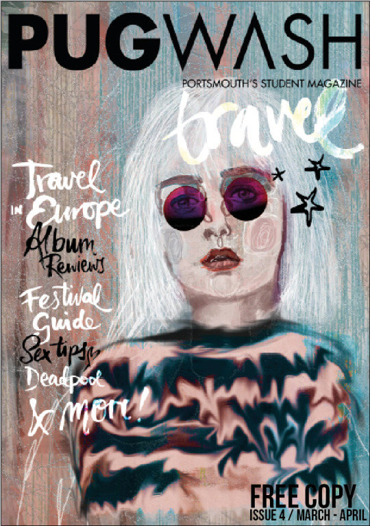
Testing Issue Three
As I only had the PDF version of the issue to test, it was harder to gain overall insight.
1. Comments suggested that this issue was the best yet, that layout was much nicer to read, and that a ‘house style’ had been achieved. Some were still skeptical, but many comments highlighted the standardised page numbers all the way through and that went a long way to creating the house style.
2. As fonts were very similar, again people expressed their like of the title fonts, and it was observed that the hand drawn fonts worked much better in this issue.
3. It was appreciated that the illustrations were both similar to the last issue, and that sections had similar images. The ‘Travel’ section in particular was well received.
4. Other comments were far fewer, people suggested that some of the ‘Uni Life’ sections were less interestingly designed and the images were more dull, but they agreed that these pages still looked pleasing.
As this was the last issue I was very pleased with the responses from the testing, I feel as though the magazine has come a long way.
0 notes