#Switch Stacking vs Cascading
Explore tagged Tumblr posts
Visit Tumblr Blog
Explore Tumblr blogs with no restrictions, modern design and the best experience.
Last Seen Tumblr Blogs


Fun Fact
Tumblr has 16.74 million mobile monthly users in the US.
Text
Differentiate the 3 Technologies: Switch Stacking vs Cascading vs Clustering
When we have more than one switches on hand we often seek to a better way in making use of them and managing them. There are mainly three technologies that we might use when we interconnect or combine several switches together, which are switch stacking, cascading and clustering. For many people that firstly get in touch with these terms, they can’t figure out the differences between them. Some discussions of the switch stacking versus switch clustering and switch stacking versus switch cascading have been put forward, but a comprehensive comparison between them has not been made. So this post is a discussion of switch stacking vs cascading vs clustering.

Switch Stacking vs Cascading vs Clustering
The comparison of switch stacking, cascading and clustering should be based on knowing the meaning of these technologies. So firstly we will see what switch stacking, cascading and cluster are.
What Are Switch Stacking, Cascading and Clustering?
Switch stacking is a technology that combines two or more switches together at the backplane typically via a specialized physical cable (stack cable), so they work like a single switch. The group of switches form a “stack”, and it requires a stack master. There’s also virtual stacking, where switches are stacked via Ethernet ports rather than stack cable/module. In such scenario, switch stacking vs cascading seems to be much similar. The port density or the switch capacity of a stack is the sum of the combined switches. For example, when you cascade two 24-port switches, you will get one large 48-port switch when it comes to configuration. And all the switches in the stack share a single IP address for remote administration instead of each stack unit having its own IP address. Only stackable switches are able to be stacked together. And it should be noted that, when the switches are stacked, there is no need to connect switches in the group via copper or fiber port besides the stacking ports, because the stack logically is one switch. It is like connecting 2 ports together on the same switch, which can cause loop.
By cascading more than one switch you can have multiple ports interconnecting each of your switches in the group. But they are configured and managed independently. Switches that are cascaded together should all support Spanning Tree Protocol (STP), in order to allow redundancy and to prevent loop. Generally switches of any models or from any manufacturers can be cascaded. But it does not rule out the cases that two switches can not be cascaded.
A switch cluster is a set of switches connected together, whether through common user port or special ports. One switch plays the role of cluster command switch, and other switches are cluster member switches, which are managed by the command switch. In a switch cluster only one IP address is needed (on the command switch). Not all switches can be clustered. Only specific cluster-capable switches from the same manufacturer can be clustered. And different manufacturers may use different software for clustering.
Switch Stacking vs Cascading
Where it comes to switch stacking vs cascading, the most obvious difference is that only stackable switches can be stacked while almost all switches can be cascaded. And the stackable switches are generally of the same model or at least belonging to the same manufacture.
In a switch stack, the port capacity is the combination of all the member switches and the bandwidth is also the sum of all switches. But by cascading switches, the bandwidth will not be increased. There’s even possibility of congestion at the cascade ports if you have only one connection between each switch.
The stack is managed as a whole. When you configure one switch, the change will be duplicated to every other switches in the stack, which is time-saving. However, in a switch cascade, you have to manage and configure every switch separately.
Stacking has a maximum number of stackable switches that you can have in a group. For example, you can connect up to four FS S3800-24F4S or FS S3800-24T4S in a stack. The switch cascading has limitation on the layers that you can have, which are usually the traditional three layers topology: core, aggregation and access. When the limitation is exceeded, there might be problems of latency and losing packet.

Switch Stacking vs Clustering
Stacking and clustering is very similar in that a stack or a cluster both use only one IP address, and member switches are managed as a whole. So when you wan to simplify the management of multiple switches, both stacking and clustering are technologies that can be adopted.
Stacking might be a bit easier to configure since the stack can automatically recognize new stack member, while in a cluster, you have to manually add a device to be the switch cluster. The management of stack members is through a single configuration file. Cluster members have separate, individual configurations files. So the management by a stack master is complete on every stack switch, but the cluster command switch is the point of some management for all cluster members.
The distances between clustered switches can be more flexible. They can be in the same location or they can be located across a Layer 2 or Layer 3. But stacked switches are in the same layer and generally they are located in the same rack. Only virtual stackable switches can be placed in different locations.
Conclusion
After reviewing the discussion of switch stacking vs cascading vs clustering, you may find that the three technologies have the similarity that switches in a stack/cascade/cluster group need to be physically connected. Some are through common Ethernet ports, while some are through special stack ports. Cascading has the minimal requirements on the switch model, while both stacking and clustering require the switches to be stackable/cluster-capable, and are of the same model or at least from a single manufacturer. Stacking and cascading are based on hardware implementation while clustering is based on software implementation. The management of a stack is the most complete among the three.
Source: http://www.fiber-optic-equipment.com/differentiate-3-technologies-switch-stacking-vs-cascading-vs-clustering.html
0 notes
Text
Making It Connect: Pairing Core Function Solutions From Multiple Vendors

The insurance landscape is changing quicker than ever before. Technology disruptions and intense competition in the sector are making insurers consider new IT vendor management strategies. Integrated solutions that have the flexibility to seamlessly link to third-party solutions are considered the most advantageous in a competitive market.
Why some companies may consider multi-vendor systems
There are many single vendor advantages for IT infrastructure management, not the least being a single vendor takes full responsibility. and you have a complete solution on one platform, with no compatibility problems. And it comes at a lower price. However, there are many reasons that insurance carriers might consider a multi-vendor system
When migrating from a legacy system, businesses prefer to do it one module at a time. This prevents any downtime. However, a great many legacy systems do not use a software architecture that allows integration of disparate systems using differing protocols.
An integrated solution might have all the core functions you need, yet there are instances where there might be a new functionality you would like to add on, from a different vendor. Modern integrated solutions like SimpleINSPIRE provide for easy integration with APIs of other providers.
Some insurance carriers opt for a microservices infrastructure that is decentralized. This system will enable independent components to be integrated and evolve independently. Unlike a single-service approach where different components are intertwined, in a microservices structure, each service can act as a separate entity. This is the biggest advantage of microservices when compared to monolithic architecture. In the latter, when there is a failure in code, it can have a cascading effect on more than one function because of its tight integration. In a microservice, the effect is minimal. In fact, when several services are brought down for maintenance, users will not even be aware of it. At the same time, loose coupling ensures that integrations are effective enough to enable smooth communication and seamless functioning as a whole.
Understanding Monolithic Vs Microservices Architecture
Monolithic architecture is a traditional way of designing applications where the entire interface is built as a single unit. Although modules within the application are interconnected, they are all structured within a single stack that are tightly-coupled.
Microservices architecture are decoupled applications functioning independently. The tech stack for each service is separate, meaning different technologies can underpin different services like claims management and billing systems.
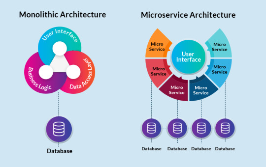
A microservices infrastructure, be it an integrated platform with same-vendor or multiple vendors providing technologies for different processes, can foster an environment for agile, efficient development. Since network architects segregate the whole system into smaller, independent functionalities, insurers can then choose providers of their own liking for each component depending on their requirements. For instance, say you believe that an existing insurance solution provider is the best vendor for cloud computing, policy management as well as claims management. However, you want a different provider for billing and accounting. The flexibility that comes with a microservices design can help with this since integration of different components and applications will be hassle-free.
Some of the key advantages of multiple vendor services in insurance are
Flexible solutions for different processes will help you find the best fit for your needs.
It will avoid vendor lock-in because if one process does not meet your expectations, you can always switch to a different vendor without disrupting other processes.
A multi-vendor services approach is also a great way to manage risk. If one of the vendors goes bust, it does not put your entire business on the rocks.
It will also make it easier to manage demand fluctuations among different on-demand products since IT infrastructure management is flexible.
Since every process has its own vendor, updates and upgrades will be on time. With the right integration, this can help improve your overall competitiveness in the market.
With that being said, a solid multi-vendor IT infrastructure management strategy will need a good integration platform that supports these different functionalities. A good platform needs to be backed with the right technology that allows distinct services to collaborate effectively and function in a manner that does not compromise the efficiency of any process.
How to ensure the success of a multi-vendor service strategy
Integrating IT solutions from multiple vendors has its advantages for sure. Yet, success depends on the right implementation strategies. To ensure that your multi-vendor service strategy works, here are some things to look out for:
Make sure that your underlying APIs support multiple vendor integrations with ease. Without this, no matter the strength of vendor solutions, your system will still crash.
Have a good understanding of how different vendor systems function and be willing to adapt your work practices to fit varying needs.
Improve cross-vendor cooperation and support partnerships for a smoother flow. When your vendors have a good rapport, it will become easier to troubleshoot when things go awry.
Monitor different processes and functionalities to identify which ones are working for you and which ones are not.
Invest in training your employees to handle services from multiple vendors.
The SimpleINSPIRE Solution
SimpleINSPIRE is an integrated, multi-line insurance platform that is designed to help you grow your insurance business in the current competitive market. Our user interface is based on Angular Framework, which creates user-friendly interfaces. Simultaneously, our application microservices will give your insurance business the flexibility to add more features and pages to the system as and when you require it. For instance, our Adjustermate mobile app is designed to import assessments and photos not only into the SimpleINSPIRE claims system, but can be independently integrated into any other claims system with the right APIs. This fluidity across all solutions makes SimpleINSPIRE a proven enterprise-level solution for all, from start-ups to $10bn insurers. We have both the software as well as the people to ensure that your insurance organization can integrate fast, high-performance products.
Source Url:- https://www.simplesolve.com/blog/multi-vendor-solutions-in-insurance-industry
Making It Connect: Pairing Core Function Solutions From Multiple Vendors
0 notes
Text
Everything You Need To Know About Nodejs!
Do you know what Walmart, Netflix, Mozilla, GoDaddy, and Microsoft have in common? Think, Think, Think!
Fail to connect the common ground among these giants? Well, let us clear the confusion – All these tech giants are using Nodejs development to offer the real-time experience to their users. Today, many web development companies have moved to a uniform web language with Node.js that leading the way.
Before we discuss why top companies are choosing Nodejs, let’s understand what is Nodejs!

A Brief About Nodejs:
Node.js is a cross-platform & open-source JavaScript run-time environment that executes JavaScript code outside of a browser. Also, it allows the Node js developers to create web servers & networking tools using JavaScript and a collection of modules that handle various core functionalities.
Nodejs was originally written by Ryan Dahl, 13 years after the introduction of the first server-side JavaScript environment “Netscape’s LiveWire Pro Web.”
This programming language came into the existence with the idea of extending the use of JavaScript in the web browser. Unlike PHP & Ruby on Rails, Node.js has a non-blocking event-driven I/O model, which makes it an excellent choice to build robust & scalable applications. Read our other blog to check the comparison of Nodejs vs PHP.
How Did it all Start? The Origin of Nodejs:
Dahl created this language because he wasn’t happy the way Apache Http server handles multiple concurrent connections. In fact, he criticized the way code was blocking the entire process or implying multiple execution stacks for simultaneous connections.
His urge compelled him to create a Node.js project that he demonstrated at the inaugural European JSConf on 8th November 2009. The smart utilization of Google’s V8 JavaScript engine, event loop and low-level I/O API in the project managed to win millions of hearts.
In June 2011, Microsoft and Joyent together implemented a native Windows version of Node.js. The first version was released in July 2011.
In January 2012, Dahl stepped aside & promoted the co-worker and npm creator “Isaac Schlueter” to manage the project.
How Does it Work?
JavaScript and Node.js run on V8 JavaScript runtime engine. This V8 engine converts the JavaScript code into faster machine code.
Nodejs Architecture Includes:
Single Threaded: Node.js works on a single thread. This approach is worth considering as it avoids context switching.
Event Loop: The event loop allows node.js to perform non-blocking I/O operations despite the single-threaded feature. A transaction passing through Node traverses a cascade of callbacks. And using the ‘libuv’ library, it handles queuing & process the asynchronous events.
Non-Blocking I/O: This loop works on a single thread, but the runtime tasks are executed asynchronously on worker’s thread top that returns the result via call back to the event loop thread. This is a great non-blocking way of handling code execution.
Front-End Development: The front end is what is visible to the user, and he engages and performs activities. Front- End Development covers coding the UI interface, handling events, and thereby interacting with back-end server to pull data at the front-end UI side.
Back-End Development: The back-end is the technical work that is not visible to the user. It deals with server-side scripting and database interaction so that the data can be requested by front-end apps.
Nodejs Features:
Encourages Sharing: Robust Node Package Manager (NPM), encourages sharing. Having a repository of 50,000 packages, developers manage to build effective solutions. With inbuilt NPM, it becomes easy for developers to update, share or reuse codes.
Lightweight and Scalable: Nodejs development accelerates with the V8 JavaScript engine without compromising on quality or security terms. Additionally, the non-blockage of the thread makes the application lightweight, scalable behaving in a network-friendly manner.

Ideal for Real-Time Applications: The language has extraordinary features for creating real-time applications like chats and gaming apps. It is also an ideal fit for programs that require an event-based server or non-blocking server.
Data Streaming: HTTP requests responses are considered as isolated events, but in reality, they are streaming data. You can leverage data streaming in Nodejs by incorporating features like processing files when uploaded. It drastically decreases the complete processing time.
High-Performance: The single threaded JavaScript runtime offers seamless network applications. Built upon Google Chrome’s V8 runtime and coded in C++, Nodejs is specifically built for multiple operating systems. Both V8 and Node are updated on regular intervals with performance optimization & security patches while supporting JavaScript features.
Suitable for Microservices: All big names are utilizing Node.js for its microservices. Wondering why? Well, Node.js has the ability to optimize the performance of your application. Furthermore, eliminating the unwieldy modules make it simpler to operate microservices on Node.js applications.Cross-Platform Development: Nodejs collaboration with Electron or NW.js allows you to build cross-platform applications.
Powerful Single Codebase: Nodejs has proved itself as a game-changing technology as it allows Node.js developers to code JavaScript server side and client side. This makes it easy to send & synchronize data between the points automatically, saving a lot of development time.
Wait, there is more to add!Node.js embraces flexibility with features like cluster module enabling load balancing over various CPU cores. Besides, the use of robust tools like PM2 process manager makes it simpler to monitor, optimize and deploy Node applications.
Getting Better Each Passing DayNode.js is improving for the better each passing day. It keeps launching new releases while enhancing the standard of the codes/features. Moreover, with the support of an open source community, this technology will be nourishing in the near future.
Need help setting up a dedicated team of Node.js developers in India? Connect with us our business head now and get a free consultation.
This content is originally posted on Your Team In India. Visit to read our other blogs.
0 notes
Link
The most advanced and modern CSS course on the internet: master flexbox, CSS Grid, responsive design, and so much more.
What you’ll learn
Tons of modern CSS techniques to create stunning designs and effects
Advanced CSS animations with @keyframes, animation and transition
How CSS works behind the scenes: the cascade, specificity, inheritance, etc.
CSS architecture: component-based design, BEM, writing reusable code, etc.
Flexbox layouts: build a huge real-world project with flexbox
CSS Grid layouts: build a huge real-world project with CSS Grid
Using Sass in real-world projects: global variables, architecting CSS, managing media queries, etc.
Advanced responsive design: media queries, mobile-first vs desktop-first, em vs rem units, etc.
Responsive images in HTML and CSS for faster page loads
SVG images and videos in HTML and CSS: build a background video effect
The NPM ecosystem: development workflows and building processes
Get friendly and fast support in the course Q&A
Downloadable lectures, code and design assets for all projects
Requirements
This not a beginner course — You should be confident in coding HTML and CSS before taking the course
Any computer and OS will work — Windows, macOS or Linux
There is no need for any paid software — The text editor you already have works just fine
Description
Have you been coding CSS for some time, but want to take your game to the next level? Do you feel confused with CSS jargon like inheritance, specificity or the cascade?
What if there was one resource, one place, where you could learn all the advanced and modern CSS techniques and properties you’ve been reading about?
Good news: there is!
Welcome to “Advanced CSS and Sass”, the most advanced, the most modern, and the most complete CSS course on the internet. It’s everything you want in an advanced CSS course, and more.
You will learn complex CSS animations, advanced responsive design techniques, flexbox layouts, Sass, CSS architecture, fundamental CSS concepts, and so much more.
Like in all my courses, you will build beautiful and carefully designed projects, that will make you proud of yourself and leave you ready to build complex projects on your own.
After finishing this course, you will:
1) Be up to speed with the most modern and advanced CSS properties and techniques;
2) Have mastered the cutting-edge layout technologies Flexbox and CSS Grid;
3) Be ready to build responsive layouts for all kind of devices and situations;
4) Truly understand how CSS works behind the scenes;
5) Be able to architect large CSS codebases for reusability and maintainability using Sass.
Please note that this course is NOT for absolute beginners, so you should already be at an intermediate level in HTML and CSS (please check out my other course if that’s not the case).
This course is massive, coming in at 20+ hours. Here is exactly what you will learn:
• Tons of modern cutting-edge CSS techniques to create stunning designs and effects: clip-path, background-clip, mask-image, background-blend-mode, shape-outside, filter, backdrop-filter, object-fit, transform, column-count, hyphens, perspective, calc() and custom CSS properties;
• Advanced CSS animations with @keyframes, animation and transition;
• Advanced CSS selectors, pseudo-classes and pseudo-elements required for modern CSS development;
• How CSS works behind the scenes: the cascade, specificity, inheritance, value processing, the visual formatting model, the box model, box types, positioning schemes and stacking contexts;
• CSS architecture: The 7-1 rule, component-based design, the BEM methodology, writing reusable, maintainable and scalable code;
• Introduction to Sass: variables, nesting, partials, imports, mixins, functions, extends, and more;
• Using Sass in real-world projects: setting global variables, building for reusability, architecting CSS and managing media queries;
• The NPM ecosystem: setting up a development process to compile Sass and automatic browser reload, and creating a build process to concatenate, prefix and compress CSS files;
• Modern responsive design: fluid grids, layout types, flexible images, using media queries to test for different screen widths, pixel densities and touch capabilities;
• Advanced responsive design workflows: mobile-first vs desktop-first strategies, selecting breakpoints, em vs rem units and feature queries to test for browser support;
• Responsive images in HTML and CSS for faster pageloads: resolution switching, density switching, art direction;
• SVG images in HTML and CSS: how and why to use SVG, generating SVG sprites, changing SVG colors in CSS and best practices;
• Videos in HTML and CSS: building a background video effect;
• Flexbox layouts: main concepts, introduction to both flex container and flex item specific properties, advanced positioning techniques applied to a huge real-world project;
• CSS Grid layouts: main concepts, CSS grid vs flexbox, and layout techniques applied to a real-world project. This part alone could be an entire course!
Why should you take this course?
So you saw that the course is absolutely full-packed with content. But maybe you’re still not sure if you should actually learn advanced CSS?
That’s probably because CSS is so easy to get started with. In fact, most developers highly underestimate the importance and power of CSS. But nothing could be further away from the truth!
CSS is what makes our design come into life. And there is so much we can do with it! Mastering advanced techniques like flexbox, CSS grid and animations, will give you an edge over many CSS developers out there who still use outdated methods.
Plus, CSS can become a real nightmare when you try to master it, and when you have to maintain large projects. So having a good grasp on fundamental concepts is an absolute must for any serious front-end developer.
And this course will help you with all that!
So, should you take this course? The answer is most likely a big YES!
And I packed so much content into this course, that no matter if you’re just starting out, or if you’re already an experienced front-end developer, there is definitely gonna be something for you in this course.
And this is what you get by signing up today:
• Lifetime access to 20+ hours of HD quality videos. No monthly subscription. Learn at your own pace, whenever you want;
• All videos are downloadable. Learn wherever you want, even without an internet connection!
• Friendly and fast support in the course Q&A whenever you have questions or get stuck;
• English closed captions (not the auto-generated ones provided by Udemy);
• Course slides in PDF format;
• Downloadable assets, starter code and final code for each project;
• Lots of small challenges are included in the videos so you can track your progress.
If you’re still with me at this point, then please watch the promo video to take a look at the course projects, and I promise you will be amazed 🙂
After that, I hope to welcome you as a new student in my course. I’m sure you’re gonna love it!
Who is the target audience?
CSS developers who want to update their CSS skills to the most modern level
CSS developers who want to expand their toolset to animations, flexbox, Sass, NPM, SVG, and much more
Front-end developers who want to finally understand how CSS works behind the scenes
In general: anyone who wants to truly master CSS!
Created by Jonas Schmedtmann Last updated 6/2018 English English
Size: 3.84 GB
Download Now
https://ift.tt/2yzP8TM.
The post Advanced CSS and Sass: Flexbox, Grid, Animations and More! appeared first on Free Course Lab.
0 notes
Text
Intel Claims Xeon Cascade Lake-AP 56 Core CPU Up To 84% Faster Than AMD’s 64 Core EPYC Rome 7742 in Real-World HPC Benchmarks
Intel has posted a series of new benchmarks claiming that their Xeon class Cascade Lake-AP CPUs run much faster than AMD's 2nd Generation EPYC Rome CPUs. The benchmarks which Intel claims are representative of 'real-world' performance in the HPC segment compare Intel's 2S (dual socket) Xeon Platinum 9282 versus AMD's EPYCX 7742 (also in a dual-socket configuration).
The Cascade Lake-AP Xeon Platinum 9282 56 Core CPU Claims To Be 84% Faster Than AMD's EPYC 7742 64 Core CPU in Intel's 'Real-World' HPC - AI Performance Benchmark Suite
The performance metrics for both processors were posted at Medium where Intel also recently published an article about core scaling and the reliance of modern applications on the number of cores available on processors. According to Intel, 8 cores along with sustained frequencies would result in better scaling than say a 12 core or a 16 core chip. Now Intel may have provided a lot of data backing up their findings but the same Intel was reluctant to move beyond 4 cores back in 2017 when AMD was offering their Ryzen chips with up to 8 cores and 16 threads. It's interesting how suddenly, 8 core processors have become the next-big-thing for Intel's mainstream lineup and the same would happen with 10th Gen family which is expected to receive even more cores.
For the HPC market, Intel says that - More processor cores add compute, but the overall system or workload performance depends on other factors, including:
· The performance of each core
· Software optimizations leveraging specific instructions
· Memory bandwidth to ensure feeding of the cores
· Cluster-level scaling deployed
Anyway, coming back to the topic, Intel's latest benchmarks compared the Xeon Platinum 9200 versus the EPYC 7742. The Xeon Platinum is one of the elusive Cascade Lake-AP processors which feature two dies instead of a single monolithic one, stacking up to 56 cores and 112 threads. The chip has a base clock of 2.60 GHz and a boost clock of 3.80 GHz along with 77 MB of cache and a TDP of 400W. The Intel Cascade Lake-AP chips feature 12 memory channels compared to AMD's 8 memory channels per chip.
The AMD EPYC 7742 is based on a 7nm process node (vs Intel's 14nm+++) and features 64 cores / 128 threads. The chip has a base clock of 2.25 GHz and a boost clock of 3.4 GHz with 256 MB of L3 cache, 128 PCIe Gen 4 lanes and a TDP of 225W. The pricing plays a huge role too and here we see the EPYC 7742 with a price of $6950 US while the Xeon Platinum 9282 is suggested to have a price between $25K - $50K .
So right off the bat, we can note that this isn't a fair comparison as not only does Intel's chip have a higher running TDP but its cost is at least 3.5x higher than the AMD processor. Yes, the EPYC 7742 is AMD's flagship 2nd Generation Rome processor for servers but even still, this isn't an apples to apples comparison in any possible way.
Update: ServerTheHome's Patrick J Kennedy has found out that the GROMACS version being used by Intel is an outdated one that doesn't utilize the 256-bit wide AVX2 SIMD instruction set that is featured on Zen 2. The GROMACS 2019.3 version was used by Intel in what they are terming as real-world benchmarks, however, the latest version available is 2019.4 which adds support for Zen 2 based EPYC Rome chips like the EPYC 7742 which Intel tested their Xeon Platinum 9282 against. It just goes off to show that even Intel's 'Real-World' benchmarks aren't indicative of actual product performance and may lead to misleading statements against competitor products. And this won't be the first time Intel is using misleading benchmarks or statements to downplay the competition. They have termed several important performance metrics used by tech reviewers that are invalid and not indicative of actual product performance while their own performance metrics surely are.
The benchmarks show that the Xeon Platinum 9282 delivers an average performance increase of 31%, going as high as up to 84%. There are several HPC specific applications shown which Intel claims are representative of real-world performance metrics in the server market. Dissecting each application reveal the breakdown of performance in each individual workload for the benchmark and in the case of the Manufacturing application (ANSYS Fluent Workload), Intel has a 13% average performance uplift over AMD's EPYC Rome chip. Intel also claims that having AVX-512 onboard the new Xeon chips gives them an edge in several applications such as VASP, NAMD, GROMACS, FSI & LAMMPS.
The HPC segment is broad with varying compute requirements by workload. 56 core Xeon Platinum 9282 ranges from 8% to 84% better performance (31% higher geomean) than AMD’s 64 core Rome-based system (7742) on leading real-world HPC workloads across manufacturing, life sciences, financial services and earth sciences(2).
Some of the applications and results are shown above are a geomean of several specific workloads, all with different characteristics and sensitivities. Drilling into the details of these workloads provides further insight into performance. For example, Xeon Platinum 9282 leads AMD Rome 7742 by 13% on a geomean of 14 ANSYS Fluent workloads. Across those 14 different CFD simulations, Xeon’s results range from 2% lower to 36% higher.
Medium (Intel)
Intel further goes on to claim that Xeon Platinum 9200 series processors offer a lower TCO (Total Cost of Ownership). Since the performance of Xeon Platinum 9200 series is higher, you'd have to require a fewer number of nodes which should drive down the node acquisition cost, lower fabric, switching and cabling cost. It is also mentioned that while the Xeon-AP has a higher TDP and power requirement than AMD's EPYC Rome (225W vs 400W), it should be offset by the lower number of nodes required to reach the same performance.
Aside from raw compute power, memory bandwidth is also highlighted as the main performance measurement factor and surprisingly, major industry players are already evaluating replacing their existing Intel-based systems with EPYC processors. Just a day before Intel published their report on performance, it was revealed that Netflix may soon be switching to AMD's EPYC based platform as the TCO is similar but the EPYC solution may actually offer higher bandwidth than an Intel Xeon based system.
There will be a lot more action next-year in the server department as AMD will launch their energy efficient 7nm+ EPYC Milan CPUs to tackle both, Intel 14nm Cooper Lake and 10nm Ice Lake lineups, simultaneously.
0 notes
Text
The Weird and Wonderful Worlds of Columns II and Ichidant-R
Arcade games always have a special allure to them. Lots of experimentation, lots of new ideas and ways to eat quarters, and also lots of difficulty bringing those games perfectly to the home console market. In a previous review, we took a look at SEGA AGES versions of Space Harrier and Puyo Puyo, which attempted to bring the arcade magic of those games to the Switch, taking advantage of the fact that modern hardware has allowed games to recreate their arcade perfect selves.
For many of the SEGA AGES titles, the focus has been on classic, well known titles, like Sonic the Hedgehog, Outrun, Phantasy Star, Alex Kidd and other famous SEGA franchises have already had their time in the limelight. But what about lesser known, weirder titles? Thanks to our friends at SEGA, we were given a chance to check out two titles that fit that bill: Columns II: The Voyage Through Time, and Ichidant-R, and boy were we surprised by these two!
Columns II is perhaps the simpler of the two to talk about: the sequel to the original puzzler Columns, Columns II is a game that’s eluded home release for a while, having been an arcade only release for much of its life except for a port to the SEGA Saturn; interestingly enough, its sequel, Columns III would see release on the Genesis, which explains why many SEGA Genesis compilations tend to skip from Columns I to III. And, frankly, that’s a bit of a shame! Columns has always been a somewhat unique puzzle game, as much of its action runs counter to what players familiar with Tetris or Puyo Puyo might expect: while combinations can be made horizontally and vertically, Columns really shines from careful consideration of diagonal plays to clear boards and create combos.
Columns II: The Voyage Through Time features two distinct modes of play: Flash Columns, and Vs Columns. Flash Columns takes players on a journey through time (hence the name) where they are tasked with completing 70 frankly punishing stages. The name “Flash Columns” refers to the fact that players are presented with a board that is already partially filled with gems (or other weird objects, like fossils or futuristic orbs; remember, time travel) that includes numerous flashing gem/fossil/things. The only way to clear a stage is to burrow down into the level and clear those flashing gems, a task that becomes increasingly difficult as the speed of the game picks up, and your own poorly laid out plans create unwanted consequences as you become your own worst enemy.
Along the way, players will run into Skulls, which appear in the board and act as a roadblock: clear them, and the entire board will be ratcheted up, meaning you have less space to work with! Flash Columns left me with what I can only describe as two distinct feelings: that I just didn't get Columns, or that I was so hyper aware of Columns that I knew the moment I had lost a board from a single set of 3 gems being placed. It was a weird feeling, to say the least, to oscillate between knowing the game is hard, to knowing the game well enough to realize I had already lost 30 seconds into a level. Thankfully, with unlimited continues and save states, this allowed me to play through the entire 70 stages of Columns II and feel a sense of accomplishment that, in an arcade, would likely have been physically impossible or extremely expensive.
Columns II runs so counter to the way most other puzzle games play (the focus on the diagonal being key to playing the game) that at times I found myself getting in my own way, trying to stack vertical or horizontal matches of icons, only for the board state to either remain exactly the same as it was, or in some cases, be even worse than it was before I cleared things. There aren’t many options to rotate or “drop” pieces either, which means that 3 stack high block is going somewhere, and you need to find the absolute best order and position for it to drop before you end up replaying that level all over again. Some stages would feel like a breeze, and others would be a grueling 30 minute long battle.
In the end, I was surprised at how I grew to actually like Columns II unique gameplay and challenge, where I initially came in comparing it only to other puzzle games, and despairing when the "wrong" 3 sets of jewels dropped. My reward for clearing all of these stages were the “Jewel Case”, a cute bonus added for SEGA AGES that features various “Jewels” of SEGA’s gaming collection, such as Nei from Phantasy Star II, and running through some frankly obscure SEGA characters and games to round out the overall collection. Having some goal or achievement to work towards, even if it was just an image of a cute SEGA character, really did help make me want to play more of Columns II, where I likely would have otherwise just played it till I got my fill and maybe picked it up occasionally afterwards.
In fact, compared to the SEGA AGES Puyo Puyo version, Columns II feels like a more robust package. Versus mode in Columns II allows 2 players to face off head to head in a format that plays like the original Columns, with each player building their board over time and trying to defeat the other (or simply outlast them) by creating cascading combos and chains. You can also take the game online and challenge other people to face you in Columns, although I must admit the overall community for such a game feels fairly small. Still, it is a nice addition to the game that gives it some extra life. There is also an included version of the original Columns as well, which gives you the option to play “regular” columns if Flash Columns is too difficult or tiring, and also gives you the ability to turn on “Skull Smash” which lets you play Flash Columns without the dreaded Skulls appearing. All of these really do create a nice package that spruces up a unique and absent part of the Columns family of games, and will really test your puzzle mettle, especially if, like me, you’re too used to those lovable tetrominos!
While Columns II was fun, the real gem in the rough of this duo of releases is Puzzle and Action: Ichidant-R. Ichidant-R is the sequel to Puzzle & Action: Tant-R, itself a spin-off of Bonanza Bros. The Bonanza Bros. heroes, Robo and Mobo, shed their original jobs to become detectives (Tant-R), Medieval knights (Ichidant-R), and reprising their roles as detectives in the final game, Treasure Hunt for the SEGA Saturn.
While that interesting tidbit of lore isn’t required, I was personally amazed to learn that Bonanza Bros. spawned such a unique trilogy of games in their own right, and Ichidant-R is perhaps the first SEGA AGES game that I’ve felt greatful to experience because of how unique the title is. Ostensibly, it’s a collection of minigame puzzles that players select from randomly; in some cases it wouldn’t be wrong to say the Puzzle & Action games feel like very early inspirations for Wario Ware titles. These games range from memory puzzles to mazes and almost everything in between, with a somewhat shocking amount of variety given the age of the game.
While Ichidant-R is a very interesting and fun game, there are a few minigames that just aren’t very fun. The pencil sharpening game feels like an absolute nightmare on the analog sticks of the Joy-Con controller, and while the Pro controller is a bit better, this certainly feels like a game that didn’t age well after the removal of the arcade stick it expects you to be using. Other times games can just get ridiculously difficult; one of Ichidant-R’s biggest features is the oppressive time limit you have to complete a round of the minigame you’re on, and sometimes a single error can spell doom for an entire attempt at the game.
This is fine, since we have unlimited continues, and one nice feature is that when you continue from a game over, the game seems to recognize this and tones down the difficulty a bit before ramping it back up. Still, there are some games I definitely don’t want to play again, and some that I found fun enough to keep me going or replaying the game. Two players can play, as well, making it a bit of a challenge to see who will complete their games faster and essentially team up to take on the challenges the game presents you wish.
However, Ichidant-R’s true magic shines in the extras included in this SEGA AGES release. SEGA really went all out for the first official Western release of Ichidant-R, presenting players with the option to try out the Mega Drive version of the game. The biggest differences here is a “Quest” mode that is almost like a miniature RPG coupled with minigames, where players roam around an overworld map, fight off enemies (who challenge them to minigames), and collect the Philosopher Stones in order to save the kingdom.
Unfortunately, the entire Mega Drive version is in Japanese, and given the amount of text in the game this is understandably something probably not worth the investment in to translate. To mitigate this factor, SEGA’s manual for the game (available online here) includes a full walkthrough to help you experience the unique Quest mode, and also has the explanation for the 2-4 player Mega Drive only Competition mode, where players compete against one another to try and reach the boss first and be the one to bring them down! The Mega Drive mode offered in this version is worth the price of admission alone, letting players explore a game that would have never likely seen the light of day in the West in any other circumstance.
In our previous review of SEGA AGES titles, we mentioned that sometimes these versions of the games introduce new, arcade perfect versions of games with some updates, like Space Harrier, and others present a somewhat flat experience of the game as it was, like Puyo Puyo. In these two titles, Columns II and Ichidant-R, SEGA AGES really shines for the showcase of games it was meant to be. Not only do players get to experience arcade perfect ports of these two previously forgotten and unpublished games, they also get a bevvy of extras, with Ichidant-R’s Mega Drive mode really taking the cake. If this is the kind of quality that gamers can expect from SEGA AGES releases, they have a lot to look forward to as the line continues to grow; for now, do yourself a favor and pick up both of these if you love puzzle games, or simply like experiencing unique games that you can’t get anywhere else!
REVIEW ROUNDUP
+ Arcade perfect ports of Columns II and Ichidant-R.
+ Lots of extras; Mega Drive Mode in Ichidant-R is worth the purchase alone.
+ Both games look and sound great, and controls are generally spot on.
+/- Some of the minigames in Ichidant-R aren’t so great, and difficulty can be uneven.
- Tetris brain will really ruin you when trying to master Columns II. Go for the diagonals!
What’s your take on these hidden SEGA gems? Have you played any of the Puzzle & Action games before? Let us know what you think of the game in the comments!
----
Nicole is a features writer and editor for Crunchyroll. Known for punching dudes in Yakuza games on her Twitch channel while professing her love for Majima. She also has a blog, Figuratively Speaking. Follow her on Twitter: @ellyberries
Do you love writing? Do you love anime? If you have an idea for a features story, pitch it to Crunchyroll Features!
0 notes
Text
Well Control Checklist (Example)
New Post has been published on http://entirelysafe.com/well-control-checklist-example/
Well Control Checklist (Example)
Below is Well Control Checklist for Land Drilling/Workover units.
Equipment Compliance
BOP stack up configuration covering all pipe sizes planned to be run in hole Confirm type of Shear rams installed as per programme requirement.
BOP function tested & BOP pressure tested
BOP drawdown tested
Standpipe manifold including individual valve seats tested
Choke manifold including individual valves and choke lines tested
1 x class 2 kelly cock and 1 x gray valves on rig floor, including crossovers for all connections on drillstring and BHA. Successfully pressure tested from below. Backup 1 x class 2 kelly cock and 1 x gray valve on site and pressure tested.
Top drive IBOPs successfully tested from below. Confirm last re-dress < 1 year.
Casing successfully tested as per drilling programme topsheet. Confirm test pressure.
SOV’s installed on A and B annulus and tested to SWP or 85% of casing burst.
WH and SOV certs sighted and SWP and sour rating (DD-NL or EE-NL) confirmed. (if applicable)
All pressure gauges have a valid pressure calibration certificate. Standpipe pressure gauges are all Max working pressure
Digitial / analogue gauges are calibrated at low pressure and full scale.
All pressure transducers on choke side are sour rated with H2S elastomers for the hammer union seal. (if applicable)
Pit level systems are operational with sensors on all pits. Ensure that mud weight in / out digital sensor is operational. Verify Drillers PVT active allocation / alarms / flo-sho alarms / EKDS alarms.
Kick detection equipment and alarms such as flow meters, level indicators and associated gauges, alarms, recorders and controls working correctly. Confirm
EKDS set for +/- 50,
PVT for +/- 1-m3.
Flo-Show for +/- 5%.
Alarms set and tested.
EKDS to be calibrated at low flow and high flowrate ie 100lpm / 1100lpm.
Return flow meter (flo-sho) not to fluctuate more than +/- 3% and sensitivity set at minimum 30% for 1000lpm flow.
Gas sensors calibrated and function tested.
Confirm minimum Barite & Calcium Carbonate based LCM
H2S contingency support company and contractor BA sets charged and ready for use in dedicated locations. Cascade system function tested. Drilling contractor has air compressor and air quality test kit, and re-filling own bottles (H2S contingency support company not to fill Drilling Contractor bottles)
Poor boy degasser flushed and contents known. PBDG pressure gauge readable from remote choke panel.
Vacuum degasser checked and confirmed operational (-5 to -15psi on gauge, test vacuum by opening valve and observing suction when unit is running)
SCRs taken with planned drilling mud (including HP unit as per WWI in HP section)
Calibration of pressurised mud weight balance witnessed.
Correct wearbushing is installed.
Confirmed latest valid copy of Drilling Programme including pore pressure available and used by all on site.
Procedure Compliance
Fluid gradient in line with specifications in programme, list overbalance to minimum / expected / maximum pore pressure.
Barrier diagrams for all operations – drilling, running liner, open hole logging, running completion with 1/2 gauge or SSSV control lines from drilling programme posted in DSV office and drillfloor.
Verify with rig leadership team (SWE / FSWE / DSV / DS / TP / NTP) that any required MOCs are approved and MOC listed mitigations are in place. Provide copy of latest PMS backlog from drilling contractor.
Close-in scenarios and choke manifold set-up (hard shut-in) agreed and displayed.
Confirm agreed kill method.
Operator and contractor kick sheets to be updated and cross checked before drilling the reservoir. If deviated well (ie > ca.10 deg) use a deviated kill graph.
Annular minimum closing pressure vs pipe OD graphs and VBR maximum hang off weight vs pipe OD graphs are posted at BOP panels.
Poor boy degasser chart of maximum working pressure vs mud weight displayed. Completed Operator PBDG capacity spreadsheet displayed.
Emergency Response Procedures available and understood by all. Well Control Contingency Plan and Firefly Manuals on site (DSV and TP office)
SIMOPS Procedures available and understood by all.
Check communications equipment functionality:
can change from group to direct mode on radio /
can call telephone from radio /
can switch radio to satellite mode /
satellite phone has minimum 150 OMR credit
Review expected and potential subsurface scenarios and required well control actions with TP / Driller / Mud Logger / Ops Eng (ie number of floaters / risk of losses / risk of supercharging / picking section TD). Discuss the same in pre-section meeting on rig. Note that in event of loss / gain event shut in and think and discuss with town.
Strip drill performed or list planned dates (for all crews)
Trip drill performed or list planned dates (for all crews)
Pit drill performed or list planned dates (for all crews)
EKDS drill performed or list planned dates (for all crews)
People
All TP / Drillers / AD / DSVs have valid IWCF
All DSV’s are FLB compliant
All safety critical positions have attended licensing where required
0 notes
Photo

Spiral Perm Hairstyles and Tips

Styling tools like straighteners and curling irons make it easier to switch up your hair’s texture from day to day. But if you’re tired of putting waves into straight hair or dealing with an irregular curl pattern on a regular basis, you might be searching for a more long-term solution to your hair woes.
Spiral Perm vs Regular Perm
Enter the perm! This chemical process can put curls and waves in your hair permanently by breaking down its natural structure. One of the most popular ways to get the look uses a spiral perm technique. If you’re considering going permanently curly, we’re giving you the details on how to tell a spiral perm vs regular perm, along with various style possibilities and things to consider before the process.
What is a perm?

Both spiral perms and regular perms use chemicals to break down the hair’s structure. When hair is wrapped around rods and these chemicals are applied, the strands will take on their new curly shape . The specific chemicals used can vary depending on your hair type, and it’s best to stick to having a professional perform this service to avoid seriously damaging your hair.
Spiral Perm vs Regular Perm: The Look

Like the name suggests, a spiral perm creates a specific shaped curl that looks like a ringlet. A regular perm creates waves in the hair that are typically looser, although this depends on the size of rods used. Celebrities like Taylor Swift and AnnaLynne McCord have been blessed with natural spiral curls, and if you’ve been jonesing after their hair’s texture, a spiral perm can help you sport the style for months on end. You can get a similar look using a curling iron, but depending on how thick your hair is and the size of spiral curls you’re going for, it can take several hours to achieve the same look.
Spiral Perm vs Regular Perm: The Process

Spiral perms use the same chemicals as a regular perm, but hair is wrapped around perm rods using a different technique. In a regular perm, hair is wrapped around horizontal perm rods. To get a spiral look, the rods are held in a vertical position, and hair is wrapped around them from top to bottom.
How long should hair be before a spiral perm?

A freshly done spiral perm will make your hair appear several inches shorter, especially if it was relatively straight before. For this reason, most stylists recommend waiting until your hair is at least 6 inches long before considering a spiral perm. If you want long, cascading spiral curls, we recommend growing your hair out quite long before having a spiral perm.
What texture works best with a spiral perm?

If you’ve got very fine hair that has trouble holding a curl, a spiral perm might not result in the bouncy ringlets you’re looking for. Spiral perms seem to take best to hair that’s more coarsely textured, or strands that already have some natural curls or waves in them. This means a spiral perm hairstyle is a popular choice for women with hair that’s got an irregular curl pattern. The spiral technique helps to create a uniform look that doesn’t need to be touched up with heat styling tools.
Spiral Perm Aftercare

Once you have a spiral perm, you’ll need to take care of it properly to maintain your new curls. Ideally for the first 48 hours after a perm you’ll leave your hair alone. This means no washing (or getting it wet, even if you don’t shampoo), no heat styling tools, and as little manipulation as possible. The longer you can go without washing your hair, the better. When you do wash your hair, use products like sulfate free shampoo that are specially formulated for chemically processed hair. Any other chemical treatments should wait for at least a week after your spiral perm. If in doubt, ask your stylist if your hair is healthy enough to stand up to bleaching or lightening post perm.
How long does a spiral perm last?

Perm is short for permanent, and hair that’s been permed will remain curly until it’s grown out or cut off. But both spiral and regular perm curls tend to loosen over time. If you’re looking for very tight, bouncy curls, you may want to have the process refreshed every six months to one year. Not paying attention to perm aftercare can mean your curls don’t set as uniformly as you’d like, but washing your hair straight after a perm won’t completely undo it.
Other things to consider before a spiral perm

Your hair should be in good condition before considering any type of perm. If your hair isn’t healthy enough to bleach or chemically lighten, it’s not healthy enough to perm. Unfortunately, this means that perms aren’t an option for restoring the curl pattern to heat damaged hair. If you’re trying to grow out hair that’s been damaged by bleach or heat, stick with healthy, no heat curls until your hair gets long enough to trim the damaged sections. A spiral perm might even cause your hair color to lighten a shade or two, so it’s a good idea to be open to having slightly lighter locks before you decide on a perm.
Spiral Perm Hairstyles: Long Spiral Perm

This long spiral perm puts gorgeous texture into ultra long red locks. If you’ve got thick hair that’s difficult to style from day to day, a spiral perm can give you uniform curls in an easy wash-and-go style.
Beach Blonde Spiral Perm

If you’re looking for soft texture to go with your beach blonde hair, a spiral perm can give you volume for days. Dark roots help to balance out the light shades of blonde in this look, and leave you with some room for hair to grow in between color touch ups.
Honey Brown Spiral Perm

Hair with lots of short layers can be tricky to wear in a spiral perm, but soft layers on longer hair can help to create new shape in your bouncy style. If you’ve got a long, thin face, this spiral perm hairstyle can help to add width to the sides of your face, especially when worn in a deep side part.
Spiral Perm on Natural Hair

Naturally curly hair doesn’t always behave itself, and many people have more than one curl pattern on their head. A spiral perm can help to uniformly define the natural curls all over your head, giving you an easier style to maintain from day to day. If you’re considering perming naturally curly hair, it’s especially important to visit a professional who has experience with your specific hair type.
Deep Spiral Perm

The deep texture in this spiral perm was created using larger perm rods. These big, defined ringlets look great both worn down and in updos. Some subtle highlights around the face help these curls to pop, but be sure to wait several weeks between coloring and perming to give your hair time to recover.
Soft Spiral Perm

The soft texture in this spiral perm looks ultra natural, and can help revive hair that tends to fall flat without daily styling.
Spiral Perm with Natural Volume

The layers in this spiral perm style help to create a rounded shape similar to a Deva cut. We love this style for women with long or oval shaped faces and angular features. Curly bangs can be a bit of a gamble, but this style pulls the look off with just a few shorter pieces at the fringe, helping to minimize a larger forehead and gently frame the eyes.
Spiral Perm Dreadlocs

Locs this long take years to grow out and involve a pretty heavy commitment to the hairstyle. Using a spiral perm technique can help to breathe new life into standard straight locs, creating a brand new bouncy look. For temporary curls in your locs, you can do a spiral perm rod set at home without the chemicals required to make the look permanent.
Spiral Perm Bob

A spiral perm on this shorter hair creates a high volume look and helps to accentuate the stacked bob shape. Keep in mind that this hair would have been several inches shorter before perming, so it’s best to wait until your hair is shoulder length before attempting this spiral permed hairstyle.
Vintage Spiral Perm

With big curls that begin a few inches after the roots, this spiral perm hairstyle is full of vintage glamour.
Spiral Perm with Bangs

Another example of curly bangs done right, this spiral perm creates a fun and bouncy style that’s super low maintenance.
Mid Length Spiral Perm

These before and after photos help to show how much shorter hair looks after a spiral perm. Long, straight hair will appear several inches shorter right after this chemical process, but will look longer over time both due to growth and curls loosening. If you’re considering a spiral perm, be sure you’ll be happy with a shorter looking style post-perm.
https://nicestyles.ca/beauty/hair/spiral-perm-hairstyles-and-tips/
0 notes
Text
The SEO’s essential guide to web technology
As an SEO professional, your role will invariably lead you to interactions with people in a wide variety of roles including business owners, marketing managers, content creators, link builders, PR agencies, and developers.
That last one – developers – is a catch-all term that can encompass software engineers, coders, programmers, front- and back-end developers, and IT professionals of various types. These are the folks who write the code and/or generally manage the underlying various web technologies that comprise and power websites.
In your role as an SEO, it may or may not be practicable for you to completely master programming languages such as C++ and Java, or scripting languages such as PHP and JavaScript, or markup languages such as HTML, XML, or the stylesheet language CSS.
And, there are many more programming, scripting, and markup languages out there – it would be a Herculean task to be a master of every kind of language, even if your role is full-time programmer and not SEO.
But, it is essential for you, as an SEO professional, to understand the various languages and technologies and technology stacks out there that comprise the web. When you’re making SEO recommendations, which developers will most likely be executing, you need to understand their mindset, their pain points, what their job is like – and you need to be able to speak their language.
You don’t have to know everything developers know, but you should have a good grasp of what developers do so that you can ask better questions and provide SEO recommendations in a way that resonates with them, and those recommendations are more likely to be executed as a result.
When you speak their language, and understand what their world is like, you’re contributing to a collaborative environment where everyone’s pulling on the same side of the rope for the same positive outcomes.
And of course, aside from building collaborative relationships, being a professional SEO involves a lot of technical detective work and problem detection and prevention, so understanding various aspects of web technology is not optional; it’s mandatory.
Web tech can be complex and intimidating, but hopefully this guide will help make things a little easier for you and fill in some blanks in your understanding.
Let’s jump right in!
The internet vs. the World Wide Web
Most people use these terms interchangeably, but technically the two terms do not mean the same thing, although they are related.
The Internet began as a decentralized network of independent interconnected computers.
The US Department of Defense was involved over time and awarded contracts, including for the development of the ARPANET (Advanced Research Projects Agency Network) project, which was an early packet switching network and first to use TCP/IP (Transmission Control Protocol and Internet Protocol).
The ARPANET project led to “internetworking” where various networks of computers could be joined into a larger “network of networks”.
The development of the World Wide Web is credited to British computer scientist Sir Tim Beners-Lee in the 1980s; he developed linking hypertext documents, which resulted in an information-sharing model built “on top” of the Internet.
Documents (web pages) were specified to be formatted in a markup language called “HTML” (Hypertext Markup Language), and could be linked to each other using “hyperlinks” that users could click to navigate to other web pages.
Further reading:
History of the Internet
History of the World Wide Web
ARPANET
Web hosting
Web hosting, or hosting for short, are services that allow people and businesses to put a web page or a website on the internet. Hosting companies have banks of computers called “servers” that are not entirely dissimilar in nature to computers you’re already familiar with, but of course there are differences.
There are various types of web hosting companies that offer a range of services in addition to web hosting; such services may include domain name registration, website builders, email addresses, website security services, and more.
In short, a host is where websites are published.
Further reading:
Web Hosting Service
Web servers
A web server is a computer that stores web documents and resources. Web servers receive requests from clients (browsers) for web pages, images, etc. When you visit a web page, your browser requests all the resources/files needed to render that web page in your browser. It goes something like this:
Client (browser) to server: “Hey, I want this web page, please provide all the text, images and other stuff you have for that page.”
Server to client: “Okay, here it is.”
Various factors impact how quickly the web page will display (render) including the speed of the server and the size(s) of the various files being requested.
There are three server types you’ll most often encounter:
Apache is open-source, free software compatible with many operating systems such as Linux. An often-used acronym is “LAMP stack” referring to a bundling of Linux, Apache, MySQL (relational database) and PHP (a server-side scripting language).
IIS stands for “Internet Information Services” and is proprietary software made by Microsoft. An IIS server is often referred to as a “Windows Server” because it runs on Windows NT operating systems.
NGINX – pronounced “Engine X”, is billed as a high-performance server able to also handle load balancing, used as a reverse proxy, and more. Their stated goals and reason for being include outperforming other types of servers.
Further reading:
Apache
IIS
NGINX
Server log files
Often shortened to “log files”, these are records of sever activity in response to requests made for web pages and associated resources such as images. Some servers may already be configured to record this activity, others will need to be configured to do so.
Log files are the “reality” of what’s happening with a website and will include information such as the page or file requested, date and time stamp of the request, the user agent making the request, the response type (found, error, redirected, etc.), the referrer, and a few other items such as bytes served and client IP address.
SEOs should get familiar with parsing log files. To go into this topic in more detail, read JafSoft’s explanation of a web server log file sample.
FTP
FTP stands for File Transfer Protocol, and it’s how you upload resource files such as webpages, images, XML Sitemaps, robots.txt files, and PDF files to your web hosting account to make these resource files available and viewable on the Web via browsers. There are free FTP software programs you can use for this purpose.
The interface is a familiar file-folder tree structure where you’ll see your local machine’s files on the left, and the remote server’s files on the right. You can drag and drop local files to the server to upload. Voila, you’ve put files onto the internet! For more detail, Wired has an excellent guide on FTP for beginners.
Domain name
A domain name is a string of (usually) text and is used in a URL (Uniform Resource Locator). Keeping this simple, for the URL https://www.website.com, “website” is the domain name. For more detail, check out the Wikipedia article on domain names.
Root domain & subdomain
A root domain is what we commonly think of as a domain name such as “website” in the URL https://www.website.com. A subdomain is the www. part of the URL. Other examples of subdomains would be news.website.com, products.website.com, support.website.com and so on.
For more information on the difference between a domain and a subdomain, check out this video from HowTech.
URL vs. URI
URL stands for “Universal Resource Locator” (such as https://www.website.com/this-is-a-page) and URI stands for “Uniform Resource Identifier” and is a subset of a full URL (such as /this-is-a-page.html). More info here.
HTML, CSS, and JavaScript
I’ve grouped together HTML, CSS, and JavaScript here not because each don’t deserve their own section here, but because it’s good for SEOs to understand that those three languages are what comprise much of how modern web pages are coded (with many exceptions of course, and some of those will be noted elsewhere here).
HTML stands for “Hypertext Markup Language”, and it’s the original and foundational language of web pages on the World Wide Web.
CSS stands for “Cascading Style Sheets” and is a style sheet language used to style and position HTML elements on a web page, enabling separation of presentation and content.
JavaScript (not to be confused with the programming language “Java”) is a client-side scripting language to create interactive features on web pages.
Further reading:
HTML intro
CSS intro
JavaScript intro
AJAX & XML
AJAX stands for “Asynchronous JavaScript And XML. Asynchronous means the client/browser and the server can work and communicate independently allowing the user to continue interaction with the web page independent of what’s happening on the server. JavaScript is used to make the asynchronous server requests and when the server responds JavaScript modifies the page content displayed to the user. Data sent asynchronously from the server to the client is packaged in an XML format, so it can be easily processed by JavaScript. This reduces the traffic between the client and the server which increases response time and speed.
XML stands for “Extensible Markup Language” and is similar to HMTL using tags, elements, and attributes and was designed to both store and transport data, whereas HTML is used to display data. For the purposes of SEO, the most common usage of XML is in XML Sitemap files.
Structured data (AKA, Schema.org)
Structured data is markup you can add to the HTML of a page to help search engines better understand the content of the page, or at least certain elements of that page. By using the approved standard formats, you provide additional information that makes it easier for search engines to parse the pertinent data on the page.
Common uses of structured data are to markup certain aspects of recipes, literary works, products, places, events of various types, and much more.
Schema.org was launched on June 2, 2011, as a collaborative effort by Google, Bing and Yahoo (soon after joined by Yandex) to create a common set of agreed-upon and standardized set of schemas for structured data markup on web pages. Since then, the term “Schema.org” has become synonymous with the term “structured data”, and Schema.org structured data types are continually evolving with new types being added with relative frequency.
One of the main takeaways about structured data is that it helps disambiguate data for search engines so they can more easily understand information and data, and that certain marked-up elements may result in additional information being displayed in Search Engines Results Pages (SERPs), such as review stars, recipe cooking times, and so on. Note that adding structured data is not a guarantee of such SERP features.
There are a number of structured data vocabularies that exist, but JSON-LD (JavaScript Object Notation for Linked Data) has emerged as Google’s preferred and recommended method of doing structured data markup per the Schema.org guidelines, but other formats are also supported such as microdata and RDFa.
JSON-LD is easier to add to pages, easier to maintain and change, and less prone to errors than microdata which must be wrapped around existing HML elements, whereas JSON-LD can be added as a single block in the HTML head section of a web page.
Here is the Schema.org FAQ page for further investigation – and to get started using microdata, RDFa and JSON-LD, check out our complete beginner’s guide to Schema.org markup.
Front-end vs. back-end, client-side vs. server-side
You may have talked to a developer who said, “I’m a front-end developer” and wondered what that meant. Of you may have heard someone say “oh, that’s a back-end functionality”. It can seem confusing what all this means, but it’s easily clarified.
“Front-end” and “client-side” both mean the same thing: it happens (executes) in the browser. For example, JavaScript was originally developed as something that executed on a web page in the browser, and that means without having to make a call to the server.
“Back-end” and “server-side” both mean the same thing: it happens (executes) on a server. For example, PHP is a server-side scripting language that executes on the server, not in the browser. Some Content Management Systems (CMS for short) like WordPress use PHP-based templates for web pages, and the content is called from the server to display in the browser.
Programming vs. scripting languages
Engineers and developers do have differing explanations and definitions of terms. Some will say ultimately there’s no differences or that the lines are blurry, but the generally accepted difference between a programming language (like C or Pascal) vs. a scripting language (like JavaScript or PHP) is that a programming language requires an explicit compiling step, whereas human-created, human-readable code is turned into a specific set of machine-language instructions understandable by a computer.
Content Management System (CMS)
A CMS is a software application or a set of related programs used to create and manage websites (or we can use the fancy term “digital content”). At the core, you can use a CMS to create, edit, publish, and archive web pages, blog posts, and articles and will typically have various built-in features.
Using a CMS to create a website means that there is no need to create any code from scratch, which is one of the main reasons CMS’ have broad appeal.
Another common aspect of CMS’ are plugins, which can be integrated with the core CMS to extend functionalities which are not part of the core CMS feature list.
Common CMS’ include WordPress, Drupal, Joomla, ExpressionEngine, Magento, WooCommerce, Shopify, Squarespace, and there are many, many others.
Read more here about Content Management Systems.
Content Delivery Network (CDN)
Sometimes called a “Content Distribution Network”, CDNs are large networks of servers which are geographically dispersed with the goal of serving web content from a server location closer to the client making the request in order to reduce latency (transfer delay).
CDNs cache copies of your web content across these servers, and then servers nearest to the website visitor serve the requested web content. CDNs are used to provide high availability along with high performance. More info here.
HTTPS, SSL, and TLS
Web data is passed between computers via data packets of code. Clients (web browsers) serve as the user interface when we request a web page from a server. HTTP (hypertext transfer protocol) is the communication method a browser uses to “talk to” a server and make requests. HTTPS is the secure version of this (hypertext transfer protocol secure).
Website owners can switch their website to HTTPS to make the connection with users more secure and less prone to “man in the middle attacks” where a third party intercepts or possibly alters the communication.
SSL refers to “secure sockets layer” and is a standard security protocol to establish communication encryption between the server and the browser. TLS, Transport Layer Security, is a more-recent version of SSL
More info on HTTPS, SSL, & TLS
HTTP/1.1 & HTTP/2
When Tim Berners-Lee invented the HTTP protocol in 1989, the computer he used did not have the processing power and memory of today’s computers. A client (browser) connecting to a server using HTTP/1.1 receives information in a sequence of network request-response transactions, which are often referred to as “round trips” to the server, sometimes called “handshakes”.
Each round trip takes time, and HTTPS is an HTTP connection with SSL/TSL layered in which requires yet-another handshake with the server. All of this takes time, causing latency. What was fast enough then is not necessarily fast enough now.
HTTP/2 is the first new version of HTTP since 1.1. Simply put, HTTP/2 allows the server to deliver more resources to the client/browser faster than HTTP/1.1 by utilizing multiplexing, compression, request prioritization, and server push which allows the server to send resources to the client that have not yet been requested.
Further reading:
HTTP/2 FAQ
What is HTTP/2 and how does it benefit SEO?
Application Programming Interface (API)
Application is a general term that, simply put, refers to a type of software that can perform specific tasks. Applications include software, web browsers, and databases.
An API is an interface with an application, typically a database. The API is like a messenger that takes requests, tells the system what you want, and returns the response back to you.
If you’re in a restaurant and want the kitchen to make you a certain dish, the waiter who takes your order is the messenger that communicates between you and the kitchen, which is analogous to using an API to request and retrieve information from a database. For more info, check out Wikipedia’s Application programming interface page.
AMP, PWA, and SPA
If you want to build a website today, you have many choices.
You can build it from scratch using HTML for content delivery along with CSS for look and feel and JavaScript for interactive elements.
Or you could use a CMS (content management system) like WordPress, Magento, or Drupal.
Or you could build it with AMP, PWA, or SPA.
AMP stands for Accelerated Mobile Pages and is an open source Google initiative which is a specified set of HTML tags and various functionality components which are ever-evolving. The upside to AMP is lightning-fast loading web pages when coded according to AMP specifications, the downside is some desired features may not be currently supported, and issues with proper analytics tracking.
Further reading:
What will Google’s Accelerated Mobile Pages mean for marketers?
Accelerated Mobile Pages (AMP) one year on: stats and infographic
Accelerated Mobile Pages vs Facebook Instant Articles: Is Google winning the mobile war?
PWA stands for Progressive Web App, and it blends the best of both worlds between traditional websites and mobile phone apps. PWAs deliver a native app-like experience to users such as push notifications, the ability to work offline, and create a start icon on your mobile phone.
By using “service workers” to communicate between the client and server, PWAs combines fast-loading web pages with the ability to act like a native mobile phone app at the same time. However, because PWAs are JavaScript frameworks, you may encounter a number of technical challenges.
Further reading:
Progressive Web Apps versus Android Instant Apps: Which is better for marketers?
Google I/O: What’s going on with Progressive Web Apps?
SPAs – Single Page Applications – are different from traditional web pages which load each page a user requests in a session via repeated communications with the server. SPAs, by contrast, run inside the browser and new pages viewed in a user session don’t require page reloading via server requests.
The primary advantages of SPAs include streamlined and simplified development, and a very fast user experience. The primary disadvantages include potential problems with SEO, due to search engines’ inconsistent ability to parse content served by JavaScript. Debugging issues can also be more difficult and take up more developer time.
It’s worth noting that future success of each of these web technologies ultimately depends on developer adoption.
Conclusion
Obviously, it would require a very long book to cover each and every bit of web technology, and in sufficient detail, but this guide should provide you, the professional SEO, with helpful info to fill in some of the blanks in your understanding of various key aspects of web technology.
I’ve provided many links in this article that serve as jumping off points for any topics you would like to explore further. There’s no doubt that there are many more topics SEOs need to be conversant with, such as robots.txt files, meta robots tags, rel canonical tags, XML Sitemaps, server response codes, and much more.
In closing, here’s a nice article on the Stanford website titled “How Does The Internet Work?” that you might find interesting reading; you can find that here.
source https://searchenginewatch.com/2018/02/22/the-seos-essential-guide-to-web-technology/ from Rising Phoenix SEO http://risingphoenixseo.blogspot.com/2018/02/the-seos-essential-guide-to-web.html
0 notes
Text
The SEO’s essential guide to web technology
As an SEO professional, your role will invariably lead you to interactions with people in a wide variety of roles including business owners, marketing managers, content creators, link builders, PR agencies, and developers.
That last one – developers – is a catch-all term that can encompass software engineers, coders, programmers, front- and back-end developers, and IT professionals of various types. These are the folks who write the code and/or generally manage the underlying various web technologies that comprise and power websites.
In your role as an SEO, it may or may not be practicable for you to completely master programming languages such as C++ and Java, or scripting languages such as PHP and JavaScript, or markup languages such as HTML, XML, or the stylesheet language CSS.
And, there are many more programming, scripting, and markup languages out there – it would be a Herculean task to be a master of every kind of language, even if your role is full-time programmer and not SEO.
But, it is essential for you, as an SEO professional, to understand the various languages and technologies and technology stacks out there that comprise the web. When you’re making SEO recommendations, which developers will most likely be executing, you need to understand their mindset, their pain points, what their job is like – and you need to be able to speak their language.
You don’t have to know everything developers know, but you should have a good grasp of what developers do so that you can ask better questions and provide SEO recommendations in a way that resonates with them, and those recommendations are more likely to be executed as a result.
When you speak their language, and understand what their world is like, you’re contributing to a collaborative environment where everyone’s pulling on the same side of the rope for the same positive outcomes.
And of course, aside from building collaborative relationships, being a professional SEO involves a lot of technical detective work and problem detection and prevention, so understanding various aspects of web technology is not optional; it’s mandatory.
Web tech can be complex and intimidating, but hopefully this guide will help make things a little easier for you and fill in some blanks in your understanding.
Let’s jump right in!
The internet vs. the World Wide Web
Most people use these terms interchangeably, but technically the two terms do not mean the same thing, although they are related.
The Internet began as a decentralized network of independent interconnected computers.
The US Department of Defense was involved over time and awarded contracts, including for the development of the ARPANET (Advanced Research Projects Agency Network) project, which was an early packet switching network and first to use TCP/IP (Transmission Control Protocol and Internet Protocol).
The ARPANET project led to “internetworking” where various networks of computers could be joined into a larger “network of networks”.
The development of the World Wide Web is credited to British computer scientist Sir Tim Beners-Lee in the 1980s; he developed linking hypertext documents, which resulted in an information-sharing model built “on top” of the Internet.
Documents (web pages) were specified to be formatted in a markup language called “HTML” (Hypertext Markup Language), and could be linked to each other using “hyperlinks” that users could click to navigate to other web pages.
Further reading:
History of the Internet
History of the World Wide Web
ARPANET
Web hosting
Web hosting, or hosting for short, are services that allow people and businesses to put a web page or a website on the internet. Hosting companies have banks of computers called “servers” that are not entirely dissimilar in nature to computers you’re already familiar with, but of course there are differences.
There are various types of web hosting companies that offer a range of services in addition to web hosting; such services may include domain name registration, website builders, email addresses, website security services, and more.
In short, a host is where websites are published.
Further reading:
Web Hosting Service
Web servers
A web server is a computer that stores web documents and resources. Web servers receive requests from clients (browsers) for web pages, images, etc. When you visit a web page, your browser requests all the resources/files needed to render that web page in your browser. It goes something like this:
Client (browser) to server: “Hey, I want this web page, please provide all the text, images and other stuff you have for that page.”
Server to client: “Okay, here it is.”
Various factors impact how quickly the web page will display (render) including the speed of the server and the size(s) of the various files being requested.
There are three server types you’ll most often encounter:
Apache is open-source, free software compatible with many operating systems such as Linux. An often-used acronym is “LAMP stack” referring to a bundling of Linux, Apache, MySQL (relational database) and PHP (a server-side scripting language).
IIS stands for “Internet Information Services” and is proprietary software made by Microsoft. An IIS server is often referred to as a “Windows Server” because it runs on Windows NT operating systems.
NGINX – pronounced “Engine X”, is billed as a high-performance server able to also handle load balancing, used as a reverse proxy, and more. Their stated goals and reason for being include outperforming other types of servers.
Further reading:
Apache
IIS
NGINX
Server log files
Often shortened to “log files”, these are records of sever activity in response to requests made for web pages and associated resources such as images. Some servers may already be configured to record this activity, others will need to be configured to do so.
Log files are the “reality” of what’s happening with a website and will include information such as the page or file requested, date and time stamp of the request, the user agent making the request, the response type (found, error, redirected, etc.), the referrer, and a few other items such as bytes served and client IP address.
SEOs should get familiar with parsing log files. To go into this topic in more detail, read JafSoft’s explanation of a web server log file sample.
FTP
FTP stands for File Transfer Protocol, and it’s how you upload resource files such as webpages, images, XML Sitemaps, robots.txt files, and PDF files to your web hosting account to make these resource files available and viewable on the Web via browsers. There are free FTP software programs you can use for this purpose.
The interface is a familiar file-folder tree structure where you’ll see your local machine’s files on the left, and the remote server’s files on the right. You can drag and drop local files to the server to upload. Voila, you’ve put files onto the internet! For more detail, Wired has an excellent guide on FTP for beginners.
Domain name
A domain name is a string of (usually) text and is used in a URL (Uniform Resource Locator). Keeping this simple, for the URL https://www.website.com, “website” is the domain name. For more detail, check out the Wikipedia article on domain names.
Root domain & subdomain
A root domain is what we commonly think of as a domain name such as “website” in the URL https://www.website.com. A subdomain is the www. part of the URL. Other examples of subdomains would be news.website.com, products.website.com, support.website.com and so on.
For more information on the difference between a domain and a subdomain, check out this video from HowTech.
URL vs. URI
URL stands for “Universal Resource Locator” (such as https://www.website.com/this-is-a-page) and URI stands for “Uniform Resource Identifier” and is a subset of a full URL (such as /this-is-a-page.html). More info here.
HTML, CSS, and JavaScript
I’ve grouped together HTML, CSS, and JavaScript here not because each don’t deserve their own section here, but because it’s good for SEOs to understand that those three languages are what comprise much of how modern web pages are coded (with many exceptions of course, and some of those will be noted elsewhere here).
HTML stands for “Hypertext Markup Language”, and it’s the original and foundational language of web pages on the World Wide Web.
CSS stands for “Cascading Style Sheets” and is a style sheet language used to style and position HTML elements on a web page, enabling separation of presentation and content.
JavaScript (not to be confused with the programming language “Java”) is a client-side scripting language to create interactive features on web pages.
Further reading:
HTML intro
CSS intro
JavaScript intro
AJAX & XML
AJAX stands for “Asynchronous JavaScript And XML. Asynchronous means the client/browser and the server can work and communicate independently allowing the user to continue interaction with the web page independent of what’s happening on the server. JavaScript is used to make the asynchronous server requests and when the server responds JavaScript modifies the page content displayed to the user. Data sent asynchronously from the server to the client is packaged in an XML format, so it can be easily processed by JavaScript. This reduces the traffic between the client and the server which increases response time and speed.
XML stands for “Extensible Markup Language” and is similar to HMTL using tags, elements, and attributes and was designed to both store and transport data, whereas HTML is used to display data. For the purposes of SEO, the most common usage of XML is in XML Sitemap files.
Structured data (AKA, Schema.org)
Structured data is markup you can add to the HTML of a page to help search engines better understand the content of the page, or at least certain elements of that page. By using the approved standard formats, you provide additional information that makes it easier for search engines to parse the pertinent data on the page.
Common uses of structured data are to markup certain aspects of recipes, literary works, products, places, events of various types, and much more.
Schema.org was launched on June 2, 2011, as a collaborative effort by Google, Bing and Yahoo (soon after joined by Yandex) to create a common set of agreed-upon and standardized set of schemas for structured data markup on web pages. Since then, the term “Schema.org” has become synonymous with the term “structured data”, and Schema.org structured data types are continually evolving with new types being added with relative frequency.
One of the main takeaways about structured data is that it helps disambiguate data for search engines so they can more easily understand information and data, and that certain marked-up elements may result in additional information being displayed in Search Engines Results Pages (SERPs), such as review stars, recipe cooking times, and so on. Note that adding structured data is not a guarantee of such SERP features.
There are a number of structured data vocabularies that exist, but JSON-LD (JavaScript Object Notation for Linked Data) has emerged as Google’s preferred and recommended method of doing structured data markup per the Schema.org guidelines, but other formats are also supported such as microdata and RDFa.
JSON-LD is easier to add to pages, easier to maintain and change, and less prone to errors than microdata which must be wrapped around existing HML elements, whereas JSON-LD can be added as a single block in the HTML head section of a web page.
Here is the Schema.org FAQ page for further investigation – and to get started using microdata, RDFa and JSON-LD, check out our complete beginner’s guide to Schema.org markup.
Front-end vs. back-end, client-side vs. server-side
You may have talked to a developer who said, “I’m a front-end developer” and wondered what that meant. Of you may have heard someone say “oh, that’s a back-end functionality”. It can seem confusing what all this means, but it’s easily clarified.
“Front-end” and “client-side” both mean the same thing: it happens (executes) in the browser. For example, JavaScript was originally developed as something that executed on a web page in the browser, and that means without having to make a call to the server.
“Back-end” and “server-side” both mean the same thing: it happens (executes) on a server. For example, PHP is a server-side scripting language that executes on the server, not in the browser. Some Content Management Systems (CMS for short) like WordPress use PHP-based templates for web pages, and the content is called from the server to display in the browser.
Programming vs. scripting languages
Engineers and developers do have differing explanations and definitions of terms. Some will say ultimately there’s no differences or that the lines are blurry, but the generally accepted difference between a programming language (like C or Pascal) vs. a scripting language (like JavaScript or PHP) is that a programming language requires an explicit compiling step, whereas human-created, human-readable code is turned into a specific set of machine-language instructions understandable by a computer.
Content Management System (CMS)
A CMS is a software application or a set of related programs used to create and manage websites (or we can use the fancy term “digital content”). At the core, you can use a CMS to create, edit, publish, and archive web pages, blog posts, and articles and will typically have various built-in features.
Using a CMS to create a website means that there is no need to create any code from scratch, which is one of the main reasons CMS’ have broad appeal.
Another common aspect of CMS’ are plugins, which can be integrated with the core CMS to extend functionalities which are not part of the core CMS feature list.
Common CMS’ include WordPress, Drupal, Joomla, ExpressionEngine, Magento, WooCommerce, Shopify, Squarespace, and there are many, many others.
Read more here about Content Management Systems.
Content Delivery Network (CDN)
Sometimes called a “Content Distribution Network”, CDNs are large networks of servers which are geographically dispersed with the goal of serving web content from a server location closer to the client making the request in order to reduce latency (transfer delay).
CDNs cache copies of your web content across these servers, and then servers nearest to the website visitor serve the requested web content. CDNs are used to provide high availability along with high performance. More info here.
HTTPS, SSL, and TLS
Web data is passed between computers via data packets of code. Clients (web browsers) serve as the user interface when we request a web page from a server. HTTP (hypertext transfer protocol) is the communication method a browser uses to “talk to” a server and make requests. HTTPS is the secure version of this (hypertext transfer protocol secure).
Website owners can switch their website to HTTPS to make the connection with users more secure and less prone to “man in the middle attacks” where a third party intercepts or possibly alters the communication.
SSL refers to “secure sockets layer” and is a standard security protocol to establish communication encryption between the server and the browser. TLS, Transport Layer Security, is a more-recent version of SSL
More info on HTTPS, SSL, & TLS
HTTP/1.1 & HTTP/2
When Tim Berners-Lee invented the HTTP protocol in 1989, the computer he used did not have the processing power and memory of today’s computers. A client (browser) connecting to a server using HTTP/1.1 receives information in a sequence of network request-response transactions, which are often referred to as “round trips” to the server, sometimes called “handshakes”.
Each round trip takes time, and HTTPS is an HTTP connection with SSL/TSL layered in which requires yet-another handshake with the server. All of this takes time, causing latency. What was fast enough then is not necessarily fast enough now.
HTTP/2 is the first new version of HTTP since 1.1. Simply put, HTTP/2 allows the server to deliver more resources to the client/browser faster than HTTP/1.1 by utilizing multiplexing, compression, request prioritization, and server push which allows the server to send resources to the client that have not yet been requested.
Further reading:
HTTP/2 FAQ
What is HTTP/2 and how does it benefit SEO?
Application Programming Interface (API)
Application is a general term that, simply put, refers to a type of software that can perform specific tasks. Applications include software, web browsers, and databases.
An API is an interface with an application, typically a database. The API is like a messenger that takes requests, tells the system what you want, and returns the response back to you.
If you’re in a restaurant and want the kitchen to make you a certain dish, the waiter who takes your order is the messenger that communicates between you and the kitchen, which is analogous to using an API to request and retrieve information from a database. For more info, check out Wikipedia’s Application programming interface page.
AMP, PWA, and SPA
If you want to build a website today, you have many choices.
You can build it from scratch using HTML for content delivery along with CSS for look and feel and JavaScript for interactive elements.
Or you could use a CMS (content management system) like WordPress, Magento, or Drupal.
Or you could build it with AMP, PWA, or SPA.
AMP stands for Accelerated Mobile Pages and is an open source Google initiative which is a specified set of HTML tags and various functionality components which are ever-evolving. The upside to AMP is lightning-fast loading web pages when coded according to AMP specifications, the downside is some desired features may not be currently supported, and issues with proper analytics tracking.
Further reading:
What will Google’s Accelerated Mobile Pages mean for marketers?
Accelerated Mobile Pages (AMP) one year on: stats and infographic
Accelerated Mobile Pages vs Facebook Instant Articles: Is Google winning the mobile war?
PWA stands for Progressive Web App, and it blends the best of both worlds between traditional websites and mobile phone apps. PWAs deliver a native app-like experience to users such as push notifications, the ability to work offline, and create a start icon on your mobile phone.
By using “service workers” to communicate between the client and server, PWAs combines fast-loading web pages with the ability to act like a native mobile phone app at the same time. However, because PWAs are JavaScript frameworks, you may encounter a number of technical challenges.
Further reading:
Progressive Web Apps versus Android Instant Apps: Which is better for marketers?
Google I/O: What’s going on with Progressive Web Apps?
SPAs – Single Page Applications – are different from traditional web pages which load each page a user requests in a session via repeated communications with the server. SPAs, by contrast, run inside the browser and new pages viewed in a user session don’t require page reloading via server requests.
The primary advantages of SPAs include streamlined and simplified development, and a very fast user experience. The primary disadvantages include potential problems with SEO, due to search engines’ inconsistent ability to parse content served by JavaScript. Debugging issues can also be more difficult and take up more developer time.
It’s worth noting that future success of each of these web technologies ultimately depends on developer adoption.
Conclusion
Obviously, it would require a very long book to cover each and every bit of web technology, and in sufficient detail, but this guide should provide you, the professional SEO, with helpful info to fill in some of the blanks in your understanding of various key aspects of web technology.
I’ve provided many links in this article that serve as jumping off points for any topics you would like to explore further. There’s no doubt that there are many more topics SEOs need to be conversant with, such as robots.txt files, meta robots tags, rel canonical tags, XML Sitemaps, server response codes, and much more.
In closing, here’s a nice article on the Stanford website titled “How Does The Internet Work?” that you might find interesting reading; you can find that here.
from Search Engine Watch https://searchenginewatch.com/2018/02/22/the-seos-essential-guide-to-web-technology/
0 notes
Link
The most advanced and modern CSS course on the internet: master flexbox, CSS Grid, responsive design, and so much more.
What you’ll learn
Tons of modern CSS techniques to create stunning designs and effects
Advanced CSS animations with @keyframes, animation and transition
How CSS works behind the scenes: the cascade, specificity, inheritance, etc.
CSS architecture: component-based design, BEM, writing reusable code, etc.
Flexbox layouts: build a huge real-world project with flexbox
CSS Grid layouts: build a huge real-world project with CSS Grid
Using Sass in real-world projects: global variables, architecting CSS, managing media queries, etc.
Advanced responsive design: media queries, mobile-first vs desktop-first, em vs rem units, etc.
Responsive images in HTML and CSS for faster page loads
SVG images and videos in HTML and CSS: build a background video effect
The NPM ecosystem: development workflows and building processes
Get friendly and fast support in the course Q&A
Downloadable lectures, code and design assets for all projects
Requirements
This not a beginner course — You should be confident in coding HTML and CSS before taking the course
Any computer and OS will work — Windows, macOS or Linux
There is no need for any paid software — The text editor you already have works just fine
Description
Have you been coding CSS for some time, but want to take your game to the next level? Do you feel confused with CSS jargon like inheritance, specificity or the cascade?
What if there was one resource, one place, where you could learn all the advanced and modern CSS techniques and properties you’ve been reading about?
Good news: there is!
Welcome to “Advanced CSS and Sass”, the most advanced, the most modern, and the most complete CSS course on the internet. It’s everything you want in an advanced CSS course, and more.
You will learn complex CSS animations, advanced responsive design techniques, flexbox layouts, Sass, CSS architecture, fundamental CSS concepts, and so much more.
Like in all my courses, you will build beautiful and carefully designed projects, that will make you proud of yourself and leave you ready to build complex projects on your own.
After finishing this course, you will:
1) Be up to speed with the most modern and advanced CSS properties and techniques;
2) Have mastered the cutting-edge layout technologies Flexbox and CSS Grid;
3) Be ready to build responsive layouts for all kind of devices and situations;
4) Truly understand how CSS works behind the scenes;
5) Be able to architect large CSS codebases for reusability and maintainability using Sass.
Please note that this course is NOT for absolute beginners, so you should already be at an intermediate level in HTML and CSS (please check out my other course if that’s not the case).
This course is massive, coming in at 20+ hours. Here is exactly what you will learn:
• Tons of modern cutting-edge CSS techniques to create stunning designs and effects: clip-path, background-clip, mask-image, background-blend-mode, shape-outside, filter, backdrop-filter, object-fit, transform, column-count, hyphens, perspective, calc() and custom CSS properties;
• Advanced CSS animations with @keyframes, animation and transition;
• Advanced CSS selectors, pseudo-classes and pseudo-elements required for modern CSS development;
• How CSS works behind the scenes: the cascade, specificity, inheritance, value processing, the visual formatting model, the box model, box types, positioning schemes and stacking contexts;
• CSS architecture: The 7-1 rule, component-based design, the BEM methodology, writing reusable, maintainable and scalable code;
• Introduction to Sass: variables, nesting, partials, imports, mixins, functions, extends, and more;
• Using Sass in real-world projects: setting global variables, building for reusability, architecting CSS and managing media queries;
• The NPM ecosystem: setting up a development process to compile Sass and automatic browser reload, and creating a build process to concatenate, prefix and compress CSS files;
• Modern responsive design: fluid grids, layout types, flexible images, using media queries to test for different screen widths, pixel densities and touch capabilities;
• Advanced responsive design workflows: mobile-first vs desktop-first strategies, selecting breakpoints, em vs rem units and feature queries to test for browser support;
• Responsive images in HTML and CSS for faster pageloads: resolution switching, density switching, art direction;
• SVG images in HTML and CSS: how and why to use SVG, generating SVG sprites, changing SVG colors in CSS and best practices;
• Videos in HTML and CSS: building a background video effect;
• Flexbox layouts: main concepts, introduction to both flex container and flex item specific properties, advanced positioning techniques applied to a huge real-world project;
• CSS Grid layouts: main concepts, CSS grid vs flexbox, and layout techniques applied to a real-world project. This part alone could be an entire course!
Why should you take this course?
So you saw that the course is absolutely full-packed with content. But maybe you’re still not sure if you should actually learn advanced CSS?
That’s probably because CSS is so easy to get started with. In fact, most developers highly underestimate the importance and power of CSS. But nothing could be further away from the truth!
CSS is what makes our design come into life. And there is so much we can do with it! Mastering advanced techniques like flexbox, CSS grid and animations, will give you an edge over many CSS developers out there who still use outdated methods.
Plus, CSS can become a real nightmare when you try to master it, and when you have to maintain large projects. So having a good grasp on fundamental concepts is an absolute must for any serious front-end developer.
And this course will help you with all that!
So, should you take this course? The answer is most likely a big YES!
And I packed so much content into this course, that no matter if you’re just starting out, or if you’re already an experienced front-end developer, there is definitely gonna be something for you in this course.
And this is what you get by signing up today:
• Lifetime access to 20+ hours of HD quality videos. No monthly subscription. Learn at your own pace, whenever you want;
• All videos are downloadable. Learn wherever you want, even without an internet connection!
• Friendly and fast support in the course Q&A whenever you have questions or get stuck;
• English closed captions (not the auto-generated ones provided by Udemy);
• Course slides in PDF format;
• Downloadable assets, starter code and final code for each project;
• Lots of small challenges are included in the videos so you can track your progress.
If you’re still with me at this point, then please watch the promo video to take a look at the course projects, and I promise you will be amazed 🙂
After that, I hope to welcome you as a new student in my course. I’m sure you’re gonna love it!
Who is the target audience?
CSS developers who want to update their CSS skills to the most modern level
CSS developers who want to expand their toolset to animations, flexbox, Sass, NPM, SVG, and much more
Front-end developers who want to finally understand how CSS works behind the scenes
In general: anyone who wants to truly master CSS!
Created by Jonas Schmedtmann Last updated 6/2018 English English
Size: 3.84 GB
Download Now
https://ift.tt/2yzP8TM.
The post Advanced CSS and Sass: Flexbox, Grid, Animations and More! appeared first on Free Course Lab.
0 notes
Link
The most advanced and modern CSS course on the internet: master flexbox, CSS Grid, responsive design, and so much more.
Best Seller
Created by Jonas Schmedtmann
Last updated 12/2017
English
What you’ll learn
Tons of modern CSS techniques to create stunning designs and effects
Advanced CSS animations with @keyframes, animation and transition
How CSS works behind the scenes: the cascade, specificity, inheritance, etc.
CSS architecture: component-based design, BEM, writing reusable code, etc.
Flexbox layouts: build a huge real-world project with flexbox
CSS Grid layouts: build a huge real-world project with CSS Grid
Using Sass in real-world projects: global variables, architecting CSS, managing media queries, etc.
Advanced responsive design: media queries, mobile-first vs desktop-first, em vs rem units, etc.
Responsive images in HTML and CSS for faster pageloads
SVG images and videos in HTML and CSS: build a background video effect
The NPM ecosystem: development workflows and building processes
Get friendly and fast support in the course Q&A
Downloadable lectures, code and design assets for all projects
Requirements
This not a beginner course — You should be confident in coding HTML and CSS before taking the course
Any computer and OS will work — Windows, macOS or Linux
There is no need for any paid software — The text editor you already have works just fine
Description
Have you been coding CSS for some time, but want to take your game to the next level? Do you feel confused with CSS jargon like inheritance, specificity or the cascade?
What if there was one resource, one place, where you could learn all the advanced and modern CSS techniques and properties you’ve been reading about?
Good news: there is!
Welcome to “Advanced CSS and Sass”, the most advanced, the most modern, and the most complete CSS course on the internet. It’s everything you want in an advanced CSS course, and more.
You will learn complex CSS animations, advanced responsive design techniques, flexbox layouts, Sass, CSS architecture, fundamental CSS concepts, and so much more.
Like in all my courses, you will build beautiful and carefully designed projects, that will make you proud of yourself and leave you ready to build complex projects on your own.
After finishing this course, you will:
1) Be up to speed with the most modern and advanced CSS properties and techniques;
2) Have mastered the cutting-edge layout technologies Flexbox and CSS Grid;
3) Be ready to build responsive layouts for all kind of devices and situations;
4) Truly understand how CSS works behind the scenes;
5) Be able to architect large CSS codebases for reusability and maintainability using Sass.
Please note that this course is NOT for absolute beginners, so you should already be at an intermediate level in HTML and CSS (please check out my other course if that’s not the case).
This course is massive, coming in at 28+ hours. Here is exactly what you will learn:
• Tons of modern cutting-edge CSS techniques to create stunning designs and effects: clip-path, background-clip, mask-image, background-blend-mode, shape-outside, filter, backdrop-filter, object-fit, transform, column-count, hyphens, perspective, calc() and custom CSS properties;
• Advanced CSS animations with @keyframes, animation and transition;
• Advanced CSS selectors, pseudo-classes and pseudo-elements required for modern CSS development;
• How CSS works behind the scenes: the cascade, specificity, inheritance, value processing, the visual formatting model, the box model, box types, positioning schemes and stacking contexts;
• CSS architecture: The 7-1 rule, component-based design, the BEM methodology, writing reusable, maintainable and scalable code;
• Introduction to Sass: variables, nesting, partials, imports, mixins, functions, extends, and more;
• Using Sass in real-world projects: setting global variables, building for reusability, architecting CSS and managing media queries;
• The NPM ecosystem: setting up a development process to compile Sass and automatic browser reload, and creating a build process to concatenate, prefix and compress CSS files;
• Modern responsive design: fluid grids, layout types, flexible images, using media queries to test for different screen widths, pixel densities and touch capabilities;
• Advanced responsive design workflows: mobile-first vs desktop-first strategies, selecting breakpoints, em vs rem units and feature queries to test for browser support;
• Responsive images in HTML and CSS for faster pageloads: resolution switching, density switching, art direction;
• SVG images in HTML and CSS: how and why to use SVG, generating SVG sprites, changing SVG colors in CSS and best practices;
• Videos in HTML and CSS: building a background video effect;
• Flexbox layouts: main concepts, introduction to both flex container and flex item specific properties, advanced positioning techniques applied to a huge real-world project;
• CSS Grid layouts: main concepts, CSS grid vs flexbox, and layout techniques applied to a real-world project. This part alone could be an entire course!
Why should you take this course?
So you saw that the course is absolutely full-packed with content. But maybe you’re still not sure if you should actually learn advanced CSS?
That’s probably because CSS is so easy to get started with. In fact, most developers highly underestimate the importance and power of CSS. But nothing could be further away from the truth!
CSS is what makes our design come into life. And there is so much we can do with it! Mastering advanced techniques like flexbox, CSS grid and animations, will give you an edge over many CSS developers out there who still use outdated methods.
Plus, CSS can become a real nightmare when you try to master it, and when you have to maintain large projects. So having a good grasp on fundamental concepts is an absolute must for any serious front-end developer.
And this course will help you with all that!
So, should you take this course? The answer is most likely a big YES!
And I packed so much content into this course, that no matter if you’re just starting out, or if you’re already an experienced front-end developer, there is definitely gonna be something for you in this course.
And this is what you get by signing up today:
• Lifetime access to 20+ hours of HD quality videos. No monthly subscription. Learn at your own pace, whenever you want;
• All videos are downloadable. Learn wherever you want, even without an internet connection!
• Friendly and fast support in the course Q&A whenever you have questions or get stuck;
• English closed captions (not the auto-generated ones provided by Udemy);
• Course slides in PDF format;
• Downloadable assets, starter code and final code for each project;
• Lots of small challenges are included in the videos so you can track your progress.
If you’re still with me at this point, then please watch the promo video to take a look at the course projects, and I promise you will be amazed 🙂
After that, I hope to welcome you as a new student in my course. I’m sure you’re gonna love it!
Who this course is for:
CSS developers who want to update their CSS skills to the most modern level
CSS developers who want to expand their toolset to animations, flexbox, Sass, NPM, SVG, and much more
Front-end developers who want to finally understand how CSS works behind the scenes
In general: anyone who wants to truly master CSS!
Size: 4G
DOWNLOAD TUTORIAL
The post ADVANCED CSS AND SASS: FLEXBOX, GRID, ANIMATIONS AND MORE! appeared first on GetFreeCourses.Me.
0 notes