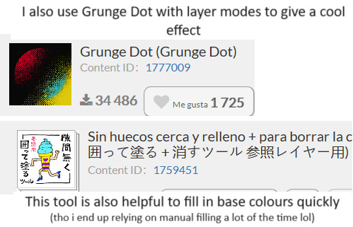
#TIL how to make brushes in CSP
Explore tagged Tumblr posts
Visit Tumblr Blog
Explore Tumblr blogs with no restrictions, modern design and the best experience.
Last Seen Tumblr Blogs


Fun Fact
Tumblr was created by web developers David Karp and Marco Arment.
Text
Looking forward to today's episode lol
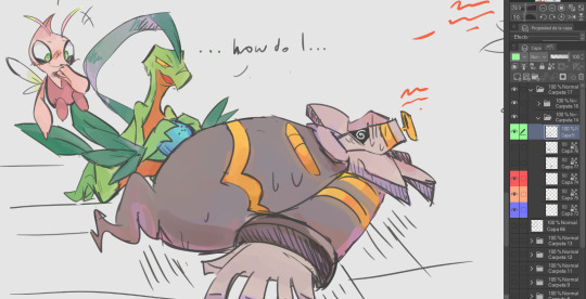
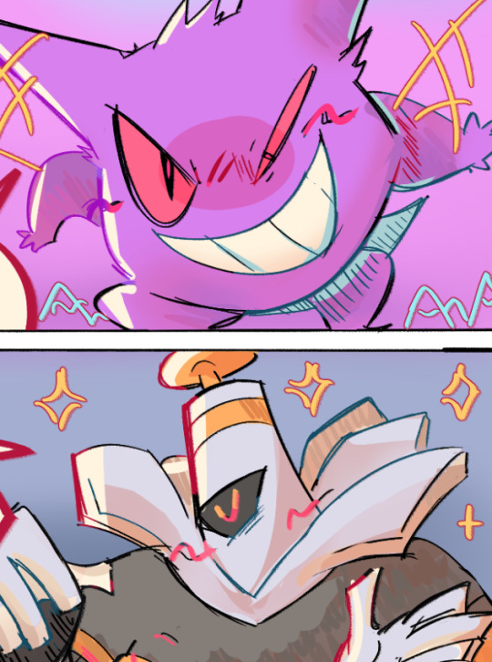
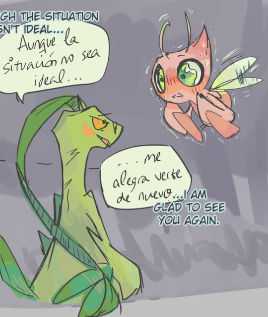
#dungeon meshi#delicious in dungeon#marcille donato#senshi of izganda#chilchuck tims#laios touden#art#god I am out of practice#it's been one million yearsss#TIL how to make brushes in CSP
34K notes
·
View notes
Note
Do you have a set process for coloring and rendering / adding texture to your art? If so, would it be alright for me to ask what goes into that process? I'd love to learn how an artist I admire goes about their work!
Omg I'm so flattered, I'll try my best to explain it!! ^^
Tho, okayyy, I apologize beforehand for how incoherent this might be, since I don't really have a set process at all and mostly I fake it 'til i make it haha. I'm the first to admit that I don't have a ver consistent method and that shows in how irregular in quality my art can look, even inside the general sketchy look.
(Btw sorry if some of the fanart i use for example doesn't make you comfortable but I've tried to find the best examples for each type of coloring haha)
I'll start with the brushes I rely on the most, tho I admit i made the mistake of downloading too many brushes and textures so I might use others on rare occassions xddd
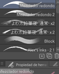
These are basically the brushes I use the most. The "mezclador redondo" is just CSP's default paintbrush and I only tweaked it to find sth I liked and felt comfortable with for both lining and painting
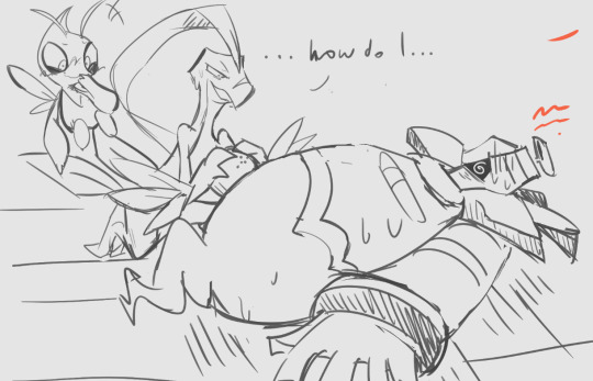
As you can see here I only used one layer for lines and other three for each of the guys' colors. I colored it all with the default brush (tho unfortunately I lost the settings I used for this drawing in particular and haven't found them again rip). In drawings like this I just do a sketch, clean the lines (no lineart) and then paint it. After the base color I start laying out different hues to make the coloring more interesting.
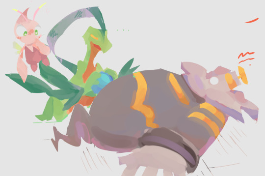
This one was the same. One layer for coloring, manually adding lighter hues (see the more light and yellowish color on grovyle's left leg compared to the shadow) or darker tones. I try to add color to the shadows as well to make them feel less flat, and an airbrush in overlay tends to help with that (tho here I just used a brush).
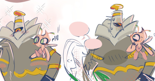
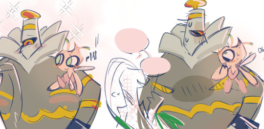
Here you can see that I often paint over the lines on another layer to correct mistakes in the "lineart" lol. I also applied an airbrush (layer mode overlay) over celebi to make her more bright. I wanted to put this one to show that coloring doesn't have to be detailed to look nice enough. Here Celebi basically has no shadows at all but the tone of the drawing makes her look cute anyways imo ^^
In these two you can see adjustements over the full image again (yellow layer), but I also wanted to show that I don't have a set number of layers either, it depends on how many I feel like using. Again, sorry for the lack of consistency but im too lazy to have a proper method lmao
I will also use harder brushes and tone changes sometimes, instead of blending them with less dense brushes. I am also fond of adding hard lighting in some drawings. You can experiments with it on a top layer and delete it if it doesn't fit, so it's always worth a try.
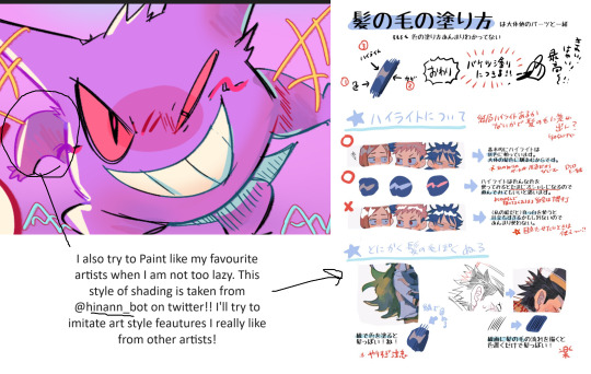
Another thing I recommend is studying and copying artists you admire or like. Add things from their styles into yours, see how they work with proportions and try to use that in your own art. It has helped me a lot and, without looking to fully copy anyone's style, it does give you some ideas of how you wish your drawing would look, which motivates me (when it doesn't depress me lol)
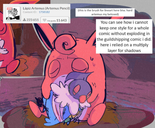
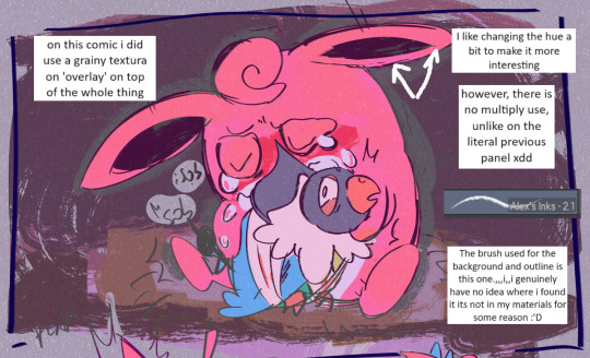
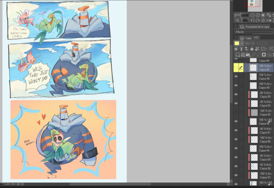
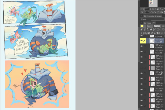
Finally, the texturing isn't consistent either. I use one of CSP's/Downloaded texture packs, put a grainy texture on the canvas, set it to overlay and adjust the opacity until I'm satisfied. In these two images you can see I am not consistent in coloring even in the same comic lmao. But we are doing this for fun, so I think experimentation is always sth worth exploring ^^
And I think that's all I have to say. I don't control color theory at all, so I can't really explain how I choose colors. I look up some tutorials on youtube and pretend I understand lol. Ig the one thing I tend to do a lot is changing hues in a base color to make it look less flat, the same as with shadows.
Anyways I hope this was helpful or that it at least waas what you asked for haha. Thank you for the interest!! :DD
#ask#art process#i guess???#anyways thank you for the ask sofie i hope this was helpful <333#I am KIND OF A BIG MESS IN ORGANIZATION#but hey we have fun hahaha
10 notes
·
View notes
Text
working on two different Last Life animations atm. when i want a break i just switch to the other one. help.
in other news im gonna try & get one part completed (or mostly completed. like the lineart @ least) so i can show yall on today, Last Life tuesday, our national holiday <3
#also last night i stayed up til the sun rose configuring CSP to be able to auto-action actual photos to ??? idek know how to describe it#to flipnote looking things? like when you imput a photo into real flipnote & it makes it all drawn in the flipnote brushes based on value.#id been doing it by hand this whole time so i finally decided to just. program it.#i need to figure out how to make it a material i can put in the CSP asset store so any other flipnotianificators wont have to struggle like#i did last night#oh the painnn#ill make a more detailed post on it when ive ironed out all the details#but for now it WORKS itll do & im so happy about it#n1m talks
1 note
·
View note
Note
Yooo, that picture with Donnie and Leo hugging is awesome and heartwarming :0 But I've a question. How did you do that sparkly scale texture on their skin? It looks so pretty!
Aww thank you!! :D
A lot of the time, its a mixture of trying different brushes for textures, flipping through layer filters and colours. I'll try and show my process, but apologies if its not so clear! (Also just so u know, I use CSP! :])
I try to find a speckle-like brush! This one is called "Wall Tzu SP hard" which is from a brush pack i bought from PharanBrush, but you can use any sort of speckle brush, i just like this one especially (good for freckles, too!)
I used a really bright blue and dappled in the areas that I wanted the sparkles to show.

Set the layer to glow dodge (sometimes colour dodge is good too!) and lower the opacity (I put it to 48% but again, you can play about with this at any stage)

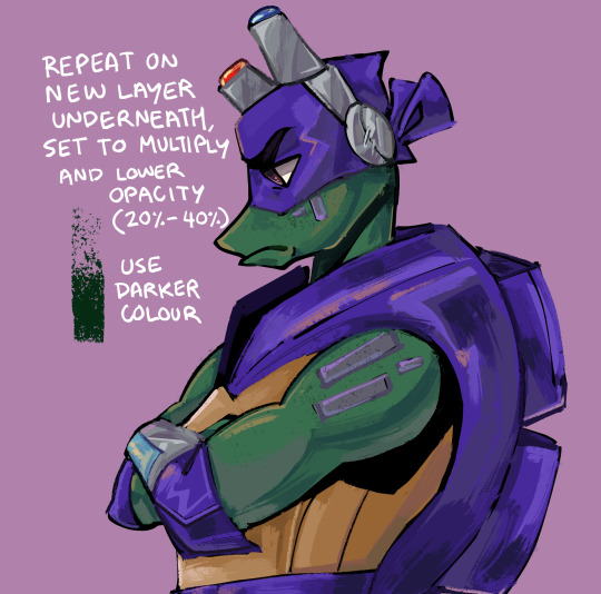
Next, I pretty much do the same in a new layer below the last, but used the darker colour of the base skin and faintly go in similar spots as before. I set that layer to multiply and lower the opacity to anything between 20% and 40%.
I just think it kinda defines the shinies a bit more!

In a similar colour to the blue I used for the sparkles, I lightly use airbrush on a new layer. Kinda helps with the form and make him more shiny. (I keep this on 100% opacity because I am very light-handed with it, but you can lower it if need be)

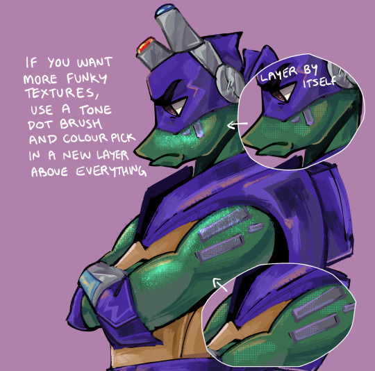
And lastly, if you want more texture and you have a dot grid tone brush, make a new layer and colour pick random parts of the shiny areas. I don't really know how to explain this, I just do whatever til it looks good PFF! (Might be a less is more scenario)
annnd yeah! :D This is just how I did these specific textures, its lots of layering and tbh you can add even more with different opacity. You also don't need to use the exact same colours as me, I usually try different hues to figure out what looks best, literally go ham!
HOPE THAT MAYBE HELPED? I do not know how to do these little tutorial ask things BWHAHAHA but if theres anything else you want to know, feel free and I'll try my best to answer!
#I SURE DID TRY#One of the times i wish i timelapsed my art#art tutorial#digital art#rottmnt#Geeves art
35 notes
·
View notes
Text
Vamptober Week 3 Reflection
Week 1 Week 2
Hello everyone it's that time again and I'm late (woopsies) here's your tldr, I am reflecting on my past weeks work from vamptober. Please consider buying me a ko-fi if you want to support me. Donations are always optional.
What a week. I was starting to lose it there. I was more than halfway done, but I was having a hard time seeing the end of the tunnel through week 4. Now writing this on the 30th, one day before the last prompt, I feel fine. But it was rough. Tears poured down my face trying to make things good enough. But I had a breakthrough from week 3 to 4. And you can really see it at work through the next fourteen pieces.
Without further ado, let's take a glance at days 15 through 21.
Vamptober Day 15: Blue Blood
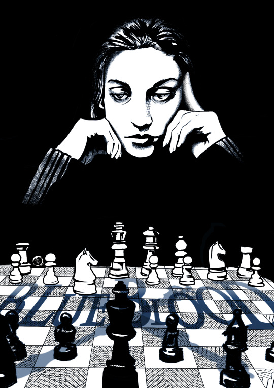
I was really happy with this one. I started by sketching a character named Antonia Vicario, trying show a little weariness behind the eyes. However most of my viewers have little idea who Miss Vicario is, and the joke of her Toreador lover on the other side of the board making funny faces until she makes a rookie mistake. But isn't the idea of waiting for them to make a mistake common in Chronicles for the Ventrue? Playing on a board with an unknown opponent, watching the pieces move.
On a technical side, I started playing with CSPs fill and tone layer modes. This let me set the chess board and utilize the cross hatching to enforce perspective. Ie the shading gets tighter further away. I think I could have spent a bit more time smoothing and shading features in the chess pieces. However, the text in this one was really well done. I could have spent more time altering the positions of the chess pieces to help convey those shadows, but it is a minute detail.
Vamptober Day 16: Crimson Tears
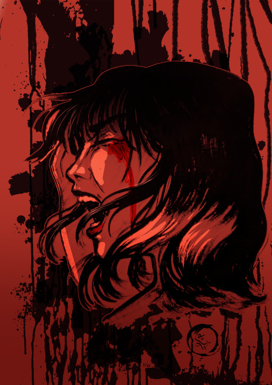
This one was where I started to lose it. I had fallen behind and only had a half hour til my shift. So I imported over a drawing I did in 2019, and began altering it. That turned a switch in my head. There's nothing wrong with hunting for images and manipulating them into your work. Collage artists do it all the time. Granted, in the digital sphere, this gets more tricky. Ripping images from a magazine and and gluing them to parchment usually doesn't raise any eyebrows (in the artistic sense, we've all seen a prop serial killer note on tv). Doing so in a digital sense, of course is harder. Navigating what is manipulated enough to be original work versus an edit is... Like walking into an ocean with an anchor strapped to you. You're going to drown in discourse. Thankfully, this drawing is my own piece. I of course have every right to manipulate it how I see fit.
I then remembered my layer for the drips of blood from the inktober day 14 piece. I copied that to this piece, altered it to solid black, and Wala! Crimson Tears.
I think the take away from this piece is remembering what tools you have in your arsenal. Digital programs manipulate images. So long as you acquire them though proper means or already own the image, you can do basically whatever.
Vamptober Day 17: The Night You Were Turned
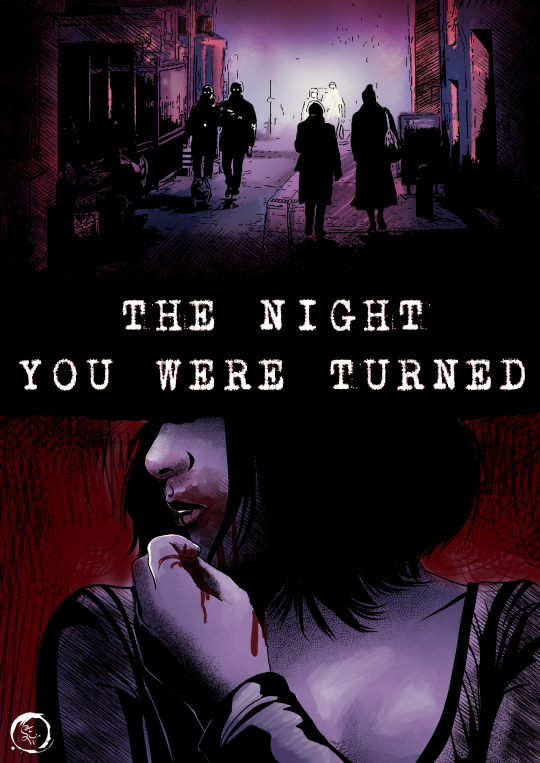
I can tell I was simultaneously working on my Secret World comic with this piece. I started to notice how I utilize the tone brush, the dots, to help with shading. The stippling effect is really effective to me. I like how it can be so subtle. Thick linework can quickly go too dark.
This piece really let me explore the hatching tools in CSP that I had neglected. I rarely touch the pattern tabs unless I need a flower brush or specific fishnet. There is a thick pencil like hatching that I found I love to use. It's easy to alter it's size and density to fit what area I need it. Additionally, if I have my clipping masks set properly, I don't have to go back in and erase the part the hatching bleeds over the lineart.
Vamptober Day 18: Hunger
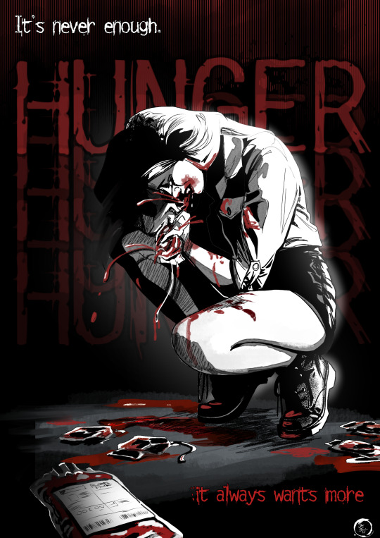
Had to get a ref for this one, but that wasn't the challenging part. The shading was difficult. My reference was really poorly lit. Usually I am able to find a way to alter the lighting with Clip Studio with adjusting levels. Nope. So a lot of this is freehanded.
I am really proud of the text behind the character. It's perfect for v5, as there are five Hunger boxes. The blood bags scattered about were hard to get right, they did not look like blood bags for multiple coloring attempts. I ended up having to completely redo them a few times until I got it right.
Vamptober Day 19: Satiated
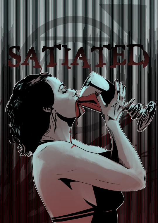
I spent several hours trying to find a reference of someone drinking from a goblet. This is surprisingly hard. I could have sworn I had them saved in one of my personal reference image libraries (folders I save to my computer or magazine clippings I keep in a binder like a complete weirdo). I attempted to freehand this and basically cried trying to make something work. Eventually I had to just say fuck it and make something work. I worked on the background first.
I implemented the Gloom manga tool from Clip Studio. This got those crisp, uniform lines, looking like it severed the text. I made sure it didn't look completely like a barcode. Once this was finished I jumped back to the figure.
Lesson learned, sometimes jump around. Move to a different part of the piece and keep finessing it. It will eventually work because I am damn skilled.
Vamptober Day 20: Last Sunset
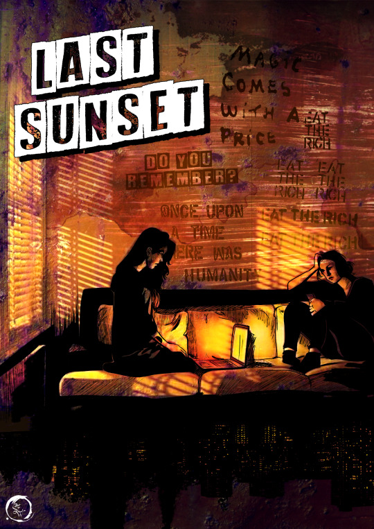
Having learned my lesson with Crimson tears, this piece is entirely composed of images and me messing with lighting and overlays. The women on the couch are a single image, the window is separate, the window light is separate. The cityscape is from a picture I took from a train window while passing Washington DC. The overlay is rust I painted in a scenic art project.
Overall, I think the mood of this piece misses the mark for VTM. But that doesn't mean it's bad. It's still very good. I like it's saturation a lot, but I think if I turned things more purple or maroon or sepia, I would have gotten the mood a bit more on the nose.
Vamptober Day 21: Eternal Enemy
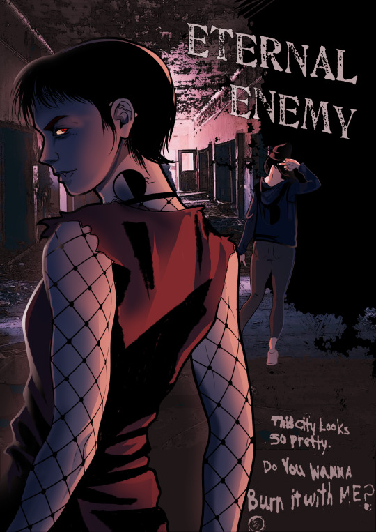
Uhhhh I really missed the mark with this one. I was not at all happy with it. Rather than tear it to pieces, I'm going to point out three things I like about it:
1. The shading and colors on the front character is very good.
2. The fallaway from the hallway into black is well done. The new tool was a bit tricky.
3. There's a bit of a story going on with the piece. It does make me, just barely, wonder what is going between these characters.
That's all that is complimentable for this. Thank you.
Week 3 overall:
I kinda feel like this
I ended the week on a low, as that last piece just really fucked with my self confidence. I am glad I learned some new tricks and got even more skilled. I am more versed in clip studio than ever before. I have been implementing all these tricks into making my Secret World comic.
But looking back, I am overall pleased with these. Although I felt like I wasn't having as much fun this week, I still produced some kick ass stuff. I then remembered to have fun through the rest of the week. After all, that's what this is for, right? Fun. A touch of glory and recognition, but overall fun. If VTM wasn't fun, I wouldn't be here.
So here's to week 4, and the finale of Vamptober 2021! Let's do this.
14 notes
·
View notes