#TOart
Text
my first inhale, the last beat of my heart
and all that it encompasses
exist solely for every brush soaked in phthalo blue,
every strum of a guitar, and
every written word and letter tied to emotion
that has ever graced the universe
3 notes
·
View notes
Photo

Muscles studies by TOART-STUDIO
3 notes
·
View notes
Photo
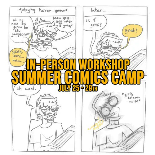
☀️IN PERSON! Summer Comics Camp☀️ starting July 25th! - returns at MTM College on Danforth Avenue
This workshop is intended for anyone ages 13 -18 who wants to start creating their own comics and runs on Saturdays, 12pm-3pm EST.
🤗 Find out more or Register: 👉 click SIGN UP
Don't Forget: ☀️ Save 10% off our Summer Workshops - Discount Code: 'DOGDAYS10' ! 🐕 (Valid: June 17 to July 17)
🐰 Participants will work with our fantastic instructor, Adrianne Chan to create a multitude of short comics! This includes the drawing characters, speech bubbles, and comic page layouts!
🔎 Our college is located in Toronto's East End near the Danforth Go Line and TTC with free parking available!
If you have any questions, e-mail us at workshops(at)maxthemutt(dot)com
🎨Post artwork by previous comic camp student, Alex!
#maxthemuttTO#maxthemuttcollege#artworkshop#TOworkshops#workshopsTO#TOart#artTO#artcollege#comics#drawing#art#characterdesign#summerfun#summerstudies#inpersonworkshops#createcomics#learnart#learncomics#illustrationcollege#mtmworkshops#mtmsummercamps#mtmsummercamp2022#artschool#cartooning#illustration#workshopstudents#MTMalumniledcourse#summerworkshops#careercollege#torontocareercollege
0 notes

Photo
ブルーピリオドの作者山口つばさトークイベント!まだ間に合う! ブルーピリオドコーデでお出迎え。 10/9 16:30から http://ptix.at/cMgqBn 10/8 10時から http://ptix.at/EFRi5H 14時から http://ptix.at/hWxmZn 今日明日は 神戸はイベント満載! Kobe JAZZ STREET 神戸大丸のARTWEEKs D-ART ボリューム満点のこの2日間 ぜひお越しくださいませ! #ブルーピリオド #山口つばさ #トークショー #神戸ジャズストリート #artweek #神戸大丸 #dart #toarts #art #神戸 #kobe #北野 #居留地 (Any Kobe with Arts) https://www.instagram.com/p/Cjb2bJvvHyw/?igshid=NGJjMDIxMWI=
0 notes
Photo


by TOART-STUDIO
182 notes
·
View notes
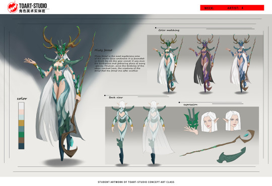
Text


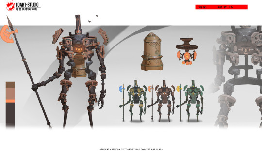
TOART2023秋季实体角色美术研修班 by TOART-STUDIO
Student Artist: 卢进伟
There's more on Art Station
7 notes
·
View notes
Text
Joseph: So have your agents found the spy yet
Peter:

Joseph: STOP POSTING FRENCH TOART
#cartoon liberation army#peter president#corrupted!peter#joe blow#colored text#public domain characters#joseph harrison president#the President siblings#Sketchworld#brick attempts to be funny
2 notes
·
View notes
Text

Love your self 🧡❤️ Watercolour/Posca markers on water color pad 30.5x22.9 cm toArt
#artoftheday#artlove#artworks#my art#artist#artforsale#art#artists on tumblr#original art#buy now#buyartfromartist#homedeor#home decoartion#homelove#annasavat#loveyourspace#love yorself
5 notes
·
View notes
Text
Când revarsă Dumnezeu trezirea?
Când revarsă Dumnezeu trezirea?
Dumnezeu cere în mai multe rânduri credincioșilor să fie în clocot și plini de puterea Duhului Sfânt. Și cu toate acestea cel care face această lucrare posibilă este tot Dumnezeu pentru că doar duhul Lui poate să rodească rezultate spirituale în viața noastră. Totuși sunt câteva aspecte care țin de noi și care îl determină pe Dumnezeu să toarte, să ne ridice și să ne țină în starea de trezi…

View On WordPress
0 notes
Text

I heard it's a certain blue hedgehogs 30th anniversary. I've been meaning to make sonic fanart for agesssss and now i finally did!
18 notes
·
View notes
Photo

Joyce & Hopper at Prom commissioned for chapter five of my fanfic, Stand By Me.
..."Ready?" Joyce asked with pep and reached for his arm — as if she wasn't about to smuggle booze into Prom under her dress.
"Oh yeah." Hopper sucked in a breath as they headed towards the school's entrance, trying not to trip over his feet as he escorted her into the party. He couldn't take his eyes off her. "You look really pretty tonight," he said, finally working up the courage to tell her what he'd thought since she walked down the stairs that evening.
But Joyce didn't seem to notice the sentiment behind his words.
"Yeah, yeah, you can whistle for it." She grinned, slapping his chest before Karen caught her attention...
Artwork by endlessly talented @toart ❤️
#jopper#young jopper#teen jopper#jopper advent#day 15#jim hopper#joyce byers#my commissions#by#toart#fanart#fic available on ao3#ao3 fic#I don't show this artwork off enough#i have been selfish keeping it for myself lol
25 notes
·
View notes
Note
Forgive my absolute novice question, but those environment studies are BEAUTIFUL! I've never done them but I want to try, since it's good practice. What's your process, do you have any advice?
Thank you! No reason to apologize either. I can give a glimpse into my process, but fair warning it’s quite messy (I did this one quickly after work as an example) and I might not have the besssst explanations for everything.
Everything under the cut!
I do these off of photos I find on google images, since i’m not using them for profit or anything like that. I kind of decide what i wanna try and study (tropical scenes, forests, mountains, whatever) and then just look for an image that strikes me.
Something to note when you’re going into this is to have some idea of what you want to try and focus on. If there’s a specific thing you want to work on or capture when you do this. For me, it was trying to get better at seeing and picking colors, plus maybe fiddling w/ how mountains and rocks work haha
Having a specific goal makes doing studies easier because you don’t feel like you have to focus on basically everything when you’re painting. When the end goal is just ‘get better,’ that’s a lot of stuff you have to try and get right or pay attention to! Doing things one at a time is good.
So anything like...Wanting to understand color, wanting to understand shadows, wanting to understand light, wanting to know how trees work, or even something like ‘i saw this photo and i like how the light hits this one particular spot and i wanna capture how that spot feels’--just give yourself something to focus on!
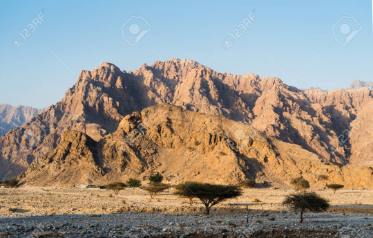
Anyhoo, I picked this one. wanted to try a desert scene. My focus, again, is trying to understand color a lil better (kinda gave myself a rule, which was ‘no colorpicking’)
I work on a really tiny canvas btw like... 3 inches by 2 inches, and with a kinda fat chalk brush with pressure opacity on. This makes sure i can’t get fiddly on it.
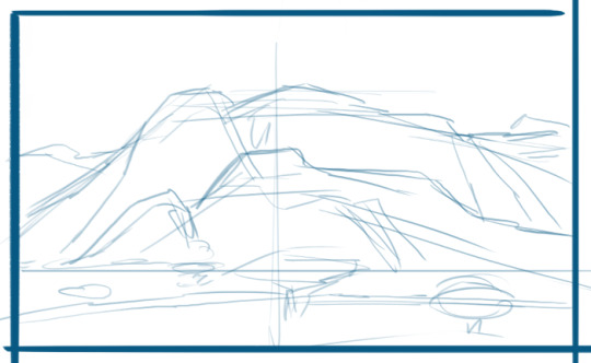
Usually start with a really basic composition sketch that is definitely gonna be inaccurate, but that’s okay since that’s not what i’m doing this for lol

a lil more ‘detail’ pulling out the forms of biggest interest. sometimes this includes the a shape of a large shadow, like at the bottom! just the big important sections of the composition that you see.
I start laying in the colors really messily, again going for BIG at first. Right now the focus is establishing those big spaces in the composition. Right now this also includes some of the stronger shadows, since those are important to the form of things. The colors I choose to lay down vary, but usually go for the sort of ‘mid tone’ that i can suss out, maybe a a bright hilight, and then a deep shadow.

lol okay this is definitely a jump forward. But you can see i focused on the mountains. I ended up painting over that tree because it wasn’t in the right place anyway.
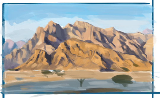
Anyway, TIPS on how I approached this:
TRY NOT TO GIVE A SHIT OVER WHETHER SOMETHING IS SUPER ACCURATE. Just make sure that it reads!
Focused first on laying in the darkest shadows, bc those really inform a lot about the shape of the thing.
A lot of squinting and stepping back, and also making the reference picture zoomed out small. This really makes the small detail disappear and helps keep you from getting caught up and confused by it. Sometimes you can eliminate certain details, or combine them with nearby details.
I added some new colors here and there, but nothing too strong. I avoided introducing too many different colors though, and most of what i had was a result of mixing the colors I already. If you add a very different color, that creates an area of high contrast. Which can be great, if that’s the focus and you want to hilight the area, tho!
Tried not to draw outlines. In fact, I made sure most of my strokes were downwards or sideways to make sure that I had to focus on things as blocks of color.
How do you do manage the shape w/out outlines? One thing to remember! You perceive form through contrast! Basically, in an area, how does the shadow butt up against the light? Look for those edges/places where they meet, and then think about how different those areas look to each other. Are the colors really different from each other? Are they similar? Is the edge hard, or is it more gradual? Look for those places where things meet!
Keeping in mind that color is relative. When you’re trying to figure out what color something is, peer at the color itself and try to isolate it. For instance a color may seem grey to you, but maybe it’s blue, and it looks much more desaturated bc you have it up against a really warm, bright color. Maybe what you think is a green is actually a red or a brown. SOME TIPS:
If you’re not focused on color as your study, feel free to colorpick off the photo! You’ll see the difference between what you perceived and what the true color was, and you’ll learn from that!
I’ve gotten good enough to be able to peer at colors and separate them in my brain from the rest of the picture. If you can’t do that, then you can mask it out physically in photoshop so that it’s literally isolated! You’ll get way better at picking up on color differences this way, and then can work towards doing it without having to physically mask things.
Questions to ask yourself when trying to figure out a color: Does it feel warmer or cooler? What hue is it (does it look purple or purple or red to you)? How saturated does it look?
Shadows usually gradiate. Shadows are made bc they block out light. So they’re darker when it’s harder for light to get into a space. So the further away from an edge or a crease, the lighter the shadow becomes.
Be wary about your colors getting too muddy, bc that happens when you’re mixing colors. Step back now and again, and if they look like they’re getting too grey or brown, feel free to paint some saturated color back into it.
Anyway, I added the trees (spent less time on them bc they’re unimportant to me lol) and cleaned up a couple other things...

And the last step is just creating a clean border around the painting to make it look clean!
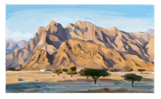
And there’s my study.
ALSO
Also
the most most most important step
is to close the fucking Reference you were working off of and not look at it after that, because you’re gonna like what you did way better as its own thing when you’re not comparing it to the real deal lol
Anyway...I think that’s all i have to say? Idk. If something’s not clear, feel free to ask, but that’s what I got. This painting was pretty rushed so it’s not the *best* representation of everything, but hopefully it got most of the point across.
78 notes
·
View notes
Text
toart replied to your post: Just keep calm and think of robots.
Just think about Charlie curled up in Bee’s lap, wrapped up in a blanket and drinking hot chocolate while he plays love songs to her :)
Bee and Charlie just being the snuggliest in cold weather is a very good thought thank you <3
71 notes
·
View notes
Photo


by TOART-STUDIO
340 notes
·
View notes
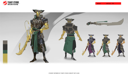
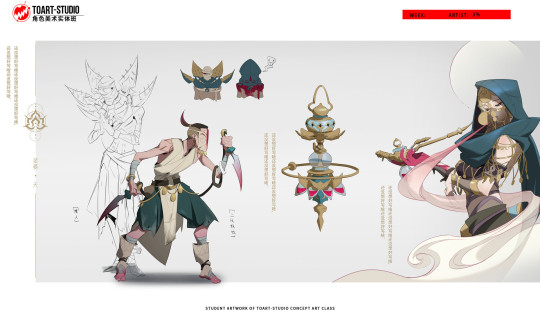
Text


TOART2023秋季实体角色美术研修班 by TOART-STUDIO
Student Artist: 马驭腾
2 notes
·
View notes
Last Seen Blogs

mrmichaelchadler
Michael D. Chandler Tumblr
evrofer
evrofer

trippingc0ntact
neon

traumor
✨👭🌟

shasamrock
CocktailCicuta