#Teiyu Goto
Text
youtube
Значення символів DualShock (Playstation)
Яке значення мають геометричні фігури на кнопках геймпадів DualShock від PlayStation різних поколінь? Хто був дизайнером символів та яке їх значення?
У цьому відео на каналі "Таємна кімната" я розповім про Teiyu Goto - культового японського дизайнера електроніки компанії Sony, який зробив великий вклад у розвиток ігрової індустрії та посприяв тому, щоб сучасні ігрові геймпади еволюціонували та стали такими, якими ми їх знаємо. Від перших PlayStation Controller, DualShock різних поколінь і до революційного DualSense PS5.
#Teiyū Gotō#таємна кімната#Teiyu Goto#DualShock#PlayStation#Тею гото#геймпади#ps1#ретро ігри#відеоігри#ігри українською#dualshock 4#PS2#плейстейшен#ігрова історія#огляд#огляд українською#геймпад dualshock#історія playstation#історія DualShock#дизайнер playstation#playstation україна#playstation вікіпедія#playstation геймпад#playstation ukraine#playstation джойстик#еволюція playstation#sony#ps one#Youtube
1 note
·
View note
Photo

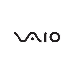
Sony Vaio Logo: Meaning Behind Sony's Laptop Logo | The Logo Smith
Etymology of the Sony Vaio Logo
Originally an acronym of Video Audio Integrated Operation, this was amended to Visual Audio Intelligent Organizer in 2008 to celebrate the brand’s 10th anniversary.
The Sony Vaio logo concept was created by Teiyu Goto, supervisor of product design from the Sony Creative Center in Tokyo.
He incorporated many meanings into the logo and acronym: the pronunciation is similar to “bio”, which is symbolic of life and the product’s future evolution; it’s also near “violet”, which is why most early Vaios were purple or included purple components.
Additionally, the Sony Vaio logo is stylized to make the “VA” look like a sine wave, and the “IO” like binary digits 1 and 0, the combination representing the merging of analog and digital signals
ソニーVAIOロゴの語源
当初はVideo Audio Integrated Operationの頭文字でしたが、2008年にブランド誕生10周年を記念してVisual Audio Intelligent Organizerに改称しました。
ソニーVAIOのロゴのコンセプトは、東京にあるソニー・クリエイティブ・センターのプロダクトデザインのスーパーバイザーである後藤禎祐が担当した。
ロゴと頭文字には多くの意味が込められている。発音が "bio "に似ていることから、生命や製品の将来的な進化を象徴していること、また "violet "に近いことから、初期のVaioの多くが紫色であったり、紫色の部品を搭載していたことなどが挙げられる。
また、ソニーのVAIOのロゴは、「VA」を正弦波に、「IO」を2進数の1と0に見立て、アナログとデジタルの融合を表現しています。
32 notes
·
View notes
Text
FA222
Project 1 : logo analyzing
Logo 1 : Sony Vaio
Its a short for visual audio intelligent organizer, Its a famous brand to us for its technology, we all know this brand but not all of us knows the hidden meaning of their logo. The word vaio represents the combination of both analog and digital technologies in their products. As you can see the letters (V..A) made to look like the analog wave, while the (i..o) look like the numbers ( 1 and 0 ) representing a digital signal.
They went with the black color obviously because of the meanings of the color black which are: power, elegance, and sophistication. And it's a common thing to use this color because it's easy to read the text.
Moreover, there was an interview I saw for Teiyu goto, the supervisor of product design, said the logo has many meanings, like the way you read the word (vaio) it's same to the word (bio) that's which means the life and improvement of their products.
5 notes
·
View notes
Text
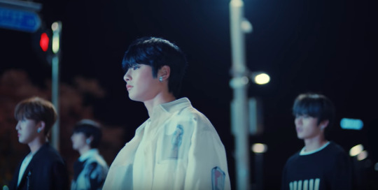
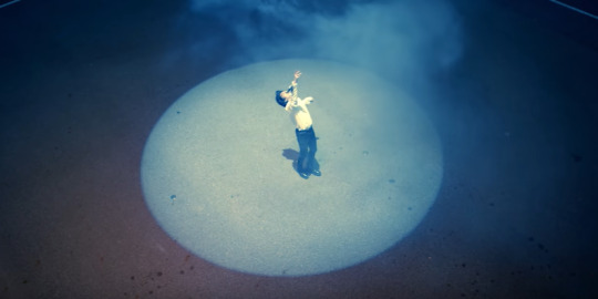
Stray Kids think it’s okay to throw a teaser like that at us lol
anyways... gonna comment what I noticed in the trailer cause why not lol So many things happened, and I’m more confused than ever, but okay...
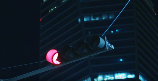
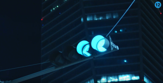
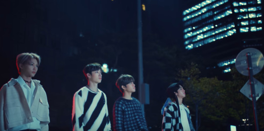
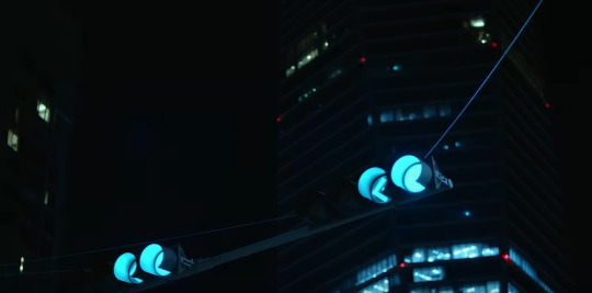
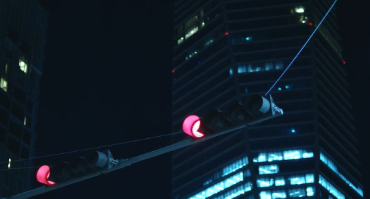
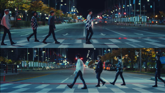
first of all, we see one red light turning into two green lights swag and SKZ divided in two groups: Jeongin, Hyunjin, Minho and Changbin vs Felix, Chan, Seungmin and Jisung and this is how they all are standing towards the end of the trailer.
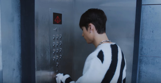
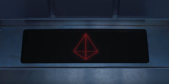
well, we then see Seungmin entering an elevator by himself and we also see a mirrored pyramid on the floor with some weird papers around it (I don’t know why, but it reminded me of 19).
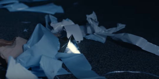
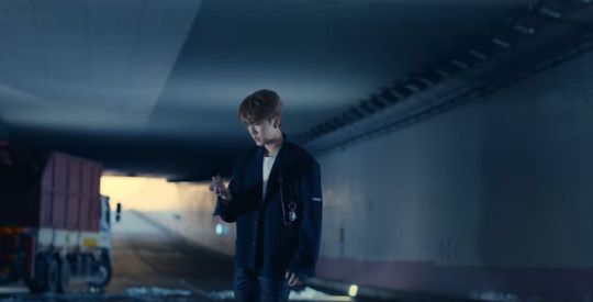
The pyramid is not with Seungmin, it is actually where Changbin and Jeongin are (it reminded me a bit of My Pace because it’s a tunnel with cars, but idk), and Changbin latter picks it up. Why? No idea, but he seems to be the only one curious about it.

Back to Seungmin, the reality is wobbling like in District 9, but it seems to be a connection to where Jisung is (that is similar to the field he finds when he comes out of the elevator in Hellevator alone, but then Chan leads SKZ to this field and they find Jisung again - and they also see a weird city upside down where their sky should be lol).
moving on... Seungmin seems to pull Jisung to his reality on the elevator and then Jisung touches the wobbly thing and two things happen: we see Chan for the first time (we don’t know where he came from, mysterious boy) and he is turning the key on the emergency thing to “on”, and a 3D triangle shows up instead of a number or letter on the elevator panel. And then we see a light suddenly appearing from above and making Hyunjin stop running (is he being abducted? this is an honest question I have because this is what it looks like).
the elevator starts crashing, Chan, Seungmin and Jisung are trapped inside it, and then it all fades to black. We see the traffic light again and now four green lights turn in two red lights. Weird, right? (does this mean that their journey or race has ended? because it seems like in the beginning they started walking their own paths after the green light, but when they’re all together again is after the red light...)
Stray Kids are divided into those two groups from the beginning and they’re walking towards each other when a strange loud noise seem to hurt their ears, but why is Jeongin the only one not being affected by it? lololololololololol
Felix looks like he’s inside the pyramid thing we see and nothing can change my mind.
and right after his background changes into a space galaxy is that Felix starts walking out of it and we see him with the others.. coincidence? was he set free by someone? Changbin maybe? (they’re together in Astronaut, remember? omg my Changlix hear is screaming). It is after Changbin picking up the pyramid that Seungmin goes crazy inside the elevator, Jisung appears inside it, Jeongin and Changbin seem to be experiencing an earthquake or sth, and Felix pyramid changes to a galaxy.
aaaaaaand we see Jeongin standing there staring straight into Changbin like he did something wrong and we see a freaking crater between them that shows what? yes, you saw it right: THE FREAKING SKY!
Changbin baby what have you done? lol jk
so it got me thinking... in this reality they’re up in the sky like some sort of a floating rock or spaceship (maybe after Astronaut?)... and maybe Changbin somehow triggered a destruction, messing it all up because of that pyramid.. which leads me to another pyramid we see, the one on the elevator that Chan suddenly appears on (where did this boy popped out from???????)
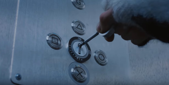
don’t laugh, but PlayStation came straight to my mind after I saw this, so I googled the meaning behind the symbols and I found out that PlayStation's Japanese designer Teiyu Goto said that "The triangle refers to viewpoint; I had it represent one's head or direction".
isn’t it cool to know that a pyramid is only complete when all the building blocks are in place??? and isn’t it cool to notice that SKZ is only seen together again when Chan puts the elevator in pyramid mode??? bc probably their direction is going where the other ones are
and isn’t is even more interesting that the compass seems to be finally working after they’re all together at the right place? (cause you cant use one in places that are too magnetized or have strong electricity power lines because that may interfere in the reading of the compass).
i still don’t know why Felix is the one always holding the compass and it bothers me the fact that we see fake on D9 teaser being shown behind him and that he stares at Jeongin in DK like they were planning sth D: but maybe is just my mind
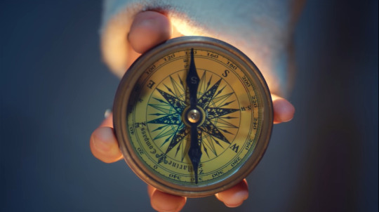
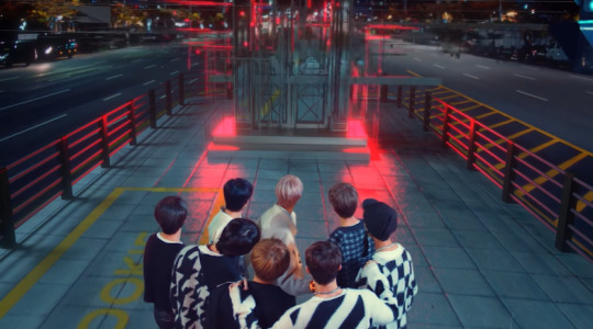
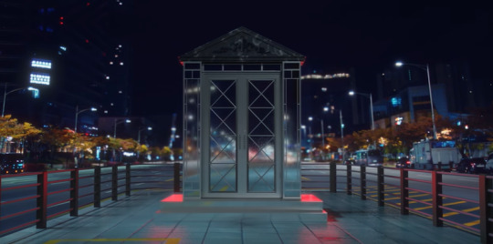
anyways... the compass (or this reality) seems to materialize another elevator (a fancier one if compared to Hellevator) and they’re in awe with it. We get a peek through the keyhole, but whatever is on the other side of those doors we'll only find out December 9th lol
Things that made me think a lot in this trailer is: why are there so many weird cuts? and is this the real Jeongin we’re seeing and the scene with the noise is he realizing he’s not with the real SKZ? or is this the fake one?
And why Seungmin (the one always in charge of the maps), Felix (the one always in charge of the compass), Chan (the leader, the one in charge of SKZ) and Changbin (the one that probably triggered this whole mess lol) are the only ones wearing the same clothes throughout the whole video? If I noticed right, Hyunjin changes clothes 3 times while the other ones change twice.
AAAAAND another thing that made me go crazy is the elevator panel that changes to letters and numbers:
Y Z 5 K 11 D 5
K11D5 to me looks like KIDS (with an extra I - there’s more than one of them there? hmmmmmm). And I tried to google anything that could mean Y Z and S or 5, but the only conclusion I got is related to math graph lol
Y on a graph means verticality, Z is dimension, but we can’t make an actual graph with only those two because the X (horizontality) is missing. Also, according to Quora: "The Y axis goes from the center of the Earth out through the equator at longitude 90 degrees (east). The Z axis goes up through the north pole". And what is always pointing to the north pole? A compass needle.
Does this make any sense? I have no idea! All I know is that I got even more confused then before, but I can’t wait for Levanter!!!
BRING IT ON STRAY KIDS!
#chan please explain what is all this#i need answers#stray kids theory#stray kids#skz#stray kids reactions#skz levanter#bang chan#minho#changbin#hyunjin#han jisung#felix#seungmin#jeongin
38 notes
·
View notes
Text

Working through some geeky patent prints, you have to love the design specs of classic consoles.
#playstation#patent#etsylove#etsystore#retrogaming#console#geekchic#geek gifts#nerdlife#console gamer#printart#printdesign#sonyimages#ps1#print#poster
2 notes
·
View notes
Photo

Go Ando / THE GUILDさんはTwitterを使っています 「VAIOのロゴデザインの由来は後世に残したい The Sony Vaio Logo – The Meaning Behind Sony’s Laptop Logo Designed by Teiyu Goto https://t.co/3pJncpjvjg https://t.co/AMi7X9fRFm」 / Twitter
1 note
·
View note
Text
PS4 Conyroller buttons

Sony designer Teiyu Goto explained each buttons on tthe controller to clear the rumor and misunderstanding.
“We wanted something simple to remember, which is why we went with icons or symbols, and I came up with the triangle-circle-X-square combination immediately afterward. I gave each symbol a meaning and a color. The triangle refers to viewpoint; I had it represent one’s head or direction and made it green. Square refers to a piece of paper; I had it represent menus or documents and made it pink. The circle and X represent ‘yes’ or ‘no’ decision-making and I made them red and blue respectively. People thought those colors were mixed up, and I had to reinforce to management that that’s what I wanted.
Quigley, R. (2010, August 26). The Meaning of the PlayStation Controller Buttons. The Mary Sue. https://www.themarysue.com/playstation-controller-buttons-meaning/.
The four symbols, when used together, are instantly associated with the Playstation brand.
Newman , J. (2014, May 11). Why Playstation Controller Buttons Are Symbols, Not Letters. Technologizer by Harry McCracken. https://www.technologizer.com/2010/08/26/why-playstation-controller-buttons-are-symbols-not-letters/.
In the West, we use the X button to confirm, and the O button handles exit and cancellation duties. But Japan has the opposite convention,
Porter, J. (2019, March 9). Japanese PS4s can now use the X button to select, but why couldn't they do that already? The Verge. https://www.theverge.com/2019/3/9/18255901/ps4-x-o-cross-circle-remap-firmware-6-50-dualshock-4.
0 notes
Photo

Playstation Controller - Exploratory Analysis
Who designed it? Teiyu Goto
When was it designed? 1994
What did the designer want to express/deliver? Goto wanted to deliver a product that would appeal to the gamers because it's comfortable and practical.
Was it the designer’s answer or resolution to a problem or issue? There was no problem or issue with past controllers, but Goto wanted to offer players a relaxed and comfortable gaming experience.
How long did it take to complete the design since its inception? Goto started working on the playstation controller in 1993 and was then released in 1994/95, so it took roughly 1-2 years.
What is the material(s) it is made of/from? The raw materials that are used to create the playstation controller are hard plastics such as poly carbonates and aluminum, electronic wiring, hard drives, and rubber.
How was it manufactured/crafted? The plastic used in the PS4 is HDPE (High-Density Polyethylene), which is a thermoplastic made from Petroleum. The only parts that don't use HDPE are the rubber analog sticks, and the grip pad on the main front controller enclosure because they use rubber.
Were there any design/technical challenges? Goto says the controller was tough to put together. The console itself was a relatively easy design process, but went through a great number of stages with the controller.
How did the designer overcome them?
How many units have been produced? There is no exact number on how many controllers have been produced but as of 2008, over 28 million controllers were sold under Sony. Now, there have probably been over 100 million produced.
Was the material(s) and/or manufacturing/crafting process better than its predecessors or competition? If so, how and why? Yes, because it is a much more aesthetic design and is also a more comfortable design for the human hand to interact with, so it meets the requirements of the interface.
Was there any consideration of its potential impact on the environment, people or society put into practice ahead of its time? Yes. Sony recently signed up to the United Nations-backed initiative Playing for the Planet, while it’s broader “Road to Zero” initiative aims to “achieve a zero environmental footprint by the year 2050,” including goals to curb climate change, conserve resources, and promote biodiversity.
Who was its target audience? People who play playstation games.
What kind of responses did it meet with?
Can you describe its typical use or experience? The playstation controller senses that the circuit is closed and sends that data to the console. The CPU compares that data with the instructions in the game software for that button, and triggers the appropriate response.
What are the most impressive qualities or features of the design (in your opinion)? What I find impressive about the design of the playstation controller is the shape/form and how it is designed to sit comfortably in the gamers hand. Another feature I like is the materials used on the controller, for example the analog uses rubber where it has more grip for the thumbs, therefore the thumbs won’t slip off when moving the analog. Last feature I found interesting was the use of colour and shapes on the buttons. Goto really thought about this and how it would interact with the human brain, so there is a reason behind the shapes used and the colours for each shape. Also with the buttons, the positioning of buttons R1,R2,L1,L2 are placed strategically so that the player can reach them with index and middle fingers without losing contact with the buttons on the main face.
Did you find any less known but remarkably enticing features? Yes, the reason behind the shapes and colours used on the buttons.
Any other intriguing facts?
Do you think it is technically, aesthetically or culturally important or meaningful? Culturally meaningful: The PlayStation Controller has since its inception in 1994 stood as an integral part of the gaming culture. The sony playstation controller has now evolved to become what people think of as a video game controller, and has shaped the look of how people have interacted with games over the last 20 years.
In conclusion, why do you think it deserves to be an exemplar of good design? I think this design deserves to be an exemplar of good design because there was a lot of thought put into the process of making the playstation controller. Also looking at the history of the gaming controllers, it has come a long way from the first controller where it was just a basic box with a circle on top.
How would you improve it if you redesign it?
Reference:
Gordon, L. (2019, December 5). The Environmental Impact of a PlayStation 4. The Verge. https://www.theverge.com/2019/12/5/20985330/ps4-sony-playstation-environmental-impact-carbon-footprint-manufacturing-25-anniversary
Reisinger, D. (2010, August 10). Origins of the PlayStation controller. CNet. https://www.cnet.com/news/origins-of-the-playstation-controller/
Tomorrow’s World Today. (n.d.). How Game Controllers are Made. https://www.tomorrowsworldtoday.com/news/2018/12/21/how-game-controllers-are-made/
Tyson, J. (n.d.). How PlayStation Works. How stuff works. https://electronics.howstuffworks.com/playstation3.htm
0 notes
Photo

In an interview with Teiyu Goto, designer of the original PlayStation Controller, he explained what the symbols mean: The circle and cross represent "yes" and "no," respectively; the triangle symbolizes a point of view and the square is equated to a sheet of paper there to be used to access menus. 🎮🕹 #Playstation buttons tattooed by @gentry_draws Cheers Garrett! =D
6 notes
·
View notes
Photo


So, a while back, I made an Undertale Soul color wheel based on the idea that Soul colors were based on the RGB model. I included the original colors, as well as some fan-made ones, and I recently updated the picture with the Joycon soul mode colors, which I’ve dubbed “Joy”.
And today, because of the Mad Mew Mew fight and the exclusive Joycon soul mode for the Switch, I decided to make soul modes and traits based on the different colors of the symbols on the Playstation’s controller buttons. Let me explain how I decided on them:
Sony designer Teiyu Goto explained each meaning behind the Playstation's different buttons in an interview. Basically, the triangle button refers to viewpoints and different directions, the square is a piece of paper that represents menus, the circle button means "yes", and the X button means "no". The hardest one to come up with was a soul mode for the square button, but after I remembered it was supposed to be a piece of paper, it all clicked into place.
I’m pretty proud of myself for coming up with all this. And no, Red isn’t Determination. All human souls have determination, so it wouldn’t make sense if a specific soul trait was about something all humans possessed.
EDIT (7/30/2024): It was pointed out to me that this isn’t an RGB wheel. I forgot what kind someone said it was, but... OH WELL
32 notes
·
View notes
Text
Llega la tarjeta PlayStation con tres meses gratis de PlayStation Plus y devoluciones en compras
Para quienes ahorramos un buen dinero comprando juegos digitales —un mercado en crecimiento constante—, un nuevo sheriff ha llegado a la ciudad. Se trata de la tarjeta PlayStation, una tarjeta gratuita que presenta un buen puñado de ventajas en forma de descuentos y ahorros incluso en nuestras facturas domiciliadas.
Contratación online, cinco clics y cinco minutos de tiempo. La fórmula es sencilla: en vez de ir recargando nuestro monedero virtual, bien desde otra tarjeta o mediante PayPal —logueándonos en la web oficial y yendo a Gestión de pagos—, con esta nueva alternativa recibimos créditos en todas las compras, por cada euro gastado, cero comisiones de mantenimiento o apertura/cancelación, y la seguridad adicional que ofrece una débito, con cobertura antifraude.
Triángulo, círculo, equis, cuadrado
Mientras todavía nos preguntamos si el futuro del gaming es streaming o qué, y con las primeras pistas de una PlayStation 5 retrocompatible sobre la mesa —una tradición que se rompió tras 20 años de consolas más o menos compatibles—, esta tarjeta PlayStation, con la que se pueden centralizar todas las compras digitales, propone una opción interesante.
Empezando por el apartado estético, permite elegir entre dos diseños personalizados. Eso sí, decorados con los sempiternos símbolos de PlayStation.
¿Sabías que la decisión de usar estos cuatro símbolos fue idea del diseñador tokiota Teiyu Goto? Su idea era simbolizar con el triángulo el punto de vista, recreado con una señal de dirección en verde. El cuadrado representaría un folio, así tenemos un recuadro para los menús o el acceso a documentos. Fue pintado en rosa, evocando las páginas salmón de los periódicos. Por último, la equis y el círculo significan respectivamente sí y no, los botones para tomar decisiones reflejados en rojo y azul.
Ahorrando un poquito cada mes
Y si la idea central es ahorrar jugando, con la contratación de esta tarjeta PlayStation, una vez realicemos alguna compra por importe igual o superior a 20 € tendremos acceso inmediato a tres meses de suscripción gratuita a PlayStation Plus. No olvidemos que PlayStation Plus es imprescindible para jugar online en PS4.
A cambio nos llevamos dos juegos de PS4 gratis cada mes y uno de PS Talents, descuentos exclusivos para los “socios” de este servicio y 100 GB de almacenamiento en la nube para guardar partidas. También existen pequeñas ventajas como códigos de descarga en juegos como ‘Fortnite’ y ‘Apex Legends’, así como el acceso a promociones y concursos en el programa PS Plus Rewards. Los juegos de regalo se mantienen activos mientras dure la suscripción y se pueden descargar durante la primera semana de cada mes.
Aunque la ventaja más jugosa de esta tarjeta PlayStation no es esa: nos devuelven el 0,5% de todas las compras realizadas con dicha tarjeta, más otro 0,5% por la domiciliación de todos nuestros recibos básicos, en forma de crédito para PSN.
¿Qué recibos son esos? Luz, agua, gas y telecomunicaciones (teléfono e Internet). Los importes se acumulan en cupones mensuales siempre y cuando se haya alcanzado el mínimo de 5 €. El importe máximo de crédito por ambos conceptos está limitado a 500 €/año por titular.
Servicio online en un mundo online
Es evidente que, visto el lanzamiento de Stadia y los actuales movimientos de Microsoft donde Sony ha dejado a un lado todo tipo de rivalidad para construir una comunidad de juego común, el gaming online parece ser una realidad más de presente que de futuro. Aunque las ventajas son obvias: mientras los DVDs se amontonan en desvencijadas estanterías, todos los juegos comprados con nuestra cuenta se asocian y salvaguardan a ese perfil digital, para siempre, para descargarlos cuándo queramos.
Como decíamos, si nos gusta tener ordenados los juegos por estilos en las carpetas del menú de PS4, con el ahorro del 0,5%, poquito a poco, iremos notando un extra para gastar en lo que nos apetezca. No olvidemos que la Store de PlayStation cuenta con más de 6.000 referencias. Difícil encontrar algo que no nos guste.
Y la ventaja final, que dejamos para cerrar, es quizá la más importante para muchos jugadores: la seguridad. En una tarjeta de crédito tenemos un límite mensual que nos pueden vaciar si alguien secuestra nuestra tarjeta y no llegamos a percatarnos. ¿Alguna vez has estado dos horas de espera en comisaría para denunciar por robo de datos, además de la espera entre cancelar y recibir una nueva tarjeta? Todo esto desaparece con una tarjeta de débito controlada con un simple clic.
Una tarjeta de débito sólo cuenta con el crédito que recarguemos. Perfecto para compras online, así podemos obtener el importe exacto de la compra que vayamos a realizar.
También es importante la garantía de una priceless protegida por cobertura antifraude: si sospechamos de movimientos que no son los nuestros, podemos tanto llamar al servicio o bloquearla online desde la web oficial, incluso desde la app de banca a distancia. La tarjeta PlayStation aspira a convertirse en un estándar, incluso tiene voluntad de ampliarse en un futuro, obteniendo y añadiendo nuevos servicios a los citados.
0 notes
Quote
The triangle refers to viewpoint; I had it represent one's head or direction and made it green. Square refers to a piece of paper; I had it represent menus or documents and made it pink. The circle and X represent 'yes' or 'no' decision-making and I made them red and blue respectively. People thought those colors were mixed up, and I had to reinforce to management that that's what I wanted.
Teiyu Goto, designer of PlayStation's iconic controller
5 notes
·
View notes
Photo


Artefact: Playstation Controller
The PlayStation controller was designed by Teiyu Goto (1994). Goto wanted to design something that would appeal to the gamer’s, and something that would be comfortable and practical. I think he has achieved this because the controller now is much better than the very first controller where it was a simple box with a button. The design is made to sit comfortably in the gamer’s hand and the placing of the buttons are put in places where the gamer can reach all buttons with their fingers without losing control of the controller.
Reference:
Gordon, L. (2019, December 5). The Environmental Impact of a PlayStation 4. The Verge. https://www.theverge.com/2019/12/5/20985330/ps4-sony-playstation-environmental-impact-carbon-footprint-manufacturing-25-anniversary
Reisinger, D. (2010, August 10). Origins of the PlayStation controller. CNet. https://www.cnet.com/news/origins-of-the-playstation-controller/
Tomorrow’s World Today. (n.d.). How Game Controllers are Made. https://www.tomorrowsworldtoday.com/news/2018/12/21/how-game-controllers-are-made/
Tyson, J. (n.d.). How PlayStation Works. How stuff works. https://electronics.howstuffworks.com/playstation3.htm
0 notes
Last Seen Blogs

lo-fimuscleguy
Insta-cameroon70

badnboujeesstuff
Untitled

c4rwex
C4rWeX
volublelemur
let's be friends!

mindsexwild
•Life Is A Bitch And Then You Die•