#The linework for the second one is coming along quite nicely at least ^^
Explore tagged Tumblr posts
Visit Tumblr Blog
Explore Tumblr blogs with no restrictions, modern design and the best experience.
Last Seen Tumblr Blogs


Fun Fact
Kazakhstan’s Minister of Communications and Informatics has blocked the Tumblr site because it contained 60 sites of terrorism, extremism, and pornography in 2015.
Text

“You will be required to do wrong no matter where you go. It is the basic condition of life, to be required to violate your own identity."
Part 1 - Part 2 - Part 3
For Day 3 - Clone Rebellion of @codex-week with additional inspitation worked in from the alt prompts DO ANDROIDS DREAM OF ELECTRIC SHEEP BY PHILIP K. DICK, and BLUE BIRCH MARSH BY JEF BOURGEAU
Bonded Pair, Do Not Separate - or they might lose their colours
The Alt prompts used here:
DO ANDROIDS DREAM OF ELECTRIC SHEEP BY PHILIP K. DICK

BLUE BIRCH MARSH BY JEF BOURGEAU

I saw all these trees and I knew I had to work them into my piece!!!
#codex#codexweek2025#commander cody#captain rex#my art#cloneshipping#I wanted to post all 3 together because I'm not sure how well the separate pieces might stand on their own#but I'm impatient and slow and I need some likes at least ^^;#I tried to go for something new and i didn't succeed as much as I wanted and that smarts a little#we shall see with the next one maybe#codyrex#I'm going for a proper theme and symbolism here for once!#The linework for the second one is coming along quite nicely at least ^^
205 notes
·
View notes
Photo
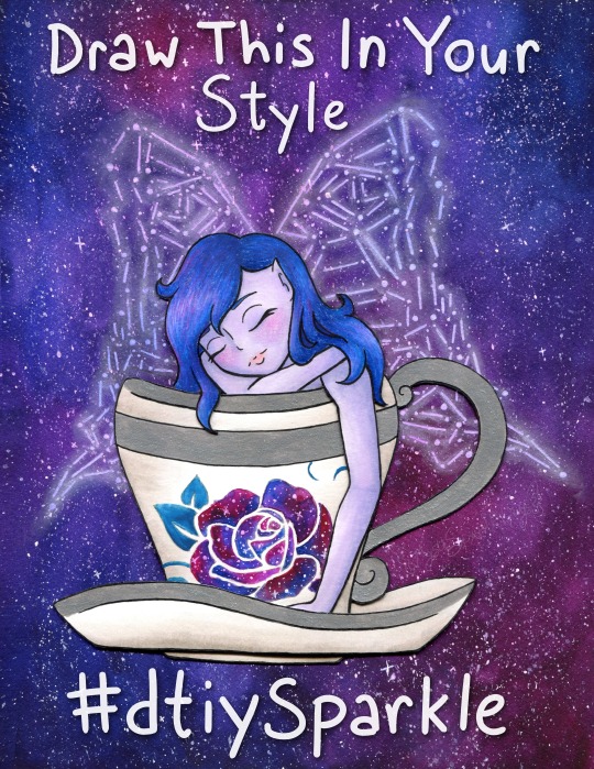
Draw This In Your Style!
Draw/Recreate This In Your Style, post the original art alongside it (on platforms that support it, elsewhere you can just link back to the original instead), and either tag it with #dtiySparkle or tag me, MysticSparkleWings (xxMysticWingsxx on Twitter) directly and I'll retweet/share/etc. it! No deadline, just create at your own pace!
____
You know, I constantly go back and forth on "celebrate milestones!" vs. "don't be that person that won't shut up about how many followers they have and the numbers and etc." Mostly because I usually find it annoying from other artists, even if I don't find the artist themselves annoying. It's complicated. I know it's important and in many cases helps grow a following further, but it also just gets exhausting, you know? Both to see it and to try to do it.
Still, I've been wanting to make a "Draw This In Your Style" (DTIYS) for a while now, but it didn't seem like the kind of thing to just do on a whim. It felt like there should be a reason for at least the first one, provided it went well enough to make me want to do more. I noticed a few weeks ago that I was approaching 1,000 followers on Twitter* and I saw an opportunity, knowing that 1. It would take me a while to finish the artwork (go big or go home, yes?) and 2. It would take a few days for the numbers to stabilize so that I would actually hold steady at 1,000+ and not be 1,000 one minute and 998 the next. (Followers go up and down like a see-saw over there)
*Thanks exclusively to Art Shares. I'm very sure I'd still have less than 100 if it weren't for those--and please don't be fooled by that number. 1,000 isn't teeny tiny, but in-depth interaction from a handful of people will always mean more to me than zero or minimal-at-best interaction from thousands/millions/etc, and frankly, my interaction over on Twitter is basically non-existent compared to the interaction I get here on dA, which precisely is why I prioritize dA over all other social media. It means more to me; it feels infinitely less passive.
But...I kinda didn't want that to be the only reason for the DTIYS. It just seemed...I don't know, cliche? Not right, somehow. Fortunately, the Twitter milestone happens to coincidence with I think I've finally stabilized around 300 followers on Instagram (after being stuck between 250 and 290 for months, consistently going up and down 2-3 people at a time), and I've also garnered over 400 watchers right here on dA.
The Twitter milestone is technically the biggest, but honestly, the dA one means a lot more to me. I thank each and everyone one of you, my fellow deviants, for thinking my art is worth the watch.
And I especially thank those of you--I'm sure you know who you are, I won't name names just in case anyone's not comfortable with that--that consistently fav and/or comment on my work. Your support and encouragement are why I keep doing this, despite the frustrations I may have along the way and aside from an innate need to create.
Speaking of which, if you're a loyal Sparkler I think now I'll get to the part you might know me best for; the long description of the artistic process!
Like I mentioned before, I noticed the milestone stuff a few weeks ago and thought now would be as good a time as any to get started on a DTIYS, so I started trying to brainstorm something that would be both fun for me to make and fun for others to recreate. I was having a little trouble on this front, so I took a trip to Pinterest and re-visited some boards I use to save potential draw ideas/inspiration on.
I was thinking I wanted to include a fairy since I've been wanting to get back into drawing them more regularly and fairies-via-Winx-Club is where I got my start here on dA and indirectly into getting more serious about my art in general. I was also thinking something with galaxies since those are usually fun to make and are a good way to make an otherwise plain or simple piece more interesting. I didn't want this to be too terribly complicated if I expected other people to draw it, but I also didn't want it to be too boring. And, of course, I was hoping for something I could lean into my mixed-media prowess with.
All that turned out to be quite the balancing act, but after some scrolling, I had some ideas and ended up with a sketch of a fairy in a teacup, with place-holder wings and a place-holder rose on the cup. The wings I knew would be easier to do the lines digitally (even if the final art was traditional, which I was planning on), and the rose I wanted to be slightly more sophisticated than my typical stencil-made roses, which I thought would also be easier to experiment with digitally. I was right on that front, thanks to some of the public domain images on PixaBay.
Beyond that, my original idea was fairly different from what you see here; I was thinking black hair, a fairly vampiric look, for the fairy, more typical butterfly wings, a red rose on the cup, and then an abstract galaxy wash, more watercolor-y and less saturated, for the background. And to be fair, that's still an interesting idea that I might return to at some point, but even as I worked on and finished the digital linework (fully planning to print them and then do what I wished with them traditionally, as has become a norm for me) something in the back of my mind told me that vision wasn't the right one; Not for this project, anyway.
Fortunately, I was a busy enough bee in between working on the lines for this that I partially had to step away from it to meet other time constraints and I could afford to step away from it and have some time to ponder what I wanted to do.
In my pondering, I kept coming back to the galaxy/constellation thing I've been experimenting with lately (Exhibits A, B, and C ). I hesitated at first since I knew for sure I didn't want to do the whole drawing that way and I wasn't entirely sure how to decided what to do with what.
Of course, after thinking about it a bit more, I decided I'd take a risk in doing the background and wings in the constellation style, and then somehow do the rest in a more traditional way. I'd have some more time to think about that while I was re-tooling the wings digitally for said constellation style, after having discovered that made life so much easier during my previous experiments with it.
I'd know from the beginning that I wanted to do metallic accents (most likely silver) on the cup and saucer, which in this case meant I'd need to use either watercolor or heavy-duty mixed media paper for them, and I definitely had to use watercolor paper for the wings/background. The mixed media will work for the galaxy technique, but the colors don't blend quite as nicely and I was concerned about how that might affect the overall look here.
Still, I didn't want to watercolor the fairy herself at least, which left me with a choice of alcohol markers or colored pencils. I was thinking pencils for the hair for texture, markers for the skin for the lack thereof. But I typically don't like using alcohol markers on watercolor paper. The additional texture feels too rough on the nib and it's almost like I can feel the paper soaking up extra ink.
I also thought that doing the background and the fairy on the same piece of paper was asking for a very big watercolor-y mess, so between that and the paper concerns, that led me eventually to deciding to split them up.
And somehow in there, the idea occurred to me that I could get a bit adventurous (read: crafty) and actually separate the various parts of the fairy and cup out a bit and not only solve my paper problem, but also makes things a little more interesting.
After yet more pondering (if you can say nothing else about my art, you cannot say it isn't well-pondered by the time it's finished!) I settled on having the layers as follows:
background/wings (watercolor paper)
back part of the saucer (mixed media paper)
the fairy (with her arm and bit of hair carefully plopped over the next layer; mixed media)
the cup (mixed media)
the front of the saucer (mixed media)
Or at least that was the plan, and if I discovered problems in this plan then I could adjust as necessary.
So I got to work on the background, which was fairly straight-forward. I layered on paint and blended to essentially my heart's content, and then let it dry overnight since it was getting late by the time I finished it, or rather the first layer. I came back to it the next day and layered on some more paint to fix some blending issues and darken the whole thing up some more.
While that second layer dried, I got to making the lines for the additional layers and cutting them out--uncolored for the time being, as I figured the layering would need to factor into that a bit--and setting how exactly they'd fit together. The only modifications to my plans I had to make, which I, fortunately, had the foresight to do while I was cutting, was to leave two little bumps at the "bottom" of the fairy (where her body meets the cup) so that she could sit probably as both in the cup but also with her hair and arm hanging over it. The little bumps were a sort of "grounding" behind the cup to hold the rest of her in place while the other pieces were wedged on top.
I hope that makes sense, it's a little hard to explain without seeing it for yourself.
Anyway. I'd also had the foresight to transfer an outline of the fairy and cup lines onto the background before I started painting, which helped with making sure everything was placed...semi-correctly...on the final piece.
I say semi correctly because despite my best efforts when I went to glue everything together it looked right in-person, but the digital scan would later reveal to me that in fact, the layered bits had all shifted slightly to the left and curved inward a bit more, like a right parathesis: ) But I'll come back to that in a minute.
Once I was convinced my layering gambit was going to work out, then I started toying with colors and ideas for the layers themselves. The clearest idea I had out of the gate was to do the rose in a galaxy style too, rather than just plain watercolor like I'd originally planned (teal for the leaf though because green wouldn't have fit with the rest of the palette and blue would've blended too well); either way, I figured it wouldn't pose much of a problem on the mixed media paper since it's such a small area. The biggest challenge would be the stars, but even then you could say the same thing: It's such a small area that star dispersion with a pen really wasn't that big of a challenge to make look convincingly like random star placement.
I went back and forth a bit on the other colors, but I ultimately decided that I liked the idea of soft purple skin and dark(ish) blue hair, maybe soft pink lips and a little blush, for the fairy herself. And I also decided to do a little warm-gray shading on the cup with markers, as opposed to just leaving it white.
The lips turned out so nicely I was tempted to try doing the blush with the same markers, but I have very mixed luck with marker blush (sometimes it blends nicely, other times I get a nice line despite my efforts), and so I decided to play it safe and do it later with pencils instead. Fortunately, the rest of the skin and the cup (both done with Copics specifically as that's where I most easily found the colors I needed) went nice and smoothly, as is the nature of markers on this mixed media paper. (Seriously; Strathmore 400 series Mixed Media works wonders with alcohol markers for layering and blending!!)
The hair was a little more complicated because of the color I was hoping for, but that didn't matter too much because half-way through I decided to change things up a bit and I added little bits of pink and purple into the mix, intentionally following the rest of the galaxy-ness of what I was doing. It's not much, but I think it was the right choice.
While I waited to make sure the cup was good and dry, I went to splatter town on the now-dry background, as was necessary for the galaxy look, and then used my phone to shine some extra light on the paper so I could see my lines and dots for the wings. And after giving the white gel pen a moment to dry, I then went back in with my PanPastel, as is custom, to make the wings glow. I have also now learned that a blending stump/tortillon is good for blending out the pastel in a tight space, while a dry paper towel or tissue works to semi-remove it if it goes on a bit too thick.
Everything, after drying, was then assembled and attached to the background with some handy-dandy tacky glue which was fortunately fairly quick-drying for liquid glue, stuck fairly well without me having to add a whole lot of it, and also not a sloppy glue mess everywhere.
I did have to carefully go back over some of my lines for the cup and hair after everything was assembled because I forgot to do so over the metallic paint and pencil wax before assembly, but it also worked out okay since a couple of corners for the hair got snipped a little short, so I could sort-of fix it by extended the corner on the paper underneath. (In hindsight this works a lot better in-person; on the undoctored scan the placement looks pretty off or incomplete)
And of course, with everything assembled, that brings me back to what I was saying about the scan earlier.
Like mentioned, everything had shifted a bit during placement and gluing, and I could more clearly see the lines I had missed in that process on the scan. Unfortunately for me, while in-person everything looks relativity fine, on the (undoctored) scan this shifting made the balance feel way off, at least to me. The fairy and cup were too far to the left, meanwhile, the ring wing stuck out too far on the bottom.
I fiddled and fiddled and fiddled with the scan, using the content-aware move tool half a dozen different ways before I conceded it just wasn't going to do what I wanted, and then my next-best idea was the extend the background to the left a bit. In doing that, I discovered the warp tool worked to my advantage for that, and so I decided I'd trying fiddling with it and see where it got me.
It's still not perfect, but it's better than it was. In the end, I used the warp tool to tweak the angle of each part of the wings and that made up for some of the balance problems without also compromising any of the lines (which was the biggest reason why the content-aware tool wasn't working; it kept messing up the lines or other parts of the drawing in the process). At the very least, I was able to do enough that it only really bothers me now when I start looking for the off-balance-ness.
I also ended up doing some minor touches, mostly just smoothing out certain lines and small tweaks, but once the balance problem was finally somewhat solved it was pretty much done. (Aside from, of course, me then also adding the words on top so people know what this is at only a moment's glance.)
The end result, both scan and traditional. I'm really happy with. The piece is plenty interesting to look at, but it's also not too complicated, especially when you break down the individual parts that make it up. (Literally and more figuratively.)
Thus, I can only hope others find it interesting-but-not-too-complicated enough to try their hand at recreating it. Even if no one takes me up on my "Draw This In Your Sparkle Style Challenge though, I enjoyed making this all the same and I'm really proud to share the art itself with you guys.
Hopefully though at least a few people will take a stab at it and I can focus on that and not explode from impatience in regards to various not-really-art-related things I'm currently waiting on.
____
Artwork © me, MysticSparkleWings
____
Where to find me & my artwork: My Website | Commission Info + Prices | Ko-Fi | dA Print Shop | RedBubble | Twitter | Tumblr | Instagram
3 notes
·
View notes