#Types of the De Vinne Press
Photo


Typography Tuesday
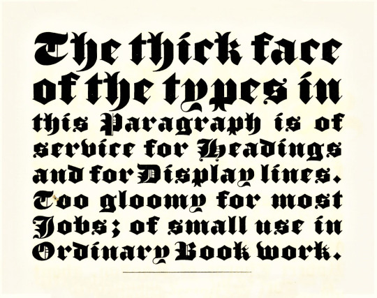
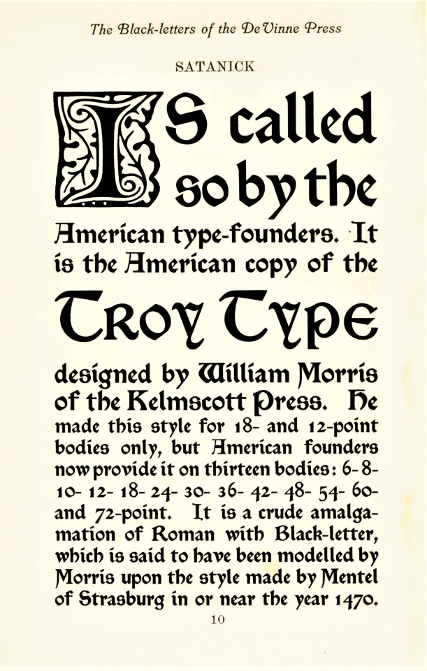
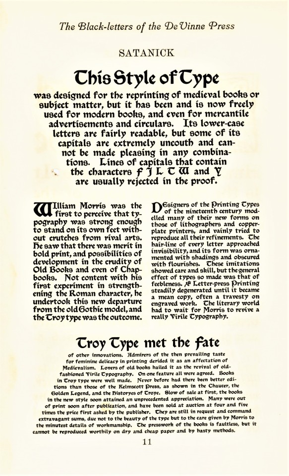
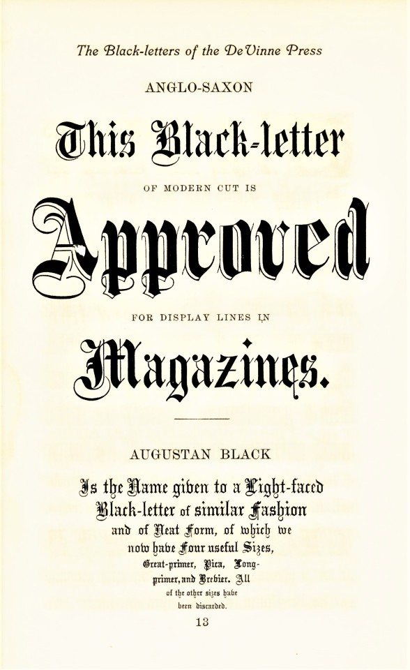
BLACKLETTER
Blackletter, also called Gothic, was the first typographic form to be founded in metal type by Johannes Gutenberg in the mid-fifteenth century. The first book printed in English was in blackletter, as was the first book printed in England (both by William Caxton; the first printed in Bruges in 1473, which was also the very first book printed in Bruges, and the latter in Westminster in 1476). It is called blackletter because its narrow, condensed forms produce a darker appearance on the page than do Roman fonts. By the late 16th century, most Western national printers had dropped blackletter in favor of the arguably more readable Roman-style fonts, except for some Scandinavian countries which held onto blackletter forms until the late 18th century, and Germany being the last holdout until 1941.
Blackletter fonts are still used today, however, as display faces, for ceremonial use, and for certain kinds of emphases. That’s certainly how Theodore Low De Vinne (1828-1914) would have used it at his De Vinne Press in New York. These examples come from Types of the De Vinne Press, published in New York by the De Vinne Press in 1907. Theodore De Vinne founded his press in 1883. He was also a co-founder of the prestigious Grolier Club and one of the leading commercial printers of his day, whose enterprise had a profound influence on American printing and typography. This book was intended as a promotional specimen book “for the use of compositors, proofreaders, and publishers,” to demonstrate the wide variety of typographic possibilities that could be available to their clients.
View more posts from Types of the De Vinne Press.
View more posts on Gothic/Blackletter type faces.
View more Typography Tuesday posts.
#Typography Tuesday#typetuesday#Typography Tuesday#Blackletter#Gothic type#Theodore Low De Vinne#De Vinne Press#Types of the De Vinne Press#book history#20th century type
236 notes
·
View notes
Text
bauer bookplate
simple & tasteful typographical ex libris from the library of the bauer type foundry, frankfurt, germany. set in their weiss types.
i acquired the bauer type foundry library’s copy [after indeterminate journey] of that indispensable reference: A Treatise on Title Pages by theodore low de vinne; being the 1914, 2nd edition issued posthumously by the oswald publishing company, nyc. john clyde oswald, publisher of American Printer, after de vinne’s death obtained rights of publication to several de vinne publications, notably «The Practice of Typography» series. the 1914 oswald edition of A Treatise on Title Pages has a canceled title-page, & so was made up from sheets still standing at the de vinne press. the weiss types did not issue until 1928—cf. ‹vase 2›—thus giving terminus post quem for the volume’s entry into the bauer library.
#typography#ex libris#bauer’sche giesserei#bauer type foundry#theodore low de vinne#john clyde oswald
0 notes
Photo
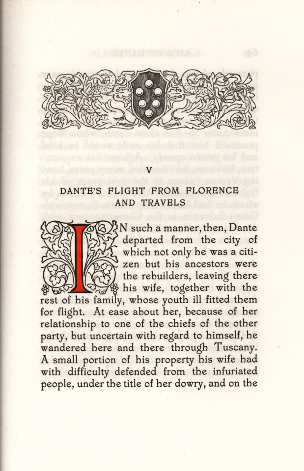
Types of the De Vinne press
1907 :: New York :: De Vinne Press
Specimens of printing types by the De Vinne press for the use of compositors, proofreaders and publishers.
Contributor: University of California Libraries
Language: English
1 note
·
View note
Text
RT @frerejones: Theodore Low De Vinne, grumping away about the type in his own shop (De Vinne Press specim… https://t.co/rBr7M6p6K4 https://t.co/0sCqhRdjRp
Theodore Low De Vinne, grumping away about the type in his own shop (De Vinne Press specim… https://t.co/rBr7M6p6K4 http://pic.twitter.com/0sCqhRdjRp
— Frere-Jones Type (@frerejones) March 27, 2017
via Twitter https://twitter.com/Faultys
March 27, 2017 at 08:13PM
0 notes
Photo


Typography Tuesday
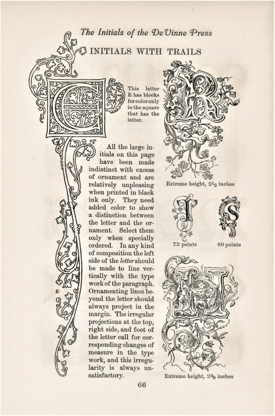
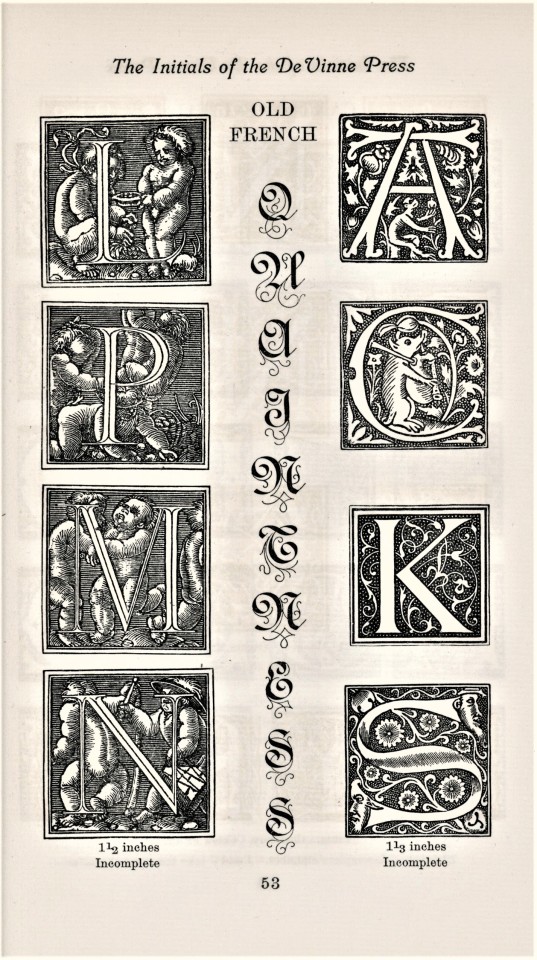
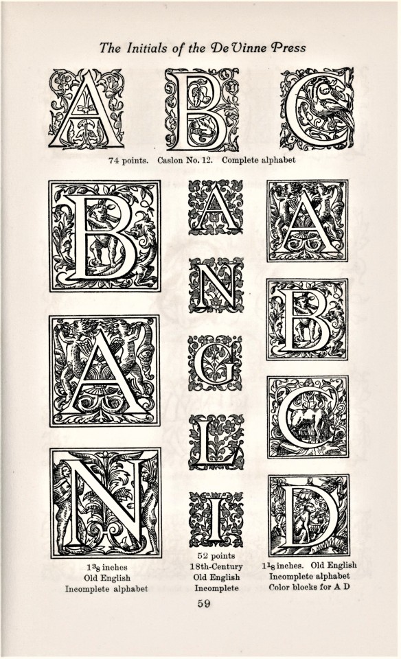
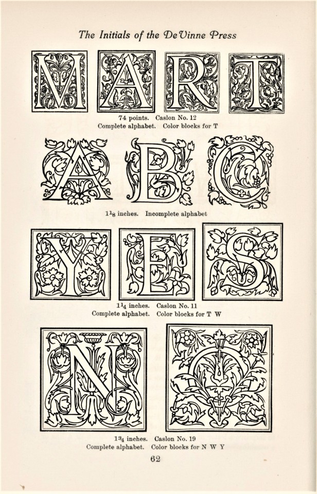
This week we return once again to Types of the De Vinne Press, published in New York by the De Vinne Press in 1907, to highlight all the “Initials with Trails” offered by the press. As De Vine points out, many of these initials are intended to be used with color, as “they have been made indistinct with excess of ornament and are relatively unpleasing when printed in black ink only. They need added color to show a distinction between the letter and the ornament.”
Founded by Theodore Low De Vinne (1828-1914), the De Vinne Press was one of the most influential American printing establishments of its day. De Vinne learned his craft in printshops and newspapers in upstate New York. Then --
In 1850 he was hired as a compositor by the printing shop of Francis Hart in New York, where he rose to the position of foreman within a year, which included duties as shop manager. He became a partner in Hart's business in 1858 and assumed sole proprietorship of the firm upon Hart's death in 1877, eventually renaming it to Theodore L. De Vinne & Co. in 1883.
While still a partner of Hart's, De Vinne managed to steer the business from job printing to the more lucrative and prestigious book and periodical trade, mostly thanks to his excellence in printing wood engravings. De Vinne's commercial success and high repute derived in large measure from the collaboration with his main client in this market segment, The Century Company, for whom he printed the popular St. Nicholas Magazine and The Century Magazine. . . . -- Wikipedia
View more posts from Types of the De Vinne Press.
View more Typography Tuesday posts.
#Typography Tuesday#typetuesday#initials#initials with trails#trailing initials#Types of the De Vinne Press#De Vinne Press#Theodore Low De Vinne#Theodore De Vinne#type specimen books#type display books#type specimens#19th century type#Typography Tuesday
211 notes
·
View notes
Photo


Typography Tuesday
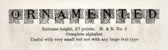
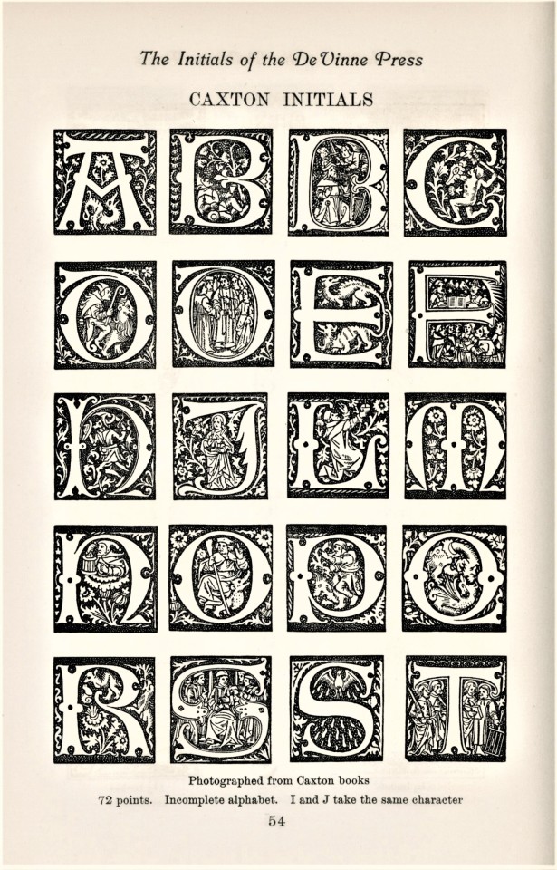
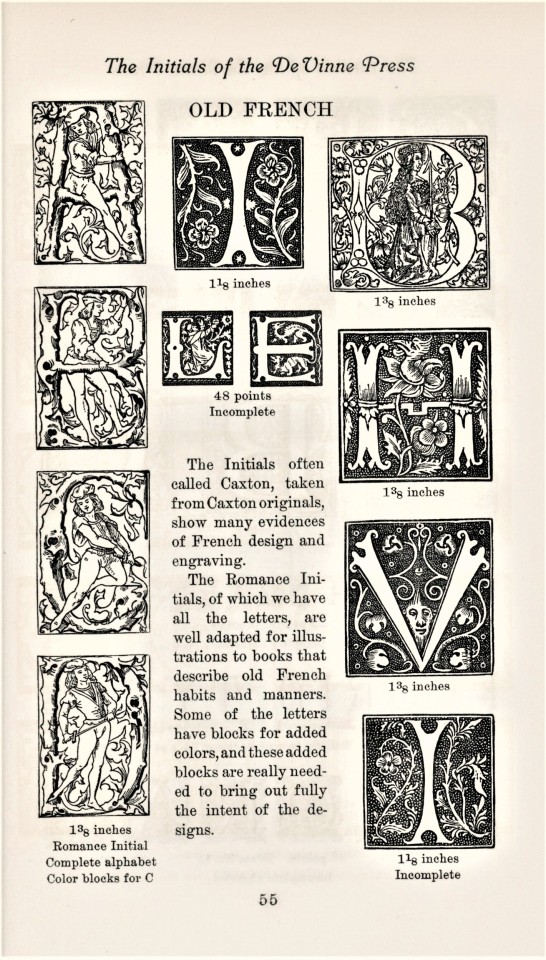
Last week we brought you specimens of wood type from Types of the De Vinne Press, published in New York by the De Vinne Press in 1907. This week we present some historiated and fancy-pants initials from the same volume.
Of the use of ornamented initials, De Vinne Press founder Theodore Low De Vinne (1828-1914) writes: “A proper initial at the beginning of a first paragraph always gives attractiveness to the composition. It is the feature that first catches the eye. The letter selected for this service may be plain or ornamented, but it should be fitting in size and style and appropriate to the subject.”
View more Typography Tuesday posts.
#Typography Tuesday#typetuesday#initials#historiated initials#ornamental initials#De Vinne Press#Theodore Low De Vinne#Theodore De Vinne#Types of the De Vinne Press#type specimen books#type display books#type specimens#19th century type#Typography Tuesday
88 notes
·
View notes
Photo


Typography Tuesday
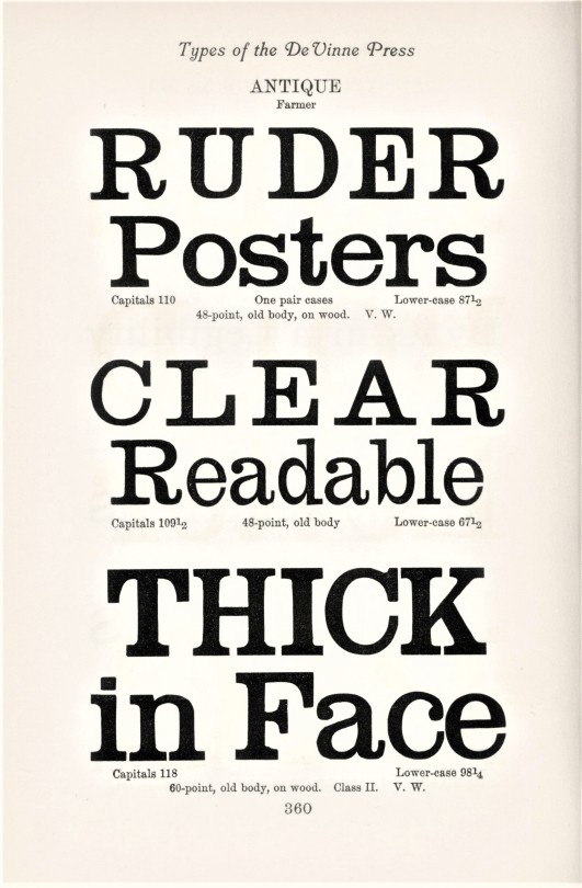
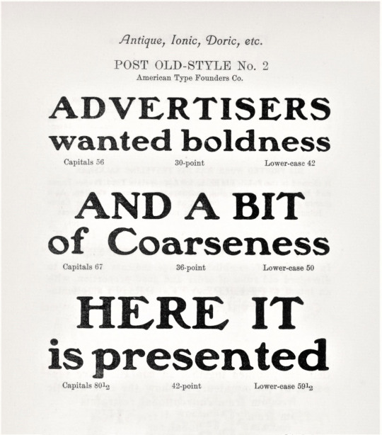
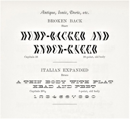
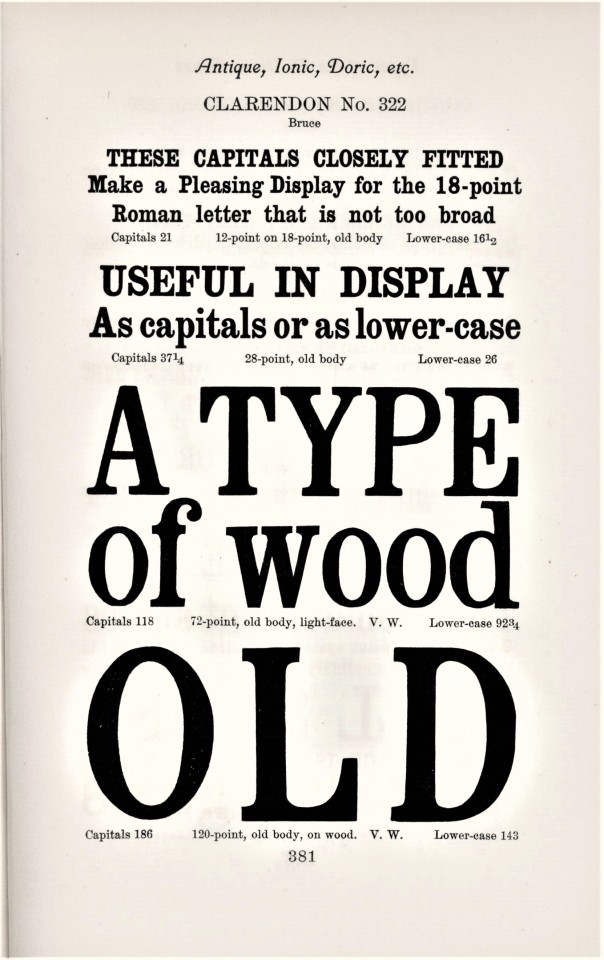
This week we return once again to Types of the De Vinne Press, published in New York by the De Vinne Press in 1907, to highlight the “Antique, Ionic, Doric” types offered by the press, and of course to highlight the quirky display language often found in type specimen books. These are all display, rather than text fonts. Some of the text strung together like this read almost like accidental poetry:
Ruder posters,
Clear readable, thick in face,
Full, bold letter, BIG,
Overrides all petty types,
Graceful in form.
This type needs relief
Outside its letters.
And we particularly like:
Hump-backed and knock-kneed,
A thin body
With flat head and feet.
View more posts from Types of the De Vinne Press.
View more Typography Tuesday posts.
#Typography Tuesday#typetuesday#Types of the De Vinne Press#De Vinne Press#Theodore Low De Vinne#Theodore De Vinne#Antique types#Ionic types#Doric types#type specimen books#specimen books#type display books#type specimens#19th century type#Typography Tuesday
44 notes
·
View notes
Photo


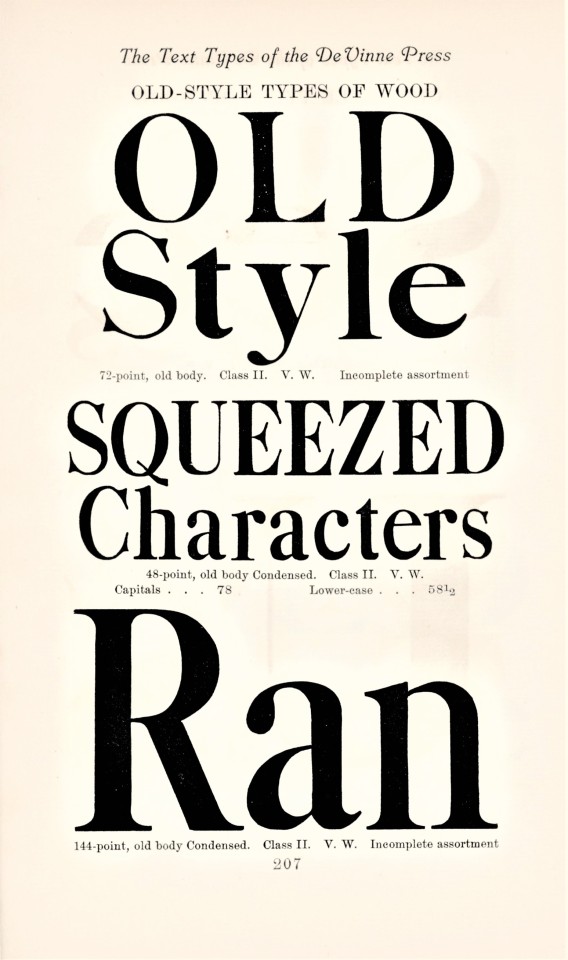


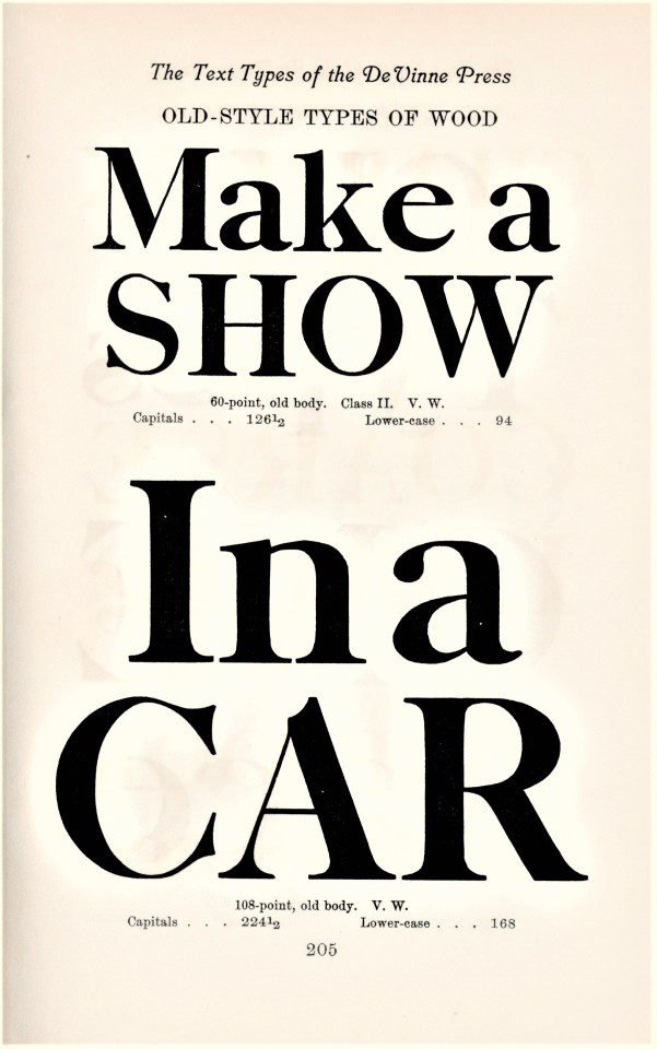
Typography Tuesday
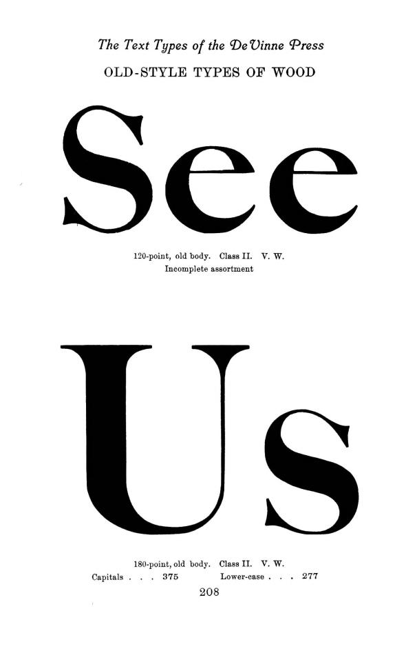
This week we present specimens of wood type from our most recent typographical acquisition, Types of the De Vinne Press, published in New York by the De Vinne Press in 1907. The press was founded in 1883 by Theodore Low De Vinne (1828-1914), a co-founder of the prestigious Grolier Club and one of the leading commercial printers of his day, whose enterprise had a profound influence on American printing and typography. This book was intended as a promotional specimen book “for the use of compositors, proofreaders, and publishers,” to demonstrate the wide variety of typographic possibilities that could be available to their clients.
We are particularly enamored of wood type and we think the wood types used by De Vinne have a clear and restrained uprightness that was characteristic of De Vinne presswork, so we introduce this volume by showcasing these fonts. Much more to come in future weeks.
View more Typography Tuesday posts.
#Typography Tuesday#typetuesday#De Vinne#De Vinne Press#Theodore Low De Vinne#Theodore De Vinne#Types of the De Vinne Press#wood type#type specimen books#type display books#type specimens#19th century type
41 notes
·
View notes
Photo
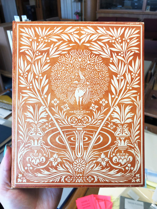


Publishers’ Binding Thursday
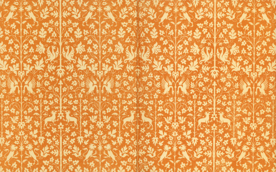
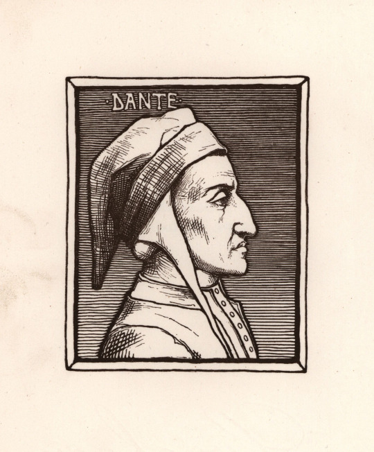
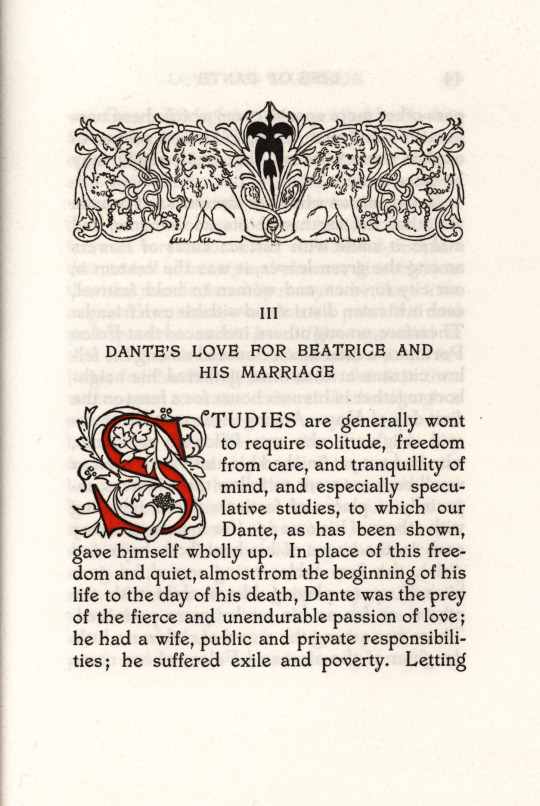
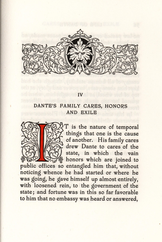
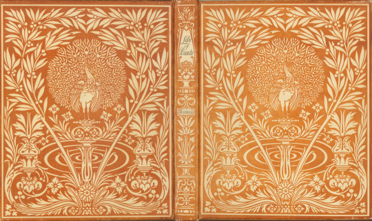
While doing research on publishers’ bindings (as one does), I came across mention of this book, A Translation of Giovanni Boccaccio’s Life of Dante by G.R. Carpenter. I decided to see if we held a copy and, lo and behold, we do! It’s such a pretty binding I couldn’t help but share it.
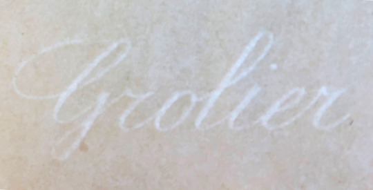
Bound in vellum over boards that has been stamped in orange with an art nouveau peacock design by Edward Edwards (1873-1946), the book features endpapers patterned in the same color in which the cover is stamped. The book also includes fancy headpieces, tailpieces, and floriated initials that are printed on handmade paper in red. It was published in 1900 by the Grolier Club in an edition of 300 copies printed at the De Vinne Press. This is the first book printed using De Vinne’s Renner type. The paper used for the book features a watermark that says “Grolier” as pictured here.
View more Publishers’ Binding Thursday posts.
View more posts about the Grolier Club.
View more posts about the De Vinne Press.
#Publishers' Binding Thursday#Publishers' bindings#bindings#Grolier Club#De Vinne Press#Renner type#Edward Edwards#G.R. Carpenter#Dante#Life of Dante#Giovanni Boccaccio#Boccaccio#peacock#vellum binding#vellum#Alice#watermarks
101 notes
·
View notes

Photo
showings of modernized old-style & modern faces [bruce foundry, nyc] in the 1891 de vinne press specimen book.
#books#type specimen#theodore low de vinne#de vinne press#typography#printing#modernized old style#bruce foundry
5 notes
·
View notes
Photo

bona fide nyc
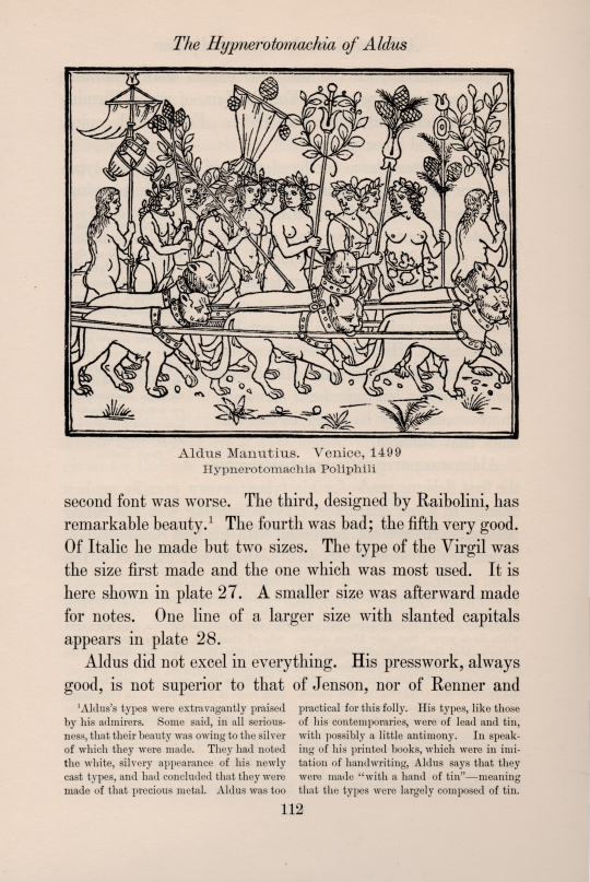
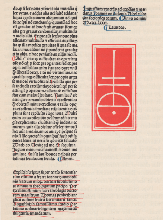
1st illustration: page from theodore low de vinne’s last book, Notable Printers of Italy during the Fifteenth Century [the grolier club, new york, 1910, p112]: de vinne’s inimitable style—erudite & tasty. composed in types both cut & cast in nyc; seen though the press by the great printer himself at his establishment, the de vinne press—vide ‹point of pilgrimage›.
the woodcut facsimile is from the Hpynerotomachia Poliphili of francesco colonna: «The amatory sentiment is extravagant, yet that is subordinate to the author’s knowledge of art and mythology.» [ibid., p113]. published by aldus, venice, 1499; amongst the most beautiful books ever printed, this was aldus’ only foray into the illustrated book. for the context of the woodcut, in english, vide ‹but tell us of the image›.
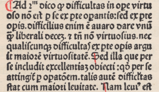
text & notes are set in condensed form of scotch-face from george bruce’s sons (2nd illustration) [theodore low de vinne, Plain Printing Types, the century co., nyc, 1902, p214]. interesting choice in 1910 as de vinne in 1902 wrote: «The condensed form of Scotch-face is now out of fashion.» [ibid.]. the face sets a monumental page, especially with two-column notes, in composition with the facsimiles of incunabula. de vinne tells us this face was cut in 1854 by james lindsey [ibid.], presumably for the bruce foundry; & embedded within a showing of diamond, or 4½ pt, type de vinne pays biographical tribute to lindsey: «James Lindsey was born in Glasgow, Scotland, in 1825, and was taught the trade in the foundry of Alexander Wilson of Edinburgh [sic*]. He died in Brooklyn on the 20th of September, 1879. He was a thoroughly educated type-founder and a punch-cutter of admitted ability.» [ibid., p103].
further, embedded within a showing of brilliant, or 4 pt, type, de vinne recounts the story of original scotch-face: «Samuel Nelson Dickinson (born 1801, died 1848) was a notable type-founder of Boston. … Unable to get from any type-foundry of his city the types his taste demanded, he undertook to have them made. The style known as the Scotch-face was modelled by him in 1837, but cut and cast to his order by Alexander Wilson & Son, of Edinburgh [sic*]. The matrices imported by him were the first types of the Dickinson foundry in 1839, and were received with marked favor.» [ibid., p104]. if dickinson imported the matrices, one wonders if/why he needed the wilson foundry to also cast for him. on dickinson’s death his foundry was acquired & continued styled in the last instance phelps, dalton & co.; & finally a component of the 1892 merger which constituted american type founders (atf) [ibid.].
*alexander wilson’s foundry was in glasgow. william miller’s foundry was at edinburgh.
captions are set in a face advocated by de vinne for such purpose: light-face. in this case, de vinne selected the broad form from farmer, little & co (3rd illustration) [ibid., p223]. de vinne tells us: «…an extremely light face of decided merit, but which is too thin and too light to be used as a text-type for descriptive matter set solid. It shows to best advantage in leaded or double leaded poetry, or in any work which has broad margins and large space of white. It finds frequent employment in the titles or descriptions of plates when these titles are printed, as in the fashion, on thin paper facing the plate, but in any place it is a strain on ordinary eyesight.» [ibid., p222]. of the broad form, in particular, he continues «…as broad as it is light, is seldom used as a text-letter for standard books. Its delicacy disqualifies it for general use, but it is an effective letter for pamphlets, catalogues, and ornamental job-work, when the composed lines have been liberally widened with leads. The larger sizes are used for book titles, running head lines, and as a display letter.» [ibid., 223].
henry lewis bullen writing under his nom de plume, quadrat, gives concise lineage of farmer, little & co.: «The present corporation of A. D. Farmer & Son Company, better known as Farmer, Little & Co. (1861), is the direct successor of Elihu White, following a son, H. T. White, and then Charles T. White & Co.» [The Inland Printer, vol. xxxviii, no.1, 1906, p36.] farmer, little & co. was acquired by american type founders (atf) in 1892 [✓].
notes on de vinne’s text in the 1st illustration
«Raibollini» is a misattribution: propagated from an attempt by sir anthony panizzi in 1858 to identify aldus’ punch cutter as francesco raibolini, the painter from bologna. «This argument was demolished by Giacomo Manzoni in his Studia di bibliografia analitica, and the matter clinched by the publication by Adamo Rossi in 1883 of a document from which it appeared that Franceso’s family name was Griffo.» [a.f. johnson, Type Designs, grafton & co., london, 1959, p95]. this information, apparently, had not yet reached the cognoscenti of new york, or de vinne was simply unaware.
the statement «One line of a larger size with slanted capitals appears on plate 28» is not apropos, as plate 28 is a facsimile of a page printed in 1566 by aldus’ son, paolo: not an incunabulum. the face is not aldine: it is a 16th c. french face—the petit-parangon italic cut by robert granjon in 1554 [cf. 298 in hendrik d.l. vervliet, French Renaissance Printing Types, the bibliographical society, london, 2010, p328].
#typography#aldus#incunabula#theodore low de vinne#nyc#grolier club#bruce foundry#james lindsey#alexander wilson#farmer little & co#henry lewis bullen#granjon
2 notes
·
View notes
Photo

jenson’s rotunda
first illustrated is a setting of alfred forbes johnson’s statement regarding nicolas jenson’s rotundas, from his Type Designs [3rd ed., andre deutsch, london, 166, p17]. johnson capitalised Rotunda but not roman: for systematic capitalisation & to improve setting color i have set both lower-case. set in bruce roger’s centaur, roger’s neo-venetian homage to jenson. for more on centaur vide ‹livius andronicus›. line finisher is digital reissue of monotype’s recutting of «Granjon’s flower on Bourgeois» (1558) [cf. hendrik d. l. vervliet, Granjon’s flowers, oak knoll press, new castle (del), 2016, p61].
second illustration is facsimile of the final page from the Super Tertio Sententiarum of john duns scouts [johannis de colonia & nicolai iençon, venice, 1481]; plate 17 in theodore low de vinne’s Notable Printers of Italy during the Fifteenth Century [the grolier club, new york, 1910, p77]. the page is set in one of jenson’s small rotundas & concludes with colophon¹ & jenson’s device. «The type of the text is a Black-letter on 10 point body that may be accepted as a design approved by Jenson even if all punches were not cut by his own hand.» [ibid., p76]. the third illustration shows enlarged section of composition. i am amazed that there has been no digital revival of a jenson rotunda!
¹ translation given by de vinne: «Printed at Venice by the order and at the expense of John of Cologne, Nicolas Jenson & Company. In the year of our Lord fourteen hundred and eighty one. To God the praise.» [A Treatise on Title-pages, the century co., new york, 1902, p24].
1 note
·
View note
Photo
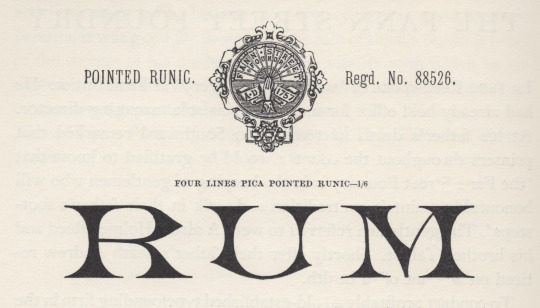
pointed runic
generally, i take the term runic to denote a fount of sorts requisite for setting the inscriptions of pagan, northern-germanic tribes in the letters they called runes [cf. isaac taylor, The Aphabet, vol.2, kegan paul, trench, & co., london, 1883, p210]. but in Plain Printing Types theodore low de vinne gives a taxonomy of types he assigns to the category «antique», & one is called runic: «Runic is the name given to another style of antique of light face, of condensed form, with pointed serifs, and often without lower case characters.» [the century co., nyc, 1902, p326]. perhaps here we get closer to the face illustrated, but not quite, i think.
stanley morison in his slim biography of Talbot Baines Reed [privately printed at the university press, cambridge, 1960] gives account of reed’s proprietorship of the type foundry he took over at his father’s death in 1881, the fann street foundry (vide footnote to ‹clarendon›); & morison shows several specimens from a fann street foundry catalogue [Specimens of Printing Types, Ornaments, &c, sir charles reed and sons, london, 1887], of which the illustration is one [op cit., p38]—morison must have found it striking. if runic is a species of antique, i do not see it in this face; or perhaps it was felt to resemble the ancient runes: there must be some logic in the name [✓].
#typography#stanley morison#runic#talbot baines reed#fann street foundry#isaac taylor#theodore low de vinne
0 notes
Photo

clarendon
the original «clarendon» was registered by the firm thorowgood & co. of london, in 1845, while under the direction of robert besley; & was cut by besley’s partner benjamin fox at their fann street foundry*. «The type was an Egyptian with bracketed serifs and fulfilled a demand for a bold face suitable for dictionary work. It was so successful that the word Clarendon for a heavy type has become part of the common language. There had been types of similar design before Besley’s, which went under the name of Ionic.» [talbot baines reed (a.f. johnson, ed.), A History of the Old English Letter Foundries, faber & faber, london, 1952, p296].
of clarendon theodore low de vinne tells us: «Clarendon, a popular variety of condensed antique, was first made for the Clarendon Press of Oxford, to serve as a display letter in a mass of text-type, and for side headings in dictionaries and books of reference.» [Plain Printing Types, the century co., nyc, 1902, p331.] de vinne gives a taxonomy of «antique» faces: «Antique differs from roman [he means old-face roman] in the boldness of its lines: stem, serif, and so-called hair-line are always of greater thickness. … The intent of the designer was to produce, for purpose of display, a bolder style that should be as distinct and easily read as that of the old lapidary characters. For this reason it was called antique by some founders and egyptian by others.» (cp. ‹antique | egyptian›) according to de vinne square serif is a characteristic of a strict antique, but ionic antique has bracketed serifs & «has large face, open counters»; & a further square serif variant, the doric antique, «has features of roman» [ibid., p323-5]—added confusion as doric was «the Caslon name for Sans Serif» [reed, op.cit., p251], & i can discover no doric antiques in the bruce’s new-york type-foundry (de vinne’s main supplier) specimen book of 1869.
nicolette gray considers clarendon & ionic to denote the same type style: «Besley’s letter, in its slightly compressed form became the normal, but it was certainly not the first Ionic letter. The Ionic is an Egyptian with the slab serif bracketed and a definite differentiation between the thick and thin strokes. … In 1842 Caslon have an upper and in 1843 a lower case with the characteristics fully developed, but of normal width, and retaining the Egyptian E and F, without serifs to the middle arm.» [XIXth Century Ornamented Types and Title Pages, faber & faber, london, 1937, p51].
jan tschichold concurs with gray (some details muddled): «The fully developed ‘Clarendon’ dates from the year 1843 [ionic dates from 1843, clarendon was 1845]. The first form of this type, called ‘Ionic’ — quite similar to the Clarendon by the Haas Type Foundry depicted here — was cast by Henry Caslon, Type Foundry [sic], London.» [Treasury of Alphabets and Lettering, Rheinhold, New York, 1966, p233]. the hass’sche schriftgiesserei [münchenstein, switzerland] clarendon was drawn by hermann eidenbenz in 1951. the illustration above is tschicholds [ibid., p199]. for another clarendon revival vide ‹volta›.
* the foundry founded by robert thorne in 1808, & acquired by william thorowgood at auction in 1820. robert besley became a partner in the firm c. 1838 at which time the foundry became styled thorowgood & co. upon thorowgood’s retirement the firm continued as robert besley & co, besley’s partner being his punch-cutter benjamin fox. in 1861 charles reed joined the firm, & the firm continued as reed & fox. after the death of fox in 1877 the firm continued as sir charles reed & sons, with talbots baines reed as sole proprietor until his death in 1893. operating until 1905 as a limited company, the material was finally acquired by stephenson, blake & co. [op. cit., pp 194 & 296-7.]
#typography#clarendon#ionic#robert besley#benjamin fox#talbot baines reed#theodore low de vinne#nicolette gray#jan tschichold
0 notes
Last Seen Blogs

reallyrevengers
Untitled

lastinlineforpie
Supernatural

jvorms
J.Vorms

hardcore-solangelo-19
Welcome to the heat death of sanity.

sexandthecitybrunchtalk
Sex And The City Quotes