#UIControl
Explore tagged Tumblr posts
Visit Tumblr Blog
Explore Tumblr blogs with no restrictions, modern design and the best experience.
Last Seen Tumblr Blogs


Fun Fact
When “GIF” was named word of the year in 2012, Oxford Dictionaries U.S.A. credited Tumblr for pushing the word.
Text
GE WD21X25381 Dishwasher Configured Top UI Control | HnKParts

Manufacturer Name: General Electric Product Number: WD21X25381 OEM Part Number: WD21X25381 Product Description: The GE WD21X25381 Dishwasher Configured Top UI Control is most likely the user interface for configuring and operating the dishwasher. GE dishwashers often provide several functions, such as dishwashing cycles, wash and dry settings, and time delay choices.
Order GE WD21X25381 Dishwasher Configured Top UI Control today! Shop home & kitchen appliance parts at HnK Parts with same-day shipping, available at the best prices.
#GeneralElectric#WD21X25381#Dishwasher#UIControl#HnKParts#homeappliances#HnKBuzz#KitchenApplianceParts#appliacepartsonline
0 notes
Text
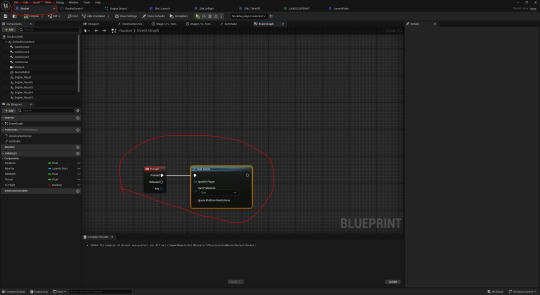
Building the game in UE5
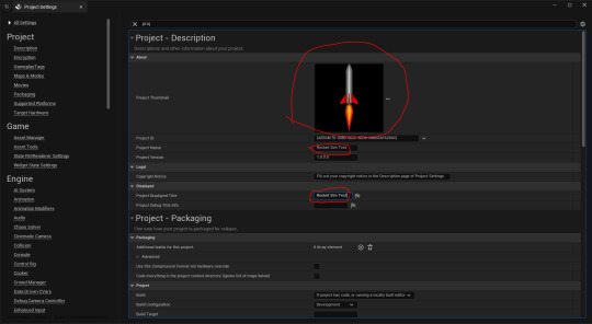
Here, I began to set up the settings that I needed and wanted for building the game. I opened up the 'Project Settings' and set the thumbnail for the project file. After that, I changed the 'Project Name' and 'Project Displayed Title' to 'Rocket Sim Test'.
Next, I had set the 'Build Configuration' to 'Shipping' and ticked the 'For Distribution' box.
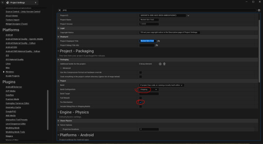
I then selected 'Windows' under 'Platform'. After that, I set the icon to the 'ICO' file I made.

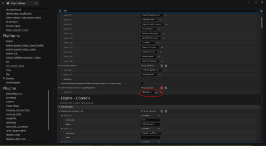
Lastly, I set the list of levels to be featured in the build. I had only set the 'BlankLevel' level.
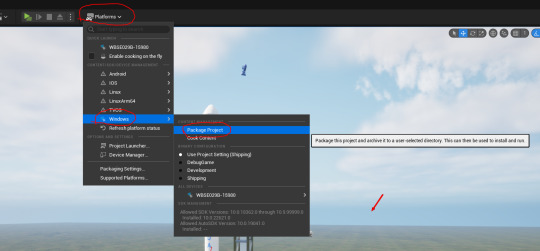
Here, I clicked on 'Platforms', 'Windows' and then 'Package Project'. This is to build the game.
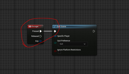
I found the game to have packaged successfully. The only thing I realized that I forgot to add was a quit button feature. I added the following code into the 'Rocket' blueprint event graph. After that, I re-packaged the game.
It still didn't work. I asked Jake why this is. He suggested that I test another key first as 'Esc' works in the editor by default which may give me a false result. I tried the key 'Q'.

Jake pointed out that I put the code into the wrong blueprint. I then cut and pasted the code into the 'UIController' tab.

Finally, this worked. I then set it to trigger by pressing 'Esc' and then re-built the game again.
0 notes
Text
Tonight theres going to be a jailbreak: detecting Jailbreaks with Swift on iOS part 2
A while ago I wrote a post about detecting Jailbreaks on iOS with Swift which I incorporated into the app that would eventually become PassVult. I thought there would be little need to continually keep updating Jailbreak’s due in part to the increasing the security of iOS and also due to Apple’s clever strategy of enticing away the Jailbreaker’s by getting them to work for them. But in this brave new / old world we live in there is always room to be surprised. So I’m sharing this code snippet to raise the bar across the board:
// Detect if device is Simulator, Jailbroken or not jailbroken func hasJailbreak() -> Bool { guard let cydiaUrlScheme = NSURL(string: "cydia://package/com.example.package") else { return false } if UIApplication.shared.canOpenURL(cydiaUrlScheme as URL) { return true } #if arch(i386) || arch(x86_64) // Device is a simulator return false #else /*let fileManager = FileManager.default if(fileManager.fileExists(atPath: "/private/var/lib/apt")) { // Device is jailbroken return true } else { // Device is not jailbroken return false } */ let fileManager = FileManager.default if fileManager.fileExists(atPath: "/Applications/Cydia.app") || fileManager.fileExists(atPath: "/Library/MobileSubstrate/MobileSubstrate.dylib") || fileManager.fileExists(atPath: "/bin/bash") || fileManager.fileExists(atPath: "/usr/sbin/sshd") || fileManager.fileExists(atPath: "/etc/apt") || fileManager.fileExists(atPath: "/usr/bin/ssh") || fileManager.fileExists(atPath: "/private/var/lib/apt") { return true } if ViewController.canOpen(path: "/Applications/Cydia.app") || ViewController.canOpen(path: "/Library/MobileSubstrate/MobileSubstrate.dylib") || ViewController.canOpen(path: "/bin/bash") || ViewController.canOpen(path: "/usr/sbin/sshd") || ViewController.canOpen(path: "/etc/apt") || ViewController.canOpen(path: "/usr/bin/ssh") { return true } let path = "/private/" + NSUUID().uuidString do { try "anyString".write(toFile: path, atomically: true, encoding: String.Encoding.utf8) try fileManager.removeItem(atPath: path) return true } catch { return false } #endif } static func canOpen(path: String) -> Bool { let file = fopen(path, "r") guard file != nil else { return false } fclose(file) return true } // Detect if iDevice is jailbroken func detectJailbreak() { if hasJailbreak() == true { UIControl().sendAction(#selector(URLSessionTask.suspend), to: UIApplication.shared, for: nil) } }
I based most of this code from browsing Stack Overflow a Github to update an earlier piece of code which I developed from browsing Stack Overflow and GitHub.
If you have better suggestions let me know.
Until Next Time!
The Security Sleuth
#Jailbreak#iOS#Code#Swift#pt2#Tonight theres going to be a jailbreak#Thin Lizzy#Apple#Stack overflow#GitHub
2 notes
·
View notes
Text
This is my main issue with SwiftUI. It's a high level black box. With UIKit I can: drop down to UIControl easily if I want to replace UIButton; make my own table view, drop down to CALayer's, customise the CALayer a view uses, etc.... https://t.co/8aA0zxdqnN
— Kyle Howells (@Freerunnering) February 13, 2022
0 notes
Photo

UX Writing 101: How to Write for an App http://ehelpdesk.tk/wp-content/uploads/2020/02/logo-header.png [ad_1] What? Gojek actually has writers... #userexperience #3dmodeling #adobe #adobeillustrator #adobexd #aftereffects #app #appdesign #autocad #blender #bunga #career #characteranimation #characterdesign #copywriting #design #digitalpainting #drawing #duniadalamdesain #flowuiux #graphicdesign #inspiration #izzi #lifeatgojek #logogojekbaru #mobileapp #motiongraphics #nadiemmakarim #photoshop #portofolio #product #revit #sastra #superapp #techcompany #technology #typography #ui #uicontrols #uitrends #uiux #userexperiencedesign #userinterface #ux #uxdesign #uxwriting #webdesign #webdeveloper #webdesign #wordpress #wordsmith #writer #writers #writinginspiration
0 notes
Text
Week 294
Happy Thursday! Dave Verwer launched another great resource for our community this week: SwiftPM Library. Think of it as the search engine of CocoaPods, but for Swift packages. At least until the GitHub Package Registry will be available for Swift packages (and maybe even after that), this will probably be the go-to resource for finding the libraries you need.
Articles
SwiftUI, Combine, and Beyond, by @BasemEmara
4 things you can do right now to be ready for SwiftUI and Combine, by @AppsDissected
Custom Publishers - Part 1, by @peres
Unit Testing Asynchronous Code in Swift, by @V8tr
Key-value observing without NSObject and dynamic modifier in Swift, by @toomasvahter
Property Wrappers, by @dmtopolog
Combine vs. RxSwift: Should you switch to Combine?, by @kofse
Local API Call Tutorial with WireMock and UI Tests in Xcode, by @ski081
Tools/Controls
SwiftUIX - An extension to the standard SwiftUI library, by @vatsal_manot
CombineCocoa - Combine publisher bridges for Cocoa Controls (UIControl) in UIKit, by @freak4pc
SDWebImageSwiftUI - Integration of SDWebImage Asynchronous image loading and SwiftUI framework, by dreampiggy
IBPCollectionViewCompositionalLayout - Backport of UICollectionViewCompositionalLayout to earlier iOS 12., by @k_katsumi
Business/Career
How to avoid common mistakes for your first iOS talk, by @BenoitPasquier_
How to maintain the focus as a software developer?, by @pakisha1989
UI/UX
How Object-Oriented Design Principles Relate to Mobile App Design, by @AngelicaSaidSo
Reduce risk in your product development with Hypothesis-Driven Design, by @chrlomholt
Credits
KaramazovShogun, moelnaggar14, popei69, valianka, BasemEmara, AppsDissected, mecid, rbarbosa
0 notes
Text
Rick and Morty (TV Series 2013– ) - IMDb
Goddamn morty. Controls implement elements such as buttons and sliders, which your app might use to facilitate navigation, gather user input, or manipulate content. Controls use the Target-Action mechanism to report user interactions to your app. You do not create instances of this class directly. The UIControl class is a subclassing point that you extend to implement custom controls. You can also subclass existing control classes to extend or modify their behaviors. For example, you might override the methods of this class to track touch events yourself or to determine when the state of the control changes.
Rick and Morty (TV Series 2013– ) - IMDb
Created by Dan Harmon, Justin Roiland. With Justin Roiland, Chris Parnell, Spencer Grammer, Sarah Chalke. An animated series that follows the exploits of a super scientist and his not-so-bright grandson.
Rick Sanchez Fan Club
0 notes
Text
How to Set Left/Right Padding in UITEXTFIELD in IOS
How to Set Left/Right Padding in UITEXTFIELD in IOS
There is a common ISSUE (How to Set Left/Right Padding in UITEXTFIELD in IOS ) we always faced while designing a IOS form and that is Padding and Margin of a UIControl.
Either way we faced the same issue whether we use Storyboard or Programmatically we create a form in IOS.
There are multiple ways to align the control 1- Programatically 2- Dragdrop ( Non-Constraint parameters) 3- Using Constraint…
View On WordPress
0 notes
Text
How To Make a Custom Control Tutorial: A Reusable Knob
Update note: Lorenzo Boaro updated this tutorial for iOS 11, Xcode 9, and Swift 4. Sam Davies wrote the original tutorial.
Custom UI controls are extremely useful when you need some new functionality in your app — especially when they’re generic enough to be reusable in other apps.
We have an excellent tutorial providing an introduction to custom UI Controls in Swift. That tutorial walks you through the creation of a custom double-ended UISlider that lets you select a range with start and end values.
This custom control tutorial takes that concept a bit further and covers the creation of a control kind of like a circular slider inspired by a control knob, such as those found on a mixer:
UIKit provides the UISlider control, which lets you set a floating point value within a specified range. If you’ve used any iOS device, then you’ve probably used a UISlider to set volume, brightness, or any one of a multitude of other variables. Your project will have the same functionality, but in a circular form.
Getting Started
Use the Download Materials button at the top or bottom of this tutorial to download the starter project.
Go to ReusableKnob/Starter and open the starter project. It’s a simple single view application. The storyboard has a few controls that are wired up to the main view controller. You’ll use these controls later in the tutorial to demonstrate the different features of the knob control.
Build and run your project to get a sense of how everything looks before you dive into the code. It should look like this:
To create the class for the knob control, click File ▸ New ▸ File… and select iOS ▸ Source ▸ Cocoa Touch Class. On the next screen, specify the class name as Knob, subclass UIControl and make sure the language is Swift. Click Next, choose the ReusableKnob group and click Create.
Before you can write any code for the new control, you have to add it to your view controller.
Open Main.storyboard and select the view to the left of the label. In Identity Inspector, set the class to Knob like this:
Now create an outlet for your knob. In the storyboard, open the Assistant editor; it should display ViewController.swift.
To create the outlet, click the Knob and control-drag it right underneath the animateSwitch IBOutlet. Release the drag and, in the pop-up window, name the outlet knob then click Connect. You’ll use it later in the tutorial.
Switch back to the Standard editor and, in Knob.swift, replace the boiler-plate class definition with the following code:
class Knob: UIControl { override init(frame: CGRect) { super.init(frame: frame) commonInit() } required init?(coder aDecoder: NSCoder) { super.init(coder: aDecoder) commonInit() } private func commonInit() { backgroundColor = .blue } }
This code defines the two initializers and sets the background color of the knob so that you can see it on the screen.
Build and run your app and you’ll see the following:
With the basic building blocks in place, it’s time to work on the API for your control!
Designing Your Control’s API
The main reason for creating a custom UI control is to create a reusable component. It’s worth taking a bit of time up-front to plan a good API for your control. Developers should understand how to use your component from looking at the API alone, without browsing the source code.
Your API consists of the public functions and properties of your custom control.
In Knob.swift, add the following code to the Knob class above the initializers:
var minimumValue: Float = 0 var maximumValue: Float = 1 private (set) var value: Float = 0 func setValue(_ newValue: Float, animated: Bool = false) { value = min(maximumValue, max(minimumValue, newValue)) } var isContinuous = true
minimumValue, maximumValue and value set the basic operating parameters for your control.
setValue(_:animated:) lets you set the value of the control programmatically, while the additional boolean parameter indicates whether or not the change in value should be animated. Because value can only be set between the limits of minimum and maximum you make its setter private with the private (set) qualifiers.
If isContinuous is true, the control calls back repeatedly as the value changes. If it’s false, the control calls back once after the user has finished interacting with it.
You’ll ensure that these properties behave appropriately later on in this tutorial.
Now, it’s time to get cracking on the visual design.
Setting the Appearance of Your Control
In this tutorial, you’ll use Core Animation layers.
A UIView is backed by a CALayer, which helps iOS optimize the rendering on the GPU. CALayer objects manage visual content and are designed to be incredibly efficient for all types of animations.
Your knob control will be made up of two CALayer objects: one for the track, and one for the pointer itself.
The diagram below illustrates the structure of your knob control:
The blue and red squares represent the two CALayer objects. The blue layer contains the track of the knob control, and the red layer the pointer. When overlaid, the two layers create the desired appearance of a moving knob. The difference in coloring above is just for illustration purposes.
The reason to use two separate layers becomes obvious when the pointer moves to represent a new value. All you need to do is rotate the layer containing the pointer, which is represented by the red layer in the diagram above.
It’s cheap and easy to rotate layers in Core Animation. If you chose to implement this using Core Graphics and override drawRect(_:), the entire knob control would be re-rendered in every step of the animation. Since it’s a very expensive operation, it would likely result in sluggish animation.
To keep the appearance parts separate from the control parts, add a new private class to the end of Knob.swift:
private class KnobRenderer { }
This class will keep track of the code associated with rendering the knob. That will add a clear separation between the control and its internals.
Next, add the following code inside the KnobRenderer definition:
var color: UIColor = .blue { didSet { trackLayer.strokeColor = color.cgColor pointerLayer.strokeColor = color.cgColor } } var lineWidth: CGFloat = 2 { didSet { trackLayer.lineWidth = lineWidth pointerLayer.lineWidth = lineWidth updateTrackLayerPath() updatePointerLayerPath() } } var startAngle: CGFloat = CGFloat(-Double.pi) * 11 / 8 { didSet { updateTrackLayerPath() } } var endAngle: CGFloat = CGFloat(Double.pi) * 3 / 8 { didSet { updateTrackLayerPath() } } var pointerLength: CGFloat = 6 { didSet { updateTrackLayerPath() updatePointerLayerPath() } } private (set) var pointerAngle: CGFloat = CGFloat(-Double.pi) * 11 / 8 func setPointerAngle(_ newPointerAngle: CGFloat, animated: Bool = false) { pointerAngle = newPointerAngle } let trackLayer = CAShapeLayer() let pointerLayer = CAShapeLayer()
Most of these properties deal with the visual appearance of the knob. The two CAShapeLayer properties represent the layers shown above. The color and lineWidth properties just delegate to the strokeColor and lineWidth of the two layers. You’ll see unresolved identifier compiler errors until you implement updateTrackLayerPath and updatePointerLayerPath in a moment.
Now add an initializer to the class right underneath the pointerLayer property:
init() { trackLayer.fillColor = UIColor.clear.cgColor pointerLayer.fillColor = UIColor.clear.cgColor }
Initially you set the appearance of the two layers as transparent.
You’ll create the two shapes that make up the overall knob as CAShapeLayer objects. These are a special subclasses of CALayer that draw a bezier path using anti-aliasing and some optimized rasterization. This makes CAShapeLayer an extremely efficient way to draw arbitrary shapes.
Add the following two methods to the KnobRenderer class:
private func updateTrackLayerPath() { let bounds = trackLayer.bounds let center = CGPoint(x: bounds.midX, y: bounds.midY) let offset = max(pointerLength, lineWidth / 2) let radius = min(bounds.width, bounds.height) / 2 - offset let ring = UIBezierPath(arcCenter: center, radius: radius, startAngle: startAngle, endAngle: endAngle, clockwise: true) trackLayer.path = ring.cgPath } private func updatePointerLayerPath() { let bounds = trackLayer.bounds let pointer = UIBezierPath() pointer.move(to: CGPoint(x: bounds.width - CGFloat(pointerLength) - CGFloat(lineWidth) / 2, y: bounds.midY)) pointer.addLine(to: CGPoint(x: bounds.width, y: bounds.midY)) pointerLayer.path = pointer.cgPath }
updateTrackLayerPath creates an arc between the startAngle and endAngle values with a radius that ensures the pointer will fit within the layer, and positions it on the center of the trackLayer. Once you create the UIBezierPath, you use the cgPath property to set the path on the appropriate CAShapeLayer.
Since UIBezierPath has a more modern API, you use that to initially create the path, and then convert it to a CGPathRef.
updatePointerLayerPath creates the path for the pointer at the position where angle is equal to zero. Again, you create a UIBezierPath, convert it to a CGPathRef and assign it to the path property of your CAShapeLayer. Since the pointer is a straight line, all you need to draw the pointer are move(to:) and addLine(to:).
Note: If you need a referesher on drawing angles and other related concepts, check out our Trigonometry for Game Programming tutorial.
Calling these methods redraws the two layers. This must happen when you modify any of the properties used by these methods.
You may have noticed that the two methods for updating the shape layer paths rely on one more property which has never been set — namely, the bounds of each of the shape layers. Since you never set the CAShapeLayer bounds, they currently have zero-sized bounds.
Add a new method to KnobRenderer:
func updateBounds(_ bounds: CGRect) { trackLayer.bounds = bounds trackLayer.position = CGPoint(x: bounds.midX, y: bounds.midY) updateTrackLayerPath() pointerLayer.bounds = trackLayer.bounds pointerLayer.position = trackLayer.position updatePointerLayerPath() }
The above method takes a bounds rectangle, resizes the layers to match and positions the layers in the center of the bounding rectangle. When you change a property that affects the paths, you must call the updateBounds(_:) method manually.
Although the renderer isn’t quite complete, there’s enough here to demonstrate the progress of your control. Add a property to hold an instance of your renderer to the Knob class:
private let renderer = KnobRenderer()
Replace the code of commonInit() method of Knob with:
private func commonInit() { renderer.updateBounds(bounds) renderer.color = tintColor renderer.setPointerAngle(renderer.startAngle, animated: false) layer.addSublayer(renderer.trackLayer) layer.addSublayer(renderer.pointerLayer) }
The above method sets the knob renderer’s size, then adds the two layers as sublayers of the control’s layer.
Build and run your app, and your control should look like the one below:
Exposing Appearance Properties in the API
Currently, all of the properties which manipulate the look of the knob are hidden away in the private renderer.
To allow developers to change the control’s appearance, add the following properties to the Knob class:
var lineWidth: CGFloat { get { return renderer.lineWidth } set { renderer.lineWidth = newValue } } var startAngle: CGFloat { get { return renderer.startAngle } set { renderer.startAngle = newValue } } var endAngle: CGFloat { get { return renderer.endAngle } set { renderer.endAngle = newValue } } var pointerLength: CGFloat { get { return renderer.pointerLength } set { renderer.pointerLength = newValue } }
The four properties are simple proxies for the properties in the renderer.
To test that the new API bits are working as expected, add this code to the end of viewDidLoad() in ViewController.swift:
knob.lineWidth = 4 knob.pointerLength = 12
Build and run again. You’ll see that the line thickness and the length of the pointer have both increased based on the values you just set:
Setting the Control’s Value Programmatically
The knob doesn’t actually do anything. In this next phase, you’ll modify the control to respond to programmatic interactions — that is, when the value property of the control changes.
At the moment, the value of the control is saved when the value property is modified directly or when you call setValue(_:animated:). However, there isn’t any communication with the renderer, and the control won’t re-render.
The renderer has no concept of value; it deals entirely in angles. You’ll need to update setValue(_:animated:) in Knob so that it converts the value to an angle and passes it to the renderer.
In Knob.swift, replace setValue(_:animated:) with the following code:
func setValue(_ newValue: Float, animated: Bool = false) { value = min(maximumValue, max(minimumValue, newValue)) let angleRange = endAngle - startAngle let valueRange = maximumValue - minimumValue let angleValue = CGFloat(value - minimumValue) / CGFloat(valueRange) * angleRange + startAngle renderer.setPointerAngle(angleValue, animated: animated) }
The code above works out the appropriate angle for the given value by mapping the minimum and maximum value range to the minimum and maximum angle range and sets the pointerAngle property on the renderer.
Note you’re just passing the value of animated to the renderer, but nothing is actually animating at the moment — you’ll fix this later.
Although the pointerAngle property is being updated, it doesn’t yet have any effect on your control. When the pointer angle is set, the layer containing the pointer should rotate to the specified angle to give the impression that the pointer has moved.
Update setPointerAngle(_:animated:) as follows:
func setPointerAngle(_ newPointerAngle: CGFloat, animated: Bool = false) { pointerLayer.transform = CATransform3DMakeRotation(newPointerAngle, 0, 0, 1) pointerAngle = newPointerAngle }
This simply creates a rotation transform which rotates the layer around the z-axis by the specified angle.
The transform property of CALayer expects to be passed a CATransform3D, not a CGAffineTransform like UIView. This means that you can perform transformations in three dimensions.
CGAffineTransform uses a 3×3 matrix and CATransform3D uses a 4×4 matrix; the addition of the z-axis requires the extra values. At their core, 3D transformations are simply matrix multiplications. You can read more about matrix multiplication in this Wikipedia article.
To demonstrate that your transforms work, you’re going to link the UISlider with the knob control in the view controller. As you adjust the slider, the value of the knob will change.
The UISlider has already been linked to handleValueChanged(_:). Open ViewController.swift and add the following to that method:
knob.setValue(valueSlider.value)
Now the knob value is set to match the valueSlider as it slides.
Build and run. Now, change the value of the UISlider and you’ll see the pointer on the knob control move to match as shown below:
Despite the fact that you haven’t started coding any of the animations yet, your control is animating. Why?
Core Animation is quietly calling implicit animations on your behalf. When you change certain properties of CALayer — including transform — the layer animates smoothly from the current value to the new value.
Now try sliding quickly from the end to the start. Rather than rotating counter-clockwise, the pointer will rotate clockwise over the end of the track, and into the bottom. That’s not what you want!
To solve this, you need to disable these animations. Update setPointerAngle(_:animated:) by replacing the CATransform3DMakeRotation line with:
CATransaction.begin() CATransaction.setDisableActions(true) pointerLayer.transform = CATransform3DMakeRotation(newPointerAngle, 0, 0, 1) CATransaction.commit()
You wrapped the property change in a CATransaction and disable animations for that interaction.
Build and run once more. You’ll see that as you move the UISlider, the knob follows instantaneously, and the knob moves predictably.
Animating Changes to the Control’s Value
Currently, setting the animated parameter to true has no effect on your control. To enable this bit of functionality, add the following to setPointerAngle(_:animated:) just below the CATransform3DMakeRotation call and before the commit:
if animated { let midAngleValue = (max(newPointerAngle, pointerAngle) - min(newPointerAngle, pointerAngle)) / 2 + min(newPointerAngle, pointerAngle) let animation = CAKeyframeAnimation(keyPath: "transform.rotation.z") animation.values = [pointerAngle, midAngleValue, newPointerAngle] animation.keyTimes = [0.0, 0.5, 1.0] animation.timingFunctions = [CAMediaTimingFunction(name: kCAMediaTimingFunctionEaseInEaseOut)] pointerLayer.add(animation, forKey: nil) }
Now when animated is true, you create an explicit animation that rotates the pointer in the correct direction. In order to specify the rotation direction, you use a keyframe animation. That’s simply an animation where you specify some in-between points in addition to the usual start and end points.
You create a CAKeyFrameAnimation and specify that the property to animate is the rotation around the z-axis with transform.rotation.z as its keypath.
Next, in animation.values, you specify three angles through which the layer should rotate: the start point, mid-point and end point. Along with that, there’s the array animation.keyTimes specifying the normalized times (as percentages) at which to reach those values. Adding the animation to the layer ensures that once the transaction is committed the animation will start.
To see this new functionality in action, you’ll need the knob to jump to a value. To do this, you’ll implement the method wired up to the Random Value button to cause the slider and knob controls to move to a random value.
Open ViewController.swift and add the following to handleRandomButtonPressed(_:):
let randomValue = Float(arc4random_uniform(101)) / 100.0 knob.setValue(randomValue, animated: animateSwitch.isOn) valueSlider.setValue(Float(randomValue), animated: animateSwitch.isOn)
The above generates a random value between 0.00 and 1.00 and sets the value on both controls. It then inspects the isOn property of animateSwitch to determine whether or not to animate the transition to the new value.
Build and run. Now tap the Random Value button a few times with the animate switch toggled on, then tap the Random Value button a few times with the animate switch toggled off to see the difference the animated parameter makes.
Updating the Label
Next you’ll populate the label to the right of the knob with its current value. Open ViewController.swift and add this method below the two @IBAction methods:
func updateLabel() { valueLabel.text = String(format: "%.2f", knob.value) }
This will show the current value selected by the knob control. Next, call this new method at the end of both handleValueChanged(_:) and handleRandomButtonPressed(_:) like this:
updateLabel()
Finally, update the initial value of the knob and the label to be the initial value of the slider so that all they are in sync when the app starts. Add the following code to the end of viewDidLoad():
knob.setValue(valueSlider.value) updateLabel()
Build and run, and perform a few tests to make sure the label shows the correct value.
Responding to Touch Interaction
The knob control you’ve built responds only to programmatic interaction, but that alone isn’t terribly useful for a UI control. In this final section, you’ll see how to add touch interaction using a custom gesture recognizer.
Apple provides a set of pre-defined gesture recognizers, such as tap, pan and pinch. However, there’s nothing to handle the single-finger rotation you need for your control.
Add a new private class to the end of Knob.swift:
import UIKit.UIGestureRecognizerSubclass private class RotationGestureRecognizer: UIPanGestureRecognizer { }
This custom gesture recognizer will behave like a pan gesture recognizer. It will track a single finger dragging across the screen and update the location as required. For this reason, it subclasses UIPanGestureRecognizer.
The import is necessary so you can override some gesture recognizer methods later.
Note: You might be wondering why you’re adding all these private classes to Knob.swift rather than the usual one-class-per-file. For this project, it makes it easy to distribute just a single file to anyone who wants to use this simple control.
Add the following property to your RotationGestureRecognizer class:
private(set) var touchAngle: CGFloat = 0
touchAngle represents the touch angle of the line which joins the current touch point to the center of the view to which the gesture recognizer is attached, as demonstrated in the following diagram:
There are three methods of interest when subclassing UIGestureRecognizer: they represent the time that the touches begin, the time they move and the time they end. You’re only interested when the gesture starts and when the user’s finger moves on the screen.
Add the following two methods to RotationGestureRecognizer:
override func touchesBegan(_ touches: Set<UITouch>, with event: UIEvent) { super.touchesBegan(touches, with: event) updateAngle(with: touches) } override func touchesMoved(_ touches: Set<UITouch>, with event: UIEvent) { super.touchesMoved(touches, with: event) updateAngle(with: touches) }
Both of these methods call through to their super equivalent, and then call a utility function which you’ll add next:
private func updateAngle(with touches: Set<UITouch>) { guard let touch = touches.first, let view = view else { return } let touchPoint = touch.location(in: view) touchAngle = angle(for: touchPoint, in: view) } private func angle(for point: CGPoint, in view: UIView) -> CGFloat { let centerOffset = CGPoint(x: point.x - view.bounds.midX, y: point.y - view.bounds.midY) return atan2(centerOffset.y, centerOffset.x) }
updateAngle(with:) takes the set of touches and extracts the first one. It then uses location(in:) to translate the touch point into the coordinate system of the view associated with this gesture recognizer. It then updates the touchAngle property using angle(for:in:), which uses some simple geometry to find the angle as demonstrated below:
x and y represent the horizontal and vertical positions of the touch point within the control. The tangent of the rotation, that is the touch angle is equal to h / w. To calculate touchAngle all you need to do is establish the following lengths:
h = y - (view height) / 2.0 (since the angle should increase in a clockwise direction)
w = x - (view width) / 2.0
angle(for:in:) performs this calculation for you, and returns the angle required.
Note: If this math makes no sense, refer to our old friend, the Trigonometry for Game Programming tutorial.
Finally, your gesture recognizer should work with one touch at a time. Add the following initializer to the class:
override init(target: Any?, action: Selector?) { super.init(target: target, action: action) maximumNumberOfTouches = 1 minimumNumberOfTouches = 1 }
Wiring Up the Custom Gesture Recognizer
Now that you’ve completed the custom gesture recognizer, you just need to wire it up to the knob control.
In Knob, add the following to the end of commonInit():
let gestureRecognizer = RotationGestureRecognizer(target: self, action: #selector(Knob.handleGesture(_:))) addGestureRecognizer(gestureRecognizer)
This creates a recognizer, specifies it should call Knob.handleGesture(_:) when activated, then adds it to the view. Now you need to implement that action!
Add the following method to Knob:
@objc private func handleGesture(_ gesture: RotationGestureRecognizer) { // 1 let midPointAngle = (2 * CGFloat(Double.pi) + startAngle - endAngle) / 2 + endAngle // 2 var boundedAngle = gesture.touchAngle if boundedAngle > midPointAngle { boundedAngle -= 2 * CGFloat(Double.pi) } else if boundedAngle < (midPointAngle - 2 * CGFloat(Double.pi)) { boundedAngle -= 2 * CGFloat(Double.pi) } // 3 boundedAngle = min(endAngle, max(startAngle, boundedAngle)) // 4 let angleRange = endAngle - startAngle let valueRange = maximumValue - minimumValue let angleValue = Float(boundedAngle - startAngle) / Float(angleRange) * valueRange + minimumValue // 5 setValue(angleValue) }
This method extracts the angle from the custom gesture recognizer, converts it to the value represented by this angle on the knob control, and then sets the value to trigger the UI updates.
Here’s what happening in the code above:
You calculate the angle which represents the mid-point between the start and end angles. This is the angle which is not part of the knob track, and instead represents the angle at which the pointer should flip between the maximum and minimum values.
The angle calculated by the gesture recognizer will be between -π and π, since it uses the inverse tangent function. However, the angle required for the track should be continuous between the startAngle and the endAngle. Therefore, create a new boundedAngle variable and adjust it to ensure that it remains within the allowed ranges.
Update boundedAngle so that it sits inside the specified bounds of the angles.
Convert the angle to a value, just as you converted it in setValue(_:animated:) earlier.
Set the knob control's value to the calculated value.
Build and run your app. Play around with your knob control to see the gesture recognizer in action. The pointer will follow your finger as you move it around the control :]
Sending Action Notifications
As you move the pointer around, you'll notice that the UISlider doesn't update. You'll wire this up using the target-action pattern which is an inherent part of UIControl.
Open ViewController.swift and add the following code at the end of viewDidLoad():
knob.addTarget(self, action: #selector(ViewController.handleValueChanged(_:)), for: .valueChanged)
Here you're listening for value-changed events.
Now replace the contents of handleValueChanged(_:) with:
if sender is UISlider { knob.setValue(valueSlider.value) } else { valueSlider.value = knob.value } updateLabel()
If the user changes the value on the knob, you update the slider. If they change the slider, you update the knob. You continue to update the label in either case.
Build and run. Now move the knob around and...nothing has changed. Whoops. You haven't actually fired the event from within the knob control itself.
To fix that, inside the Knob class, add the following code to the end of handleGesture(_:):
if isContinuous { sendActions(for: .valueChanged) } else { if gesture.state == .ended || gesture.state == .cancelled { sendActions(for: .valueChanged) } }
If isContinuous is true, then the event should be fired every time that the gesture sends an update, so call sendActions(for:).
If isContinuous is false, then the event should only fire when the gesture ends or is cancelled.
Since the control is only concerned with value changes, the only event you need to handle is UIControlEvents.valueChanged.
Build and run again. Move the knob once again and you'll see the UISlider move to match the value on the knob. Success!
Where to Go From Here?
Congrats, your knob control is now fully functional and you can drop it into your apps.
You can download the final version of the project using the Download Materials button at the top or bottom of this tutorial.
However, there are still a lot of ways to improve your control:
Add extra configuration options to the appearance of the control — you could allow an image to be used for the pointer.
Ensure that a user can only interact with the control if their first touch is on the pointer.
At the moment, if you resize the knob control, the layers won't be re-rendered. You can add this functionality with just a few lines of code.
These suggestions are quite good fun, and will help you hone your skills with the different features of iOS you've encountered in this tutorial. You can also apply what you've learned in other controls that you build.
To learn how to make another custom UIControl, check out this tutorial on making a reusable UISlider.
I'd love to hear your comments or questions in the forums below!
The post How To Make a Custom Control Tutorial: A Reusable Knob appeared first on Ray Wenderlich.
How To Make a Custom Control Tutorial: A Reusable Knob published first on https://medium.com/@koresol
0 notes
Text
[SLRCLUB] A7M3 질렀습니다.. - 2018-06-07 01:45:05
[SLRCLUB] 50mm 1.4는 엘렌즈 출시 않하나여??? - 2018-06-07 01:45:05
[뽐뿌] 더레프트님 트윗 - 이재명 캠프 및 관계자의 - 2018-06-07 01:44:52
[뽐뿌] [ebay] Apple iPad Pro 128 - 2018-06-07 01:44:52
[뽐뿌] [ebay] Canon PIXMA MX922 - 2018-06-07 01:44:52
[딴지일보] 아이둘 아빠가 된 후로 혼자있는 시간이 많이 - 2018-06-07 01:44:32
[오늘의 유머] 우익 vs 중국 - 2018-06-07 01:44:19
[SLRCLUB] 소니 스트로브 V860II랑 TT350S랑 고민 - 2018-06-07 01:35:07
[SLRCLUB] 자전거 수리는 했지만. 좀 아쉽고 서운한 면이 - 2018-06-07 01:35:07
[딴지일보] 썸녀에게 날리는 필살기 멘트 추천.txt - 2018-06-07 01:34:30
[해외 IT 이야기] Watch Spider-Man : Spider-Verse의 놀라운 새로운 트레일러로 – CNET - 2018-06-06 16:26:00
[해외 IT 이야기] Watch Spider-Man : Spider-Verse의 놀라운 새로운 트레일러로 – CNET - 2018-06-06 16:26:00
[IT 블로거들 이야기] [ios] UIControl - 2018-06-06 16:23:51
[해외 IT 이야기] 드문 Apple-1 컴퓨터 경매로 1976 년에 다시 돌아 간다 – CNET - 2018-06-06 16:19:44
[해외 IT 이야기] 드문 Apple-1 컴퓨터 경매로 1976 년에 다시 돌아 간다 – CNET - 2018-06-06 16:19:44
[해외 IT 이야기] CNN, Fox, Univision의 CNET News 보도 자료 - 2018-06-06 16:17:49
[해외 IT 이야기] CNN, Fox, Univision의 CNET News 보도 자료 - 2018-06-06 16:17:49
[해외 IT 이야기] LG Stylus Q 시리즈, 이번에는 더 많은 전력으로 갤럭시 노트 8을 사용함 – CNET - 2018-06-06 15:53:16
[해외 IT 이야기] LG Stylus Q 시리즈, 이번에는 더 많은 전력으로 갤럭시 노트 8을 사용함 – CNET - 2018-06-06 15:53:16
[해외 IT 이야기] McLaren, 극단적 인 새로운 수수께끼 모델을 애타게 – Roadshow - 2018-06-06 15:51:49
0 notes
Text
Programlama Yoluyla Nesnelerin Eklenmesi
Yukarıda bahsedilen mygui.m dosyasının içeriğine aşağıda belirtilen kodları eklediğimizde GUI arayüzümüz şu şekilde görülecektir.
function varargout = mygui(varargin) mygui icin fonksiyon tanı mı
fh = figure('Visible','on','Name','My GUI',... bu sat��rlar ekrana belirtilen boyut 'Position',[360,550,550,300]); ve konumda figure (GUI yüzeyi) getirme
cbh = uicontrol(fh,'Style','checkbox',... GUI yüzeyine checkbox nesnesi 'String','Display file extension',... ekleme 'Value',1,'Position',[30 15 130 20]); eth = uicontrol(fh,'Style','edit',... GUI yüzeyine edit kutusu ekleme 'String','Enter your name here.',... 'Position',[30 45 130 20]);
eth = uicontrol(fh,'Style','edit',... GUI yüzeyine çok satırlı edit kutusu 'String','Enter your name and address here.',... ekleme (çünkü max-min>1 durumu) 'Max',2,'Min',0,... 'Position',[30 75 130 105]);
0 notes
Text
review
昨天的 review sharing
Cell 的 initial 應該在 awakeFromNib. 跟 prepareForDequeue 不需要多做 initWithFrame
Each PR and commit should only focus on what you say in title
Naming convention
https://developer.apple.com/library/content/documentation/Cocoa/Conceptual/ProgrammingWithObjectiveC/Conventions/Conventions.html
https://developer.apple.com/library/content/documentation/Cocoa/Conceptual/CodingGuidelines/CodingGuidelines.html#//apple_ref/doc/uid/10000146-SW1
http://nshipster.com/ibaction-iboutlet-iboutletcollection/
Don't use two variables to reference same thing
Collection view cell might be dequeued, so use [collectionView cellOfIndexPath]
separate feature control and business logic.
[NSULL null] is different from @""
If your view has input text, consider to also implement resignFirstResponder
If we can use addTarget:selector: don't use delegate
Highlight means get touch event in UIControl and Cell
enumerateObjectsUsingBlock 並沒有比較快
0 notes
Text
美团点评前端无痕埋点实践
构建一个数据平台大体上包括数据采集、数据上报、数据存储、数据计算,以及数据的可视化展示等几个重要的环节。前端��据采集与上报是整个流程中最重要的一环,只有确保前端数据生产的全面、准确、及时,最终产生的数据结果才是可靠的、有价值的。
为了解决前端埋点的准确性、及时性、开发效率等问题,业内各家公司从不同角度,提出了多种技术方案,这些方案大体上可以归为三类:第一类是代码埋点,即在需要埋点的节点调用接口直接上传埋点数据,友盟、百度统计等第三方数据统计服务商大都采用这种方案;第二类是可视化埋点,即通过可视化工具配置采集节点,在前端自动解析配置并上报埋点数据,从而实现所谓的“无痕埋点”, 代表方案是已经开源的Mixpanel;第三类是“无埋点”,它并不是真正的不需要埋点,而是前端自动采集全部事件并上报埋点数据,在后端数据计算时过滤出有用数据,代表方案是国内的GrowingIO。
美团点评对于前端埋点的要求很高,总结起来主要有三点需求:第一是数据的准确性和及时性,数据质量的好坏将直接影响依赖埋点数据的后端策略服务、与合作伙伴结算、以及运营数据报表等等。第二是埋点的效率,埋点的复杂度往往与业务需求相关,埋点效率会影响版本迭代的速度。第三是动态部署与修复埋点的能力,本质上这也是提升埋点效率的一种手段,并且使埋点不再依赖于客户端发版。
公司原有埋点主要采用手动代码埋点的方案,代码埋点虽然使用起来灵活,但是开发成本较高,并且一旦上线就很难修改。如果发生严重的数据问题,我们只能通过发热修复解决。如果直接改进为可视化埋点,开发成本较高,并且也不能解决所有埋点需求;改进为无埋点的话,带来的流量消耗和数据计算成本也是业务不能接受的。因此,我们在原有代码埋点方案的基础上,演化出了一套轻量的、声明式的前端埋点方案,并且在动态埋点、无痕埋点等方向做了进一步的探索和实践。
代码埋点
由于后面要介绍的声明式埋点和无痕埋点方��仍然依赖原有代码埋点的底层逻辑,这里有必要简单介绍下代码埋点。在实现代码埋点时,我们主要关注的是数据结构的规范性、埋点接口的易用性、上报策略的可靠性等问题。整体的模块划分如下图所示,这里就不再详述。
开发者需要手动在需要埋点的节点处(例如:点击事件的回调方法、列表元素的展示回调方法、页面的生命周期函数等等)插入这些埋点代码。
EventInfo eventInfo = new EventInfo(); eventInfo.nm = EventName.MGE; // 事件类型为MGE eventInfo.val_bid = "xxx"; // 事件的唯一标标识 eventInfo.val_lab = new HashMap<>(); // 携带的业务数据 eventInfo.val_lab.put(Constants.Business.xx,"xxx"); Statistics.getChannel("hotel").writeEvent(eventInfo);
可以看出,代码埋点是一种典型的命令式编程,因此埋点代码常常要侵入具体的业务逻辑,这使埋点代码变得很繁琐并且容易出错。因此,最直接的做法就是将埋点代码与业务逻辑解耦,也就是“声明式编程”,从而降低埋点的难度。
声明式埋点
声明式埋点的思路是将埋点代码和具体的交互和业务逻辑解耦,开发者只用关心需要埋点的控件,并且为这些控件声明需要的埋点数据即可,从而减轻开发者埋点的成本。
Android
在Android中,我们自定义了常用的UI控件,例如TextView、LinearLayout、ListView、ViewPager等,重写了事件响应方法,在这些方法内部自动填写埋点代码。重写控件的好处在于可以拦截到更多的事件,执行效率高并且运行稳定。但其弊端也非常明显——移植成本很高!
为了解决这个问题,我们借鉴了Android support v7库的思路,即通过AppCompatDelegate代理自动替换UI控件。
public class GAAppCompatDelegateV14 extends AppCompatDelegateImplV14 { @Override View callActivityOnCreateView(View parent, String name, Context context, AttributeSet attrs) { switch (name) { case "TextView": return new NovaTextView(context, attrs); } return super.callActivityOnCreateView(parent, name, context, attrs); } }
这样,开发者只需要在自己的Activity基类中重写getDelegate方法,将方法的返回值替换为修改过的AppCompatDelegate,就可以实现自动替换UI控件了。
@Override public AppCompatDelegate getDelegate() { if (mDelegate == null) { mDelegate = GAAppCompatUtil.create(this, this); } return mDelegate; }
然而,新的问题又出现了。
如果引用的第三方库中重写了UI控件,上述方法是不生效的,也就是说我们需要一种替换UI控件类的父类方法。可是在运行时,我们没有找到可行的替换UI控件类的父类方法。因此,我们尝试在编译时修改父类,并开发了一个gradle插件。事实上,这样做并不存在运行时效率的问题,只是会牺牲一些编译速度。这样开发者只需要运行这个插件,就可以实现自动将UI控件的父类替换为我们重写的UI控件了。
apply plugin: 'com.meituan.judasplugin'
采用了声明式埋点后,只需要在控件初始化时声明一下需要的埋点就可以了。我们不必再侵入程序的各种响应函数,降低了埋点的难度。
GAHelper.bindClick(view, bid, lab);
iOS
在iOS中,利用Objective-C关联属性和类别的语法特性,我们无需重写UI控件,就能实现声明式打点。对于UIControl,可以在声明埋点时添加新的action,并在事件发生时自动填写埋点代码。
- (void)nvja_setAnalyticsParams:(NVJAMGEParameter *)params mgeType:(SAKStatisticsEventMGEType)type { if (self.wmja_clickParams == nil && type == SAKStatisticsEventClick) { [self addTarget:self action:@selector(wmja_controlDidTapped:) forControlEvents:UIControlEventTouchUpInside]; } [super nvja_setAnalyticsParams:params mgeType:type]; }
对于UITableView,可以通过重写UITableViewDelegate,利用消息传递机制拦截事件,并在事件回调方法中自动填写埋点代码。
- (void)forwardInvocation:(NSInvocation *)anInvocation { SEL selector = [anInvocation selector]; if (self.originalDelegate && [self.originalDelegate respondsToSelector:selector]) { [anInvocation invokeWithTarget:self.originalDelegate]; } SEL nvjaSelector = [self nvjaSelector:selector]; if ([super respondsToSelector:nvjaSelector]) { [anInvocation setSelector:nvjaSelector]; [anInvocation invokeWithTarget:self]; } }
同样的,采用了声明式埋点后,埋点代码得到了简化。
NVJAMGEParameter *parameter = [[NVJAMGEParameter alloc] init]; parameter.bid = @"bid"; parameter.lab = @{@"poi_id":@"1"}; button.nvja_clickParams = parameter;
声明式埋点能够替代所有的代码埋点,并且能解决早期遇到的移植成本高等问题。但是其本质上还是一种代码埋点,只是埋点的代码减少了,并且不再侵入业务逻辑了。如果要满足动态部署与修复埋点的需求,就需要彻底消灭写死在前端的埋点代码。
无痕埋点
我们注意到,之所以声明式埋点还需要写死代码,主要有两个原因:第一是需要声明埋点控件的唯一事件标识,即bid;第二是有的业务字段需要在前端埋点时携带,而这些字段是在运行时才可获知的值。
对于第一点,我们可以尝试在前后端使用一致的规则自动生成事件标识,这样后端就可以配置前端的埋点行为,从而做到自动化埋点。对于第二点,可以尝试通过某种方式将业务数据自动与埋点数据关联,这种关联可以发生在前端,也可以发生在后端。
事件标识
为了自动生成事件标识,我们需要获取每个控件自身的ID、类名以及位于所属父组件的Index等特征信息,并逐级向上遍历找到根节点。根节点一般是手动标记的,如果没有标记则默认是视图层次树的顶层节点。最后,将遍历产生的路径上所有节点的特征信息组合在一起,就是这个事件的标识。考虑到在实际布局中有可能存在一些动态插入的控件,我们允许父组件的Index有一定的误差。
配置后台需要维护自动生成的事件标识和bid的映射关系,并且可以下发给前端一个配置文件。当前端控件事件触发时,自动和配置文件匹配就可以拿到对应的bid了。需要注意的是,配置后台维护事件标识的工作可不是一件轻松的事情,主要的复杂性在于不同版本之间布局变更导致的事件标识变更,这就是为什么还需要手动标记根节点的原因。所以,一般我们会选取不易变更的视图节点。
数据关联
为了实现业务数据与埋点数据的自动关联,我们起初尝试了前后端日志关联的方式。即在前端请求后端API的时机,由后端将业务数据写入日志,最后在数据清洗时将相对应的前后端日志合并。这种方式带来的问题是后端改造成本较高,并且数据清洗的开销较大,因此并不能广泛应用。但是在一些特殊场景下,例如某些业务数据只有后端可以获知,而前端不能获知时,这种关联是必要的。
更常见的数据关联发生在前端数据之间。当页面跳转时,通过传递规范的跳转Uri Scheme,将业务数据传递给下个页面,并且自动填入这个页面的PV事件中。而该页面内产生的所有其他事件,都会携带与PV事件相同的业务数据。
这样,通过自动产生事件标识并进行数据关联,我们就能够实现“无痕埋点”了,并且埋点节点可以通过配置文件动态下发,从而具备了动态部署与修复埋点的能力。但需要注意的是,这种“无痕埋点”并不能解决所有问题,当业务字段无法通过数据关联获取时(这种情况比较常见),仍然需要开发者代码埋点或声明式埋点指定业务字段。就目前实践阶段的数据来看,业务中大约70%左右的埋点需求可以通过无痕埋点解决,而对于另外30%的埋点需求,仍然需要使用声明式埋点和代码埋点。
总结
前端数据采集与上报是构建数据平台过程中最重要的环节,美团点评前端每天上报的数据达到百亿次级别。为了更好的满足公司各业务日益复杂的埋点需求,以及对埋点准确性、及时性、开发效率的要求,我们在代码埋点方案的基础上演化出了一套轻量的、声明式的前端埋点方案,并且在动态埋点、无痕埋点等方向做了进一步的探索和实践。目前声明式埋点已经在部分业务上全量使用,从数据质量和开发者反馈来看,取得了预期的收益。而无痕埋点也正在一些业务上验证和持续优化中,后面也会在公司范围内进一步推广。
在实践中我们认识到,埋点问题不能通过单一一种技术方案来解决,在不同场景下我们需要选择不同的埋点方案。例如对于简单的用户行为类事件,可以使用无痕埋点解决;而对于需要携带大量运行时才可获知的业务字段的埋点需求,就需要声明式埋点来解决。从更高的层面来看,除了前端埋点技术的优化,埋点数据的规范化、前后端协同埋点、数据清洗和关联对于未来构建更加自动化、动态化的埋点体系同样非常重要。
0 notes
Text
Week 253
There's an Apple event next week, where rumours say we'll see new iPads and new Macs. And tomorrow's the day when iPhone XR goes on sale, a phone which received surprisingly good reviews. Exciting times, right? 😄
Articles
One Quick Way to Drastically Reduce Your App's Download Size, by @michaeleisel
Specializing protocols in Swift, by @johnsundell
Best strategies for configuring multiple environments in Xcode projects, by @kenboreham
Running Other Apps' Siri Shortcuts Through Deep Links in Swift, by @rockthebruno
The Hows and Whys of Pair Programming, by @yuki24 and @orta
Tools/Controls
CodyFire - Powerful codable API requests builder and manager for iOS. Based on Alamofire, by @MihaelIsaev
MVCTodo - A very simple "To Do" app to illustrate the principles from my "A Better MVC" talk, by @davedelong
DropdownTitleView - A UINavigationItem.titleView compatible UIControl with a title, subtitle, and dropdown, by @_ryannystrom
Squawk - Quick & interactive iOS alerts in Swift, by @_ryannystrom
VersaPlayer - Customizable AVPlayer implementation, by @josejuanqm
Business/Career
I Know the Salaries of Thousands of Tech Employees, by @jackiehluo
Why Is Tech Advertising Jobs To Women And Not Men?, by @syswarren
UI/UX
Uber’s Undoing Part III: Redemption, by @eli_schiff
Design an “ugly” post image component, by Ian Tran
Credits
michaeleisel, pmusolino, rbarbosa
0 notes
Text
Selection: A UIKit to XCUIElement Translation
I forget or wonder how the attributes of XCUIElements in UI tests translate into the world of UIKit for app development a lot. Other people probably do at some point or another too, so here's my translation of the concept of "selection" between the two.
Note: XCUIElement conforms to the XCUIElementAttributes protocol, and so any property of XCUIElementAttributes will be present on an XCUIElement.
Selection
XCTest: XCUIElementAttributes.isSelected UIKit: UIView.accessibilityTraits.contains(UIAccessibilityTraitSelected)
Key phrases: Switch, toggle, on or off state, stable state
An XCUIElement can either be in a 'selected' state, or a 'not selected' state. This is a trait that is usually applied to UI elements like switches, which have an 'on' and 'off' state.
In XCTest, there is a simple property, isSelected, on all XCUIElements.
In UIKit, selection is denoted using Accessibility Traits. UIViews and their descendants can have one or more "accessibility traits", which help to explain their state. Traits are applied as a bitmask.
Selection does not only apply to switches. Selection states can be added to any kind of view. Some UIKit views have selection built in, like buttons, because they inherit from UIControl.
Buttons can behave in an on/off (toggle) manner, but may not. Before implementing selection as a solution, you should check that your UI element has two distinct, stable states. For example, 'being selected' should not apply to a button which submits a form, since that is not a toggle behaviour, and should also not be used in place of [enabled/disabled] behaviour.
Use Case
A shopping app has many products. Each product has an associated heart image which indicates whether the product is on the user's wishlist or not. When the product is on the user's wishlist, the image is a coloured-in heart. When the product is not on the user's wishlist, the image is an outline of a heart, with no colour fill. When the user taps the heart image, its state is toggled, and the product is added/removed from the user's wishlist as appropriate.
UIKit:
let wishlistIndicator = UIImageView! let unselectedWishlistImage = UIImage! let selectedWishlistImage = UIImage! ... func toggleWishlist() { if wishlistImage.accessibilityTraits.contains(UIAccessibilityTraitSelected) { // Switch to unselected state wishlistIndicator.accessibilityTraits = UIAccessibilityTraitButton wishlistIndicator.image = unselectedWishlistImage } else { // Switch to selected state wishlistIndicator.accessibilityTraits = (UIAccessibilityTraitButton | UIAccessibilityTraitSelected) wishlistIndicator.image = selectedWishlistImage } }
XCTest:
func testWishlistIndicatorCanBeSelected() { let app = XCUIApplication() app.launch() ... let wishlistIndicator = app.images["wishlistIndicator"] wishlistIndicator.tap() XCTAssertTrue(wishlistIndicator.selected) }
0 notes