#User Friendly Design
Explore tagged Tumblr posts
Visit Tumblr Blog
Explore Tumblr blogs with no restrictions, modern design and the best experience.
Last Seen Tumblr Blogs


Fun Fact
US Tumblr user growth rate is estimated to slow down to 4.1%.
Note
HI i’m personally a crutch user and i love scout with crutches but consider
pyro or engie crutch user(s)
im a big enjoyer of my comfort characters being just like me i hope this is ok 👍
Pyro or Engie crutch users? ❌️
Pyro AND Engie crutch users ✅️
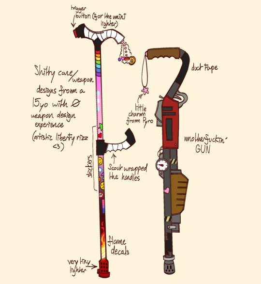
Hopefully these cane personalisations don't look too weird?? I have no idea where I was going with Pyro tbh, I think I was trying to make it a mini lighter but kinda failed miserably :')
Edit: FUCK, YOU SAID CRUTCH NOT CANE I'M SO SORRY I GOT IT MIXED UP
#tf2#team fortress two#my art#tf2 pyro#tf2 engineer#mobility aid#disability#canes#cane user#ALSO FRIENDLY REMINDER THAT I AM REALLY BAD AT TRYING TO DESIGN WEAPONS THAT MAKE SENSE SO IM SORRY IF THIS MAKES NO SENSE#plz correct me if the cane designs are incorrecting any way!#THANK U @waltzfantasia for correcting my cane lengths in ny last drawing!!#i looked at the drawings again and tbh u are so right bestie I drew the canes WAY too short#thanks for telling me tho- love you <3#disabilitymercs
985 notes
·
View notes
Text


20250309
♡ After toiling for the whole entire February and wrestling with html/css, I finally made a Neocities webpage through brackets! I cannot believe I really did that (my coding background is WEAK). Although I'm still fixing some minor details (such as putting in my socials and fixing favicons/symbols), I am ready to show you all what I got. I'm gonna create separate posts for other standout pages I made, so stay tuned for that! All my credits for different items can be found in the resources tab of my website. Feel free to leave something in my guestbook (homepage).
You can go to my website through this link:
threecheersforsuccess.neocities.org
It's on everything I like and care about. You're gonna see my journals, word vomit on my premed journey, lots of Sanji, Nikki outfits galore, etc. I just went all out as much as I could.
#pink#pinkcore#web design#old web#vstudies#indie web#neocities#geocities#it's really not user friendly#big disclaimer there lol#reentry#pastel#pink aesthetic#studyblr
9 notes
·
View notes
Text

not sure what the hypothesis is and idk what it’s like for kids these days but just weighing in if you grew up using macs in the 00s your tech problem solving skills got honed bc nothing on planet earth was compatible with your computer. so you had to spend hours researching and figuring out the sketchiest shit recommended by guys on niche forums all so you could play some stupid game your friends were playing on the worst emulator ever
#what problem solving skills do you develop when everything is designed for your device#p#i imagine the gap is much less of a problem these days but like across the board#user friendliness has increased dramatically and everything is more limited
14 notes
·
View notes
Text

Affinity is giving everyone a 6-month long free trial here to use their software - even people who've registered for a trial in the past! You can use your same email and get a brand new trail period.
I'm not yet familiar with Affinity Photo and Publisher (the alts for Photoshop and InDesign) but I've already been using Affinity Designer (alt for Illustrator) for months and it is FANTASTIC. I consider it more streamlined and easier to get used to than Illus so I highly recommend it as a vector and design tool.
Best of all, it's a one-time purchase if you decide you want it.
#affinity#adobe alternatives#affinity designer#affinity photo#affinity publisher#seriously underrated#but I'm glad they're getting more love#let's hope their practices remain user friendly and ethical
33 notes
·
View notes
Text
Anyway for work I'm checking the ancient-ass links in this Excel document from *checks metadata* 2006 and can I just say if nobody else has got me I know the Wayback Machine has got me.
#some of these are still extant :3#love the old web design. love the user-friendliness of these glossaries that are old enough to vote#and no cookie permissions to deny...
7 notes
·
View notes
Text
sewing machine rant because im mad as hell. fucking singer man. my mom got me a new shiny singer heavy duty 4423 because my old machine jammed out of nowhere and i was told fixing it would be more expensive than just getting a new one. my mom got the old one second hand like 30 years ago and it had minor issues the whole time but until it jammed it served me perfectly well enough. and more importantly when it did have minor issues most of them i could fix myself with minor effort.
enter singer, a famously well liked and respected brand. they're marketing this machine as "beginner friendly" and "easy to use" and all the research i did told me the same. now this might have been my own fault for apparently just sucking at doing research, i probably should've dug deeper or something, lesson learned i guess.
i'm not too active with sewing, i mostly work on some cosplays, and i was specifically marketed this machine to because apparently it "can handle difficult materials" and "is good for cosplayers". it worked fine for a few months, then i started getting issues with thread tension. nothing i tried with the top thread worked so the problem must be the bottom thread then. easy fix right? i sure as hell though so. i did had to check the manual cause my old machine had the bobbin on the side so this one was different than what i was used to. turns out the user manual only says "tension is adjusted correctly at the factory, you dont need to do anything". long story short i ended up adjusting it with the help of youtube and a lot of googling and it turned out fine.
now yesterday i was doing what i thought was basic maintenance on the machine, cleaning it and checking if it needs to be oiled and stuff. i took out the bobbin case and brushed away the frankly disgusting amount of lint and dust. when i was putting it back together i noticed the shuttle was hitting the needle. i took a video of it, went to the shop i bought the machine from and asked what does that mean and how can i fix it. i get told the timing is off and "this is why you shouldn't tinker with it yourself, you are causing issues". i was a bit offended ngl and said "i wasn't tinkering or trying to adjust anything, i was just cleaning out the lint and the dust". they told me sewing machines are delicate and that everything from the thread to the needle to the fucking position of the moon i guess can affect the timing and cause issues with the machine.
i went back to read the user manual cause surely there has to be something about basic maintenance right? RIGHT? like this is something my mom has drilled into me my whole life, i need to take care of a sewing machine or it will break. yea no, there is absolutely nothing on cleaning out the machine in the manual (note that i didn't even get a full manual with the machine, i had to google it myself). there is a troubleshooting page where it briefly says "clean out as advised/instructed" but nowhere does it actually advise anything. basically any issue that can't be solved with thread tension, a new needle or rethreading the machine apparently requires a professional. oh and if anyone who is not a licensed singer repairman does anything to it it's not covered by the fucking warranty.
so now i don't know if i do get it fixed by a pro do i have to pay something like 100€ because i made the mistake of thinking that i can access parts of the machine that they gave me a specific tool to access to. i also feel really fucking bad for not liking the machine cause my mom bought it for me specifically because i thought it'd be a good machine. like idgaf if i waste money on something that sucks, cause that's my own issue and my own fault but it was my parents' money.
also why did my moms old machine handle literally anything (except whatever made it jam i guess......) but i can't apparently breathe near the new one without breaking something. if i broke a needle in the old one i could just change it and continue but the singer apparently breaks from that too. any machine meant for use should be designed so it doesn't require absolute perfection to stay in working condition.
#im a student i dont have that kind of money#why is everything so non user friendly nowadays??#why is nothing designed to be easy to maintain anymore i hate capitalism i hate consumerism i hate the degrade of quality in technology#im gonna start fucking handsewing my shit or something im tired of this#anyway rant over thanks#im not expecting anyone to read the whole thing just needed to let it out instead of seething by myself#ramblings#sewing#cosplay
9 notes
·
View notes
Note
can you make a “This user kins Serial Designation V“ user box? :3 unless you already have ;U;
Here you go!! :3

!! Click for better quality !!
#requests <3#user box#userbox#editblr#no id#click for better quality#endo safe#anti endo dni#dni anti endos#endo friendly#Serial Designation v#murder drones#md#fictionkin userbox#fictionkin#fickin userbox#fickin#mediakin#kin userbox#otherkin userbox#otherkin#other kin
9 notes
·
View notes
Text
Exploring the Future of Smart Homes with Dreame!
Hello Everyone!
I'm excited to share my thoughts on the amazing advancements in the smart home industry, particularly with the brand Dreame. Their innovative products are truly transforming the way we manage our homes. One standout feature is the dust channel technology, which efficiently captures dust and debris, ensuring a cleaner and healthier living environment.
Dreame's commitment to quality and user-friendly designs makes it easy for anyone to incorporate smart technology into their daily lives. Whether it's through smart vacuums or home automation systems, Dreame is paving the way for a more convenient and enjoyable home experience.
If you're looking for ways to enhance your smart home setup, I highly recommend checking out Dreame's offerings. They are leading the charge in creating products that make our lives easier and more efficient.
Thank you for reading, and I look forward to hearing your thoughts on the future of smart homes!
Best regards,
Sent from my intuitive smart device!
2 notes
·
View notes
Text
i think factory pomo will always be my sweetheart aesthetic i just love the geometric stylings. i always used factory pomo style clip art in school projects i thought it was suuuch a cool style.
looking thru that website... memphis jr is also great, kind of similar geometric style with brighter colours. i even used to have the toy used as the example image, and for some reason images of LSD:DE are used as an example lol
#SILICON DREAMS IS THE ONE FOR EARLY CGI WOOOOOOOOOO💥💥💥💥💥#whimsicraft is also great ::-) crashbox is oke of the examples!! i do love the collage aspect there.#laser grid is a good one i see it a lot in computing magazines. not my fav but still good.#original nonsense#personal#FACKING AUTISM WIN USER FRIENDLY IS ONE OF THE EXAMPLE IMAGES FOR SILCION DREAMS!!!!!!!!!!!!!!!!LETS GOOOOOOOOOO!!!!!!!!!!!!!!!!!!!!!!!!!!!#!!!!!!!!!!!💥💥💥💥💥💥💥💥💥💥💥💥💥💥💥💥💥💥💥💥💥💥💥💥😊😊😊😊👍👍👍💖💖💖💖💖💥💥💥💥💥💥💖💖💖💥💥💥💥💥💥💥💥💥💥💥💥💥💥#whoa so is zap the magical computer....#i loooove utopian scholastic in conjunction with pc games you pick up a disc wit that design you Know its gonna Reek of the late 90s.#good stuff.#got that. kid friendly educational content while the use of white negative space and serif fonts felt vaguely professional like you#were engaging in adult behaviours. such as playing computer games.#i couldnt sleep thats why im up posting this sfuff wheeee[falls over forever#wait one more thought for now. how is there so little intersection between laser grid and cgi....#i would expect to see much more laser grid in early cgi since they both encapsulate early computing tech.#i can think of a few examples but not many... maybe ppl were just excited to move to other things. like textured planes.
11 notes
·
View notes
Text

🚀 Attention Business Owners!
Are you struggling with your WordPress site’s performance? 🖥️📱
Let The Big Shoutout help you optimize your website for lightning-fast speeds and top-notch responsiveness, especially on Google PageSpeed Insights for Mobile. 🔧✅
🎯 What we do:
• Boost your site speed
• Enhance mobile-friendliness
• Improve user experience across all devices
Don’t let a slow website hold you back! 💼💻
📩 WhatsApp us now: Click Here
👉 Get your WordPress site performing at its BEST!
#wordpress expert#website optimization#page speed insight#mobile friendly design#website speedboost#user experience design#web performance#seo optimization#local business growth#website consultant#web dev solutions#digital marketing#wordpress services#mobile optimization#fast load website
3 notes
·
View notes
Text
I'm trying so hard not to be a hater but the more I learn about other ttrpgs the more the way that people talk about dnd annoys me
#'it's great because of how versatile it is! You can play it however you want!'#this is true of every tabletop rpg#you are making up a game with your friends of course you can do whatever you want#if you're playing dnd by ignoring over half the rules then the rules are probably over-bloated for the kind of game you're trying to play#the fact that you are having fun is a testament to your group being good sports and roleplayers/having a good gm#it doesn't mean that dnd is particularly well designed for your group#and also dnd (even 5e) is not especially beginner friendly and its shitty corporate overlords want you to pay at least $150 to play it#but it's so entrenched in our culture and rhe community has put so much effort into making it as accessible as possible regardless#that it's so hard to get people to look past it#i promise you that whatever game you want to play whether it's social intrigue or combat or dungeon crawling in whatever genre you want#somebody has made it#and somebody has also made amazing games that you never could've imagined needing but maybe they're just right for you#I'm not saying dnd is poorly designed like there's obviously a lot of good things about the huge scope of 5e and its experience#if you like using all of those systems or having them on hand in case they come up in play that is so awesome#I'm glad you found the game for you#but it isn't the game for everyone! and acting like it is funnels more money and cultural capital into the hand of wotc#when we could be supporting small publishers and indie creators making sick niche shit#y'all heard about bluebeard's bride? you play as bluebeard's new wife wandering through the rooms of his house#just the one bride. the different players play different aspects of her personality and can get into arguments about what to do next#isn't that wild and cool?#okay rant over#a podcast man made me upset through no fault of his own#and i had to get it out of my system#my rambles#negative/#tma#d/nd#ttr/pgs#i have no idea if that tag thing actually works or if tumblr users made it up#i never want to put negative posts in main tags man. I'm not a monster
3 notes
·
View notes
Text
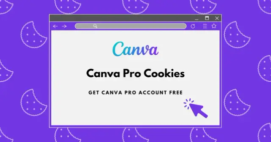
Canva is a user-friendly online design platform that enables individuals and businesses to create a wide array of visual content, including social media graphics, presentations, posters, and more. It offers an extensive library of templates, images, and fonts, making it accessible to users without prior design experience. Canva's intuitive drag-and-drop interface simplifies the design process, allowing users to produce professional-quality visuals efficiently.
Canva provides a free version that includes a substantial range of features suitable for most design needs. Users can access thousands of templates and a vast selection of photos and graphics at no cost. For those seeking advanced functionalities, Canva offers premium plans like Canva Pro and Canva Teams, which include additional tools, assets, and collaboration capabilities. These paid options are designed to cater to more complex design requirements and team-based projects.
#Canva is a user-friendly online design platform that enables individuals and businesses to create a wide array of visual content#including social media graphics#presentations#posters#and more. It offers an extensive library of templates#images#and fonts#making it accessible to users without prior design experience. Canva's intuitive drag-and-drop interface simplifies the design process#allowing users to produce professional-quality visuals efficiently.#Canva provides a free version that includes a substantial range of features suitable for most design needs. Users can access thousands of t#Canva offers premium plans like Canva Pro and Canva Teams#which include additional tools#assets#and collaboration capabilities. These paid options are designed to cater to more complex design requirements and team-based projects.
2 notes
·
View notes
Text
Exploring the Best Automatic Floor Sweeper: Dreame's Innovative Solutions
In the ever-evolving smart home industry, efficiency and convenience are key. Today, let's dive into one of the most exciting brands making waves: Dreame. They have positioned themselves as a leader in home cleaning technology, particularly with their range of automatic floor sweepers.
Dreame's automatic floor sweepers stand out for their advanced features and user-friendly design. These devices are not just about cleaning; they are about enhancing your daily life. With powerful suction capabilities, smart navigation, and a sleek design, Dreame's floor sweepers make maintaining a clean home effortless.
Imagine coming home to spotless floors without lifting a finger! Dreame's automatic floor sweepers are equipped with intelligent mapping technology, allowing them to navigate your home efficiently, avoiding obstacles and ensuring every corner is reached. Plus, with their app integration, you can control your sweeper from anywhere, schedule cleanings, and even receive maintenance alerts.
What makes Dreame's products even more appealing is their commitment to sustainability. Their devices are designed to be energy-efficient, helping you reduce your carbon footprint while keeping your home pristine.
In conclusion, if you're looking for an automatic floor sweeper to elevate your smart home experience, Dreame is a brand worth considering. Their innovative solutions not only simplify cleaning but also contribute positively to your lifestyle. Embrace the future of home cleaning with Dreame!
#app integration#efficiency#Dreame#powerful suction#user-friendly design#intelligent mapping#smart home
1 note
·
View note
Note
You can make the little drawing box bigger. I don't know how, I specialize in using Carrd, not strawpage. But, regardless. When I make one I'll figure it out.
i COULD scale it up yeah... but if i did i would no longer have room for the funny images on the side :(
#ask#nivi#the little designer in my heart is deeply conflicted#bc on one hand. margin space/visual design#on the other hand. user friendliness#i'll probs be tweaking the page as time goes on so. we'll see if i can resolve this dilemma
3 notes
·
View notes
Text
2 notes
·
View notes