#Watercolor Snow Scenes
Text
Christmas Snowglobes Clip Art Set Digital Art Scrapbooking ClipArt Watercolor Style Personal Printable Commercial Winter Snow Decoration
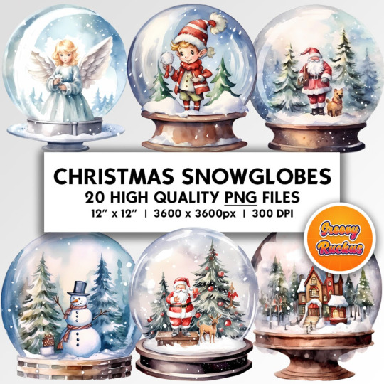
Step into a world of enchantment and tranquility with our "Snowflake Serenity" digital watercolor clip art, featuring charming Christmas snowglobes that capture the serene beauty of the holiday season. This collection brings to life the whimsy and wonder of snowglobes, offering a touch of magical elegance to your creative projects.
#Christmas Snowglobes#Watercolor Clip Art#Digital Art#Holiday Decor#Festive Designs#Snowglobe Illustrations#Seasonal Artwork#Christmas Collectibles#Watercolor Snow Scenes#Xmas Clip Art#Festive Snow Globes#Holiday Art#Winter Wonderland#Watercolor Painting#Christmas Art#Snowglobe Collection#Miniature Worlds#Watercolor Globes#Holiday Snow Scenes#Christmas Home Decor#printable#etsy finds#home decor#etsy store#digital prints#wall art#etsy shop#etsy#digital wall art
0 notes
Photo

A chill in the air.
2K notes
·
View notes
Photo
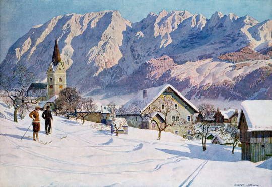
Mitterndorf in Austria, after an original watercolour by Gustav Jahn
#Gustav Jahn#Austria#watercolor#mountains#snow#snowy#landscape#snowy landscape#ski#skiing#church#freezing#winter#winter wonderland#trail#couple#scene#view#alps#alpine#alpen#berge#countryside#lila#violett#blue#aesthetic#art#artwork#kunst
24 notes
·
View notes
Text
Let It Snow!
For our prompt of “Mittens” today, I sketched a little mouse enjoying a snowy winter day. Christmas Eve and Day here ended up being much warmer than usual and rainy. It was the spitting kind of rain that never stops and just continues on endlessly. Our poor pup Elliott didn’t get to play outside, and we could only go on short walks instead. As Philippe and I sang Christmas carols together…

View On WordPress
#doodlewashDecember2023#WorldWatercolorGroup#Christmas#doodlewash#drawing#illustration#illustrator#mice#mouse#sketching#snow#snow scene#watercolor#watercolour#winter
5 notes
·
View notes
Text
Winter scene #2. Winsor & Newton professional watercolor on Arches 140lb cold press paper. White gouache stars and highlights.

#watercolor#watercolorart#watercolor art#watercolorpainting#art#painting#watercolour#watercolour art#watercolourpainting#winter#night sky#stars#moon#snow#winter scene#gouache
15 notes
·
View notes
Text
walking in a winter wonderland
10 notes
·
View notes
Text

Merry Christmas Everyone!
Watercolor by me (thanks to a youtube tutorial) and original sent to a friend for Christmas.
#The Ducky Life#Watercolor#Painting#Christmas#Cardinal#Snowy Scene#Christmas tree#Forest#Snow#merry chrismas 2022#merry christmas
8 notes
·
View notes
Text

Merry Christmas and Happy New years!!
Hope you had the merriest Christmas and cheers to the next year! Here's to much more art, Fandom appreciation and growth.
I did this as a thank you/Christmas card for a family friend. It was nice working with physical watercolors again.
#artgoob#watercolor#winter scene#watercolorart#winter cabin#christmas#winter wonderland#snow#snow covered#evergreens
2 notes
·
View notes
Photo
Braemar Village Winter Print - Cozy Home Decor (Print only no frame)
#Home Decor Print#Snow Scene Print#Snowy Village Print#Winter Cottage Print#Cozy Winter Print#Artistic Home Print#Watercolor Art Print
0 notes
Text
A Winter Scene in Watercolor
A Winter Scene in Watercolor
A watercolor winter scene that was created as a Christmas card. Watercolor is such a easy medium to create fast but effective images like this.

View On WordPress
0 notes
Text
Flight Rising flights but as art mediums:
There are some overlaps in mediums since dragons are so tight knit and far spread
Earth: tile work/mosaics, jewelry work, ceramics, stone sculpture, chalk, clay work, plaster, leather work, rain chains
Water: plaster work, woven tapestries, shell jewelry and chimes, pearl inlays, decorative sails and flags, basket weaving, sandstone carving, watercolors, mirrors and glass sculptures
Shadow: optical illusions, black and white photography, puzzle boxes, uranium glass work, maybe iron work, mycology arrangements, shadow boxes, gouache, anything that involves glowing in the dark
Light: stone carving and gold foiled painting, sometimes tapestry weaving to depict an image or scene, impressionism, oil paint, tempera, portraiture, clothing and attire, mirrors, pigment making
Plague: hyper realism, and taxidermy, ceramics, bone carvings, tattoos, ink block prints, collage art, murals, leather work, totems and large outdoor installations
Nature: floral arrangements, dye work, wood work, candle making, hot wax painting, landscaping, rain chains, wind chimes, tapestries, needle felting, carpentry, animal cosmetics (haircuts, animal safe dye, nail and claw painting, etc), apparel/clothing, pigment making
Ice: needle felting, wood carving, quilting, ice carving and sculpture, snow sculptures, knitting, the art of tea blends, dried plant arrangements, carpentry, fabric weaving, tapestries, crochet, wood burning, blanket weaving, candle making, dye work, wood turning
Fire: welding, decorative weapon smithing, glass blowing, wood burning, wrought iron, stained glass, latticed metal, terracotta, ceramics, obsidian and basalt carving, graphite, slate, charcoal
Wind: paper mache, ribbon mediums, basket weaving, sonorous sculptures, wind chimes, feathered attire, really tall and thin structures/sculptures, jade carving, blanket weaving
Arcane: resin, stained glass, welding, intricate silver work, collaborative neon work with shadow (they need that special eye for glow in the dark), crystal carving, zen gardens, bonsai art, screen printing, photography, illuminated manuscripts, clothing and apparel, gold foil work, abstract art
Lightning: bronze cast sculptures, sand sculptures (when lightning strikes the sand and turns it to stone) aluminum casts poured into ant colonies/hills, pop art, up-cycled art, photography, art that is still capable of being utilized and interacted with because people and dragons are part of the medium, assemblage art, banners and flags
#feel free to add your own this is all I could think of off the top of my head#you are also free to use this for lore purposes I’m just spit alling ideas#I understand music and writing are also artistic mediums but I was thinking tangible mediums#plus mysic and writing have their own categories and genres#fr#dragon#flight rising#flightrising#flight rising flights#flights#worldbuilding
158 notes
·
View notes
Text
Winter Wonderland Clip Art Set Digital Art Scrapbooking ClipArt Watercolor Style Personal Printable Commercial White Christmas Snow Scenery

Immerse yourself in the serene beauty and enchantment of winter with our "Snowy Wonderland Dreams" digital watercolor clip art, featuring breathtaking winter wonderland scenery that captures the magic of a snow-covered landscape. This collection transports you to a world of peaceful elegance, ready to add a touch of seasonal enchantment to your creative projects.
#Winter Wonderland#Watercolor Clip Art#Digital Art#Seasonal Decor#Snowy Scenes#Holiday Illustrations#Cozy Landscapes#Snowy Forest#Watercolor Painting#Winter Art#Seasonal Beauty#Festive Designs#Holiday Magic#Snowy Wonderland#Watercolor Landscapes#Christmas Art#Snow-Covered Trees#Winter Dreams#Watercolor Scenery#Seasonal Tranquility#etsy store#digital prints#home decor#wall art#etsy finds#printable#digital wall art#etsy shop#etsy
0 notes
Text
kai, untitled (scene in snow with dogs), 2001, Laquer, paper, watercolor, varnish 40 x 40 x 4.5 cm
70 notes
·
View notes
Text
TUTORIAL: How to Paint A Winter’s Night in Gouache
TUTORIAL: How to Paint A Winter’s Night in Gouache - #doodlewash #WorldWatercolorGroup #watercolor #watercolour
Today I’m here to show you how to do a painting is of a young boy and his dog wandering through trees on a snowy night. These instructions could be used for any night-time winter scene.
We’ll be using a dark-to-light, poster-style technique. All the colors will be added as broad shapes without fussing. Detail and adjustments will be done at the very last. (more…)

View On WordPress
#featured#gouache#Gouache set#Life Imitates Doodles#night scene#Sandra Strait#snow scene#trees#tutorial#tutorials#watercolor tutorial#watercolour tutorial
6 notes
·
View notes
Text
Yesterday I watched "Wish" - a new feature film from Disney.
I swear, if at least someone didn't tell me that it was true from Disney, I thought that a small studio was engaged in the project, which is just trying its hand. Or even a game, it would look much more interesting if it were finalized.
But….
Seriously?
They just stuffed "references" from Snow White, Cinderella and Pinocchio with a taste of Frozen Heart???
And made the main villain a slave in the mirror?
From the very first minutes, the thought did not leave me that the color palette looks like this…insipid. And not accented.
If you look at the colors of the previous cartoons, you will notice that a certain color composition, (I forgot what it's called, the key colors in the scenes?) it can perfectly convey the atmosphere and mood in the scene.
The main character just gets lost on different backgrounds because there are too many of the same blue colors.
The emphasis on the yellow star? Yeah, great. But otherwise, if it had been placed somewhere in the crowd and the saturation with brightness had been slightly twisted, no one would have noticed it.
And where the hell are the complimentary colors (opposite in color scheme) that work so well in the very first works? The same Alice in Wonderland.
Alice - delicate blue and light shades, lightness and lightness.
The Queen of Hearts- is black and red, looks heavy and domineering. Here's a sharp contrast for you visually.
What about Atlantis or the Treasure Planet?
Good down-to-earth colors, overlaid with darker ones. The color scheme is more suited to the concept that we are used to in reality. Here you cannot predict who will be the villain. There are no very pronounced accents throughout the cartoon, only in a couple of cases perfectly suitable for narration.
The colors are played superbly. They can still be disassembled as a study for artists.
Light and shadows, tone perfectly harmonize with each other.
But here everything went to the trash can.
If this pretentious and polished male magician in a cape is a villain, then do the balancing of the colors damn it. Give him a little background, not a couple of cheap songs written by AI. Show the more repulsive side that he is duplicitous, that he has the brains to hold power for so many years. That he is obsessed with his beauty and surrounds himself with mirrors to encourage his exorbitant ego.
The simplest solution is to take the main character and make an inventive/negative of colors!
If the heroine has soft pastel lavender colors. Add a couple of color accents for the Villain in the form of yellow or green flowers.
Goddesses for the sake of not so pastel and faded! If you don't have everything in the same watercolor light colors! You're not shooting Winnie the Pooh!!
Or show his luxury in power, richer ones. Make silver shades colder, sharper, making feel prickly and heavy.
Sorry, I got carried away with the visual component.
But I absolutely did not like this cartoon.
No visual, no narration, no songs.
#san talk#I miss the good old 2d animation so much#Klaus looks more luxurious at times than this next marketing spit from a mouse
23 notes
·
View notes
Text

Untitled watercolor, 19x27”
The assignment: paint a night scene on a full sheet of watercolor paper. The biggest challenges: preserving the yellow glow without making it look like yellow snow, and layering my dark colors so they aren’t totally opaque. I figured I had better share this one before winter is officially over!
#watercolor#watercolor landscape#landscape painting#winter painting#winter watercolor#night watercolor#painting#watercolor painting
14 notes
·
View notes
Last Seen Blogs

llbboozer
Tall Dark and Handsome
velleitee
Velleitea
lazyspeedster93
Slifer Slacker
👾🧩♟🃏🎲

luleli
Sin título
mlynar-nearl
"fear neither hardship nor darkness."