#Website Footer Examples
Explore tagged Tumblr posts
Visit Tumblr Blog
Explore Tumblr blogs with no restrictions, modern design and the best experience.
Last Seen Tumblr Blogs


Fun Fact
Users from the US are the majority of Tumblr visitors.
Text
Working on my javascript for my web page. Turns out I have the perfect kind of setup to accomplish some of the project requirements, specifically with even handlers and user interactions
My website, conceptually, will load a different employee details page depending on what employee name is clicked on. But I need to load it dynamically (instead of hard-coding it) so that the user can add or delete employees & it'll be able to still load the relevant shit.
So! Only one employee details page, but depending on how it's loaded, it'll load a different employee's information. Still working on getting down Exactly how to do it (I'm thinking using URL parameters that'll read a different object depending on what ID is used)
It's entirely doable. In fact, it's probably extremely common to do in web pages. No one wants to hard-code information for every new object. Of course not. And thus the usefulness of dynamic javascript stuff.
I can do this. I can very much do this.
#speculation nation#i wasnt very good when i got home and i read fanfic for a while#then took a nap. and now im up again and Getting To Work.#i dont have to have this 100% perfect for final submission just yet. bc final submission isnt today.#but i need to have my final presentation over my thing done by noon (11 hours from now)#and im presenting TODAY. and part of that will be giving a live demo of my project website#so. i need to have all of the core functionality of my website down at the Very Least#might not be perfect yet. but by god if im gonna show up to my presentation with my website not working.#i need to have the employee list lead to employee details with personalized information displayed per employee#i need to create an add employee field that will Actually add an employee. using a form.#and that employee will need to show up on the list and have a new id and everything. the works.#need to set it up so that employees can be deleted. shouldnt be too much extra.#and it would be . interesting. to give an actual 'login' pop-up when someone clicks on the login button#with some kind of basic info as the login parameters. this cant be that hard to code.#the project requirements are: implement 5 distinct user interactions using javascript. at least 3 different eventhandlers#at least 5 different elements with which interaction will trigger an event handler. page modification & addition of new elements to pages#3 different ways of selecting elements. one selection returning collection of html elements with customized operations on each...#hm. customized operations on each... the example given is a todo list with different styles based on if an item is overdue or not#i wonder if my personalized detail page loading would count for this... i also have some extra info displayed for each#but i specifically want the employees to be displayed in the list uniformly. that's kinda like. The Thing.#actually im poking around on my web pages i made previously and i do quite enjoy what i set up before.#need to modify the CSS for the statistics page and employee details to make it in line with what i actually wanted for it#maybe put a background behind the footer text... i tried it before & it was iffy in how it displayed...#but it looks weird when it overlaps with a page's content. idk that's just me being particular again.#theres also data interchange as a requirement. but that should be easy if i set an initial employee list as a json file#good god im going to have to think of so much extra bullshit for these 10 made up employees#wah. this is going to be a lot of work. but. im going to do it. i just wont get very much sleep tonight.#that's ok tho. ive presented under worse conditions (cough my all nighter when i read 3gun vol 10 and cried my eyes out)#and this is going to be the last night like this of my schooling career. the very last one.#just gotta stay strong for one more night 💪💪💪
6 notes
·
View notes
Note
Excuse me, if it's not too much trouble, I was wondering if you could give me some tips or teach me how to introduce myself as an author? I have a serious doubt about how to start this since I'm new to this.
Writing Notes: Author Profile
Professional Bio - (short for professional biography) is a summary of your background, including details like work experience and education.
Serves to introduce you to the reader, usually to establish your credibility and forge a personal connection, like a mini-cover letter.
You can use a professional bio across many mediums, from social media profiles to resumes to blog footers.
They can range from a few sentences to a few paragraphs in length.
How to Write a Professional Bio
Whether you’re applying for new jobs or making a website for your small business, you don’t have to follow a template to write a compelling professional bio. Here is a quick guide to help you in the crafting process:
Determine the purpose. To write a stellar bio, you’ll need to know the exact reason you’re writing it. Identify your target audience and desired outcome. Knowing your bio’s purpose will help you determine its length, necessary components to feature, the ideal point of view (e.g., first person or third person), and tone.
Tailor it to your needs. You can include a short, memorable bio in your portfolio materials, along with any credentials that show recruiters you are a great employee. When crafting a bio for work purposes, writing in the third-person perspective is optimal to help you stand out to hiring managers. You can also include a brief bio on your personal website’s “about page,” which can tell your story and show that you’re capable of serving your customers. This type of bio can help you form a confident, personal connection with your potential clients and is often written in a first-person perspective to sound more personable.
Begin with the most important information. Identify the most important information and include it in the first sentence of your bio. Usually, the first sentence of a professional bio will consist of your full name, your current position, and length of service in the role. Try to keep this sentence clear and concise so that it serves as a clear hook—a long, wordy, opening sentence can run the risk of confusing or losing your readers’ attention.
Add in previous professional experience. Once you state the most important information, add a few more details about your professional background—for instance, previous work experience, job titles, professional accomplishments, schooling, or technical credentials. Keep this section focused and specific (for example, limit yourself to two or three bullet points of personal achievements), or it may seem too braggadocious. If you don’t have a lot of previous experience yet, mention a specific detail or two that shows your capabilities within the field.
Include personal details about your life. Your bio can include information outside of your personal work history. Some people list hobbies, personal interests, fun facts, or pets in their bios to show their personality.
Tips for Writing a Professional Bio
When writing your bio, here are a few tips to keep in mind:
Focus on vital information. The best bios include essential and interesting information. A biography weighed down by extraneous details can become dull or bury critical details. Your bio’s optimal length will depend on its purpose, so consider that before you begin the writing process.
Consider adding links or handles. In situations where you want readers to find you online or contact you, consider adding links for your website or professional social media pages at the bottom of your bio. Linking is especially common in biographies that accompany a writer’s byline on an online blog post.
Maintain a few different bios. Maintain a few different versions of your bio ensures that you’re ready for any situation that requires one. A three-sentence professional bio, a casual or humorous bio, and a more extended bio are all good options to have on-hand.
Profile - a written portrait of a person.
Often, a profile is published as a narrative non-fiction article in a newspaper, magazine, or website.
The story is based on facts discovered through research as well as interviews with the subject and their friends, family, or professional associates.
A profile piece is meant to be informative. It is a portrait of the person through a combination of stories, quotes, and photographs.
Tips for Writing a Profile of a Person
Capturing the essence of a person through words takes good observation and writing skills. Follow these 10 tips to learn how to write a profile:
Read other profiles. To know how to write a profile essay, read how other writers do it. Find feature profiles in the New Yorker. You can also find personality profiles throughout The New York Times, particularly in the Sunday edition of the paper. Look for what information the writer presents about their subject. At the end of the piece, see if you have any lingering questions about the person to make sure you fill those gaps in your own story.
Do your prep work. When you know who the subject of your piece is, start doing some prep work. Research the person. If they’re well-known, it will be easy to find information online. It’s important to use reputable websites in order to find accurate information—this will also save you effort when you or an editor fact-check the article before it’s published. The second part of your prep work will be writing out the questions you want to ask your subject. After doing your research and have read other articles, ask questions other writers haven’t asked yet.
Create an outline. Before you get started, create an outline for your story. Use bullet points to highlight the main points you want to make in your article. You should also figure out the angle of your story. When a journalist writes a story, they have some kind of news angle to their piece—a focus that pulls the article together. This will help you determine what information you need to find out from your subject.
Interview your subject. When you write a profile, you’ll meet with your subject and interview them at least once but usually several times for a big feature story. Be prepared with your questions but also be ready to follow the natural flow of the conversation. Ask questions during your meeting that you think readers will want to know. Pose questions that will encourage your subject to tell a story. Ask them to share anecdotes. Avoid yes or no questions. You want them to open up. Make sure to record and transcribe the entire interview. As you review their answers on paper or on your computer, highlight the best quotes.
Observe your subject in their environment. When you’re writing a profile of somebody, you need to spend time with them on their turf. Your profile piece should capture them in their environment and allow readers to see their world. If you’re writing about a musician, you might meet them at home but also go to the studio with them to watch how they compose a song. Make several trips to become acquainted with your subject—it might take a lot of time for them to let their guard down and be themselves around you.
Start with a strong lede. As you gather your information and write your profile, you must start strong. Your opening line and paragraph, otherwise known as your lede, needs to capture the reader’s attention. You’re setting the scene for your article and creating a first impression of this person, so make sure you hook your readers from the start.
Incorporate direct quotes. While you’re crafting this piece with your own words, you need to show your subject’s point of view. Quote them extensively in this piece. As a general rule of thumb, try to use a few quotes for every topic you cover in the profile. It can be a good idea to let your subject have the last word and end with a quote. On top of the subject’s quotes, you’ll be interviewing others who know this person, like friends, family, and associates. Their stories can contribute interesting information to your piece.
Tell a story. Like any other piece you write, good profiles have a beginning, middle, and end. Use a narrative writing style. Use descriptive language. Your subject is your main character, so develop them for your reader. Include any interesting tidbits and background information about their life, like obstacles they’ve overcome. This will help illustrate what motivates them.
Reveal new information. Write a unique, great profile that gives the reader fascinating takeaways about the person. If you’re writing about someone famous, they’ve most likely been interviewed before. Find additional information that hasn’t been published that makes them more compelling to your readers and gives your story a unique approach. If you’ve crafted great questions, you’ll be able to uncover fascinating information about your subject’s life.
Show, don’t tell. Many profile articles will include the writer’s experience of meeting their subject and conducting the interview. In that case, you’ll write the story in first person, including yourself in the narrative. Describe the experience using sensory details of the person and their environment. Capture what the person is like in real life to let readers feel like they know this person.
Examples of a Professional Bio
Here are a few short professional bio examples that work to establish the writer’s credentials and paint a picture of their professional identity:
Marketing bio: Sylvia Johnson has served as the director of marketing at Hardy & Jones International for four years. Previously, she ran the communications department at Marketing Incorporated and coordinated a team of copywriters at The ABC-Scribe Organization. She has a master’s degree in business administration from Great University and still cheers on its basketball team. In her free time, she enjoys hiking and photography.
Arts and entertainment bio: Adam O’Hare has a bachelor’s degree in art history from Great University. During his studies, he completed a one-year internship at the Museum of Art, where he led guided tours and spent time designing an all-new organization system for the archives. When he’s not enjoying works of art, you can find him at home spending time with his two dogs, Rembrandt and Picasso. Adam can be reached at ______________.com.
Entrepreneur bio: My name is Rachel Smith, and when I was four years old, my mother found me sneaking Brie cheese out of the fridge—it’s safe to say that I’ve always been passionate about good food. I went on to work as a sous chef in several Houston-area restaurants before getting my master’s degree in food science. After many years of cooking and eating in the city, I became frustrated that there wasn’t a reliable place to shop for high-quality ingredients near my home. That’s why I founded Rachel’s Food Company, an organization dedicated to helping you find the top-shelf ingredients you need in the kitchen.
Sources: 1 2 ⚜ More: Notes & References ⚜ Writing Resources PDFs
Hi, this is perfectly fine! Here are some tips and notes from a couple of sources I found. So it depends on where you're posting/using your author introduction to help you determine how formal you want to be, what types of information you'll include etc. Definitely look at examples of your favourite writers' own author profiles as well to give you more ideas. All the best with creating your intro!
#anonymous#writing tips#writeblr#writing reference#writers on tumblr#spilled ink#dark academia#writing prompt#creative writing#literature#writing inspiration#writing ideas#writing resources
71 notes
·
View notes
Text
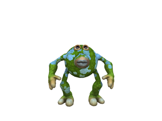
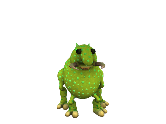
comic book creator research again (part 1, part 2, part 3)
resuming the misc creatures and continuing with named ones
- misc_13, was also in the wallpaper footer thing but not much else to note here


-
misc_14


the eyes definitely look very weird, otherwise this was also in the website under Guy1.gif
-
misc_15. also was in the footer thing but most of these are


-
misc_16. its ape! the eyes are remarkably red but thats it


it looks straight up the same otherwise, even the arrangement of the paints aside from the torso

it might also be aepox, which differs in the front limbs being further apart from each other, and differently sized eyes
-
misc_17 actually uses a paint from final (ce_skinpaint_theme_stanford) but i dont know why the accents are this green blue. i dont THINK theyre meant to be


-
misc_18, actually seems to have barely visible wings but theres not much to note otherwise


-
misc_19 which is Guy2.gif on the website!


-
misc_20 is the final misc creature. its rather interesting looking


theres yet more of these creations that didnt get in here it seems. Guy3.gif isnt one of the misc creatures for example. however it DOES seem to be rendered differently so maybe itll crop up

-
now resuming the normal creatures with mooseybun


this one was also in the fankit as Creature_Render_6.png. these are actually much higher quality in the fankit

-
mortlidge. not in final, not much to say here


-
nog


yup they only changed the colors (even then barely, and that might look different because of the lighting) but it still has the same paints

although curiously the paints dont cover the foot anymore
-
then theres the "other" folder which is full of cropped images of all of the misc creatures, nothing new in there so im not delving into it
pearl


actually this confirms these renders are older than the test drive screenshots of the misc creatures! look at the eyes! this is from when the neo-teeny eyes were just black orbs with eyelashes, in the test drive screenshots weve already seen it with a proper iris and pupil (if differently colored from final). also its beak is colored weird
and it kind of looks like chuchoko

9 notes
·
View notes
Text
Mini React.js Tips #3 | Resources ✨

Continuing the #mini react tips series, its components making time~!
In React, a component is like a Lego brick for building websites or apps. It's a small, independent part of the user interface (UI) that you can reuse whenever you need it. These components can be combined to create bigger and more complex applications. Examples are the header, footer, cards, asides, etc!
What you'll need:
know how to create a React project >> click
know the default React project's file structure >> click
know basic HTML
know basic JavaScript
basic knowledge of using the Terminal

What We Are Creating:
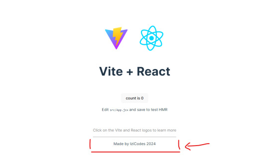
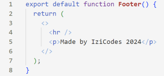
The footer at the bottom!
[ 1 ] Navigate to the 'src' Folder: Open your project in Visual Studio Code, locate the 'src' folder, and right-click on it.
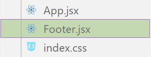
[ 2 ] Create a New File: Click 'New File' to create the file within the 'src' folder. This file will house the code for your React component.
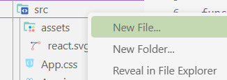
[ 3 ] Naming Conventions: Give your component a name, according to the convention of starting with a capital letter. This naming convention is essential for React to recognize your component~!!
[ 4 ] Create The Initial Function: Open the file and type:
export default function [name of component]() {}

[ 5 ] Insert The return() Statement: The statement is used within a component to specify what content should be rendered when the component is invoked or used. Type:
return()
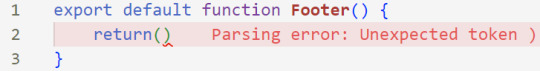
*the error is there because we haven't added anything inside yet, don't worry!
[ 6 ] Insert The Empty Tags: Inside of the return(), add empty tags (tags that don't have a specified element inside of them).
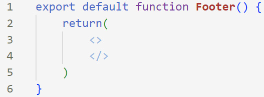
[ 7 ] Time For Some HTML: Inside the empty tags, enter the normal HTML elements that you want~!
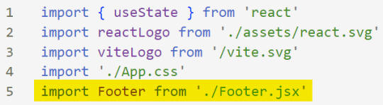
[ 8 ] Integration with App.jsx: Navigate to the 'App.jsx' file in the project, which is typically the entry point of your React application. At the top, import your newly created component. Type:
import [name of component] from './[location of the component]'
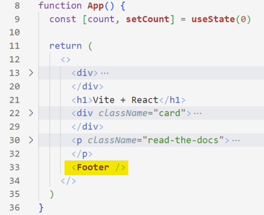
[ 9 ] Use Your Component: Inside the return() statement of the 'App()' function, include your component using the following syntax:
<[name of your component] />
[ 10 ] Run the Development Server: Start your development server with the command (the 'Local' link):
npm run dev

[ 11 ] Preview Your Project: Open the link provided in your terminal in your web browser. Witness your component in action!

Congratulations! You made your first component! Try and create some new ones and place them around in the App()~!
BroCode’s 'React Full Course for Free’ 2024 >> click
React Official Website >> click
W3School's React Components >> click
Importing and Exporting Components >> click
🐬Previous Tip: Tip #2 The anatomy of the default React project >> click
Stay tuned for the other posts I will make on this series #mini react tips~!
#mini react tips#my resources#resources#codeblr#coding#progblr#programming#studyblr#studying#javascript#react.js#reactjs#coding tips#coding resources
33 notes
·
View notes
Text
Also, while I’m here, I would like to shout out a project I’ve been supporting on Patreon for a while. It’s a new Pokémon wiki / encyclopedia called Pokéos.
They are a Pokémon wiki that attempts to cover as many parts of the franchise as possible, from the games to the TCG to the anime.
However, what makes the difference in my eyes is their additional features.
All of the information you might want to find on a Pokémon’s profile is easily accessible and shown in a clear way, which is something I struggled with on other websites. But ALSO, my favorite thing mostly is, all of the additional contents. At the bottom of the page, you can see a lot of the art done for that pokémon, along with all of the forms it has ever had, including anime-exclusive forms, or the Stadium 2 color palettes! All done in the style of the render for Pokémon Home! It also includes all the beta content found for that Pokémon like sprites!
Check out Charizard for example! The early generation Pokémon are a great showcase of this!
Another really great feature of the website is the Forgottendex, which showcases all the Pokémon oddities, in the style of the Home renders! This includes stuff like that mongoose from the first season of the anime, the ghost of the Lavender Town tower, that weird squid thing from the manga, and more!
There is also a great feature for artists that allows you to host your very own fan-made Pokédex with your own Fakémon!
And that’s not even including all of the tools like the Dex tracker, the Shiny counter, the Team builder, the list of serial codes and events running right now, and everything else coming soon!
The only downside I’d mention is the loading times. The website seems to rely a lot on fetching things from an API, which can make loading take longer. Also, some of the CSS effects can take a toll on older devices, so i’s recommend turning off the visual effects in the footer.
I’m not being paid to share all of this, i’m just very satisfied with this website after supporting it for a while now, and I feel like a lot of people would really enjoy it! Especially those of us who, like me, LOVE the obscure stuff of the franchise (i’m obsessed with the Stadium 2 color palettes and weird little oddities haha!)
If you use it, please tell me your thoughts! :D
2 notes
·
View notes
Note
I just wanted to say thank you for giving the lesser known ones a proper chance. Some only take characters that get lots of suggestions, which leads to mostly the same characters over and over unfortunately (I won't tag the ones I have in mind as I don't want them to get harassed but people have probably seen some of them themselves). So I'm very happy that they get their chance to shine here and possibly get people interested in them..!
And if it's okay; to voters, rather than getting upset that the characters you are curious about aren't available in English and ignoring it or sending lots of messages to the creators who can't do anything with the situation. So may I suggest filling in the survey over at Seven Seas Entertainment:
https://sevenseasentertainment.com/
(near the footer)
One can also tweet at publishers one like, but I don't know how powerful this is anymore after the website was... Corrupted for lack of better words. Messaging on Instagram could work, maybe.
If you want/can, can you mark those not published/printed in English yet with 📖 for novels (Royalty Witches, Mystical, etc.) and 🗨️ (Ragnarok, Gryphoon, MiniMonsters, The World God Only Knows, Soluna, etc.) for manga, graphic novels, and comics (given that's how things are sorted in the survey. You can't suggest games and shows there though, although Limited Run and Fangamer might listen for games (although most games are region free now 💕) . Diskotek Media can work for shows maybe. I also recommend putting in things as "[story] by [author]" to make them easier to find. So for example Phenomena by Ruben Eliassen (📖), Ragnarok by Odin Helgheim(🗨️) I know it's tagged wrong on booksfromnorway.com, keep in mind that not all Norwegian books are there and the ones that are, have their titles translated, but it's mostly right about which has been licensed of the ones there), etc. As some titles can be rather generic. Other countries probably have websites like that but I do I know a mangafansite that has some information (mangaupdates.com, but it's far from perfect and has some creeps). But yeah, maybe if we work together, maybe more will get licensed! As most of the creators deserve to have their works published around the world!
Thank you for your time! 💕
I definitely use submissions to gauge which characters are more popular, but I don't think it's fair if you guys submit someone who will never make it into a poll. This sounds so cool!
2 notes
·
View notes
Text
Short Term Loans UK Direct Lender - Card-Free Loans Available Anytime

If you are running low on funds but need to make some urgent payments before payday. On the other side, you don't have a credit card to give to the lender. Don't be concerned! You are encouraged to apply for short term loans UK direct lender without a bank card without hesitation. As the name implies, you can get money whenever you want and when you need it the most.
The fact that your poor credit score, such as defaults, arrears, foreclosure, late payments, missing payments, due payments, CCJs, IVA, installment skipping, or even bankruptcy, can benefit from the mentioned short term loan at any time. The reason for this is that loan lenders do not conduct credit checks.
However, there are certain specific criteria to qualify, such as being 18 years old, a UK resident, a permanent employee with a secure job, and having a current checking account at the moment you wish to use short term loans UK direct lender. To get instant cash decision, fill out a simple online application form with required information and submit it on the website. After finalizing your application, your cash will be deposited into your bank account on the same day.
With every loan application, including a short term loans direct lenders, you must ensure that your lender or broker is trustworthy and reliable. They must be authorized and regulated by the Financial Conduct Authority (FCA). To be certain, you can look up the lenders or broker's trading name on the financial conduct authority's website. The registered office address should be included in the footer of direct lenders and brokers as well.
Short Term Loans UK Facts You Should Be Aware Of
Loans come in a variety of shapes and sizes. While it is possible to obtain a loans for as little as a month (a short term loan), many loans can extend for years. A short term loans UK may be the best solution for some people. It can assist customers in spreading the expense of the loan over several years - 24 months, 36 months, or longer - by providing affordable repayment terms and the opportunity to finance a greater purchase.
Short-term loans are sometimes used to refinance debt over several years. A short term loans direct lenders, for example, could assist pay off an existing loan at a lower interest rate. This is known as debt consolidation. Some consumers choose to spread the expense of a credit card debt over a year or more, for example, by exchanging it for a loan.
The most important thing to do before taking out any same day loans UK is to educate you as much as possible about them. Make certain you grasp the benefits of same day loans direct lenders. You are responsible for making the monthly installments as well as repaying the total amount owed. Short term loans UK direct lender may be what you're looking for if you're looking for a loan. You can learn more about them by clicking here.
https://paydayquid.co.uk/
#Short Term Loans UK#Same Day Loans UK#Short Term Cash Loans#same day payday loans#same day loans online#short term loans#same day loans
4 notes
·
View notes
Text
What is HTML5 and its uses?
HTML5 is the latest version of HTML, which is the standard markup language for creating web pages. HTML5 was released in 2014 and has since become the most widely used version of HTML. HTML5 includes many new features and improvements over previous versions of HTML.
New Features in HTML5
Here are some of the new features in HTML5:
Semantic elements: HTML5 includes new semantic elements such as <header>, <footer>, <nav>, and <article>. These elements provide more meaning to the content of a web page, making it easier for search engines to index and understand the content.
Multimedia support: HTML5 includes built-in support for multimedia elements such as <video> and <audio>. This makes it easier to embed videos and audio files into web pages without requiring third-party plugins such as Adobe Flash.
Form validation: HTML5 includes new form validation features that allow developers to validate user input without requiring JavaScript. This makes it easier to create forms that are more user-friendly and accessible.
Canvas: HTML5 includes a new element called <canvas>, which allows developers to create dynamic graphics and animations using JavaScript.
Uses of HTML5
HTML5 is used for creating a wide range of web applications and websites. Here are some examples:
Responsive web design: HTML5 provides many features that make it easier to create responsive web designs that work well on different devices such as desktops, tablets, and smartphones.
Mobile apps: HTML5 can be used to create mobile apps that run on different platforms such as iOS, Android, and Windows Phone. This is done using frameworks such as Apache Cordova or PhoneGap.
Games: HTML5 can be used to create games that run in a web browser without requiring any plugins. This is done using frameworks such as Phaser or PixiJS.
Web applications: HTML5 can be used to create web applications that run entirely in a web browser without requiring any server-side processing. This is done using frameworks such as AngularJS or React.
Here are some resources that can help you learn HTML:
W3Schools: W3Schools is a popular online learning platform that offers free HTML tutorials. Their tutorials are designed for beginners and cover everything from the basics to advanced topics .
MDN Web Docs: MDN Web Docs is another great resource for learning HTML. They offer comprehensive HTML tutorials that cover everything from the basics to advanced topics .
e-Tuitions: e-Tuitions offers online classes for HTML coding. You can visit their website at e-Tuitions to book a free demo class.
Codecademy: Codecademy is an online learning platform that offers interactive HTML courses. Their courses are designed for beginners and cover everything from the basics to advanced topics .
In conclusion, HTML5 is the latest version of HTML and includes many new features and improvements over previous versions. It is widely used for creating web applications and websites, including responsive designs, mobile apps, games, and web applications.
2 notes
·
View notes
Text
What is Better for Your Business: SEO or Digital Marketing?
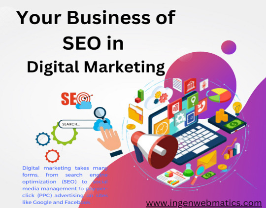
SEO and digital marketing are closely related, but they’re not quite the same thing. Digital marketing takes many forms, from search engine optimization (SEO) to social media management to pay-per-click (PPC) advertising on sites like Google and Facebook. Together, SEO and digital marketing help businesses maximize their visibility and engagement with potential customers, which leads to increased sales, subscribers, and foot traffic in the door. So which one is better? Search engine optimization (SEO) and digital marketing are both important parts of online business marketing, but what’s better? Which method should you use to help grow your business? The answer depends on the stage you are in right now as well as what your ultimate goals are. Read this carefully to know in detail.
On-page tactics
To be found in search engine results, you need to optimize your website for Search Engine Optimization (SEO). These are tactics that are done on your website to make it rank higher on search engines. It can be as simple as creating an about page on your site and filling it with keywords and phrases that people will search in the search bar.
Advertisement
In addition to SEO, you should also invest time and resources into Online Marketing (OM), which is all the marketing done over the Internet. OM can include social media promotion, email marketing campaigns, influencer relations, and more. OM includes Search Engine Optimization so these two terms overlap a bit but OM doesn’t always include SEO as part of its strategy. For example, if you’re looking for someone to write blog posts for your company blog then SEO is important because blogs depend on Google searches.
On the other hand, if you want to promote a coupon code online through Twitter then Online Marketing might be best because Twitter does not affect SEO rankings while still promoting content across many different platforms. Online Marketing is better when you’re looking to get a quick burst of traffic to your site. SEO, on the other hand, is more effective long term because it requires less maintenance and will help keep visitors coming back month after month. You’ll have a steady stream of revenue throughout the year instead of just one short burst. In short, they both work well together, but one isn’t necessarily better than the other.
Link building tactics
Link building is a great way to improve your SEO and get more traffic to your website. In addition, it helps you rank higher on search engine results pages. Link building isn’t hard, but it does require some time and effort. The first step is determining which websites are relevant to your industry or topic. You can find these by using the Google Search Console Tool – an invaluable tool that will help you identify any websites linking to the competitors that aren’t linking back to you yet. Next, reach out to them via social media and email; use call-to-actions like Hey, I noticed you linked back to our competitor instead of us.
Can we swap links? In this message include where they can find your link (e.g., in the footer of your homepage). Be sure to follow up with those who don’t respond on time. To increase the chances of getting a link, include keyword-rich anchor text when possible. Finally, be persistent!
When done correctly, link-building can have a significant impact on your digital marketing efforts and performance. It not only increases your rankings in search engines but also helps gain recognition from influencers in the industry. If you’re not prepared to put some time and effort into reaching out to influencers, then focus on other digital marketing strategies such as content creation and social media management.
These two strategies work together to create brand awareness and drive traffic to your site. They also make it easier for people to find you online. However, if you want a little bit more guidance with your strategy, consider hiring an experienced marketing consultant. Doing so could prove extremely beneficial because consultants have the expertise needed to effectively execute campaigns through all avenues of digital marketing – including content marketing, social media management, paid advertising etcetera. Keep reading to know more in detail.
Content marketing tactics
Which marketing tactic is better depends on what you’re looking to get out of it. For example, if you want to increase your site traffic, then search engine optimization (SEO) might be a better option than digital marketing.
If you’re more interested in increasing sales, then digital marketing would be the best bet. Social media platforms can be great ways to boost brand awareness and encourage customer engagement. So, should you focus on social media marketing or SEO? It all depends on your goals and objectives.
If your goal is to build a large audience for an upcoming product launch or event, then social media marketing might be the way to go. On the other hand, if you aim to rank higher in Google’s organic rankings, then SEO may be the most effective strategy. Ultimately, you’ll have to figure out which avenue best suits your business needs and resources. What are you trying to achieve? What has been successful for your competitors in the past? Who are your target audiences and how do they typically engage with content that they find valuable?
These are just some of the questions that need answering before settling on a marketing strategy. The answer will depend on your company and its objectives. There is no one-size-fits-all approach. Experimentation will always be necessary. You never know until you try! A combination of both SEO and digital marketing could work well depending on the type of business you have. Get creative!
Social media tactics
Don’t be afraid to experiment with social media platforms! You may find that you love Twitter, but find Facebook a waste of time. Not only will experimenting help you determine what works best for your business, but it will also show the people who follow your business that you’re open to change and willing to try new things. It’s also important to note that not all content is created equal- not everything needs to go on every channel.
Choose one platform where you want to focus and put most of your efforts into perfecting your content for this platform before branching out again. That being said, don’t forget about the other networks either; just because they aren’t as popular doesn’t mean they should get ignored! Just like in any other aspect of marketing, it’s vital to diversify your tactics.
A lot of digital marketers are finding success by implementing a series of micro-posts rather than uploading a single post once per day or week. Posting more often can lead to higher engagement rates due to the human tendency of reciprocity- if someone likes or comments on your content, we’re likely to do something nice for them in return.
Additionally, posting more frequently (even if it’s less than 10 times) can lead to a higher number of followers over time since these consumers see that you’re constantly sharing updates and staying active. Lastly, when crafting your message it’s important to keep in mind the differences between platforms. For example, Pinterest has a very visual aesthetic while Instagram is much more focused on imagery than text.
Though there are no hard and fast rules here and different approaches work better depending on what type of content you’re posting, always ask yourself will my audience appreciate this? before pressing send.
Paid advertising tactics
Marketing is never a one-size-fits-all scenario. What might work well for one company may not be the best fit for another. One of the most important parts of any marketing strategy is figuring out how to spend your advertising dollars so that they have the maximum impact on your business. To figure this out, you need to understand which type of advertising will give you the best bang for your buck. That’s where digital marketing and SEO can help – let’s take a look at each in turn. SEO stands for search engine optimization. When executed properly, it boosts the website rankings for targeted keywords in search engines like Google and Bing so more people are likely to find your site when they do an online search. It also helps with generating organic traffic by attracting links from other websites.
The benefits of SEO are substantial, but the downside is that these benefits don’t typically show up immediately. You could be looking at a 12-month timeline before you start seeing real results from SEO efforts alone. The best way to get started with digital marketing is by creating social media profiles for your business and then investing in paid ads such as Facebook Ads or Google Adwords campaigns. These platforms allow you to create compelling ad copy targeting specific demographics and interests who are likely to become your customers. They also allow you to set goals such as clicks or engagement rates, allowing you to monitor success rates easily over time.
The advantage of digital marketing is that the ROI (return on investment) often shows up much quicker than with SEO because there’s no waiting period involved in producing measurable results. The disadvantage is that the costs of digital marketing can add up very quickly – especially if you invest heavily without knowing what works and what doesn’t. SEO takes longer to produce tangible results, but it offers a sustainable long-term approach to building customer loyalty and trust through quality content.
The key takeaway here is not about choosing one option or the other – both approaches offer advantages and disadvantages, meaning that every company needs to weigh them against their own needs to decide which suits them best. If you want to see quick results in your ROI, go ahead and explore options like Facebook Ads. If you’re able to spend a little more time and money upfront, put your energy into finding a top-tier SEO consultant who can guide you along the process of making your website rank higher in search engines.
Video marketing tips
Video marketing is a great way to get your message across and in front of more people. Studies show that videos can increase your viewers by up to 300%. Here are some tips on how you can start video marketing today.
1. Create a video with a call to action at the end. This is a great way to encourage viewers to take an action like signing up for an email list, following you on social media, or buying something from your store. Make sure that whatever you ask them to do has value so they will be likely to act on it.
2. Promote your video everywhere possible! You want as many people as possible to see it. Share it on social media, put links in your blog posts, send out emails with a link back to the video and post it on any other websites you may own or have access to.
3. Include subtitles in other languages if applicable.
4. Use captions instead of subtitles if possible because captions make it easier for hearing-impaired individuals to watch your video.
5. Incentivize viewers to watch your entire video by including quizzes, polls, surveys, and games related to the content throughout it. They will then feel rewarded when they finish watching it.
Remember to include a call-to-action near the end again so they know what you would like them to do next. Even after all this, there are still tons of other ways you can promote your video such as paying for advertisements. Hopefully, these five tips help you get started with video marketing!
Conclusion:
You might think that SEO and digital marketing are interchangeable terms, but they’re different processes for accomplishing slightly different goals. While both can help to improve your search rankings and attract new clients, it’s important to know the differences to decide which strategy will work best for you. In this guide, we have looked at the unique features of each service, so you can choose what’s better for your business: SEO or digital marketing. So, this guide is worth reading!
Source: What is Better for Your Business: SEO or Digital Marketing?.
2 notes
·
View notes
Text

Friendly reminder to suggest any foreign stories you may find interesting into Seven Seas Entertainment's survey (on top of the PC page and near the footer of the mobile page) or any publisher survey you may know about.
Including to Royalty Witches📖 above do I recommend:
(I recommend writing [book] by [author] or pasting the urls to make them easier to find. Those marked with 📖 are "regular" novels, those marked with 🗨️ are comics/graphic novels)
Phenomena by Ruben Eliassen. Started coming out in the same time as hp but doesn't have its flaws (casual racism for example). The heroine is an aroace lesbian elf with frost powers, this in the "boyfriend of the week" in many tv-shows. The story is about her and her twin brother being chosen to save their people from slavery, how much of a burden this is when put onto children, and their growth from 10 to 17. The author has promised to add a non-binary character to book 9 (as of book 8 he's self-publishing. His abusive ex has given him a lot of debt, so please support him! He and the story are amazing!)📖
Dragens Øye by Cha Sandmæl/@cha-c-san. Non-binary author and non-binary main character. Aside from what's mentioned in the link, they later get a buff girlfriend. There's also gay and bi characters. 🗨️
Ville Poter by Victor Nordal. Trans author and those foxes are gay. 🗨️
MiniMonsters and Dinokid by David Ramírez. A mlm comic artist who who posts lots of trans support things. MiniMonsters is about the shenanigans of a group of monster kids. Dinokid is about some kids gaining the abilities to transform into various creatures, one of them gains the ability to turn into whoever the kid wants, and choses to become a girl, she's instantly accepted.🗨️
Soluna by Camilla Dahlstrøm. One of the main characters is a gay ace trans man and his sister is arobi. 🗨️
Mørkalven by Helen Kaldheim/@helipeach. Has 2 trans characters, one of them a main character.🗨️
Edelmot by Victor Sotberg and Odin Helgheim (Ragnarok🗨️ by Helgheim is even better in my opinion but this is about stories with lgbtqia+ characters, Ragnarok has no focus on romance so who knows). The main character is bi and gets a boyfriend in the second volume, they even kiss 🗨️
IS - Otoko Demo Onna Demo Nai Sei (IS 男でも女でもない性) by Chiyo Rokuhana. About intersex people. The first volume is a anthology but the rest is about Hoshino Haru, who is trans masculine and eventually falls in love with a guy (and no "falling for him makes me feel like a girl"), and he meets many different intersex people who feel different about it. 🗨️
Forbi Stjernenes Port* by Benedicte Luane Kristensen and Sam Einar Engh Syftestad. Syftestad is non-binary and the heroines are implied to be crushing on each other, and some of the characters also appear to be poly. As the website isn't translated, the story is about Paprika who finds an alien who crashed onto her planet and brings her home. The alien Kabaiel is there to find the starry gates to find an energy source to save her planet. It's an adorable sci-fi! 🗨️
Goshiki no Fune (五色の船) by Yasumi Tsuhara. Alternative universe set during WW2. About a group of 5 "freaks" who put on freakshows to earn for a living. One of them is a trans woman who had to have both of her legs amputated due to gangrene. Their love for each other and their conflicting pride for the attention yet shame they try hiding even from themselves. 📖
Saiki Kusuo no ψ nan (斉木楠雄のΨ難) by Shūichi Asō. the anime is translated, not the manga. The protagonist claims he was going to be born a girl but that felt wrong and swapped into a boy with his tremendous psychic powers. He's also strongly implied to be aroace, despite what parts of the fandom might tell you. 🗨️
Sket Dance by Kenta Shinohara. (for some reason they didn't renew it for the new website. Like with Saiki above, the anime is translated but not the manga and the anime isn't finished) A trans boy appears near the end and they accept him with open arms. If anything is he one of the more "normal" kids overall. 🗨️
* same editor contact person as most of the others, like Dragens Øye, but for some reason not on that website.


Already out:
Hunter × Hunter (a main character's little sister is trans and he loves her just as she is)
Dr. Stone (a character has unspecified gender and their boss is proudly bi/pan)
Gintama (needs a new and more accurate/respectful translation**, many gay characters and some trans, maybe a little crude by American people, but beloved by the lgbtqia+ community in Japan)
Boys Run the Riot (made by a trans man. About a trans boy's journey to self-acceptance and he befriends an X-gender who realises they're bi after thinking they're only attracted men)
Our Dreams at Dusk: Shimanami Tasogare (author is X-gender and is about a group of lgbtqia+ people hanging out together)
Claudine (was as respectful and caring as a story from the 70s a few years after Japan's trans ban could be. It's a tragedy, so be warned)
Is Love the Answer (about an aroace young woman who who realizes that they might be x-gender)
Paper Mario: The Thousand-Year Door (charming RPG and one of Mario's partners is a trans girl, they accept that part of her straight away)
Zombie Land Saga (funny dark comedy, but one of the girls being trans is treated seriously and respectfully)
Otomen (at first it shows the dumb "man runs away to become a woman" cliché so I didn't give it a chance at first but later did, but when she actually appears she gets the love and care she deserves while not treating her leaving them as okay)
Already out (By friends of some of the authors in the previous list of ones that aren't out):
Snøkattprinsen
Oppfinneren
Nordlys
Ravneringene
** the translator swapped jokes with his own and made this very Japanese series very American.
Seriously. I'm starting to block y'all on sight it has been quite long enough of a campaign to get you weaned off this terf's books and shows (and now games!)
28K notes
·
View notes
Text
Ventorus Review and Website Analysis
When you see a modern website with flashy slogans like “Redefine excellence in every move”, it’s tempting to believe you’re looking at a reliable forex broker that cares about its clients. However, is that really the case? Or is this just another scam focused solely on its own interests? Interestingly, there are even positive reviews about Ventorus. Let’s dig deeper.
Ventorus.com Examination
The company’s website is visually appealing. It’s not a groundbreaking or entirely unique broker site, but it does stand out compared to many generic competitors. However, the drawbacks significantly outweigh the advantages.
The site heavily relies on images that seem to come straight from free stock photo libraries. A smiling man holding a smartphone, a helicopter with the company logo in mid-flight — these feel more like advertising clichés than the authentic attributes of a serious business. This type of design clearly targets beginners who are swayed by visual effects rather than substance. It’s worth noting that the images have no real connection to trading activities — they’re purely decorative.
In addition to English, several Asian languages are supported, which indicates the regions the company is targeting. The site includes links to social media, details about its legal entity in the footer, and a section for legal documents. However, some crucial information is missing, such as the company’s operational history and the names of its directors.

Company Contacts
Users have several ways to contact Ventorus representatives, including email, phone, live chat, and social media. A basic check of these channels didn’t reveal any issues — they all seemed functional. However, live chat is notoriously slow to respond, with some inquiries left unanswered entirely. The company’s social media accounts have almost no engagement. For example, the Instagram account boasts over 1,700 followers, but they’re clearly bots, as there’s zero interaction. This creates a false image of a popular broker that, in reality, is barely known.
Key Conditions
The first thing that immediately stands out is the broker’s attempt to extract as much money as possible from traders. This is evident from the account types. The better the account, the more money you need to invest, but in return, clients supposedly get more favorable trading conditions. Do honest and legitimate companies operate like this? No, they offer equal conditions for all users, regardless of deposit size.
Ventorus claims to offer STP order execution and zero commissions simultaneously. This means traders are supposedly paying only the spread, starting at 1 pip. How does the platform make money? It’s highly doubtful that such narrow spreads are profitable for the company. The truth is, there are no liquidity providers here, and there never have been. The STP claim is false. What you’re looking at is a standard dealing desk, where the primary source of revenue is client deposits. When traders lose money, the platform profits.
Exposing Ventorus
Now, it’s clear that the company benefits from traders investing and then losing their deposits. However, that alone isn’t enough to label the firm as a scam. To do so, we need to look at the legal address, licenses, and other aspects of its operations.
The platform is owned by an organization called Apex Mkt. First, they claim to hold a license from MISA (Mwali, Comoros Islands). Second, they list a legal address in Saint Lucia. Both of these claims are true. We verified both registries and confirmed that Apex Mkt is a legitimately existing organization.
When a broker is registered in Saint Lucia and boasts a license from MISA (Comoros Islands), it should immediately raise a red flag. Why? Because these jurisdictions are a haven for those who want to avoid strict regulations and oversight. Saint Lucia and the Comoros Islands do not require rigorous reporting, transparency, or any guarantees for clients. Companies choose these locations for a reason — there’s no one to stop them from doing whatever they please.
What Reviews Do Users Leave?
Another hallmark of scammers is fake positive reviews. Take a look at the Ventorus reviews. While there aren’t many, most of them are overwhelmingly positive. This suggests that the company’s creators are fabricating feedback to attract unsuspecting traders.
It’s easy to spot these fake comments. Pay attention to their length and content. These are primitive reviews, offering no proof that the platform processes withdrawals. Most of these comments are just 2-3 lines long and lack substance.
Conclusions
Brokers like this are not reliable or trustworthy. While they may currently allow withdrawals, there are no guarantees they won’t shut their doors tomorrow. We strongly advise against taking such a significant risk and do not recommend Ventorus for trading.
1 note
·
View note
Text
How to add a custom code snippet to your WordPress site
While working on your WordPress website, you will find yourself needing to add a lot of code to your WordPress website, whether it is code for tracking tools such as (Google Analytics, Webmaster Tools, Heatmaps, Facebook Pixel, etc.) or PHP codes that make a specific modification to the template structure (Functions.php) or the plugin structure. Adding these codes will require you to be precise, and adding any code incorrectly may cause your website to fail completely. Also, if you do not have a programming background, this will increase the burden on you in adding these codes to your website. Since the WordPress system is primarily built on facilitating the management of codes, it is best for you to obtain an administrative solution that makes it easier for you to understand and manage these codes.
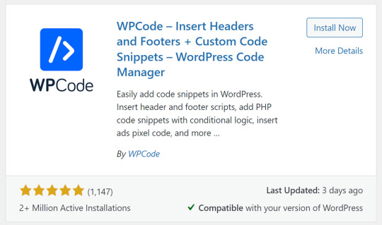
1- Adding custom code
You can rely on the Code Snippets plugin to insert, modify, or deactivate code without having to modify the site’s source code. First, you will install and activate the plugin on your website, as we explained in the method for installing and activating plugins on WordPress. You will find a new tab appearing in your website’s dashboard toolbar, through which you can add custom codes through: Snippets >> Add New
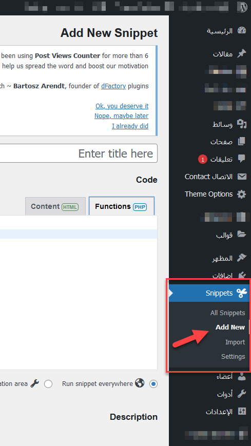
Add custom code through the Code Snippets plugin After that, you will be directed to the code editing page, through which you can add custom programming code and describe the code information as follows
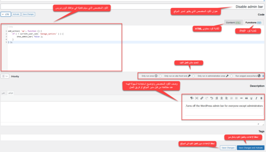
For example, in this illustrative image, I added the following custom code: add_action( 'wp', function () { if ( ! current_user_can( 'manage_options' ) ) { show_admin_bar( false ); } } ); and wrote the code title: Disable admin bar and in the code description Turns off the WordPress admin bar for everyone except administrators. This title and description are intended to make it easier for the site administrator or work team to know how to use these mechanisms, especially when you have a lot of custom codes activated within the plugin panel, you will be confused about knowing the use of each of these custom codes. Then you can click Save Changes to save the settings only without activating the code and applying it to the site, or click Save Changes and Activate to activate the code on the site and enable the function it performs. Then you can manage all the custom codes that you published on your site by going to: Snippets >> All snippets

Note: These codes are activated on your site, so if an unexpected error occurs on your site after activating a custom code, deactivate this code.
2- Add a tracking code to your site
Another thing that you will need and must do while managing your site is add tracking codes for different tools, such as Google Analytics, which you install to track the site and thus obtain the necessary statistics for the Google Analytics tool, or track the results of your marketing campaigns on the Facebook platform by adding the Facebook pixel, and the same applies to heatmaps, webmaster tools, or other tracking codes. Sometimes you need to add tracking code to all pages of your website to analyze all pages (as in Google Analytics), the tool you use to analyze your entire website. Sometimes you need to add tracking code to specific pages, as in Heatmaps, which analyzes specific pages (such as sales pages or registration pages), rather than all pages of your website. Adding Tracking Code to All Pages of Your Website If you want to add tracking code to all pages of your website, as in Google Analytics, the easiest solution is to add the tracking code to your website’s header. The header appears on all pages of your website. Some WordPress themes allow you to add tracking code directly to the theme as a basic part of the theme settings.
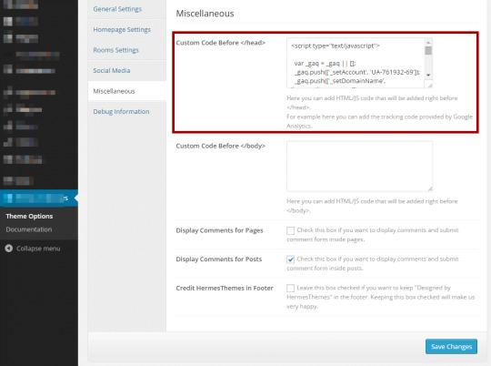
However, not all themes offer this feature, so the best solution for everyone is to install the Insert Headers and Footers plugin, which allows you to easily add the code to your website’s header or footer. After installing and activating the plugin, you will find a new tab under the settings tab called (Insert headers and footers). When you click on it, you will find an empty code editor through which you can insert any tracking codes into the header, footer, or body of the site.
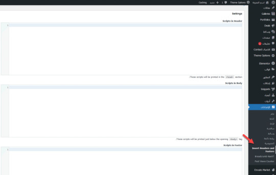
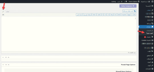
There are also some plugins that website owners use for a specific purpose and have an additional purpose to provide this feature, such as Rank Math and Site Kit by Google. Adding tracking code to specific pages Also, if you want to add tracking code to specific pages, such as tracking a specific event for Google Analytics or Facebook, you can do so by going to the page you want to edit, then switching from the visual editor to (Text)
Then adding the tracking code to the page structure itself after ensuring that the tracking service is linked to your site. Adding tracking code through Google Tag Manager Another effective way to manage tracking codes on your site is by placing the Tag Manager code in your WordPress site and then managing all tracking codes through the Google tool. The idea behind this tool is that it manages all your tracking codes in one place, and then you add a single tracking code specific to the tool to your website. However, using this tool will require you to learn some specific skills, and you can check out the Google Tag Manager Basics course provided by Google. Conclusion With this, we’ve learned how to add code to your WordPress website in more than one easy way that doesn’t require you to modify the WordPress source code. You can certainly add the code or tracking code by modifying the source code of the template or plugin directly. However, we’ve avoided this option to avoid serious errors on the site, especially by those who don’t have programming experience. Try to be precise about the purpose of the code and use the code in the correct place. Don’t use code unnecessarily, as this code burdens your site in any case, and using it incorrectly can harm your site. Read the full article
0 notes
Text
comic book creator research again (part 1, part 2)
very convenient where these posts happened to split up because the next ones are the misc creatures
they seem to be in this wallpaper though that was also used for the website footer

basically none of them are in final, and this entire post is just going to be the misc creatures because theres 20 of them
-
misc_1/misc_1/photo_0524997a_ful, photo_0524997b_ful and photo_05249979_ful are named like test drive screenshots (for example like CRE_Kalien-2562db8d_ful.png; CRE_-22fcbc88_ful.png for unnamed creatures)
and they LOOK like test drive screenshots


and these have lighting closer to the actual ingame lighting, as opposed to all these beige tinted renders, so you get a better look at how the game rendered creatures at the time
also these are dated to november 6 2008, but obviously this is from an older version of the game, around early 2008 or some point in 2007 id imagine?
also these actually have bumpmaps this time. this looks remarkably closer to the final game, but the larveyes look unpainted, and also the screenshot is curiously anti aliased which doesnt happen with the final test drive _ful screenshots
-
misc_2/photo_051dc762_ful and photo_051dc763_ful
has an early version of stalkgazer when it had a split pupil (also it had no middle variant?), lighting feels kind of different but not much to remark on otherwise. this is remarkably similar to the final game


-
misc_3, im gonna stop noting the other folder names because theyre not that remarkable
this one also has ... what looks like meanstalk actually, with the same slit pupils, but it also has the cut paint from the previous post that gnosh had


-
misc_4. not much to note here but i like this thing. fauxry wings seem to not be using the morph handles that it had up until the creature creator demo?


-
misc_5, its doing an idle animation in the second image i guess


-
misc_6


this one actually looks like the final game's Frog Boy and Ballboy, its possible it might have been repurposed into one or the other

it also crops up on the spore website occacionally

-
misc_7, same paint again, same early eyes again


-
misc_8

this one was on the spore website!!! where its seemingly always referred to as greenball in the filename, and uses the left screenshot

-
misc_9. it seems like the wings didnt have a closing animation at the time. this one also uses neo-teeny eyes but they look kind of weird. im also not sure these wings get affected by paints this strongly in final


-
misc_10


this one is VERY familiar, besides the group art, but i cant remember what else it was in
-
misc_11. paints look kind of weird?

-
misc_12 is the worst maxis creature on earth


6 notes
·
View notes
Text
Demo Footer #2
Get Started Tutorials Downloads Documentation Account About Blog Comunity Assets About Features Services Resources Guides Examples Follow Us Facebook Twitter Youtube Wordpress Whatsapp © 2020 My website Terms and conditions Privacy
0 notes
Text
HTML Interview Questions: Crack Your Web Developer Interview

HTML (HyperText Markup Language) is the foundation of every website you see on the internet. Whether you're a fresher stepping into the tech world or an experienced developer preparing for a job switch, mastering HTML interview questions is crucial for clearing any web developer interview.
In this guide, we’ll explore the most commonly asked HTML interview questions, along with clear explanations and examples. These questions are ideal for both beginners and intermediate developers aiming to showcase their front-end knowledge.
Why HTML is Important in Web Development Interviews
HTML is the standard markup language used to create the structure of web pages. It forms the base upon which CSS and JavaScript work. Employers test HTML skills in interviews to evaluate a candidate’s understanding of webpage structure, semantic elements, accessibility, and proper coding practices.
Basic HTML Interview Questions and Answers
1. What is HTML?
Answer: HTML stands for HyperText Markup Language. It is used to structure content on the web using elements like headings, paragraphs, links, lists, and images.
2. What are HTML tags and elements?
Answer: HTML tags are the building blocks used to create HTML elements. Tags are enclosed in angle brackets, like <p> for paragraphs. An element includes the start tag, content, and end tag, e.g., <p>This is a paragraph</p>.
3. What is the difference between HTML and HTML5?
Answer:
HTML5 is the latest version of HTML.
HTML5 supports semantic elements like <article>, <section>, and <nav>.
It introduces multimedia tags like <audio> and <video>.
HTML5 supports APIs for geolocation, local storage, and canvas graphics.
4. What is a semantic HTML element?
Answer: Semantic HTML elements clearly describe their meaning to both the browser and developer. Examples include <header>, <footer>, <article>, and <aside>. These improve SEO and accessibility.
5. What is the difference between <div> and <span>?
Answer:
<div> is a block-level element used for grouping content.
<span> is an inline element used for styling small pieces of text or elements.
Intermediate HTML Interview Questions
6. How do you create a hyperlink in HTML?
Answer: Use the <a> tag with the href attribute. Example: <a href="https://example.com">Visit Example</a>
7. How can you insert an image in HTML?
Answer: Use the <img> tag with the src and alt attributes. Example: <img src="image.jpg" alt="Description of image">
8. What is the purpose of the alt attribute in images?
Answer: The alt attribute provides alternative text if the image can't load and improves accessibility for screen readers.
9. What is the use of the <meta> tag?
Answer: <meta> provides metadata about the HTML document such as character encoding, page description, keywords, and author. It is placed inside the <head> tag.
10. What are void (self-closing) elements in HTML?
Answer: Void elements do not require a closing tag. Examples include <img>, <br>, <hr>, <input>, and <meta>.
Advanced HTML Interview Questions
11. What is the difference between id and class attributes in HTML?
Answer:
id is unique and used to target one specific element.
class can be used on multiple elements for grouping and styling.
12. How do you create a form in HTML?
Answer:<form action="/submit" method="post"> <input type="text" name="username"> <input type="password" name="password"> <input type="submit" value="Login"> </form>
This creates a form that takes input and submits data to a server.
13. What are some new input types in HTML5?
Answer: HTML5 introduced new input types such as:
email
date
time
number
range
color These enhance validation and user experience.
14. What is the use of <iframe> in HTML?
Answer: <iframe> is used to embed another HTML page or external content (like YouTube videos) within a current webpage.
Example:<iframe src="https://example.com" width="600" height="400"></iframe>
15. How does HTML handle accessibility?
Answer: HTML supports accessibility through:
Semantic tags
alt attributes for images
ARIA (Accessible Rich Internet Applications) roles
Proper use of forms and labels
These features make content more usable for screen readers and assistive technologies.
Bonus Tips to Crack HTML Interviews
Practice Real Code: Use platforms like CodePen or JSFiddle to experiment with HTML structures.
Understand Semantic HTML: Many companies focus on code that is SEO- and accessibility-friendly.
Be Clear with Fundamentals: Interviewers often focus on basic but important questions.
Combine with CSS & JavaScript: Know how HTML works in combination with styling and scripting.
Ask Clarifying Questions: If you're given a coding task, ask questions before you begin coding.
Final Thoughts
Cracking a web developer interview starts with having a strong grip on the basics, and HTML is at the core of front-end development. This guide — “HTML Interview Questions: Crack Your Web Developer Interview” — has walked you through a range of frequently asked questions from beginner to advanced levels.
By preparing these questions and practicing real-world HTML code, you’ll be well-equipped to confidently answer your interviewer and demonstrate your understanding of webpage structure, elements, and best practices.
So, keep coding, stay curious, and crack that web developer interview!
0 notes
Text
Best practices for web design for local service businesses
When designing a website for a local service business (like a salon, restaurant, plumber, or digital agency), the goal is conversions and trust, not just aesthetics. Here are some best practices that work in real scenarios:
🔹 1. Clear Call-to-Actions (CTAs): Every page should guide the visitor toward an action — call now, book a service, or request a quote.
🔹 2. Mobile-First Design: Most local users find businesses via mobile. Ensure fast loading, tap-friendly buttons, and responsive layouts.
🔹 3. Showcase Local Trust Signals: Add Google Reviews, client testimonials, and local awards. People trust what’s familiar and proven.
🔹 4. Local SEO Integration: Include your service area in headings, meta tags, image alt text, and even testimonials. Embed a Google Map.
🔹 5. Fast Loading Speeds: A slow site = lost leads. Compress images, avoid bloated themes, and use lightweight plugins.
🔹 6. Easy Navigation & Contact Info: Keep menus simple. Your phone number, address, and working hours should be visible on every page (preferably in the header/footer).
🔹 7. Use Authentic Visuals: Showcase real photos of your team, location, or services instead of stock images. It builds trust.
🔹 8. Blog with Local Content: Talk about local events, success stories, or service tips relevant to your community — great for SEO and engagement.
💡Example: We recently redesigned a Pondicherry-based brand's site at Kerplunk Media — after implementing these practices, their leads doubled in 60 days.
Happy to share examples or ideas if you’re building or revamping your site!
0 notes