#a lizard with rad shades
Text
More doodles I did last year and this year!

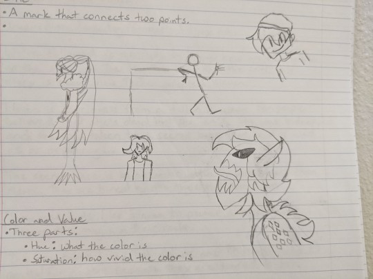

#my art#sketch art#school doodles#technoblade#wilbur soot#dream's mask#other unknown doodles i made#a lizard with rad shades#a witch#a stick figure#a random dude#a creature#not ranboo#two different arms#a mantis#a chick
2 notes
·
View notes
Text
Obviously they all have "dragon" somewhere in the name. All of the lizards are from Indonesia, where Kendra's family is from, while the flower and millipede were chosen because they can come in shades of purple... And I think they're cool. And Don is a botany nerd so maybe they can try to be friends ONE OF THEM HAS POISON IN IT how rad is that??? I love this sorta thing because I always end up learning about cool new animals
Don't worry about the details of how it happened. Maybe she was at a zoo or something like that, doesn't matter, this is purely about what would be most fitting for her as a character design- and theme-wise
#rottmnt kendra#rise of the tmnt#tmnt kendra#uhhhh what else can i tag this as...#kendratello#sure. it's for a thing that has that ship in it. that's relevant to making the choice
38 notes
·
View notes
Text
earnest snake emoji review, from someone with 3 snakes.

Lovely shading, and the musculature is really accurate! the head-to-body proportion is a bit off, and snakes without a rattle won’t raise their tails at you, but the tongue is adorable. not 100% sure what’s going on with the cheekbones(???), but the body shape makes me happy. Well hydrated & shiny young fellow. Inquisitive periscope. (9.5/10)

He reminds me of the snake game where you try not to run into yourself, so points for familiarity, but the proportions are waaay off :( His tongue is huge! His poise is kind of awkward.... but he looks curious and kind! The color pallet is very sweet. (5/10)

I don’t like him at all........the raised no-rattle tail.....the perfect circle coils......the spherical head.... the tongue is cute & the patterns are okay, but his coloration reminds me of barney......i love all snakes but this guy has been done a little dirty. (1/10)

Energetic! Once again the head is way too big, but the pose isn’t horrible and the periscope + tongue flicker makes her seem curious. Her eyes look very kind. Her tail is missing!! Points for good head shape, though. (7/10)

This is the most dynamic pose yet, but those twists have got to be super uncomfortable!! The bulge in their belly is a bit out of place - rolls would’ve been more accurate, or just a smoother curve. Head shape is weirdly round and again too big, and the eyes are simultaneously in the right and wrong spots....they’re far back enough, but too high up! Their mouth is well shaped, though. (5/10)

she’s cute, but this would’ve been better as an aerial view rather than....sideways?? Head is too big, but not long enough, and she doesn’t really have a neck. and her tongue is twisted :( the idea is cute, and the tail shape is amazing. good energy. (4/10)

i feel concerned.......he’s got kind of a lizard-head?? but the lips and nostril are good. his tongue is too big, but they really captured the body shape (spine, musculature). His body isn’t long enough, but the detail makes me happy. (6/10)

She’s adorable!!! Her proportions are elegant!!!! If I really wanted to nit-pick, her neck could’ve been a bit thinner, but at least she has one! Her pose doesn’t look completely comfortable, and the belly scales confused me for a moment, but her head shape and ....wait

nevermind................... (3/10)

what??? i like the simplicity a lot, but what’s with the chopped up lineart? not enough to really go off, but the body shape & presence of neck is pretty rad. cute! (5/10)

the body shape is really good, and im going to assume her head isn’t too big since we can’t see the rest of her body. The white vampire-fangs are disconcerting, and her mouth is worrisomely red, but the general shapes are pretty sweet! (6/10)

conflicted..........his smile is a great size, and his nostrils are cute, and his eye is well placed, but.......................the big.....head...looks like one of those adventure time worms at first glance...... (1/10)

they defile almost all of my ‘rules’ (tiny mouth, raised tail, questionable lump) but their smile......is so friendly..... (100/10)
🐍🐍🐍
210 notes
·
View notes
Text
this week’s lizard kiss fic contains... exactly zero kisses. and is entirely angst. and doesn’t even feature Arum physically. oops. uh, it still counts because it is rad bouquet endgame, fight me.
You Want To Live (When Life Is Achingly Unfair) [Chapter 1]
[ao3]
Archive Warning: Major Character Death
Fandom: The Penumbra Podcast
Relationship: Sir Damien/Rilla, Lord Arum/Sir Damien/Rilla
Characters: Sir Damien, Rilla, Lord Arum, Sir Angelo
Additional Tags: (angelo isn’t mentioned by name but You Know), (also arum won't technically 'be here' until next chapter), Second Citadel, Lizard Kissin’ Tuesday, Alternate Universe - Mythology, Alternate Universe - Orpheus/Eurydice/Hades, Grief/Mourning, Heavy Angst, Angst with a Happy Ending, (though there will NOT be relief until later chapters), Death, (Death but it's Weird when the afterlife is a place you can just Go), Singing
Summary: Damien’s beloved dies in spring. His flower dies, among flowers. This cruelty is not without beauty.
Notes: The Orpheus/Eurydice/Hades au that I've been thinking about since before I even started writing Penumbra fanfic. Please hang in there with me. This is... very different from my usual style. Title from the song Don't Give Up by The Whitest Boy Alive.
~
Damien’s beloved dies in spring. His flower dies, among flowers. This cruelty is not without beauty.
Damien weeps. He rages. He barters with empty air, beats his fists bloody among lilies in the grass, howls his despair. He cannot understand.
Damien is a poet. Damien knows how stories are meant to go, knows the flow of meeting and curiosity and affection and settling comfort and long long years of peace that should follow. Damien the poet and his clever, keen-eyed betrothed are meant to be in the midst of a beginning, in a place of promise.
Endings come whenever they please, Damien learns, and then he weeps violently enough to make himself ill.
The flowers for their wedding are given new purpose. The ceremony shifts. The almost-widower is expected to speak, and when he is led with strong gentle hands to the front of the congregation he opens his mouth and for long, long minutes he fully believes his gift and his tongue and his own heart have died as well, have crawled in beside Rilla’s motionless, vacant form to be laid to rest.
Words, on their own, cannot carry her weight.
So, Damien sings.
If there are words among the melody, he does not remember them. All in attendance weep, as he weeps. All grieve, as he grieves. Like ribs cracked, like poison, like stillness within. He is led away again. He is caressed with words of comfort. With praise, for his weavers gift, spinning despair into melodic silk. He cannot speak to answer.
His mourning song is begun, his love pouring out from within him, and it will not stop, now. Not until every drop of lamentation is wrung out. Even with his mouth pressed closed, he cannot help but hum.
Damien languishes. Cannot remember hunger, cannot remember thirst. Cannot remember the straining of the sapling towards the sun. Remembers only the weight of Rilla’s smile, and the memory is as stone. Heavy, unmoving, unchanging, until the (distant, distant, still please distant) time when it will erode as well.
No other weight can Damien bear. Not even his own hands. Not even his own head, which bows his neck like the weakest of willows.
Blessed is he, then, with friendship bright and strong enough to lift such weight for him. If friendship need weep to be beside him as he croons and keens, friendship will never, never complain. Friendship will lift sweet water to his lips when they crack from his withering song. Friendship will carry him, feed him, sit beside him and mourn and love and mourn, and believe in change and light and sunrise soft and sweet enough until Damien at last lifts his head again to see it too. He sees the sunlight, sees that love is still here, though it is not the love that pulls his soul from his bones, though it is not the love that pours unceasing from his lips. He begins to play the part of the living again, feeds and cares for the body which still lives, to honor the sacrifices of his friend. To allow his companion, at last, to relent in his vigil.
Damien cannot cease his song, but he will remember, in time, to be half in love with life, for all it reminds him of the woman who once lived and loved him. He sees her smile in the waves, feels her touch in rainstorm gusts, hears her laughter in all laughter, and he aches. He is haunted by life that echoes and remembers the beauty and movement that once was his beloved. He is haunted by these pieces of her that transmute and shift, that move on while she cannot. While he cannot.
Damien falls half in love with death, as well. For it is death who embraces his flower now, and they who love Amaryllis must themself be lovely in turn. She touches everything with light; even death. Even grief.
He is more and less aware. More aware of change. Less aware of time. More attuned to decay, to erosion, to endings. Less aligned with his own body. The world changes, all inevitability running like a river, time unspooling each thread one by one, and all of life is change-
Amaryllis has ceased to change.
The dead are only ever still.
Damien sings, notes that move and flow as time does, notes that slide in subtle knives up his throat but never, ever stop, and the grief within him becomes grief without him, curling the tops of grass and summoning the keening howls of distant wolves. Her death is a living thing, his song a cloak whose hood shades his eyes and trails behind him, touching all.
He wanders, rather than allowing his misery to pool in one place, rather than allowing his pain to fester in the fields of his home. He wanders, and takes his sorrow with him, painting gray across the land.
He wanders, he sings, and rivers flow faster as he passes, tears of the mountains following him down. A copse of dryads wilt and weep with his passing, begging for relief at his heel, and he smiles sadly and quickens his pace, though he cannot put a stopper to his song. The stones shiver underfoot. The earth groans with mourning. The sky cracks, and roils, and pours.
He sings. He sings. Grief, and love, and every way he is changing and unchanging without her. He sings.
Once, his songs were sung in duet. He forgets where harmonies once lived, and he grieves for that as well.
Damien sings. The world listens. Damien yearns, and in some small way Amaryllis lives in echo as the world yearns in his wake.
Helios comes to him, eventually, wearing the face of his friend. Else his friend is sunlight itself and never thought it bore mentioning. The god embraces him, and Damien weeps for comfort, weeps as he did on the very first day, weeps as he sings his every fear and pain and plea, and the god weeps with him. The god weeps with him, but nonetheless Helios smiles when he leans close enough to whisper in Damien’s ear.
Hope is a flower which blooms slowly, and the god is already gone before Damien understands the gift he has been given.
Hope blooms slow, but it also blooms bright and hardy, and Damien knows at last what he must do.
Damien sings, and Damien descends.
~
End Notes: Oh please hang in there. It will not always be this sad.
#elle's fanfic#the penumbra podcast#second citadel#lizard kissin' tuesday#rad bouquet#sir damien#amaryllis of exile#penumbra au zone#mourning bouquet au#(which is i guess what i'm tagging this *shrug*)
19 notes
·
View notes
Text
OK KO! Episodes 13-16
Just Be A Pebble
This was the FIRST EPISODE we produced! As I've stated before, we started with a few simpler stories before making the "first" episodes and this one is indeed very simple. We wrote it to be a linear, self-contained opportunity for the characters to act the way they are supposed to act and the world to be the way it's supposed to be. It mostly takes place in the plaza, giving our designers an opportunity to build up a cache of experience and artwork leading up to everything's true first reveal in "Let's Be Heroes". Because this was the first episode, there are some things going on visually that chose to not carry over into future episodes but are fun to see here. It's like our "Doug Can't Dance"! Or our "Tommy's First Birthday"! Yeah, you get it.
After making the pilot and all those shorts, we weren't really sure what an 11-minute episode might actually look and feel like. Ian and I boarded two unproduced episodes between the pilot and the series, but a lot had changed since then. After seeing Mira and Geneva's first pitch, we were completely energized. It's a real show! It works! They were the first to set the tone for the comedy, action, and especially the characters.
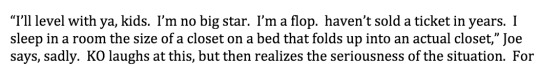
Presenting Joe Cuppa
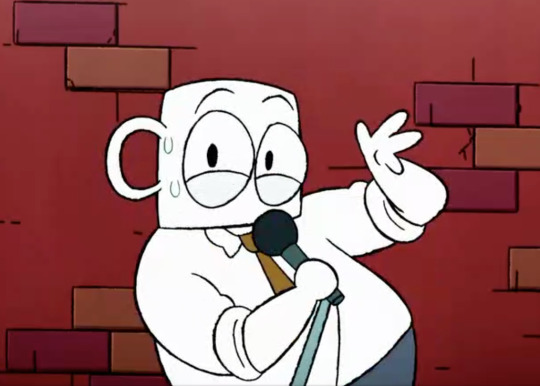
Believe it or not, this is a very personal episode for me. During our summer 2015 development time, Ian and I spent a number of days building out the world by creating dozens of characters and their backstories. A lot of them came from the crowd shot in the original pilot. Here is proto-Cuppa (and Crinkly Wrinkly, and Dogmun!)
I suggested giving him a Rodney Dangerfield-esque lounge lizard persona, something I find inherently funny. In 2010 I had co-written a feature length screenplay about a character like this trying to live a normal life while being physically unable to speak in anything but Dangerfeldian quips and one-liners. Nobody wanted to fund that movie for SOME REASON, but I was able to infuse some of its spirit into this story. It was Dave Tennant who decided Joe Cuppa should specifically speak in coffee puns, and Erin Shade who conceived the hilarious extended slapstick sequence at the end.
This episode has a clear example of why it's so fun working on a board driven show. I had written this bit in the original premise, which I thought was SO FUNNY-
Then at Stevie and Danny's board pitch, I was blown away by how far the concept got pushed. My line worked fine as a dialogue joke, but it became something much more imaginative and visual. If you’ve seen the episode, you know what I’m talking about!
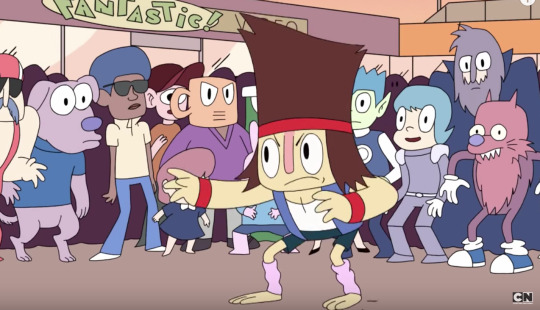
We've Got Pests
Pests is a super old idea! Ian and I first started meeting to talk about Lakewood Plaza Turbo in 2013, and one of the story pitches I had was that the Plaza gets infested by tiny 90s platformer mascots. In 2015 we wrote our first outline, which was completely different. It was still an Enid story, but it was all about her trying to be a cool employee and not care when things went wrong at the plaza. We felt pretty good about it and moved on. When time came to hand the episode out to board, I realized we had taken a lot of these themes and tackled them with more depth in "You Have to Care", which we had just finished outlining. So with just a few days to go before handout, we re-broke the entire story to cover different thematic territory.
The main thing that held between all versions is the ending where we see the pests grow and change over many years thanks to Enid's words. It's one of my favorite ideas we've ever put into the show, and Danny did an amazing job making this a standout sequence in the series.
Fun fact: another secret internal document we use is called "Illegal Words". It's a list of words, phrases and terms we have required ourselves to avoid. Items on the list vary from cliches, soon-to-be-dated slang, pet peeves, overused jokes, etc. For this episode we decided to open pandora's box and allow the pests to say some of these illegal words. Whether this was good satire or a grievous error is up to the viewer. It was an experiment we will likely never try again!
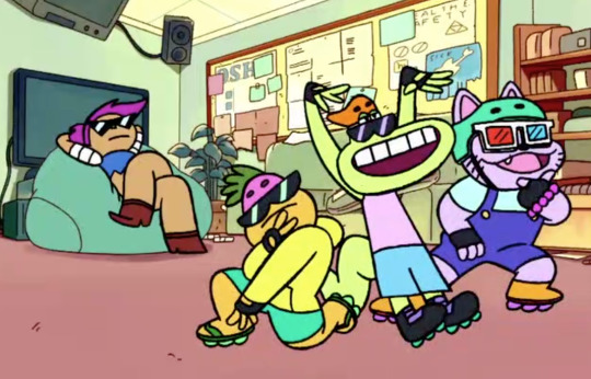
Legends of Mr. Gar
As we started figuring out where we were going with the season, having outlined episodes like "Face Your Fears" and "Plaza Prom", we realized we were spending a lot of our Gar time on his nervousness around Carol and were missing a big showcase of his amazing hero power. Because we were working pretty far ahead, we were able to very quickly write up this story and hand it out ahead of those other episodes to keep Gar in balance. Ian came up with the initial concept and we had a lot of fun dipping into the backstories of the characters. The opening scene is actually heavily cannibalized from one of our 2014 unproduced development boards, and Skateboard Nerd's explosive final fate is based on a cut scene from one of Ian's Secret Mountain Fort Awesome episodes!
This episode has more hilarious wand weird moments than I can count. I love that we were able to do such a fun digression with an unconventional structure this early in the series. Dave's visual gag of Gar walking out from behind a shelf that looks like his body... legendary. Haewon's sequences of young Rad.. incredible. Crinkly Wrinkly's tall tale... fact or fiction?!
ALSO Jake and Mint Potion did incredible work on this episode. They completely blow us away every week, but I especially loved their variations on Rad and Enid's character themes here.
723 notes
·
View notes
Text
Tagged!
Rules: Answer the questions and tag 20 followers that you’d like to know better!
Thanks @thatweirdone9000 for tagging me (I honestly didn’t know people were interested in me lmao)
Name: Rose
Nickname: I mean not by friends but growing up my family always called me Rosie so there’s that but it’s weird hearing anyone but family call me that?
Star sign: Scorpio
Height: like 5'3" 5'4" average
Orientation: like as far as I know bisexual?
Hogwarts house: Slytherin (a Scorpio in slytherin what a surprise)
Favorite color: I mean I wear pink and black the most but I like all sorts of colors (they lean towards pastels usually) mainly I like pink, blue, purple, yellow, and green for lighter shades, I like darker shades too? Idk I’m indecisive but typically it’s pink
Favorite animal: ????? There’s too many good ones????? Like cats are my initial favorite but I love dogs just as much (so like I can’t be asked if I’m a cat person or a dog person) and like have u seen lizards? They’re all so rad I aspire to be as cool as them. And don’t get me started on Sea animals cuz I love so many of them. Penguins and dolphins happen to be some of my faves growing up tho and sea stars are so cool (and terrifying I recently saw how they how they eat and I was like holy fuck) EDIT ALSO BIRDS HOW COULD I FORGET BIRDS THEY'RE SO COOL???
Average amount of sleep: wtf is sleep??? Nah usually I get up at noon no matter how late I sleep so it varies ¯\_(ツ)_/¯
Cat person or dog person: I explained that I’m both already lmao
Favorite fictional character: holy fuck there’s too many? I’ll list a few I can think of off the top of my head tho. Kyoko (Skip Beat), Nana O. (Nana), every sailor senshi no doubt, Sayaka (Madoka), Jotaro (jojo cuz what else do you expect of me), too many other jojo characters and magical girls??? Idk there’s so many inspirational characters that I can’t think of rn ¯\_(ツ)_/¯ I have way too many as well so like? EDIT um koichi too duh how could I forget my favorite son when he’s lookin right at me while writing this
Number of blankets you sleep with: typically 2 at any given time unless it’s summer than only 1
Dream trip: ? Idk I’d like to visit Italy or Japan at least once in my life and honestly I’m cool with just going to theme parks with my friends when we can cuz I love roller coasters (Santa Cruz is a personal favorite tho so hopefully I can go there with my close friends someday) also like tbh I’m hoping to become a famous musician like David Bowie or something (I’m just using him as an example cuz he’s one of my personal faves) so travelling would just be a part of the job which would seem really cool (and probably busy to all hell but pls)
When was your blog created: uhh like March of 2013? It was late in my sophomore year of high school I remember that
Current number of followers: Uh last I checked was 180? Idk I don’t usually pay attention to it
Followers I’m going to tag:
@the-holy-waffle
@mightylettuce
@j02uk3
@calvitaro @lordgroose @granreycero @chibichibi3 @hotpantys @odaibachase @suzukipot @julaincacablancas @pastelgothleoneabbacchio @emocutie (I have like no idea who my main mutuals are I’m sorry)
5 notes
·
View notes
Text
Exciting new paper stocks for your next print project
Leapin’ lizards! The last time there were so many new, uncoated paper stocks introduced to the graphic design community was probably the same week that fire was invented. It’s been a long time coming, but there are great new finishes, textures and hues now available for printing and packaging projects.
With the addition of these beautiful new paper stocks design potential is growing exponentially. Coupling the new stunning colors and finishes with outstanding graphic design can yield breathtaking results. In this article we’ll introduce you to some exciting new paper options and what you can use them for.
But, first some background on uncoated paper stocks.
What are uncoated paper stocks?
—
For the past several decades, there have basically been about a half-dozen finishes and textures manufactured which fall under the uncoated paper umbrella.
Non-embossed, uncoated paper stocks
This business card gets a lot of character from uncoated paper stocks. Design by Ian Douglas.
There are several types of non-embossed, uncoated paper finishes. Vellum paper has almost an eggshell appearance and a somewhat rough-hewn finish. Its name is sometimes confused with translucent paper, which is correctly known as ultravellum. Chances are good that paper manufactured for stationery usage, letterheads and matching envelopes is wove paper. This typically has a semi-smooth surface and no real distinguishing characteristics. Smooth and ultra-smooth paper has been repeatedly flattened during the manufacturing process. This finish is commonly used in copying machines and for digital printing.
Smooth and vellum finishes are often available as opaque paper stocks. Generally, these are low-priced “work-horse” paper stocks that have reduced show-through and are most suitable for reports, workbooks, journals and other lengthier publications. These are perhaps more for function than for design.
Embossed, uncoated paper stocks
Among the embossed, tactile, uncoated paper finishes, laid paper gives the feel and appearance of a very traditional (some would say aged), hand-crafted, high-quality paper. It has a series of continuous, fine lines on its surface that run parallel to the paper’s grain direction. A linen paper is a more complex version of laid. Linen stocks are reminiscent of fine linen napkins or tablecloths, featuring a crosshatch pattern on both sides of the stock. Felt paper has a coarse, grainy texture, which appears as a series of hills and valleys on the paper surface when magnified.
Exciting new paper stocks you need to know about
—
Now, let’s explore several of the new and exciting print and packaging paper options available to art directors and business owners looking to make their print projects shine.
I’ll take cream and two sugars with that paper
Kona Paper by Monadnock Paper Mills via JetPens.com
Monadnock Paper Mills, based in leafy New Hampshire, has been manufacturing fine printing and packaging paper since way back in 1819. Despite its old age, it has introduced some truly rad, new products to the market.
Taking recycling to the max, Monadnock has created Kona Paper, which is produced from fiber derived from used burlap coffee bags. Saving these bags from eternal life in landfills, they have been repurposed into paper stock used for labels, tags and folding boxes/packaging. Manufactured in two caffeine inspired hues, Light Roast and Medium Roast, Kona can be appropriate for offset and digital print reproduction.
It’s rewarding to be part of a solution where you divert packaging from the landfill.
- Lisa Berghaus
“It’s rewarding to be part of a solution where you divert packaging that was made from natural fiber from the landfill, and make something new and really beautiful,” explains Lisa Berghaus, Monadnock Paper’s Director of Marketing Communications. “We’re helping to close this loop in the coffee supply chain.“
In a nod to the ever-expanding signage market, Monadnock earlier this year announced the introduction of their Ultrahide Blockout Poster stock. This is a 100 percent opaque cover stock (meaning no show-through), ideal for two-sided signage, window signs and other retail, point-of-purchase, event and hospitality uses. It is most suitable for offset printing and Latex or UV inkjet.
The key to kolour
Keaykolour by Mohawk
New York State’s Mohawk Fine Papers has very recently been named the sole US distributor of Keaykolour. Long established outside the US and manufactured by Arjowiggins Paper, Keaykolour has been revamped by Mohawk; actually transforming the brand to better serve the US graphic community’s needs.
Among the changes made to Keaykolour: it is now available in 43 hues, including three shades of white. The beautiful color palette works individually or combined, with hues ranging from Cappuccino (notice a coffee theme here) to Blackberry to Lipstick to Steel.
Using colored paper has never been so easy and accessible.
- Chris Harrold
“Using colored paper has never been so easy and accessible,” says Chris Harrold, Vice President and Creative Director for Mohawk. “Simply choose from 43 colors in text or cover weight.“
Keaykolour has a vellum finish, and is manufactured in 80 lb text and 111 lb cover weights. Keaykolour can be the right choice for a wide-breadth of projects, and is compatible with both offset and HP Indigo digital printing. Matching envelopes can also be provided.
All that glitters is paper
Glitter you can print on! Diamond Print by Harmony Papers.
Looking for a lot of glitter with that design? Harmony Papers has created Diamond Print, which they describe as printable glitter paper. Certified for HP Indigo digital and offset printing, Diamond Print can provide a truly memorable background for everything from invitations to pocket folders to envelopes to displays to packaging.
Diamond Print is made in Crystal (white) and Champagne (natural white) colors, in text and cover weights.
So classic, yet so radical
Neenah Paper’s Classic Paper has been a go-to brand for the design community for decades, but it has recently become a whole lot more interesting. In 2017, the Neenah mill added three totally unique, completely unduplicated, new finishes to the Classic family, collectively known as Classic Textures.
For designers and brands seeking a paper texture that gives off a warm, homey vibe, Classic Woodgrain provides the aesthetic charm of a wood finish. Neenah’s Commercial Sales Manager Holly Kirby says, “With an organic feel and complementary color palette, Classic Woodgrain was developed specifically because designers requested an environmental, organic touch to fall in line with current trends.”
Designers requested an environmental, organic touch to fall in line with current trends.
- Holly Kirby
Last, but not least, is Classic Techweave, a finish that embodies the texture of fabric, but with a high-tech twist. Kirby describes Techwave as “high touch meets high tech with this new texture.” She adds that, “It is the feel of finely woven fabric, with one-of-a-kind surface, inspired by the movement of digital data.” Both of these are available in six shades of white, plus ten additional colors; manufactured in weights ranging from 80 lb text to 165 lb double-thick cover.
Neenah has also expanded its Cotton brand of 100 percent cotton paper that’s ideal for letterpress, engraving, embossing, foil stamping and digital or offset printing. Three new hues in the Letterpress finish—blush, gray and mint—join three shades of white. Neenah Cotton, also manufactured in wove and smooth finishes, is a great fit for invitations, letterheads, envelopes and professional documents.
Versatility matters
by George paper via ArcherMalmo
Crafted in South Carolina by International Paper Company, by George is a new family of fairly smooth, cover weight only stocks perfect for a potpourri of applications.
Manufactured in 11 point and 18 point thicknesses, suggested uses include hang tags, table tents, invitations, book covers, menus and posters. There are seven colors in the by George family, ranging from bright white to deep black. Ideal for various finishing processes, by George can be embossed, foil stamped, die-cut and folded.
The right paper will do the trick
—
Keep these stocks in mind for your upcoming design projects. Between the vast array of unusual new textures and finishes, along with the introduction of new colors to the marketplace, the design possibilities are endless.
Chances are good that paper samples and/or swatch books can be obtained from your print vendor, or from the above-mentioned paper mills. Check them out to find the perfect paper for your next print project.
Want to make sure your next print project becomes a raving success?
Find the perfect graphic designer to work with.
Let’s go!
The post Exciting new paper stocks for your next print project appeared first on 99designs.
Exciting new paper stocks for your next print project published first on https://www.lilpackaging.com/
0 notes
Text
Exciting new paper stocks for your next print project
Leapin’ lizards! The last time there were so many new, uncoated paper stocks introduced to the graphic design community was probably the same week that fire was invented. It’s been a long time coming, but there are great new finishes, textures and hues now available for printing and packaging projects.
With the addition of these beautiful new paper stocks design potential is growing exponentially. Coupling the new stunning colors and finishes with outstanding graphic design can yield breathtaking results. In this article we’ll introduce you to some exciting new paper options and what you can use them for.
But, first some background on uncoated paper stocks.
What are uncoated paper stocks?
—
For the past several decades, there have basically been about a half-dozen finishes and textures manufactured which fall under the uncoated paper umbrella.
Non-embossed, uncoated paper stocks
This business card gets a lot of character from uncoated paper stocks. Design by Ian Douglas.
There are several types of non-embossed, uncoated paper finishes. Vellum paper has almost an eggshell appearance and a somewhat rough-hewn finish. Its name is sometimes confused with translucent paper, which is correctly known as ultravellum. Chances are good that paper manufactured for stationery usage, letterheads and matching envelopes is wove paper. This typically has a semi-smooth surface and no real distinguishing characteristics. Smooth and ultra-smooth paper has been repeatedly flattened during the manufacturing process. This finish is commonly used in copying machines and for digital printing.
Smooth and vellum finishes are often available as opaque paper stocks. Generally, these are low-priced “work-horse” paper stocks that have reduced show-through and are most suitable for reports, workbooks, journals and other lengthier publications. These are perhaps more for function than for design.
Embossed, uncoated paper stocks
Among the embossed, tactile, uncoated paper finishes, laid paper gives the feel and appearance of a very traditional (some would say aged), hand-crafted, high-quality paper. It has a series of continuous, fine lines on its surface that run parallel to the paper’s grain direction. A linen paper is a more complex version of laid. Linen stocks are reminiscent of fine linen napkins or tablecloths, featuring a crosshatch pattern on both sides of the stock. Felt paper has a coarse, grainy texture, which appears as a series of hills and valleys on the paper surface when magnified.
Exciting new paper stocks you need to know about
—
Now, let’s explore several of the new and exciting print and packaging paper options available to art directors and business owners looking to make their print projects shine.
I’ll take cream and two sugars with that paper
Kona Paper by Monadnock Paper Mills via JetPens.com
Monadnock Paper Mills, based in leafy New Hampshire, has been manufacturing fine printing and packaging paper since way back in 1819. Despite its old age, it has introduced some truly rad, new products to the market.
Taking recycling to the max, Monadnock has created Kona Paper, which is produced from fiber derived from used burlap coffee bags. Saving these bags from eternal life in landfills, they have been repurposed into paper stock used for labels, tags and folding boxes/packaging. Manufactured in two caffeine inspired hues, Light Roast and Medium Roast, Kona can be appropriate for offset and digital print reproduction.
It’s rewarding to be part of a solution where you divert packaging from the landfill.
- Lisa Berghaus
“It’s rewarding to be part of a solution where you divert packaging that was made from natural fiber from the landfill, and make something new and really beautiful,” explains Lisa Berghaus, Monadnock Paper’s Director of Marketing Communications. “We’re helping to close this loop in the coffee supply chain.“
In a nod to the ever-expanding signage market, Monadnock earlier this year announced the introduction of their Ultrahide Blockout Poster stock. This is a 100 percent opaque cover stock (meaning no show-through), ideal for two-sided signage, window signs and other retail, point-of-purchase, event and hospitality uses. It is most suitable for offset printing and Latex or UV inkjet.
The key to kolour
Keaykolour by Mohawk
New York State’s Mohawk Fine Papers has very recently been named the sole US distributor of Keaykolour. Long established outside the US and manufactured by Arjowiggins Paper, Keaykolour has been revamped by Mohawk; actually transforming the brand to better serve the US graphic community’s needs.
Among the changes made to Keaykolour: it is now available in 43 hues, including three shades of white. The beautiful color palette works individually or combined, with hues ranging from Cappuccino (notice a coffee theme here) to Blackberry to Lipstick to Steel.
Using colored paper has never been so easy and accessible.
- Chris Harrold
“Using colored paper has never been so easy and accessible,” says Chris Harrold, Vice President and Creative Director for Mohawk. “Simply choose from 43 colors in text or cover weight.“
Keaykolour has a vellum finish, and is manufactured in 80 lb text and 111 lb cover weights. Keaykolour can be the right choice for a wide-breadth of projects, and is compatible with both offset and HP Indigo digital printing. Matching envelopes can also be provided.
All that glitters is paper
Glitter you can print on! Diamond Print by Harmony Papers.
Looking for a lot of glitter with that design? Harmony Papers has created Diamond Print, which they describe as printable glitter paper. Certified for HP Indigo digital and offset printing, Diamond Print can provide a truly memorable background for everything from invitations to pocket folders to envelopes to displays to packaging.
Diamond Print is made in Crystal (white) and Champagne (natural white) colors, in text and cover weights.
So classic, yet so radical
Neenah Paper’s Classic Paper has been a go-to brand for the design community for decades, but it has recently become a whole lot more interesting. In 2017, the Neenah mill added three totally unique, completely unduplicated, new finishes to the Classic family, collectively known as Classic Textures.
For designers and brands seeking a paper texture that gives off a warm, homey vibe, Classic Woodgrain provides the aesthetic charm of a wood finish. Neenah’s Commercial Sales Manager Holly Kirby says, “With an organic feel and complementary color palette, Classic Woodgrain was developed specifically because designers requested an environmental, organic touch to fall in line with current trends.”
Designers requested an environmental, organic touch to fall in line with current trends.
- Holly Kirby
Last, but not least, is Classic Techweave, a finish that embodies the texture of fabric, but with a high-tech twist. Kirby describes Techwave as “high touch meets high tech with this new texture.” She adds that, “It is the feel of finely woven fabric, with one-of-a-kind surface, inspired by the movement of digital data.” Both of these are available in six shades of white, plus ten additional colors; manufactured in weights ranging from 80 lb text to 165 lb double-thick cover.
Neenah has also expanded its Cotton brand of 100 percent cotton paper that’s ideal for letterpress, engraving, embossing, foil stamping and digital or offset printing. Three new hues in the Letterpress finish—blush, gray and mint—join three shades of white. Neenah Cotton, also manufactured in wove and smooth finishes, is a great fit for invitations, letterheads, envelopes and professional documents.
Versatility matters
by George paper via ArcherMalmo
Crafted in South Carolina by International Paper Company, by George is a new family of fairly smooth, cover weight only stocks perfect for a potpourri of applications.
Manufactured in 11 point and 18 point thicknesses, suggested uses include hang tags, table tents, invitations, book covers, menus and posters. There are seven colors in the by George family, ranging from bright white to deep black. Ideal for various finishing processes, by George can be embossed, foil stamped, die-cut and folded.
The right paper will do the trick
—
Keep these stocks in mind for your upcoming design projects. Between the vast array of unusual new textures and finishes, along with the introduction of new colors to the marketplace, the design possibilities are endless.
Chances are good that paper samples and/or swatch books can be obtained from your print vendor, or from the above-mentioned paper mills. Check them out to find the perfect paper for your next print project.
Want to make sure your next print project becomes a raving success?
Find the perfect graphic designer to work with.
Let's go!
The post Exciting new paper stocks for your next print project appeared first on 99designs.
via 99designs https://99designs.co.uk/blog/design-other-en-gb/new-paper-stocks-for-print/
0 notes
Text
Exciting new paper stocks for your next print project
Leapin’ lizards! The last time there were so many new, uncoated paper stocks introduced to the graphic design community was probably the same week that fire was invented. It’s been a long time coming, but there are great new finishes, textures and hues now available for printing and packaging projects.
With the addition of these beautiful new paper stocks design potential is growing exponentially. Coupling the new stunning colors and finishes with outstanding graphic design can yield breathtaking results. In this article we’ll introduce you to some exciting new paper options and what you can use them for.
But, first some background on uncoated paper stocks.
What are uncoated paper stocks?
—
For the past several decades, there have basically been about a half-dozen finishes and textures manufactured which fall under the uncoated paper umbrella.
Non-embossed, uncoated paper stocks
This business card gets a lot of character from uncoated paper stocks. Design by Ian Douglas.
There are several types of non-embossed, uncoated paper finishes. Vellum paper has almost an eggshell appearance and a somewhat rough-hewn finish. Its name is sometimes confused with translucent paper, which is correctly known as ultravellum. Chances are good that paper manufactured for stationery usage, letterheads and matching envelopes is wove paper. This typically has a semi-smooth surface and no real distinguishing characteristics. Smooth and ultra-smooth paper has been repeatedly flattened during the manufacturing process. This finish is commonly used in copying machines and for digital printing.
Smooth and vellum finishes are often available as opaque paper stocks. Generally, these are low-priced “work-horse” paper stocks that have reduced show-through and are most suitable for reports, workbooks, journals and other lengthier publications. These are perhaps more for function than for design.
Embossed, uncoated paper stocks
Among the embossed, tactile, uncoated paper finishes, laid paper gives the feel and appearance of a very traditional (some would say aged), hand-crafted, high-quality paper. It has a series of continuous, fine lines on its surface that run parallel to the paper’s grain direction. A linen paper is a more complex version of laid. Linen stocks are reminiscent of fine linen napkins or tablecloths, featuring a crosshatch pattern on both sides of the stock. Felt paper has a coarse, grainy texture, which appears as a series of hills and valleys on the paper surface when magnified.
Exciting new paper stocks you need to know about
—
Now, let’s explore several of the new and exciting print and packaging paper options available to art directors and business owners looking to make their print projects shine.
I’ll take cream and two sugars with that paper
Kona Paper by Monadnock Paper Mills via JetPens.com
Monadnock Paper Mills, based in leafy New Hampshire, has been manufacturing fine printing and packaging paper since way back in 1819. Despite its old age, it has introduced some truly rad, new products to the market.
Taking recycling to the max, Monadnock has created Kona Paper, which is produced from fiber derived from used burlap coffee bags. Saving these bags from eternal life in landfills, they have been repurposed into paper stock used for labels, tags and folding boxes/packaging. Manufactured in two caffeine inspired hues, Light Roast and Medium Roast, Kona can be appropriate for offset and digital print reproduction.
It’s rewarding to be part of a solution where you divert packaging from the landfill.
- Lisa Berghaus
“It’s rewarding to be part of a solution where you divert packaging that was made from natural fiber from the landfill, and make something new and really beautiful,” explains Lisa Berghaus, Monadnock Paper’s Director of Marketing Communications. “We’re helping to close this loop in the coffee supply chain.“
In a nod to the ever-expanding signage market, Monadnock earlier this year announced the introduction of their Ultrahide Blockout Poster stock. This is a 100 percent opaque cover stock (meaning no show-through), ideal for two-sided signage, window signs and other retail, point-of-purchase, event and hospitality uses. It is most suitable for offset printing and Latex or UV inkjet.
The key to kolour
Keaykolour by Mohawk
New York State’s Mohawk Fine Papers has very recently been named the sole US distributor of Keaykolour. Long established outside the US and manufactured by Arjowiggins Paper, Keaykolour has been revamped by Mohawk; actually transforming the brand to better serve the US graphic community’s needs.
Among the changes made to Keaykolour: it is now available in 43 hues, including three shades of white. The beautiful color palette works individually or combined, with hues ranging from Cappuccino (notice a coffee theme here) to Blackberry to Lipstick to Steel.
Using colored paper has never been so easy and accessible.
- Chris Harrold
“Using colored paper has never been so easy and accessible,” says Chris Harrold, Vice President and Creative Director for Mohawk. “Simply choose from 43 colors in text or cover weight.“
Keaykolour has a vellum finish, and is manufactured in 80 lb text and 111 lb cover weights. Keaykolour can be the right choice for a wide-breadth of projects, and is compatible with both offset and HP Indigo digital printing. Matching envelopes can also be provided.
All that glitters is paper
Glitter you can print on! Diamond Print by Harmony Papers.
Looking for a lot of glitter with that design? Harmony Papers has created Diamond Print, which they describe as printable glitter paper. Certified for HP Indigo digital and offset printing, Diamond Print can provide a truly memorable background for everything from invitations to pocket folders to envelopes to displays to packaging.
Diamond Print is made in Crystal (white) and Champagne (natural white) colors, in text and cover weights.
So classic, yet so radical
Neenah Paper’s Classic Paper has been a go-to brand for the design community for decades, but it has recently become a whole lot more interesting. In 2017, the Neenah mill added three totally unique, completely unduplicated, new finishes to the Classic family, collectively known as Classic Textures.
For designers and brands seeking a paper texture that gives off a warm, homey vibe, Classic Woodgrain provides the aesthetic charm of a wood finish. Neenah’s Commercial Sales Manager Holly Kirby says, “With an organic feel and complementary color palette, Classic Woodgrain was developed specifically because designers requested an environmental, organic touch to fall in line with current trends.”
Designers requested an environmental, organic touch to fall in line with current trends.
- Holly Kirby
Last, but not least, is Classic Techweave, a finish that embodies the texture of fabric, but with a high-tech twist. Kirby describes Techwave as “high touch meets high tech with this new texture.” She adds that, “It is the feel of finely woven fabric, with one-of-a-kind surface, inspired by the movement of digital data.” Both of these are available in six shades of white, plus ten additional colors; manufactured in weights ranging from 80 lb text to 165 lb double-thick cover.
Neenah has also expanded its Cotton brand of 100 percent cotton paper that’s ideal for letterpress, engraving, embossing, foil stamping and digital or offset printing. Three new hues in the Letterpress finish—blush, gray and mint—join three shades of white. Neenah Cotton, also manufactured in wove and smooth finishes, is a great fit for invitations, letterheads, envelopes and professional documents.
Versatility matters
by George paper via ArcherMalmo
Crafted in South Carolina by International Paper Company, by George is a new family of fairly smooth, cover weight only stocks perfect for a potpourri of applications.
Manufactured in 11 point and 18 point thicknesses, suggested uses include hang tags, table tents, invitations, book covers, menus and posters. There are seven colors in the by George family, ranging from bright white to deep black. Ideal for various finishing processes, by George can be embossed, foil stamped, die-cut and folded.
The right paper will do the trick
—
Keep these stocks in mind for your upcoming design projects. Between the vast array of unusual new textures and finishes, along with the introduction of new colors to the marketplace, the design possibilities are endless.
Chances are good that paper samples and/or swatch books can be obtained from your print vendor, or from the above-mentioned paper mills. Check them out to find the perfect paper for your next print project.
Want to make sure your next print project becomes a raving success?
Find the perfect graphic designer to work with.
Let's go!
The post Exciting new paper stocks for your next print project appeared first on 99designs.
0 notes
Photo

New Post has been published on http://deutschstyle.net/2017/06/13/130-faszinierende-frauen-tattoo-designs.html
130 Faszinierende Frauen Tattoo Designs
Weibliche tattoos weiterhin wachsen in der Popularität und Dynamik gewinnen mit jedem Jahr. Wenn Sie gerne kreativ, bunt und unglaublich schöne art, du wirst lieben diese tattoos.
Leg Kunst gewinnt Bekanntheit die ganze Zeit vor allem mit der hipster-Bewegung. Diese Leinwand entschieden sich für eine bunte und dramatische Darstellung, die ist Blickfang und absolut prächtig. Es erzählt eine faszinierende Geschichte, und das ist ein fantastisches Stück. Die Farbgebung und der Kontrast ist einfach nur schön.
2. Diese Haut und schwarze Kunst, ist kreativ und anregend. Es ist ein Interessantes Stück, und der Künstler hat einen tollen job mit der Linie arbeiten.
3. Schwalben sind beliebt bei Frauen aller Altersgruppen, die sich in der tattoo-Welt. Hier ist eine schöne Darstellung von zwei Vögeln, die Fliegen, während Sie, umgeben von Blumen.
4. Worte, stenciled in der nie aus der Mode. Diese Leinwand geschrieben haben könnte, aus dem Wortschwall und der Künstler kopiert haben, oder vielleicht fand Sie eine schriftart, die Sie geliebt und benutzt, statt. So oder so, es ist eine einfache, aber tiefgründige Stück.
5. Dieses schwarze Stück ist lebendig obwohl es fehlt Farbe. Bäume sind oft symbolisch und kann bedeuten, eine Vielzahl von Dingen abhängig von der person. Dies könnte möglicherweise repräsentativ für die Kraft oder Führung durch harte Zeiten.
6. Diese Stelle zwischen den Brüsten ist eigentlich ein ziemlich verzwickter spot zu wählen, weil es direkt auf dem Brustbein. Requisiten, um diese Frau für ein schönes Bild, wie auch immer ein design in einem zarten Stelle.
7. Dies ist wirklich ein sehr kostbares Bild. Die Elefanten sehen so realistisch. Der Künstler hat einen tollen job der Erfassung der Essenz dieses Tieres. Die Details und die Schattierung auf den Punkt.
8. Diese Bögen sind schön und einzigartig. Sie gehen sehr gut zusammen und sehen verhältnismäßig sein.
9. Das ist ja großartig. Der Künstler hat einen tollen job mit der Linie arbeiten. Sie setzte sich bis zu einfach hinzufügen, andere designs und machen Sie Ihren Rücken Stück wirklich gut Aussehen.
10. Der kleine fox ist perfekt platziert und ausgerichtet an Ihrem zierlichen Handgelenk.
11. Es gibt eine Menge Los in diesem Stück und Ihre Farbauswahl sind fantastisch. Da gibt es so viele verschiedene Bilder, dieses Stück könnte leicht unübersichtlich werden, aber da steckte Sie mit einer zwei-Farben-palette ist es einfach für die Augen zu navigieren und überprüfen Sie jedes Bild.
12. Sie entschied sich für eine einzigartige Platzierung für diese Fledermäuse. Die Schattierung ist gut gemacht auf jeden.
13. Der Künstler hat einen tollen job mit einem 3D-wie Bild -. Die Biene sieht ganz real in diesem Bild.
14. Sicherheitsnadeln konnten eine fülle von Bedeutungen und dieser Künstler hat einen tollen job mit der Linie detail und Kontur.
15. Rock on! Liebe dieses shading der Gitarre.
16. Diese kleinen Vögel variation von rote Färbung ist dezent und süß.
17. Diese Pfeile sind perfekt auf Ihren finger. Sie könnte bedeuten, dass Sie ist perfekt geeignet für Ihre mate.
18. Die Gliederung dieses K ist auf den Punkt. Haben Sie überhaupt geerwogen, Ihre erste Tinte auf?
19. Die Platzierung dieser Bogen ist original. Es ist eine große starter-tattoo und lässt viel für die Phantasie zu schaffen, weitere Stücke in der Zukunft.
20. Wir lieben die einzigartige Idee, um tag sich selbst “Ich”.
21. Kleine Pfotenabdrücke sind große Möglichkeiten zu geben, einen kleinen shoutout an die pelzigen Freunde in Ihrem Leben. Kleinere Fuß-tattoos werden immer richtig gut Aussehen mit den Fersen.
22. Das ist so wie das Leben. Die Nähmaschine sieht aus wie es kommt, off Ihr Bein und die Spitze sieht auch so authentisch. Der Künstler ist enorm talentiert. Das Bild ist nahezu makellos und die Farbauswahl sind der Perfektion.
23. Diese kleinen Vögel sind einfach die süßesten. Die Gliederung hier ist sehr gut gelungen und obwohl es keine Farbe, die Wirksamkeit des Stückes vermittelt wird, wirklich gut.
24. In den letzten zehn Jahren die handschriftlichen Stücke weiter an Popularität zu gewinnen. Viele Frauen, wie sich Ihre Tätowierungen auf Ihrem rib-Käfige. Es schafft eine einigermaßen sexy und geheimnisvolle aura.
25. Der Fuß ist eine sehr Prominente Platzierung. Die Berge hier könnte stehen für Stärke und die Anzahl der Berge, könnte auch Bedeutung.
26. Das einfache Herz, sagt eine Millionen Dinge, für die es keine Worte.
27. Direkt über dem Brustkorb und unterhalb der Achselhöhle ist ein weiterer beliebter Ort. Diese Schablonen Herzschlag ist tief und Berührend.
28. Ob Sie nennen es die Anzahl Zeichen, ein hashtag oder Pfund, den mittleren Bereich vor dem Handgelenk und unterhalb der Unterarm ist ein ausgezeichneter Ort für ein kleines und einfaches Bild.
29. Hand tattoos gut gemacht sind nicht von dieser Welt Fabelhaft. Ihre Wahl von einem Ballon ist exquisit. Es macht Spaß und nervös und Sie sieht aus wie ein totaler rockstar.
30. Der kleine Mond fast in der beuge Ihres Arms ist perfekt platziert.
31. Die Schädel-und Kreuz-beide schauen ein wenig verblasst, die nur noch auf die Mystik Ihrer Geschichte.
32. Hier ist ein Beispiel für eine Daumen-tattoo. Was würden Sie wählen, die Sie auf Ihren Daumen?
33. Dies ist ein interessanter Ort für ein Fragezeichen. Der Künstler hat einen tollen job mit der Schattierung.
34. Ananas sind eine beliebte Wahl unter den Frauen, und diese Platzierung ist interessant. Es setzt den rest der Ihr Bein für mehr Bilder in der Zukunft.
35. Ein Mädchen und Ihr truck bedeutet eine glückliche Dame. Das detail ist hier wirklich toll.
36. Die Platzierung ist hier interessant, weil auch das tragen ein langes Hemd, das tattoo wird immer noch klar sein. Wir lieben die gelbe und die grüne pop zu dieser Frucht. Es ist lebendig und erfrischend.
37. Die Innenseite der hand ist weniger populär als Sie denken, für tattoos, denn es trägt sich leicht. Sie haben, um es zu bekommen berührte ziemlich regelmäßig.
38. Dieses Mädchen scheint zu sein, abzuleiten, dass Diamanten könnte nur sein, eine Ihrer Lieblings-Dinge. Sie wählte ein großartiger Ort für Sie.
39. Dieser Hase ist so süß und ist sehr hipster-Platzierung.
40. Das ägyptische Auge ist ein beliebtes design und wählte Sie einen großen Fleck auf dem Rücken. Viele Frauen entscheiden sich für dieses Praktikum, weil es einfach zu präsentieren, die design mit tank-tops oder Badeanzüge.
41. Vielleicht ist Sie eine Katze-Liebhaber oder vielleicht ist es Ihr name, aber so oder so, die Mitte der Rückseite des Halses ist ein rad-spot für Tinte.
42. Das Gleichheitszeichen ist in der Popularität wächst für hand-tattoo-designs.
43. Ein einfaches Herz genäht ist nett und zurückhaltend. Man kann sagen, es ist nagelneu, aufgrund der roten, die es umgeben.
44. Eine einfache O ist eine tolle Idee für die Knöchel. Die Schnörkel und Feder ist ein funky Hinzugefügt berühren Sie, um das ensemble.
45. Diese Biene ist so detailliert und gut gemacht. Die Mitte Handgelenk ist ideal Platzierung, weil es leicht sein kann, angezeigt oder verborgen, je nach Anlass.
46. Die Punkte, die in Kombination mit den Pfeil schafft so hip, cool vibe, meinst du nicht? Besonders gefallen hat uns die Punkte, weil Sie so subtil, die Sie kaum bemerken Sie zuerst.
47. Diese innere hand-Kaffee-design ist ein java-Liebhaber Traum.
48. Ohrläppchen designs sind schön und macht Spaß. Diese Laune, Blumen-und Sterne-die perfekte Kombination.
50. Die puppy love auf dem Handgelenk ist die perfekte Kombination aus einfach und anspruchsvoll.
51. Das und-Zeichen direkt unter dem Bizeps ist genial.
52. Wer braucht ein holster, wo Sie haben, Ihre Waffen Tinte auf? Dies ist ein hübsches, sinnliches design und wahrscheinlich nur ein teeny bisschen schmerzhaft, als würde es nach rechts über Ihre Hüfte Knochen.
53. Diese Feder hat schöne Farbtöne. Es sieht so lebensecht und Sie entschied sich zu einem beliebten und verführerischen Platzierung. Es ist einfach zu erfassen und anzuzeigen, wenn Sie so wählt.
54. Diese kleine lady bug ist liebenswert. Es ist hell und lebendig und hat so viel Persönlichkeit. Der Künstler hat einen tollen job der Erfassung es ist spunk.
55. Wir lieben, wie einfach und subtil dieser look ist. Die meisten Leute denken, der Brust-Stücke, die als sehr invasiv, aber das ist ziemlich das Gegenteil, und es sieht fantastisch aus.
56. Diese Kirschen sind so lustig! Sie sind unterhaltsam und lustig und der Künstler hat einen tollen job zu erfassen, was Sie Leinwand wurde versucht zu vermitteln.
57. Diese Noten scheinen praktisch zu tanzen bis Ihr Bein. Die Farbe ist toll und der verschiedenen Graden der Schattierung, Kontrast und Details sind gut gemacht.
58. Dieser Schmetterling ist exquisit. Wie es aussieht ist es unter Flug. Die Farben sind wunderschön und die Liebe zum detail ist auf den Punkt.
59. Die Unterseite des Fußes ist eine abenteuerliche Ort, um sich Tinte, die aufgrund der Allgemeinen Abnutzung, die Auftritt, auf den Sohlen von Menschen die Füße. Sie werden wahrscheinlich haben, um es retuschiert mehr oft, weil es einfach verblassen schneller.
60. Weiße tattoos sind immer mehr und mehr beliebt. Sie sind nicht immer die einfachste Sache für die Zuschauer zu sehen, aber die Leinwand weiß genau, wo Sie zu suchen.
61. Wir lieben diese kursive Gestaltung der Krieger. Es ist einfach und zurückhaltend, und doch so elegant.
62. Zuerst dachten wir, der lizard war ein Teil des Designs! Das ist ein tolles Bild von der Welt. Der Künstler hat einen tollen job der mapping it out.
63. Dieser Umriss der Schale ist gut gemacht.
64. Diese dramatischen Farben gegenseitig kompensieren, wie sich die Geschichte entfaltet sich auf Ihrer Hälfte ärmel. Es ist ein schönes design alle zusammen gebracht, durch ein gemeinsames Thema.
65. Diese Konturen der Rosen sind absolut traumhaft. Es wird immer mehr und mehr beliebt bei Frauen um die Hälfte ärmel und volle Hülse Tätowierungen.
66. Es ist schwer zu sagen, wo das eine anfängt und das nächste aufhört, diese sind aber alle schön gemacht. Sie hat eine beeindruckende Menge an Arbeit, die getan wird, und Sie schön Aussehen.
67. Es gibt eine Menge action gehen auf der rechten Seite hier. Der Künstler hat nicht verwenden, sehr viel Farbe, das macht das Stück noch mehr Fett.
68. Sie hat einfache und schlichte Stücke, die wahrscheinlich bedeuten Sie die Welt. Der Rücken ist ein sehr beliebter Ort unter vielen Frauen.
69. Ihre volle ärmel ist absolut atemberaubend. Es ist dramatisch, gut gemacht, hat eine ausgezeichnete Beschattung und sieht unglaublich.
70. Die Einfachheit dieses Stück macht ihn unkompliziert und schön.
71. Diese Libelle ist so Schalk und Verträumt.
72. Der Künstler hat einen tollen job mit dieser Kunst. Es sieht so ähnlich aus wie der original-Charakter aus der Farbpalette, um die Details in seinem lächeln.
73. Der Spritzer Farbe hier nicht besser platziert. Sie hat so einen tollen job mit diesem Stück.
74. Rechts oberhalb des Ellenbogens ist eine gute Wahl in der Platzierung.
75. Die Farbgebung und Schattierung auf dem Bild ist geschmackvoll gemacht. Es zeigt überraschende Mengen von Kontrast.
76. Der Pfotenabdruck ist einfach und gut skizziert.
77. Die Eleganz dieser Blume kann nicht genug gesagt. Der Künstler hat einen tollen job und die Wahl der Farbe ist auf Augenhöhe.
78. Dies erinnert an Peter Pan. Die Färbung ist lebhaft und kühn und der Kreativität, die in jedem Charakter ist charmant.
79. Dieses süße und einfache design und die quote ist einzigartig und originell.
80. Ein weiterer Ananas design, gepaart mit den Initialen macht uns Fragen, wenn Sie gehen, um mehr hinzuzufügen, um Ihre ärmel.
81. Eine einfache Blume mit großer Bedeutung. Der Unterarm ist ein beliebter Ort, um sich getuscht.
82. Dies ist eine verrückte patriotischen design mit viel Los.
83. Dieser Adler unter Flug ist schön. Der Künstler hat einen außergewöhnlichen job auf dem Flügel.
84. Die Sonne und der Mond sind sehr lebendig und detailliert.
85. Ein einfaches Wort, das hält eine Welt der Sinne auf die Leinwand.
86. Boo! Eine tolle Idee für ein ghost-tattoo.
87. Liebe die Schrift hier auf dem Fuß. Es ist auch ziemlich einzigartig, wo Sie legte ihn, da Sie nicht tragen aus, wenn Sie trägt Sandalen und obwohl andere Schuh könnte dazu führen, einige Probleme.
88. Solid schriftart Wahl für diesen Brief.
89. Dies ist eine wirklich wunderschöne design. Der Künstler hat einen tollen job mit der exquisiten Details und unterschiedlichen Graden der Schattierung. Wenn es in der Mitte der Rückseite ermöglicht es, unauffällig zu sein, wenn es sein muss.
90. Dies ist ein Interessantes Stück, weil Sie Blumen nicht wirklich in den Rhythmus, der den rest des Stückes. Das beiseite, es ist ein großes Stück. Die Farben sind Fett und schön und die Liebe zum detail ist außergewöhnlich.
91. Liebe, die Komplexität dieses Bild.
92. Dies ist ein großartiger Ort für die Bilder, die Sie ausgewählt haben.
93. Dieser Löwe scheint so herrisch obwohl es so klein ist.
94. Sie hat mehrere platziert alle über Ihre Arme. Welcher ist Ihr Favorit?
95. Dies ist eine mutige Aussage, und Sie ist nicht allzu besorgt über das halten es ist eine versteckte Botschaft.
96. Es gibt so viel Abwechslung innerhalb der Stücke. Das shading ist schön und wirkt die Geschichte so faszinierend. Sie hat Raum zu füllen, die mehr von Ihrem arm, wenn Sie so wählt, welche Bilder denkst du, wird Sie tun?
97. Die Farbpalette orientiert sich diese Arbeit vom gewöhnlichen zum außergewöhnlichen.
98. Einfach die Vögel Fliegen nach oben ist immer eine große starter-Wahl.
99. Weiße Tinte ist immer eine wirklich tolle Idee.
100. Der Künstler hat einen tollen job, die zeigen dagegen hier.
101. Dieses einfache design sieht sauber und frisch.
102. Die einfache Mond ist sehr beliebt, so kann man wohl sagen. Dieser ist ziemlich neu, da hat es noch Rötungen alle um ihn herum. Vergessen Sie nicht, schützen Sie Ihre neue Tinte und befeuchten Sie es, um es von peeling.
103. Dieses Kaninchen scheint so lebensecht. Der Künstler hat einen phänomenalen job mit dem Kontrast und Schattierung.
104. Sie hatte umfangreiche Tinte getan, und es sieht aus wie es geht alles zusammen. Es ist sehr lebendig und anschaulich.
105. Ein tolles Beispiel für einen Kompass. Die Liebe zum detail ist so gut gemacht.
106. Wir ziemlich viel Liebe alles über diese. Sie ist offensichtlich ein fernweh und Sie tuschte einige, dass die Leidenschaft auf Ihren Rücken.
107. Bein-tattoos sind einfach so cool. Diese scheinen zu halten mit den primären Farben, so dass es eine verlockende aura.
108. Diese Skizze ein Hase ist etwas liebenswert, meinst du nicht?
109. Es gibt so viel komplizierten Kunstwerk in diesem Stück.
110. Sie hat eine Breite Palette von tattoos und Abweichungen in Farbe und design. Es ist ein sehr skater-girl-look, der macht Sie sehen wirklich cool und hip.
111. Dieses einfache Bild einer Taube mit Oliven-ast enthält wichtige Bedeutung.
112. Ein einfaches Herz um der Liebe zu Gedenken. Es ist so winzig und fast winzig, doch es erscheint rechts von Ihrem finger in eine laute Anweisung.
113. Die Kniescheiben sind immer hart spots zu bekommen, eingefärbt, weil es richtig auf die Knochen. Sie ist eine trooper, beide Knie gemacht und das fertige Ergebnis sieht fantastisch aus.
114. Dies ist so eine einzigartige, originelle design. Es ist so ein Interessantes Stück.
115. Hier ist eine beschreibende Kreuz rechts hinter dem Ohr. Es ist ziemlich groß, sodass es nicht einfach verschwiegen, sondern Sie können nicht wollen, es zu sein. Obwohl es nicht hell und bunt, es ist tiefgründig und aussagekräftig.
116. Dieser ist Vertreter der henna-Kunstwerk. Etwas im Auge zu behalten um die hand der Kunst ist, dass, obwohl es schön ist, es ist schwer zu vertuschen, wenn Sie brauchen, um sich zu verstecken Ihre Tinte bei der Arbeit.
117. Das ist so eine interessante Darstellung des Sonnensystems. Einzigartig und faszinierend ist, wie wir uns am besten beschreiben würden dieses design. Wir sind wirklich wie die variation in den Farben und die Art und Weise, dass die Größen variieren auch.
118. Die klassische rose wird immer eine uralte gehen. Dieser hat so gestochen scharfe und klare Linien.
119. Tut dieses erinnern jemand anderes der Antenne? Es ist so, wie Sie schwimmen an die Oberfläche. Wir mögen die Art, wie Sie beschlossen, zu tun Schatten. Es zeigt so viel Kontrast und ist so anschaulich.
120. Wir lieben alles über diese. Es gibt so viel Kontrast und Schattierung. Das Farbschema ist schön.
121. Diese Bein-tattoo ist intensiv. Es gibt so viele Variationen Los und es ist so interessant, dass Sie nur wählte, um die Farbe schwarz. Der Künstler (wenn es das gleiche für jedes Bild) hat einen fantastischen job über alles auf details, um die Schattierung und alles dazwischen.
122. Wir sind hin und Weg jedes mal, wenn wir schauen auf die Linie der Arbeit in den Blumen hier. Es ist eine außergewöhnliche Arbeit. Dieses Stück könnte leicht überwältigt Sie zurück, aber stattdessen ist es sauber, frisch und geschmackvoll.
123. Diese süßen Löwenzahn hat die perfekten Blütenblätter. Es ist so Zierlich und der Knöchel ist die perfekte Auswahl.
124. Besonders mögen wir dieses Stück, weil es so viele Dimensionen umfassen.
125. Alles, was über diesen ist so gut gemacht. Die Farbwahl ist toll und das artwork ist fantastisch. Wir mögen, wie die Beine passen und wie die Geschichten, die scheint zusammen zu gehen. Sie hatte umfangreiche Arbeit getan, und alle, es fließt wirklich gut.
126. Sie hat auf jeden Fall gesetzt, es bis zum Ende der Hülse, insbesondere, da bekam Sie mit, dass der top rose auf Ihrer Schulter. Das detail in diesen Rosen ist exquisit. Die verschiedenen Schattierungen sind wunderschön und das ganze Stück ist einfach nur wunderschön.
127. Wir lieben, wie die Blume, die knallen aus Ihrem T-shirt und die Hälfte davon bleibt im verborgenen. Die Künstler haben einen fantastischen job mit diesem Stück.
128. Diese giant X ist nicht, was Sie zu sein scheinen. Sie haben Rosen umschlossen und nehmen Sie an einem girly-Natur, Spaß und reizende.
129. Es gibt so viel Abwechslung in diesem Stück. Wenn es dein arm, würde Sie voran gehen und füllen Sie den rest der Leinwand?
130. Dieser wolf ist ein großes Stück zu Ende. Es ist so real und doch hat Sie die Puppe wie Qualität, um es. Es ist heftig, und dann sieht fast freundlich.
Alle diese Stücke gehören zu Frauen, die es lieben tattoos und Liebe den Austausch Ihrer Kunst. Als Sie Las, was blieb dir am meisten? Wenn Sie erwägen, sich getuscht, hier sind ein paar Dinge im Auge zu behalten. Entscheiden Sie, wo Sie wollen es platziert. Vergessen Sie nicht, mit arbeiten, um sicherzustellen, es ist ok, um Kunstwerk. Wenn es nicht so ist, dann erwägen, eingefärbt in einem Gebiet, das leicht zu verbergen. Dann entscheiden Sie, was Sie gern getan. Wollen Sie Bilder, die von Bedeutung ist, um Ihnen oder erzählt eine Geschichte? Wollen Sie Worte oder ein Wort, das für Sie von Bedeutung? Es gibt so viele Optionen zur Verfügung, so sicher sein, nachdenken über es für eine Weile, bevor Sie einfach spontan etwas zu tun. Finden Sie einen Künstler, die Sie genießen, zu arbeiten mit und überprüfen Sie heraus einige Ihrer früheren designs. Wenn Sie mögen, was Sie sehen, vereinbaren Sie einen Termin, mitteilen, was Sie wollen, um Tinte und Spaß haben!
0 notes
Last Seen Blogs

dipyourtoes-inthegalaxy-blog
Few of Us Realize Life Is Quite Surreal.

essentiallyeloise-blog
Essentially Eloise

haikyuuforyou
That Haikyuu!! scenarios blog

undead-nazgul
Lover/hater
