#and i cant seem to fix it in photoshop either
Text

Come on down to Jori's Garage and get your car fixed! Promise she wont try to scam you 😉🧡
#Cyberpunk 2077#Nomad V#My V#My OC#OC: Jori#🦊#the lighting in this little space is my worst enemy#no matter what it's either too bright or too dark#and i cant seem to fix it in photoshop either
51 notes
·
View notes
Note
psst share your outer banks coloring secrets
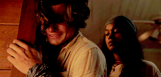
ah, yes, one of the worst shows to color lmaoooo. i'll try to give some tips but im sure as anyone who has tried to color this show knows each scene is diff and has it's own flavor of awful yellow/green/red shading.
some tips on how to go from this to this......


............under the cut! (warning v long and idk if i'm the best at explaining things lmao)
so firstly, i use this psd i made ages ago for everything (alecbaenes was my url many moons ago i just am too lazy to change and reupload). usually i will go into each individual layer of that psd and see how they work with the scene, and will change the opacity or turn off the layer depending on what looks best. generally for obx, i will lower the opacity on the gradient map layer, as well as certain vibrancy/curves/levels layers, ones that make the gif brighter and more vibrant. i will usually bring back some vibrancy and brightness later but when im first getting the base coloring, some layers just heighten the yellow/red and we need to kinda bring that down before we make adjustments to get aspects like skin color more accurate.
so, just with my psd/adjustments made to the psd layers, the gif may looks something like this: (going to use this gif bc i made it more recently so i remember some of the stuff i did better, and is the most accurate to my current process--plus it sucks to color lmao)
ususally still way to red/yellow for my liking, both for the skin tones and to be able to manipulate the colors for a vibrant coloring! so the next step is to get colors as close to how they are normally. warning, you will have to make 345435354 adjustment layers and just keep tweaking and tweaking... and tweaking. sometimes i will have like 20+ adjustment layers at the end of the process. i usually put all my adjustments under my psd--i also always add a vibrance and brightness layer above. sometimes it helps to do final tweaks above the psd if you just cant get anything right bc of course the psd will change how colors normally look.
anyways, usually my base fixes will be some sort of combination of curves, levels, color balance, and selective color. so like, if the gif needs more depth/darkness, or is way too bright, i will bring the curve down or up respectively. levels, and also increasing the black selective color layer will also add depth. i will also use auto curve sometimes! the first image i have below i circled some of the extra tools i may use--auto for auto curves, the top black eyedropper you select the darker points in your gif and it will adjust based on that, the bottom one for the lightest--if i use those i will either use the black one only, or the black and then the white. the other three are examples of how my curve layers may look--i already have S curves in my psd, so when i do extra curve adjustments, it's just one single point, and i don't move it that much. same with levels, i dont make a super dramatic change, when it's under the psd it's enough to just move a bit to make a big difference. sometimes i'll also bring these layers to a lower opacity.
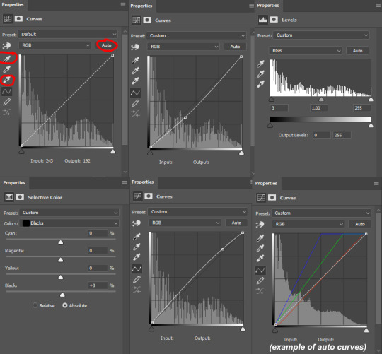
generally my first step is color balance though, especially if the gif seems mostly fine lighting wise. for obx, i usually shift it towards cyan and blue to cancel out the red tones. magenta and green depends, if its more green i may move towards magenta and vice versa, but usually i dont shift it that dramatically and often leave it alone. i will usually move the bottom bar towards blue, to soften the yellow tones. color balance helps shift the overall colors of the gif. notice that it's on mid tones in these pictures:
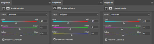
as you can see, i shift the cyan/red one more dramatically than the yellow/blue, and with magenta and green i usually just move it 1-3 points over. in the last one, i actually shifted towards red above my psd layer, because after all my adjustments i lost some of the red/warmth, so i brought back in red.
with color balance/curves, the gif may looks something like this
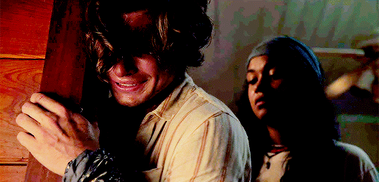
less of a completely red/yellow filter over everything! but still not great, their skin is too red, and overall still not the best base to try colorings. so next up is selective color, which can really help you fine tune things, but because of that.... SUUUUPER tedious. i will have 3495874 selective color layers and sometimes like 5 of them will be half canceling each other out just to get something okay. but this is a hobby i've chosen so we must suffer LKRGJRG. generally, my realm revolves around red, yellow, and at times magenta or neutral. if you think back to how we fixed some of the colors with color balance, kind of a similar principle, just with the individual colors. and lots of experimenting. so with color balance i would cancel out reds by making them more cyan--on the red selective color, im also gonna turn up the cyan. for yellow, i'm gonna make it more magenta, to make the yellow tones warmer. i will tweak the other tones too, just kinda experiment to see how changing it affects the gif, and then soon you will kind of intuitively know how to change the values based on whats going on in the gif lighting. magenta selective color helps for red values that are more pink, so make them more red or yellow based on what you need--i don't use this as much, hence i didnt have an example in the crop of psds i opened, but it's helpful sometimes. with neutral selective color, it usually affects the whole gif, so again, only minimal changes--usually i will bring the black levels down if it got to bright, or add just a tinge or yellow or cyan or whatever i need. here's some pics to show examples of what mine looked like for this gif:
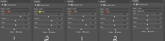
there were many more, but i just chose a few. the '1' and '2' i wrote to demonstrate that these layers were sequential, how they balance each other, and how selective color can be a tedious balancing act-- the second example it's like basically the opposite but it balances it out. also, if you have two characters with different skin tones, or the lighting is different for them, etc, you can use layer masks to erase certain adjustments so it only affects one of the subjects. some of these tweaks will be inbetween me transforming the gif to be colorful, and noticing how the colors interact, etc. so between this i was also making it colorful and it's not exactly the finished product at this stage: but this is kind of what the gif would look like after all the adjustments just to get it looking... normalish:

not totally perfect but MUCH better, and also will look a little different when surrounded by the colors i want to turn it into. i have some stuff about how i color in this tag, i can do a lil other tutorial or smth if needed but bc i have limited photo space on the ask and already wrote so much i wont get super into it here. but for shows like obx, it helps to work with a group of colors that will work with the show--yellows/oranges are easier bc of all the yellow already found in the show. pinks can be harder because there is so much yellow in the show, but doable. greens are good because of all the green in the show, and thus blues are good because its easy to go from green to blue with selective color and stuff. thus, purples are good too because its easy to go from blue to purple! stuff like that makes it easier. some work with selective color, hue and saturation, gradients, and voila!

you can see how maybe some of the issues like it being still a little too yellow/greeny toned balances out with the surrounding colors.
also, a big part of it is just practice! i've been giffing for yeaaaaaars and with media that has just the most god awful lighting so i've gotten good at understanding what to do and sometimes i'm just on auto pilot.
hopefully that helped, i know it was long winded and it can be hard to explain/understand photoshop. if y'all want some more in depth explanation about a part of the process i can try, or with other examples!
9 notes
·
View notes
Text
Prompt list
Ok so I got bored and made a prompt list. Some are things I've seen online and some are just shit I came up with. I'm bored as fuck right now so feel free to request.
No, it's really not that complicated. He’s a bad person.”
“Hey...What's wrong with your face?”
“How could you do this to me?”
“You’ve got ten seconds to tell me what you are doing here.”
“I know this is hard to believe, but I'm on your side.”
“Never seen that used as a murder weapon before.”
“Just sit around and cry, then. I don't have that luxury.”
“Sorry, I thought you were someone else.”
“Well that's the nice thing about telling the truth, there is a lot less to keep track of.”
“That's the least of your worries.”
“You look a lot different than your profile picture”
“Do you trust me?”
“What? I meant it as a complement.”
“Who put this in my pocket?”
“I can’t do this anymore.”
“You think your so good looking, but deep down your that kind of ugly PhotoShop can't fix.”
“I know you did your best, it just wasn't enough.”
“Even if I could stop, I wouldn't.”
“You have got to see this.”
“I try not to think of myself as a thief.”
“I can't believe I used to think he was attractive.”
“Well this contest is not going to rig itself."
“I cant believe I'm about to tell you this.”
“I thought we were friends!”
“Thanks, I hate myself.”
“Depression is not a great look on you."
“I know you're here, your terrible at being quiet.”
“I will break your jaw if you finish that sentence.”
“Why are you helping me?”
“I didn't even recognize you.”
“I told you not to read that.”
“Wait, are you banned from that Wendy’s, or every Wendys?
"Wait…. So you aren't dating him?"
"Do you have any idea how many rules we're breaking right now?"
"Go on then! Leave! See if I care!"
"You really have no clue who I am?"
"Its pathetic, I can't believe I still care."
"You left this, I just wanted to return it."
"Do not use me as an example, I am a terrible person."
"I'm crying on the floor of a bathroom, how do you think I'm doing?"
"Are you still pouting?"
"Can't you see I'm in love with you?"
"How can you love him/her? After everything he/she has done."
"You belong with me. Not them."
"Shut up and take it."
"Are you seriously scared of this?"
"Wow, great self control you've got there."
"I'm so sorry, I panicked!"
"I've met goldfish that are smarter than you."
"I am about 7 seconds from stabbing you."
"Sorry, but I don't dance, it's against my principles."
"You have the moral backbone of a chocolate eclair" (john mulaney thank you)
"Are you that blind. Can't you see I'm in love with you?!"
"You speak to me again, I will skin you alive."
"Sleep, I just want to sleep."
"Fuck me." "You're quite forward, but I'm game."
"Why are you lying on the table?"
"How long until you leave?"
"I have salsa in my bra."
"Wait if your here then, who's over there?"
"You did all of this on a dare?"
"I bet you say that to all the girls/guys."
"My brain contains barley enough information to keep me alive."
"I would personally like to use the stairs so if you could move, that'd be great."
"I'm not a baby, I am at least a child!"
"Do you not know how much of an asshole you are or, do you just not care?"
"If you wanted to be babied you should have asked yourself."
"You can't sleep here so get up and get out."
"Some say revenge is a dish best served cold. I believe it is best served hot, hot enough to burn your tongue off."
"That only happened five minutes ago! Why are you acting like it happened five years ago!"
"Oh, so my food just got up and walked away then."
"You still think that you can change me?"
"I don't do positive baby, I'm just a, 'the glass is full of poison' sort of person."
"I don't think I've ever seen a human digest that much coffee before."
"Do you like annoying me or is it something you just can't help?"
"I hope they haunt you. The things you have done."
"I might be drunk. Orrrrr, I'm actually a giraffe."
"This is illegal isn't it."
"Ow! You nearly hurt me!"
"Okay, your friends are fucking crazy."
"I hold grudges because they are all I have left."
"I will face god as I walk backwards into Hell."
"Better bury me deep, you don't want me back do ya?"
"Am I the only one in this whole place to make a single good life decisions?"
"Why would I share my feelings if I could just bottle them up and eventually die?"
"You got a tattoo? OF WHAT!?
"You said you knew where you were going." "Yeah well, I lied."
"FUCK YOU AND YOUR MONOPOLY MONEY YOU WORTHLESS WHORE!"
"You know I'm not gonna lie, I'm kind of taking this personally."
"Uh-uh I do not fuck with spirits, you guys have fun getting possessed."
"Are you kidding! There's TWO of you!"
"Love is a fucking scam, try eating a mango instead."
"For a nerd, you're quite stupid."
"You'll pay for this!" "Put it on my tab."
"I think I just speed ran the five stages of grief."
"Why do you have tattoos, you wouldn't put a sticker on a nice car." "I'm at best a 2003 Corolla."
"I'm gonna be honest, I thought you were gay."
"If you call me cute again I will rip your eye out and make you eat it."
"You do know not everyone wants to fuck you right?"
"I can't believe I actually thought you were capable of loving someone.
"You do know how fucking terrifying you are right?
"Me? Overreacting? Probably."
"Its okay. I'm not mad…. Ok you know what, I've changed my mind you can go burn in hell."
"No no, you see that sounds like a responsibility. I want no part in it."
"Ohh um I'm not good at advice. Can I interest you in a sarcastic comment?
"I may seem like an angry person on the outside but buried deep inside, I'm even angrier."
"Huh, I wonder what it's like to know what the actual fuck is going on."
"I'm sorry but you must be at least friend level 5 to unlock my tragic backstory."
"I have the best story, once upon a time in a place that is clearly not here, you weren't such a little bitch."
"Emotions? Ha! Those are for people who aren't mentally scared and or broken."
"Just you wait until I graduated top of my class form the Hogwarts, school of bitchcraft and misery!"
"Why am I living in a Stephen King novel, everyone's either dead, dying or wish they were one of the above?"
#harry potter imagines#harry potter au#imagine#hogwarts#draco malfoy#jk rowling#draco imagine#sirius black imagine#draco malfoy x reader#draco malfoy x you#harry/draco#i love them#sirius black imagines#sirius black x reader#fred and george#fred weasley#fred weasley deserved better#fred weasley imagines#fred weasley x reader#george wealsey x reader#george weasley#harry potter imagine#fred and goerge weasley#fred weasley imagine#fred x reader#ginny potter#ginny weasley#ron weasley#draco malfoy imagines#james potter imagine
83 notes
·
View notes
Note
henlo! can u post a gif tutorial cause your gifs are so pretty and look amazing, even on mobile which messes up with everythjng 😆
ahh anon u flatter me!! thank you for your kind words!!! i honestly have ways to go, but it means a lot that u say this thank you
so for starters i have a mac + photoshop cs5 so a lot of this tutorial will be based on what you do for that, but i’m sure u could do the same thing on pcs (actually pcs have more programs available so i highly recommend, if u have a pc, finding a tutorial that is based around pcs) and other photoshop versions too! but i think the general process is still the same, a different tutorial might just be more nuanced^^
1. Finding/downloading your video~so for normal mp4 videos on youtube i use this website. it’s pretty useful it can download from actually a wide variety of sites like naver (up till 1080p!) ~for v app videos i use this site~ts files i find on kpopexciting or kpop24hrs (u need an account for kpop24hrs i think to download video but! signing up isnt difficult and its nothing fishy. i use it a lot esp for older ts files it has a good archive, kpopexciting tends to be faster though.)~the higher quality files you find the better! i find that it tends to go mp4~honestly finding the right high quality video is a HUGE part of making gifs look nice2. Extracting your video~there are many many many ways to extract your video but I highly recommend downloading avisynth! There are ways to download it for pc! avisynth is beautiful because it doesn’t really reduce the quality of your video to the extent that photoshop does, plus it can extract 60fps from ts files. some gifs ive made through avisynth ( x x x ) if you’re interested in avisynth further, tumblr user @/brandinator is a good place to start! if you want to know more regarding how to use it and a different tutorial through that, let me know! ~now i’m not sure if there is an avisynth tutorial for mac anymore, BUT theres another great program, vapoursynth, that mac users can look into. here’s a tutorial that i’ve found~Before I got avisynth I used VLC player for ts files but I had to basically screenshot each frame individually. Some gifs I’ve made through this method ( x x x ). these gifs are 60fps only bc i found a user who uploaded the ts file in 60fps. usually you cant get 60fps w/o avisynth. but this is also me saying that if you cant get avisynth or vapoursynth, there are still ways to work around it i think! one of my fav giffers for the longest time didnt use either!! and sharpening and coloring were always on point.~I think pcs can use kmplayer? id look into that if you have a pc~for normal mp4 videos I just use photoshops ‘import video frames to layers’ option (under file in the menubar)! you can use avisynth as well, but for me it takes forever to extract what i want in avisynth (minimum like a minute ish), whereas ps can get the part of the video i want to gif in a couple of seconds. I think it’s self explanatory but basically you find the video you want to extract, find where u want ur gif to start, and for photoshop cs5, you hit the ‘shift’ key and let the part u want giffed in the video play. when youre done u lift the shift key and hit ‘ok’ (idk if it differs for different versions of ps). i extract all!!! frames!! it makes it look smoother too :)
3. Coloring/Sharpening/Cropping/Etc~now this is the step that I can’t really give a tutorial on because honestly it varies for everyone! but i feel that this is the step that a lot of ppl need guidance with (me included) because it is the hardest step, probably because it is so ‘up in the air’ for lack of a better word? there is no one right way of doing it the possibilities are literally endless but here are some tips~Coloring: ~most important rule: don’t whitewash ur gifs!! ~other than that, the world is yours. ~honestly have fun with this part! coloring is something that i haven’t fully learned yet ~i tend to play around mainly with the curves, selective color, hue/saturation, and color balance layers ~you can also download psds other ppl have made (i dont do this myself) and use those! ~also i feel that a lot of the times, the right coloring can make ur gif seem higher quality. coloring can also play a role in reducing gif size if u do it correctly. ~honestly this part is just a lot of experimentation, over the course of a gifset and over the course of time in general. some people find their coloring style easily, but i was not one of those people. ive spent a lot of time trying to figure out how to adjust what layers to get the colors that i want and i think only as of this era ive been able to execute the coloring i had pictured in my mind. so patience is a virtue!!! ~Sharpening: ~ah yes my biggest enemy: sharpening ~first things first, i sharpen my gifs using smart sharpen + topaz ~settings for my smart sharpen are 500%; 0.4 ~check the box that says ‘more accurate’ and i personally remove ‘gaussian blur’ ~some people also use topaz denoise, and/or topaz clean ~ honestly topaz is a lifesaver for me bc it smoothes out a lot of grain that can be introduced via coloring! also!!! it can reduce gif size by a lot!!!!!!!!!!! ~on topaz denoise i hit the ‘light’ setting on the side and adjust the settings accordingly ~idk how to use topaz clean even though I have it, because it refuses to work ~to apply topaz you have to hit ‘flatten frames into layers’ ~some gifs i’ve made with just topaz and no avisynth ( x x x x) ~there are ways to make it look nice without topaz but i’ve forgotten how after i got it ~id duplicate the frame then use smart sharpen and ‘gaussian blur’ under ‘blur’ ~then adjust the opacity levels in some way. ~my settings for the opacity levels aren’t good so i’ll refrain from sharing ~some gifs ive made through this method ( x x ) ~last but not least i’ll bring up avisynth again. avisynth is nice at preserving video quality ~a lot of ppl i know say they don’t even sharpen gifs out of avisynth ~here are some gifs i have made with avisynth + topaz ( x x x x x x x ) ~honestly when it comes to sharpening, im still floundering with it. my sharpening needs a lot of work but, amongst the people who i consider good sharpners, most of them use avisynth, topaz denoise and/or clean, and smart sharpen! so all the resources are here !
~Cropping: ~it’s super important to follow tumblr dimensions otherwise gifs come out looking grainy! even when they’re not ! (case in point: x in which i used 168 instead of 178 for the dimensions)~Timing: ~Timing is so important!!! I almost forgot!! Always make sure u dont have duplicate frames for starters! for 60fps source videos i use .03, for mp4s i typically use .04 but sometimes the frame rate is kinda funky so you may have to go slower accordingly! and the important thing about timing is that if u use smart object, when u save ur gif, it’ll be in a different timing? like .04 gets changed to .07 but in order to fix that, u can simply just save ur gif in the wrong timing, and then reopen the gif in ps, simply change the timing to what u want on all ur frames, and then save it again!! idk if that made any sense but laskdjf this was the biggest mystery for me for so long omg4. Saving the gif~personally the save settings I use are “Selective/Adaptive” ; “Diffusive”; Dither: 100%; 256 colors. sometimes this makes the gif super grainy so i use “pattern” instead of “diffusive” in those instances5. Pray Perseverance ~a lot of the time when you’re giffing, gifs won’t come out the way you want it (i’m sure for every gifset i’ve uploaded on tumblr, there’s a gifset that i started making and never finished because it looked really bad). idk sometimes it feels like photoshop has its own will, sharpenings wont always work the same way each time, video quality won’t be the way you want it, i’m honestly still very experimental right now I don’t have ps figured out at all. so yeah…sometimes all u can do is that when u hit that save for web button (that ruins everything alskf), pray that ps doesnt mess it up too bad ahahaha but also that even when it does, its okay and you can try again! or try something new!
this is a super generic guide! let me know if you need more information!
10 notes
·
View notes
Text
it looks like my laptop kicked the bucket
after a fair amount of tampering we’ve decided that its either something with the motherboard or the sata converter which pretty much means it cant be fixed
i picked up a cheapo chromebook which makes for a decent travel computer for basic internet use but it sucks that i cant do photoshop stuff on it. but i pretty much need to have some sort of computer to 1) school work 2) mturk (in the past 2 days ive already recouped about %10 of the laptops cost just from turking)
i ordered a external hdd that we’re going to put into a case an run ubuntu off of it to at least try to get a little more off out of the laptop. i was hoping i could use win 10 externally and while its possible it doesnt seem like it would be fast enough to be useful
98 was able to recover all of my files off of the old hdd which was the most important thing i was worried about (stuff from bermuda, personal pictures, in progress photoshop drawings etc). and thankfully i have been keeping all of my thesis related content on google docs. still sucks big time but i didnt lose that much overall
4 notes
·
View notes
Text
Artist’s Commentary
Rather than a new page this week, I will instead be reviewing and providing commentary for the previous 10 pages published. For the most part I will be going over my own mistakes, as well as explaining some of the choices made, and whether or not they worked. Before we start however, I would like to note these pages are not complete, but more of a rough draft. There are several reasons for this. One major reason, is that it has been several years since I have drawn with any regularity. Producing a page each week will, I hope, shake off the rust. Additionally, neither my or my brother's hardware is up to the task of rendering RFO. One day, RFO may see an updated version that better fits our mutual vision of this project. And so, the commentary begins. RFO 1 -Jude Anderson lives in a poor neighborhood; identical row houses with unkempt lawns and no decoration outside. -My first mistake was leaving the sky blank. Its meant to be near midnight, but the bright sky and lack of shading imply otherwise. -Jude's front door and the paneling on it will change in scale just about every panel. Partly, this is because there was no consistent model. -Jude's house -interior and exterior- were modeled in Lego Digital Designer. -Jude's house number is 616, a less popular interpretation of the number of the beast. -My original attempt at this was painted in photoshop. The foreshortened fences were an absolute nightmare. I'm still not too happy about them as drawn now, but its still better than it was. -I forgot to shade the first floor window shutters. Oops. RFO 2 -Jude is whistling the ever popular 'Happy Birthday'. I’m not totally certain about the notation here, because I haven't had to read music since middle school. (side note: This song recently entered the public domain) -Jude's outfit was inspired by Back to the Future's Marty McFly. -I forgot to put a candle in the birthday apple pie. -You may notice Jude has no visible fridge in his kitchen. Jude cant afford a full fridge, or fit it in his kitchen. Instead, anything he needs cold is kept in a basement mini-fridge. -Jude’s facial features and hair take inspiration from Norville 'Shaggy' Rogers of Scooby Doo. -You may notice the quality of characters hands changing. Hands are still difficult for me, but I'm hoping to improve. -My brother pointed out that the carpet in Jude's living room looks like grass. I'm not really certain how one draws carpet. -The leftmost painting depicts two figures with an arm around the others shoulder. A third figure appears later, but there is no story significance, I just forgot what it was supposed to be. RFO 3 -The overly enthusiastic individual at Jude's door is meant to be androgynous. I feel I made them a little too masculine -The design on the handbag clearly denotes a christian denomination, although not any specific one. I wanted it to be generic, but evocative of several things. (a cross, a sword, an angel, a shooting star, etc) -While it was done primarily to help them stand out, the white outline around the stranger nicely implies a holy glow. -I'm most proud of this page, and how uncomfortable and annoyed Jude is by this stranger interrupting his birthday and asking about religion at midnight. -Several of these pages were first sketched in faint colored pencil. Its not meant to show up when scanned, but clearly that didn't work quite as advertised. -You may notice proportions are inconsistent, especially regarding head size. Like most of my mistakes, I did not notice until it was already too late to fix without starting the whole page over. -The handbag is unshaded in the last panel. RFO 4 -I'm not sure how I feel about these sound effects in retrospect. I'm still toying with how they work. -One habit I need to break is placing speech bubbles too close to the papers edge. The scanner sometimes cuts them! -As Jude gets more confused and frustrated by strangers popping up at or in his house, his hair gets wilder. -Jude's house layout is similar to several I personally have been in. RFO 5 -I'm not happy at all with the posing of the officer; they're so stiff and lifeless. While I could try to pass it off as part of the stranger's idea of how a police officer asks, the truth is that even when my skills weren't rusty; posing was never my strong suit. -Some panels have blank backgrounds partly due to laziness on my part, and partly so the paper could be held without smearing -The officer's nametag reads 'GATES'.This, along with his unusual badge and emblems, indicate that this is still the same person who was at Jude's door only a minute before. RFO 6 -I don't have much to say about this page, except that the officers uniform is visibly becoming simpler by the panel. This is because drawing those details was hurting my wrist. In the future I will try to be more economical with character design. RFO 7 -If the past ten weeks have taught me anything, its that I should plan out what I'm going to do more thoroughly. Jude's speech balloon was drawn first, and ended up over the other man's crotch. Now it looks stupid. -The officer (stranger) tends to be to Jude left, while the other man tends to the right. -The middle left panel is another I'm proud of, not for any major thing, but because tilting the head is difficult for me to do on purpose; especially when the part of the head where the jaw meets the neck is visible, but I think I did okay here. -The hard angles and edges of the final speech balloon show the officer is stern and serious. It is also shaped like a stop sign. RFO 8 -While the officer is still left of Jude (to the viewer), he is now right of the other man. Left positioning in RFO signifies benevolence, right signifies malice. It could have been the opposite just as easily, but sometimes you have to make an arbitrary choice for theming purposes. -The other man's hair forms horns on the sides and a tail in the back whereas the officer's (stranger's) hair is more flowing and wing-like. -Jude only owns one other jacket, as seen in his barren closet. -The officer's proportions in the bottom left are so off, I'm not sure why I thought it looked okay. -The other man's outfit and personality are meant to evoke a stereotypical used car salesman. Also Rodney Dangerfield! RFO 9 -Not much to say here. I will continue to simplify the style until an equilibrium is met between making things look good versus not destroying my wrist. -Also, the other man's sleeve in the first panel is missing its vertical stripes. RFO 10 -Jude's face in the last panel seems off to me. I don't quite know why, and I'm the one who drew it. -When I originally planned this page out, there was too much vertical space. It would have left me either having to draw their legs (which would been difficult with the furniture in the scene at leg height) or leaving a terrible amount of dead air above their heads. Instead, I tried to do something more visually interesting with that negative space, by making the last two panels more diagonal than horizontal. Jacob Birmingham
0 notes
Last Seen Blogs

thscore001
无标题

blazequakes-sdv
Blaze's Adventures in Stardew Valley

one-of-each-amputated
Unbetitelt

soulfulweaver
hey, daydreamer