#and teach me about typography
Explore tagged Tumblr posts
Visit Tumblr Blog
Explore Tumblr blogs with no restrictions, modern design and the best experience.
Last Seen Tumblr Blogs


Fun Fact
Tumblr’s website traffic is steadily declining.
Note
For the fic writer asks: 1, 4, and 7
thanks so much!! <3
1: the last sentence you wrote
from the same wip as the one i shared in my last post!
In spite of his concerns, he has received only a few more minor shocks from Minun by the time they make it back into the city proper.
...which out of context, sounds incredibly silly xD
4: a story idea you haven’t written yet
i just answered this one but i'll answer it for a different idea! one of the other whumpuary fics i really wanted to write was for the prompt "i didn't know where else to go." this one was more of a future fic where goh meets mew again but finds it severely injured, and he doesn't really know how to help it on his own, so he seeks out ash, who i imagine he hasn't had like...a whole lot of contact with since they parted ways. the idea is like...i'd think that's something ash does with all his friends, but where ash doesn't really need the remind that they're still friends, goh kind of does. so long silences have made him bitter, which makes for a not-so-fun reunion...add the injured mythical pokemon into the mix, and...yeah. it IS a whump fic, after all lol
7: your preferred writing fonts
ah well...i'm still a high school english teacher at heart, so i do all my writing in 12pt times new roman, lol. justified alignment, the whole thing. my orig is even fully double spaced and everything (fic is 1.15 spacing. tbh, i'm not sure why i still do them in different formats, lol). the only time i switch fonts is to write poetry, which is...in garamond. so still pretty predictable hahaha
fic writer asks!
#answered#mcalhenwrites#ask games#i actually have a lot of thoughts about fonts but that's mostly from a teaching perspective rather than a writing one#font accessibility and stuff - really interesting topic! i did a module on typography in hs and it stuck with me lol#one day i will invent in indesign and format my books beautifully...but for now i just use scrivener to export my manus#too expensive otherwise im afraid lol. but god i loved indesign
0 notes
Text


Typography Tuesday
Every spring semester when I teach INFOST 603: History of Books & Printing in person (I teach it online in the fall), I have my students (mostly from Information Studies) set type and print a collaborative broadside. I set a theme (this year, "Springtime Milwaukee"), have each student send me a very short phrase related to that theme, and then I arrange the lines as an exquisite corpse poem.
This year, we met at Adam Beadel's Team Nerd Press/Grove Gallery, where each student set their individual line in various fonts of wood type. These were locked up on a poster press in the poetic arrangement, and everyone got to ink up the form in a kaleidoscope of colors and pull their own prints. After reading about the invention of type and the beginning of letterpress, the only way to fully understand the nature of that technology is to do it yourself!
Thanks to Melissa, our Special Collections Library Assistant (and student in the class), for taking the pictures.
View other field trip posts from INFOST 603.
View more posts with wood type.
View our other Typography Tuesday posts.
– MAX, Head, Special Collections
#Typography Tuesday#typetuesday#instructions sessions#students#graduate students#Information Studies#INFOST 603#History of Books & Printing#letterpress#letterpress printing#wood type#Adam Beadel#Team Nerd Letterpress#type setting#broadsides#student work#exquisite corpse
97 notes
·
View notes
Text
It’s horrible how my design course has killed my enjoyment in creativity because all they want is finished pieces founded in nothing but a spontaneous mark just to hang at some concrete art gallery or to sell to some “join our revolution” comfy business-casual company with a prison cell wellness room. I’m not saying that it’s “not art” —cos that’s a different post altogether— it’s that the ethos behind this particular formula for art education is ruining the way we think about creation.
Design courses (and other art courses I’ve heard?) are no longer teaching artists or designers techniques, drawing skills, art fundamentals and allowing them to find their own voice so much as they are only instructing how to tic boxes alongside pushing corporate and classist motivated style/methodology bias aimed at producing workers, not creatives, not to mention providing Adobe with endless funds for their despicable scam programs. That’s it. My creativity is only a means to money for them, and if they can extract the process of creation from me without the complex creative intimacy involved in it, they know they can churn out products and services faster and it’s concerning some lecturers don’t seem to be aware this is what they’re teaching? Like they’re buying into industry propaganda?
And the whole time it’s sold to you like you can be some trailblazer when the irony is they’re usually either prepping you for cubicle work or for some misguided high horse creative team pumping out design solutions completely divorced from the reality. I’m tired of all the talks about sustainability in a vacuum with no conversation about nuanced designs that factor in broader social and economic perspectives which lack thereof is leading to sustainable products being sold at a price only able to be afforded by wealthier people who are causing said economic and social problems and contributing to the rapid obsoletion of trades and crafts. Lecturers and speakers don’t seem to think that’s any of our concern and should just worry about producing the design for the hypothetical Bluetooth powered organic hairbrush or using the twigs to make the pattern for the £85 fabric square.
Like? Can I please make something that actually resonates with people outside the circle jerk of egotistical creatives and corporations? Something charming and maybe idk something that doesn’t make me want to tear my miserable portfolio in half with my teeth? And they’re like Mm nope sorry it has to be an extreme close up of a mark making abstract leaf you made from a recycled trash bag inspired by a stalled urban space which we will force you to price at £100 during your exhibition 5 people will bother to attend and no you’re not allowed any other style cos this isn’t the Dark Ages :///
I think the worst thing my lecturer ever said was, while looking around the room of our class work reduced down to a series of cubes and splatters and abstract typography, “Wow, I love how you can’t tell what anyone’s [main artist discipline] is!” Like awww conformity at the expense of a person’s individuality to make pieces for airport hallways and rich people’s living rooms wow so cool heehee like girl that’s not good?? Why on Earth are you complimenting us for that? Like I get it, I thought this course would boost skillset as an illustrator (as we were told), turns out the degree is really not for me, fair enough to anyone thinking that, but forcing students to produce modern abstract art because you think it’s the ONLY Logical Pathway for the future of design, judging them intensely for doing a different style, and thinking producing financially inaccessible art + design is the solution to things like climate change and community severance is an objectively bad take.
#needed to get that off my chest it’s been sitting in my drafts and it’s still true#genuinely hate just about everything I’ve produced on this course#like illustration as a course was fine#this one is just depressing#had to almost completely reinvent my art after first year cos this Forced Style threw me off so bad#I am Scared for the future of creativity in academia#wrote a 10000 word essay (for fun) about why the corporate bullshit is contributing to the downfall of art#so needless to say I have my dissertation for my honours already#ok to rb#illustration#design
157 notes
·
View notes
Text

BIONICLE: Ta-Wahi Travel Poster - [PROTOTYPE]
In a graphic design course dedicated to Adobe Illustrator, we were tasked to make vacation spot posters in the style of the ones from the 1950's. Our professor said it could be fictional, or even a real place we're fond of. Part of the assignment was to use the Symbol Sprayer, repetition of shapes, and the Warp Tool.
First thing that came to mind for me was a location in Bionicle, such as Ta-Wahi Beach, the first place you wake up to as Takua in Mata-Nui Online Game.
I wouldn't be surprised if the assets of MNOG were made in Illustrator and/or Flash (which I think the latter once belonged to MacroMedia at the time if we really wanna talk about feeling old).
Will I make other posters for the other Koro's/Wahi's? Um... it sounds like having them all together would be really cool, but if I do, I kinda wanna revise this current one and learn to have an easier time making them and/or possibly make them a little more straightforward and easy to make out. Definitely should go for the classic TradeMarker font if I do (since this isn't an assignment anymore, let alone one being monitored/graded by a professor who also teaches typography :p)
Made in 2022.
300 notes
·
View notes
Note
I want to know more about the guy who threw three tons of type into the Thames, please! Thank you!!
So first, thank you for this ask. I love talking about this guy, and you gave me an excuse to fact-check all of the absurd things I’ve learned about him over the past year or so and, as a result, learn even more absurd things about him. But oh man, where to start. So those tags were about a guy named Thomas James Cobden-Sanderson (often written about as T. J. Cobden-Sanderson, TJCS here for efficiency). He was an absolutely fascinating dude – quit like three or four different career paths before actually becoming a lawyer and just fucking hating it. He was hanging out with his buddy William Morris (yes, THAT William Morris*) lamenting his lack of satisfying work when Morris’s wife Jane (yes THAT Jane Morris**) suggested he try his hand at bookbinding. (Side note (there are going to be so many side notes): TJCS is the one who coined the name “Arts and Crafts” for the decorative arts movement that Morris basically founded, and TJCS was hugely influential in that circle as well.) He started a bookbinding apprenticeship and just kind of blew everyone away. He was crazy good at it much faster than he should have been, and he founded the Doves Bindery (named after the nearby pub, not the bird) with capital from his wife.
(The biggest side note: TJCS was a hard core Wife Guy, and Annie Cobden-Sanderson was insanely cool in her own right. She was a famous suffragette, was arrested and imprisoned for demonstrating in the lobby of parliament, and was an evangelist for vegetarianism. This whole post could be about her, actually. TJCS thought she was so cool that he took her name – he was T. J. Sanderson, she was Annie Cobden, and when they married, they both took the name Cobden-Sanderson. She went to the U.S. in the early 20th century to teach the suffragettes there what she had learned protesting in England, so I feel like she is in part responsible for my right to vote. Love her.)
Okay, but back to TJCS. Our very talented, very egotistical, very tempestuous little dude was Not Satisfied binding whatever books came in the door because he had big feelings about what the Ideal Book should be. To that end, he teamed up with printer and engraver Emery Walker, William Morris’s former partner at the Kelmscott Press (yes, THAT Kelmscott Press***) to found the Doves Press so that he could create the most beautiful books by printing only the most beautiful words. TJCS was the “visionary and fanatic” (his words) and Walker was the technician. TJCS commissioned a new typeface to be used exclusively by the Doves Press. It was based on some of the most beautiful typography ever created – the capitals based on Nicholas Jensen’s 15th century roman that’s still considered one of the standards of perfection in type design (if you’ve ever used Centaur or read a book set in it, that’s kind of the contemporary version of Jensen’s roman). The Doves Press was unexpectedly successful and it along with Kelmscott Press laid the foundation for what would be the fine press movement of the 20th century. The Doves Bindery now only bound Doves Press books, and if you have a local library or museum that has examples in their collection, it’s well worth the trip to go look at these books.

(The opening of Genesis from The Doves Bible, widely regarded as one of the most perfect books ever printed, image from Jonkers Rare Books.)
Of course, “tempestuous” and “egotistical” are not a great recipe for long and healthy partnerships, even when coupled with “very talented,” and TJCS and Walker had a mega falling out. TJCS was a perfectionist the level of which it is hard to overstate. Walker was… not. He was a printer. You printed your pages, and that was that; sometimes there were going to be errors. Also, he liked to make money. The Doves Type was widely regarded as the most beautiful typeface in existence, and there were lots of folks willing to pay to use it in their own printing pursuits like advertising and other commercial work. I’m sure you can imagine how well this went over with TJCS. After what seemed like endless fighting, a mutual friend, Sydney Cockerell****, suggested a compromise: TJCS would get exclusive use of the Doves Type for the rest of his life, but Emery Walker would own it and could do whatever he wanted with it once TJCS died. Walker figured this was the best he was going to get and agreed. TJCS agreed at the time, but as he got older, he got even more tempestuous and obsessive, and this is where the river comes in. Dude grabbed all of the matrices and punches (the stuff you would need to make more of the Doves Type) and literally threw it into the Thames. Fine, now the only Doves Type that exists is what’s in active use by the Doves Press. That was not good enough for our good friend and Weird Little Guy TJCS. No, in addition to throwing the matrices and punches into the river, he ALSO threw every last piece of type in the workshop into the river. This is fucking hilarious because it’s not like a print shop just has a few copies of the alphabet laying around. A working press (even a small one) like the Doves Press had literally more than a ton of type in the workshop. TJCS was so petty and so determined that only HE would ever get to use this type that he made almost TWO HUNDRED trips to Hammersmith Bridge to dump type in the river.
And the story doesn’t even end there! And I’m typing this alone on my couch instead of trying to retell the abridged version over drinks with friends, so guess what? You get the rest of the story too! The Doves Type is still to this day considered one of the most beautiful typefaces ever created, and I get to introduce you to another single-minded, obsessive little guy who REALLY REALLY wanted to create the most accurate digital facsimile possible of the Doves Type. His name is Robert Green, and at first he was just looking at the texts printed by the Doves Press and trying to recreate it from the printed pages themselves. He did a pretty good job. In his quest, read everything he could about TJCS and the Doves Press, including TJCS’s diaries. I’m not sure anyone before Green really took literally TJCS’s declaration that the type had been “dedicated & consecrated” to the river but Green sure did. He even figured out that TJCS’s bridge of choice must have been Hammersmith. And then he started digging around. Almost a hundred years after TJCS donated it to the Thames, Green found a piece of the Doves Type in the mud under Hammersmith Bridge. With help from Port of London Authority divers, more than one hundred and fifty pieces of the Doves Type were recovered, and Green was able to revise his facsimile based on actual specimens.
The absolutely insane consequence of this is that YOU, dear friend, can buy your own license to the Doves Type and use it for whatever unhinged purpose you can dream up. Whether your interests align with TJCS and you also want to create the Ideal Book, or you feel like typesetting your favorite shitpost, one of the most beautiful typefaces ever cut is at your disposal.
Feels a little silly to put the footnotes under the cut given how long this got, but we're running solely on vibes now, so here we go.
*Founding member of the Arts and Crafts movement, iconic designer, you definitely know who William Morris is. Or at least you've seen his wallpaper.

**Similarly, textile artist, muse and model for the painters of the Pre-Raphaelite Brotherhood and Arts and Crafts movement, you know who Jane Morris is.

***If you know Kelmscott press, it's likely because you know The Kelmscott Chaucer. It is widely considered one of the most beautiful books ever printed, and it's likely that you've seen images of its pages if your interests run bookish at all (and I kind of assume they do if you've managed to read this far).

****Okay, so I footnoted Sydney Cockerell mostly to talk about his younger brother, Douglas. You probably don't know who Douglas Cockerell was, but I think you should! The fine binding tradition in England is an incredibly vibrant community of artists, and many of them can trace their education directly to TJCS through his apprentice Douglas Cockerell. Cockerell quickly became a giant in the craft and trained a generation of bookbinders himself, notably Bernard Middleton, another deeply talented binder and teacher who taught many, including Dominic Riley, from whom I have been lucky enough to take classes.
#so this definitely got away from me#but yeah everyone loves to hear the story of the Weird Little Guy who tossed a literal ton of printers type into the Thames for spite#t. j. cobden-sanderson#william morris#jane morris#the doves press#bookbinding#letterpress#fine press#long post
40 notes
·
View notes
Text
EPINAGI chapter 20 things im rotating on my mind
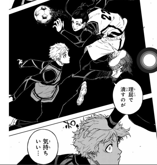
hiiragi was saying how it feels so good to destroy nagi’s natural (and sensitive?) genius with his logic
nagi kinda has a knack for attracting smart people who want to tell him how to ‘play’ only for him to end up rejecting them and angering them (reo, agi in the msc, and well this dude isn’t gonna get too far but he tried)
really, the curse of the lazy genius.
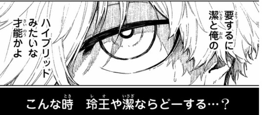
nagi was comparing hiiragi to isagi with his analysis and logic and to himself with his trapping skills. then he goes to ask what reo or isagi would do at a time like this…
and it happened around the time niko said how matches were so easy without reo or isagi around, too 😭
reo mentions in the chapter: 2 and in passing.
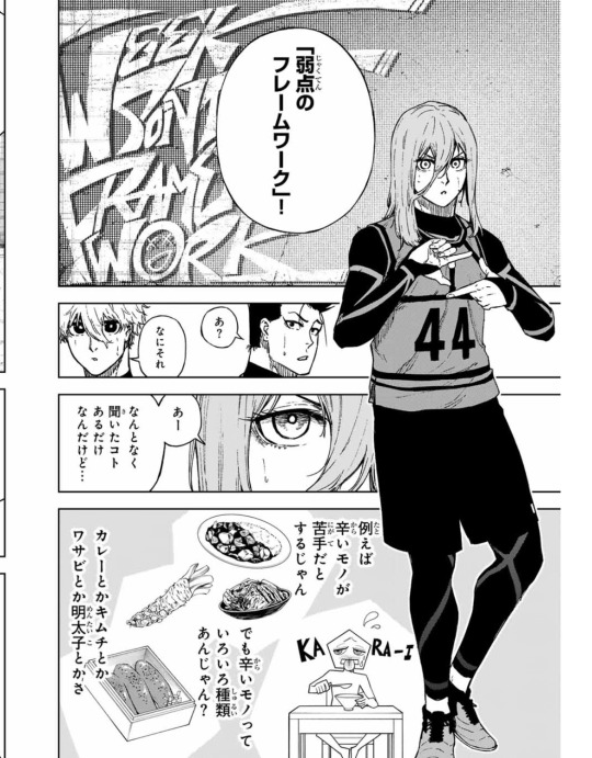
chigiri explains a different framework or perspective so they can overcome their weaknesses
the only one who stepped up 😭😭🫶 imagine trying to explain something to BAROU AND NAGI
the graffiti wall makes me think back on skater chigiri what with the misspelling and typography. queen.
barou and chigiri realizing hiiragis intentions
i mean zantetsu and niko both said they wanted nagi i don’t know what they expected. or did they saw how it was kinda exploitative and that’s why they don’t want to give him up?
hiiragi wants to get nagi into his team so he can teach him about soccer since nagi’s ignorant.
something about how that’s what’s so attractive about nagi to other people, his unbelievable talent with barely any background, but seeing it being expressed so explicitly in a way that sounds kinda malicious is just hyping me tf up like defend urself nagi!!!
do yall think nagi is going to relate hiiragis motivations to reo’s and get even more angry 🥺
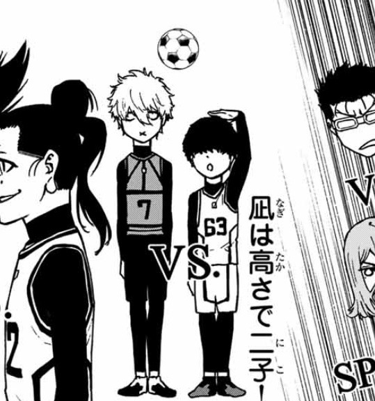
anyways i will be microwaving these specific moments if anyone wants to comment on something feel free to and also here’s a size comparison between niko and nagi from the chapter
#blue lock#episode nagi#bllk#nagi seishiro#chigiri hyoma#reiji hiiragi#is there a reason people don’t post about epinagi anymore besides the schedule#epinagi spoilers
78 notes
·
View notes
Note
Hello! :D I was wondering a couple of things if that's ok :)
1: What got you into doing art as a whole, did you teach yourself or go to art school? 2: Who is your fav OC to draw? If any. I also want to say that i love your artwork. And a lot of your stories are such a fun read! I love everything you upload and i cant wait for the next post ^-^
Hello! Thank you so much, I'm really glad to hear you enjoy my work! c:
1.) Well, I'd been doing traditional art since childhood. I've always loved drawing and being craftsy, and I was always curious about delving into the world of digital art ever since I first discovered the likes of DeviantArt & Elfwood. I learned Photoshop in high school, and was an Art major in college; I did a ton of paintings, pastel-art, mixed media, and some photography.
But honestly my college's digital art program was... Kind of a joke. Most professors there were very of the mind that traditional art was the "real" art and that digital art was mostly meant moreso for like. Advertising. So the most they taught for digital art classes was how to render a hyper-realistic backpack in Illustrator, and some typography techniques.
So when it comes to digital art, I'm mostly self-taught. I took the basics I learned, and looked up tutorial videos for the various drawing software I tried out over the years (my current program being Clip Studio), and went from there. Took a long time to get my art to a point where I'm actually proud of my style, but it's been worth it 👍
2.) My fav OC to draw? Ooof that's a tough one. There's many I enjoy drawing just because I love their expressions so much. Rags, Victor, Balthy, Roscoe… I wanna draw Willie and Nillie more often for a similar reason. Rags is definitely the OC I've drawn the most of over the years. He's very near and dear to me.
Thank you again! <3
❌🔞MINORS AND NO AGE IN PROFILE DNI. This is a NSFW blog, you will be blocked on sight. (More DNIs in Pinned post.)🔞❌
2 notes
·
View notes
Text
Happy 2024! I hope you all have been celeb rating or at least enjoying the holiday season.
I wanted to shoutout my favourite posts from 2023 - that just means I reblogged them during 2023 and I like them.... ALOT!
You may have seen the posts I do monthly, I am going to continue to do so and I released the December one yesterday, you can find it here.
I scrolled through all my posts (archive...shhh!) to find my absolute favourites from this year. I am sorry if I missed you....I reblog a lot of content and I have about 400+ in my current queue. I can't wait to see what next year has in store because I am sure I won't remember a lot of what I have queued up for us all.
If you would like to draw my attention to any posts your create. feel free to tag me #usernae.
I want to say thank you to my fellow content creators that make this site such a joy to be on, and be in awe of. You are all crazy talented and I am always surprised by the style, concepts, and skill so many of you display.
But mostly, thank you for all the time you put into making these creations - I want to acknowledge the effort and resources put into this kind of fan art and content creation.
To get the show on the way...
(P.S. some of these posts have reblogs/likes so low it is criminal - have a look through these posts and show them some love.)
Please find all of my favourite posts from 2023 below the cut.
wednesday addams in green by @yenvengerberg
@lgbtqcreators creator challenge | shapes by @matlillard
1 year celebration: shuffle challenge day 3: color manipulation | typography | potc by @lady-arryn
TED LASSO APPRECIATION WEEK ☆ day 5: fave episode ↳ SEASON 2 EP 8 MAN CITY by @simoneashley
@pscentral event 12: take two AMANDA SEYFRIED as KAREN SMITH by @matlillard
Halliwell Sisters by @witchhalliwell
Tyler Posey as SCOTT MCCALL in Teen Wolf: The Movie (2023) by @tracystewart
TED LASSO APPRECIATION WEEK ☆ day 4: underrated character(s) you love [inspo.] ↳ THE PUB REGULARS + CHARACTER TROPES by @simoneashley
@userphotoshop event 9 | characters of color » Kathani Sharma by @anthonybrxdgerton
PARIS by Taylor Swift ⭐by @sadbeautifutragic
KUWTK SECRET SANTA + ELIO’S 2.5K PARTY for @sith-maul ♡ happy holidays, soupmate! by @edwards-teach
MORGANA PENDRAGON in Merlin | 3.05 “The Crystal Cave” by @mazykeen
Here endeth the lesson. I just wonder if you’ll like it as much as she did. by @payidaresque
EVANESCENCE, BREATHE NO MORE by @hauntedwhispers
11 notes
·
View notes
Text
RUNE!IRISH
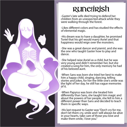
Irish
-Gaster's late wife died trying to defend her children from an unexpected attack while they were walking through the forest.
-Likes different colors and has studied the effects of elemental magic.
-His dream was to have a daughter, he promised Toriel that his girl would marry Asriel and that happiness would reign over the monsters.
-She was a great dancer and pianist, and she was the one who taught Gaster how to play and dance.
-She helped raise Asriel as a child, but he was very young and didn't remember her, but she created a song for him, the only memory he had of his beloved aunt.
-When Sans was born she tried her best to make him a happy child, singing, dancing, telling stories and jokes, for her the little one's smile was the light of her day, he still has vague memories of it.
-When Papyrus was born she treated him differently than Sans, she taught him magic and about the powers of her people, she felt a different power in him than Sans and decided to teach them in specific ways.
-His last request to Gaster was “Don’t cry for me, don’t let them cry, smile and I will always be alive in your hearts, take care of those you love and make them smile, I love you.”
-----------------------------------------------------------------------------
OBS:
Irish would be gaster's wife, this character was created by me, at first I wasn't going to post about her, I was just going to leave her as the deceased mother of the skeletons, but she is crucial to the story, And over time it gained more and more space so I decided to make a card just for it. I hope you like it 💕
And yes its name is based on a typography font too

This is the font I use in the titles of all content relating to the story of Runetale.
8 notes
·
View notes
Text


So, for my posters, I really wanted to capture the essence of what Otara EFKS has taught me. Each poster tries to visually represent those key values and lessons, moving beyond just text to make it more impactful. It's been a journey trying to make these ideas come alive on paper, especially when thinking about how they'll resonate with people.
The first poster, the one with "BALANCE" prominently featured, was all about playing with typography to create a sense of movement and depth. I started with "EKFS TAUGHT ME" at the top, pretty straightforward, but then "BALANCE" itself kind of breaks apart, almost like it's shifting, which is how balance feels sometimes like something you're always working on. The other words like 'REVERENCE,' 'DISCIPLINE,' and 'BOUNDARIES' are scattered and rotated, some bigger, some smaller, creating this almost chaotic yet interconnected web. It’s meant to show how all these different teachings from EFKS contribute to finding your own balance. The dark purple background contrasted with the black and white text really makes it pop, giving it a strong, almost solemn feel, fitting for the depth of these teachings. The idea was to make it look like a flow, an organic growth of these concepts.
For the "FAITH" poster, I went for something completely different, focusing on repetition and pattern to convey a central idea. You can see how the word "FEAR" is repeated over and over again, swirling out from the center. But right in the middle of all that 'FEAR' is the word 'FAITH,' standing solid and strong. This was my way of showing how faith, for me, acts as this anchor, pushing back against fear and doubt. The circular, almost mandala-like patterns are pretty eye-catching and draw you into the center. Again, the dark purple background provides a good contrast, letting the black and white text really stand out. It’s supposed to be a bit hypnotic, drawing your gaze in to that central point of 'FAITH.'
Finally, the poster that lists all the values like 'CONTROL,' 'STRUCTURE,' and 'DEVOTION' has a more structured, almost layered feel. It’s like a visual inventory of all the lessons. The words are arranged in a way that suggests a foundation, with some words being larger and bolder, indicating their significance. The lines and subtle overlaps create a sense of depth without being too overwhelming. It’s less about abstract visual representation and more about a direct, yet still artful, presentation of these core teachings. The consistent purple background across all three helps tie them together as a series, even though their individual designs are distinct. I wanted this one to feel like a pillar, a solid list of things that really ground you.
0 notes
Text
Final Reflection
For my second typography class, I was not disappointed. This class teaches you the alternate fundamentals that you need to learn for any sort of design you were looking to go into. Typography class has taught me so much not only about the work itself, but about my own work and my own style. I've gotten to learn so many new terms and rules that will hopefully make me stand out from others and take my design career further. I am very grateful to have two amazing teachers that are very well-known in the program and also who have helped me when creating projects and work that I can use in a portfolio for the future. Typography class has made me realize that design not only relies on your own creativity, but also on rules that have been around and been used for years by so many people in so many different ways. This class specifically was personally one of my favorites I have had. One of my favorite things I will always say about my art classes is getting to see and admire my peers' work. It's always so fun for me to be able to see how all of our minds work differently when given the same prompt and even more so when the class focuses mainly on type. It's easy to create a fun and dynamic illustration, but even harder to add type into that into and to “make type the hero.” Ultimately I will keep everything that I learned in these courses under my belt for a long time and am very grateful to be able to learn from such amazing professors, and specifically Marius!
0 notes
Text
From Sketch to Screen: My Journey from Traditional to Digital Art
Creativity has always been at the core of who I am. From childhood sketches to exploring the worlds of photography, graphic design and animation, my artistic journey will take me through a very dynamic blend of discovery and growth. With each medium, I will learn new techniques, adapt my skills and always find new ways to tell stories through visuals. This post is simply the beginning of my journey as a multimedia artist and how I will learn to integrate different art forms into my creative process.
In my early days I fell in love with the idea of drawing, the thought of turning my thoughts into visuals into a sheet of paper always intrigued me as a child, and like many artists, my journey began with a pencil and paper. Drawing was really my first love—it was my way of expressing ideas and bringing characters to life, and as someone who is interested in not only illustration but also photography, graphic design, and, eventually, animation, learning digital art feels like a natural progression. Graphic design, for example, depends heavily on software such as Photoshop and Illustrator. Animation necessitates knowledge of digital drawing tools. Photographs frequently include digital retouching. By honing my digital illustration skills, I can bridge the gap between these creative disciplines and broaden my artistic horizons.
Well, of course, moving from traditional to digital isn't easy. Unlike a pencil and paper, where I can feel the texture and control every stroke with precision, drawing on a tablet feels completely different. There's a learning curve—getting used to the pen sensitivity, understanding layers, and figuring out how to blend colors digitally.. At times, it's frustrating. But I remind myself that every great artist started somewhere. One of the most difficult challenges is getting past the comparison mindset. I see digital artists who have mastered their craft and wonder if I will ever reach that level. But instead of allowing doubt to hold me back, I remind myself that this journey is about progress, not perfection. My traditional art skills will serve me well in digital illustration; all I need to do now is figure out how to apply them.
However.. There is another of my interests that I want to share.
Illustration isn't my only creative outlet; I also enjoy photography and graphic design. These fields work better together than most people realize. Photography helps me understand lighting, composition, and color, all of which are useful in digital illustration. Graphic design teaches me about layout, typography, and how to produce visually appealing images.
By combining these abilities, I hope to create one-of-a-kind artwork that blends illustration, design, and photography. Eventually, I'd like to experiment with animation, bringing my drawings to life through movement.
Finally, this blog will serve as a personal journal of my journey—documenting my struggles, achievements, and everything I learn along the way. I want to show that transitioning form traditional to digital art isn't an overnight process, but a rewarding one. I've always wanted to become an amazing illustrator or an amazing animator, so I am willing to take this journey to achieve my goals.
To any other artists out there feeling intimidated by digital art: I get it. It's challenging, but it's also exciting, there is something incredible about thinking about how much potential you can unlock by putting in the time and effort to patiently learn a skill. Every new skill starts with a first step, and I'm ready to take mine. Let's grow and prosper together!
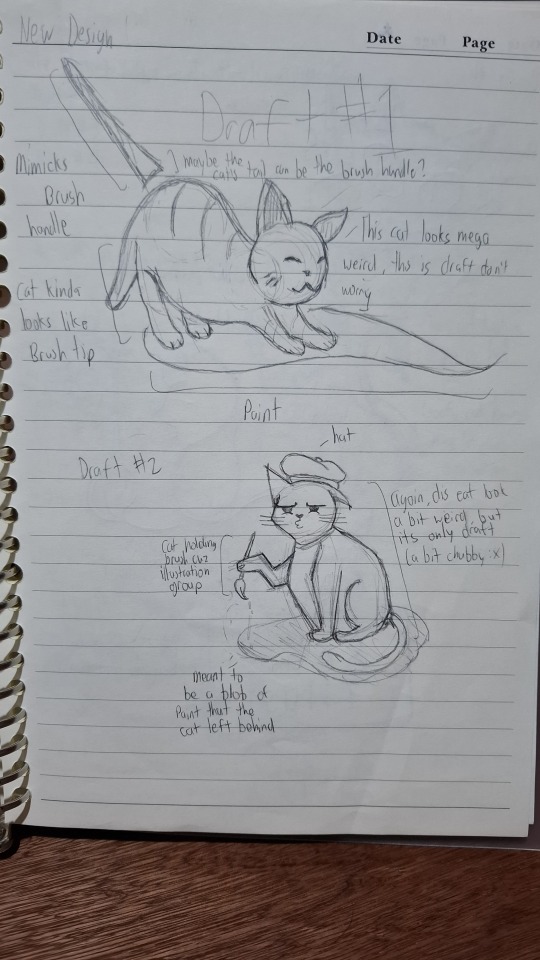
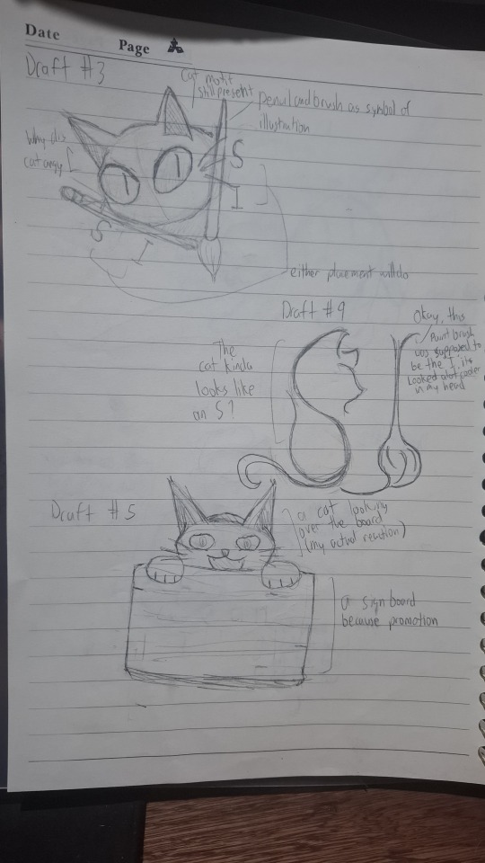
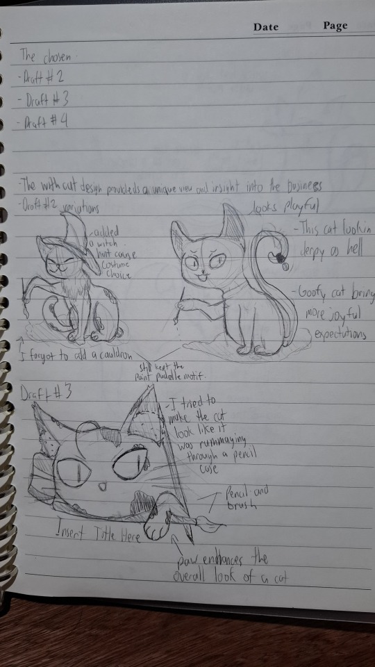
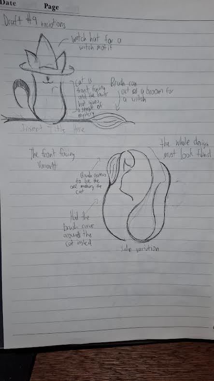
So for now, I'll show some drafts that I worked on in my design classes in school! The whole idea is to combine cats and an animation/illustration vibe..
With all that said, if you're also learning digital art or just have any tips to share, feel free to comment below! Let's support one another on this journey!
1 note
·
View note
Text
Which Course is Better, Graphic Design or Digital Marketing?
For Quick Enquiry: Click Here

Introduction: Choosing Between Creativity and Strategy for a Career Path
In today’s digital-first world, two courses are consistently dominating career conversations: graphic design and digital marketing. Each has the potential to shape vibrant careers, but let’s be honest, the decision between the two feels like choosing between coffee and chai—both are great, but your choice depends on your vibe. If you’re creative at heart and love working with visuals, Graphic Design Courses Near Me might just be your calling. On the other hand, if you thrive on data, trends, and strategizing campaigns, digital marketing might steal your heart.
In India, where online businesses are booming, both fields offer immense opportunities. Graphic design is the art behind eye-catching visuals, while digital marketing ensures those visuals actually reach the right audience. But which one aligns better with your goals? The answer isn’t simple, but this blog will help you make a confident choice by diving into key aspects of both. Oh, and don’t worry—we’ll add a sprinkle of humor to make this career dilemma feel less like a boardroom meeting and more like a friendly chat.
Before we dive in, remember: this isn’t about which course is “better” but about which one is better for you. So, grab a cup of chai (or coffee), and let’s get started!
Exploring the Key Skills Taught in Both Fields
"Exploring the Key Skills Taught in Both Fields" dives into the essential competencies developed in graphic design and digital marketing. From creative software mastery in design to strategic SEO and analytics in marketing, this exploration highlights the versatile skills that prepare individuals for successful careers in both industries. Finding a Graphic Design Courses Near Me can be the first step towards building a successful career in the creative field.
1. What Graphic Design Teaches About Creativity and Visual Appeal?
If your Pinterest boards are filled with aesthetic posters and logo designs, graphic design might just be your soulmate. This field equips you with skills to create visuals that not only look great but also communicate effectively. From mastering color theory to understanding typography, Graphic Design Courses Near Me will make sure you’re ready to create designs that speak louder than words.
Graphic design is more than just “making things look pretty.” It’s about solving problems through visuals. For instance, if a brand wants to attract younger audiences, you’d use bold colors, playful fonts, and trendy layouts. The best part? You’ll get to see your work everywhere—from billboards to Instagram posts, making you feel like a celebrity designer. Plus, working on creative briefs is never boring—you’re basically paid to think outside the box.
2. The Technical and Analytical Skills Taught in Digital Marketing
Digital marketing, on the other hand, is all about using strategies and tools to get brands noticed online. Think of it as the Sherlock Holmes of the marketing world: you’re solving mysteries about what people want and how to give it to them. Courses in this field cover SEO, social media strategies, Google Ads, and analytics. If numbers don’t scare you, this could be your dream job. Graphic Design Courses in Delhi can help you develop the creative skills and technical expertise needed to succeed in this field.
In India, where digital platforms are growing exponentially, digital marketers are in high demand. But don’t think it’s all about data; creativity is equally important. Whether it’s brainstorming Instagram captions or designing email campaigns, you’ll find plenty of opportunities to flex your creative muscles. The best part? You can measure your success. Imagine knowing that your strategy increased a company’s sales by 200%! That’s the kind of job satisfaction you’ll be signing up for.
3. Which Field Offers More Freedom to Freelance in India?
Both graphic design and digital marketing offer excellent freelancing opportunities, but they cater to slightly different audiences. If you’re a graphic designer, you might find yourself working with startups, e-commerce businesses, or even NGOs looking for compelling visuals. Thanks to online platforms, clients can easily find you if you’ve honed your craft through Graphic Design Courses in Delhi.
Digital marketers, however, often juggle multiple clients at once, running campaigns and analyzing performance data. The beauty of freelancing in either field is the freedom to choose projects that resonate with you. In India, where freelancing is on the rise, both fields offer a solid path to independence—so long as you’re willing to hustle.
Evaluating Career Opportunities and Future Growth Potential
"Evaluating Career Opportunities and Future Growth Potential" involves analyzing various job roles, industries, and emerging trends. It helps individuals identify fields with high demand, stability, and advancement prospects. This strategic approach allows professionals to make informed decisions, ensuring long-term success and growth in their chosen careers.

1. The Scope of Career Growth in Graphic Design Roles
Graphic design careers often start with roles like junior designer or layout artist. As you gain experience, you can branch into specialized areas like UX/UI design, branding, or even animation. The demand for skilled designers is growing in India, especially with the rise of e-commerce and digital content platforms. Completing Graphic Design Courses in Delhi can open doors to agencies, startups, or even international freelance opportunities.
One thing to remember: graphic design is highly portfolio-driven. Your skills and creativity matter more than your degree, so always be ready to showcase your work. And let’s not forget the personal satisfaction of seeing your designs in the real world—it’s like leaving your creative footprint on society.
2. The Growth Potential in Digital Marketing Careers
Digital marketing, on the other hand, offers a more varied career path. From SEO specialists to social media managers and digital strategists, the roles are diverse and ever-evolving. In India, where every business is moving online, the demand for digital marketers is off the charts. The skills you gain can also help you transition into other fields, like public relations or market research. If you're interested in a creative career path, consider exploring Online Graphic Design Courses.
Unlike graphic design, digital marketing roles often require staying updated with trends and algorithms. If you love learning new tools and strategies, this field will keep you on your toes. The best part? Results are measurable, so your hard work rarely goes unnoticed.
3. How do Both Fields Compare in Terms of Income Potential?
When it comes to income, both fields have strong earning potential. Graphic designers in India typically start with moderate salaries but can earn significantly more with experience and specialization. Freelancers often command premium rates for unique, high-quality work. Enrolling in Online Graphic Design Courses can help you build the skills and portfolio needed to attract well-paying clients.
Digital marketers, meanwhile, often have higher starting salaries, especially if they specialize in in-demand skills like PPC advertising or data analytics. The income ceiling is also higher, thanks to the growing importance of digital strategies in business success. Whether you choose design or marketing, your earnings will largely depend on your expertise, creativity, and ability to adapt to industry needs.
Conclusion: Choosing Between Creativity and Strategy for Your Career
Deciding between graphic design and digital marketing can feel like choosing between two equally delicious desserts. Both fields offer unique challenges, creative outlets, and career opportunities. If you’re someone who loves playing with visuals, color palettes, and innovative ideas, pursuing Online Graphic Design Courses could be the perfect way to kickstart your creative journey. On the other hand, if analyzing trends and crafting strategic campaigns sounds exciting, digital marketing might be more your style.
In India’s ever-evolving digital landscape, both fields promise rewarding careers. The key is to assess your skills, interests, and long-term goals before making a decision. Remember, the best choice isn’t about picking the “better” field but choosing the one that aligns with your personality and aspirations.
Whichever path you choose, know that success lies in continuous learning and staying updated with industry trends. So, dive in, explore, and let your career soar in this vibrant digital age. Who knows? Maybe one day, you’ll find yourself combining the best of both worlds—a graphic designer with a flair for marketing, or a marketer with an eye for design. Now that’s what we call the ultimate power combo!
Also Read This:-
How Important is Graphic Design for Social Media Marketing?
#kvch#GraphicDesignCourses#GraphicDesignTraining#LearnGraphicDesign#PhotoshopCourses#IllustratorCourses#AdobeCreativeSuite#MotionGraphicsCourses#3DDesignCourses#OnlineCourses#OnlineLearning#LinkedInLearning#SkillDevelopment#CreativeProfession#DesignCareer
0 notes
Text
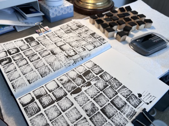
(ARTS345) Project #2 In Progress Critique and Typography Experimentation & Skillshare Video #5: Getting Started with Letterpress Printing with Hope Johnson
Week Seven
Project #2: Typography Stamping Experimentation & In-Progress Critique


Skillshare Video #5: Getting Started with Letterpress Printing with Surface Designer & Printmaker Hope Johnson
This week's fifth and final Skillshare video for the semester is a beginner's guide to letterpress printing. I first learned about letterpress during an artist talk by Brad Vetter organized by SVAD last year, and I've been fascinated by it ever since. I enjoy combining history with the present, and I saw the Project #2 voting poster as a great opportunity to create something fun, unique, and cool using physical type. Since letterpress was the theme, I decided to watch an informative video about it by Hope Johnson, a talented surface designer and printmaker.
Hope's letterpress journey began when she fell in love with designing custom stationery and invitations. She now works from her home studio, using a vintage Chandler & Price press affectionately named "Marlin," which she found on eBay. Her passion for all things vintage, combined with her creative flair, drives her business. She specializes in creating personalized, handcrafted pieces with a focus on wedding invitations.
Hope Johnson shares her foundational knowledge and tips, which took her over 6 years to master, in a comprehensive overview of the craft. The class will cover essential skills, equipment, and techniques, making it an ideal starting point for anyone interested in learning letterpress printing. Hope's enthusiastic and approachable teaching style aims to foster a sense of community, encouraging students to ask questions and connect on social media as they explore the art form.
In the course, Hope emphasizes the importance of creativity and personal touch in letterpress projects. She also provides technical advice on how to handle and maintain equipment. Hope offers encouragement and is eager to connect with students on social media to assist them along their letterpress journey. The course covers not only the mechanics of letterpress printing but also the creation of meaningful and beautiful experiences through the art of stationery. Whether you're restoring an old press, eager to use a press you already have, or setting up your own in-house letterpress, this class offers a welcoming and inspirational foundation.
I hope to have the chance to use a letterpress machine someday. Project #2 has given me the opportunity to work with hand-stamping letters using traditional ink and wooden stamps, but letterpress printing seems really fascinating to me. These old machines might be a bit intimidating, but Hope's video has helped me learn more about them and feel a little less intimidated. I'm looking forward to the opportunity to working on letterpress design projects in the future!
0 notes
Text
Raphaël Lefeuvre at the ‘Jeudis de Lure’ to turn constraints into challenges
The ‘Jeudis de Lure’ at Césure are typographic meetings organized by the Rencontres de Lure association, dedicated to enthusiasts of graphic design, typography, alphabets and Unicode. These events take place on certain Thursdays and offer an enriching experience for both experts and the simply curious, with captivating lectures, informal discussions and convivial moments over a drink. Participants can enjoy this celebration of letters and scholarly exchange in a relaxed and accessible atmosphere. Eager to enrich my culture and seduced by the promise of the event, which seemed to fit me perfectly, I decided to go and have a look around.
This edition's program consisted of a discussion on monospace typefaces. A monospace typeface is a letter whose width, including the letterspacing, remains constant. Popular among typists, accountants and developers, monospace typefaces have become a favorite choice for graphic designers, sometimes far removed from their original purpose. And that's precisely what made me like the approach described by Raphael Lefeuvre: considering a technical constraint, even an obsolete one, as a way of taking up a challenge.
Raphaël Lefeuvre is a typographic and graphic designer based in Paris. Alongside his professional activities, he teaches graphic design and typography at the École Duperré, after having directed the master's degree in typographic design at the École Estienne for ten years. He is particularly interested in typography in its various media and materials, and experiments with both digital and manual drawing, lapidary engraving and old-fashioned letterpress printing.
He describes his approach to type design as often resulting from the observation of details of past or present editorial usage, specificities of language, or singular forms and styles, from which he defines his fields of constraints and deploys his terrain of visual speculation.

Specimen of the Square Mono
The type designer talked about the process of creating his monospace typeface Square Mono. Square is a monospace typeface, where each sign is designed within the confines of a square. This constraint makes it possible to write both vertically and horizontally. The initial idea behind this typeface was to evoke a ‘square’ (a small park), seen from above.
This enjoyment of constraints is, as a graphic design student, the reason why I chose to start pursuing my studies.
0 notes
Text
CTS A | Week 12 | Compulsory Question 3
Q1. Connect CTS A to your learning and professional journey.
For my learning journey, I want to collaborate with the Animation students on a short animation for Racial Harmony Day, aimed at educating children about Singapore’s diversity. This project will highlight the country’s rich cultural traditions. Through effective teamwork, we will combine our expertise in animation, design, and storytelling to create engaging content that fosters understanding and respect of Singapore’s multicultural heritage. I will handle the design of the visuals while they animate the assets and produce a video. Additionally, I would like to create a communication campaign focused on climate change. The campaign will aim to raise awareness and drive action on climate issues by creating visually compelling materials that effectively communicate key messages. Through a combination of graphic design, typography, and critical thinkingi, I plan to showcase how design and successful teamwork can play a vital role in addressing global challenges and inspiring positive change.
Professionally, I would like to work with the Singapore Kindness Movement (SKM) to promote kindness. Through creative design and storytelling, I aim to develop visually impactful materials and campaigns that inspire individuals to practice and spread kindness. By leveraging design elements such as graphics, digital media, and typography, I hope to engage the public and raise awareness about the importance of kindness in building a more compassionate society. This partnership will allow me to contribute to SKM’s mission while showcasing the power of design and growth mindset in fostering positive social change

Lastly, Critical Thinking modules enhance my professional growth by equipping me with skills to analyze problems, make informed decisions, and adapt to challenges. With a growth mindset, I’ll see challenges as opportunities to learn, allowing me to continuously improve my problem-solving and decision-making abilities. It also helps refine my communication skills by teaching me to structure my ideas clearly, while encouraging openness to feedback. CTS A fosters a lifelong learning approach, enabling me to adapt to change, enhance my career, and embrace new opportunities for development.
(325 Words)
0 notes