#and that I would not mind being that one artist who draws a pretty drow with imposter syndrome an unhealthy amount
Text
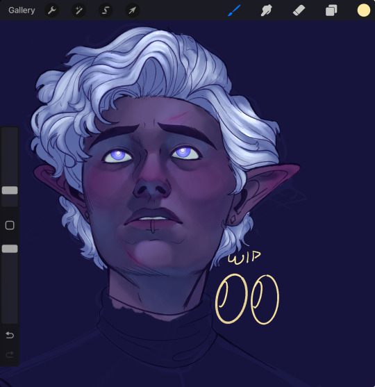
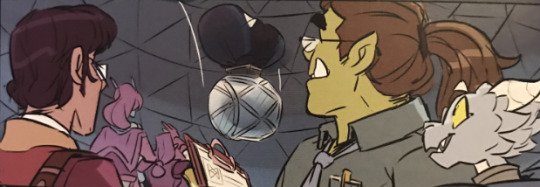
Uhhhhhh Essie enjoyers come get this wip ig?
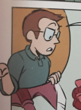
#non kink#listen all I’m saying is that some preg artists on tumblr have their fandom niche#and that I would not mind being that one artist who draws a pretty drow with imposter syndrome an unhealthy amount#seriously he’s been such a comfort character since I started watching live during quarantine#he means so much to me#and I would love nothing more than for my art to motivate someone to find the source material#and discover the MASTER craftsmanship that is his character#we’re a sha/dow/gast household btw#what’s sexier than wizards N#m draws#m in progress#yes I got so excited to start painting that I didn’t even finish the flats
30 notes
·
View notes
Text
what’s up everybody! it’s time for part 2 of my taz graphic novel review.
part one covered (most of) my beef with the writing and storytelling choices. this part is gonna cover character designs!!! you should know going into this that my opinions are not positive. this post is also a lot less analytical in tone than part 1, because art is not my forte.
disclaimer: i love the mcelroys. i truly do. taz has gotten me through some very difficult stuff and i have a tattoo. all this to say i’m not doing this because i hate them or because i like hating things. if you feel the need to message me about how i am overreacting, specifically to green taako, or about how i should just calm down and ignore it, or about how it’s sad that i’m getting so worked up instead of just enjoying the show, i’ve heard it and i don’t care. you will not be taken seriously. save yourself the energy.
there are spoilers for the graphic novel under the cut.
alright. i’m getting the elephant in the room out of the way first because it’s the most important thing to address, and once it’s out of my system i’ll feel better goofing on the rest of the designs. as i mentioned in the disclaimer: Green Taako Is Bad.
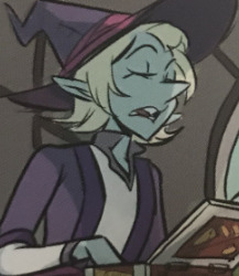
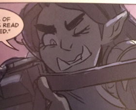
[ID: a panel focusing on taako. he’s skinny and minty green with chin-length light blonde hair and a big, pointy nose.]
now, a lot of people have made posts about this before, and i’m not saying anything new about it by any means. i’m also not the most equipped person to talk about why green taako is bad, because i’m a white gentile (i’ve heard conflicting opinions on whether or not green taako is antisemitic, but it feels remiss not to mention that there’s been discussion) and therefore not part of any groups affected by this whole debacle, but in short: when pressed for more diversity, specifically in taako’s case as a pretty large chunk of his arc involves literally inventing a mexican cultural food (fun note: that’s never mentioned in this book,) carey pietsch decided he should be green and the mcelroys were down with it. this is not an issue that cropped up when this design was released; it was something that there was already a ton of discourse surrounding, and it should never have gotten concepts drawn, let alone made it to publish.
this article by natt cuesta has been linked before on the subject, and i think it’s a good, concise explanation of why green taako is bad as well as why aracial characters in general are bad. this is a racist design.
now that we’ve gotten those ethical ramifications out of the way... i’m sorry, but it’s an ugly design, lmao. he looks like a palette-swapped version of pearl from steven universe with less character. the ONLY thing about this design that i like is the prominent lower lashes, if only because they’re the only thing that keeps him from looking entirely generic. because, like, y’all, when has anything about taako been generic?
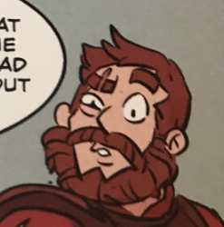
[ID: a panel focusing on magnus. he’s a muscular fair-skinned man with auburn hair, a bushy beard, and a scar over his left eye.]
generic is a word that’s going to come up a lot over the course of this review, because i genuinely can’t think of a more apt descriptor for pietsch’s designs. it feels like she went with the lowest common denominator of every character’s design, a synthesis of all of the most popular (and most boring) ones, except in instances where that would lend any personality to a character’s design. magnus fits what brief description we’re given in the podcast: auburn hair. beard. big. and i guess that’s all you need?
i understand that by appealing to the most common and basic designs for these characters you’re inviting a lot less ire than you might by going with something more individual, so i get the motivation behind it -- or i would, if her designs hadn’t always been about this dull. but it’s bizarre to me that in a story as unique as the balance campaign, we ended up with the most basic ass Fantasy Hero lookin’ dude in the world as one of our protagonists.
i just really don’t have a lot to say about this. i’m just bored by it.
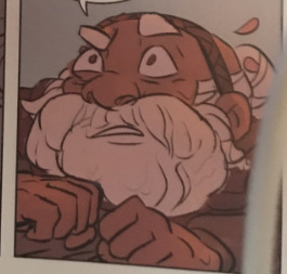
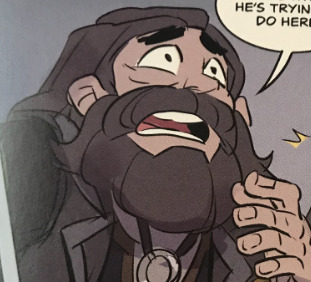
[ID: a panel of merle. he has medium-dark skin with a smooth white bun and beard.]
merle is simultaneously the design i like most out of the boys and the one that throws me the most, because i feel like he’s the most out on a limb one. which... oof. most merle designs i see give him a floral motif (i guess he has a few petals in his hair, maybe?) and big coke-bottle glasses, and i miss those things with this design, but at least it doesn’t totally feel like pietsch threw every merle she could get her hands on into a blender and poured it out on a page, although honestly, that might have been more satisfying. people do some really fun shit with their merle designs, but again, he’s. generic.
as the cuesta article mentions, with how much of an issue it was to get any of the boys to be poc in the first place and in conjunction with minty up there, this design also feels like tokenism -- an appeasement rather than an honest attempt at diversity or god forbid because the artist actually headcanons merle as a person of color. personally, i wish that she’d gone a step beyond re-coloring his skin and idk given him a natural hairstyle or something. he still feels very much like a recolor to me rather than a character who was designed as a person of color from the beginning.
i feel like he looks more like a cleric than he looks like a merle, which i feel like is pretty contradictory to who merle is.
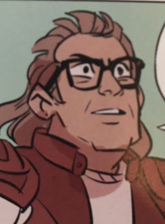
[ID: a cutaway showing griffin, a white man with brown hair and glasses wearing a collared shirt.]
i’ve said before that it feels a little odd to talk about her design of a real person, so i’ll keep this brief, but... you know how every drawing of a basic white dude looks a little bit like griffin mcelroy? you know how that one arthur character looks a little bit like griffin mcelroy? you know how everyone is constantly messaging mysillycomics about how her avatar looks like griffin mcelroy?
how did carey pietsch manage to actively attempt to draw griffin mcelroy and miss the mark? it boggles the mind. he doesn’t not look like griffin, i guess, but he doesn’t look like griffin, either. i don’t know, man
[ID: a generic gerblin. he has yellowy-green skin, slight tusks or fangs, and weird, nubby little horn-type things.]
i hate these gerblins. they are ugly. next
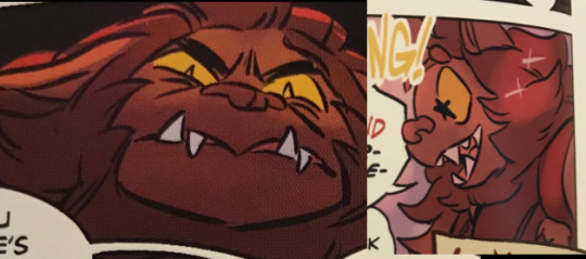
[ID: two images of klaarg/g’nash. he’s a bugbear with brown fur and yellow eyes as well as a mouth full of pointy teeth. in the first image he looks pissed off; in the second he’s starry-eyed and delighted.]
klaarg is probably my favorite design in the book, and that’s just because he looks like a cute dog for most of the time he’s on the page. he’s fluffy and i love klaarg anyway, so like. did not take a lot to reach this mark. especially considering how i feel about most of the other designs lmfao
i do definitely think he keeps up the trend of looking generic, though.
[ID: an image of barry bluejeans. he looks like tom arnold, kind of; he’s square-jawed and white with thick-rimmed glasses. he also has a light brown mullet.]
i hate this. i hate the mullet. i’m sorry, y’all, i really, truly, cannot stand the mullet. i don’t feel like barry has mullet energy. i feel like it’s too powerful a move for him. it wouldn’t be a good move, mind you, but it would be a big one. i don’t know y’all it’s just bad
[ID: an image of killian. she’s a green-skinned orc woman with prominent eyelashes, eyebrows, and tusks, and straight brown hair.]
i can’t have been the only one who was hoping for a badass, visibly muscular, maybe even butch killian design, right? that wasn’t just me being a big old lesbian, that’s a pretty common theme of killian designs? i guess kudos for going out on a limb again, but then, like, take the kudos back for going out on the most boring limb possible again. i could hang with the face if her hair wasn’t so boring, but it’s... it’s so boring
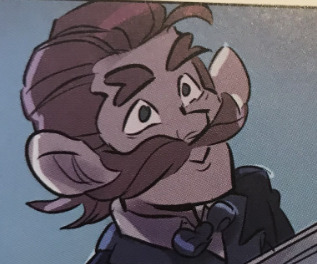
[ID: an image of magic brian. he’s a drow with long white hair and an oblong face and oddly shaped nose.]
for how many of her designs are syntheses of popular ones, i..... don’t understand how this happened. i don’t understand how whimiscal and flamboyant magic brian who’s often drawn as taako-but-a-goth-dark-elf ended up looking like this. he looks like he used to play football and got his nose busted up and peaked in fantasy high school. he looks like the first quarter of a monster factory video where the thing’s just ugly but doesn’t have a personality or any endearing traits yet. he didn’t have to be the goth twink we all know he is but what.......... is this
[ID: an image of gundren rockseeker/bogard. he’s a light-skinned dwarf with dark long hair and a matching beard.]
..........listen i know they’re cousins and distant cousins at that but all of merle’s cousins are light-skinned and, like, not to say that that can’t happen but having them be anywhere near merle’s skin tone would’ve been such an easy way to help bolster the obviously inaccurate idea that this is a work concerned with diverse character designs, or rather to help ppl claim it was being bolstered, and yet
[ID: avi, a fair-skinned man with long dark hair kept up in a ponytail and slight scruff on his face.]
i feel like maybe avi is intended to be east asian so i think at this point that brings the count up to a whole two characters of color. we’re almost done with the book. cool. he’s cute, i guess, but guess what word i’m about to say again (it’s generic)
[ID: a panel of several unnamed cameo characters. from right to left: carey fangbattle, a light blue dragonborn; brad bradson, a green orc man with a long brown ponytail; and presumably lucas miller, a tan human with glasses and dark hair.]
ok. deep breaths.
first off, there’s another panel w these three as well as boyland, who looks fine, but i didn’t grab that one bc it’s harder to make out detail. carey is cute. brad is fine.
i assume the third guy is lucas miller because i’m not entirely sure who else he would be, and... oof! as you may know i can’t stand lucas miller, which has nothing to do with his necromancy or nerdiness and everything to do with the various human rights violations he commits in the small time he’s got focus as well as the fact that he’s got a theoretical redemption arc that’s not actually an arc so much as us being told he’s better now. lucas is an entitled jackass who repeatedly uses other people’s bodies and minds without their consent, from the obvious offense of using the bugbears as brainwashed chore-doers (read: slaves) to the less-oft discussed dragging of noelle and others out of the astral plane into robot bodies, again to do his chores for him. because of this, it has always sat very uncomfortably with me when people make lucas a poc, because everything about him screams Shitty White Nerd Boy to me. it sits extra uncomfortably coming from carey pietsch, given how white all of her other designs are.
it’s a little hard to tell because i took all these pics with my phone camera in my room’s lighting so they’re not super high fidelity or anything, but pietsch’s lucas is noticeably darker than any other character we’ve seen so far save merle. maybe he’s just a white guy with a tan, but all the same, it strikes me as incredibly skeevy to have one of so few characters of color be this fucking guy.
[ID: johann, a black man with an oblong face and textured dark hair.]
johann’s design is fine, although this is a similar face shape to that brian from earlier and i just. i don’t. understand it. it’s not especially interesting, but hey, at least he’s not another generic white guy.
that being said, as i mentioned in part 1 of this review, johann’s role is severely cut in this -- he’s reduced to three panels, when in the show itself he’s the one who escorts the boys to the voidfish’s chamber and inoculates them. as i mentioned in that post i understand that they shifted it some to give lucretia a more prominent entrance, but as i also mentioned in that post, they should have compensated for that. three panels.
johann is not a character with a great deal of screentime as it is, but he’s a character with a major impact. he is the reason story and song happens. his song serves as a direct foil to john’s nihilistic conversion of his own home plane into the hunger. the fact that he’s been reduced to three panels with little to no characterization at this point, especially in conjunction with the fact that he’s one of very few poc, makes me really, really uncomfortable. avi is in more panels in this book than johann is, and while i love avi and as i said i am parsing him as an asian dude, he’s also still light-skinned enough and the style is nondescript enough that there are definitely people who will parse him as white, and also, avi’s role in the story is not as big as johann’s.
it doesn’t sit right with me.
[ID: an image of davenport, a fair-skinned man with a big red mustache and slicked back red hair.]
ginger davenport with a big mustache. groundbreaking.
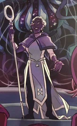
[ID: an image of lucretia, a slender black woman with short white hair dressed in blue layers.]
and finally, lucretia. now, i’m biased, and it’s hard for me to see a lucretia design i don’t like. i also think that this is, compared to a lot of the others at least, one of the more interesting designs in the book, at least as far as her clothes go. it’s not a long robe that would be hard to move in, and i appreciate that -- it strikes me as a pretty practical outfit while also being ornamental and wizard-y. and she’s pretty, and she’s not whitewashed, and that’s all great. i like her earrings.
all that being said, i feel like it’s not enough. luc’s hair continues a theme with merle’s and johann’s (as well as the preview we’ve seen of angus,) which is that it strikes me as very low-effort on pietsch’s part. it’s short and it’s definitely not straight, but it doesn’t feel to me like it had as much thought put into it as, say, minty green taako’s hair. we could’ve had a lucretia with a big beautiful afro, or long box braids, or so many other natural hairstyles; we got this. it’s not bad, but i do think it’s disappointing. without going looking for it and without being a person who reads a great deal about character design, i’ve seen a fair amount of discussion from black women (artists, writers, and none of the above) about the portrayal of black women as it pertains to their hair. they’re never designed to be as feminine as their white counterparts. their hair is never treated with the same amount of detail or respect as their white counterparts. it’s short, maybe curly if you’re lucky.
i’m gonna circle back quickly to killian’s hair. it’s long and smooth and kept down, despite the fact that killian is an action-oriented women and might not want it to be in her face all the time -- it could have at least been braided or in a bun. it could’ve been short! and that would’ve made sense. and i don’t mean to say that lucretia couldn’t have short hair, but she’s a very elegant woman whose dress is described as intricate. she wears business regalia. she could have any number of hairstyles, from something elaborate to something simple but more out-of-the-box than this, but she doesn’t. i found this on a quick hunt through my ref tag -- it’s a tutorial for drawing black folks with just a small selection of interesting things you can do with afrotextured hair. these resources aren’t hard to find! and i’m doing this for fun -- carey pietsch is a professional artist who was paid for these designs. if she’d put in more than the bare minimum effort, we could’ve had some really interesting shit going on, but she didn’t.
and that’s the core of the issue here. i truly do not feel like pietsch put the same amount of care into the designs for the few characters of color we see as she did into the white ones, and that’s upsetting and emblematic of a larger problem in the work: neither pietsch nor the mcelroys put in very much care at all for the fans of color who spoke up and asked for representation.i know i said i was getting taako out of the way first so the majority of the post could be goof-heavy, but goddamn, y’all, it’s hard to goof about when it’s so blatantly shitty. pietsch’s designs are boring at best and racist at worst, not to mention conspicuously lacking in anyone who is not skinny, muscular, or a dwarf. people have praised this thing so uncritically, including people whose opinions i generally really respect, as if the fact that the mcelroys signing off on green taako made it above reproach.
it didn’t, by the way. there’s no such thing as an unproblematic fav, because everybody fucks something up now and then, but even then, this is a pretty egregious fuck-up! and it was willful!
i’m not saying y’all need to burn your copies of the gn or stop listening to the mcelroys entirely or anything of the sort -- you may remember the disclaimer at the top of the post where i say i really, really love them, and more specifically, i really love taz: balance. but i am BEGGING YOU to think critically about their work. good, good boys can do bad, bad things. white people can produce work that’s racist even if they’re gay women. it’s not mean to critique the boys and it’s not homophobic (or god forbid reverse racist, which is still not a real thing) to critique carey.
¯\_(ツ)_/¯ the real kicker of this whole thing for me is that there’s a small fanart gallery in the back of the book. most of them aren’t labeled with the artist’s handles, just their names, but there are some truly beautiful pieces featuring diverse designs -- galacticjonah and milkychai both have beautiful latino taakos featured! galacticjonah’s is fat, too! but even after the backlash against green taako, even aside from that being the design that people are going to accept as canonical, there are pieces in the gallery of green taako, as if doubling down on it was the right move.
and by the way, yeah, i’ve read griffin’s apology. but i thought we all learned in kindergarten that an apology doesn’t count if you don’t act on it.
18 notes
·
View notes
Last Seen Blogs

yume-fanfare
manic pixie dream girl

rugbyscrum96
Life is better w/ moi n pizza

keren-lizbeth-blog
✦✩ keren luna✦✩

weblighter
weblighter

galionne-diging
Spiders & Fools