#and use it as a distinctive visual element for the whole challenge
Explore tagged Tumblr posts
Visit Tumblr Blog
Explore Tumblr blogs with no restrictions, modern design and the best experience.
Last Seen Tumblr Blogs


Fun Fact
28.6 is the average number of monthly visits per US mobile user.
Text
Cliji 30 days drawing challenge 01. Holding Hands
Ok, I kinda wanted to have them just holding hands, but you know, Clive couldn't really resist ;)
You can see the rest of the art challenge here
#clive rosfield#jill warrick#cliji#warfield#ff16#cliji drawing challenge#I'm really doing it!!!#And no Clive's cape is really really really not there to cover his impossible armor XD#I tried to add some touch of red and blue to throw in their respective eikon/colors#and use it as a distinctive visual element for the whole challenge#but maybe I'm the only one seeing it I'm not sure XD#ellynasart
251 notes
·
View notes
Text
[2025.02] Echoes of Life 'THE BOOK' - MIKIKO Interview

[Directing a Stage Performance Based on an Original Work]
——This is already the third time ICE STORY has been produced. Compared to the previous two installments, were there any major differences in terms of production design?
The biggest challenge this time was that we were working with an original source material and had to adapt it into a live-action performance. When people read a manga or novel first and then watch a live-action adaptation, the difficulty lies in having to go beyond what each person imagined in their own mind. Personally, that aspect really stumped me at the beginning. As for Hanyu’s performances on the ice, we could reference his past works, so I felt a bit more at ease there. But the video segments—that part really felt tricky and had to be approached with great care. The footage needed to have a near-futuristic style, but exactly what kind of near-future? Should it lean toward a 2.5D anime aesthetic, or take on more of a fantasy tone? That all depended on the video director. Since the themes included things like a desolate world and war, I wanted to soften those elements through visuals so the audience could ease into the story more comfortably. And since everything had to be done using CGI, we needed someone with deep CG knowledge and refined aesthetic sensibilities. With all of that in mind, we brought in director Jun Tamukai, whose style is very modern and who has a great sense of working in 3D space. I believed he could rise to the challenge.
——What was the most difficult aspect of the production design this time?
Honestly, just about every part could be considered a struggle, but the biggest challenge was figuring out which parts of the original story to cut and how to do that while staying true to the narrative while still making the story clear and engaging. That took a lot of thought. First, I read the original work over and over. Then, to ensure the audience would be able to understand the story even on their first viewing, the whole team contributed their impressions and questions. Everyone involved in the production shared their perspectives, saying things like “I didn’t quite get this part,” or “What about this scene?” Through this process, we refined the script together. From there, we collectively considered which moments were best conveyed through visuals alone, and which needed to be explained through narration. It was a collaborative effort across the whole team.
——How did Nova’s visual design come to life?
It was developed through discussions among director Tamukai, producer Mamoru Inagaki, stylist Tsuyoshi Takahashi who designed Nova’s costume, hair and makeup artist Ryoji Inagaki, Hanyu, and myself. Together, we had conversations along the lines of “maybe something like this,” “this direction feels right,” and gradually shaped Nova’s look step by step. Initially, I think Hanyu wanted to tone down his own identity as “Yuzuru Hanyu” in the portrayal. But considering how to let him embody Nova in the most natural and authentic way, we eventually arrived at the visual presentation you see now.
——This time, the performance was almost entirely carried by Hanyu alone. Was there anything you paid special attention to in that regard?
Since there are two distinct characters appearing in this production, we aimed to keep the video structure as simple as possible so the audience could easily understand each character’s role. During the alternating sequence of video and live performance—video, skating, video, skating—there are moments where the Nova in the video wears black, while the Nova who appears on the ice wears a different costume. That might cause viewers to wonder, “Wait, who is the one on the ice right now?” To prevent that kind of confusion and to make the costume changes feel more natural, we came up with a setting where Nova passes through a white door to transform. We created a scene that visually represents a game-like costume change, helping the audience interpret Nova’s appearance on the ice as part of a transformation process. As for the guide character, we did consider whether it could be played by someone else or perhaps even designed as a mascot-like character using CG. But Hanyu had very specific thoughts about the guide’s personality and presence, and he felt strongly that it would be best if all the roles in ICE STORY were performed by himself. So in the end, we chose to respect his vision and worked on ways to ensure that even first-time viewers wouldn’t feel confused by the structure or character presentation.
[Philosophy Expressed Through Piano Collection and Poem]
——The stage design showing the Piano Collection skating over the sheet music was absolutely stunning!
I think from the very beginning, Hanyu already had the concept of the Piano Collection in mind. When I first heard his idea, an image immediately came to my mind of him gliding across the musical staff, surrounded by falling notes drifting all around. But in reality, bringing this to life was much more difficult than I had imagined. Because our concept was to have him glide over a handwritten-style score, we asked professionals to transcribe the sheet music by hand based on the pieces played by Kiyozuka. Then we separated the staff lines and the notes, releasing them sequentially in sync with the music. However, this task could only be completed by someone who can both read and write music notation and understands music deeply. Asking the video production team alone to do this was very challenging. Moreover, no matter how well the timing was controlled, if the visuals weren’t interesting enough, it wouldn’t work. To balance these elements, we kept researching and refining. Since we wanted even people very knowledgeable about music to not find faults when watching, we made multiple revisions. However, the audience is there to watch Hanyu’s performance, so instead of focusing solely on whether the score was perfectly accurate, we placed more importance on whether it was fun to watch together with Hanyu’s performance. Moving in that direction, sometimes we designed the scrolling screen to look like piano keys, and other times the notes would scatter down like raindrops, constantly expanding our creative ideas. Generally, projections are cast onto screens of specific shapes, perfectly controlling the images within those boundaries. But we deliberately broke that concept, trying to let the sheet music overflow beyond the screen and fill the entire venue.
——The 'Poem' in the latter half was also quite impressive.
We designed the first and second halves so that the Piano Collection and the Poem would echo each other. At first, for the Poem section, Hanyu only wrote the word “poetry,” which left me a bit puzzled, wondering, “What exactly does he want to do here?” (laughs), so I put it aside for a while. After some time, I asked him, “What exactly do you want to do with the poetry part?” He said he wanted to use a certain training method from ELEVENPLAY to create the work. This training goes like this: I would recite a poem aloud, and the dancers would use their bodies to “voice” the poem through movements that reflect its meaning, rhythm, intonation, or emotional fluctuations. Four dancers face each other and practice repeatedly, and eventually, even without my reciting, the four dancers have the poem flowing synchronously in their minds, enabling them to coordinate perfectly in silence. Hanyu had also done this kind of training, and this time he wanted to incorporate it into the performance. Essentially, it is a practice of harmonizing the spirit through improvisational movement. To present it as a work, we first needed to experiment with various approaches. After deciding on this, Hanyu immediately wrote a large number of foundational poems and handed them to me. He really wrote so many that we found it difficult to decide which ones to select. Like the Piano Collection, the Poem scene was something Hanyu already had a vivid image of in his mind before creating the original work. To make this scene leave a strong impression in the performance, I felt it was best to have it appear somewhat transcendent. Therefore, we carefully chose poems that highlight Hanyu’s unique linguistic style. During the creative process, we had to stay close to the story, ensure that the numerous poems, large-scale projections, and ELEVENPLAY’s dance did not clash with each other, and at the same time let the poems expressing Nova’s inner emotions linger in the audience’s ears. This was truly a headache for us, but also a luxurious creative experience. I feel the background music flowing in the poetry scene acted like seasoning, providing excellent enhancement.
—Did he really write that many poems?
He really did! I half-jokingly said to him, “Isn’t it about time to submit the poems?” and he suddenly handed over a whole bunch (laughs). I think there were about 20 to 30 poems that didn’t even get used in the performance. Some are in the style of combining words and phrases like “Awake: Stepping onto a whole new path,” covering from A to Z, and others are themed poems like those in the second half. He wrote many of both kinds.
—So there are two forms of poetry?
Yes, but initially we didn’t plan to use the “Awake: Stepping onto a whole new path” type at all. Before the Saitama performance, we originally planned to present just music during the 30-second intervals between each piece of the Piano Collection. But while doing lighting and video simulations, we felt those 30-second gaps needed more meaningful stage design to fill them. I was racking my brain about what to use, and then I told Hanyu about this dilemma. He said, “Here, words and music are interconnected. These words come from the many books in Nova’s Room, and those words become the music of the five pieces—that’s the concept.” So we finally agreed, “Ah! This is the moment for those poems to appear!” When choosing the poems, we made sure they corresponded to the five pieces individually and also echoed the Poem scenes in the second part.
—So that’s how the structure works!
Regarding those five pieces, Hanyu also sent us detailed explanations about the music and the composers. He said, “I don’t think these explanations need to be included in the performance, but I’m sending them to you anyway.” After reading them, we learned a lot. The Piano Collection and Poem scenes involved very complex work, from calculating the scrolling screen to all the other details. The staff and I kept refining it like doing “a thousand trainings” (a baseball metaphor for repetitive practice). Thanks to this, we finally managed to present a quite captivating scene.
—At the end of the performance, Nova seems to walk through an orange panel and disappear somewhere. Where is he going?
For the ending, I want to leave the interpretation up to each audience member. One great thing about this story is the positive feeling of “Come on, let’s go, let’s start…” Although the path ahead is unseen and scary, there’s a strong and bright image of facing forward and moving bravely onward. From the very beginning of designing the art concept, I wanted the ending to be a silhouette walking toward a tunnel or an endless road. After many reviews, that image was finally realized on stage.
[What Takes Time and Effort]
—Did you discover anything new this time?
When Hanyu was practicing the rap part of "Mass Destruction," Emmy, the choreographer, pointed out, “If the intensity is too strong, it won’t feel like hip-hop. Maybe you could consciously practice how to relax.” Of course, giving it his all is one of Yuzuru Hanyu’s great strengths, but we told him that to dance coolly even without that full intensity, he needed to consciously practice relaxing his body. That was a completely new kind of training for him (laughs).
—This must have been his first time doing that kind of training (laughs).
Exactly! After being reminded, Hanyu earnestly and diligently practiced not to use excessive force when dancing. But later, we found that when he wore his skates and danced on ice, if he didn’t put in enough effort, it looked like he was slacking off. We realized that dancing on ice is completely different from dancing on a floor. So then we told him, “Maybe there’s a way to look composed and relaxed without using too much strength. If you can develop that, it would be amazing.” It sounds simple, but I imagine it’s really difficult to achieve. Still, he understood the necessity and, through continuous practice, ultimately reached that professional level.
—That’s a unique suggestion only you as a teacher could have made.
Since Hanyu was putting his life on the line, we couldn’t be careless or slack off, and excuses were out of the question. That was the unspoken consensus from the start. ICE STORY itself is like a form of training or ascetic practice. Even though I feel like I’ve overcome countless challenges and created many things, I keep discovering there are even higher mountains to climb. Using all the wisdom and experience accumulated so far to challenge new fields strengthens us, and I’ve also learned from Hanyu the importance of continuously challenging oneself. This show really requires more preparation time than any other performance, but I think we shouldn’t forget the value of investing such enormous time and effort into the work. These days, it’s hard to find staff who will stick with us and give it their all at this level. Everyone is truly going all out—and most importantly, everyone is enjoying the process.
— This is a place where everyone works together to create an outstanding work…
We’re always filled with tension. Everyone is driven by the mindset of “We can’t lose to Hanyu. Let’s overcome this challenge together!” Hanyu never forcefully emphasized, “I’m giving it my all,” but everyone just felt it. We all firmly believe that Hanyu will turn this into an amazing production. Because of that, we want to respond to him, and even surpass him. We hope that everyone who experiences this work, including the audience, can share in seeing the most beautiful scenery together.
Source: https://weibo.com/ttarticle/p/show?id=2309405174925811384382
#hanyu yuzuru#yuzuru hanyu#羽生結弦#figure skater#figure skating#ice story#echoes of life#interview#machine#translation
15 notes
·
View notes
Text
Articles linked with my final project + relevant themes from Keith Negus's Popular Music in Theory:
Hi everyone :)
Today I’d like to explore various themes of Keith Negus’ Popular Music in Theory that align with my project which is: ‘How does Playboi Carti uses gothic and vampire themes in his ‘Whole Lotta Red’ album cover and lyrics to construct a unique persona within hip-hop culture?’ I will also present you 2 articles that I consider to be very useful for my analysis of the album.
Negus’s work gives insight into how artists construct their identities through media, which aligns with Carti’s dark, vampiric persona. Carti’s gothic aesthetics create a mediated identity, standing out within hip-hop by challenging traditional norms. This echoes Negus’s idea of using media to shape alternative personas. Playboi Carti’s vampire imagery also mirrors the rebellious energy of punk cultures, positioning him as an ‘outsider’, a sort of ‘countercultural’ symbol.
Another theme Negus discusses is aesthetic pluralism in subcultures, where distinctive styles are crafted by blending elements (clothing, symbols, language…) to challenge mainstream norms. Similarly, Carti’s gothic visuals are based on dark, dramatic imagery, fused with hip-hop to form a unique style. This aesthetic pluralism reshapes hip-hop’s boundaries. It actually puts Carti in the position of an artist who embodies subcultural values of defiance.
Concerning the articles, I’ve chosen: ‘The 'King Vamp': Vampiric Aesthetics of Playboi Carti’s ‘Whole Lotta Red’" by D. Green. This article is particularly useful as it explores the vampiric themes in Carti’s album. It analyzes aspects like the stage design, the album cover, the lyrics, and overall sound. It provides an in-depth look at how these elements work together to create Carti's unique persona within hip-hop culture.
I’ve also picked the article ‘Playboi Carti 'Whole Lotta Red' Album Review’ by Vivian Medithi posted on HipHopDX. This one praises the album's innovative approach, describing it as "the sound of a new legend dying to be born" and predicting it will be the album of the year in 2022. He also makes an important contrast between the people who absolutely love Carti's innovative style, and the others who clearly hate it.
The last article I chose is 'Playboi Carti, Rap Iconoclast" by The Nation. This one emphasizes how his style sets him appart in the Hip-Hop genre.
Finally, as my 'main' secondary source, I considered using the book 'Goth: Identity, Style, and Subculture' by Paul Hodkinson. This one focuses on the gothic subculture and explores how aesthetic choices create an identity within a cultural context. It shows how gothic themes are adopted and reinterpreted by different genres. This is why is think that this is a great book to examine Carti's use of gothic and vampire motifs in his album.
Thanks for reading my post,
Thomas
8 notes
·
View notes
Text
Review of Twin Peaks S2 EP22 by Kiara Choruma
Can we ever truly escape the shadows of our past? Is the quiet, peaceful town of Twin Peaks a fragmented version of reality? Twin Peaks is a cult classic TV series created by David Lynch and Mark Frost, which first aired in 1990. The show is well-known for its unique blend of mystery, drama, and surrealism, set in a small town in Washington called Twin Peaks. The story focuses on the investigation into the murder of high school student Laura Palmer, a case that reveals the dark undercurrents of the seemingly idyllic community. The narrative is driven by FBI Special Agent Dale Cooper, who arrives in Twin Peaks to solve the case. As he delves deeper into the investigation, he uncovers not only the secrets of Laura Palmer but also the dark waters that flow beneath the town's idyllic surface.
Twin Peaks has a distinct visual style characterised by its use of surrealism. Combined with melodrama and film noir, this creates a dreamlike atmosphere that challenges the basis of reality. Mixed with Angelo Badalamenti’s haunting score, the show crafts an atmosphere that is both eerie and whimsical in a horrifying way. The music, with its haunting melodies and ethereal tones, underscores the emotional weight of the story and amplifies the tension in pivotal scenes. It evokes a sense of nostalgia and longing, drawing viewers deeper into the psychological landscape of the characters. Together, these elements create a unique viewing experience that transcends traditional storytelling, inviting audiences to explore the complexities of human emotion and the darker aspects of existence.
Each season of Twin Peaks explores slightly different themes and narrative arcs that contribute to the complexity of the story. In season one, the story focuses more on the investigation into the murder of Laura Palmer. This season establishes the central mystery and introduces key characters, setting the stage for the exploration of the town's secrets and the impact of trauma on its residents. In season two, we see a shift in the mysterious occurrences in the town, which relates to supernatural aspects within the town. The introduction of elements such as the Black Lodge and the presence of otherworldly beings deepens the narrative, intertwining the personal struggles of the characters with a broader metaphysical context. This season expands on the themes of duality and the battle between good and evil, further complicating the story. In season three, we see the return of the characters 25 years later, focusing on the lives of all the characters, including Dale Cooper. This season presents a more distorted and fragmented reality, reflecting the passage of time and the changes that have occurred in both the characters and the town itself.
Season two, episode 22, also known as “Beyond Life and Death” or episode 29 of the whole series, serves as the finale before season 3, “The Return,” which was made 25 years later. In this episode, everything comes together as we see the various plotlines explained. Cooper finds himself trapped in an alternate dimension known as the Black Lodge, where the boundaries of reality blur. The episode introduces Cooper’s doppelgänger, a dark reflection of his character that embodies the themes of duality and the struggle between good and evil. The narrative is filled with many cryptic messages and surreal imagery, contributing to the dreamlike quality of the episode. For instance, the introduction of the mysterious figure known as Judy adds to the unsettling atmosphere. Throughout the entire episode, the atmosphere is eerie, dark, and surreal, as Lynch delves into themes of the supernatural. The visual style, combined with the haunting score, creates a sense of dread and anticipation. This episode keeps viewers on the edge of their seats, eager to see what will unfold next. As a fan of David Lynch’s work, it's evident that he draws heavily from film noir and classic horror, with these elements woven throughout the series, enhancing the overall impact and complexity of the story.
Overall, I would say that the episode itself created a huge impact as it was left on a cliffhanger, and it also changed the trajectory of the way television is made. The supernatural elements are mixed with surrealism as David Lynch makes us question whether the reality in Twin Peaks truly is fragmented. This blending of genres allows for a deeper exploration of the characters' psyches, illustrating how their fears and desires manifest in both the real world and the dreamlike realms of the Black Lodge. This innovative approach has inspired countless creators to push the boundaries of traditional storytelling, encouraging them to incorporate elements of mystery, horror, and psychological depth into their own works. Ultimately, "Beyond Life and Death" stands as a testament to Lynch's vision and its lasting influence on the evolution of television as an art form.
Written/published by Kiara Choruma
Sources/ BFI (2018) https://www.bfi.org.uk/sight-and-sound/features/how-twin-peaks-stretches-television-into-unknown [Accessed 18 February 2025]
Stream: Paramount Plus
Rating: 4.5/5
2 notes
·
View notes
Text
Hi it's me again today I'm elaborating on my Danger Days and RDR2 brainrot ☕ shoutout to @fru1tt0ast 🤝
Arthur Morgan and Danger Days practically embody a sense of anti-establishment, anti-modernism and resistance against authority.
They both explore defiance against established norms, whether in the wild west setting of Arthur Morgan's story, or the futuristic and chaotic world depicted in Danger Days. Both narratives incorporate elements of individualism, freedom, and pushing against societal constraints.
Arthur, as a member of the Van der Linde gang, challenges the societal norms of the west and feels compelled to confront the changing times. Similarly, Danger Days takes place in a dystopian future where the protagonists, the fabulous Killjoys, rebel against controlling corporations (Better Living Industries).
In Arthur's case, the Van der Linde gang faces increasing pressure from lawmen and government agencies as they attempt to maintain their outlaw way of life. The infiltration of civilization and the relentless pursuit by authorities contribute to feelings of confinement and the closing of the frontier that the gang once thrived in.
And in the world of Danger Days, Party Poison and the fabulous Killjoys resist the control of Better Living Industries, a powerful and sickening oppressive corporation that acts as a governing force in their dystopian future. The constant surveillance, regulations, and suppression of individuality create a world where freedom is restricted, and the walls (or should I say Zones) seem to close in on those who resist the established order.
The whole looming presence of authoritative figures contributes significantly to the characters struggles and adds a layer of tension as they navigate these environments that increasingly limit their autonomy and challenge their way of life.
Aesthetically, both the game and the album have a vibrant but gritty and stylized visual approach!
Arthur's world is rich in detail with all its various stunning landscapes, while Danger Days presents a colorful and neon-soaked vision of the chaotic future. Both places embrace a mix of harsh realism and exaggerated, stylized elements to create unique atmospheres.
Arthur and the Killjoys deal with themes of identity, sacrifice, and the pursuit of freedom. Whether it's Arthur trying to steer his loyalty to the gang or the Killjoys fighting for individuality, there's this shared exploration of personal values and the consequences of living outside "societal norms".
Arthur's journey especially involves complex relationships within the Van der Linde gang, showing the struggles of conflicting loyalties to the people who raised him and grew up with him.
Similarly, the Killjoys in Danger Days navigate a whole web of connections as they resist their corporate-controlled society, pretty much emphasizing the importance of chosen family and bonds forged in rebellion.
The two narratives incorporate a sense of fatalism and the inevitability of change.
Arthur faces the invasion of civilization on the wild west, marking the end of an era, while Danger Days explores the consequences of a dystopian world where freedom is under constant threat.
This shared theme contributes to such a raw feeling of urgency and significance in their actions.
And most importantly, the music of Danger Days plays a vital role in shaping the narrative of their world, much like the absolutely immersive soundtrack in Red Dead Redemption 2. The game and the album utilize their soundscapes to really enhance emotional moments and immerse us in the atmosphere of their worlds.
The parallel themes of personal relationships, the inevitability of change, and the role of music in storytelling really connect Arthur Morgan's journey and MCR's Danger Days album for me.
Arthur Morgan and Danger Days are also surprisingly similar where they share rebellious spirit, distinctive visual aesthetics blending realism with stylized elements, and a whole thematic exploration of individualism and resistance against oppressive forces.
And to compare Arthur Morgan and Party Poison especially, they're similar in more ways than one, essentially gunslingers from different eras.
Both act as their gangs enforcers, taking on a sense of responsibility and authority, guiding their groups through challenging circumstances.
Arthur faces the challenges of second-leading a gang and making decisions that impact the lives of those around him, Party Poison also shoulders the responsibility of leading the Killjoys in their fight against a dystopian downfall. Arthur and Poison's characters explore the sheer complexities of leadership, sacrifice, and the toll it takes on an individual.
Not to mention they both possess amazing skills with firearms and engage in combat as a pretty much central aspect of their narratives, despite existing in completely different time periods.
Both characters respective gangs are trying to survive in two different eras of the American Frontier. Arthur with the challenges of the traditional American frontier in the late 1800s and Party Poison in a futuristic, dystopian version of the frontier in Danger Days.
In essence, both Arthur Morgan and Party Poison can be seen as leaders against the evolving frontiers of their times, whether it be the historical American West or a futuristic, post-apocalyptic version. Their narratives reflect a timeless theme of individuals standing against forces that seek to control the frontier of their eras.
Thank you ☕
#wrote this instead of sleeping#the brainrot is real#the brainROT#im not crazy right#you guys see the threads that connect them too right#rdr2#red dead redemption 2#arthur morgan#mcr#my chemical romance#danger days the true lives of the fabulous killjoys#mick squeaks#gerard way#phew
16 notes
·
View notes
Text
"Into the Pit": Revealing the Horror - A Novel Chapter in the FNAF Chronicles
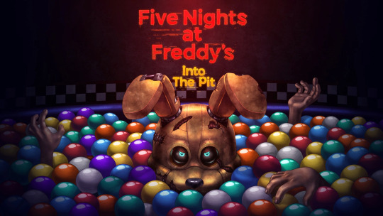
Since its launch, the Five Nights at Freddy's (FNAF) brand has given players chills, and it doesn't seem to be slowing down. "Into the Pit," the newest instalment in the series, transports viewers further into the horrific realm of nightmare riddles and mechanical creatures.
Exploring the Abyss:
Released as a new chapter in the ongoing development of the FNAF universe, "Into the Pit" presents players with a whole new set of terrifying puzzles and challenges. This chapter, created by Steel Wool Studios and Scott Cawthon, takes players into the most sinister parts of Freddy Fazbear's universe and promises to be an exhilarating and terrifying ride.
An Enthralling Story:

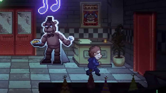
The captivating story at the center of "Into the Pit" is what keeps players on the edge of their seats. The protagonist of the game finds himself in an altered and horrifying version of the FNAF universe after falling into a mysterious hole. Players must solve puzzles, face fresh animatronic nightmares, and find the secrets concealed in the shadows as they make their way through this warped reality.
Creative Gameplay:

By introducing novel gaming concepts, "Into the Pit" expands on the groundwork set by its predecessors and elevates the FNAF experience to a higher level. In order to survive the night, players must use strategic thinking and fast thinking. Understanding the mechanics is essential to remain one step ahead of the unrelenting creatures that lurk in the shadows because every animatronic has a distinct set of characteristics.
Visuals and Ambience:
The visual abilities of "Into the Pit" are very astounding. The game's breathtaking visuals transport players to an eerie, atmospheric setting. Every element, from gloomy hallways to unsettling animatronic designs, has been painstakingly created to arouse feelings of anxiety and expectation. The sound design is a fantastic match for the graphics, producing a spooky atmosphere that makes players look over their shoulders.
Fan Theories and Easter Eggs:

In keeping with FNAF custom, "Into the Pit" is full of hidden clues and Easter eggs that entice players to learn more about the game's history. Fan theories about the game's hidden links are already rife in the community, with members analyzing every element. Fans continue to theorize about Scott Cawthon's rich storytelling even after the initial release, which enhances the FNAF experience.
In summary:

"Into the Pit" is an immersive trip into the core of terror rather than merely a game. It is proof of the FNAF franchise's ongoing appeal thanks to its captivating story, inventive gameplay, and evocative design. One thing is certain: the terror that began in Freddy Fazbear's Pizza is far from done as players prepare for the next round of animatronic nightmares. Prepare to be enthralled, terrified, and enthralled as you go straight into the terrifying experience.
3 notes
·
View notes
Text
The Power of Creative Branding: How to Stand Out in a Competitive Market
In today's crowded marketplace, branding is more than just a logo or a catchy tagline—it’s the personality of your business. With so many brands competing for attention, how do you make yours stand out? The answer lies in creative branding. A strong brand doesn’t just tell people what you sell; it makes them feel something, creates lasting impressions, and builds loyalty.
Think about the brands you love—Nike, Apple, or Starbucks. What makes them unforgettable? It’s not just their products; it’s the experience and emotion they bring. Whether you’re a small business owner or working with a Marketing Agency Singapore, mastering creative branding can set you apart from the competition.
In this article, we’ll explore the power of creative branding, how to craft a unique brand identity, and the strategies that make businesses truly memorable.
What is Creative Branding?
Creative branding is the art of making your business stand out. It’s about creating a brand that doesn’t just sell products but also tells a story, evokes emotions, and connects with customers. Unlike basic branding, which focuses on logos and names, creative branding takes it a step further by using innovative marketing, engaging visuals, and strong messaging.
Why Branding Matters More Than Ever
In today’s digital age, customers have endless choices. If your brand doesn’t capture attention quickly, people will move on to competitors. A strong brand builds trust, creates recognition, and drives customer loyalty. When customers remember and trust your brand, they’re more likely to choose you over others.
Building a Unique Brand Identity
A brand identity is more than just a logo; it includes:
Brand name and tagline – What do you want people to remember?
Mission and values – What does your brand stand for?
Visual identity – Colors, fonts, and design elements that reflect your personality.
Brand personality – Are you fun and playful like Coca-Cola or sleek and professional like Apple?
Crafting a unique brand identity helps customers instantly recognize and connect with your business.
How Storytelling Enhances Branding
People don’t just buy products; they buy stories. Every successful brand has a compelling story behind it. Think of how Nike’s “Just Do It” campaign isn’t just about shoes—it’s about motivation and pushing limits.
By sharing your brand’s journey, challenges, and vision, you create an emotional bond with your audience.
The Role of Colors, Fonts, and Design
Colors and fonts play a crucial role in how people perceive your brand. For example:
Red – Excitement, energy (Coca-Cola, Netflix)
Blue – Trust, professionalism (Facebook, PayPal)
Green – Growth, sustainability (Starbucks, Whole Foods)
Choosing the right colors, typography, and design elements ensures your brand feels consistent and recognizable.
Creating a Memorable Brand Voice
How does your brand “sound” in marketing messages? A brand voice should match your brand personality.
A luxury brand might use elegant, refined language.
A youthful brand might be playful, funny, and informal.
A tech brand might focus on innovation and simplicity.
A distinct and consistent brand voice makes your messaging instantly recognizable.
Brand Consistency: Why It’s Crucial
Imagine if McDonald’s suddenly changed its red and yellow colors to blue and green. It would confuse customers, right? That’s why brand consistency is key.
Maintaining the same logo, colors, tone, and messaging across all platforms builds trust and recognition. Customers should instantly recognize your brand whether they see an ad, visit your website, or receive an email.
Leveraging Social Media for Branding
Social media is one of the most powerful branding tools today. Businesses can:
Share behind-the-scenes content to create transparency.
Engage with follbowers through comments and messages.
Run creative campaigns to increase brand awareness.
Brands that actively engage on social media build stronger relationships with their audience.
How a Marketing Agency in Singapore Can Help
Branding takes time and expertise. A Marketing Agency in Singapore can help businesses by:
Developing a strong brand identity that aligns with their vision.
Creating engaging content for social media and marketing.
Designing logos, websites, and promotional materials.
Implementing branding strategies that increase visibility.
Hiring a professional agency ensures that branding efforts are strategic, creative, and results-driven.
Personal Branding vs. Business Branding
Personal branding focuses on individuals, while business branding focuses on companies. Entrepreneurs, influencers, and CEOs often invest in personal branding to establish themselves as experts.
For businesses, branding should reflect company values, culture, and mission to create a recognizable brand identity.
The Power of Customer Experience in Branding
Your brand isn’t just what you say—it’s how customers feel when interacting with your business. Providing exceptional customer service, a seamless buying experience, and personalized interactions strengthens branding.
Branding Mistakes to Avoid
Many businesses struggle with branding because they:
Lack a clear brand identity.
Change branding too often, confusing customers.
Ignore customer feedback, missing opportunities to improve.
Fail to maintain brand consistency across platforms.
Avoiding these mistakes helps build a strong, lasting brand.
The Future of Branding: Trends to Watch
Branding is evolving, and businesses must keep up. Future trends include:
AI-driven branding – Personalization through artificial intelligence.
Sustainability-focused branding – Eco-friendly brands gaining popularity.
Experiential branding – Brands focusing on immersive customer experiences.
Adapting to these trends helps businesses stay relevant and competitive.
Case Studies: Brands That Got It Right
Some brands have mastered creative branding, such as:
Nike – Inspirational storytelling and emotional marketing.
Airbnb – Community-driven branding focused on belonging.
Apple – Simplicity, innovation, and sleek design.
Studying successful brands provides valuable insights for businesses.
Conclusion: Making Your Brand Unforgettable
In a competitive market, creative branding is the key to standing out. By developing a unique brand identity, leveraging storytelling, and ensuring consistency, businesses can attract loyal customers and create lasting impressions. Whether you’re growing your brand independently or seeking help from a Marketing Agency in Singapore, investing in creative branding is essential for long-term success.
0 notes
Text
Advantages of a custom built commercial shed
When it comes to constructing commercial sheds, the choice between generic designs and fully customised structures is a decision that can significantly impact the long-term success and efficiency of your operations. While a generic commercial shed might seem appealing because it’s ready to go, and seemingly costs less, this isn’t always the best option for your business in the long-term. In this blog, we’ll explore the advantages of choosing a custom built shed.
Optimal use of land
Every piece of land is different in size and shape, and its location is an influencing factor as to what can and can’t be done with it. A custom designed commercial shed gives you the opportunity to optimise the use of available land. And with the soaring price of land these days, who wouldn’t want that? Cookie-cutter designs can be a wasted opportunity, failing to make the most efficient use of your specific space, and leading to wasted areas or constraints in functionality. Custom designs, on the other hand, allow for a tailored approach, where every square metre is utilised to its maximum potential. This is especially important if space utilisation directly impacts productivity.
Durability of materials used
Generic commercial sheds often rely on standard materials that may not be suited to the specific environmental conditions of your location. Opting for a custom built shed means you can choose materials based on factors such as climate, weather patterns, and the nature of your business. This ensures that the shed is not only durable but also resistant to challenges posed by the environment. Imagine housing expensive equipment in a shed that can’t hold up in its environment. Corrosion and structural integrity could put your equipment at risk. Investing in quality materials from the outset can alleviate these dangers, and contribute to the longevity and performance of your commercial shed.
Flexibility of design
No two businesses are alike, and a custom built commercial shed allows for the flexibility to design a space that fits your unique needs. Whether you need specific storage arrangements, specialised work areas, or particular access points, a custom design can deliver these elements. Beyond functionality, a custom design also offers the opportunity for the building to align with your brand identity. This might mean including distinctive architectural elements, colour schemes or signage that reflects the company’s image. A visually cohesive space can contribute to a positive impression on clients or other visitors.
Built to relevant regulations
Another critical aspect to consider when needing a commercial shed is the local regulations and building codes that need to be complied with. Generic designs may not always align with the specific regulations of your area, potentially leading to costly modifications or legal issues. A custom built shed is designed with these regulations in mind, ensuring that the construction meets all necessary standards. This means the approval process and build are streamlined, saving you time as well as money in the long run.
Optimised for current and future operations
Businesses are always changing. By choosing a custom built commercial shed, you’ll be able to consider your current needs but also anticipate future requirements. By being proactive and planning for the future, you can avoid expensive renovations, expansions, or even the need for a whole new location. By investing in a structure that grows with your business, you’re ensuring that your commercial space remains an asset rather than a limitation. While a generic, predesigned commercial shed may be tempting in the short term, the advantages offered by a fully custom built design are substantial. From optimising land use to ensuring compliance with regulations and providing flexibility for future growth, the benefits of customisation extend well beyond the construction phase. When it comes to commercial sheds, the choice is clear – invest in a custom built solution tailored to your business needs and set the stage for long term success. To get started with your commercial shed project, get in touch with Asset Building Systems’ experienced team.
0 notes
Text
Design Adventure Zones in OPG School Classrooms
Such a dynamic world of education and the traditional learning methods are rapidly changing. OPG School among the cbse school in dwarka takes the lead by introducing innovation adventure zones within classrooms. Creative spaces to provoke curiosity, enhance engagement, and enhance the learning experience of the students as a whole; By bringing fun with education, the school looks forward to redefining the classroom learning formula for wholesome development.
What Are Adventure Zones in Classrooms?
Adventure zones are an interactive learning zone in the class which allows students for hands-on experience when learning various school subjects in distinct ways. Since this is different from what occurs during traditional lecturing within OPG School cbse 11th and 12th schools dwarka, adventure zones ensure the setting by liveliness where the student should challenge himself for thoughtful and creative work on his own.
This has placed OPG School at the top rated school in dwarka and has initiated the concept of experiential learning. The school has brought together all the diverse components like theme-based learning corners, digital learning tools, and playful activities that make the process of learning fun and lively.
Building Interest in Learning at OPG School
As a top rated cbse school in dwarka, OPG School offers an environment to learn that provokes students to learn more. Adventure zones break the routine classroom sessions as students get to study concepts practically.
Interactive storytelling sessions, science experiments, and creative problem-solving activities make all difficult topics easy for the students of these zones. OPG School has become one of the best-ranked cbse schools in Dwarka delhi because of such innovative activities.
Role of Technology in Adventure Zones
Technology is something that makes adventure zones interactive and interesting. OPG School, being an ac school in Dwarka with great ratings, develops smart boards, VR tools, and applications for education to create immersive experiences.
All the digital tools present in the learning zones have made it easy for the students to visualize concepts as graphics and experience simulated events. The parents who might be looking out to search "CBSE schools near me with fees structure" or "CBSE school admission near me," this technologically-enabled learning environment of OPG School comes as an attractive proposition.
The school has Play-Based Learning available for the junior students.
For children, games and plays form an essential part of a learning journey. Adventure zones at OPG school cbse 11th admission dwarka consist of play corners designed to develop motor skills, social skills, and some basic cognitive abilities.
This makes the school an excellent choice for parents who seek "nursery admission near me" or "play school near me." A child will have a chance at cbse based school in dwarka to develop fun, nurturing early learning years along with a strong educational base.
Hands-on Science and Exploration Zones
Science and exploration zones in the classrooms allow the students to conduct experiments and come up with scientific facts. The zones are equipped with modern tools and laboratory materials for OPG School students to become young scientists.
This hands-on learning approach has made the school a preferable choice for parents in search of "CBSE schools near me for 11 and 12 Dwarka" and "CBSE education near me." By including practical experiences together with theoretical knowledge, the school makes sure that the students develop deep understanding about science and technology.
Creative Art and Craft Corners
Creativity is an integral element of holistic development. There are adventure zones, such as art and craft corners, where the hallmark of creativity is used in painting, sculpture, and all sorts of arts.
These creative spaces provide students with a sense of achievement and dexterity of hand, which contributes miles in being an antecedent to appreciation of art. So, parents searching for "CBSE schools near me for class 1" or "schools near me for nursery admission dwarka" would find OPG School to be the best place where their children's creativity will bloom.
Learning Spaces for Outdoor Adventures
best cbse schools in dwarka delhi Besides the indoor adventure zones, OPG School has outdoor learning areas where children interact with nature and participate in physical activities. The outdoor areas are planned for teamwork, leadership, and awareness of the environment.
Parents who search for "international schools near me" or "best schools around me" appreciate the school's focus on outdoor learning in addition to the academic curriculum that can help the children develop holistically.
Admission and Parent-Friendly Process
Parents are finding "admission open in Dwarka school" or "CBSE school admission form Dwarka"; thus, admissions can be obtained without a tussle. OPG School provides hassle-free and smooth process with clarity over admission process of nursery and further higher classes.
OPG School possesses adventure zones as well as a wholesome approach towards schooling, making it the first priority of parents who come searching for "available schools for admission in Dwarka" and want to "apply for schools online Dwarka." It keeps ensuring that the best world schools in dwarka education is given in a caring manner with lots of interaction.
Differences Between Other Schools in Dwarka And OPG School:
As one of the top 10 schools in dwarka cbse, and a top cbse schools in dwarka, OPG School takes all possible measures to achieve exceptionally good educational experience within its premises. A focus on creating adventure zones in classrooms has taken this school's experiences to an altogether new level in the region.
It has a state-of-the-art infrastructure, a well-equipped faculty body, and methods of teaching. The modern school is what one would describe for those in pursuit of "private CBSE school" or "top 5 CBSE schools in Dwarka". OPG School has been resurfacing into the epitome of education supremacy in changing classroom learning trends.
The Future of Education at OPG School
OPG School is looking forward as education school in dwarka with the advanced methods of teaching and making learning fruitful through enjoyable environments. This introduction of adventure zones in classrooms is one example of commitment toward a well-rounded and fun-filled education.
For parents, it would be "schools near me CBSE" or "CBSE board near me," then OPG school stands for the epitome of learning with academic brilliance and experiential learning, preparing students to face a brighter and more promising future.
Adventure zones in classrooms of OPG School have thrown learning into a new definition where education is happening through recreation and play. Being one of the best schools in Dwarka, OPG School has continued to lead the way in bringing to students unforgettable learning experiences that will aid in all-round development. To parents looking for the admission for kg in dwarka look no further than OPG School as their ideal learning partner.
0 notes
Text
What Unique Features Make the Dune Ornithopter Model a Must-Have?
Enthusiasts will find the Dune Ornithopter model particularly noteworthy because of its remarkable utility and elaborate appearance. This model is a fascinating addition to any collection since it blends engineering and artwork, drawing inspiration from the renowned gear from the Dune universe. Among its distinctive features are its movable wings, which replicate the principles of real-world flying and make construction fun. Its eye-catching visual appeal is enhanced by the meticulous attention to detail, which extends to the theme elements. It’s ideal for enthusiasts and hobbyists alike because the task of producing the model offers a sense of accomplishment and fulfillment.

Novel Designs Using Plasma Spider Assembly Kits Plasma spider assembly kits are a fun way to study engineering and creativity for anyone who like doing hands-on projects. These kits give hobbyists the ability to construct complex models with creative ideas that come to life. Building a plasma spider develops a deeper comprehension of mechanical ideas while also improving fine motor abilities. These kits can be used as an introduction to the engineering field, promoting critical thinking skills and enjoyment along the way.

Western Dragon is one of the legendary models.
A favorite among aficionados, the Western dragon model embodies the spirit of mythology and imagination. Its complex layout and commanding appearance enable builders to hone their construction abilities while losing themselves in a realm of myths. Putting the piece together becomes an adventure through a fantastical world, where each element adds to the whole narrative and raises the object’s value as a decorative piece and artistic achievement.
3D Metal Puzzles for Difficult Adventures For those looking for a mental challenge, 3D Metal puzzle pathfinder provide an exciting task. These puzzles demand time and accuracy, but the results are beautiful models that exhibit artistic flair and expert craftsmanship. The Scavenger 3D Metal models also offer an engaging opportunity to investigate intricate designs, with each component coming together to form a unified whole.
Using Dune Models to Imagine the Future Science fiction models such as the Dune ornithopter and Dune Flying Machine encourage constructors to imagine technologies of the future. Fans of the genre will find these complex kits to have sophisticated designs that are both entertaining and engrossing. Exploring the possibilities of flying and allowing fans to go creative, the dune ornithopter is a perfect example of mechanical creativity.
Using Mechanics and Art in Steampunk DIY
DIY steampunk crafts offer a distinctive creative experience that embraces creativity, embodying the merger of art and technology. The allure of mechanical steampunk components inspires builders to try out different materials and layouts, leading to unique creations that showcase particular tastes. These projects offer countless chances for experimentation and self-expression, whether building a complex device or a decorative piece.
0 notes
Text
[ad_1] The artwork of cell sport growth, nonetheless, has its distinctive set of challenges that are fairly completely different from those encountered in standard sport arts. These embrace restrictions caused by the scale of the display, the completely different resolutions of the units, and the necessity for pleasant interfaces. It's with this in thoughts that many sport builders search help from the sport artwork outsourcing companies. Outsourcing permits tasks to faucet into specialised expertise that understands the difficult points surrounding cell design thereby permitting the groups to be strategic about different elements of the sport growth course of. It's inside this context that this essay intends to know the problems of making enticing cell artworks contemplating the slender area restrictions. The Significance of Understanding the Cellular Surroundings So earlier than considering of cell sport artwork, you will need to first contemplate the cell atmosphere. Since cell units differ in dimensions and backbone, the paintings must be versatile sufficient and graphics zoomable. Because of this visuals ought to be interesting on completely different units together with, the small smartphone screens and huge pill units. Sport artwork outsourcing companies play an important position in addressing these challenges, as they supply specialised experience to make sure the paintings maintains its high quality throughout varied platforms. This very variability offers rise to inconsistencies within the artwork model and high quality throughout a number of units and therefore, platforms. Restricted Display screen Actual Property Artwork is tough for cell video games primarily as a result of there's little display area accessible for graphics and different interface components. When there's little actual property to work with, the expansion of what's proven on-screen relies on or constrained by which organic and graphic info is included. This largely includes making graphics much less detailed and the wordings much less because the potential participant won't be able to get the whole idea of the interactivity concerned within the sport. Simplifying Advanced Designs Contemplating the scale of screens, it's possible that very complicated designs excessive or very fascinating and trendy bits could be flushed out within the small screens. Artists at all times need to simplify their drawings and get rid of excessive definitions of artwork which may very well be very best when considered on an even bigger display. Due to these elements, the photographs and works are more likely to be extra stylized contemplating the artists need to work alongside coloured patterns over the shapes with outlined strains and its topics fairly simple to depict. Hierarchical Construction of Info Another step in cell sport artwork design that deserves consideration is noticing info hierarchy throughout the design. Such consideration makes a alternative over what particulars are probably the most important, and must be accentuated on the display. As within the case, some key buttons or icons that the gamers ought to carry out on, ought to be bigger than some secondary info. Additionally, using varied methods similar to t, shade and place, designers can transfer or pull the participant's consideration in the direction of sure crucial elements. Adjusting Graphics for Contact Management Cellular gaming has additionally modified the best way gamers used to play the video games. Contact controls are completely different from the standard controls which suggests a shift in design as a result of the artwork must be interactive. For instance, buttons and icons need to be designed such that they're navigable by gamers, that's, they shouldn't be too small for worry of lacking or tapping on the display, and never too small for aiming and hitting the supposed goal. Additionally, when designing contact interfaces, there ought to
be a couple of extra components similar to making modifications in shade, wobbling the bottom picture or a brief animation to system the participant into considering that the button has been clicked. Such suggestions makes the interplay higher and the gamers keener to play a selected sport. Responsive Design The sport artwork must be responsive with regard to completely different cell units which have completely different sizes and resolutions. This requires creating quite a few variations of the identical asset in order that it seems appropriately on each system. As an illustration, backdrops, performing figures, and interface buttons should not solely be resized or modified in placement but additionally redraw with respect to display measurement with out distortion of the standard. Balancing Aesthetic and Performance Final however not the least, designers need to stroll a tactful rope of aestheticism and functionalism. Though interesting visuals are more likely to entice gamers, the artwork has to do greater than look good within the gameplay expertise. For example this level, the colour of the objects on the display shouldn't solely be lovely however also needs to have a function, similar to aiding in comprehension of the atmosphere. In navigation of a backside panel, an energetic button could also be represented in daring colours whereas much less energetic sections could also be in white and gray. This is essential in combining a number of elements collectively with the intention to have a really clean and pleasing expertise for the gamers. Testing and Iteration It's oftentimes the case that the designing of the artwork of cell video games their creation is iterative. Designers are required to use their artwork to completely different units and display sizes, for the needs of performing successfully, in addition to managing to attraction to the supposed viewers. Accumulating suggestions whereas testing can provide some concepts on what else may very well be modified or improved earlier than the ultimate product is launched. This iterative strategy additionally lets the designers resolve related points like readability, contact accuracy and attraction and so forth earlier than the discharge of the sport. Conclusion The artwork of cell video games design discovers its true issues in relation to the issue of display area and the issue of placing collectively person interfaces. With sport growth on cell units persevering with to enhance so additionally ought to strategies of artistry and design be improved. Employment of sport artwork outsourcing companies would additionally assist in getting round these issues and allow groups to provide you with fascinating and fascinating visuals that can attraction to gamers. Provided that the designers comprehend the cell habitat, reduce the complexity of the designs and prioritize the usability of the designs, the designers are able to making designs, which, moreover trying good, enhance the gaming expertise. [ad_2] Supply hyperlink
0 notes
Text
Top 8 Website Design Trends To Follow In 2024
Welcome the New Year with a blast and upgrade your website by hiring a professional website design company in Kolkata. The past year has offered us unique improvisation web design trends. And, the digital marketing companies have undoubtedly earned a whole lot of profit from this.

But as the year changes, it’s time to look forward.
This year, you can focus more on making engaging and accessible websites that are user-centric as well. Every trend we survey provides diligent opportunities to connect with varied audiences and pursue an improved digital environment.
So, let’s discuss the top 10 website design trends that have begun to redefine the digital journey in 2024.
Top 8 Web Design Trends In 2024
Go through the following points and update your website to a new one:
1. 3D Elements and Graphics
3D is not only for blockbuster Hollywood or Bollywood films. It’s a website design trend that has taken a storm in 2023 and will continue to stay in the future. With the evolution of screen technology, the approach to designing a website will also change.
You can ask the web development company in Kolkata to add depth and dimensions to your website, either with a fully immersive 3D layout or delicate 3D elements. “What will be the result?” - you ask! You will receive a visually stimulating website that’s really hard to forget.
However, you must remember that 3D graphics are resource-intensive; therefore, you can optimise performance and guarantee a smooth and enjoyable user experience.
2. The Revival of Brutalism
Start 2024 boldly with the brutalism design trend. It’s about trying new website design to its most raw and bare elements. Most of the people didn’t like the soft and polished look but welcomed brutalism because of its rough edges, bold colour schemes, and distinctive typography.
We are not talking about the average design trend; rather, it’s daring. For example, the website Bloomberg is the ultimate brutalism trend that is challenging older norms.
But stray aware of this trend! If you do it correctly, it’s captivating, or else, it can come out as overdone. That’s why the designers always try to strike a perfect balance between the two.
3. Try New Dark Mode Design
Dark mode is everywhere, and it will make a bigger comeback in 2024. LinkedIn, Shopify, Facebook, and even Apple prefer the dark mode theme; no doubt that the websites will also follow the same.
Today, more than 4 out of every person selects dark mode on their phones. You may love black, but do you know about its benefits? It minimises screen glare, saves battery, and provides comfort to the eyes - a boon for the night owls who burn the midnight oil.
4. Websites Loaded With Animations
Do you love animation? Do you want them on your website as well? Yes, we know loading animations was once popular in the web’s early days, but again, it’s on the rise. The growing popularity of animated, interactive, and immersive website designs has provided a creative avenue to engage with potential customers and increase your brand’s identity.
People hate buffering, and they will leave the page if it’s filled with unnecessary ads and videos. However, loading animations can transform this into an engaging and quality experience.
5. Microinteractions - The Fun And Beauty!
The practical usage of micro-interactions often goes unnoticed. Still, they are the unsung heroes of the user experience that offer small, subtle animations or design elements that acknowledge the user's actions.
That’s why the website designers in Kolkata always try incorporating micro-interactions in their websites. It’s because these features offer immediate feedback and guide the users from the beginning till the end by providing a more satisfying and intuitive web experience.
It’s a clear estimation that in 2024, more website designers will look forward to this feature to enrich the overall user experience and encourage more user engagement. For example, websites like Stripe and Google have strategically used micro-interactions to improve their UX.
6. Horizontal Scrolling Methods
Forget about vertical scrolling - horizontal scrolling is in fashion! This trend allows designers to get creative by avoiding all those traditional design themes - everyone loves doing something different!
If applied correctly, horizontal scrolling can be a powerful design choice for users. It goes best with visual-heavy and linear content, like photo galleries or portfolios.
However, it’s important to ensure that the web design company in Kolkata designs the website in such a way that the horizontal scrolling doesn't disrupt the user experience. That’s why ask the design company to provide clear cues so that you don’t get confused or miss the important content.
7. Parallax Scrolling Effects
The parallax scrolling will continue captivating the web designers even in 2024. This applied technique includes a background that moves slower than the foreground, thereby, creating a 3D effect when you scroll down the page. This provides your website a more engaging experience making them visit your website again and again.
Using it wisely can deliver unique and extremely stunning visuals. Therefore, the website designers work carefully so that it does not compromise the website's performance or accessibility.
8. Choose Maximalism Over Minimalism
Say goodbye to the days when minimalism rules the website design world. In 2024, maximalism is the new hero. You will see most of the websites, whether shopping or beauty, the designers are choosing abundance and extravagance — utilising more colours, beautiful textures, relevant images, and typefaces.
For example, the highlighted colour of the website of Nykaa is pink. It can be a little controversial for the gender-specific use of colour, but it is what it is! And for Flipkart, the colour theme is clear blue, sun yellow, mandarin peel, brave orange and green.
But again, there is a sign of caution! “Too many cooks can spoil the broth” - hence, use every feature with care that should not compromise the usability.
Bottom Line
So, there it is! As we are moving ahead to the first week of 2024, it’s obvious that the web design world can be anything but not dull! But there is no need to apply all the trends on your website. Seek suggestions from a web development company in Kolkata and pick what suits your brand the most!
#web design company#web development company#website design company#website development company#digital marketing agency kolkata#digital marketing agency in kolkata#digital marketing company kolkata#digital marketing company in kolkata#website design service in kolkata#best website design company in kolkata
0 notes
Text
The NVIDIA Canvas App: An Introduction Guide to AI Art

NVIDIA Canvas App
This article is a part of the AI Decoded series, which shows off new RTX PC hardware, software, tools, and accelerations while demystifying AI by making the technology more approachable.
AI has totally changed as a result of generative models, which are highlighted by well-known apps like Stable Diffusion and ChatGPT.
Foundational AI models and generative adversarial networks (GANs) spurred a productivity and creative leap, paving the stage for this explosion.
One such model is NVIDIA’s GauGAN, which drives the NVIDIA Canvas app and use AI to turn crude sketches into stunning artwork.
NVIDIA Canvas
AI may be used to create realistic landscape photographs from basic brushstrokes. Make backgrounds fast, or explore concepts more rapidly so you may devote more time on idea visualisation.
Utilise AI’s Potential
Utilise a palette of realistic elements, such as grass or clouds, to paint basic forms and lines. Next, observe in real time how the screen is filled with jaw-dropping outcomes thanks to NVIDIA’s ground-breaking AI model. Dislike what you observe? Change the material from snow to grass, and observe how the whole scene transforms from a wintry paradise to a tropical paradise. There are countless innovative options.
Adaptable Styles
With NVIDIA Canvas app, you can alter your image to precisely what you require. Using nine Standard Mode styles, eight Panorama Mode styles, and a variety of materials from sky and mountains to rivers and stone you may alter the appearance and feel of your painting. Additionally, you can paint on many levels to distinguish distinct elements. One of the included sample scenarios can serve as inspiration, or you can start from scratch.
A Whole 360° Inspiration
With the addition of 360° panoramic functionality, artists can now quickly construct wraparound environments with Canvas and export them as equirectangular environment maps into any 3D application. These maps can be used by artists to alter the surrounding lighting in a 3D scene and add reflections for more realism.
Save as PSD or EXR
After you’ve produced the perfect image, Canvas allows you to upload it into Adobe Photoshop for further editing or blending with other pieces of art. Additionally, pictures can be imported into Blender, NVIDIA Omniverse USD Composer (previously Create), and other 3D programmes using Panorama.
How Everything Started
A generator and a discriminator are two complementing neural networks used in deep learning models called GANs.
There is competition between these neural networks. While the discriminator strives to distinguish between created and actual imagery, the generator aims to produce realistic, lifelike imagery. GANs get increasingly adept at producing realistic-looking samples as long as their neural networks continue to challenge one another.
GANs are excellent at deciphering intricate data patterns and producing output of the highest calibre. Applications for them include data augmentation, style transfer, image synthesis, and picture-to-image translation.
NVIDIA’s AI demonstration for creating lifelike images is called GauGAN, after the post-Impressionist painter Paul Gauguin. Developed by NVIDIA Research, it served as a direct inspiration for the creation of the NVIDIA Canvas app and is available for free download via the NVIDIA AI Playground.
NVIDIA AI Playground
Use NeVA to Unlock Image Insights
A multimodal vision-language model called NVIDIA NeMo Vision and Language Assistant (NeVA) can comprehend text and images and provide insightful answers.
Create Text-Based Images with SDXL
With shorter prompts, Stable Diffusion XL (SDXL) enables you to create expressive visuals and add text to photos.
Handle AI Models Real-Time
With the AI Playground on NGC, you can easily experiment with generative AI models like NeVA, SDXL, Llama 2, and CLIP right from your web browser thanks to its user-friendly interface.
Since its 2019 NVIDIA GTC premiere, GauGAN has gained enormous popularity and is utilised online by millions of people in addition to art educators, creative agencies, and museums.
Adding Sketch to Gogh’s Scenery
With the help of GauGAN and nearby NVIDIA RTX GPUs, NVIDIA Canvas app employs AI to convert basic brushstrokes into lifelike landscapes, with real-time outcomes displayed.
Using a palette of real-world objects like grass or clouds referred as in the app as “materials” users can begin by drawing basic lines and shapes.
The improved image is then produced in real time by the AI model on the other side of the screen. A few triangle shapes drawn with the “mountain” material, for instance, will appear as an amazing, lifelike range. Alternatively, users can choose the “cloud” material and change the weather from sunny to cloudy with a few mouse clicks.
There are countless innovative options. Draw a pond so that the water will reflect other visual features like the rocks and trees. When the material changes from snow to grass, the scene becomes a tropical paradise instead of a warm winter’s environment.
With Canvas’s Panorama mode, artists may produce 360-degree pictures that can be used in 3D applications. Greenskull AI, a YouTuber, painted a cove in the ocean to illustrate Panorama mode before importing it into Unreal Engine 5.
Read more on Govindhtech.com
#nvidiacanvasapp#aimodel#chatgpt#nvidia#NVIDIAOmniverse#nvidianemo#aiplayground#Llama2#nvidiagtc#nvidiartxgpus#artificialintelligence#news#technews#technology#technologynews#technologytrends#govindhtech
0 notes
Text

Interview: Aatmaja Pandya
What are some of your earliest memories of making art? What's your first memory of comics?
Art-making has always been part of my life, in the way it is for all kids. I do have a really specific elementary school memory of having to make a Halloween diorama for a school assignment. We had this program on the school computer that would let you design and print one. But I made one with paper shapes instead because I knew it would look more distinctive and even at that age I liked that handmade touch. When I think back on that it makes me laugh so much - what a little snob! But to this day I really value analog process, so I guess it is pretty indicative of the person I became.
My first comics were graphic versions of the Ramayana and, like, stories about the god Krishna. My parents must have bought them for me and my brother in India. Weirdly I wouldn't consider them artistic influences at all - my strongest earliest influences are manga - but I think it's proof of the power of comics that I remember those stories so clearly and fondly now.
What makes a good story?
I ask myself this question all the time and the answer changes all the time too. We live in an era of easily consumed art and this isn't necessarily the fault of creators. Big companies are in control of a lot of our media, and art as a corporate product is designed to reach the maximum number of people but is made with as few resources as possible. So inevitably, a lot of mediocre art gets made. I find it pretty unnerving how many books or movies I feel totally lukewarm about, or how many just leave my mind completely after I've finished them. As a storyteller I find that so tragic!
So, at this moment I think a really good story is one that provokes strong emotion. One with some very visible humanity, I guess. Just technically speaking, I also love a really tight, snappy story with a sense of humor and an element of surprise.
What was your time at SVA like? How has it impacted your career?
I loved my time at school. I'm just a dweeb and have always liked learning environments. Art school was a pretty fraught experience for some friends and it was out of reach for others - I got lucky with my teachers and peers. It was definitely a huge financial gamble, though, and the fear of professional failure has been the fire under me basically my whole career. I owe a lot to my community but in a way I also owe a lot to that pressure.

I know you're currently working on your first published book that is both written and drawn by you. How's that going and any updates you want to share?
Yes I am! Thank you for asking about it!
It's chugging along - it's a challenge in a way I wasn't expecting. My first book project had a script ready (by author Marika McCoola) and in a way it was much easier, even though the actual labor of drawing a graphic novel is not an easy thing. This time along the book is my special little baby and I want it to be super, super fun and interesting and emotional... it feels like I could tweak it infinitely and I wish I could! I'm also just finding it difficult to hold the shape of this story in my head. I've done lots of short stories and I can usually visualize those in full, but this one is going to be 250+ pages for sure and needs a lot more brainstorming, both on paper and in the literal brain. Thankfully, I really enjoy the process of writing and layout. The feeling of a story clicking into place after you've been fiddling with it for ages is the best feeling in the world. Sometimes I think I write just to feel that satisfaction.
How much planning goes into your books and do you stick to it? Does a page ever dictate or change the narrative as you work on it?
It depends on the project! Artists either follow rules or instincts and I am definitely an instincts person. Traditionally a comic page has four or so steps - script, thumbnails, pencils, inks, and then tones/colors if the project asks for it. I used to follow this system when I was younger, but these days drawing the same thing over and over just makes me nuts and I find that it takes a lot of life out of my drawing. What I do now is write a rough outline, do a rough thumbnail pass on paper, and then I scan those into a digital program. I use them as a guide and move straight to inks, and then do a clean-up pass so I can retain as much energy as possible while improving readability. If a page or scene is giving me a lot of trouble, I will flesh it out in more detail. I also like to have some flexibility so I can adjust the narrative if it's needed. In my opinion, if you're bored while working on your own story, the game's already over.
I don't find that a page changes the narrative as I'm working on it, exactly, but I often start thumbnailing with a couple of key "scenes" in mind and structure the story around them.

What advice would you give to aspiring cartoonists?
Unfortunately it's probably advice they've already heard elsewhere - just draw! Draw just for the pleasure of making marks on a page! Start with something small - adapt a story if writing one is daunting. Try not to get caught up in perfectionism. Try and make everything you do better than the thing before it. And try to hold on to the pride and pleasure of creating through it all. Artists make art because we can't live without it!
0 notes
Text
Vivienne Westwood's Fashion Designs in the 80's: The Impact of Tartan
Vivienne Westwood, the iconic British fashion designer, is renowned for her bold, innovative, and unconventional designs. In the 1980s, Westwood's fashion creations took the world by storm, with her distinct use of tartan fabric becoming a defining element of her style. This unique incorporation of tartan not only revolutionized fashion but also had a significant impact on the industry, challenging traditional norms and redefining the concept of punk and rebellion.
One of Westwood's most iconic tartan looks from the 80s was her collaboration with Malcolm McLaren for their influential fashion boutique, "Sex." Together, they created a collection called "Pirates," which introduced a new wave of punk-inspired fashion. This collection featured an array of tartan garments, including kilts, trousers, jackets, and corsets, all reimagined with a punk twist. Firstly, she challenged societal norms by appropriating a fabric associated with tradition and corrupt its meaning by using tartan in unconventional ways, she brought a sense of rebellion to her designs, reflecting the punk of the time. Tartan became a symbol of and a way for individuals to express their unique identities.
Secondly, Westwood's incorporation of tartan brought this fabric into the mainstream fashion scene. It was no longer confined to Scottish kilts or traditional attire but became a dynamic and versatile textile used in high fashion. Her innovative use of tartan opened doors for future designers to experiment with traditional fabrics and challenge the boundaries of fashion.
Westwood's tartan designs also played a crucial role in shaping the aesthetics of the 80s punk movement. The fusion of tartan with other punk elements, such as safety pins, leather, and provocative styling, created a visual language that defined the punk subculture. This unique blend of rebellion and sophistication became synonymous with Westwood's designs and influenced a generation of fashion enthusiasts.
Furthermore, Westwood's tartan looks in the 80s had a lasting impact on the fashion industry as a whole. Her bold experimentation with patterns, colors, and silhouettes not only redefined the concept of punk fashion but also inspired other designers to push boundaries and embrace individuality. Tartan became a symbol of empowerment and self-expression, transcending its traditional associations.
Today, the legacy of Vivienne Westwood's tartan designs in the 80s can still be seen in contemporary fashion. Tartan continues to be a popular pattern, embraced by designers and fashion enthusiasts alike. It has become a symbol of rebellion, nonconformity, and a celebration of individual style.
0 notes
Text
Artwork Installation How Art Enhances Educational Environments for Learning
Introduction
Artwork installation is more than just placing objects in a room. It's a thoughtful process of combining space, story, and artistic expression to create an immersive experience. In the bustling art scene of Pune, Saypan has emerged as the premier artwork installation agency, expertly crafting spaces that narrate compelling tales through art.
The Science of Space in Art Installation
Space is the canvas on which artists and installers paint their stories. Understanding the dynamics of spatial relationships is crucial to creating an engaging viewer experience. The manipulation of space can dictate the flow, focus, and interpretation of the artwork.
Innovative Branding & Packaging by Saypan - Learn More @ https://saypan.in/our-services/

Our Artwork Installation Video @ https://youtu.be/nEkwU1cx1m4?si=5Vmg3zzTc_x5Pea6
The Art of Storytelling Through Installation
Every art installation tells a story. The key to effective storytelling is thematic consistency, allowing viewers to journey through the narrative visually and emotionally. The art lies in weaving various pieces into a cohesive whole that resonates with audiences.
Techniques in Artwork Installation
Innovative techniques such as strategic lighting can dramatically alter the perception of artworks, highlighting features and creating depth. Moreover, balancing scale and proportion is vital to maintain visual harmony within the space.
Wall Art Decor: Transforming Spaces
Wall art decor has the power to transform mundane spaces into sources of inspiration. Whether it's a gallery, office, or public area, the right wall art can elevate the aesthetic and atmosphere.
Innovative Wall Artwork for Modern Offices
Modern offices are increasingly embracing art to enhance their environments. Office wall decor goes beyond aesthetics; it can influence mood, productivity, and even corporate identity. Saypan excels in integrating art with workplace design, creating spaces that inspire creativity and innovation.
The Impact of Wall Graphics and Environmental Graphic Design
Wall graphics and environmental graphic design are at the forefront of visual communication in spaces. These elements blend art with architecture, enriching environments and guiding visitor interactions within the space.

Our Video @ https://www.youtube.com/watch?v=yP7zrabBvu0
Saypan: Leading the Way in Art Installation
Saypan's distinction lies in its meticulous approach to art installation. With a keen eye for detail and a deep understanding of artistic and spatial dynamics, Saypan has successfully executed numerous projects, establishing itself as a leader in Pune's art installation scene.
Challenges in Artwork Installation and Solutions
Artwork installation comes with its set of challenges, from logistical hurdles to adapting designs for unique spaces. Saypan's expertise lies in its ability to provide custom solutions, ensuring that every project is executed flawlessly.
Future Trends in Artwork Installation
The future of artwork installation lies in the integration of digital technology and sustainability. Interactive installations and the use of eco-friendly materials are set to redefine the boundaries of art and installation.
Conclusion
Mastering the art of artwork installation requires an intricate blend of science, art, and storytelling. As we've explored through various aspects and techniques, including the exceptional work by Saypan in Pune, it's evident that thoughtful artwork installation can profoundly impact spaces and narratives.
Contact us
Phone : +91 96657 20007, +91 87672 11111
Email : [email protected]
Website: https://saypan.in/
Follow us :
Facebook
Instagram
linkedin
#Artwork installation in Pune#Artwork installation#Artwork installation Agency#Top Artwork installation Company#Wall Art Decor#Wall Artwork#Office Walls Designs#Office Wall Decor#Wall Graphics#Environmental Graphic Design in Pune
1 note
·
View note