#arial bold
Explore tagged Tumblr posts
Visit Tumblr Blog
Explore Tumblr blogs with no restrictions, modern design and the best experience.
Last Seen Tumblr Blogs


Fun Fact
The total number of visits Tumblr.com received during January 2021 is 327 million.
Text

#stupid sunday#sunday#stupid#gif warning#glitter text#bloggif.com#arial font#arial bold#60px#2px outline
68 notes
·
View notes

Text
22-64: Who's At Fault for the Rain?


The masked ninja had a demand note for a soy milk payment. He insisted it wasn’t him who bought it. However, the person who placed the order is unknown. Meanwhile at Urayama, Tachibana-senpai is engaged in a fight with a suspicious man.
first half can be found here.
finally went ahead and got this wrapped up. this is the second half to an arc that is an adaptation of the last chapter of volume 52 of the manga, along with the stolen signboard arc immediately preceding it (that also happens to feature the Dokusasako ninjas iirc!). gingin! every episode where tomesaburou and monjirou have petty arguments is a good episode.
it's been a while since I've revisited subbing, so if there's any major inconsistencies between phrasing and format here and my previous work, feel free to reach out and let me know.
mega link here: (x)
youtube link here (unlisted): (x)
Happy watching!
extra notes under the cut!
my knowledge on terms used mostly within the context of the show's time period and related to ninjas is a little rusty (see comment about subbing), but I tried my best. if any history nerds want to chime in and correct me, sound off in the comments below haha
the name of senzou's weapon: Bomb was easier to conceptualize visually for a general audience than fire arrow, but I added an extra note up top in case someone comes across the latter term so it isn't immediately unfamiliar. both the official nhk episode index and amako soubei's book on ninja equipment use 宝禄火矢 (hourokuhiya) as the spelling in kanji, so I went with that for the translator's notes.
zanchi saga 1 (background): perfunctory research refers to zanchi as spies left to infiltrate enemy territories for extended periods of time to establish relationships with the local population and gather intel, though it mostly seems to be in a modern context (notably, Onoda Hiroo who actually fits Senzou's description of a zanchi pretty well). i'm not sure if its usage and meaning differs in a muromachi period context or not, though. history nerds! sound off in the comments!
zanchi saga 2 (the puns): Wordplay hurts... For the sake of the lunch/zanchi pun, since it's explained in the show, zanchi was left in its romanized form. Rantarou's mispronounciation was a lot more of a headache. I tried my best, viewer, I really did.
#another formatting update. i thought arial bold was a little corny. let me know how you all feel!#nintama#nintama rantarou#fansubs#mine#rkrn#looking back i think I could've found a better paced way to translate kusemono but it's only really been a problem in episode 63. hopefully#it looks fine here!#i don't have any plans to sub the stolen signboard arc and I don't think you need to know it to go into this one but they are back to back#so I felt it was imperative to bring it up anyway.
35 notes
·
View notes
Text
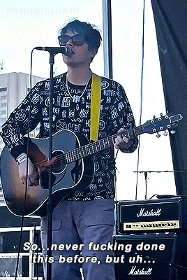
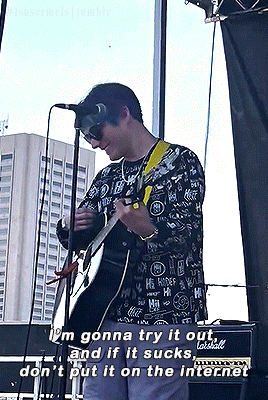


CALL ME, BEEP ME || live debut (Cleveland, Ohio)
#.gif#*mine#waterparks#waterparks band#awsten knight#bandedit#musicedit#userjake#userasterion#parx#usermusic#I was today years old when I found out that the arial rounded mt bold font doesn't support the music emoji apparently rip
71 notes
·
View notes
Text
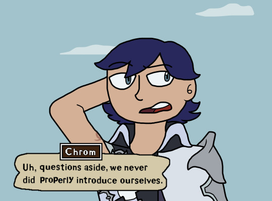
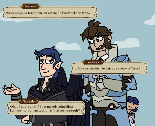
Part 1: Mad King's War
Prologue: Diverged History(pages 26-31)


< prev | start | next(wip)
#fanart#myart#fire emblem#Fire Emblem Wrong Bird au#naesala#chrom#fe frederick#fe lissa#fire emblem awakening#tellius#FE WB au MKW#FE WB au MKW prologue#i took so long with this i had to recheck what my tags were for this sheesh#also took so long that the text boxes changed along with how i draw these guys#hell i even plan on changing up how i draw them even more next batch(if it pans out)#finally figured out how to get things to look how i wanted by the second page of this batch with-#-the name tag things the text boxes the text itself that sort of stuff#or at least a gist as i keep repeating things are always liable to change down the line#anyways figuring out the font was a godsend so i didn't have to keep writing letter by letter with a mouse each time#which for the record is Chiaro STD B Bold#also got the text font for Ancient Tongue while i was at it#already had Arial Narrow for later so didn't have to do anything there#was not expecting having to look into various fonts when starting my first of hopefully several au fancomics for this fandom#but here we are i guess#but anyways#as per usual there is no schedule still#(especially since artfight is coming up soon so i'll be busy drawing other things that month)#but i do not plan to abandon this anytime soon or at all really#it's fun and i have a good bit outlined for how i want it to go#still need to work on dialogue especially for when it diverges more heavily though
4 notes
·
View notes
Text
I might not be an expert on enunciation, but most of the time slowing down by about 5-10%, works a lot better for me than sounding out each exaggerated syllable like an asshole.
#my post#it's like writing something on paper slower instead of faster if that makes sense- I'm just trying to make the words more legible#i don't wanna go from 10pt Comic Sans to 18pt Arial Bold yaknow?
2 notes
·
View notes
Text


alex g lyrics
#2014 aesthetic#old tumblr#mine#arial bold italic#alex g#song lyrics#lyric posting#quotes#aesthetic#niche memes
9 notes
·
View notes
Text
i've been tempted to start one of those tumblr gimmick blogs but its "identifying fonts in posts" because i. am autistic about typography. and in my daily life a million times i will stop what i'm doing and comment on the font something is written in
#'if you were a true nerd you would know fonts and typefaces are different' I KNOW THIS BUT NOT EVERYONE DOES#AND I MUSTNT BE TRULY OBNOXIOUS I AM ANNOYING ENOUGH AS IT IS#i really like helvetica but mostly when its bold and not when its in all caps#helvetica neue can stay but its on thin ice. i dont like it as much even though there are only marginal differences#some people will say Arial and Helvetica are the same. i tell these people there is a special layer of hell made just for them#joking. but they are very different#i hate copperplate gothic and every time i see it i lose a year off my life#futura is Okay. its also on thin ice. when its good its really good but its also a bit oversaturated rn#anyways.
9 notes
·
View notes
Text
I know this is so very much not Sun and Moon or even FNAF related but- has anyone that follows me watched Person of Interest 👀
#not a new hyperfixation I promise!!! i still am very much obsessed with Sun and Moon and FNAF sgshsjks#i just love this show like. a normal person 🧍 (/gen) and I love terrorizing my boyfriend about finch x reese#the other day i wanted to discuss an episode with him and I opened up with <hey remember that episode finch and reese got divorced?>#cue heavy sigh lmfao#(they are not actually in a relationship but. its not even gay subtext. it bolded italicized and underlined text in Arial size 50. imo.)#go watch Person of Interest its really good
5 notes
·
View notes
Text
why are criterion channel graphics sooooooo bad. like what are these


#that idaho title is stolen straight from a purely typographic shirt... looks not good#and nowhere is using the arial bold italic like it's 2015.. what's going on!!!!!
6 notes
·
View notes
Text

guilttripping - frnkiero andthe cellabration
#guilttripping#frnkiero andthe cellabration#frank iero lyrics#frank iero#album: stomachaches#gif warning#glitter text#red#my body's weak#lyrics#hopelessness#bloggif.com#arial bold#arial font
167 notes
·
View notes
Text
font detected: Arial Rounded Bold font detected: Century Schoolbook

#2 for 1 deal#arial rounded bold#century schoolbook#theres a chance im wrong on that last one#the origin of this meme is like blatantly antisemitic.#font detected
9K notes
·
View notes
Text
I think that being called fascinating is the best compliment I've ever received. like im still swooning. thats kinda embarrassing. oh well 🥰
#personal#ALL I DID WAS ASK WHAT KIND OF FONT HIS PHONE USES#and if its the standard or if he changed the font of his phone#cus it doesn't look standard to me???#i told him it feels like i just found out he speaks and hears in a completely different text dialect than I do#because like I think my phones font is an Arial variant i dont know the exact name but it feels pretty standard to me?m#when i see screenshots online most others seems to have a similar font#but his looks kinda like a roboto variant? or something similar. more angular letters a bit more bold more spaced out letters#and yeah!!! that makes me curious okay😭#but apparently this makes me Fascinating#🙄🙄🙄🙄#😭♥️#i like fonts okay
0 notes
Text


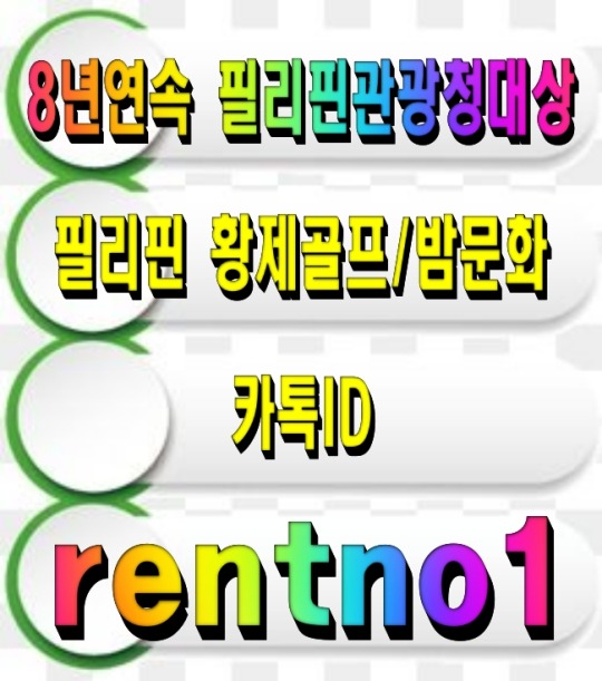

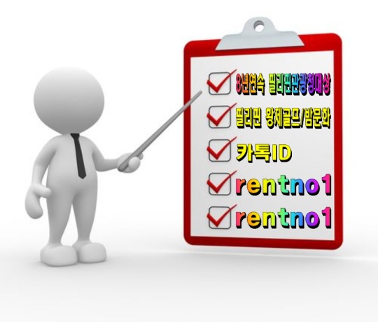

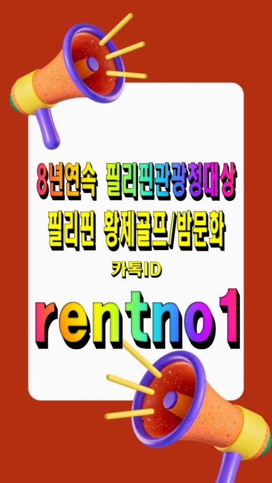


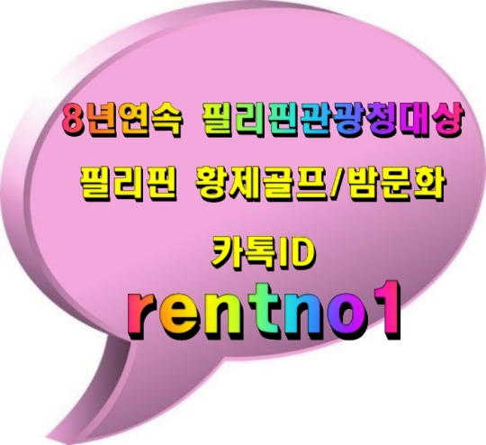
[회원수5만명 검증된 밤문화골프여행 현지여행사]
[ 여행문의 카톡 : rentno1 ]
[필리핀관광청선정 8년연속 BEST AGENCY]
↓↓더 많은 필리핀 정보가 필요하시면 클릭해 주세요↓↓ 필맨스토리 필리핀골프여행
#font-family: 'Arial'#FFB6C1#87CEFA); padding: 30px; border-radius: 15px; box-shadow: 0 4px 8px rgba(0#0#0.1);#color:#FF4500; font-size: 24px; font-weight: bold; text-shadow: 2px 2px 4px rgba(0#0.2);#1E90FF; text-decoration: underline; font-weight: bold;#background: linear-gradient(135deg#FFD700#FF8C00); color: white; font-size: 22px; padding: 15px 30px; border: none; border-radius: 50px; cursor: pointer; font-weight: bold; box-shad#0.2); transition: all 0.3s ease;#<div style=>#<p style=>#[회원수5만명 검증된 밤문화골프여행 현지여행사]#</p>#32CD32; font-size: 20px; font-weight: bold; text-shadow: 1px 1px 3px rgba(0#[ 여행문의 카톡 : <span style=>rentno1</span> ]#FF6347; font-size: 20px; font-weight: bold; text-shadow: 1px 1px 3px rgba(0#[필리핀관광청선정 8년연속 BEST AGENCY]#FF1493; font-size: 22px; font-weight: bold; margin-top: 20px; text-shadow: 2px 2px 4px rgba(0#↓↓더 많은 필리핀 정보가 필요하시면 클릭해 주세요↓↓#<a href=“https://cafe.naver.com/philmanlove” target=“_blank” style=“text-decoration: none;”>#<button style=>#필맨스토리 필리핀골프여행#</button>#</a>#</div>
0 notes
Text
this is very specific but do any tumblr veterans here remember arial bold italic aesthetic from the mid 2010s. it looked like this


this was basically brat summer but for suicidal people. in this essay i will
7K notes
·
View notes
Note
I’m actually 🤓👆the font he uses is arial rounded bold not comic sans
i've said it before and i'll say it again tommyinnit's subtitles are amazing and should be the norm and i'm so happy he does it
it's great for several reasons
it's in comic sans which sure could be for the bit but comic sans is a more dyslexia-friendly font, which is great for people with dyslexia trying to you know, read the captions.
the people speaking are color-coded so you don't have to try and figure out whose speaking
there is love and thought put into the captioning, its not just the words people are saying but also they show when things are music, the voice people use with the wiggly or static effect, have the sounds people make, and the little silly smiley faces that you can hear in the audio and it means people can get the full experience without the audio
its part of the video, its not just for people who need it, its a part of the experience which is great because it normalizes the use of close-captioning and makes the video more fun
so shout out to tommyinnit, any of his editors who do the captioning, and anyone who has ever done cations like this you are wonderful <3
#arial is still a dyslexic friendly font though especially bold#this is due to it being sans serif with thicker lines#which has been proven to help those with dyslexia read just a bit faster#kinda interesting#sorry my moms a graphic designer#so I’m weird about fonts
824 notes
·
View notes