#aspect ratio Frame Size Guide
Explore tagged Tumblr posts
Visit Tumblr Blog
Explore Tumblr blogs with no restrictions, modern design and the best experience.
Last Seen Tumblr Blogs


Fun Fact
28.6 is the average number of monthly visits per US mobile user.
Text
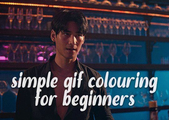
✨ Simple Gif Colouring for Beginners ✨
I wrote up my basic gif colouring process for a friend recently, but a couple of people here mentioned they'd also find it helpful! so, as requested, this is a beginner-friendly walkthrough of the way I colour my gifs :) it's aimed at brand new gif makers with no prior experience with photoshop or photo editing.
when I first started gif making I found colouring and photoshop in general suuuper daunting, so I've tried to simplify everything here as much as possible. hopefully this will be relatively easy to follow and not too intimidating!
a couple of things to begin with:
I'm only talking about colouring here - this is not a full gif making tutorial. I've linked to some of my favourites of those here!
I personally like to make bright, 'clean' looking gifs with vibrant but natural colours, so that is the style of colouring this tutorial is geared towards. most of gif colouring is subjective and about personal taste - the only thing that I'd say is possible to get wrong is skin tones, which I talk about a lot in this guide.
as I mostly gif Thai dramas, most of the advice is geared towards colouring for East Asian/South East Asian skin tones - but the techniques should be fairly universally applicable (and here are some tutorials that talk about gif colouring for other skin tones).
I'm not an expert! I'm not claiming this is the best or the only way to colour gifs - it's just how I do it.
this post is very image-heavy. if the images aren't loading (or the gifs are running slowly or cutting/looping weirdly), then try viewing the post in its own tab (rather than on the your dash or someone's blog) and refreshing the page.
okay, full walkthrough beneath the cut!
contents:
1. intro a. natural gif colouring goals b. very very basic colour theory 2. super simple colouring (the essentials) a. curves b. selective colour (and skin tone correction) c. hue/saturation d. saving and reusing colouring e. another simple colouring example 3. other adjustment layers a. brightness/contrast b. levels c. vibrance d. colour balance e. channel mixer 4. troubleshooting a. curves b. saturation 5. fin!
1. intro
the colouring part of gif making can be super overwhelming, especially if (like me when I first started!) you're completely new to photoshop and/or have no experience with colour theory or photo/video editing.
if you're opening photoshop and making gifs for the first time, I highly recommend getting used to making a few basic, uncoloured gifs to begin with. just to practice, rather than post anywhere (though you can always come back and colour them later if you want) - but it'll make the rest of the process much easier if you're already beginning to get used to working in timeline mode of photoshop. give yourself a bit of time to practice and get a feel for things like how many frames you tend to like in a gif, where you like to crop them for the best loop, what kind of aspect ratio you like etc* - so that you're not trying to navigate all of that for the first time on top of everything else!
* frames: for me between 60-90 frames is ideal, but 40-120 frames is the absolute min-max I'd personally use in a normal gifset loops: for the smoothest loops, try to avoid cutting someone off mid-movement or mid-word if possible. aspect ratio: for full-size (540px) gifs, I tend to go for either 8:5 (slightly 'skinnier' gifs), 7:5, or 5:4 (particularly big, thick gifs lmao)
✨ natural gif colouring goals
part of what can be so daunting about starting gif making is not knowing where to start or what you want to achieve. this is definitely something that gets easier with practice - the more gifs you make, the more you'll get a feel for what kind of look you like and the more instinctively you'll know how to get there. it also helps to see if any gif makers you like have made "before and after colouring" posts - these can help with getting a sense of the kinds of changes made through gif colouring. here's one I made!
in general, I like to make my gifs bright and 'clean' looking, with vibrant but natural colours. these are the things I'm usually hoping to achieve with colouring:
brighten dark scenes
remove muddy, yellowish lighting or filters
saturate colours
correct any skin lightening filters or overexposure
make lighting and colours as consistent as possible between gifs within a single gifset, especially gifsets featuring gifs from multiple scenes/episodes/videos
this guide is focusing on natural colouring, but of course there are many cool ways to make stylised/unnaturally coloured gifs. imo you'll need to master these basics first, but if you want to learn how to do things like change the background colour of gifs or use gradients or other cool effects, then @usergif's resource directory has loads of super helpful tutorials!
✨ very very basic colour theory
[disclaimer! I don't know shit about fuck. I do not study light or art. this is just an explanation that makes sense to me exclusively for the purposes of gif making.]
the primary colours for light/digital screens are red, blue, and green. having all three colours in equal measures neutralises them (represented by the white section in the middle of the diagram).
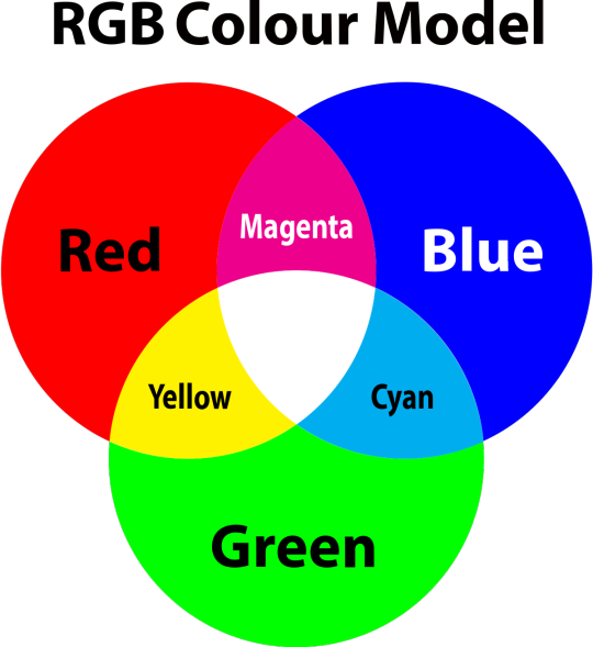
so to neutralise a colour within a gif, you need to add more of the colour(s) that are lacking.
in practice this usually means: the scene you want to gif is very yellow! yellow is made of red and green light, so to neutralise it you need to add more blue into your gif.
it can also mean the reverse: if you desaturate the yellow tones in a gif, it will look much more blue.
looking at the colour balance sliders on photoshop can make it easier to visualise:
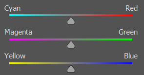
so making a gif more red also means making it less cyan.
removing green from a gif means adding magenta.
taking yellow out of a gif will make it more blue.
tl;dr:
neutralise yellows by adding blue (and vice versa)
neutralise reds by adding cyan (and vice versa)
neutralise green by adding magenta (and vice versa)
2. super simple colouring (the essentials)
starting with a nice sharpened gif in photoshop in timeline mode. (these are the sharpening settings I use!)
some scenes are much harder to colour than others - it helps to start out practising with scenes that are bright/well-lit and that don't have harsh unnaturally coloured lights/filters on. scenes with a lot of brown/orange also tend to be harder.
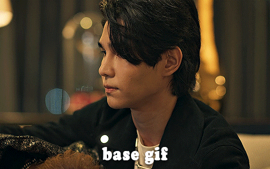
I usually save a base copy of my gif before I start colouring just in case I end up hating it, or find out later that it doesn't quite fit right into a set and need to redo it etc.
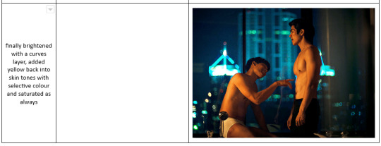
so here is my base gif!

it's an okay gif, but it has a bit of a yellow tint to it that I want to reduce.
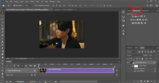
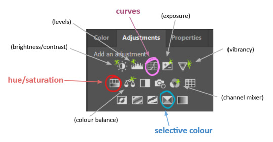
colouring is easiest to do in adjustment layers, which can be found under layer -> new adjustment layer - or for me they are here:
there are lots of different types of adjustment layers that do lots of different things - but for me the absolute essentials for colouring are curves, selective colour, and hue/saturation.
I also use brightness/contrast, levels, exposure, vibrance, colour balance, and channel mixer sometimes, depending on the gif - but I use curves, selective colour, and hue/saturation on every single gif.
✨ curves layer
the first thing I always do is a curves layer. when you first open one it will look like this:
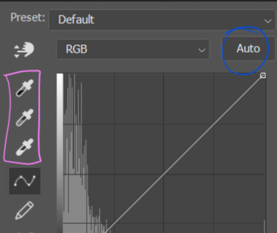
first I usually click the ‘auto’ button, just to see what happens. sometimes it makes a big difference (it usually brightens the gif a lot) - but on this gif it didn’t do much.
if it had made the gif look nicer then I would have kept it and added a second curves layer on top to do the rest of these steps.
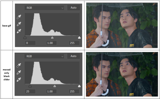
the next step is selecting the white and black points with the little eyedropper tools.
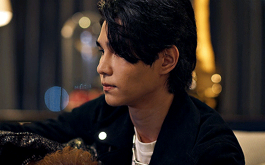
the bottom eyedropper lets you pick a white point for the gif. click somewhere super light on the gif to see what happens - for this gif, I clicked on the lampshade on the left. if it looks weird, I just undo it and try somewhere else - it usually takes a few goes to find something that looks good.
here's what that did to the gif:

then I pick the top eyedropper and use it to pick a black point by clicking somewhere really dark, again playing around until I find a black point that looks good.
here's what the gif looks like after picking the white and black points:

this can take some experimenting, but you can make super easy drastic changes to your gif just with this. in this case, the curves layer took out a lot of that yellowy tint.
and this is what the curves graph looks like now:
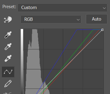
you can click and drag those lines to make further changes if you want - I usually leave them alone though. the colours of the lines indicate which colours have been changed in the gif - for example, you can see from that steep blue line on the graph that blue has been added to neutralise those yellows.
next I usually do another curves layer and just press the ‘auto’ button again to see what happens. usually it brightens the gif a bit more, which I like.
‼️if nothing is working: usually with a bit of fucking about a curves layer works well - but sometimes you can’t find a good white and black point anywhere, and instead your gif turns wacky colours and nothing looks good. this happens more often with very heavily colour tinted scenes :( the troubleshooting section at the end goes over some options, including starting with a levels layer instead.
✨ selective colour (and skin tone correction)
skin tones are made up of a mixture of yellow and red.
removing yellow (or adding blue or red) to a gif will make the skin-tones too red - and removing red (or adding cyan or yellow) to a gif will make the skin-tones too yellow.
adding blue to this gif with the curves layer took out the yellowy tint, which I wanted - but it also took the yellows out of Kim's skin tone, which I don’t want. so I need to put yellow back into the skin tones specifically - without putting it back into the rest of the gif.
selective colour layers let you select an individual colour and adjust the levels of other colours within that colour. you can change how yellow the green shades are, or how much cyan is in the blues, for example.
I need to add yellow back into the red tones to correct the skin tones on this gif. this is the case for most gifs in my experience - the vast majority of the time, unless a scene is very heavily tinted in another colour, a curves layer will add blue/remove yellow.
in the 'colors' dropdown, select the 'reds' section and drag the 'yellow' slider higher - this will add more yellow into just the red shades within the gif.

the amount of yellow you need to add back into the reds depends on how much yellow was taken out of the gif initially - I just play around with the slider until it looks right. if you're not sure, it helps to have some neutrally-coloured (not white-washed!) reference photos of the people in your gif to compare to.
here's the result. Kim's skin is a lot less pink toned and much more natural looking:
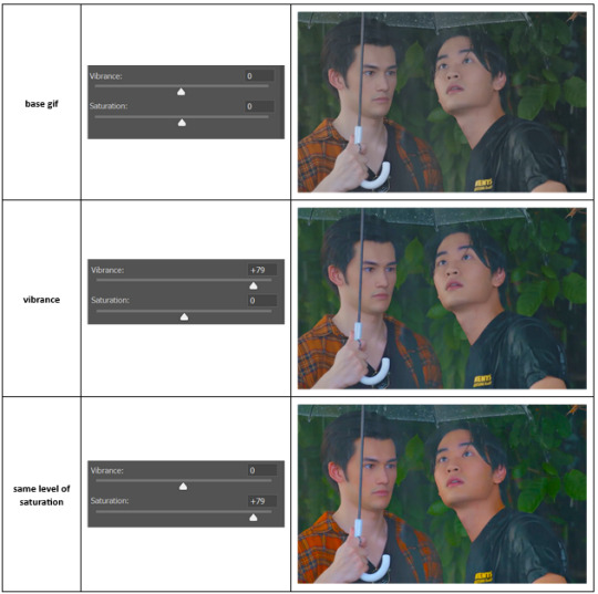
✨ hue/saturation
this adjustment layer lets you adjust the hue and saturation of the gif as a whole, and also of each colour individually.
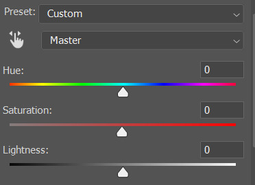
I don't use the hue or lightness sliders unless I'm trying to do something more complicated with the colouring.
clicking the dropdown menu that says 'master' lets you edit the saturation of each colour individually. this is useful if your gif is still super tinted in one colour.
I thought the yellows on this gif were still slightly too bright, so I switched to the yellow channel and desaturated them slightly. (remember if you do this then you need to go back to selective colour and add more yellow into the red skin tones to balance out the desaturation!)
then I increased the 'master' saturation of all the colours to +5:
I usually find the right amount of saturation is somewhere between +5 and +12, but it depends on the gif.
‼️if the gif feels undersaturated, but the saturation slider isn't helping/is making the colours worse, try a vibrance layer instead.
done!
✨ saving and reusing colouring
you can copy and paste adjustment layers between gifs to make your colouring even across each of your gifs for one scene - so if you're making a set of multiple gifs of the same scene, or you think you might want to gif the same scene again in the future, you can save it as a psd so you can reuse the colouring again later.
each gif's colouring will then still need tweaking - different cameras/angles/shots of the same scene can still start out with slightly different colouring.
I recommend uploading the gifs as a draft post on tumblr so you can see what they all look like next to each other and catch any inconsistencies.
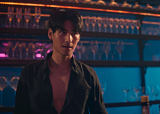
✨ another one! (speedrun!)
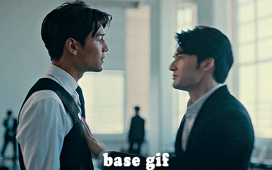
HI KEN!
the white point for the curves layer was in the window behind them.
the curves layer removes the muddy yellow tint, but again it makes their skin tones (especially Ken's) very red toned, which is adjusted by the selective colour layer.
3. other adjustment layers
imo many many gifs can be coloured really nicely with just those three adjustment layers, but some need different adjustments.
✨ brightness/contrast
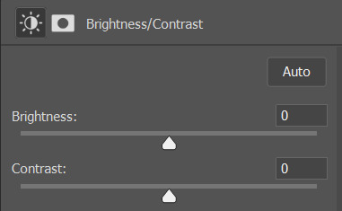
pretty self explanatory!
I personally usually avoid using the 'brightness' slider because I rarely like the effect - I only tend to use the 'contrast' one.
the 'auto' button is sometimes useful though, especially if you’re struggling with the curves layer.
✨ levels

levels alters the white and black points of the gif, like curves - but unlike curves it doesn't also alter other colours.
use the sliders beneath the graph to alter how dark/light the gif is. you can slide the black slider further to the right to make the blacks darker, and the white slider to the left to make the whites lighter.
levels is a good place to start if your curves layer isn't working.
(I'm going to hit the image limit for this post lol so here are some screenshots of a table I made to demonstrate this rather than actual gifs. sorry!)

on both sides, I dragged the sliders up to where the big jumps are on the graph - this is usually a good place to start!
✨ vibrance
vibrance... makes the colours more vibrant. it's more subtle than saturation.
it's really helpful for gifs that feel grey. sometimes adjusting saturation just makes the greys kind of weirdly tinted, but a vibrance layer can fix that.
vibrance is much more subtle!
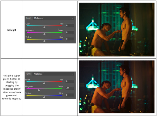
✨ colour balance
colour balance affects the overall balance of colours within a gif.
it's good for scenes with heavy tints.
I tend to stick to the 'midtones' dropdown, but you can also alter the colour balance within the shadows and highlights if you want.

✨ channel mixer
I avoided channel mixer for such a long time because it scared me. but it's great for scenes that are very heavily tinted in one colour.
basically, it works with the levels of red, green, and blue within a gif. you select an output colour and then play around with the levels of the colour you selected within each other colour.
kind of the reverse of selective colour?
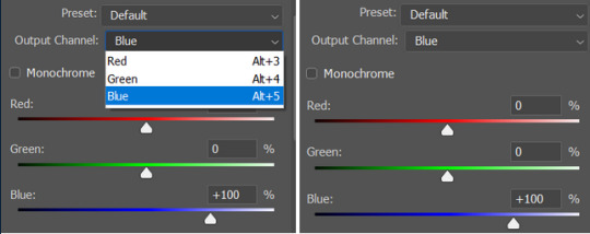
so in the 'blue' channel, the levels of blue are at 100%, and the levels of red and green are at 0% - but you can impact how much blue is in the reds and greens and blues.
this tutorial explains it well - but imo the best way to get to grips with channel mixer is just to play around with it a bit (sorry)
(when I made this guide for my friend, I also made a slightly more complicated gif colouring walk-through that included using channel mixer. there isn't space to include it within this post, but if anyone is interested I could always upload it as an 'intermediate' gif colouring tutorial - lmk!)
4. troubleshooting
‼️curves
usually with a bit of fucking about a curves layer works well - but sometimes you can’t find a good white and black point anywhere, and instead your gif turns wacky colours and nothing looks good. this happens more often with very heavily colour tinted scenes :(
for example, with this base gif:
using many of the brightest points as a white point turn it wacky colours, like this:

yikes :(
some options for these cases:
try brightening the gif first with the 'auto' button on the curves layer or with a levels layer. having a brighter gif to start with can give you better options for picking a white point.
try finding an alternate, whiter/brighter white point. look for places the light reflects - on this gif, using the light on Porsche's cheekbone works well as the white point. it also helps to find places that would be white if the scene wasn't tinted - the lightest part of a white shirt is often a good place to start, for example.
skip the curves layer, and instead use a levels layer to alter your white/black points, and colour balance or channel mixer to balance the colours.
‼️over/undersaturation
if your gif (especially the skintones) is looking a little washed out or lifeless, it might be undersaturated. boost that saturation - or if that's not working, try a vibrance layer.
oversaturation is often easiest to spot in the mouths and ears of any people in a gif. if the mouths are looking unnaturally, vibrantly red, then you've gone too far with the saturation.
5. fin!
and done! I hope this was coherent helpful to somebody.
if there's anything that I've missed or that doesn't make sense pls feel free to shoot me an ask or a message and I'll do my best to help! I've also collated a bunch of additional reading/resources below.
happy gifmaking 🥰
✨ some links!
photoshop basics by @selenapastel
gifmaking for beginners by @hayaosmiyazaki
gifmaking guide for beginners by @saw-x
dreamy's gif tutorial by @scoupsy-remade (includes instructions on how to blur out burned-on subtitles or annoying video graphics)
beginner's guide to channel mixer by @aubrey-plaza
how to fix orange-washed characters by aubrey-plaza
colour correcting and fixing dark scenes by @kylos
does resampling matter? by usergif
how to put multiple gifs on one canvas by @fictionalheroine
watermarking using actions by @wonwooridul
resource directory by @usergif
#i got a couple of asks about this so i figured i'd type it up as a post#it's been sitting in my drafts for a while now though i'm so sorry omg.#i had to replace my laptop and it took me a while to get round to downloading photoshop on the new one#but i hope this is helpful!!#gif making#tutorial#photoshop tutorial#colouring tutorial#coloring tutorial#gif colouring#gif coloring#photoshop resources#gif tutorial#gif resources#userbunn#uservik#darcey.txt#darcey.gif#usergif
861 notes
·
View notes
Text
how i make gifs using filmora x (for anon ❤️)
read under the cut!
hey!! thanks for reading this! just a few notes before i explain about my editing process:
filmora x works very differently from photoshop. it's a video-editing software anyways, so treat it like that!
always use high-quality sources!! most of my issues with grainy gifs come from using low-quality sources. so, i always ensure to use sources at 1080p, at least!
if i'm creating multiple gifs from one match, i usually download the entire match (which is a hugeeee file 😵💫 but it's so worth it!!). but if it's only a scene or two, i screen record them! i have an astro supersport subscription and a beinsports account, so i don't have an issue screen recording clips, as their content are always in high-quality! but if you're using other sources or streams, then do ensure the quality is good!!
if the only available source is of low-quality, my trick is to make smaller gifs! for smaller gifs, i usually keep a 1:1 or 4:3 size ratio, and post them side-by-side in a single post - usually two in a row!
general colouring stuff applies here as well, you can check out the photoshop guide i've linked in the ask!
remember, there isn't one "correct" way to gif, you can gif however you like!
and now without further ado:-
step one: adjust video settings, speed and length after importing the clip into filmora, setting the aspect ratio, resolution and frame rate according to preference, the first thing i'd do is to adjust the speed of the clip. i like to slow them down, so i usually go for a 0.5x speed. you can always adjust the speed to your preference!
i like to keep my gifs within a 3 to 5-second length, depending on the content, so i'll trim the clip or adjust the speed as desired. if the clip is shaky, i usually add stabilization at about 10%, but you can adjust as you like! here's an example of a clip before and after speed reduction:


step two: auto-enhance once the clip is at your preferred length, size and speed, now it's time to make it look pretty! in filmora, there's an 'auto-enhance' feature, so i usually begin with that, setting it somewhere between 50% to 100%. here's an example of how it looks like before and after auto-enhancing at 100%:

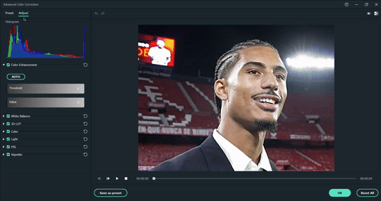
step three: colour correction head over to 'advanced colour correction', where you can use either the given presets, or manually adjust to your liking. i always manually adjust them!! you can also start off with a preset and make additional manual adjustments as I did below! what i did here was to darken it, then adjust the colour enhancement, white balance (hue and tint), colour (exposure, brightness, contrast, vibrance, saturation), lighting (highlight, shadow, black, white), and hsl (for this example, i adjusted only the red).
you can also save your adjustments as custom presets so that you can use them again in the future!
here's a quick look at how i do the colouring! from the before and after colour correction examples, you can see that this is the important part of the whole process!!
step four: sharpen once i'm satisfied with my colouring, i sharpen them by adding the 'luma sharp' effect (usually at 50% or 70% alpha and 50% intensity)
here's how it looks like before and after sharpening:

step five: final touches and exporting before i export, i make some final tweaks to the brightness, contrast and saturation, etc., ... and voila!! there also many other effects available for you to add (grainy effect, blur effect, etc.) so feel free to play around!

once you're satisfied with your result, it's time to export! now, video-editing softwares HATE gifs. you can always just export as gif from filmora directly, but i don't really like the way it turns out 😭 so, i export them as video (.mp4) and use external gifmakers (like ezgif!) to convert them from video to gif!
aaaand that's all!! here's a comparison of the original clip vs the end result!
final note: remember to size your gifs correctly for tumblr (540px for full width, and 268px for half), and keep each gif within the size limit of 10mb!! if you find that your gifs exceed the size limit, try reducing the number of frames or removing duplicate frames, increasing the contrast, or you may also crop the height if necessary.
if you have any questions about making gifs using filmora, feel free to reach out! thank you for reading, mwah mwah!! 💞
10 notes
·
View notes
Note
talk shop tuesday!! (´꒳`)♡ what do you look for when making a giftset? do you think more in terms of a theme (siblings, parallels, quote connections, etc.) or do the visual aspects of a scene (lighting, coloring, framing) inspire you more?
mhhh, i think for most of my gifsets it starts with a theme and then i have to hope that the scenes i think will fit that specific theme aren't going to be a pain to match among themselves or color
for example with quotes especially, i tend to read a line and almost immediately associate it with a particular moment and so it often happens that i just have to adapt to whatever the scene is like in terms of visual aspects, if that makes sense? my colorings are pretty simple so that's not a big concern, but say size and aspect ratio i just let however the scene is shot guide me and hope it works for each gif if they're from different moments.
i feel like for parallels too, at the end of the day my hands are a bit tied by the source material, after all it's not that i can reshoot scenes myself (lmao i wish)
so yeah, i think the idea/theme comes first and then i do what i can with what i have 🙏💌
4 notes
·
View notes
Text
A Complete Guide to Resizing, Printing, and Sharing Photos with PhotoCut

Photography dimensions are foremost in its application in communication, social media, and a storehouse of memories in every digital world today. Supplies are therefore mandatory for printing or posting, or maintaining a photo library. Different purposes would call for different photo sizes. For example, you might want to know how large a 4x6, 5x7, or 8x10 photo should be for printing, or how to make an image seem its best on Instagram or another site. More often than not, resizing and editing will be required to get your shots just right on social media or cropped to the various measurements needed. This article explains how to fit photographs on Instagram Stories, use PhotoCut to resize and modify photos, and the measurements of typical photo sizes.
Read about the Nude color and use it in your designs.
1. How Big is a 4x6 Photo?

The 4x6 picture is among the most widely used photo-size prints, especially when it comes to printing. Be it photo albums, frames, or even gifts, the 4x6 is a standard for a physical print.
Dimensions of a 4x6 Photo
Inches: 4 inches by 6 inches
Centimeters: 10.2 cm by 15.2 cm
Pixels: The pixel dimensions of a 4x6 photo largely rely on resolution. A high-quality resolution for printing is generally accepted to be 300 DPI (dots per inch). Thus, the pixel dimensions of a 4x6 photo would be:
1200 pixels by 1800 pixels (length x breadth) at 300 DPI.
The size of the photo would be suitable for producing small-sized print pictures of good quality and can easily fit in normal-sized photo frames. But if you are looking for lower resolution prints (maybe for a digital slideshow or casual prints), you might lower the DPI value, but then the image clarity would blur.
How to Resize a 4x6 Photo Using PhotoCut
For your needs, PhotoCut could be a nice app to crop or resize an image into the 4x6 format. To achieve the image resizing with PhotoCut:
Open PhotoCut and import your photo.
Choose the “Crop” tool and set the aspect ratio to 4x6 (or 3:2).
Adjust the cropping area accordingly so that the focal point of your image stays inside the framing.
Save the image, and it's now all set for printing in the 4x6 standard.
The tool also enables you to adjust your picture quality, enhance it, or apply filters to improve the printed version. Whether printing at home or via an online photo-printing company, any kind of resizing must be done correctly so that the prints come out nice and crisp.
2. How Big is a 5x7 Photo?

5x7 is another somewhat common photo size usually used for portraits, family photos, and other special occasions. It is a bit larger than the 4x6, thus providing a lovely decor for an office desk or mantel.
Dimensions of a 5x7 Photo
Inches: 5 inches by 7 inches
Centimeters: 12.7 cm by 17.8 cm
Pixels: A 5x7 photo for a high-quality print at 300 DPI would be:
1500 pixels by 2100 pixels (width x height).
The larger 5x7 photo size gives more detail than a 4x6 size, but can still be considered a standard size for photo printing. It is used for printing wedding pictures, portraits, and other treasured memories, which are usually framed in medium-sized frames.
How to Resize a 5x7 Photo Using PhotoCut
You should ensure a good resolution when resizing to a 5x7, so the photo does not go pixelated. For this purpose, the cropping tool in PhotoCut would be needed. Follow these steps:
Open your image in the PhotoCut application.
Choose the "Crop" icon and set the aspect ratio to 5x7 (or 5:7).
Crop and adjust the photo to center the image on the most important area of the photo.
Save that photo, and it's ready to either print or share.
If you want to personalize the portrait or family photo more, you can do so directly for printing by adding text and overlays using PhotoCut or even removing the background you don't want.
Remove unwanted elements from your photos with PhotoCut’s AI Image Cleaner.
3. How Big is an 8x10 Photo?

As for large prints being put up in some sort of major way in lots of places, living rooms, galleries, or even an office, the 8x10 size is quite popular indeed. This size allows for more detail and is typically used for portraits, high-quality prints, or professional photography.
Dimensions of an 8x10 Photo
Inches: 8 inches by 10 inches.
Centimeters: 20.3 cm by 25.4 cm
Pixels: For a high-quality print at 300 DPI, an 8-by-10 photo would be:
2400 pixels by 3000 pixels (width x height).
This size is an excellent display size for wall-mounted photos and is widely used among professional portraiture, art printing, and family-enlarged photo work. There is ample room for high-resolution, crisp images to represent fine detail.
How to Resize an 8x10 Photo Using PhotoCut
PhotoCut makes it very easy to resize an image to an 8x10 size. Here is how you can resize your photo for 8x10 printing:
Start PhotoCut and open the photo you want to resize.
Press "Crop," and adjust the aspect ratio to 8x10, or 4:5.
Crop the image, showing the areas of interest, which might also need zooming in or out; now adjust the frame.
Then, save that version of the image, and it is all the more ready for printing.
More flexibility and space for more detail and larger prints for framing or special occasions can be easily offered through its larger size.
Blend two images online for free with PhotoCut’s Photo Blender.
4. How to Use Common Photo Sizes

Fitting images into the required sizes will help you maximize results for a given project. Be it printing, framing, or displaying images online, knowing common photo sizes is the crux.
Standard Photo Sizes Used for Printing
4x6 inches: The classic choice for every use, and snapshots go quite well in this size for small frames.
5x7 inches: Ideal for framing or gifting photos.
8x10 inches: Popular for larger prints and exhibitions.
11x14 and 16x20 inches: Mostly seen posters, promotional material, or gallery-quality prints.
Common Resolutions for Digital Use
72 DPI: The standard resolution for images shown online.
300 DPI: A favored resolution for print-quality images.
How to Resize Images Using PhotoCut
Should you want to resize items quickly with ease, then PhotoCut is a great tool for resizing your pictures to the desired size. For either print or digital passing, images are simply resized and cropped in PhotoCut without losing any quality.
The right photo size makes sure that your picture is clear and well-formatted, looking its best. Having an understanding of standard photo sizes and the use of applications like PhotoCut is a time-saver for you in achieving great results.
Change your eye color in images with PhotoCut’s Eye Color Changer.
5. How to Fit Photos on Instagram Story

Digital Stories from Instagram are valuable forms of sharing special moments with other followers. Knowing how to have perfectly fit photos in an Instagram Story could be critical for providing a glamorous and professional touch. Also, Instagram Stories will typically be in a display ratio of 9:16, so it would be wise to crop or resize any specific image such that it fits this ratio.
Ideal Instagram Story Size
Aspect Ratio: 9:16
Dimensions: 1080 pixels by 1920 pixels (width x height)
Inches: Approximately 6.2 inches by 11 inches (for standard phone screens)
If the photo does not fit this quotation, then you need to make some kind of cropping or adjustment to it. These are where PhotoCut comes in handy. PhotoCut is a simple tool to help you easily crop your photo based on the required aspect ratio to fit in Instagram Stories.
How to Fit Photos on Instagram Story Using PhotoCut
Open the app PhotoCut and import the photo that you are gonna use for your Instagram Story.
Choose the Crop option and select the 9:16 aspect ratio (Instagram story size).
Let's adjust the photo to fill the screen, taking care that essential parts of the image are not getting cut off.
Perfect, and when you are satisfied with how the photo fits, save it and upload it directly to your Instagram Story.
As an option, adding text, stickers, or other cool elements to create an engaging Instagram Story can also be done through the PhotoCut app.
Conclusion
Whether you resize photos for prints (for example, 4x6, 5x7, or 8x10), use tools to resize images for Instagram Stories, or learn how to use PhotoCut for resizing and editing, image dimensions, and managing them, will always be the heart of effective photo management. This application is indeed a perfect tool for photographers, social media enthusiasts, and anyone creating high-quality, custom images to fit their specific needs. The wonderful thing is that PhotoCut has very user-friendly cropping options as well as resizing tools that can assist you in optimizing your photos for both print and digital use, hence ensuring that your photos always look their best.
Remove red eyes from your photos for free using PhotoCut’s Red-Eye Remover.
FAQs
Q1. What does a 4x6 photo size mean?
Ans. This denotes a rectangular print that measures 4 inches in width and 6 inches in height, as a very common standard for prints nowadays.
Q2 How big is a 5x7 photo?
Ans. The picture's dimensions are 5 inches wide by 7 inches high. More formal or portrait printing usually uses a slightly bigger format than 4x6.
Q3 What measures an 8x10 photo?
Ans. An 8x10 measures 8 inches by 10 inches. It is the most widely used size in framing and posing materials when putting up photos on walls.
Q4. Why are those standard sizes so important when talking about photograph sizes?
Ans. Because they put the photographs in a place where it becomes very easy to get frames and albums.
Q5. Are these measurements exact?
Ans. Generally, it could be said so. Nevertheless, slight deviations in size (for example, a fraction of an inch) might occur through the printing procedures or when using the aspect ratio of your original digital image.
Q6. What is a photo sizer or photo resizer?
Ans. A picture sizer, often known as a resizer, is a software program or web tool that lets you change the digital photo's dimensions (height and width) or file size.
Q7. Why would I need to use a photo sizer?
Ans. Common reasons include:
Reducing file size for faster uploading to websites or social media.
Resizing an image to fit a specific frame or print size.
Optimizing images for email attachments.
Changing the dimensions to match a website’s or app's requirements.
Q8. What happens if my photo is a different size or aspect ratio?
Ans. Instagram will either:
Crop your photo: Parts of your image will be cut off to fit the 9:16 ratio. This is often undesirable.
Adding black bars (letterboxing): If your picture is wider than the screen, Instagram will apply black bars at the top and bottom to fill in the extra space, thus making your picture look rather small and less significant.
Zooming up: Instagram may automatically zoom in towards your photo to make it fill the space available on-screen, which at the same time would also cause important portions of your photo to get cropped.
Q9. How do I fit a photo into an Instagram Story without cropping or black bars?
Ans. Here are a couple of other ways:
Resize/Crop your photo before uploading: Use any photo-editing application or online utility to crop or resize your photo to a 9:16 aspect ratio (1080 x 1920 px). You will then have all the power over what gets shown.
Use Instagram's Zoom/Pinch Function: While adding a photo to your Story, the screen can be pinched to zoom out and hopefully show more of the image, but this might create black bars.
Background: Some colored backgrounds can be added to the photo on Instagram Stories. You can select a color from the pen tool on the screen and then tap and hold to fill it. After that, place your photo above the background color that fills the screen. This tends to make the view of black bars much less.
Layout Apps: Apps like Canva or Unfold were made for creating Instagram Stories, with templates and tools that make resizing or formatting your photos easier.
Q10. What's the best way to guarantee professional-looking Instagram Stories?
Ans. Here's the best way to guarantee professional-looking Instagram Stories:
Use only high-resolution photos: You want to avoid blurry or pixelated images.
Keep with overall style: Use similar filters, fonts, and colors to create a cohesive brand.
Limit text and graphics: Don't put too much into your Story.
Think about composition: Ensure your pictures speak the design language.
Compare across devices: Check how your Story looks on multiple phone screens, so you can be sure that everything is aligned perfectly.
0 notes
Text
Universal Columns: Specifications, Sizes, and Load Capacities

When it comes to structural support in modern construction, the universal column plays a critical role. Whether in residential, commercial, or industrial buildings, universal columns provide the strength and versatility needed to bear heavy loads and maintain structural integrity. But what exactly are universal columns? What are their specifications, available sizes, and how much load can they handle? In this comprehensive guide, we delve deep into the technical and practical aspects of universal columns and their importance in construction frameworks.
What is a Universal Column?
A universal column is a type of structural steel section designed primarily to carry vertical loads. These columns are distinguished by their "I" or "H"-shaped cross-section, which provides excellent resistance to compression and buckling. Unlike universal beams, which have a longer flange width, universal columns feature nearly equal width and depth, giving them symmetrical strength across both axes.
Due to their design, universal columns are ideal for vertical load-bearing applications, especially in steel-framed structures. They are also referred to as steel beam columns in some contexts, although technically, beams are designed to resist bending, while columns are intended to support axial loads.
Importance of Steel Beam Columns in Construction
Steel beam columns, including universal columns, are essential components in modern architecture and structural engineering. Their high strength-to-weight ratio, durability, and flexibility make them a preferred choice over concrete or wood columns. Here’s why universal columns stand out:
Strength: These columns support heavy loads with minimal deflection.
Efficiency: They reduce construction time and material waste.
Longevity: Resistant to environmental factors such as corrosion (with appropriate treatment).
Flexibility: Easily integrated into various architectural and structural designs.
Whether used in residential buildings or high-rise towers, universal columns enhance structural reliability and safety.
Universal Column Specifications
When selecting a universal column, it’s essential to understand its technical specifications. These specifications ensure that the column selected matches the load requirements and design parameters of a building.
1. Material Grade
Universal columns are typically manufactured from high-grade structural steel, such as:
S275 – Minimum yield strength of 275 MPa
S355 – Minimum yield strength of 355 MPa
Higher grades offer increased strength but may also affect weldability and cost. The choice depends on the nature of the project and the expected load-bearing requirements.
2. Dimensions and Section Properties
Each universal column has a unique designation that reflects its size. For example, UC 203x203x60 means the column has a nominal depth and width of 203 mm and weighs 60 kg per meter. Common parameters include:
Depth and Width (mm): Usually between 100 mm to 400 mm
Weight per meter (kg/m): Typically ranges from 23 to 173 kg/m
Sectional area (cm²): Influences the load-bearing capacity
Moment of Inertia and Radius of Gyration: Key for understanding bending and buckling resistance
Common Sizes of Universal Columns
Universal columns are manufactured in a wide range of sizes to suit diverse structural requirements. These sizes are carefully designed to handle various loads in both small and large-scale projects. Typically, the size of a universal column is denoted by three parameters: depth, width, and weight per meter. The most commonly used sections are symmetrical, ensuring consistent performance regardless of the direction of the load.
For instance, smaller sections like UC 152x152 are ideal for light structural framing and internal supports, such as in residential buildings or mezzanine floors. Medium-sized options, such as UC 203x203 or UC 254x254, are often used in commercial constructions like shopping complexes and office buildings, where moderate to heavy loads need support. For industrial projects or high-rise construction, heavier sections such as UC 305x305 or UC 356x368 offer the robustness required to withstand massive loads and harsh conditions.
The selection of a universal column size depends on various factors, including the load to be supported, the height of the column, the spacing between supports, and the specific design requirements. Structural engineers typically consult steel section manuals or use design software to choose the optimal size for safety and cost efficiency.

Load Capacities of Universal Columns
Load capacity is arguably the most crucial factor when selecting a universal column. It determines how much axial load the column can support before failing or deforming. Load capacities vary based on size, material grade, and length of the column.
Axial Load Capacity
For a column made of S355 steel, a UC 203x203x60 can safely support over 1,300 kN in axial load under ideal conditions. However, real-world conditions such as effective length, bracing, and lateral-torsional buckling must be factored into the final load capacity calculation.
Buckling Considerations
Columns are susceptible to buckling under axial compression. The effective length of the column and end conditions (pinned or fixed) play a key role in determining its safe working load. Using Euler’s buckling formula and relevant design codes, engineers can calculate the critical buckling load for each universal column.
Load Tables
Engineers often refer to manufacturer-supplied load tables or use structural software for precise load estimations. These tables include safe load capacities for various lengths and conditions.
Applications of Universal Columns
Universal columns are not just limited to commercial projects. Their usage spans across a wide range of construction applications:
Building columns in steel-framed structures
Support members in bridges and towers
Vertical posts in industrial warehouses
Foundations for mezzanine floors
Load-bearing elements in multistory buildings
Their strength and adaptability make them suitable for both interior and exterior load-bearing functions.
Universal Column vs Universal Beam
It’s essential to distinguish between a universal column and a universal beam. While they may appear similar in cross-section, their uses and dimensions differ:
Universal Column: Equal or nearly equal flange and depth dimensions. Designed for axial compression.
Universal Beam: Deeper than it is wide. Designed primarily for bending loads across spans.
Choosing the right steel section depends on the function it will serve—be it vertical support or horizontal spanning.
Final Thoughts
The universal column is a backbone element in structural engineering. Understanding its specifications, standard sizes, and load capacities helps architects, engineers, and builders make informed decisions when designing robust and efficient structures. As construction standards evolve and demand for high-performance materials increases, the role of steel beam columns will continue to grow, shaping skylines and infrastructure across the globe.
Choosing the right universal column means balancing structural demands with design efficiency. From high-rises to homes, these steel sections offer unmatched durability and load-handling capability, making them a cornerstone of modern building design.
0 notes
Text
Choosing the Right Size and Material for Your Outdoor Movie Screens
Nothing beats the magic of watching your favorite films under the stars. Whether you're planning a backyard movie night, hosting a community event, or setting up a mobile outdoor theater, choosing the right size and material for your outdoor movie screen is key to creating an unforgettable viewing experience. The wrong screen can result in poor picture quality, difficulty in setup, or an underwhelming event. In this guide, we’ll break down how to choose the ideal size and material for your needs so you can bring the big screen to the great outdoors with confidence.

1. Determine Your Audience Size and Viewing Distance
The first step in selecting the right screen size is understanding how many people you expect and how far they’ll be sitting from the screen. A general rule of thumb is that the optimal viewing distance is about 1.5 to 2.5 times the screen width. So, if your screen is 10 feet wide, viewers should be seated between 15 to 25 feet away for the best experience.
Here’s a quick breakdown of recommended screen widths based on audience size:
Up to 20 people: 8–10 feet wide
20–50 people: 12–16 feet wide
50+ people: 20+ feet wide
Remember, bigger isn’t always better. An oversized screen in a small space can overwhelm your audience and distort the viewing experience. Always match screen size to your venue and expected crowd.
2. Select the Right Screen Aspect Ratio
Most movies today are filmed in either 16:9 (widescreen) or 4:3 (standard) aspect ratios. Choosing a screen that matches your content format ensures you won’t have black bars on the sides or top and bottom, which can be distracting.
16:9 (Widescreen): Ideal for modern films, sports events, and high-definition content.
4:3 (Standard): Suitable for older movies, educational content, or business presentations.
For flexibility, some screen materials come with adjustable masking to accommodate both ratios, but if your content is mostly widescreen, go with a 16:9 screen to maximize picture size and clarity.
3. Choose the Right Screen Material for Picture Quality
Material type plays a crucial role in brightness, contrast, and overall viewing quality. Your choice will depend on whether you’re using a front or rear projector, the lighting conditions, and your desired level of portability.
Common outdoor screen materials include:
Matte White Vinyl: A popular choice for front projection. Offers good image clarity and wide viewing angles but works best in low-light conditions.
Gray or Ambient Light Rejecting (ALR) Screens: Designed for high-ambient light settings. These enhance contrast and color saturation, making them ideal for twilight or daytime events.
Rear Projection Screens: Made of translucent materials that allow the image to be projected from behind. These are great when you want to keep the projector out of the audience’s view or reduce shadow interference.
Always opt for a material that is wrinkle-resistant, UV-protected, and waterproof to ensure durability and a crisp image, rain or shine.
4. Consider Portability and Ease of Setup
If you're planning to move your screen from place to place or set it up regularly, weight, frame type, and ease of assembly are important factors. Freestanding screens with collapsible aluminum frames or inflatable screens are the most convenient options for on-the-go setups.
Portable options include:
Inflatable Screens: Quick to set up and perfect for large audiences. Just anchor them well to withstand wind.
Tripod or Folding Frame Screens: Lightweight and easy to transport. Best for smaller gatherings and casual setups.
Fixed Frame Screens: Best for permanent installations like patios or outdoor home theaters. These offer top-tier viewing quality but are less portable.
When shopping, check the included accessories: Does the screen come with ropes, stakes, or a carrying bag? The right accessories can save you time and hassle on movie night.
5. Don’t Forget About Weather Resistance
Outdoor movie screens are exposed to the elements, so durability is non-negotiable. Look for materials that are mildew-resistant, UV-resistant, and designed for outdoor use. Reinforced edges and grommets can also add to the longevity and help you secure the screen tightly.
For those living in windy regions, pay attention to wind resistance. Inflatable models often include blower fans that keep the screen upright, while frame-mounted screens should have extra tie-down points to prevent tipping. A weatherproof tarp or screen cover can also help protect your setup when not in use.
Conclusion: Bring the Outdoor Theater Experience to Life
Choosing the right size and material for your outdoor movie screen isn’t just about specs—it’s about creating a memorable experience for your guests. From sizing based on audience numbers to selecting the best material for lighting conditions, every detail makes a difference. By taking the time to match your screen to your event’s needs, you'll ensure crystal-clear visuals, easier setup, and a movie night worth repeating. So get ready to press play, kick back, and enjoy the ultimate outdoor entertainment.
0 notes
Text
Best Coding Practices for Mobile Game Developers: Building Games That Perform and Last
In the competitive world of mobile game development, the difference between a hit game and one that languishes in app stores often comes down to technical execution. While creative game design and compelling visuals capture players' attention, it's clean, efficient code that ensures games run smoothly across devices and can be maintained and updated over time. This guide explores the essential coding best practices that every mobile game developer should implement to create successful, sustainable games.
Why Coding Practices Matter in Mobile Game Development
Mobile gaming presents unique challenges that desktop and console development don't face:
Limited processing power and memory
Battery consumption concerns
Fragmented device ecosystem
Diverse operating system versions
Strict app store performance requirements
Following industry-proven coding practices helps address these challenges while providing a foundation for games that can evolve with your studio's ambitions.
Performance Optimization: The Core of Mobile Game Development
Memory Management Best Practices
Memory constraints remain one of the biggest challenges in mobile game performance. Implement these practices to keep your game running smoothly:
Object Pooling: Instead of constantly creating and destroying objects (like bullets, enemies, or particles), pre-allocate a pool of reusable objects. This significantly reduces garbage collection pauses that can cause frame rate drops.
Asset Bundling: Group related assets together to minimize load times and memory fragmentation. Modern game engines like Unity and Unreal provide sophisticated bundling systems that optimize how assets are loaded and unloaded.
Texture Atlasing: Combine multiple smaller textures into one larger texture atlas. This reduces draw calls and optimizes memory usage, particularly important for 2D mobile games.
Progressive Loading: Instead of loading all game assets upfront, implement progressive loading to bring in assets as needed. This reduces initial load times and keeps memory usage efficient.
Code Architecture for Maintainable Mobile Games
Component-Based Design
Component-based architecture has become the gold standard in game programming for good reason:
Promotes modularity and code reuse
Makes debugging easier by isolating functionality
Allows team members to work on separate systems with minimal conflicts
Simplifies adding new features without disrupting existing ones
Popular implementations include Unity's MonoBehaviour system and Unreal's Actor Component model, but the principle applies across all mobile game frameworks.
Data-Driven Design
Separating game data from logic makes your codebase more flexible and easier to balance:
Store game parameters in external configuration files
Implement robust serialization/deserialization systems
Use scriptable objects or similar patterns to define game entities
Create editor tools to help designers modify game values without coding
This approach not only makes your code cleaner but also empowers designers to iterate without requiring programmer intervention for every change.
Cross-Platform Development Considerations
Abstraction Layers
When developing for both iOS and Android (or beyond), create clean abstraction layers:
This separation allows you to:
Isolate platform-specific APIs (notifications, store integrations, etc.)
Handle hardware differences elegantly
Make platform-specific optimizations when necessary
Port your game to new platforms more easily
Responsive UI Design
Mobile devices come in countless screen sizes and aspect ratios. Implement these practices for UI that works everywhere:
Use anchoring and dynamic layouts rather than fixed positions
Test on multiple device resolutions during development
Implement safe areas to account for notches and camera cutouts
Scale UI elements proportionally rather than with fixed sizes
Optimization Techniques for Mobile-Specific Constraints
Battery-Friendly Coding
Battery drain can lead to negative reviews and reduced play sessions. Consider these practices:
Implement adaptive frame rates that lower when appropriate
Reduce update frequency for off-screen objects
Optimize network calls to batch requests
Use event-driven programming instead of polling where possible
Implement proper sleep modes when the game is in the background
Network Code Optimization
Mobile networks are often unreliable. Make your networking code robust with these practices:
Implement retry mechanisms with exponential backoff
Use delta updates instead of full state synchronization
Compress network data when appropriate
Cache responses locally to reduce unnecessary calls
Design your game to gracefully handle offline scenarios
Testing and Quality Assurance Practices
Automated Testing
While game testing often focuses on manual playtesting, automated tests are invaluable for catching regressions:
Unit tests for core game systems and algorithms
Integration tests for feature interactions
Performance tests to catch frame rate drops
Memory leak detection tests
Load testing for server components
Many mobile game engines now include built-in testing frameworks, or you can integrate third-party solutions.
Profiling and Monitoring
Regular profiling should be part of your development workflow:
Profile CPU usage to identify bottlenecks
Monitor memory allocation patterns
Track frame rates across different devices
Analyze loading times and asset usage
Implement crash reporting and analytics
Tools like Unity Profiler, Xcode Instruments, and Android Profiler are essential companions for serious mobile developers.
Version Control Best Practices
Git Workflow for Game Development
Establish a disciplined Git workflow that accounts for game development's unique challenges:
Use Git LFS (Large File Storage) for binary assets
Implement meaningful branching strategies (feature branches, release branches)
Write descriptive commit messages that reference issue trackers
Consider trunk-based development for smaller teams
Automate build processes with CI/CD pipelines
Asset Management
Game development involves large binary files that traditional version control systems struggle with:
Separate code repositories from asset repositories when appropriate
Implement asset naming conventions that prevent conflicts
Consider dedicated asset management solutions for larger projects
Create clear processes for asset integration and review
Security Considerations
Protecting Game Assets and Logic
Mobile games are easily decompiled and examined. Implement these protections:
Obfuscate your code to make reverse engineering more difficult
Move sensitive logic to server-side when possible
Implement anti-tamper checks for local data
Encrypt saved games and player data
Use secure communication protocols for all network traffic
Responsible Data Handling
With increasing privacy regulations, responsible data handling is essential:
Only collect data you actually need
Be transparent about data collection in your privacy policy
Implement proper data encryption for stored information
Follow platform-specific guidelines (App Store, Google Play) for user privacy
Conclusion: Sustainable Code for Long-Term Success
The most successful mobile games aren't just launched—they're maintained and improved for years. Implementing these coding best practices creates a foundation that supports this long-term vision. While it may require more upfront investment, clean architecture and optimized code will save countless hours and resources as your game evolves.
Remember that great mobile games balance technical excellence with creative design. The best code in the world won't save a boring game, but poor code can certainly ruin an innovative one. By applying these practices, you'll ensure that your creativity can shine through without being hampered by technical limitations.
0 notes
Text
Tyre Load Rating Guide: Everything You Need to Know

When choosing tyres for your vehicle, one of the most critical factors to consider is the tyre load rating. This rating determines the maximum weight a tyre can safely support, ensuring both safety and performance on the road. Whether you own a passenger car, SUV, or a commercial vehicle, understanding the tyre load rating helps in making an informed decision.
What is a Tyre Load Rating?
A tyre load rating, also known as a load index, is a numerical value that indicates the maximum weight a tyre can carry when properly inflated. This number is usually found on the tyre’s sidewall, followed by the speed rating. For instance, a tyre with a load rating of 91 can support up to 615 kg per tyre.
Why is Tyre Load Rating Important?
Safety: Overloading tyres beyond their capacity can lead to blowouts, reduced traction, and accidents.
Performance: Proper load ratings help maintain optimal handling, braking, and fuel efficiency.
Legal Compliance: Using incorrect tyre load ratings may violate road safety regulations.
Longevity: Overloaded tyres wear out faster and may lead to frequent replacements.
How to Read a Tyre Load Rating?
The tyre load rating is displayed as part of the tyre size code. Here’s an example:
205/55 R16 91V
205 — Tyre width in millimeters
55 — Aspect ratio (height as a percentage of width)
R — Radial construction
16 — Diameter of the wheel in inches
91 — Load rating (can carry up to 615 kg per tyre)
V — Speed rating (maximum speed the tyre can sustain)
How to Choose the Right Load Rating for Your Vehicle?
When selecting tyres, always refer to the vehicle manufacturer’s recommendations. Here’s how:
Check the vehicle manual — The recommended load rating is specified in the handbook.
Look at the tyre placard — Usually located on the driver’s side door or fuel cap.
Avoid choosing a lower rating — Using tyres with a lower load index than recommended can compromise safety and performance.
Tyre Load Index Chart

Common Mistakes to Avoid When Selecting Tyre Load Ratings
Ignoring manufacturer guidelines — Always follow the recommended specifications.
Overlooking tyre inflation — Under-inflated tyres may not support the full load rating.
Mixing different load ratings — This can lead to uneven wear and reduced handling.
Choosing a lower rating for cost-saving — Cheaper tyres with lower ratings may compromise safety.
FAQs About Tyre Load Ratings
Q1: Can I use tyres with a higher load rating?
Yes, tyres with a higher load rating are safe to use, but ensure they are compatible with your vehicle’s suspension and handling.
Q2: What happens if I exceed the tyre load rating?
Overloading tyres can lead to increased wear, overheating, and even sudden failure.
Q3: Is load rating the same as tyre pressure?
No, but they are related. A tyre must be properly inflated to carry its maximum load capacity.
Q4: Where can I find my vehicle’s recommended load rating?
You can check the tyre placard on the driver’s side door frame, inside the glove box, or in the vehicle manual.
Q5: Does tyre load rating affect fuel efficiency?
Yes, tyres with improper load ratings can increase rolling resistance, reducing fuel efficiency.
Final Thoughts
Selecting the right tyre load rating is essential for safe driving, optimal performance, and compliance with road regulations. Whether you’re looking for replacement tyres or upgrading to a more durable set, always ensure they meet the required load specifications.
If you need expert guidance on choosing the right tyres for your vehicle, visit EverTyres Mobile Fitting Service for professional assistance and mobile tyre fitting solutions.
0 notes
Text
Apple Music Video Uploading 101 for Indie Artists
If you're an independent artist, getting your music video on major streaming platforms is a game-changer. Apple Music is one of the largest platforms where artists can showcase their talent, gain exposure, and even generate revenue. However, unlike YouTube, Apple Music does not allow artists to upload content directly. Instead, you must go through an Apple-approved distributor. The process might seem complicated, but it's entirely possible to upload your video on Apple Music without a label if you follow the correct steps.
In this guide, we'll break down everything you need to know about uploading your music video to Apple Music, from choosing the right distributor to formatting your video correctly and maximizing your reach once it's live.
Why Upload Your Video to Apple Music?
As an independent artist, you may already be using YouTube, Instagram, or TikTok to share your videos. So why should you consider Apple Music?
1. Professionalism and Credibility
Unlike YouTube, Apple Music is a curated platform, meaning only high-quality content gets featured. Having your video on Apple Music gives you a level of credibility that can make you stand out in the industry.
2. Revenue Generation
Apple Music pays artists per stream, meaning your video can help you earn money. Unlike free platforms like YouTube, where ad revenue is shared among multiple parties, Apple Music directly compensates artists for their work.
3. Exposure to a Global Audience
Apple Music has millions of users worldwide. By uploading your music video, you can reach a broader audience that may not discover your content on other platforms.
4. Competing with Major Label Artists
The great thing about Apple Music is that independent artists are placed alongside major label artists. This levels the playing field, giving you the same platform to showcase your work.
Step 1: Choosing an Apple-Approved Music Distributor
Since Apple Music does not allow independent artists to upload videos directly, you need a digital music distributor that has partnered with Apple. Some of the most reliable options include:
TuneCore
DistroKid
CD Baby
Symphonic
Ditto Music
Each of these services offers different pricing models. Some charge a one-time fee per release, while others require a monthly or annual subscription. Compare the pricing and features before making a choice.
Step 2: Preparing Your Music Video for Upload
Before submitting your video, it must meet Apple Music’s technical specifications. Failing to meet these requirements could result in your video being rejected.
1. Video Format
Apple Music requires high-quality video files. The preferred formats are:
ProRes 422 HQ (best quality, larger file size)
H.264 (good quality, smaller file size)
2. Resolution and Aspect Ratio
Minimum resolution: 1080p (Full HD)
Recommended resolution: 4K for best quality
Aspect ratio: 16:9
3. Frame Rate
Your video should be 24, 25, or 30 frames per second (FPS). Anything lower or higher may not be accepted.
4. Audio Quality
Since Apple Music prioritizes high-quality sound, your audio should be:
AAC or Apple Lossless (ALAC)
Minimum bit rate: 256 kbps
5. Metadata and Credits
When submitting your video, you’ll need to provide:
Artist name
Song title
Video director (if applicable)
Songwriter and producer credits
Having complete metadata ensures your video is correctly listed and searchable on Apple Music.
Step 3: Uploading Your Video Through a Distributor
Once your video is formatted correctly, it's time to upload it. Each distributor has a slightly different process, but the general steps are similar:
Create an account with your chosen distributor.
Upload your video file in the correct format.
Enter metadata (artist name, song title, credits).
Select Apple Music as a distribution platform.
Pay any required fees.
Submit for review and approval.
After submission, the distributor will review your video before forwarding it to Apple Music.
Step 4: Understanding the Review and Approval Process
Apple Music does not instantly approve all videos. The review process can take anywhere from 3 to 7 days, depending on the distributor and Apple’s content review team.
1. What Apple Music Looks for During Review
Apple Music checks for:
Quality compliance (proper resolution, format, and audio).
Appropriate content (no explicit material unless correctly labeled).
Accurate metadata (ensuring proper song and artist information).
If your video meets all requirements, it will be approved and go live on Apple Music. If rejected, your distributor will notify you about the necessary changes.
Step 5: Promoting Your Music Video on Apple Music
Getting your video on Apple Music is only half the battle. To make the most of your release, you need to actively promote it.
1. Use Social Media
Share short clips and behind-the-scenes content on Instagram, TikTok, and Twitter. Encourage fans to stream your video on Apple Music.
2. Email Your Fanbase
If you have a mailing list, send out a newsletter announcing your Apple Music release.
3. Submit to Apple Music Playlists
Apple Music has curated playlists for different genres. Getting featured on one of these playlists can give your video a huge boost.
4. Reach Out to Music Blogs and Websites
Submit your video to indie music blogs, YouTube channels, and influencers for potential coverage.
Common Mistakes to Avoid When Uploading Your Video
1. Using the Wrong File Format
Make sure you are using ProRes 422 HQ or H.264, as Apple Music has strict video requirements.
2. Incorrect Metadata
Double-check all details before submission. Any errors in song title, artist name, or credits could cause delays.
3. Poor Audio Quality
Even if your video looks great, bad audio can ruin the experience. Make sure your audio is mastered correctly.
4. Lack of Promotion
Uploading your video is just the first step. If you don’t promote it, it may not get the visibility it deserves.
Conclusion
As an independent artist, learning how to upload your video on Apple Music without a label is an important step in taking control of your career. By using a trusted distributor, formatting your video correctly, and actively promoting your content, you can reach a wider audience and even generate revenue from your streams.
Apple Music offers indie artists the same opportunities as major label musicians, making it an essential platform for serious artists. Take the leap, follow the steps outlined in this guide, and get your music video on Apple Music today!
Are you planning to upload your next video on Apple Music? Let us know about your experience in the comments!
Related Articles:
For further reading, explore these related articles:
How to Upload Your Video on Apple Music with No Upfront Fees
How to Upload Your Video on Apple Music Quickly
How to Upload Your Video on Apple Music and Keep 100% Royalties
How to Upload Your Video on Apple Music Without Paying Fees
For additional resources on music marketing and distribution, visit DMT Records Private Limited.
0 notes
Text
Car Magazine Cover | 20+ Best Automotive Magazine Templates

This car magazine layout is a professionally designed layout ideal for automotive enthusiasts and businesses from GraphyPix LLC. Perfect for car magazines, racing booklets, or driving magazines, it comes in both Illustrator AI and Vector EPS formats. With a stylish format, this template is easy to customize for a variety of projects.
Whether you’re a car dealership, a racing event organizer, or a motor magazine editor, this car magazine layout will drive your content to the finish line. Its clean layout and vector graphics make it suitable for both print and digital use. Supports comparative features like Envato , Behance, and Graphicriver. Fuel your passion for automobiles with versatile best car magazines.
This is a DIGITAL DOWNLOAD, which means it is an affordable way to personalize your home or office, saving you shipping costs and delivery time.
Get Advanced Tips & Tricks while You Design! Read the blog
Buy some of our DIY-trending products:
1. https://graphypix.com/downloads/fitness-magazine-layout-1425/
2. https://graphypix.com/downloads/landscape-portfolio-magazine-template-1401/
3. https://graphypix.com/downloads/portfolio-magazine-template-1399/
4. https://graphypix.com/downloads/fashion-magazine-template-1398/
5. https://graphypix.com/downloads/fashion-magazine-template-1397/
Product Features of Car Magazine Layout:
WHAT YOU WILL RECEIVE IN CAR MAGAZINE COVER TEMPLATES
4 ready-to-print high-res 300DPI JPG files printable in the following aspect ratios
2:3 ASPECT (Printable at 24x36in, 20x30in, 16x24in, 12x18in, 8x12in, and 4x6in.)
3:4 ASPECT (Printable at 18x24in, 15x20in, 12x16in, 9x12in, and 6x8in.)
4:5 ASPECT (Printable at 16x20in, 12x15in, 8x10in, and 4x5in.)
A-SIZE (Printable at A1, A2, A3, A4, and A5.)
car magazine layout contains 20 pages
Photo-rich spreads in car magazine online
Instant access to the car design illustration after purchase.
A PDF guide for car magazine layout
The car magazine template includes
Illustrator Ai, Vector EPS car magazine template illustrator download
InDesign Indd, Vector Idml car magazine template InDesign
Final printed size: A4, US Letter
Color space: CMYK for car magazine layout
Canva template file (optional)
Get free & premium graphic design templates on GraphyPix LLC. Buy Now
WHAT CAN BE EDITED IN CAR MAGAZINE DESIGN
You can edit text, font, font size, and colors in the car magazine layout and placement or delete them completely.
Edit your photos (cut, resize, etc.) in Adobe; no additional subscription is required.
Insert your actual design elements.
Insert and customise as many photos as you want.
Create and personalize additional pages.
How to work on your car magazine layout
Download your files, print at your local print shop, print at home, or upload the files to your nearby printing service, frame, and hang!
After checkout, you will get an on-screen confirmation and an email from GraphyPix that your car magazine layout order is ready for download.
Make a copy of your design and start editing car magazine covers.
You will have unlimited access to these downloads after purchase in case you accidentally delete or lose them.
Please note that the colors may vary from monitor to monitor as well as from printer to printer.
Feeling CHILL-Seasoned? Try our trending designs. Shop GraphyPix
Printing your car magazine layout
At Home:
We recommend using heavy paper like cardstock or art paper for the best results
Local Printer:
For example, when printing at home, make sure to provide your local printer with the proper aspect ratio. You can print your artwork both online and in stores such as Staples, Walmart, or Walgreens. Make sure to get heavyweight paper no matter what type of printer you choose.
#car magazine#cars#vintage cars#japanese car#japanese art#japanese magazine#template design#print template#graphypix#template#layout#design
0 notes
Text
How to Create an iPhone Mockup in Figma: A Step-by-Step Guide

Creating an iPhone mockup in Figma is a fantastic way to bring mobile app and website designs to life. With Figma’s powerful design tools, you can easily create a mockup from scratch or use an iPhone mockup generator for added convenience. In this blog, we’ll go through the steps to create a professional-looking iPhone mockup in Figma, even if you’re new to the tool.
Why Use an iPhone Mockup?
iPhone mockups are essential for presenting mobile app designs or responsive web layouts in a realistic setting. They help showcase your design within the familiar interface of an iPhone screen, allowing clients and stakeholders to visualize how it will appear to users. By creating an iPhone mockup in Figma, you can add interactivity, customize the display, and save time by having everything in one place.
Step 1: Set Up Your Canvas in Figma
Open Figma and Create a New Frame: Start by opening Figma and creating a new file. Use the Frame tool (F) to set up a new frame that will hold your iPhone mockup. Select a custom frame size that matches the iPhone model you’re using, or choose from Figma’s default frame options (e.g., iPhone 14, iPhone 14 Pro).
Select the iPhone Frame Size: Figma offers pre-defined iPhone screen sizes that match various models. Choose the frame size that fits your project best, ensuring the dimensions align with your design requirements.
Step 2: Add the iPhone Frame to Your Design
Search for an iPhone Mockup Template: In the left-hand panel, go to Figma Community and search for “iPhone mockup.” You’ll find several free templates that include iPhone frames with realistic details, like device shadows and 3D effects. Import the iPhone mockup template that suits your design style, or simply download a free Figma iPhone mockup file online.
Place Your iPhone Mockup Frame: Drag the chosen iPhone mockup frame into your main canvas. Adjust its position and size so it fits within your design presentation, and align it as needed.
Step 3: Insert Your Design into the Mockup
Copy Your App or Website Design: In a separate frame, design your mobile app or website layout, or import it if it’s already complete. Once done, select all the elements of your design and copy them (Cmd/Ctrl + C).
Paste Your Design into the iPhone Frame: Go back to the iPhone mockup frame and paste your design (Cmd/Ctrl + V) so that it fits within the screen of the iPhone mockup. Resize if necessary by holding down Shift to maintain the aspect ratio.
Align and Center the Design: Use Figma’s alignment tools to center your design within the iPhone screen. Adjust the design to ensure no elements are cut off by the edges of the mockup.
Step 4: Add Finishing Touches with Backgrounds and Shadows
Choose a Background: Adding a background to your iPhone mockup can help it stand out. Select a solid color, gradient, or image background that complements your design. Neutral colors work well, or you can use a branded color that matches your design theme.
Add Drop Shadows or Highlights: For a more realistic effect, add a subtle shadow or highlight to the iPhone frame. Use the Effects panel in Figma to create a shadow that gives depth, simulating a 3D look.
Customize as Needed: If you want extra customization, Figma’s vector tools allow you to add accessories, like a hand holding the iPhone, or surrounding props like a laptop or coffee mug for a lifestyle effect.
Step 5: Export Your iPhone Mockup
Prepare for Export: Once you’re happy with the final look of your iPhone mockup, select the frame. In the right-hand panel, go to Export and choose the format you want (PNG, JPG, or SVG are standard options for high-quality images).
Set the Resolution and Export: Choose the resolution and export size that best suits your needs. For web or social media sharing, a resolution of 2x is usually sufficient, but you can select higher resolutions if you need a crisp image for presentations.
Tips for Using an iPhone Mockup Generator in Figma
If you’re looking for a quick, customizable way to generate iPhone mockups without building from scratch, you can explore iPhone mockup generators available in Figma. These tools provide ready-made templates, often with options for customizing colors, angles, and even hand placements. Some mockup generators in Figma’s Community section include:
Clay Mockups: These offer minimal, modern iPhone templates with clay-like designs and neutral colors.
Realistic Mockup Kits: These include high-quality, photorealistic iPhone mockups with a range of backgrounds and settings.
Perspective Mockups: For a unique look, perspective mockups let you display the iPhone from different angles, adding depth and movement to your presentation.
To find these, head to Figma Community, search for “iPhone mockup generator,” and browse through free and premium options.
Final Thoughts
Creating an iPhone mockup in Figma is a simple yet effective way to bring your mobile designs to life. By combining the right iPhone frame, background, and realistic touches like shadows, you can produce mockups that enhance your design presentation and leave a lasting impression. Whether you’re building from scratch or using an iPhone mockup generator, Figma’s tools make it easy to create stunning, professional mockups that showcase your design at its best.
1 note
·
View note
Text
LG QNED90T 65 inch Ultra HD 4K Mini LED Smart TV (65QNED90T6A)
General Model 65QNED90T6A Type Mini LED Warranty 1 Year In The Box TV, Magic Remote MR24, Remote Control Battery, Power Cable, Quick Start Guide, E-Manual Launch Year 2024 Display Size (Diagonal) 65 in Screen Resolution 4K, 3840 x 2160 pixels Refresh Rate 120 Hz Aspect Ratio 16:9 HDR Yes HDR Format Types HDR10, HLG, Dolby Vision High Frame Rate (HFR) Yes, 4K 120 fps (HDMI) Tone…
0 notes
Text
Understanding the 5 x 7 Photo Size

One of the most commonly used print sizes for photographs is a 5 x 7 photo. It’s widely known and applied in photography, printing, and framing. Good for portraits, small posters, and greeting cards, there is no shortage of scenarios in which this size fits right. But how big is a 5 x 7 photo, and how can one ensure optimal printing resolution? That's what we'll explore in this article. Read on!
What Are the 5 x 7 Photo Dimensions?
In Inches:
A 5 x 7 picture measures 5 inches in height and 7 inches in width. This is a decent size for portraits.
In Feet:
Conversion to feet, however, reveals a size of approximately 0.42ft in width and 0.58ft in height.
In Centimeters:
The width and height of a 5 × 7 picture in centimeters are 12.7cm and 17.8cm, respectively. This helps people who work with metric measures.
In Millimeters:
A 5 x 7 photo in millimeters is measured as 127mm in width and 178mm in height. Useful for people working with dimension measurements in millimeters.
What is the 5 x 7 Photo Size in Pixels?
A 5 x 7 photo's pixel size varies with print resolution. The unit for measuring the print resolution of images is pixels per inch, abbreviated as PPI. The greater the PPI for print resolution, the more print-friendly a picture will be with it. That gives a photo extra sharpness and definition. You can also learn about an 8 x 10 photo pixel. The following are the common resolutions used to print images, along with their corresponding pixel sizes for a 5 x 7 photo:
1. High-quality Print (300 PPI)
Your image should be 300 PPI for optimal print quality. Preset your shot to 5 x 7 with a 1500 x 2100 resolution. If it needs to be printed with much detail, for fine art or professional portrait photography, that will be the optimal resolution.
2. Standard Print Resolution (150 PPI)
A 5 x 7 image will have 750 x 1050 pixels at 150 PPI. It’s a standard photo printing resolution that is sufficient for daily use. It won't be as sharp as 300 PPI but it will print nicely for casual use.
3. Screen Display (72 PPI)
For viewing a 5 x 7 photo on a computer or social media, a screen resolution of 72 PPI would be fine. The pixel size would be 360 x 504 at a 72 PPI. However, if it's an enlarged print and pixellated, it's great for a screen appearance but not recommended as a print.
Aspect Ratio of a 5 x 7 Photo
A 5 x 7 photo's aspect ratio is 5:7, which can also be interpreted as saying the height of a 5 x 7 photo is 7/5 times the width. It's crucial because that ratio determines exactly how a photograph will appear either cropped or rescaled. A photographer printing out a 5 x 7 must keep this ratio so part of the photograph is not clipped or stretched.
How to Crop an Image to a 5 x 7 Size
If your image does not have the correct aspect ratio for a 5 x 7 picture, it can be cropped. Crop an image to 5 x 7 dimensions using an online photo editor like PhotoCut with the following steps:
Open PhotoCut and identify the crop tool.
There will be several options available, select the 5:7 ratio.
Open your image and adjust it within the crop box. Make sure important details aren’t cut off.
Once you’re happy with the crop, click “Start” and download your resized photo.
This will ensure that your photo has the right dimensions without losing essential features.
Best Resolution for Printing a 5 x 7 Photo
The resolution you select might have an impact on the print quality of a 5 x 7 photo. This guide will assist you in selecting the optimal resolution:
For High-Quality Print: Use 300 PPI (1500 x 2100 pixels) for the highest quality photo with crisp details, and this is used for portraits and images where textures or small details are important.
For Standard Prints: For a casual photo, 150 PPI is enough, 750 x 1050 pixels. It's a good print resolution that doesn't consume too much of your computer.
For Digital Use: If the picture is only to be used digitally (such as social media), 72 PPI (360 x 504 pixels) will be sufficient. This is perfect for sharing online or as a digital background.
Common Uses for a 5 x 7 Photo
A 5 x 7 size is flexible and extensively used for different purposes. The following are the common uses for a 5 x 7 photo.
1. Portrait Photography
This is perfect for portrait photography as its dimensions feature every important aspect of someone's face yet makes the picture simple.
2. Photo Albums
This is an excellent size for picture albums. Big enough to demonstrate details, not so large that the album becomes hard to handle, but at this size, 5 x 7 photos can fit conveniently without filling an excessive amount of pages in the album.
3. Online Sharing
If you need to share a picture online via social media such as Instagram or Facebook, you may want a 5 x 7 photo so it fills the feed appropriately and looks good.
4. Desktop Backgrounds
You can use a 5 x 7 photo as a wallpaper and fit it into your desktop. The only condition is that the aspect ratio will be 5:7. Thus, distortion will not happen. You can use the best apps to choose wallpapers.
5. Digital Photo Frames
A 5 x 7 photo size is good for digital photo frames. The photo will look clear and visible, displaying all the details without being too large for the frame.
6. Educational Projects and Presentations
A 5 x 7 photo is large enough for everyone to view but small enough to handle comfortably. It also makes a perfect visual aid when giving presentations in school or for business use.
7. Gift or Greeting Cards
A 5 x 7 photo would be the best size for greeting cards or custom gifts. In this case, text and images align perfectly with a personalized gift or card without showing cramps. You can learn about the Fuchsia color and use it for making greeting cards.
8. Art Prints
Often, artists make prints of their works in 5 x 7 size. It's portable, easy to frame, and significantly cheaper than printing larger ones to make affordable art reproductions.
Conclusion
The 5 x 7 photo size is widely used for personal and commercial use. Whether printing a portrait, crafting a greeting card, or framing an artwork, this size balances the presence of the image with its portability. To ensure that your 5 x 7 photo prints are always at their best, learn their dimensions in inches, centimeters, and pixels and the best resolutions for printing.
You can use PhotoCut’s Old Filter to see what your future self might look like.
FAQs
Q1. What does 5 x 7 mean?
Ans. "5 x 7" represents a photo size in inches. It measures 5 inches across and 7 inches high. This is an everyday and standard-size photo taken for many applications. The format is always width x height.
Q2. How much bigger or smaller are 5 x 7 photos than 4 x 6 photos?
Ans. 4 x 6 photos are smaller in comparison to 5 x 7 photos. As it is bigger in area compared to a 4 x 6 photo, it is an excellent substitute if you want something a little more detailed or sharp-looking. Usually, it's best to frame and display a 5 x 7.
Q3. How does the aspect ratio of a 5 x 7 photo compare to other common photo sizes?
Ans. A 5 x 7-inch photograph is 5:7 or 1:1.4 but not so in most pictures. Most photographs come in more generic 2:3 and 1:1.5, which are simply 4 x 6. Depending on this contrast within the two image frames, when printed sometimes the surroundings might get cropped in attempts to frame and create the desired composition for photography purposes.
Q4. Why is 5 x 7 a popular photo size?
Ans. 5 x 7 is a popular picture size because it balances the competing demands:
Readability: It's large enough to be easily seen and appreciated on a desktop or an album.
Convenience: It's not too bulky to carry around with you.
Versatility: It proves to be convenient when trying to print portraits and landscapes.
Framing: There are many 5 x 7 frames and albums available.
Q5. What are some typical uses for 5 x 7 photos?
Ans. 5 x 7 photos are commonly used for:
Framing: Displaying photos on walls, desks, or shelves.
Greeting Cards: Creating personalized photo cards for various occasions.
Photo Albums: Adding larger images to a photo collection.
Gifts: Make an impressive gift rather than smaller-sized prints.
Table Number Signs: For events like weddings and parties.
Event and Photo Booths: Often a popular size to offer as print options.
Q6. Will I need to crop my image to print it as a 5 x 7?
Ans. That depends on the original size aspect ratio of your picture.
It is unlikely that you will need to crop the picture if it already has a 5:7 ratio or close.
If your photo is of a different aspect ratio, say 2:3, it will crop to the dimensions of 5 x 7. If you choose 'fit to the size,' you could potentially lose part of the image's content on the sides or at the top or bottom. Other services offer a "fit" option that will print the whole image on a 5 x 7 with white borders as needed to avoid the loss of content.
Q7. What is the best resolution to use for printing a 5 x 7 photo?
Ans. The resolution for printing 5 x 7 would be around 300 PPI. So the minimum size your image should have is 1500 x 2100 pixels to print that perfectly. Otherwise, the resolutions lower than these may look grainy or pixelated when you print them.
Q8. Can I enlarge a smaller photo to 5 x 7 without losing quality?
Ans. You can expand a smaller image, but only so far-then you discover that the pictures are getting terrible. When you enlarge a photo beyond its resolution, the photos will degrade, pixelate, and become blurry. You should work with the original hi-res version any time you enlarge a picture.
Q9. Where can I have 5 x 7 photographs printed?
Ans: 5 x 7 photographs may be printed at:
Online Print Services: A wide range of online services print 5 x 7 photographs, typically on different types of paper.
Local Photo Labs: 5 x 7 pictures may be printed by the majority of pharmacies, big-box retailers, and photo laboratories.
Domestic Printers: Certain home photo printers can print pictures that are 5 x 7 or comparable, but you need high-quality photo paper.
Q10. Are 5 x 7 photos more expensive to print than 4 x 6 photos?
Ans. Yes, 5 x 7 pictures are pricier than printing a 4 x 6 size as the image size is bigger, hence, requires more paper for printout. This can make it expensive when getting printouts through services or a photo lab, although prices remain cheap when you consider other prints in a poster or canvas prints.
0 notes
Text
CORSAIR XENEON 34WQHD240-C QD-OLED Gaming Monitor

CORSAIR XENEON 34WQHD240-C
The XENEON 34WQHD240-C QD-OLED Gaming Monitor, from CORSAIR , has brilliant colors, genuine deep blacks, and increased brightness for breathtaking images. Its release was announced today. Content creators need accurate color, and gamers and multimedia fans seek an immersive experience. This WQHD display meets their needs. A modern white panel is slender and streamlined.
The XENEON 34WQHD240-C enhances the popular 34-inch monitor size with a visually engaging experience by utilizing the most recent 2024 Samsung QD-OLED panel. The curved 1800R display and 21:9 cinematic aspect ratio provide a wide viewing angle for productivity, multimedia, and gaming. DisplayHDR True Black 400 and a contrast ratio of up to 1,500,000:1 reveal incredible detail in every image, from bright highlights to black shadows, with up to 1000-nit peak brightness and 99% DCI-P3 color gamut.
For high-speed gaming, such as racing, first-person shooter, or action games, the XENEON 34WQHD240-C is the perfect partner because QD-OLED improves response times and refresh rates. With a remarkable response time of up to 0.03 ms (GtG) and a refresh rate of up to 240 Hz, the image on the screen responds to stimuli faster than your eyes can perceive. In scenarios with high frame rates, support for AMD FreeSync Premium and NVIDIA G-SYNC prevents tearing while preserving fluid motion clarity.
With the XENEON 34WQHD240-C, interacting with your monitor is now simpler than ever thanks to an on-screen display (OSD) proximity sensor that activates merely by putting your palm near its bottom edge. The back I/O design offers access to a high-performance range of sophisticated connectivity choices while managing cords and clutter.
With its 100 x 100mm VESA compatibility, the ergonomic stand design optimizes your desk space for a versatile setup by enabling you to tilt (-7° to +15°) and rotate (+/- 30°) the XENEON 34 QD-OLED to your desired height (up to 100mm).
A number of burn-in avoidance features are included with the XENEON 34 QD-OLED, including an image retention refresh after eight hours of operation and an orbit feature that reduces the chance of burn-in by shifting the entire image by one pixel every three minutes. A thorough three-year Zero Dead Pixel and Zero Burn In warranty supports everything.
The XENEON 34 QD-OLED exhibits the remarkable advantages of QD-OLED technology, including brilliant colors, real deep blacks, excellent color accuracy, and unmatched contrast. It can display all your PC is capable of doing at its best.
SPORTS MONITOR QD-OLED GET AHEAD OF THE CURVE
REDEFINING IMMERSION
The XENEON 34WQHD240-C QD-OLED display creates amazing graphics with vivid colors, ideal for immersive gaming, multimedia experiences, and content production. It does this by combining the genuine, deep blacks and vibrant colors of OLED with greater brightness and color accuracy.
OSD PROXIMITY SENSOR
Three well-positioned buttons govern the monitor’s operations. You could assume that the 4-way joystick, change input, and on/off buttons are a little difficult to discover because they are on the bottom of the monitor. For this reason, they incorporated a proximity sensor on the bottom, which activates useful buttons-positioning guides on the display itself.
The Picture by Picture (PbP) and Picture in Picture (PiP) modes are two excellent features of the display. When you need to know what’s happening on two devices at once, the ability to examine multiple input sources at once can be useful.
SIMPLE MANAGEMENT
It’s now easier than ever to interact with your monitor thanks to On-Screen Display (OSD), which activates merely by bringing your palm close to its bottom side via proximity sensor.
WHAT ARE THE OPTIONS FOR INPUT AND OUTPUT ON THE XENEON 34WQHD240-C
We think a monitor should have all the necessary input and output choices, just like other monitors. Since a monitor is the focal point of your workstation, it is an excellent choice to act as a hub for other devices or peripherals. Devices can be plugged in to charge their batteries or transfer data.
To connect four devices at once, there are two HDMI 2.1 connectors, one DisplayPort 1.4 port, and one USB Type-C DP port. For instance, you can simultaneously connect your PC, gaming console, and suitable business laptop to the Gaming Monitor. The dedicated Input Switch button on the control panel of the display makes switching between devices simple and convenient.
Should that prove insufficient, the monitor features an integrated USB hub that can be linked directly to your PC using the supplied cable. To connect your peripherals or other USB-compatible devices to the display, there are four USB Type-A 3.1 connections available. The USB hub is shared by the USB Type-C DP-A port and the device that is connected via the USB Type-C to USB Type-A connection. This implies that when you switch between the USB-C DP-alt device and the device to which the hub is connected. Every hub-connected device will transition to one of the two active input modes. When you wish to use the USB hub’s peripherals and rapidly connect your laptop to the monitor, this is useful.
Contemporary Links
Manage cords and clutter while getting access to a powerful range of cutting-edge connectivity choices.
Right
PD 15 and USB-C 3.1 DP Upstream
KVM and four USB-A 3.1 ports
A 3.5mm headphone jack
Left
Two HDMI ports.
DisplayPort 1.4
PD 65W USB-C 3.1 DP ALT
WORLD-CLASS ASSISTANCE
The elite CORSAIR customer care team provides lifetime technical assistance for the XENEON 34WQHD240-C QD-OLED.
XENEON 34WQHD240-C SPECS
Screen Dimensions (width x height): 812.04mm x 359.86mm
Screen size (Measured diagonally): 34″
Resolution: 3440×1440
Panel type: QD-OLED
Max refresh rate: 240Hz
Adaptive sync: Nvidia G-Sync Compatible Certified, AMD FreeSync™ Certified
Color Space: 1.07 Billion (10bit data)
HDR: True Black HDR400
Display inputs: HDMI 2.1 x2, DP1.4 x1, USB-C DP ALT with PD 65W x1
Additional Ports: USB-C Upstream with PD 15W x1, USB-A 5Gbps with KVM x4, 3.5mm Audio output x1
VESA Compatibility: 100 x 100
Weight without stand: 7.2kg/15.8lbs
Warranty: 3 years
Read more on govindhtech.com
#CORSAIRXENEON#34WQHD240C#QDOLED#GamingMonitor#AMDFreeSync#QDOLEDtechnology#OLEDdisplay#monitor#HDMI21#ASSISTANCE#ContemporaryLinks#OUTPUT#input#osd#SPORTSMONITOR#amd#technology#technews#news#govindhtech
0 notes
Text
Klara Projections: Your Ultimate Guide to Home Theater Projection Screens
youtube
In the age of streaming services and digital downloads, the concept of home theater has transitioned from a luxury to an essential part of modern living spaces. The core of an immersive home cinema experience lies not just in the audio system or the streaming device but significantly in the choice of projection screen. Klara Projections, a leader in the home theater market, offers a comprehensive range of home theater projection screens designed to cater to every cinephile's dream. This guide will delve into the nuances of selecting the perfect projection screen for your home theater, highlighting the innovations and solutions provided by Klara Projections.
Understanding Projection Screen Basics Before diving into the specifics, it's essential to grasp the basics of home theater projection screens. These screens are far more than mere backdrops for your projector's images. They are engineered to enhance picture quality, color accuracy, and overall viewing experience. The primary factors that influence the performance of a projection screen include gain, aspect ratio, size, and the type of screen material.
Gain Gain refers to the measure of a screen's reflectivity. Screens with a higher gain will reflect more light directly back to the viewer, enhancing brightness in well-lit rooms. Klara Projections offers a variety of screens with optimal gain levels, ensuring that you get the best possible image in any lighting condition.
Aspect Ratio The aspect ratio is the ratio of the width to the height of the image. The most common ratios for home theaters are 16:9, suitable for movies, television, and gaming, and 2.35:1, which is ideal for widescreen cinematic experiences. Klara Projections specializes in providing screens that cater to both these preferences, allowing users to choose based on their viewing habits.
Screen Size The size of the screen should correspond to your room's dimensions and the projector's capability. A larger screen provides a more immersive experience but requires a projector with higher luminosity to maintain image quality. Klara Projections offers personalized consultancy to help you select the perfect screen size for your space.
Screen Material The material of the screen impacts its texture, color reproduction, and ambient light rejection capabilities. Klara Projections utilizes cutting-edge materials to produce screens that offer the best in class image quality and are suitable for a wide range of environments, from darkened home theaters to living rooms with natural light.
Why Choose Klara Projections? Klara Projections stands out in the market for several reasons:
Variety Whether you're looking for a fixed frame, motorized, or portable screen, Klara Projections has an option to suit your needs. Our range includes screens for indoor and outdoor use, catering to all types of viewers, from the casual watcher to the avid cinephile.
Customization Understanding that every home theater is unique, Klara Projections offers customizable solutions. From size and aspect ratio to screen material, you can tailor every aspect of your screen to fit your specific requirements.
Quality With Klara Projections, quality is paramount. Our screens are designed to provide superior image quality, ensuring deep blacks, vibrant colors, and exceptional brightness levels. We use durable, high-quality materials to ensure that your screen stands the test of time.
Expertise Our team of experts is always ready to provide advice, from selecting the right screen to optimizing your entire home theater setup. We pride ourselves on our customer service and strive to ensure that every Klara Projections customer is fully satisfied with their purchase.
Innovation Klara Projections is at the forefront of projection technology. We continuously research and develop new materials and technologies to enhance your viewing experience. Our screens are designed to be compatible with the latest projectors, including 4K and HDR models.
Final Thoughts A home theater projection screen is not just a purchase; it's an investment in unparalleled cinematic experiences within the comfort of your home. Choosing the right screen can be the difference between a good viewing experience and a great one. With Klara Projections, you're not just buying a screen; you're gaining a partner dedicated to enhancing your love for movies, games, and everything in between.
Whether you're setting up a new home theater or upgrading an existing one, consider the value, variety, and expertise that Klara Projections brings to the table. Dive into the world of high-quality home theater projection screens with Klara Projections and transform your home entertainment experience forever.
#Home theater projection screens#visual solutions#innovative displays#home entertainment#projection technology#Youtube
1 note
·
View note
Text

Welcome! This is your ultimate guide to mastering the print process! Whether you're a seasoned photographer or a growing artist, understanding the intricacies of printing can elevate your work to new heights. In this extensive guide, we'll delve into a plethora of expert tips to help you achieve stunning results every time you entrust your precious creations to the printing process.
1. Resolution Matters:
Understand the importance of resolution in achieving sharp and clear prints. Aim for a minimum resolution of 300 DPI (dots per inch) to ensure optimal print quality.
2. File Formats for Quality:
Opt for lossless file formats like TIFF or PNG to preserve image quality without compression artifacts, especially for printing purposes.
3. Color Consistency:
Calibrate your monitor to ensure accurate color representation. Consistent color management from screen to print is essential for achieving desired results.
4. Aspect Ratio:
Match the aspect ratio of your image to the intended print size to avoid distortion or cropping. Maintain the original composition whenever possible.
5. Reduce Image Noise:
Address digital noise in your images to enhance clarity. Utilize noise reduction tools to minimize graininess, particularly in low-light or high ISO images.
6. Leave Margin Space:
Allow for sufficient margin space around your subject to accommodate matting or framing. Preserve the integrity of your composition during the finishing process.
7. Utilize ICC Profiles:
Apply ICC profiles specific to the printer and media type for accurate color reproduction. Leveraging the right profiles ensures consistency and fidelity in your prints.
8. Request Proofs:
Prior to large-scale printing, request proofs to evaluate color accuracy and overall quality. Fine-tune your settings as needed to achieve desired results.
9. Choose Finishes Wisely:
Consider the effect of matte or glossy finishes on your prints. Matte finishes minimize glare and fingerprints, while glossy finishes enhance vibrancy and contrast.
10. Invest in Preservation:
Choose archival-quality materials for framing and display to protect your prints from environmental damage. Opt for acid-free mats and UV-protective glass or acrylic for longevity.
11. Explore Customization:
Embrace customization options such as canvas printing and matting to add depth and dimension to your prints. Experiment with textures and finishes to elevate your work.
12. Professional Scanning:
When digitizing artwork or old photos, entrust the task to professionals for accurate color reproduction and preservation of detail. High-resolution scanning is paramount.
13. Optimal Lighting Conditions:
Ensure proper lighting when photographing artwork or prints for reproduction. Even, diffused lighting minimizes shadows and ensures faithful color representation.
14. Paper Selection:
Select paper types that complement your work's aesthetic and purpose. Fine art papers offer texture and archival quality, while glossy papers enhance color saturation.
15. Backup Your Files:
Maintain backups of your digital files to safeguard against loss or corruption. Utilize cloud storage, external drives, and physical prints as reliable backup solutions.
Incorporating these expert tips into your print process will empower you to achieve breathtaking results that truly showcase your artistic vision. We're dedicated to supporting photographers and artists in their quest for printing excellence.
Stay tuned for more insider tips, product updates, and inspiration to fuel your creative journey. Happy printing!
0 notes