#back now! designs changed and lineart is thinner so it looks bad
Note
Hi Noisette!
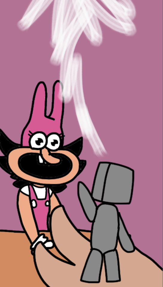
"woah, whats that!?"
"tob a ni seciov fo hcnub a tsuj er'yeht yas yehT !yella eht yb edistuo meht dnuof i :)"
"Neat!!!"

"so, here for the usual? On the house of course, since you're my second favorite customer!"
"..sey esoppus I os ,yrgnuh ma I .dnik os er'uoy"
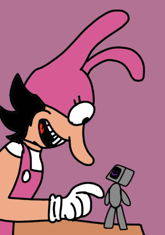
"well lil guy! or, guys plural? Anyways, whats your deal?"
#SORRY FOR THE ABSENCE ACK#back now! designs changed and lineart is thinner so it looks bad#translations >#i found them outside by the alley! They say they're just a bunch of voices in a bot#you're so kind. I am hungry so I suppose yes..#pizza tower#pizza tower au#A Watchful Eye AU#AWE.png#Fake Peppino#Noisette
16 notes
·
View notes
Note
besides kikos are there any other pets u think got done dirty by the customization update? or specific pet/color combos? i personally am made irrationally angry by what they did to mutant hissi post-customization
oh yeah tons... feels kind of like beating a dead horse at this point, but man
uhh i mentioned koi last time but im bringing them up again because i think they come close to the kiko in terms of how badly suited they are for customization. the fists just look so bad... i feel like scorchios lost a ton of its appeal, theyre very blocky and oddly drawn and proportioned now. dont like how they changed the arms and legs, the pre coversion chocolate scorchio is a way nicer looking update to the old artwork. uhhh lutari is kind of ruined for me, i just do not like the post customization art at all and i loved the species pre conversion. it feels like a shame they made chias so lifeless- they have the potential to be cute but someone figured out the most stiff and unemotive way to draw their expressions and then pasted that face onto nearly every fruit chia. this makes me sad. tonus have thicker lineart than other species and this annoys the hell out of me. poogles at first look identical but then if you really look you realize that there’s been a noticable loss of fidelity between the old and new art and you can never unsee it. kougras have faces that are shaded the opposite direction from their bodies because it was traced from the old art where its head was turned around, and iirc the head also has slightly thinner looking lines than the body??? aaaaAAAAA. oh also both of the frog pets look really strange and frozen and eerie post conversion, which is a shame because i like frogs a lot and thought the original designs were charming
i agree with you on mutant hissi- i think the new one is charming in its own way but its totally different than the old one and doesnt have the same personality or feel to it at all.
this is a weird one but its stuck with me: the mutant grarrl went from being ‘kind of boring with dated art’ to ‘contender for worst looking pet on the website’
i’ll never get over how much personality virtually every grey pet lost... plushie and royal are pretty big losses too, but at least royal is a color where they can go nuts on an elaborate outfit and kind of make up for the lack of unique poses. mutant maraquan and baby are infuriating when theyre worse because its like. these ones could have all probably been left unchanged. some of them DID get to stay the same, like the mutant ixi... my least favorite thing is how many maraquan pets especially are poorly thought out edits of the new base pet art, when maraquan pets barely even get any clothes and they look SO much worse than the old art. the maraquan techo and scorchio and zafara didnt deserve this come on
which reminds me: another standout bad pet, the maraquan lupe is completely ruined. the tyrannian korbat is ALSO ruined, they decided to make it a caveman instead of a pteranodon so it would work better with customization and i will never forgive this. 9 year old me would be heartbroken if they knew that this had happened
i say all of this while also knowing that customization is ultimately what got me back into neopets in high school and that i enjoy being able to make my pets feel like unique individuals with the feature... it can make for a fun project. there’s also a few species that i think got better art post conversion. the acara and the kacheek come to mind as looking more appealing to their pre conversion designs- there’s other pets where its subjective, like the gelert, aisha, buzz and bruce. i like the new designs for these, they feel a little more lively, but can see why other people might not and a few of them i could go either way on. the draik looks technically nicer but i kind of prefer the old draik anyway... the circle pose at least, the happy pose doesnt have the same appeal to me
#this is a lot- sorry for such a long answer#i have even more opinions probably but im gonna stop here#long post#neopets#asks#i need a text post tag
13 notes
·
View notes
Last Seen Blogs

sensational-autumn
cozy & warm

omnicurisofficial
Omnicuris

nct-whore
Lets Cry Together

logisticsindelhi
Untitled

catboy-lover-archive
MOVED BLOGS!! SEE PINNED !!!