#backgroundcolor
Text
How to Change the Background Color of Your Photo in Photoshop - A Step-by-Step Tutorial by Clipping Path Center

Imagine you have a perfect photo, but the background color is not what you want.
Imagine you can do this easily and quickly, without compromising the quality of your photo.
You don't have to imagine anymore. You can do it with Photoshop, the most powerful and versatile photo editing software in the world. Photoshop allows you to change the background color of any photo with just a few clicks and adjustments. You can choose from millions of colors, gradients, patterns, or even your own custom images.
But how do you do it? How do you change the background color of your photo in Photoshop?
That's where we come in. We are Clipping Path Center, a professional photo editing service provider with over 10 years of experience. We have created a detailed and easy-to-follow tutorial on how to change the background color of your photo in Photoshop. You can find it here: https://www.clippingpathcenter.com/change-background-color-photoshop/
In this tutorial, you will learn how to:
- Select the background of your photo using various tools and techniques
- Change the background color of your photo using different methods and options
- Refine the edges of your selection to make it smooth and realistic
- Save and export your photo with the new background color
Whether you are a beginner or an expert, this tutorial will help you master the skill of changing the background color of your photo in Photoshop. You will be able to create stunning photos that suit your needs and preferences.
So what are you waiting for? Grave it and start changing the background color of your photo in Photoshop today!
#photoshop#photoediting#photographytips#imageediting#photoshoptips#photoshopmagic#photoshoptutorial#graphicdesign#backgroundcolor
0 notes
Link
#Windows fotoğraf görüntüleyicisi#Windows Photo Viewer#Arkaplan rengi#Windows fotoğraf görüntüleyisi arkaplan rengini değiştir#BackgroundColor#Gri arkaplan olmasın
0 notes
Text
the way you do inline styling in react/MDX is so stupid and it's poisoned me. instead of <style="background-color: white"> you have to go <style={{backgroundColor: 'white'}}>. fucking camel case!!
13 notes
·
View notes
Note
Saw a dad wearing this same shirt at the store, only it was purple.
https://image.spreadshirtmedia.com/image-server/v1/products/T210A1PA4301PT17X13Y13D1017294241W30667H36804/views/1,width=550,height=550,appearanceId=1,backgroundColor=F2F2F2,modelId=1147,crop=list/unicorn-and-tacos-t-shirt-cinco-de-mayo-mexican-food-kids-girls-boys-rainbow-squad-cute-gifts-party-mens-t-shirt.jpg
LET THIS BE ALMA'S FATHER'S DAY GIFT TO HER PAPÁ! 😭 💕 🦄 🌮
(enchantedchocolatebars)
@enchantedchocolatebars YES OMG ABSOLUTELY
Philip loves the shirt very much and wears it as many times as he can
3 notes
·
View notes
Text
Crear un modal en Flutter con 2 botones
Crear un modal en Flutter con 2 botones aparece primero en nuestro https://jonathanmelgoza.com/blog/crear-un-modal-en-flutter/
Hoy hablamos sobre cómo crear un modal en Flutter con dos botones de opción, cancelar y confirmar, te dejo una función lista, para integrar en tus proyectos rápidamente y te explico lo que hacemos para que no te pierdas de nada.
Recientemente, he estado trabajando en un proyecto de aplicación móvil multiplataforma.
La elección tomada fue Flutter por su simplicidad y el gigante detrás de esta tecnología.
En este proyecto he tenido que experimentar mucho con esta tecnología, por lo que próximamente estaré subiendo más snippets de código.
Hoy les hablaré un poco sobre una funcionalidad que recientemente tuve que implementar y que creo es muy necesaria en cualquier proyecto.
Veremos como crear un modal en Flutter con dos botones de acción: cancelar y eliminar.
Por supuesto puedes cambiar estas opciones, pues la estructura es la misma, puedes hacer por ejemplo un cancelar y confirmar.
Como te he comentado antes he puesto el código en una función para que sea más fácil integrar en tus proyectos.
Solo debes de tomar en cuenta a partir del código del botón que abre el modal para llamar la función.
onPressed: () async showConfirmDelete(context); ,
Lo único que hacemos es llamar a una función y mandar como parámetro nuestro contexto.
Ahora vemos la función principal de este post.
showConfirmDelete(BuildContext context) Widget cancelButton = ElevatedButton( child: Text("Cancelar"), style: ButtonStyle( backgroundColor: MaterialStateProperty.all<Color>(primarycolor), shape: MaterialStateProperty.all( RoundedRectangleBorder( borderRadius: BorderRadius.circular(16), ), ), ), onPressed: () print("Cancelando.."); Navigator.of(context).pop(); , ); Widget continueButton = ElevatedButton( child: Text("Eliminar"), style: ButtonStyle( backgroundColor: MaterialStateProperty.all<Color>(redcolor), shape: MaterialStateProperty.all( RoundedRectangleBorder( borderRadius: BorderRadius.circular(16), ), ), ), onPressed: () print("Eliminando.."); // Otras acciones de eliminar , ); // set up the AlertDialog AlertDialog alert = AlertDialog( title: Text("Eliminar cuenta"), content: Text("¿Estás seguro de eliminar permanentemente tu cuenta?"), actions: [ cancelButton, continueButton, ], ); // show the dialog showDialog( context: context, builder: (BuildContext context) return alert; , );
Lo primero que hacemos es crear nuestros dos botones de acción: cancelar y eliminar.
Agregamos un pequeño estilo, en mi caso el botón de Eliminar lo he puesto en rojo.
Puedes notar que para simplemente salir del modal para por ejemplo el botón de cancelar usamos:
Navigator.of(context).pop();
Nuestro modal lo creamos con AlertDialog donde podemos personalizar el título y contenido, además de por supuesto agregar los botones que creamos antes.
Como puedes ver no es nada complicado, pero es muy útil en proyectos de apps móviles con Flutter.
Si este artículo sobre cómo crear un modal en Flutter te ha sido de utilidad, no olvides compartirlo en tus redes sociales y dejarnos un comentario en la sección de abajo si tienes cualquier duda respecto a este tema, será un placer ayudarte.
¡Hasta luego!
3 notes
·
View notes
Text
10 Unknown Facts About Flawless Product Photos Against Plain White Background

Utilize a lightbox: A lightbox provides even, diffused lighting, eliminating shadows and ensuring a clean white background.
Consider the product's color: For darker products, use a slightly warmer white background to avoid the product appearing too dark.
Experiment with angles: Tilting the product slightly can add dimension and visual interest to your photos.
Use a tripod: A tripod helps maintain stability and prevents camera shake, resulting in sharper images.
Pay attention to reflections: Avoid unwanted reflections in your photos by using a non-reflective surface or angling the product to minimize glare.
Consider the product's size: Larger products may require more space and lighting to capture the entire object in the frame.
Use a polarizing filter: A polarizing filter can help reduce glare and enhance the color saturation of your product.
Shoot in RAW format: This allows for more flexibility in post-processing, especially when correcting any color casts or imperfections.
Consider using a white backdrop instead of a white wall: A white backdrop can provide a cleaner and more controlled background.
Practice makes perfect: Experiment with different lighting setups, angles, and compositions to find what works best for your specific product.
#lightbox #productphotography #lighting #productphotography #backgroundcolor #whitebackground #productphotography #angles #composition #productphotography #tripod #stability #productphotography #glare #reflection
0 notes
Text
Animating Your React Apps with Framer Motion- Tips and Tricks

Hey there, React developers! If you're looking to breathe new life into your React apps, animations can be a game-changer. Animations make your user interfaces more engaging and can significantly enhance the user experience. In this blog, we'll dive into the world of React animations using the fantastic library, Framer Motion. We'll cover some essential tips and tricks to help you create stunning animations in your React apps. So, let's get started!
What is Framer Motion?
Framer Motion is a powerful animation library for React that makes it incredibly easy to add animations to your components. It's built on top of the popular Framer library, which is used by designers and developers worldwide. Framer Motion provides a simple yet flexible API, making it perfect for both beginners and advanced users.
Why Use Animations in Your React Apps?
Before we dive into the nitty-gritty of Framer Motion, let's talk about why you should consider using animations in your React apps. Animations can:
Enhance User Experience: Animations can make your app feel more responsive and intuitive. They can provide visual feedback, guide users through interactions, and create a sense of flow.
Improve Visual Appeal: Well-designed animations can make your app look polished and professional. They can add a touch of elegance and sophistication to your UI.
Communicate State Changes: Animations can effectively communicate changes in the state of your app. For example, you can use animations to indicate loading, success, or error states.
Getting Started with Framer Motion
To get started with Framer Motion, you'll need to install it in your React project. You can do this using npm or yarn:npm install framer-motion
oryarn add framer-motion
Once you have Framer Motion installed, you can start using it in your components. Let's take a look at some basic examples.
Basic Animations
One of the simplest ways to create animations with Framer Motion is by using the motion component. This component can be used just like any other React component, but it comes with built-in animation capabilities.
Here's an example of a simple fade-in animation:import { motion } from "framer-motion"; const FadeInComponent = () => { return ( <motion.div initial={{ opacity: 0 }} animate={{ opacity: 1 }} transition={{ duration: 1 }} > Hello, I'm a fading component! </motion.div> ); }; export default FadeInComponent;
In this example, we're using the motion.div component to create a div element with animation. The initial prop sets the initial state of the element (opacity: 0), and the animate prop defines the final state (opacity: 1). The transition prop specifies the duration of the animation (1 second).
Advanced Animations
Framer Motion also allows you to create more complex animations using keyframes. Keyframes enable you to define multiple states and transition between them.
Here's an example of a bouncing ball animation:import { motion } from "framer-motion"; const BouncingBall = () => { return ( <motion.div style={{ width: "50px", height: "50px", borderRadius: "50%", backgroundColor: "red", }} animate={{ y: [0, -30, 0], }} transition={{ duration: 0.5, repeat: Infinity, repeatType: "loop", }} /> ); }; export default BouncingBall;
In this example, we're using the animate prop to define a keyframe animation that moves the ball up and down. The transition prop includes a repeat option to create a looping animation.
Animating Presence
Framer Motion also provides a powerful feature called AnimatePresence, which makes it easy to animate components when they enter or exit the DOM.
Here's an example of a component that fades in and out:import { motion, AnimatePresence } from "framer-motion"; import { useState } from "react"; const FadeInOutComponent = () => { const [isVisible, setIsVisible] = useState(true); return ( <div> <button onClick={() => setIsVisible(!isVisible)}>Toggle</button> <AnimatePresence> {isVisible && ( <motion.div initial={{ opacity: 0 }} animate={{ opacity: 1 }} exit={{ opacity: 0 }} transition={{ duration: 0.5 }} > I'm fading in and out! </motion.div> )} </AnimatePresence> </div> ); }; export default FadeInOutComponent;
In this example, we're using AnimatePresence to handle the entry and exit animations of the component. When the component is removed from the DOM, it will animate out before disappearing.
Tips and Tricks for Using Framer Motion
Now that we've covered the basics, let's dive into some tips and tricks to help you get the most out of Framer Motion.
1. Use Variants for Reusability
Variants are a powerful feature in Framer Motion that allow you to define reusable animation states. You can create a set of variants and apply them to multiple components, making your code more maintainable.const variants = { hidden: { opacity: 0, y: -20 }, visible: { opacity: 1, y: 0 }, }; const ReusableComponent = () => { return ( <motion.div variants={variants} initial="hidden" animate="visible" transition={{ duration: 0.5 }} > I'm a reusable component! </motion.div> ); }; export default ReusableComponent;
2. Use Custom Hooks for Complex Animations
If you find yourself creating complex animations with multiple states, consider using custom hooks to encapsulate your animation logic. This can help you keep your components clean and focused.import { useAnimation } from "framer-motion"; const useBouncingAnimation = () => { const controls = useAnimation(); const startBouncing = () => { controls.start({ y: [0, -30, 0], transition: { duration: 0.5, repeat: Infinity, repeatType: "loop" }, }); }; return { controls, startBouncing }; }; const BouncingBall = () => { const { controls, startBouncing } = useBouncingAnimation(); return ( <motion.div style={{ width: "50px", height: "50px", borderRadius: "50%", backgroundColor: "blue", }} animate={controls} onClick={startBouncing} /> ); }; export default BouncingBall;
3. Optimize Performance with shouldForwardProp
When animating large lists or complex components, performance can become an issue. Framer Motion provides the shouldForwardProp function to help you optimize performance by controlling which props are forwarded to the DOM.import { motion } from "framer-motion"; import styled from "styled-components"; const StyledMotionDiv = styled(motion.div).withConfig({ shouldForwardProp: (prop) => prop !== "customProp", })``; const OptimizedComponent = ({ customProp }) => { return ( <StyledMotionDiv initial={{ opacity: 0 }} animate={{ opacity: 1 }} transition={{ duration: 0.5 }} > I'm optimized! </StyledMotionDiv> ); }; export default OptimizedComponent;
Read More
0 notes
Text
26.4 JavaScript 객체 디스트럭처링
JavaScript 객체 디스트럭처링
JavaScript 객체 디스트럭처링(Destructuring)은 객체 속성을 쉽게 추출하고 변수를 할당할 수 있는 편리한 방법입니다. 이는 코드의 가독성을 높이고, 데이터를 보다 쉽게 다룰 수 있게 해줍니다. 이번 포스팅에서는 객체 디스트럭처링의 기본적인 사용 방법과 다양한 활용 사례에 대해 자세히 설명하겠습니다.
기본 문법
객체 디스트럭처링은 중괄호 {} 안에 객체의 속성 이름을 넣어 해당 속성의 값을 변수로 추출합니다.
const person = {
name: 'John',
age: 30,
city: 'New York'
};
const { name, age, city } = person;
console.log(name); // John
console.log(age); // 30
console.log(city); // New York
변수 이름 변경
디스트럭처링을 할 때 변수 이름을 변경할 수도 있습니다. 콜론 :을 사용하여 객체 속성 이름과 변수 이름을 매핑할 수 있습니다.
const person = {
name: 'John',
age: 30,
city: 'New York'
};
const { name: personName, age: personAge, city: personCity } = person;
console.log(personName); // John
console.log(personAge); // 30
console.log(personCity); // New York
기본값 설정
해당 속성이 객체에 없을 경우 기본값을 설정할 수도 있습니다.
const person = {
name: 'John',
age: 30
};
const { name, age, city = 'Unknown' } = person;
console.log(city); // Unknown
중첩 객체 디스트럭처링
중첩된 객체 속성을 디스트럭처링할 수도 있습니다.
const person = {
name: 'John',
age: 30,
address: {
city: 'New York',
zipcode: 10001
}
};
const { name, address: { city, zipcode } } = person;
console.log(city); // New York
console.log(zipcode); // 10001
나머지 속성 가져오기
디��트럭처링을 할 때 특정 속성만 제외하고 나머지 속성을 가져올 수도 있습니다.
const person = {
name: 'John',
age: 30,
city: 'New York'
};
const { name, ...rest } = person;
console.log(name); // John
console.log(rest); // { age: 30, city: 'New York' }
함수 매개변수에서의 디스트럭처링
함수의 매개변수로 객체를 전달할 때도 디스트럭처링을 사용할 수 있습니다.
function printPerson({ name, age, city }) {
console.log(`Name: ${name}, Age: ${age}, City: ${city}`);
}
const person = {
name: 'John',
age: 30,
city: 'New York'
};
printPerson(person); // Name: John, Age: 30, City: New York
예제 종합
위에서 배운 내용을 종합하여 예제를 작성해보겠습니다.
const book = {
title: 'JavaScript: The Good Parts',
author: {
firstName: 'Douglas',
lastName: 'Crockford'
},
year: 2008,
publisher: 'O'Reilly Media'
};
// 중첩 객체 디스트럭처링과 변수 이름 변경
const {
title,
author: { firstName: authorFirstName, lastName: authorLastName },
year,
publisher: bookPublisher = 'Unknown'
} = book;
console.log(title); // JavaScript: The Good Parts
console.log(authorFirstName); // Douglas
console.log(authorLastName); // Crockford
console.log(year); // 2008
console.log(bookPublisher); // O'Reilly Media
배열 디스트럭처링
객체뿐만 아니라 배열에서도 디스트럭처링을 사용할 수 있습니다.
const numbers = ;
const = numbers;
console.log(first); // 1
console.log(second); // 2
console.log(rest); //
실용적인 예제
디스트럭처링은 실제로 어떻게 사용될 수 있는지에 대한 몇 가지 실용적인 예제를 살펴보겠습니다.
API 응답 처리
API로부터 받은 JSON 응답을 처리할 때 유용하게 사용할 수 있습니다.
const response = {
data: {
user: {
id: 1,
name: 'John Doe',
email: '[email protected]'
},
status: 'success'
}
};
const { data: { user: { id, name, email } }, status } = response;
console.log(id); // 1
console.log(name); // John Doe
console.log(email); // [email protected]
console.log(status);// success
설정 객체
함수에 전달되는 설정 객체의 디스트럭처링 예제입니다.
function setupCanvas({ width = 600, height = 400, backgroundColor = 'white' } = {}) {
console.log(`Width: ${width}, Height: ${height}, BackgroundColor: ${backgroundColor}`);
}
setupCanvas({ width: 800, height: 600 });
// Width: 800, Height: 600, BackgroundColor: white
setupCanvas();
// Width: 600, Height: 400, BackgroundColor: white
파라미터 디폴트 값과 조합
함수의 파라미터 디폴트 값과 디스트럭처링을 조합하여 사용할 수 있습니다.
function createUser({ name = 'Anonymous', age = 0, isActive = false } = {}) {
console.log(`Name: ${name}, Age: ${age}, Active: ${isActive}`);
}
createUser({ name: 'Alice', age: 25 });
// Name: Alice, Age: 25, Active: false
createUser();
// Name: Anonymous, Age: 0, Active: false
결론
JavaScript 객체 디스트럭처링은 다양한 상황에서 유용하게 사용할 수 있는 강력한 기능입니다. 이를 활용하면 코드의 가독성과 유지보수성을 크게 향상시킬 수 있습니다. 이번 포스팅에서 소개한 다양한 예제를 통해 객체 디스트럭처링을 보다 효과적으로 활용할 수 있기를 바랍니다.
Read the full article
0 notes
Text
ISSUU reader embeds, follow the link below to see the full pdf of the magazine: https://e.issuu.com/embed.html?backgroundColor=%23bdaaad&d=spot37_by_cfa_press&doAutoflipPages=true&u=circlefoundationforthearts
Circle Arts Spotlight Magazine.
I have 4 pages, two spreads:
0 notes
Text
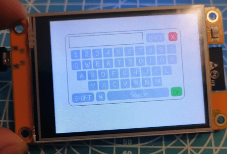
ESP32 & Touchscreen - Bildschirmtastatur programmieren

Auf dem ESP32 mit Touchscreen kannst du nicht nur geometrische Figuren zeichnen, sondern mit etwas Geschick und Zeit auch Dashboards. In diesem Beitrag möchte ich dir daher nun zeigen, wie eine Bildschirmtastatur programmiert wird.
https://youtu.be/oQ_NSk1W470
Die hier vorgestellte Bildschirmtastatur wird in einem weiteren Beitrag benötigt, jedoch finde ich das es ein Eigner Beitrag wert ist, weil dieses kleine Feature kannst du für viele Anwendungsfälle verwenden.
Wie soll die Bildschirmtastatur am ESP32 mit Touchscreen aussehen?
Eine Bildschirmtastatur kennst du bestimmt schon von deinem Handy und genau von dort nehme ich mir eine Vorlage.
Aus dieser Vorlage streiche ich jedoch die Funktion für die Smileys und füge für die Sonderzeichen eine zusätzliche Taste ein.
Hier jetzt ein Bild wie das Ergebnis aussieht, wenn du diesen Beitrag durcharbeitest oder dir ganz bequem vom GitHub Repository StefanDraeger / ESP32_Development_Board_ESP32-2432S028R dir den Code herunterlädst und ausführst.
Programmieren der Bildschirmtastatur in der Arduino IDE
Fangen wir jetzt an und programmieren die Bildschirmtastatur. Wie man geometrische Figuren zeichnet und auf ein Touch Event reagiert, habe ich dir bereits in den nachfolgenden Beiträgen gezeigt.
- ESP32 Development Board mit 2,8 Zoll Touch Display: Programmieren für Anfänger
- ESP32 Development Board: Touchfunktion programmieren
Ausgangsstruktur für das Programm
Zunächst das kleine Programm, welches wir als Basis nutzen möchten:
#define LGFX_USE_V1
#include
#include "lgfx_ESP32_2432S028.h"
//Größe der Zeichenfläche definieren
#define MAX_X 319
#define MAX_Y 239
//Felder für die ermittelte Position
//bei einem klick
uint16_t x = 0, y = 0;
//Instanz des Displays
static LGFX lcd;
void setup(void) {
//beginn der seriellen Kommunikation mit
//115200 Baud
Serial.begin(115200);
//beginn der Kommunikation mit dem Display
lcd.init();
//drehen des Displays
lcd.setRotation(1);
//füllen des Displays mit der Farbe Schwarz
lcd.fillScreen(lcd.color332(0,0,0));
//eine kleine Pause von 100ms.
delay(100);
}
void loop() {
if (lcd.getTouch(&x, &y) == 1) {
if (x > MAX_X || y > MAX_Y) {
return;
}
}
//eine Pause von 50 Millisekunden.
delay(50);
}
Zusätzlich benötigst du noch die Datei "lgfx_ESP32_2432S028.h" welche du vom GitHub Repository OttoMeister/ARDUINO_ESP32-2432S028R herunterladen kannst. Nachfolgend eine ZIP-Datei mit dem Code und der benötigten Datei.
Grundprogramm - ESP32 Development Board mit TFT TouchdisplayHerunterladen
Schritt 1 - Struktur für die GUI Elemente anlegen
Zunächst erstellen wir die Strukturen für die Schaltflächen und das Eingabefeld, denn schließlich wollen wir unseren Code effizient und optimiert aufbauen.
Auf der Tastatur findest du zwei verschiedene Buttons, zum einen für die Buchstaben, Zahlen und Sonderzeichen sowie die Funktionstasten, Löschen (BACK), Umschalten (SHIFT), Leerzeichen (SPACE), Schließen (X) und OK. Dafür benötigen wir nun zwei Strukturen.
Schritt 1.1 - Struktur für die Funktionstasten
struct ButtonFunction {
uint8_t backgroundcolor; //Hintergrundfarbe
uint8_t textcolor; //Textfarbe
int coord_x; //X Koordinate der Schaltfläche
int coord_y; //Y Koordinate der Schaltfläche
int width; //Breite
int height; //Höhe
int roundEdge; //Wert ffür die Rundung der Ecke
String caption; //Text
};
Schritt 1.2 - Struktur für die Schaltflächen Buchstaben, Zahlen & Sonderzeichen
Die Buttons haben alle eine gleiche Größe & Farbe und daher entfallen hier die Attribute für backgroundcolor, textcolor, width & height.
struct Button {
int coord_x; //X Koordinate der Schaltfläche
int coord_y; //Y Koordinate der Schaltfläche
String caption1; //Text normal
String caption2; //Text umgeschaltet
};
Schritt 1.3 - Struktur für das Eingabefeld
Das Eingabefeld hat zusätzlich ein Attribut für eine Rahmenfarbe.
struct InputField {
uint8_t backgroundcolor; //Hintergrundfarbe
uint8_t bordercolor; //Rahmenfarbe
uint8_t textcolor; //Textfarbe
int coord_x; //X Koordinate
int coord_y; //Y Koordinate
int width; //Breite
int height; //Höhe
};
Schritt 2 - Anlegen der Schaltflächen und speichern im Array
Wie erwähnt schreiben wir unseren Code optimiert, dazu reduzieren wir Redundanzen im Code, wo es geht. Die Schaltflächen werden dazu gleich im Array erzeugt, was jetzt nicht so gut lesbar ist, aber die Codezeilen reduziert (Die Belegung des Speichers bleibt dieselbe.).
Da die Zeilen der Tastatur nicht gleichartig aufgebaut sind, habe ich ein zusätzliches Array implementiert, in welchem die Anzahl der Schaltflächen pro Zeile definiert sind.
//Wieviele Schaltflächen sollen pro Zeile angezeigt werden?
int rowButtonCount = {10, 10, 9, 7};
//Maximale Anzahl der Schaltflächen pro Zeile
const int NUM_BUTTONS = 10;
//Anzahl der Zeilen
const int NUM_ROWS = 4;
Button keyboard = {
{ { 0, 0, "1", "!" }, { 0, 0, "2", """ }, { 0, 0, "3", ":" }, { 0, 0, "4", "$" }, { 0, 0, "5", "%" }, { 0, 0, "6", "&" }, { 0, 0, "7", "/" }, { 0, 0, "8", "(" }, { 0, 0, "9", ")" }, { 0, 0, "0", "=" } },
{ { 0, 0, "Q", "q" }, { 0, 0, "W", "w" }, { 0, 0, "E", "e" }, { 0, 0, "R", "r" }, { 0, 0, "T", "t" }, { 0, 0, "Z", "z" }, { 0, 0, "U", "u" }, { 0, 0, "I", "i" }, { 0, 0, "O", "o" }, { 0, 0, "P", "p" } },
{ { 0, 0, "A", "a" }, { 0, 0, "S", "s" }, { 0, 0, "D", "d" }, { 0, 0, "F", "f" }, { 0, 0, "G", "g" }, { 0, 0, "H", "h" }, { 0, 0, "J", "j" }, { 0, 0, "K", "k" }, { 0, 0, "L", "l" } },
{ { 0, 0, "Y", "y" }, { 0, 0, "X", "x" }, { 0, 0, "C", "c" }, { 0, 0, "V", "v" }, { 0, 0, "B", "b" }, { 0, 0, "N", "n" }, { 0, 0, "M", "m" }}
};
Dasselbe machen wir auch für die Schaltflächen der Sonderzeichen:
//Anzahl der Schaltflächen pro Zeile
const int NUM_BTN_SYMBOL = 5;
//Anzahl der Zeilen
const int NUM_BTN_SYMBOL_ROWS = 4;
Button symbols = {
{{ 0, 0, "+", "" }, { 0, 0, "-", "" }, { 0, 0, "/", "" }, { 0, 0, "#", "" }, { 0, 0, "'", "" }},
{{ 0, 0, "_", "" }, { 0, 0, ".", "" }, { 0, 0, ":", "" }, { 0, 0, ",", "" }, { 0, 0, ";", "" }},
{{ 0, 0, "", "" }, { 0, 0, "|", "" }, { 0, 0, "?", "" }, { 0, 0, "!", "" }},
{{ 0, 0, "{", "" }, { 0, 0, "}", "" }, { 0, 0, "", "" }, { 0, 0, "~", "" }}
};
Schritt 3 - Zeichnen der Schaltflächen
Die Schaltflächen haben wir zuvor in einem Array abgelegt und den "Style" in einem weiteren Array definiert, mit diesen Informationen läßt sich nun recht einfach die Schaltfläche zeichnen.
Wie du sicherlich gesehen hast, sind die Koordinaten jeweils mit 0 vorbelegt, diese Koordinaten werden beim Zeichnen berechnet und an die Schaltfläche gespeichert.
//Zeichnen eines Buttons
void drawButton(int row, int btnIndex, Button &button, int offset_X) {
int x = start_X + offset_X;
//Für den ersten Button die Berechnung der neuen X Koordinate überspringen
if (btnIndex > 0) {
x = start_X + (BTN_WIDTH + BTN_MARGIN_HORIZONTAL) + offset_X;
}
// Y Koordinate vom durchlauf zuvor verwenden
int y = start_Y;
lcd.fillRoundRect(x, y, BTN_WIDTH, BTN_HEIGHT, 2, LIGHT_GREY);
lcd.setTextColor(WHITE, LIGHT_GREY);
lcd.setCursor(x + 7, y + 2);
lcd.print(isShiftActive ? button.caption2 : button.caption1);
//Speichern der Koordinaten am Button
button.coord_x = x;
button.coord_y = y;
//Speichern der Koordinaten an den Feldern für den nächsten durchlauf
start_X = x;
start_Y = y;
}
Die Funktionstasten sind ähnlich, jedoch haben diese zusätzliche Attribute welche behandelt werden müssen.
//Zeichnen einer Funktionstaste
void drawFunctionButton(ButtonFunction &button) {
//Wenn die Shift-Taste oder die Symbol-Taste betätigt wurde, dann soll die jeweilige
//Taste mit dunkelgrauem hintergrund dargestellt werden.
if ((button.caption == "SHIFT" && isShiftActive) || (button.caption == "#" && isSymbolActive)) {
lcd.fillRoundRect(button.coord_x, button.coord_y, button.width, button.height, BTN_ROUNDEDGE, DARKER_GREY);
lcd.setTextColor(button.textcolor, button.backgroundcolor);
} else {
lcd.fillRoundRect(button.coord_x, button.coord_y, button.width, button.height, BTN_ROUNDEDGE, button.backgroundcolor);
lcd.setTextColor(button.textcolor, button.backgroundcolor);
}
//Die Leertaste ist deutlich länger und damit der Text zentriert angezeigt wird, muss hier eine If-Bedingung erfolgen.
if (button.caption == "Space") {
lcd.setCursor(button.coord_x + 50, button.coord_y + 3);
} else {
lcd.setCursor(button.coord_x + 6, button.coord_y + 3);
}
lcd.print(button.caption);
}
Schritt 4 - Zeichnen des Eingabefeldes
Das Eingabefeld ist eigentlich nur ein Rechteck in welchem ein Text geschrieben wird. Daher ist das Zeichnen von diesem recht einfach.
void drawInputField(InputField inputField) {
lcd.drawRect(inputField.coord_x, inputField.coord_y, inputField.width, inputField.height, inputField.bordercolor);
lcd.fillRect(inputField.coord_x + 1, inputField.coord_y + 1, inputField.width - 2, inputField.height - 2, BK_GREY);
lcd.setTextColor(inputField.textcolor, inputField.backgroundcolor);
lcd.setCursor(inputField.coord_x + 4, inputField.coord_y + 5);
int maxTextLength = 15;
int textLength = inputText.length();
if (textLength > maxTextLength) {
lcd.print(inputText.substring(textLength - maxTextLength, textLength));
} else {
lcd.print(inputText);
}
}
Da keine TrueType Font zur Verfügung steht habe ich zur ermittlung der maximalen Eingabe den Buchstaben "W" genutzt, es wurde ermittelt das maximal 15 Zeichen in dieses Eingabefeld passt.
struct InputField {
uint8_t backgroundcolor; //Hintergrundfarbe
uint8_t bordercolor; //Rahmenfarbe
uint8_t textcolor; //Textfarbe
int coord_x; //X Koordinate
int coord_y; //Y Koordinate
int width; //Breite
int height; //Höhe
};
Schritt 5 - Anzeigen / Zeichnen der Bildschirmtastatur
Die Funktion showKeyboard wird genutzt um die Bildschirmtastatur zu zeichnen und wird auch aufgerufen wenn die SHIFT / Symbol-Taste betätigt wird.
//Zeigt die Bildschirmtastatur an, wird ebenso verwendet um
//die Bildschirmtastatur neu zu zeichnen.
void showKeyboard() {
//Die Bildschirmtastatur ist sichtbar!
keyboardIsVisible = true;
//Koordinaten der Bildschirmtastatur
start_X = DEFAULT_START_X;
start_Y = DEFAULT_START_Y;
//Hintergrundfarbe
lcd.fillScreen(BK_GREY);
//Rahmen zeichnen
lcd.drawRoundRect(30, 30, 250, 155, 10, DARK_GREY);
//Zeichnen der Funktionstasten
drawFunctionButton(closeBtn);
drawFunctionButton(backBtn);
//Wenn die Symbol-Taste aktiviert ist, dann soll
//die Shift-Taste nicht gezeichnet werden
if (!isSymbolActive) {
drawFunctionButton(shiftBtn);
}
drawFunctionButton(symbolsBtn);
drawFunctionButton(spaceBtn);
drawFunctionButton(okBtn);
//Zeichnen des Eingabefeldes
drawInputField(inputField);
//Wenn nicht die Symbol-Taste aktiviert ist,
//dann soll die normale Tastatur gezeichnet werden.
if (!isSymbolActive) {
//Schleifen über die Arrays
for (int row = 0; row < NUM_ROWS; row++) {
start_X = DEFAULT_START_X;
//Berechnen der X Koordinate für Zeilen größer als 1
if (row > 0) {
start_Y = DEFAULT_START_Y + (row * (BTN_HEIGHT + BTN_MARGIN_VERTIKAL));
}
//Schleife über die Schaltflächen im Array, zusätzlich wird hier aus dem Array
//rowButtonCount die maximale Anzahl entnommen
for (int btnIndex = 0; btnIndex < rowButtonCount; btnIndex++) {
int offset_X = 0;
//Berechnen eines Offsets
if (rowButtonCount < 10 && btnIndex == 0) {
//Abhängig von der Anzahl der Schaltflächen soll die Zeile eingerückt werden.
switch (rowButtonCount) {
case 9: offset_X = BTN_WIDTH / 2; break;
case 7: offset_X = BTN_WIDTH * 1.5 + BTN_MARGIN_HORIZONTAL; break;
}
}
//Zeichnen der Bildschirmtastatur
drawButton(row, btnIndex, keyboard, offset_X);
}
}
} else { //Wenn die Symbol-Taste aktiviert wurde, dann sollen die Sonderzeichen gezeichnet werden
//Die Sonderzeichen sind als Block von 5x4 abgelegt.
for (int row = 0; row < NUM_BTN_SYMBOL_ROWS; row++) {
start_X = DEFAULT_START_X;
if (row > 0) {
start_Y = DEFAULT_START_Y + (row * (BTN_HEIGHT + BTN_MARGIN_VERTIKAL));
}
for (int btnIndex = 0; btnIndex < NUM_BTN_SYMBOL; btnIndex++) {
int offset_X = 0;
if (btnIndex == 0) {
offset_X = 60;
}
drawButton(row, btnIndex, symbols, offset_X);
}
}
}
}
Schritt 6 - Aktionen an der Bildschirmtastatur am ESP32 behandeln
Wie man eine Aktion am Touchscreen am ESP32 behandelt habe ich dir bereits im Beitrag ESP32 Development Board: Touchfunktion programmieren erläutert, hier nutzen wir den Code und wandeln diesen lediglich etwas ab.
//Aktionen an der Bildschirmtastatur behandeln
//Als Parameter werden die geklickten Koordinaten am Display erwartet.
void handleKeyboard(int x, int y) {
//Felder ob die komplette Bildschirmtastatur neugezeichnet werden soll, oder
//nur das Eingabefeld.
bool redrawKeyboard = false;
bool redrawInputField = false;
//prüfen ob die Symbold-Taste aktiviert ist.
//Hintergrund: Es wird geprüft ob sich an einer X/Y Koordinate eine Schaltfläche
//befindet. Da die Bildschirmtastatur jedoch zweischichtig ist, kommt es hier zu
//Überlagerungen von Schaltflächen.
if (!isSymbolActive) {
for (int row = 0; row < NUM_ROWS; row++) {
for (int btnIndex = 0; btnIndex < NUM_BUTTONS; btnIndex++) {
Button button = keyboard;
if (checkCoordButton(button, x, y)) {
redrawInputField = true;
addSignToInputField(isShiftActive ? button.caption2 : button.caption1);
}
}
}
} else {
for (int row = 0; row < NUM_BTN_SYMBOL_ROWS; row++) {
for (int btnIndex = 0; btnIndex < NUM_BTN_SYMBOL; btnIndex++) {
Button button = symbols;
if (checkCoordButton(button, x, y)) {
addSignToInputField(button.caption1);
redrawInputField = true;
}
}
}
}
//Prüfen der Funktionstasten
if (checkCoordButton(closeBtn, x, y)) {
//Hier wird die Schaltfläche X behandelt.
} else if (checkCoordButton(shiftBtn, x, y)) {
//Wenn die Shift-Taste betätigt wurde dann soll der
//boolsche Wert umgekert werden
isShiftActive = !isShiftActive;
//Auf jedenfall soll dann auch die Symboltaste als deaktiviert gelten
isSymbolActive = false;
//neuzeichnen der Bildschirmtastatur, entweder werden nun
//die kleinen Buchstaben oder die großen angezeigt.
redrawKeyboard = true;
} else if (checkCoordButton(symbolsBtn, x, y)) {
isSymbolActive = !isSymbolActive;
isShiftActive = false;
redrawKeyboard = true;
} else if (checkCoordButton(spaceBtn, x, y)) {
//Ein Leerzeichen dem Eingabefeld hinzufügen.
addSignToInputField(" ");
} else if (checkCoordButton(okBtn, x, y)) {
//Hier wird die Schaltfläche OK behandelt.
} else if (checkCoordButton(backBtn, x, y)) {
//Taste zum löschen des letzten Zeichens im Eingabefeld
//Wird jedoch nur ausgehührt wenn die Länge des Feldes größer 0 ist.
if (inputText.length() > 0) {
inputText = inputText.substring(0, inputText.length() - 1);
//nur das Eingabefeld neuzeichnen
redrawInputField = true;
}
}
if (redrawKeyboard) {
showKeyboard();
} else if (redrawInputField) {
drawInputField(inputField);
}
}
Schritt 7 - Einbinden der Bildschirmtastatur in die Loop
In der Funktion loop müssen wir nun nurnoch eine kleine If-Bedingung implementieren in welcher zunächst geprüft wird ob die Bildschirmtastatur sichtbar ist und wenn dieses so ist, dann soll der Klick bzw. die Koordinaten ausgewertet werden.
void loop() {
long currentMillis = millis();
if (lcd.getTouch(&x, &y) == 1 && (lastClick + CLICK_DELAY < currentMillis)) {
lastClick = currentMillis;
if (x > MAX_X || y > MAX_Y) {
return;
}
//Nur wenn die Bildschirmtastatur sichtbar ist, soll diese behandelt werden.
if(keyboardIsVisible){
//Aufrufen der Funktion mit den geklickten Koordinaten.
handleKeyboard(x, y);
}
}
//eine Pause von 50 Millisekunden.
delay(50);
Read the full article
0 notes
Text
MXML nedir ve ne işe yarar?
MXML (Macromedia Flex Markup Language), Adobe Flex Framework’ünün bir parçasıdır ve Flex uygulamaları için kullanılan bir XML tabanlı dilidir. MXML, Adobe Flex Builder ve diğer geliştirme araçları ile kullanılarak, zengin internet uygulamaları oluşturulabilir.
MXML, geliştiricilere, kullanıcı arayüzü oluşturma, olay yönetimi, veri bağlama ve dinamik içerik eklemeyi sağlayan bir araçtır. Bu sayede, web uygulamalarının geliştirilmesi hızlanır ve daha verimli hale gelir.
MXML dosyaları, kullanıcı arayüzlerinin tanımlanmasını sağlayan etiketlerden oluşur. Bu etiketler, bir web uygulamasının nasıl görüneceğini ve nasıl davranacağını belirler. Ayrıca, MXML dosyaları, ActionScript kodları ile birleştirilerek web uygulamasının mantıksal kısmını oluşturur.
MXML, Adobe Flex Framework’e entegre edilmiş olması nedeniyle, zengin internet uygulamaları geliştirmek isteyen geliştiriciler tarafından tercih edilmektedir. Bu dil sayesinde, görsel arayüzlerin kolayca tasarlanması, veri bağlama işlemlerinin yapılması ve olay yönetiminin gerçekleştirilmesi mümkün hale gelmektedir.
MXML dosyaları nasıl oluşturulur?MXML dosyaları, Adobe Flex Builder veya diğer bir MXML düzenleyicisi kullanılarak oluşturulabilir. Öncelikle, bir MXML dosyası oluşturmak istediğiniz projeyi açın veya yeni bir proje başlatın. Ardından, projenizin içinde yeni bir MXML dosyası oluşturun. Bu dosyayı oluştururken, dosyanın adını ve kaydedileceği yeri belirtmelisiniz. Bu adımları tamamladıktan sonra, oluşturduğunuz MXML dosyasını açarak tasarımını ve içeriğini düzenlemeye başlayabilirsiniz.Bunun yanı sıra, MXML dosyalarını oluşturmak için XML tabanlı bir yapı kullandığı için metin tabanlı bir düzenleyici de kullanabilirsiniz. MXML kodunu elle yazarak, dosyaları istediğiniz gibi özelleştirebilir ve düzenleyebilirsiniz. Bu sayede, daha fazla kontrol ve esneklik elde edebilirsiniz.Ayrıca, MXML dosyalarını oluştururken dikkat etmeniz gereken bir diğer nokta da dosyanın uzantısının .mxml olmasıdır. Bu uzantı sayesinde dosya, MXML düzenleyicileri tarafından tanınır ve düzgün bir şekilde işlenebilir.Son olarak, MXML dosyalarını oluştururken projenizin gereksinimlerine ve tasarım ihtiyaçlarına uygun olarak dosyanın yapısını ve içeriğini planlamanız önemlidir. Bu sayede, projenizdeki MXML dosyalarını verimli bir şekilde kullanabilir ve geliştirebilirsiniz.MXML etiketleri ve özellikleri nelerdir?
MXML (Metadata eXtensible Markup Language), Adobe Flex uygulama geliştirme platformunda kullanılan bir XML tabanlı bir dilidir. Bu dil, Flex uygulamalarında kullanılan etiketler ve özellikler ile birlikte kullanıcı arayüzlerinin tanımlanmasını sağlar. MXML'in etiket ve özellikleri, Flex uygulamalarının oluşturulması sürecinde büyük bir öneme sahiptir.
MXML etiketleri arasında en yaygın olarak kullanılanlar mx:Application, mx:Canvas, mx:Button, mx:Label, mx:TextInput gibi etiketlerdir. Bu etiketler aracılığıyla kullanıcı arayüzlerinin düzenlenmesi ve eleman eklenmesi mümkün olmaktadır.
Bununla birlikte, MXML'in özellikleri de uygulamaların görünüm ve işlevselliğini belirlemede büyük bir rol oynamaktadır. Özellikler arasında id, width, height, backgroundColor, color, fontSize gibi özellikler bulunmaktadır. Bu özellikler aracılığıyla arayüz elemanlarının özellikleri ve davranışları belirlenebilmektedir.
MXML etiketleri ve özellikleri, Flex uygulamalarının geliştirilmesi sürecinde geliştiricilere büyük bir esneklik ve kontrol imkanı sağlar. Bu sayede, kullanıcı arayüzlerinin istenilen şekilde tasarlanması ve özelleştirilmesi mümkün hale gelir.MXML ile veri bağlama nasıl yapılır?MXML, veri bağlama işlemini gerçekleştirmek için kullanılan bir XML tabanlı dosya biçimidir. Veri bağlamak, genellikle kullanıcı arayüzü öğeleriyle (UI) veriler arasında ilişki kurma işlemidir. MXML ile veri bağlama yapmak için, öncelikle veriyi görüntüleyecek olan UI elemanını belirlememiz gerekmektedir.Bunun için Binding etiketi kullanılır. Binding etiketi, bir UI öğesine veri eklemek veya veriyi göstermek için kullanılır.
Bu etiket, veri kaynağından gelen değişiklikleri anında UI öğesine yansıtmak için kullanılır.Veri bağlama işlemi sırasında, veri kaynağındaki değişiklikler otomatik olarak UI öğesine aktarılır. Bu, veri güncellendiğinde, UI'nin otomatik olarak güncellenmesini sağlar.MXML ile veri bağlama işlemi, UI öğeleri ve veri kaynaklarını birbirine bağlayarak, veri değişikliklerini otomatik olarak algılamak ve UI öğelerini güncellemek için kullanılır.MXML ile olay yönetimi nasıl gerçekleştirilir?MXML ile olay yönetimi, kullanıcı etkileşimlerini yönetmek için kullanılan bir teknolojidir. Bu etkileşimler, kullanıcının uygulamayla etkileşim kurması sonucu gerçekleşen olaylardır. MXML etiketleri ve özellikleri, bu olayların nasıl gerçekleştirileceğini belirler. Örneğin, bir kullanıcının bir düğmeye tıklaması, bir olayı tetikleyebilir. Bu olayın nasıl yönetileceği, MXML ile belirlenir.MXML dosyaları, olay yönetimini sağlamak için olay dinleyicileri ve olay atıcıları kullanır. Bu mekanizma sayesinde, bir olay gerçekleştiğinde belirli bir işlemi tetikleyebilirsiniz. Örneğin, bir düğmeye tıklandığında bir metin kutusunda belirli bir yazı görünmesini sağlayabilirsiniz. Bu işlevsellik, MXML ile olay yönetimi sayesinde gerçekleştirilir.MXML ile olay yönetimini gerçekleştirmek için, öncelikle olayı tanımlamanız gerekir. Ardından, bu olaya bir dinleyici eklemelisiniz. Dinleyici, olay gerçekleştiğinde tetiklenecek olan işlemi belirler. Son olarak, olayı tetikleyebilecek bir bileşen ekleyerek, olay yönetimini tamamlamış olursunuz.MXML ile olay yönetimi, uygulama geliştiricilerine kullanıcı etkileşimlerini ve olayları kolayca yönetme imkanı sağlar. Bu sayede, kullanıcı deneyimini geliştirmek ve uygulama performansını artırmak mümkün hale gelir. Ancak, kullanıcı etkileşimlerinin karmaşıklığı ve olay sayısının artması durumunda, olay yönetimi daha zor bir hale gelebilir.MXML'in avantajları ve dezavantajları nelerdir?MXML'in avantajları ve dezavantajları nelerdir?
MXML, Adobe Flex framework'ünün kullanıldığı bir XML tabanlı bir işaretleme dilidir. Bu dil, Adobe Flex Builder veya diğer geliştirme araçları tarafından derlendiğinde, Flash player tarafından çalıştırılabilen SWF dosyaları oluşturur. MXML'in en büyük avantajlarından biri, zengin kullanıcı arayüzleri oluşturmak için güçlü bir araç olarak kullanılabilmesidir. Bu, geliştiricilerin kolayca kullanıcı dostu ve etkileyici arayüzler tasarlamasına olanak tanır.
Bununla birlikte, MXML'in dezavantajlarından biri, XML tabanlı bir dil olması nedeniyle kodun karmaşıklığının artmasıdır. Bu, geliştiricilerin daha karmaşık MXML dosyalarını anlamalarını ve işlemelerini zorlaştırabilir. Ayrıca, MXML dosyaları genellikle tasarımla birlikte bakımı zorlu bir yapının içinde bulundurur ve bu da dezavantaj olarak kabul edilebilir.
Bununla birlikte, MXML ile veri bağlama ve olay yönetimi kolaylaştırılabilir. Veri bağlama, kullanıcı arayüzündeki değişikliklerin otomatik olarak veri modelinde yansıtılmasını sağlar. Aynı şekilde, olay yönetimi, kullanıcı etkileşimlerini ve uygulama etkinliklerini dinlemek ve işlemek için kullanılır.
Genel olarak, MXML'in avantajlarının dezavantajlarından daha fazla olduğunu söylemek mümkündür. Bu, Adobe Flex framework'ünün gücünü ve esnekliğini gösterir, ancak geliştiricilerin MXML'in karmaşık yapısını anlamaları gerektiğini unutmamak gerekir.
0 notes
Text
Custom Date Range Picker for Flutter
Custom Date Range Picker for Flutter
custom_date_range_picker
custom_date_range_picker
Usage
...
floatingActionButton: FloatingActionButton(
onPressed: () {
showCustomDateRangePicker(
context,
dismissible: true,
minimumDate: DateTime.now().subtract(const Duration(days: 30)),
maximumDate: DateTime.now().add(const Duration(days: 30)),
endDate: endDate,
startDate: startDate,
backgroundColor:…
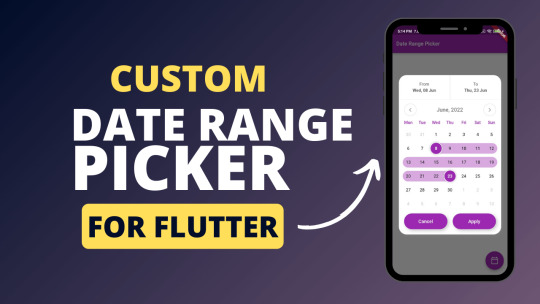
View On WordPress
0 notes
Text

I found the MIT App Inventor very easy to navigate. I made a switch that turns the "lights" (background color) on (white) and off (black). To do this, I added a switch to the screen titled "light". I then changed the background color to black. Then, I added a "when Switch1 changed" "do" control code block. To this, I attached a "set Screen 1 backgroundColor to [white]" variable. I am currently in the process of figuring out how to test it out, but the code and interface look good. I found this app a lot more beginner-friendly than say code.org, as it had many viable suggestions for code blocks. This would have been good for originally learning this stuff.
1 note
·
View note
Text
How to Display a Circular Timer in Flutter?
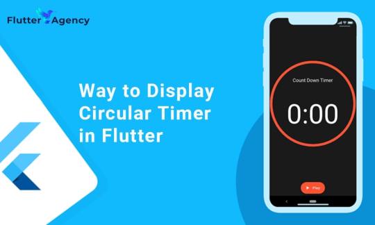
You can make stunning, native-looking apps for Android and iOS using the popular cross-platform Flutter mobile app programming framework. Circular timer creation is just one of the numerous things you can accomplish with Flutter. A countdown clock or a stopwatch are two examples of circular timers that are excellent for displaying the amount of time left on a job.
In Flutter, there are some different methods to build a circular timer. This article will teach you how to design a circular clock in Flutter. In addition, you will know how to change the timer’s look. You can learn more about displaying a circular timer in Flutter by reading the tutorial below. Also you can read this blog from our official website Circular Timer in Flutter.
Developing a Custom Circular Timer in Flutter
There are several methods in Flutter for displaying a circular timer outside the circular_countdown_timer package. As an illustration, you might make a circular progress bar using the RadialGauge widget. The circular_countdown_timer box, on the other hand, is a more specialized widget made just for showing countdown timers. You may make a customized circular timer by following the instructions in this article after installing Flutter:
import 'package:flutter/material.dart';
import 'package:circular_countdown_timer/circular_countdown_timer.dart';
void main() {
runApp(const MyApp());
}
class MyApp extends StatelessWidget {
const MyApp({super.key});
@override
Widget build(BuildContext context) {
return MaterialApp(
title: 'Flutter Demo',
theme: ThemeData(
primarySwatch: Colors.blue,
),
home: const HomePage(),
debugShowCheckedModeBanner: false,
);
}
}
class HomePage extends StatefulWidget {
const HomePage({super.key});
@override
State<homepage> createState() => _HomePageState();
}
class _HomePageState extends State<homepage> {
final int _duration = 10;
final CountDownController _controller = CountDownController();
@override
Widget build(BuildContext context) {
return Scaffold(
appBar: AppBar(
title: const Text("Circular Counter with countdown timer"),
),
body: Center(
child: CircularCountDownTimer(
// Countdown duration in Seconds.
duration: _duration,
// Countdown initial elapsed Duration in Seconds.
initialDuration: 0,
// Controls (i.e., Start, Pause, Resume, Restart) the Countdown Timer.
controller: _controller,
// Width of the Countdown Widget.
width: MediaQuery.of(context).size.width / 2,
// Height of the Countdown Widget.
height: MediaQuery.of(context).size.height / 2,
// Ring Color for Countdown Widget.
ringColor: Colors.blue,
// Ring Gradient for Countdown Widget.
ringGradient: null,
// Filling Color for Countdown Widget.
fillColor: Colors.red,
// Filling Gradient for Countdown Widget.
fillGradient: null,
// Background Color for Countdown Widget.
backgroundColor: Colors.amber,
// Background Gradient for Countdown Widget.
backgroundGradient: null,
// Border Thickness of the Countdown Ring.
strokeWidth: 20.0,
// Begin and end contours with a flat edge and no extension.
strokeCap: StrokeCap.round,
// Text Style for Countdown Text.
textStyle: const TextStyle(
fontSize: 33.0,
color: Colors.black,
fontWeight: FontWeight.bold,
),
// Format for the Countdown Text.
textFormat: CountdownTextFormat.S,
// Handles Countdown Timer (true for Reverse Countdown (max to 0), false for Forward Countdown (0 to max)).
isReverse: true,
// Handles Animation Direction (true for Reverse Animation, false for Forward Animation).
isReverseAnimation: true,
// Handles visibility of the Countdown Text.
isTimerTextShown: true,
// Handles the timer start.
autoStart: true,
// This Callback will execute when the Countdown Starts.
onStart: () {
// Here, do whatever you want
debugPrint('Started Countdown');
},
// This Callback will execute when the Countdown Ends.
onComplete: () {
// Here, do whatever you want
debugPrint('Ended Countdown');
},
// This Callback will execute when the Countdown Changes.
onChange: (String timeStamp) {
// Here, do whatever you want
debugPrint('Changed Countdown $timeStamp');
},
),
),
);
}
}
</homepage></homepage>
Function to format the text.
Allows you to format the current duration to any String.
It also provides the default function in case you want to format specific moments as in reverse when reaching ‘0’ show ‘GO,’ and for the rest of the instances, follow the default behavior.
Inside the CircularCountDownTimer we have to add these below lines:
timeFormatterFunction: (defaultFormatterFunction, duration) {
if (duration.inSeconds == 0) {
// only format for '0'
return "Start";
} else {
// other durations by it's default format
return Function.apply(defaultFormatterFunction, [duration]);
}
},
Add inside the scaffold widget to control the counter
floatingActionButton: Row(
mainAxisAlignment: MainAxisAlignment.center,
children: [
const SizedBox(
width: 30,
),
_button(
title: "Start",
onPressed: () => _controller.start(),
),
const SizedBox(
width: 10,
),
_button(
title: "Pause",
onPressed: () => _controller.pause(),
),
const SizedBox(
width: 10,
),
_button(
title: "Resume",
onPressed: () => _controller.resume(),
),
const SizedBox(
width: 10,
),
_button(
title: "Restart",
onPressed: () => _controller.restart(duration: _duration),
),
],
),
Function return button
Widget _button({required String title, VoidCallback? onPressed}) {
return Expanded(
child: ElevatedButton(
style: ButtonStyle(
backgroundColor: MaterialStateProperty.all(Colors.purple),
),
onPressed: onPressed,
child: Text(
title,
style: const TextStyle(color: Colors.white),
),
),
);
}
Example
import 'package:flutter/material.dart';
import 'package:circular_countdown_timer/circular_countdown_timer.dart';
void main() {
runApp(const MyApp());
}
class MyApp extends StatelessWidget {
const MyApp({super.key});
@override
Widget build(BuildContext context) {
return MaterialApp(
title: 'Flutter Demo',
theme: ThemeData(
primarySwatch: Colors.blue,
),
home: const HomePage(),
debugShowCheckedModeBanner: false,
);
}
}
class HomePage extends StatefulWidget {
const HomePage({super.key});
@override
State<homepage> createState() => _HomePageState();
}
class _HomePageState extends State<homepage> {
final int _duration = 10;
final CountDownController _controller = CountDownController();
@override
Widget build(BuildContext context) {
return Scaffold(
appBar: AppBar(
title: const Text("Circular Counter with countdown timer"),
),
body: Center(
child: CircularCountDownTimer(
timeFormatterFunction: (defaultFormatterFunction, duration) {
if (duration.inSeconds == 0) {
// only format for '0'
return "Start";
} else {
// other durations by it's default format
return Function.apply(defaultFormatterFunction, [duration]);
}
},
// Countdown duration in Seconds.
duration: _duration,
// Countdown initial elapsed Duration in Seconds.
initialDuration: 0,
// Controls (i.e., Start, Pause, Resume, Restart) the Countdown Timer.
controller: _controller,
// Width of the Countdown Widget.
width: MediaQuery.of(context).size.width / 2,
// Height of the Countdown Widget.
height: MediaQuery.of(context).size.height / 2,
// Ring Color for Countdown Widget.
ringColor: Colors.blue,
// Ring Gradient for Countdown Widget.
ringGradient: null,
// Filling Color for Countdown Widget.
fillColor: Colors.red,
// Filling Gradient for Countdown Widget.
fillGradient: null,
// Background Color for Countdown Widget.
backgroundColor: Colors.amber,
// Background Gradient for Countdown Widget.
backgroundGradient: null,
// Border Thickness of the Countdown Ring.
strokeWidth: 20.0,
// Begin and end contours with a flat edge and no extension.
strokeCap: StrokeCap.round,
// Text Style for Countdown Text.
textStyle: const TextStyle(
fontSize: 33.0,
color: Colors.black,
fontWeight: FontWeight.bold,
),
// Format for the Countdown Text.
textFormat: CountdownTextFormat.S,
// Handles Countdown Timer (true for Reverse Countdown (max to 0), false for Forward Countdown (0 to max)).
isReverse: true,
// Handles Animation Direction (true for Reverse Animation, false for Forward Animation).
isReverseAnimation: true,
// Handles visibility of the Countdown Text.
isTimerTextShown: true,
// Handles the timer start.
autoStart: true,
// This Callback will execute when the Countdown Starts.
onStart: () {
// Here, do whatever you want
debugPrint('Started Countdown');
},
// This Callback will execute when the Countdown Ends.
onComplete: () {
// Here, do whatever you want
debugPrint('Ended Countdown');
},
// This Callback will execute when the Countdown Changes.
onChange: (String timeStamp) {
// Here, do whatever you want
debugPrint('Changed Countdown $timeStamp');
},
),
),
floatingActionButton: Row(
mainAxisAlignment: MainAxisAlignment.center,
children: [
const SizedBox(
width: 30,
),
_button(
title: "Start",
onPressed: () => _controller.start(),
),
const SizedBox(
width: 10,
),
_button(
title: "Pause",
onPressed: () => _controller.pause(),
),
const SizedBox(
width: 10,
),
_button(
title: "Resume",
onPressed: () => _controller.resume(),
),
const SizedBox(
width: 10,
),
_button(
title: "Restart",
onPressed: () => _controller.restart(duration: _duration),
),
],
),
);
}
Widget _button({required String title, VoidCallback? onPressed}) {
return Expanded(
child: ElevatedButton(
style: ButtonStyle(
backgroundColor: MaterialStateProperty.all(Colors.purple),
),
onPressed: onPressed,
child: Text(
title,
style: const TextStyle(color: Colors.white),
),
),
);
}
}
</homepage></homepage>
Output
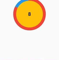
Why Should You Display a Circular Timer in Flutter?
You can choose to show a circular timer in Flutter for various reasons. Here are some of the most typical causes:
1. To start the countdown to an upcoming event. The most typical application for circular timers is this. They help count down to the beginning of a presentation, the end of a timer, or any other event you wish to keep track of.
2. To provide user feedback. The user can receive feedback about the passing of time through circular timers. This is advantageous when performing duties like preparing meals or watching for a bus.
2. For a visual component for your app. Circular timers may provide an optical element to your app that will increase its aesthetic appeal and make it more engaging.
Hire Flutter developer to create a circular timer. It is an excellent alternative if you are searching for a way to show the passing of time in your Flutter project. They are versatile, easy to use, and serve several functions.
Conclusion
The article has shown how to display a circular timer in Flutter. First, you will set up the widget to show a circular countdown timer from the circular_countdown_timer package. It can also utilize the widget to exhibit a ten-second countdown timer by creating a simple example. By defining the colors, border width, and text style, the article also provided information on how to alter the timer’s visual look.
Connect with the top Flutter app development company for your project if you want to create mobile apps with the circular timer for your business. But if you’re still unclear and want more information about the Flutter framework, browse our blogs!
Frequently Asked Questions (FAQs)
1. How is a dart timer used?
The timer starts at the given duration and counts down to 0. The given callback function is called when the timer approaches zero. To repeatedly count down the same interval, use a periodic timer. The same rules apply to negative durations as to durations of 0.
2. How can I create a widget with a countdown timer?
Press the addition (+) sign in the top left corner to add a widget. A Countdown widget can be selected. Click Add Widget. Please tap on the widget once it shows on your Home Screen.
3. What does Flutter’s circle indicator mean?
The CircularProgressIndicator widget uses a circle to represent progress. It can be used as a progress indicator for determined and indeterminate work. The value attribute must be left empty or unspecified to create an indeterminate progress indicator in Flutter.
#flutter app development#flutter#hire flutter developers#flutter agency#hire flutter developer#flutter developers#flutter app developers#FlutterTips#FlutterTimer#CircularTimer
0 notes
Text
Leveraging Gutenberg for WordPress Plugin Development
Hey there, fellow developers! If you're looking to level up your WordPress plugin development game, you've come to the right place. In this blog, we'll dive deep into Gutenberg, the revolutionary block-based editor that's changing the way we create content in WordPress. We'll explore how to harness Gutenberg's potential to build powerful and user-friendly plugins that elevate your websites to the next level. So, buckle up, and let's get started!

Understanding Gutenberg Blocks
Gutenberg is all about blocks - those neat little content elements that make up your web pages. From paragraphs to images, galleries to buttons, each piece of content is now a block. And guess what? You can create your custom blocks too! Embrace the future of content creation with this simple example of a custom "My Awesome Block":
import { registerBlockType } from '@wordpress/blocks';
registerBlockType('my-awesome-plugin/my-awesome-block', {
title: 'My Awesome Block',
icon: 'star-filled',
category: 'common',
edit: () => {
return <div>Hey there! I'm your custom block. Let's rock!</div>;
},
save: () => {
return <div>Hi, I'm the front-end version of your custom block!</div>;
},
});
Building Custom Gutenberg Blocks Creating custom Gutenberg blocks is a breeze. All you need is the Gutenberg Block API and some JavaScript magic. The API lets you define block attributes, settings, and UI components. Let's build a dynamic "Quote Block" with editable author and text:
const { __ } = wp.i18n;
const { registerBlockType } = wp.blocks;
const { RichText } = wp.editor;
registerBlockType('my-awesome-plugin/quote-block', {
title: __('Quote Block'),
icon: 'format-quote',
category: 'common',
attributes: {
quoteText: {
type: 'string',
source: 'html',
selector: 'p',
},
quoteAuthor: {
type: 'string',
source: 'text',
selector: 'cite',
},
},
edit: ({ attributes, setAttributes }) => {
const { quoteText, quoteAuthor } = attributes;
const onChangeQuoteText = (newText) => setAttributes({ quoteText: newText });
const onChangeQuoteAuthor = (newAuthor) => setAttributes({ quoteAuthor: newAuthor });
return (
<blockquote>
<RichText
tagName="p"
value={quoteText}
onChange={onChangeQuoteText}
placeholder="Enter your quote here..."
/>
<RichText
tagName="cite"
value={quoteAuthor}
onChange={onChangeQuoteAuthor}
placeholder="Author"
/>
</blockquote>
);
},
save: ({ attributes }) => {
const { quoteText, quoteAuthor } = attributes;
return (
<blockquote>
<p>{quoteText}</p>
<cite>{quoteAuthor}<;/cite>
</blockquote>
);
},
});
Extending Core Gutenberg Blocks
Gutenberg comes with a rich set of core blocks, but sometimes you need that extra oomph! Fear not, you can extend core blocks too. Let's add a custom color option to the default "Button Block":
const { createHigherOrderComponent } = wp.compose;
const { addFilter } = wp.hooks;
const withCustomButtonColor = createHigherOrderComponent((BlockEdit) => {
return (props) => {
const { name, attributes, setAttributes } = props;
const { backgroundColor } = attributes;
const onChangeBackgroundColor = (colorValue) => {
setAttributes({ backgroundColor: colorValue });
};
return (
<>
<BlockEdit {...props} />
<InspectorControls>
<PanelBody title="Button Settings" initialOpen={true}>
<ColorPicker
color={backgroundColor}
onChangeComplete={onChangeBackgroundColor}
/>
</PanelBody>
</InspectorControls>
</>
);
};
}, 'withCustomButtonColor');
wp.hooks.addFilter('editor.BlockEdit', 'my-awesome-plugin/custom-button-color', withCustomButtonColor);
Implementing Block Patterns
Block Patterns are pre-designed block combinations that simplify content creation. With a single click, you can add complex layouts to your pages. Let's create a "Hero Section" pattern with an image and a heading:
const { registerBlockPattern } = wp.blockPatterns;
const { Fragment } = wp.element;
const { useBlockProps, RichText } = wp.blockEditor;
const heroSectionPattern = {
title: 'Hero Section',
description: 'Add a stunning hero section to your website.',
categories: ['header'],
content: [
{
name: 'core/image',
attributes: {
align: 'center',
},
},
{
name: 'core/heading',
attributes: {
level: 2,
align: 'center',
placeholder: 'Enter your heading here...',
},
},
],
};
registerBlockPattern('my-awesome-plugin/hero-section-pattern', heroSectionPattern);
Testing and Debugging Gutenberg Blocks
Testing and debugging are essential in any development process. For Gutenberg blocks, you can use the Gutenberg Plugin Compatibility and Site Health tools. Additionally, unit testing with Jest and end-to-end testing with Cypress can ensure your blocks perform seamlessly.
Congratulations! You've unlocked the immense power of Gutenberg for WordPress Plugin Development. With custom blocks, core block extensions, block patterns, and more, you can now build feature-rich plugins that elevate user experiences. So go ahead, experiment, and create amazing Gutenberg-powered plugins that rock the WordPress world. To know more visit us at https://magnigeeks.com/
#Gutenberg#WordPressPluginDevelopment#GutenbergBlocks#CustomBlocks#BlockEditor#GutenbergDevelopment#WordPressDevelopment#PluginDevelopment#WebDevelopment
0 notes
Text
What's the best way to add a full screen background image
I wanted to add a full-screen image to the View so I write this code
return ( <View style={styles.container}> <Image source={require('image!egg')} style={styles.backgroundImage}/> </View>)
and defined the style as
var styles = StyleSheet.create({container: { flex: 1, justifyContent: 'center', alignItems: 'center', backgroundColor: '#F5FCFF', flexDirection: 'column',}, backgroundImage:{ width:320, height:480, }...
but in this way how am I supposed to find the actual iPhone screen size?
I've seen an API to access the Pixel Density but nothing about the screen size...
https://codehunter.cc/a/javascript/whats-the-best-way-to-add-a-full-screen-background-image
0 notes
Last Seen Blogs

sck1788
LEO娛樂城

matsunoluvr
ᶻ 𝗓 𐰁

joyfulrascaleggdragon
경기/오프/중딩/의정부/양주/포천/동두천

rainh4-d4-pista
Como Flor.

felixlafeuille
emulsions sensibles