#because standards for digital art are different like me colouring outside the lines in digital art is pretty wacky
Text
(Cracks knuckles) Alright folks I remember how to draw
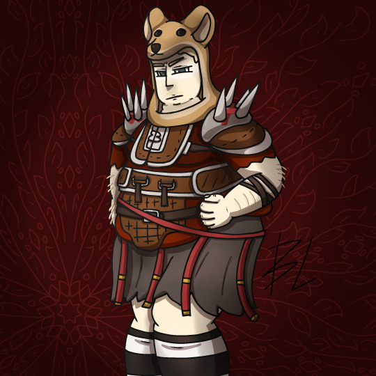
Fat fuck Vulpes by yours truly, Blaze Lander. Inspired by the lovely drawing by @yourmateyoya ,egged on by @legions-top-dog , and because i force you to deal with all my shitty drawings, @noomycatz
Yes, once again, i have put too much effort into a shitpost. Roughly 2 hours as I reused a canvas on ibis paint for a 5th drawing lmao
Yall can burn me at the stake later lol
Process below hehe i like to ramble
And just because i like to talk about my drawing process for characters with complex outfits, this is how my lobotomy brain does it:

First i do silly fun colored sketch. I use different colors to differentiate the "skeleton" from the, euh, fleshy bits, and the clothing. You can see lots of lines that would not be shown in the final product so it makes it confusing to look at.
Next i do a clean sketch.

This is where i clean up everything before doing the final lines. I use one color and a thin brush to make it easier to line over. Here i add any extra bits (like the top football armour) and "render the physics" as i call it, so properly drape cloth and the uhhh squish of stupid fat fuck vulpes' boobs and stomach. I also will balance the drawing here by flipping it and redrawing or using the drag tool.
Next is lining.

For this drawing, i used a 9.0 digital pen with a taper. Its my standard :þ. I kept my pen at the same size for this piece. Sometimes i line the outside darker to make the drawing stand out more. I decided not to as i wanted to give the drawing a more "serious" tone. (How serious can this be though lol-)You may notice on the arms little bits of the lines are missing, thats because i gave him some arm hair. I like make little details like that show over the lines. But since the one shading technique i used works with clipping masks, i had to but the arm hairs on a layer lower than the line art. Next is colour:

I colour in the drawing with midtones. Simple as. I tried to stick with warm colours besides his eyes, which are grey blue. Idc if they arent, im too lazy to google it. I mostly use flat colors but i did make his shirt a gradient. Next is do simple cell shading:

Depending on how i feel i shade with or without the colours in the back. I went with a sorta "non decrepit" light source here. Didnt want too much intensity. I used a deep marronish orange on a multiply layer on 45% opacity. Soft shading/lighting next:

I get intense with the soft shading. I use the airbrush with a deep maroon to add dark gradient and airbrush with a light pink to add a bit more depth. I usually use less light and more dark because im evil i like the intensity. I keep the layer the same amount of opacity and multiply it with the darks and soft light for the lights. Next are the shine highlights:

I use the dip pen hard with a taper to add light highlights of white on shiny bits like metal and eyes. I uses pure white, set the layer to 25% opacity, and use normal blending.
I also shade the lines because it makes the lines softer. I use a clipping layer on the line art, set the whole thing to a dark grey, and airbrush in darker and lighter parts. (I felt like a picture wasnt needed cuz its hard to notice.
For the background, i used a dark red i stole from the cell shaded layer, drew a vine pattern with the kaleidoscope ruler, and added a vignette. Vignettes are my cheat code for background hehe~ it makes the subject stand out while keeping suave, seriousness and formality. To make a subject pop out more, put the vignette behind the character but in front of the background. For more intensity but it on top of both.
Also- I usually draw with a level 10 stabilizer (i got shaky hands) but i drew with a 2 stabilizer so im surprised it came out so smoothly-
Also i gave him goggle tan lines because if i have to have them from playing tennis with sunnies, so does he.
#fallout#fnv#new vegas#drawing#digital art#fallout new vegas#vulpes inculta#shitpost#i put way too much effort into this#dont ask why i draw this type of shit good i swear i will blow up in a million pieces and cry if you do
20 notes
·
View notes
Text
artfight aka the month where i agonize for hours about whether or not my colouring style counts as “rough colour” or “clean colour“
#this was easier when i did mostly digital art because it was basically always rough colour#because standards for digital art are different like me colouring outside the lines in digital art is pretty wacky#but with watercolour art things are different like colouring outside the lines is pretty normal#especially if ur like me and draw it all on mixed media paper instead of actual watercolour paper jfkdLJKDLFKDS its a race against time...#i think i'll stick with rough colour unless someone tells me otherwise to be safe tho lol#edit: wait i wonder if it would count as painting. life is so complex#edit2: OH GOD THEY SIMPLIFIED THE LINE SECTION TOO. DOES MY DYSGRAPHIC ASS LINEART COUNT AS ROUGH SKETCH OR LINED#edit3: also btw i finally fixed up my ocs on artfight!! my roster is FUNCTIONAL once more#i'll add more ocs as i go (definitely wanna put lia and her pals on there) so stay tuned but yeah i am READY
2 notes
·
View notes
Text
Digital Sketchbook for Negotiated Project Film
Planning:
(https://connorcarter32.tumblr.com/post/618097627778711552/planning-for-negotiated-project-film)
During the Pre-production stages of production I researched different existentialists such as Jean Paul Gaultier and Albert Camus. A consistent theme that’s used in their work is the absurdity of objects with counter intuitive use. I also found the ‘Musa Museum of Absurd’, which similarly features works such as a library sign that reads “free books”, or a mesh fence surrounding nothing. There is also the ‘Cancún Underwater Musuem’, that depicts domestic events in a bizarre setting. I found that these types of instalments and ideologies lead a discussion for a very anti-materialistic lifestyle, which I decided to embellish within my production.

During planning I wanted to adopt the medium of music video, since I would be working with 3D animation to combat the limitations from COVID-19. 3D animation was very popularised by music video, especially ‘Blue’ (1998, Eiffel 65).

https://www.youtube.com/watch?v=68ugkg9RePc
I found its use of uncanny visuals enthralling in the context of the music video, as it well represents the artist’s feelings on the future genres they wish to express. I wanted to draw from this and create and equally uncanny yet enthralling world with my visuals. I did this by considering existentialist themes; most notably meaninglessness, then writing an abundance of scenarios that defy rules or lack sense, such as a desert littered with pylons to portray a collapse of industrialism, and a bright purple sunrise to represent unobtainable royalty through colour theory.
I cover my Ideas and commentary much more extensively in my written evaluation:
https://docs.google.com/document/d/11NEKIOU0bJ_B6zfYVxwwcnYRPZdlxawfDAuUit7rDoQ/edit?usp=sharing
Before I began production I carried out an array of tests to ensure that what I wrote in my script would be realistic to create in a 3D animated art form. By using the software ‘Blender’ I have been able to work very efficiently, but at the expense of certain creative processes, such as advanced rigging and easy texturing, so it was integral that I performed these tests to finalise the script. At first I began a few tests of the main scenes, such as the sunrises and the general design of the set and character.

This image shows how the scene would be initially, however later in production I was able to add bloom to the sun, and I made the terrain much darker to better represent the nothingness. In this phase I also began playing with the posing of the character. I created the mesh in a standard A-pose for easy rigging:

This image shows much clearer how the bones of the character move individually to pose the character. At the bottom on the timeline is the key frames used to transition between each pose to create procedural ‘in between frames' for movement.

This image shows the contrast between the view and the final render. A lot more grass has rendered, since its absent in the view to save on processing power.
Poduction:
https://drive.google.com/file/d/1rcbG1dTwI_Ln9y6m2WyUv1rVKuVZoIrC/view?usp=sharing
Here is some of the first animation I applied to the model. I used a reference video of myself so that it would seem somewhat realistic. At this point I had not correctly aligned the arm movements.
Reference video:
https://drive.google.com/file/d/1eEiMgGa5LRfdJdrqj4IniXsoAdEL27SF/view?usp=sharing
Below is the same updated scene, that demonstrates the different stages of rendering and animation.
https://drive.google.com/file/d/1xrlKoFtY5Zly1QX2e2_H9ITXVV7aRhff/view?usp=sharing
This is a scene that I recorded before I had finished assembling the scene. Notice the unfinished model of a plant in the air, and the model in its A-pose. I thought this well represents the workflow I used where I’d assemble and render each scene at one time from beginning to end. This was so I could focus my attention entirely on presenting a felling from each scene as much as possible.
https://drive.google.com/file/d/1RcV5lRCAtBD2Vh1oFQs6tsD_c2IbNnMX/view?usp=sharing
During these tests I was amazed that I could create a moving image production out of almost nothing, and express myself through an entirely digital format. No crew or cast, equipment; just a PC. On the other hand this film could have had a lot more content, and denser animation with more key frames, had I more crew to focus on sound design, cinematography, lighting and such. I also understand that I have had no prior experience with animation, and as a consequence, some scenes seem really unnatural. The deadline extension was almost essential for me to finish the film, although had I more time, I would have cleaned up the animation, and devoted more time to the music video aspects of the film.
Very ‘jank’ scene:
https://drive.google.com/file/d/1RcV5lRCAtBD2Vh1oFQs6tsD_c2IbNnMX/view?usp=sharing
Another important aspect of the film I had to consider is the sound design. At first I began experiment with synth music to produce a dream wave piece, embellished with euphoria.

I used the software ‘FL studio’ to arrange the music for the piece, as the array of synthesised features really let me get creative with the sounds I want to produce. Above is the arrangement I used for the final film. I ran it through a distortion filter to give it a retro quality, as this has a nicer nostalgic tone and it helps viewers to distinguish the narrative sections from the musical sections. Unfortunately I didn’t have the resources to create a fully fledged music video, so I consider the final film a narrative feature that serves as a reel or even a trailer for the music video instalment in the series. I intend to continue this project after the module as I’ve put a great deal of time into it, and I believe the ideas are sound.
An issue I faced with the arising pandemic situation was the inability to go outside to do wild tracking and acquire ample sound for a film that is set in an exterior setting. I did some research into the real life equivalent of sounds I needed, and considered how I could get the same tone. For example the plant uprooting scene was made from a bag of cereal being put on its side, after I looked into carrots being harvested.
https://drive.google.com/file/d/17aEqTYOumbbtcVvafQa0mdy3HPKcRX_l/view?usp=sharing
(2:41 - 2:45)
Alongside the diagetic sounds of the film, I made use of some small musical segments, such as the ominous tone in this scene:
https://drive.google.com/file/d/17aEqTYOumbbtcVvafQa0mdy3HPKcRX_l/view?usp=sharing
(2:29 - 2:33)
This is purely to emphasis the severity of the two characters encounters, as I feel the visuals were inadequate of presenting this. i do find it slightly cliche in some regards, but I think its necessary. Furthermore the cartoon style sometimes calls for absurdities such as this and it can play better for audiences.
Script:
SCENE 1
EXT. DESERT PLAINS
An arid black desert is still, and a sinister purple sun rises from the horizon, illuminating the black sand. After it reaches its peak in the sky an obelisk of a second green sun slowly rises and bleaches the colours of the setting.
TITLE
SCENE 2
(Long shot)
A drag PILGRIM wearing robes traverses the sands across a flat, featureless plain.
(Long shots)
After an extensive cut of his tribulations, the plains start to become populated with dilapidated pylons. One has its cables spread across the ground. PILGRIM carefully steps over each cable, as a volatile hissing emits from them.
SCENE 3
PILGRIM Comes across a farming patch that seems rather barren despite some scraps here and there.
He takes a nearby shovel, and tills one of the patches. He produces an array of vegetables that have the textures of meat, and one by one he notes his findings in a small book from his robes.
SCENE 4
(Mid Shot)
An arid wind is heard, alerting the PILGRIM. A dark hue lingers in the air as a sandstorm brews. The PILGRIM falls to the ground and withdraws into his robe, as the storm washes over him and envelops the scene.
SCENE 4
INT. RUINED CHAMBER
Once the storm had subsided, it has uncovered the decrepit hallway, which lies before the PILGRIM.
Once he stands and staves off the adrenaline, The candles lined up on the walls flicker, as if beckoning him towards the back wall.
The back wall crumbles and a radiant purple light floods the hall, drowning the light of the candles.
The walls begin slowly pulsing forward, getting faster, pushing him backwards. Little progress is made as he struggles towards the Source of light. The hall then twists and contours.
SCENE 5
Once being pushed out from the hallway, the previous desert is now a vast empty space above the clouds. PILGRIM falls, struggling to stabilise himself. Once passing the cloud layer, a dense green field is seen from below, the sky unnaturally blending in with the verdant green tones.
Eventually he strikes the ground at an accelerated pace, by a patch of dense purple flowers, congregating only in a small circle around PILGRIM.
He stands up and observes his surroundings. His hand reaches for the grass below, however the blades snap and crumble like ice.
SCENE 6
In the distance, another Human figure stands alone, brandishing a glass sword. PILGRIM excitedly hurries over to them, however they are met with hostility, they are clearly scared. once they stand before one another the figure strikes PILGRIM, however the blade shatters to dust.
PILGRIM embraces the figure, who is much the same of he.
FADE TO BLACK
-END
When looking at the script I notice that I took quite a few creative liberties, such as introducing a scene of waving towards the end:
https://drive.google.com/file/d/17aEqTYOumbbtcVvafQa0mdy3HPKcRX_l/view?usp=sharing
(3:20 - 3:27)
I included this because I really wanted to drive home the point of their encounter being the only meaningful experience of the film. I also felt as though the audience is not given enough time to sympathise with the characters connection. This also helps coincide with Albert Camus’ beliefs of equality and justice for all, as I wanted to have clear commentary for the only thing that we should focus on as people is each other.
https://drive.google.com/file/d/1Q5D8EMAfpacH0ocNEohQ8czu-m__vXoa/view?usp=sharing
here is a live view of how long the render times were generally. Since this was the mid point of the film, it took around half the time the last few scenes did, do the addition of much more geometry in each scene.
One other change I made is to cut the hallway scene. It was supposed to interpret Sigmund Freud’s dream interpretation theories that are frequently reference by existentialist philosophers. This included the sexual imagery in the pulsing hallway, alongside the falling through the sky scene. I decided to remove the scene since it grounded the world in realism far too much, as it imposes rules to the scene. I also included a noise film filter over the piece, as it lends itself to the nostalgic feelings I wanted to create, while also making the desert environments seem more harsh and although I don’t want to admit it, I makes a lot of the models look clearer when they are obscured.

This is the set I tested for the scene. The back wall is separated from the hallways mesh so that it can be slid away to reveal the aforementioned light and the candles have shape keys that allow the lights to dim or brighten.
In conclusion I believe that I have aptly provided the commentary that I intended to through experimenting with the animated medium and using existentialist art and philosophy as my catalyst. Unfortunately my skill in animating and creating textures is what I find held the film back the most, as its hard to take certain scenes seriously when the character slide instead of walks, or noise artefacts are seen within the textures. I also think that the sound design could have been much better had I access to more resources such as better audio equipment and sound blocking. Following this film I will pursue 3D animation as I find i work much more fluidly with the digital medium when compared to live shoots where I struggle to direct my image. I will also pursue the final music video production, since I have the necessary material ready.
0 notes
Text
things i wish i’d known when i started out with digital art:
An Unwanted Text Post By Yours Truly
(no, real talk, if even one person reads this and gets some advice out of it my work here is already done)
1. brushes are your identity
for real. take the time to download and get to know brushes. life’s bigger than just the default round brush at different opacities. also, definitely take the time to get to know brushes, and if you’re really trying to figure out if one brush works for you, try and make an entire piece with just that drawing. that way you use it in a variety of ways and you can figure out what works best. (no required, but it made me fall in love with my default brush <3)
2. EXPERIMENT!
i’m not kidding. if i had started experimenting much earlier I could’ve maybe been much further. get new layers, ctrl+z all the mistakes you fucking make.. it doesn’t matter. just be bold and brave and try things.
3. think about your colour scheme
i actually got this from ‘euclase’, a very skilled digital artist. it might sound stupid.. but think about what you want to achieve first. do you want contrasting colours? if yes, where? where does the light hit? or do you want an ‘older’ look? if you can’t find this immediately, you can always put some filters and stuff on the reference pic to see if it gives you any inspiration. or look at a picture that already has what you want to draw, because that might be easier. of course try to challenge yourself, so i’d only suggest that as a point to start out with or a last result. the most fun is still to make stuff up as you go. you can try to train using different colours than the ‘standard’ colours by doing colour palette challenges, they’re so much fun!
4. look at other artists
one way to develop your artstyle is by looking at what you like. it’ll give you a bit of a guideline. you don’t need to flat-out copy it, but it’ll give you an insight in how things work. plus, it’ll never be 100% the same. there will be differences, and you’ve got to embrace that what sets you apart (I for one love looking at ‘alicexz’ her work, but you wouldn’t be able to tell im massively inspired by her by my work, if that makes sense)
5. it’s not about the materials
you don’t need the most expensive stuff. i worked for a long time on a pen tablet from the lidl. though i would recommend getting a (second hand) wacom: they have easy access to drivers and replacement parts and i’d say their pens are definitely making me able to draw smoother lines. you also don’t need photoshop. every program is different with different settings, and you might find what works for you better outside of photoshop.
and most of all: never, ever give up. i have yet to dig up my old drawings, but well.. my first drawing (ironically one of nicolas cage) was terrible and a disgrace and ugly, but it was the start of something.
it takes time to get used to your tablet and to your program. it takes time develop certain skills. be patient, try to keep yourself motivated, and most of all: if you ever hit a real wall (because there will be times where you feel like smashing your head in), take a walk.. take a break, save your ps file for another day.. you don’t have to be good in one day.
#digital art#artists on tumblr#g'lies makes text posts#i naively hope that one person will be like 'ah that makes sense'#they're pretty straightforward but all of these things i realized way too late....
6 notes
·
View notes
Last Seen Blogs


godshattered
Open All Night

majorunit
Major Unit
pleasereadmeok
Matthew Goode Stuff from PleaseReadMeOK