#bootstrap carousel
Explore tagged Tumblr posts
Visit Tumblr Blog
Explore Tumblr blogs with no restrictions, modern design and the best experience.
Last Seen Tumblr Blogs


Fun Fact
The total number of visits Tumblr.com received during January 2021 is 327 million.
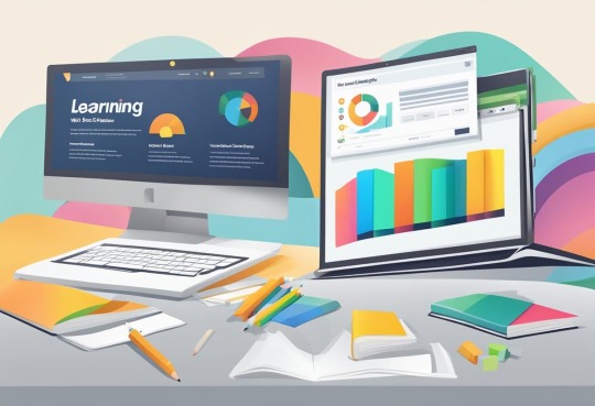
Text

Bootstrap Carousel with Text Animation
3 notes
·
View notes
Text

Slider with Text Effect
#slider with text animation#bootstrap snippets#bootstrap carousel#codingflicks#html css#frontend#css#html#frontenddevelopment#webdesign#text animation#css3#bootstrap slider
3 notes
·
View notes
Text

Bootstrap Testimonial Carousel
#Bootstrap Testimonial Carousel#testimonial slider#codenewbies#html css#html5 css3#frontenddevelopment#bootstrap testimonials#webdesign#css#bootstrap carousel
1 note
·
View note
Note
It's yer lucky day, Kiddos. A new shipment of Space Cola Nebula shall be stocked in your ship's FridgeCave™, and then some. As we are being sponsored by SPACE SNAKS©, you all have access to ALL SPACE SNAKS© provisions.
The provisions are listed below:
Space Cola Nebula (Transparent metal can with a glowing neon turquoise color. May or may not be chemically enhanced. Tastes like melted taffy.)
Space Cola Kalypzo (Tropical fruit and lime flavored drink with a "Vaporwave Aesthetic" design)
Chocostroid™ Assorted Bon Bons (may contain tree nuts). Largest Bon Bons This Side of The Milky Way Galaxy!
S'Mars (Cherry flavored marshmallow candy. Called "S'marzipans" in other countries).
Venus Crisps (Spicy chips to simulate life on Venus. Had the slogan "now you know how women want it" before being replaced for being "too problematic of a slogan.")
Cheesy Comet Cheddar Balls: Comes in a variety of cheese flavors and always guarantees at least 98% real cheese!
Pizza Planet's Deep Dish Dinners (Want to have a new year's resolution all over again? Eat an entire pack of our triple D'zas!)
Pluto™ Jawbreakers (It doesn't actually break jaws, even if you believe it can.)
Alien Apples™ Genetically Modified Fruit Treats
Carousel® Animal shaped Caramel Custards (Stable like a cookie, creamy like a custard, rich like a caramel!)
As per the contract, the snacks will last you 2 years maximum, so no hogging any snacks. We expect a speedy, efficient service from you, so pull yourselves up by the bootstraps and set sail, or rather "SPAIL" into Space!
Sincerely yours,
The Chief, Pony Express Inc.
{This has been delivered for Curly for him to read aloud.}
Oh, I’d better give this to Curly. Thank you!
Well, would you look at that? I’ll hand this back to Anya, but this is neat! The team seems happy too! 😆
OOC- RHIS IS SO COOL??? OH MY GOODNESS SORRY FOR RESPONDING SO LATE BUT IM SMILING CUZ THIS SEEMS SO EPIC…

#anya mouthwashing#curly mouthwashing#daisuke mouthwashing#game mouthwashing#jimmy mouthwashing#mouthwashing#mouthwashing anya#swansea mouthwashing#ask blog#wrong organ
25 notes
·
View notes
Text
“I’ll build my brand when I have the budget.”
There’s a belief that silently kills momentum:
“I’ll build my brand when I have the budget.”
But here’s the truth, most founders realize too late:
You don’t need a massive budget to build a powerful brand. You need clarity, consistency, and the right strategy.
When I started working with early-stage businesses, one thing became clear:
→ Most people overcomplicate branding. → They confuse it with aesthetics. → And they think DIY means amateur.
Not true.
A lean, sharp, professional identity is doable—even on a scrappy budget.
That’s precisely what this new post is about ↓ Budget-friendly brand identity tips — made for: ✅ Founders ✅ Solopreneurs ✅ Small business owners ✅ Creative service providers
If you want to grow without looking like a “cheap startup”… → This carousel is for you.
Let’s make your brand look like it’s already funded—even if it’s still bootstrapped.
👉 www.sansarahub.com
🔗 Check the post. Save it. Please share it with someone stuck in the DIY trap.
Your future brand will thank you.


#brandidentitytips#startupbranding#foundersupport#smallbusinessmarketing#creativeentrepreneurs#sansarahub
6 notes
·
View notes
Text
Perfex CRM Office Theme Nulled Script 1.2.6

Unlock the Power of Your CRM with Perfex CRM Office Theme Nulled Script Are you looking to elevate your Perfex CRM interface to new levels of professionalism and user-friendliness? The Perfex CRM Office Theme Nulled Script is your perfect solution. Designed for businesses and freelancers alike, this stunning theme transforms your default Perfex CRM dashboard into an intuitive, sleek, and highly efficient workspace — all at zero cost. What is the Perfex CRM Office Theme Nulled Script? The Perfex CRM Office Theme Nulled Script is a premium add-on that revamps the user interface of your Perfex CRM system. With a fully responsive layout, clean design elements, and user-centric features, this nulled theme enhances usability and aesthetics without compromising functionality. Whether you're managing sales, leads, clients, or support tickets, this theme adds a polished, office-grade experience that makes daily CRM usage more enjoyable and efficient. Why Choose the Perfex CRM Office Theme Nulled Script? Unlike standard CRM dashboards, this nulled script offers an enriched UI experience that closely mimics professional office software. From its visually appealing sidebar to color-coded statuses and smooth navigation, the theme significantly improves your CRM workflow. Best of all, you can download it for free from our platform without any hidden costs. Technical Specifications Compatibility: Fully compatible with the latest version of Perfex CRM Responsive Design: Optimized for desktops, tablets, and smartphones Framework: Built on Bootstrap for high performance Easy Installation: Plug-and-play integration with Perfex CRM Customization: Minimal coding required for personalization Outstanding Features and Benefits Modern Dashboard Layout: Clean interface design for enhanced readability and navigation Time-Saving Navigation: Quick access menus to important modules Optimized for Speed: Reduces clutter and boosts CRM loading time Custom Icons and Typography: Add a premium touch to your dashboard aesthetics Multi-Language Support: Ideal for global teams and international businesses Use Cases: Who Should Use This Nulled Theme? The Perfex CRM Office Theme Nulled Script is ideal for: Startups looking to create a professional image from day one Freelancers who want a clean and organized client dashboard Agencies managing multiple clients through a robust CRM SMBs aiming to streamline their operations and impress stakeholders Whether you're tracking invoices, generating reports, or managing support tickets, this theme ensures that everything looks great and performs even better. How to Install the Perfex CRM Office Theme Nulled Script Installing the theme is quick and effortless: Download the Perfex CRM Office Theme from our website. Navigate to your Perfex CRM admin panel. Go to the “Themes” section and upload the theme ZIP file. Activate the theme, and you're all set! Need extra flair for your website visuals? Check out our Slider Revolution NULLED plugin — perfect for creating responsive sliders, carousels, and hero sections with ease. Frequently Asked Questions Is the Perfex CRM Office Theme Nulled Script safe to use? Absolutely! All our scripts are scanned for vulnerabilities and malware. Plus, they're updated regularly to keep up with the latest security practices. Can I use this theme on multiple CRM installations? Yes, you can install the theme on unlimited instances of Perfex CRM without restrictions. Will this theme slow down my CRM performance? Not at all. In fact, it’s designed to optimize your dashboard for better speed and responsiveness. Can I customize the theme to fit my brand? Yes, the theme is built with flexibility in mind. You can easily adjust colors, fonts, and layout structures to align with your branding. Is there support available? While this is a nulled version, our community forum offers extensive guides and peer support to help you with any issues. Take your CRM experience to the next level with the Perfex CRM Office Theme .
Download it today and enjoy a high-end CRM interface without spending a dime. Also, don't miss out on optimizing your site with WP-Optimize Premium nulled — a must-have tool for performance enthusiasts.
0 notes
Text
bearer of the curse in a way i forget all coding syntax despite having it done more than the average person by the following:
baby's first code is delving into tumblr themes and tweaking it to your liking the more you switch themes. also the ancient old custom boxes from deviantart. i miss you so babygirl
whatever the fuck tweaking c++ values is with the dumpster fire of (bethesda) games
idk how tf i made a relatively good first ever attempt at a game with fucking unreal engine blueprint in uni but somehow i did
tweaked to fully modified a toyhouse premium template (css/html/bootstrap) to my tastes, to the point i might as well have written it myself
converted/merged above code into other languages multiple times to make it a) work without premium (no css), b) work on a walmart wiki (tumblr blog), c) work on neocities by splitting & writing new css/html/jscript files albeit briefly because d) building it with templates and an SSG like astro fits my needs better
i Get why layout builders like weebly and carrd exist but fuck me neocities is so fucking good i'm going to pass away. i love customisation and i'm going to jork it violently
crash course into several pyramid schemes of frameworks and proceed to lose my mind and die
also die because x program is better for y language and z framework. then you proceed to install 3920282 programs you use for about 2 weeks and then forget again. but hey i guess i can start up localhost now instead of horribly failing at editing neocities pages
i just really like layouts. i love importing a template and then tweaking individual fucking values the way i need em to so i can make my oc world in the microwave radiate its signals outside the kitchen
wrote several own profile/folder/mockup codes inspired by toyhouse codes <- what can i say. i am fascinated by the humble button and the carousel
yayyy i love responsive ui i looove mobile friendly webbed sites i looove beating the shit out of bootstrap code by giving recurring elements their own fucking style.css and thus shortening justify-content-xl-between and rounded-circle border-0 background-faded to a single word class yayyy yippee ^_^
slightly delved into java for hypothetical entertaining thought of minecraft modding & i guess i can read it better now alongside python. but object programming stinks ass in the way to tell everything you're x and you have sexual relations with files y, z & the rest of the alphabet. webdev import is so sexy actually
#something something adhd without saying adhd. yeah. anyway#sy.txt#anyway the entire neocities shebang might add another incentive to actually write more oc bios than like 3 5k essays every 6 months
1 note
·
View note
Text
Web Design in Melbourne: Guide to Build an Educational Website
Designing an educational website for a resource portal, a school, university, or an online learning platform requires strong knowledge. If your brain jumps from left to right thinking about quality designs, you can safely believe that there are many other administrators who are on the same page.
Every educational institute or online learning platform is unique in what they bring to the learners. Whether it is more comprehensive resources, personalized attention, or guaranteed results, you would surely want to understand the web design goals that make a learning experience easy and engaging. But how to achieve them all?
In this blog, we will explore 5 essential web design features that you must consider in a professional web design in Melbourne for a functional educational website.
5 Must-Have Web Design Features for an Educational Website
Here are five most crucial web design qualities and features that make an educational portal, institution, or, an e-learning platform engaging.
1. User-Friendly Menus
When planning a website menu layout with a website designer, focus on creating simple and easy to find menus. Focus on keeping only the main links like Courses, Admissions, About Us, Gallery, or Contact Us page. When choosing a layout, hamburger-style menus and sticky navigation bars can make them easily appear on smaller screens.
User experience is the crucial factor. It is important to choose one of the best professionals for web design in Melbourne who ensure that the website menu colors, fonts, alignment, and style helps users to find the information.
2. Responsive Design for Mobiles and Tablets
Teachers and students use their tablets or mobile devices to browse educational websites or e-learning platforms. If they find it difficult to read the content on your website or explore the website without zooming in, they will move on.
For this reason, it is crucial to use responsive frameworks when designing a website. Commonly used web design frameworks like Bootstrap and Foundation allow a website to automatically adjust to the smaller screens. These feature one-column grids, in-built sliders, buttons, forms, and carousels, and media queries that perform well on different devices.
If you are not aware of the technicalities, it is good to consider a professional for SEO in Geelong for high-performing frameworks.
3. Integrate Multiple Media
Next, multimedia tools are another effective and popular way to make education fun and engaging for both educators and learners. As long as your students and educators get access to different audio and visual learning modules, your website performs well.
Video lectures, podcasts, quizzes, or other interactive forums are highly becoming resourceful additions on an educational website. Keeping aside the traditional listen-only concepts, these tools allow learners to interact through quizzes, ask questions, use clickable annotations, or jump to specific sections on podcasts.
You can even include downloadable PDFs and worksheets, or reading lists to let users learn the study materials at their own pace. Remember, integrating media can reduce website speed, so an SEO expert in Geelong is helpful in optimizing the speed.
4. Use Learning Management Platform Within the Website
An educational website must have a highly-organized and user-centric learning management tool. It allows learners to find the different study materials, submit assignments, and view grades at one place. And it also enables teachers and providers to track student progress, answer their questions, and interact about upcoming events.
While choosing a Learning Management System (LMS), keep in mind the existing website structure. A sign of a good LMS platform is its easy integration, drag-and-drop dashboard, customization features, and technical support features. Web design companies also help you to choose the best platform that stands true and right to these qualities.
5. Secure Registration and Enrollments
Lastly, safe and easy-to-use registration and enrollment forms complete an educational website. If you are just starting, handle this task to an expert SEO in Geelong.
If you are creating a website for school or colleges, structure the registration form with essential and autofill options. Clear instructions and examples in the input fields can make a big difference. Including error validation and progress indicators will allow learners to correct their mistakes and know how far they have come.
In addition, if you are creating an online learning platform, using secure payment gateways with confirmation messages makes the site safe.
Final Words
We hope you found this blog useful. Designing an educational web design in Melbourne or Geelong takes time as you are considering user experience, user interface, and website security as a goal to fulfill both learners and educators needs.
Whether you are a chancellor, president, or an e-learning educator designing a website, it is wise to invest in a professional company. They have a team of best website designers in both locations to plan, guide, and initiate the best process.
0 notes
Text
With Google’s mobile-friendly update, responsive web designs have become a crucial ranking factor. Due to this update, several coveted companies worldwide have started to adopt a responsive design for their business websites. With the advent of various web-based development tools like HTML5, CSS3, Bootstrap, Jquery, and others, creating responsive web design are not an uphill task anymore. Among several such tools, jQuery is the crucial one that enables designers to create responsive layouts. It is something that makes web pages livelier. With the aid of Jquery plugins, you can revive navigation, sliders, images, carousels, calendars, and other components of your website. Today, there are a plethora of Jquery plugins are available that you can use to transform your site into a responsive one. If you are looking for some Jquery plugins to revive your website, then this blog may prove useful for you. ANIMSITION ANIMSITION is a simple yet powerful plugin. When it comes to adding page transitions with CSS animations, developers use this plugin a lot as it provides a wide choice of 58 different animations whether it is fade-in, fade-out, rotate, zoom, overlay, and a lot more. Browser Support (CSS3): IE 10+, Safari, Chrome, Firefox. anoFlow anoFlow is a lightweight, responsive lightbox plugin. It is a perfect choice for mobile development that is available free for personal and commercial use. Brick Work Brick Work is a lightweight (15kb) full-featured plugin that are extensively used for creating responsive, dynamic layouts. Further, it supports almost all the browsers like chrome, opera, safari, IE 8.0+, Firefox. Data-Img Data-Img is a simple yet reliable plugin that deals with responsive image delivery. It just replaces images from ‘background-image URL’ or ‘image src’ depending on screen width. FitText By using FitText, a featured-rich plugin, you can make the font sizes of your web page flexible. This plugin helps developers and designers to achieve scalable headlines for the websites. FitVids.JS A website that lacks interactivity will be worthless to design. Use FitVids.JS plugin that allows designers and developers to embed fluid-width videos on web pages. Well, credit goes to its developer Chris Coyier and Paravel. Flickerplate Flickerplate is a full-featured and touch-enabled responsive plugin that allows designers to ‘flick’ through content. This plugin is extensively used by designers to create responsive layouts for websites. FlowType.JS If you want to see web typography at its finest, use FlowType.JS. Today, on several websites the most legible typography contains between 45-75 characters per line, and it is quite difficult to accomplish the sale for all screens with only CSS media queries. Further, this plugin simplifies this difficulty by changing empowering designs to change font size based on a particular element’s width. FullPage.JS fullPage.js from Alvaro Trigo is a powerful plugin that allows designers to create fast and simple full-screen scrolling pages. GridScrolling.JS When it comes to providing easy cursor key navigation by positioning sections and asides in a grid, Gridscrolling.js plugin is the first choice among designers. jq-idealforms Ijq-idealforms is a full-featured framework that allows designers to create and validating responsive HTML5 forms. Moreover, it supports third party extensions and all modern browsers. Masonry For creating a dynamic grid layout, Masonry is a powerful jQuery plugin. Designers use this plugin to place elements at the optimal position based on vertical space. You may have seen it in use on several websites. nanoGALLERY nanoGALLERY is a touch-enabled image gallery plugin that empowers designers to design fully responsive image galleries with different layouts. By using this plugin, you can provide an elegant look to your website gallery. pagePiling.JS pagePiling.js is a fantastic jQuery plugin that allows designers to pile layout sections over one another that users can access by scrolling.
It supports all modern browsers and old browsers like Opera 12 and IE 8. Further, it gives plenty of options and methods to use, a perfectly designed plugin to work on tablets and smartphones. PhotoSwipe When it comes to creating an enthralling image gallery for smartphones and desktops, PhotoSwipe is highly preferred and used by designers. Responsive Tables Tables often break a responsive layout. Don’t let this happen in your case. To make your tables adapt to the small screens, you can rely on Responsive Tables, a jQuery plugin that helps you get rid of the layout-disturbing table issue. You can also use a WordPress tables plugin that can do everything almost automatically for you Responsive Calendar Responsive Calendar is a feature-rich and fully responsive jQuery plugin that is available free for non-commercial use. The websites that use this plugin allow freedom to users to add, delete, and remove events. Responsive Nav Responsive Nav is a powerful tiny JavaScript plugin that and helps designers to create a toggled navigation for small screens. It uses CSS3 transitions to provide the best possible layouts with an assured performance. It works well with almost all the main desktop and mobile browsers. ResponsiveSlides.js ResponsiveSlides.js is a fully responsive jQuery plugin that weighs just 1kb. Further, it provides multiple slideshow options that designers can use to create enticing effects on their websites. Responsive Tabs Responsive Tabs is a must-have plugin that fulfills the need of creating responsive tabs. The tabs created with the aid of this plugin quickly adapt to any screen to provide a perfectly responsive experience to the users. It is an ideal solution for creating tabs that work on desktops, tablets, and smartphones. SlabText.js When it comes to creating big, bold, and responsive headlines for websites, SlabText provides great support to designers. It quickly adapts to different screens and provides a unique look and feel to a website. Slicknav Slicknav is a must-have Jquery plugin that provides multi-level support and cross-browser compatibility that allows designers to create eye-catching menus. Slidebars Slidebars is a lightweight (2kb) plugin that helps designers to create an app-style push menu and sidebars for websites. timeBOX timeBOX is a powerful plugin that enhances the content of any site. Its beautiful and responsive overlay helps designers to create a responsive layout. It is one of the best Lightbox plugins. Further, it provides cross-browser support and is compatible with WordPress 4.0 or greater. TinyNav.js TinyNav.js is a must-have Jquery plugin that weighs just 452 bytes that are created to work for small screens like iPhones. This plugin empowers designers to transform navigation menus into a selection for smartphones. Conclusion The Jquery plugins that I mentioned above are extensively used to create responsive layouts. If you want to transform your web pages into responsive layouts, then surely these plugins will help you. Did you like this post, don’t forget to drop your valuable comments below. Abhyudaya Tripathi is a digital marketing expert with over 8 years of precious experience and presently he is an Associate Director at ResultFirst. He is extremely passionate about making information seekers and quest lovers aware about digital marketing.
0 notes
Text
Bootstrap Online Training - NareshIT
Bootstrap Online Training - NareshIT
https://nareshit.com/courses/bootstrap-online-training
Description:
Thiscourse begins with an introduction to Bootstrap and its key features. Participants will learn how to use Bootstrap's grid system, components, and utilities to create responsive layouts and enhance the user experience.

Course Objectives:
The primary objectives of the Bootstrap course are as follows:
Introduction to Bootstrap: Provide an overview of Bootstrap, its history, and its role in front-end web development
Grid System: Explore Bootstrap's responsive grid system for creating flexible and adaptive layouts.
Components: Cover Bootstrap components, including navigation bars, modals, carousels, and other UI elements.
Typography and Utilities: Introduce Bootstrap's typography styles and utility classes for efficient styling.
Customization: Teach participants how to customize Bootstrap styles, colors, and components to match specific design requirements.
Responsive Design: Emphasize responsive design principles in Bootstrap for creating websites that work seamlessly across devices.
Integration with JavaScript: Explore the integration of Bootstrap with JavaScript components for enhanced interactivity.
SASS (Syntactically Awesome Stylesheets): Provide an introduction to SASS, a preprocessor scripting language for CSS, often used with Bootstrap.
Accessibility: Discuss best practices for ensuring accessibility in Bootstrap-based web applications.
Project Development: Engage participants in hands-on projects to apply Bootstrap concepts to real-world scenarios.
Prerequisites:
Basic understanding of HTML and CSS.
Familiarity with responsive web design principles.
Knowledge of JavaScript and its fundamentals.
Understanding of CSS preprocessors (e.g., Sass).
Awareness of front-end development frameworks.
Experience with using and navigating code editors or IDEs.
Who can learn this course:
Front-End Developers
Web Designers
UI/UX Designers
Full Stack Developers
Students and Beginners
Entrepreneurs and Small Business Owners
Anyone Curious about Bootstrap
Training Features:
Comprehensive Course Curriculum
Experienced Industry Professionals
24/7 Learning Access
Comprehensive Placement Programs
Hands-on Practice
Lab Facility with Expert Mentors
For Online Training:
India:
+91 8179191999
Whatsapp:
+91 8179191999
USA:
+1 4042329879
Email: [email protected]
0 notes
Text

Bootstrap Carousel with Fade Effect
#bootstrap examples#bootstrap slider#bootstrap snippets#animation#html css#divinector#css#frontenddevelopment#webdesign#html#css3#bootstrap carousel
1 note
·
View note
Text

Text effect on Bootstrap Slider
#bootstrap slider with text animation#bootstrap carousel#bootstrap snippets#html css#codingflicks#text animation#learn to code#html#css#webdesign#frontend#frontenddevelopment
3 notes
·
View notes
Text

Bootstrap Testimonial slider
#testimonial slider#codenewbies#html css#frontenddevelopment#css#html5 css3#code#bootstrap slider#bootstrap carousel#testimonial#review slider#html5#css3#webdesign#frontend
1 note
·
View note
Text
A Guide to the Best CSS Frameworks for Web Developers
CSS frameworks are an essential tool for modern web development, enabling developers to create responsive, mobile-friendly websites with less effort. They come with pre-built grids, styles, and UI components, saving developers time and allowing them to focus on functionality and user experience. In this article, we’ll explore some of the top CSS frameworks that are widely used in the industry today.
1. Bootstrap
Overview:
Bootstrap is the most well-known CSS framework and has been a popular choice among developers for many years. It provides a rich set of UI components, a responsive grid system, and a consistent design language, making it an ideal choice for rapid development.
Key Features:
Responsive Grid System: Bootstrap's 12-column grid is flexible and adapts to different screen sizes, making it easy to create responsive layouts.
Pre-designed UI Components: Includes buttons, forms, carousels, and navigation bars that are ready to use.
Extensive Documentation: One of the reasons for Bootstrap's popularity is its comprehensive documentation, making it easy for developers to get started.
Customizable via Sass: Developers can easily customize the framework using Sass variables.
Use Case:
Bootstrap is a go-to choice for building responsive websites quickly, making it suitable for beginners and experienced developers alike. It is commonly used for creating corporate websites, landing pages, and admin dashboards.
2. Foundation
Overview:
Foundation by Zurb is a robust CSS framework designed for professional developers who need flexibility and control over their projects. It’s built with a mobile-first philosophy, ensuring that designs are fully responsive right out of the box.
Key Features:
Advanced Grid System: Foundation’s grid system is highly customizable, giving developers more control over layouts.
Mobile-first Design: Every element is optimized for smaller screens and can easily scale up for larger devices.
Comprehensive UI Components: Offers pre-built components like dropdown menus, buttons, forms, and more.
Foundation for Emails: In addition to web development, Foundation also has a version tailored for creating responsive email templates.
Use Case:
Foundation is ideal for larger projects where flexibility is important. It’s widely used for enterprise-level websites, web applications, and complex projects that require a mobile-first approach.
3. Tailwind CSS
Overview:
Tailwind CSS is a utility-first framework that provides developers with low-level CSS classes, offering maximum flexibility to design their projects without predefined styles or components. Unlike traditional frameworks, Tailwind allows developers to apply styles directly in their HTML, giving them full control over the look and feel of their sites.
Key Features:
Utility-first Classes: Tailwind’s utility classes allow developers to style elements quickly without writing custom CSS.
Highly Customizable: Developers can override default settings to create their own themes and styles.
Responsive Design Utilities: Tailwind makes it easy to apply different styles based on screen size using responsive utility classes.
Minimal Overhead: Tailwind doesn’t come with pre-built UI components, keeping the framework lightweight.
Use Case:
Tailwind is perfect for developers who want to create unique designs without relying on predefined components. It’s ideal for projects that require a lot of customization and creativity, such as web apps and portfolio sites.
4. Bulma
Overview:
Bulma is a lightweight, modern CSS framework that is built on Flexbox. It’s known for its simplicity and ease of use, making it a great option for developers who want a minimalistic approach to web design.
Key Features:
Flexbox-based Grid: Bulma uses Flexbox for its grid system, which makes creating responsive layouts a breeze.
Clean Syntax: Bulma offers a clean and readable CSS structure, making it easy for developers to work with.
Pre-styled Components: Provides simple UI components such as buttons, cards, and navigation menus.
No JavaScript Dependencies: Bulma focuses purely on CSS, making it compatible with any JavaScript framework or library.
Use Case:
Bulma is an excellent choice for developers who want a minimalist, clean design with modern UI components. It’s well-suited for smaller projects, landing pages, and personal websites.
5. Materialize CSS
Overview:
Materialize is a CSS framework based on Google’s Material Design principles. It provides developers with ready-made components that follow Material Design guidelines, allowing them to create clean and intuitive user interfaces.
Key Features:
Material Design Components: Includes all the standard Material Design components such as cards, buttons, and navigation bars.
Responsive Grid: Like Bootstrap, Materialize uses a 12-column grid that helps in creating fluid, responsive layouts.
Interactive Elements: Comes with built-in JavaScript components like sliders, modals, and parallax effects.
Sass Support: Materialize is built using Sass, making it highly customizable.
Use Case:
Materialize is perfect for developers looking to implement Google’s Material Design system in their projects. It’s commonly used for web apps, portfolios, and other projects where a clean, modern design is essential.
Conclusion
Each CSS framework offers its own set of features and benefits, so the right one for you depends on the specific requirements of your project. Bootstrap is a versatile and popular choice for most websites, while Foundation is great for more advanced, flexible designs. Tailwind CSS gives developers the freedom to create custom designs, while Bulma offers a lightweight, minimalist option. Lastly, Materialize is perfect for those who prefer Google’s Material Design aesthetic.
1 note
·
View note
Text
Bootstrap 5: A Comprehensive Guide for Web Developers

Introduction:
Bootstrap is a popular front-end framework that simplifies the process of building responsive and visually appealing websites. With its pre-built components, grid system, and utility classes, Bootstrap offers a robust toolkit for developers of all levels. In this guide, we’ll explore the key features of Bootstrap 5 and provide practical examples to help you get started.
Core Concepts
Grid System: Bootstrap’s grid system is highly flexible and responsive. It uses containers, rows, and columns to create layouts that adapt to different screen sizes.
Components: Bootstrap offers a wide range of pre-designed components, including buttons, forms, navigation menus, alerts, and more. These components are fully customizable and can be easily integrated into your projects.
Utilities: Bootstrap provides a variety of utility classes for styling elements such as spacing, colors, typography, and more. These classes can be used to quickly and efficiently customize the appearance of your website.
Advanced Features
Customizing Bootstrap: Bootstrap can be customized to match your specific design needs. You can override default styles, create custom components, and use variables to manage your project’s theme.
JavaScript Plugins: Bootstrap includes several JavaScript plugins, such as carousels, modals, and tooltips. These plugins can add dynamic functionality to your website without requiring extensive JavaScript knowledge.
Responsive Design Best Practices: Bootstrap is built with responsive design in mind. It automatically adjusts to different screen sizes, ensuring a great user experience on all devices.
Real-world Examples
To illustrate the power of Bootstrap, let’s consider a simple example: creating a basic landing page.
<!DOCTYPE html>
<html lang=”en”>
<head>
<meta charset=”UTF-8″>
<meta name=”viewport” content=”width=device-width, initial-scale=1.0″>
<title>Bootstrap
Landing Page</title>
<link href=”https://cdn.jsdelivr.net/npm/[email protected]/dist/css/bootstrap.min.css" rel=”stylesheet”>
</head>
<body>
<! — Navbar →
<nav class=”navbar navbar-light bg-light”>
<div class=”container-fluid”>
<a class=”navbar-brand” href=”#”>Navbar</a>
</div>
</nav>
<! — Content Section →
<div class=”container text-center mt-5">
<h1>Hello, Bootstrap 5!</h1>
<p>This is a simple example.</p>
</div>
<script src=”https://cdn.jsdelivr.net/npm/[email protected]/dist/js/bootstrap.bundle.min.js">
</script>
</body>
</html>
To learn how integrating these elements can transform your business, read the full article on our website Algorizon Technologies.
For an in-depth look at the benefits of integrating web development, software solutions, and digital marketing, click here to read the full article on our website.
0 notes
Text
Avas Theme Multi-Purpose Elementor WordPress Theme v6.6.3
https://themesfores.com/product/avas-theme-multi-purpose-elementor-wordpress-theme/ Avas Theme – Multi-Purpose Elementor WordPress Theme Avas theme is a multi-purpose responsive WordPress theme with lightweight and fewer plugins. Ready to use for any purpose such as Business, Finance, Corporate, Agency, Portfolio, App, Real Estate, News, Blog, Magazine, Cleaning services, Construction, Designs, Freelancer, Wedding, Restaurant, Education, Charity, Shop, Mechanic, Moving, Covid-19 Coronavirus, Resume, Startup, Creative, Architecture, Consultant, Kindergarten, Travel, Insurance, Lawyer, Medical, Hosting, Fitness, Gym, Spa, SEO, Pinterest Style, ICO Cryptocurrency, Crypto News, Photographer, Website Builder, Website Solution, Barber Shop, Driving School, Nice & Clean, Music Band, Chef, Tattoo Parlour and many more. Avas has 48 different demos ready with one click demo install supported so you can choose any of the demos according to your niche. Avas templates are built with a super-fast lightweight Elementor page builder with a drag and drop function so your website will not load heavily. We have added lots of options in the theme options panel with the Redux framework so you don’t need any coding knowledge. AVAS GPL Theme Features (Demo) Built with Redux Framework for easy customization and endless options. Built with Twitter Bootstrap. Elementor Page Builder included is the best lightweight page builder that won’t make your page slow. It has many ready-made templates. You can create a nicer page within minutes. SEO optimized for search engine recognizably. 100% responsive, performs beautifully on all devices. Smooth parallax effect. Beautiful portfolio galleries, optimized for desktop, laptop, tablet, and mobile devices. Google Font, Font Awesome, Flaticon, and Icomoon font icon integrated. Fully integrated Contact Form 7 with CSS Style ready. Responsive sticky header with a menu. Left – Right Sidebar blog layouts. Filterable portfolio layouts to choose of three columns grid, four columns grid, and pagination. Translation Ready – You can translate the theme to your own Language. WPML Ready WordPress theme Customizer support. Custom widgets included. One-click demo install. Mega Menu(no plugin required). Side Menu RTL supported Cookie notice bar without plugin Dark Mode support Server Minimum Requirements: PHP version 7.4 or greater. MySQL version 5.6 or greater OR MariaDB version 10.1 or greater. WP Memory: 256 MB or greater PHP max input variables 10000 max_execution_time: 120 (This needs to be increased if your server is slow and cannot import data.) PHP Post Max Size: 64 MB or greater Avas Theme Change Version 6.6.3 – August 20, 2024 – New: Avas Switcher widget created. – Fixed: The Avas Heading widget alignment option is not working on the responsive view. Version 6.6.2 – August 10, 2024 – New: Immigration Visa Consulting demo released. https://tinyurl.com/avas-immigrationvisaconsulting – Tweak: Sticky Section content width added % option to fix the responsive layout issue. – Fixed: PHP Fatal error: Uncaught Error: Undefined constant “TX_CSS”. – Fixed: Tiktok url doesn’t work. – Fixed: get_page_by_title() deprecated. – Integrated: Fontawesome v6.6.0. – Updated: Twitter new icon X. Version 6.6.1 – August 1, 2024 – New: Avas Grid Elementor widget created. – New: Avas Carousel Elemenetor widget created. – Updated: Redux Framework. https://themesfores.com/product/avas-theme-multi-purpose-elementor-wordpress-theme/ #Multi-PurposeThemes #WordpressTheme
0 notes