#bootstrap navigation bar
Explore tagged Tumblr posts
Visit Tumblr Blog
Explore Tumblr blogs with no restrictions, modern design and the best experience.
Last Seen Tumblr Blogs


Fun Fact
Tumblr.com is the 103rd most visited website in the world.
Text

Bootstrap navbar with Slider
#slider bootstrap#bootstrap navbar#html css#frontend#css#html#css3#frontenddevelopment#neduzone#css navbar#navigation menu css#navigation menu#navigation bar#css menu
1 note
·
View note
Text
Common Mistakes to Avoid in Architecture Website Design
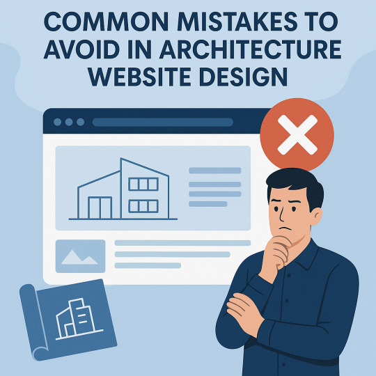
In today's digital landscape, your website is the blueprint of your brand. For architecture firms, Architecture Website Design is more than just aesthetics — it's about communicating expertise, attracting leads, and standing out in a competitive market. Yet, many firms fall into common design traps that can cost them credibility and conversions. In this blog, we explore the most frequent architecture website design mistakes and how to avoid them with practical, technical insights.
1. Overloading the Website with Visuals
Architecture is a visual industry — and while high-quality images are essential, overloading your website with large, unoptimized visuals can backfire. Many firms try to showcase every project, resulting in cluttered layouts and painfully slow load times.
This not only frustrates users but also harms SEO rankings and mobile performance. According to Google, 53% of mobile users abandon a site that takes more than three seconds to load.
How to fix it:
Use next-gen formats like WebP for images.
Compress and lazy-load media files.
Limit portfolio items per page and link to full case studies.
Balanced visual storytelling is the key to effective architecture website design — show just enough to entice without overwhelming.
2. Ignoring Mobile Responsiveness
With over 60% of global web traffic now coming from mobile devices, a desktop-only approach to design is outdated and risky. Architecture websites often suffer from oversized galleries or awkward layouts that don’t translate well to smaller screens.
Responsive design isn’t optional anymore.
Technical tips:
Use flexible grids (CSS Grid or Flexbox).
Set breakpoints for multiple screen sizes.
Implement mobile-first design in frameworks like Bootstrap or Tailwind.
A responsive architecture website design ensures accessibility and a positive user experience for every device.
3. Poor Navigation and User Experience (UX)
Visitors to architecture websites are often clients or collaborators looking for quick answers: Who are you? What have you done? How can they contact you?
Clunky menus, broken links, or buried content can drive them away.
UX best practices:
Use a clear top menu with categories like "About," "Portfolio," "Services," and "Contact."
Implement sticky navigation bars for easy access.
Highlight CTAs like “Book a Consultation” or “Download Portfolio.”
Great UX in architecture website design helps users discover your value fast — and keeps them engaged longer.
4. Lack of Project-Focused Portfolio Structure
An unstructured portfolio is a major red flag. Visitors want to explore your past projects, but many architecture sites either show too much or too little, with no way to filter or drill down.
Fix this with:
Categorized portfolio pages (e.g., Residential, Commercial, Urban). -
Filters for project type, location, or size.
Detailed case studies with challenges, solutions, and visuals.
Smart portfolio presentation sets the tone for your capability and professionalism, enhancing the impact of your architecture website design.
5. Neglecting SEO and Site Performance
A beautiful website that no one finds is a wasted investment. Architecture firms often neglect the foundational elements of SEO — like proper tagging, clean code, and content strategy — which limits their visibility.
Key SEO & performance practices:
Add relevant meta titles and descriptions.
Use schema markup for projects and team profiles.
Optimize for Core Web Vitals using tools like Google PageSpeed Insights.
Host on fast, reliable servers and use a CDN for image delivery.
Platforms like WordPress combined with plugins like Yoast SEO and WP Rocket can streamline performance and SEO for your architecture website design.
6. Inconsistent Branding and Aesthetic
Architecture is about precision and design integrity — your website should reflect that. Yet many firms suffer from branding inconsistency: mismatched fonts, erratic color schemes, and uneven design patterns.
Establish a cohesive identity with:
A defined color palette and typography hierarchy.
Consistent use of logos and visual styles.
A style guide or design system.
Strong branding makes your firm instantly recognizable and sets the tone for trust — a crucial goal of any architecture website design.
7. Not Integrating Contact or Lead Generation Tools
Some websites make it surprisingly hard to reach the company. Others fail to include forms, live chat, or even clickable phone numbers — turning potential clients away.
Conversion-focused design tips:
Include visible CTAs on every page.
Use sticky “Contact” or “Schedule a Call” buttons.
Integrate tools like Calendly, HubSpot, or Mailchimp for leads and automation.
Seamless lead capture transforms your architecture website design from a digital brochure into a business asset.
Conclusion
A well-executed architecture website design should function as a showcase, a sales funnel, and a statement of your firm's identity — all in one. Avoiding the mistakes we’ve covered — from poor mobile optimization to missed SEO opportunities — will help position your brand at the forefront of the industry.
0 notes
Text
Beginner's Guide to Responsive Web Design
Websites are the storefronts of the digital world. Everyone wants a sleek, stylish, and easy-to-use web design in Sydney. However, not everyone knows how to make one that works on all devices. That is where responsive web design comes in. It is not just a trend—it is the new normal. If your web design in Sydney is not responsive, you are already behind. But don’t worry, this guide will help you catch up.
What is Responsive Web Design?
Responsive web design means a website adjusts to any screen size. You don’t need to zoom in. You don’t need to scroll side to side. Everything lines up. Everything flows. It feels natural.
So, the goal is simple: Make your web design in Sydney readable and usable, no matter the device. No matter the screen resolution.
Why Should You Care?
People use all kinds of gadgets today. Laptops, tablets, smartphones, smart TVs, and so on. Some websites look perfect on a laptop, but try the same site on your phone. It’s a mess. The text is tiny. Buttons are hard to click. Images get cut off. All this chaos makes your visitors leave in frustration.
Google loves responsive websites and gives them better rankings. This leads to more visitors and better visibility. Thus, a responsive site is not a luxury but a necessity.
The Key Ingredients of Responsive Design
1. Fluid Grids
A fluid grid uses percentages instead of fixed pixels. That way, elements grow or shrink depending on the screen size. For example, imagine a picture might be 50% wide. It stretches on a big screen, while on a small screen, it shrinks. The layout stays balanced. The structure remains intact.
2. Flexible Images
Images are tricky. If not sized properly, they break layouts. So, responsive design always uses flexible images that are easy to scale and adjust. No overflow. No broken sections. Just smooth visuals. You can use CSS to control this. A common trick is to set the image width to 100%. That way, it always fills the space.
3. Media Queries
This is the secret sauce. Media queries are CSS rules. They tell the browser how to style the page based on screen size.
When the screen is 600 pixels wide or smaller, the background turns light blue. You can:
Change fonts
Rearrange sections
Hide or show content
In short, media queries give you control and make your design smart.
Mobile-First Design: Start Small
Design for the smallest screen first. That is mobile-first design. It makes you focus. It helps you prioritise. You start with what really matters. To put it in order:
Build a layout for phones.
Then scale it up for tablets.
Then expand it for desktops.
This approach saves time while reducing clutter. It also ensures a clean and clear user experience.
Tools to Help You Get Started
Bootstrap
This is a popular framework with pre-made grid systems. It includes responsive components, from buttons to forms to navigation bars. You can build fast. You can customise easily.
CSS Flexbox
Flexbox helps you align items in rows or columns. It adapts quickly and is ideal for one-dimensional layouts. Want a row of cards that wraps on small screens? Flexbox does that.
CSS Grid
Grid is perfect for complex layouts. You can place items wherever you want—rows, columns, or overlapping elements. It gives you full control.
Chrome DevTools
Test your design right in your browser.
Open Chrome.
Press F12.
You’ll see the Developer Tools.
Switch to mobile view.
Resize the window.
See how your site responds.
Adjust and fix issues on the spot.
Tips for Better Responsive Web Design in Sydney
Keep Navigation Simple
Big menus do not work well on phones. Use icons or collapsible menus, and keep it clean. More importantly, keep it user-friendly.
Avoid Fixed Widths
Fixed widths can break your layout. Stick to percentages. Embrace fluidity.
Use Viewport Meta Tag
Add this to your HTML:
```html
<meta name="viewport" content="width=device-width, initial-scale=1.0">
```
This tells the browser how to scale the page. Without it, your design might look weird on mobile.
Test on Real Devices
Simulators help, but nothing beats the real thing. Open your site on different phones. Try it on tablets. Check how it looks. Check how it feels.
Optimise Loading Time
Mobile users want speed. Compress your images. Minify your CSS and JavaScript. Use lazy loading. Keep things light.
Real World Example
Let’s take a basic layout. A homepage with a header, a main section, a sidebar, and a footer.
On desktop:
– The header stretches across the top.
– The main section sits on the left.
– The sidebar is on the right.
– The footer is at the bottom.
On mobile:
– The header still sits on top.
– The sidebar moves below the main section.
– Everything stacks vertically.
Same content. Different layout. That’s the beauty of responsive design.
Common Mistakes to Avoid
Even the best designers mess up. Let’s make sure you don’t.
– Don’t forget the viewport meta tag.
– Don’t use large fixed images.
– Don’t hide important content on mobile.
– Don’t ignore load speed.
– Don’t test only on one screen size.
Each screen is a new experience. Each visitor deserves a smooth journey.
Final Thoughts: The Future is Flexible
The internet will keep changing. New devices will appear and new screen sizes will emerge. So, your fully responsive website must be ready. It keeps your site future-proof. To get started with your responsive web design in Sydney - https://www.makemywebsite.com.au/web-design/sydney/ , connect with Make My Website.
Web design is not just about looking pretty. It’s about function. It’s about flow. It’s about flexibility. Responsive design gives your website a fighting chance.
0 notes
Text
Website Optimization Best Practices for Enhanced User Experience
In today's digital landscape, the significance of a well-optimized website cannot be overstated. With search engines continuously evolving and users becoming more discerning, understanding the best practices for website optimization is crucial for enhancing user experience and achieving better organic search rankings. This article delves into the myriad aspects of website optimization, ranging from SEO services to technical SEO, to help you create an engaging online presence that keeps visitors coming back.
What is Website Optimization?
Website optimization refers to the process of improving various aspects of a website to enhance its performance, user experience, and visibility in search engines. This encompasses various techniques:
On-page SEO Off-page SEO Technical SEO Content optimization
These strategies aim not only to improve Google ranking but also to create a seamless experience for users.
The Importance of User Experience in Website Optimization greenbananaseo.com niche marketing
User experience (UX) is a critical factor influencing how visitors interact with your website. A positive UX leads to longer site visits, lower bounce rates, and higher conversion rates. When users find what they’re looking for quickly and effortlessly, they are more likely to engage with your content or make a purchase.
Why Does User Experience Matter? Retention: Users are more likely to return to a site that offers a smooth browsing experience. Conversions: A user-friendly design can significantly increase conversion rates. SEO Benefits: Search engines like Google prioritize sites that provide excellent user experiences. Website Optimization Best Practices for Enhanced User Experience
Improving your website requires adopting several best practices that focus on optimizing both performance and content.
1. Mobile Responsiveness
With over half of web greenbananaseo.com Search engine marketing traffic coming from mobile devices, ensuring your site is mobile-friendly is paramount.
How Can You Achieve Mobile Responsiveness? Use responsive design frameworks like Bootstrap. Optimize images for faster loading times. Ensure all buttons and links are easy to navigate on smaller screens. 2. Page Speed Optimization
Page speed directly affects user experience and is a ranking factor for Google.
Tips for Improving Page Speed: Compress images using tools like TinyPNG. Minimize HTTP requests by combining files. Utilize browser caching. 3. Effective Navigation Structure
A clear navigation structure helps users find what they need without frustration.
Best Practices for Navigation: Keep menu items concise and categorized logically. Use breadcrumb trails for easy backtracking. Include a search bar for quick access. 4. High-Quality Content Creation
Content remains king in the world of SEO marketing.
What Constitutes Quality Content? Originality: Avoid dupli
0 notes
Text
Why Use Bootstrap?
Easy to Use: Simple to integrate with HTML and CSS.
Responsive Design: Automatically adjusts to different screen sizes.
Pre-Built Components: Buttons, forms, modals, and navigation bars are ready to use.
Customization: Can be modified using CSS or Sass.
Cross-Browser Compatibility: Works on all modern browsers.
#Bootstrap5#Bootstrap#WebDevelopment#FrontendDevelopment#ResponsiveDesign#CSSFramework#TechEducation#WebDesign#WebDevelopmentTutorial#BootstrapTutorial#FrontendDesign#WebAppDevelopment#CSS3#HTML5#MobileFirstDesign#Bootstrap5Tutorial#TechLearning#WebDevelopmentSkills#UIUXDesign#WebDesignBestPractices#BootstrapComponents#WebDesignTips#TechBooks#BootstrapForBeginners#WebDevelopmentCourse
0 notes
Text
Learn Web Design HTML, CSS, JavaScript, and Bootstrap

Web Design - as Introduction to
Now, in the contemporary high-tech world, Learn Web Design HTML CSS JavaScript and Bootstrap is one of the most in-demand skills. It involves creating your own site, building a career as a web designer, or simply gaining essential knowledge. This includes mastering web technologies like HTML, CSS, JavaScript, and Bootstrap. At TCCI Computer Coaching Institute, we offer high-quality training to help you design stunning, responsive websites.
HTML - the Backbone of Web Development
What is HTML?
Web pages from HTML (HyperText Markup Language) form the backbone of these web pages. Here is the basic framework for showing web content.
Basic Structure of an HTML Page
An HTML document consists of various headings, paragraphs, links, images, and so on. This tags keep content in order.
Key HTML elements and tags
to for headings
for paragraphs
for links
to place images
CSS-the web has Usable Styling
Understanding CSS and Its Importance
CSS styles HMTL elements. It beautifies HTML and makes any content visually appealing.
Two Types of CSS
Inline CSS – Applied to a single HTML element.
Internal CSS – Defined between a tag in the HTML document.
External CSS – Different .css file.
JavaScript – for Interaction on Websites
JavaScript language is heftier most important interactive programming language by which the websites become highly dynamic, i.e., forms, sliders, animations are created.
Main JavaScript Concepts
-Variables and Data Types
-Functions and Events
-DOM Manipulations
Lessening Work in Web Design-Bootstrap
Bootstrap itself is one of the most widely used front-end frameworks, which is why it is easier to design for a site that will hold lots of images in a responsive manner. It has various pre-designed components, such as navigation bars, buttons, and forms. With these pre-designed components, we can create our pages easily and simply build our web pages with a professional look.
Why learn Web Design from TCCI?
TCCI Computer Coaching Institute prides itself on practical and hands-on training, complete with expert faculty, which would ensure that web development becomes actualized for you. The blessed flexibility in choice of learning mode caters for students and working learners.
Conclusion
Web design will bring you numerous career opportunities in the broadly expanding IT industry. You may either opt to be a front-end developer or even want to establish your own business in web designing. Important portals to becoming an expert, such as those at TCCI in HTML, CSS, JavaScript, and Bootstrap, have been opened before you.
Location: Ahmedabad, Gujarat
Call now on +91 9825618292
Get information from https://tccicomputercoaching.wordpress.com/
#Computer classes in bopal Ahmedabad#Computer classes near me#JavaScript Training in Ahmedabad#TCCI - Tririd Computer Coaching Institute#Web Design course In Ahmedabad
0 notes
Text
What’s the Difference Between Front-End and Back-End Development?

Web development is all about building websites and applications, and it’s divided into two main parts: front-end and back-end development. These two work together to make websites look good and function properly, but they have different tasks, tools, and skills. Let’s explore the differences in a simple way.
What is Front-End Development?
Front-end development is everything on a website or app that you can see and click on, like buttons, images, text, and menus. It’s all about making the website look nice and easy to use, so users can easily navigate and interact with it.
Example: When you visit a website and click on a button, the design you see and the way the button works is the result of front-end development.
Key Responsibilities of a Front-End Developer
Designing the user interface (UI): Creating how the website looks and making sure it's easy to use.
Making designs work on all devices: Ensuring the website looks good on phones, tablets, and computers.
Adding interactivity: Making the website interactive with things like buttons, menus, and animations.
Languages and Frameworks
Core Languages
HTML: Builds the structure of a website.
CSS: Styles the website with colors, fonts, and layout.
JavaScript: Adds interactivity like dropdowns and sliders.
Frameworks and Libraries
React.js: Used for building dynamic websites.
Angular: A powerful tool for building complex apps.
Vue.js: A simple and flexible tool for modern websites.
Bootstrap: Helps design websites that work well on all devices.
What is Back-End Development?
Back-end development is everything that happens behind the scenes on a website. It makes sure the website works properly by managing things like data storage and the server. When you do something on a website, like clicking a button or submitting a form, the back-end makes sure the right information is processed and sent where it needs to go.
Example: When you log into a website, the back-end makes sure your username and password are correct, finds your information in a storage system, and lets you into your account.
Key Responsibilities of a Back-End Developer
Managing Data: A back-end developer makes sure that data is stored safely and can be retrieved when needed.
Writing Code for the Server: They write the instructions that tell the website how to process actions, like when a user submits a form.
Making the Website Fast and Safe: They ensure the website works quickly and securely, protecting it from potential problems.
Languages and Frameworks
Core Languages
Python: Easy to learn and used with frameworks like Django and Flask.
Java: Great for large applications, often used with the Spring Boot framework.
PHP: Used for creating dynamic websites, with Laravel as a key framework.
Ruby: Often used with the Ruby on Rails framework for quick development.
JavaScript (Node.js): Allows developers to use JavaScript for both the front-end and back-end.
C#: Often used with ASP.NET for building web applications.
Databases
SQL-Based: Like MySQL, PostgreSQL, and Microsoft SQL Server for structured data.
NoSQL-Based: Like MongoDB, Cassandra, and DynamoDB for unstructured data.
The Connection Between Front-End and Back-End
Front-end and back-end work together to ensure the website functions correctly:
Front-End Role: When you visit an education website, the front-end shows you things like course listings, a search bar, and a login form to register or sign in.
Back-End Role: When you search for a course or log in, the back-end processes your request, checks the available courses in the database, and verifies your login details.
Front-End Role: After the back-end processes everything, the front-end shows you the list of courses or confirms your login and takes you to your student dashboard.
For example, when you want to enroll in a course, the front-end displays the course options. Once you select a course, the back-end checks if you're eligible, processes your enrollment, and confirms it. The front-end then shows your updated enrollment status.
Skills Required
Front-End Developer Skills
Proficiency in HTML, CSS, and JavaScript.
Knowledge of front-end frameworks like React, Angular, or Vue.js.
Experience with responsive and accessible design.
Basic understanding of back-end APIs for better integration.
Back-End Developer Skills
Knowledge of server-side programming languages like Python, Java, or PHP.
Familiarity with frameworks like Django, Flask, or Node.js.
Experience with databases (SQL and NoSQL).
Understanding of APIs, security practices, and server management.
Which One You Should Choose?
Choose Front-End Development if you enjoy creating visually appealing websites and focusing on how users interact with them. You’ll work on designs, layouts, and make sure everything looks good and functions smoothly for the user.
Opt for Back-End Development if you enjoy problem-solving, working with data, and focusing on how everything behind the scenes works. You’ll deal with servers, databases, and ensuring the website runs efficiently.
Consider Full-Stack Development if you're interested in both the front-end and back-end. You’ll get to work on all parts of a website, from what users see to how the data is managed and processed.
Average Salary for each Development Type
Front-End Developer
Focus on visual design and user experience, creating interactive and appealing websites.
₹6 LPA - ₹20 LPA (India)
$60,000 - $120,000 (Outside India)
2. Back-End Developer
Work on server-side logic, databases, and handling the functionality behind the scenes.
₹8 LPA - ₹25 LPA (India)
$70,000 - $130,000 (Outside India)
3. Full-Stack Developer
Work on both front-end and back-end, managing the entire website development process.
₹10 LPA - ₹30 LPA (India)
$80,000 - $150,000 (Outside India)
KEY TAKEAWAYS
Career Paths and Roles
1. Front-End Developers
Front-End Developer
Web Designer
Front-End Engineer
React Developer / Angular Developer
UI/UX Designer
2. Back-End Developers
Back-End Developer
Database Administrator (DBA)
Server-Side Developer
API Developer
DevOps Engineer
Front-end and back-end development are two parts of building a website—they depend on each other to create websites that work well and look good. Understanding the differences can help you choose which path is right for you.
Both areas offer great job opportunities and are important for creating the websites and apps we use every day.
#Difference between front end and back end#Front end vs back end#Responsibilities of front-end and back-end developers#Web development career paths#Languages and frameworks for front and back end
1 note
·
View note
Text
Bootstrap 4 Tutorial for Beginners: Learn the Basics of Responsive Web Development

If you’re new to web design and development, Bootstrap 4 is the perfect tool to help you get started. It’s a free, open-source framework that makes creating responsive and visually appealing websites quick and easy. With Bootstrap 4, you don’t need advanced coding skills – the framework does the heavy lifting for you!
One of the standout features of Bootstrap 4 is its grid system, which allows you to create layouts that adapt beautifully to different screen sizes. Whether you’re building a website for desktops, tablets, or smartphones, Bootstrap ensures your content looks great everywhere.
Bootstrap 4 also includes a wide variety of components, such as navigation bars, buttons, modals, and forms. These pre-designed elements save you time and effort, allowing you to focus on customizing the look and feel of your website.
Another reason Bootstrap 4 is ideal for beginners is its built-in utilities, which make styling easier. With simple classes, you can adjust spacing, alignment, colors, and more without writing complex CSS.
Getting started with Bootstrap 4 is simple. All you need is basic HTML knowledge, and you’re ready to dive in. Many online tutorials and resources are available to guide you step by step.
If you’re ready to create stunning, responsive websites, explore more with the Bootstrap Tutorial for Beginners at Tutorial and Example. Happy learning!
0 notes
Text
10 Essential Skills Every Web Designer Should Master

In 2025, Proper skills make a huge Difference between a good designer & great designer in the fastest digital world of web design. Mastery of the most essential skills make it possible for a website not only to look fantastic but also function well & be more user friendly.
In this Blog,We mentioned some skills that every web designer must have in 2025 . This can help on their career path .These skills not only enhance your ability to create visually stunning websites but also improve functionality, usability, and the overall user experience. Let's break it down into 5 essential skills Every web designer Should have.
1. User Experience (UX) Design
Effective web design depends on the Understand of User experience (UX). UX Designer is all about creating a website through all elements that are easy to navigate , more enjoyable. A good UX design ensures visitors can find what they need quickly without frustration.
Practical example :
When you visit Amazon, you can quickly find what you’re looking for thanks to the clear categories, filters, and search bar. For example, if you type “headphones,” you immediately see a list of products, reviews, and prices. This makes shopping easy and enjoyable.
How to Master UX Design:
Familiarize yourself with tools like Adobe XD and Figma.
Study user behavior and apply data-driven insights.
Continuously gather feedback and refine your designs.
2. Responsive Design
When it comes to Web Design, Responsive design is non negotiable. Websites only look good that is not essential but also all the layouts,elements must smoothly run across various devices in all sizes like from desktops,laptops, tab & mobile phones .
Why It Matters:
Responsive design helps to improve your Functionality, more mobile friendly for boost SEO Ranking.
How to Master Responsive Design:
Test your designs on various devices and browsers.
Use frameworks like Bootstrap or CSS media queries to create fluid layouts.
Practical example :
Open Facebook on your phone and then on a computer. You’ll notice how the layout adjusts to fit the screen size. On your phone, the menu is compact, and posts are arranged vertically for easy scrolling. This ensures it works smoothly no matter what device you’re using.
3. Visual Hierarchy
Visual Hierarchy is a key principle in design that helps to organize & prioritize content on web pages to guide the viewers. It ensures that the most important elements stand out while maintaining a clean & logical flow of Information.
Practical example :
Visit Apple’s website and see how they highlight their latest products. For example, the newest iPhone is shown in a large image with a bold headline like “iPhone 15 Pro.” Below it, you’ll find smaller details and links like “Learn More” or “Buy Now.” Your eyes are naturally guided from the most important information to the details.
How to Achieve Visual Hierarchy:
Use size, color, contrast, alignment, and spacing effectively.
Focus on making the website engaging and easy to navigate
4. Knowledge of Web Development Tools
A web designer will be more confident When the understanding the basic programming language & tools because it can help to collaborate with developers & together they both can design in a more practical way & achievable .
Tools and Skills to Explore:
Learn basic programming languages like HTML, CSS, and JavaScript.
Familiarize yourself with tools such as WordPress, Webflow, and code editors.
Practical Example :
On WordPress.com, you can design a basic website using its pre-made themes. However, knowing a little HTML or CSS allows you to customize the design further, like changing the colors or layout to match a brand’s style.
5. Communication Skills
Web design is not technical expertise, It is also about understanding your audience & engaging them through your message effectively. Strong communication skills help you collaborate with clients, developers, and other stakeholders.
What to do :
Invest time to improve your listening skills, & clear voice makes your communication strong with your clients But In the same way you understand human behaviour & human psychology helps you to convey your message in the website.
Practical Example :
Think of how Netflix promotes new shows. Their homepage uses big banners and clear text like “Watch Now” to tell you what’s popular. Similarly, web designers need to use simple language and design elements to help visitors understand what to do, like clicking a “Sign Up” button.
Conclusion
Mastering these five essential skills—UX design, responsive design, visual hierarchy, web development tools, and communication—can set you apart as a web designer. Start by focusing on one skill at a time, practice regularly, and stay updated with the latest trends in web design. Remember, great web design is not just about aesthetics but also about creating meaningful and seamless user experiences.
By honing these skills, you’ll not only improve your craft but also create designs that truly make an impact. Ready to level up your web design game? Start today, and watch your expertise soar!
0 notes
Text

Bootstrap Navbar with Slider
#bootstrap navbar with slider#bootstrap slider#bootstrap navbar#html css#learn to code#code#codingflicks#frontend#webdesign#css#html#css3#frontenddevelopment#bootstrap tutorial#learn css#navigation bar
0 notes
Text
What are the 5 golden rules of web designing?
Web design is an art and science that combines creativity, functionality, and user experience to create an engaging and effective online presence. A well-designed website can captivate users, enhance brand credibility, and achieve business goals. However, creating a great website isn't just about aesthetics—it's about following certain principles that ensure functionality and usability. These principles are often referred to as the "golden rules" of web design.
Here are the 5 golden rules of web designing to help you create a user-friendly and visually appealing website.
Prioritize Simplicity Simplicity is the ultimate sophistication. When it comes to web design, less is often more. Overcrowded layouts, too many elements, or excessive animations can overwhelm visitors and distract them from the main purpose of the website.
Why It Matters: A clean and simple design ensures that users can focus on your content or calls-to-action without unnecessary distractions. How to Achieve It: Use a limited color palette, consistent typography, and sufficient white space. Make sure every design element serves a purpose. Example: Think of brands like Apple or Google, which prioritize minimalistic designs. Their websites are clean, easy to navigate, and focused on their key offerings.
Keep Navigation Intuitive Navigation is the backbone of any website. Visitors should be able to find what they’re looking for quickly and effortlessly. If they can't, they’re likely to leave your site and look elsewhere.
Why It Matters: Good navigation ensures a seamless user experience, reducing frustration and bounce rates. How to Achieve It: Use a clear and concise menu structure. Include a search bar for larger websites. Avoid overloading your navigation bar with too many options. Tip: Follow the "three-click rule," which suggests that users should be able to find what they need within three clicks.
Optimize for Mobile With over half of all web traffic coming from mobile devices, optimizing your website for mobile users is no longer optional—it’s essential. Mobile-friendly design enhances user experience and boosts your website's ranking on search engines.
Why It Matters: A responsive website ensures that your content looks great and functions well on all devices, from desktops to smartphones. How to Achieve It: Use responsive design frameworks like Bootstrap. Test your website across various screen sizes and devices. Ensure fast loading times on mobile by compressing images and minimizing code. Statistic: According to a report by Statista, mobile devices accounted for 59% of global website traffic in 2023.
Focus on Visual Hierarchy Visual hierarchy refers to the arrangement and prioritization of elements on a page to guide the user's eye. It ensures that the most important information is noticed first.
Why It Matters: A strong visual hierarchy improves readability and helps users understand your content more effectively. How to Achieve It: Use larger fonts for headings and smaller ones for body text. Highlight calls-to-action with contrasting colors. Place critical information (like offers or sign-up buttons) above the fold. Example: E-commerce websites like Amazon excel in visual hierarchy by prioritizing product images, prices, and "Add to Cart" buttons.
Test and Iterate No design is perfect on the first attempt. Regular testing and iteration are key to creating a website that meets user needs and performs well.
Why It Matters: Testing allows you to identify issues, improve usability, and optimize for conversions. How to Achieve It: Conduct usability testing with real users. Use analytics tools like Google Analytics to track user behavior. Continuously gather feedback and make improvements. Tip: A/B testing is a great way to compare two versions of a webpage to see which performs better.
The 5 golden rules of web designing—simplicity, intuitive navigation, mobile optimization, visual hierarchy, and continuous testing—are essential for creating websites that are not only visually appealing but also functional and user-friendly. By following these principles, you can ensure your website delivers an excellent user experience, achieves its objectives, and stands out in the competitive digital landscape.
Remember, web design is not just about making things look good—it’s about solving problems, communicating effectively, and providing value to your users. Stick to these golden rules, and you’ll be well on your way to designing a website that leaves a lasting impression.
0 notes
Text
Free Essential Tools for Web Development

Embarking on a web development journey can be both thrilling and overwhelming, especially when faced with a vast array of tools and software options. For beginners, finding high-quality, cost-effective resources is essential. Fortunately, numerous free tools are available to help you master foundational skills and build effective websites without a large financial investment. Whether you are creating a personal project or collaborating with a web development company these tools can be transformative.
1. Visual Studio Code (VS Code)
Visual Studio Code is a robust and widely used code editor available at no cost. It features syntax highlighting, debugging, and an integrated terminal, providing all the essentials for beginners. Usage: Install VS Code to experiment with HTML, CSS, and JavaScript. Personalize your experience by adding plugins that cater to your specific needs
2. GitHub
GitHub offers free repositories for beginners, allowing them to store and manage their code. It is an excellent platform to learn version control and collaborate with others. Usage: Use GitHub to save your projects and track changes over time. Many web development companies utilize GitHub for managing large-scale projects, making it a valuable tool for all levels.
3. Bootstrap
Bootstrap is a free, open-source CSS framework that simplifies responsive design, making it ideal for beginners who want to build mobile-friendly websites without delving deeply into CSS. Usage: Familiarize yourself with Bootstrap’s library of components, such as buttons, forms, and navigation bars. Quickly create layouts that are visually appealing across devices.
4. Canva
Effective web design extends beyond coding. Canva is a free graphic design tool that enables beginners to create visuals, from website banners to social media images. Usage: Leverage Canva’s templates to design professional-looking images. Visuals are crucial to web development, and this tool makes it easy to produce high-quality assets. 5. Google Chrome DevTools Chrome DevTools, built into the Chrome browser, provides a set of developer tools that allow you to inspect and debug your website directly in the browser. Usage: Use DevTools to test and refine your code, resolve layout issues, and assess mobile responsiveness. It is indispensable for bug identification and site optimization.
#ios and android app development in brisbane#web design and development company in brisbane#web design services in brisbane
0 notes
Text
Web Design in Melbourne: Guide to Build an Educational Website
Designing an educational website for a resource portal, a school, university, or an online learning platform requires strong knowledge. If your brain jumps from left to right thinking about quality designs, you can safely believe that there are many other administrators who are on the same page.
Every educational institute or online learning platform is unique in what they bring to the learners. Whether it is more comprehensive resources, personalized attention, or guaranteed results, you would surely want to understand the web design goals that make a learning experience easy and engaging. But how to achieve them all?
In this blog, we will explore 5 essential web design features that you must consider in a professional web design in Melbourne for a functional educational website.
5 Must-Have Web Design Features for an Educational Website
Here are five most crucial web design qualities and features that make an educational portal, institution, or, an e-learning platform engaging.
1. User-Friendly Menus
When planning a website menu layout with a website designer, focus on creating simple and easy to find menus. Focus on keeping only the main links like Courses, Admissions, About Us, Gallery, or Contact Us page. When choosing a layout, hamburger-style menus and sticky navigation bars can make them easily appear on smaller screens.
User experience is the crucial factor. It is important to choose one of the best professionals for web design in Melbourne who ensure that the website menu colors, fonts, alignment, and style helps users to find the information.
2. Responsive Design for Mobiles and Tablets
Teachers and students use their tablets or mobile devices to browse educational websites or e-learning platforms. If they find it difficult to read the content on your website or explore the website without zooming in, they will move on.
For this reason, it is crucial to use responsive frameworks when designing a website. Commonly used web design frameworks like Bootstrap and Foundation allow a website to automatically adjust to the smaller screens. These feature one-column grids, in-built sliders, buttons, forms, and carousels, and media queries that perform well on different devices.
If you are not aware of the technicalities, it is good to consider a professional for SEO in Geelong for high-performing frameworks.
3. Integrate Multiple Media
Next, multimedia tools are another effective and popular way to make education fun and engaging for both educators and learners. As long as your students and educators get access to different audio and visual learning modules, your website performs well.
Video lectures, podcasts, quizzes, or other interactive forums are highly becoming resourceful additions on an educational website. Keeping aside the traditional listen-only concepts, these tools allow learners to interact through quizzes, ask questions, use clickable annotations, or jump to specific sections on podcasts.
You can even include downloadable PDFs and worksheets, or reading lists to let users learn the study materials at their own pace. Remember, integrating media can reduce website speed, so an SEO expert in Geelong is helpful in optimizing the speed.
4. Use Learning Management Platform Within the Website
An educational website must have a highly-organized and user-centric learning management tool. It allows learners to find the different study materials, submit assignments, and view grades at one place. And it also enables teachers and providers to track student progress, answer their questions, and interact about upcoming events.
While choosing a Learning Management System (LMS), keep in mind the existing website structure. A sign of a good LMS platform is its easy integration, drag-and-drop dashboard, customization features, and technical support features. Web design companies also help you to choose the best platform that stands true and right to these qualities.
5. Secure Registration and Enrollments
Lastly, safe and easy-to-use registration and enrollment forms complete an educational website. If you are just starting, handle this task to an expert SEO in Geelong.
If you are creating a website for school or colleges, structure the registration form with essential and autofill options. Clear instructions and examples in the input fields can make a big difference. Including error validation and progress indicators will allow learners to correct their mistakes and know how far they have come.
In addition, if you are creating an online learning platform, using secure payment gateways with confirmation messages makes the site safe.
Final Words
We hope you found this blog useful. Designing an educational web design in Melbourne or Geelong takes time as you are considering user experience, user interface, and website security as a goal to fulfill both learners and educators needs.
Whether you are a chancellor, president, or an e-learning educator designing a website, it is wise to invest in a professional company. They have a team of best website designers in both locations to plan, guide, and initiate the best process.
0 notes
Text
Website Optimization Best Practices for Enhanced User Experience
In today's digital landscape, the significance of a well-optimized website cannot be overstated. With search engines continuously evolving and users becoming more discerning, understanding the best practices for website optimization is crucial for enhancing user Green Banana SERP strategies experience and achieving better organic search rankings. This article delves into the myriad aspects of website optimization, ranging from SEO services to technical SEO, to help you create an engaging online presence that keeps visitors coming back.
What is Website Optimization?
Website optimization refers to the process of improving various aspects of a website to enhance its performance, user experience, and visibility in search engines. This encompasses various techniques:
On-page SEO Off-page SEO Technical SEO Content optimization
These strategies aim not only to improve Google ranking but also to create a seamless experience for users.
The Importance of User Experience in Website Optimization
User experience (UX) is a critical factor influencing how visitors interact with your website. A positive UX leads to longer site visits, lower bounce rates, and higher conversion rates. When users find what they’re looking for quickly and effortlessly, they are more likely to engage with your content or make a purchase.
Why Does User Experience Matter? Retention: Users are more likely to return to a site that offers a smooth browsing experience. Conversions: A user-friendly design can significantly increase conversion rates. SEO Benefits: Search engines like Google prioritize sites that provide excellent user experiences. Website Optimization Best Practices for Enhanced User Experience
Improving your website requires adopting several best practices that focus on optimizing both performance and content.
1. Mobile Responsiveness
With over half of web traffic coming from mobile devices, ensuring your site is mobile-friendly is paramount.
How Can You Achieve Mobile Responsiveness? Use responsive design frameworks like Bootstrap. Optimize images for faster loading times. Ensure all buttons and links are easy to navigate on smaller screens. 2. Page Speed Optimization
Page speed directly affects user experience and is a ranking factor for Google.
Tips for Improving Page Speed: Compress images using tools like TinyPNG. Minimize HTTP requests by combining files. Utilize browser caching. 3. Effective Navigation Structure
A clear navigation structure helps users find what they need without frustration.
Best Practices for Navigation: Keep menu items concise and categorized logically. Use breadcrumb trails for easy backtracking. Include a search bar for quick access. 4. High-Quality Content Creation
Content remains king in the world of SEO marketing.
What Constitutes Quality Content? Originality: Avoid dupli
0 notes
Text
What is Bootstrap Used for?

What is Bootstrap Used for?
Today's fast evolving landscape of the web development needs making responsive yet visually-pleasing sites. The game-changer here has to be Bootstrap. Popular among front-end frameworks, Bootstrap makes front-end website development easier.
Why Use Bootstrap?
Bootstrap is an open-source toolkit by Twitter. It is a readymade code of various web components, and developers can save their precious time in designing and functionalities. Here's how Bootstrap stands out:
Responsive Design: Your website will look great on all devices - desktops to mobile phones. The grid system in Bootstrap allows for effortless adjustments in the layout.
Pre-Styled Elements: It contains pre-styled components such as buttons, modals, and navigation bars, which are easily customizable.
Cross-browser compatibility: Bootstrap handles all the inconsistencies in different browsers so that the application remains uniform.
Customization Capability: Developers can change the framework to fit their exact branding requirements by using the SASS variables.
Using Bootstrap
Bootstrap is applicable in the following areas, among others,
Mobile first website development: Its mobile-first approach ensures that sites developed with Bootstrap easily transform into smaller screens.
Rapid Prototyping: Developers can quickly create prototypes using pre-styled components.
E-Commerce Sites: For businesses, Bootstrap provides robust tools to build clean and user-friendly online stores.
Web Applications: It simplifies the styling of complex apps while maintaining a professional look.
Why Learn Bootstrap at TCCI Computer Coaching Institute?
At TCCI Computer Coaching Institute, we focus on teaching the latest web development tools like Bootstrap. Our expert trainers guide you through:
Understanding the Bootstrap grid system.
Using built-in utilities and classes for responsive design.
Creating dynamic and interactive web elements.
Be it a fresher or an upgrading person, TCCI is there for you.
Get ready to master Bootstrap and create magnificent websites! Sign up at TCCI now and get your web development journey rocking!
Call now on +91 9825618292
Get information from https://tccicomputercoaching.wordpress.com/
#TCCI Computer Coaching Institute#Computer Training Institutes near me in Ahmedabad#Bootstrap Training Institutes in Ahmedabad#Website Designing Training Institutes in Bopal Ahmedabad#Best Computer Institute in Iskon-Ambli road Ahmedabad
0 notes
Text
Web Design Trends on a Budget: Staying Current in Adelaide's Market
In today’s fast-paced digital landscape, a well-designed website is crucial for businesses of all sizes. For small and medium-sized businesses (SMBs) in Adelaide, the pressure to maintain a contemporary web presence while sticking to a tight budget can be particularly daunting. The good news is that staying up-to-date with the latest web design trends doesn't have to break the bank. Affordable web design in Adelaide is achievable, and with the right approach, your business can create an engaging, visually appealing website that meets customer expectations without overspending.
This article explores cost-effective ways to implement the latest web design trends, ensuring your business remains competitive in Adelaide's vibrant market.
The Importance of Modern Web Design for SMBs
Web design trends are constantly evolving, driven by advances in technology and changing user behaviour. What worked five years ago may no longer suffice, and businesses that fail to keep up can risk losing customers to competitors with more appealing online experiences.
A modern, user-friendly website can:
Enhance your brand image
Improve user engagement
Increase conversions and lead generation
Boost search engine rankings
For SMBs in Adelaide, where competition is fierce, a well-designed website can be the difference between thriving and falling behind. Fortunately, there are numerous ways to integrate current design trends affordably, allowing even budget-conscious businesses to stay relevant.
1. Minimalism: Less Is More
One of the most significant web design trends in recent years is minimalism, characterised by clean layouts, simple navigation, and a focus on essential elements. This trend works exceptionally well for businesses on a budget because it reduces the need for excessive design elements and development time.
Key elements of minimalist design include:
White space: Allows content to breathe and prevents clutter.
Simple colour schemes: Stick to a limited colour palette to maintain a clean and professional look.
Clear typography: Use legible fonts that enhance readability without overwhelming the user.
Streamlined navigation: Keep menus and links straightforward to ensure an intuitive user experience.
Minimalism aligns perfectly with affordable web design in Adelaide because it emphasises functionality and aesthetics without the need for costly custom design work.
2. Mobile-First Design
In Australia, mobile internet usage continues to rise, and Adelaide is no exception. More users are browsing the web on smartphones than ever before, meaning a mobile-first approach to web design is essential. Mobile-first design ensures that your website looks and functions seamlessly on all devices, prioritising the mobile experience over desktop versions.
How to implement mobile-first design on a budget:
Use responsive web design frameworks, such as Bootstrap, to create websites that automatically adjust to different screen sizes.
Simplify the layout for mobile users by eliminating unnecessary content or features.
Test your website on multiple devices to ensure a consistent user experience.
Focusing on mobile-first design is not only crucial for customer satisfaction but also benefits search engine optimisation (SEO), as Google favours mobile-friendly websites in search rankings. By prioritising mobile design, you can future-proof your website while keeping costs down.
3. Microinteractions for Enhanced User Engagement
Microinteractions are small, subtle animations or design elements that provide feedback to users as they interact with your website. These can include buttons changing colour when clicked, a progress bar filling as a page loads, or icons moving when hovered over.
Although they may seem like minor details, microinteractions play a significant role in improving the user experience, making your website feel more interactive and engaging. They can be integrated into your site affordably, adding a modern touch without requiring extensive design work.
Affordable ways to add microinteractions:
Use CSS animations to create hover effects or transitions between elements.
Add small animations to buttons, icons, or images that respond to user actions.
Incorporate loading animations to enhance user experience on slower connections.
Microinteractions can elevate the overall feel of your website, making it more engaging without requiring a massive budget. With affordable web design in Adelaide, even the smallest details can make a big difference in user satisfaction.
4. Bold Typography and Colour Schemes
Typography and colour schemes are two of the most impactful elements of web design. Using bold fonts and vibrant colours can help your website stand out, convey your brand’s personality, and guide users through the content.
Bold typography is a trend that can be implemented without significant costs, as there are many free web fonts available. For example, Google Fonts offers a wide variety of stylish, modern fonts that you can integrate into your website at no additional charge.
Affordable tips for bold typography and colour schemes:
Choose 1-2 bold fonts for headings and pair them with simpler fonts for body text.
Use colours that align with your brand, but limit the number of hues to avoid overwhelming users.
Contrast text and background colours to improve readability and visual appeal.
By focusing on typography and colour schemes, you can create a visually striking website that grabs users' attention and enhances your brand image—all without a hefty price tag.
5. User-Generated Content and Social Proof
One of the most effective, budget-friendly ways to enhance your website is by incorporating user-generated content (UGC), such as customer reviews, testimonials, and social media feeds. UGC not only builds trust with potential customers but also helps create a sense of community around your brand.
How to use UGC affordably:
Add a review section where customers can leave feedback about your products or services.
Integrate social media feeds to showcase user-generated photos, videos, or comments.
Highlight testimonials and case studies from satisfied clients.
By leveraging the content your customers are already creating, you can save on content creation costs while building credibility and increasing user engagement.
6. Sustainability and Eco-Friendly Design
Sustainability is a growing concern in today’s market, with many consumers gravitating toward eco-friendly brands. Incorporating sustainability into your web design not only appeals to this growing demographic but also aligns your business with positive social values.
Ways to implement sustainable web design on a budget:
Optimise images and files to reduce website loading times, lowering energy consumption.
Choose a green hosting provider that uses renewable energy to power its servers.
Encourage digital minimalism by reducing unnecessary features and focusing on essential functionality.
By embracing sustainable web design practices, your business can position itself as environmentally conscious, a trend that resonates with today’s consumers, particularly in a city like Adelaide where green initiatives are gaining traction.
Conclusion: Staying Current Without Overspending
Staying up-to-date with web design trends is essential for maintaining a competitive edge in Adelaide’s business landscape. The key is finding ways to implement these trends without exceeding your budget. By focusing on minimalism, mobile-first design, microinteractions, bold typography, user-generated content, and sustainability, your business can create a modern, user-friendly website without breaking the bank.
Affordable web design in Adelaide doesn’t mean sacrificing quality or cutting corners. With careful planning and an understanding of current trends, your business can maintain a strong digital presence that attracts customers and keeps them coming back.
FAQs
1. How can I update my website without spending too much?Start by focusing on the most impactful elements, such as typography, colour schemes, and mobile-first design. These updates can be implemented affordably and make a big difference in user experience.
2. What is mobile-first design, and why is it important?Mobile-first design prioritises the mobile version of your website, ensuring it looks and functions well on smartphones and tablets. This is crucial as more users browse the web on mobile devices, and search engines like Google reward mobile-friendly websites with better rankings.
3. How can user-generated content improve my website?User-generated content, such as reviews and testimonials, builds trust with potential customers by showcasing real experiences. It’s an affordable way to enhance credibility and engagement.
4. What are microinteractions, and do I need them?Microinteractions are small animations or design elements that respond to user actions. They improve the overall user experience by making your website feel more interactive and engaging. Implementing microinteractions is affordable and can make a big impact on user satisfaction.
5. How can I make my website more sustainable?To make your website more eco-friendly, optimise your images and files for faster loading times, use green hosting providers, and focus on essential functionality to reduce unnecessary energy consumption.
affordable web design in melbourne affordable web design in Brisbane
0 notes