#cartogram
Photo

Population cartogram of the EU, 2008.
78 notes
·
View notes
Photo
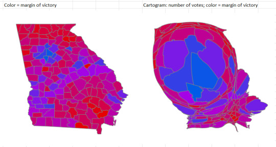
THE POWER OF CARTOGRAMS: These two maps both depict the results of the recent senatorial vote in Georgia. They both have the same color scheme for the margin of victory per county –– a continuous blue-red scale.
But the cartogram on the right graphically depicts the demographic proportions involved and thereby explains how Warnock could win while victorious in only 30 out of 159 counties.
The cartogram really illustrates the power of people's votes. I wish the press and news media would use more cartograms, since it is so hard to understand the demographic realities from a conventional map.
Cartographer: Mary Ann Cunningham
22 notes
·
View notes
Text


wales, deformed according to number of welsh speakers
Welsh speaker data license here (basically UK government)
Map data license here (OpenStreetMap)
Made using QGIS (open source software)
#maps#cartography#cartogram#cymru#wales#cymru am byth#please be gentle i am a newbie at these things
3 notes
·
View notes
Text
Poor Weeoming.
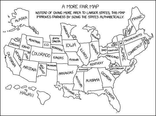
Alphabetical Cartogram [Explained]
Transcript Under the Ground
A More Fair Map
Instead of giving more area to larger states, this map improves fairness by sizing the states alphabetically.
[A labeled map of the United States where states are resized based on their alphabetical order. Hawai'i, is noticeably large, and Delaware stretches down to where Virginia would be in a normal map - meanwhile Washington, Wisconson, Wyoming, West Virginia, and Texas are comically tiny.]
487 notes
·
View notes
Text
youtube
IF STATE MOST RED WHY REPUBLICAN NO WIN??
Vaush explains how population density/distribution relates to voting trends, gerrymandering, "tyranny of the majority" lies, and how conservatives are desperately trying to retain control over their electorates.
Lots of cool data visualization was shown, some of which you can see here:


Here are some that weren't shown that tell the same story:
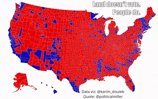


#us politics#2022#videos#land doesn't vote people do#gerrymandering#vaush#vaush good#@vaushv#popular vote#populations#population density#maps#Youtube#voting trends#data visualization#data#population distribution#tyranny of the majority#cartograms
129 notes
·
View notes
Text
As I leave the land of my spotty youth and leave behind most of the 2022 midterm elections, I do so with a real nostalgia for the following provision of the U.S. Constitution:
Article IV, Section 4: The United States shall guarantee to every State in this Union a Republican Form of Government, and shall protect each of them against Invasion; and on Application of the Legislature, or of the Executive (when the Legislature cannot be convened) against domestic Violence.
This was placed into the new Constitution as a further device to exorcize the evil spirits of the Articles of Confederation, which blew goats. The passage has gone largely unexamined almost since it was adopted with the rest of the Constitution. (For example, it’s hardly mentioned in the Federalist Papers, and the Supreme Court, when it has taken up the subject at all, is incoherent on it.) But whatever “a Republican Form of Government” means, it cannot possibly mean the situation as it stands in Wisconsin.
On Tuesday, the Democratic Party got 51% of the vote statewide. This got the Democrats…30% of the seats in the state legislature. Any reasonable definition of “a Republican Form of Government” cannot possibly include this kind of result. It is completely and utterly a product of grotesque partisan gerrymandering sanctioned by the Supreme Court in its disgraceful decision Rucho v. Common Cause three years ago.
The die was cast on this atrocity last April, when the state supreme court ruled that this year’s elections would be contested on the ludicrous maps produced by the state legislature, itself the product of past gerrymanders. The U.S. Supreme Court was a critical accessory after the fact. From Wisconsin Public Radio:
"It was a reversal for Hagedorn, who joined the court's liberals in early March to choose a legislative map drawn by Gov. Tony Evers. But after the U.S. Supreme Court struck down Hagedorn's ruling based on the way it applied the federal Voting Rights Act to draw Black-majority districts in Milwaukee, it sent the case back to the Wisconsin Supreme Court to consider all over again."
You will note that the carefully manufactured conservative majority on the court was not shy about meddling with maps in this instance.
"'We could construct one ourselves or with the assistance of an expert, but time and our institutional limitations make that unrealistic at this juncture,' Hagedorn wrote. 'The remaining option is to choose one of the proposed maps we received as the baseline. Only one proposal was represented as race-neutral in its construction: the maps submitted by the Legislature.'
For Democrats, the decision was likely the worst-possible outcome. For the past decade, they've felt the sting of the 2011 map, which Republicans drew when they controlled all branches of state government. Even during years when Democratic candidates have performed well statewide, Republicans have maintained large majorities in the Legislature, thanks in part to a map that political scientists have said is among the biggest partisan gerrymanders in modern U.S. history. The new map, drawn by Republicans and made law by four justices on the state Supreme Court Friday, further entrenched that advantage, giving Republicans a realistic shot at a two-thirds majority that would let them override a governor's veto. It took effect despite being vetoed by Evers last year and being initially rejected by the state Supreme Court last month."
The best chance that Wisconsin has to un-fuck itself here comes next April, when an election could bring a Democratic majority to the state supreme court, which theoretically could open the door to maps that less closely resemble a game of three-card monte. Of course, John Roberts and the gang put the kibosh on the last attempt at un-fucking last April. The roundness and completeness with which extreme conservatism has deformed the American republic is occasionally stunning.
Maps are an indispensable tool for outlining natural features, human boundaries and transportation networks. But when it comes to depicting how many people are in a given place — how populations are distributed —a traditional map has distinct drawbacks. Mapmakers have sought to offset this limitation through an innovation that's known as a cartogram.
There are two types of cartograms. Distance cartograms are often used to show stylized bus or subway routes. They depict networks without strict adherence to location or range. The other type is called an area cartogram. In these graphics, the size of each shape making up the map — like counties, states or nations — is adjusted to represent a different variable, often the number of people living there.
Cartograms can highlight the difference between places with large populations (or large amounts of whatever variable is replacing area) and places with large amounts of land and/or water, but which have small populations. In other words, a cartogram shows population density in a graphic format.
There are many different ways to develop an area cartogram. In a contiguous cartogram, the shape of a specific area is altered to account for differences in population (or another variable), but shapes retain their positions relative to one another. This approach leads to distortion of the basic shapes. Another is a non-contiguous cartogram, which means that the shapes can move and resize without remaining in position with their neighbors. Rather, the shapes keep their usual form, and are scaled in size based on population (or other variable).
Cartograms can be helpful in interpreting data when the number of people is important. For example, area cartograms are often used to display election outcomes when the variable of interest is total number of votes — not some rate or percentage. An election results cartogram is an increasingly common tool used to help highlight dynamics related to population density. In conventional maps showing election results large areas that are sparsely populated take up the most space, and thus have the most visual impact, while more densely populated areas that take up very little land area have far less visual impact despite representing many more people.
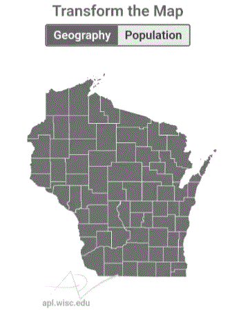
In an non-contiguous area cartogram of Wisconsin, the state's counties have been resized according to their their populations. Counties with large populations grow bigger than they would appear on a standard map, and counties with sparse populations shrink in comparison.
These two maps of Wisconsin's counties highlight a few key points about the distribution of the state's population. First, the cartogram emphasizes how overwhelmingly large Milwaukee County's population is, relative to all other counties in the state. Dane and Waukesha counties stand out as the next two largest after Milwaukee. In addition, the other counties on the southern and eastern edges of the state together represent a preponderance of Wisconsin's total population. Another takeaway is just how different an area-based map and a population-scaled map look. It's easy to think of Wisconsin's rural areas as making up a lot of the state, but in terms of population they are quite small.
A cartogram can help make sense of any topic where the important information is in the number of people, and there is wide variation in population density in a region. For example, cartograms can be useful illustrations of economic activity, immigration, school enrollment, votes, jobs or housing numbers.
#us politics#news#op eds#esquire#charles p. pierce#wiscontext#maps#data#data visualization#gerrymandering#wisconsin#2022 midterms#2022 elections#2022#gov. tony evers#Wisconsin Public Radio#us constitution#cartograms#land doesn't vote people do#representative democracy
39 notes
·
View notes
Text
(2-syllable word starting with G) (2-syllable word starting with B) is like the anime version of (3-syllable word starting with B) (3-syllable word starting with C)
0 notes
Text

I love cartograms
10 notes
·
View notes
Text
I don’t care for cartograms. There’s always some better way of presenting information than Map But Worse.
6 notes
·
View notes
Text
Best Diagnostic Centre in Patna: Your One-Stop Solution for Comprehensive Healthcare
Introduction
Ensuring your health and well-being starts with choosing the right diagnostic center. In Patna, a city with a growing demand for top-notch healthcare services, choosing the right diagnostic centre can make all the difference. This is where Raman Imaging and Diagnostic Centre, the Best Diagnostic Centre in Patna, comes into play, offering a wide range of services to meet all your medical needs. From progressed imaging procedures to exact pathology tests, this middle is devoted to giving exact and dependable diagnostics.

Advanced Imaging Services:
At Raman Imaging and Diagnostic Centre, cutting-edge technology is at the forefront of their services. One standout feature is their 3 Tesla MRI Centre in Patna. This state-of-the-art MRI machine offers unparalleled image quality, ensuring that even the smallest anomalies are detected. Whether you need a routine scan or a more detailed examination, the 3 Tesla MRI Centre in Patna is equipped to provide the highest level of diagnostic accuracy.
Comprehensive Pathology Services:
Recognizing the requirement for an exact lab comes about, Raman Imaging and Diagnostic Centre offers a chief Pathology Centre in Patna. Our team of expert pathologists is dedicated to providing accurate results for a wide range of tests. From routine blood work to specialized tests, the Pathology Centre in Patna ensures that all results are both timely and accurate, aiding in effective diagnosis and treatment planning.
Leading Radiology Centre:
Radiology plays a crucial role in modern diagnostics, and Raman Imaging and Diagnostic Centre excels in this area. As a premier Radiology Centre in Patna, they offer a full suite of radiological services, including X-rays, CT scans, ultrasounds, Non-vascular intervention procedures including FNAC and biopsy, 3 TESLA MRI with advanced applications like Cartogram, Neuroperfusion, MPR Prostate, Breast MRI, Cardiac MRI, small joints MRI, CSF Flow study, MRI Enterography, MR Defecography, Non-contrast Lower limb Angio, Multiphasic Liver MRI, Whole body diffusion. These latest machineries with advanced applications and a dedicated experienced team of doctors and paramedics help provide quality standards of healthcare and diagnostics. Expert radiologists utilize advanced technology to produce precise and detailed images, aiding doctors in making well-informed health decisions.
Reliable Blood Test Lab:
For many medical conditions, blood tests are an essential diagnostic tool. The Blood Test Lab in Patna, part of Raman Imaging and Diagnostic Centre, is renowned for its accuracy and efficiency. Whether you need a complete blood count, hormone levels, or any other specific test, the Blood Test Lab in Patna ensures that you receive your results promptly, allowing for quick and effective medical intervention.
As healthcare evolves, the need for comprehensive and reliable diagnostic services becomes even more critical. Raman Imaging and Diagnostic Centre understands this necessity and is continually upgrading its facilities and expertise to stay ahead of the curve. By combining advanced technology with skilled professionals, they are committed to offering the best possible care to their patients.
Conclusion:
In conclusion, Raman Imaging and Diagnostic Centre stands out as a beacon of excellence in the field of diagnostics. They focus on advanced imaging, precise pathology, comprehensive radiology, and efficient blood testing, covering all aspects of diagnostic healthcare. By choosing this centre, you are opting for the best diagnostic centre in Patna and ensuring that your health is in capable and caring hands. Trust the experts at Raman Imaging and Diagnostic Centre and experience th
#3 Tesla MRI#Blood test lab#diagnostic centre#imaging centre#pathology centre#MRI#Pathology lab#radiology centre
0 notes
Photo
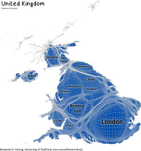
Population cartogram of the United Kingdom
490 notes
·
View notes
Text
Exploring the Techniques of Data Visualization

Large data sets need in-depth analytics and processing power to manage. This is where data visualization is helpful. Data visualization services have advanced rapidly in recent years, anticipated to alter the business environment shortly.
Data visualization utilizes visual elements such as charts, graphs, and maps to facilitate the observation and comprehension of trends, outliers, and patterns in data. It helps determine which variables to include or discard in the analysis.
This blog on data visualization techniques will provide detailed insights into the techniques and benefits.
What is Data Visualization?
Data visualization is a captivating form of visual art that captures our attention and effectively conveys a message. When we look at a chart, we can easily identify trends and outliers. Visualizing data allows us to quickly internalize information. It's essentially storytelling with a purpose. If you've ever struggled to identify a trend in a large spreadsheet of data, you understand the power of visualization.
Data visualization is a powerful method to explore data and present results effectively. Its primary use is in the pre-processing stage of the data mining process. It supports the data-cleaning process by identifying incorrect and missing values.
Techniques of Data Visualization
Representing visual data requires various techniques that must be followed to achieve this process. Let's explore some of these techniques to make this process simpler and easier.
1. Temporal
Temporal data visualization offers the advantage of familiarity, as we are already accustomed to using such visuals, particularly in educational and professional settings where charts are commonly used for explanations. Linear and one-dimensional data visualizations play a crucial role in temporal data visualization. Examples of temporal data visualizations include linear graphs, polar area diagrams, scatter plots, time series sequences, and timelines.
2. Multidimensional
Multidimensional data visualizations, as their name implies, involve multiple dimensions, typically requiring at least two variables for a 3D data visualization. These visualizations often feature vibrant and striking graphics due to the numerous concurrent layers and datasets. They excel at condensing large amounts of information into key points. Examples of multidimensional data visualizations include histograms, scatter plots, pie charts, Venn diagrams, and stacked bar graphs.
3. Geospatial
Geospatial or spatial data visualizations involve overlaying different data points on familiar maps to connect them to specific geographic locations. Examples of geospatial data visualizations include Cartograms, Heat maps, Flow maps, and Density maps.
4. Network
Users of network data visualization can demonstrate connections between different data sets. Within this network, communication takes place via intricate connections linking one data set to another. Visualizations such as alluvial diagram charts, parallel coordinate plots, node-link diagram charts, word cloud plots, network diagram charts, non-ribbon chord diagram plots, and matrix charts are commonly used to illustrate the relationships between data sets.
5. Hierarchical
When information needs to be organized into clusters, hierarchical data visualizations are very helpful. However, creating these graphs is more complex compared to other forms of visualization. Hierarchical data visualizations can show a company's or organization's data and object hierarchy. Examples of hierarchical data visualizations include ring charts, sunburst diagrams, and tree diagrams.
Wrapping Up
Data visualization solutions are an essential step in data processing techniques. In the new era, data visualization is making its debut. With the introduction of next-generation technologies and the development of apparent frameworks, it is moving from art to science, opening up new opportunities.
Using the above guide, you can use data visualizations for processing your business data or use the help of data visualization consulting services. A leading data visualization company excels at this situation and can help you to implement this approach. There is a plethora of legacy modernization services available to modernize your business applications. To make data-driven decisions, choose top-quality data visualization services to create a data visual model.
0 notes
Text
Why Oh Why Does an Alphabetical Cartogram Have to Be a Thing?
https://www.maproomblog.com/2024/05/why-oh-why-does-an-alphabetical-cartogram-have-to-be-a-thing/?utm_source=dlvr.it&utm_medium=tumblr
0 notes
Text
How to Make a Hexagonal Cartogram in #ArcGIS Pro
https://adventuresinmapping.com/2024/03/13/how-to-make-a-hexagonal-cartogram-in-arcgis-pro/
0 notes
Text
-13 latvias

so i took the "idea" that 13 latvias came from and "fixed it" (i assume the op was in on the joke but who knows). the area circled on this map holds approximately half of the world's population (as of 2022). the rest holds the other half! thank u for indulging me
original map source: https://ourworldindata.org/world-population-cartogram
1 note
·
View note
Text
Geospatial Analytics Market to Hit $256 Billion by 2028
It is said that in the early days of Walmart, Sam Walton used to stand in the parking lot to gauge the performance of the store based on the number of cars parked there.
It was only years later when Geospatial Intelligence and Location Data became available at scale that people realized there is a relation between retailer's parking lots and revenues.
Companies often struggle while choosing the physical location for their stores as they have to balance between procurement and customer convenience.
Now, Geo Spatial Intelligence can solve this dilemma with detailed information on traffic patterns, peak hours, parking availability, customer behaviour and even demographic data.
It is said that 70% of all data available with brands have geospatial components that are never utilized.
This is because tools were not available to analyze this data and now with brands like Bayanat, you can take full advantage of data to take your business to new levels of growth.
Geospatial analytics are utilized to add location and timing to conventional sorts of data to create effective data visualization.
It also includes graphs, maps, statistics, and cartograms that show past and present shifts.
Governments and businesses are increasingly relying on geospatial data as a source of information for making choices about risk assessment and mitigation, disaster management, and urban development.
Along with interest in Geo Spatial Intelligence, there is also soaring demand for artificial intelligence across several end-user industries.
For example, Analytics, business solutions, and the medical and healthcare industries are quickly adopting Artificial Intelligence (AI).
The industry demand is also driven by the expanding requirement for cloud computing technology and high-performance computing capabilities.
In addition, the market is expanding profitably due to technological developments in 5G communications technology and 4D GIS software.
For more details, visit Bayanat today.
0 notes
Last Seen Blogs

kookykreationsgb
KookykreationsGB

a-m-automaton
Untitled

aetmaad
Untitled

stxygcld
lilly!

cipselajournal
Verónica Herrera