#change the layout. the colour. the bg. the font even. there's so much to do!!!
Text
wanna make it VERY clear that right now the spam bot blog problem is so severe that I'm currently blocking AND reporting (as spam/bot) all new followers that have: a photo of a person as an icon, less than two lines blog description, and 0 posts.
so for any people who wanna follow me who are a real person, but just so happen to match these three conditions: I'm sorry but you're indistinguishable from this website's current pest at a glance, so if you don't wanna get blocked and reported by accident please consider doing something to your blog to look human.
#text post#tumblr#bot invasion#to my followers#just gonna go ahead and pin this until tumblr deals with this friggin problem#and i no longer have to pick ticks off of my blog every goddamn day lest they lingering long enough to harm it#also new people please don't leave the dorm room that is your blog page bare. decorate it a little i beg of you#your blog is your space to do as you want this is one of the few places on the internet where you can still majorly costumize your own page#take advantage of that!#change the layout. the colour. the bg. the font even. there's so much to do!!!#just go to the costumise blog/html option and explore!#go wild!#have fun!
16 notes
·
View notes
Text
The Final Group Project Journey
For the final group project, we took turns to come up with topics. Healthy eating, child-raising and a backpacking guide were among the ideas raised. I suggested a guide to surviving quarantine which we ultimately decided on due to the appropriate time. Mid-way during our project, the circuit breaker occurred and it was timely for us to edit the content to suit the topic of staying at home during the circuit breaker.
We discussed the content we wanted to put in the journal and came up with 4 main spreads at the initial stage – an information spread on symptoms of COVID and how to keep clean even at home so that millennials could monitor themselves, followed by an exercise spread based on the 7-minute home workout since many were complaining about the closure of gyms and the sudden shift to sedentary lifestyles at home may cause many to reduce physical activity in an unhealthy manner, as well as a recipe page made up of simple yet trendy recipes which made use of few and more common ingredients, since many also complained about their palates being bored while staying at home, and lastly an entertainment spread with Netflix and YouTube recommendations since entertainment was prime to helping people stay in.
Based on this, I came up with a few initial sketches for the team.

(Cover spread)

(Information spread)

(Exercise spread)
(Recipe spread)

(Entertainment spread)
I sketched these on the iPad and after sharing it with the group quickly, our team members suggested we try another layout for the entertainment spread as it was slightly cluttered. They suggested using a flowchart as inspired by Buzzfeed quizzes so that we could include an interactive element. Additionally considering the goal of our spread was to encourage people to stay at home by invoking some sort of excitement and fulfilment in staying at home, an interactive element was essential to helping us entertain the readers in this entertainment spread.
Subsequently, I came up with this spread:

(Second sketch for entertainment spread)
Hay Thi and Pei Xin also came up with moodboards for the art-direction we were aiming for.


The above were the inspirations for the colour palette we intended to use.

(Palette 1)

(Palette 2)
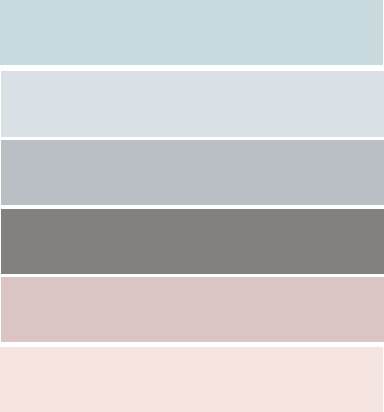
(Palette 3)
We intended to use more neutral tones for a cleaner approach, with accent colours for the illustrations for them to stand out.
We also intended to use lineless vector graphics and chose inspiration graphics to suit these.
We then worked on the slides and after the first critique, we were advised to put extra consideration to using brighter colours since the goal of our spread was to invoke excitement and brighter palettes would better suit this goal. Additionally, we were also advised to pay special attention to typography when presenting larger chunks of text, as well as try to use a more realistic approach for our illustrations.
We thus went with a brighter overall palette:

and a brighter palette for additional colours in some of our illustrations to make them pop:

Considering we had to illustrate exercise moves for readers to follow, and also illustrate food for the recipes to make them look appetising, a realistic approach as well as colours which popped were necessary.
As such, we delegated the work Pei Xin was in charge of illustrating the humans, I was in charge of illustrating everything else including the food, the icons and other non-human illustrations while Hay Thi and Atikah were in charge of the layout and text content.
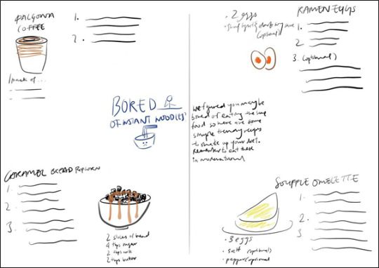
I started off by illustrating the food and initially made use of lighter tones

(Dalgona coffee 1st draft)
(Souffle omelette 2nd draft)
However, after placing it in the document, and also receiving feedback, I realized that due to the size of the illustrations, some lines were unclear and the colours were dull in comparison to the background. Understanding the importance of making the food pop, I adjusted the lines and colours.

(Dalgona coffee final draft: more contrast in colour with thicker lines – black bg as lines were white)
I used more saturated colours for the other art as well.
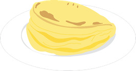
As for the illustration of the popcorn bread, I decided to go for a more 3D look. Since the bread looked like squares on a plate on a 2D level, I found that the regular approach to this bread was too plain and flat and did not do well to make the food look more appetising. As such, I used more shades and colours in the production of this. Using a photograph as the base, I traced the outlines of the cubes, before doing the shading.
After drawing out the shapes, I began to shade each side of each cube with a different shade, to create more depth.

Hence the final product which went for an approach with slightly more depth. This was necessary to make the food appear more appetising.
Moving on, intermediate feedback also prompted me to change some of the colours of some icons to be more saturated to stand out. For instance, below shows some edits I made to the colours of icons.

(Friday night icon 1st draft: too similar to the background)

(Friday night icon final: increased saturation of the colours)

(Various colours attempted for the fashion quiz icon: chose the middle as it was heavily saturated and stood out most)

(Various colours attempted for the shopping quiz icon: chose the middle as it was heavily saturated and stood out most)
While colour was important, we were also reminded that the smaller icons should not be as detailed, considering their size. This was important when it came to illustrating the face mask for the relaxation quiz icon.

From left to right: the design on the far left was my initial design. However, when placed on the spread, I found that it looked emotionless and hence I decided to throw in a splash of joy and use a smile instead (middle). However, considering the advice given in the intermediate review, that details would be hard to see for smaller icons, I widened the smile to make it more obvious (far right) for the final illustration used.
Moving on to layout:
Starting from the first spread, we initially intended the layout to consist of an illustration in the center and surrounding body text.

However, we tweaked the info in this spread to be about why people should stay at home, as our initial feedback expressed the information of COVID-19 to be out of line from our main goal of encouraging people to stay at home. Hence we tweaked the information to be four reasons to stay at home.


This was our new layout and our team member, Pei Xin, decided to illustrate two people wearing masks as the center illustration. (font changes and alignment changes were made which will be discussed later)

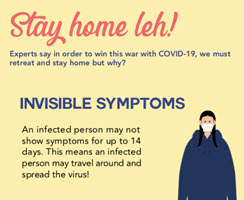
Ultimately, the feedback we received was that there was a missing link between the illustrations and the information, contrary to the rest of the spreads. As such, after this round of feedback, I decided to use a new layout and we agreed to illustrate the two points – invisible symptoms (main reason we should stay at home) and as a form of gratitude for healthcare workers (our second point.
I thus came up with a new layout:

With approval from the rest of the team, I got to work to change all the illustrations. I removed the masks on the humans and changed the illustration of the left girl to be a regular asymptomatic person – illustrated by her smile and regular appearance but with the added illustrations of the virus near her to denote how she is unaware of the virus she is spreading – followed by the man on the right to be a healthcare worker. These two illustrations were used to illustrate the two points on the left.
Hence, after reworking the illustrations and layout, this was the final product.

The layout for the exercise portion was slightly trickier.
My initial sketch involved the illustrations surrounding the borders as shown below:

However, I believe that amidst working on this spread, Hay Thi wanted to place more emphasis on the moves and due to the illustrations being varied in terms of shape and size, she initially tried to place them together as shown below:
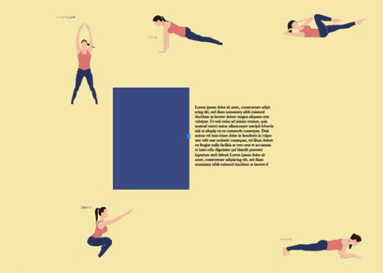

However, while illustrating, Pei Xin mentioned that she wanted to use multiple drawings to show some moves that were hard to convey through a single static illustration. As such, after receiving the final illustrations, we reworked the layout:
Placing the illustrations in were slightly daunting as they were varied in shape. I decided to number the moves to make the order clearer.
While editing, I was actually super mindful of the gap between 7. And 8. In fact, I was really pissed off, trying to shift everything around to cut off that annoying space.
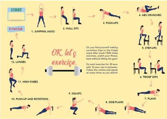
After feedback, Ms Tifffany mentioned how the space between double illustrated moves were too large. And while editing and cutting the space out, I managed to cut down on the space between 7 and 8 slightly! Even though it was not that noticeable (I shared this joyously with my teammates who said they could not tell the difference in gap between 7 and 8 haha!) But this was important because even though it was a small change in the gap, the other moves were pushed nearer to each other and as such, the overall product was more evenly spaced and the turning gap between 7 and 8 did not stand out as much so hurray!
The final product is shown below:
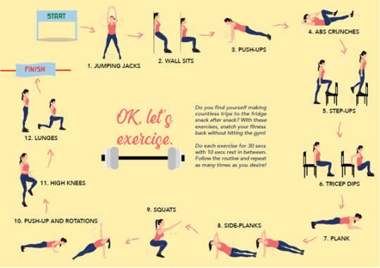
Our team member, Pei Xin, also suggested another layout. However, even though it was neat, we had to scrap it because it did not illustrate the moves in order and it would be confusing for readers on how they should plan their workout as well:

Thus we did not use this.
The next spread’s layout was the most trying time for me to be really honest.
This was our initial layout:


It was beginning to prevail that the omelette and ramen egg recipes were beginning to be unclear. As we changed the fonts and colour schemes, it basically got worse and I tried to reduce the text sizes and shift the recipes further from each other:

Though I tried to clearly separate the recipes, another issue arose and many feedbacked that on first glance, it was difficult to pinpoint which body text belonged to which title or illustration. Additionally, Ms Tiffany also pointed out that there was an awkwardly large gap between the souffle omelette and the recipe below which was imbalanced compared to the left side. As such, I tried various layouts and shared them with the group.
The first suggestion we had from someone on the forum was to use coloured blocks.

However, they were really odd as the style did not really match the rest of the other spreads and the blocks were just kind of strange.
The next approach (suggestion) was to place the illustrations at the corners to clearly mark out 4 different illustrations for 4 different recipes.

This was… just no to be honest. The placement of the recipe titles and its arrangement with the recipes was not intuitive at all and turned out really odd – as if the recipes were missing a title – oh look it’s on the side. So I scrapped it quickly.
I tried just making some minor tweaks:

but my groupmates found the souffle omelette illustration to still be too dangerously close to the ramen egg recipe. (I wanted to go with this personally, but my group mates later settled on another design)

Pei Xin then suggested moving the illustrations to the center as shown above and so I tried a few layouts based on that idea:

There was a gap between the omelette and the ramen egg (AGAIN!!!) which stood out even more now that it was more cramped on the left.
I then tried more variations:


However, all these had awkward spaces and ultimately when I presented the below layout, my groupmates agreed that that was the best approach:

Pei Xin suggested blowing up the illustrations but we agreed that it was too overwhelming and the illustrations behind the text interfered with the readability of the text.

Thus, based on the previous layout, I made some tweaks and adjustments and we decided on the final product:

While I still preferred the earlier layout which I mentioned, the recipes here were much more intuitively placed and easier to follow so I could understand why this choice was agreed on ultimately.
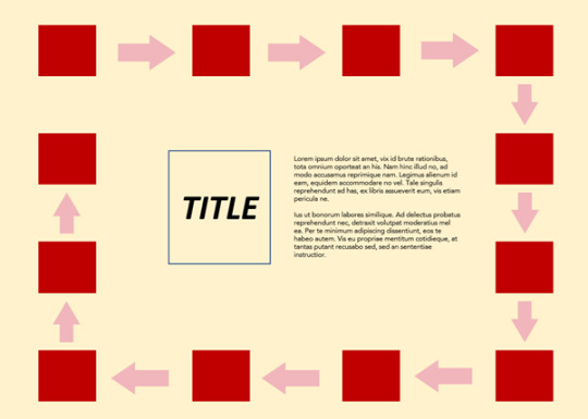
For the final spread, our layout changed many times:
Hay Thi changed the layout from a flowchart (light blue: flowchart, dark blue: central illustration):

to a quiz and answer:
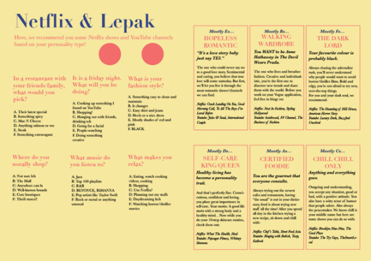
As we were afraid that the right spread would be too wordy, we tried to add an illustration at the back off the spread. I lowered the opacity and used very light shades. Below was our intermediate product and grid structure.


However, after feedback, we learnt that the TV at the back distracted readers from the content and hence, Atikah decided to cut the words (description of the characters) and replaced them with illustrations which she worked on. After I added icons and side illustrations, this was our intermediate product:

The feedback we received (apart from colour which I mentioned in front), was that the icons somehow separated the questions from their answers and so after tweaking the alignment and placement of the icons, this was the final product:

I made sure that the icons did not separate the questions from their answers and also tried to move them closer such that there was no big gap between the questions and options.
The last part of my blog post will be about the font.
We initially used transitional fonts such as Baskerville and Didot as it gave off an elegant vibe and aided a minimalistic approach.

However, we received intermediate feedback that the typeface did not do well for readability of large chunks of text, and that they also did not help with evoking the excitement and joy. As such , we opted to use sans-serif font Avenir for the body text as it was easy to read and rather than exuding elegance, gave off a cleaner vibe.
It also did not give off as much a formal and elegant vibe which was good since we wanted to go in the direction of joy and happiness. This was further aided by our use of Couture Black for the headings which was a pretty font that could give off a vibe of casualness. We explored some pairings for the title and found a pairing of script title and sans-serif body to be interesting:

The contrast added a nice splash of fun and thus we chose Blackbird to be our script title.
This was thus our final product:
Overall, for our delegation of tasks, I worked on the initial sketches, and illustrations before the intermediate check, followed by the layout, text alignment and overall doc before the final presentation. For the presentation, I did the slides while the other members filled up the forum text and edited some information in the slides. After the FP, I did the final edits for the overall design while Atikah worked on Section 1 (research) of the design doc. I worked on Section 2 (design), while Hay Thi worked on Section 3 (specifications). We worked on Section 4 (reflections) together while Pei Xin made the cover page.
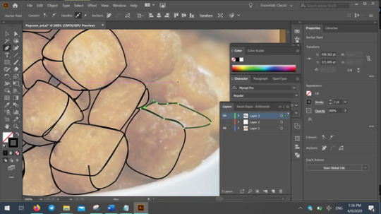
This is a screenshot of the layers we used:

Thus concluded our fun exploration of this journey of working on a spread! <3
0 notes
Last Seen Blogs

littlewitchesconcord
Little Witches in Concord Journal

shishamo-rsd
ArtWorks

linaphilippss-blog
Art Studio

kiseopingu
Pingu's World

lilyelias
Untitled