#charcoal on nepal paper
Text
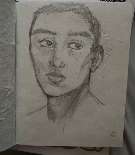
🪻
1 note
·
View note
Text
5 Famous Traditional Indian Art Forms

India is about many things. We are proud to be a country of cultures, festivals, cuisines, and much more. The 35 states and union territories spread across the country have their own distinct cultural and traditional identities and are displayed through various forms of art. Amid all the art that screams of modern and contemporary styles, there comes a beautiful relief in the form of indigenous and classical. They are our living tradition. It takes a lot of practice and dedication to make these paintings and keep the tradition going.
Here are the five famous Traditional Indian Art Forms -
Gond Art - Gond Art is the folk art of painting practiced by the Gond tribe of the state. It has evolved from the dense forests of the Vindhyas, Satpura, and Mandla in the Narmada region of the Amarkantak range; the Gond art mainly represents the ancient art forms of Madhya Pradesh. They are the largest tribal/Adivasi community in India today, and their art is rare and possesses a great heritage value, and the intricacy of this art demands respect. Vibrant palette, double-lined outlines, and signature patterns are some of the distinctive and outstanding features of Gond art. These paintings represent the images of the lifestyle of the tribe and their environment, the wildlife of the place, and their surroundings. The paintings also illustrate the belief and faith of the tribe, various mythological creatures, and characters from the tribal folklore; all the above are an innate part of this artwork. Animals are one of the prominent motifs used in the paintings and the tribe believes that all creatures are inhabited by spirits, and everything is thus holy and sacred. This tribal custom of painting actually evolved from the mud walls but after its improvement by one of the most famous Indian artists, Shyam Gond, it crossed the traditional boundaries and started reaching connoisseurs of art. Traditionally, colors were derived from natural resources like cow dung, plant sap, charcoal, coloured soil, mud, flowers, leaves etc. But now Gond artists use commercial water-based colors to paint on paper and canvas.
Madhubani Painting - The heritage of Madhubani art goes back at least 2,500 years. In Japan, there is a museum called ‘Mithila Museum’. It is also called Mithila Painting and it is one of the most celebrated styles of folk paintings in India which originated in the Mithila region of Bihar as a form of wall art. This ethnic art is one of the most famous art of Bihar and Nepal, mostly practiced in Mithila region. Every Madhubani home flaunts a sun painting. The villagers are dependent on the sun for a good harvest. It is painted in vivid colors. These paintings have been creating a world that resembles mythological, folk themes, tantric symbolism, love, and fertility. It represents the nine planets, the sun, the moon, and other auspicious symbols like the fish, turtle, etc. The sun inhabits a very important place in Madhubani paintings. These paintings are popular because of their tribal patterns and use of bright earthy colors. The work is done on freshly plastered or a mud wall. Madhubani painting is different from the other painting styles because of the balance between the vibrancy of colors and simplicity in its patterns. Bharni, Katchni, Tantrik, Godna, and Kohbar are the five distinct styles of Madhubani painting.
Warli Painting - Maharashtra is known for its Warli folk paintings. Warli is the name of the largest tribe found on the northern outskirts of Mumbai, in Western India. The 2500-year-old tradition of Warli paintings of the Thane and Nasik areas of Maharashtra are closely linked with the nature and social rituals of the tribe. This art form is simple in comparison to the vibrant paintings of Madhubani. This art represents the cycle of birth and death, fertility, and their everyday life. This artwork is very simple but interesting at the same time. Women are mainly engaged in the creation of these paintings. These paintings do not represent mythological characters or images but represent social life - images of human beings and animals, along with scenes from daily life. These paintings are made in the homes of Warlis. Painted white on mud walls, they are pretty close to prehistoric cave paintings in execution and usually depict scenes of human figures engaged in activities like hunting, dancing, sowing, and harvesting.
Kalighat Painting - It is a traditional Indian art form that emerged in the 19th century. This traditional painting style owes its name to the Kalighat Kali Temple, Calcutta. These drawings on paper were done by a group known as patuas hence the name Kalighata Pata. The paintings evolved to the depiction of various other Gods and Goddesses and their tales. And much later the paintings went on to depict the daily life of the people living in the space, but the style of the painting remains the same. Kalighat painters predominantly use earthy Indian colors like indigo, ochre, Indian red, grey, blue and white. The swift, seamless, free-flowing outline is a distinguishing characteristic of the Kalighat style of paintings.
Kalamkari Painting - The name Kalamkari is derived from the Persian word ‘Kalam’, which means pen, and ‘Kari’, which means craftsmanship. It refers to a particular, intricate style of hand and block painting used for making narrative scrolls and panels. Andhra Pradesh is famous all over for this form of art. The major forms are Srikalahasthi in Chittoor district, and Machilipatnam Kalamkari, created in Krishna district. This art involves earthy colors like indigo, green, rust, black, and mustard. Natural dyes are used to color Kalamkari painting and these dyes are extracted from natural resources. The color pattern used for this painting also follows certain special themes and rules. Women figures are always represented using Yellow color, gods are in blue, while demons are projected using green and red. Lotus is the common background figure and red is the most commonly used color for backdrops.
1 note
·
View note
Text
Lost Tomb Lewks, Part 4
(Masterpost) (Other Canary Amusements)
Warning: vague Spoilers for Season 1 of The Lost Tomb Reboot
Look 17 is this gorgeous knife.
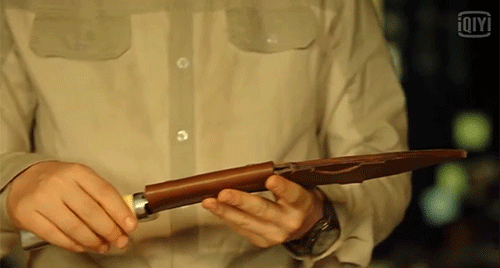
I’m not a “knives are sexy” person, or I should say, I never WAS a “knives are sexy” person before.
I do have a strong affection for my Alaskan ulu kitchen knife, which is a godsend for anyone who is arthritic (me) or who is an upper-limb amputee (my family member) or is hemiplegic (different family member), but that’s as much attention as I’ve ever paid to a knife.
Until now:


(*whisper* lick it)
Ahem.
This is a kukri, a traditional knife of the Gurkha people in Nepal and India. It’s similar to a machete but it has a downward-curving blade, which means you can slash downward forcefully without bending your wrist. It’s excellent for cracking crustacean shells heavy chopping, as well as combat. Wikipedia doesn’t know why there are notches near the base of the blade but sure does have some theories.
The handle looks to be a mix of metal and ivory. Hopefully antique ivory, or ivory from a properly-compensated voluntary donor. [That is a joke, the ivory trade is bad, don’t kill elephants, etc.] The case is topstitched leather with snaps to keep the knife from escaping. Did OP just spend an hour learning too much about knives? She did. Does this mean she’s going to also make an effort to learn something about watches, a critically overlooked area of her menswear commentary? It does not.
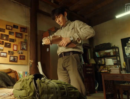
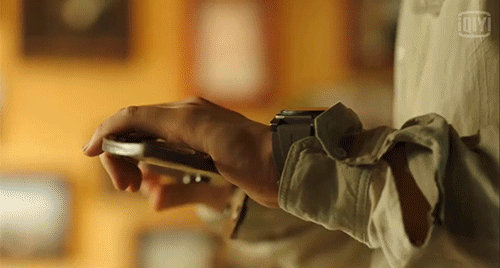
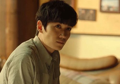
Look 18 is a classic explorer’s rig that looks like it came out of the Banana Republic catalog back in 1987 when the name “Banana Republic” still kind of suited the clothes sold there. (Google it and be startled) This look features dark brown trousers that are comfortably loose but still well-fitted and flattering. The shirt is two warm tans--a dark one for most parts, and a lighter one through the chest and inner arms. This gives it a nice depth and keeps it from looking bland. This outfit also features Wu Xie’s watch, which...is round? and tells time.
(more after the cut!)
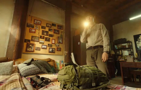
This look features the first of many, many, many times that a character will shine a flashlight directly into the camera. Which makes it painful to watch the show on my tablet in the dark when my bedmate is asleep. Knock it off, characters!
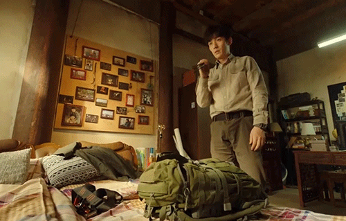
Side Note: Wu Xie’s room has some good features. He’s got a giant bulletin board holding framed photos of all the adventures in which he was played by a different actor. This makes it easy to move his photo collection when his uncle decides to be a dick about the rent.
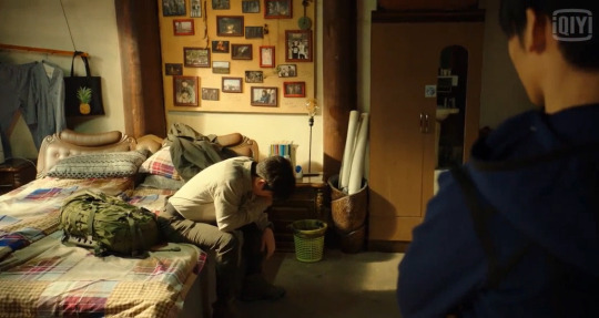
Wu Xie’s bed is big and comfy-looking, with a variety of patterns and textures; appropriate for a person who’s planning on dying, or having an increasingly complicated love life, or both. This bed has room for a 100-year-old boyfriend, a 20-year-old girlfriend, and a thousand-year-old crustacean-brained princess, as long as everyone’s friendly.
It also has a padded headboard, which is so important when you are dating a paper-mache person with a fragile head. This padded headboard also has curved head/neck support things that look just the right size for a person to grab onto with both hands and hold on for dear life. It looks antique, which means Wu Xie bought it for the aesthetic value and definitely not for fucking, right? Definitely not. For fucking.
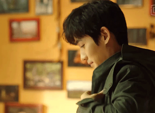
Wu Xie tops off Look 18 with the handsome swamp green coat from their recent tomb adventure, now completely unmuddy thanks to the world’s greatest dry cleaner, and with a strappy, practical backpack.
This warm-toned outfit and the buttery colors of the room are perfect for having an intimate, deeply truthful conversation...
....in which you gently crush your dear one’s heart into powder.

Look 19 is Xiao Ge’s blue hoodie and black pants combo, which we finally get to see in the full light of day.
The hood is good for hiding in when you want to cry.

This hoodie looks black in low light, but is actually navy blue with black piping, placket, and zipper.

The ensemble features black trousers with an eye-catching vertical silver-toned zipper on the front pockets. Black boots and black tactical gloves round out the look.
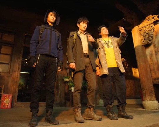
Side note: each of the Iron Triangle guys has his own backpack style. Wu Xie’s is an olive green expedition pack. Pangzi’s is two-tone canvas and leather.

Xiao Ge’s is black tech fabric, and features a chest strap to keep it from shifting around when he is kicking asses. The black straps coordinates well with the black piping on his hoodie.

This outfit is a good one to wear while you exchange tender gazes of pure unconditional love with the guy who is crushing your heart into powder.


I don’t need to look at Pangzi I know what Pangzi looks like and anyway I glanced at him already today.

Did OP slow these gifs way down purely to keep from giving anybody eye strain? She did. OP is considerate of your eyes. Speaking of eyes, awww. Xiao Ge sure is bros with Wu Xie, you guys.
Look 20: Liu Sang! Liu Sang! Liu Sang!

Actor Liu Chang, a man who can wear literally anything and make it look fucking amazing, makes his entry onto the scene in a good, but understated, suit.

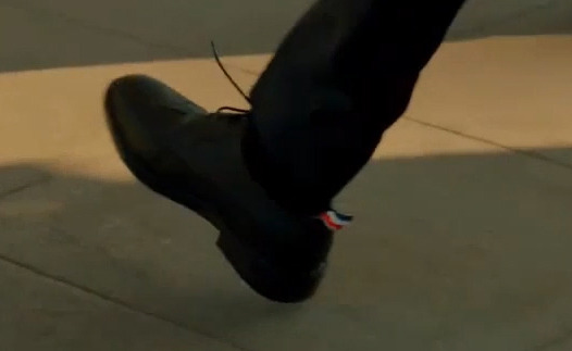
Most of the suit is a charcoal grey, but it has a single light grey lapel and pocket flap, to keep things interesting. He’s wearing it with black Oxford shoes that have a small red, white, & blue tab poking out the back. So he’s dressed conservatively, but with a bit of flair.
He’s accessorized the look with perfectly fine, but not very interesting, black wirefame glasses that he’ll replace with cooler ones after some time underground. He’s got a cartilage piercing in his left ear with a flat black oblong earring. Because of his extreme hearing, he’s wearing noise-cancelling earphones.

This look says, “normalize the use of adaptive tech.” These are probably - in real life - not as effective as the larger over-ear headphones a lot of noise-sensitive people use, but their sleekness and elegance match the rest of Liu Sang’s accessories and clothing.
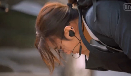
Because of his noise sensitivity, Liu Sang pukes as soon as he gets out into the crowded street. He vomits neatly into a drain, however, in the way of someone who’s used to managing this symptom and isn’t going to let it spoil his outfit. We stan a neuroatypical king.
More Lewks coming soon!
#the lost tomb reboot#reunion: the sound of the providence#liu sang#zhu yilong#liu chang#lost tomb lewks#wu xie#canary3d-original#don't worry I haven't forgotten restless rewatch#I just had to write about the knife first#the kniiiiiffffeeee#spoilers
105 notes
·
View notes
Photo


Fabric of Memory
2018
50 6"x6" Lokta paper squares. Charcoal, graphite, ink, acrylic, glitter, coffee, twine, and human hair
Abigale Collins
Project for an experimental painting + drawing course. We were asked to create multiples using at least one unconventional art material. We were also informed and inspired by 'The Gift' by French sociologist Marcel Mauss.
I have an obsession with romanticizing my life. Not being religious, my general outlook on life can be quite bleak. It’s really up to me to infuse my life with hope and meaning. I turn to the powerful things present in my own life to do this. The things that spark something in my soul, the things that bring me the closest to feeling anything close to transcendental. It’s the strange, magical moments in everyday life. It’s the women who move me to tears. It’s the memories of these moments and relationships.
Further, it’s the juxtaposition of all of these memories. We weave them together and the whole becomes independent of its parts. We can’t save every single memory individually, but we can save the whole. You might not be able to identify every distinct flavor or ingredient in it, but that whole has a unique flavor of its own.
I have a deep fear of losing things like all of the files on my hard drive, everything on my phone, or every thing I’ve ever shared online. Those files are much more tangible than memories. I have had several experiences where technology malfunctioned and I was only left with the memories of what had existed, and I was struck with deep anxiety over the impermanence of it all. We grow old and our memories are fragmented, lost, and replaced with new ones. Sure, we can preserve the memories through keepsakes or other mediums, but it comes full circle: we can lose those physical objects too.
Lately I’ve been asking myself, “how much art about your memories do you need to make before you feel like you have honored and preserved them enough?” I think that I have finally found the answer I was looking for. I must accept that no amount of art, or any effort for that matter, will preserve my memories in the way that I wish I could. Through this project, I hope to take the first steps of accepting impermanence. This concept actually has a name in Buddhism teachings: anicca. It is referred to as one of the three marks of existence. Denying and trying to change impermanence leads to suffering. However, I am far too sentimental of a person to completely give in to impermanence and stop honoring my memories. I simply want to begin to accept the true ephemerality of all things, and celebrate it.
When thinking about the culture I grew up in of rural Appalachia, I know that many people have made efforts to preserve memories by creating commemorative quilts. It’s a deep and rich history and I recall seeing hundreds of quilts at county and state fairs throughout my life.
I have created somewhat of a quilt to honor and represent the ‘whole’ that my fragments of memories create. The ‘quilt’ is made up of individual 6”x6” mixed media explorations on Nepal paper, a type of paper with an interesting material quality. It is strong yet fragile, and reminiscent of human skin. The pieces are woven together with various materials, mainly the hair of the women in my life who I have powerful relationships with. This material choice stems from the Victorian era, where women used one another’s hair as keepsakes and representations of their friendships. They kept their friend’s hair and other mementos in memory books. The explorations on the paper themselves began with me recalling memories I had with those women and proceeding intuitively while working with the memory in tandem.
As I have worked through these paintings, I have had several realizations and changes in direction. I began by using colors. Pastels and vibrant, lively colors. It felt off. I began thinking about the thread that weaves everything in my life together: as an artist, it’s my art style and lens which I view the world through. The work was not made with that thread. In order to portray the idea of impermanence, I needed to work with colors and marks that were much more dry and dark, that were a bit wilted. Delicate, but resilient. Elegant and strong.
This final product is the unique whole that the fragments of my memories create. It’s a physical representation of the space and beauty that my memories and relationships take up in my own mind. And it is fragile and delicate and impermanent. Oh so impermanent.
2 notes
·
View notes
Photo

Andy Mister, Snowing Sun on view through August 13th If it was only the dark voice of the sea That rose, or even colored by many waves; If it was only the outer voice of sky And cloud, of the sunken coral water-walled, However clear, it would have been deep air, The heaving speech of air, a summer sound Repeated in a summer without end - from "The Idea of Order at Key West" by Wallace Stevens Andy Mister Nepal 1 2021 Carbon pencil, charcoal, and acrylic on paper mounted on panel 46h x 68w in (116.84h x 172.72w cm) LOWELL RYAN PROJECTS 4619 W Washington Blvd. Los Angeles, CA 90016 +1 323 413 2584 lowellryanprojects.com @lowellryanprojects (at Lowell Ryan Projects) https://www.instagram.com/p/CgujDTxPfZS/?igshid=NGJjMDIxMWI=
0 notes
Photo

Sale! 50% off ceremonial charcoal base incense. Each comes packaged in sacred lokta paper crafted in Nepal, perfect for spellwork. . These sticks are best used for ritual, shamanic, or ceremonial works. . #witchyvibes #witchythings #spiritualjourney #incense https://www.instagram.com/p/CbDWATMuVEv/?utm_medium=tumblr
1 note
·
View note
Text
Madhubani Art & its Significance
Madhubani paintings are one of India’s oldest and most distinctive traditional art forms. Madhubani paintings are a 2500-year-old folk art that is believed to have originated during the Ramayana, when king Janaka invited the people to photograph his daughter Sita’s wedding to prince Rama. During festivals, ceremonies, or special events, women would hand painted these paintings on the walls and floors of their homes. This kind of painting, also known as Mithila art, started in the Mithila region of Bihar and has since spread throughout Bihar and Nepal. After the earthquake in the Mithila region in 1934 caused severe devastation, a British officer named William G. Archer went to Madhubani district to investigate the damage. He spotted paintings on the interior walls of the residences that were similar to the work of Western artists such as Miro and Picasso while inspecting them. He photographed these paintings and wrote about them in an art magazine, bringing Madhubani painting to the attention of the wider population.
Main Themes in Madhubani Art Religion
Popular Hindu deities such as Radha and Krishna, Shiva, Ganesha, Saraswati, and Laxmi are frequently depicted in mythological figures and scenarios from sacred texts.
Social
Madhubani painting beautifully depicts scenes from regular rural Indian life, from harvests and markets to the royal court and children playing. Wedding ceremonies, with their messages of love and fertility, are particularly popular.
Nature
Madhubani paintings are defined by the beauty and profusion of nature. The sun, the moon, birds and animals, the sacred Tulsi plant, and Banyan trees are among the most popular images.
Preparation of Natural Colours
Madhubani artisans make their own paints and equipment out of locally sourced natural materials. Here are the basic processes in making a Madhubani painting, from extracting juice from flowers to making brushes out of bamboo sticks: To preserve the vibrant colour of the natural pigments, the paper is treated with cow dung before being painted. For the black outline, cow excrement is combined with charcoal and water. The artist then draws the detailed black outline with a bamboo stick, which cannot be erased or changed once it has started. This black outline completely fills the paper, leaving a very little white area. Finally, the artist prepares each colour by hand. The Aparajita flower is used for blue, bougainvillea is used for pink, flat bean leaves are used for green, turmeric is used for yellow, and rice powder is used for white.

1 note
·
View note
Text
From mud huts to paper: The story of Madhubani painting.

Looking at the bright colors and intricate designs of Madhubani paintings, it's hard to believe that they originated from simple mud huts. But that's exactly where this unique form of painting began, and it has since evolved into a popular form of art that is enjoyed by people all over the world.
Ilmi-e-Nagari, or the art of Madhubani painting, has its roots in the Mithila region of India and Nepal. The Madhubani paintings are done with natural dyes and pigments, and depict scenes from Hindu mythology.
The women of the region have been painting these murals for centuries, handed down from generation to generation. In the past, the paintings were done on the walls and floors of mud huts. But nowadays, they are done on paper, cloth and even towels.
The colors and patterns used in Madhubani paintings are very intricate and detailed. It is said that each painting is a representation of the cosmos.
The paintings are done using a variety of techniques, including finger painting, brush painting, and stencilling. The women of the region are very skilled in this art form, and their paintings are highly sought after by collectors.
Madhubani paintings are a unique and beautiful art form, and it is fascinating to see how they have evolved over time.
Madhubani painting is a form of Indian folk art that dates back centuries. Madhubani paintings are characterized by their brightly colored, intricate patterns.
Madhubani paintings are traditionally done on the walls of homes, as they are believed to bring good luck and protect against evil. Today, Madhubani paintings can be found on a variety of surfaces, including cloth, paper, and even wood.
If you're interested in trying your hand at Madhubani painting, there are a few things you'll need to get started. First, you'll need some supplies. Madhubani painting is typically done with natural materials like cow dung, soot, and vegetable dyes. You'll also need a brush, preferably one made from a bamboo reed.
Once you have your supplies, you're ready to start painting! The first step is to draw your design on the surface you're painting. You can use a pencil or charcoal to make your drawing, but be sure to make it as light as possible. Once you're happy with your design, you can start painting.
Madhubani painting is all about color and pattern, so don't be afraid to experiment. Work in small sections and build up the colors slowly. As you paint, you can add more details and patterns.
When you're finished, your Madhubani painting will be a beautiful and unique work of art!
The Madhubani painting tradition is over 3,000 years old, and the paintings are still created using the same techniques today. The paintings are created by women, and depict scenes from Indian mythology.
Penkraft conducts classes, course, online courses, live courses, workshops, teachers' training & online teachers' training in Handwriting Improvement, Calligraphy, Abacus Maths, Vedic Maths, Phonics and various Craft & Artforms - Madhubani, Mandala, Warli, Gond, Lippan Art, Kalighat, Kalamkari, Pichwai, Cheriyal, Kerala Mural, Pattachitra, Tanjore Painting, One Stroke Painting, Decoupage, Image Transfer, Resin Art, Fluid Art, Alcohol Ink Art, Pop Art, Knife Painting, Scandinavian Art, Water Colors, Coffee Painting, Pencil Shading, Resin Art Advanced etc. at pan-India locations. With our mission to inspire, educate, empower & uplift people through our endeavours, we have trained & operationally supported (and continue to support) 1500+ home-makers to become Penkraft Certified Teachers? in various disciplines.
0 notes
Photo

María Berrío “My work isn’t autobiographical but I do paint idealised parts of myself in the women I create. These are women I want to be: in harmony with themselves and nature, strong, vulnerable, compassionate and courageous.” - María Berrío, Artist. María Berrío wants to push collage to its limits. She cuts and tears small scraps of patterned paper to build abundant worlds on canvases bigger than herself, where tribes of women and children live in harmony with nature. Always drawn to pattern, Berrío used to conjure designs with wallpaper and fabric samples before she discovered decorative Japanese craft paper and began to collage with it. The majority of her paper collection comes from Japan while the rest is sourced largely from the global south – Brazil, Thailand, Nepal and Mexico. For some artworks she’ll seek out a certain pattern that fits her vision for a piece, for others she lets the beauty of the paper inform what she creates. The designs which appear on Japanese paper were based on the motifs of kimonos. In Berrío’s works the patterns find their way back into clothing in the technicolor dream dresses that grace her women. Instead of using a pattern as it exists Berrío manipulates its symmetry by cutting it into shards and reassembling it so it’s less neat and more organic. Berrío draws on and around the patterns with charcoal, colour pencils and inks to make them even more intricate, dense and detailed. Her ink-stained skies are created in a wash of watercolour. Berrío’s artworks (which she refers to as paintings) are set in lands of blue-marbled mountains or forests of mottled bark where folk tales play out and reality is smudged. You can see Berrío’s work for yourself in her first UK exhibition at ‘Victoria Miro’ in London or via the App Store on ‘Vortic Collect’. ‘María Berrío, A Day’s Cadence’ July 7 - August 8, 2020. #neonurchin #neonurchinblog #dedicatedtothethingswelove #suzyurchin #ollyurchin #art #music #photography #fashion #film #words #pictures #neon #urchin #multimediacollages #paintings #artist #personal #political #folklore #columbia #latinamerica #utopia #victoriamiro #exhibition #maríaberrío (at Victoria Miro) https://www.instagram.com/p/CC228pXl9cd/?igshid=k9yluxh6k2e8
#neonurchin#neonurchinblog#dedicatedtothethingswelove#suzyurchin#ollyurchin#art#music#photography#fashion#film#words#pictures#neon#urchin#multimediacollages#paintings#artist#personal#political#folklore#columbia#latinamerica#utopia#victoriamiro#exhibition#maríaberrío
0 notes
Text
BOUNDLESS - Gallery LOCALEDUE, Bologna IT, January 11, 2018
The two artists on show, Barbara Jane Matera, Italian-American and Gedske Ramløv, of danish origins, started from a reflection in common, that sees the concept of border as a construct of man and a convention of society.
Playing on the ambiguity of the use of the term, they have focused with irony on the positivity that the word carries in itself. Their reflection has expanded and through different researches, that refer to philosophical and sociological approaches, the two artists exhibit drawings, videos and an installation, works that have internet resources as traits d'union.
Gedske Ramløv presents a series of twelve drawings, composing one single work entitled Terminator - studies for a topography of twilight zones (painful crossings).
The title Terminator derives from the astronomical term for the crepuscular line that marks the transit from day to night, an undefined line in which the elements of light and dark coexist. The passage between these two opposites is just a shadow line, and it can be seen as an element of contiguity or separation, never fixed, but always in progress. The inspiration for this reflection comes from the Greek philosopher Heraclitus, who claimed that the dynamism of reality is based on the conflict of the opposites, in which one cannot exist without the other.
In this artwork the artist decided to work on the crossings that human beings have perpetually made in the course of history of man, as migrants or refugees. Being aware not only of the condition of the invisibility of these people, but also of the territories they pass through – shadow areas in all respects, unknown to those not directly involved – she made a work of identification of these territories, selecting, among many, only the ones that could be precisely found on Google Earth, a privileged tool for the geographical location.
Some of these crossings areas report to the past: the famous Ellis Island, which was bearer of hope and change of identity for those who were lucky enough to be permitted to go on, or of disillusionment and tragedy, for those who did not exceed the health criteria or were unwanted; the Berlin Wall; the Øresund, where Danish Jews were ferried to Sweden during the Second World War; the Grand Trunk Road, that became the pathway of the Great Exodus between India and Pakistan accomplished by thousands of Hindus and Muslims in 1947.
Others areas refer to present facts: the Rohingya drama in Myanmar, and the crossing of the border between Mexico and the United States. Other places refer to forgotten facts: the forced transfer of the entire population of the ancient Thule settlement in Greenland, to make space for an American military base; the attack suffered by a group of Tibetan monks, with the killing of a woman and the wounding of many others by Chinese soldiers at the Nangpa La Pass, on the border between Tibet (China) and Nepal, on September 30, 2006; the wait of hundreds of Burundian refugees gathered on the shores of Tanganyika Lake in the village of Kagunga in western Tanzania, on May 18, 2015. And others refer to crossings areas close to us, as the route of those facing the Libyan desert to reach Europe and, later, the Eurotunnel under the English Channel; or the river Suva Reka between Greece and Macedonia.
In drawing the sites, Ramløv maintained the flattening effect and the distortion of the satellite images determined by the algorithms of the digital program, that causes a sense of estrangement in observing the photos. She has taken into account the light/dark opposites, and has highlighted the shadows in the images, transmitting a sense of suspension, even psychological, that these spaces carry within themselves. The series of drawings, created with charcoal pencils on paper, consists in one long endless vanishing line, that can never be interrupted. Moreover, the artist decided to expose, isolated from the others, a smaller drawing representing The Expulsion from the Garden of Eden by Masaccio, deliberately ‘distorted’ as well as the rest of the drawings, the only one in which the human figure is present, constituting a real key to understanding the work.
Katia Baraldi, the curator
3 notes
·
View notes
Photo

~Traveler Bag of Medicine~
Hand stitched travelers bag, for carrying your essentials on the everyday or for the travelling nomad~
Made with Hmong batik Fabric~Added details, such as, a brass bell from Nepal, multi-colored fabric balls along the sides. Ethical leather fringe sewn on the front flap, and a single coconut button for closure.
Inside contents that come with this bag are:
A handmade ethical leather bound journal, with blank sheets of parchment paper for the traveling poet, writer, artist, musician, anyone who wishes to capture their sacred moments in life~
An ethical leather holder for sage, burners, candles, oils, etc.
You ALSO get a choice of 2 items to fill the bag as well (If you desire more contents, please message me, to adjust the listing to your needs.:
- 1 - 5ml bottle of oil blend that I make-with a handmade pouch made of recycled materials.
- 2 sticks of palo santo
- 2 charcoals, with a teaspoon of resin-either Copal or Pinon, with a small clay diya dish.
- 1 slice of stone/or polished stones that I have currently available.
- 1 bell
- 1 small sage bundle
- 1 candle
- 1 feather
Hangs about 31" long from top of strap to bottom of the purse.
Hand sewn Rattlesnake skin on the front flap, with added raw turquoise beads, and a single coconut shell button for closure.
Little details along the piece as well~
This bag comes with a choice of one (1) of the following:
- 1 - 5ml bottle of oil blend that I specially blend myself. (If you desire a certain oil, please message me.)
- 2 small sticks of palo santo
- 1 slice of raw cut stone/or polished stones that I have currently available.
We are here leaving footprints, as our ancestors did, and keeping old traditions alive through our hands to your hearts.
Aho~
Namaste~
Ashe~
Amen~
Rebeca and Brian of The Gypsies Caravan
0 notes
Text
I was recently lucky enough to dine at Gaggan again, this time in the newly opened “Lab”. Chef Gaggan added to the existing plantation house restaurant a 2 level atrium, the top level of which is “The Lab”.
I like the new addition, it enhances the existing structure with minimal impact. What do you think?
The idea behind the “Lab” is to provide diners with the opportunity to immerse themselves further into the wonderful culinary world that Gaggan has created.
One additional difference to this meal is that the wines were chosen by Vladimir the Head Sommelier, who as usual, did a great job pairing wines with the different dishes.
The Menu
To keep you guessing the menu provided at the start of the meal is a list of emoticons.
Bite Sized Starters
As always Gaggan likes to give you something “different” to start with in this case a pair of lips made from lychee, rose and yuzu. I liked them, similar to a Sorbet, cleansed the palate getting it ready for the gastronomic adventure we were embarking on.
The next starters were the Plastic Nuts and Yoghurt Explosion, enjoyable as always.
Idly Sambhar was next up, slightly different from the last time I visited Gaggan, really enjoyed, nice and light, very tasty.
Next up was the Chocolate Chili Bomb – AWESOME. The right balance of Chocolate and Chili (well maybe a bit more spice would have been good for me, but probably not for the rest).
Next up was the curry cookie, this is uncooked, and extremely tasty. REALLY LIKED IT. So simple yet so good! The cookie is made from eggplant.
Ok so what do you think this is? On the menu it looked like a mushroom with a red top, it was a Ghewar Truffle. Ghewar, Gaggan’s interpretation of a traditional Rajasthani sweet, was the base with a curry topping.
Up until this point the Veg and Non-Veg menus were the same.
The Sundae
The Non-Veg Sundae was a Mango Wasabi Uni Sundae and the Veg version was a Mango Wasabi Sweet Potato Sundae. Both were interesting, but I preferred the Sweet Potato, the textures and the flavour combinations were more to my liking.
Vindaloo
The two vindaloo options were Pork and Banana. The Pork was the one for me. I have never had a Pork Vindaloo before and I liked the flavour combinations, something to try cooking at home. Surprisingly the Banana Vindaloo was, IMHO, the better dish, but not by much.
Gol Gappa
These were interesting, Gaggan’s interpretation of a North Indian Street Snack combined with his interest in Golf. This dish was the same for both Veg and Non-Veg menus. Great combo of coco butter, green chili, mint and something else I couldn’t pick, the “golf ball” shell was a nice touch.
Sushi
Was not expecting to eat Sushi in an Indian Restaurant let alone one in Bangkok, but would never say no, purely in the interest of learning of course.
The non-veg dish was Chūtoro Sushi, which is medium fatty tuna sushi. I liked it, nicely prepared, better than a lot of the sushi I have had from some sushi and Japanese restaurants.
The veg version was Vegetable Sushi, also well prepared, but I do like tuna!
Wrap
To me this was a Taco and thankfully, more Tuna. The non-veg dish was an Akami Taco and the veg dish was pickled vegetables. The metal gauze presentation “plates” are great.
Made it to half way and so much more yum to come!
Kebab
The next dish was the Shami Kebab, a meat-less chicken drumstick. Something different, enjoyable combination of spice and I believe chickpeas molded into a chicken drumstick.
Corn
Next up was the corn course, something new for me. The veg version was corn and the non-veg was Goat Brain. Both had an interesting combination of spice and texture and were flavourful. The use of the wheat to present the food is a nice touch.
Foie Gras Passion-fruit
An interesting substitute for a sorbet, Foie Gras Passion-fruit with Yuzu Jelly. A very refreshing palate cleanser.
Charcoal
I always enjoyed the Charcoal course. The non-veg dish was Seabass and the veg dish was sweet potato both encrusted in edible bamboo ash, both were very tasty
Matcha
Another of Gaggan’s standard menu items is the Tomato Matcha, always a great dish and prepared at the table.
Rangoli
Another of the courses that I look forward to is this course. Rangoli is an art form from Nepal, India and Bangladesh and is used to decorate floors within houses and courtyards or in this case our plates. As usual the lamb chop was very tender and tasty so was the Morels Mushroom, hard to choose which I preferred, but probably the lamb.
Curry
My favourite course, always one of the highlights of a meal at Gaggan. Both the non-veg, Crab, and the veg, Palak Paneer, were excellent. I am not usually a fan of Paneer, but really enjoyed this. As usual the flavours of the Crab / Paneer were balanced with the curry and spices. Always like the how the Curry is “delivered” in tiffin tins.
Dessert
Cronut
The first of the dessert courses was a Cronut, Gaggan’s version of a doughnut. Not what I was expecting for dessert, it was enjoyable
Apple Snow
The second dessert was Apple Snow, great dish. Chilled apple “snow” sprinkled generously over chilled fruit.
Indian National Drink
The final “dish” of the night was an Indian National Drink, I have no idea what was in this, but the rocks on top of the rice paper were like pop rocks, they kept popping for minutes, great stuff.
The Menu – COMPLETE
Non-Vegetarian
Vegetarian
The Food
[soliloquy id=”11662″]
The Lab Team
Throughout the dinner the Chefs in the Lab were always around, including Gaggan himself, continually chatting with all of the diners and responding to questions, providing us details on each dish. Very interactive and fun.
[soliloquy id=”11664″]
The Wine
Vladimir’s wine matches were great. Really added to the experience.
[wpdatatable id=54 table_view=regular]
[soliloquy id=”11663″]
Conclusion
Another great night at Gaggan, IMHO the best of my three visits so far. Great food, awesome wine pairing, excellent service and fantastic company, not sure how it could have been improved. Can’t wait to head back.
If you are planning on visiting Gaggan I recommend the lab and the late sitting so that you can really enjoy the experience and not rush.
Cheers!
Gaggan Nov 2016 I was recently lucky enough to dine at Gaggan again, this time in the newly opened "Lab".
#2011 Chateau Larrivet-Haut-Brion Blanc Sauvignon Blanc Semillon#2011 El Enemigo Cabernet Franc#2014 Foradori Fontanasanta Nosiola#2014 Weingut Dr Fischer Ockfen Riesling#2015 Jamesheed Harem Pepé Le Pinot Noir#Gaggan#NV Lustau Manzanilla Papirusa Palomino
0 notes
Photo

Andy Mister’s interest lies not in the specific origin of an image, but the process of its refraction through replication. Color schemes are reminiscent of the tones of paper one would find at a Xerox shop in the pre-internet area, but while Mister’s process of reproduction is laborious in nature, his skill is evident in the illusion of effortlessness and the surrealist quality of the final works. Mister, who holds degrees in English Literature, Philosophy and Creative Writing, approaches his work through the mind of a linguist. Mister’s exhibition runs through August 13th. Pictured: Andy Mister Nepal 2 2022 Carbon pencil, charcoal, and acrylic on paper mounted on panel 46h x 69 1/2w in (116.84h x 176.53w cm) #andymister #lowellryanprojects (at Lowell Ryan Projects) https://www.instagram.com/p/CgkDyDHLRyU/?igshid=NGJjMDIxMWI=
0 notes
Photo

Andy Mister, Nepal 3, 2022 Carbon pencil, charcoal, and acrylic on paper mounted on panel 56h x 42w in (142.24h x 106.68w cm) LOWELL RYAN PROJECTS 4619 W Washington Blvd. Los Angeles, CA 90016 +1 323 413 2584 lowellryanprojects.com @lowellryanprojects (at Lowell Ryan Projects) https://www.instagram.com/p/CgUgLYiLfc3/?igshid=NGJjMDIxMWI=
0 notes
Photo

Andy Mister’s works investigate the boundary between mechanical and manual reproduction. Working with images appropriated from contemporary and vintage photographs, he questions how meaning is created or lost through the act of ‘copying.’ Pictured: Andy Mister Nepal 2 2022 Carbon pencil, charcoal, and acrylic on paper mounted on panel 46h x 69 1/2w in (116.84h x 176.53w cm) #andymister #nepal #drawing (at Lowell Ryan Projects) https://www.instagram.com/p/CgFHXGirjWi/?igshid=NGJjMDIxMWI=
0 notes
Photo

Andy Mister Nepal 1 2021 Carbon pencil, charcoal, and acrylic on paper mounted on panel 46h x 68w in 116.84h x (172.72w cm) LOWELL RYAN PROJECTS 4619 W Washington Blvd. Los Angeles, CA 90016 +1 323 413 2584 lowellryanprojects.com @lowellryanprojects (at Lowell Ryan Projects) https://www.instagram.com/p/Cf72GucL6p7/?igshid=NGJjMDIxMWI=
0 notes
Last Seen Blogs