#complimentary contrast
Text


it's 5am and there's no way to put into words how deeply the new bad durge ending fucked me up im so . unwell
#bg3 spoilers#im going to throw up!#(complimentary)(?)#in contrast to taking over the brain where he was having. a great fucking time. daddy's boy!#worth going through those miserable miserably slog of final battles for#every day larian finds a way to drag me deeper into the durge pit#im having a great time. im suffering. im having a great time. im suffering.#oc: riele
57 notes
·
View notes
Text

WIP (i have so many of those you've no idea)
also can't choose a color scheme for my little shit lord >:3
#she's rangana's younger sister btw#pureblood sith#swtor#star wars the old republic#sith pureblood#yeah i know it's more common for sith to wear reds and golds and blacks#i also like that headcanon where white (in sith cuture) is a color of death#sorry don't know who posted it BUT I LOVE THE IDEA#but on the other hand.... split complimentary palette??? Values contrast?? look at her!😭#mb i'll change it again idk
62 notes
·
View notes
Text

Maxy 🥰 acrylics on paper
This is part of a complimentary contrast painting series
Part 2
#finally finished it#i started this after Monaco but couldn’t work on it because exams#orange and blue is my fav complimentary contrast#thinking about doing red green with Charles and purple yellow with Lewis#anyways look at the eye cronkle!!! he’s so endearing I just had to paint this#it looks more vibrant irl but that’s the pain with traditional art getting good pics of it is hard#max verstappen#f1#formula 1#art#fanart#painting
82 notes
·
View notes
Text
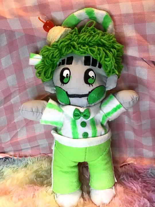
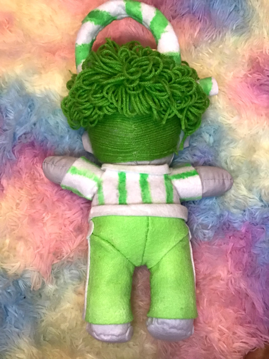
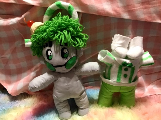
1010 Malt Shop - Green Plushie
It's done. It's finally done. 1 week of blood, sweat, and tears (mostly blood), and he's done.
But I don't have a good enough camera nor photography skills to really capture his true charm ;w;
(Boring self reflection + more pics under the cut)
Anyway, this is the project I've been working on lately. No particular thing really prompted this. Like most things I do, it was started on a whim and finished with will power. I don't really have much experience with plush making or sewing, so despite his obvious faults, I still think he turned out pretty nicely for an amateur.
As per usual, I didn't have enough foresight to document the process, but I can nonetheless talk about the experience and point out some details of it.
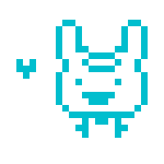
Firstly, he's a pretty large lad. Here he is compared to the official DJSS plush and one of the test prints I did of "Melon Float."
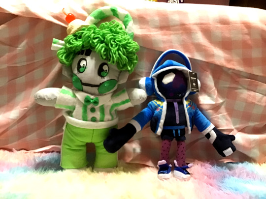
Counting his straw, he's about 16 inches tall. I wasn't counting on him being so big, so I don't really know what I'm gonna do with him now...
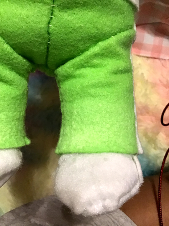
I say this took a week, but I probably could have quartered that time if I had a working sewing machine, but since I didn't, the majority of the time was spent just sewing the thing together. (Btw, pattern over here.) The only fabric details that weren't hand-sewn are the circle/stripe details on his pants and shoes, and the bow/buttons on his shirt, which were all glued on.
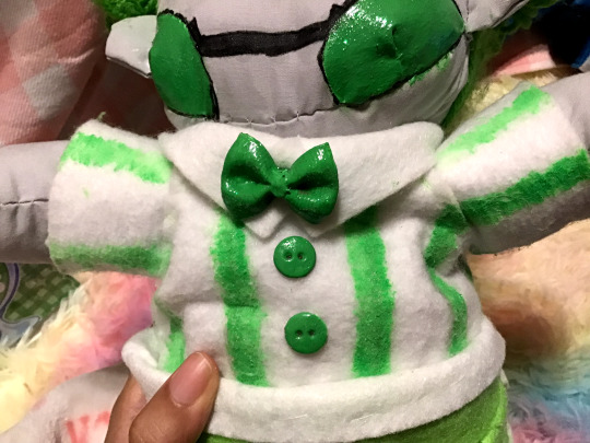
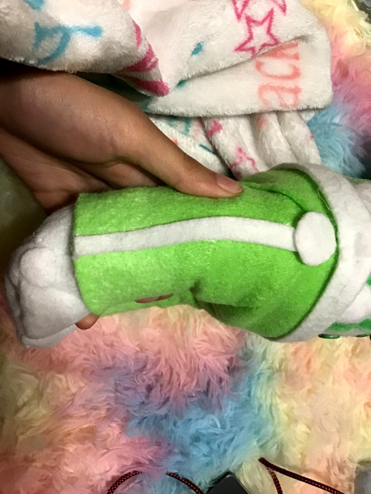
The base pattern didn't come with any clothes, so I just adapted the body patterns into clothes. Structurally, he's basically wearing a second skin~ I did think about making the gloves for the sake of accuracy, but at that point, the only skin he'd be showing is his face, and I wanted to keep some soft parts out since his clothes are so stiff. They're so stiff, they can stand on their own and be stacked on top of each other without falling over.
(The plush has a harder time standing than his clothes do...)
Speaking of the clothes, let me say right now that it bothers me more than anyone else that the paint details don't color-match his pants. I was so high on the euphoria of starting this project that when I was out getting supplies, I saw some glow-in-the-dark paint and thought it'd be a great idea since he's a robot and all. The color on the bottle looked close enough at the time, and the original plan was that only the face would be painted with the other details being felt, but on top of me forgetting that effects paint takes a long time to build up layers, the green also dried differently than I thought it would, so it threw everything off, but I didn't have the patience to suck it up and repaint everything with a better color match. I did try to add a light gradient with my pastels like in the original art work, but it turned out so light that it's barely perceivable and totally not worth the clamminess I get when I touch chalk.
I think the most time-consuming part was his hair. While sewing the body together took 2 days, the clothes 2 days, and painting 1 day, the hair took about 3 as I had to figure out essentially how to do it myself on the fly. The first day was mostly trial and error. I did find a couple of online tutorials about how to get this loopy yarn hair, but the ones that I found both required tools that I didn't have. Eventually, I figured out a way to make it work, but I feel like it was less than efficient:
Basically, his hair is made with chunks of yarn that are tied together, and each chunk is individually sewn into place. I didn't count, but I think there are 13-14 hair chunks total to give him a full head. I do like how I made his bangs uneven to mimick how I draw his hair, but I couldn't quite pull off having his distinct hair-part and I couldn't figure out how to give the illusion of half his hair being straight without it looking weird. (I did try cutting the loops to let the strands be straight, but I didn't like the look of it, so I kept them all loopy).
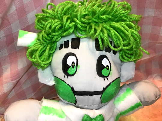

This is a weird thing to say out of context, but I'm especially proud of the back of his head. Originally I was just going to paint on his undercut (which I'm glad I didn't because this paint REALLY hardens the cotton), so I got the bright idea to sew on individual strands of yarn for it. I think the effect is great, but I would not wish it upon my worst enemy, because to get the effect, I had to sew on each. strand. individually. The day I made the face poll, and said that was going to be a break day? I wound up doing this instead, and it took just as long to sew in those 20+ strands of yarn as it did the rest of his hair.
To segway into that poll, as you can see, I went with option 2 with some slight edits. Just the white/green eyes looked a little plain to me, so I added my usual dark pupil and added a green-star glitter to the center. I'm the one that has to live with this thing for the foreseeable future, so I made some executive decisions. Unfortunately, there were a few errors while painting, which you can clearly see in the above pictures OTL. I did try to seal off my painting areas with tape, but it still bled and stained in a few places. I don't really know if it's possible to clean the stains without ruing the rest of the face, but if you have any ideas, I'd love to hear them.
There are a few extra details that I guess are worth pointing out: he's actually wired. I put in some armature wire so he'd be able to move his limbs despite the stiff felt but... I didn't secure them that well, and the wire for his arms got displaced, so I currently can't bend them ;3;. I'd have to open him up again to replace it, and I REALLY don't want to undress him again to get to his back. The worst thing about this plush is that his clothes are so stiff that he's actually very hard to dress.
The wire in his legs is mostly still in place, so he can at least (kinda) sit.
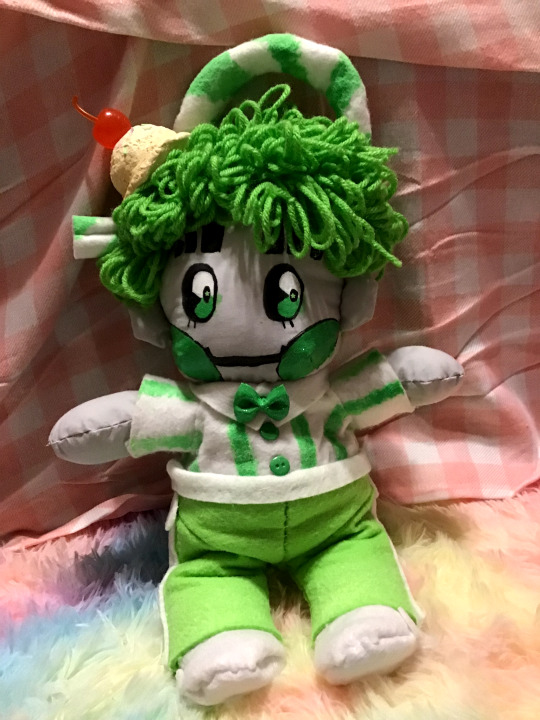
I think the last thing worth talking about is the ice cream accessory. It was really simple to make (it's just air dry clay over foil + extra pieces), but it's cute, so I wanted to point it out~

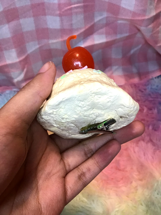
It's a hair clip, so it can be taken on and off. Theoretically, it could be worn by a person, but it's a little heavy to be wearing it all day~ The camera/lighting really blew out the colors, but I think it turned out to be a nice creamy french vanilla color like I really wanted~
Other details like the glitter on his eyes/cheeks can't really be captured on my shitty ipod camera, but rest assured that he is pleasantly sparkling~
I think my biggest takeaway from this project has been materials: I thought that using felt would be a great alternative to having to buy an entire yard of fabric for a one time project, but besides the paint, it was the hardest material to work with. If I have to pick and choose, next time I think the body will be felt, and the clothes will be cotton, or maybe I'll actually invest in some fleece, so it can be soft all the way~ Since the clothes are removable, I could theoretically make him his default sailor suit and just replace the straw with his proper hair loop to convert this into a "canon" design plush, but we'll see what the future holds. I did get the felt colors to make my *other* babygirl, but given this experience, I may hold off on making him until a much later date.
#gbunny makes#plush#nsr#no straight roads#green 1010#1010#1010 malt shop#short story time: so I think i've said this before#but i originally started the malt shop series because i just wanted to make a pink white!1010 and it just evolved from there#and i wanted a pink version of him because in the off chance that i ever decided to 'make' something of him#i wanted it to fit in with the rest of my things#which are mostly pink#well the day finally came when i wanted to make something#that said#i made green because 1: i thought the contrast would actually work better for my pink things#since green and pink a complimentary colors#and 2: all of green's hair accessories would give me more things to make#and thus more skills to use/improve on#since it's my first 'original' plush i wanted to practice as many techniques as possible so the next one can be even better!#this experience has taught me that i DEF need to sew in his head accessories BEFORE the hair#and if i'm going to add an undercut using this method#I also need to do that before the hair#i'm telling you. sewing the base was the easiest part#it's all the hair that was the biggest hurdle for me
45 notes
·
View notes
Text

And a second oc to go w the other guy
#lemon time#my art#art#digital art#in case you were wondering YES i almost started crying. ive created a sweetheart.#also. contrasting colour schemes. i love them. having one character being made up of cooler tones and then another one warm tones? great.#originally iwas going to go w green eyes. then while i was trying to sleep i realised that on the standard ryb colour wheel.#purple and yellow are complimentary. so yes i did change the eye colour. and then almost finished the sketch.
5 notes
·
View notes
Text
love the episode. love the vibes. love these characters. love this setting.
why does brennan look green screened into like two thirds the shots he’s in though
#i think it’s the contrasting colors bc most of the time the bg is pink and his shirt is like. full complimentary green#sorry resident d20 theatre tech can’t figure this one out folks </3#dimension 20#d20#dungeons and drag queens#dndrag#reese watches dungeons and drag queens
15 notes
·
View notes
Text

Still on break (scheduling this for the morning), but since I've been playing Engage (on ch 13 iirc), I got some ideas for an insert/OC for it!
This is Iolite (goes by the nickname Io)! Brodian nobility and one of Citrinne's siblings, this axe fighter always carries herself with confidence and takes crap from no one. Very loud and brash and definitely never afraid of a fight. It's usually up to Citrinne to reign her rowdy sibling in. Despite their outward demeanor, Iolite enjoys reading novels and taking hikes to quietly enjoy nature, often doing a combination of both whenever he has the free time. Her decision to take up the battle axe was inspired by her uncle, King Morion, and he even took the time to train her whenever he could.
#insert/oc uses they/she/he!#I purposely chose a purple gemstone to base them around to be a direct contrast to citrinne (since the gem itself is yellow)#they're complimentary color siblings :>#messing around with the idea that they're twins too! and the stereotypical “omg we're twins but suuuuch opposites”#to clarify for the twins thing: I'm in the camp that the datamined ages aren't canon and are just used as data for event flags in the code#so my hc is the citrinne is close to age with diamant with dia being older so citri being early mid 20s and dia late mid 20s#data log: manda's doodles#iolite (fe engage)
10 notes
·
View notes
Text
i dont think much ab art comes very naturally to me in the way it seems it does to other people but there’s one exception to that rule and it’s colour theory. this is something ive fully understood since i was about 8 years old and im never letting go of that
#like posing composition etc etc is all very difficult for me but colour theory is smth i dont even have to think about#ofc i had a whole learning curve on how to utilise it but the basics like values complimentary colours contrasts etc are so easy to me#and thats the ONLY thing the rest is hard work and some luck dkfhldkjd#personal
14 notes
·
View notes
Text
I FORGOT YOU CANT EDIT POLLS AFTER YOU POST EM
#ougnm#i was gonna say#all of them need 2 be more balaced as far as values go#bc i turned everything b&w and they all had some issues#like 4 instance A is very light and looks overexposed/washed out bc there's not enough shades 2 differentiate shapes#& B turns out very dark & top heavy with a lot of the darker values clumped together#C is the most balanced but the value of the tail doesn't appear anywhere else on the design so it looks disjointed#the pastel ver is the most magical girl / green & purple 1 has the most complimentary color contrast#which helps lead the eye 2 important parts#C is remincent of miku which i think is on point for their alphys like personality#but the greens all being a similar shade/value struggle with color contrast and don't commuicate fluorite very well#hrmmm#this is why i made the poll✨️bc im indecisive✨️🎶#elliot rambles
2 notes
·
View notes
Note
What's Kea's morality like
At heart, Kea believes in protecting the weak, aiding those in need, and that everyone should have the right to be themselves. Primarily concerned with people, she cares little for concepts like nations or authority - to her, "Eorzea" is the people who live there, not whatever flags or banners or ideals they might claim. Something of a naive idealist, she tries to see the best in others, despite how it sometimes leads to people taking advantage of her trusting nature and earnest desire to help.
Though she has few qualms about using violence as necessary - you can't really be an adventurer without breaking a lot of eggs - she's far more of an adrenaline junkie than inherently violent, and in a world where fighting wasn't necessary, she'd be perfectly happy doing just exploring or mountain climbing or the like. While typically not the kind to hold grudges, there are a handful who she'll never forgive.
This all said, her approach to morality is also somewhat simplistic - she recognises the injustice inherent in the widespread poverty of Ul'dah compared to the massive wealth of a limited few, for example, but lacks the vocabulary or or theory necessary to pinpoint the systemic reasons behind it. She innately dislikes and distrusts people like Lord Lollorito, but would struggle to express why that is beyond finding him callous and greedy. For better or worse, she trusts her friends to point the way in matters too complex for her heart to understand.
#kea lurvis#her naive idealism is in stark contrast to Y'shtola#who is much more of a pragmatist#it makes them complimentary however
4 notes
·
View notes
Text


Striking eyes, obsessed with orange and blue combinations at the moment
0 notes
Photo

On Point #pointillism #point #dots #polkadots #seurat #signac #art #arthistory #color #contrast #complimentary #complimentarycolors #woman #redhair #redhead #gingerhair #fauvism #ntx575 #thor #thorium #artwork #point #pinpoint #cultureclubfans #cultureclub #boygeorge #karma #chameleon (at Auburn, Maine) https://www.instagram.com/p/CnHYV09LSQE/?igshid=NGJjMDIxMWI=
#pointillism#point#dots#polkadots#seurat#signac#art#arthistory#color#contrast#complimentary#complimentarycolors#woman#redhair#redhead#gingerhair#fauvism#ntx575#thor#thorium#artwork#pinpoint#cultureclubfans#cultureclub#boygeorge#karma#chameleon
0 notes
Text

Perhaps a somewhat unusual colour scheme, but I for one think it captures the horror of driving for Ferrari really well 😉
This is part 2 of a complimentary contrast painting series
Part 1
#i swear that shadow is red and not black but my magenta is semi transparent#and because there’s green underneath it looks black on camera because complimentary colours and stuff#anyways I was going for a more sickly undead kinda vibe here#and I also think it contrasts Max from part 1 really well#sorry for the glare but it’s still really hard to take good pics of traditional art#charles leclerc#f1#formula 1#art#fanart#f1 fanart#painting#acrylic
66 notes
·
View notes
Text
Designing a form from the Time Stones with good alliteration and a second color palette for Thistle in that context is pain.
#pili rambles#Super Sonic is really good because well blue is complementary to yellow and there isa strong enough contrast plus the adding the red makes#it a triad#Super shadow is a less saturated yellow but Silver’s super form doesn’t have great contrast#Super Scourge gets cool points on account of keeping the Complimentary color swap#beyond the yellow super form as a dragon ball reference it doesn’t always look great next to the characters’ og palette
1 note
·
View note
Note
how do you choose colors?? i love your color choices and wanna know how you do it
oookay, i don't actually know what i am doing with colors 90% of the time, but there are some guidelines that i follow, so, i hope this will be useful ":3
so. one of the main things that i use almost all the time is complimentary colors! a very cool very useful thing, good for everything. complimentary colors are the ones that are opposite each other on a color wheel. a proper color wheel, not the one that drawing apps use, because that one most of the time has the colors distributed wrong 😔
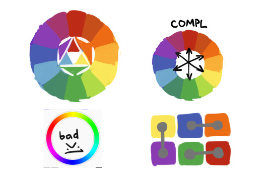
the thing about complimentary colors is that they make each other stand out more. so if you use them in equal amount and saturation they will fight for attention and don't look as good. another thing is that if you put gray on one complimentary color it will appear to have changed the hue to its pair. uhhh its hard to describe with words, but just try to fill a canvas with one saturated color and draw something gray on it, its an optical illusion of sorts.
so uhhhhhh, what im trying to say is, complimentary colors compliment each other (wow), so using them for accents and shadows and backgrounds will generally make both stand out and look better? idk, here are some examples so it hopefully makes more sense

and so you change the amount of color, it's saturation, hue, warmth, tone, other smart words, and it changes the feeling of the picture! as you can see i really like my greens and reds, they're almost in every picture, but it still looks different (hopefully). if you can't full on change the color of something, if you have a set design for example, bringing the complimentary color in shadows and highlights or background works too! try different things see what's for you!
and, of course, using complimentary colors doesn't mean you can't use any other color! its more like, complimentary colors establish this connection that's pleasing to the eye and everything else is whatever you want it to be! i also have no idea about using more than one pair, generally one is enough but technically it works?
i also try not to use more than 3 main colors for a piece, like, blue-red-yellow but no green, or green-blue-yellow and no red, and stuff. (key word is "try" of course lol) this has nothing to do with the color wheel, just uhh general color balance? but this is about um, "clean" colors. you can absolutely use all 4, if one of them appears different because of the lighting and stuff? again, its hard to explain color with words. plus it all depends on a style, its not a rule, that's just how i do it

and then all the things outside of theory, like, don't use black and gray for shadows, it looks dirty. a lot of artists don't use pure black at all, but i just can't help it i like it too much. i try not to use pure white for things like clothes and eyes and other things that are in-universe colored white. its fine for highlights but for everything else i usually use grayish yellowish color, it looks much more pleasing. things that are closer are more saturated and have more contrast, things that are far have less saturation and less contrast. things that you want to attract attention should have more contrast, and the other way around
aaand i think that's it? all that i can remember at least
1K notes
·
View notes
Last Seen Blogs

d3marine
D3MARINE

exactlyhappyphilosopher
Maria35

dreiddesigns
D- Reid Designs

jstew1000
Gay Sex Lover

tornjunk
Does anyone like this?