#copy-webpack-plugin
Explore tagged Tumblr posts
Visit Tumblr Blog
Explore Tumblr blogs with no restrictions, modern design and the best experience.
Last Seen Tumblr Blogs


Fun Fact
130K people were victims of a chain letter scam that affected Tumblr in May 2011.
Text
Webpackで階層を維持してファイルをコピーするプラグイン。 なかなか見つからなかった… こちらも参考に…
0 notes
Text
Website Loading Woes: Speed Optimization for Musicians
In today’s fast-paced digital world, your website is often the first impression you make on potential fans, collaborators, and industry professionals. A slow-loading site can turn visitors away before they even get a chance to hear your music or learn about your upcoming shows. Speed optimization for musicians isn’t just a technical concern; it’s a crucial part of building and maintaining an effective online presence. In this post, we’ll explore practical tips to optimize your website’s loading times and ensure a smooth, fast experience for your visitors.
1. **Choose the Right Hosting Provider**
Your website’s performance starts with your hosting provider. A reliable and fast web host is essential for quick loading times.
- **Shared vs. Dedicated Hosting:** While shared hosting is cheaper, it often results in slower load times due to the number of sites sharing the same server. If you can afford it, consider upgrading to a dedicated hosting plan or a Virtual Private Server (VPS) for better performance.
- **Content Delivery Network (CDN):** A CDN stores copies of your site’s content on servers around the world, delivering it to users from the nearest server. This reduces the distance data has to travel and speeds up loading times for your global audience.
2. **Optimize Your Images**
Images are often the largest files on a website, and unoptimized images can significantly slow down your site.
- **Use the Right File Format:** JPEGs are great for photographs, while PNGs are better for images that require transparency. Avoid using BMPs or TIFFs, as they are not web-friendly.
- **Compress Images:** Use image compression tools like TinyPNG, JPEGmini, or Photoshop’s “Save for Web” option to reduce file sizes without sacrificing quality. This can drastically reduce load times.
- **Lazy Loading:** Implement lazy loading, a technique where images load only when they’re about to enter the user’s view. This reduces the initial load time and improves the user experience.
3. **Minimize HTTP Requests**
Every element on your web page—images, scripts, stylesheets—requires an HTTP request. The more requests, the slower your site.
- **Combine Files:** Combine multiple CSS files into one and do the same for JavaScript files. This reduces the number of requests and speeds up load times.
- **Use CSS Sprites:** CSS sprites allow you to combine multiple images into a single file. The browser then loads the single file and displays the correct image portion. This is especially useful for icons and buttons.
- **Reduce Plugins:** If you’re using a platform like WordPress, minimize the number of plugins. Each plugin adds to the number of HTTP requests, so only use the ones that are essential.
4. **Enable Browser Caching**
Browser caching allows your site to store files on a visitor’s device, so they don’t have to be downloaded every time the user visits your site.
- **Set Expiry Dates:** By setting expiry dates on cached content, you can control how long files are stored on the user’s device. Use tools like YSlow or Google PageSpeed Insights to identify which files should be cached.
- **Leverage .htaccess:** If you have access to your site’s .htaccess file, you can manually enable caching and set expiry dates for different types of content.
5. **Minify CSS, JavaScript, and HTML**
Minification is the process of removing unnecessary characters (like spaces and line breaks) from your code, making it smaller and faster to load.
- **Use Online Tools:** Tools like UglifyJS for JavaScript, CSSNano for CSS, and HTMLMinifier for HTML can help you minify your files.
- **Automate the Process:** If you’re using a build tool like Gulp or Webpack, you can automate minification during your site’s build process, ensuring your files are always optimized.
6. **Optimize Your Music Player**
If your site features a music player, it’s important to ensure it doesn’t slow down your site.
- **Use Streaming Services:** Instead of hosting large audio files on your server, embed music from streaming platforms like SoundCloud, Spotify, or Bandcamp. These platforms are optimized for fast loading and offer high-quality streaming.
- **Optimize Embedded Players:** If you’re embedding a music player, make sure it loads asynchronously, meaning it won’t hold up the rest of your site’s content from loading.
7. **Enable Gzip Compression**
Gzip compression reduces the size of your files before they are sent to the browser, which can significantly decrease loading times.
- **Activate Gzip:** Most web servers, including Apache and Nginx, support Gzip compression. You can enable it through your site’s .htaccess file or via your server’s configuration settings.
- **Check Compression:** Use online tools like Gtmetrix or Google PageSpeed Insights to check if Gzip compression is enabled on your site and see the difference in file sizes.
8. **Use a Lightweight Theme**
If you’re using a content management system (CMS) like WordPress, the theme you choose can greatly impact your site’s speed.
- **Choose a Fast Theme:** Opt for themes that are built with performance in mind. Avoid overly complex themes with excessive animations, sliders, and widgets that can slow down your site.
- **Custom vs. Premade Themes:** If you have the budget, consider a custom-built theme that’s optimized for your specific needs. Otherwise, choose a well-coded, lightweight premade theme and customize it to suit your style.
9. **Monitor Your Website’s Performance**
Regularly monitoring your website’s performance helps you identify issues and make necessary adjustments.
- **Use Speed Testing Tools:** Tools like Google PageSpeed Insights, Pingdom, and Gtmetrix provide detailed reports on your site’s speed and offer suggestions for improvement.
- **Analyze Traffic Spikes:** If you experience slowdowns during traffic spikes, consider using a service like Cloudflare to manage the increased load or upgrading your hosting plan to handle more visitors.
10. **Keep Your Site Updated**
Keeping your site’s software up-to-date is crucial for both security and performance.
- **Update CMS and Plugins:** Regularly update your CMS, plugins, and themes to ensure they’re optimized and free from vulnerabilities that could slow down your site.
- **Remove Unused Plugins and Themes:** Deactivate and delete any plugins or themes you’re not using. Even inactive plugins can slow down your site, so keep your installation clean.
Conclusion
Optimizing your website’s loading times is essential for keeping your audience engaged and improving your overall online presence. With the right strategies, you can ensure that your site is fast, efficient, and provides a great user experience, even if you’re working with limited resources. By choosing the right hosting, optimizing your images, minimizing HTTP requests, and staying on top of updates, you can create a site that not only looks great but also performs at its best. Remember, in the digital age, speed is not just a luxury—it’s a necessity.
#MusicianTips#MusicMarketing#FastLoading#FanEngagement#WebsiteOptimization#SpeedMatters#DigitalPresence#WebPerformance#OnlineMusic#TechForMusicians
0 notes
Text
JavaScript yang ringan dan efisien sangat penting untuk meningkatkan kinerja situs web. Dengan mengurangi ukuran dan kompleksitas kode JavaScript, Anda dapat mempercepat waktu muat halaman dan meningkatkan pengalaman pengguna. Berikut adalah langkah-langkah untuk membuat JavaScript yang lebih ringan: 1. Minifikasi Kode Minifikasi adalah proses menghapus semua karakter yang tidak perlu dari kode sumber tanpa mengubah fungsionalitasnya. Ini termasuk menghapus spasi, komentar, dan karakter baru. Anda dapat menggunakan alat seperti UglifyJS, Terser, atau terser-webpack-plugin untuk melakukan minifikasi secara otomatis. Contoh: javascript Copy code // Sebelum Minifikasi function add(a, b) { return a + b; } // Setelah Minifikasi function add(a,b){return a+b;} 2. Hapus Kode yang Tidak Digunakan Saring kode Anda untuk menemukan dan menghapus fungsi, variabel, atau bagian lain yang tidak terpakai. Anda juga bisa menggunakan alat seperti PurifyCSS atau PurgeCSS untuk membersihkan kode JavaScript yang tidak diperlukan. Contoh: javascript Copy code // Kode Tidak Digunakan function unusedFunction() { console.log(“Ini tidak digunakan”); } // Hapus fungsi yang tidak terpakai 3. Gunakan Modul dan Pembagian Kode Pecah kode JavaScript Anda menjadi modul-modul kecil yang dapat dimuat secara terpisah. Ini akan mengurangi beban awal dan hanya memuat kode yang diperlukan saat itu juga. Anda bisa menggunakan teknik code splitting dengan alat seperti Webpack. Contoh: javascript Copy code // Menggunakan dynamic import import(/* webpackChunkName: “moduleName” */ ‘./moduleName’).then(module => { // Gunakan module }); 4. Optimalkan Penggunaan Library dan Framework Jika Anda menggunakan library atau framework, pastikan untuk hanya memuat bagian yang diperlukan. Misalnya, saat menggunakan lodash, Anda bisa mengimpor hanya fungsi yang diperlukan daripada seluruh library. Contoh: javascript Copy code // Mengimpor seluruh lodash import _ from ‘lodash’; // Mengimpor hanya fungsi yang diperlukan import { debounce } from ‘lodash’; 5. Gunakan Event Delegation Alih-alih menambahkan event listener ke banyak elemen, gunakan event delegation untuk menambahkan listener pada elemen induk. Ini mengurangi jumlah event listener yang aktif di DOM. Contoh: javascript Copy code // Tanpa Delegation document.querySelectorAll(‘.item’).forEach(item => { item.addEventListener(‘click’, function() { console.log(‘Item clicked’); }); }); // Dengan Delegation document.querySelector(‘.parent’).addEventListener(‘click’, function(e) { if (e.target.classList.contains(‘item’)) { console.log(‘Item clicked’); } }); 6. Optimalkan Algoritma dan Logika Tinjau algoritma dan logika dalam kode Anda. Pastikan untuk menggunakan algoritma yang efisien dan menghindari pengulangan yang tidak perlu. Contoh: javascript Copy code // Pengulangan tidak efisien for (let i = 0; i < array.length; i++) { // Proses } // Gunakan metode yang lebih efisien array.forEach(item => { // Proses }); 7. Caché Data dan Hasil Jika Anda melakukan perhitungan yang berat atau memanggil API berulang kali, pertimbangkan untuk menyimpan hasilnya dalam variabel atau menggunakan teknik caching untuk menghindari perhitungan berulang. Contoh: javascript Copy code let cachedData = {}; function fetchData(id) { if (cachedData[id]) { return cachedData[id]; } // Lakukan fetch dan simpan hasilnya cachedData[id] = fetch(`api/data/${id}`); return cachedData[id]; } 8. Gunakan Asynchronous Loading Gunakan async atau defer pada tag Dengan mengikuti langkah-langkah di atas, Anda dapat membuat JavaScript yang lebih ringan dan efisien. Hal ini tidak hanya meningkatkan ki...
0 notes
Text
Understanding and Resolving the TypeError [ERR_UNKNOWN_FILE_EXTENSION]: Unknown File Extension “.javascript” Error
JavaScript, being one of the core technologies of the web, is widely used for creating interactive web pages and dynamic user interfaces. Node.js, a popular runtime for executing JavaScript outside the browser, has streamlined server-side scripting and brought JavaScript into the backend development sphere. However, developers occasionally encounter errors that can be perplexing, especially those related to file extensions. One such error is TypeError [ERR_UNKNOWN_FILE_EXTENSION]: Unknown file extension “.javascript” for c:\xxxx\xxxxx\xxxxx-xxxx\xxxxxxxxx.javascript. This article delves into the causes, implications, and resolutions for this specific error.

Understanding the Error
The TypeError [ERR_UNKNOWN_FILE_EXTENSION]: Unknown file extension “.javascript” error indicates that Node.js does not recognize the .javascript file extension. Node.js expects JavaScript files to have the .js extension. When it encounters a file with the .javascript extension, it throws this error, signaling that it does not know how to handle the file.
Causes of the Error
Incorrect File Extension: The most direct cause is the use of the .javascript extension instead of the standard .js extension.
Configuration Issues: Sometimes, custom configurations or build tools might mistakenly generate or refer to files with the .javascript extension.
Typographical Errors: Developers may accidentally type .javascript instead of .js when saving or referencing files.
Implications of the Error
This error prevents Node.js from executing the JavaScript file. As a result, the intended functionality will not be performed, potentially causing the entire application to malfunction or crash.
Steps to Resolve the Error
1. Renaming the File Extension
The simplest solution is to rename the file extension from .javascript to .js. Here���s how you can do it:
Locate the file on your filesystem.
Right-click the file and select “Rename.”
Change the extension from .javascript to .js.
Alternatively, you can use the command line:
bash
Copy code
mv c:\xxxx\xxxxx\xxxxx-xxxx\xxxxxxxxx.javascript c:\xxxx\xxxxx\xxxxx-xxxx\xxxxxxxxx.js
2. Updating File References
If your code references the file with the incorrect extension, update these references to use the .js extension. For example:
javascript
Copy code
// Before const script = require('./path/to/xxxxxxxxx.javascript'); // After const script = require('./path/to/xxxxxxxxx.js');
3. Configuring Build Tools
If you are using a build tool like Webpack, Gulp, or Grunt, ensure that the configuration does not inadvertently generate files with the .javascript extension. Check the tool's configuration files (e.g., webpack.config.js) for any rules or plugins that might be causing this issue.
Example Scenario
Consider a Node.js project with the following structure:
css
Copy code
project-root/ ├── src/ │ ├── index.js │ └── app.javascript └── package.json
Attempting to require the app.javascript file in index.js would result in the error:
javascript
Copy code
const app = require('./app.javascript'); // This line throws the error
To resolve this, you should:
Rename app.javascript to app.js.
Update the reference in index.js:
javascript
Copy code
const app = require('./app.js'); // Corrected line
Prevention Strategies
Consistent Naming Conventions: Establish and adhere to a consistent naming convention for file extensions within your team or project.
Code Reviews: Regular code reviews can help catch such issues before they become problematic.
Linting Tools: Use linting tools like ESLint to enforce file naming conventions. For example, you can create a custom rule to flag non-standard file extensions.
Automated Testing: Implement automated tests that include file loading and execution as part of your CI/CD pipeline. This ensures that any issues with file extensions are caught early in the development process.
Conclusion
The TypeError [ERR_UNKNOWN_FILE_EXTENSION]: Unknown file extension “.javascript” error in Node.js is a common yet easily resolvable issue. By understanding its causes and following best practices for file naming and configuration, developers can prevent this error and ensure smooth execution of their JavaScript applications. Consistent conventions, diligent reviews, and the use of automated tools are key strategies in maintaining a robust and error-free codebase.
0 notes
Text
Create a custom work item control with Azure DevOps extension SDK
The Azure DevOps Web Extension SD or Azure DevOps Extension SDK is a client SDK for developing extensions for Azure DevOps. In this example I will show you how to make a custom work item control using this SDK.
Here is an example of a small project with a custom work item.
Prerequisites
We will need the following before we get started with building our extension:
NodeJS
Setting up the project
We start setting up the project by running the following NPM command in your project directory:
npm init
You can configure these settings as you wish. These can be found in package.json.
we need to install the following packages a dependencies:
npm i azure-devops-extension-api azure-devops-extension-sdk azure-devops-ui react react-dom
as well as the following dev dependencies:
npm i @types/react @types/react-dom copy-webpack-plugin cross-env css-loader loader-utils node-sass rimraf sass sass-loader style-loader tfx-cli ts-loader typescript webpack webpack-cli --save-dev
Now your package.json should look something like, the packager versions might be different:
{ "name": "testextension", "version": "1.0.0", "description": "", "main": "index.js", "scripts": { "test": "echo \"Error: no test specified\" && exit 1" }, "author": "", "license": "ISC", "dependencies": { "azure-devops-extension-api": "^1.158.0", "azure-devops-extension-sdk": "^2.0.11", "azure-devops-ui": "^2.167.49", "react": "^16.14.0", "react-dom": "^16.14.0" }, "devDependencies": { "@types/react": "^18.0.25", "@types/react-dom": "^18.0.8", "copy-webpack-plugin": "^11.0.0", "cross-env": "^7.0.3", "css-loader": "^6.7.1", "loader-utils": "^3.2.0", "node-sass": "^7.0.3", "rimraf": "^3.0.2", "sass": "^1.56.0", "sass-loader": "^13.1.0", "style-loader": "^3.3.1", "tfx-cli": "^0.12.0", "ts-loader": "^9.4.1", "typescript": "^4.8.4", "webpack": "^5.74.0", "webpack-cli": "^4.10.0" } }
Create two directories inside your root directory: src and static. in this example we won’t be adding anything to the static folder, but it is meant for, for example image files that your project uses. For now, you can add a file named .gitkeep instead.
Next up is configuring TypeScript. Create tsconfig.json in your root folder and put the following inside it:
{ "compilerOptions": { "charset": "utf8", "experimentalDecorators": true, "module": "amd", "moduleResolution": "node", "noImplicitAny": true, "noImplicitThis": true, "strict": true, "target": "es5", "rootDir": "src/", "outDir": "dist/", "jsx": "react", "lib": [ "es5", "es6", "dom", "es2015.promise", "es2019" ], "types": [ "react", "node" ], "esModuleInterop": true } }
Now we configure Webpack. Create webpack.config.js in your root folder and put the following inside it:
const path = require("path"); const fs = require("fs"); const CopyWebpackPlugin = require("copy-webpack-plugin");
const entries = {};
const ComponentsDir = path.join(__dirname, "src/Components"); fs.readdirSync(ComponentsDir).filter(dir => { if (fs.statSync(path.join(ComponentsDir, dir)).isDirectory()) { entries[dir] = "./" + path.relative(process.cwd(), path.join(ComponentsDir, dir, dir)); } });
module.exports = { entry: entries, output: { filename: "[name]/[name].js" }, resolve: { extensions: [".ts", ".tsx", ".js"], alias: { "azure-devops-extension-sdk": path.resolve("node_modules/azure-devops-extension-sdk") }, }, stats: { warnings: false }, module: { rules: [ { test: /\.tsx?$/, loader: "ts-loader" }, { test: /\.s[ac]ss?$/, use: ["style-loader", "css-loader", "azure-devops-ui/buildScripts/css-variables-loader", "sass-loader"] }, { test: /\.css?$/, use: ["style-loader", "css-loader"], }, { test: /\.woff?$/, type: 'asset/inline' }, { test: /\.html?$/, loader: "file-loader" } ] }, plugins: [ new CopyWebpackPlugin({ patterns: [ { from: "**/*.html", context: "src/Components" } ] }) ] };
The last configuration we need to make is specifically for Azure DevOps extensions. Again, in the root directory, create a new file, this time it’s called azure-devops-extension.json:
{ "manifestVersion": 1.0, "id": "textextension", "publisher": "your Visual Studio Marketplace publisher here", "version": "0.0.1", "public": false, "name": "testextension", "description": "custom control", "categories": [ "Azure Boards" ], "targets": [ { "id": "Microsoft.VisualStudio.Services" } ], "icons": { "default": "logo.png" }, "content": { "details": { "path": "README.md" } }, "scopes": [ "vso.work" ], "files": [ { "path": "static", "addressable": true }, { "path": "dist", "addressable": true } ] }
Now, you might notice how this configuration file needs two files: README.md and logo.png. You can add these files in your root folder.
Making the custom control
inside the src directory, create a new React component, let’s name the file Common.tsx.
import "azure-devops-ui/Core/override.css" import "es6-promise/auto" import * as React from "react" import * as ReactDOM from "react-dom" import "./Common.scss"
export function showRootComponent(component: React.ReactElement<any>) { ReactDOM.render(component, document.getElementById("root")) }
It is important we import "azure-devops-ui/Core/override.css", so that we can use standardized UI styling.
This component is more or less our root component, which renders our other components inside a HTML element with id “root”.
Also create a Common.scss file. All we’re going to add to this is:
body { margin: 0; padding: 0; }
Inside the src folder, let’s make another directory named Components and inside that folder create another one named TestExtensionComponent.
src │ Common.scss │ Common.tsx │ └───Components └───TestExtensionComponent
Inside the TestExtensionComponent folder, we’re going to add a few files. First off is TestExtensionComponent.html, this will be our html that will contain the component(s) of your custom control.
<!DOCTYPE html> <html xmlns="http://www.w3.org/1999/xhtml"> <body> <div id="root"></div> <script type="text/javascript" src="TestExtensionComponent.js" charset="utf-8"></script> </body> </html>
Next is TestExtensionComponent.scss.
@import "node_modules/azure-devops-ui/Core/_platformCommon.scss";
This will import the Azure DevOps styling.
Now add TestExtensionComponent.json, this is our component configuration file. Let’s add an input to the configuration, let’s call it SampleInput
{ "contributions": [ { "id": "TestExtensonComponent", "type": "ms.vss-work-web.work-item-form-control", "targets": [ "ms.vss-work-web.work-item-form" ], "properties": { "name": "cusom control", "uri": "dist/TestExtensonComponent/TestExtensonComponent.html", "inputs": [ { "id": "SampleInput", "name": "sample input", "description": "sample input", "validation": { "dataType": "String", "isRequired": true } } ] } } ], "scopes": [ "vso.work" ] }
Next is TestExtensionComponent.tsx
import React, { Component } from 'react' import * as SDK from "azure-devops-extension-sdk" import { IWorkItemFormService, WorkItemTrackingServiceIds, WorkItemOptions } from "azure-devops-extension-api/WorkItemTracking"
import "./TestExtensionComponent.scss"
import { showRootComponent } from "../../Common"
class TestExtensionComponent extends Component<{}, {}> {
constructor(props: {}) { super(props) }
public componentDidMount() { SDK.init({}) }
public render(): JSX.Element { return ( <></> ) } }
export default RESTRequestButton showRootComponent(<RESTRequestButton />)
The component doesn’t do much for now. What is important is the SDK.Init() inside the ComponentDidMount(). This makes sure we can use the Azure DevOps Extension SDK in our component.
So, what if we want to get input data? For example, our SampleInput we configured in the json. We can use the Azure DevOps Extension SDK for that.
To the constructor add:
this.state = { displayText: "default text", }
and to the Component after the extends keyword:
class TestExtensionComponent extends Component<{}, { displayText : string }>
SDK.Init() inside ComponentDidMount() is a Promise so, we can use then-chaining to set our state values there.
public componentDidMount() { SDK.init({}) .then( () => { this.setState({ displayText: SDK.getConfiguration().witInputs["SampleInput"] }) }) }
Now in our render() we can display the input data
public render(): JSX.Element { return ( <>{this.state.displayText}</> ) }
You might also want the data of the current Work Item, we can do this with the IWorkItemFormService interface.
const workItemFormService = await SDK.getService<IWorkItemFormService>( WorkItemTrackingServiceIds.WorkItemFormService )
Then we can use this to get specific fields
const fieldValues : Promise<{[fieldName: string]: Object}> = workItemFormService.getFieldValues(fields, options)
fields here is an array of strings containing key names of the work item, for example: System.Title, System.AssignedTo or Custom.HasPineapple
options is a class that implements WorkItemOptions, which can be done quite easily like
class Options implements WorkItemOptions { returnOriginalValue: boolean = true }
Now, the variablefieldValues is a Promise, so you can use then-chaining to get the data.
Say, we want to display the title of the work item instead on the SampleInput, we could modify our code to look like this:
public componentDidMount() { SDK.init({}) .then( () => { const workItemFormService = await SDK.getService<IWorkItemFormService>( WorkItemTrackingServiceIds.WorkItemFormService ) const fieldValues : Promise<{[fieldName: string]: Object}> = workItemFormService.getFieldValues(fields, options)
fieldValues.then( data =>
this.setState({ displayText: data["System.Title"] }) ) }) }
0 notes
Text
Npm minify

NPM MINIFY HOW TO
NPM MINIFY INSTALL
NPM MINIFY CODE
Webpack 5.5.0 compiled successfully in 6388 ms If you build the project now ( npm run build), you should notice that CSS has become smaller as it's missing comments and has been concatenated: ⬡ webpack: Build FinishedĪsset vendor.js 126 KiB (name: vendor ) (id hint: commons ) 2 related assetsĪsset main.js 3.32 KiB (name: main ) 2 related assetsĪsset 34.js 247 bytes 2 related assetsĪsset main.css 730 bytes (name: main ). const TerserPlugin = require ( "terser-webpack-plugin" ) To attach it to the configuration, define a part for it first: To get started, include the plugin to the project: npm add terser-webpack-plugin -develop To tune the defaults, we'll attach terser-webpack-plugin to the project so that it's possible to adjust it. In webpack, minification process is controlled through two configuration fields: optimization.minimize flag to toggle it and optimization.minimizer array to configure the process. Modifying JavaScript minification process #
NPM MINIFY CODE
Rewriting the parameters breaks code unless you take precautions against it in this case. For example, Angular 1 expects specific function parameter naming when using modules. Unsafe transformations can break code as they can lose something implicit the underlying code relies upon. Good examples of this include renaming variables or even removing entire blocks of code based on the fact that they are unreachable ( if (false)). Safe transformations do this without losing any meaning by rewriting code. The point of minification is to convert the code into a smaller form.
NPM MINIFY HOW TO
Compared to UglifyJS, the earlier standard for many projects, it's a future-oriented option.Īlthough webpack minifies the output by default, it's good to understand how to customize the behavior should you want to adjust it further or replace the minifier. Terser is an ES2015+ compatible JavaScript-minifier.
In package.Since webpack 4, the production output gets minified using terser by default.
NPM MINIFY INSTALL
It is possible to install two copies - global and local - like this: npm install uglify-js -global -save-dev The advantage of using -save-dev is that the dependency is listed in package.json so that when your code is placed on a different machine, running npm install installs all dependencies (except global ones). If you install globally with npm install -global uglifyjs, you don’t have to do this. node_modules/.bin/uglifyjs instead of just uglifyjs. node_modules/bin and if you want to run it directly from the command-line you need to write. Note: npm tools installed with -save-dev are located in.
Install in a terminal with npm install -save-dev uglify-js.
Major web browsers will run the minified code but show you the original code when you use their debugger).Ĭonfusingly there are two packages, uglify-js and uglify-es. Uglify can also produce a source map to your original TypeScript or ES6 code (source maps allow you to debug the minified code as if it was the original. Uglify-js is 100 times larger than jsmin ( 1.5MB vs 15KB) but has many more features, is more popular, and is still small compared to WebPack or the TypeScript compiler. "build" : "tsc -declaration & npm run minify" ,
In package.json in the "scripts" section, add a minify script that uses jsmin (replace name with the name of your JavaScript file, not your TypeScript file multiple filenames are allowed):.
Install in a terminal with npm install -save-dev jsmin.
It just removes spaces it does not shorten variable names so it does not provide the smallest possible size. This is a tiny (15KB), simple and old minifier, appropriate for simple programs/modules. Parcel’s production mode, parcel build, also uses a minifier. If you’re using webpack to build your code, webpack -p reportedly minifies the application using “UglifyJSPlugin”. tsc -declaration & tsc -removeComments) 1. As of 2018 there is no compiler option to avoid this (at least you can remove comments with "removeComments":true, but if you are producing a d.ts file this will also remove comments from the d.ts file unless you perform a separate comment-removing build that does not produce a d.ts file, e.g. Even if your TypeScript code uses two spaces for indentation and has compact expressions like x+1, the TypeScript compiler produces output with four spaces and adds spaces between things like x + 1. Unfortunately, the TypeScript compiler not only cannot produce minified output, it proactively wastes space. Obfuscators are closely related - their goal is to make code harder to understand. For this reason, we have minifiers to remove spaces, remove newlines and shorten variable names to a single character. Since web apps are sent over the internet, it’s good to keep them small so that the app loads quickly. Leave a comment Four ways to minify your code
0 notes
Text
Which Are The Best React Templates To Start App Development?

React Native templates are the best choice for you if you are going to develop mobile applications for Android or iOS. Every developer can use the JavaScript framework which is a flexible and powerful choice for them.
It may not feel easy to make a start with it especially if you are a newbie in building apps. Fortunately, users of React Native have a wide community. They put together the useful tools that help them to make a new start.
You will find variety in the names such as starter kits, boilerplates, templates, or blueprints. The goal of every tool and template is the same but the features are a little different.
The templates provide you themes, a set of useful components, and other useful resources that help you to kickstart the app development quickly. We have enlisted the top React templates here that help you to start app development in the best possible way.
Material Kit React Native
It offers you two hundred handcrafted elements and five customized plugins. The template is composed of five example pages. It is inspired by the Material Design of Google.
The app template is completely coded. You will get cards and components for mobile apps in Material Kit React Native. The template is built over Expo, React Native, and Galio.io.
Galio Framework
It provides you sixty above elements with eleven screens. The pre-made templates of Galio Framework offer you UI Kit blocks and base adaptable themes with comprehensive documentation.
The Galio framework has two versions. One is for designers and another version is made for the use of developers.
Ignite CLI
You will find a variety of boilerplates in Ignite CLI. All of these boilerplates are default. The template has an API test screen and a modular plugin system.
Use the component library with examples of usage. The templates support android and iOS. All the app templates that Ignite CLI contains, are default.
Argon React Native
It offers you two hundred handcrafted elements with example screens that are pre-built. There are five customized plugins and two hundred component variations that make the process of app development easy for the users and app developers.
The template is built over React Native, Expo, and Galio.io. It also has cards and components for the mobile applications of e-commerce. Moreover, Argon React Native provides you an immediate switch from the image to the page that is absolutely real.
NativeBase
The component styling of the NativeBase is much easier. It supports android and iOS. There are a variety of component options to use. You can also access and use the third-party libraries of native. It helps you to import the custom components.
The documentation through NativeBase is comprehensive and makes the process of app development quicker and easier for you.
React Native Walkthrough Flow
It has a stunning design with a quick user interface. You will get android and iOS compatibility in this template. Moreover, it offers you modularized strings, images, and colors.
The coding that React Native Walkthrough Flow offers you is extensible. You will find the implementation of React Native Walkthrough here.
SB Admin React
It has a modular structure with a responsive navigation menu. The template has a Webpack automation tool with nested routing and multi-level drop-down sidebars. The loading is lazy. The template has Bootstrap theme SB Admin v2.
React Native Starter
It offers you a mobile starter kit with sixteen pre-built components. Reactive Native Starter supports android and iOS. It has a chat application and a wide range of UI elements.
There are multiple color schemes in the React Native starters and the social media sign-ins.
React Native Seed
It has a starter kit with customized boilerplates and three state management libraries. React Native Seed supports android and iOS. You can easily download the kit.
Copy the code and work with the flow typing tool or TypeScript. React Native Seed has a React Native stack or CRNA tool to make the app development process easier for app developers.
Baker
It has a pre-configured toolset with various component sets and code generators that are multiple. Baker is based on the Parse server. It has completely ‘hackable’ internals.
You will find three server script modes in the Bakers. Moreover, the app deployment with Baker is Fastlane.
0 notes
Text
Architecting a Progressive Web App using React Native: Step by Step Guidance!

A Progressive Web Application (PWA) is a disruptive innovation that integrates the functionality of a native mobile app and the usability of a responsive website. Several business brands have harnessed the goodies of PWAs to reach unprecedented heights of success.
Take a look at the success stories of the following brands on account of PWA adoption, as published by the online research portal “Cloud Four”.
‘Flipkart’ experienced a 40% increase in the re-engagement rate.
‘5miles’ were able to reduce the bounce rate by 50% and boost the conversion rate by 30%.
With their new PWA, ‘Tinder’s’ load times decreased from 11.91 sec to 4.69 sec and also, the engagement rate shot up. Besides, the PWA is 90% smaller as compared to their native Android app.
‘Twitter’ witnessed a 65% spike in the pages per session, a 75% increase in Tweets, and a 20% decrease in the bounce rate.
‘Forbes’ experienced a 43% increase in the sessions per user, a 20% boost in the ad viewability, and a 100% spike in the engagement rate.
Thus, it is evident that progressive web app development is successfully fulfilling the demanding user expectations and challenging business requirements of modern times.
So, if you too are one of those planning to build a PWA, the obvious question that will crop up in your mind is, “Which framework is best suited for PWA development?” Many, businesses and corporates prefer React Native for end-to-end PWA development and hire efficient React Native developers for the same.
This blog guides you through crafting a PWA using the React Native Framework. But before we commence, let me enlighten you on some crucial facts about PWAs and the reasons to choose React Native Development.
Progressive Web App (PWA): Unique Strengths
The usual websites can be conveniently accessed from any device or browser, but they fail to leverage the platform-specific hardware that ensures high-performance. Native apps, on the other hand, can completely utilize the platform-specific hardware and software capacities to optimize performance but are available only for the particular platform for which they are designed. But, progressive web applications combine the best of both worlds and are known for delivering a native app-like experience in the browser. The distinct capabilities of this futuristic software solution are as follows.
Delivers a native-like experience.
Loads instantly and promptly respond to user inputs.
Integrates push notifications for maximizing user engagement.
Offers a highly responsive UI and consistent UX across mobile phones, tablets, and PCs.
Integrates with users’ devices and utilizes the device capabilities to the fullest for delivering improved performance.
Employs cached data from earlier interactions to provide offline access to content and certain features.
Are easily discoverable and can be installed by simply clicking a pop-up without having to visit the app store.
Possesses cross-platform compatibility and involves a cost-efficient developmental cycle.
Is reliable and secure.
Takes up less storage memory.
Why choose React Native Development for PWA Creation?
React Native is considered to be an apt progressive web app framework as it proves immensely advantageous for developers. Let’s peek into the reasons:
It is a JavaScript library containing multiple in-built packages and ready-to-use plugins.
The ‘create-react-app’ package helps in configuring the app with ready-to-use features. This speeds up development and makes it possible to create a PWA in real-time.
The SW-Precache-Webpack-plugin enables the creation of highly functional PWAs decked up with rich features. Besides, the fact that this plugin is integrated with create-react-app, eases out things further.
Thus, if a PWA is built using React Native, the end-product becomes more progressive with lesser efforts.
Key Steps on Creating a PWA with React Native

Check out the key requirements for PWA creation.
Adoption of a Secure Network Connection
Adopting a secure network connection for PWA creation ensures security and helps you to gain users’ trust. Sometime back, the Google team had declared HTTP web pages as not safe and secure and had advised going for an HTTPS connection that is more secure. So, it is essential that mobile app companies opt for HTTPS connection while developing PWA. For using HTTPS, one can employ service workers, thus, activating home screen installations.
Implementing the “Add to Home Screen” Option
After you serve the web on HTTPS, do not forget to implement the “Add to Home Screen” option for your users. This move is sure to improve the user experience and as such, expedite the conversion rate for your brand. To execute this task you need to add a Web App Manifest or manifest.json file to the PWA.
Employing Web App Manifest
Adding the manifest.json file to the app’s root directory allows the users to install the app on their smartphones effortlessly. It should contain details such as name, icons, description as well as a splash screen for the application. The manifest.json file can either be written by your React Native Developers or created employing a tool. This file consists of metadata in a public folder that controls the app’s visual appearance on the home screen of users.
So, given below are key terms used while coding manifest.json. (Let’s assume that your app’s name is Dizon)
Short_name: The name of the app (Dizon) is displayed when you add it to the users’ home screen.
Name: Browser uses this name when users add the application to their home screen. It is displayed as “Add Dizon to Home Screen.”
Icons: The icon of your app is visible on the users’ home screens.
Start_url: It is the URL that specifies the starting point of the PWA.
Theme_color: It regulates the toolbar color of the users’ browser.
Background color: When the app is launched, the background color of the splash screen can be changed.
Display: This feature enables one to tweak the browser view and you may run the app on a separate window or a full screen.
Implementing Custom Splash Screen
Whenever users launch a PWA on their Android devices, a white screen is displayed till the app is ready for use. This white blank screen is visible for a longer time, hence implementing a custom splash screen is important to get a better user experience. Custom splash screen enables you to employ an icon displaying your brand and a custom background for the PWA, imparting a native-like look and feel.
Usage of Pusher to add Real-time Functionalities
A React Native App Development Company should employ Pusher to add Real-time functionalities in their PWA. This is so because Pusher simplifies the task of binding the UI interactions to the events which are triggered by the server or the client. The setup process involves:
Logging in to the dashboard and building a new app
Copying the app_id, secret, key, cluster and then store these for future usage.
Setting up a server in node.js which will assist in triggering events using Pusher.
Creating a file called ‘server.js’ in the project’s root directory with the required content. Further details can be viewed in this linked content by Pusher
Integrating a Service Worker
A PWA development company needs to integrate a service worker - a script running in the background that does not interact with the actual app. Its function is to regulate installations, push notifications, caching, etc. Service Workers play a vital role by intercepting the network requests in the background and caching information to facilitate offline usage.
Auditing the Code with Lighthouse
Auditing the code with Google’s automated open-source tool called Lighthouse will help a Web App Development Company in monitoring the performance of a web application. This tool runs multiple tests for examining the performance, accessibility, etc. of a web app and generates a report for the same. These reports prove useful in fixing the weak aspects of the PWA like performance, best practices, accessibility, etc. Additionally, the Lighthouse plugin guides on resolving the issues and thus, improving performance.
Final Verdict:
React Progressive Web Applications help businesses across diverse domains establish their digital footprints successfully. In today’s smartphone dominated world, PWAs have become an absolute necessity for businesses to gain loyal and happy customers. Therefore, if you are planning to develop a web app or a website, it is advisable to deploy the same as a PWA as it adds convenience to the users and hence improves the user engagement and experience.
I hope this blog was beneficial.
Do share your opinions and experiences on PWAs in the comments section.
#React Native App Development Company#React Native Developers#react native development#progressive web app development#PWA development company#Web App Development Company
0 notes
Photo

Setting up an ES6 Project Using Babel and webpack
In this article, we’re going to look at creating a build setup for handling modern JavaScript (running in web browsers) using Babel and Webpack.
This is needed to ensure that our modern JavaScript code in particular is made compatible with a wider range of browsers than it might otherwise be.
JavaScript, like most web-related technologies, is evolving all the time. In the good old days, we could drop a couple of <script> tags into a page, maybe include jQuery and a couple of plugins, then be good to go.
However, since the introduction of ES6, things have got progressively more complicated. Browser support for newer language features is often patchy, and as JavaScript apps become more ambitious, developers are starting to use modules to organize their code. In turn, this means that if you’re writing modern JavaScript today, you’ll need to introduce a build step into your process.
As you can see from the links beneath, converting down from ES6 to ES5 dramatically increases the number of browsers that we can support.
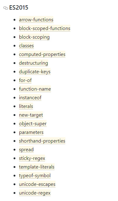
ES6 compatibility
ES5 compatibility
The purpose of a build system is to automate the workflow needed to get our code ready for browsers and production. This may include steps such as transpiling code to a differing standard, compiling Sass to CSS, bundling files, minifying and compressing code, and many others. To ensure these are consistently repeatable, a build system is needed to initiate the steps in a known sequence from a single command.
Prerequisites
In order to follow along, you’ll need to have both Node.js and npm installed (they come packaged together). I would recommend using a version manager such as nvm to manage your Node installation (here’s how), and if you’d like some help getting to grips with npm, then check out SitePoint’s beginner-friendly npm tutorial.
Set Up
Create a root folder somewhere on your computer and navigate into it from your terminal/command line. This will be your <ROOT> folder.
Create a package.json file with this:
npm init -y
Note: The -y flag creates the file with default settings, and means you don’t need to complete any of the usual details from the command line. They can be changed in your code editor later if you wish.
Within your <ROOT> folder, make the directories src, src/js, and public. The src/js folder will be where we’ll put our unprocessed source code, and the public folder will be where the transpiled code will end up.
Transpiling with Babel
To get ourselves going, we’re going to install babel-cli, which provides the ability to transpile ES6 into ES5, and babel-preset-env, which allows us to target specific browser versions with the transpiled code.
npm install babel-cli babel-preset-env --save-dev
You should now see the following in your package.json:
"devDependencies": { "babel-cli": "^6.26.0", "babel-preset-env": "^1.6.1" }
Whilst we’re in the package.json file, let’s change the scripts section to read like this:
"scripts": { "build": "babel src -d public" },
This gives us the ability to call Babel via a script, rather than directly from the terminal every time. If you’d like to find out more about npm scripts and what they can do, check out this SitePoint tutorial.
Lastly, before we can test out whether Babel is doing its thing, we need to create a .babelrc configuration file. This is what our babel-preset-env package will refer to for its transpile parameters.
Create a new file in your <ROOT> directory called .babelrc and paste the following into it:
{ "presets": [ [ "env", { "targets": { "browsers": ["last 2 versions", "safari >= 7"] } } ] ] }
This will set up Babel to transpile for the last two versions of each browser, plus Safari at v7 or higher. Other options are available depending on which browsers you need to support.
With that saved, we can now test things out with a sample JavaScript file that uses ES6. For the purposes of this article, I’ve modified a copy of leftpad to use ES6 syntax in a number of places: template literals, arrow functions, const and let.
"use strict"; function leftPad(str, len, ch) { const cache = [ "", " ", " ", " ", " ", " ", " ", " ", " ", " " ]; str = str + ""; len = len - str.length; if (len <= 0) return str; if (!ch && ch !== 0) ch = " "; ch = ch + ""; if (ch === " " && len < 10) return () => { cache[len] + str; }; let pad = ""; while (true) { if (len & 1) pad += ch; len >>= 1; if (len) ch += ch; else break; } return `${pad}${str}`; }
Save this as src/js/leftpad.js and from your terminal run the following:
npm run build
If all is as intended, in your public folder you should now find a new file called js/leftpad.js. If you open that up, you’ll find it no longer contains any ES6 syntax and looks like this:
"use strict"; function leftPad(str, len, ch) { var cache = ["", " ", " ", " ", " ", " ", " ", " ", " ", " "]; str = str + ""; len = len - str.length; if (len <= 0) return str; if (!ch && ch !== 0) ch = " "; ch = ch + ""; if (ch === " " && len < 10) return function () { cache[len] + str; }; var pad = ""; while (true) { if (len & 1) pad += ch; len >>= 1; if (len) ch += ch;else break; } return "" + pad + str; }
Continue reading %Setting up an ES6 Project Using Babel and webpack%
by Chris Perry via SitePoint https://ift.tt/2HA1AmE
1 note
·
View note
Text
Chrome ExtensionをTypeScriptとReactで作る環境を構築する
Chrome拡張機能を作るときの環境をいい感じにしてみます。
最終的なディレクトリ構造はこんな感じになります。
env-extension ├── dist // 拡張機能として読み込むディレクトリはこれ ├── public │ ├── index.html │ └── manifest.json ├── src │ ├── background │ │ └── background.ts │ ├── content │ │ ├── content.scss │ │ └── content.tsx │ └── popup │ └── index.tsx ├── gulpfile.js ├── package-lock.json ├── package.json ├── tsconfig.json └── webpack.config.js
npmの環境を作る
ディレクトリを作ってnpmの初期化を行います。
$ mkdir env-extension && cd env-extension $ npm init -y
React + TypeScript環境を作る
必要なパッケージを落っことします。
$ npm install --save-dev webpack webpack-cli html-loader html-webpack-plugin file-loader ts-loader typescript @types/react @types/react-dom copy-webpack-plugin $ npm install react react-dom
パッケージを軽く整理してみる。
webpack
モジュールバンドラー。JavaScriptファイルをブラウザで動くようにするために必要。
webpack-cli
webpackのコマンドセット。
file-loader
importやrequireで読み込まれるファイルを出力先のディレクトリに配置する
html-loader
htmlをstringにして出力する
html-webpack-plugin
htmlファイルの作成を簡単にする。
copy-webpack-plugin
すでにあるファイルやディレクトリを、ビルドディレクトリにコピーする
ts-loader
webpackについてのTypeScriptLoader
typescript
TypeScriptへの対応に必要
@types/react, @types/react-dom
reactのための型定義が入ってるパッケージ
tsconfig.json、webpack.config.jsを作成します。 webpackの中身はあとで!
// tsconfig.json { "compilerOptions": { "outDir": "./dist/", "allowSyntheticDefaultImports": true, "sourceMap": true, "noImplicitAny": true, "module": "esnext", "moduleResolution": "node", "target": "es5", "lib": [ "es5", "es6", "dom" ], "jsx": "react" }, "include": [ "./src/**/*" ] }
ChromeExtension用のファイルを用意
popup
popupにはhtmlとjsファイル双方必要なので用意。
src/popup/index.tsxを作成します。
// src/popup/index.tsx import React from 'react'; import ReactDOM from 'react-dom'; const Popup = () => <h1>Hello world</h1>; ReactDOM.render(<popup></popup>, document.getElementById("root"));
// public/index.html <meta charset="utf-8"><title>env test</title><div id="root"></div>
background
とりあえず確認のためのスクリプトを挟み込んでおきます。
// src/background/background.ts console.log("background test");
content
スタイルシートなしで、確認できるようにボタンを配置しておきます。
// src/content/content.tsx import React from 'react'; import ReactDOM from 'react-dom'; const Button = () => <button>Hello</button>; const app = document.createElement('div'); app.id = 'extension-button'; document.body.appendChild(app); ReactDOM.render(<button></button>, app);
manifest
manifestを作成します。今回は確認のためだけの最小限に留めます。
// public/manifest.json { "manifest_version": 2, "version": "0.0.1", "name": "env-sample", "description": "sample", "browser_action": { "default_popup": "index.html" }, "background": { "scripts": [ "background.js" ] }, "content_scripts": [ { "matches": [ "http://*/*", "https://*/*" ], "js": [ "content.js" ] } ], "content_security_policy": "script-src 'self' 'unsafe-eval'; object-src 'self'" }
ビルドの設定を作成
webpackの設定を行います。
// webpack.config.js const webpack = require('webpack'); const HtmlWebPackPlugin = require('html-webpack-plugin'); const CopyPlugin = require('copy-webpack-plugin'); module.exports = { mode: "production", entry: { popup: './src/popup/index.tsx', background: './src/background/background.ts', content: './src/content/content.tsx', }, output: { path: __dirname + '/dist', }, module: { rules: [ { test: /\.tsx?$/, loader: 'ts-loader', }, { test: /\.html$/, use: [ { loader: 'html-loader', options: { minimize: true }, }, ], }, ], }, resolve: { extensions: [ '.ts', '.js', '.tsx', '.jsx' ] }, plugins: [ new HtmlWebPackPlugin({ template: './public/index.html', filename: './index.html', chunks: ['popup'] // ここはentryの値を入れる }), new CopyPlugin({ patterns: [ { from: './public/manifest.json', to: 'manifest.json' } ] }), ], }
ビルドの自動化
package.jsonに以下を追記。ファイルの変更を検知して自動でビルドしてもらいましょう。。。
// package.json // webpack modeのデフォルトはproducion, configはあれば読んでくれるので省略 { ... "scripts": { "build": "webpack --mode production --config webpack.config.js", "build-watch": "webpack --watch", ... }, ... }
$ npm run build-watchでファイルの変更を監視して、変更があり次第ビルドしてくれます。
ついでにlintと自動修正
ついでにESLintを導入してみます。
まずはパッケージのダウンロード。
$ npm install --save-dev eslint-config-airbnb eslint-plugin-import eslint-plugin-react eslint-plugin-jsx-a11y eslint $ npm install --save-dev gulp gulp-eslint
eslint
JavaScriptのコードからフォーマットの違いとかを発見して通知してくれる。
eslint-config-airbnb
airbnbの設定を適用するのに必要
eslint-plugin-import
eslintでimport/exportに対応する
eslint-plugin-react
eslintでreactに対応する
eslint-plugin-jsx-a11y
jsxの静的解析に対応する
gulp
gulpを使うのに必要
gulp-eslint
gulpでeslintを使うために必要
設定ファイルの追加。項目は適宜変更してください。
// .eslintrc.js module.exports = { "env": { "browser": true, "es6": true }, "extends": "airbnb", "parserOptions": { "sourceType": "module" }, "rules": { "indent": [ "error", 2 ], "linebreak-style": [ "error", "unix" ], "quotes": [ "error", "single" ], "semi": [ "error", "always" ] } };
gulpでタスクにして、自動化します。
// gulpfile.js const gulp = require("gulp"); const eslint = require("gulp-eslint"); const applyLintPaths = [ "src/**/*.{js,jsx,ts,tsx}", "gulpfile.js" ]; /** * lint */ gulp.task("lint", function () { return ( gulp.src(applyLintPaths) .pipe(eslint({ fix: true })) .pipe(eslint.format()) .pipe(gulp.dest((file) => file.base)) // overwrite fixed file .pipe(eslint.failAfterError()) ); }); gulp.task("lint-watch", function () { return ( gulp.watch(applyLintPaths, gulp.task("lint")) ); });
package.jsonの書き換え。
// package.json { ... "scripts": { ... "lint": "gulp lint", "lint-watch": "gulp lint-watch", ... }, }
$ npm run lint or $ npm run lint-watchでlintできます。
ついでにsass対応
ソース内で、import '**.scss'が使えるようにします。
まずはパッケージのダウンロード。
$ npm install --save-dev style-loader css-loader sass-loader sass
style-loader
DOMにCSSを注入するのに必要
css-loader
importやrequireで読み込まれるcssファイル解決に必要
sass
sassをJavaScriptで実装したもの
sass-loader
sass, scssファイルを読み込んで、cssにコンパイルするのに必要
ビルドの設定をいじる。
// webpack.config.js module.exports = { module: { rules: [ ... { test: /\.s[ac]ss$/i, use: [ // Creates `style` nodes from JS strings "style-loader", // Translates CSS into CommonJS "css-loader", // Compiles Sass to CSS "sass-loader", ], }, ], }, };
contentをいじったり、sass書いたり。
// src/content/content.tsx ... import './content.scss'; ...
// src/content/content.scss $bgcolor: black; $color: white; button { background-color: $bgcolor; color: $color; }
tsでのエイリアスの貼り方
tsconfig.jsonの変更
{ "compilerOptions": { ... "baseUrl": "./", "paths": { "@/*": ["src/*"] } }, ... }
webpack.config.jsの変更
const path = require('path'); module.exports = { ... resolve: { alias: { '@': path.resolve(__dirname, 'src/') }, extensions: [ '.ts', '.js', '.tsx', '.jsx' ] }, ... }
viteを使っている場合はvite.config.tsを変更
import { defineConfig } from 'vite' import react from '@vitejs/plugin-react' // https://vitejs.dev/config/ export default defineConfig({ ... plugins: [react()], resolve: { alias: { "@/": `${__dirname}/src/`, } } })
lintも設定
$ npm install --save-dev eslint-import-resolver-webpack
.eslintrc.jsの変更
module.exports= { ... "settings": { "react": { "version": "detect" }, "import/resolver": { "webpack": { "config": path.join(__dirname, "webpack.config.js") } } } }
参考
ReactでChrome Extensionを開発するために必要なwebpackのビルド設定
Eslint --fix supresses errors but doesn't actually change file
sass-loader
npm
React: import時のaliasを設定するときはWebpack、TypeScript、ESLintの3つを対応しなければならない件 -qiita
【TypeScript】パスのエイリアスの設定方法
<2022/02更新>vite+TypeScriptでalias pathを~に設定する
0 notes
Text
Popular Front End Development Tools You Should Know
If you are just getting started with JavaScript, the number of tools and technologies you'll hear about may be overwhelming. And you might have a hard time deciding which tools you actually need.
Or maybe you're familiar with the tools, but you haven't given much thought to what problems they solve and how miserable your life would be without their help.
I believe it is important for Software Engineers and Developers to understand the purpose of the tools we use every day.
That's why, in this article, I look at NPM, Babel, Webpack, ESLint, and CircleCI and I try to clarify the problems they solve and how they solve them.
NPM

NPM is the default package manager for JavaScript development. It helps you find and install packages (programs) that you can use in your programs.
You can add npm to a project simply by using the "npm init" command. When you run this command it creates a "package.json" file in the current directory. This is the file where your dependencies are listed, and npm views it as the ID card of the project.
You can add a dependency with the "npm install (package_name)" command.
When you run this command, npm goes to the remote registry and checks if there is a package identified by this package name. If it finds it, a new dependency entry is added to your package.json and the package, with it's internal dependencies, is downloaded from the registry.
You can find downloaded packages or dependencies under the "node_modules" folder. Just keep in mind that it usually gets pretty big – so make sure to add it to .gitignore.

NPM does not only ease the process of finding and downloading packages but also makes it easier to work collaboratively on a project.
Without NPM, it would be hard to manage external dependencies. You would need to download the correct versions of every dependency by hand when you join an existing project. And that would be a real hassle.
With the help of npm, you can just run "npm install" and it will install all external dependencies for you. Then you can just run it again anytime someone on your team adds a new one.
Babel

Babel is a JavaScript compiler or transpiler which translates the ECMAScript 2015+ code into code that can be understood by older JavaScript engines.
Babel is the most popular Javascript compiler, and frameworks like Vue and React use it by default. That said, concepts we will talk about here are not only related to Babel and will apply to any JavaScript compiler.
Why do you need a compiler?
"Why do we need a compiler, isn't JavaScript an interpreted language?" you may ask if you are familiar with the concepts of compiled and interpreted languages.
It's true that we usually call something a "compiler" if it translates our human-readable code to an executable binary that can be understood by the CPU. But that is not the case here.
The term transpiler may be more appropriate since it is a subset of a compiler: Transpilers are compilers that translate the code from a programming language to another language (in this example, from modern JS to an older version).
JavaScript is the language of browsers. But there is a problem with browsers: Cross compatibility. JavaScript tools and the language itself are evolving rapidly and many browsers fail to match that pace. This results in compatibility issues.
You probably want to write code in the most recent versions of JavaScript so you can use its new features. But if the browser that your code is running has not implemented some of the new features in its JavaScript engine, the code will not execute properly on that browser.
This is a complex problem because every browser implements the features at a different speed. And even if they do implement those new features, there will always be people who use an older version of their browser.
So what if you want to be able to use the recent features but also want your users to view those pages without any problems?
Before Babel, we used polyfills to run older versions of certain code if the browser did not support the modern features. And when you use Babel, it uses polyfills behind the scenes and does not require you to do anything.
How do transpilers/compilers work?
Babel works similar to other compilers. It has parsing, transformation, and code generation stages.
We won't go in-depth here into how it works, since compilers are complicated things. But to understand the basics of how compilers work, you can check out the the-super-tiny-compiler project. It is also mentioned in Babel's official documentation as being helpful in understanding how Babel works.
We can usually get away with knowing about Babel plugins and presets. Plugins are the snippets that Babel uses behind the scenes to compile your code to older versions of JavaScript. You can think of each modern feature as a plugin. You can go to this link to check out the full list of plugins.
List of plugins for ES5
Presets are collections of plugins. If you want to use Babel for a React project you can use the pre-made @babel/preset-react which contains the necessary plugins.

React Preset Plugins
You can add plugins by editing the Babel config file.
Do you need Babel for your React App?
For React, you need a compiler because React code generally uses JSX and JSX needs to be compiled. Also the library is built on the concept of using ES6 syntax.
Luckily, when you create a project with create-react-app, it comes with Babel already configured and you usually do not need to modify the config.
Examples of a compiler in action
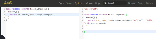
Babel's website has an online compiler and it is really helpful to understand how it works. Just plug in some code and analyze the output.

Webpack
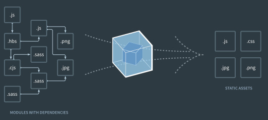
Webpack is a static module bundler. When you create a new project, most JavaScript frameworks/libraries use it out of the box nowadays.
If the phrase "static module bundler" sounds confusing, keep reading because I have some great examples to help you understand.
Why do you need a bundler?
In web apps you're going to have a lot of files. This is especially the case for Single Page Applications (React, Vue, Angular), with each having their own dependencies.
What I mean by a dependency is an import statement – if file A needs to import file B to run properly, then we say A depends on B.
In small projects, you can handle the module dependencies with <script> tags. But when the project gets larger, the dependencies rapidly become hard to manage.
Maybe, more importantly, dividing the code into multiple files makes your website load more slowly. This is because the browser needs to send more requests compared to one large file, and your website starts to consume a ton of bandwidth, because of HTTP headers.
We, as developers want our code to be modular. We divide it into multiple files because we do not want to work with one file with thousands of lines. Still, we also want our websites to be performant, to use less bandwidth, and to load fast.
So now, we'll see how Webpack solves this issue.
How Webpack works
When we were talking about Babel, we mentioned that JavaScript code needs to be transpiled before the deployment.
But compiling with Babel is not the only operation you need before deploying your project.
You usually need to uglify it, transpile it, compile the SASS or SCSS to CSS if you are using any preprocessors, compile the TypeScript if you are using it...and as you can see, this list can get long easily.
You do not want to deal with all those commands and operations before every deployment. It would be great if there was a tool that did all that for you in the correct order and correct way.
The good news – there is: Webpack.
Webpack also provides features like a local server with hot reload (they call it hot module replacement) to make your development experience better.
So what's hot reloading? It means that whenever you save your code, it gets compiled and deployed to the local HTTP server running on your machine. And whenever a file changes, it sends a message to your browser so you do not even need to refresh the page.
If you have ever used "npm run serve", "npm start" or "npm run dev", those commands also start Webpack's dev server behind the scenes.
Webpack starts from the entry point of your project (index) and generates the Abstract Syntax Tree of the file. You can think of it as parsing the code. This operation is also done in compilers, which then look for import statements recursively to generate a graph of dependencies.
It then converts the files into IIFEs to modularize them (remember, putting code inside a function restricts its scope). By doing this, they modularize the files and make sure the variables and functions are not accessible to other files.
Without this operation, it would be like copying and pasting the code of the imported file and that file would have the same scope.
Webpack does many other advanced things behind the scenes, but this is enough to understand the basics.
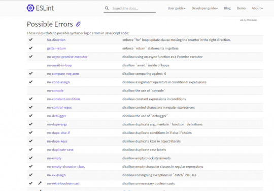
Bonus – ESLint

Code quality is important and helps keep your projects maintainable and easily extendable. While most of us developers recognize the significance of clean coding, we sometimes tend to ignore the long term consequences under the pressure of deadlines.
Many companies decide on coding standards and encourage developers to obey those standards. But how can you make sure that your code meets the standards?
Well, you can use a tool like ESLint to enforce rules in the code. For example, you can create a rule to enforce or disallow the usage of semicolons in your JavaScript code. If you break a rule, ESLint shows an error and the code does not even get compiled – so it is not possible to ignore that unless you disable the rule.
Linters can be used to enforce standards by writing custom rules. But you can also use the pre-made ESLint configs established by big tech companies to help devs get into the habit of writing clean code.
You can take a look at Google's ESLint config here – it is the one I prefer.
ESLint helps you get used to best practices, but that's not its only benefit. ESLint also warns you about possible bugs/errors in your code so you can avoid common mistakes.
Bonus – CI/CD (CircleCI)

Continuous Integration/Development has gained a lot of popularity in recent years as many companies have adopted Agile principles.
Tools like Jenkins and CircleCI allow you to automate the deployment and testing of your software so you can deploy more often and reliably without going through difficult and error-prone build processes by yourselves.
I mention CircleCI as the product here because it is free and used frequently in JavaScript projects. It's also quite easy to use.
Let's go over an example: Say you have a deployment/QA server and your Git repository. You want to deploy your changes to your deployment/QA server, so here is an example process:
Push the changes to Git
Connect to the server
Create a Docker container and run it
Pull the changes to the server, download all the dependencies (npm install)
Run the tests to make sure nothing is broken
Use a tool like ESLint/Sonar to ensure code quality
Merge the code if everything is fine
With the help of CircleCI, you can automatically do all these operations. You can set it up and configure to do all of the above operations whenever you push a change to Git. It will reject the push if anything goes wrong, for example a failing test.
I will not get into the details of how to configure CircleCI because this article is more about the "Why?" of each tool. But if you are interested in learning more and seeing it in action, you can check out this tutorial series.
Conclusion
The world of JavaScript is evolving rapidly and new tools are gaining popularity every year.
It's easy to react to this change by just learning how to use the tool – we are often too busy to take our time and think about the reason why that tool became popular or what problem it solves.
In this article, I picked the tools I think are most popular and shared my thoughts on their significance. I also wanted to make you think about the problems they solve rather than just the details of how to use them.
If you liked the article you can check out and subscribe to my blog where I try to write frequently. Also, let me know what you think by commenting so we can brainstorm or you can tell me what other tools you love to use :)
0 notes
Link
Welcome to open-force.org! This is a maker space for developers and others in the Salesforce.com ecosystem to share code with each other. Think of open-force as a workshop where people like you are hanging out, tinkering with things they are passionate about. Maybe you'd like to chip in on a project you find interesting, or maybe you'd like to bring your own project into the workshop? This website includes a searchable index of open source projects that exist in Salesforce-land. You can browse these projects with the tool below. We're happy to list any Salesforce-related open source project; send an email to [email protected] to have your project added to the index. There are some companion resources to this website: if you'd like a place to host your project, we give out repositories in our public GitHub at https://github.com/open-force. To have a repository created, send an email to [email protected] have a community of collaborators that hang out in a slack channel over on the GoodDaySir podcast slack. Sign up for the slack group at https://www.gooddaysirpodcast.com/community, and find us in the #open-force channel.We're glad you're here. We love sharing knowledge and code, and we hope you will participate in our open source movement on the Salesforce platform! Want to make this website even better? It's open-source (you're shocked, I'm sure), so go ahead and submit a pull request: https://github.com/open-force/website. A utility class that allows serialization/deserialization of reserved keywords Apex Wrapper for the Salesforce Metadata API Apex463463703BSD 3-Clause "New" or "Revised" License61A simple framework for building Restful API on Salesforce Platform-Event-based Apex logger for unified logging over transaction boundaries Apex797928MIT License Define "Templates" to match and parse URI. Apex660 A collection of apex classes that can be useful for development on the salesforce platform Apex11113MIT License Advanced Techniques for Salesforce DX Adoption Framework Apex676722BSD 3-Clause "New" or "Revised" License7This project is archived, please see the readme for additional resources. JavaScript676676332Apache License 2.0 B.A.S.S. Starter: react / redux / typescript / antd / ts-force / sfdx / webpack / salesforce TypeScript11411419MIT License14Auto-completion for the Cumulus CI CLI for bash Shell110Apache License 2.0 Customized Visual Code Server built from coder/code-server to support Salesforce development using sfdx and other extensions Shell110MIT License A simple bit of Apex to help you investigate which Apex Limits are applied in various execution contexts where Apex can run. Apex551MIT License Python framework for building portable automation for Salesforce projects Python189189156BSD 3-Clause "New" or "Revised" License88Dummy project used to test CumulusCI - CumulusCI will run this project through the whole CI flow to verify everything works RobotFramework88161BSD 3-Clause "New" or "Revised" License7Declarative Rollup Summaries for Lookups Apex451451180BSD 3-Clause "New" or "Revised" License150Salesforce Lightning Design System JavaScript29752975664Other12Salesforce Lightning Design System for React JavaScript615615274BSD 3-Clause "New" or "Revised" License90Common Apex Library supporting Apex Enterprise Patterns and much more! Apex480480326BSD 3-Clause "New" or "Revised" License69Common Apex Library supporting Apex Enterprise Patterns and much more! Apex480480326BSD 3-Clause "New" or "Revised" License69Builder Extension library to fflib_apex-common Apex25259BSD 3-Clause "New" or "Revised" License3An Apex mocking framework for true unit testing in Salesforce, with Stub API support Apex228228135BSD 3-Clause "New" or "Revised" License17An Apex mocking framework for true unit testing in Salesforce, with Stub API support Apex228228135BSD 3-Clause "New" or "Revised" License17[DEPRECATED] Command line tool supporting the Force.com development lifecycle JavaScript10410437MIT License8Generic DI library with support for Apex, Triggers, Visualforce and Lightning Apex15215267BSD 3-Clause "New" or "Revised" License19A structured, extensible logger for Salesforce Apex A native app to support complex Salesforce sharing with quick and easy configuration Automatic Entity-Relationship diagrams and SOQL queries for Salesforce JavaScript23232The Unlicense26A Lightning Component grid implementation that expects a server-side data store. Apex353510MIT License A Salesforce Lightning Component that allows users to show useful links for users on Lightning pages HTML551Apache License 2.01Apex library for HTTP callouts. Apex003Apache License 2.01Image labeller for Salesforce Einstein Object Detection JavaScript334Apache License 2.0 Indicators Lightning Web Component JavaScript17172MIT License8Apex JSON parser to make it easier to extract information from nested JSON structures Apex67678MIT License Lightning Components and Redux: A Predictable State Container for Lightning Apps JavaScript42427MIT License2Lightning component that acts a singleton JavaScript441Apache License 2.0 lodash as a Lightning Web Component JavaScript771 :zap: LWC - A Blazing Fast, Enterprise-Grade Web Components Foundation JavaScript854854180MIT License251The SLDS Illustration component as an App Builder-ready Lightning Web Component. HTML440MIT License Useful LWC components for Salesforce JavaScript15152BSD 3-Clause "New" or "Revised" License11Using Salesforce and Lightning Web Component technology to explore machine learning, using TensorFlow.js and other libraries. JavaScript440 Lightweight, Salesforce specific CI app run on Heroku to build Github repositories configured for CumulusCI Python393916BSD 3-Clause "New" or "Revised" License43CLI tool for processing Salesforce Metadata XML files Shell13131MIT License Salesforce.org's managed package installer Python161611BSD 3-Clause "New" or "Revised" License7The current version of the Salesforce.org Nonprofit Success Pack Apex455455275BSD 3-Clause "New" or "Revised" License383Generic and reusable Lightning service component that retrieves picklist entries (Archived) Apex10105Apache License 2.01PowerShell module for Salesforce SFDX PowerShell000 Pygments lexer for the Salesforce Apex language. Python000MIT License Salesforce open source library with logging framework, trigger framework, feature switches, and advanced monitoring capabilities Apex404011BSD 3-Clause "New" or "Revised" License A custom path assistant built using only Lightning Web Components JavaScript202010MIT License2Salesforce DevTools is a Chrome extension for Salesforce developer, based on everything we need in Salesforce development A simple solution for managing environment variables in salesforce TypeScript26264MIT License4A tool for copying test data into Salesforce sandboxes Not your mother's Salesforce scheduler JavaScript17172BSD 3-Clause "New" or "Revised" License3Apex Library to schedule Unit Test runs Community project to collect and collate recipes for using the Salesforce command line interface (CLI). A lightning component that lets you generate an order w/products from an opportunity record Apex110MIT License Salesforce Lighitng Data table JavaScript552 Utility to provide automated ranking of objects based on values. i.e. Accounts Ranked by Annual Revenue Apex110MIT License Invocable Apex method to allow admins to setup and send slack messages to incoming webhooks Apex551 A native chat application for Salesforce Apex111MIT License Project template for SFDO Django/React/SLDS projects sfdx plugin for browser automation TypeScript616116MIT License5A sfdx plugin to help compare metadata from different environments and provide a user friendly way to merge them. TypeScript990MIT License5Utility for copying files from one dir to another, useful for sfdx Extended Salesforce DX project directory template, designed to support complex projects and managed packages. Shell15615653MIT License10SalesforceDX command to login using username password oauth2 flow 🚀 Declaratively schedule Process Builder, Flows, Quick Actions, Email Alerts, Workflow Rules, or Apex to process records from Reports, List Views, SOQL, or Apex. Apex18718731BSD 3-Clause "New" or "Revised" License32A GUI for managing sfdx orgs TypeScript22222MIT License14Autocomplete script for powershell on windows, for sfdx PowerShell442GNU General Public License v3.01A plugin for splitting and merging Salesforce profiles. Common Apex utility classes and frameworks used by Sirono products 000Apache License 2.0 Common Apex utility classes and frameworks used by Sirono products Apex838324Apache License 2.03A Apex Utility class to Clone a Salesforce SObject & and it's children. Custom Metadata Type Loader, designed for Lightning Experience Apex12121MIT License Website serving various status info for Salesforce.org Python334BSD 3-Clause "New" or "Revised" License9A Lightning app for monitoring streaming events: PushTopic, generic, platform events, CDC events and monitoring events. A Salesforce Lightning Component that allows users to embed a Trello board or a Trello card. More information on the Trello embedding functionality can be found here - https://developers.trello.com/docs/boards and https://developers.trello.com/docs/cards HTML110Apache License 2.01A Salesforce REST Client written in Typescript for Typescript TypeScript38384BSD 3-Clause "New" or "Revised" License28Heroku app that drives the open-force.org website. Check the Readme for how to get your stuff listed. TypeScript996MIT License5A not-that-carefully-maintained list of weird limits you might run across working with Salesforce.com 15151
0 notes
Text
Adding a Custom Welcome Guide to the WordPress Block Editor
I am creating a WordPress plugin and there is a slight learning curve when it comes to using it. I’d like to give users a primer on how to use the plugin, but I want to avoid diverting users to documentation on the plugin’s website since that takes them out of the experience.
What would be great is for users to immediately start using the plugin once it’s installed but have access to helpful tips while they are actively using it. There’s no native feature for something like this in WordPress but we can make something because WordPress is super flexible like that.
So here’s the idea. We’re going to bake documentation directly into the plugin and make it easily accessible in the block editor. This way, users get to use the plugin right away while having answers to common questions directly where they’re working.
My plugin operates through several Custom Post Types (CPT). What we’re going to build is essentially a popup modal that users get when they go to these CPTs.
The WordPress block editor is built in React, which utilizes components that can be customized to and reused for different situations. That is the case with what we’re making — let’s call it the <Guide> component — which behaves like a modal, but is composed of several pages that the user can paginate through.
WordPress itself has a <Guide> component that displays a welcome guide when opening the block editor for the first time:

WordPress displays a modal with instructions for using the block editor when a user loads the editor for the first time.
The guide is a container filled with content that’s broken up into individual pages. In other words, it’s pretty much what we want. That means we don’t have to re-invent the wheel with this project; we can reuse this same concept for our own plugin.
Let’s do exactly that.
What we want to achieve
Before we get to the solution, let’s talk about the end goal.
The design satisfies the requirements of the plugin, which is a GraphQL server for WordPress. The plugin offers a variety of CPTs that are edited through custom blocks which, in turn, are defined through templates. There’s a grand total of two blocks: one called “GraphiQL client” to input the GraphQL query, and one called “Persisted query options” to customize the behavior of the execution.
Since creating a query for GraphQL is not a trivial task, I decided to add the guide component to the editor screen for that CPT. It’s available in the Document settings as a panel called “Welcome Guide.”

Crack that panel open and the user gets a link. That link is what will trigger the modal.
For the modal itself, I decided to display a tutorial video on using the CPT on the first page, and then describe in detail all the options available in the CPT on subsequent pages.

I believe this layout is an effective way to show documentation to the user. It is out of the way, but still conveniently close to the action. Sure, we can use a different design or even place the modal trigger somewhere else using a different component instead of repurposing <Guide>, but this is perfectly good.
Planning the implementation
The implementation comprises the following steps:
Scaffolding a new script to register the custom sidebar panel
Displaying the custom sidebar panel on the editor for our Custom Post Type only
Creating the guide
Adding content to the guide
Let’s start!
Step 1: Scaffolding the script
Starting in WordPress 5.4, we can use a component called <PluginDocumentSettingPanel> to add a panel on the editor’s Document settings like this:
const { registerPlugin } = wp.plugins; const { PluginDocumentSettingPanel } = wp.editPost; const PluginDocumentSettingPanelDemo = () => ( <PluginDocumentSettingPanel name="custom-panel" title="Custom Panel" className="custom-panel" > Custom Panel Contents </PluginDocumentSettingPanel> ); registerPlugin( 'plugin-document-setting-panel-demo', { render: PluginDocumentSettingPanelDemo, icon: 'palmtree', } );
If you’re experienced with the block editor and already know how to execute this code, then you can skip ahead. I’ve been coding with the block editor for less than three months, and using React/npm/webpack is a new world for me — this plugin is my first project using them! I’ve found that the docs in the Gutenberg repo are not always adequate for beginners like me, and sometimes the documentation is missing altogether, so I’ve had to dig into the source code to find answers.
When the documentation for the component indicates to use that piece of code above, I don’t know what to do next, because <PluginDocumentSettingPanel> is not a block and I am unable to scaffold a new block or add the code there. Plus, we’re working with JSX, which means we need to have a JavaScript build step to compile the code.
I did, however, find the equivalent ES5 code:
var el = wp.element.createElement; var __ = wp.i18n.__; var registerPlugin = wp.plugins.registerPlugin; var PluginDocumentSettingPanel = wp.editPost.PluginDocumentSettingPanel;
function MyDocumentSettingPlugin() { return el( PluginDocumentSettingPanel, { className: 'my-document-setting-plugin', title: 'My Panel', }, __( 'My Document Setting Panel' ) ); }
registerPlugin( 'my-document-setting-plugin', { render: MyDocumentSettingPlugin } );
ES5 code does not need be compiled, so we can load it like any other script in WordPress. But I don’t want to use that. I want the full, modern experience of ESNext and JSX.
So my thinking goes like this: I can’t use the block scaffolding tools since it’s not a block, and I don’t know how to compile the script (I’m certainly not going to set-up webpack all by myself). That means I’m stuck.
But wait! The only difference between a block and a regular script is just how they are registered in WordPress. A block is registered like this:
wp_register_script($blockScriptName, $blockScriptURL, $dependencies, $version); register_block_type('my-namespace/my-block', [ 'editor_script' => $blockScriptName, ]);
And a regular script is registered like this:
wp_register_script($scriptName, $scriptURL, $dependencies, $version); wp_enqueue_script($scriptName);
We can use any of the block scaffolding tools to modify things then register a regular script instead of a block, which gains us access to the webpack configuration to compile the ESNext code. Those available tools are:
The WP CLI ‘scaffold’ command
Ahmad Awais’s create-guten-block package
The official @wordpress/create-block package
I chose to use the @wordpress/create-block package because it is maintained by the team developing Gutenberg.
To scaffold the block, we execute this in the command line:
npm init @wordpress/block
After completing all the prompts for information — including the block’s name, title and description — the tool will generate a single-block plugin, with an entry PHP file containing code similar to this:
/** * Registers all block assets so that they can be enqueued through the block editor * in the corresponding context. * * @see https://developer.wordpress.org/block-editor/tutorials/block-tutorial/applying-styles-with-stylesheets/ */ function my_namespace_my_block_block_init() { $dir = dirname( __FILE__ );
$script_asset_path = "$dir/build/index.asset.php"; if ( ! file_exists( $script_asset_path ) ) { throw new Error( 'You need to run `npm start` or `npm run build` for the "my-namespace/my-block" block first.' ); } $index_js = 'build/index.js'; $script_asset = require( $script_asset_path ); wp_register_script( 'my-namespace-my-block-block-editor', plugins_url( $index_js, __FILE__ ), $script_asset['dependencies'], $script_asset['version'] );
$editor_css = 'editor.css'; wp_register_style( 'my-namespace-my-block-block-editor', plugins_url( $editor_css, __FILE__ ), array(), filemtime( "$dir/$editor_css" ) );
$style_css = 'style.css'; wp_register_style( 'my-namespace-my-block-block', plugins_url( $style_css, __FILE__ ), array(), filemtime( "$dir/$style_css" ) );
register_block_type( 'my-namespace/my-block', array( 'editor_script' => 'my-namespace-my-block-block-editor', 'editor_style' => 'my-namespace-my-block-block-editor', 'style' => 'my-namespace-my-block-block', ) ); } add_action( 'init', 'my_namespace_my_block_block_init' );
We can copy this code into the plugin, and modify it appropriately, converting the block into a regular script. (Note that I’m also removing the CSS files along the way, but could keep them, if needed.)
function my_script_init() { $dir = dirname( __FILE__ );
$script_asset_path = "$dir/build/index.asset.php"; if ( ! file_exists( $script_asset_path ) ) { throw new Error( 'You need to run `npm start` or `npm run build` for the "my-script" script first.' ); } $index_js = 'build/index.js'; $script_asset = require( $script_asset_path ); wp_register_script( 'my-script', plugins_url( $index_js, __FILE__ ), $script_asset['dependencies'], $script_asset['version'] ); wp_enqueue_script( 'my-script' ); } add_action( 'init', 'my_script_init' );
Let’s copy the package.json file over:
{ "name": "my-block", "version": "0.1.0", "description": "This is my block", "author": "The WordPress Contributors", "license": "GPL-2.0-or-later", "main": "build/index.js", "scripts": { "build": "wp-scripts build", "format:js": "wp-scripts format-js", "lint:css": "wp-scripts lint-style", "lint:js": "wp-scripts lint-js", "start": "wp-scripts start", "packages-update": "wp-scripts packages-update" }, "devDependencies": { "@wordpress/scripts": "^9.1.0" } }
Now, we can replace the contents of file src/index.js with the ESNext code from above to register the <PluginDocumentSettingPanel> component. Upon running npm start (or npm run build for production) the code will be compiled into build/index.js.
There is a last problem to solve: the <PluginDocumentSettingPanel> component is not statically imported, but instead obtained from wp.editPost, and since wp is a global variable loaded by WordPress on runtime, this dependency is not present in index.asset.php (which is auto-generated during build). We must manually add a dependency to the wp-edit-post script when registering the script to make sure it loads before ours:
$dependencies = array_merge( $script_asset['dependencies'], [ 'wp-edit-post', ] ); wp_register_script( 'my-script', plugins_url( $index_js, __FILE__ ), $dependencies, $script_asset['version'] );
Now the script setup is ready!
The plugin can be updated with Gutenberg’s relentless development cycles. Run npm run packages-update to update the npm dependencies (and, consequently, the webpack configuration, which is defined on package "@wordpress/scripts") to their latest supported versions.
At this point, you might be wondering how I knew to add a dependency to the "wp-edit-post" script before our script. Well, I had to dig into Gutenberg’s source code. The documentation for <PluginDocumentSettingPanel> is somewhat incomplete, which is a perfect example of how Gutenberg’s documentation is lacking in certain places.
While digging in code and browsing documentation, I discovered a few enlightening things. For example, there are two ways to code our scripts: using either the ES5 or the ESNext syntax. ES5 doesn’t require a build process, and it references instances of code from the runtime environment, most likely through the global wp variable. For instance, the code to create an icon goes like this:
var moreIcon = wp.element.createElement( 'svg' );
ESNext relies on webpack to resolve all dependencies, which enables us to import static components. For instance, the code to create an icon would be:
import { more } from '@wordpress/icons';
This applies pretty much everywhere. However, that’s not the case for the <PluginDocumentSettingPanel> component, which references the runtime environment for ESNext:
const { PluginDocumentSettingPanel } = wp.editPost;
That’s why we have to add a dependency to the “wp-edit-post” script. That’s where the wp.editPost variable is defined.
If <PluginDocumentSettingPanel> could be directly imported, then the dependency to “wp-edit-post” would be automatically handled by the block editor through the Dependency Extraction Webpack Plugin. This plugin builds the bridge from static to runtime by creating a index.asset.php file containing all the dependencies for the runtime environment scripts, which are obtained by replacing "@wordpress/" from the package name with "wp-". Hence, the "@wordpress/edit-post" package becomes the "wp-edit-post" runtime script. That’s how I figured out which script to add the dependency.
Step 2: Blacklisting the custom sidebar panel on all other CPTs
The panel will display documentation for a specific CPT, so it must be registered only to that CPT. That means we need to blacklist it from appearing on any other post types.
Ryan Welcher (who created the <PluginDocumentSettingPanel> component) describes this process when registering the panel:
const { registerPlugin } = wp.plugins; const { PluginDocumentSettingPanel } = wp.editPost const { withSelect } = wp.data;
const MyCustomSideBarPanel = ( { postType } ) => {
if ( 'post-type-name' !== postType ) { return null; }
return( <PluginDocumentSettingPanel name="my-custom-panel" title="My Custom Panel" > Hello, World! </PluginDocumentSettingPanel> ); }
const CustomSideBarPanelwithSelect = withSelect( select => { return { postType: select( 'core/editor' ).getCurrentPostType(), }; } )( MyCustomSideBarPanel);
registerPlugin( 'my-custom-panel', { render: CustomSideBarPanelwithSelect } );
He also suggests an alternative solution, using useSelect instead of withSelect.
That said, I’m not totally convinced by this solution, because the JavaScript file must still be loaded, even if it isn’t needed, forcing the website to take a performance hit. Doesn’t it make more sense to not register the JavaScript file than it does to run JavaScript just to disable JavaScript?
I have created a PHP solution. I’ll admit that it feels a bit hacky, but it works well. First, we find out which post type is related to the object being created or edited:
function get_editing_post_type(): ?string { if (!is_admin()) { return null; }
global $pagenow; $typenow = ''; if ( 'post-new.php' === $pagenow ) { if ( isset( $_REQUEST['post_type'] ) && post_type_exists( $_REQUEST['post_type'] ) ) { $typenow = $_REQUEST['post_type']; }; } elseif ( 'post.php' === $pagenow ) { if ( isset( $_GET['post'] ) && isset( $_POST['post_ID'] ) && (int) $_GET['post'] !== (int) $_POST['post_ID'] ) { // Do nothing } elseif ( isset( $_GET['post'] ) ) { $post_id = (int) $_GET['post']; } elseif ( isset( $_POST['post_ID'] ) ) { $post_id = (int) $_POST['post_ID']; } if ( $post_id ) { $post = get_post( $post_id ); $typenow = $post->post_type; } } return $typenow; }
Then, ,we register the script only if it matches our CPT:
add_action('init', 'maybe_register_script'); function maybe_register_script() { // Check if this is the intended custom post type if (get_editing_post_type() != 'my-custom-post-type') { return; }
// Only then register the block wp_register_script(...); wp_enqueue_script(...); }
Check out this post for a deeper dive on how this works.
Step 3: Creating the custom guide
I designed the functionality for my plugin’s guide based on the WordPress <Guide> component. I didn’t realize I’d be doing that at first, so here’s how I was able to figure that out.
Search the source code to see how it was done there.
Explore the catalogue of all available components in Gutenberg’s Storybook.
First, I copied content from the block editor modal and did a basic search. The results pointed me to this file. From there I discovered the component is called <Guide> and could simply copy and paste its code to my plugin as a base for my own guide.
Then I looked for the component’s documentation. I browsed the @wordpress/components package (which, as you may have guessed, is where components are implemented) and found the component’s README file. That gave me all the information I needed to implement my own custom guide component.
I also explored the catalogue of all the available components in Gutenberg’s Storybook (which actually shows that these components can be used outside the context of WordPress). Clicking on all of them, I finally discovered <Guide>. The storybook provides the source code for several examples (or stories). It’s a handy resource for understanding how to customize a component through props.
At this point, I knew <Guide> would make a solid base for my component. There is one missing element, though: how to trigger the guide on click. I had to rack my brain for this one!
This is a button with a listener that opens the modal on click:
import { useState } from '@wordpress/element'; import { Button } from '@wordpress/components'; import { __ } from '@wordpress/i18n'; import MyGuide from './guide';
const MyGuideWithButton = ( props ) => { const [ isOpen, setOpen ] = useState( false ); return ( <> <Button onClick={ () => setOpen( true ) }> { __('Open Guide: “Creating Persisted Queries”') } </Button> { isOpen && ( <MyGuide { ...props } onFinish={ () => setOpen( false ) } /> ) } </> ); }; export default MyGuideWithButton;
Even though the block editor tries to hide it, we are operating within React. Until now, we’ve been dealing with JSX and components. But now we need the useState hook, which is specific to React.
I’d say that having a good grasp of React is required if you want to master the WordPress block editor. There is no way around it.
Step 4: Adding content to the guide
We’re almost there! Let’s create the <Guide> component, containing a <GuidePage> component for each page of content.
The content can use HTML, include other components, and whatnot. In this particular case, I have added three <GuidePage> instances for my CPT just using HTML. The first page includes a video tutorial and the next two pages contain detailed instructions.
import { Guide, GuidePage } from '@wordpress/components'; import { __ } from '@wordpress/i18n';
const MyGuide = ( props ) => { return ( <Guide { ...props } > <GuidePage> <video width="640" height="400" controls> <source src="https://d1c2lqfn9an7pb.cloudfront.net/presentations/graphql-api/videos/graphql-api-creating-persisted-query.mov" type="video/mp4" /> { __('Your browser does not support the video tag.') } </video> // etc. </GuidePage> <GuidePage> // ... </GuidePage> <GuidePage> // ... </GuidePage> </Guide> ) } export default MyGuide;
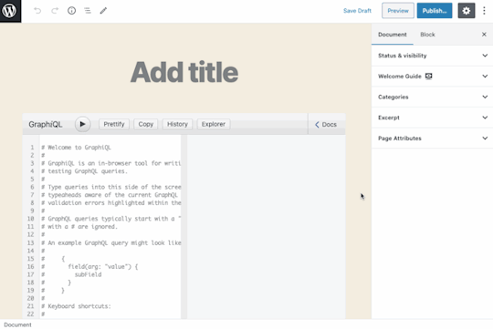
Hey look, we have our own guide now!
Not bad! There are a few issues, though:
I couldn’t embed the video inside the <Guide> because clicking the play button closes the guide. I assume that’s because the <iframe> falls outside the boundaries of the guide. I wound up uploading the video file to S3 and serving with <video>.
The page transition in the guide is not very smooth. The block editor’s modal looks alright because all pages have a similar height, but the transition in this one is pretty abrupt.
The hover effect on buttons could be improved. Hopefully, the Gutenberg team needs to fix this for their own purposes, because my CSS aren’t there. It’s not that my skills are bad; they are nonexistent.
But I can live with these issues. Functionality-wise, I’ve achieved what I need the guide to do.
Bonus: Opening docs independently
For our <Guide>, we created the content of each <GuidePage> component directly using HTML. However, if this HTML code is instead added through an autonomous component, then it can be reused for other user interactions.
For instance, the component <CacheControlDescription> displays a description concerning HTTP caching:
const CacheControlDescription = () => { return ( <p>The Cache-Control header will contain the minimum max-age value from all fields/directives involved in the request, or "no-store" if the max-age is 0</p> ) } export default CacheControlDescription;
This component can be added inside a <GuidePage> as we did before, but also within a <Modal> component:
import { useState } from '@wordpress/element'; import { Button } from '@wordpress/components'; import { __ } from '@wordpress/i18n'; import CacheControlDescription from './cache-control-desc';
const CacheControlModalWithButton = ( props ) => { const [ isOpen, setOpen ] = useState( false ); return ( <> <Button icon="editor-help" onClick={ () => setOpen( true ) } /> { isOpen && ( <Modal { ...props } onRequestClose={ () => setOpen( false ) } > <CacheControlDescription /> </Modal> ) } </> ); }; export default CacheControlModalWithButton;
To provide a good user experience, we can offer to show the documentation only when the user is interacting with the block. For that, we show or hide the button depending on the value of isSelected:
import { __ } from '@wordpress/i18n'; import CacheControlModalWithButton from './modal-with-btn';
const CacheControlHeader = ( props ) => { const { isSelected } = props; return ( <> { __('Cache-Control max-age') } { isSelected && ( <CacheControlModalWithButton /> ) } </> ); } export default CacheControlHeader;
Finally, the <CacheControlHeader> component is added to the appropriate control.

Tadaaaaaaaa

The WordPress block editor is quite a piece of software! I was able to accomplish things with it that I would have been unable to without it. Providing documentation to the user may not be the shiniest of examples or use cases, but it’s a very practical one and something that’s relevant for many other plugins. Want to use it for your own plugin? Go for it!
The post Adding a Custom Welcome Guide to the WordPress Block Editor appeared first on CSS-Tricks.
source https://css-tricks.com/adding-a-custom-welcome-guide-to-the-wordpress-block-editor/
from WordPress https://ift.tt/30KQMi4 via IFTTT
0 notes
Text
Create a Gutenberg Block
In this article you are going to see how to create Gutenberg block.
You are going to learn:
Overview
Requirements
Available Tools
Create Gutenberg Block with create-guten-block
Create Gutenberg Block with @wordpress/block
Create Gutenberg Block with wp scaffold block
Conclusion
Overview #Overview
This article is one of the parts of the series Gutenberg Development: Beginner to Advanced. I am explaining all the details for considering the article for beginner developers. After reading this article you can easily understand the process of creating a Gutenberg block.
In this article we just setup the boilerplate of our first Gutenberg block. So, Let’s see how to create custom Gutenberg block.
Requirements #Requirements
To get started we need a NPM and Node.js to be installed on the system. NPM is a package manager for Node.js. So, After installing the Node.js you’ll get access to use the NPM too.
See the article install the NPM and Node.js
Available Tools #Available Tools
We can create a Gutenberg block from scratch. We custom configure the webpack, Babel, etc but to make the development as simple as possible I’m going to use below tools to create a first Gutenberg block.
We have 3 tools which provides the Gutenberg block development environment. These tools are:
create-guten-block – NPM unofficial but pretty awesome package created by Ahmad Awais.
@wordpress/block – NPM official WordPress package to create a Gutenberg block.
wp scaffold block – WP CLI package to create a Gutenberg block.
All these tools are nice to create a Gutenberg block boilerplate. But, I recommend using the create-guten-block for development. We have a WordPress official tool @wordpress/block for development. The official package @wordpress/block is available from Jan 24, 2020.
I am going to see How to create a Gutenberg block with all the above available tools. Finally, you can choose your favorite tool for creating a Gutenberg block.
Create Gutenberg Block with create-guten-block #Create Gutenberg Block with create-guten-block
The create-guten-block is an awesome tool for developing Gutenberg blocks. create-guten-block is developed by ahmadawais.
create-guten-block provides the ZERO configuration setup. create-guten-block is the same as the create-react-app which is used for creating React applications.
Let’s get started.
Open the Terminal or CMD (command prompt)
Navigate to the \wp-content\plugins\ directory.
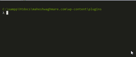
Terminal Window
Type npx create-guten-block {your-gutenberg-block-plugin} command. Note: Above command create a WordPress plugin with your provided plugin name.
I’m using below command:
npx create-guten-block awesome-headings
Here, I am creating a Gutenberg Block plugin with name awesome-headings.
After executing the above command you can see something similar:
λ npx create-guten-block awesome-headings � Creating a WP Gutenberg Block plugin called: awesome-headings In the directory: C:\xampp\htdocs\maheshwaghmare.com\wp-content\plugins\awesome-headings This might take a couple of minutes. √ 1. Creating the plugin directory called → awesome-headings √ 2. Installing npm packages... √ 3. Creating plugin files... ✅ All done! Go build some Gutenberg blocks. CGB (create-guten-block) has created a WordPress plugin called awesome-headings that you can use with zero configurations #0CJS to build Gutenberg blocks with ESNext (i.e. ES6/7/8), React.js, JSX, Webpack, ESLint, etc. Created awesome-headings plugin at: C:\xampp\htdocs\maheshwaghmare.com\wp-content\plugins\awesome-headings Inside that directory, you can run several commands: � Type npm start Use to compile and run the block in development mode. Watches for any changes and reports back any errors in your code. � Type npm run build Use to build production code for your block inside dist folder. Runs once and reports back the gzip file sizes of the produced code. � Type npm run eject Removes this tool and copies build dependencies, configuration files and scripts into the plugin folder. ⚠️ It's a one way street. If you do this, you can’t go back! ✊ Support create-guten-block → Love create-guten-block? You can now support this free and open source project. Supporting CGB means more updates and better maintenance: Support for one hour or more → https://AhmdA.ws/CGB99 More ways to support → https://AhmdA.ws/CGBSupport Check out my best work. VSCode Power User → https://VSCode.pro Get Started → We suggest that you begin by typing: cd awesome-headings npm start
See below screenshot for reference:
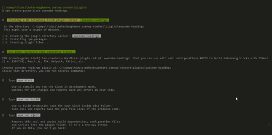
Successfully Created a Gutenberg Block Plugin
If we see the plugins directory the we can see that the new directory awesome-headings with all required files and folders.
See below screenshot for reference.
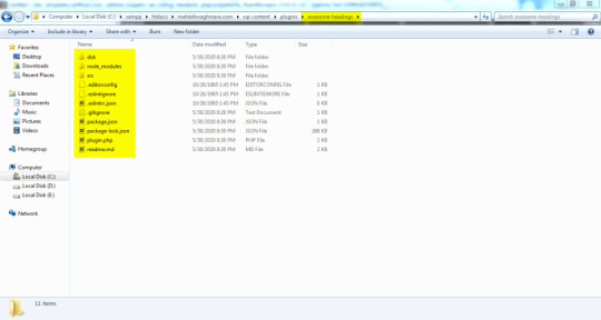
Directory Structure after creating a Gutenberg Block
We have a proper setup for our new block awesome-headings – CGB Block.
We can see the development files and folders into the directory \plugins\awesome-headings\src\
└───block └───block.js └───editor.scss └───style.scss └───blocks.js └───common.scss └───init.php
If you open the file block/block.js then you can see the code something like below:
// Import CSS. import './editor.scss'; import './style.scss'; const { __ } = wp.i18n; // Import __() from wp.i18n const { registerBlockType } = wp.blocks; // Import registerBlockType() from wp.blocks
The above code is written NEW JavaScript format which is ECMAScript 6 is also known as ES6 and ECMAScript 2015 and with JSX.
The new ES6 format is not supported for all browsers also browsers don’t read the JSX expressions. We need to make the browser supported format JS files.
As I describe to you earlier that the create-guten-block tool provides the ZERO configuration setup. So, We don’t need to configure anything.
Simply execute the command npm run build.
What does the npm run build command?
Simply it build the executable files which files browsers can read.
We have a directory \src\ in which we have a .js files (written in ES6 & JSX code) & .scss files. Both files are not readable by browser.
So, The npm run build command create a directory \dist\ and create the .js and .css iles:
└───blocks.build.js └───blocks.editor.build.css └───blocks.style.build.css
Here, We have 3 files which are readable by browser.
Now, Lets create the build files for our awesome-headings – CGB Block Gutenberg block.
Go to \wp-content\plugins\awesome-headings\
Execute the command npm run build e.g.
λ npm run build > [email protected] build C:\xampp\htdocs\maheshwaghmare.com\wp-content\plugins\awesome-headings > cgb-scripts build Let's build and compile the files... ✅ Built successfully! File sizes after gzip: 671 B — ./dist/ blocks.build.js 134 B — ./dist/ blocks.editor.build.css 135 B — ./dist/ blocks.style.build.css � Support Awais via VSCode Power User at https://VSCode.pro →
You can see the screenshot somethine like below:
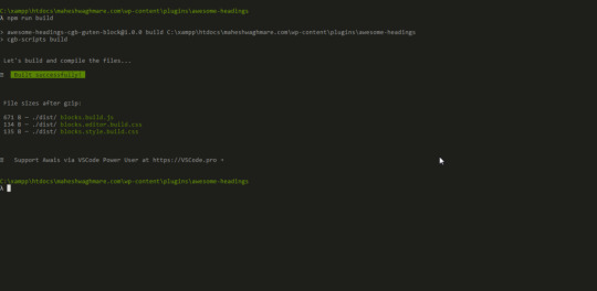
Build the Gutenberg block assets
Now, Our block files are build and ready to see in Gutenberg editor.
Let’s see how our first block looks like in the Gutenberg editor. First we need to activate our plugin.
Go to /wp-admin/plugins.php screen and activate the awesome-headings — CGB Gutenberg Block Plugin.
See below screenshot for reference:
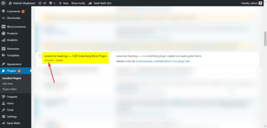
Activate “Gutenberg Block” Plugin
Now, Let’s create a new post from Posts > Add new
Type /awesome in the editor which shows the available bocks.

Inline Gutenberg Block Search
Or
We can search the block in top right corner.
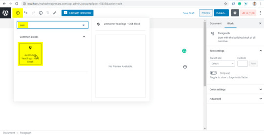
Now, Click on awesome-headings – CGB Block
Click on the Publish button

Publish New Post
Now, Click on View Post to see your post on frontend.
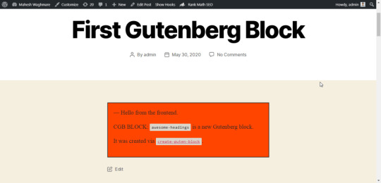
Post Front-End
Here, We can see our first Gutenberg block output in post content.
I have use the default WordPress theme Twenty Twenty to avoid any CSS or JS conflicts. You can use any your favorite theme for development.
I recommend to use the default WordPress themes while development. Also, deactivate all other plugins. Once your development is complete and plugins is ready to test then you can test the plugin with different themes and different plugins.
Create Gutenberg Block with @wordpress/block #Create Gutenberg Block with @wordpress/block
The @wordpress/block is also inspired by create-react-app. The create-react-app is used for creating the react app.
Lets see how to create custom gutenberg block with @wordpress/block.
Goto /wp-content/plugins/ directory and execute below command:
npm init @wordpress/block awesome-heading-with-wordpress-block
Here, the awesome-heading-with-wordpress-block is our plugin name. The package @wordpress/block create a ready to use Gutenberg block for us.
After executing above command you can see something similar:
λ npm init @wordpress/block awesome-heading-with-wordpress-block npx: installed 205 in 62.679s Creating a new WordPress block in "awesome-heading-with-wordpress-block" folder. Creating a "package.json" file. Installing packages. It might take a couple of minutes. Formatting JavaScript files. Compiling block. Done: block "Awesome Heading With WordPress Block" bootstrapped in the "awesome-heading-with-wordpress-block" folder. Inside that directory, you can run several commands: $ npm start Starts the build for development. $ npm run build Builds the code for production. $ npm run format:js Formats JavaScript files. $ npm run lint:css Lints CSS files. $ npm run lint:js Lints JavaScript files. $ npm run packages-update Updates WordPress packages to the latest version. You can start by typing: $ cd awesome-heading-with-wordpress-block $ npm start Code is Poetry
See below screenshot for reference:
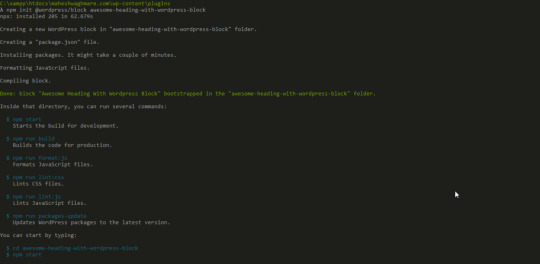
Create new Gutenberg Block with @wordpress/block
Same as create-guten-block the NPM package @wordpress/block also create a directory awesome-heading-with-wordpress-block into /wp-content/plugins/ directory. The file structure looks like below:
└───.editorconfig └───.gitignore └───awesome-heading-with-wordpress-block.php └───build └──────index.asset.php └──────index.js └───editor.css └───node_modules └───package-lock.json └───package.json └───readme.txt └───src └──────edit.js └──────index.js └──────save.js └───style.css
Now, Lets see how our first block looks like in the Gutenberg editor.
Note: Here we have not executed the npm run build command. By default the @wordpresss/block generate the /dist/ directory. If the block is not available from the Gutenberg editor then you can execute the above command.
Create a new post from Posts > Add new
Search from the Awesome Heading With WordPress Block block.
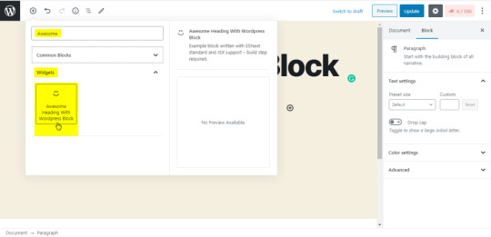
OR
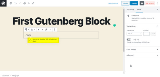
Click on the “Awesome Heading With WordPress Block” which add our block into the editor.
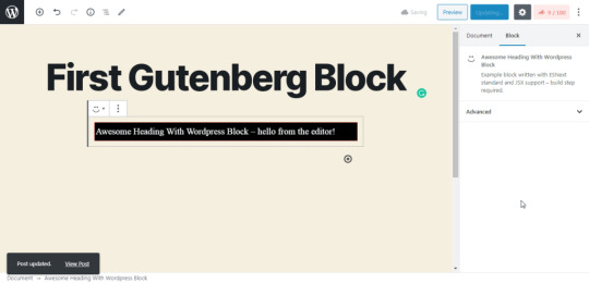
Now, Click on View Post to see the front end.
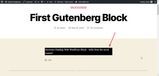
Create Gutenberg Block with wp scaffold block #Create Gutenberg Block with wp scaffold block
Creating the block with wp scaffold block is two step process if we don’t have any plugin.
We are creating a new plugin and a new block wihtin it.
Let’s see how to do it.
Create a new plugin my-gutenberg-plugin with wp scaffold plugin command.
E.g.
wp scaffold plugin my-gutenberg-plugin
After executing above command you can see something below:
λ wp scaffold plugin my-gutenberg-plugin Success: Created plugin files. Success: Created test files.
Here, The new plugin is created into the /wp-content/plugins/ direcotry with my-gutenberg-plugin
Now, Goto our new plugin directory /wp-content/plugins/my-gutenberg-plugin/ and execute below command:
wp scaffold block my-first-block --title="My First Block" --plugin=my-gutenberg-plugin
You can see something like below:
λ wp scaffold block my-first-block --title="My First Block" --plugin=my-gutenberg-plugin Success: Created block 'My First Block'.
Here, We have created a new block My First Block.
Now, Activate the plugin and Lets see how to use it in Gutenberg Editor.
After activate you’ll not see the Gutenberg block. We need to add a single line of code which actually include the block file path.
Add below code into the My Gutenberg Plugin plugin’s my-gutenberg-plugin.php file.
// Your code starts here. require_once plugin_dir_path( __FILE__ ) ) . 'blocks/my-first-block.php';
See below screenshot for reference:
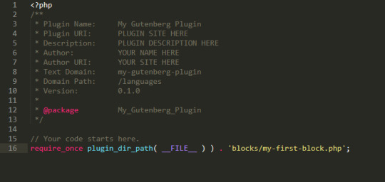
Now, Lets create a post and add our new block My First Block.
NOTE: Here we don’t need to build the JS or CSS files because of the Gutenberg block is created with the regular javascript functions. There is NO any JSX syntax. So, We dont need to build the dist directory. We can directly use our block.
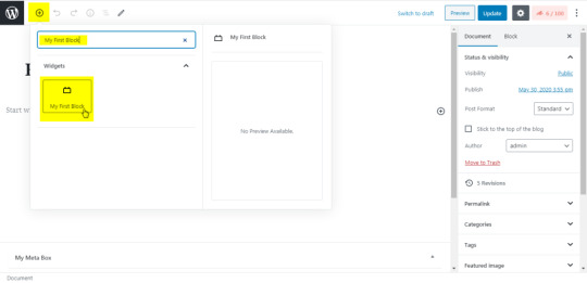


Conclusion #Conclusion
In this article we learn how to create Gutenberg block boilerplate with create-guten-block, @wordpress/block, and wp scaffold block. You can setup your custom development environment or use any of the above tools.
In next article you’ll see How to develop a Gutenberg block in details?
from WordPress https://bit.ly/2ZZYZP4 via IFTTT
0 notes
Text
How to Use Tailwind on a Svelte Site
Let’s spin up a basic Svelte site and integrate Tailwind into it for styling. One advantage of working with Tailwind is that there isn’t any context switching going back and forth between HTML and CSS, since you’re applying styles as classes right on the HTML. It’s all the in same file in Svelte anyway, but still, this way you don’t even need a <style> section in your .svelte files.
If you are a Svelte developer or enthusiast, and you’d like to use Tailwind CSS in your Svelte app, this article looks at the easiest, most-straightforward way to install tailwind in your app and hit the ground running in creating a unique, modern UI for your app.
If you like to just see a working example, here’s a working GitHub repo.
Why Svelte?
Performance-wise, Svelte is widely considered to be one of the top JavaScript frameworks on the market right now. Created by Rich Harris in 2016, it has been growing rapidly and becoming popular in the developer community. This is mainly because, while very similar to React (and Vue), Svelte is much faster. When you create an app with React, the final code at build time is a mixture of React and vanilla JavaScript. But browsers only understand vanilla JavaScript. So when a user loads your app in a browser (at runtime), the browser has to download React’s library to help generate the app’s UI. This slows down the process of loading the app significantly. How’s Svelte different? It comes with a compiler that compiles all your app code into vanilla JavaScript at build time. No Svelte code makes it into the final bundle. In this instance, when a user loads your app, their browser downloads only vanilla JavaScript files, which are lighter. No framework UI library is needed. This significantly speeds up the process of loading your app. For this reason, Svelte applications are usually very small and lightning fast. The only downside Svelte currently faces is that since it’s still new and doesn’t have the kind of ecosystem and community backing that more established frameworks like React enjoy.
Why Tailwind?
Tailwind CSS is a CSS framework. It’s somewhat similar to popular frameworks, like Bootstrap and Materialize, in that you apply classes to elements and it styles them. But it is also atomic CSS in that one class name does one thing. While Tailwind does have Tailwind UI for pre-built componentry, generally you customize Tailwind to look how you want it to look, so there is less risk of “looking like a Bootstrap site” (or whatever other framework that is less commonly customized). For example, rather than give you a generic header component that comes with some default font sizes, margins, paddings, and other styling, Tailwind provides you with utility classes for different font sizes, margins, and paddings. You can pick the specific ones you want and create a unique looking header with them. Tailwind has other advantages as well:
It saves you the time and stress of writing custom CSS yourself. With Tailwind, you get thousands of out-of-the-box CSS classes that you just need to apply to your HTML elements.
One thing most users of Tailwind appreciate is the naming convention of the utility classes. The names are simple and they do a good job of telling you what their functions are. For example, text-sm gives your text a small font size**.** This is a breath of fresh air for people that struggle with naming custom CSS classes.
By utilizing a mobile-first approach, responsiveness is at the heart of Tailwind’s design. Making use of the sm, md, and lg prefixes to specify breakpoints, you can control the way styles are rendered across different screen sizes. For example, if you use the md prefix on a style, that style will only be applied to medium-sized screens and larger. Small screens will not be affected.
It prioritizes making your application lightweight by making PurgeCSS easy to set up in your app. PurgeCSS is a tool that runs through your application and optimizes it by removing all unused CSS classes, significantly reducing the size of your style file. We’ll use PurgeCSS in our practice project.
All this said Tailwind might not be your cup of tea. Some people believe that adding lots of CSS classes to your HTML elements makes your HTML code difficult to read. Some developers even think it’s bad practice and makes your code ugly. It’s worth noting that this problem can easily be solved by abstracting many classes into one using the @apply directive, and applying that one class to your HTML, instead of the many. Tailwind might also not be for you if you are someone who prefers ready-made components to avoid stress and save time, or you are working on a project with a short deadline.
Step 1: Scaffold a new Svelte site
Svelte provides us with a starter template we can use. You can get it by either cloning the Svelte GitHub repo, or by using degit. Using degit provides us with certain advantages, like helping us make a copy of the starter template repository without downloading its entire Git history (unlike git clone). This makes the process faster. Note that degit requires Node 8 and above.
Run the following command to clone the starter app template with degit:
npx degit sveltejs/template project-name
Navigate into the directory of the starter project so we can start making changes to it:
cd project-name
The template is mostly empty right now, so we’ll need to install some required npm packages:
npm install
Now that you have your Svelte app ready, you can proceed to combining it with Tailwind CSS to create a fast, light, unique web app.
Step 2: Adding Tailwind CSS
Let’s proceed to adding Tailwind CSS to our Svelte app, along with some dev dependencies that will help with its setup.
npm install tailwindcss@npm:@tailwindcss/postcss7-compat postcss@^7 autoprefixer@^9 # or yarn add tailwindcss@npm:@tailwindcss/postcss7-compat postcss@^7 autoprefixer@^9
The three tools we are downloading with the command above:
Tailwind
PostCSS
Autoprefixer
PostCSS is a tool that uses JavaScript to transform and improve CSS. It comes with a bunch of plugins that perform different functions like polyfilling future CSS features, highlighting errors in your CSS code, controlling the scope of CSS class names, etc.
Autoprefixer is a PostCSS plugin that goes through your code adding vendor prefixes to your CSS rules (Tailwind does not do this automatically), using caniuse as reference. While browsers are choosing to not use prefixing on CSS properties the way they had in years past, some older browsers still rely on them. Autoprefixer helps with that backwards compatibility, while also supporting future compatibility for browsers that might apply a prefix to a property prior to it becoming a standard.
For now, Svelte works with an older version of PostCSS. Its latest version, PostCSS 8, was released September 2020. So, to avoid getting any version-related errors, our command above specifies PostCSS 7 instead of 8. A PostCSS 7 compatibility build of Tailwind is made available under the compat channel on npm.
Step 3: Configuring Tailwind
Now that we have Tailwind installed, let’s create the configuration file needed and do the necessary setup. In the root directory of your project, run this to create a tailwind.config.js file:
npx tailwindcss init tailwind.config.js
Being a highly customizable framework, Tailwind allows us to easily override its default configurations with custom configurations inside this tailwind.config.js file. This is where we can easily customize things like spacing, colors, fonts, etc.
The tailwind.config.js file is provided to prevent ‘fighting the framework’ which is common with other CSS libraries. Rather than struggling to reverse the effect of certain classes, you come here and specify what you want. It’s in this file that we also define the PostCSS plugins used in the project.
The file comes with some default code. Open it in your text editor and add this compatibility code to it:
future: { purgeLayersByDefault: true, removeDeprecatedGapUtilities: true, },
Tailwind 2.0 (the latest version), all layers (e.g., base, components, and utilities) are purged by default. In previous versions, however, just the utilities layer is purged. We can manually configure Tailwind to purge all layers by setting the purgeLayersByDefault flag to true.
Tailwind 2.0 also removes some gap utilities, replacing them with new ones. We can manually remove them from our code by setting removeDeprecatedGapUtilities to true.
These will help you handle deprecations and breaking changes from future updates.
PurgeCSS
The several thousand utility classes that come with Tailwind are added to your project by default. So, even if you don’t use a single Tailwind class in your HTML, your project still carries the entire library, making it rather bulky. We’ll want our files to be as small as possible in production, so we can use purge to remove all of the unused utility classes from our project before pushing the code to production.
Since this is mainly a production problem, we specify that purge should only be enabled in production.
purge: { content: [ "./src/**/*.svelte", ], enabled: production // disable purge in dev },
Now, your tailwind.config.js should look like this:
const production = !process.env.ROLLUP_WATCH; module.exports = { future: { purgeLayersByDefault: true, removeDeprecatedGapUtilities: true, }, plugins: [ ], purge: { content: [ "./src/**/*.svelte", ], enabled: production // disable purge in dev }, };
Rollup.js
Our Svelte app uses Rollup.js, a JavaScript module bundler made by Rich Harris, the creator of Svelte, that is used for compiling multiple source files into one single bundle (similar to webpack). In our app, Rollup performs its function inside a configuration file called rollup.config.js.
With Rollup, We can freely break our project up into small, individual files to make development easier. Rollup also helps to lint, prettify, and syntax-check our source code during bundling.
Step 4: Making Tailwind compatible with Svelte
Navigate to rollup.config.js and import the sveltePreprocess package. This package helps us handle all the CSS processing required with PostCSS and Tailwind.
import sveltePreprocess from "svelte-preprocess";
Under plugins, add sveltePreprocess and require Tailwind and Autoprefixer, as Autoprefixer will be processing the CSS generated by these tools.
preprocess: sveltePreprocess({ sourceMap: !production, postcss: { plugins: [ require("tailwindcss"), require("autoprefixer"), ], }, }),
Since PostCSS is an external tool with a syntax that’s different from Svelte’s framework, we need a preprocessor to process it and make it compatible with our Svelte code. That’s where the sveltePreprocess package comes in. It provides support for PostCSS and its plugins. We specify to the sveltePreprocess package that we are going to require two external plugins from PostCSS, Tailwind and Autoprefixer. sveltePreprocess runs the foreign code from these two plugins through Babel and converts them to code supported by the Svelte compiler (ES6+). Rollup eventually bundles all of the code together.
The next step is to inject Tailwind’s styles into our app using the @tailwind directive. You can think of @tailwind loosely as a function that helps import and access the files containing Tailwind’s styles. We need to import three sets of styles.
The first set of styles is @tailwind base. This injects Tailwind’s base styles—mostly pulled straight from Normalize.css—into our CSS. Think of the styles you commonly see at the top of stylesheets. Tailwind calls these Preflight styles. They are provided to help solve cross-browser inconsistencies. In other words, they remove all the styles that come with different browsers, ensuring that only the styles you employ are rendered. Preflight helps remove default margins, make headings and lists unstyled by default, and a host of other things. Here’s a complete reference of all the Preflight styles.
The second set of styles is @tailwind components. While Tailwind is a utility-first library created to prevent generic designs, it’s almost impossible to not reuse some designs (or components) when working on a large project. Think about it. The fact that you want a unique-looking website doesn’t mean that all the buttons on a page should be designed differently from each other. You’ll likely use a button style throughout the app.
Follow this thought process. We avoid frameworks, like Bootstrap, to prevent using the same kind of button that everyone else uses. Instead, we use Tailwind to create our own unique button. Great! But we might want to use this nice-looking button we just created on different pages. In this case, it should become a component. Same goes for forms, cards, badges etc.
All the components you create will eventually be injected into the position that @tailwind components occupies. Unlike other frameworks, Tailwind doesn’t come with lots of predefined components, but there are a few. If you aren’t creating components and plan to only use the utility styles, then there’s no need to add this directive.
And, lastly, there’s @tailwind utilities. Tailwind’s utility classes are injected here, along with the ones you create.
Step 5: Injecting Tailwind Styles into Your Site
It’s best to inject all of the above into a high-level component so they’re accessible on every page. You can inject them in the App.svelte file:
<style global lang="postcss"> @tailwind base; @tailwind components; @tailwind utilities; </style>
Now that we have Tailwind set up in, let’s create a website header to see how tailwind works with Svelte. We’ll create it in App.svelte, inside the main tag.

Step 6: Creating A Website Header
Starting with some basic markup:
<nav> <div> <div> <a href="#">APP LOGO</a> <!-- Menus --> <div> <ul> <li> <a href="#">About</a> </li> <li> <a href="#">Services</a> </li> <li> <a href="#">Blog</a> </li> <li> <a href="#">Contact</a> </li> </ul> </div> </div> </div> </nav>
This is the header HTML without any Tailwind CSS styling. Pretty standard stuff. We’ll wind up moving the “APP LOGO” to the left side, and the four navigation links on the right side of it.

Now let’s add some Tailwind CSS to it:
<nav class="bg-blue-900 shadow-lg"> <div class="container mx-auto"> <div class="sm:flex"> <a href="#" class="text-white text-3xl font-bold p-3">APP LOGO</a> <!-- Menus --> <div class="ml-55 mt-4"> <ul class="text-white sm:self-center text-xl"> <li class="sm:inline-block"> <a href="#" class="p-3 hover:text-red-900">About</a> </li> <li class="sm:inline-block"> <a href="#" class="p-3 hover:text-red-900">Services</a> </li> <li class="sm:inline-block"> <a href="#" class="p-3 hover:text-red-900">Blog</a> </li> <li class="sm:inline-block"> <a href="#" class="p-3 hover:text-red-900">Contact</a> </li> </ul> </div> </div> </div> </nav>
OK, let’s break down all those classes we just added to the HTML. First, let’s look at the <nav> element:
<nav class="bg-blue-900 shadow-lg">
We apply the class bg-blue-900 gives our header a blue background with a shade of 900, which is dark. The class shadow-lg class applies a large outer box shadow. The shadow effect this class creates will be 0px at the top, 10px on the right, 15px at the bottom, and -3px on the left.
Next is the first div, our container for the logo and navigation links:
<div class="container mx-auto">
To center it and our navigation links, we use the mx-auto class. It’s equivalent to margin: auto, horizontally centering an element within its container.
Onto the next div:
<div class="sm:flex">
By default, a div is a block-level element. We use the sm:flex class to make our header a block-level flex container, so as to make its children responsive (to enable them shrink and expand easily). We use the sm prefix to ensure that the style is applied to all screen sizes (small and above).
Alright, the logo:
<a href="#" class="text-white text-3xl font-bold p-3">APP LOGO</a>
The text-white class, true to its name, make the text of the logo white. The text-3xl class sets the font size of our logo (which is configured to 1.875rem)and its line height (configured to 2.25rem). From there, p-3 sets a padding of 0.75rem on all sides of the logo.
That takes us to:
<div class="ml-55 mt-4">
We’re giving the navigation links a left margin of 55% to move them to the right. However, there’s no Tailwind class for this, so we’ve created a custom style called ml-55, a name that’s totally made up but stands for “margin-left 55%.”
It’s one thing to name a custom class. We also have to add it to our style tags:
.ml-55 { margin-left: 55%; }
There’s one more class in there: mt-4. Can you guess what it does? If you guessed that it seta a top margin, then you are correct! In this case, it’s configured to 1rem for our navigation links.
Next up, the navigation links are wrapped in an unordered list tag that contains a few classes:
<ul class="text-white sm:self-center text-xl">
We’re using the text-white class again, followed by sm:self-center to center the list—again, we use the sm prefix to ensure that the style is applied to all screen sizes (small and above). Then there’s text-xl which is the extra-large configured font size.
For each list item:
<li class="sm:inline-block">
The sm:inline-block class sets each list item as an inline block-level element, bringing them side-by-side.
And, lastly, the link inside each list item:
<a href="#" class="p-3 hover:text-red-900">
We use the utility class hover:text-red-900 to make each red on hover.
Let’s run our app in the command line:
npm run dev
This is what we should get:

And that is how we used Tailwind CSS with Svelte in six little steps!
Conclusion
My hope is that you now know how to integrate Tailwind CSS into our Svelte app and configure it. We covered some pretty basic styling, but there’s always more to learn! Here’s an idea: Try improving the project we worked on by adding a sign-up form and a footer to the page. Tailwind provides comprehensive documentation on all its utility classes. Go through it and familiarize yourself with the classes.
Do you learn better with video? Here are a couple of excellent videos that also go into the process of integrating Tailwind CSS with Svelte.
youtube
youtube
The post How to Use Tailwind on a Svelte Site appeared first on CSS-Tricks.
You can support CSS-Tricks by being an MVP Supporter.
How to Use Tailwind on a Svelte Site published first on https://deskbysnafu.tumblr.com/
0 notes
Link
I've tried to collect some of the most used topics in Node, and looked for their alternative with Deno. First of all, I would like to make it clear that we can use many of the current Node.js modules. There is no need to look for an alternative for everything, as many modules are reusable. You can visit pika.dev to look for modules to use in Deno. That said, let's start with the list: Electron With Node.js we can create desktop applications using Electron. Electron uses Chromium as interface to run a web environment. But, can we use Electron with Deno? Are there alternatives?

Well, right now Electron is far from being able to be executed under Deno. We must look for alternatives. Since Deno is made with Rust, we can use web-view rust bindings to run Destkop application in Deno. This way, we can use the native OS webview to run as many webviews as we want. Repo: https://github.com/eliassjogreen/deno_webview
import { WebView } from "https://deno.land/x/webview/mod.ts"; const contentType = 'text/html' const sharedOptions = { width: 400, height: 200, resizable: true, debug: true, frameless: false, }; const webview1 = new WebView({ title: "Multiple deno_webview example", url: `data:${contentType}, <html> <body> <h1>1</h1> </body> </html> `, ...sharedOptions, }); const webview2 = new WebView({ title: "Multiple deno_webview example", url: `data:${contentType}, <html> <body> <h1>2</h1> </body> </html> `, ...sharedOptions, }); await Promise.all([webview1.run(), webview2.run()]);
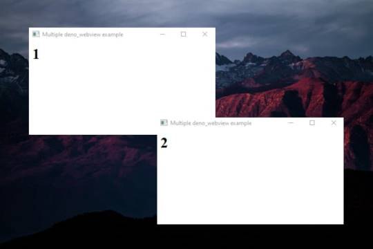
Forever / PM2
Forever and PM2 are CLI tools for ensuring that a given script runs continuously as a daemon. Unlike Forever, PM2 is more complete and also serves as load balancer. Both are very useful in Node, but can we use them in Deno? Forever is intended for Node only, so using it is not feasible. On the other hand, with PM2 we can run non-node scripts, so we could still use it for Deno.

Creating an app.sh file
#!/bin/bash deno run -A myCode.ts
And
➜ pm2 start ./app.sh
Express / Koa
Express and Koa are the best known Node frameworks. They're known for their robust routing system and their HTTP helpers (redirection, caching, etc). Can we use them in Deno? The answer is not... But there are some alternatives.

Http (std lib)
Deno's own STD library already covers many of the needs provided by Express or Koa. https://deno.land/std/http/.
import { ServerRequest } from "https://deno.land/std/http/server.ts"; import { getCookies } from "https://deno.land/std/http/cookie.ts"; let request = new ServerRequest(); request.headers = new Headers(); request.headers.set("Cookie", "full=of; tasty=chocolate"); const cookies = getCookies(request); console.log("cookies:", cookies);
However, the way to declare routes is not very attractive. So let's look at some more alternatives.
Oak (Third party lib)
One of the most elegant solutions right now, very inspired by Koa. https://github.com/oakserver/oak
import { Application, } from "https://deno.land/x/oak/mod.ts"; const app = new Application(); app.use((ctx) => { ctx.response.body = "Hello World!"; }); await app.listen({ port: 8000 });
Abc (Third party lib)
Similar to Oak. https://deno.land/x/abc.
import { Application } from "https://deno.land/x/abc/mod.ts"; const app = new Application(); app.static("/static", "assets"); app.get("/hello", (c) => "Hello!") .start({ port: 8080 });
Deno-express (Third party lib)
Maybe the most similar alternative to Express Framework. https://github.com/NMathar/deno-express.
import * as exp from "https://raw.githubusercontent.com/NMathar/deno-express/master/mod.ts"; const port = 3000; const app = new exp.App(); app.use(exp.static_("./public")); app.use(exp.bodyParser.json()); app.get("/api/todos", async (req, res) => { await res.json([{ name: "Buy some milk" }]); }); const server = await app.listen(port); console.log(`app listening on port ${server.port}`);
MongoDB
MongoDB is a document database with a huge scability and flexibility. In the JavaScript ecosystem has been widely used, with many stacks like MEAN or MERN that use it. It's very popular.

So yes, we can use MongoDB with Deno. To do this, we can use this driver: https://github.com/manyuanrong/deno_mongo.
import { init, MongoClient } from "https://deno.land/x/[email protected]/mod.ts"; // Initialize the plugin await init(); const client = new MongoClient(); client.connectWithUri("mongodb://localhost:27017"); const db = client.database("test"); const users = db.collection("users"); // insert const insertId = await users.insertOne({ username: "user1", password: "pass1" }); // findOne const user1 = await users.findOne({ _id: insertId }); // find const users = await users.find({ username: { $ne: null } }); // aggregation const docs = await users.aggregation([ { $match: { username: "many" } }, { $group: { _id: "$username", total: { $sum: 1 } } } ]); // updateOne const { matchedCount, modifiedCount, upsertedId } = await users.updateOne( username: { $ne: null }, { $set: { username: "USERNAME" } } ); // deleteOne const deleteCount = await users.deleteOne({ _id: insertId });
PostgresSQL

Like MongoDB, there is also a driver for PostgresSQL.
https://github.com/buildondata/deno-postgres.
import { Client } from "https://deno.land/x/postgres/mod.ts"; const client = new Client({ user: "user", database: "test", hostname: "localhost", port: 5432 }); await client.connect(); const result = await client.query("SELECT * FROM people;"); console.log(result.rows); await client.end();
MySQL / MariaDB

As with MongoDB and PostgresSQL, there is also a driver for MySQL / MariaDB.
https://github.com/manyuanrong/deno_mysql
import { Client } from "https://deno.land/x/mysql/mod.ts"; const client = await new Client().connect({ hostname: "127.0.0.1", username: "root", db: "dbname", poolSize: 3, // connection limit password: "password", }); let result = await client.execute(`INSERT INTO users(name) values(?)`, [ "aralroca", ]); console.log(result); // { affectedRows: 1, lastInsertId: 1 }
Redis

Redis, the best known database for caching, has also a driver for Deno.
https://github.com/keroxp/deno-redis
import { connect } from "https://denopkg.com/keroxp/deno-redis/mod.ts"; const redis = await connect({ hostname: "127.0.0.1", port: 6379 }); const ok = await redis.set("example", "this is an example"); const example = await redis.get("example");
Nodemon

Nodemon is used in development environment to monitor any changes in your files, automatically restarting the server. This makes node development much more enjoyable, without having to manually stop and restart the server to see the applied changes. Can it be used in Deno? Sorry, but you can't... but still, there is an alternative: Denon.
https://github.com/eliassjogreen/denon
We can use Denon as we use deno run to execute scripts.
➜ denon server.ts
Jest, Jasmine, Ava...

In the Node.js ecosystem there are a lot of alternatives for test runners. However, there isn't one official way to test the Node.js code. In Deno, there is an official way, you can use the testing std library.
https://deno.land/std/testing
import { assertStrictEq } from 'https://deno.land/std/testing/asserts.ts' Deno.test('My first test', async () => { assertStrictEq(true, false) })
To run the tests:
➜ deno test
Webpack, Parcel, Rollup...

One of the strengths of Deno is that we can use ESmodules with TypeScript without the need for a bundler such as Webpack, Parcel or Rollup. However, probably you wonder if given a tree of files, we can make a bundle to put everything in one file to run it on the web. Well, it's possible, yes. We can do it with Deno's CLI. Thus, there's no need for a third-party bundler.
➜ deno bundle myLib.ts myLib.bundle.js
Now it's ready to be loaded in the browser:
<script type="module"> import * as myLib from "myLib.bundle.js"; </script>
Prettier

In the last few years Prettier has become quite well known within the JavaScript ecosystem because with it you don't have to worry about formatting the files. And the truth is, it can still be used on Deno but it loses its meaning, because Deno has its own formatter. You can format your files using this command:
➜ deno fmt
NPM Scripts

With Deno, the package.json no longer exists. One of the things I really miss are the scripts that were declared in the package.json. A simple solution would be to use a makefile and execute it with make. However, if you miss the npm syntax, there is an npm-style script runner for Deno:
https://github.com/umbopepato/velociraptor
You can define a file with your scripts:
# scripts.yaml scripts: start: deno run --allow-net server.ts test: deno test --allow-net server_test.ts
Execute with:
➜ vr run <SCRIPT>
Another alternative is denox, very similar to Velociraptor.
Nvm

Nvm is a CLI to manage multiple active Node versions, to easy upgrade or downgrade versions depending on your projects. A nvm equivalent in Deno is dvm.
https://github.com/axetroy/dvm
➜ dvm use 1.0.0
Npx
Npx in recent years has become very popular to execute npm packages without having to install them. Now many projects won't exist within npm because Deno is a separate ecosystem. So, how can we execute Deno modules without having to install them with deno install https://url-of-module.ts? In the same way that we run our project, instead of a file we put the URL of the module:
➜ deno run https://deno.land/std/examples/welcome.ts
As you can see, not only we have to remember the name of the module, but the whole URL, which makes it a little more difficult to use. On the other hand it gives a lot more flexibility as we can run any file, not just what's specified as a binary in the package.json like npx.
Run on a Docker

To run Deno inside a Docker, we can create this Dockerfile:
FROM hayd/alpine-deno:1.0.0 EXPOSE 1993 # Port. WORKDIR /app USER deno COPY deps.ts . RUN deno cache deps.ts # Cache the deps ADD . . RUN deno cache main.ts # main entrypoint. CMD ["--allow-net", "main.ts"]
To build + run it:
➜ docker build -t app . && docker run -it --init -p 1993:1993 app
Repo: https://github.com/hayd/deno-docker
Run as a lambda

To use Deno as a lambda, there is a module in Deno STD library. https://deno.land/x/lambda.
import { APIGatewayProxyEvent, APIGatewayProxyResult, Context } from "https://deno.land/x/lambda/mod.ts"; export async function handler( event: APIGatewayProxyEvent, context: Context ): Promise<APIGatewayProxyResult> { return { body: `Welcome to deno ${Deno.version.deno} 🦕`, headers: { "content-type": "text/html;charset=utf8" }, statusCode: 200 }; }
Interesting references:
Deno in Vercel: https://github.com/lucacasonato/now-deno
Deno in AWS: https://blog.begin.com/deno-runtime-support-for-architect-805fcbaa82c3
Conclusion
I'm sure I forgot some Node topics and their Deno alternative, let me know if there's anything I missed that you'd like me to explain. I hope this article helps you break the ice with Deno. To explore all libraries you can use with Deno:
https://deno.land/std
https://deno.land/x
https://www.pika.dev/
0 notes