#crapcreatives
Photo
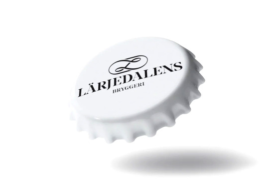
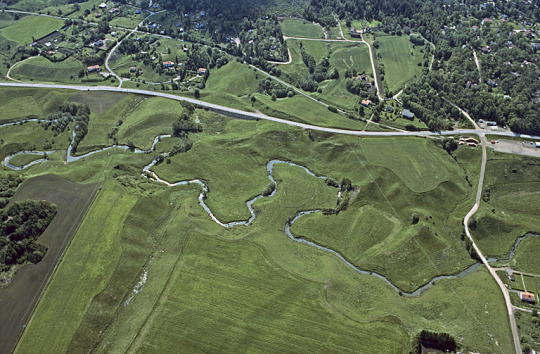
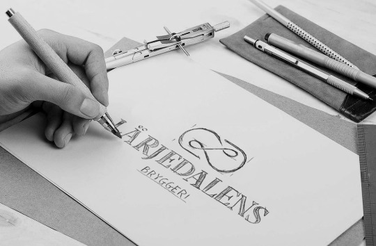

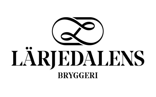
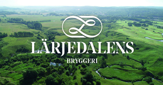
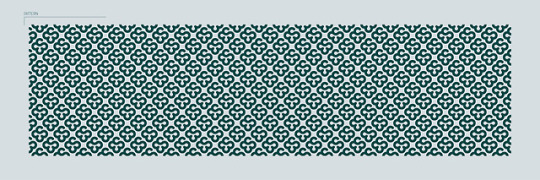
Lärjedalens Bryggeri
Lärjedalen is a district council area northeast of Gothenburg that got its name from the stream that meanders through the landscape; Lärjeån. In the valley, it runs naturally through a fissure valley that runs from a rolling stone ridge in the east and then flows into the Göta Älv in the west. The shape changes from thin to wide and follows the undulating nature...
A monogram represents the flow of the stream. The letter L is central and no matter how it is turned, it stands correctly. This makes it suitable for caps, coasters and other merch. Just as the river it flows to be wide and thin. And just as nature, the beer is amazing.
5 notes
·
View notes
Text
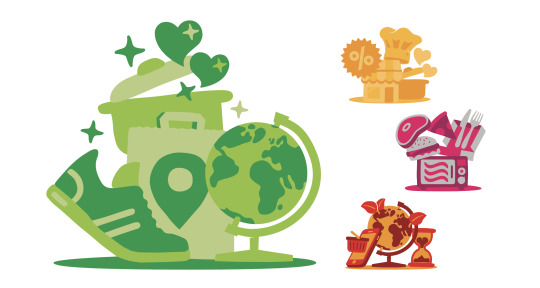
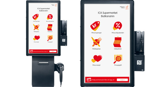
ICA Sverige - Customer Segments
Based on knowledge and customer data, these small worlds of objects show the different shopper segments at ICA. Together with introduction texts and statistics, each illustration tells a story about a general persona.
The groups got their own color setting with a refined variant of the main palette. The illustrations are based on the Illustrative Icons, but are modified to be more alive and able to be put into motion. The icons can easily be separated from the clusters to specify the data in more detail. Which one are you?
1 note
·
View note
Text
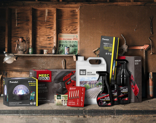
JULA - Own Brand Packaging
Jula has wide range of products in within the home fixer industry – and they all need a package design. My role as Packaging Artworker at the Inhouse EMV department was about implementing the new design guidelines to most of their Own Brand products. From line extensions to a whole new packagingconcept about to be launched for christmas.
0 notes
Text
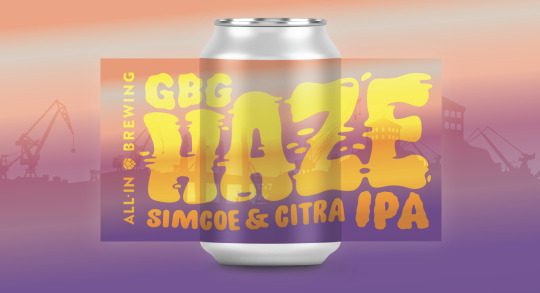
All in Brewing - Gbg Haze
One out of many labels for my friends at All In Brewing.
This is the sixth version of their Gbg Haze IPA with a summer vibe label.
0 notes
Text
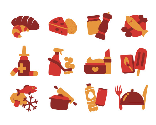
ICA Sverige - Illustrative icons
An update to the library with illustrative icons. As a step between functional pictograms and ICA’s illustration style, the icons are designed to communicate a hand-drawn feeling while at the same time containing a high degree of clarity. They are used both internally and externally for customers both in print and digitally, mainly online, in shop terminals, and on the Pronto App. ICA’s illustrations should evoke emotions and combine clarity with playfulness, with the presence of a human hand. Depending on the role of the illustration in the context, the image can be more or less descriptive. The illustrative icons are mainly used in the primary color scheme “red/orange” but are also available in five secondary color schemes that can be used where the icons must match existing design.
1 note
·
View note
Photo
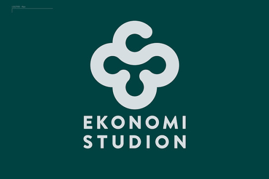
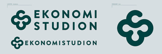
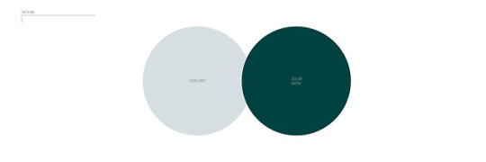
EKONOMI STUDION
Logotype for the accounting agency Ekonomi Studion. The E and S together creates a clover to hint about welfare and luck. Part of a Visual identity.
#logo#logotype#visualidentity#identity#graphic design#graphic#monogram#pattern#patterndesign#coins#dollar#economy#crap#crapcreatives
1 note
·
View note
Photo
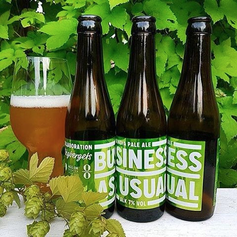
Business As Usual!
Printed on metallic label for the bottle, and for the tap label , a lentacular print (see movie)
Sense this was a collaboration brew with three breweries, the whole label design is visible only when three bottles stands next to each other.
Triple win!
2 notes
·
View notes
Photo
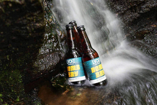
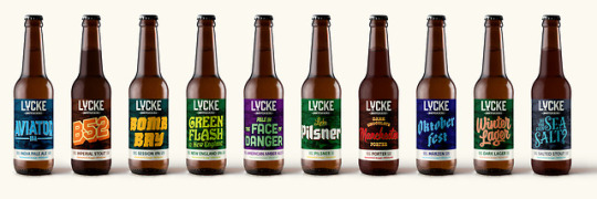
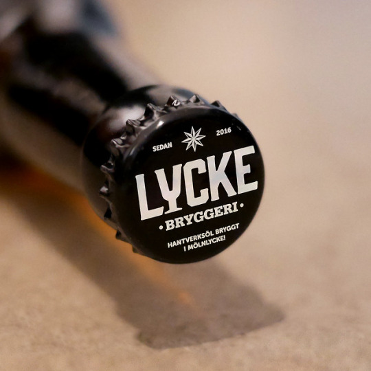
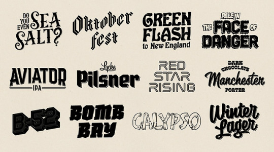
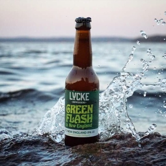
LYCKE
Brand-development for Lycke Bryggeri.
The mission was to modernize their brand and make it a obvious choise without jeopardize the feeling traditional craftsmanship.
The labels was set with existing logo, new imagery, pictography and typography. To make the brand come alive on the bottles each beer got an "text logo" with a custom made font, based on the story of each beer. The custom typed product names together with new brand colors communicate the Lycke essentials. Carefully crafted, and something for every taste profile out there.
The image in the back is an 19th century illustration that shows the old factory buildings where the brewery is located today; Mölnlycke Fabriker outside of Gothenburg, Sweden.
#craftbeer#beer#beerlabel#Labeldesign#label#customtype#lettering#letters#typographic#type#logotype#handmadefont#nofont#beerporn#crap#crapcreatives
0 notes
Photo


THIS & THAT!
Naming and labeling desing for these two IPA's brewed by @allinbrewing.
A Googled and photoshopped set design inspired by Systembolaget taste guide.
#this#that#ipa#beer#craftbeer#beerporn#beer label#beerdesign#graphic design#set#Labeldesign#labelart#design#identity#Branding#phot#crap#crapcreatives
5 notes
·
View notes
Photo
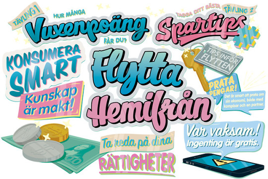
Typographic illustrations for the folder "Flytta hemifrån" that was sent out to all young adults in city of Gothenburg.
Commissioned by Intraservice.
0 notes
Photo
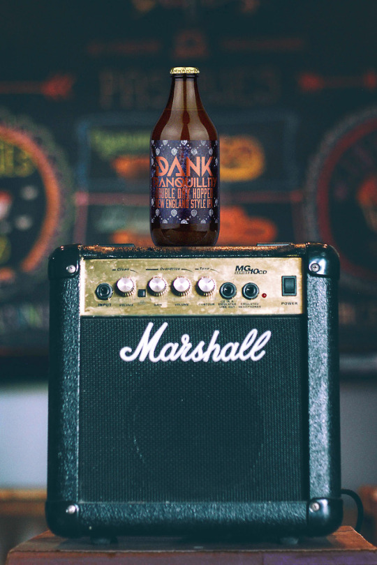
Dank Tranquillity
Label design for Dank Tranquillity, a Double Dry Hopped New England India Pale Ale. Yes, a DDHNEIPA.
Brewed by All In Brewing in collaboration with the death metal-band; Dark Tranquillity.
Printed on metallic paper for extra metal feeling, of course!
#danktranquillity#darktranquillity#DDHNEIPA#newengland#IPA#beer#allinbrewing#beerdesign#labeldesign#labelart#label#design#graphicdesign#graphic#metalprint#metal#branding#identity#crap#crapcreatives
0 notes
Photo
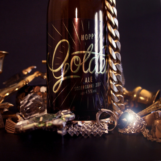
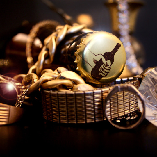
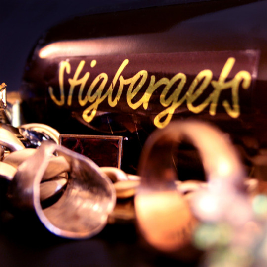
Hoppy Golden Ale
The label for Stigbergets Bryggeri and the official festival beer for the Micro Beer Festival in Söderbärke, SMÖF 2017.
Print on gold foil paper matches this golden brew.
#beerlabel#labeldesign#stigbergetsbryggeri#stigbergets#bryggeri#SMÖF#gold#hoppy#goldenale#craftbeer#beerdesign#labelart#label#design#graphicdesign#identity#branding#crap#crapcreatives
0 notes
Photo


All In Beer Fest 2016
After the poster and other graphics was done over 40 sisgns, one for each brewery participated, was paintet with blank ink on 70X100 cm carboards.
Stay tundet for 2017 edition!
#allinbeerfest#allinbrewing#beerfestival#craftbeer#sign#painting#signpaint#handmadefont#goodtype#brushtype#ink#crap#crapcreatives
0 notes
Photo


University of Gothenburg
This concepts should attract more international students for Gothenburg University by improving communication at the student fairs. In relation to our developed key words Journeys/Adventure/Ambition/Experience/Future, we created 2 concepts // 2 goodie bags. They package the brand and tells about the conditions, materials and thoughts.
No 1: Journey: Through life, Studies, Cities.
No 2: Gothenburg: Student Life, Context, The seances.
“University of Gothenburg is about traveling, about adventures and experiences, futures and visions. The education is your key to the city.“
Project group: Andreas Remfeldt, Ebba Carlén, Caroline Eriksson, Frej Wichmann
7 notes
·
View notes
Photo

KULAN
An investigation of the design object Kulan, using the word Prejudice to apply with the object. Kulan is designed by the artist Gunnar Larsson in 1969 for Gustavsberg. Made of the heat resistant plastic melamin and produced in a range of colors.
Collaboration with Lisa Marie Bengtsson
1 note
·
View note
Photo


GATUMUSIK APP
How do you pay the musicians on the streets without cash?
Use this APP. You can see where and when they preform, follow your favorites and offcourse, give them some money!
4 notes
·
View notes
Last Seen Blogs

tobedl
下载用的
odditycircus-2002
Chaos And Coffee [REQUESTS CLOSED]

pumpingbeat
Cardiophilia Blog

indoretattoos
tattoo artist body percar

virginsissystudent
SissyStudent