#css pie chart
Photo
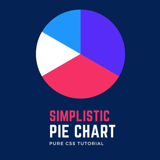
CSS Pie Chart
#css pie chart#pie chart html css#how to make pie chart#css tricks#html css tutorial#CSS Tutorial for beginner#css tutorial#codenewbies#learn css#learn to code#code#100daysofcode
0 notes
Text
ORACLE APEX BI

Unlocking Business Intelligence with Oracle APEX
Oracle APEX, the powerful low-code development platform within the Oracle Database, offers a surprisingly robust set of tools for creating insightful Business Intelligence (BI) solutions. In this blog, we’ll dive into how you can leverage APEX to enhance your data analysis and decision-making.
Why Choose APEX for BI?
Cost-Effective: APEX comes bundled with your Oracle Database license, eliminating the need for expensive third-party BI software.
Agile Development: APEX’s low-code environment lets you prototype BI solutions quickly, allowing faster iterations based on user feedback.
Data-Centric: APEX seamlessly integrates with your Oracle Database, giving you direct access to all your data without complex data movement or synchronization.
Customization: Customize your BI components to match your business needs and branding perfectly.
Secure: Benefit from the robust security features baked into the Oracle Database and APEX.
Key BI Features in APEX
Interactive Reports:
Drill-downs, pivoting, sorting, filtering, and aggregations empower users to explore data dynamically.
Easily export data to various formats (Excel, PDF, etc.).
Charts and Visualization:
There is a wide range of chart types to visualize business metrics: bar charts, pie charts, line graphs, scatter plots, and more.
Control the look and feel of your charts for maximum impact.
Dashboards:
Combine multiple reports, charts, and visualizations into consolidated, interactive dashboards.
Provide a high-level overview of critical KPIs (Key Performance Indicators).
Analytic Views:
Leverage the power of Oracle Analytic Views to pre-calculate complex metrics and aggregations, optimizing performance when dealing with large datasets.
Integration with External BI Tools:
While APEX has native BI capabilities, it can smoothly integrate with more extensive BI platforms, such as Oracle BI Publisher, Microsoft Power BI, and others, if needed.
How to Get Started with APEX BI
Understand Your Data: Identify the key data sources and metrics you want to track.
Design Your BI Components: Plan the reports, charts, and dashboards aligned with information needs.
Leverage APEX Wizards: APEX provides intuitive wizards to help you create these components quickly.
Customization: Use SQL, PL/SQL, CSS, and JavaScript to tailor components and add advanced functionality.
Example: Creating a Sales Analytics Dashboard in APEX
Create an Interactive Report showcasing sales data (customer, product, date, revenue, etc.).
Add charts visualizing sales trends, top-selling products, and regional sales performance.
Construct a dashboard with interactive reports and charts, providing a consolidated view of sales metrics.
Beyond the Basics
APEX’s BI capabilities extend far beyond what’s covered here. You can explore features like geospatial mapping, advanced analytics, and more. The best part is that APEX constantly evolves, offering new features and enhancements in each release.
Conclusion
Oracle APEX provides a powerful and accessible platform for building tailored BI solutions directly within your Oracle Database environment. If you’re looking for a cost-effective, adaptable, and secure way to gain data-driven insights, it’s an excellent choice.
youtube
You can find more information about Oracle Apex in this Oracle Apex Link
Conclusion:
Unogeeks is the No.1 IT Training Institute for Oracle Apex Training. Anyone Disagree? Please drop in a comment
You can check out our other latest blogs on Oracle Apex here – Oarcle Apex Blogs
You can check out our Best In Class Oracle Apex Details here – Oracle Apex Training
Follow & Connect with us:
———————————-
For Training inquiries:
Call/Whatsapp: +91 73960 33555
Mail us at: [email protected]
Our Website ➜ https://unogeeks.com
Follow us:
Instagram: https://www.instagram.com/unogeeks
Facebook: https://www.facebook.com/UnogeeksSoftwareTrainingInstitute
Twitter: https://twitter.com/unogeeks
0 notes
Text
Discover 25+ CSS Charts And Graphs
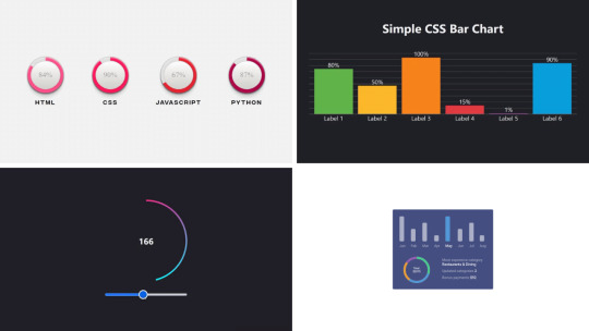
Welcome to CSS Monster, your go-to destination for discovering our curated collection of free HTML and CSS chart and graph code examples. These examples, carefully sourced from platforms like CodePen, GitHub, and other reputable resources, represent an exciting update to our July 2023 collection, introducing three new items to inspire your creativity.
CSS, renowned for its versatility, offers a myriad of advantages when it comes to crafting charts and graphs:
Flexibility: CSS empowers you with a high degree of customization, allowing the creation of charts and graphs that seamlessly align with your website's aesthetic.
Interactivity: With the capabilities of CSS, you can design interactive charts and graphs that respond dynamically to user input, enhancing overall user engagement and experience.
Performance: CSS-based charts and graphs are known for their swift loading times and optimal performance, ensuring a smooth user experience even on lower-end devices.
We extend an invitation to explore our collection of CSS charts and graphs, tailored for both seasoned developers and those just starting their coding journey. We are confident that within this collection, you'll discover elements that ignite inspiration for your next project.
It's worth noting that every item in our collection is freely available for use. So why wait? Embark on your exploration today and elevate your projects with the dynamic and visually appealing world of CSS charts and graphs!
Author
Hannah
March 9, 2023
Links
Just Get The Demo Link
How To Download - Article
How To Download - Video
Made with
HTML / CSS (SCSS)
About a code
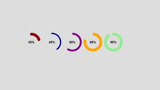
PROGRESS DONUT CHARTS
Compatible browsers:Chrome, Edge, Firefox, Opera, Safari
Responsive:no
Dependencies:-
Author
Adam Argyle
February 12, 2023
Links
Just Get The Demo Link
How To Download - Article
How To Download - Video
Made with
HTML / CSS / JS (Babel)
About a code
GRADIENT CIRCLE OUTLINE BOUND TO ANGLE
Compatible browsers:Chrome, Edge, Firefox, Opera, Safari
Responsive:yes
Dependencies:-
Author
Mark Boots
October 27, 2022
Links
Just Get The Demo Link
How To Download - Article
How To Download - Video
Made with
HTML / CSS
About a code
SIMPLE CSS BAR CHART
Compatible browsers:Chrome, Edge, Firefox, Opera, Safari
Responsive:yes
Dependencies:-
Author
Temani Afif
January 6, 2022
Links
Just Get The Demo Link
How To Download - Article
How To Download - Video
Made with
HTML / CSS
About a code
CSS-ONLY PIE CHARTS
Compatible browsers:Chrome, Edge, Firefox, Opera, Safari
Responsive:no
Dependencies:-
Author
Ana Tudor
May 28, 2021
Links
Just Get The Demo Link
How To Download - Article
How To Download - Video
Made with
HTML (Pug) / CSS (SCSS)
About a code
SKILLS CHART ANIMATION WITH A BIT OF HOUDINI MAGIC
Compatible browsers:Chrome, Edge, Firefox, Opera, Safari
Responsive:no
Dependencies:-

Author
Rami
November 19, 2020
Links
Just Get The Demo Link
How To Download - Article
How To Download - Video
Made with
HTML / CSS
About a code
PURE CSS AREA CHART
Compatible browsers:Chrome, Edge, Firefox, Opera, Safari
Responsive:no
Dependencies:-
Author
Jorge Mendes
June 3, 2020
Links
Just Get The Demo Link
How To Download - Article
How To Download - Video
Made with
HTML / CSS
About a code
GRAPH
Compatible browsers:Chrome, Edge, Firefox, Opera, Safari
Responsive:no
Dependencies:-
Author
Jerry Low
April 20, 2020
Links
Just Get The Demo Link
How To Download - Article
How To Download - Video
Made with
HTML (Slim) / CSS (SCSS)
About a code
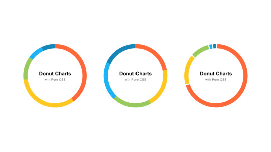
PURE CSS DONUT CHARTS
Compatible browsers:Chrome, Edge, Firefox, Opera, Safari
Responsive:no
Dependencies:-
Author
Ana Tudor
May 21, 2019
Links
Just Get The Demo Link
How To Download - Article
How To Download - Video
Made with
HTML (Pug) / CSS (SCSS)
About a code
PURE CSS BACKGROUND DEPENDING ON HEIGHT
Compatible browsers:Chrome, Edge, Firefox, Opera, Safari
Responsive:no
Dependencies:-
Author
sean_codes
April 17, 2019
Links
Just Get The Demo Link
How To Download - Article
How To Download - Video
Made with
HTML (Pug) / CSS (SCSS)
About a code
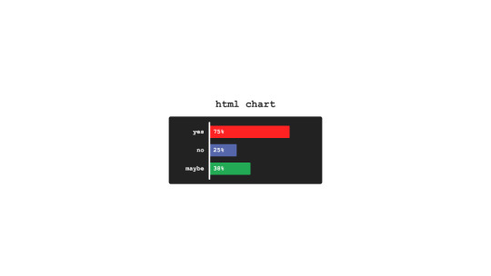
HTML CHART
Compatible browsers:Chrome, Edge, Firefox, Opera, Safari
Responsive:no
Dependencies:-
Author
Bence Szabo
April 13, 2019
Links
Just Get The Demo Link
How To Download - Article
How To Download - Video
Made with
HTML / CSS
About a code
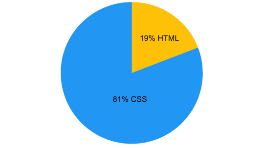
THIS PEN IS 19% HTML & 81% CSS
Compatible browsers:Chrome, Edge, Firefox, Opera, Safari
Responsive:yes
Dependencies:-
Author
Anjanas_dh
January 29, 2019
Links
Just Get The Demo Link
How To Download - Article
How To Download - Video
Made with
HTML / CSS (SCSS)
About a code
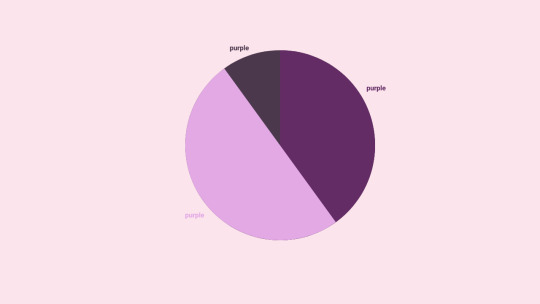
PURPLE PIE CHART
Compatible browsers:Chrome, Edge, Firefox, Opera, Safari
Responsive:no
Dependencies:-
Author
Sabine Robart
January 13, 2019
Links
Just Get The Demo Link
How To Download - Article
How To Download - Video
Made with
HTML / CSS (SCSS)
About a code
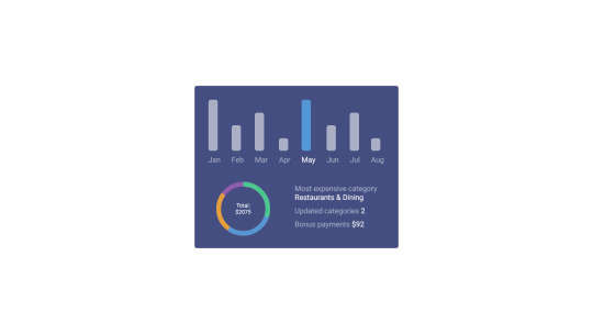
STATISTICS CARD
Compatible browsers:Chrome, Edge, Firefox, Opera, Safari
Responsive:no
Dependencies:-
Author
Olivia Ng
October 29, 2018
Links
Just Get The Demo Link
How To Download - Article
How To Download - Video
Made with
HTML (Pug) / CSS (SCSS) / JS
About a code
CSS ANIMATION: A LINE GRAPH
Compatible browsers:Chrome, Edge, Firefox, Opera, Safari
Responsive:no
Dependencies:simple-line-icons.css, jquery.js
Author
Ana Tudor
July 4, 2018
Links
Just Get The Demo Link
How To Download - Article
How To Download - Video
Made with
HTML (Pug) / CSS (SCSS)
About a code
INTERACTIVE, RESPONSIVE PIE CHART
Compatible browsers:Chrome, Edge, Firefox, Opera, Safari
Responsive:yes
Dependencies:-
Author
Erin E. Sullivan
July 18, 2017
Links
Just Get The Demo Link
How To Download - Article
How To Download - Video
Made with
HTML / CSS
About a code
SIMPLE AND RESPONSIVE ORGANIZATIONAL CHART
Compatible browsers:Chrome, Edge, Firefox, Opera, Safari
Responsive:yes
Dependencies:-
Author
Champlow
July 13, 2017
Links
Just Get The Demo Link
How To Download - Article
How To Download - Video
Made with
HTML / CSS (Less)
About a code
BAR GRAPH
Compatible browsers:Chrome, Edge, Firefox, Opera, Safari
Responsive:no
Dependencies:-
Author
Chen Hui Jing
February 24, 2017
Links
Just Get The Demo Link
How To Download - Article
How To Download - Video
Made with
HTML / CSS (SCSS)
About a code
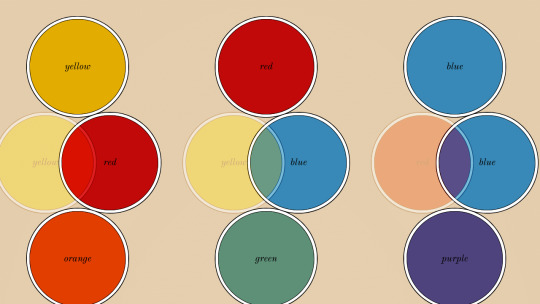
CHARLES HAYTER'S COLOUR DIAGRAMS
Compatible browsers:Chrome, Edge, Firefox, Opera, Safari
Responsive:yes
Dependencies:-
Author
Nick Walsh
February 14, 2017
Links
Just Get The Demo Link
How To Download - Article
How To Download - Video
Made with
HTML / CSS (Sass)
Read the full article
0 notes
Text
How to use JavaScript for data visualization
Data visualization is the process of transforming data into graphical or visual representations, such as charts, graphs, maps, etc. Data visualization can help us understand, analyze, and communicate data more effectively and efficiently.
JavaScript is a powerful and popular programming language that can be used for creating dynamic and interactive data visualizations in web browsers. JavaScript can manipulate the HTML and CSS elements of a web page, as well as fetch data from external sources, such as APIs, databases, or files.
To use JavaScript for data visualization, we need to learn how to:
Select and manipulate HTML elements: We can use JavaScript to select HTML elements by their id, class, tag name, attribute, or CSS selector. We can use methods such as getElementById(), getElementsByClassName(), getElementsByTagName(), querySelector(), or querySelectorAll() to return one or more elements. We can then use properties and methods such as innerHTML, style, setAttribute(), removeAttribute(), appendChild(), removeChild(), etc. to manipulate the selected elements.
Create and modify SVG elements: SVG (Scalable Vector Graphics) is a standard for creating vector graphics in XML format. SVG elements can be scaled without losing quality, and can be styled and animated with CSS and JavaScript. We can use JavaScript to create and modify SVG elements, such as , , , , , etc. We can use methods such as createElementNS(), setAttributeNS(), appendChild(), etc. to manipulate the SVG elements.
Handle events: We can use JavaScript to handle events that occur on the web page, such as mouse clicks, keyboard presses, window resizing, page loading, etc. We can use methods such as addEventListener() or removeEventListener() to attach or detach event handlers to elements. We can also use properties such as onclick, onkeyup, onload, etc. to assign event handlers to elements. An event handler is a function that runs when an event occurs. We can use the event object to access information about the event, such as its type, target, coordinates, key code, etc.
Use AJAX: We can use AJAX (Asynchronous JavaScript and XML) to send and receive data from a server without reloading the web page. We can use objects such as XMLHttpRequest or Fetch API to create and send requests to a server. We can also use methods such as open(), send(), then(), catch(), etc. to specify the request parameters, send the request, and handle the response. We can use properties such as readyState, status, responseText, responseJSON, etc. to access the state, status, and data of the response.
These are some of the basic skills we need to use JavaScript for data visualization. However, writing JavaScript code from scratch for data visualization can be challenging and time-consuming. That’s why many developers use JavaScript libraries and frameworks that provide pre-written code and templates for creating various types of data visualizations.
Some of the most popular JavaScript libraries and frameworks for data visualization are:
D3.js: D3.js (short for Data-Driven Documents) is a JavaScript library for producing dynamic and interactive data visualizations in web browsers. It makes use of SVG, HTML5, and CSS standards. D3.js allows us to bind data to DOM elements, apply data-driven transformations to them, and create custom visualizations with unparalleled flexibility1.
Chart.js: Chart.js is a JavaScript library for creating simple and responsive charts in web browsers. It uses HTML5 canvas element to render the charts. Chart.js supports various types of charts, such as line, bar, pie, doughnut, radar, polar area, bubble, scatter, etc.2
Highcharts: Highcharts is a JavaScript library for creating interactive and high-quality charts in web browsers. It supports SVG and canvas rendering modes. Highcharts supports various types of charts, such as line, spline, area, column, bar, pie, scatter, bubble, gauge, heatmap, treemap, etc. Highcharts also provides features such as zooming, panning, exporting, annotations, drilldowns, etc.
These are some of the popular JavaScript libraries and frameworks for data visualization. To use them in your web development project, you need to follow these steps:
Choose the right library or framework for your project: Depending on your project’s requirements, goals, and preferences, you need to select the most suitable library or framework that can help you create the data visualizations you want. You should consider factors such as the learning curve, documentation, community support, performance, compatibility, scalability, etc. of each library or framework before making a decision.
Add the library or framework to your web page: You can add a library or framework to your web page using either a script tag or an external file. The script tag can be placed either in the head or the body section of the HTML document. The external file can be linked to the HTML document using the src attribute of the script tag.
Learn how to use the library or framework features and functionalities: You need to read the documentation and guides of the library or framework you are using to understand how to use its features and functionalities effectively. You should also follow some tutorials and examples to get familiar with the syntax, conventions, patterns, and best practices of the library or framework.
Write your application code using the library or framework: You need to write your application code using the library or framework functions, methods, objects, components, etc. You should also test and debug your code regularly to ensure its functionality and quality.
These are some of the ways you can use JavaScript for data visualization. To learn more about JavaScript and data visualization, you can visit some of the online resources that offer tutorials, examples, exercises, and quizzes. Some of them are:
[W3Schools]: A website that provides free web development tutorials and references for HTML, CSS, JavaScript, and other web technologies.
[MDN Web Docs]: A website that provides documentation and guides for web developers, covering topics such as HTML, CSS, JavaScript, Web APIs, and more.
[Data Visualization with D3.js]: A website that provides a comprehensive course on data visualization with D3.js.
[e-Tutitions]: A website that provides online courses and for web , development, Learn JavaScript and you can book a free demo class.
[Codecademy]: A website that provides interactive online courses and projects for various programming languages and technologies.
0 notes
Text
Data Visualization in Frontend Development: Creating Interactive Charts and Graphs

Introduction
In the dynamic world of front-end development, data visualization plays a pivotal role in transforming complex information into intuitive and interactive charts and graphs. With businesses and users demanding richer experiences, front-end developers embrace innovative data presentation methods. In this blog, we'll explore the significance of data visualization in frontend development, understand its impact on frontend development services, and how frontend development companies leverage it to create engaging and user-friendly interfaces. Join us on this exciting journey into the realm of interactive charts and graphs!
Basics of Data Visualization
Data Types:
Categorical: Data that represent distinct categories or groups.
Numerical: Data with continuous or discrete numerical values.
Ordinal: Data with a predefined order or ranking.
Choosing Chart Types:
Categorical data: Bar charts (vertical/horizontal), stacked bar charts.
Numerical data: Line charts, scatter plots, histograms.
Ordinal data: Dot plots, ranked bar charts.
Popular Chart Types:
Bar charts: Visualize categorical data using bars of different lengths.
Line charts: Display trends and relationships between numerical data points.
Pie charts: Show proportions of different categories as a whole.
Tools and Libraries for Data Visualization
Frontend Libraries:
D3.js: Powerful library for creating interactive visualizations using HTML, SVG, and CSS.
Chart.js: User-friendly library with a variety of chart types and easy setup.
Comparison of Different Tools:
D3.js: Offers high customization but requires more coding skills.
Chart.js: Quick to implement with less coding required but may have limited customization options.
Selecting the Right Tool:
For complex, interactive visualizations, consider D3.js if you have front-end development expertise.
For simpler visualizations and faster implementation, choose Chart.js for efficient front-end development services.
Data Preparation and Formatting
Cleaning and processing data is essential to ensure accuracy and meaningful insights before visualising it.
Data cleaning involves removing errors, duplicates, and inconsistencies in the dataset.
Processing data includes transforming, reshaping, and aggregating it for better analysis.
Dealing with missing values requires imputing them with appropriate techniques or removing the affected records.
Outliers, which are extreme values, need to be handled by either adjusting them or considering them separately.
Transforming data into a suitable format for charts and graphs involves organizing it into columns, rows, or categories.
The data is converted into a compatible format, such as CSV or JSON, for visualization tools.
Creating Interactive Charts
Interactive charts provide enhanced user experiences and allow users to explore data interactively.
Adding tooltips, hover effects, and click events to charts can display additional information when users interact with specific elements.
Tooltips provide contextual information when hovering over data points, helping users understand the data better.
Hover effects highlight or change the appearance of chart elements to provide visual feedback when interacting with them.
Click events enable users to drill down into detailed data or navigate to related content.
Implementing interactive filters and data controls allows users to modify the chart's displayed data dynamically.
Filters enable users to select specific data subsets based on predefined or custom criteria.
Data controls, such as sliders or dropdown menus, provide a convenient way for users to interact with data parameters.
Frontend development company offer services to create visually appealing and interactive charts that meet specific business requirements.
These companies specialize in implementing front-end technologies and frameworks to create seamless and engaging user interfaces for data visualization.
Customizing Visualizations
Styling charts to match website design and branding enhances visual appeal and user experience.
CSS (Cascading Style Sheets) and SVG (Scalable Vector Graphics) are powerful tools for customizing chart appearance.
Using CSS, you can control colours, fonts, and layout to align with your front-end development company's branding.
SVG allows for scalable and resolution-independent graphics, ensuring crisp visuals on any screen.
Accessibility in Data Visualization
Accessibility is crucial for front-end development services to cater to all users, including those with disabilities.
Implement proper labels and alternative text (alt text) for charts and visual elements.
Alt text provides descriptions of images, making them understandable for screen readers.
Test visualizations for accessibility compliance using tools like Lighthouse or Wave.
Performance Optimization
Performance optimization is a crucial aspect of front-end development. It ensures that websites and applications run smoothly, providing a seamless user experience. Here are some techniques to improve chart rendering performance and handle real-time data updates efficiently:
Chart Rendering Performance:
Implement data caching: Store pre-rendered charts to reduce processing time.
Use optimized chart libraries: Choose high-quality and efficient rendering libraries.
Minimize DOM manipulation: Limit the number of redraws and updates to the chart's DOM elements.
Enable hardware acceleration: Utilize the GPU to accelerate rendering, especially for complex charts.
Implement data pagination: Load and render data in chunks to avoid overwhelming the browser.
Lazy Loading of Data:
Load data on demand: Fetch data only when needed, particularly for large datasets.
Implement infinite scrolling: Load additional data as users scroll down instead of loading everything upfront.
Handling Real-time Data Updates:
Use efficient data update algorithms: Optimize updating chart data to minimize computation.
Implement data streaming: Receive and process real-time data updates incrementally, reducing the load on the front end.
Utilize web sockets: Establish a persistent connection for real-time data transfer, avoiding frequent HTTP requests.
By employing these techniques, front-end development companies can significantly enhance performance and provide efficient front-end development services.
Conclusion
In conclusion, data visualization has emerged as an essential aspect of front-end development. It empowers front-end development companies to craft visually appealing, user-friendly interfaces that convey information effectively. By embracing interactive charts and graphs, front-end developers can elevate the overall user experience, making data more accessible and engaging for everyone. As businesses continue to emphasize data-driven decision-making, mastering the art of data visualization will be a crucial skill for front-end developers. So, let's embrace the power of data visualization and unlock a world of creativity and innovation in the front-end development domain.
0 notes
Link
0 notes
Text
React dist unpkg

#React dist unpkg how to#
#React dist unpkg install#
#React dist unpkg code#
#React dist unpkg code#
To lint your code, run the tests, and create code coverage reports: npm run full-test Requirementsreact-vis makes use of ES6 array methods such as.
#React dist unpkg install#
DevelopmentTo develop on this component, install the dependencies and then build and watch the static files: npm install & npm run startOnce complete, you can view the component's example in your browser (will open automatically).Īny changes you make to the example code will run the compiler to build the files again. Sunbursts about making sunburst diagrams. Parallel Coordinates about making parallel coordinate charts.
#React dist unpkg how to#
Scales and Data about how the attributes can be adjusted.Īnimations about how to tweak animations in the library. #4 More informationTake a look at the folder with examples or check out some docs: The global reactVis object will now be available for you to play around. If you're working in a non-node environment, you can also directly include the bundle and compiled style using basic html tags. … and add the following code to your render function: Import the necessary components from the library. Here's an example of importing only the legends "~react-vis/dist/styles/legends" This helps minimize the size of the outputted CSS. You can also select only the styles you want to use. npm install react-vis -saveInclude the built main CSS file in your HTML page or via "~react-vis/dist/style" react-vis supports the React's lifecycle and doesn't create unnecessary nodes. The library provides a set of defaults which can be overridden by the custom user's settings. This provides a high level of control of chart layout for applications that need it. For instance, separate X and Y axis components. react-vis provides a set of basic building blocks for different charts. react-vis doesn't require any deep knowledge of data visualization libraries to start building your first visualizations. This project initially started as a mozilla-services project.OverviewA collection of react components to render common data visualization charts, such as line/area/bar charts, heat maps, scatterplots, contour plots, hexagon heatmaps, pie and donut charts, sunbursts, radar charts, parallel coordinates, and tree maps. Title: Ĭonst log = (type) => (console, type) įor more information on what themes we support, see Using Themes. You'll also need to alias the default export property to use the Form component: const Form = fault Note: The CDN version does not embed react or react-dom. You can also install react-jsonschema-form (the 1.x version) which works with React 15+. Then import the dependency as follows: import Form from latest version requires React 16+. Installation ¶įirst install the dependency from npm: $ npm install -save React-jsonschema-form also comes with tools such as uiSchema and other form props to customize the look and feel of the form beyond the default themes. If you have a priori knowledge of your data and want a toolkit for generating forms for it, you might look elsewhere. If you want to generate a form for any data, sight unseen, simply given a JSON schema, react-jsonschema-form may be for you. React-jsonschema-form is meant to automatically generate a React form based on a JSON Schema. A simple React component capable of building HTML forms out of a JSON schema.Ī live playground is hosted on GitHub Pages:
0 notes
Text
Avoid displaying data in plt.hist python jupyter notebook

#AVOID DISPLAYING DATA IN PLT.HIST PYTHON JUPYTER NOTEBOOK HOW TO#
#AVOID DISPLAYING DATA IN PLT.HIST PYTHON JUPYTER NOTEBOOK CODE#
When I did this, however, I received this message.
#AVOID DISPLAYING DATA IN PLT.HIST PYTHON JUPYTER NOTEBOOK CODE#
I replicated this code in a Jupyter cell and clicked "Run". 'Hogs')Īx1.pie(sizes, explode=explode, labels=labels, autopct='%1.1f%%',Īx1.axis('equal') # Equal aspect ratio ensures that pie is drawn as a circle. # Pie chart, where the slices will be ordered and plotted counter-clockwise:Įxplode = (0, 0.1, 0, 0) # only "explode" the 2nd slice (i.e. Here is the annotated sample code that the tutorial offers: import matplotlib.pyplot as plt First, I went to the pie chart tutorial on the matplotlib website in order become familiar with the basics: I am using Jupyter and matplotlib in a miniconda environment on Linux. I am unsure if this is the correct sub-reddit to post this question, so if there is somewhere better please let me know. Subreddit CSS and other assets can be found on github here: If you have any questions/suggestions/special offers for the community please message the moderators: Posting homework assignments is not prohibited if you show that you tried to solve it yourself. Either the example compiles cleanly, or causes the exact error message about which you want help.Īvoid posting a lot of code in your posts. Include the error you get when running the code, if there is one.Įnsure your example is correct. SSCCE Keep your code Short, Self Contained, Correct (Compilable) and provide Example Your code is hard to read and test otherwise.īe sure to try out suggestions you get and report back. Proofread your answers for clarity and correctness.įormat your code for reddit or use a site like github or pastebin. Try to guide OP to a solution instead of providing one directly.Īnswer the question and highlight side-issues if any exist.ĭon't "answer and run", be prepared to respond to follow up questions. r/Python /r/madeinpython /r/programmingbuddies /r/pythontips /r/flask /r/django /r/pygame /r/programming /r/learnprogramming /r/dailyprogrammer Guidelines Commenting
#AVOID DISPLAYING DATA IN PLT.HIST PYTHON JUPYTER NOTEBOOK HOW TO#
Guide on how to join and different IRC clients: /wiki/IRCĪll learning resources are in the wiki: /r/learnpython/w/indexįrequently Asked Questions: /r/learnpython/w/FAQ Join us in the IRC channel: #learnpython on libera.chat Reddit rules These apply also on this subreddit.Posting screenshot of the code is (generally) not allowed.Posting only assignment/project goal is not allowed.Please do not delete your post after you get an answer, others might have a similar question or want to continue the conversation. Please, no "hit and run" posts, if you make a post, engage with people that answer you. Rule 3: No recruiting/hiring/seeking others posts.Rule 2: No posts advertising blogs/videos/tutorials/etc.Rule 1: Posts must be about learning python.The easiest way to create a histogram using Matplotlib, is simply to call the hist function: plt.Please read the rules and guidelines below and search before posting. Tip! If you’re working in the Jupyter environment, be sure to include the %matplotlib inline Jupyter magic to display the histogram inline. This hist function takes a number of arguments, the key one being the bins argument, which specifies the number of equal-width bins in the range. To create a histogram in Python using Matplotlib, you can use the hist() function. Creating a Histogram in Python with Matplotlib It might make sense to split the data in 5-year increments. We can see from the data above that the data goes up to 43. We can then create histograms using Python on the age column, to visualize the distribution of that variable. Let’s begin by loading the required libraries and our dataset. The histogram can turn a frequency table of binned data into a helpful visualization: Loading our Dataset If you want to learn how to create your own bins for data, you can check out my tutorial on binning data with Pandas. The shape of the histogram displays the spread of a continuous sample of data. The taller the bar, the more data falls into that range. Creating a Histogram in Python with PandasĪ histogram is a chart that uses bars represent frequencies which helps visualize distributions of data.īars can represent unique values or groups of numbers that fall into ranges.Changing Matplotlib Histogram Appearance.Creating a Histogram in Python with Matplotlib.
0 notes
Photo

🔴 Create PIE Chart using only HTML & CSS | Radial Gradient ☞ https://bit.ly/2PFsqQ5 #html #css #javascript
6 notes
·
View notes
Photo
Pie Chart with CSS Conic Gradient and Vue.js ☞ https://school.geekwall.in/p/egCtppvk/pie-chart-with-css-conic-gradient-and-vue-js #vuejs #javascript
4 notes
·
View notes
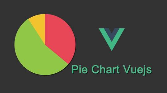
Photo

Pie Chart with CSS Conic Gradient and Vue.js ☞ https://school.geekwall.in/p/egCtppvk/pie-chart-with-css-conic-gradient-and-vue-js #vuejs #javascript
1 note
·
View note
Photo

Pie Chart with CSS Conic Gradient and Vue.js ☞ https://school.geekwall.in/p/egCtppvk/pie-chart-with-css-conic-gradient-and-vue-js #vuejs #javascript
2 notes
·
View notes
Photo

Pie Chart with CSS Conic Gradient and Vue.js ☞ https://school.geekwall.in/p/egCtppvk/pie-chart-with-css-conic-gradient-and-vue-js #vuejs #javascript
1 note
·
View note
Text
Single Element Pie Chart (Circle Diagram) With CSS
Single Element Pie Chart (Circle Diagram) With CSS
A circle chart or pie chart is a circular statistic graph, which represents the proportions of a whole.
Using a single div and some CSS you can build circle diagrams representing percentage values. You can also optionally have smooth transitions by using JavaScript.
How to use it:
1. Add the CSS class circle-diagram to a DIV element and define a number expressed as a fraction of 100 using the…

View On WordPress
1 note
·
View note
Text
The Web Building Process: Rebuilding the Survey Results Page
Hello everyone! Finally went and finished the survey results page. This took a little under an hour to finish, but it's probably my favorite page of the main six. Now, 5/6 pages are done; only the conclusion page remains!
I previously talked about the mild annoyance that was the evaluation line-up in this post. Thankfully, the ability to copy and paste styles (as well as duplicating sections) was super helpful!
And oh, here's the mockup and wireframe for this page for a comparison:


In regards to the responsive version of the website, here's what I'll need to fix/keep in mind:
Create a PDF version of the survey questions (the link is on # at the moment)
Remember to make the spreadsheet link public and open to viewing.
Add a CSS class to the "evaluation line-up" section so that returning to the page is easy (and that people don't have to scroll through the first parts of the website).
When the survey results close, provide a proper title + description for the pie charts
As per usual, give more left/right padding to the sections so that they're not hugging the wall.
Fix the demographic information section, it's very misaligned
Change the columns for the evaluation line-up on tablet/mobile versions
Going to finish the conclusion page now! But for now, if you'd like to see the other timelapses/discussions for the other pages, consider checking out these posts: Home | Research | About | Further Reading
#amber updates#cm 491#web design#elementor page builder#EDIT: forgot to include the mockup and wireframe so i uploaded that now!
1 note
·
View note
Last Seen Blogs

allaboardthepornship-blog
All Aboard the the Pornship

skyler206
Skyler White

mutant-munchies
MOVED

itkimidol
maybe,

byhareth
Hareth - حارث