#css3 tutorial
Explore tagged Tumblr posts
Visit Tumblr Blog
Explore Tumblr blogs with no restrictions, modern design and the best experience.
Last Seen Tumblr Blogs


Fun Fact
Mobile US users spent an average of 115.8 minutes on Tumblr app monthly.
Text
CSS Mix Blend Mode
#css mix blend mode#css effects#css tricks#html css#frontend#css#html#css3#frontenddevelopment#css image effects#neduzone#basic css tutorial#css for beginners#css tutorial#css3 tutorial
2 notes
·
View notes
Text

CSS Slideshow with Thumbnails
#html css slideshow#css slideshow#css slider#css slider with thu#css slider with thumbnail#html css#codenewbies#frontenddevelopment#html5 css3#css#css animation examples#css animation tutorial#pure css animation#code#webdesign
5 notes
·
View notes
Text

3D Cube Animation
#3d cube animation#html css animation#html css#divinector#frontenddevelopment#css3#css animation tutorial#css animation examples#css animation snippets#css#html#learn to code#code
6 notes
·
View notes
Text
Responsive Animated Website With HTML & CSS
youtube
#html#tamilitmemes#css3#tamilwebdesign#css animation#web development#web design#website#webdesign#youtube#responsivewebdesign#responsive design#responsive webdesign#responsive web design#webdev#htmlcodes#htmlcss#learn html#html5#html course#css tutorial#html css#html5 css3#css#htmlcoding#frontenddevelopment#javascript#csstricks#websitedesign#website development
5 notes
·
View notes
Text
youtube
2 notes
·
View notes
Text
youtube
Fancy css button animations
2 notes
·
View notes
Text

🌟 Webflow Tip of the Day – Unlock Clean Layouts with Negative Margins (Carefully!)
Want pixel-perfect spacing between overlapping elements or tight layout precision without bloating your DOM with extra divs?
🎯 Use Negative Margins for Smart Overlaps
📌 What are Negative Margins? Negative margins pull elements closer than default spacing allows — perfect for creative layouts and tighter UI.
🛠️ Use Cases: • Pulling headings over hero images • Tightening card layouts • Floating buttons partially outside sections
💡 How To Apply:
Select your element
Go to Spacing → Margin
Enter a negative value (e.g., -20px)
Preview across breakpoints for responsiveness
⚠️ Pro Tips: • Use sparingly — too many = layout chaos • Always check responsiveness, especially on mobile • Combine with relative positioning for best results
🚀 Why It Works: ✅ Cleaner layout without wrapper clutter ✅ Optimized DOM = better SEO ✅ Professional control over spacing
📌 Connect With Me 🌐 Webflow Portfolio: www.webflowwork.com 🎯 Upwork: https://bit.ly/4iu6AKd 🎯 Fiverr: https://bit.ly/3EzQxNd
#webflow#web design#freelancewebdeveloper#web development#webflowdesign#webflowexperts#webflowlandingpage#website#nocode#ui ux design#fiverr tutorial#fiverr#freelancing#upwork#html5 css3#html css#html#htmlcoding#learn to code#coding#code#html5#css#nocodedesign#webdesign#app development#webdevelopment#web developers
0 notes
Text
Image Accordion - Follow me on yt
#HTML#CSS#WebDevelopment#ImageAccordion#Tutorial#Coding#FrontendDevelopment#WebDesign#ResponsiveDesign#HTML5#CSS3#WebTutorial#Programming#WebDev#LearnToCode#WebDesignTutorial
0 notes
Text
HTML5 and CSS3 for Responsive Web Design: Tips, Tricks, and Tutorials

Creating a responsive website means your site will look great and work well on any device, from large desktop monitors to small mobile screens. In this responsive HTML5 and CSS3 tutorial, we will explore some key concepts to help you design a site that adapts to various screen sizes.
First, it's important to control the viewport settings. This tells the browser how to adjust the page dimensions and scaling. Setting the viewport properly ensures that your website scales correctly on all devices.
Next, design your website using flexible layouts. Instead of setting fixed widths, use percentages. This allows the layout to adjust based on the screen size. For example, if your content container is set to 80% of the screen width, it will automatically resize when the screen size changes, providing a consistent look across devices.
Images should also be flexible. Ensuring that images resize within their containers prevents them from breaking the layout on smaller screens. This can be done by setting the maximum width of the images to 100% of their container.
Media queries are essential for responsive design. These allow you to apply different styles depending on the screen size. For instance, you might want to change the layout for screens that are smaller than 600 pixels. Media queries enable you to do this by specifying different CSS rules for different screen sizes.
With these simple steps, you can start building responsive websites using HTML5 and CSS3. Remember, testing your design on multiple devices is crucial to ensure it looks and works perfectly everywhere.
For a more detailed guide, check out this comprehensive tutorial. Happy coding!
0 notes
Text

Learn to create responsive websites with this comprehensive HTML5 and CSS3 tutorial, covering flexible layouts, media queries, and best practices for ensuring optimal performance across all devices.
0 notes
Text
Exploring the :has() Selector in CSS
CSS has progressed greatly over time, introducing a number of advanced selectors that improve the ability to style web pages with precision and flexibility. One of the most recent additions to the CSS selector is the :has() pseudo-class. This blog will go over the details of the :has() selector, including its usage, benefits, and practical examples to help you use this powerful tool in your web development projects.
What is the :has() Selector?
The :has() selector is a relational pseudo-class that lets you choose an element depending on the presence of a descendant or a more complicated relationship within its subtree. In simpler terms, it allows you to style a parent element if it contains specific child components.
Syntax:
element:has(selector) { /* CSS properties */ }
Key Features
Relational Selection: Unlike typical CSS selectors, which focus on the element or its immediate children, :has() selector looks at the content within the element to see if it fits a specified conditions.
Dynamic Styling: It can dynamically apply styles based on the presence or absence of specific elements, resulting in more interactive and context-aware designs.
Please check out nine examples of the :has selector by clicking on the link.
follow- https://www.linkedin.com/company/skillivo/
#html#css#javascript#web design#web development#programming#coding#advanced css#css3#html5#frontenddevelopment#webdevelopment#css tutorial#skillivo
1 note
·
View note
Text
Responsive Image Gallery Design
#responsive web design#codingflicks#html css#frontend#css#html#css3#frontenddevelopment#responsive image gallery#image gallery html css#responsive design#basic css tutorial#css3 tutorial
0 notes
Text

Text Typing Effect
#text typing effect#css text animation#pure css animation#html5 css3#html css#codenewbies#css animation examples#css animation tutorial#css#frontenddevelopment
6 notes
·
View notes
Text
Responsive Web Layout with Video Background
#responsive web design#responsive web layout#css3#html css#divinector#frontenddevelopment#webdesign#html#learn to code#css#html5 css3#html css tutorial#css tutorial#video background
8 notes
·
View notes
Text
youtube
0 notes
Text
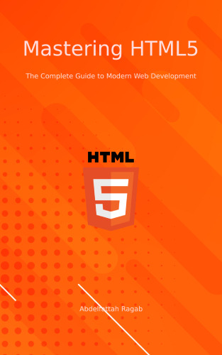
Mastering HTML5: The Complete Guide to Modern Web Development https://buy.stripe.com/dR6dUN4Mx7G72hG8wz
— — — — — — — — — — — — — — — — — — — — — — — — — — -
Join our affiliate program to promote Angular and React courses.
You will only receive money when sales are made, and these should be through your link. Then you will receive 45% commission.
Sign up:
#angular #react #affiliate #commission
0 notes