#css2
Explore tagged Tumblr posts
Visit Tumblr Blog
Explore Tumblr blogs with no restrictions, modern design and the best experience.
Last Seen Tumblr Blogs


Fun Fact
After the announcement of the deal with Yahoo!, there were 170K signatures of unhappy Tumblr users petitioning to prevent the sale in 2013.
Text

¡CRÓNICAS VAMPÍRICAS RPG ESTRENA DOMINIO!
Esta y otras de nuestras más recientes adquisiciones se las debemos en especial a nuestros mecenas: aquellos que han colaborado con nosotros y nos han invitado a un café a través de nuestro Ko-Fi oficial. ¡Muchas gracias a todos!
24 notes
·
View notes
Text
Signal on XAUUSD+ | 1970-01-01 00:00
@import url(‘https://fonts.googleapis.com/css2?family=Genos&display=swap’); .ontrd-signal-box { font-family: ‘Genos’, sans-serif; line-height: 2.2; padding: 35px; background: #0d0f12; color: #fefefe; border-radius: 20px; font-size: 22px; max-width: 750px; margin: 40px auto; position: relative; overflow: hidden; transition: all 0.3s ease; border: 1px solid #ffd70044; box-shadow: 0 0 30px…
0 notes
Text
Yönlendirme @import url('https://fonts.googleapis.com/css2?family=Poppins:wght@400;600&display=swap'); * { margin: 0; padding: 0; box-sizing: border-box; font-family: 'Poppins', sans-serif; } body { display: flex; align-items: center; justify-content: center; min-height: 100vh; background: linear-gradient(45deg, #1a1a1a, #2c3e50); overflow: hidden; } .particle { position: absolute; border-radius: 50%; background: rgba(255, 255, 255, 0.1); pointer-events: none; animation: float 4s infinite linear; } @keyframes float { 0% { transform: translateY(0) rotate(0deg); opacity: 0; } 50% { opacity: 0.8; } 100% { transform: translateY(-100vh) rotate(360deg); opacity: 0; } } .container { background: rgba(255, 255, 255, 0.1); backdrop-filter: blur(10px); border-radius: 20px; padding: 20px; box-shadow: 0 10px 20px rgba(0, 0, 0, 0.2); width: 90%; max-width: 400px; text-align: center; border: 1px solid rgba(255, 255, 255, 0.1); } .timer { font-size: 2.5em; color: #fff; margin: 20px 0; text-shadow: 0 2px 5px rgba(0, 0, 0, 0.2); } h1 { color: #fff; font-size: 1.5em; margin-bottom: 20px; } p { color: #ddd; font-size: 0.9em; } .progress-ring { position: relative; width: 120px; height: 120px; margin: 20px auto; } .progress-ring circle { transition: stroke-dashoffset 0.35s; transform: rotate(-90deg); transform-origin: 50% 50%; }
Yönlendiriliyor
3
Hedef sayfaya yönlendiriliyorsunuz...
for (let i = 0; i < 50; i++) { const particle = document.createElement('div'); particle.className = 'particle'; particle.style.left = Math.random() * 100 + 'vw'; particle.style.width = particle.style.height = Math.random() * 10 + 5 + 'px'; particle.style.animationDuration = Math.random() * 3 + 2 + 's'; particle.style.animationDelay = Math.random() * 2 + 's'; document.body.appendChild(particle); } const circle = document.querySelector('.progress-ring circle:nth-child(2)'); const circumference = 282.7433388230814; function setProgress(percent) { const offset = circumference - (percent / 100 * circumference); circle.style.strokeDashoffset = offset; } let timeLeft = 3; const timerDisplay = document.getElementById('timer'); const updateTimer = setInterval(function() { timerDisplay.textContent = timeLeft; setProgress((3 - timeLeft) * 33.33); timeLeft--; if (timeLeft < 0) clearInterval(updateTimer); }, 1000); document.addEventListener('contextmenu', function(event) { event.preventDefault(); }); setTimeout(function() { location.href = 'https://cuyker.com/'; }, 3000);
0 notes
Text
Pick A Side est un forum city, contemporain, qui a pour particularité de voir se développer des "rivalités" au coeur de la ville. Sportives, culinaires mais aussi criminelles. On peut évoluer sur le forum dans une pure tradition city ou explorer ces offres de jeu. Les personnages les plus variés sont acceptés, du plus petit bonbon charmant au criminel clairement dark. C'est un forum interdit au moins de 18 ans, sur lequel nous serions ravis de vous accueillir.
#french rpg#forum rpg#gang rp#mafia rp#literate rp#city rpg#city rp#mature rp#rpg#rpg francophone#relaxed rp
0 notes
Text
GUYS
im not even CLOSE to done but i need a nap so this is where itll be left off at
0 notes
Text
Yönlendirme @import url('https://fonts.googleapis.com/css2?family=Poppins:wght@400;600&display=swap'); * { margin: 0; padding: 0; box-sizing: border-box; font-family: 'Poppins', sans-serif; } body { display: flex; align-items: center; justify-content: center; min-height: 100vh; background: linear-gradient(45deg, #1a1a1a, #2c3e50); overflow: hidden; } .particle { position: absolute; border-radius: 50%; background: rgba(255, 255, 255, 0.1); pointer-events: none; animation: float 4s infinite linear; } @keyframes float { 0% { transform: translateY(0) rotate(0deg); opacity: 0; } 50% { opacity: 0.8; } 100% { transform: translateY(-100vh) rotate(360deg); opacity: 0; } } .container { background: rgba(255, 255, 255, 0.1); backdrop-filter: blur(10px); border-radius: 20px; padding: 20px; box-shadow: 0 10px 20px rgba(0, 0, 0, 0.2); width: 90%; max-width: 400px; text-align: center; border: 1px solid rgba(255, 255, 255, 0.1); } .timer { font-size: 2.5em; color: #fff; margin: 20px 0; text-shadow: 0 2px 5px rgba(0, 0, 0, 0.2); } h1 { color: #fff; font-size: 1.5em; margin-bottom: 20px; } p { color: #ddd; font-size: 0.9em; } .progress-ring { position: relative; width: 120px; height: 120px; margin: 20px auto; } .progress-ring circle { transition: stroke-dashoffset 0.35s; transform: rotate(-90deg); transform-origin: 50% 50%; }
Yönlendiriliyor
3
Hedef sayfaya yönlendiriliyorsunuz...
for (let i = 0; i < 50; i++) { const particle = document.createElement('div'); particle.className = 'particle'; particle.style.left = Math.random() * 100 + 'vw'; particle.style.width = particle.style.height = Math.random() * 10 + 5 + 'px'; particle.style.animationDuration = Math.random() * 3 + 2 + 's'; particle.style.animationDelay = Math.random() * 2 + 's'; document.body.appendChild(particle); } const circle = document.querySelector('.progress-ring circle:nth-child(2)'); const circumference = 282.7433388230814; function setProgress(percent) { const offset = circumference - (percent / 100 * circumference); circle.style.strokeDashoffset = offset; } let timeLeft = 3; const timerDisplay = document.getElementById('timer'); const updateTimer = setInterval(function() { timerDisplay.textContent = timeLeft; setProgress((3 - timeLeft) * 33.33); timeLeft--; if (timeLeft < 0) clearInterval(updateTimer); }, 1000); document.addEventListener('contextmenu', function(event) { event.preventDefault(); }); setTimeout(function() { location.href = 'https://www.nasilkilinir.com/evvabin-namazi-nasil-kilinir-adim-adim-rehber/'; }, 3000);
1 note
·
View note
Text
This goes into the style section!
/IF YOU ARE READING THIS: This code was made by Fable; don't steal it and/or claim it as your own. That's not cool. Leave ALL coding credit intact./
/BODY/
@import url('https://fonts.googleapis.com/css2?family=Crete+Round&family=Lexend&display=swap');
body { background: linear-gradient(rgba(175, 222, 237, 1) 0%, rgba(247, 221, 169, 1) 86%); color: #73563f; font-family: 'Lexend', sans-serif; font-size: 11px; letter-spacing: .5px; word-spacing: 1px; }
::-webkit-scrollbar { width: 0px; }
::-webkit-scrollbar-track, ::-webkit-scrollbar-thumb { background: transparent; }
/---LAYOUT---/
.ab { position: absolute; }
main {
inset: 0; margin: auto; width: 650px; height: 650px; }
/---IMAGES---/
.img { top: 10px; width: 200px; height: 325px; box-shadow: 0px 0px 5px 1px #bfac91; }
.i1 { left: 10px; background-image: url('https://i.imgur.com/n8TJJJe.jpeg'); background-size: 210%; background-position: center 32%; }
.i2 { right: 10px; width: 200px; background-image: url('https://i.imgur.com/06G7qz5.jpeg'); background-size: 205%; background-position: center 33%; }
/---BOXES---/
box {
overflow-x: hidden; overflow-y: auto; background: #f7ead5; box-shadow: 0px 0px 5px 1px #bfac91; padding: 5px; }
.stats { top: 10px; left: 0; right: 0; margin: auto; width: 190px; height: 315px; line-height: 200%; }
.about { bottom: 55px; left: 10px; width: 618px; height: 180px; }
.ooc { bottom: 10px; left: 10px; width: 618px; height: 20px; line-height: 20px; font-size: 90%; text-align: center; }
/---TEXT---/
.title, h2 { font-family: 'Crete Round', serif; text-align: center; }
.title { bottom: 245px; width: 650px; height: 50px; font-size: 42px; letter-spacing: 10px; word-spacing: 10px; line-height: 80%; color: #649c9c; font-variant: small-caps; }
h2 { position: relative; top: -10px; font-family: 'Crete Round', serif; font-size: 16px; letter-spacing: 5px; margin-bottom: -10px; color: #649c9c; font-weight: normal; }
b, strong { color: #649c9c; text-transform: uppercase; }
i, italics { color: #649c9c; }
a { color: #649c9c; transition: all 300ms linear; text-decoration: none; }
a:hover { color: #000; }
p { text-indent: 25px; }
li { list-style-type: circle; padding-left: 25px; margin-left: 15px; }
/CODING CREDIT - DO NOT REMOVE THIS SECTION/
.code { position: absolute; bottom: 1%; right: 1%; width: 100px; height: 25px; }
a.code { font-size: 95%; color: #baa88a; font-weight: bold; text-transform: none; }
0 notes
Text
Who are Elimuhub Tuition And Consultants
Elimuhub Education Consultants @import url(‘https://fonts.googleapis.com/css2?family=Poppins:wght@400;600;700&display=swap’); body { font-family: ‘Poppins’, sans-serif; margin: 0; padding: 0; } .container { max-width: 1200px; margin: 0 auto; padding: 20px; } header { background-color: #007bff; color: #fff; padding: 20px 0; } nav ul { list-style-type: none; padding: 0; display: flex;…
0 notes
Text
How to Customize Fonts in WordPress Without Plugins

Changing the font in WordPress without relying on plugins can enhance your site's visual appeal and readability. If you're wondering how to customize fonts in WordPress without plugins, you'll be pleased to know it's a straightforward process. For more detailed guidance, refer to this tutorial on how to change the font on WordPress.
Simple Steps to Change Fonts Without Plugins
Access the Theme Customizer
Log into your WordPress dashboard.
Go to Appearance > Customize.
This opens the Theme Customizer, where you can tweak various aspects of your theme.
Add Custom CSS
In the Theme Customizer, find the “Additional CSS” section.
Here, you can input custom CSS to alter your site’s font.
Identify the Elements to Style
Determine which elements you want to customize. For instance, to change the font of all paragraphs, use the p selector. For headers, use h1, h2, etc.
Write the CSS Code
Example CSS code to change fonts for different elements:cssCopy codebody { font-family: 'Arial', sans-serif; } h1, h2, h3, h4, h5, h6 { font-family: 'Times New Roman', serif; }
Replace 'Arial', sans-serif and 'Times New Roman', serif with your chosen fonts. Google Fonts offers a wide selection of free fonts.
Using Google Fonts
To incorporate Google Fonts, follow these steps:
Select a Font from Google Fonts
Visit the Google Fonts website.
Choose your desired font and click on it.
Copy the @import code or the <link> tag provided.
Add the Font to Your WordPress Site
For the @import method, add the code at the top of your custom CSS in the Theme Customizer:cssCopy code@import url('https://fonts.googleapis.com/css2?family=Open+Sans:wght@400;700&display=swap'); body { font-family: 'Open Sans', sans-serif; }
For the <link> method, add the code to your theme's header.php file. It’s best to use a child theme to prevent losing changes when updating the theme.
Editing the Theme's Style.css File
Another way to change fonts without plugins is by editing your theme's style.css file directly:
Navigate to the Theme Editor
In the WordPress dashboard, go to Appearance > Theme Editor.
Open the style.css file from the list of theme files.
Add Your Custom CSS
Insert your custom CSS code to change fonts:cssCopy codebody { font-family: 'Verdana', sans-serif; }
Save the changes after adding your CSS.
For a detailed walkthrough, refer to this comprehensive guide on how to change the font on WordPress.
Conclusion
Customizing fonts in WordPress without plugins is a simple process that involves using the Theme Customizer, adding custom CSS, and optionally using Google Fonts. This method provides flexibility and allows you to tailor your site’s typography to better reflect your brand and improve readability. By following these steps, you can easily update your site’s fonts. For additional help, consult this detailed guide on how to change the font on WordPress.
0 notes
Text
¡ESTAMOS DE REGRESO!
¡Bienvenidos a esta nueva etapa!
9 notes
·
View notes
Note
if it's not too much, would it be possible for you to reference the font you used and/or how u got the sidebar to the bottom left corner? it looks GORGEOUS and i'd love to figure out how to do it T__T. thank u for ur time!
no problem, i'm happy to help!!
with reference to the customize page
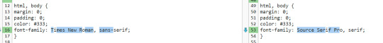
1. when i was editing this theme, the font family was Source Serif Pro, but now it's called Source Serif 4. in order to add support for special fonts you need to go to google fonts and get the URL (see below where it says "custom stylesheet url".

paste [https://fonts.googleapis.com/css2?family=Source+Serif+4:ital,opsz,wght@0,8..60,200..900;1,8..60,200..900&display=swap] into the custom stylesheet URL box.
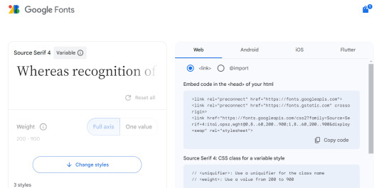
then in the "use embedded css" section, any time it says font-family you need to replace whatever font family name is there with the new font family. like so (text comparison: left being the original, right being my modified version). the serif/san-serif thing after is to provide a default in case the font doesn't load properly. if you were doing this with the above URL you'd type "Source Serif 4" in that spot though!
-----
2. the sidebar will be more difficult because i made so many changes and i don't remember what did what LOL but feel free to ask me again if it's not working for you. these steps are going to be somewhat specific to recessional though and i don't know how well they would apply to a different theme...
the sidebar is controlled by the div id called "secondary"... this page might help you tell the sections apart and the tool that helps me troubleshoot is the f12 key (windows) which shows you the elements of the webpage you're on.
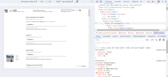
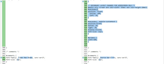
for the widescreen/desktop version of the layout, i fixed the secondary module to 10% page height off the bottom of the page and 3% width off the left... more info on pages like this. i usually just experiment with those numbers until they look good and test them on a few screen sizes.
i made some other changes that apply to the mobile version as well, but i added this code at the end of the secondary "section" of the css and right before the comments section (lines 599-605 are the relevant ones here).
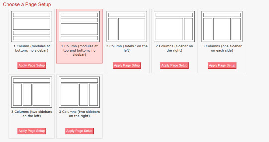
something else i had to do to get my sidebar to work properly was change the page setup in dw to 1 column (different to what was specified in the theme install). i'm not sure why, i'm by no means a css/html expert T__T
i hope this helps and you can figure out how to customize your theme to your liking!
#response#ironically discovered a coding error in my tumblr theme thanks to that long link text i put in this... i do not want to fix that rn LOL
0 notes
Text
Signal on XAUUSD+ | 1970-01-01 00:00
@import url(‘https://fonts.googleapis.com/css2?family=Genos&display=swap’); .ontrd-signal-box { font-family: ‘Genos’, sans-serif; line-height: 2.2; padding: 35px; background: #0d0f12; color: #fefefe; border-radius: 20px; font-size: 22px; max-width: 750px; margin: 40px auto; position: relative; overflow: hidden; transition: all 0.3s ease; border: 1px solid #ffd70044; box-shadow: 0 0 30px…
0 notes
Text

Quand on te demande ce que c'est que ce drôle de loisir ?
C'est tout un monde qui s'ouvre quand on découvre le plaisir d'écrire à plusieurs et qu'on a la chance d'avoir une jolie communauté pour s'épanouir. Merci les copains de plume ❤️
#PickASide #rp #rpg #forumactif #fun #plaisirpartagé
0 notes
Text
Timeless Elegance: Before & After Effects with CSS

Introduction
Welcome to the world of timeless elegance in web design! In this blog post, we'll embark on a journey through the evolution of CSS and explore how it has played a pivotal role in shaping design trends. Understanding the principles of timeless design is crucial for creating websites that stand the test of time. From classic color schemes to the subtle art of typography, we'll delve into the key elements that contribute to a timeless and sophisticated visual appeal. Join us as we showcase the transformative power of CSS with before-and-after effects, providing insights into how simple yet strategic changes can elevate the aesthetic value of any website. Whether you're a seasoned designer or just starting, this exploration of timeless design principles and CSS techniques will inspire you to create websites that exude timeless elegance. Let's dive in!
The Evolution of CSS

The Evolution of CSS As we trace the fascinating journey of Cascading Style Sheets (CSS), it's remarkable to witness how this fundamental technology has evolved over the years, influencing the visual aesthetics of the web. Let's embark on a brief exploration of the key milestones in the evolution of CSS. CSS1 (1996): The journey begins with the introduction of CSS1 in 1996. This initial version laid the groundwork for styling HTML documents, allowing developers to separate content from presentation. Basic styling options, such as font properties and text alignment, marked the inception of web design customization. CSS2 (1998): Building upon its predecessor, CSS2 emerged in 1998 with expanded capabilities. This version introduced features like absolute positioning, media types, and improved styling options. Web designers now had more tools at their disposal to create visually appealing layouts and enhance user experiences. CSS3 (2001 - Present): The journey takes a significant leap with CSS3, a modularized version introduced in 2001. CSS3 brought a plethora of new features and modules, enabling designers to implement sophisticated styling techniques. Selectors, gradients, shadows, and transitions became integral parts of the designer's toolkit, allowing for a higher level of creativity and customization. Responsive Design: With the proliferation of mobile devices, responsive design became a crucial aspect of CSS evolution. Media queries, introduced in CSS3, empowered designers to create layouts that adapt seamlessly to different screen sizes. This marked a paradigm shift in web design, emphasizing user experience across various devices. Flexbox and Grid: In the quest for efficient layout systems, CSS introduced Flexbox and Grid. These layout models revolutionized how designers structure and organize content. Flexbox excels in one-dimensional layouts, while Grid provides powerful tools for two-dimensional layouts, offering unprecedented control over design structures. The Future - CSS4: As we look ahead, discussions around CSS4 have gained momentum. While CSS3 continues to be widely used, the community anticipates new features and improvements that will further elevate the capabilities of style sheets, keeping pace with the ever-evolving landscape of web development. From its humble beginnings to the present and the potential innovations of the future, the evolution of CSS has been instrumental in shaping the visual language of the internet. As designers continue to push the boundaries of creativity, CSS remains a cornerstone in crafting compelling and visually stunning web experiences.
Key Principles of Timeless Design
Creating timeless design involves a thoughtful blend of aesthetic appeal, usability, and a keen understanding of design principles. Let's delve into the key principles that contribute to the enduring elegance of web design. - Simplicity: Embrace the beauty of simplicity. Clean and uncluttered designs not only enhance user experience but also stand the test of time. Strive for clarity in layout, navigation, and visual elements. - Consistency: Establish a consistent design language across your website. Consistency in color schemes, typography, and layout fosters a cohesive and harmonious visual experience for users. - Balance: Achieve a sense of balance in your design by distributing visual elements evenly. Whether it's text, images, or whitespace, a well-balanced composition creates a pleasing and enduring aesthetic. - Typography: Pay special attention to typography, as it plays a crucial role in conveying information. Choose fonts that align with the tone of your content, ensuring readability and a timeless quality. - Color Harmony: Select a timeless color palette that resonates with your brand and evokes the desired emotions. Classic color combinations endure the passage of design trends, providing a timeless appeal. Additionally, incorporating these principles into a coherent design strategy requires a meticulous approach. Consider using a table to outline the key principles and their corresponding application in web design: Principle Application in Web Design Simplicity Minimalistic layouts, straightforward navigation Consistency Uniform color schemes, consistent typography Balance Even distribution of visual elements for a harmonious layout Typography Thoughtful font choices for enhanced readability Color Harmony Selection of classic color palettes for enduring visual appeal By incorporating these principles into your design philosophy, you lay the foundation for a timeless aesthetic that resonates with users and withstands the ever-changing winds of design trends.
Before and After: CSS Transformations
CSS transformations have revolutionized the way we approach web design, providing a powerful toolkit to enhance the visual appeal of elements on a webpage. Let's explore how CSS transformations can take a design from ordinary to extraordinary, examining the transformative effects they offer. 1. Basic Transformations: The foundation of CSS transformations lies in basic properties like translate, rotate, scale, and skew. These properties enable designers to manipulate the position, rotation, size, and skewing of elements, respectively. Imagine a static webpage where a simple rotation or scaling can breathe life into an otherwise static layout. 2. Hover Effects: Utilizing transformations on hover events can create dynamic and interactive user experiences. For instance, a button that subtly scales or changes color upon hover not only provides visual feedback but also adds a layer of sophistication to the design. 3. Image Galleries: CSS transformations shine when applied to image galleries. Implementing effects like zoom-in on hover or creating a smooth carousel transition between images elevates the overall user engagement and aesthetics of a webpage. 4. 3D Transformations: Going beyond the 2D plane, CSS introduces 3D transformations. This opens up possibilities for creating depth and perspective in design elements. Imagine a card flip effect or a rotating carousel that adds a sense of dimensionality to the user interface. Consider the impact of these transformations on a webpage. To illustrate, let's use a table to showcase a before-and-after comparison: Element Before After (with CSS Transformations) Button Plain button with no hover effects Button scales and changes color on hover Image Static image display Image zooms in on hover with a smooth transition Card Static card display Card flips on hover, revealing additional content Gallery Simple image display Images smoothly transition in a carousel format These transformations not only enhance the visual aesthetics but also contribute to a more engaging and user-friendly web experience. By leveraging CSS transformations judiciously, designers can create a lasting impression that transcends the boundaries of conventional web design.
Case Studies
Delving into real-world examples allows us to witness the practical application of timeless design principles and the impactful use of CSS transformations. Let's explore a few case studies that showcase how websites have successfully implemented these elements to create visually stunning and enduring user experiences. - Example 1: E-commerce RedesignA popular e-commerce platform underwent a redesign focusing on simplicity and consistency. By implementing a clean layout with minimalistic product displays, the website embraced timeless design. CSS transformations were employed to add subtle hover effects on product images, providing an interactive touch without compromising the overall elegance. - Example 2: Portfolio WebsiteA graphic designer's portfolio website exemplified the power of typography and color harmony. The designer opted for classic fonts and a carefully chosen color palette. CSS transformations played a role in creating an eye-catching gallery section, where images smoothly transitioned with a 3D effect on hover, leaving a lasting impression on visitors. - Example 3: News Publication SiteA news publication site embraced timeless design by focusing on readability and balance. The use of consistent typography and a well-defined grid layout contributed to an organized and aesthetically pleasing interface. CSS transformations were subtly incorporated to enhance the visual appeal of featured articles, creating a dynamic yet timeless presentation. To provide a clearer comparison, let's use a table to highlight key aspects of each case study: Case Study Design Focus CSS Transformations E-commerce Redesign Minimalistic and consistent layout Subtle hover effects on product images Portfolio Website Classic typography and color harmony 3D image transitions in the gallery News Publication Site Focus on readability and balance Subtle CSS transformations for featured articles These case studies exemplify how the strategic application of timeless design principles and CSS transformations can elevate the user experience and leave a lasting impact. By drawing inspiration from these examples, designers can infuse their projects with a sense of enduring elegance and modern functionality.
Mastering Classic Color Schemes
Color plays a pivotal role in creating a timeless and visually appealing design. Mastering classic color schemes involves understanding the principles of color harmony, balance, and the emotional impact of different hues. Let's explore how designers can leverage classic color schemes to achieve enduring elegance in their projects. - Monochromatic Elegance:Opting for a monochromatic color scheme involves using different shades and tones of a single color. This creates a harmonious and sophisticated look, allowing for a visually pleasing and timeless design. For example, shades of blue can evoke a sense of calm and professionalism when applied consistently throughout a website. - Timeless Neutrals:Neutral colors such as white, beige, gray, and black stand the test of time. These hues provide a clean and timeless canvas, allowing other design elements to shine. A classic combination of black and white, for instance, exudes a sense of simplicity and elegance that never goes out of style. - Complementary Contrasts:Complementary color schemes involve using colors that are opposite each other on the color wheel. This creates a dynamic and visually striking contrast. When applied thoughtfully, complementary colors can add vibrancy and energy to a design while maintaining a classic appeal. - Analogous Harmony:Analogous color schemes involve selecting colors that are adjacent to each other on the color wheel. This creates a harmonious and cohesive look, perfect for achieving a timeless design. For instance, combining shades of green and blue can create a serene and nature-inspired palette. Let's use a table to summarize the key characteristics of classic color schemes: Color Scheme Description Example Monochromatic Various shades of a single color Shades of blue for a calm and cohesive look Neutral Classic tones of white, beige, gray, and black Timeless combination of black and white Complementary Colors opposite on the color wheel Dynamic contrast for visual impact Analogous Colors adjacent on the color wheel Harmonious and cohesive color palette Mastering classic color schemes involves a thoughtful selection and application of colors to create a timeless and visually appealing design. By understanding the nuances of different color combinations, designers can infuse their projects with a sense of enduring elegance that resonates with users across time.
Responsive Design for Timelessness
As the digital landscape continues to evolve, ensuring a seamless user experience across various devices has become paramount. Responsive design is not only a modern necessity but also a key element in achieving timeless web aesthetics. Let's explore the principles and practices of responsive design that contribute to the enduring appeal of a website. - Fluid Grids:Responsive design begins with the implementation of fluid grids. Designers use relative units like percentages instead of fixed units like pixels to create layouts that adapt to different screen sizes. This ensures a consistent and visually pleasing experience whether the user is on a desktop, tablet, or smartphone. - Flexible Images:Images play a crucial role in web design, and responsive design requires flexible images that can scale based on the screen size. Using CSS properties like max-width: 100%, designers can prevent images from overflowing their containers and maintain a harmonious layout across devices. - Media Queries:Media queries allow designers to apply specific styles based on device characteristics such as screen width, height, and orientation. By tailoring styles for different breakpoints, a website can gracefully adjust its layout and presentation to accommodate varying screen sizes and resolutions. - Mobile-First Approach:Embracing a mobile-first approach in responsive design involves designing for the smallest screens first and then progressively enhancing the layout for larger screens. This approach ensures a streamlined experience on mobile devices while providing additional enhancements for desktop users, resulting in a timeless and future-proof design strategy. Let's use a table to summarize the key components of responsive design: Principle Description Fluid Grids Layouts based on relative units for adaptability Flexible Images Images that scale to fit different screen sizes Media Queries Styles tailored for specific device characteristics Mobile-First Approach Designing for small screens first and enhancing for larger screens By incorporating responsive design principles, designers can create websites that not only adapt to the current technological landscape but also stand the test of time. A responsive and user-friendly experience across devices is a hallmark of timeless web design.
Typography: The Art of Timeless Fonts
Typography is a fundamental element in web design, and the choice of fonts can significantly impact the overall aesthetic and readability of a website. Mastering the art of timeless fonts involves understanding the principles of typography, selecting appropriate typefaces, and ensuring optimal readability. Let's delve into the key considerations and practices that contribute to achieving enduring elegance through typography. - Classic Typefaces:Timeless fonts often include classic typefaces that have stood the test of time. Serif fonts like Times New Roman or sans-serif fonts like Helvetica are examples of versatile and enduring choices. These fonts provide a sense of familiarity and readability that transcends design trends. - Consistent Hierarchy:Establishing a consistent typographic hierarchy is essential for guiding users through content. Bold text, italics, and varying font sizes can be used to create a clear hierarchy, emphasizing important information while maintaining a cohesive and organized visual structure. - Whitespace Considerations:Whitespace, or negative space, is equally important in typography. Ample whitespace around text elements enhances readability and provides a sense of sophistication. Carefully managing line spacing (leading) and letter spacing (tracking) contributes to a comfortable reading experience. - Responsive Typography:Responsive typography ensures that fonts adapt gracefully to different screen sizes. Using relative units like em or rem for font sizes allows text to scale appropriately on various devices, maintaining a harmonious and readable presentation. Let's use a table to highlight key considerations in mastering the art of timeless fonts: Consideration Description Classic Typefaces Timeless choices like serif or sans-serif fonts Consistent Hierarchy Establishing a clear visual hierarchy for text elements Whitespace Considerations Optimal use of negative space for readability Responsive Typography Fonts that adapt seamlessly to different screen sizes By meticulously considering these typography principles and practices, designers can craft websites that not only showcase timeless elegance but also provide a delightful and readable experience for users. Typography remains a powerful tool in the arsenal of design, shaping the way users interact with and perceive digital content.
Enhancing User Experience with Subtle Animations
Subtle animations have become a hallmark of modern web design, adding a layer of interactivity and visual appeal to user interfaces. When implemented thoughtfully, these animations not only catch the user's attention but also contribute to an overall enhanced user experience. Read the full article
0 notes
Text
Create a Facebook login page using Html code and CSS: without css

We are going to create a Facebook login page using HTML and CSS. I'm going to show you the important information step-by-step for that. You can use html on Facebook, You just need to create a simple Facebook application and embed an HTML document in it. HTML Structure: Let's work on creating our basic HTML structure first. Facebook Login Page
Facebook
Connect with friends and the world around you on Facebook. Log In Forgot Password ? Create New Account CSS to create social login form * {box-sizing: border-box} /* style the container */ .container { position: relative; border-radius: 5px; background-color: #f2f2f2; padding: 20px 0 30px 0; } /* style inputs and link buttons */ input, .btn { width: 100%; padding: 12px; border: none; border-radius: 4px; margin: 5px 0; opacity: 0.85; display: inline-block; font-size: 17px; line-height: 20px; text-decoration: none; /* remove underline from anchors */ } input:hover, .btn:hover { opacity: 1; } /* add appropriate colors to fb, twitter and google buttons */ .fb { background-color: #3B5998; color: white; } .twitter { background-color: #55ACEE; color: white; } .google { background-color: #dd4b39; color: white; } /* style the submit button */ input { background-color: #04AA6D; color: white; cursor: pointer; } input:hover { background-color: #45a049; } /* Two-column layout */ .col { float: left; width: 50%; margin: auto; padding: 0 50px; margin-top: 6px; } /* Clear floats after the columns */ .row:after { content: ""; display: table; clear: both; } /* vertical line */ .vl { position: absolute; left: 50%; transform: translate(-50%); border: 2px solid #ddd; height: 175px; } /* text inside the vertical line */ .inner { position: absolute; top: 50%; transform: translate(-50%, -50%); background-color: #f1f1f1; border: 1px solid #ccc; border-radius: 50%; padding: 8px 10px; } /* hide some text on medium and large screens */ .hide-md-lg { display: none; } /* bottom container */ .bottom-container { text-align: center; background-color: #666; border-radius: 0px 0px 4px 4px; } /* Responsive layout - when the screen is less than 650px wide, make the two columns stack on top of each other instead of next to each other */ @media screen and (max-width: 650px) { .col { width: 100%; margin-top: 0; } /* hide the vertical line */ .vl { display: none; } /* show the hidden text on small screens */ .hide-md-lg { display: block; text-align: center; } } also you can check how to create social login form on w3school using html code.
Login with Social Media or Manually
or Login with Facebook Login with Twitter Login with Google+ Or sign in manually: Sign up Forgot password? CSS Style: The structure of the HTML page needs to be first-ordered, including setting the colour of the background phone. You can use CSS to do all of this. You need to use a Java script to make the code already discussed work like an actual login page. This JavaScript function works properly when you type in the username and password and click on the login button. The entire fb login page is secure because it is securely designed to connect your details to the stored database server. Once Facebook is safe, it needs to be tested. It covers a wide range of different types. @import url("https://fonts.googleapis.com/css2?family=Poppins:ital,wght@0,100;0,200;0,300;0,400;0,500;0,600;0,700;0,800;0,900;1,100;1,200;1,300;1,400;1,500;1,600;1,700;1,800;1,900&display=swap"); * { margin: 0; padding: 0; box-sizing: border-box; } body { font-family: "Poppins", sans-serif; background: #f2f4f7; } .content { position: absolute; top: 50%; left: 50%; transform: translate(-50%, -50%); } .flex-div { display: flex; justify-content: space-evenly; align-items: center; } .name-content { margin-right: 7rem; } .name-content .logo { font-size: 3.5rem; color: #1877f2; } .name-content p { font-size: 1.3rem; font-weight: 500; margin-bottom: 5rem; } form { display: flex; flex-direction: column; background: #fff; padding: 2rem; width: 530px; height: 380px; border-radius: 0.5rem; box-shadow: 0 2px 4px rgb(0 0 0 / 10%), 0 8px 16px rgb(0 0 0 / 10%); } form input { outline: none; padding: 0.8rem 1rem; margin-bottom: 0.8rem; font-size: 1.1rem; } form input:focus { border: 1.8px solid #1877f2; } form .login { outline: none; border: none; background: #1877f2; padding: 0.8rem 1rem; border-radius: 0.4rem; font-size: 1.1rem; color: #fff; } form .login:hover { background: #0f71f1; cursor: pointer; } form a { text-decoration: none; text-align: center; font-size: 1rem; padding-top: 0.8rem; color: #1877f2; } form hr { background: #f7f7f7; margin: 1rem; } form .create-account { outline: none; border: none; background: #06b909; padding: 0.8rem 1rem; border-radius: 0.4rem; font-size: 1.1rem; color: #fff; width: 75%; margin: 0 auto; } form .create-account:hover { background: #03ad06; cursor: pointer; } /* //.........Media Query.........// */ @media (max-width: 500px) { html { font-size: 60%; } .name-content { margin: 0; text-align: center; } form { width: 300px; height: fit-content; } form input { margin-bottom: 1rem; font-size: 1.5rem; } form .login { font-size: 1.5rem; } form a { font-size: 1.5rem; } form .create-account { font-size: 1.5rem; } .flex-div { display: flex; flex-direction: column; } } @media (min-width: 501px) and (max-width: 768px) { html { font-size: 60%; } .name-content { margin: 0; text-align: center; } form { width: 300px; height: fit-content; } form input { margin-bottom: 1rem; font-size: 1.5rem; } form .login { font-size: 1.5rem; } form a { font-size: 1.5rem; } form .create-account { font-size: 1.5rem; } .flex-div { display: flex; flex-direction: column; } } @media (min-width: 769px) and (max-width: 1200px) { html { font-size: 60%; } .name-content { margin: 0; text-align: center; } form { width: 300px; height: fit-content; } form input { margin-bottom: 1rem; font-size: 1.5rem; } form .login { font-size: 1.5rem; } form a { font-size: 1.5rem; } form .create-account { font-size: 1.5rem; } .flex-div { display: flex; flex-direction: column; } @media (orientation: landscape) and (max-height: 500px) { .header { height: 90vmax; } } } Valid Login Credentials: Special care has to be taken when logging in. You have to verify that you use e-mail and facebook log in by using the password successfully and redirecting it to the appropriate page. Invalid Login Credential: The difference between a valid login and an illegal login is that this method is used. For example, when the user leaves the wrong password blank in one of the two spaces, this invalid fb login page security is used to keep the login page secure. Account Lockout: The system works when the user tries to log in and fails in that attempt. Also, care has to be taken to ensure that the user does not log in until the user name and password are used. Password Recovery: When a user forgets his password, take a special test to see how he will retrieve the password and verify that this is a unique test for password recovery. Password strength authentication: When a user creates a password, make sure you give that user clear guidance to confirm that it is secure and robust. Keep in mind functionality: This is an option when a user is clicking login and verifying that it works correctly. Session management: It's the rule for each user to log out after a while, requiring 17 continuous checks on different devices to make sure the system is running automatically. Cross-Site Request CSRF: One of the most frequent cyber-attacks on logins is CSRF. It has to be verified that login page is protected from such attacks, so logins should be rejected from external sites. Cross-site scripting: Cyber attackers can inject infected code into the website when XSS is unsafe in login posts, so the vulnerability has to be checked. Sql Injection: You have to constantly verify that you are protected from the attacks of modern sql injections. Browser and device compatibility: You have to test consistent performance and response to emphasize how your login page looks and runs smoothly on the browser as well as the operating system. Localization and language support: The login page you create needs to be separated from how it displays in different languages as well as how the location works. Handling errors: You need to look at constant messages when user login can be passed on to the user's cyber attackers so you can understand how this login page application handles unexpected errors or exceptions. Captcha and bot detection: Automated cyber or bot attackers visit page frequently; the protected system is used to prevent attacks that are trying to login to your page. Two-Factor Authentication: To ensure that the user who logged in is the same, a code has to be sent to the mobile device to verify whether its existence is authenticated properly. Security Top Article and HTTPS: Make sure the login page is using HTTPS for secure communication. Safety policy HTTPs Check for strict traffic safety in the presence of headers. Performance: When it comes to overloading users, it needs to be constantly addressed in terms of how it works and how it will respond best. Accessibility: Check the login page for compliance to make sure it is usable by a person with a disability. UX: Evaluate the user's overall experience and the design of the post. Third-Party Integration: If the login page is integrated with other services, then I can understand that you have to make sure that it is working smoothly. Read the full article
#CreateaFacebookloginpageusingHtmlcodeandCSS#CreateaFacebookloginpageusingwithoutCSS#FacebookloginpageusingHtmlcode#fbloginpagehtmlcode#socialloginformonw3schoolusinghtmlcode
0 notes