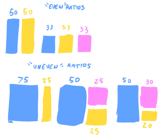
#disclaimer those hastily drawn boxes are definitely NOT accurate ratios but i tried my best and thats what counts
Note
Hi there! I deeply admire your art, especially your color choices. Looking at your sculptures always feels like a warm hug, or the sun shining on your face. I'm a sculptor myself (polymer and porcelain), though I know precious little regarding color theory, and it shows. If you have the time, I was wondering if you had any recommendations for guides or suggestions on how to develop an eye for color?
ahhh thank you so much for the kind words, and as for color theory....
i'll start off with a few book recs on the subject! picture this by molly bang is probably my all time favorite book on art making ever, and while it is primarily about shapes and composition, she does touch on color and the emotions colors can produce, which is always a good thing to keep in mind (also its just a great book and everyone should read it)! and color and light by james gurney is a classic book on, well, color and light. while i actually don't like gurney's color schemes all that often (at least in the examples he has in the book), he breaks down basically everything you need to know about color theory really simply and quickly in the book, so it's a great read if you need to touch up on basics and get an overview of the whole field.
if you're looking to develop an eye for color, i would recommend starting to pick out and define the colors in your favorite pieces. what colors are actually present? which ones cover most of the piece and which ones are only there as a highlight? what ranges of shades are there in your colors? just getting comfortable with picking apart a piece into base colors might be very helpful, and it will give you an idea of the kinds of color schemes you prefer!
another good thing to keep in mind is the ratio of one color to another. i tend not to like ratios that are close to 50:50, or 33:33:33, or what have you. instead i like an "uneven" ratio, like 75:25 or 50:30:20. it just adds a little more visual intrigue!
it's also been super helpful for me to limit the colors i am actually able to use! when i paint, i use pre-mixed house paints. i rarely ever mix colors for a piece, just choose pre-mixed colors from the selection i already have. this makes picking a color scheme easy because i can SEE all the colors i have and how they fit together without putting paint down anywhere. it also limits my options, which makes it easier for me to pick a handful of colors i like and stick to them for the whole piece. i think having some limits or a structure (to use a less mean-sounding word) in which to work like this can be really helpful. it also makes me feel way less paralyzed when my color scheme selection process is just picking out jars of paint and putting them next to each other to see if they look good, instead of mixing and tweaking and whatnot.
finally, one thing that really helps me but is mostly (maybe almost entirely?) applicable to digital art is to stay in THIS PART

of the color selector. it is so tempting to me to go to 1000% on my saturation, but it is really hard to work with super saturated colors! if you've got a lot of different colors that you want to look harmonious together, if they're all somewhere in that mid range, they'll work together, even if they would look awful at full saturation.
i'll be honest with you, though, the range i actually stick to with digital art is more like this:
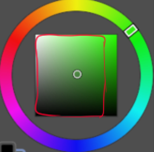
but avoiding the temptation of the full saturation is a win for me!
#disclaimer those hastily drawn boxes are definitely NOT accurate ratios but i tried my best and thats what counts#long post#I HOPE THIS HELPS!!! honestly i have had a lot of trouble with color#and have only gotten more comfortable with it recently#so it is TOTALLY a learnable thing!#just takes some practice :^)#ask#advice#process
276 notes
·
View notes
Last Seen Blogs

the-primola-universe
Wurst und Salami`s Nonno Pietro

paranoidyob-blog
PARANOID

hiswiftphillhere
Untitled

wordsinthewillows-blog
what the mole saw
ameliawarnerr
Amelia