#don’t ask why i added detail to the fortnite thing
Text
more turtle doodle


gonna be spamming these because i have no life left to salvage from the depths from under the couch
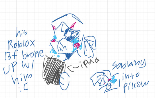
#rottmnt#leo#donnie#rottmnt leo#rottmnt donnie#don’t ask why i added detail to the fortnite thing#but does fortnite even look like that rn#i am not searching it up#anyways can you tell i drew the fortnite out of pure muscle memory#anyways#donnie is going to hack mayor whiskers bc they called leo a shithead#doodles#blue#purple#man i’m dizzy#also here’s a fun yyal fact:#i had a roblox gf once#it only lasted 30 mins#because i didn’t say i would still love her if she had a spider crawling out of her deteriorating eye socket#like i would still love you JUST GO TO A HOSPITAL???#anyways we broke up after that and i still miss her#that was in 2019 i miss those strange times#i should probably stop telling my life story#YYAL art
31 notes
·
View notes
Text
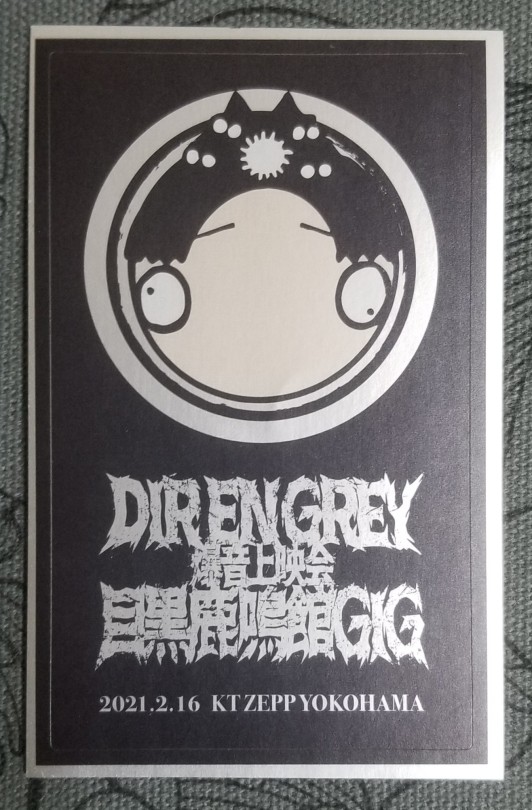
2021.02.16 2nd session of Meguro Rock-May-KanGIG at Zepp Yokohama
The encore of the recorded concert changed, it was such an awesome surprise! Felt a bit more like an actual concert, I love the idea of the changing setlist!😆
When they prepared the stage again for the talk session, Fujieda and Takabayashi came first. F jokingly started the introductions with 'hi this is Fujifuji~ and...' but T didn't realize what's F is doing (or did he?😂) and didn't join😂 after a moment of F waiting he finally joined with '...I'm T'.
Then F invited the band members on the stage and again Die and Kyo came on stage!
Die stayed in the same outfit, but Kyo changed! He had a long oversized greengrey-ish coat and shirt with a scarf thing.
D: はい、Dieでっすー
K: 京です🦊
F started to talk about Kyo's birthday again, but then K casually turned to the side and very casually without a comment pointed his phone at F.
F: are you filming me?!
K: I can't? (あかん?)
F: Ah no, it's okay...
*K continues*
F:... so Happy Birthday Kyo!
...
K: you know, I'm not that happy with the waiting time between the sessions, I'd prefer to do the talk part at the beginning and then go home. I don't want to waste time. We should have two patterns, one with the talking first.
(I guess some fans would be happy with that too😂)
F: (moved to the Rock-May-Kan film topic) so you played your new song, Ochita koto no aru sora there, how was it?
K: it was okay, it went smoothly
D said something like the song was ok, it will likely change/transform when the tour comes (?)
F: so it wasn't hard.
D: the hard part was that the stage was so narrow there was only space for few extra people (cameramen), all other staff were waiting in the audience area
F: so when you had to change guitars etc they had to climb the stage?
D: also with guitar tunning, especially the 7 string one, it's really tough and takes time, so it felt there wasn't enough time during short breaks between the songs. Toshiya always does tunning humself, I don't, I guess I should improve that a bit.
F: any songs that stood out?
K: I guess Jealous
F: in what way?
K: the arrangement was too old, it's actually embarrassing (how bad it is), the lyrics too. I changed the lyrics, I was laughing internally at myself, but I couldn't change the arrangement. it was like hell.
He also complained that some parts were too high, they were hard to sing. Some parts changed the piano intro done by Takumi etc, he didn't want to listen to the CD, old version, because it was too embarrassing.
F: and it became a 2021 version?
K: I want to change it even more, make it less troublesome for me.
D: it wasn't hard for me, but it is old, so the song's speed doesn't match my body anymore (not too fast, just wrong speed), it was easy to play though.
K: but it was hard to know how to move during the song.
*Kyo then showed us a movement he got unhappy with*
K: So I moved as little as possible
F: it didn't look like you had this much trouble
K: I'm a pro in the end.
😆
F next talked about the release of Oboro on April 28th.
F: K, you said that Oboro is refreshing. How about TDFF?
K: てんでだめなぶしぶし (TendeDamenaFujiFuji can translate to 'utterly useless Fujieda')
🤣
F: D, you said it's powerful, what about Oboro?
D: the music video is good. The filming took quite a long time, the way we used to do it in the past.
K: it was [refreshingly] cool, too fresh (light).
D: it got refreshing from about halfway?
F then talked about the merchandise. He started with the travel poach, he held it up and moved it closer to the center of the table so fans could see it on the screen in the back. But by doing that it ended up quite close to Kyo's head. K gave F a super bewildered look, turned to check the screen in the back and then continued to give F evil glares of 'why you doin this to me'😂
K: I thought that rubber keychains are so cute! We should release the older costume versions as well (he got applause from the audience for that).
K then commented it looks so cute that they all got beheaded with their heads so low, like they're holding their heads.
D grabbed the rechargeable heat pack and said (totally sarcastic): ah so wa~rm...
😂
F: the highest temperature is 40℃.
K: (gets the pack) Can you charge devices with it? Huh, it just gets hot? When you're in trouble or sth you can't use it as charger? People would have wanted that in December...
F: ...(passes it to Die)
D: it's exactly the same temperature as the charging phone...
F next showed us the usb power strip holding it over Kyo, K got uncomfortable again😅
After that they moved to the questions from fans.
D: "anything you were particular about when creating the setlist?" We added songs we were thinking about playing at SOGAI, so also some older songs.
F: do you have any good questions?
K passes one paper to F.
F reads: "did F do anything to make you angry?"
and K replied with a list😂 the main was again F's easy ハイハイハイ ( like yeayeah) or biting his lips.
F: how about you D?
D: nothing really.
F: " do you have favourite ramen?"
K (immediately): Jiroken. And it has to be smaller noodle portion with more toppings (麺少なめ全マシ), it's the best.
D: I don't really eat ramen.
F: you also said no McDonald.
D: yeah
F: Have you tried Jiro?
D: once or so
K (concerned😂): did you eat normal ramen? Which shop?
he made sure Die knows which ramen to order and which shop is the best😂
T: "which venue would you like to play at next?"
D said not exactly a venue, he would like to go to prefectures they haven't been to yet.
K: Nagoya Music Fan.
F: in Fujigaoka?
T: Does it still exist?
F: yeah.
T: let's discuss it in the future (aka not very likely?😂)
F: but it's not impossible!
F then picked a 'combo-question': "do you use any perfumes? What are you crazy about now? What kind of BGM do you play at home?"
K: I don't use perfume. I have a bar soap I like, the old style one with an image of cow on it. It doesn't have a strong smell.
F: how about BGM?
K: I only play Fortnite. Ah, but now the Chinese buns skins are on sale. I've been playing for a year and only saw someone using it once. Somehow I like the least popular skin.
K: at home I also eat cookies. Chocolate cookies.
F: what kind/brand?
K: Any.
D: I use perfume / he said he got Fueguia (but then there was some thing wrong with the frangrance after a while, it went away???)
And no crazes or BGMs.
D: "when you travel on work to other cities, are your seats on bullet train decided? Do you sit next to someone?"
D: it's not really decided, we travel by ourselves (??), most of us prefer aisle seat. So I was surprised when once Shinya asked if we could swap so he can get the window side.
F: and you K, window or aisle?
K: Definitely aisle. If you're on the window side and someone next to you falls asleep it's really rude to wake them up if you need to get up. I prefer to be woken up than wake someone up.😇
D: There's also the table.
K: aaah, Shinya likes window seat so you could put the table down with some food on top of it and then pretend to be dead sleeping.😈
The change😂 he was laughing so much at the idea too😂
F: "what's your preference for the food at venues?" (??)
K: sushi.
D: like in Shinkiba.
K: yeah, I get so excited.
F: We also had sushi in the US.
K: We got it from a fan.
D told us a story how he was able to start eating eel/unagi, he doesn't like fishbones but once in Nagoya everyone was having hitsumabushi backstage and saying how good it is, so he tried and actually liked it.
F: "Did you watch any good movies recently? I watched Miike's 'Imprint'". Do you know this movie, K?
K: Yeah, it as good.
F: you watch movies often.
K: Recently I watched Rob Zombie's '3 from Hell'.
F: how about you, D?
D: a movie with Tachi Hiroshi, a new one, about yakuza (he didn't remember the title, but most likely ヤクザと家族 The Family (2021)).
F: "Do you have a favourite fruit?"
K: melon.
F: do you eat it at home?
K: no・食べない
F: do you eat it if it's backstage?
K: yes・食べる
F: but at home?
K: no・食べない
F: melon...
K: like・好き
👨👦
F: do you eat melons at home, D?
D: I don't.
T: "who do you like from Fist of the North Star?"
D: I saw it, but I don't remember details.
K gave a very detailed answer but as I haven't seen it I didn't really get it (the only name I caught was Shuren)😅 but he compared one character to F?😆
And then came Kyo's biggest laughing fit.
The question was about some story about other members they remember the most. Kyo talked about how once Kaoru had trouble with the mic stand and guitar cable, the cable got twisted around the stand and Kaoru ended up empty handed which Kyo found very amusing. Then Kyo just kept gesturing the 'round round・ぐるぐる' bit and he was laughing so much he started crying🤣
But then Die said he had a similar situation once and F replied he remembers that. Kyo burst out again and then it was also Die's turn to just lose it🤣
The laughers to the point of tears continued for a while as they tried to calm down😂
But then.
Then.
Suddenly the backscreen went black with a message 'battery empty, please change battery' and the venue that was giggling because of band members also exploded.
The timing was just too much🤣🤣🤣
F said it's time to finish anyway and asked them for the last comments for the fans, starting from Die.
Die: ... 🤣... can't think of... anything🤣...I'm crying🤣
F: ... let's go from Kyo
K: ... I don't have anything to say... all...
(a moment)
Kyo: I don't have any big message. But please wait a bit more for the new single. It will be like Taiyou no Ao 2.0, in a good way. ...or Taiyou no Ao remix.
Die: Thank you for coming today. ... I'd really love to do a normal tour soon, shows with audience. For now please enjoy the concert film from Rock-May-Kan, but in the future let's enjoy the show all together... I still can't stop tearing up🤣 ok, I'm done.
A marvelous ending of even more marvelous day😆💚❤️
128 notes
·
View notes
Note
I really, really, REALLY love your train!palace AU.
I was just curious if you have any other HCs for potential palaces — for either Akechi or Akira.
You don’t have to do any drawings or anything, I just loved reading about all your little details for the train AU and I’m starving for more haha
Ah thank you! I’m really glad you liked it!!! ^u^ I don’t really have any other hcs that i’m planning to draw (as of right now anyway B) ), but I did have an Akira palace concept a while ago that I’ll talk about below the cut if you’re interested! :)
(its kind of long cause once I started typing I just started rambling, so be warned)
Thanks for the ‘you dont have to draw anything’ by the way, lol xD There’s 1 drawing cause I couldn’t help myself though ;P
So, I dont know if it’ll be what you were hoping for, but a while ago i was thinking about an Akira palace about feeling overwhelmed that’s maybe called “Balancing Act” (i was thinking about calling it like. ‘tilting tower’ or something cause I think ‘tilting tower toppled’ would be a funny achievement to get once you beat it, but that just sounds too much like the fortnite thing and i cant handle that lmao), which the thieves (sans akechi- this will be explained later) probably realize exists somewhere around the end of sae’s palace.
Since the palace isn’t really akira’s distortion of a place so much as it is his distortion of what’s expected of him, his keywords could probably be something like “everyone’s happiness” and “his responsibility”? And I guess the location could just be leblanc since that’s where he lives?? I haven’t really. thought this part out too heavily lol ^^; feel free to interpret it as you’d like.
It’s probably been done before, but the whole thing is based around the idea of akira's shadow manifesting as atlas, but instead of holding up the weight of the sky, he’s holding the growing weight of people’s expectations. So, the palace itself is....you guessed it.....a tilting building! wow! It’s only not completely falling over because akira’s holding it up from the foundation, since it’s full of people he’s afraid to let down :)
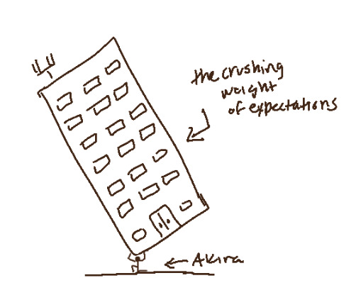

sort of like that. it doesn’t have to be an apartment building, obviously. In all honesty what’s in my head is just like. a giant white cube. cause i really don’t know what “feeling responsible for other people’s continued happiness” would manifest as aside from something that could maybe hold cognitions of said people, so please accept the apartment building for now lmao (again feel free to interpret as you like)! And his outfit is definitely subject to change, i just stuck him in the first thing that came to mind xD
“BUT SOPHIA,” i hear you asking, “IF AKIRA’S RIGHT THERE, CAN’T THE PT JUST FIGHT HIM AND TAKE HIS TREASURE REALLY QUICKLY?” NO, you fool!! He’s holding up the weight of the world! does it LOOK like he’s got time to fight, let alone know where the hell his treasure is?? It being Akira’s palace, of course he cuts a deal with them- find his treasure and they can just keep it since it’ll be a weight off his mind (literally), in exchange for someone bearing the building for just a few minutes so he can have a break before they actually leave with the treasure. The thieves agree to this and eventually head into the building he’s holding up (i thought the thieves stealing his treasure literally adding weight to his mind/being another burden he has to shoulder was a funny concept here), and begin searching.
pretty much at this point I just figured the goal would be scaling the building, since the treasure is most likely at the top? (cause i mean honestly speaking if it’s not with akira, where else would it be. just finding it sitting in the middle of the fifth floor seems anti-climactic). As they ascend, they realize everything is in perfect equilibrium, perfectly balanced on both sides of the building so it helps it not topple. E.g., on one floor one side of the hall has a ryuji cognition while the other has an ann cognition, or something to that effect.
Earlier I mentioned the thieves sans akechi finding out about this palace late into the infiltration of sae’s because if the thieves were to discover akira had a palace, i doubt they’d tell akechi when they know he’s going to betray them and wouldn’t want him to purposefully muck up their infiltration. I also thought it would be interesting to see an akechi cognition in the palace, and maybe have it purposefully doing something to throw akira off balance (a consequence of him knowing about the assassination plot, explaining why it would be late in sae’s palace)? my initial thought was literally something like ‘the thieves walk into a room just in time to see the akechi cognition step off the edge of the balcony and un-balance the building, causing the gimmick of the palace to become having to leave a party member behind to keep it balanced every time something throws it off-balance on their way to reach the top’ or something. but idk! that seems a little extreme and i didn’t really put any thought into how they’d get back down afterward, so. just consider there being a trouble-maker akechi cognition, lol. ^^;
anyway! they reach the top eventually, the treasure’s there. hooray! they head back down to send the calling card. I genuinely don’t know whether akira knows about his palace or not in this au or whether he even wants the pt to steal his heart, but. He gets a calling card none-the-less, since whatever is causing his distortion is harmful to him and his friends want to help him. And I don’t feel like exploring the potential consequences of it being his choice or not rn >o>
So the pt go back in to steal the treasure! And it goes really easily. in and out! but before they can leave, Akira’s shadow asks them to uphold their part of the deal- someone take the weight of the palace for him for a minute so he can know what it’s like to exist without the weight of that on his shoulders for a minute before he disappears. Now...if you know anything about atlas’ encounter with heracles, you know that he tries to trick him into holding up the sky indefinitely. WELL! guess what happens when one of the pt takes up his mantle under the building. Akira’s like “oh gee, thank you! you’re a great friend.” and then yoinks his treasure from the others and tells them they’re going to have to try to take it from him. he’s got people relying on him, and he needs this in order to keep them happy!!
the supposed gimmick of the palace continues, in that the PT are always one party member down during the boss fight (maybe you can switch out whose holding it? i don’t see why you couldn’t, so long as someone always is).
This is where my planning on the palace kind of ends, because I’m not sure what akira’s shadow turns into during the bossfight. Back when i first got into p5 vanilla, i didn’t have a whole palace au but i had a kinda melancholy akira shadow encounter thought out, where when his friends ask why he hasn’t transformed into a monster during his boss fight he says something like “i’ve got a palace. i’m already a monster, aren’t I?” or something to that effect. so, that’s an option, but it sort of doesn’t fit the vibe so... idk! again feel free to interpret it as you will lmao.
When they do defeat him and get his treasure back, he tells them to get out of the palace before it collapses and takes the (now probably crumbling) building from whoever’s currently holding it. The thieves feel bad leaving him there, and he tries to convince them that he’s heading back to his real self in a few moments so they shouldn’t worry, but they all band together for a hot minute and help him hold up the palace even as it collapses, and it’s like. a show of solidarity? Like a “you can call on us if you need help” kinda thing? and they’re with him till he disappears and they escape.
Not sure what happens when they get back to the real world or what akira’s treasure turns out to be (i’ve seen other aus where its his probation notebook so. maybe that?), but thats it!
...yep. i’m not as attached to it as the train one (cause its not got goro in it lmao), but! that’s what i got. :>
thanks for asking though, anon! I hope that was what you were looking for!
#i'm glad you liked the train palace au though!! ^u^#and thanks for asking- i wouldn't have done anything about this one if you hadn't asked#p5
82 notes
·
View notes
Text
Jij Verliest - Chapter Five: Clip 2
master list
previous
...
Zondag 18:53
With hurried goodbyes to the people spamming ‘bye!’ in the chat, Robbe ended his surprise Sunday afternoon stream and immediately slumped against his desk.
During the semester, Robbe didn’t stream on Sundays. He preferred to spend the time studying with Yasmina or simply doing homework. His plan was to keep the same schedule for the summer, simply to keep things consistent, and save his Sundays for skating with his friends or hanging out with Sander. But the beach house trip was going to prevent him from streaming for three days. Once he got back, Robbe knew that he would need to get back on a consistent schedule.
Today’s stream was unplanned and a surprise, but it had been one of the best streams that he had in weeks.
Normally, Robbe would’ve only streamed for three hours. It was what his body was used to and Robbe was rigorous about keeping his streams uniform. Occasionally, he would extend the stream or shorten it in thirty minute intervals. But, normally, he couldn’t extend the stream by more than an hour. Until today. He had just ended the stream a few minutes shy of five hours.
As soon as he started the stream, Robbe had felt rejuvenated. His good mood was helped by Sander’s “good luck <3” text when Robbe informed him that he would be disappearing for a few hours. But, in the midst of studying for exams and his stressed-out streams, he had missed doing this. He had missed streaming simply because he could and hanging out with his viewers, who he saw as his friends. It was fun and exhilarating and he had missed it all.
Plus, the fact that Sander was probably watching him sent a thrill up his spine. It made him more excited than he would ever admit to any of his friends. But the extended time in his chair had stiffened his legs and his joints. Even though Robbe had taken multiple five-minute breaks, he was still tense.
As Robbe stood, stretching his body as far as he could, his phone buzzed on the desk and drew his attention.
Sander: Amazing stream, Mr. Streamer.
Even if I don’t know a thing about Fortnite.
Feeling stiff?
Robbe chuckled, picking up his phone as he moved out of his room.
Robbe: Yeah, I’m walking around the apartment.
Might not sit down for another 30 min.
Did you get any drawings done?
It didn’t take long to respond.
Sander: Of course, I’m still working on your concentrated face though.
Wanna see?
As Robbe sent him the affirmative, he headed out of his bedroom. Across the hall, Zoë’s bedroom door was slightly open and he glanced inside to find her sleeping. Zoë was curled up on her bed, wrapped in her gray blanket, with her hair tied back. Her laptop was perched on the edge of the bed, playing a show.
As Robbe closed his bedroom door behind him, his stomach gave an angry growl, reminding him he had waited too long. Robbe quickly moved in the direction of the kitchen, where he could hear voices. Rounding the corner, he spotted Milan at the kitchen table with Senne. Both of them were drinking what looked like a cup of hot cocoa. As Robbe stepped inside, Milan cut Senne off mid-sentence to ask, “How was your stream?”
Robbe blinked, confused. “It was fine.” Senne turned to him, smiling nervously, as Robbe headed to the fridge to pull out the leftovers from earlier. “I’m just getting some food. It should only take a few minutes. Then, the two of you can go back to your top-secret talk that I’m not supposed to hear.”
“Oooooo,” Milan said, grinning wickedly. “Is someone jealous that other people go to me with top-secret information?”
Robbe rolled his eyes and flipped Milan off for good measure.
“No, no, it’s not that,” Senne said, letting out a sigh. Robbe grabbed one of the plates from the cabinets as he looked over at Senne. Despite being so sure of himself, Senne looked unbelievably nervous—like he was about to jump out of his skin. In all honesty, Robbe wasn’t prepared to see it. “We were just talking about the fact that I’m going to meet your mama on Thursday.” Robbe nodded as he piled the cold spaghetti onto his plate. “Do you have any advice?”
Robbe nodded again, placing the plate into the microwave. Once he started it, Robbe turned back to Senne and Milan, who were waiting on him. “There’s absolutely nothing you need to worry about, Senne,” Robbe said. “Mama is physically incapable of hating anyone. Even my dad and Thomas. As long as you love and take care of Zoë—which you do—she’s going to love you.”
“There’s always a first,” Senne said.
“If there was a first time, it would’ve been Thomas,” Robbe deadpanned.
“Agreed,” Milan said. He reached across the table to take Senne’s hand in his own. “She’s going to love you, Senne. How can she not?” The microwave let out a beep. Robbe moved to pull his steaming pasta out. He blew away the steam as he crossed the kitchen, taking up one of the spare chairs. Robbe extended his legs out beneath the table, stretching them until they popped. “You love her daughter and that’s all any mother would want. Especially Marie.”
Robbe nodded. “Nothing to worry about.”
“Okay,” Senne said, turning to him. “I’m trusting you.” Robbe chuckled, taking a bite of his pasta. “How did your exams go?” Senne asked. Robbe glanced over at Senne, who had turned in his chair. “I didn’t see you at the party Friday night.”
“Are you still going to college parties?” Robbe asked.
“Only when my girlfriend is.”
“Oh, did someone spend the night with his mystery man that we don’t know anything about?” Milan asked, raising his mug to his mouth. Robbe rolled his eyes as Milan suggestively waved his eyebrows. Beside him, Senne took a sip of his hot cocoa. He tried his best to seem indifferent, but Robbe could still spot the suggestive look on Senne’s features. “Come on, Robbe. It’s a safe space. If we talk about it, I’m sure Senne won’t mind.”
Robbe was certain he couldn’t roll his eyes harder. “Sometimes, I wonder why you’re so interested in everyone’s love life,” Robbe said. Senne snorted. Thankfully, he wasn’t holding his cocoa anymore. Senne covered his face with his hand as Milan sent him an accusatory stare. “But yes, I did stay with him. We went to his apartment, he cooked, and we stayed in his bedroom all night, playing video games.”
“Good,” Milan said, grinning. “You seem happy with him.”
“I am,” Robbe said, nodding. He took another bite of spaghetti before letting out a sigh. Milan raised an eyebrow and Senne glanced over at him. Despite the growling in his stomach, Robbe dropped his fork on his plate and leaned back. “I just wish Thomas would leave me alone.”
“Thomas?” Milan asked, raising his eyebrows.
Senne glanced at Robbe, asking, “Your ex?”
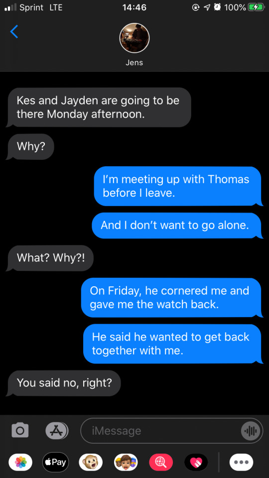
“Yeah, that’s the one,” Robbe said. “After my exam on Friday, as I headed out to meet ‘my mystery man,’ Thomas came up to me.” Robbe shook his head, letting out a sigh. “He gave me the watch back and told me that he wanted to get back together with me.” Milan’s eyes widened. “I was so angry that I couldn’t respond to him, but—uhh… the guy I’m seeing interrupted him and Thomas left soon after that.”
“Do you want to get back together with him? With Thomas?” Senne asked.
Before Senne finished the question, Robbe was shaking his head. “No,” Robbe said. “I don’t.”
“If you don’t want to get back together with him, you need to tell that to Thomas face-to-face, Robbe,” Senne said. He crossed his arms over his chest as Milan took a sip of his cocoa. “He deserves to hear it from you in person. If he can’t understand, that’s on him.”
“I know,” Robbe said, slumping back in his chair. “I’m just worried that he’s going to try and talk me into getting back together with him. Again.”
“Do you want me to come with you?” Senne asked, standing up from his chair. “I don’t mind.” He moved to the coffee maker. As the machine whirred to life, he moved around, starting to make another cup of hot cocoa. Once the machine started brewing, Senne added, “I’ve always been pretty good at scaring people away. Plus my parents will pay for pretty good lawyers.”
Robbe chuckled, shaking his head. “No, but I’ll keep that in mind. I’ll probably end up asking Jens or Moyo to come with me. I just don’t want to be worried about my ex showing up at the apartment for the third or fourth time.” As Robbe picked up his fork, his phone dinged in his pocket.
“You could always go to the police,” Senne said.
Milan nodded. “He’s right, Robbe.”
“Yeah,” Robbe said, pulling his phone from his pocket. “I just don’t want to have to deal with it. But if it gets too much and he keeps showing up, I promise that I will report him to the police.” Milan nodded and, from his spot at the coffee machine, Senne made an affirmative noise.
“It’ll be okay, Robbe,” Milan said.
Robbe nodded his head, turning his attention back to his phone.
Sander: Sorry for the delay.
Noor came into my room asking about dinner.
Here are all my sketches.
Below his texts, a picture loaded in of a sheet of paper—or rather many sheets of paper—and Robbe had to stop himself from literally dropping his mouth open. If these were simply “sketches,” Robbe couldn’t help but wonder what Sander’s masterpieces would look like. In the middle of the page, his own profile was etched in with headphones over his ears. There were a handful of figures that looked like they could’ve been Pokémon, but Robbe didn’t recognize them.
Robbe was so focused on absorbing each and every detail that he didn’t notice Senne walk up behind him. He peered over Robbe’s shoulder, holding tightly to the cup of cocoa with one hand. His presence behind Robbe had startled him, but Senne’s gaze was simply on his phone. As Robbe glanced up at him, Senne smiled down at the phone and gave him a knowing look.
If Senne recognized Sander’s sketches, he didn’t say anything. In fact, Senne just returned to the table and struck up a conversation with Milan about work.
...
Zondag 20:34


#wtfock#wtfam#sander driesen#sobbe#robbe ijzermans#rosander#brenna writes#jij verliest fic#wtfock fanfiction#wtfock fanfic#wtf fanfic#twitch streamer robbe#twitch streamer!robbe#tattoo artist!sander#tattoo artist sander
95 notes
·
View notes
Text
My choices for the final Smash character. (And other general stuff)
Well, figured I would post something. My OOT Zelda post is taking a bit and admittedly I’ve just been wrapped up in other things. I’ve made a lot of progress with playing through the games on my list, having only three games for stages left before I’ve done all the ones I had in place for them. The thing is, two of those are somewhat long games and the other is Minecraft which I’ve just been casually playing alongside everything else for a while now. The Direct yesterday had a lot of pleasant surprises, especially for me with games like Dr Mario 64 and of course Banjo finally being available on a Nintendo console again (would have loved to be able to buy it but I guess I’m glad it’s on there at all...) Not to mention Castlevania Collection (which will come in handy in not too long on my list.)
With the reveal that the final Smash character will be shown in detail on the 5th of October, it’s given me a drive to try and finish the last three games on the stages portion of my list, Minecraft, Final Fantasy 7 (which I beat before but it was on Steam on PC and I lost my save data so I’ve been playing the Switch version again.) and finally Three Houses. Since I want to be in a position by the 5th where I can play through (granted depending on who it is) the game/s related to the final character, I’ve decided for my current playthrough of Three Houses to stop it at a specific point (without spoilers let’s just say the halfway point) along with playing the DLC for the first time. I will come back to it for the next section on my list which are the background and stage hazard characters, with the second half representing the various Three Houses characters who appear in Garreg Mach in the background. My rationale for this is that as I’m playing currently for the stage, it changes a lot in the second half of the game, so therefore that part of the game is better suited to representing the background characters. Call it a copout or whatever you want, I just want to avoid burnout with too many long games at once which has been hitting me a little admittedly. Oh also for context, my first playthrough of the games I went with Blue Lions, this time I’m playing through Black Eagles, I plan to play the other paths when I get to Three Houses for the Spirits part of my list.
So, onto the title of this post. I mentioned in an earlier post plans to talk about what I want/expect for Smash, but seeing as this is confirmed explicitly to be the final update, I thought it was now or never really when it comes down to it. I will admit with this list, I have definite biases, there’s characters I just don’t want (Fortnite Jonesy, Freddy Fazbear), characters I think are fine for base roster but would not bring enough new as the final DLC character to really be justified (and admittedly some I’m just absolutely sick of people saying ‘everyone wants’) such as Waluigi, Skull Kid or Shadow the Hedgehog, and finally, ones I keep seeing people ask for that I just don’t want and don’t feel would fit in Smash (Master Chief, Kratos, Doomguy (I only give him a bit of a pass because of how big DOOM’s legacy is)) I know ‘anything is possible’ and people are always going on about ‘fan rules’ but there are things I think it’s reasonable to think damage a characters chances. I believe if a character’s had a Mii costume added as DLC (eg. Dante), if their game has had a spirit event (Resident Evil) or most importantly to me, they’re an assist trophy, it means Sakurai’s team considered the possibility of adding them and decided not to, representing them in another way. Mii Cosumes I think it only applies to the specific characters who have had DLC Mii outfits as we’ve seen with Kazuya getting in after the Heihachi Mii Costume, but if it’s a character who was a Mii costume in the base roster it doesn’t necessarily count them out (Dixie Kong for example). For Spirit events, I don’t believe they’d have done an event if the series was planned to be added with a fighter, there’s not been any cases of that happening so far, such as there not being a Three Houses spirit event. We know spirits in the base game don’t matter like for Min Min and Pyra/Mythra, but I think with the DLC already planned they wouldn’t then do those series for a spirit event. Assist Trophies, I feel whilst people keep saying about there being an option to switch them off when they’re playable, there was probably lot of work put into making them work as Assist Trophies and it was done to represent them in the game, so I just personally don’t believe they’d suddenly go “Oh actually lets add Waluigi as DLC.” Of course, I do have a big bias with this, I like seeing new stuff with the DLC, or for them to bring something new other than just the fighter. Yes Waluigi could bring ‘Mario Sports spirits’ or something but that’s hardly something not in the game already, not to mention it’d be seeing a character who already has a model in the game, there’d be very little new about him imo.
Anyway, now I’ve probably pissed off half of the people who might read this, my personal wants for characters in Smash are first and foremost that they bring an interesting franchise to the series. Simon and Richter were really cool additions, but even bigger to me was how they brought all the Castlevania stuff, a franchise I love which got so much representation with the stage and even a Dracula boss. A second element for me personally, is I like when it’s a character who has a history with Nintendo. Obviously, this isn’t a dealbreaker and I know they’ve done plenty now who have very few links to Nintendo (although, still even now every character in has had at least one small appearance on a Nintendo console beforehand) but part of why Banjo was such a big deal to me was because of just how intertwined with Nintendo he and Rare had been in the past. This has played into my list admittedly a bit. So, with that all said, here’s my top 5 predictions based on what I think it plausible and I would like for Smash.
5. Crash Bandicoot: Simply put, this isn’t one I personally want, just of all the popular suggestions that I think are workable, he’s the one I’d be most ok with. I believe his legacy in gaming is enough that he ‘deserves’ a spot in Smash. I’ve never been particularly interested in his series, but it does seem like it’d be ripe for adding a lot to Smash with a stage, spirits and music etc. Overall, if I don’t get one I want, I guess Crash is the one I’d be most ok with. (to be clear even if it was Master Chief I’d be fine seeing what’s done with him, only Fortnite really would be one I’d not like in any way.)
4. Dixie Kong: I don’t think this is likely at all, it goes against everything I’ve said before almost, as unlike with Sephiroth or Pyra for example there’s not tons of things Dixie could bring with her not already in the game for the DK series. This choice is purely if I got to add my dream character and since the DK franchise is a really huge deal to me, Dixie would be it.
3. Professor Layton: If this was Smash 4, I’d be putting Layton at number 2, his games were a pretty big deal on the DS and he’s got a lot of history with Nintendo, not to mention seeing Sakurai think up a way to make him work would probably turn out really special. The main problem with him nowadays is simply his series has pretty much ended. There’s a spinoff (which I really need to finish someday) but the Layton series was really at its peak on DS and 3DS. In more realistic terms, I’d love to see a Mii Costume of Layton at least, paired with my number 1 choice would make it fit even better.
2. Dr. Eggman: So, growing up during the SEGA vs Nintendo era, honestly, I never ‘picked a side’. I enjoyed both consoles and I liked Sonic just as much as many Nintendo series back then. In my mind, Dr. Eggman is one of the most iconic videogame villains of all time, he has that same quality Bowser has where he can work as the overall antagonist or a side character and not ever really feel out of character. Apart from that though, fighting in his Egg Mobile there’s all sorts of cool things could be done with him, and being a fair bit bigger I think it’d be different to how Bowser Jr works meaning he wouldn’t be redundant. On top of that, Sonic is one of the series in Smash that arguably is somewhat lacking in content, not to the degree of FF7 of course, but there’s a lot that could still be added, with Eggman perhaps bringing various Badnik spirits with him and there being plenty of awesome music from the Sonic series that could be added. Overall, if they were to add a character who wasn’t from an all-new series as the finale, Eggman would be in my opinion the best choice.
1. Phoenix Wright: So, yes I am a huge fan of Ace Attorney, it’s a very important series to me so I’m absolutely biased in this. Whilst I understand why there’s plenty of reasons to doubt this happening, I think the chances are higher than people think. Firstly and probably least importantly, but something that I do personally consider is that the AA series has a long history with Nintendo, starting in Japan on GBA, then on DS, 3DS and now Switch, the series whilst not remaining exclusive has never skipped out on a Nintendo console. When it comes to how iconic the series is, honestly for visual novels, I think it’s the most famous overall. So many times when I see people who don’t really play visual novels talk about them they often say things like “so it’s like Phoenix Wright.” This doesn’t mean of course that these people have actually played the games, but they are easily the most recognisable examples of the genre in my mind. (Maybe Dangan Ronpa would also count, but I don’t hear that referenced as often) Add to that how often people recognise “OBJECTION!” as being a Phoenix Wright reference, even if they barely know the series and I’d say it’s pretty iconic. Next, probably most surprisingly to me, Capcom’s only new character in Smash Ultimate is Ken, an Echo Fighter. Capcom has a long history, a huge list of franchises (in some ways arguably rivalling Nintendo themselves with how many iconic franchises they’ve put out) and have definitely had a lot of involvement with Nintendo over the years (I mean, they’ve been involved in a few Zelda games such as Minish Cap). The thing is, almost all of their biggest franchises that weren’t already in Smash have now been represented in various forms, Resident Evil got a spirit event, Dante infamously got a Mii costume, as has Arthur from Ghouls and Ghosts. Of the most recognisable Capcom franchises not represented at all in Smash from Capcom, I’d say off the top of my head, the only two really remaining are Ace Attorney and Okami. Of those two, AA imo is the one that’s more widely known (not to mention has had a lot more entries etc).
One thing that both supports and goes against his inclusion is that he appeared in Ultimate Marvel vs Capcom 3 as a fighter. Going for him with that is that it’s been shown he could work in a fighting game before, but against it is therefore it wouldn’t be as surprising to see as it was in that case. I’d argue, due to the nature of Smash as a game, there’s a lot that could be done with Phoenix that couldn’t have been done in UMvC3 (btw, I really enjoyed playing that game). Probably one of the biggest things to me is the stage it could offer. In the Ace Attorney series, the majority of the game shockingly is set in the courtroom, Phoenix Wright being the Defence Attorney (in the original Trilogy, there’s other characters in later games) and there being various Prosecutors he’s faced over the years with the majority of the time the same bald bearded Judge presiding over every trial. The somewhat sedentary nature of the games, where the characters stand in the same spot 99% of the time and cycle through various reaction animations (desk slams, damaged shocked sprites and of course lots of pointing) would be fantastic as a stage. Given how many cameos and things we’ve seen in recent DLC stages, having the courtroom rotate through various prosecutors as well as maybe having Phoenix (when not being played as) appear behind the Defence bench would be something I’d love to see. I realise now I’m going into way more of a ‘moveset ideas’ type thing than I should so I’ll just leave it off with I feel Phoenix would be a really awesome if admittedly controversial choice (with those that wouldn’t have some sort of controversy if they get in becoming a smaller and smaller pool and mostly ones I find personally kinda boring.) and as a final plus would represent a game genre not represented yet overall with visual novels.
So yeah, that’s my personal hopes. I said before, there’s very few characters I’d outright be unhappy with if they got in. I’ve gotten sick of hearing certain choices but either way based on everything so far I trust whoever it is will be done well. I got my wish for Banjo, so anything else now is a bonus. Just as a blog that’s focused on Smash (although, I definitely want to stick to my references and origins of characters lane rather than the whole competitive etc scene...) I wanted to at least put my guesses out there before the final reveal. Looking forward to it.
#off-topic#My Smash Playthrough#My Smash Playthroughs#Super Smash Bros Ultimate#Final Roster#Final Fighter#Predictions for Smash
0 notes
Text
Epic vs. Apple: 10 Strangest Facts the Fortnite Trial Has Revealed So Far
https://ift.tt/eA8V8J
The Epic vs. Apple trial may have started over a disagreement about Apple’s revenue share and how it was impacting Fortnite, but the early days of the trial have already made it clear that these proceedings are going to bring a lot of strange facts about both companies to the surface.
As Epic and Apple release everything from email chains to internal reports, gamers everywhere are being treated to a rare look at the inner workings of two companies that tend to keep things pretty close to the chest. In fact, it seems that both sides may have revealed more than intended as supposedly sealed documents have been unsealed and revealed to the public as part of the trial.
So, from Snake Plissken skins to Walmart’s gaming plans, here are the strangest facts we’ve learned from the Epic vs. Apple Fortnite trial so far.
The Rock, Samus Aran, Snake Plissken, and More Are Coming to Fortnite (Probably)
Among the many things revealed by leaked internal Epic documents is a loose kind of confirmation Epic doesn’t intend to stop adding bizarre crossover characters to Fortnite anytime soon. In fact, documents that have been disclosed so far seemingly reveal that the following celebrities and characters may be coming to Fornite in some capacity:
Samus Aran
Naruto Uzumaki
Lebron James
Dwayne “The Rock” Johnson
Katniss Everdeen
The Bride (Kill Bill)
John McClane
Snake Plissken
Lady Gaga
Ariana Grande
It’s pretty clear that some of those characters will be added to the game as skins, but the Lebron James crossover might actually tie into a special Fortnite basketball mode vaguely hinted at by other documents. As for Lady Gaga and Ariana Grande, it seems that the hope is that they will perform in-game concerts or participate in a similar promotion. As always, though, all of these plans and details are subject to change.
Fortnite Made $9 Billion in Two Years
Maybe this isn’t technically a “strange” bit of news, but if you’re wondering just how successful Fortnite is, just know that it reportedly generated over $9 billion from the beginning of 2018 to the end of 2019.
To put that already incredible number in perspective, it appears that Epic Games generated $108 million from their other games during that same period. If it wasn’t already clear, Epic Games is pretty much Fortnite at this point from a revenue perspective.
The Epic Game Store is Far From Profitable
The Epic Games Store has certainly disrupted the PC gaming scene, but documents and emails reveal that it is not yet profitable for Epic and isn’t expected to be profitable until around 2024.
That’s not uncommon for new ventures (especially ones of that size), but what is a little surprising is how much money Epic is spending on the Epic Store in the meantime. In 2020, they spent $444 million on exclusivity deals alone. While gamers did spend $700 million on the Epic Store in 2020, only $265 million of that came from third-party games.
Tim Cook to Tim Sweeney: I Don’t Even Know Who You Are
In 2015, Epic Games CEO Tim Sweeney sent an email to Apple CEO Tim Cook in which he asked Cook to consider “separating iOS App Store curation from compliance review and app distribution.” In retrospect, it was a prelude to the issues that would lead to Epic and Apple going to court.
However, the biggest takeaway from this email has to be the fact that Cook forwarded it internally along with the question: “Is this the guy that was at one of our rehearsals?” Granted, this was before Epic even released Fortnite, but that’s still pretty cold/funny.
Epic Had to Apologize To Ubisoft For Stunning Fraud Figures
In 2019, Epic upgraded the Epic Store’s security system with long-overdue verification options. While such security upgrades were inevitable, it seems that their release at that time may have been partially prompted by the fact that some games on the Epic Store were suffering from a significant number of fraudulent transactions.
No game was hit quite so hard by fraudulent transactions as The Division 2. At one point, it seems that over 70% of Division 2 purchases on the Epic Games Store were made with stolen credit cards and other compromised information. That level of fraud prompted Tim Sweeney to send an email to Ubisoft CEO Yves Guillemot in which he explained just how unusual that figure was and stated that “the fault in this situation is entirely Epic’s.”
Tim Sweeney May Not Own a PS5
Aside from a hilarious moment when Tim Sweeney was asked to identify next-gen consoles, the most interesting next-gen revelation to come from the early days of this trial is the reveal that Tim Sweeney apparently doesn’t have a PS5 at home.
Now, Sweeney did say that he has a PS5 at the office, but it’s not clear if that’s his personal model or just a work unit. Still, it’s kind of funny to think that even Epic’s CEO has struggled to find a PS5 for personal use.
Epic Asked Xbox to Enable Free Multiplayer Ahead of the Trial
Recently, the Xbox team announced that you will no longer need an Xbox Live Gold subscription to play select free-to-play games. It’s a big win for many Xbox gamers, but some say this move should have happened a while ago.
In fact, it seems that Epic tried to push the Xbox team to make a similar move ahead of the start of the Epic/Apple trial. The wording of their request strongly suggests that they hoped such a decision would make Apple look bad by showing how easy it was to play Fortnite on consoles rather than mobile devices.
PlayStation Can Charge Epic for Cross-Platform Play
The PlayStation team was always hesitant to enable cross-play on PlayStation platforms, but they seemingly finally tore down that wall in 2018 when they opened up cross-play options for various developers and games.
However, Epic’s documents seem to reveal that the Fortnite studio (and possibly other developers) have to pay the PlayStation team extra royalties if it’s discovered that cross-play is costing them a certain amount of revenue or playtime. Again, it’s not clear how or if this deal is enforced with other studios, but it just goes to show how hesitant Sony was to just enable crossplay across the board.
The PS4 is Responsible for More Fortnite Revenue Than Any Other Platform
While Fortnite is clearly popular across all available platforms (including mobile), Epic’s internal reports confirm that the PS4 is by far the most popular Fortnite platform from a revenue perspective.
In fact, the PS4 accounts for 46.8% of Fortnite revenue. That’s compared to just 27.5% on Xbox, 9.6% on PC, and only 7% on iOS devices (prior to the game’s Apple Store delisting). That would certainly help explain why Sony is so insistent on getting their full cut.
Walmart Wants to Start a Cloud Gaming Service
While the Epic/Apple lawsuit was expected to include a few secrets from both companies, it seems that the leaks won’t be limited to those two parties.
cnx.cmd.push(function() { cnx({ playerId: "106e33c0-3911-473c-b599-b1426db57530", }).render("0270c398a82f44f49c23c16122516796"); });
For instance, a 2019 email from Epic Games co-founder Mark Rein seemingly confirms that Walmart is working on a cloud gaming service called Project Storm. While Rein said he’s tried the service and was impressed by it, it’s not entirely clear whether or not Walmart is still working on Project Storm and if or when they intend to reveal and release it.
The post Epic vs. Apple: 10 Strangest Facts the Fortnite Trial Has Revealed So Far appeared first on Den of Geek.
from Den of Geek https://ift.tt/3b0vEJ2
0 notes
Text
How to Create Irresistible Facebook Landing Pages (Examples)
Imagine a potential customer is sitting in their car, waiting to pick up their kids from school. They’ve got 15 minutes to kill, so they pick up their phone and (because they’re 46 and don’t know about TikTok yet) scroll through Facebook.
Between checking out their best friend’s pictures from a tropical vacation and trying to untangle their Aunt Ida’s… uh, “unorthodox” political insights, they see your Facebook advertisement for gorgeous, handmade leather bags.
Your ads reach people like this because of tracking, pixels, lookalike audiences, and all the other technical magic that powers Facebook’s advertising platform. Facebook can see that this potential customer is in the market for a new leather bag (they were just searching for one last night!) and, based on the demographic targeting you’ve applied, shows them your ad.
There are only five minutes left until the school bell rights and children flood out the doors into the car, demanding snacks, Fortnite V-Bucks, and meaningful action to address global climate change. So, your prospect clicks your ad with the intent to buy.
Only… your Facebook ad doesn’t send them where they expected. Instead, it takes them to the homepage of your store. The beautiful leather bag you were advertising is nowhere in sight. Now the kids are in the car, the phone is back in the console, and the sale is lost. Where’d you go wrong?
In this article, we’re going to discuss how dedicated Facebook landing pages help you capture more of these near-miss conversions. Along the way, we’ll highlight ways you can optimize your pages to make ’em more impactful and share some examples of digital brands who’re doing it right.
What Is a Facebook Landing Page?
A Facebook landing page is a dedicated page designed to convert visitors from a specific pay-per-click (PPC) Facebook ad.
These landing pages are different from other pages (like product pages on your website) because they’re tailor-made to complement your Facebook ad. They continue the story—the hook, the design, the call to action that was introduced to the reader as they scrolled through their Facebook newsfeed.
Years ago, Facebook offered landing pages within their own platform. These allowed businesses to gate their content for Facebook likes (earning them the nickname “like gate”), but they haven’t been available since 2014.
In this post, when we talk about Facebook landing pages, we’re talking about the first page someone sees after they click on a Facebook ad—not to be confused with the on-platform landing pages Facebook used to offer.
Why Do I Need Landing Pages for My Facebook Ads?
Everyone’s Facebook newsfeed is unique. The content and pages you like, the friends you’re connected to, the groups you’re joined—these things all influence the way your newsfeed populates. Because prospects’ newsfeeds are personalized and the ads they see are highly targeted, your Facebook landing page needs to be tightly aligned with your ad if it’s going to be successful.
Here are some other reasons that having dedicated landing pages for each Facebook ad is good practice:
Potential customers need more information
Scrollers, readers, and browsers on Facebook need extra nurturing to go from ad click to purchase. These potential customers are in the brand awareness phase. To convert on your page, they’ll wanna see specific information related to whatever got them to click on the ad in the first place. A focused Facebook landing page—with concise info and a consistent message—is the best way to turn them into customers.
Mobile users are distracted users
People don’t log into Facebook for in-depth reading and focused learning. They’re filling time, or just picking up their phone for a quick check-in. And because 94% of Facebook ad revenue is from a mobile device, you should assume everyone who sees your ad only has five minutes or less to make a purchase.
That’s why you need to make it as easy as possible to go from Facebook ad to landing page call to action. Every navigation obstacle or confusing message risks losing your prospect’s attention and having them move on to something else.
Homepages are slow and overwhelming
Homepages are great for solution-aware prospects looking for specific information, but they can be overwhelming for visitors from social media. (Just think of all the distractions: nav bars, calls to action, lists of products and features.) A MECLABS study found that 44% of clicks generated by B2B companies send readers to a homepage and not a dedicated landing page. That’s a lot of businesses that aren’t optimizing for conversions.
An average visitor won’t wait more than three seconds for a page to load. Most websites are heavy with images, scripts, and other elements that make them slower than an optimized landing page. When you send your Facebook ad traffic to your homepage, you’re probably losing more customers than you realize.
How Do I Create a High-Converting Facebook Landing Page?
We’ve got a quick-reference list of Facebook landing page best practices below, but there are two things you really wanna keep in mind as you start building your page:
Know your audience. It’s no secret that Facebook has amazing targeting capabilities, but you won’t be able to take advantage of them if you don’t know anything about your ideal prospects. Before you shell out the cash for Facebook ads, make sure that you know your audience well. Spend time investigating how potential customers search for your solution, what words they use when describing products or services similar to yours, and what features or benefits interest them most.
Keep it consistent. When writing for a Facebook landing page, remember to keep the messaging consistent between your ad and your landing page. Marketers might think that repeating copy is repetitive, but it can help reinforce your message to prospects and reassure them they’re in the right place after they click. Same with calls to action: if someone clicks an ad about earning a doctoral degree, that’d better be the main focus of your landing page.
5 Facebook Landing Page Must-Haves
Clear unique selling proposition (USP). Visitors should immediately be able to tell what makes your product or service a fit for their needs. Don’t bury the most important details lower on your page—show ’em above the fold.
Strong, descriptive headlines. Your headline should make the reader want to know more or see more. The headline on both the Facebook ad and landing page should convey the same offer.
Consistent design elements. The goal here is to continue the story you started on Facebook, and that includes visuals. If the images on your Facebook ad are neutral colors with images of smiling kids, then your Facebook landing page should also have neutral colors with images of smiling kids.
High-quality images or videos. This seems like a gimme, but you’d be surprised how many Facebook landing pages use low-res visuals that scare off prospects right after they’ve clicked an ad. Make sure to use images or videos on your landing page that shows your offer in the best light.
A singular, compelling call to action. You can repeat your call to action throughout the page, but you should only ask visitors to do one specific thing. Plus, your copy should tell them exactly what happens when they do that thing: for example, “get the ebook” rather than “submit” on a form.
Examples of Facebook Landing Pages Done Right
Of course, we’d never give you all this information without providing some concrete examples. Here’s a breakdown of Facebook landing pages from Unbounce customers who really know what they’re doing.
Quarters: Target Your Ads with Demographic Information
Quarters is an all-inclusive community living space in multiple locations around the world. They advertise their service on Facebook by highlighting their transparent pricing, contract flexibility, and included amenities.
This Facebook ad that Quarters is running has five variants. Each features copy and imagery designed to target people looking for housing in a particular city or neighborhood—say, Manhattan—allowing Facebook to surface relevant ads depending on audience location.
Image courtesy of Quarters. (Click to see the whole thing.)
When someone clicks through to the landing page, Quarters encourages them to “Check Availability,” repeating the call to action throughout the page to keep it top-of-mind. This does a great job of guiding visitors to take the next step in the purchase journey.
Choosing a place to live can be a substantial expense (especially in the Big Apple), and Quarters anticipates their prospects will have plenty of questions. The landing page includes tons of useful information, including 360-degree tours of available rooms, details on the neighborhoods (with images and maps), and quick-reference lists of amenities and pricing.
TapSnap + Samuraw: Give Visitors Everything They Need to Convert
Here are a couple of landing pages that show it’s often more important to be clear than clever.
TapSnap is a photo booth rental company and their Facebook landing page makes that obvious. Above the fold, their message is super straightforward: they’re selling photo booths, they’ll deliver them to you, here’s how to get in touch. Boom.
Side note: Check out the arrow at the bottom of the fold that directs your eye to more information. Without it, the page might’ve created a false bottom effect, leading people to believe that they were at the bottom of the page when there’s actually more to read.
Image courtesy of TapSnap. (Click to see the whole thing.)
Further down, TapSnap provides a concise, skimmable list of features that help prospects quickly understand what they can expect from the product. Plus, the brand shows its booths in action with photos from real events (alongside examples of the different kinds of pictures available) to show off the experience they create.
TapSnap doesn’t leave anything to the imagination—and neither does Samuraw.
Samuraw offers a high-quality mineral and probiotic supplement made from natural ingredients, and this Facebook landing page (built by Webistry) delivers that message right away in the headline. By including the “add to cart” call to action above the fold, Samuraw also gives visitors a clear path to purchase.
Image courtesy of Samuraw. (Click to see the whole thing.)
If you’re already in the market for a real-food multivitamin and probiotic (who isn’t?), you might choose to purchase right them. But if you’re curious about ingredients and other nutritional details, Samuraw has done a great job of providing all that information further down the page.
Another neat feature of this Samuraw landing page is the sticky call to action that follows visitors as they scroll the page. This helps keep the offer top of mind and makes it easy for readers to purchase the product when they’re ready to convert.
Wanna see how other brands are using Facebook landing pages to grow their businesses? Check out this post about how a baby food brand used Facebook to create an email list of 14,000+ subscribers, or this one about how Indochino drove 50% growth in just one year.
Taboola + TurnKey: Use Proof Points to Establish Credibility
Leveraging proof (like evidence of your supposed benefits or testimonials from happy customers) in your Facebook ad and landing page copy is a powerful way to create trust with your audience.
Take Taboola, an advertising and sponsored content platform that you’ve probably seen surfacing content all over the web. In this Facebook ad, Taboola makes sure to highlight their expansive digital network: “Reach 1.4B users – and get traffic that converts.”
That’s a huge benefit that’s sure to get the attention of businesses who wanna get their message in front of loads of prospects.
Image courtesy of Taboola. (Click to see the whole thing.)
Taboola continues to build trust on their Facebook landing page. Above the fold, they’ve included a banner of some of their most recognizable partners and customers: USA Today, IKEA, and Microsoft, to name a few.
Further down, Taboola even includes concrete results that brands have gotten with the platform. It’s one thing to say you can increase someone’s conversion rate or audience engagement. It’s another thing to prove it with hard numbers.
TurnKey gives us another great example of how to use proof on your Facebook landing page. As a vacation rental platform, the company needs visitors to trust that their properties will be handled with care. They do that by including featured media logos and various awards in a banner above the fold.
Image courtesy of TurnKey. (Click to see the whole thing.)
But the most compelling proof on this page is a testimonial that TurnKey includes lower down. This customer totally lays out TurnKey’s unique selling proposition: other rental platforms have left their home in shambles and failed to earn them what they expected, whereas TurnKey puts their mind at ease by protecting the property from damage and generating more revenue.
You’ve gotta hire this guy, TurnKey.
CommuniCloud: Convert More with a Compelling Incentive
Sure, your offer is great—but to really get people converting, it can help to give ’em a little something extra. For ecommerce companies, maybe it’s free shipping or a discount. For SaaS brands, it’s usually a no-commitment free trial.
That’s how CommuniCloud is driving registrations on this Facebook landing page. The brand keeps things simple: along with a quick description of their benefits and some social proof, we’ve got a quick form that asks just for necessary information.
Image courtesy of Communicloud. (Click to see the whole thing.)
It’s important to note that CommuniCloud doesn’t require a credit card to sign up for their trial. That’d create some serious friction at this stage, so better to capture contact details and sort out the payment side later.
Schedulehead + HiredHippo: Show Off the Product In Action
Some products are… let’s say, more photogenic than others. It’s easier to get people’s attention with a picture of food or clothing than something like software. Still, showing off your product—whatever it is—can better (and more quickly) communicate what you’re offering than words alone.
Schedulehead is a software platform that helps companies manage their employee scheduling and payroll. On this Facebook landing page, the brand is sure to highlight their user interface right from the beginning—before even getting into the specifics of their functionality.
Image courtesy of Schedulehead. (Click to see the whole thing.)
This helps visitors understand that Schedulehead isn’t some overrated spreadsheet. There are at-a-glance graphs and charts, map and calendar integrations, and loads of other features to help track your workforce.
And check out this page from HiredHippo, a job search network that automatically matches professionals with hiring companies. (Love this headline, by the way. Finding job opportunities without updating a dull resume sounds like a dream come true.)
Image courtesy of HiredHippo. (Click to see the whole thing.)
After listing some of the benefits and sharing testimonials from users, HiredHippo is sure to include a snapshot of the platform to show visitors what they can expect. Even just from this image, we can see that the dashboard makes evaluating job opportunities way easier by sharing the key details in a bulleted list.
Start Building Your Own Facebook Landing Pages with Unbounce
Ready to create a landing page for your next Facebook ad campaign? Be sure to check out how Unbounce helps digital brands turn more followers into customers. Then head over to our templates to get a head start building a customized landing page that’ll keep your campaigns consistent and convertin’.
from Digital https://unbounce.com/social-media/facebook-landing-pages/
via http://www.rssmix.com/
0 notes
Text
How to Create Irresistible Facebook Landing Pages (Examples)
Imagine a potential customer is sitting in their car, waiting to pick up their kids from school. They’ve got 15 minutes to kill, so they pick up their phone and (because they’re 46 and don’t know about TikTok yet) scroll through Facebook.
Between checking out their best friend’s pictures from a tropical vacation and trying to untangle their Aunt Ida’s… uh, “unorthodox” political insights, they see your Facebook advertisement for gorgeous, handmade leather bags.
Your ads reach people like this because of tracking, pixels, lookalike audiences, and all the other technical magic that powers Facebook’s advertising platform. Facebook can see that this potential customer is in the market for a new leather bag (they were just searching for one last night!) and, based on the demographic targeting you’ve applied, shows them your ad.
There are only five minutes left until the school bell rights and children flood out the doors into the car, demanding snacks, Fortnite V-Bucks, and meaningful action to address global climate change. So, your prospect clicks your ad with the intent to buy.
Only… your Facebook ad doesn’t send them where they expected. Instead, it takes them to the homepage of your store. The beautiful leather bag you were advertising is nowhere in sight. Now the kids are in the car, the phone is back in the console, and the sale is lost. Where’d you go wrong?
In this article, we’re going to discuss how dedicated Facebook landing pages help you capture more of these near-miss conversions. Along the way, we’ll highlight ways you can optimize your pages to make ’em more impactful and share some examples of digital brands who’re doing it right.
What Is a Facebook Landing Page?
A Facebook landing page is a dedicated page designed to convert visitors from a specific pay-per-click (PPC) Facebook ad.
These landing pages are different from other pages (like product pages on your website) because they’re tailor-made to complement your Facebook ad. They continue the story—the hook, the design, the call to action that was introduced to the reader as they scrolled through their Facebook newsfeed.
Years ago, Facebook offered landing pages within their own platform. These allowed businesses to gate their content for Facebook likes (earning them the nickname “like gate”), but they haven’t been available since 2014.
In this post, when we talk about Facebook landing pages, we’re talking about the first page someone sees after they click on a Facebook ad—not to be confused with the on-platform landing pages Facebook used to offer.
Why Do I Need Landing Pages for My Facebook Ads?
Everyone’s Facebook newsfeed is unique. The content and pages you like, the friends you’re connected to, the groups you’re joined—these things all influence the way your newsfeed populates. Because prospects’ newsfeeds are personalized and the ads they see are highly targeted, your Facebook landing page needs to be tightly aligned with your ad if it’s going to be successful.
Here are some other reasons that having dedicated landing pages for each Facebook ad is good practice:
Potential customers need more information
Scrollers, readers, and browsers on Facebook need extra nurturing to go from ad click to purchase. These potential customers are in the brand awareness phase. To convert on your page, they’ll wanna see specific information related to whatever got them to click on the ad in the first place. A focused Facebook landing page—with concise info and a consistent message—is the best way to turn them into customers.
Mobile users are distracted users
People don’t log into Facebook for in-depth reading and focused learning. They’re filling time, or just picking up their phone for a quick check-in. And because 94% of Facebook ad revenue is from a mobile device, you should assume everyone who sees your ad only has five minutes or less to make a purchase.
That’s why you need to make it as easy as possible to go from Facebook ad to landing page call to action. Every navigation obstacle or confusing message risks losing your prospect’s attention and having them move on to something else.
Homepages are slow and overwhelming
Homepages are great for solution-aware prospects looking for specific information, but they can be overwhelming for visitors from social media. (Just think of all the distractions: nav bars, calls to action, lists of products and features.) A MECLABS study found that 44% of clicks generated by B2B companies send readers to a homepage and not a dedicated landing page. That’s a lot of businesses that aren’t optimizing for conversions.
An average visitor won’t wait more than three seconds for a page to load. Most websites are heavy with images, scripts, and other elements that make them slower than an optimized landing page. When you send your Facebook ad traffic to your homepage, you’re probably losing more customers than you realize.
How Do I Create a High-Converting Facebook Landing Page?
We’ve got a quick-reference list of Facebook landing page best practices below, but there are two things you really wanna keep in mind as you start building your page:
Know your audience. It’s no secret that Facebook has amazing targeting capabilities, but you won’t be able to take advantage of them if you don’t know anything about your ideal prospects. Before you shell out the cash for Facebook ads, make sure that you know your audience well. Spend time investigating how potential customers search for your solution, what words they use when describing products or services similar to yours, and what features or benefits interest them most.
Keep it consistent. When writing for a Facebook landing page, remember to keep the messaging consistent between your ad and your landing page. Marketers might think that repeating copy is repetitive, but it can help reinforce your message to prospects and reassure them they’re in the right place after they click. Same with calls to action: if someone clicks an ad about earning a doctoral degree, that’d better be the main focus of your landing page.
5 Facebook Landing Page Must-Haves
Clear unique selling proposition (USP). Visitors should immediately be able to tell what makes your product or service a fit for their needs. Don’t bury the most important details lower on your page—show ’em above the fold.
Strong, descriptive headlines. Your headline should make the reader want to know more or see more. The headline on both the Facebook ad and landing page should convey the same offer.
Consistent design elements. The goal here is to continue the story you started on Facebook, and that includes visuals. If the images on your Facebook ad are neutral colors with images of smiling kids, then your Facebook landing page should also have neutral colors with images of smiling kids.
High-quality images or videos. This seems like a gimme, but you’d be surprised how many Facebook landing pages use low-res visuals that scare off prospects right after they’ve clicked an ad. Make sure to use images or videos on your landing page that shows your offer in the best light.
A singular, compelling call to action. You can repeat your call to action throughout the page, but you should only ask visitors to do one specific thing. Plus, your copy should tell them exactly what happens when they do that thing: for example, “get the ebook” rather than “submit” on a form.
Examples of Facebook Landing Pages Done Right
Of course, we’d never give you all this information without providing some concrete examples. Here’s a breakdown of Facebook landing pages from Unbounce customers who really know what they’re doing.
Quarters: Target Your Ads with Demographic Information
Quarters is an all-inclusive community living space in multiple locations around the world. They advertise their service on Facebook by highlighting their transparent pricing, contract flexibility, and included amenities.
This Facebook ad that Quarters is running has five variants. Each features copy and imagery designed to target people looking for housing in a particular city or neighborhood—say, Manhattan—allowing Facebook to surface relevant ads depending on audience location.
Image courtesy of Quarters. (Click to see the whole thing.)
When someone clicks through to the landing page, Quarters encourages them to “Check Availability,” repeating the call to action throughout the page to keep it top-of-mind. This does a great job of guiding visitors to take the next step in the purchase journey.
Choosing a place to live can be a substantial expense (especially in the Big Apple), and Quarters anticipates their prospects will have plenty of questions. The landing page includes tons of useful information, including 360-degree tours of available rooms, details on the neighborhoods (with images and maps), and quick-reference lists of amenities and pricing.
TapSnap + Samuraw: Give Visitors Everything They Need to Convert
Here are a couple of landing pages that show it’s often more important to be clear than clever.
TapSnap is a photo booth rental company and their Facebook landing page makes that obvious. Above the fold, their message is super straightforward: they’re selling photo booths, they’ll deliver them to you, here’s how to get in touch. Boom.
Side note: Check out the arrow at the bottom of the fold that directs your eye to more information. Without it, the page might’ve created a false bottom effect, leading people to believe that they were at the bottom of the page when there’s actually more to read.
Image courtesy of TapSnap. (Click to see the whole thing.)
Further down, TapSnap provides a concise, skimmable list of features that help prospects quickly understand what they can expect from the product. Plus, the brand shows its booths in action with photos from real events (alongside examples of the different kinds of pictures available) to show off the experience they create.
TapSnap doesn’t leave anything to the imagination—and neither does Samuraw.
Samuraw offers a high-quality mineral and probiotic supplement made from natural ingredients, and this Facebook landing page (built by Webistry) delivers that message right away in the headline. By including the “add to cart” call to action above the fold, Samuraw also gives visitors a clear path to purchase.
Image courtesy of Samuraw. (Click to see the whole thing.)
If you’re already in the market for a real-food multivitamin and probiotic (who isn’t?), you might choose to purchase right them. But if you’re curious about ingredients and other nutritional details, Samuraw has done a great job of providing all that information further down the page.
Another neat feature of this Samuraw landing page is the sticky call to action that follows visitors as they scroll the page. This helps keep the offer top of mind and makes it easy for readers to purchase the product when they’re ready to convert.
Wanna see how other brands are using Facebook landing pages to grow their businesses? Check out this post about how a baby food brand used Facebook to create an email list of 14,000+ subscribers, or this one about how Indochino drove 50% growth in just one year.
Taboola + TurnKey: Use Proof Points to Establish Credibility
Leveraging proof (like evidence of your supposed benefits or testimonials from happy customers) in your Facebook ad and landing page copy is a powerful way to create trust with your audience.
Take Taboola, an advertising and sponsored content platform that you’ve probably seen surfacing content all over the web. In this Facebook ad, Taboola makes sure to highlight their expansive digital network: “Reach 1.4B users – and get traffic that converts.”
That’s a huge benefit that’s sure to get the attention of businesses who wanna get their message in front of loads of prospects.
Image courtesy of Taboola. (Click to see the whole thing.)
Taboola continues to build trust on their Facebook landing page. Above the fold, they’ve included a banner of some of their most recognizable partners and customers: USA Today, IKEA, and Microsoft, to name a few.
Further down, Taboola even includes concrete results that brands have gotten with the platform. It’s one thing to say you can increase someone’s conversion rate or audience engagement. It’s another thing to prove it with hard numbers.
TurnKey gives us another great example of how to use proof on your Facebook landing page. As a vacation rental platform, the company needs visitors to trust that their properties will be handled with care. They do that by including featured media logos and various awards in a banner above the fold.
Image courtesy of TurnKey. (Click to see the whole thing.)
But the most compelling proof on this page is a testimonial that TurnKey includes lower down. This customer totally lays out TurnKey’s unique selling proposition: other rental platforms have left their home in shambles and failed to earn them what they expected, whereas TurnKey puts their mind at ease by protecting the property from damage and generating more revenue.
You’ve gotta hire this guy, TurnKey.
CommuniCloud: Convert More with a Compelling Incentive
Sure, your offer is great—but to really get people converting, it can help to give ’em a little something extra. For ecommerce companies, maybe it’s free shipping or a discount. For SaaS brands, it’s usually a no-commitment free trial.
That’s how CommuniCloud is driving registrations on this Facebook landing page. The brand keeps things simple: along with a quick description of their benefits and some social proof, we’ve got a quick form that asks just for necessary information.
Image courtesy of Communicloud. (Click to see the whole thing.)
It’s important to note that CommuniCloud doesn’t require a credit card to sign up for their trial. That’d create some serious friction at this stage, so better to capture contact details and sort out the payment side later.
Schedulehead + HiredHippo: Show Off the Product In Action
Some products are… let’s say, more photogenic than others. It’s easier to get people’s attention with a picture of food or clothing than something like software. Still, showing off your product—whatever it is—can better (and more quickly) communicate what you’re offering than words alone.
Schedulehead is a software platform that helps companies manage their employee scheduling and payroll. On this Facebook landing page, the brand is sure to highlight their user interface right from the beginning—before even getting into the specifics of their functionality.
Image courtesy of Schedulehead. (Click to see the whole thing.)
This helps visitors understand that Schedulehead isn’t some overrated spreadsheet. There are at-a-glance graphs and charts, map and calendar integrations, and loads of other features to help track your workforce.
And check out this page from HiredHippo, a job search network that automatically matches professionals with hiring companies. (Love this headline, by the way. Finding job opportunities without updating a dull resume sounds like a dream come true.)
Image courtesy of HiredHippo. (Click to see the whole thing.)
After listing some of the benefits and sharing testimonials from users, HiredHippo is sure to include a snapshot of the platform to show visitors what they can expect. Even just from this image, we can see that the dashboard makes evaluating job opportunities way easier by sharing the key details in a bulleted list.
Start Building Your Own Facebook Landing Pages with Unbounce
Ready to create a landing page for your next Facebook ad campaign? Be sure to check out how Unbounce helps digital brands turn more followers into customers. Then head over to our templates to get a head start building a customized landing page that’ll keep your campaigns consistent and convertin’.
from Marketing https://unbounce.com/social-media/facebook-landing-pages/
via http://www.rssmix.com/
0 notes
Text
How to Create Irresistible Facebook Landing Pages (Examples)
Imagine a potential customer is sitting in their car, waiting to pick up their kids from school. They’ve got 15 minutes to kill, so they pick up their phone and (because they’re 46 and don’t know about TikTok yet) scroll through Facebook.
Between checking out their best friend’s pictures from a tropical vacation and trying to untangle their Aunt Ida’s… uh, “unorthodox” political insights, they see your Facebook advertisement for gorgeous, handmade leather bags.
Your ads reach people like this because of tracking, pixels, lookalike audiences, and all the other technical magic that powers Facebook’s advertising platform. Facebook can see that this potential customer is in the market for a new leather bag (they were just searching for one last night!) and, based on the demographic targeting you’ve applied, shows them your ad.
There are only five minutes left until the school bell rights and children flood out the doors into the car, demanding snacks, Fortnite V-Bucks, and meaningful action to address global climate change. So, your prospect clicks your ad with the intent to buy.
Only… your Facebook ad doesn’t send them where they expected. Instead, it takes them to the homepage of your store. The beautiful leather bag you were advertising is nowhere in sight. Now the kids are in the car, the phone is back in the console, and the sale is lost. Where’d you go wrong?
In this article, we’re going to discuss how dedicated Facebook landing pages help you capture more of these near-miss conversions. Along the way, we’ll highlight ways you can optimize your pages to make ’em more impactful and share some examples of digital brands who’re doing it right.
What Is a Facebook Landing Page?
A Facebook landing page is a dedicated page designed to convert visitors from a specific pay-per-click (PPC) Facebook ad.
These landing pages are different from other pages (like product pages on your website) because they’re tailor-made to complement your Facebook ad. They continue the story—the hook, the design, the call to action that was introduced to the reader as they scrolled through their Facebook newsfeed.
Years ago, Facebook offered landing pages within their own platform. These allowed businesses to gate their content for Facebook likes (earning them the nickname “like gate”), but they haven’t been available since 2014.
In this post, when we talk about Facebook landing pages, we’re talking about the first page someone sees after they click on a Facebook ad—not to be confused with the on-platform landing pages Facebook used to offer.
Why Do I Need Landing Pages for My Facebook Ads?
Everyone’s Facebook newsfeed is unique. The content and pages you like, the friends you’re connected to, the groups you’re joined—these things all influence the way your newsfeed populates. Because prospects’ newsfeeds are personalized and the ads they see are highly targeted, your Facebook landing page needs to be tightly aligned with your ad if it’s going to be successful.
Here are some other reasons that having dedicated landing pages for each Facebook ad is good practice:
Potential customers need more information
Scrollers, readers, and browsers on Facebook need extra nurturing to go from ad click to purchase. These potential customers are in the brand awareness phase. To convert on your page, they’ll wanna see specific information related to whatever got them to click on the ad in the first place. A focused Facebook landing page—with concise info and a consistent message—is the best way to turn them into customers.
Mobile users are distracted users
People don’t log into Facebook for in-depth reading and focused learning. They’re filling time, or just picking up their phone for a quick check-in. And because 94% of Facebook ad revenue is from a mobile device, you should assume everyone who sees your ad only has five minutes or less to make a purchase.
That’s why you need to make it as easy as possible to go from Facebook ad to landing page call to action. Every navigation obstacle or confusing message risks losing your prospect’s attention and having them move on to something else.
Homepages are slow and overwhelming
Homepages are great for solution-aware prospects looking for specific information, but they can be overwhelming for visitors from social media. (Just think of all the distractions: nav bars, calls to action, lists of products and features.) A MECLABS study found that 44% of clicks generated by B2B companies send readers to a homepage and not a dedicated landing page. That’s a lot of businesses that aren’t optimizing for conversions.
An average visitor won’t wait more than three seconds for a page to load. Most websites are heavy with images, scripts, and other elements that make them slower than an optimized landing page. When you send your Facebook ad traffic to your homepage, you’re probably losing more customers than you realize.
How Do I Create a High-Converting Facebook Landing Page?
We’ve got a quick-reference list of Facebook landing page best practices below, but there are two things you really wanna keep in mind as you start building your page:
Know your audience. It’s no secret that Facebook has amazing targeting capabilities, but you won’t be able to take advantage of them if you don’t know anything about your ideal prospects. Before you shell out the cash for Facebook ads, make sure that you know your audience well. Spend time investigating how potential customers search for your solution, what words they use when describing products or services similar to yours, and what features or benefits interest them most.
Keep it consistent. When writing for a Facebook landing page, remember to keep the messaging consistent between your ad and your landing page. Marketers might think that repeating copy is repetitive, but it can help reinforce your message to prospects and reassure them they’re in the right place after they click. Same with calls to action: if someone clicks an ad about earning a doctoral degree, that’d better be the main focus of your landing page.
5 Facebook Landing Page Must-Haves
Clear unique selling proposition (USP). Visitors should immediately be able to tell what makes your product or service a fit for their needs. Don’t bury the most important details lower on your page—show ’em above the fold.
Strong, descriptive headlines. Your headline should make the reader want to know more or see more. The headline on both the Facebook ad and landing page should convey the same offer.
Consistent design elements. The goal here is to continue the story you started on Facebook, and that includes visuals. If the images on your Facebook ad are neutral colors with images of smiling kids, then your Facebook landing page should also have neutral colors with images of smiling kids.
High-quality images or videos. This seems like a gimme, but you’d be surprised how many Facebook landing pages use low-res visuals that scare off prospects right after they’ve clicked an ad. Make sure to use images or videos on your landing page that shows your offer in the best light.
A singular, compelling call to action. You can repeat your call to action throughout the page, but you should only ask visitors to do one specific thing. Plus, your copy should tell them exactly what happens when they do that thing: for example, “get the ebook” rather than “submit” on a form.
Examples of Facebook Landing Pages Done Right
Of course, we’d never give you all this information without providing some concrete examples. Here’s a breakdown of Facebook landing pages from Unbounce customers who really know what they’re doing.
Quarters: Target Your Ads with Demographic Information
Quarters is an all-inclusive community living space in multiple locations around the world. They advertise their service on Facebook by highlighting their transparent pricing, contract flexibility, and included amenities.
This Facebook ad that Quarters is running has five variants. Each features copy and imagery designed to target people looking for housing in a particular city or neighborhood—say, Manhattan—allowing Facebook to surface relevant ads depending on audience location.
Image courtesy of Quarters. (Click to see the whole thing.)
When someone clicks through to the landing page, Quarters encourages them to “Check Availability,” repeating the call to action throughout the page to keep it top-of-mind. This does a great job of guiding visitors to take the next step in the purchase journey.
Choosing a place to live can be a substantial expense (especially in the Big Apple), and Quarters anticipates their prospects will have plenty of questions. The landing page includes tons of useful information, including 360-degree tours of available rooms, details on the neighborhoods (with images and maps), and quick-reference lists of amenities and pricing.
TapSnap + Samuraw: Give Visitors Everything They Need to Convert
Here are a couple of landing pages that show it’s often more important to be clear than clever.
TapSnap is a photo booth rental company and their Facebook landing page makes that obvious. Above the fold, their message is super straightforward: they’re selling photo booths, they’ll deliver them to you, here’s how to get in touch. Boom.
Side note: Check out the arrow at the bottom of the fold that directs your eye to more information. Without it, the page might’ve created a false bottom effect, leading people to believe that they were at the bottom of the page when there’s actually more to read.
Image courtesy of TapSnap. (Click to see the whole thing.)
Further down, TapSnap provides a concise, skimmable list of features that help prospects quickly understand what they can expect from the product. Plus, the brand shows its booths in action with photos from real events (alongside examples of the different kinds of pictures available) to show off the experience they create.
TapSnap doesn’t leave anything to the imagination—and neither does Samuraw.
Samuraw offers a high-quality mineral and probiotic supplement made from natural ingredients, and this Facebook landing page (built by Webistry) delivers that message right away in the headline. By including the “add to cart” call to action above the fold, Samuraw also gives visitors a clear path to purchase.
Image courtesy of Samuraw. (Click to see the whole thing.)
If you’re already in the market for a real-food multivitamin and probiotic (who isn’t?), you might choose to purchase right them. But if you’re curious about ingredients and other nutritional details, Samuraw has done a great job of providing all that information further down the page.
Another neat feature of this Samuraw landing page is the sticky call to action that follows visitors as they scroll the page. This helps keep the offer top of mind and makes it easy for readers to purchase the product when they’re ready to convert.
Wanna see how other brands are using Facebook landing pages to grow their businesses? Check out this post about how a baby food brand used Facebook to create an email list of 14,000+ subscribers, or this one about how Indochino drove 50% growth in just one year.
Taboola + TurnKey: Use Proof Points to Establish Credibility
Leveraging proof (like evidence of your supposed benefits or testimonials from happy customers) in your Facebook ad and landing page copy is a powerful way to create trust with your audience.
Take Taboola, an advertising and sponsored content platform that you’ve probably seen surfacing content all over the web. In this Facebook ad, Taboola makes sure to highlight their expansive digital network: “Reach 1.4B users – and get traffic that converts.”
That’s a huge benefit that’s sure to get the attention of businesses who wanna get their message in front of loads of prospects.
Image courtesy of Taboola. (Click to see the whole thing.)
Taboola continues to build trust on their Facebook landing page. Above the fold, they’ve included a banner of some of their most recognizable partners and customers: USA Today, IKEA, and Microsoft, to name a few.
Further down, Taboola even includes concrete results that brands have gotten with the platform. It’s one thing to say you can increase someone’s conversion rate or audience engagement. It’s another thing to prove it with hard numbers.
TurnKey gives us another great example of how to use proof on your Facebook landing page. As a vacation rental platform, the company needs visitors to trust that their properties will be handled with care. They do that by including featured media logos and various awards in a banner above the fold.
Image courtesy of TurnKey. (Click to see the whole thing.)
But the most compelling proof on this page is a testimonial that TurnKey includes lower down. This customer totally lays out TurnKey’s unique selling proposition: other rental platforms have left their home in shambles and failed to earn them what they expected, whereas TurnKey puts their mind at ease by protecting the property from damage and generating more revenue.
You’ve gotta hire this guy, TurnKey.
CommuniCloud: Convert More with a Compelling Incentive
Sure, your offer is great—but to really get people converting, it can help to give ’em a little something extra. For ecommerce companies, maybe it’s free shipping or a discount. For SaaS brands, it’s usually a no-commitment free trial.
That’s how CommuniCloud is driving registrations on this Facebook landing page. The brand keeps things simple: along with a quick description of their benefits and some social proof, we’ve got a quick form that asks just for necessary information.
Image courtesy of Communicloud. (Click to see the whole thing.)
It’s important to note that CommuniCloud doesn’t require a credit card to sign up for their trial. That’d create some serious friction at this stage, so better to capture contact details and sort out the payment side later.
Schedulehead + HiredHippo: Show Off the Product In Action
Some products are… let’s say, more photogenic than others. It’s easier to get people’s attention with a picture of food or clothing than something like software. Still, showing off your product—whatever it is—can better (and more quickly) communicate what you’re offering than words alone.
Schedulehead is a software platform that helps companies manage their employee scheduling and payroll. On this Facebook landing page, the brand is sure to highlight their user interface right from the beginning—before even getting into the specifics of their functionality.
Image courtesy of Schedulehead. (Click to see the whole thing.)
This helps visitors understand that Schedulehead isn’t some overrated spreadsheet. There are at-a-glance graphs and charts, map and calendar integrations, and loads of other features to help track your workforce.
And check out this page from HiredHippo, a job search network that automatically matches professionals with hiring companies. (Love this headline, by the way. Finding job opportunities without updating a dull resume sounds like a dream come true.)
Image courtesy of HiredHippo. (Click to see the whole thing.)
After listing some of the benefits and sharing testimonials from users, HiredHippo is sure to include a snapshot of the platform to show visitors what they can expect. Even just from this image, we can see that the dashboard makes evaluating job opportunities way easier by sharing the key details in a bulleted list.
Start Building Your Own Facebook Landing Pages with Unbounce
Ready to create a landing page for your next Facebook ad campaign? Be sure to check out how Unbounce helps digital brands turn more followers into customers. Then head over to our templates to get a head start building a customized landing page that’ll keep your campaigns consistent and convertin’.
How to Create Irresistible Facebook Landing Pages (Examples) published first on https://nickpontemrktg.wordpress.com/
0 notes
Text
How to Create Irresistible Facebook Landing Pages (Examples)
Imagine a potential customer is sitting in their car, waiting to pick up their kids from school. They’ve got 15 minutes to kill, so they pick up their phone and (because they’re 46 and don’t know about TikTok yet) scroll through Facebook.
Between checking out their best friend’s pictures from a tropical vacation and trying to untangle their Aunt Ida’s… uh, “unorthodox” political insights, they see your Facebook advertisement for gorgeous, handmade leather bags.
Your ads reach people like this because of tracking, pixels, lookalike audiences, and all the other technical magic that powers Facebook’s advertising platform. Facebook can see that this potential customer is in the market for a new leather bag (they were just searching for one last night!) and, based on the demographic targeting you’ve applied, shows them your ad.
There are only five minutes left until the school bell rights and children flood out the doors into the car, demanding snacks, Fortnite V-Bucks, and meaningful action to address global climate change. So, your prospect clicks your ad with the intent to buy.
Only… your Facebook ad doesn’t send them where they expected. Instead, it takes them to the homepage of your store. The beautiful leather bag you were advertising is nowhere in sight. Now the kids are in the car, the phone is back in the console, and the sale is lost. Where’d you go wrong?
In this article, we’re going to discuss how dedicated Facebook landing pages help you capture more of these near-miss conversions. Along the way, we’ll highlight ways you can optimize your pages to make ’em more impactful and share some examples of digital brands who’re doing it right.
What Is a Facebook Landing Page?
A Facebook landing page is a dedicated page designed to convert visitors from a specific pay-per-click (PPC) Facebook ad.
These landing pages are different from other pages (like product pages on your website) because they’re tailor-made to complement your Facebook ad. They continue the story—the hook, the design, the call to action that was introduced to the reader as they scrolled through their Facebook newsfeed.
Years ago, Facebook offered landing pages within their own platform. These allowed businesses to gate their content for Facebook likes (earning them the nickname “like gate”), but they haven’t been available since 2014.
In this post, when we talk about Facebook landing pages, we’re talking about the first page someone sees after they click on a Facebook ad—not to be confused with the on-platform landing pages Facebook used to offer.
Why Do I Need Landing Pages for My Facebook Ads?
Everyone’s Facebook newsfeed is unique. The content and pages you like, the friends you’re connected to, the groups you’re joined—these things all influence the way your newsfeed populates. Because prospects’ newsfeeds are personalized and the ads they see are highly targeted, your Facebook landing page needs to be tightly aligned with your ad if it’s going to be successful.
Here are some other reasons that having dedicated landing pages for each Facebook ad is good practice:
Potential customers need more information
Scrollers, readers, and browsers on Facebook need extra nurturing to go from ad click to purchase. These potential customers are in the brand awareness phase. To convert on your page, they’ll wanna see specific information related to whatever got them to click on the ad in the first place. A focused Facebook landing page—with concise info and a consistent message—is the best way to turn them into customers.
Mobile users are distracted users
People don’t log into Facebook for in-depth reading and focused learning. They’re filling time, or just picking up their phone for a quick check-in. And because 94% of Facebook ad revenue is from a mobile device, you should assume everyone who sees your ad only has five minutes or less to make a purchase.
That’s why you need to make it as easy as possible to go from Facebook ad to landing page call to action. Every navigation obstacle or confusing message risks losing your prospect’s attention and having them move on to something else.
Homepages are slow and overwhelming
Homepages are great for solution-aware prospects looking for specific information, but they can be overwhelming for visitors from social media. (Just think of all the distractions: nav bars, calls to action, lists of products and features.) A MECLABS study found that 44% of clicks generated by B2B companies send readers to a homepage and not a dedicated landing page. That’s a lot of businesses that aren’t optimizing for conversions.
An average visitor won’t wait more than three seconds for a page to load. Most websites are heavy with images, scripts, and other elements that make them slower than an optimized landing page. When you send your Facebook ad traffic to your homepage, you’re probably losing more customers than you realize.
How Do I Create a High-Converting Facebook Landing Page?
We’ve got a quick-reference list of Facebook landing page best practices below, but there are two things you really wanna keep in mind as you start building your page:
Know your audience. It’s no secret that Facebook has amazing targeting capabilities, but you won’t be able to take advantage of them if you don’t know anything about your ideal prospects. Before you shell out the cash for Facebook ads, make sure that you know your audience well. Spend time investigating how potential customers search for your solution, what words they use when describing products or services similar to yours, and what features or benefits interest them most.
Keep it consistent. When writing for a Facebook landing page, remember to keep the messaging consistent between your ad and your landing page. Marketers might think that repeating copy is repetitive, but it can help reinforce your message to prospects and reassure them they’re in the right place after they click. Same with calls to action: if someone clicks an ad about earning a doctoral degree, that’d better be the main focus of your landing page.
5 Facebook Landing Page Must-Haves
Clear unique selling proposition (USP). Visitors should immediately be able to tell what makes your product or service a fit for their needs. Don’t bury the most important details lower on your page—show ’em above the fold.
Strong, descriptive headlines. Your headline should make the reader want to know more or see more. The headline on both the Facebook ad and landing page should convey the same offer.
Consistent design elements. The goal here is to continue the story you started on Facebook, and that includes visuals. If the images on your Facebook ad are neutral colors with images of smiling kids, then your Facebook landing page should also have neutral colors with images of smiling kids.
High-quality images or videos. This seems like a gimme, but you’d be surprised how many Facebook landing pages use low-res visuals that scare off prospects right after they’ve clicked an ad. Make sure to use images or videos on your landing page that shows your offer in the best light.
A singular, compelling call to action. You can repeat your call to action throughout the page, but you should only ask visitors to do one specific thing. Plus, your copy should tell them exactly what happens when they do that thing: for example, “get the ebook” rather than “submit” on a form.
Examples of Facebook Landing Pages Done Right
Of course, we’d never give you all this information without providing some concrete examples. Here’s a breakdown of Facebook landing pages from Unbounce customers who really know what they’re doing.
Quarters: Target Your Ads with Demographic Information
Quarters is an all-inclusive community living space in multiple locations around the world. They advertise their service on Facebook by highlighting their transparent pricing, contract flexibility, and included amenities.
This Facebook ad that Quarters is running has five variants. Each features copy and imagery designed to target people looking for housing in a particular city or neighborhood—say, Manhattan—allowing Facebook to surface relevant ads depending on audience location.
Image courtesy of Quarters. (Click to see the whole thing.)
When someone clicks through to the landing page, Quarters encourages them to “Check Availability,” repeating the call to action throughout the page to keep it top-of-mind. This does a great job of guiding visitors to take the next step in the purchase journey.
Choosing a place to live can be a substantial expense (especially in the Big Apple), and Quarters anticipates their prospects will have plenty of questions. The landing page includes tons of useful information, including 360-degree tours of available rooms, details on the neighborhoods (with images and maps), and quick-reference lists of amenities and pricing.
TapSnap + Samuraw: Give Visitors Everything They Need to Convert
Here are a couple of landing pages that show it’s often more important to be clear than clever.
TapSnap is a photo booth rental company and their Facebook landing page makes that obvious. Above the fold, their message is super straightforward: they’re selling photo booths, they’ll deliver them to you, here’s how to get in touch. Boom.
Side note: Check out the arrow at the bottom of the fold that directs your eye to more information. Without it, the page might’ve created a false bottom effect, leading people to believe that they were at the bottom of the page when there’s actually more to read.
Image courtesy of TapSnap. (Click to see the whole thing.)
Further down, TapSnap provides a concise, skimmable list of features that help prospects quickly understand what they can expect from the product. Plus, the brand shows its booths in action with photos from real events (alongside examples of the different kinds of pictures available) to show off the experience they create.
TapSnap doesn’t leave anything to the imagination—and neither does Samuraw.
Samuraw offers a high-quality mineral and probiotic supplement made from natural ingredients, and this Facebook landing page (built by Webistry) delivers that message right away in the headline. By including the “add to cart” call to action above the fold, Samuraw also gives visitors a clear path to purchase.
Image courtesy of Samuraw. (Click to see the whole thing.)
If you’re already in the market for a real-food multivitamin and probiotic (who isn’t?), you might choose to purchase right them. But if you’re curious about ingredients and other nutritional details, Samuraw has done a great job of providing all that information further down the page.
Another neat feature of this Samuraw landing page is the sticky call to action that follows visitors as they scroll the page. This helps keep the offer top of mind and makes it easy for readers to purchase the product when they’re ready to convert.
Wanna see how other brands are using Facebook landing pages to grow their businesses? Check out this post about how a baby food brand used Facebook to create an email list of 14,000+ subscribers, or this one about how Indochino drove 50% growth in just one year.
Taboola + TurnKey: Use Proof Points to Establish Credibility
Leveraging proof (like evidence of your supposed benefits or testimonials from happy customers) in your Facebook ad and landing page copy is a powerful way to create trust with your audience.
Take Taboola, an advertising and sponsored content platform that you’ve probably seen surfacing content all over the web. In this Facebook ad, Taboola makes sure to highlight their expansive digital network: “Reach 1.4B users – and get traffic that converts.”
That’s a huge benefit that’s sure to get the attention of businesses who wanna get their message in front of loads of prospects.
Image courtesy of Taboola. (Click to see the whole thing.)
Taboola continues to build trust on their Facebook landing page. Above the fold, they’ve included a banner of some of their most recognizable partners and customers: USA Today, IKEA, and Microsoft, to name a few.
Further down, Taboola even includes concrete results that brands have gotten with the platform. It’s one thing to say you can increase someone’s conversion rate or audience engagement. It’s another thing to prove it with hard numbers.
TurnKey gives us another great example of how to use proof on your Facebook landing page. As a vacation rental platform, the company needs visitors to trust that their properties will be handled with care. They do that by including featured media logos and various awards in a banner above the fold.
Image courtesy of TurnKey. (Click to see the whole thing.)
But the most compelling proof on this page is a testimonial that TurnKey includes lower down. This customer totally lays out TurnKey’s unique selling proposition: other rental platforms have left their home in shambles and failed to earn them what they expected, whereas TurnKey puts their mind at ease by protecting the property from damage and generating more revenue.
You’ve gotta hire this guy, TurnKey.
CommuniCloud: Convert More with a Compelling Incentive
Sure, your offer is great—but to really get people converting, it can help to give ’em a little something extra. For ecommerce companies, maybe it’s free shipping or a discount. For SaaS brands, it’s usually a no-commitment free trial.
That’s how CommuniCloud is driving registrations on this Facebook landing page. The brand keeps things simple: along with a quick description of their benefits and some social proof, we’ve got a quick form that asks just for necessary information.
Image courtesy of Communicloud. (Click to see the whole thing.)
It’s important to note that CommuniCloud doesn’t require a credit card to sign up for their trial. That’d create some serious friction at this stage, so better to capture contact details and sort out the payment side later.
Schedulehead + HiredHippo: Show Off the Product In Action
Some products are… let’s say, more photogenic than others. It’s easier to get people’s attention with a picture of food or clothing than something like software. Still, showing off your product—whatever it is—can better (and more quickly) communicate what you’re offering than words alone.
Schedulehead is a software platform that helps companies manage their employee scheduling and payroll. On this Facebook landing page, the brand is sure to highlight their user interface right from the beginning—before even getting into the specifics of their functionality.
Image courtesy of Schedulehead. (Click to see the whole thing.)
This helps visitors understand that Schedulehead isn’t some overrated spreadsheet. There are at-a-glance graphs and charts, map and calendar integrations, and loads of other features to help track your workforce.
And check out this page from HiredHippo, a job search network that automatically matches professionals with hiring companies. (Love this headline, by the way. Finding job opportunities without updating a dull resume sounds like a dream come true.)
Image courtesy of HiredHippo. (Click to see the whole thing.)
After listing some of the benefits and sharing testimonials from users, HiredHippo is sure to include a snapshot of the platform to show visitors what they can expect. Even just from this image, we can see that the dashboard makes evaluating job opportunities way easier by sharing the key details in a bulleted list.
Start Building Your Own Facebook Landing Pages with Unbounce
Ready to create a landing page for your next Facebook ad campaign? Be sure to check out how Unbounce helps digital brands turn more followers into customers. Then head over to our templates to get a head start building a customized landing page that’ll keep your campaigns consistent and convertin’.
How to Create Irresistible Facebook Landing Pages (Examples) published first on http://nickpontemktg.blogspot.com/
0 notes
Text
How to Create Irresistible Facebook Landing Pages (Examples)
Imagine a potential customer is sitting in their car, waiting to pick up their kids from school. They’ve got 15 minutes to kill, so they pick up their phone and (because they’re 46 and don’t know about TikTok yet) scroll through Facebook.
Between checking out their best friend’s pictures from a tropical vacation and trying to untangle their Aunt Ida’s… uh, “unorthodox” political insights, they see your Facebook advertisement for gorgeous, handmade leather bags.
Your ads reach people like this because of tracking, pixels, lookalike audiences, and all the other technical magic that powers Facebook’s advertising platform. Facebook can see that this potential customer is in the market for a new leather bag (they were just searching for one last night!) and, based on the demographic targeting you’ve applied, shows them your ad.
There are only five minutes left until the school bell rights and children flood out the doors into the car, demanding snacks, Fortnite V-Bucks, and meaningful action to address global climate change. So, your prospect clicks your ad with the intent to buy.
Only… your Facebook ad doesn’t send them where they expected. Instead, it takes them to the homepage of your store. The beautiful leather bag you were advertising is nowhere in sight. Now the kids are in the car, the phone is back in the console, and the sale is lost. Where’d you go wrong?
In this article, we’re going to discuss how dedicated Facebook landing pages help you capture more of these near-miss conversions. Along the way, we’ll highlight ways you can optimize your pages to make ’em more impactful and share some examples of digital brands who’re doing it right.
What Is a Facebook Landing Page?
A Facebook landing page is a dedicated page designed to convert visitors from a specific pay-per-click (PPC) Facebook ad.
These landing pages are different from other pages (like product pages on your website) because they’re tailor-made to complement your Facebook ad. They continue the story—the hook, the design, the call to action that was introduced to the reader as they scrolled through their Facebook newsfeed.
Years ago, Facebook offered landing pages within their own platform. These allowed businesses to gate their content for Facebook likes (earning them the nickname “like gate”), but they haven’t been available since 2014.
In this post, when we talk about Facebook landing pages, we’re talking about the first page someone sees after they click on a Facebook ad—not to be confused with the on-platform landing pages Facebook used to offer.
Why Do I Need Landing Pages for My Facebook Ads?
Everyone’s Facebook newsfeed is unique. The content and pages you like, the friends you’re connected to, the groups you’re joined—these things all influence the way your newsfeed populates. Because prospects’ newsfeeds are personalized and the ads they see are highly targeted, your Facebook landing page needs to be tightly aligned with your ad if it’s going to be successful.
Here are some other reasons that having dedicated landing pages for each Facebook ad is good practice:
Potential customers need more information
Scrollers, readers, and browsers on Facebook need extra nurturing to go from ad click to purchase. These potential customers are in the brand awareness phase. To convert on your page, they’ll wanna see specific information related to whatever got them to click on the ad in the first place. A focused Facebook landing page—with concise info and a consistent message—is the best way to turn them into customers.
Mobile users are distracted users
People don’t log into Facebook for in-depth reading and focused learning. They’re filling time, or just picking up their phone for a quick check-in. And because 94% of Facebook ad revenue is from a mobile device, you should assume everyone who sees your ad only has five minutes or less to make a purchase.
That’s why you need to make it as easy as possible to go from Facebook ad to landing page call to action. Every navigation obstacle or confusing message risks losing your prospect’s attention and having them move on to something else.
Homepages are slow and overwhelming
Homepages are great for solution-aware prospects looking for specific information, but they can be overwhelming for visitors from social media. (Just think of all the distractions: nav bars, calls to action, lists of products and features.) A MECLABS study found that 44% of clicks generated by B2B companies send readers to a homepage and not a dedicated landing page. That’s a lot of businesses that aren’t optimizing for conversions.
An average visitor won’t wait more than three seconds for a page to load. Most websites are heavy with images, scripts, and other elements that make them slower than an optimized landing page. When you send your Facebook ad traffic to your homepage, you’re probably losing more customers than you realize.
How Do I Create a High-Converting Facebook Landing Page?
We’ve got a quick-reference list of Facebook landing page best practices below, but there are two things you really wanna keep in mind as you start building your page:
Know your audience. It’s no secret that Facebook has amazing targeting capabilities, but you won’t be able to take advantage of them if you don’t know anything about your ideal prospects. Before you shell out the cash for Facebook ads, make sure that you know your audience well. Spend time investigating how potential customers search for your solution, what words they use when describing products or services similar to yours, and what features or benefits interest them most.
Keep it consistent. When writing for a Facebook landing page, remember to keep the messaging consistent between your ad and your landing page. Marketers might think that repeating copy is repetitive, but it can help reinforce your message to prospects and reassure them they’re in the right place after they click. Same with calls to action: if someone clicks an ad about earning a doctoral degree, that’d better be the main focus of your landing page.
5 Facebook Landing Page Must-Haves
Clear unique selling proposition (USP). Visitors should immediately be able to tell what makes your product or service a fit for their needs. Don’t bury the most important details lower on your page—show ’em above the fold.
Strong, descriptive headlines. Your headline should make the reader want to know more or see more. The headline on both the Facebook ad and landing page should convey the same offer.
Consistent design elements. The goal here is to continue the story you started on Facebook, and that includes visuals. If the images on your Facebook ad are neutral colors with images of smiling kids, then your Facebook landing page should also have neutral colors with images of smiling kids.
High-quality images or videos. This seems like a gimme, but you’d be surprised how many Facebook landing pages use low-res visuals that scare off prospects right after they’ve clicked an ad. Make sure to use images or videos on your landing page that shows your offer in the best light.
A singular, compelling call to action. You can repeat your call to action throughout the page, but you should only ask visitors to do one specific thing. Plus, your copy should tell them exactly what happens when they do that thing: for example, “get the ebook” rather than “submit” on a form.
Examples of Facebook Landing Pages Done Right
Of course, we’d never give you all this information without providing some concrete examples. Here’s a breakdown of Facebook landing pages from Unbounce customers who really know what they’re doing.
Quarters: Target Your Ads with Demographic Information
Quarters is an all-inclusive community living space in multiple locations around the world. They advertise their service on Facebook by highlighting their transparent pricing, contract flexibility, and included amenities.
This Facebook ad that Quarters is running has five variants. Each features copy and imagery designed to target people looking for housing in a particular city or neighborhood—say, Manhattan—allowing Facebook to surface relevant ads depending on audience location.
Image courtesy of Quarters. (Click to see the whole thing.)
When someone clicks through to the landing page, Quarters encourages them to “Check Availability,” repeating the call to action throughout the page to keep it top-of-mind. This does a great job of guiding visitors to take the next step in the purchase journey.
Choosing a place to live can be a substantial expense (especially in the Big Apple), and Quarters anticipates their prospects will have plenty of questions. The landing page includes tons of useful information, including 360-degree tours of available rooms, details on the neighborhoods (with images and maps), and quick-reference lists of amenities and pricing.
TapSnap + Samuraw: Give Visitors Everything They Need to Convert
Here are a couple of landing pages that show it’s often more important to be clear than clever.
TapSnap is a photo booth rental company and their Facebook landing page makes that obvious. Above the fold, their message is super straightforward: they’re selling photo booths, they’ll deliver them to you, here’s how to get in touch. Boom.
Side note: Check out the arrow at the bottom of the fold that directs your eye to more information. Without it, the page might’ve created a false bottom effect, leading people to believe that they were at the bottom of the page when there’s actually more to read.
Image courtesy of TapSnap. (Click to see the whole thing.)
Further down, TapSnap provides a concise, skimmable list of features that help prospects quickly understand what they can expect from the product. Plus, the brand shows its booths in action with photos from real events (alongside examples of the different kinds of pictures available) to show off the experience they create.
TapSnap doesn’t leave anything to the imagination—and neither does Samuraw.
Samuraw offers a high-quality mineral and probiotic supplement made from natural ingredients, and this Facebook landing page (built by Webistry) delivers that message right away in the headline. By including the “add to cart” call to action above the fold, Samuraw also gives visitors a clear path to purchase.
Image courtesy of Samuraw. (Click to see the whole thing.)
If you’re already in the market for a real-food multivitamin and probiotic (who isn’t?), you might choose to purchase right them. But if you’re curious about ingredients and other nutritional details, Samuraw has done a great job of providing all that information further down the page.
Another neat feature of this Samuraw landing page is the sticky call to action that follows visitors as they scroll the page. This helps keep the offer top of mind and makes it easy for readers to purchase the product when they’re ready to convert.
Wanna see how other brands are using Facebook landing pages to grow their businesses? Check out this post about how a baby food brand used Facebook to create an email list of 14,000+ subscribers, or this one about how Indochino drove 50% growth in just one year.
Taboola + TurnKey: Use Proof Points to Establish Credibility
Leveraging proof (like evidence of your supposed benefits or testimonials from happy customers) in your Facebook ad and landing page copy is a powerful way to create trust with your audience.
Take Taboola, an advertising and sponsored content platform that you’ve probably seen surfacing content all over the web. In this Facebook ad, Taboola makes sure to highlight their expansive digital network: “Reach 1.4B users – and get traffic that converts.”
That’s a huge benefit that’s sure to get the attention of businesses who wanna get their message in front of loads of prospects.
Image courtesy of Taboola. (Click to see the whole thing.)
Taboola continues to build trust on their Facebook landing page. Above the fold, they’ve included a banner of some of their most recognizable partners and customers: USA Today, IKEA, and Microsoft, to name a few.
Further down, Taboola even includes concrete results that brands have gotten with the platform. It’s one thing to say you can increase someone’s conversion rate or audience engagement. It’s another thing to prove it with hard numbers.
TurnKey gives us another great example of how to use proof on your Facebook landing page. As a vacation rental platform, the company needs visitors to trust that their properties will be handled with care. They do that by including featured media logos and various awards in a banner above the fold.
Image courtesy of TurnKey. (Click to see the whole thing.)
But the most compelling proof on this page is a testimonial that TurnKey includes lower down. This customer totally lays out TurnKey’s unique selling proposition: other rental platforms have left their home in shambles and failed to earn them what they expected, whereas TurnKey puts their mind at ease by protecting the property from damage and generating more revenue.
You’ve gotta hire this guy, TurnKey.
CommuniCloud: Convert More with a Compelling Incentive
Sure, your offer is great—but to really get people converting, it can help to give ’em a little something extra. For ecommerce companies, maybe it’s free shipping or a discount. For SaaS brands, it’s usually a no-commitment free trial.
That’s how CommuniCloud is driving registrations on this Facebook landing page. The brand keeps things simple: along with a quick description of their benefits and some social proof, we’ve got a quick form that asks just for necessary information.
Image courtesy of Communicloud. (Click to see the whole thing.)
It’s important to note that CommuniCloud doesn’t require a credit card to sign up for their trial. That’d create some serious friction at this stage, so better to capture contact details and sort out the payment side later.
Schedulehead + HiredHippo: Show Off the Product In Action
Some products are… let’s say, more photogenic than others. It’s easier to get people’s attention with a picture of food or clothing than something like software. Still, showing off your product—whatever it is—can better (and more quickly) communicate what you’re offering than words alone.
Schedulehead is a software platform that helps companies manage their employee scheduling and payroll. On this Facebook landing page, the brand is sure to highlight their user interface right from the beginning—before even getting into the specifics of their functionality.
Image courtesy of Schedulehead. (Click to see the whole thing.)
This helps visitors understand that Schedulehead isn’t some overrated spreadsheet. There are at-a-glance graphs and charts, map and calendar integrations, and loads of other features to help track your workforce.
And check out this page from HiredHippo, a job search network that automatically matches professionals with hiring companies. (Love this headline, by the way. Finding job opportunities without updating a dull resume sounds like a dream come true.)
Image courtesy of HiredHippo. (Click to see the whole thing.)
After listing some of the benefits and sharing testimonials from users, HiredHippo is sure to include a snapshot of the platform to show visitors what they can expect. Even just from this image, we can see that the dashboard makes evaluating job opportunities way easier by sharing the key details in a bulleted list.
Start Building Your Own Facebook Landing Pages with Unbounce
Ready to create a landing page for your next Facebook ad campaign? Be sure to check out how Unbounce helps digital brands turn more followers into customers. Then head over to our templates to get a head start building a customized landing page that’ll keep your campaigns consistent and convertin’.
from Marketing https://unbounce.com/social-media/facebook-landing-pages/
via http://www.rssmix.com/
0 notes
Text
How to Create Irresistible Facebook Landing Pages (Examples)
Imagine a potential customer is sitting in their car, waiting to pick up their kids from school. They’ve got 15 minutes to kill, so they pick up their phone and (because they’re 46 and don’t know about TikTok yet) scroll through Facebook.
Between checking out their best friend’s pictures from a tropical vacation and trying to untangle their Aunt Ida’s… uh, “unorthodox” political insights, they see your Facebook advertisement for gorgeous, handmade leather bags.
Your ads reach people like this because of tracking, pixels, lookalike audiences, and all the other technical magic that powers Facebook’s advertising platform. Facebook can see that this potential customer is in the market for a new leather bag (they were just searching for one last night!) and, based on the demographic targeting you’ve applied, shows them your ad.
There are only five minutes left until the school bell rights and children flood out the doors into the car, demanding snacks, Fortnite V-Bucks, and meaningful action to address global climate change. So, your prospect clicks your ad with the intent to buy.
Only… your Facebook ad doesn’t send them where they expected. Instead, it takes them to the homepage of your store. The beautiful leather bag you were advertising is nowhere in sight. Now the kids are in the car, the phone is back in the console, and the sale is lost. Where’d you go wrong?
In this article, we’re going to discuss how dedicated Facebook landing pages help you capture more of these near-miss conversions. Along the way, we’ll highlight ways you can optimize your pages to make ’em more impactful and share some examples of digital brands who’re doing it right.
What Is a Facebook Landing Page?
A Facebook landing page is a dedicated page designed to convert visitors from a specific pay-per-click (PPC) Facebook ad.
These landing pages are different from other pages (like product pages on your website) because they’re tailor-made to complement your Facebook ad. They continue the story—the hook, the design, the call to action that was introduced to the reader as they scrolled through their Facebook newsfeed.
Years ago, Facebook offered landing pages within their own platform. These allowed businesses to gate their content for Facebook likes (earning them the nickname “like gate”), but they haven’t been available since 2014.
In this post, when we talk about Facebook landing pages, we’re talking about the first page someone sees after they click on a Facebook ad—not to be confused with the on-platform landing pages Facebook used to offer.
Why Do I Need Landing Pages for My Facebook Ads?
Everyone’s Facebook newsfeed is unique. The content and pages you like, the friends you’re connected to, the groups you’re joined—these things all influence the way your newsfeed populates. Because prospects’ newsfeeds are personalized and the ads they see are highly targeted, your Facebook landing page needs to be tightly aligned with your ad if it’s going to be successful.
Here are some other reasons that having dedicated landing pages for each Facebook ad is good practice:
Potential customers need more information
Scrollers, readers, and browsers on Facebook need extra nurturing to go from ad click to purchase. These potential customers are in the brand awareness phase. To convert on your page, they’ll wanna see specific information related to whatever got them to click on the ad in the first place. A focused Facebook landing page—with concise info and a consistent message—is the best way to turn them into customers.
Mobile users are distracted users
People don’t log into Facebook for in-depth reading and focused learning. They’re filling time, or just picking up their phone for a quick check-in. And because 94% of Facebook ad revenue is from a mobile device, you should assume everyone who sees your ad only has five minutes or less to make a purchase.
That’s why you need to make it as easy as possible to go from Facebook ad to landing page call to action. Every navigation obstacle or confusing message risks losing your prospect’s attention and having them move on to something else.
Homepages are slow and overwhelming
Homepages are great for solution-aware prospects looking for specific information, but they can be overwhelming for visitors from social media. (Just think of all the distractions: nav bars, calls to action, lists of products and features.) A MECLABS study found that 44% of clicks generated by B2B companies send readers to a homepage and not a dedicated landing page. That’s a lot of businesses that aren’t optimizing for conversions.
An average visitor won’t wait more than three seconds for a page to load. Most websites are heavy with images, scripts, and other elements that make them slower than an optimized landing page. When you send your Facebook ad traffic to your homepage, you’re probably losing more customers than you realize.
How Do I Create a High-Converting Facebook Landing Page?
We’ve got a quick-reference list of Facebook landing page best practices below, but there are two things you really wanna keep in mind as you start building your page:
Know your audience. It’s no secret that Facebook has amazing targeting capabilities, but you won’t be able to take advantage of them if you don’t know anything about your ideal prospects. Before you shell out the cash for Facebook ads, make sure that you know your audience well. Spend time investigating how potential customers search for your solution, what words they use when describing products or services similar to yours, and what features or benefits interest them most.
Keep it consistent. When writing for a Facebook landing page, remember to keep the messaging consistent between your ad and your landing page. Marketers might think that repeating copy is repetitive, but it can help reinforce your message to prospects and reassure them they’re in the right place after they click. Same with calls to action: if someone clicks an ad about earning a doctoral degree, that’d better be the main focus of your landing page.
5 Facebook Landing Page Must-Haves
Clear unique selling proposition (USP). Visitors should immediately be able to tell what makes your product or service a fit for their needs. Don’t bury the most important details lower on your page—show ’em above the fold.
Strong, descriptive headlines. Your headline should make the reader want to know more or see more. The headline on both the Facebook ad and landing page should convey the same offer.
Consistent design elements. The goal here is to continue the story you started on Facebook, and that includes visuals. If the images on your Facebook ad are neutral colors with images of smiling kids, then your Facebook landing page should also have neutral colors with images of smiling kids.
High-quality images or videos. This seems like a gimme, but you’d be surprised how many Facebook landing pages use low-res visuals that scare off prospects right after they’ve clicked an ad. Make sure to use images or videos on your landing page that shows your offer in the best light.
A singular, compelling call to action. You can repeat your call to action throughout the page, but you should only ask visitors to do one specific thing. Plus, your copy should tell them exactly what happens when they do that thing: for example, “get the ebook” rather than “submit” on a form.
Examples of Facebook Landing Pages Done Right
Of course, we’d never give you all this information without providing some concrete examples. Here’s a breakdown of Facebook landing pages from Unbounce customers who really know what they’re doing.
Quarters: Target Your Ads with Demographic Information
Quarters is an all-inclusive community living space in multiple locations around the world. They advertise their service on Facebook by highlighting their transparent pricing, contract flexibility, and included amenities.
This Facebook ad that Quarters is running has five variants. Each features copy and imagery designed to target people looking for housing in a particular city or neighborhood—say, Manhattan—allowing Facebook to surface relevant ads depending on audience location.
Image courtesy of Quarters. (Click to see the whole thing.)
When someone clicks through to the landing page, Quarters encourages them to “Check Availability,” repeating the call to action throughout the page to keep it top-of-mind. This does a great job of guiding visitors to take the next step in the purchase journey.
Choosing a place to live can be a substantial expense (especially in the Big Apple), and Quarters anticipates their prospects will have plenty of questions. The landing page includes tons of useful information, including 360-degree tours of available rooms, details on the neighborhoods (with images and maps), and quick-reference lists of amenities and pricing.
TapSnap + Samuraw: Give Visitors Everything They Need to Convert
Here are a couple of landing pages that show it’s often more important to be clear than clever.
TapSnap is a photo booth rental company and their Facebook landing page makes that obvious. Above the fold, their message is super straightforward: they’re selling photo booths, they’ll deliver them to you, here’s how to get in touch. Boom.
Side note: Check out the arrow at the bottom of the fold that directs your eye to more information. Without it, the page might’ve created a false bottom effect, leading people to believe that they were at the bottom of the page when there’s actually more to read.
Image courtesy of TapSnap. (Click to see the whole thing.)
Further down, TapSnap provides a concise, skimmable list of features that help prospects quickly understand what they can expect from the product. Plus, the brand shows its booths in action with photos from real events (alongside examples of the different kinds of pictures available) to show off the experience they create.
TapSnap doesn’t leave anything to the imagination—and neither does Samuraw.
Samuraw offers a high-quality mineral and probiotic supplement made from natural ingredients, and this Facebook landing page (built by Webistry) delivers that message right away in the headline. By including the “add to cart” call to action above the fold, Samuraw also gives visitors a clear path to purchase.
Image courtesy of Samuraw. (Click to see the whole thing.)
If you’re already in the market for a real-food multivitamin and probiotic (who isn’t?), you might choose to purchase right them. But if you’re curious about ingredients and other nutritional details, Samuraw has done a great job of providing all that information further down the page.
Another neat feature of this Samuraw landing page is the sticky call to action that follows visitors as they scroll the page. This helps keep the offer top of mind and makes it easy for readers to purchase the product when they’re ready to convert.
Wanna see how other brands are using Facebook landing pages to grow their businesses? Check out this post about how a baby food brand used Facebook to create an email list of 14,000+ subscribers, or this one about how Indochino drove 50% growth in just one year.
Taboola + TurnKey: Use Proof Points to Establish Credibility
Leveraging proof (like evidence of your supposed benefits or testimonials from happy customers) in your Facebook ad and landing page copy is a powerful way to create trust with your audience.
Take Taboola, an advertising and sponsored content platform that you’ve probably seen surfacing content all over the web. In this Facebook ad, Taboola makes sure to highlight their expansive digital network: “Reach 1.4B users – and get traffic that converts.”
That’s a huge benefit that’s sure to get the attention of businesses who wanna get their message in front of loads of prospects.
Image courtesy of Taboola. (Click to see the whole thing.)
Taboola continues to build trust on their Facebook landing page. Above the fold, they’ve included a banner of some of their most recognizable partners and customers: USA Today, IKEA, and Microsoft, to name a few.
Further down, Taboola even includes concrete results that brands have gotten with the platform. It’s one thing to say you can increase someone’s conversion rate or audience engagement. It’s another thing to prove it with hard numbers.
TurnKey gives us another great example of how to use proof on your Facebook landing page. As a vacation rental platform, the company needs visitors to trust that their properties will be handled with care. They do that by including featured media logos and various awards in a banner above the fold.
Image courtesy of TurnKey. (Click to see the whole thing.)
But the most compelling proof on this page is a testimonial that TurnKey includes lower down. This customer totally lays out TurnKey’s unique selling proposition: other rental platforms have left their home in shambles and failed to earn them what they expected, whereas TurnKey puts their mind at ease by protecting the property from damage and generating more revenue.
You’ve gotta hire this guy, TurnKey.
CommuniCloud: Convert More with a Compelling Incentive
Sure, your offer is great—but to really get people converting, it can help to give ’em a little something extra. For ecommerce companies, maybe it’s free shipping or a discount. For SaaS brands, it’s usually a no-commitment free trial.
That’s how CommuniCloud is driving registrations on this Facebook landing page. The brand keeps things simple: along with a quick description of their benefits and some social proof, we’ve got a quick form that asks just for necessary information.
Image courtesy of Communicloud. (Click to see the whole thing.)
It’s important to note that CommuniCloud doesn’t require a credit card to sign up for their trial. That’d create some serious friction at this stage, so better to capture contact details and sort out the payment side later.
Schedulehead + HiredHippo: Show Off the Product In Action
Some products are… let’s say, more photogenic than others. It’s easier to get people’s attention with a picture of food or clothing than something like software. Still, showing off your product—whatever it is—can better (and more quickly) communicate what you’re offering than words alone.
Schedulehead is a software platform that helps companies manage their employee scheduling and payroll. On this Facebook landing page, the brand is sure to highlight their user interface right from the beginning—before even getting into the specifics of their functionality.
Image courtesy of Schedulehead. (Click to see the whole thing.)
This helps visitors understand that Schedulehead isn’t some overrated spreadsheet. There are at-a-glance graphs and charts, map and calendar integrations, and loads of other features to help track your workforce.
And check out this page from HiredHippo, a job search network that automatically matches professionals with hiring companies. (Love this headline, by the way. Finding job opportunities without updating a dull resume sounds like a dream come true.)
Image courtesy of HiredHippo. (Click to see the whole thing.)
After listing some of the benefits and sharing testimonials from users, HiredHippo is sure to include a snapshot of the platform to show visitors what they can expect. Even just from this image, we can see that the dashboard makes evaluating job opportunities way easier by sharing the key details in a bulleted list.
Start Building Your Own Facebook Landing Pages with Unbounce
Ready to create a landing page for your next Facebook ad campaign? Be sure to check out how Unbounce helps digital brands turn more followers into customers. Then head over to our templates to get a head start building a customized landing page that’ll keep your campaigns consistent and convertin’.
https://unbounce.com/social-media/facebook-landing-pages/
0 notes
Text
As Riot bids to take on Blizzard and Valve, the studio faces challenges of its own making • Eurogamer.net
For a good decade, Blizzard Entertainment has been the undisputed champion of developing and publishing prestige PC games. Warcraft, World of Warcraft, StarCraft, Overwatch, Diablo, and Hearthstone (we can maybe skip Heroes of the Storm, sorry) have sat at more or less the top of their respective genres for years. In some cases, decades. Blizzard was way ahead of the curve in setting up, in Battle.net, a kind of storefront-launcher across its multiple games. It has an annual convention, in BlizzCon, where thousands gather to cosplay as their favourite Blizzard characters and cheer the most minuscule of announcements. Most of all, it’s one of the only developer-publishers whose name carries the same kind of “seal of quality” weight that you could apply to the likes of Nintendo. But things change, and a new challenger approaches. A plucky, independent little studio called Riot Games fancies a pop at the title.
The background here is really quite delicious, too. For the unfamiliar, back in 2002 Blizzard released the popular, influential real-time strategy game Warcraft 3, and then in 2003 some modders came along and made a new mode of their own for it called Defence of the Ancients, a kind of weird tower defense evolution of the RTS (and they actually made it with the official world editor which is why, you’d imagine, Blizzard was so aggressive with its terms and conditions in the recent Warcraft 3: Reforged). After the Defence of the Ancients mod gained huge popularity, rival company Valve bought the rights to it – much to Blizzard’s chagrin – and hired one of the mod’s major developers, the pseudonymous “IceFrog”, to make Dota 2 for them in 2009. Another designer of the mod, Steve “Guinsoo” Feak, who worked on it even before IceFrog, went on to join Riot’s co-founders – a couple of ambitious, business school dorm-buddies called Marc Merrill and Brandon Beck – and made League of Legends.
Marc ‘Tryndamere’ Merrill, co-founder and now co-chairman of Riot Games. Image: via Twitter.
Now, Dota 2 is handing out prizes in the tens of millions to its tournament winners and Valve of course has a near total monopoly on the PC gaming storefront. Riot’s League of Legends is frequently the most-watched game on Twitch, is probably the biggest esport in the world, and probably the biggest game in the world too. As of August 2019, League is averaging peaks of eight million concurrent players worldwide. Meanwhile, at Blizzard, the remaster of Warcraft 3 launched to criticism and controversy, the RTS as a genre is in the worst shape it’s ever been, and the company is still getting over the huge protests from both fans and its own staff for the handling of Ng Wai Chung, or “Blitzchung” – one of its own professional players.
That’s just the background. Riot has since unveiled Legends of Runeterra, a collectable card game that will surely go head-to-head for a share of the audience with Hearthstone. And even more recently it’s shown off Valorant, a highly accomplished – if slightly charmless – tactical, character-and-abilities-based team shooter that forms a delicious triangle with Valve’s Counter-Strike: Global Offensive and Blizzard’s Overwatch. All of a sudden, Blizzard, Riot, and Valve have formed a triad of companies vying for each other’s lunch, each enormously wealthy – Blizzard is now Activision Blizzard, remember – and each with their own subtly different vision. The three are so cross-pollinated Valve can’t resist the urge to reboot its own card game, Artifact, and “Project F”, Riot’s least-detailed tease from their wave of anniversary announcements, is an action RPG that looks an awful lot like a League of Legends universe spin on Diablo. Riot’s untitled fighting game is the only one not already covered by one or both of its main rivals.
youtube
Perhaps unsurprisingly, though, Marc Merrill, now co-chairman at Riot Games, refuses to be drawn into talk of direct competition – or any kind of rivalry – with the other two PC gaming giants. In fact he argues the opposite. “This may sound strange, but we literally don’t think about the world from a business or industry perspective, especially relative to other developers or other titles,” he said, when I put all that lengthy history to him. Instead, Riot’s ambition is simply to “make it better to be a player”.
“It’s not about ‘beating Magic [the Gathering]’ or ‘beating Hearthstone’, or anything like that,” he added, using Riot’s card battler Legends of Runeterra as an example. “Those are incredible games that we’ve all played – I’ve literally played probably close to 6000 games of Hearthstone. But for a certain type of player, we believed – and the team really believed – that there was an opportunity to do things in a way that would carve out its own niche.
“That being said, when we do look at various genres – I’ll just give an example, we’ll say an MMO – the analysis very quickly goes: where are our player expectations? What are they set by? And where would opportunity be? You look at the MMO, you’re like: WoW. They’re 20 years in or 15 years in, right? WoW is still the genre-defining game, the king of the genre, absolutely incredible, such a compelling game across every dimension. So if the team or anybody was going, hey, we want to go build an MMO that was in the same vein as something like WoW, it would have to acknowledge and understand how it would differentiate in a way that would actually be significant and meaningful… but any of the analysis or perspective that’s oriented from that standpoint has nothing to do with the companies.”
Blizzard’s upcoming Overwatch 2 looks to continue the game’s character-first approach. Image Credit: Blizzard.
Perhaps all the talk of rivalry is a little overblown, then – as it often can be, when people talk about this industry. As sumptuous and ironic as all that historical jostling was between the three companies back in the late noughties, the reality is that now, at least between Blizzard and Riot – which probably share the most in common, in terms of games – things seem rosy. Merrill talks glowingly of Blizzard’s development team (“Rob Pardo and the whole team. Chris Metzen. And [Jeff] Kaplan of course is still there and is an amazing developer”), and will only refer to Blizzard as “an incredible company”. He speaks with pride about the “fireside chat” he had with Mike Morhaime, Blizzard’s co-founder, just a couple of months ago, where the two waxed lyrical about shared learnings and community insights and all that. Merrill talks of developing rivalling games or services in terms of “standing on the shoulders of giants,” or “rising tide that lifts all boats”, and even points to Epic’s work with Fortnite as “a great job from a games-as-a-service standpoint” and a “helpful reminder” for Riot to keep “continuing to evolve”.
No “Riot does what Blizzdon’t”, sadly. But whether Riot and co. admit it or not, there is competition there. There are only so many pounds in the bank and hours in the day to dedicate to Overwatch 2 or Valorant, or League of Legends or WoW. People watch one game at a time on Twitch. They practise one game at a time to become an esports pro, and build one outfit at a time for their cosplay. As much as, of course, people juggle games and swap between them, the world of games today and surely in the near future is one of engagement. This is a time of building personalities around favoured slices of pop culture and one where Netflix, famously, cites Fortnite as a major competitor, over HBO or Hulu. Companies want your eyeballs, rather gruesomely, and they want them all to themselves.
youtube
So yes, as Merrill noted himself, the Overwatch League’s tide can drive money to and lift the boat of the League of Legends Championships, through the added exposure of esports to advertisers and markets and whatever else. But what will the Overwatch League’s viewership look like when Valorant launches, with Riot’s esports expertise and broadcasting weight behind it? And what will happen to Counter-Strike’s numbers – which only recently hit a record high – if the top streamers and players switch to playing Valorant on Riot’s lovely, peeker-free servers instead? What will happen to Valorant if they don’t?
That, of course, is all speculation for now. But behind all of that speculation lies an even bigger question, which is whether Riot itself is up to it. It may no longer be right to call the studio “embattled”, but the vast sexual discrimination lawsuit – originally settled for $10m last year, having been opened in the wake of a devastating report on company culture – is now back in dispute again, with California state reckoning it’s worth more in the region of $400million.
As much as Riot would surely like to move on from talking about it, the reality is it probably never will. Endemic sexism is the type of stink that tends to linger, even more than the odd fart on a colleague, and it’s unclear just how different the culture at Riot is, 18 months on from the first report. It’s part of the reason why Angela Roseboro, Riot’s diversity and inclusion czar hired in the wake of the crisis and referred to as “a godsend” by some Rioters, still posts updates on LinkedIn with titles like “Out of Crisis Comes Conviction”. And it’s why women are still very much justified in asking if it’s safe to work at Riot (according to Roseboro’s own anecdotes they still very much are). Riot’s COO, Scott Gelb, was namechecked multiple times in reports and remains at the company, with Roseboro on-side saying “the memes don’t represent the person and leader that I have come to know” and that “from everything I have read, I can tell you that not everything reported in the media is true”, while Riot sources tell the press “it’s difficult to heal and move on when we are faced with the reality that at the end of the day, Riot prefers to pay the women still here for the trouble of continuing to work with alleged abusers.”
Riot has been open about its cultural issues and, to its credit, appears to be tackling it head-on. This image is from a section titled ‘Diversity and Inclusion’ that sits prominently at the top its company website. Image Credit: Riot Games.
The question, beyond the culture itself, is what impact that culture might have on the games Riot makes and indeed its wider community. There’s an easy hypothesis to make: while Riot’s battle to overcome its apparently deep, ingrained “bro culture” played out in public, the company was making fighting games and competitive shooters and, of course, League of Legends, notorious for the toxic experience many have playing it online. Genres and games can’t all be tarnished with one brush, obviously, but MOBAs, “hardcore” shooters, and fighting games can also be fairly named as genres that naturally lend themselves to greater toxicity – or at the very least greater imbalances in their audience. One 2019 study, for instance, suggests the five games in which the highest percentage of players received harassment were Dota 2, Counter-Strike: Global Offensive, Overwatch, PUBG and League of Legends. A survey from 2017 suggests female players make up just 10 per cent of the audience of MOBAs as a genre, and seven per cent of the audience of first-person shooters. Of tactical shooters, such as Valorant, that number is even lower, at four per cent. The concern, in other words, is there’s a vicious circularity to it all. A company allegedly dominated by men and a troubling culture making games dominated by men, with troubling cultures. These games need more attention than many others when it comes to managing toxicity among its players, and the question – if you follow that hypothesis – becomes one of whether Riot as a company is up to that.
I’ve already raised concerns about Riot’s plans for handling toxicity with Valorant, specifically in its reliance on the exact same communication system as League of Legends, with some added voice chat thrown in for good measure. Merrill’s attitude seems to suggest that the laissez-faire approach in-game will continue. “I think it’s a really interesting challenge and opportunity around: how do we do that in a way that is really healthy? And in a way that can be embraced rather than be perceived as Riot trying to, you know, create sort of this ‘police state’, or ‘thought police’ – we don’t want to do that. We want to help people learn in an organic, effective way.
When I visited Riot in January, I noticed some of the internal efforts to right the ship. Company computers feature regular, Clippy-style diversity and inclusion pop-ups, for instance, which include reminders to avoid booking meetings up multiple flights of stairs, making video conferencing available where possible, and tips for what to do if you catch yourself interrupting someone. Image Credit: Riot Games.
“When there’s competition – of setting people against each other – some percentage of the time, there’s going to be intensity. And with intensity, some people are going to handle that really well, and other people are going to handle that less well. And that then goes to [Riot’s] question, which is: how do we help people learn how to behave appropriately? How do we improve human dynamics? How do we train sportsmanship? How do we reinforce a positive culture around celebrating your teammates?
“We faced lots of criticism,” Merrill admits. “As an organisation, as entrepreneurs, from the game standpoint. I mean, if you wanted to come find things to criticise Riot for, there’s a laundry list, right? People could talk about how we used to be X and Y [culturally speaking], or, ‘oh, the monetisation is evolving in a certain way,’ and, ‘the community’s toxic.’
“From our perspective – and obviously we’re biased being very close to what we do – I think the League of Legends community is an amazing community. And a lot of the frame of reference people are looking at in terms of [the players] is skewed by the headlines they’ve seen around toxicity. Which is an error on our part where we were talking about, ‘hey, look, we’re incrementally improving something that had bad positioning,’ because we’re trying to say we’re improving toxicity by doing XYZ. That reinforced that we’re thinking something’s bad and we’re making it incrementally better, rather than talking about what’s great. And the reality is it is great. And when you look at the behaviour that happens in online [gaming], it’s just like what would happen on a basketball court.
Having played a few thousand hours of League of Legends I have to disagree with Merrill on the community front. Despite a definite improvement a few years back, games without any toxicity at all are still the overwhelming minority – even if other games may suffer too, and the wider community in person is all happy days. Image Credit: Riot Games.
“The difference is in real life, right, you can go talk to somebody and say, ‘hey!’ You know, or you can shove somebody – you can walk away. In an online game, people oftentimes don’t have the ability to do that, or if you leave the game you get punished, things like this. Which then from our perspective gives us a responsibility where it’s not our fault that humans can be rude or mean to each other, but it’s our problem. So what do we do to help cultivate a positive community?
“And whether it’s things like how we’re doing reform-oriented behaviour, and report cards, and how we introduced the honour system and all these things, there’s a whole lens to look at what Riot’s been doing across community cultivation and think that we’re a global leader in how the internet is going to be managed in the future. We’ve helped give advice to Google and Twitter and a variety of other companies that have actually come and asked us for best practices and expertise around dealing with human behaviour in an online world.
“And so that mindset, in the approach and innovation and the focus on that, is something that is really, really important. And it’s just a really hard problem to solve.
“I think there’s a similar parallel with, you know, our culture and organisationally… it’s incredibly transparent. Developers are incredibly empowered, everybody loves information sharing… there’s a lot of great things to appreciate about how Riot operates. But we’re not going to bat a thousand, especially at scale. And so then we have had some lawsuits – for the first time in the company’s history, right – but with 2500 employees over 13 years. Again, I think there’s lots of lenses with which to look at that.”
Riot’s mysterious ‘Project F’. Image Credit: Riot Games.
To bring it back to that question of internal culture – and its mirror in the battle with toxicity in-game – Merrill’s take is this: “We want to help people learn how to thrive and succeed in these [competitive in-game] environments, because we think that helps generate life skills. I think the same thing through internally [at Riot]. I think we need psychological safety, because we’re a creative company. There are ‘fragile ideas’ – these ideas that need vulnerabilities – and people need to feel safe so they can have the crazy ideas, and they can debate it among their friends and peers and developers and colleagues. These are just all really hard problems to solve. We’re really working hard to try to build a great community, build a good company. I think there’s a lot more we can do. I think there’s a lot more everybody can do.”
As Merrill himself put it, perhaps the rising tide will lift all boats, and the company’s libertarian, reformist approach to both its own culture and that of the community will win out. Applications from women to work at Riot are actually increasing, he tells me – after an initial dip – while applications from senior women at the higher levels of the company rose significantly, which Merrill assumes is because of the way the company tackled the accusations head-on and talked about them openly. The word from employees, as of 2019, is that “real progress” has been made.
It’s likely most Rioters you talk to – at least in the public eye – will say the work is never done, and the company can always improve. That’s certainly the message from Roseboro’s updates and indeed from Merrill himself, and there’s a laundry list of positive steps you can point to Riot taking since the report – social impact funds, community work, and the positive noises employees have made – just the same as there’s the laundry list of problems Merrill pointed out. But as a new world order of PC gaming approaches, with Blizzard tripping up on its own feet and Valve barrelling down the path to techie esoterica, Riot’s greatest problems are still ones of its own making. The solution lies not just in Riot repeating the mantra of always improving, but in whether the company’s leadership actually believes it: that the work really is never done, in both its internal culture and that of its games.
from EnterGamingXP https://entergamingxp.com/2020/03/as-riot-bids-to-take-on-blizzard-and-valve-the-studio-faces-challenges-of-its-own-making-%e2%80%a2-eurogamer-net/?utm_source=rss&utm_medium=rss&utm_campaign=as-riot-bids-to-take-on-blizzard-and-valve-the-studio-faces-challenges-of-its-own-making-%25e2%2580%25a2-eurogamer-net
0 notes
Text
3 Things Everyone Understands About ACTIVITY That You never
Pc Gaming Blog
Whether or not you are a initially-time gamer or an individual who has been gaming considering that the golden age, there's no denying that the sector has grown. Lone Wolf Development specializes in developing revolutionary digital tools for the tabletop gaming market, permitting players to streamline game preparation, do away with errors, and devote extra time playing the games they like. With an ever-growing suite of tools, which includes the award-winning Army Builder, Hero Lab, and Realm Functions solutions, Lone Wolf's digital tools are the business regular and are in standard use by tens of thousands of gamers, from miniatures games to function-playing games.
So I went to Google and searched…. And searched …. And searched, but there have been no genuine article or blog that could explain in detail how to start out a gaming blog that would in fact operate. Byrk's additions function a discussion of what it indicates to play with fascism, the part of sexual violence in the globe of Vampire: The Masquerade, a list of techniques to help gaming groups come across the limits of what they're comfortable with, and a reminder that folks are additional critical than the game.
Right after all, console and Computer gaming are witnessing a revival, with exciting new titles such as Fortnite, PUBG and Overwatch combining with veteran franchises such as FIFA, Get in touch with of Duty, Battlefield and GTA, not forgetting booming hardware sales from Nintendo Switch and PlayStation four, and emerging trends like esports. This is a guest blogpost by Thomas Sorenson. Thomas Sorenson spent a week with us at White Wizard Games as a Wizard for a Week” Kickstarter supporter, and he writes detailed tactic articles about Epic Card Game on his blog, Tom's Epic Gaming Weblog This blogpost initially appeared there.
Nintendo may possibly release updated versions of the Switch this year, but their key concentrate appears to be on games. The business plans to release new versions of Animal Crossing and Luigi's Mansion. They have also stated that they will migrate all Pokémon games more than to the Switch and will release Pokémon Sword and Shield later this year. Other notable titles involve Super Mario Maker two, Mortal Kombat 11 , and a remastered version of The Legend of Zelda: Link's Awakening. Nintendo also believes that their upcoming Mario Kart Tour mobile game will do properly internationally. These games could not only assistance to solidify their hold in places exactly where Nintendo is currently preferred, but cement their spot in the Chinese gaming marketplace.
Paul Sulyok, CEO and Founder of Green Man Gaming comments: Video games as a type of entertainment has come into their personal with revenues 2.five occasions that of the film market and 6 instances the size of digital music. Gamers are playing even far more games than ever ahead of and our neighborhood information shows this with an 88% improve in playtime year on year. Games developed in Edinburgh are played by gamers in London, Los Angeles and Lagos simultaneously and the variety of games offered now is at an all-time high.
Taking a look at other elements of mobile gaming, such as the surge in reputation of mobile smartphone and tablet controllers” that hook onto your device to give you more control more than your in-game character, and you have access to a related level of manage that you would experience on a Pc or console. Gone are the days of mobile players attempting to handle their game by way of touchscreen controls only, opening up even much more gaming space on devices whose screens are not only becoming larger but also clearer with extra pixels than ever prior to.
Why GAMING Is No Friend To Tiny Business
Like gaming? With the help of a screen capture device (or a video camera) you can pass on your expertise on a specific game (or level) and entertain folks at the exact same time. Video games as a spectator sport is a fairly new phenomenon, but immensely well-known. Take Twitch, where millions of gamers gather each month. Some gamers have even develop into celebrities as a outcome.
Verify out GamesTM for not just specialist evaluations but also deep insights into the gaming world with latest news, columns, functions, and interviews of the major game developers. Why Big Fish Games is a Top Video Game Resource: You can find out about gaming improvement schools, the history of games, and the game development method, among other factors. Huge Fish also creates their personal games, and their weekly updates will hold you informed about the items they have obtainable for you to play.
The achievement in winning a game is only real if there is a danger of losing. If there is no possibility of losing, then why play? If you feel you should win, after you discover that other persons are intelligent and wise human beings worthy of beating you, you are going to locate yourself gaming for the social side, more than needing to win. PCs offer you a broad set of game titles in several genres, a variety of gaming accessories and annually updated hardware, with the pricing to match. With an typical gaming Computer beginning at about €1500, if you refuse to compromise and want 4K resolution at 60 FPS with the most current GPU, you could be lightening your wallet by about €4000.
Welcome to the very first post on my new weblog! My name is Ian, and I am a serial gamer. I'm also fortunate enough to own JustPlay Though we routinely write about well known games on our gaming blog , I also wanted to do some writing about some private projects and other gaming bits that don't genuinely fit there so I figured it could live here rather - and hopefully it may also be of interest to some of you.
Those trailers are all offered on line on the company's official YouTube channel. Watching the video Battlefield 1 Trailer Green Man Gaming shows you some of the gameplay identified in this game. The trailer will also assistance you decide whether you want to play the game for yourself. Lenovo Legion sent collegiate Fortnite players to sunny California to take their play to the subsequent level by way of the help of Ghost Gaming's Bizzle and Kayuun. Verify out the videos featuring competitive and building approaches, where to drop assistance, live stream recap and far more behind-the-scenes action.
I've noticed too quite a few newbie gaming blogs (me included when I began) which attempt to cover a lot of subjects at after and not extended following that they give up for the reason that they just could not maintain up with the information overload. Green Man Gaming gives wonderful pricing, frequently with discounted bargains on all the most recent huge games' tittles on Pc. You can also find great bargains on pre-orders of games that are but to be released. Their weblog consists of substantial, original content material covering news and critiques from the gaming sector.
The gaming sector (which contains mobile gaming, Pc gaming, and console gaming) is predicted to generate $one hundred billion in income in 2016, creating it one particular of the most profitable forms of entertainment for each game developers and advertisers who partner with game makers and gaming influencers ( Newzoo ). To put that figure in point of view, the revenue of the entire U.S. film business is projected to be $35 billion in 2019 As we highlighted in a previous post entitled " Why YouTube Gaming Channels Are Seeing Immense Development ," YouTube is now the epicenter of the gaming neighborhood, and gaming videos are the 2nd most preferred form of video on the platform. According to ReelSEO , ads on YouTube gaming videos and marketing collaborations with game-playing YouTubers brought in close to $four billion in 2015, and the audience for gaming videos is projected to grow to almost 800 million by 2017.
SanFrancisco is a further powerful multi-purpose WordPress theme with a demo that's ideal for gaming sites. You generally want to establish a brand for people today to recognize. For instance, you can be the guy who writes everything about GTA V or the specialist who knows his stuff around the best gaming graphics cards by writing extremely high high-quality reviews.
Ask your self why you are considering starting a gaming blog or youtube channel? If it's because you assume you have what it requires to be the subsequent PewDiePie or DanTDM (or TheTechieGuy ), then you are not alone. Nonetheless, your traghetticapri.info best games blog principal reason should be that you have an overwhelming love for gaming. It does not hurt to have a great voice and a thing to contribute to the gaming network. (Of course, the perks ain't poor when they start rolling in, either).
0 notes
Last Seen Blogs

hyperfixating24-7
Hyperfixation6000
alexf14r
Alexey Frolov

mdlat-alqahtani
القحطاني

torachw
[ SPACE ]

freakyfriendsyeah
Freaky Friends