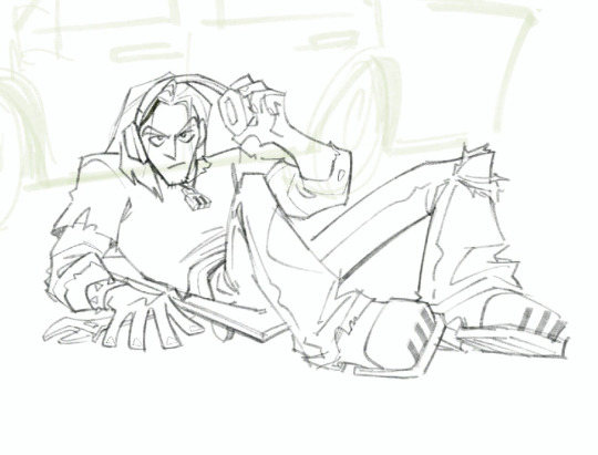
#dont look at this too much its just my cleaned up sketch theres probably details left not fixed
Text

i dont think hes wearing anything behind that guitar.
#vegito#vegetto#gogeta#dbz#dragon ball z#dragon ball#art#drawing#metal#i guess idk#dont look at this too much its just my cleaned up sketch theres probably details left not fixed#but its awesome sketchy right. yeah
526 notes
·
View notes
Text
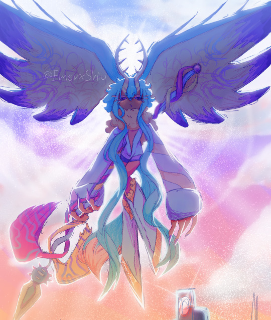
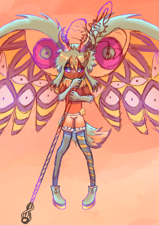
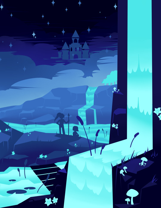
FORGOTTEN LAND'S SECOND ANNIVERSARY :3
I AM SOOOO BACK
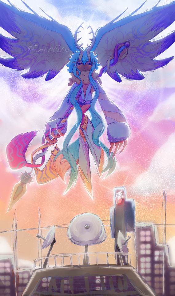
I started this drawing yesterday around afternoon and finished it just a few minutes earlier.
I went with a messier type of drawing instead of more clean like the elfilin one from yesterday, i find it fun doing it like this, mostly cause i dont have to worry about making it perfectly so i dont get as frustrated as normal. Id place this one as my second best digital drawing. im pretty sure i havent posted what i consider my best digital drawing here, tho i do have it in instagram, i might post it here one day, tho these two are way too tied up, i love how this came out, its not exactly like how i imagined it but its really close to it, and also itd say that since i dont tend to play around lighting that much, this was such a joy to draw and i cant help but stare at it a lot, at least until i start hating it because i made quite a lot of errors. i also changed my elfilis gijinka just a tad bit from last time, but its not that big of a difference, mostly.
ofc i had to draw elfilis for forgotten land's anniversary, i tend to deny it in my head but yeah they're my fave of the kirby characters even tho i hate them a bit. I wanted to draw some more doodles, like, elfilis eating cake, kirby car, a bunch of other stuff (not elfilin cuz i already drew him yesterday) but when i tried i couldnt draw anything more, guess this drawing burned me out a lot, huh?
you can definitly tell i spent all the efforts on him cuz if you look a bit closer to the bottom part you'll see its almost barely detailed, but i mean, they're the focus so make sense i guess for me not add that much detail there. um also, maybe because i dunno i had OVER 130 LAYERS jeez no wonder firealpaca was slowing down so much, i need to manage my layers better next time, tho i did do something i keep forgetting, wich is naming them (most of them at least) that was a real life saver
Also, antares (fecto elfilis' spear/cadaceus), as always, was a pain to draw, but this time its probably been draw the most accurate out of every other drawing ive made with it in it, i didnt notice it was like, a little curved when it reached the blade
some close ups since his face is a bit hard to see
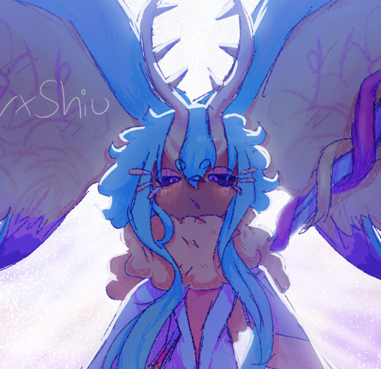
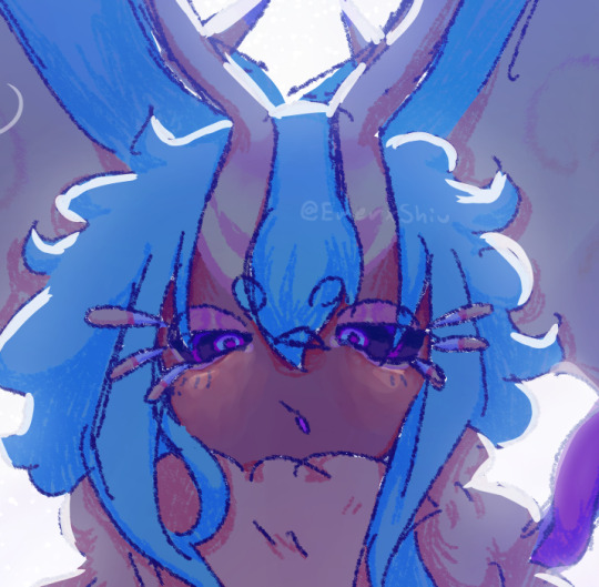
silly :3
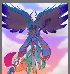
fun fact! actually, this is technically a redraw, somewhere around between february and march i started a fecto elfilis drawing for the first anniversary, but i couldnt finish it in time, and i never finished it
thats...quite the improvement! (i remember being so proud of it)
also his wings are like that cuz i did not want to draw the pattern, its way too hard, i literally copy pasted it, wait, i was talking about the 2024 version but i looked at the 2023 one and i just noticed it also has the pattern copy pasted, i guess some stuff never changes since i still abuse the ctrl+c ctrl+v to this day
Also i ended up making a huge error there, i was planing to add the phantom spears from orbital pulsar (the attack he does first when you battle them at lab discovera) but theres an innacuracy, when they do the attack, they always close their eyes, i had actually sketched him (well i mean both these drawings are basically the first sketch (2023) or second sketch(2024) with some color, shadows and lighting. i didnt do lineart in the 2024 one cuz i wanted to be a bit like the og i made (too bad i sketched that one with black since the og was sketched with white due to me drawing the bg first)) with his eyes closed but them decided to make them open for a reason i cant remember, maybe i thought itd look nicer? idk
ive had the idea of redrawing this for quite some month now so it was kinda already planned
background cuz i think it came out really pretty
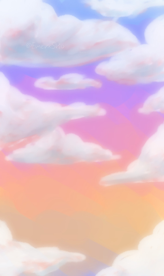
doesnt have the little stars since without elfilis and the structures it looks fucked up. the actual sky in game is more blue, but the clouds have some orange, in the 2023 ver. i made the sky orange, and in the 2024 ver i wanted it more accurate, but i didnt wanna loose the orange sky, so i did a gradient. pretty...
also here's a screenshot i took when i was like halfway trough it, its barely noticeable but i changed his mouth in the final drawing
I really love katfl, like a buncha whole lot, its basically almost my first mainline kirby game. 100% the demo, finished the game in almost one day, i literally play it monthly, like, every month i put the card in my switch, start it up, get morpho sword, and go shred elfilis in lab discovera. i would probably not even be here on tumblr and the kirby fandom if it werent for it. and i love it so much i genuinly cannot express how much i like it and treasure it with words or anything
Thank you for reading my unnecesarily long rambles lol
I hope i'll post tomorrow and dont forget like usual
Jambuhbye!
#art#fanart#kirby#kirby fanart#kirby gijinka#silly#digital art#firealpaca#fecto elfilis#fecto elfilis gijinka#my wife fecto elfilis and his new drip#yep changed them again#fecto elfilis lives in my head rent free 24/7#fecto elfilis fanart#kirby and the forgotten land#katfl#katfl spoilers#katfl second anniversary#kirby and the forgotten land second anniversary#katfl fanart#kirby and the forgotten land fanart#please reach a lot of people i spent way too much effort on this drawing#kirby series#kirby elfilis#kirby of the stars#:3333#:3#digital artist#artists on tumblr#small artist
44 notes
·
View notes
Note
Your Disco Elysium jacket kicks fucking ass, do you have any advice or resources for techniques you used to make it? It looks SO clean and I love the edges too!
hey thank you! :D
as for some tips, heres some i can think of from the top of my head:
i used acrylic paint on denim, it cracks a bit if you move it a lot (so the back is probably the best place for painting) and i would definitly not put it in the washing mashine
black denim specifically bc it makes it so much easier to clean up the edges with black acrylic at the end
definitly do a sketch of what you want to paint on some paper beforehand, get familiar with it, and iirc i used a white pencil (or chalk?) for the sketch on the jacket, that was easy to remove with some water (or painted over later). when you look at a picture of the window you can see that the propotrions are a bit off, i just made it fit
honestly there was a lot of eyeballing involved
for painting i put down a baseic shape down first so i didnt have to relie on the sketch on the jacket (this is where the one on paper comes in handy) and then put doen more and more detail
the first layer of paint i watered down quite a bit so it would flow better into the ridges of the fabric
its easier to paint straight lines on fabric if theres already paint on it so dont worry if the edges are´t that smooth in the beginning
look at it from afar too, not only up close
one thing that might not be very helpful to everybody, but i shortend the jacket, it is now only about waist lenght, bc it fits me better like that but it also doesnt crinkle the painting as much.
i cant think of anything else rn (and it has been almost two years since i painted this jacket) but i hope it was somewhat helpful! :D
@zinoprimo
5 notes
·
View notes
Note
hi there, I love your art! if you have time to answer, I was wondering if you have any tips or recommendations for drawing in a more expressive or cartoony style? I've been drawing for years but I always get caught up in the weeds and end up adding way too many details that don't necessarily look bad, but are too stiff and over-detailed. I really admire the way you capture so much in such clean lines, if you have any thoughts or advice I would love to hear them - thanks for sharing your art, have a great day!
ah thanks so much, i really appreciate it!! i totally get where youre coming from tho, i really tend to get caught up in the small things too (the amount of sketch layers i have on finished things is stupid lmao). anyways yes theres a few things i do to help myself out of that pattern!! im not all that great at putting things into words but hopefully the pictures help haha
putting it under the cut because it'll probably end up long sorry
i cant speak for everybody but this is what i do! heres how i tend to approach my initial sketches:
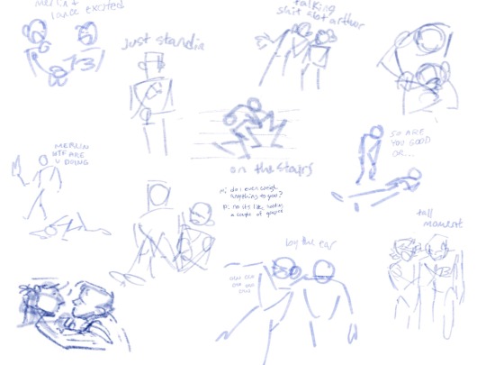
i like to keep it minimal here so i can focus on the pose over everything else, i try to do it in one pass and not worry about the anatomy. usually i do a few of these kind of sketches before i figure out something i like. also something ive found recently is that, for me, zooming in and doing these sketches really tiny helps because i dont have the space to add in detail. i do this a lot when i thumbnail a sequence to storyboard (usually on paper tho) and it helps me focus on the idea over the drawing
after that i like to focus on shapes!

if theyre a character with loose fitting clothes i usually won't sketch out much anatomy and just get into the shapes of the clothes bc then i dont get too particular with proportions and all. im gonna state here that this is not an excuse to not study anatomy tho and the reason that this works out for me is because i have studied it haha
getting into details of things, i kind of try to walk the line between too little and too much? like with clothes the details i like to get are wrinkles at bent joints and obvious seams. with wrinkles i try to only do one, maybe two, because it can get excessive fast.
seams are really good for establishing the direction things are facing, like to read volume in 3D space. the ones ill pretty much always include (unless theyre not present in the clothing worn) are shoulder seams and pants seams. in my experience shoulder seams are great at telling the fit of a shirt without a ton of detail!
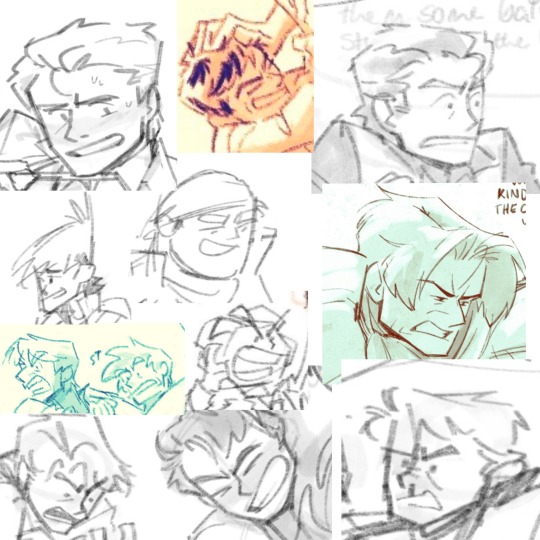
lmao heres a collage of expressions for an example. as far as faces go i like to exaggerate mouths and eyebrows a lot lmao its kind of hard for me to put into words my process here. i really like dot eyes bc i feel like i can do a lot with em in combination with lines. tho i dont usually use em on finished artwork. eyebrows and mouth are primarily what i use to establish a facial expression, though sometimes ill throw in a scrunched nose if the expression calls for it.
the whole "clean lines" bit really does help with making sure things dont look too cluttered, and the way to approach that for me is doing your line in just one stroke (maybe two if u want it darker but thats besides the point lmao) but yeah drawing from your shoulder, not having a hairy line, etc really helps not clutter your drawing
anyways i think thats about it for expressiveness and clean lines idk if youve got anything more to ask ill answer to the best of my ability
TL;DR i try to focus on shapes and pose, and putting in just enough details to make action/expression read well
#ask#anon#i hope this is what you were looking for? im not that great at putting things into words haha#sorry i took a min to get to this ask haha i had to figure out what i wanted to say
39 notes
·
View notes
Text
My approach to flat colors + limited palette drawings
This is a follow up to this post i made about how i go about figuring out a color palette for my limited palette drawings. an anon asked me about my actual technique of finishing them so this is gonna be an explanation of how I work in a limited palette with flat colors. I ended up with these thumbnails for a sketch last time so we’re gonna work from here and I’m gonna sort of walk through how i got to the finished version

first things first: every part of this process is just developed as a result of me messing around. take my advice with a grain of salt and if you think you know a way to do something better/that makes you more comfortable. go with that over what I say.
I’m honestly a little surprised when people express confusion about how i draw like this because it’s SUPER simple - literally all you’re doing is just stacking solid color blocks of shape. its very imprecise despite how sharp everything ends up looking.
First things first is that you want to decide how you will be handling your edges throughout the duration. Do you want your shapes to be ultra-sharp and precise, or do you want a little bit of a wobblier, grainier edge? Both can look good but it’s VERY much a matter of situational basis. i’ve been favoring looser and grainier shapes so that’s how i’m going to be working on this.
on the left here, you can see the shapes made with precise rectangular selections and an untextured pen, on the right, freehand drawn shapes and a grittier pen. There’s something immediately pretty different feeling about them. So play around with that first - its not something that’s fun to change halfway through! But lets step back a minute. It helps to work large to small. The two biggest shapes here are these orange chunks and everything gets stacked on top of them so i’m gonna do that first.
Now, a key feature of what i do: clipping masks. almost all digital art programs have them. What a clipping mask does is it constrains the pixels of a layer to the transparency of the layer below it. Here I have the light orange layer, and then on top of it the buildings and billboard are clipped to the orange. Most of you probably already know this and I’m overexplaining a bit, but there was a time when i didnt know how clipping layers worked and someone had to explain it to me.

now you’ll notice the shapes of the buildings are rough, and sloppy. here’s the fun part: since this is all about stacking shapes, only your exterior edges matter. this all gets filled in. be as sloppy as you want when you’re making your shapes. in fact, the outside edges get trimmed out a bunch to when i do this - i go in and erase them clean. Don’t be too finnicky about drawing perfect and precise! its a waste of time. As long as the silhouette is what you want, the interior can be a nightmare.
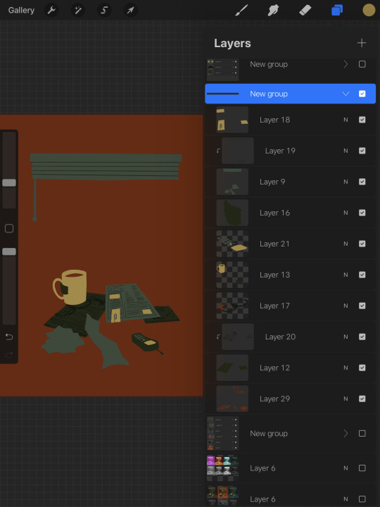
Working this way, it’s important to keep your layers stacked in a way you can make sense of. Right now there are four layers here: the background dark orange, the two main orange rectangle shapes, and then the buildings on one layer and a billboard on the other. I rack up a LOT of layers doing this and it makes it annoying in some aspects, but being able to freely recolor any one chunk without losing my detail is a key aspect of this.
So, I block those out
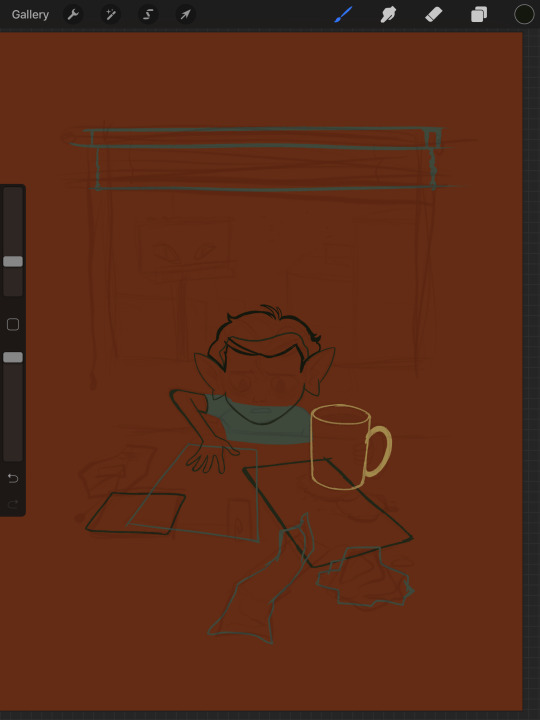
Next, I do the same for the smaller chunks that are still main shapes. There are once again, a lot of layers here. The top layer is the hair - you can see the head showing through it. The head and arm underneath the hair, same layer. Then the cup. Then the light green pieces of paper. Then the dark green ones.
The cup is technically farther forward than the head and arm so you would think it’d go on top, but the point isnt to recreate the foreground and background hierarchy with layers so much as it is to group things in a way i can work with. The cup goes underneath so it can be grouped with all the other objects on the table.
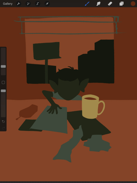
now, i just go and fill in all the shapes. i forgot to do the blinds but i get them later. you might notice a lot of these shapes are pretty rough, which was harder to notice before they were filled in. Now that I can see better, I go in with an eraser and clean up the edges until they’re the shape I want

sometimes erasing leaves little bits of ‘noise’ around objects like on this napkin here. i like to keep a little bit of this noise for texture, but if you dont like it make sure to get rid of it! if you’re working very crisp this will stand out a LOT
Next up is to add some detail onto the objects
I flipped the canvas here because the head shape was wrong - the ears were uneven and i wanted to fix it. I want to go about adding detail onto the billboard and buildings. i do all detail with clipping masks - but the objects are clipped to another layer and so nothing can be clipped to them. instead, i unclip them and just erase by selection for the same effect
all of the text on the papers is clipped to the papers below it. the buttons are clipped to the phone. the yellow photos and card are actually another independent layer on top, in case i want to recolor them separately. im indecisive and end up recoloring things a lot. For the most part these objects are starting to become recognizable as more than just shapes
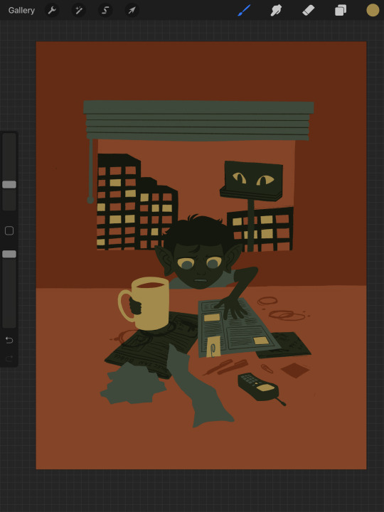
i go in an add the details on the background and character now. theres some more stuff on the table. the lines of the face and ears are on one layer, and the flats of the eyes below that. Here’s what each group of layers is, and what they look like on their own

The background/bottom chunk. Just the table, window, and shirt.
The middle bit. All the stuff on the table and the blinds.

Finally, the top, which is just his head and arm.
now this stage is the bare bones of the drawing. you can more or less tell everything that’s happening. it reads. but its very much lacking in something - it doesnt have a ton of depth or interest. and adding that additional detailing, the dept and interest, is where stuff starts getting REALLY tricky and subjective.
im gonna take you to a much simpler scenario to show the sort of options i go through at this stage
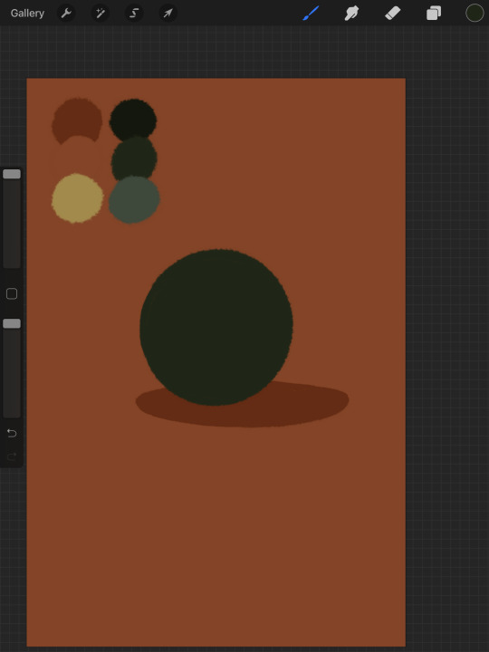
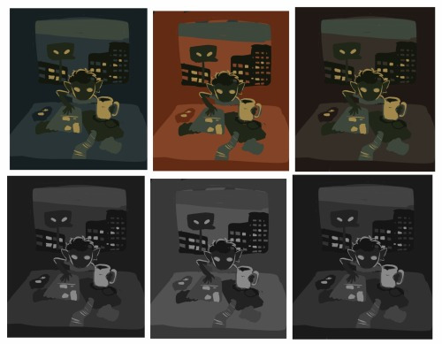
ahh its our dear friend, sphere casting shadow. this is, more or less, the kind of image we have. you can tell whats happening but it’s lackluster. there are TONSSS of ways frm here that you can go add interior detail to a shape once it has been established. here are some quick and SUPER rough examples
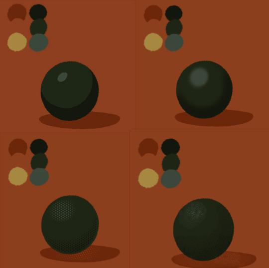
from top left to bottom right: flat cel shading, softer airbrushed/gradient shading, halftone, and a textured brush. Each of these has their strengths and weaknesses. They can also be combined.

for example, here’s the solid cel shading being used to contain a gradient/airbrushed detail. This image - probably the single oldest piece of my art i still willingly show people - is entirely colored with gradients being contained in cel-shaded chunks. It has a sort of soft, luminous quality but without losing its crispness.
here’s a super quick bust with some variations of stuff going on. obviously this is no masterpiece but you see how different types of detailing can interact with each other and be used to distinguish materials too.

With the mob psycho comic I did, the detailing that wasnt line was done using a variety of halftones of different shapes layered on top of each other


by contrast parts of my ace attorney comic use a textured brush and have a sort of blended, papery feel
any of them can work for pretty much anything as long as you are using it with intent. practice around. mix styles of finishing together. find a comfort zone. the more you do it the more intuitive it becomes and at the heart of it this process is a very intuitive way of drawing because of how far removed it is from realism.
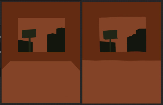
Now here is the trick - light and shadow.
Everything up to this point has been very flat and adding detail helps but there’s only so much that can accomplish. To get HEAVY light and shadow you need to think about things differently. I think if there’s any part of this process that’s complicated, its this one.
To truly get the most out of your palette, you need to pick chunks of an image to be in higher/lower light and then either ‘step up’ or ‘step down’ the colors in that chunk. here’s what I mean.
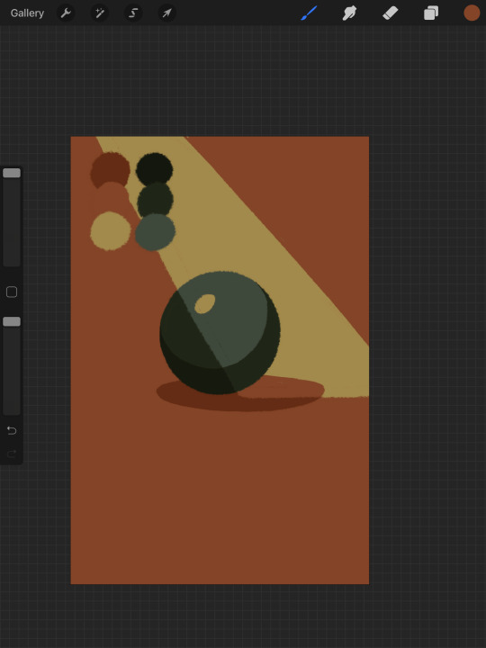
Here’s our ball with a beam of light on it. Everything Within the beam of light is one step in our limited palette lighter than anything outside of it. Here’s how I go about doing this: the shape of the beam of light is below everything else. Then, once I have the shape blocked out, i select it. With that selection in place, i go to EVERY SINGLE LAYER that’s effected, lock the opacity, and recolor that chunk. So what’s going on here is that there is only one more layer - the beam of light, below everything but the background, and the rest of this effect is just caused by every layer above it now being two-toned following the exact same silhouette. THIS is why it’s so important to keep your layers separate - if the shadow and highlight had been painted onto the base directly, i would not be able to do this without significant effort.
This works with all of the finishing techniques I talked about above
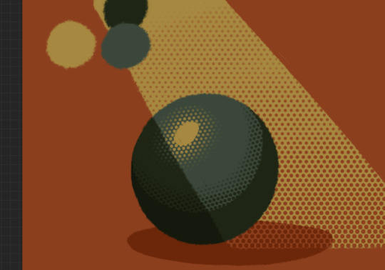
A combination of cel shading and half toning, all stepped up to give the appearance of heavier light on one area.This is also how I go about rendering transparency in this style. All of my layers are fully opaque and I allow the colors to do the work of conveying transparent material

Here’s our ball with the patterned/textured brush shading, being viewed partially through a window
it’s obviously not a very representational way of working, but as long as your audience UNDERSTANDS what you’re trying to convey, then you’re executing it successfully.
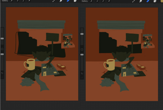
So with that, now we’re gonna go and finish this drawing.
For this one, I decide a big central shadow is necessary. In the original thumbnail, he was backlit, which I still plan on doing, and that wouldn’t make sense without casting a shadow.

I’ve had to change the colors of some objects entirely in order to get this to work right. This is what I mean when I call this an intuitive process - some stuff felt weird, so I changed it. This also involves a bit of problem solving. The newspaper is now unable to be separated from his hand. Sometimes changing the color of an object makes that object look better, but ruins its relationship with the objects around it. It’s up to you to learn how to adjust and finagle things until you get it where you want.The paper he has and the napkin underneath it also all blend together now.
The next few parts of this process are REALLY just trial and error, where I toss a bunch of spaghetti at it until it works. It’s hard to decide what to screenshot, because I don’t know what will or will not be part of the finished drawing. To that end, you can watch the recording of this drawing here. This video isn’t edited at all so it contains a couple of minutes of really shitty sketching, and then all of the color thumbnailing work i did in the last post. Actually getting started on these final colors begins around the two minute mark. It is also sideways, I am sorry I don’t know why.
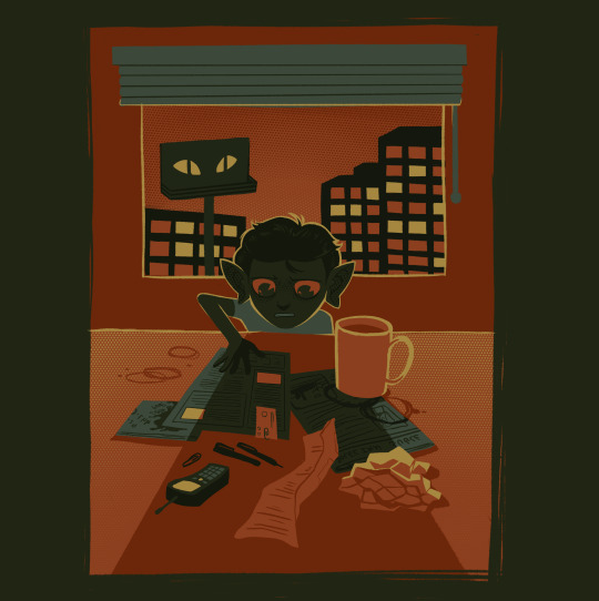
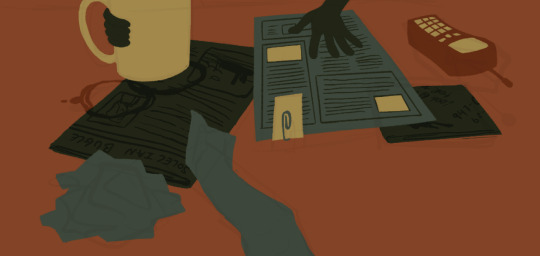
Now, here you can see where I’ve more or less worked things out. His hand’s not on the cup anymore because my friend pointed out it didnt have an arm attached to it. I added some halftoning to make a gradiating effect in the sky and on the table to give the impression of a sunrise. His eyes are different but as of posting this, I don’t like them and am probably about to go back and change them again. The Cup now has a shadow and some rim lighting. His hand is in shadow. The stain on the napkin is big enough to define the edge of the paper on top of it.
Little things like that.
The more you draw like this the more the way you need to think about your space becomes natural. I hope this helps and I wish you all the best of luck!
117 notes
·
View notes
Text
i need more money to buy little art
honestly tho feeling like for that ideal goal existence i’ll try get to someday, i’ll needa be making proper money comfortable and good so i can spend all i like on society 6 and other to buy shirts and bags and just everything to a house all in different art prints (mostly florals) bc just those pictures are like everything i want but just so expensive. i’m trying to sum down like 10 to stickers, bc i wanna do up my laptop, but dedicating to a single decal (thats like 25 ON SALE) is too much esp since i love so much. so ive kinda decided to get a hard cover for the laptop just in case i break it, and just in case i do break my laptop that i can keep the stickers on the hard case and dont lose them to replaced parts. idk seems smart. ill probs buy a kinda shady cover off of ebay for 5 or 6 pound and then spend 20 on stickers for it :] since theyre on sale till 8 am today and its 3 am im probs just gonna settle and order them. might order cover tomorrow w my dad bc i need trust assurance. hes not all on board on the stickers so im just gonna go for it. theyre gonna be like my post cards. i buy so many every place. and no. not trashy postcards. i want art. i have so many postcards of paintings in galleries and so many from comic con art valleys (guess who wants to get so much more and 100% will) i love original art the most when its pretty to me and like everyone who sees it. simples okay but i prefer soft and detailed. excited now i can go to con and also be looking for stickers bc maybe ill get a few cool ones that wont cost me as much as the society 6 ones do. and then my laptop can replicate my walls, displaying all the art ive loved that ive been able to take with me (bc theres so much i obviously dont have on my walls) anyway im looking at these and making some small bc i suddenly realise this laptops got realestate. and the saddest thing w stickers (literally why i had one of those waxy paged sticker books as a child) is that i cant dedicate stickers to a single spot. its so much dedication. what if i buy a bigger sticker and it wont fit? what if i get the perfect sticker for that spot and it wont fit? (over lap i guess) how can i be sure i put them in the right spots to start with? augh i dont really wanna cover just half of it and obviously leave space bc that puts pressure on finding stickers and i might get ones i dont love. i cant get sick of any one bc itll be there (joy of having multiple mean theres less getting sick of anything). anyway i think im happy w the sizes of these 10 stickers and can work w them (also for now i think im just gonna be going around the edges and leaving the apple logo as it is, esp bc it glows and theres already this shitty old smiley face sticker from my old psych teacher and i kinda dont wanna get rid of it, i just wanna add things around it so it doesnt look so: clean (actually dirty) laptop that a child marked as their own)
anyway society 6 has random discounts all the time which is p rad and maybe the day im ready to invest in my own living space and dont feel obliged to check w my parents about just about any purchase, i’ll then subscribe to something thatll tell me what discount is on. that in mind, i think i’ll only get the 9 now, that hopefully wont cost too much, and leave a bunch in my wishlist, bc there’ll be another discount (this is 20% off everything) and maybe that’ll be like 50% off stickers and boy then when my collection is underway you bet ill go for it. and like maxx sticks on their sketch book, if i dedicate to a new book maybe ill get more for that and have a pretty thing to keep and reminisce over (tho knowing me, ill not use it much bc i have a need for pretty things to stay perfect and presentable, and i have a need for everything that i might show to others to be like near perfect otherwise its sucks and ill feel bad bc i dont wanna show it off to people. like my art book, sure i couldve made it all experimental and crap and then edited the real pages together on the computer. but no. i needed everypage to be presentable and pretty and handwritten and creative. and they must go page after page, its so awkward showing someone something and then going “oh wait now these few are empty sorry yeah heres the next page” so i baasically have a book with mhmmm 20-26 pages of beautiful spreads that im quite proud of inside beautiful covers ( i knew id want to be presenting it for years to come) and the back pages are just...empty. and theyll probably stay that way bc i no longer have projects to be doing to fill them with. maybe one day ill grow into myself and grow out the fear of ruining what ive achieved and fill some with new projects to please myself and be an indepenednt artist not just a teacher pleaser. you know its like that with my work too, like it has to have a direction and a plan that will be achieved, and its terribly frustrating when that vision doesnt happen. but i think thats the same with everyone.
anyway on a side note, dont you guys think its so fun and cool how ive not done my post labs that were due last friday? how every night ends up being 3-4 am until i go... mhmmmm yeah i guess nothing is happening. like i hope id bloom and do work at that 11pm-3am window and then i get here, suddenly having lost all track and sense of time and just sigh. its wasted, its basically tuesday already. have to keep telling myself dates bc it moves so weird. i planned on getting shit done two days ago. here we are regardless. and the most ill get done is get those stickers ordered bc that is i guess what ive been half focused on for mhmmm5 hrs. then ill save my 7 dollars or whatever, have stickers on the way, tomorrow order the case and thats one insignificant thing done. then the question will be have i looked at summer jobs? no of course not ive looked at ballet courses. shush. i havent showered for days bc theyve just slipped by too laying in bed, maybe tomorrow ill take a shower and pick up all the trash and tissues on the ground. maybe i will. i know i wont get real work done tonight, and already ill be sleepy till 1 pm and by then mom will be again on me abt sleeping to latesoo... yeah no point. and here i thought id make a quick totes relatable short post about how i need more money to buy stickers and maybe a brief my ideal life is to have enough money to spend on art being in every part of my life and all this being unique so people love coming to my house and go wow its so original and cool. and that turned into a word vent thats so far taken me over half an hour. hi my batterys dying.
lng story short, i’ll order the stickers currently in my basket after so much though, suck it up and do it and know that i have a bunch over in my wishlist for that next maybe even better sale when it happens. the only thing is im taking all the rest as transparent which for sure dulls them down (yeah white background looks sick but for some its just more classy w transparent, then theres this one bear i’m 100% naming wojtek thats in white bc i feel it’ll be best for him, and i guess having him in white will set that theres no clear rules to follow and worst case if it doesnt fit he can come chill on the keyboard side next to my mouse pad thing) honestly i cant tell if i should be getting them all in white and just hope that theyll look gorgeous no matter what. yikes 3 dollar shipping for stickers, ok itll actually be 19.62 pound and using euro card 22.50 in euros.... am i dumb? maybe. and tho im supposed to be saving money up so i have some, i also did get birthday money sorta recently soo... birthday gift from them. first set of stickers. deep breaths ok. my parents told me when i bugged them that i just have to make a decision and not ask them all the time, and he said to get 3 stickers i told him id pick 12 so i think getting 9 is reasonable. also oh shit realising that the delivery time is 1-3 weeks and im staying here only 1 and a half more so i should really order it to scotland even tho it might get ther ebefore i do bc my parents might not rly want to send them up to me. idk ok order to scotland, thank f at least one of my flat mates is staying and tbh i should really bring her some chocolate... shes done me faavours.
#another thought trail rant#this time on buying art in form of post cards and now stickers for the first time and being unsure about everything#when am i sure tho
0 notes
Last Seen Blogs

shuuji-chan
@ShuujiChan_

portejartelle
porte-jartelle

mxrveltrxsh
my Marvel trash page

monimoniboo
Starchy Moni

fashion-tipps
Fashion-Tipps