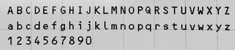
#dot matrix typeface
Text
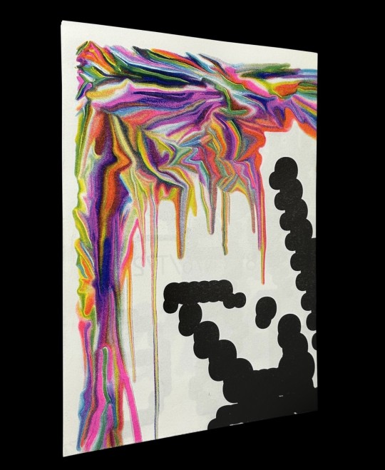
Harber Type Specimen (A2 version) by Benoît Bodhuin
Harber is a dot matrix design with variable axes for weight, slant, volume, noise, and optical size.
Published by Benoît Bodhuin, 2023
1 double-sided sheet, 5-color Risograph, 16.5 × 23.4 inches
Ships folded, dimensions 8.3 × 11.7 inches
#type specimen#Risograph type specimen#Harber typeface#Benoit Bodhuin#variable type#type design#dot matrix typeface#Draw Down Books
37 notes
·
View notes
Text
DIGITAL IMAGES & GRAPHIC DESIGN/LAYOUT

DPI—Dots per inch. It is a measure of spatial printing. It is what can make an image look crisp and high quality. The higher the number the more dense the dots are placed. The smaller the number, the less dense.

Image Resolution—The level of detailed that is contained in an image. It refers specifically to the number of pixels that exist within an image. The higher resolution the more pixels, wheres the lower the resolution the less pixels.
Pixel—The smallest unit of a digital image capture by a camera's image sensor. Each pixel represent specific values and hues and collectively forms an image.

PPI—Pixels per inch. The numbers of pixels in each inch of an an image. It also refers to the number of pixels a screen can display. The higher the PPI, the more crisp an image's quality is.

Raster Images— Complied using pixels or dots into a rectangular matrix and/or grid to form pictures. These pixels or dots make sue of different color and tonal information to create a final product. The more you zoom in on a raster image, the easier you can see these pixels.
Vector Images—Images that are vector makes use of geometric shapes defined on a Cartesian plane i.e points, lines, curves and polygons. Vector images do not abide by the constraints of a raster image and can be scaled up or down without loss of defintion.
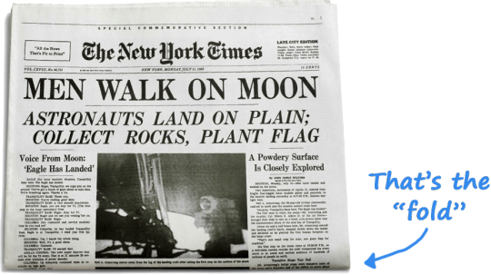
Above the Fold—The upper half of the front page of a Newspaper or tabloid. Often, an important news story or photograph is placed here. It van be seen used a in newspapers due to the fact they were often given out folded in half.
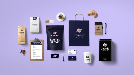
Branding/Brand Identity—Key brand elements such as logo, color scheme/palette, typography and other components that are easily identifiable by costumers and something that sets a company aside from its competitors.

Style Guide—A file/template that sets the standards for writing, formatting and other design elements for a company or a set of documents, deliverables, etc.

Logo—A design that is used to represent a brand. Can be a symbol, typography, or a mix of both. It is what is used to identify the brand and is put on uniforms, vehicles, products, etc.

Lorem Ipsum— A place holder text commonly used to demonstrate the visual form of a document or a typeface without relying on actual text. It is used to create visual mock-ups and layout previews.

Trapped White Space—White space that is trapped by design. It is boxed in by other elements and is often unintentional creating an unattractive hole in the design. Sometimes it can be use intentionally.

White Space—Any blank or empty s[ace that surrounds other elements in a composition. it's the space between text, images, buttons, etc.

En vs. Em Dash— An en dash (-) is used to make rangers with the meaning "to" such as being used in numbers and dated. An em dash (—) can be used to mark an abrupt—or break—change in a sentence. It functions similar to a comma, colon, or parenthesis.
0 notes
Text
Page 360
When I showed the alien letters to the Mystic-old man, we discussed them in great detail. Back in 2010, I drew the matrix and tapped into the subject of sacral geometry. I was researching the crossing of the lines, circles, and dots, as well as the Freemasons” square and compass, and I got this information. It is just a language, a typeface. It is so simple, but we don’t see it. People are so unconscious, their perception is foggy, they don’t understand the essence and take everything so superficially. This is not good. As for me, I am very curious about the nature of everything. I am always questioning,” “A cross. Why a cross? Where did it come from””. Naturally, I don’t ask people about it; I don’t need the false nonsense that they store in their heads. I search for the answers inside of me, and it turns out that the cross is just an alien letter. But people called it a cross. As if we would worship the letter “”A”” Are you with me? This is number one. Later, I got even more proof on this topic. I didn’t pay much attention to it before because the access to the knowledge about the “”alien”” was not open to me back then. It was a long time ago, and I didn’t believe in it. When we discussed the matrix and the structure of everything, we spoke about the matrix of St. Petersburg, and the Mystic-old man mentioned that somewhere in St. Petersburg, there must be alien spaceships. He said that while we are talking about the “”aliens”” they know we are talking about them, and they are watching us. They know that we know about them. He said that he saw the flying saucer. Not physically, but he sees the information the same way I see it. He saw an image and a name and asked for a piece of paper. And when we gave it to him, he drew three letters that looked like sticks. Later, I bought a book on sacred geometry and discovered the names of some strange gods and descriptions of what they did here on Earth. Each of them was illustrated, and they didn’t look like people. There were pictures of their firmware and their structure, which looked like lines and squiggles. These lines were emitting energy, and when I researched it further, I discovered that there was some kind of alien language.
There is no conclusive information about this typeface and its origin, and through my research, I found different names for it. Someone called it the angels” alphabet or angels” typeface. I found a picture with the numbers and the names of the numbers that looked like scribbles. I had a crazy response to them as if I knew them. I decided to write my numbers three, fourteen, and fifteen
0 notes
Text
Process Blog 9/8/23
This week we talked about cropped type, type as texture, readability and legibility. Cropped type and type as texture are exactly what they sound like. Here are some examples.

Where my brain got confused was when we talked about legibility vs. readability. Legibility is how easy is it to distinguish one letter from another in a typeface, but readability is about how easy it is for someone to read it. We had to bring in two good and bad examples of each.
Here are my good examples

Here are my bad examples


Discussing project 1
Today we also had a class discussion about everyone's ideas for their magazine. I decided to do my magazine about video games over the decades. This magazine will cover the 50s to present day. I also want to touch on how history affected the direction of gaming from early on.
Reading 1
This week our reading was about how to define problems. Some of the different ways were brain storming, mind mapping, interviewing, focus groups, visual research, brand matrix, brand book, site research and redefining the creative brief. Some of these methods I've used before such as brainstorming and mind mapping, but the other I have not done before two of the methods that stood out to me was brand matrix, and brand book. a brand matrix crosses two different value scales. To make a matrix, you first start a list (of the subject you are working on) then you find the opposites, and then you connect the dots between the two. I just find it interesting how there are so many different ways to help you spark ideas for projects. I can see how this method would help you think outside the box. A brand book is the way to visualize the vibe and life of a product, brand or company. This is often used for education or for people inside the company. I love books, and I have been trying to grow my own collection of design books for this reason.
0 notes
Text
London Underground Dot Matrix Typeface
https://github.com/petykowski/London-Underground-Dot-Matrix-Typeface
0 notes
Text
Post Crit Research Whim Crouwl

Crouwel most known for his new alphabet, he thought it would be better to design a typeface that was suitable for this machine instead of forcing it to use the typefaces we knew. He drew the New Alphabet, a highly abstract font, based on a dot-matrix system. With its straight lines, 90 degree angles and 45 degree roundings, either big or small, it always looked exactly the same. The face was as high as it was wide, thus lining in every way so it would fit in every grid system.
This typeface was merely developped as a theory, a direction of thinking. It wasn’t meant for actual use. Crouwel gave lectures on the subject and gained a lot of response. In the 90’s the New Alphabet showed up in UK pop magazines. Although it was often changed to make it more readable it was undoubtedly inspired by his original drawings. 30 years after his first experiment Crouwel was asked to digitise the original typeface.

works like this I think are more applicable to what im doing while I understand the purpose of the new Alphabet the limits of technology art there in 2022. however the other works of Crouwl is still useful to me as his use of grid and geometric type feels timeless. While these fonts can't be used for everything I think they have a holding place as futuristic expirimierntal type. Something interesting Im going to keep in mind when creating my font is the use of gutters within the grid. this isn't something I've considered but I think it could help keep the counters of my font consistent.


this is a really good look at the actually process of using there grid and gives me a bit more confidence because it donsnt have to be anything special I think as long as I pick a grid and stick to it the intended effect will shine through. Outside of that I think this example shows how its ok to break the grid if its intention and consistent. you van see in the J and H quite clearly the 3 steps up and down don't fit the grid being used but tis consistent throughout so it fits and feels right.

1 note
·
View note
Text
Week 10 - Graphic Design
One of the most interesting things I found about this week was the different nineteenth century types that were developed. The first commercial sans serif was released in 1816 and it differed from other styles such as Didot in that it tended towards uniform strokes. It is noted that the vertical stress and strong geometric structures of the type seemed to copy characteristics of modern serifed faces. This style of type was used as a way of making bold statements evident. At the same time however, the slab serif also developed with a typeface that features heavy rectangle serifs. This type of serif, unlike sans serif, its face overemphasizes the serif instead of eliminating it. Its purpose however, remained the same in its goal to attract people to the type. I find it interesting how advertising agencies have helped propel graphic design in different forms. Given that social media has become an essential, I also wonder how common this kind of printing is still handmade versus being digitized.
The emergence of digital typography came as a result of rapidly evolving technology and the introduction of computer systems. Unfortunately, there were still limitations that included the screen and the dot matrix printer that could only display 72 dots per inch. Designers like Zuzana Licko were able to establish a ratio based on using a two-pixel stem to a one-pixel counter. This type of digital typeface became popular through a journal called Émigré. Licko produced more fonts such as Modula, where geometric curves were applied to smooth out a bit-map’s stair step pixesl. These designs would continue to become popular and would eventually become important in popular graphic design.
Overall, I found these readings to be insightful and I feel that I could point out some of these styles if I ever saw them in a public setting. It is evident that typography has evolved tremendously but the influence of previous invented styles continues to be evident in modern typography.
0 notes
Text
Seven segment font windows
SEVEN SEGMENT FONT WINDOWS >> DOWNLOAD LINK
vk.cc/c7jKeU
SEVEN SEGMENT FONT WINDOWS >> READ ONLINE
bit.do/fSmfG
This list ignores fonts (or rather typefaces) that segment their glyphs, but in an non-consistent way, e.g. arbitrary breaks, shifts, or extra diagonals for 'M', 'W', 'K', or 'R'. Dot-matrix or pixel fonts are available in sizes such as 3×5 and smaller (i.e. 15 segments and less), but do not count. Seven Segment Font is beauty LCD font, designed by Krafti Lab. You can use this font for personal purpose. 7 Segment Font Windows. Gravitate Segment BRKHideShow. Fifteen Segment Rush LDRHideShow. 7 Segmental Digital DisplayHideShow. SegmentalHideShow. Segment7 - Font Library. Segment7: Strictly seven-segment (plus point) calculator display face, fixed-width and free. Download 7 segmental digital display font with regular style. Download free fonts for Mac, Windows and Linux. This font was posted on 09 May 2015 and is called "7 SEGMENTAL DIGITAL DISPLAY" font. This font is in the regular style. You can find over 79364 other regular fonts on Fontsup. < Segment display | Seven-segment display. These list ignores fonts (or rather typefaces) that display their glyphs with segment display, but in an non-consistent way, e.g. arbitrary breaks, shifts or extra diagonals for "M", "W", "K" or "R". Dot-matrix or pixel fonts are available in sizes such as 3×5 Font type: Full font (95 chars). Font size: 32x24 pixels. Windows Dingbats font. DotMatrix_M. Seven Segment full font. Some artistic freedom has been used on a few of the punctuation marks. Submitted by: Chris. Seven Segment Font dafont.com. Submit a font Tools. Seven Segment € by Krafti Lab. Seven Segment.ttf. Note of the author. Multilingual 7-Segment Display Font. Download Segment7 font at FontsMarket.com, the largest collection of amazing freely available fonts for Windows and Mac. Seven Segment Regular font 2.81/5. 200. votes, rated based on results identification. Similar fonts for Seven Segment Regular from CreativeMarket.com.
https://hawadewojuj.tumblr.com/post/668361706980966400/nero-83200-keygen, https://begacohuveqo.tumblr.com/post/668355216507289600/434-destruction-warlock-pve-guide, https://noquvuboxet.tumblr.com/post/668351186520391680/seche-linge-bellavita-dc-8-b-wmic-noticedomo-b3951, https://kojahibugiko.tumblr.com/post/668367096593399808/coleman-445a700-user-manual, https://noquvuboxet.tumblr.com/post/668353773697204224/shibu-kv-introduction-embedded-system-pdf.
0 notes
Text
following my search to make my data visualisation feel authentic, i wanted to match the typeface used on the original, i tried the match font feature on photoshop but this didn't get me anywhere unfortunately. from there i had a quick google as i felt most receipts use a similar font. i found a forum where someone was asking the same question and it gave me a few to try out;
monaco
dejavu sans mono
OCR-A
OCR-b
dot matrix
hypermarket
i will search for these (hopefully they are free) and see which one works best.
forum link: https://wallpapersite.com/en/knowledge-base/20027/what-font-is-typically-used-for-receipts-
0 notes
Text
Font Junkie
My name is John and I’m a fontaholic. My first use of alternative typefaces occurred in college, when I bought two extra round elements for the electronic Olympia typewriter. Very much like the popular IBM Selectric of the time. The idea that there was more than “Courier” in the universe was eye-opening. I was hooked.
Later, I indulged in a type of word processing machine that allowed for more than one style of printing. It included a little window that showed each line as you typed it out to help avoid bad spelling and even worse grammar. The pages it produced were done with dot matrix technology on thermal paper. Not terribly aesthetically pleasing.
Not long after my return to Tucson in 1985 for the public relations job at a local hospital, the office invested in a brand new laser printer from Hewlett-Packard. It featured built-in (or loaded in) fonts, which gave us the choice between serif and sans-serif faces. It was thrilling.
At some point, fonts became a thing all their own, independent of a particular platform or operating system, and the availability of styles exploded. Digital foundries were created by the long-standing companies, but also by individuals. Before long, I also got into the game. The details from one of my early adventures have been offered previously, and my experiments with creation have continued.
Even more recently, use of all these lovely fonts on the web has become quite simple. No longer are site designers restricted to a few typefaces supported by internet browsers. The technology has reduced use of almost any font to just a couple lines of code. Sadly, this has resulted in some sites looking like ransom notes cut from letters in magazines and newspapers. But that is simply due to a lack of training.
While font design can be complex, and many beautiful creations exist thanks to talented and patient artists, my own few are mostly adaptations of handwriting by myself and others. Printing, to be clear. Script creation is not something I have attempted yet.
Unlike substance abuse and addiction, my attraction to fonts has been without severe and debilitating consequences. The worst has been the increasingly complex filing system. Or, should I say, increasingly large. Almost 15GB of font files are stored in the cloud. Another couple are on an external hard drive. More is added on a regular basis.
Every Monday one internet service offers a handful of free files, which often include fonts. They join my collection. Occasionally, offers from vendors pop up that can’t be passed up, with hundreds of fonts available for mere pennies each. One such bundle was tucked away on my external drive just today.
Another consequence of my unfettered collecting is that I face a daunting task whenever I need to find something new for a particular project. I can spend hours, quite literally, digging through folders and popping open views of various fonts. Serif, sans-serif, blackletter, handwriting, block, foreign alphabets. The possibilities are endless. As is my obsession.
0 notes
Photo

PC Magazine November 10, 1987
A mass of printer tests rolled around in this issue, although the sun definitely seemed to be setting on daisy wheel printers with laser printers offering just about the same “letter quality” with many more typefaces and dot matrix printers continuing to improve. Microsoft porting its Excel spreadsheet from the Macintosh to Windows was presented as merely “challenging” Lotus 1-2-3...
0 notes
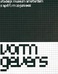
Text
Wim Crouwell
In 1954 Crouwell designed the posters for the Van Abbe museum. He took this on with the viewpoint that the posters should merely provide relevant information to the reader, without any styling that may lead to confusion.
Crouwell felt that his designs related to the Bauhaus style, the Swiss-inspired international style. He was fascinated by the rational aspect in Bauhaus typography.

Crouwell appreciated ideas about serial and mass production, as he stated “we need the machine since we have no time”. But he also believed “the machine cannot replace the precision of the human eye and human feeling” - I completely agree with this statement. I think that typography really is an art that cannot be replicated to such a degree of detail with machinery.
NEW ALPHABET
Crouwell designed the ‘New Alphabet’ in 1967 after seeing the first digital typesetters at a print exhibition in Germany. It is a highly abstract font based on a dot matrix system. Due to the continuity of its straight lines, 90 degree angles and 45 degree rounding no matter the size of the font it always looked exactly the same. The typeface was as high as it was wide meaning it would always fit within a grid system. It was interesting to find out during my research that the typeface was merely developed as a theory, a direction of thinking. It wasn’t meant for actual use.

Crouwel gave lectures on the subject and gained a lot of response. In the 90’s the New Alphabet showed up in UK pop magazines. Although it was often changed to make it more readable it was undoubtedly inspired by his original drawings. 30 years after his first experiment Crouwel was asked to digitise the original typeface.
0 notes
Text
Optical Character Recognition
In the book, Color & Type for the screen by Götz gives examples of Optical Character Recognition (OCR) typefaces.

Optical Character Recognition A. Unknown, 1998
Optical Character Recognition B. Unknow, 1998
Typeface OCR A and the improved form OCR B (associated with Helvetica), are typefaces which were specially developed as computer-readable typefaces. OCR A is a very clear, if rather stilted like that of typefaces on earlier computer screens. The letters of OCR A, it is visible that exertion has been made to maintain a strategic distance from round and diagonal, or, which is difficult to display on a screen. The ‘o’ nearly looks square with rounded corners and the capital 'w’ does not have the characteristics slanted strokes and the equivalent for the capital 'v’ where the finish of the characters are vertical, not slanted.
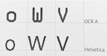
Example Characters of faults in the display. Unknown, 1998
When compared to that of OCR B the profiles of each character seems to fit the characteristics of known through pattern recognition developed through early stages of learning as a child. As a result of the development of special characters, the typeface has not influenced that of the screen but has also influenced trends in typography on paper. Therefore, enhancing the importance of shape within the characters on screen and well as that on paper. The shape of a character’s evolution towards the screen has gone from a handcrafted script to a structured coded computer tool. The shape, in turn, is visible on screen, so therefore legible. With the development of typefaces such as the OCR, typeface focuses on the shape of each character, without potentially regaining the essence of the original shape. Through the uses of the dot matrix system, the development of how the shape appears is important for it to be recognisable.
Veruschka Götz. 1998. Color & Type for the screen. RotoVision SA, Switzerland.
Establishing a gridded system of modern OCR typeface, OCR-B. That I will use to design my own typeface based on that of an existing font- Helvetica. Using OCR- B, Optical Character Recognition font, is the best character shape for reading on a screen - the pinnacle of digital life.

0 notes
Text
How to simplify your design
Companies are in constant pursuit of building simple and usable products. More features, new technologies, and advanced capabilities but still in a lightweight and simple to use format. More often than not, making it simple is the hardest thing there can be.
What is “simplicity”?
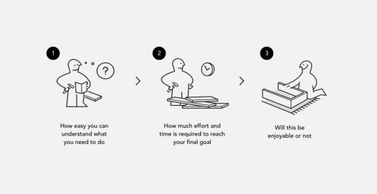
We can define simple – as something that is easily understood or done; presenting no difficulty. Simplicity is a subjective, things that appear simple for one person will not be perceived identically by another. Generally, we form our personal opinion regarding any process being simple or complex, in three quick stages:
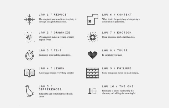
Removing difficulties on the way of users to their goals — will help you move towards simplicity. In The Laws of Simplicity, John Maeda offers ten laws for balancing simplicity and complexity in business, technology, and design — guidelines for needing less and actually getting more.
The Laws of Simplicity, John Maeda: http://lawsofsimplicity.com/
Maeda — a professor in MIT’s Media Lab and a world-renowned graphic designer — explores the question of how we can redefine the notion of “improved” so that it doesn’t always mean something more. And a book is a great read so I really recommend you to check it out.
What about complexity?
Talking about simplicity we need to mention the opposite side of the spectrum. As simplicity sense of complexity is subjective. With appropriate training, even rocket science is not so hard. But there are several factors that tend to complicate even the simplest task. They should be avoided in product design as much as possible:
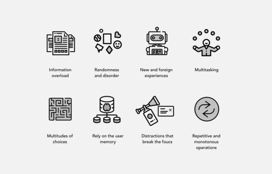
So how can we apply it to product design?
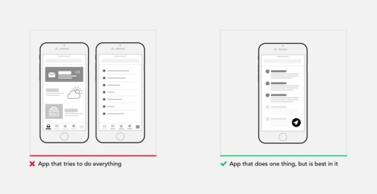
1. Build products with focused value
There is so much software that tries to do so much for so many audiences, everyone tries to be a Swiss Army Knife of the industry. If you want your product to be simple you need to define a core value and identify who is this product really for. Not every product should have Facebook built-in.
2. Remove everything unnecessary
The simplest way to achieve simplicity is through thoughtful reduction. When in doubt, just remove. Secondary information, not frequently used controls, and distracting styles. It’s as easy as that. Once you start to apply this principle you will immediately see the results. But be careful of what you remove.
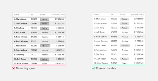
“Simplicity is not the absence of clutter, that’s a consequence of simplicity. Simplicity is somehow essentially describing the purpose and place of an object and product. The absence of clutter is just a clutter-free product. That’s not simple.”-Jonathan Ive
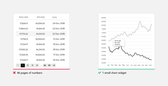
3. Translate data into a meaningful format
Majority of products that we design daily are focused on a lot of data that the user needs to make sense of in order to efficiently carry on their daily task. When you know users interested in trends and changes, help them with visual representation rather than a bunch of numbers. You always can show additional information on demand. Try to extract the meaningful from the data you have and put it in front of the user.
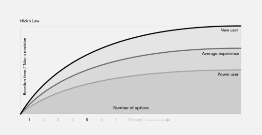
4.Support quick decision making
Users bombarded with choices have to take time to interpret and decide, giving them work they don’t want. This was famously explained by Hick’s Law. Hick’s Law predicts that the time and the effort it takes to make a decision increases with the number of options. So if you want your user experience to feel simple you need to support quick decision making as much as possible. Eliminate the need to choose when is not required, guide and handhold user.
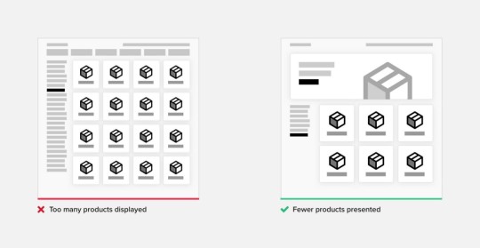
5. Too many choices will scare off customers
Current psychological theory and research affirm the positive affective and motivational consequences of having personal choice. These findings have led to the popular notion that the more choice, the better — that the human ability to manage, and the human desire for, a choice is unlimited. But in reality, research proves the opposite.
The Jam Experiment is one of the most famous experiments in consumer psychology; offering consumers less choice can be good for sales. Critically, the study reveals when precisely offering less choice may enhance your sales.
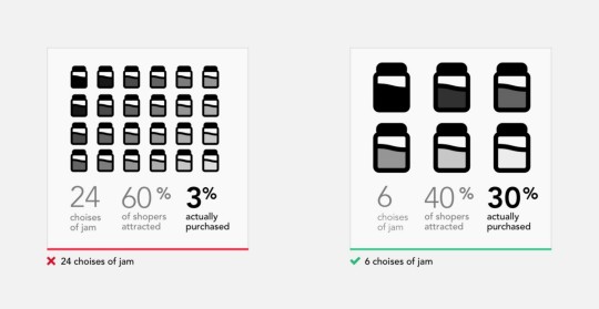
This experiment seemingly proves that customers presented with fewer choices are 10 times more likely to purchase compared with those who are shown many choices. It has been helping up as a crucial example of choice overload, the idea that presenting customers with too many choices actually inhibits customer purchases.
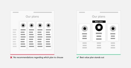
6. Provide recommendations where multiple choices are presented
When choices cannot be avoided, try to limit them. Provide a recommendation yourself or share statistics of what is most preferred by other customers. Clearly communicate to the user what the key difference between proposed options. This approach is often used on pricing plans pages.
7. Draw users attention to the right areas
When you understand the journey of your user to reach their goals, on every stage of that journey are things that are more relevant and will help you to progress to the final goal. Find those key areas and draw user attention to them.
8. Use color and typography to communicate a hierarchy of content
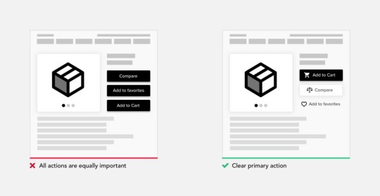
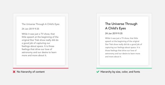
How many times you heard — “Users don’t read”. And it’s kind of true, we are really selective to what we actually remember or deep dive to. If you ever accepted Huge User Policies without reading a word then you know what I mean. There are so many characteristics that can influence what type communicates: typeface & font, size, kerning, leading, capitalization, and color. Use that to communicate the hierarchy of content. With right use color and typography, you will be able to reflect product branding and make it instantly recognizable, much more attractive and memorable.
9. Organizations help the system of many look fewer and more manageable.
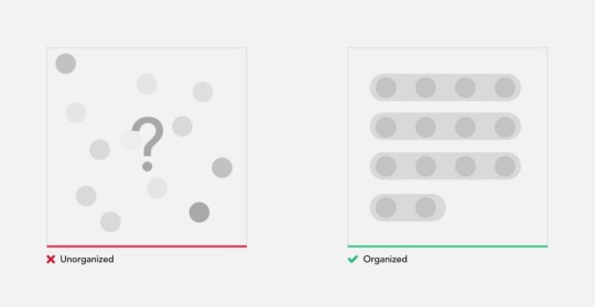
Let’s take a simple test. In the illustration below we have 2 images. Use a stopwatch to measure how much time(and effort) it will take for you to count the number of black dots in each square.
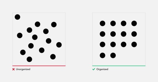
Finished? As you will see for yourself counting the unorganized square of dots took considerably more time, and in addition to that put a much more cognitive load on you. Why we had this result if the squares have an identical number of dots?
Mapping dots on to a specific matrix, helped us scan them visually, and group when counting. While in the unorganized square we had to go dot by dot, counting them individually. In addition, many of you probably made a miscalculation or was forced to double check your result with left image.
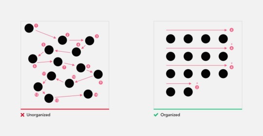
Organization of elements not only improves recognition but also makes it easier to remember. When operating any machine, it’s very important to remember the position and function of all controls. Let’s do another small exercise. It’s only a minute ago you were counting the dots in 2 images, now please recall the position of every dot in 2 squares. For majority recalling the unorganized structure is close to impossible.
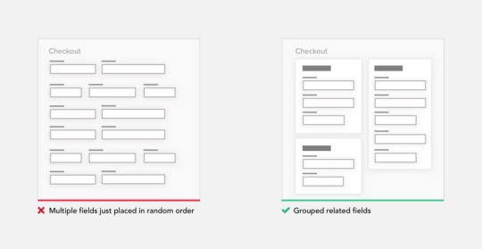
10. Group related content
Often an easy way to simplify complex page is to start grouping components. At that point, users are dealing with few groups rather than with multitudes of unrelated components. Adding borders (creating common regions) around an element or group of elements is an easy way to create separation from surrounding elements. There are multiple principles of grouping in Gestalt psychology that help items feel related: Proximity, Similarity, Continuity, Closure, and Connectedness.
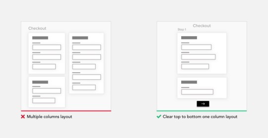
11. Break up huge tasks in smaller steps, try one column layout
Different kinds of forms are present almost in any product. It’s a way you capture user information. Sometimes even after removing everything unnecessary, those can get huge. Such forms can be very demotivation for the user to finish. So what we can do is break up that huge task into a series of smaller ones. All of a sudden it seems much easier to carry out this process to the end. Finishing small subtask gives the user a portion of endorphins and satisfaction to carry on.
When designing forms, use one column layout instead of multiple columns. One column layout is much easier to fill out. This way user doesn’t need to think what to fill out next, simply moving down the page in straight line.
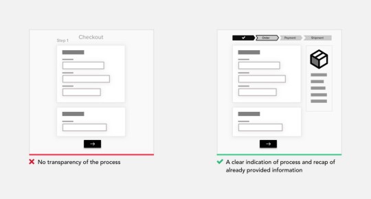
12. Be transparent in communicating the process and system status
Uncertainty makes us anxious, it should be avoided as much as possible. That’s why at any time unless it’s obvious, the user should be able to see where he is currently in the process, where he coming from and what’s coming next. Keeping a summary of the previously provided information is also a good idea, it lower loads on user memory and removes the need to go back to double check previous steps.
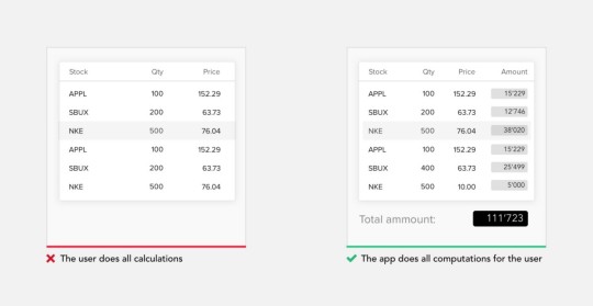
13. Do the calculations for your user
Human brain bad at raw arithmetic involving numbers. Evolutionary pressures have favored brains optimized for object recognition compared to arithmetical operations. Try to leverage the system to do all calculations instead of the user.
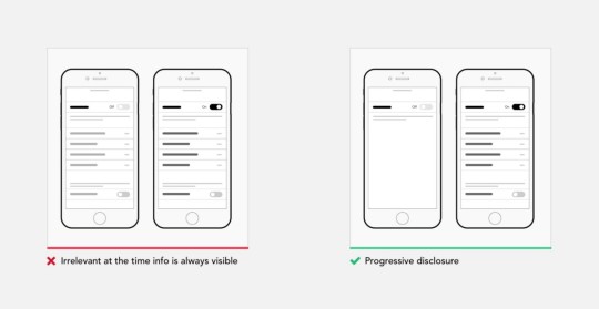
14. Hide complexity with progressive disclosure
Progressive disclosure is a design pattern used in UX design to make user interfaces easier for users to interpret. It involves sequencing information and actions across several screens so as not to overwhelm the user or hiding irrelevant information until it becomes relevant. Progressive disclosure follows the typical notion of moving from “abstract to specific,” including the sequencing of user behaviors or interactions. A good example of progressive disclosure is iOS nested doll navigation.
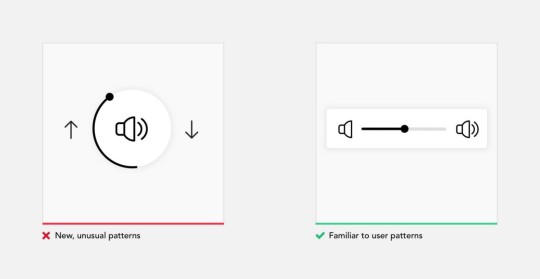
15. Rely on commonly accepted patterns and interactions
Users spend most of their time on other products. This means that users prefer your site to work the same way as all the other sites they already know, and they come on with specific expectations to how your product should look and behave. This statement holds true for any digital or physical product from social network to your fridge and reflects consumer mindset. That’s doesn’t mean you should stop innovating, more to evaluate whether a depart from traditional ways presenting navigation or controls, justifies user to change their mental model.
16. Design a streamlined first-time experience
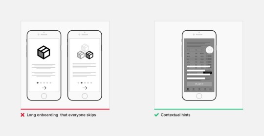
The primary goal of any design should be connecting users to the value product provides as soon as possible. Think about that for a second. So anything that stands between a user and him actually operating a system, is a barrier unless it serves a functional need. The first-time experience is very important for any process, we humans are very quick to form our opinion about the product and walk away immediately if we are not satisfied.
Even the simplest task is challenging if you try to do it the first time. Sometimes additional training is required before we can operate the product. In digital design I suggest to forget a manual approach, user expectation is the product should be simple enough to understand and they expect help on demand, or when something goes wrong. Provide contextual help instead of an upfront overwhelming user with learning material, design for empty states
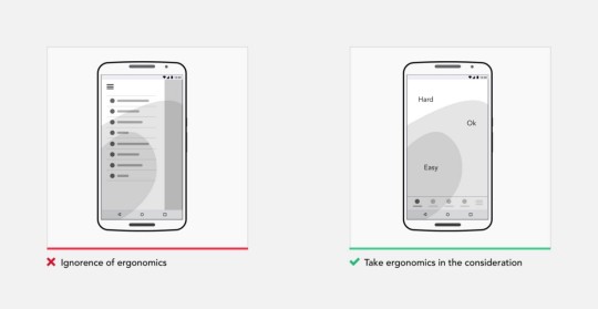
17. Keep in mind ergonomics and circumstances under which product will be used
Simplicity as we already defined by how easily you can actually use the product, with its ergonomics. Ergonomics is the process of designing or arranging workplaces, products, and systems so that they fit the people who operate them. Most people think it is something to do with seating or with the design of car controls and instruments — and it is… but it is so much more. Ergonomics applies to the design of anything that involves people, including digital products.
In 1954, psychologist Paul Fitts, examining the human motor system, showed that the time required to move to a target depends on the distance to it and relates inversely to its size. So make sure commonly used elements large and position them close to users.
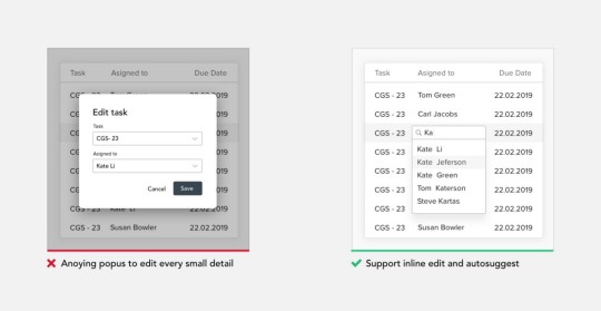
18. Support inline edit and autosuggest values
Remove all unnecessary interactions, views, steps in every process. There is an optimal speed at which the user should operate the system, it called a “state of the flow”. Don’t break that flow with popups. For all actions/values that can be changed later, support inline edit as much as possible. Autosuggest values when a great number of values is available.
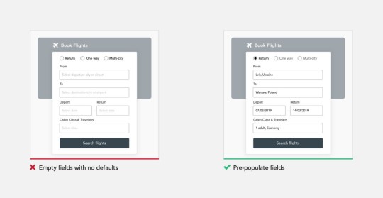
19. Use Smart Defaults to Reduce Cognitive Load
Smart defaults are selections put in place that provide answers to questions for you. This supports users to complete forms faster. Filling in forms requires people them to parse it, formulate a response, and then input their answer into the affordance provided on the form. Defining relevant defaults, designers need to understand users and the context in which they will use a product. This is only possible with deep research and testing, to learn from their users and adjust defaults based on their users’ historical data and usage patterns. Always set the default to the choice the vast majority of users (say, 90–95 percent) would choose if explicit choices were required.
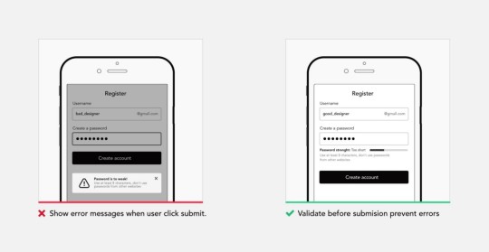
20. Prevent errors
Error messages bring a lot of stress and bring the users a feeling that they messed up or not up to the task. Ensure automatic check for entered data and provide alerts or reminders for inappropriate data entries to reduce errors. Either eliminate error-prone conditions or check for them and present users with a confirmation option before they commit to the action. Destructive and irrecoverable actions should be guarded with a forcing function to ensure that users conscious of the impact their choice will have.
21. Design for accessibility
As a designer, your goals are to champion accessibility, make sure your product is accessible by a broader audience without exclusions. There are over 1 billion people worldwide who have a disability. Don’t use color as the only visual means of conveying information. Ensure sufficient contrast between text and its background, support keyboard navigation etc. Accessibility is not confined to a group of users with some different abilities, when you design for accessibility you improve the experience for everyone using the product.

Conclusion
Designing simple to use and understand products is not easy, but its a way to go, and there are quick ways to move towards simplicity.
The post How to simplify your design appeared first on Design your way.
from Web Development & Designing https://www.designyourway.net/blog/user-interface-design/how-to-simplify-your-design/
0 notes
Text
Week 10 - Graphic Design
Topic: “Please expand upon some of the most interesting ideas in your typographic readings.”
Typography readings include:
· Introduction: The Origins of Type and Typography p. 12-23,
· Nineteenth Century Type p. 45-50
· Blackletter p. 97-98
· Posters and Typography p. 114
· Art Deco Type p. 169
· Type at the Bauhaus p 230-239.
· The Triumph of International Style p. 286-319
· Postmodern Typography p. 342-344
· Digital Typography p. 358-362
· Contemporary Typography p. 411-418
Intro:
The name most commonly associated with the widespread printing of works in the Latin alphabet during the Renaissance in Europe was Johann Gutenberg. He combined the tools that allowed for mass production of printed material on an unheard-of scale.
Blackletter:
Blackletter is a term for scripted-lettering rooted in the Middle Ages where the darkness overpowers the whiteness of the page. This can often resemble letters used in manuscript that were written with a blunt-edged quill pen. In comparison with roman face, blackletter’s letters are narrow, have stylized ligatures to connect letters, and small spaces between the text. In relation to roman faces and blackletter, it is not true that one helps facilitate readability or that one reads faster/slower.
It’s important not to confuse this with other decorative prefaces that are sometimes illegible or unreadable. For someone only familiar with roman lettering, it can be hard to see the difference with typical German Art Nouveau lettering that combines elements of blackletter with curvilinear, decorative elements.
Examples of Blackletter:

Citation: Farley, Jennifer, and Jennifer Farley. “The Blackletter Typeface: A Long And Colored History.” SitePoint, SitePoint, 7 Nov. 2009, www.sitepoint.com/the-blackletter-typeface-a-long-and-colored-history/.
Contemporary Typography: Dot dot dot
“Dot dot dot” was an important venue for sophisticated explorations of design and culture.
“It’s a constant oscillation between intuition and intellect, never just one or the other. No theory can fully encapsulate the decision one has to make when drawing type or designing a book. When we work on DDD, we often use the phrase ‘This feels very dot dot dot’, which is the only way to convey a particularly good gut feeling about something. Contrary to beliefs of some, design often operates beyond the rational parts of the brain.”
Dot dot dot shows how a great deal of contemporary graphic design is meshed into an intellectual matrix.
Citation: “Peter Biľak, Founder of Typotheque, Dot Dot Dot.” Typotheque, www.typotheque.com/articles/peter_bilak_founder_of_typotheque_dot_dot_dot.
0 notes
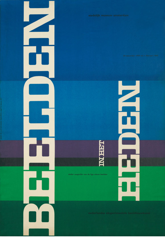
Text
Week 3 - Image from Presentation
Willem Hendrik Crouwel, also known as Wim Crouwel is a Dutch graphic designer, type designer, and typographer, born in 1928. In 1947, he began to study Fine Arts at ‘Academie Minerva’ in the Netherlands. He also went on to study typography at the ‘Gerrit Rietveld Academie’ in Amsterdam. After leaving fine arts school, he became a painter practicing the art form of expressionism. However, he discovered the pleasure of organising visual information in an aesthetical context when designing his first poster in 1952. Becoming more of a designer, his designs were heavily related to ideas within the Bauhaus including the swiss inspired graphic style.
Crouwel has designed several font sets, however his work the New Alphabet created in 1967 is best known. He designed this typeface to work with the Cathode Ray Tube technology used by early computer monitors. This technology rendered images in large pixels making letterforms difficult to reconstruct, this is why Crouwel used only straight lines and no diagonals or curves in the design. The design was a statement piece based on the impact of modern technologies on historic typographic tradition. Crouwel stated that New Alphabet was “never really meant to be used”. In recent years it was placed in a permanent collection of the Museum of Modern Art in New York, that includes many other projects by Crouwel.

As the New Alphabet by Wim Crouwel was created in 1967, this means it was created just before the period of Postmodernism. In my recent research into Modernism, I discovered that Modernism can be defined as modern thinking with the power to create, improve and reshape the environment through experimentation. Modernism became a trend that would create the influence of human beings to make, improve their environment of work, with the use of scientific knowledge, and technology. Wim Crouwel challenged the typeface norm, and was inspired by new technology and science in his creation of the New Alphabet. It was a very thoughtful statement/way of thinking within the modernist trend that was occuring. After seeing the first digital typesetters at a print exhibition in Germany, Crowel was disgusted at the digital production of Garamond as it had no consistency or resolution when scaled, due to the low amount of pixels used. Crowel used modern thinking with the desire to create and improve, knowing it would be better to design a typeface specifically for the new technology arriving.
Wim Crouwel was interested enormously in computers. He stated himself that they were an adventure, a completely new world. He believes the development of technology will evolve dramatically within the coming years. Although Crouwel is pretty old and can only work a few programs on his iMac, he's excited to see it, and experience what's to come. The New Alphabet was drawn using a dox matrix system. After researching what exactly this is, I found that a dot matrix system is a ‘type of computer printing, which uses a print point that moves back and forth, or in an up and down motion, on the page and prints by impact. It strikes an ink soaked cloth ribbon against the paper, much like the print mechanism on a typewriter’. Straight lines and 90 degree angles allow for the typeface to remain exactly the same whether scaled up or down, perfect for in a grid system.
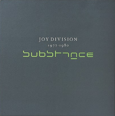
The legacy of the New Alphabet continued on. The first major appearance was when the New Alphabet was reused by Peter Saville and Brett Wickens for the Joy Division album ‘Substance’, in the late 1980s. Crouwel was delighted with this mentioning in an interview with Graham Sturt, Creative Director of Dutch design agency VBAT, Crouwel stated: “I didn’t know Peter Saville. I met him much later. An interesting thing is that one of my heroes within architecture is Mies van der Rohe of course and I met Peter Saville for the first time in the pavilion of Mies van der Rohe in Barcelona. We had a meeting of design there, and we were both invited and we met for the first time in that pavilion. That was absolutely a moment I will never forget. He is a great designer.”
Works cited:
IDEA Magazine, #323. “IDEA No.323”. IDEA Magazine. 2007. Magazine. http://www.iconofgraphics.com/wim-crouwel/
Munari, Nicola-Matteo. “Wim Crouwel”. Designculture. 2013. Interview. http://www.designculture.it/interview/wim-crouwel.html
Sturt, Graham. “Dutch Design heroes: Wim Crouwel”. Vbat. 2015. Interview. https://medium.com/inside-vbat/creative-conversations-1-wim-crouwel-149e8b2956e8
0 notes
Last Seen Blogs

treeroutes
it's not going to haunt itself.

the-amazingsaf
The Realm Of The_Amazing SAF

silly-mavy
Mavis

suicidalrobot
suicidalrobot
inbredfawn
white trash cunt