#typefaces
Explore tagged Tumblr posts
Photo

Poster for Odd Mono a typeface from Metis Foundry
92 notes
·
View notes
Photo

What’s Your Type? A Reading List on Typefaces with Wild Tales to Tell
Follow Kanya Kanchana down the typeface rabbit hole! Today, she bring us a reading list of seven stories highlighting our love affair with typefaces.
I found out early that I had a love for letters, scripts, and the art of making them. As a student of architecture involved in literary-type activities in college, I drew posters for years, made design drawings, read a lot, discovered a dubious ability to write in a great number of convincing hands, resisted putting it to criminal use, and stumbled upon a body of knowledge about type. I had caught the bug. I had fallen in love with Aldus Manutius, if not with Johannes Gutenberg. And when I became a programmer, I got to play with type. If it was good enough for Steve Jobs, it wasn’t perhaps all that mad.
433 notes
·
View notes
Text


Typography Tuesday
Here are some pages from Flowers & Flourishes by the noted British book designer John Ryder (1917-2001), published in London by The Bodley Head for Mackays of Chatham and printed at Mackays in 1976. The book displays all the decorative flowers, ornaments, rules, and typefaces held at the printing house of Mackays, prepared to mark the centenary of their foundation in 1875. Since 1999, Mackays has been part of the CPI Group of printers. The type display pages were designed by the eminent wood engraver and illustrator Yvonne Skargon (1931-2010).
View some wood engravings by Yvonne Skargon.
View other type specimen books.
View more Typography Tuesday posts.
#Typography Tuesday#typetuesday#typefaces#type ornaments#Mackays#Mackays of Chatham#Flowers & Flourishes#John Ryder#The Bodley Head#Yvonne Skargon#typography#Type display books#type specimen books#type specimens#20th century type
183 notes
·
View notes
Note
How do you identify fonts used in your sources?
https://www.myfonts.com/pages/whatthefont is a handy web page that'll identify a font from a picture. The clarity should at least be decent for good results, but it's helped me out more times than I can count!
634 notes
·
View notes
Text

The Doves Type legend is one of the most enduring in typographic history and probably the most infamous. It’s the story of a typeface and a bitter feud between the two partners of Hammersmith’s celebrated Doves Press, Thomas James Cobden-Sanderson and Emery Walker, leading to the protracted disposal of their unique metal type into London’s River Thames. Starting in 1913 with the initial dumping of the punches and matrices, by the end of January 1917 an increasingly frail Cobden-Sanderson had made hundreds of clandestine trips under cover of darkness to Hammersmith Bridge and systematically thrown 12lb parcels of metal type into the murky depths below. As one person so aptly commented on Twitter recently, this notorious tale bears all the hallmarks of a story by Edgar Allan Poe.
The original Doves Type was crafted by master punchcutter Edward Prince, based on drawings produced by Percy Tiffin of Nicolas Jenson’s pioneering 15th-century Venetian type. William Morris, founder of the Kelmscott Press, had actually developed his own ‘Golden’ type some years before The Doves Press came into being but Doves is held by experts as being more faithful to the original Venetian letterforms.
The Doves Type was commissioned in 1899 and created solely by Prince in 16 pt; it was used in all of the press’s publications including their iconic edition of the King James Bible. Each Doves Press book was beautifully bound and, notes Green, noticeably “stripped of decorative borders and illustration, the elegantly clear & legible type acting alone as visual siren-song.”
By 1908, despite successful Milton prints and the aforementioned Bible, the Press was in dire financial difficulty. Subscribers began melting away after Walker had effectively left in 1906 as the bitter & acrimonious dispute took hold between the partners. On finally dissolving their partnership in 1909, Cobden-Sanderson began attempts to wriggle out of an earlier promise that, should the partnership cease, Walker would receive a fount of type ‘for his own use’. Walker retaliated, issuing a writ insisting that the Press shut down completely and he receive 50% of remaining assets. In 1909, the Press’s only valuable asset was the type.
A compromise was reached, brokered by their exasperated friend Sir Sydney Cockerell, which allowed Cobden-Sanderson uncontrolled use of the type for as long as he lived, at which time it would pass to Emery Walker, if he did not die first.
The thought of ‘his’ typeface being used by anyone else, and in a manner beyond his control, prompted Cobden-Sanderson’s now infamous course of action. Only the Doves Press, run exclusively by him, could be bestowed the honour of printing his type. And so the mission to destroy it, beginning with the punches and matrices on Good Friday 1913, began. On an almost nightly basis from August 1916 the ailing septuagenarian dumped the type into the Thames, wrapped in paper parcels and tied with string; “bequeathed to the river” as he put it in his personal diary. Every piece of this beautiful typeface, more than a ton of metal, was destroyed in a prolonged ritual sacrifice.
—Raised from the dead: The Doves Type story, 2013

After working on a revised digital facsimile Robert Green decided that he would try and find some of the original metal type. Using the sources available, including Cobden-Sanderson's published journals, Mr Green worked out where he thought the type was thrown from the bridge into the Thames.
At low tide, and with a mudlarkers licence, he scoured the Thames foreshore and found three pieces of the original type.
Due to the dangerous nature of the Thames currents and tides a team of professional divers from the Port of London Authority then spent two days looking for more type and a total of 150 pieces were recovered.
—One man's obsession with rediscovering a lost typeface, BBC News, 2015
68 notes
·
View notes
Text

Gimme Extra Bold Sans Serif Font by BilberryCreates
Are you on the hunt for a typeface bursting with personality? Meet Gimme Extra Bold — a high-impact sans-serif from the talented creators at BilberryCreates. This isn’t just bold; it’s extra bold, radiating retro 80s energy with every letterform. Groovy, funky, and undeniably eye-catching, it’s made to make your visuals pop and leave a lasting impression. Whether you're designing for digital or print, Gimme Extra Bold brings a vibrant, expressive twist that sets your work apart.
Download here.
Subscribe to the podcast on Spotify, Apple Podcasts, or Amazon Music.
Follow WE AND THE COLOR on Facebook I Twitter I Pinterest I YouTube I Instagram I Reddit I ChatGPT I Podcast
#font#fonts#typeface#typefaces#bold typeface#bold font#design#graphic design#typography#creative market#download#best fonts#new font#trending font#retro font#vintage font
13 notes
·
View notes
Text
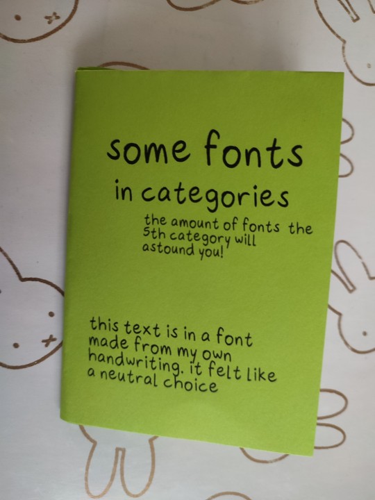
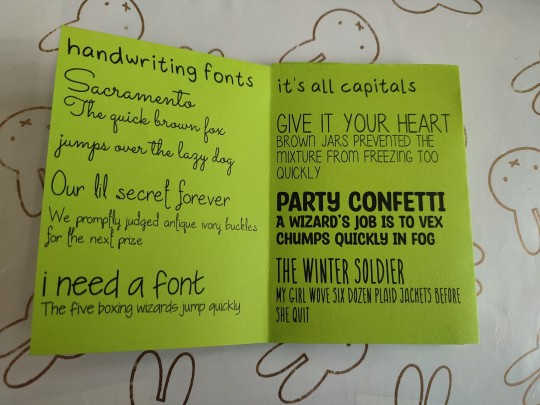
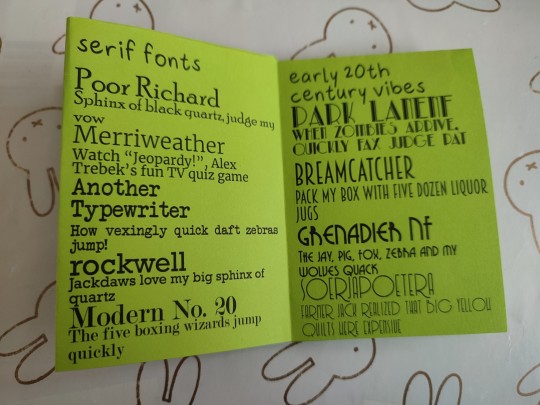
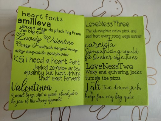
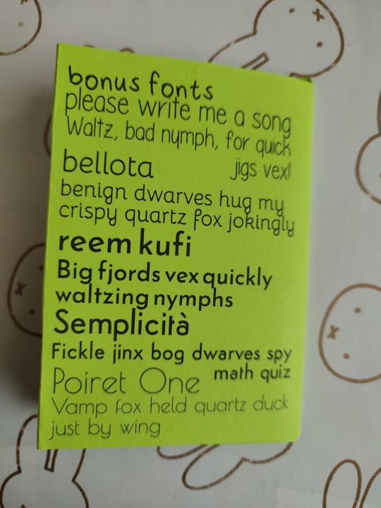
some fonts! they're all findable online somewhere, save for the font from my own handwriting. i wrote the name of the font and then a unique pangram every time. it was a struggle to find this many pangrams! i hope that this can help you if you're looking for a font :)
i downloaded a Lot of fonts with hearts for a project once so they got a full spread
errata: i accidentally forgot the h in lathi. the last heart font is called lathi
this is part of my project to make a zine a day in april
#fonts#typefaces#zine#zines#my zines#bis zines#8 page zine#1 sheet zine#handmade zine#physical art#art#kind of#heart fonts#zinepril#aprine
72 notes
·
View notes
Text


Not Beatles posters, but here's a font I designed for my typography class! introducing cleodile. I made it with fontstruct to its a little blocky lol.
#art#graphic art#graphic design#poster#poster design#design#type#typography#type design#fonts#typefaces#typeface#illustrator#gothic#goth#goth design#medieval#school project#lmk if yall want this as a download hashtag lol
21 notes
·
View notes
Text
73 notes
·
View notes
Text


23 March 2025 | The Typographic Library, Winterbourne House, University of Birmingham 🏴
Specimen pamphlet for the Venus type face from the Bauer Type Foundry (Germany), date unknown, but sometime after the release of Venus in 1907. England dingle, mandolin blouse.
10 notes
·
View notes
Text

Modular concept typography ioD©MMXXV
56 notes
·
View notes
Text

Open come in.
#typography#graphic design#design#fonts#typefaces#vintage typography#type specimens#type#type faces#vintage signs#signs#signage
27 notes
·
View notes
Text


Typography Tuesday
The Overbrook Press was founded in 1934 by American financier turned fine-press publisher Frank Altschul (1887-1981), with Margaret B. Evans (1903-1986) as the designer, compositor, and printer. The press continued operations until 1969. One of the first publications printed at the press was this little keepsake specimen book for friends, The Types, Borders, Rules, & Devices of the Press, printed in Stamford, Connecticut in an edition of 150 copies in 1934.
Our copy, another donation from the estate of our late friend Dennis Bayuzick, bears a signed presentation from Margaret B. Evans to the noted typographer and book designer Abe Lerner (1929-2002) and his wife Kit Currie (d. 2014) in 1980.
View more posts on books from the Overbrook Press.
View our other Typography Tuesday posts.
#Typography Tuesday#typetuesday#Overbrook Press#Frank Altschul#Margaret B. Evans#typefaces#Borders#type specimens#type specimen books#type display books#Abe Lerner#Kit Currie#Dennis Bayuzick
189 notes
·
View notes
Text

7 notes
·
View notes
Text

Had fun with new typefaces! Print without watermark is available at my shop
Ko-Fi Commissions | Prints | Linktree
37 notes
·
View notes