#edit tutorial
Explore tagged Tumblr posts
Visit Tumblr Blog
Explore Tumblr blogs with no restrictions, modern design and the best experience.
Last Seen Tumblr Blogs


Fun Fact
The Tumblr office adopted Tommy, an 11-year-old Pomeranian.
Text
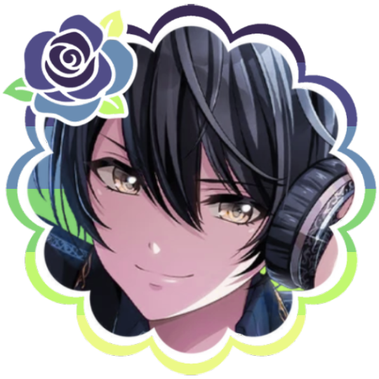
PHOTOPEA TUTORIAL: RP ICONS/ICON BORDERS !
HOW I USE CLIPPING MASKS && RECTANGLE SELECT TO CREATE MY ICON BORDERS. this post will include framing the rp icon itself, the border around the icon && adding on optional block quotes—also, a bonus how-to for applying patterns to your block quotes and/or icon border; in case you're after some zesty editing !
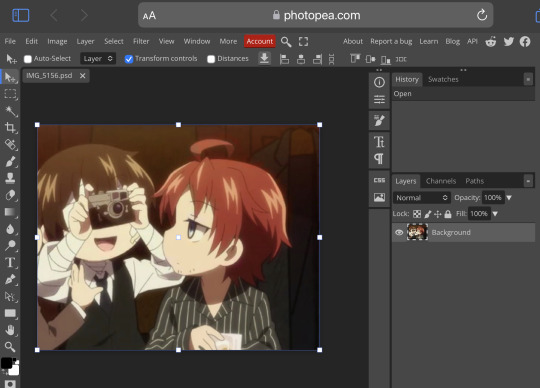
pictured below is a simple, PRE-MADE icon that we will be attempting to recreate in this tutorial. all you need is a screencap && photopea ! as for the blockquote pattern, it is an optional design / example that i will provide later on in the tutorial ! this tutorial will involve rectangle select & clipping masks and i will cover how to do them both.

start a New Project, make sure the background is transparent. pick what size you'd like the overall border to be, not the icon itself.

you should start out with a transparent rectangle, as seen above. for this particular recreation, i've listed the width & height of my standard icon border sizes below. if you don't know, these sizes are determined by pixels.
W: 640 H: 107 i.e., W: 640 pixels H: 107 pixels.
next step: select Layer>New>Layer as seen highlighted below. this new layer is where your icon base will be/your clipping mask will go.

now that we've added a new layer for the icon base/mask to go, we're going to use rectangle select to set the size of our icon. right click where the yellow highlight(left bar) is pointing in the example below && drag your cursor to expand the "rectangle select" to whatever size icon you want. for this example(as seen below) i've chosen the size 80x80.

after you've set your desired icon size, you can now drag the selection(you should see a dotted border outlining your selection) to where you'd like your icon to be placed. i personally chose to place mine in the center—i did accidentally forget this step in the tutorial, so don't mind it if you see it move in the next two examples. though not an incredibly important detail, you can always move it after you fill it in !
once you have placed your base, select your brush tool && choose a color(highlighted in yellow, located on the left bar in the example below). you can use whatever color you'd like here, as long as it stands out to you—i usually choose red or green so that it can stand out from the background. once you've picked your color, you're going to color inside of the selection that you've made. don't be afraid to color outside of the lines...the brush will not exceed past what you've selected in advance with your rectangle tool !

once your base is colored in, you may now de-select your rectangle select tool(right click>deselect).
pictured below is an example of our current progress. as you can see i finally moved my icon to the center.

this colored shape will be your 'x marks the spot'—it is where your screencap(as a clipping mask) will be going once we finish the border of the icon.
speaking of which, now it's time to create our border ! add a new layer with the same process as before. Layer>New>Layer. name it whatever you'd like. i've simply labeled the new layer as "icon border" because it will be the layer the border goes on. make sure it is on a layer that is separate from the icon base.

in the "icon border" layer, repeat the rectangle select process outside of each side of your square/icon base. selecting one side at a time, be sure to fill it with the color of your desired border. i will be using a white border, which will be 3 pixels wide on each side. (example is of me expanding the select tool to the preferred pixel height/width outside of the base)

once you've finished creating a selection && filling each section, you can deselect && should be left with something like this:

this is optional, of course, but if you'd like you can also make an outer border/border edge. you can do this in a new layer or simply place it on the same layer as the white border. in the example icon at the top of the post, you can see that the icon i made has a gray outline outside of the white border. to do that, simply repeat the rectangle select option; and this time, only select 1 px width of space(or more, depending on how thick you want it/if your border is wider) on the outer edges of the white border. with you're new color(mine being gray as depicted) you can fill each of these edges. here's what we got going on so far !

now, to add your icon inside of the border! (it doesn't really matter if you do it before or after, just as long as you got your layers right!)

as you can see, i already added my icon to the base; you can do this before or after you've created your border && border edge. in the image above, the rectangle select you're seeing is an example of where the outer border/edge was filled in with gray. of course, to add your icon, file>open and place>choose your screencap. once your screencap is opened, right click it && once you're met with the drop down, left click the option that says "clipping mask." doing this will give you free reign to zoom in or out and move your icon around(to move it, edit>free transform && drag) all within the confines of the icon base you've created with your selection tool && brush.
our current result:

now... for optional blockquotes. make sure to start a new layer for your blockquote/s. once again, you're going to use the rectangle select tool; choose the width && height of your blockquote by dragging/expanding the tool with your cursor. i've made my blockquote 2 pixels wide because i prefer them thin—if you would choose wider blockquotes, just expand the selection.

once selected, fill that selection with the preferred color of your desired blockquotes. most people choose gray or colors relevant to their characters—i will be using red because i will be treating this as a clipping mask, so i can show you how to put a pattern into the blockquotes if you want something that stands out.

you can see ive put two blockquotes in place. you can choose to move them however you want them, or include both the blockquotes in one layer or seperate layers. i've personally separated mine for this example. (layers bq 1 + bq 2 on the side)
ADDING A PATTERN: do the same thing you did with your screencap...file>open and place>choose image. i will be using this abhorrent little pattern(free to use!) i created for the sake of this tutorial. and just like you did with placing your screencap, right click and select "clipping mask" on the dropdown. again, you can move it, zoom in and out however you please. just make sure the image is lined up with the blockquotes!

and here's what you should end up with, or something similar !

EXTRA / ADDING A PATTERN TO YOUR BORDER:
once you've gotten the hang of rectangle select/clipping masks, this part is self explanatory. basically, if you'd like to put a pattern inside your border (this will be the white border you created) you can repeat steps you took to add a pattern to your blockquote, this time placing your clipping mask over the layer with your border.

and that's pretty much the formula of all formulas for me personally—these tools come in hand for a lot of my editing !
#* MY TUTORIALS.#long post /#rp community#icon tutorial#rp icon tutorial#psd tutorial#roleplay help#roleplay resources#roleplay community#roleplay graphics#coloring psd#psds#icon psd#psd#roleplay psd#rp graphics#rp psd#rp resources#tutorial#editing tutorial#rpc tutorial#editing resources#psd coloring#icon border#icon border tutorial
284 notes
·
View notes
Text


Hello guys! Today ill make a tutorial on how to use psds! Dont be scared, its really easy and very fun too!

First, open photopea with the image you wanna use. click “File” and press open, after that, you open your files and select your psd!


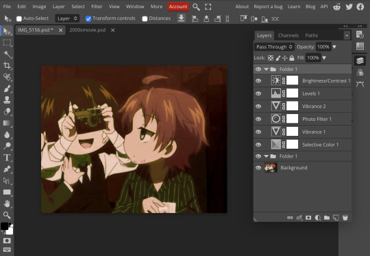
Great! Now we have the psd! But what do we do with it…?
well, first you need to check that youre on the right layer: Make sure youre selecting your psd folder before doing anything here!

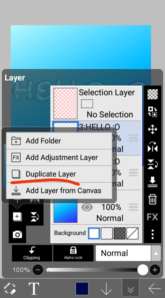
great! Now click “layer” and after that, “duplicate into”

Now make sure you change it to the name of the project you wanna apply the psd to!


Enjoy your edits!
Feel free to send in an ask if you have any questions or something wasnt clear enough! Im always happy to help. See ya!

#⌗ 🍦 ⊹⁺ Marking what is mine#rentry decor#photopea psd#psd#psd tutorial#editing resources#edit tutorial#rentry inspo#editblr#rentry resources
529 notes
·
View notes
Text


Hey look it's my first manga animation. Digging these out from 2020 for @marshmallowgoop!
Fun fact I made the top gif as part of my first semester learning after effects. Immediately decided against making an MMV for my 30 second final. Just the prep work is so time consuming.
#dcmk#motion graphics#my gif#my edit#I honestly don't know why the white in the first gif is darker#and why I'm just noticing it now#I'm 99% sure this was the first time I animated an ink splatter with shape layers#that tutorial is ingrained in my soul I've made so many ink animations
185 notes
·
View notes
Text

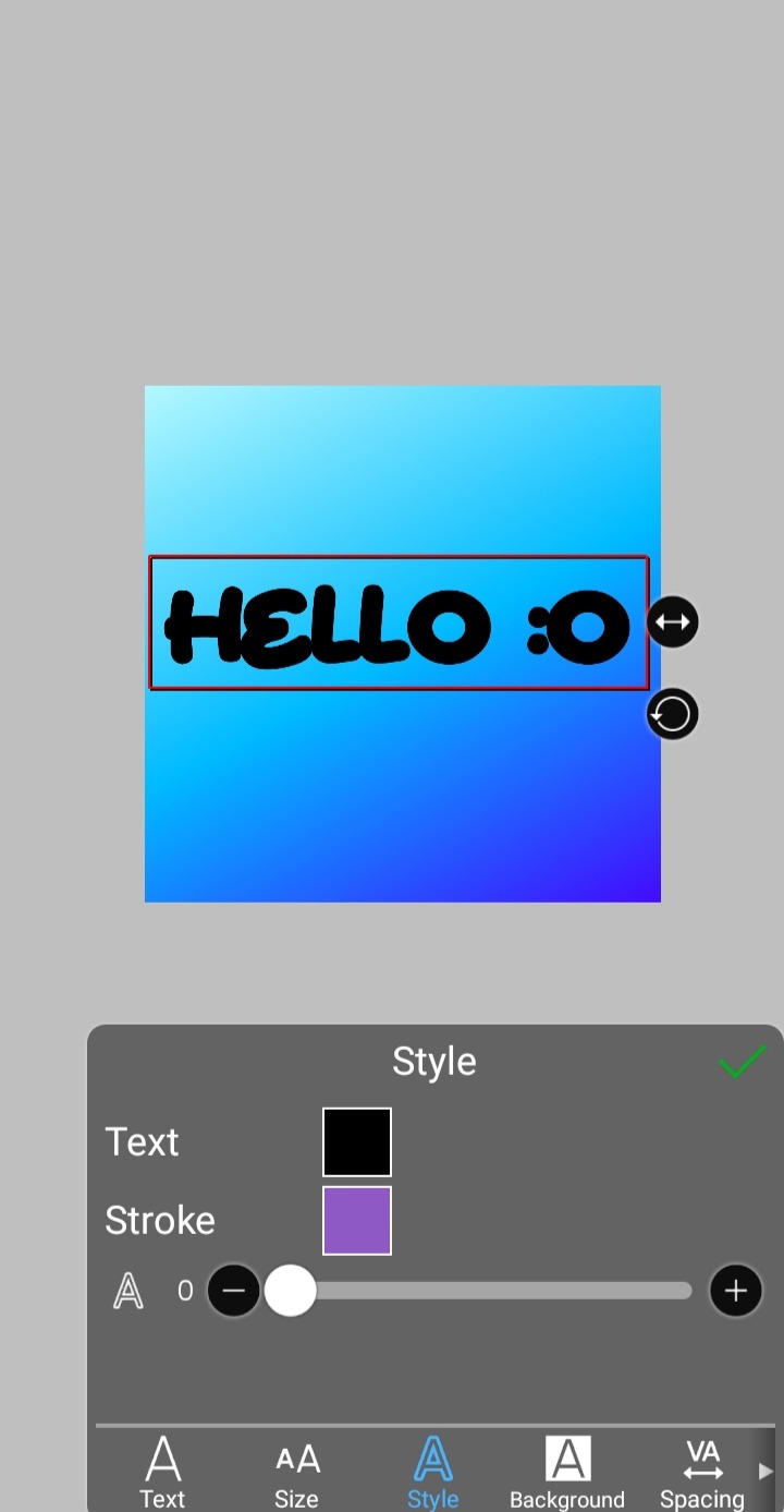
jelly text tutorial! (works with shapes as well)
what you need: ibis paint x, premium or free version doesnt matter
step 1: color
yes we're starting with color! I highly suggest using multiple colors for a prettier finish. I prefer parallel gradiation but as long as its blurry anything should look nice. pick analogous colors for the best result.

step 2: write the text or draw/import the shape.
as it says! if youre drawing it, make sure its on a new layer above the gradient! I suggest using rounder, bubblier fonts/shapes, one of my favorites to use is starborn on all uppercase. the color you use does not matter as it will be the background color in a short bit
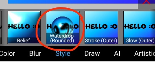
step 3, the jellificationing
this little friend called "water drop (rounded)" in effects under style is your best pal. its here to help you and make the process so much easier.
so just press it and fiddle around with it until you're happy with the result.
step 4 (optional): refracting
to help it make look more 'realistic' I tend to add another layer of the water drop. to do this I simply copy the previous one and go do the same effect on the top layer
step 4.5: tips
you need to make sure the refractive index for the second one is turned down all the way, or itll look weird, streaky, etc. make sure the highlight and highlight size settings are lower than the previous time you used this effect. and make sure the little sun symbol (the light source) is on the edge of the opposite direction of the previous time you used the effect. so if the first layer of jelliness had the light source coming from the top right, the second layer should br on the very edge of the bottom left.

step 5: begone, background
yeah, we're done with that, this will also be the big reveal of the final image

and then you just crop to fit and then save as a transparent
bam! heres the final thing!

I dont know how good I am at explaining but I hope this helped! if youre confused dont be afraid to ask!
#🌫️ i know what you dread | creations#rentry#rentry inspo#rentry resources#editing resources#editing#editing tutorial#edit tutorial#edit resources#rentry decor#rentry graphics#carrd resources#web graphics
601 notes
·
View notes
Text
How do you clip GIFs onto masks?
[PT: How do you clip GIFs onto masks? /END PT]
Right click on your mask layer, click Select Pixels.
Click the Folder icon and then the Raster Mask icon on the bottom right. This should create a new folder.
Duplicate your gif into your project, either by clicking and dragging it into it or by right clicking and duplicating it into your project.
Simply put your gif into the folder that you made earlier and adjust it as needed. (make sure you have the WHOLE GIF FOLDER selected and have AUTO-SELECT OFF! otherwise it'll only edit one frame)
Export it as a gif and you're done.
You CAN do this with images that have faded borders, but it is important to note that gifs will make masks with any fading solid if you export it as a gif. Exporting it as a webp will keep the fading, though.
#𐐪 tutorials and help.#𐐪 from praysia.#𐐪 by praysia.#photopea#photopea tutorial#edit help#editing help#rentry resources#masks#rentry masks#how to#how-to#photopeablr#photopea resources#editblr
433 notes
·
View notes
Note
Hello, this is not a request it's question because I really want to learn how to make graphics with gifs and idk how to do it 😭😭😭
Like your agar agar cookie layouts, I really like your work and would like to learn how you make it
Thank you for reading this, if you don't want reply it's okay, have a very nice day

Haiii!! It's no problem!! Unfortunately, I'm VERY bad at explaining stuff LOL, so here's the best I can do!! (Also, have a sneak-peak to another post :3)
How to make a gif edit.
How I decorate my edits.
How I make my PSDs.
VERY LONG POST BELOW. MASU LOVES TO HEAR HIMSELF TALK.
Okay so step one is to use photopea. I used to be an avid ibispaintx user until I realized that photopea can make gif edits and suddenly I'm photopea's #1 fan (and hater). Photopea is a website, BTW, here's the link!
First, open up a project. Good job! We're 1/4 of the way there! You can import a PSD if you want (Here's a different tutorial for that), but let's just say you DON'T have a PSD, for the simplicity of this tutorial.

Next, find the animation you want! For this example, we'll be using the Wind Archer sprite below (I took this from the CRK wiki). It can be anything - but preferably nothing too big, because Tumblr for SOME REASON HATES high quality gifs. Siiiigh...

From here, you want to go to FILE > OPEN & PLACE. It'll show a window of all your downloaded items. Click on the animation we just downloaded.


Wam-bam! We're almost there!! Okay, if your image is a WEBP file, it will not animate if you export as a GIF. But! That's okay! Because with trial and error, I found out how to fix this!
On the downloaded layer, double click on the layer. After this, go to SMART OBJECT > CONVERT TO LAYERS...

Now, if your photopea tries to explode and pretend it don't know nobody, that's okay! Just let it load a bit. The file is very. very big. It should turn into a folder! You have nothing else to do from this.

After this, you can do, well, whatever ya need!! Slap a stroke on, put a gradient map on this bad boy, anything else! Once you're finished, go to FILE > EXPORT AS... > GIF. Your photopea might try to explode again, for like, a few minutes. Just give it some time. It's a lot of trial and error!! Don't feel bad if you didn't get it the first time!!
Now, before I talk about my edits, I want to make it clear that you should FIND YOUR OWN STYLE! Don't try to copy off of someone else, or try to replicate another style. Every editor is different!! While I overuse overlays and gradient maps like I won't see tomorrow, you may like a more simple style, or something less over and out there ~ ! That's alright! Don't be afraid to branch out.
Now, as we said - we love to use overlays + gradient maps. I am an artist, so a LOT of what I do correlates to that as well (having an interesting silhouette, making a focal point, color theory, color contrast, composition). It'll be WAY, WAY too much to explain in one single post, so I'd just say to go with the flow! If something looks off, try something else! There's no shame in scrapping an entire project - especially if you're unsatisfied with the result. Do what you need to do!! It's your edits.
For making PSDs, our process is actually pretty simple. We just use a gradient map and adjusts it till it works LOL. We add a few others things too - but that's mostly what I do. If you want to learn how to make your own, my word of advice is to dissect from others. Take inspiration!! If you don't feel like doing that, there's no harm in just using a F2U PSD floating out there. Feel free to look at our Squid Ink post and use that as an example of our PSDs! (If you don't feel like going to go get it, yeah I understand, here it is right here.)
All in all, my biggest tip (besides to have fun), is to edit until you like it. Don't try to compare yourself to big editors - they've had TONS, AND TONS, of experience and editing. Experiment with your style, put yourself out there, edit some new media you've never edited before, find resources to help you out, find tutorials, ETC. It takes time to learn, so make sure to take that time!! You got this, don't feel discouraged by other people's work!!!
That's all from us folks!! Peace out!! ^_^


#໒꒰ྀི ․ ․⸝⸝⸝ ꒱აㅤ﹑﹫ㅤtalks.#໒꒰ྀི 𖦹 ˕ × ꒱ྀིაㅤ﹑﹫ㅤasks.#editblr#edit tutorial#editing#edit blog#psds#photopea tutorial#tutorial
34 notes
·
View notes
Text
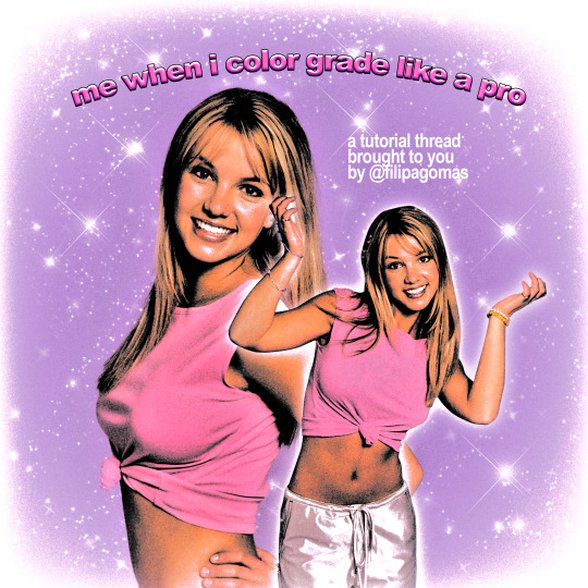
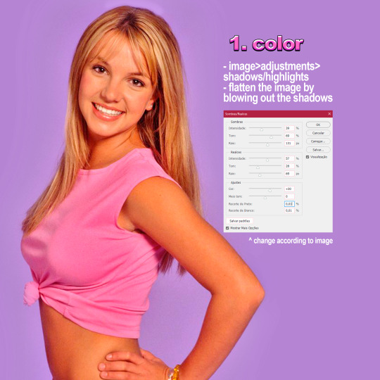
90's/y2k style magazine edit tutorial
↞ a thread ↠
INSTAGRAM | TWITTER
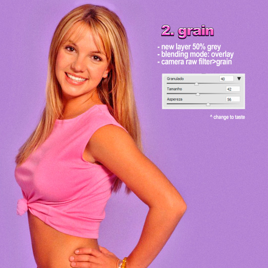
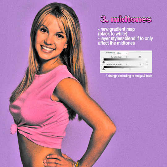
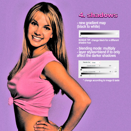
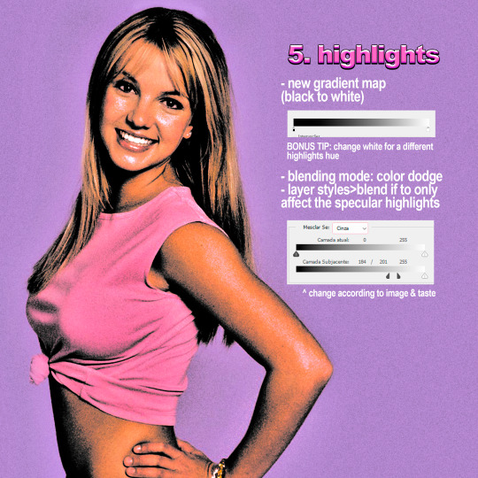
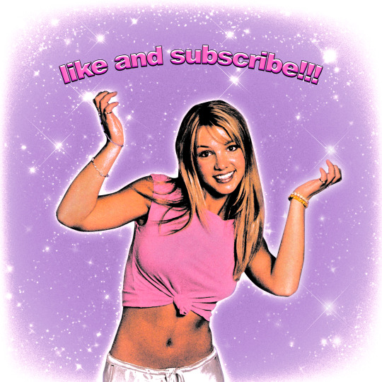
#90s design#90s aesthetic#britney spears#britney bitch#y2k aesthetic#photoshop#poster#artists on tumblr#digitalarchive#tutorial#photoshop tutorial#edit tutorial#vintage#copyscan#filipagomas
62 notes
·
View notes
Text
How to make icons like these:
Flags: Idol system, Bubblegender, Musicstar
Warning: This tutorial relies on the idea that you have some understanding of how to use photoediting software like photoshop, however if something that doesn't make sense then feel free to ask and I will explain it as best as I can.
All the icons we made for this can be found here! Thank you for reading, please consider reblogging this post and the icons because this took forever to write up and the icons take a LONG time to make.
In this tutorial I will make DID/OSDD Aoi Miyake icons.
Anyway let's get into it!
Step one, choose what you're going to make (and gathering resources)
This may seem obvious, but going in with a plan makes these so much easier.
In this stage we consider three things:
The flag and/or colors we want to use in the icon, this is important as it can affect the images used or even the character depending on how similar their colors are
Character and the general colors associated with them, this is important as it can makes the filtering stage easier (or harder) and can make an icon look 'wrong' or 'right' sadly
The border of the icon and how that will affect the icon itself, sometimes they're easy to work with, others not so much. Our method differs from a lot of other peoples so we take more time with them than most others
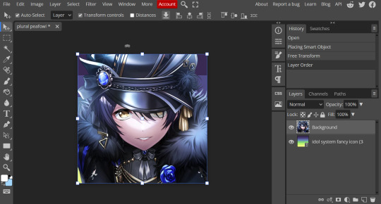
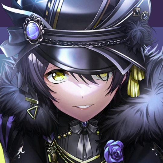
In this case I will be making DID icons of Aoi Miyake from D4DJ, however due to how most of her cards have a blue tint I will be using the plural peafowl flag by m0dem0n than the original DID flag- This is to save time and make th icons look more harmonious.
We will also be using this mask by i'mjustchillinghere as the icon base


Step two, coloring the middle image (optional step)
This is a lot of guess work and everyone has a different process for this. Essentially we're going to make a PSD that makes the image look better with the colors of the flag.
As shown above we have the flag and the character image, but they don't match completely. The rose and other blue accents are too saturated compared to the flag and the black is too black and the wrong blue hue, the eye could also be a bit greener and saturated imo.
What I like to do is open the image with the flag behind or infront, so I can see the colors I'm working with.
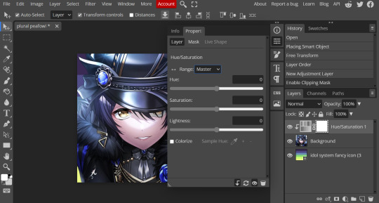
Then I open the hue editor layer (Layer > New Adjustment Layer > Hue and Saturation). It's very important to clip the hue layer to the image so it doesn't start messing with the colors of the flag (we've had this happen many times before it's very awkward trying to match a color that keeps changing) to clip right click 'Clipping Mask'.
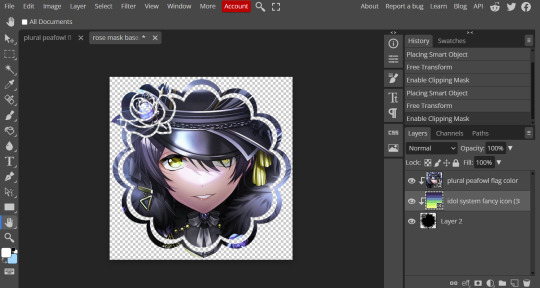
Your screen should then look like this:
Okay so if you need to adjust the screen to get the icon in the center so you can see everything do this now.
Next where the box with the hue options says master, click it.
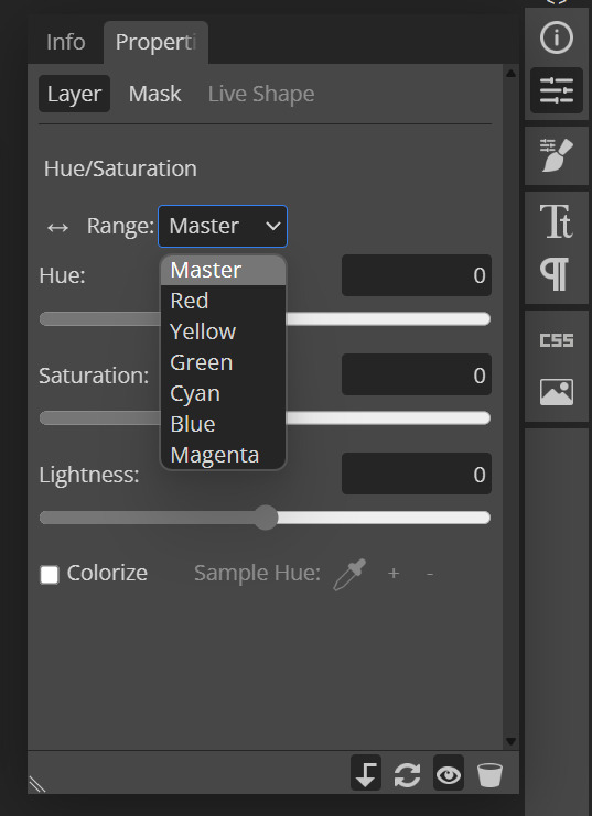
These are all the color options you can change, in this we'll mostly be using, yellow, green and blue. For other projects blue and cyan sometimes get 'mixed up' and can control both shades so be careful with that.
Other color settings we personally use are: Vibrance and Selective Color (both are located under the Layer option), but in this case I'm happy to just use Hue and Vibrance.
This is what the icons look like:
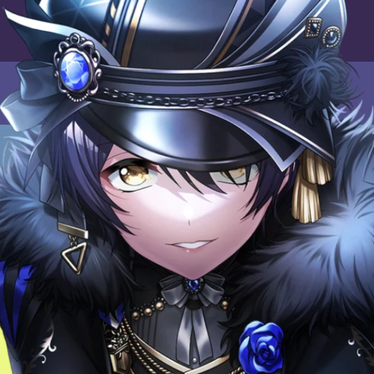

No color editing | Just Hue and Saturation | Hue and Saturation + Vibrance
Now your middle icon is ready turn off the background layer and save the image as a transparent png!
Step three, preparing the mask for use
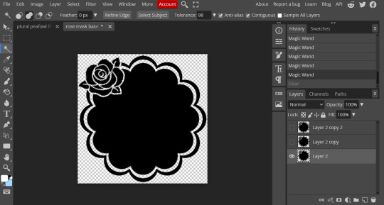
So the mask is the base of your icon, however if you clip all aspects of your icon to the mask it looks like this and you can't see the flag.
So what you need to do is layer the mask. This will vary in difficulty, it can depend on how far apart the pieces of the mask are and how they interlink. You could erase the border parts but that takes a lot of time.
This icon is simple because to me there's three clear sections, the middle part, the border and the rose. What you need to do is copy the layer three times and get the wand- I would reccomend having the wand strengh over 100 or else black lines may remain, but this will depend on how close the black parts are.
Hide the top two layers and work from the bottom up. Select all the areas you want to delete, in this case I can only delete the rose (the border is too close to the middle part and would delete that as well) and then hit delete.
In this case, I will just erase the border by hand, and then BOOM, you have a base!
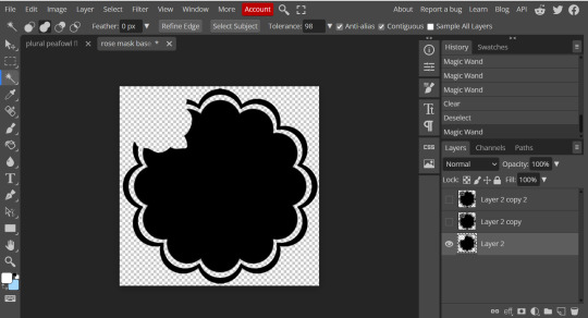
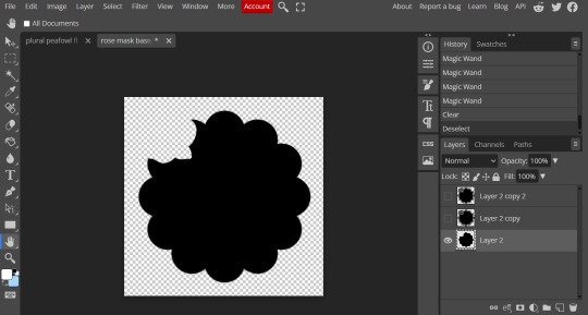
Hide this layer and move to the next, for this one I'm removing the middle and the rose.
For the next layer you can select what's in the layer below and delete it without it impacting the border, which makes the icon process easier, however in this case I'm going to give out the border layers for you here!


Step four, using the mask
NOW you can clip the flag to the layers! We always clip it to the base and border layer.
As for the rose... We make a seperate layer and clip it to those rose. Then (using the eye dropper tool) pick colors from the flag to use to color it in! As shown:
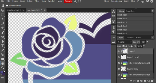
Next step is to add the image you colored!
Go to File > Open and Place and then choose the PNG from your gallery and place it in the icon. Once it's there fiddle around with it until you get the image you want and then BOOM!

Now you have a singlar icon!
Feel free to repeat this as many times as you want and make as many icons as you want.
-
All the icons we made for this can be found here! Thank you for reading, once again please consider reblogging this post and the icons because this took forever to write up and the icons take a LONG time to make.
98 notes
·
View notes
Text
Basic Gif Making Websites
so if you want to make gifs but dont want to spend hours doing them, there's a couple different options you have!
first: you wanna get whatever clips you want gifs of, you can do that with screen recording on obs (which, you can find a tutorial on how to do that here if you need it) or just by downloading the video from somewhere (note: if you want to gif a game and there's no clips on youtube or anything, you can use the screen recording method)
after that you want to cut the clips down, you can do this on an editor like capcut which is free and fairly easy (I have a tutorial for using capcut here which is more for video editing, but does explain the interface if you need it), you can also edit things like colors and sharpness/clarity in the editor if you dont want to do this later
now, there are 3 programs you can use to make the actual gifs, ranging from the worst to best quality imo:
Capcut editor
capcut actually has an export option that makes your clip into a gif, however the resolution only goes to 240p with the free version so it is not the highest quality but it is an option
you simply export your clip and make sure ONLY the gif option is checked in the export menu

EzGif.com
ezgif has been my friend and brother for years, and while it does not create the highest quality ever gifs, it still has a pretty good output considering
the site itself is pretty easy to navigate, you go to video to gif and go from there. you can use their editing tools or simply save the gif after its finished converting, the converting may take a little bit depending on your internet and computer but you can switch tabs while it does this
Photopea.com
photopea is the free photoshop alternative that you can use psd and xcf files with, although it can only be used with internet currently
this, however, is the best free option for making gifs that i've found so far as you have all the same editing options as regular photoshop (as far as i know) and the output is generally going to be the highest quality
you can do extremely basic gifs by simply uploading the video into the program (i recommend using a lower fps option when prompted, i usually do around 10) and then simply exporting as a gif, however you can also edit and use psd's premade by others
i hope these help some of you! if you want some more tutorials and resources i've gathered for editing you can find some here (its not a ton, but its something!)
#nobody asked for this or anything but i have something i wanna make soon#and i thought this info may be helpful to some people#gifs are really easy and can be fun to make#and these sites can make it a lot easier#they dont all have to be hd super edited masterpieces#idk what to tag#gif making#gif tutorial#edit tutorial#my resources#devo speaks
31 notes
·
View notes
Note
how do you make high quality gifs?? 😭
I use EZgif if you’re talking abt how I make my layouts, the actual gifs I use I steal from google. in case you want to know how to add high quality gifs and keep ‘em high quality, here ya go :)
I go on EZGIF and go to effects

after that go to add overlay, upload the gif you want, then use this

to input what you what the gif to be on(make sure where you want the gif to go has a transparent bg kinda like this)

then you click the generate image button, and it’ll load the overlay with the gif under it, then you can save it :) you might need to change the size of the gif to fit the overlay, to do that you just go to ‘resize’ or ‘crop’

(I feel like I over explained this but even if this isn’t what you meant at least it’s here for ppl who need it 😭)
32 notes
·
View notes
Text
PHOTOPEA TUTORIAL / PHOTO FILTER FOR SKIN TONES:
a tutorial on HOW TO BRING OUT SKIN TONES if an image is 'too gray' (faded) or has too much of one (likely over saturated) color! this technique can easily be applied to icons that already have a border ! just put your focus on the base image / icon ! this works on relatively anything, including poc and non-poc. WHAT YOU WILL NEED: photopea...and your desired your base image(for example, i'll be showcasing inconsistent or otherwise dark/faded scene lighting, like twilight and saw). DISCLAIMER: not all lighting/images are the same, nor are psd colorings. while some colorings may be designed to bring out reds/yellows(which is the filters we'll be using in this specific example), others may mute them and you may have to improvise with whatever color the psd you're using is designed to focus on. this is just a general idea, you will have to explore as you see fit. it's all going to depend on your personal taste !
by the end of this, you should be able to manage results like this !

cool, huh?....anyway, on with the mechanics !
EXAMPLES:

[ BEFORE PSD ] [ SYNOPSIS ]
#01 / LEFT IMAGE ABOVE: too much green, becomes muted with psd and doesn't show variety. #02 / RIGHT IMAGE ABOVE: the colors are very faded in this scene, and the pink focused psd in question made the image seem gray. we will start with EXAMPLE #01. i will be using the same PSD on both, a custom psd i made and focuses on reds/pinks.

as you'll see above the PSD has now been applied...but now it's kinda boring :// (there's nothing wrong if you don't mind how it is above, everyone's got their aesthetic choice—HOWEVER, we're aiming to add skin tone...)
once you have your image open, you'll want to go to image>adjustments>photo filter; i went ahead highlighted it in yellow for easy finding !

since this psd DOESN'T mute reds/yellows, (and those are usually the base of most/general skin tone combinations) i applied both a yellow and red filter. now, these colors i'll be using in this example, because they're in my default colors on the photo filter option—you can totally choose lighter or darker variants of these colors, or like i said, a different color altogether based on how the PSD you're using works. the toggle setting doesn't have to be exact to this example either—this is just what worked best on this image combined with the chosen PSD ! // RIGHT IMAGE IS THE FINAL RESULT AFTER APPLYING THE RED FILTER AFTER THE YELLOW.


repetition on a different example . . .


this scene in particular is very faded, and the red feels a little blotchy/over saturated here...so i'll show you an EXTRA STEP you can use ! in saying this, you don't have to do exactly this; you can even choose to go ahead with selective color to fix your image, without doing the filters, if you find that suitable. but i'll be showing you the magic of selective color to balance out the red toned overlay.

same concept as before, just a different selection: image>adjustments>selective color. think of selective colors as "balancing" the colors. it does have a toggle selection for each color, which is super helpful, including diminishing or adding white highlights. given the PSD colors, naturally, i'll be focusing on yellow and red.


it's now got a general skin tone and red is not as blotchy !
[ FINAL RESULTS / CONSISTENCY WITH PSD APPLIED ]

this is a great hack i use quite a bit, it's great for maintaining consistency in your icons when the lighting is working against you...hope this was comprehensible and helpful, happy editing !
#* RE - RELEASE#* MY TUTORIALS.#sorry i didnt realize i forgot to reupload this one!#long post /#FREE TO REBLOG !#rp community#icon tutorial#rp icon tutorial#psd tutorial#roleplay coloring#roleplay help#roleplay resources#roleplay community#roleplay graphics#coloring psd#psds#icon psd#psd#roleplay psd#rp graphics#rp psd#rp resources#tutorial#editing tutorial#rpc tutorial#editing resources#psd coloring
254 notes
·
View notes
Text
🎵 playlist cover tutorial (& psd)
In this tutorial, I'll be going over how to make a character-centric playlist cover using my template


✨ Firstly, thank you so much @withered-rose-with-thorns for your kind words on my edits and interest in learning how to make these! 😊
The core of our process is thankfully a simple one. We'll be using the clipping mask function to affix a character cutout and textures to 3 specific primary layers. Here, I'll walk through remaking a cover similar to that of my Vi playlist. To begin, download the following:
cover template (mega.nz)
My template is 400x400px in overall size and mainly features 3 named layers.

1.) CUTOUT — With the template ready to rock, we'll start by working on the heart of the edit, which is getting the character cutout for the portrait layer. (As a general rule, always try to use the highest quality images/shots for projects whenever possible.) In this example, I've used the Pen tool to free Vi from her scene:

For creating precise cutouts I will only ever recommend using the Pen tool, as anchor points allow the most control in achieving the cleanest results. If you're unfamiliar with the Pen tool and its settings, here's a 60-second guide to the basics. (i.e. connecting anchor points all the way around your character from the start to end > Make Selection > set Feather Radius to 0 and have anti-alias checked for smooth edges) Once you've made your selection, if you need, you can change the cutout size by using the Transform Controls or simply adjusting the overall Image Size.
2.) PORTRAIT LAYER — Back on planet template, we'll focus on the "middle portrait" layer. Above each of the 3 main layers is one titled *top clipping mask*, which we'll keep at the top for all. This is a means of ensuring all new layers created beneath it will stay clipped to the primary layer (as indicated by the little arrow pointing downward to the left of each mini thumbnail image). You can simply drag your cutout to the template, or just copy & paste it in a new layer, and use the Move tool to position the image how you'd like. (If any layer accidentally unclips, right click it and select Create Clipping Mask or just hit that Alt+Ctrl+G)

With your image now in position, you can then change the portrait background color by creating a new fill layer > Solid Color. Double-click the Solid Color layer to change the color at any time. Your cutout layer should sit atop the Solid Color layer and beneath the *top clipping mask* layer, as shown above.
3.) BACKGROUND LAYER — The bottom-most layer is our background color layer, which is gray by default. Feel free to adjust this Solid Color layer any time to your preference. Now with the basics covered (your cutout, middle portrait background color, and background color), let's add a texture or two! Since we're on the background layer now, I've downloaded and resized this unsplash texture and made it a new, clipped layer.

Experimenting with the Blend Modes and Opacity is key (and super fun)! Here, I've set my texture layer to Subtract with a 50% Opacity.
On top of the texture layer, I've added a couple of adjustment layers and color layers using the Brush tool for the sizzle.

4.) PORTRAIT LAYER — Back on the middle portrait layer, we can add a texture layer here a s we've done for the background, though if you prefer you can leave the portrait background as a solid color. For the purpose of the tutorial, I've downloaded this graffiti texture from unsplash and added it as a new layer, changing the Blend Mode and Opacity.

By experimenting with the Blend Mode on your texture layer, adjustment & color layers, you can create all kinds of wild effects to fit your subject and mood of your playlist.
In addition to fiddling with the portrait layer, I've also sharpened my Vi cutout and added adjustment layers above it - such as Vibrance, Color Balance and Curves - to make her shine against the saturation of the colors surrounding her.
When you're all done, save your cover as a .png to retain high-quality compression.
You may have noticed that we didn't make any adjustments to the 3rd "white border" layer after all, which is on purpose! Depending on what look you'd like to create for your cover, and knowing how a clipping mask works from previous steps, the set-up has been prepped to change as you please, if you please.
And if you've read this far, thank you! I appreciate you, and I hope you found some useful information. You're welcome to download the finalized Vi psd cover I made for this tutorial.
Happy Creating! 🧡
22 notes
·
View notes
Text
꒰ 𝐛𝐫𝐞𝐚𝐤𝐢𝐧𝐠 · 𝐮𝐧𝐝𝐞𝐫 · 𝐲𝐨𝐮 ꒱
♱ ˗ˏˋ ᴇᴅɪᴛɪɴɢ ᴛᴜᴛᴏʀɪᴀʟ ʙʏ ʙᴇᴄᴋ ˎˊ- ♱
link: x thread


𓊆 ᴀᴘᴘꜱ ɴᴇᴇᴅᴇᴅ 𓊇
⊱⋆ love and deepspace (obviously) ⊱⋆ picsart
𓊆 ᴍᴄ’ꜱ ᴘᴏꜱᴇ + ɪɴɢᴀᴍᴇ ꜰɪʟᴛᴇʀ 𓊇


𓊆 ʜᴀɴᴅ 𓊇
⊱⋆ if you don’t use my hand png, remember to add the previous ingame filter ⊱⋆ for my black and poc cuties here’s the qr for the hand position (remember to add the previous ingame filter)


⊱⋆ tutorial on how to cut the hand using picsart
𓊆 ʜᴇᴀᴅ 𓊇
⊱⋆ veil’s png ⊱⋆ to put it on your mc’s head, use picsart’s background remover or, in alternative, use this site: https://remove.bg/it ⊱⋆ adjust it however you like

𓊆 ꜰᴀᴄᴇ 𓊇
⊱⋆ cracked pngs


⊱⋆ to put the cracked pngs on your mc’s face, use picsart and follow these steps:

𓊆 ꜰɪʟᴛᴇʀꜱ 𓊇
⊱⋆ i used picsart effects, but you can use the app you like the most ⊱⋆ play around a lot with effects!! put one filter over the other, use them at 90% fade, use even the “adjust” feature, everything is fine as long as you have fun and like the results
𓊆 ɪꜰ ʏᴏᴜ ᴜꜱᴇ ᴍʏ ᴛᴜᴛᴏʀɪᴀʟ ʀᴇᴍᴇᴍʙᴇʀ ᴛᴏ ᴄʀᴇᴅɪᴛ ᴍᴇ ᴀɴᴅ ᴛᴏ ᴛᴀɢ ᴍᴇ ꜱᴏ ɪ ᴄᴀɴ ꜱᴇᴇ ᴀʟʟ ʏᴏᴜʀ ꜱᴛᴜɴɴɪɴɢ ᴍᴄꜱ ♡ 𓊇

#❦・beck’s edits#love and deepspace#lads#l&ds#lnds#mc love and deepspace#love and deepspace mc#lads mc#l&nds mc#lnds mc#mc lads#loveanddeepspace#edit tutorial#lads edit#love and deepspace edit#l&ds edit#lnds edit
7 notes
·
View notes
Note
Hi hi!! Not a request and you don't have to answer this at all but riliane is just curious a and hasen't seen that before,,, How do you get the gifs in banner masks? /nf
the way i do it is probably way too complicated so take what i say with a grain of salt this isn't the most convenient solution BUT !! it works!!!!!!
and for reference, this is all done with photopea :3


these are the measurements i use, open a new file
find the mask and gif you wanna use!! then put the mask in your new file like so,

then select all the white parts and delete/erase them

3. save your gif (make sure it's in a .gif format!!) then open it in a new file, your photopea should look like this


4. move your gif folder to the file with the mask, it should look like this:

5. adjust your gif however you like, then hide the folder and select the mask with the selection tool, this time the black parts and invert them
6. now here's where it gets complicated . start selecting each frame/layer in the gif folder and deleting the selected parts, so it looks like this:

7. continue doing that until you've gone through all the frames,

and boom!! you're done!! here's what the output should look like <3 (make sure to export as gif!!)

#⌞♥︎ chatting ᵎ ⌝#i haven't done a tutorial befoer but this was fun hehe :33#i hope this helps you if you decide to do it!!#editblr#edit resource#editing tutorial#edit tutorial
14 notes
·
View notes
Text
Wonyoung Poster Edit <3

if you want the template, click here ! 🤍
like + reblog is much appreciated :))
#wonyoungism#jang wonyoung#ive wonyoung#wonyoung moodboard#poster#poster design#kpop moodboard#kpop#kpop edits#ive moodboard#ive edits#graphic design#design#wonyoung fluff#wonyoung icons#wonyoung pink#wonyoung packs#wonyoung layouts#kpop layouts#wall art#art print#printable#wall decor#kpop icons#kpop idols#kpop design#kpop decor#canva#edit tutorial#design concept
17 notes
·
View notes
Text
How i edit <3
My app it's with Brazilian Portuguese settings, but I hope you can understand <3
App used: Ibispaint X
Answering @skingums
Final results !

#how i edit#edit#aesthetic edit#pfp#answered#edit tutorial#pfp icons#pfp ideas#hsr blade#hsr icons#tutorial#soft edit#softcore#ibispaintx
21 notes
·
View notes