#rpc tutorial
Explore tagged Tumblr posts
Visit Tumblr Blog
Explore Tumblr blogs with no restrictions, modern design and the best experience.
Last Seen Tumblr Blogs


Fun Fact
Tumblr was created by web developers David Karp and Marco Arment.
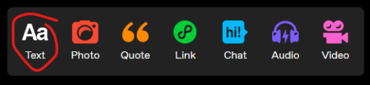
Text
PHOTOPEA TUTORIAL / PHOTO FILTER FOR SKIN TONES:
a tutorial on HOW TO BRING OUT SKIN TONES if an image is 'too gray' (faded) or has too much of one (likely over saturated) color! this technique can easily be applied to icons that already have a border ! just put your focus on the base image / icon ! this works on relatively anything, including poc and non-poc. WHAT YOU WILL NEED: photopea...and your desired your base image(for example, i'll be showcasing inconsistent or otherwise dark/faded scene lighting, like twilight and saw). DISCLAIMER: not all lighting/images are the same, nor are psd colorings. while some colorings may be designed to bring out reds/yellows(which is the filters we'll be using in this specific example), others may mute them and you may have to improvise with whatever color the psd you're using is designed to focus on. this is just a general idea, you will have to explore as you see fit. it's all going to depend on your personal taste !
by the end of this, you should be able to manage results like this !

cool, huh?....anyway, on with the mechanics !
EXAMPLES:

[ BEFORE PSD ] [ SYNOPSIS ]
#01 / LEFT IMAGE ABOVE: too much green, becomes muted with psd and doesn't show variety. #02 / RIGHT IMAGE ABOVE: the colors are very faded in this scene, and the pink focused psd in question made the image seem gray. we will start with EXAMPLE #01. i will be using the same PSD on both, a custom psd i made and focuses on reds/pinks.

as you'll see above the PSD has now been applied...but now it's kinda boring :// (there's nothing wrong if you don't mind how it is above, everyone's got their aesthetic choice—HOWEVER, we're aiming to add skin tone...)
once you have your image open, you'll want to go to image>adjustments>photo filter; i went ahead highlighted it in yellow for easy finding !

since this psd DOESN'T mute reds/yellows, (and those are usually the base of most/general skin tone combinations) i applied both a yellow and red filter. now, these colors i'll be using in this example, because they're in my default colors on the photo filter option—you can totally choose lighter or darker variants of these colors, or like i said, a different color altogether based on how the PSD you're using works. the toggle setting doesn't have to be exact to this example either—this is just what worked best on this image combined with the chosen PSD ! // RIGHT IMAGE IS THE FINAL RESULT AFTER APPLYING THE RED FILTER AFTER THE YELLOW.


repetition on a different example . . .


this scene in particular is very faded, and the red feels a little blotchy/over saturated here...so i'll show you an EXTRA STEP you can use ! in saying this, you don't have to do exactly this; you can even choose to go ahead with selective color to fix your image, without doing the filters, if you find that suitable. but i'll be showing you the magic of selective color to balance out the red toned overlay.

same concept as before, just a different selection: image>adjustments>selective color. think of selective colors as "balancing" the colors. it does have a toggle selection for each color, which is super helpful, including diminishing or adding white highlights. given the PSD colors, naturally, i'll be focusing on yellow and red.


it's now got a general skin tone and red is not as blotchy !
[ FINAL RESULTS / CONSISTENCY WITH PSD APPLIED ]

this is a great hack i use quite a bit, it's great for maintaining consistency in your icons when the lighting is working against you...hope this was comprehensible and helpful, happy editing !
#* RE - RELEASE#* MY TUTORIALS.#sorry i didnt realize i forgot to reupload this one!#long post /#FREE TO REBLOG !#rp community#icon tutorial#rp icon tutorial#psd tutorial#roleplay coloring#roleplay help#roleplay resources#roleplay community#roleplay graphics#coloring psd#psds#icon psd#psd#roleplay psd#rp graphics#rp psd#rp resources#tutorial#editing tutorial#rpc tutorial#editing resources#psd coloring
237 notes
·
View notes
Text
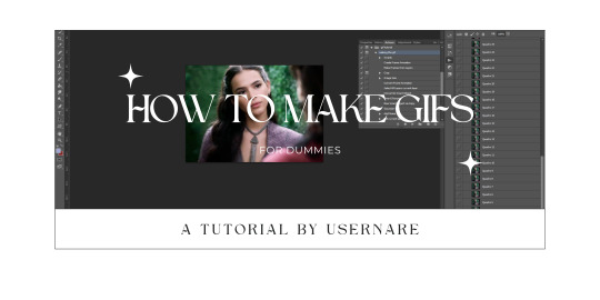
we all know that giffing can be a pain in the ass sometimes. it is time-consuming, tiring, and annoying. but highly addictive, too. there's no cake recipe for making gifs, but everyone has some tips and shortcuts developed through time and hard work, the same way as our nanas have their special chocolate cake recipe.
that being said, welcome to my crazy attempt to make a comprehensive tutorial. this is how to make gifs for dummies, my name is nare and i'll be your host during this extensive ramble dressed as a tutorial.
my giffing process (and this tutorial) is divided into 5 phases:
downloading the footage;
cropping the scenes;
extracting the frames from said videos;
organizing the frames into the folders;
and making the actual gifs.
at google docs i'll provide every link you might need, and will try to explain everything you need to start making your own gifs. thank you!
#tutorial#gif pack tutorial#gif tutorial#rpc#rph#rpt#dearindies#supportcontentcreators#usermina#userdevon#idk who to tag#but i hope it helps anon#nare: tutorial#res: useful
613 notes
·
View notes
Text
*✶ please please please
a template by cozysip.
by clicking in the source link you’ll find 02 different dash icon templates made by me from scratch. credit is not needed , but do not claim as your own ! if you enjoy this or you use it, please reblog or like this post . thank you !
#01. PSD TEMPLATES : mine.#template#free template#rp template#psd template#free psd#dash icon#dash icons#dash icons template#icon template#icon psd#psd#rpc#rph#graphic tutorial#free graphics
260 notes
·
View notes
Text
A Complete Guide on how to Fix & Optimize The Sims 2 on Windows 10/11
I've made a video tutorial and written guide on everything you need to know on how to Fix & Optimize The Sims 2 on Windows 10/11, with Performance, Stability, and Graphics Enhancements.
Watch the Video Tutorial on YouTube:
youtube
Read the Written Guide on my Website
#sims 2#the sims 2#ts2#sims 2 2024#sims 2 windows 11#sims 2 windows 10#fix sims 2#graphics rules maker#sims 2 RPC#sims 2 4gb patch#Empty standby list#empty standby memory#sims 2 shadow fix#sims 2 George#Sims 2 Settings#Sims 2 Ultimate Collection#Sims 2 Resolution Fix#Sims 2 tutorial#Sims 2 help#Sims 2 crash fix#Sims 2 error fix#Sims 2 video#BellaDovah#Youtube
229 notes
·
View notes
Text
INDIE ROLEPLAY SET UP :
You must give credit if you take some or all of my set-up pieces as your own. This doesn't include the templates that I didn't make. But if you use the same templates, tagging, format, etc as me or some of the mixed bags (not just templates alone) then crediting me is mandatory as you didn't come up with the mixed bag.
some of the templates I used in my set up are NOT made by me. There is credit linked for everyone to grab them if you want.
if you have any questions please feel free to message me
PINNED POST


URL HERE a BLANK TYPE OF BLOG written by ALLIAS ( PRONOUNS / PRONOUNS, +AGE, TIMEZONE ). All triggers are tagged extensively. All muses are canon divergent, influenced by their source material. this blog doesn't adhere to strict canon. STARTED ON 00 / 00 / 0000.
guidelines . . . muse list . . . navigation . . . meme tag . . . writing sample . . . interaction call . . . promo . . . blogroll . . . credits . . . spotify . . . pinterest . . . sideblog
used this header psd by carestuff but edited ● font I used was Blackadder ITC for the top, Forte for the bottom
used this website for a fancy font ( I used the font called "BOLD FONT" )
Casual reminder that if you link a Google doc or to Spotify, that it will show your name, so make sure you are using a roleplay / burner based account so no one has access to your personal information, such as your real name.
TAGGING SYSTEM

I created this section in Google Docs for every single one of my muses. Below is a link to the symbols I used.
❥ . . . ( tester | tester )

ARC VS VERSE : every single character gets both an arc and a verse that is undecided. Since you can search by both ARC and VERSE, I felt this would make the most sense. A verse is the overreaching section, so for example, SUPERNATURAL is a show, so it gets its own verse. Now for an ARC, I would be putting different sections in for, say, I want Hope to have a soulless arc, then that would be where that would go. Or say I want Hope to have an arc that she has her humanity off, it would fall under the arc section. It's not a big enough theme for me to make it a whole verse.
I can use the tag of no humanity in an arc repeatedly. Combined with, say, searching my Queen of Nola verse and the arc of no humanity, it should give you all of the information written about her no humanity time in said verse. Above picture shows you how I format my verse posts.
CHARACTER ID: This is an overreaching tag that covers pretty much anything written by me for that character, so answered asks, interactions, headcanons, drabbles, etc. all fall in line with this. You could also add it to your visage and musing tags, but I personally don't find that helpful.

This is an example of my tags underneath a reply of mine. More will be explained soon about what everything else means.

This is what I used to tag all the different types of calls I make. So someone can click on, say my meme call, and get to like a call for them to be sent memes.

Any reblogged content went here minus the ask memes, but you could very well put ask memes there as well.

This section is anything related to my set up. Now, I have two different blogs (more to come on why I do that later). This kind of shows you how I break things up.

The extra section is really anything that I couldn't figure out where it might go. So promos, scheduled posts, dash games, etc.

This one feels very self-explanatory. Anything that I personally want saved goes here

This section is anything created by me or something I agree with strongly. Graphics are different than my adventures in ps. The first for me is like character edits, while the second one is maybe asking for opinions or showing people what I am excited for.

I'm not a huge talker in the tags person. However, I do find a few things helpful to point out like when something might be triggering, if one should look at a link I put in my replies, making sure that people know to send the whole prompt not just the symbol (in case it takes me a moment to get it done and I need to know what the instructions for the meme was to prevent deleting a meme because all I see is a symbol or word and therefore have no idea which meme it is attached to. Sending the whole sentence is helpful and doesn't require a two-step process like asking for the meme and the link simultaneously. It is also beneficial to tell people to tell me what muse things are for as well, so that way I am not playing a guessing game.
The potentially triggering topic for me is an overall tag for triggers. I do also break it down into say " clowns tw " as well just for blacklisting purposes. However, the blanket tag covers so that say I forget someone is triggered by something and I forgot to tag it, there is a possibility that this might save it a little bit.

This section of tagging is where I get an overview of things. So, say you aren't looking for any muse's writing in particular that you want to see, but you want to see if we are a good fit to write together. Then you might want to see all my writing, which has answered asks, headcanons, drabbles, and interactions in it. Or maybe you only want to see thread interactions, so you'd go to all replies.
Since there might be a lot of tags (depending on if you are a multiuse or not), I recommend using a Google Docs or a draft post to hold all of your tags for easy keeping.
FORMATTING

The two dividers are from two different sources. The thin one was made by theresourcedhunted, and the thick one was made by dividing by underesources. However, I edited it to remove many of the fancy pieces as I wanted something a tad simpler.
To make my gifs centered without editing them, I use THIS blank space / image.
❝ ❞ is what I use for my dialogue around spoken words. ● A tutorial on making adding coloring to your replies faster without going into the HTML, but a single time. You could always use the few colors tumblr has built in for simplicity.
There are about 4 to 5 spaces between my dialogue and the rest of my text. I'm still trying to figure out what I like personally in that department.
To simplify things, if you use a Windows computer to hotkey and streamline some things, I use aText, a Microsoft Store application. All I have to do is enter a specific combo of letters and words to get a unique key or spacing that I set up myself.
【 ✉️ 𝐂𝐇𝐀𝐑𝐀𝐂𝐓𝐄𝐑 𝐍𝐀𝐌𝐄 】 : this is for any sent messages by my muse. Again, the fancy font is the same one I used in my pinned post. You could use fancy emojis and things. I colored the text of the name and bold it. The actual text is in a small-sized font along with regular normal Tumblr font.
【 📩 𝐂𝐇𝐀𝐑𝐀𝐂𝐓𝐄𝐑 𝐍𝐀𝐌𝐄 】 : this is what I tend to use for messages that my message receives. So, if I am writing a reply that my muse is talking to their friend, but my muse's mother texts them, and I want to show it, that is how I do it.
I personally like to link in headcanons in my replies and things for others to read if needed, share links to songs that might be heard in a reply, or pinterest links to images of maybe the muse's style that is relevant to a reply. I mentioned this in my rules so others know that there will never me links to malware or anything else and is always in good faith.

My formatting doesn't really change for headcanons. I use bolded fonts for the header of each headcanon. Then, bullet points might make it easier for others to find information and read.

every post that I make that isn't a starter tends to follow the same spacing that I mentioned being between my dialogue and using the same bolded font that I always use and was linked above.
Now onto another important thing being what all do I make headers for?
photoshop adventures
liveblogging tv shows
out of character posts
biography post
links section
arcs section
lore post
headcanon post
locations post ● pretty much anything that I think of that could use a title gets a header

You can find my stats template HERE
To show dead pets, siblings, parents, etc. I tend to use ✞ for deceased family and pets

the icon template that I made (without the fade to black)
fade to black ( photoshop action ).
This is what I am currently working on icons for my blog.

gif made by me. could use any template from HERE
my dash icon is currently from HERE, but you could use anything from HERE
MUSE LIST


This is what my muse list looks like. All of my stats go to my sideblog. My sideblog's pinned post looks like my pinned post on my main blog. For the title of all fandoms, they are in the same bold heading that I have done thus far.
OPEN . . . means accepting memes & starters without plotting SEMI SELECTIVE . . . means accepting memes & starters without plotting but will be slower to respond SELECTIVE . . . means accepting memes & starters but would prefer plotting with this muse and I will be slower to respond PLOT BASED . . . means that I don't accept memes & starters for this muse without plotting first. If you ignore this, then your request / meme will be denied. EXCLUSIVE . . . means that this muse is for only a certain number of people. click the link on their name to figure out who this meme is for.
These few things explain what my muse list is like regarding organization.

RULES
𝐀𝐁𝐎𝐔𝐓 𝐓𝐇𝐄 𝐀𝐃𝐌𝐈𝐍 . . .
𝐖𝐑𝐈𝐓𝐈𝐍𝐆 𝐄𝐗𝐏𝐄𝐑𝐈𝐄𝐍𝐂𝐄 . . .
𝐀𝐆𝐄 𝐑𝐀𝐍𝐆𝐄 . . .
𝐏𝐋𝐎𝐓𝐓𝐈𝐍𝐆 . . .
𝐒𝐏𝐄𝐂𝐈𝐅𝐘 𝐓𝐇𝐄 𝐌𝐔𝐒𝐄 . . .
𝐌𝐔𝐋𝐓𝐈𝐌𝐔𝐒𝐄 . . .
𝐒𝐌𝐔𝐓 . . .
𝐌𝐔𝐒𝐄 ≠ 𝐌𝐔𝐍 . . .
𝐀𝐒𝐊 𝐌𝐄𝐌𝐄𝐒 . . .
𝐓𝐀𝐋𝐊𝐈𝐍𝐆 𝐈𝐍 𝐓𝐇𝐄 𝐓𝐀𝐆𝐒 + 𝐋𝐈𝐍𝐊𝐒 𝐈𝐍 𝐑𝐄𝐏𝐋𝐈𝐄𝐒 . . .
𝐐𝐔𝐄𝐔𝐄 𝐁𝐀𝐒𝐄𝐃 . . .
𝐑𝐄𝐏𝐋𝐘 𝐋𝐄𝐍𝐆𝐓𝐇 + 𝐖𝐀𝐈𝐓 𝐓𝐈𝐌𝐄 . . .
𝐀𝐈 𝐌𝐀𝐓𝐄𝐑𝐈𝐀𝐋 . . .
𝐃𝐎 𝐍𝐎𝐓 𝐈𝐍𝐓𝐄𝐑𝐀𝐂𝐓 . . .
𝐏𝐄𝐑𝐒𝐎𝐍𝐀𝐋 𝐁𝐋𝐎𝐆𝐒 . . .
𝐓𝐑𝐈𝐆𝐆𝐄𝐑𝐈𝐍𝐆 𝐂𝐎𝐍𝐓𝐄𝐍𝐓 . . .
𝐓𝐀𝐆𝐆𝐈𝐍𝐆 𝐒𝐘𝐒𝐓𝐄𝐌. . .
𝐒𝐇𝐈𝐏𝐏𝐈𝐍𝐆 . . .
𝐌𝐀𝐈𝐍𝐒 & 𝐄𝐗𝐂𝐋𝐔𝐒𝐈𝐕𝐄𝐒 . . .
𝐑𝐄𝐒𝐎𝐔𝐑𝐂𝐄 𝐁𝐋𝐎𝐆 . . .
𝐁𝐀𝐍𝐍𝐄𝐃 𝐅𝐀𝐂𝐄 𝐂𝐋𝐀𝐈𝐌𝐒 . . .
𝐁𝐀𝐍𝐍𝐄𝐃 𝐅𝐀𝐍𝐃𝐎𝐌𝐒 . . .
𝐑𝐄𝐒𝐄𝐀𝐑𝐂𝐇 . . .
𝐒𝐓𝐄𝐀��𝐈𝐍𝐆 . . .
𝐆𝐎𝐃 𝐌𝐎𝐃𝐃𝐈𝐍𝐆 & 𝐏𝐎𝐖𝐄𝐑 𝐏𝐋𝐀𝐘𝐈𝐍𝐆 . . .
𝐃𝐈𝐒𝐂𝐎𝐑𝐃 . . .
𝐂𝐎𝐌𝐌𝐔𝐍𝐈𝐂𝐀𝐓𝐈𝐎𝐍 . . .
𝐇𝐀𝐑𝐃 𝐍𝐎'𝐒. . .
𝐂𝐀𝐋𝐋 𝐎𝐔𝐓 𝐂𝐔𝐋𝐓𝐔𝐑𝐄 . . .
𝐔𝐍𝐅𝐎𝐋𝐋𝐎𝐖𝐈𝐍𝐆 . . .
𝐅𝐎𝐋𝐋𝐎𝐖𝐈𝐍𝐆 . . .
𝐌𝐔𝐓𝐔𝐀𝐋𝐒 𝐎𝐍𝐋𝐘 . . .
𝐃𝐑𝐀𝐌𝐀 . . .
𝐃𝐑𝐎𝐏𝐏𝐈𝐍𝐆 𝐓𝐇𝐑𝐄𝐀𝐃𝐒 . . .
𝐅𝐎𝐑𝐌𝐀𝐓𝐓𝐈𝐍𝐆 . . .
𝐁𝐋𝐀𝐍𝐊 𝐁𝐋𝐎𝐆𝐒 . . .
𝐌𝐔𝐒𝐓 𝐇𝐀𝐕𝐄𝐒 . . .
𝐁𝐋𝐎𝐂𝐊𝐈𝐍𝐆 . . .
𝐆𝐄𝐓𝐓𝐈𝐍𝐆 𝐓𝐎 𝐊𝐍𝐎𝐖 𝐌𝐘 𝐑𝐎𝐋𝐄𝐏𝐋𝐀𝐘 𝐏𝐀𝐑𝐓𝐍𝐄𝐑𝐒 . . . ● I used the same unique font and bolding/coloring as usual for everything. Then, I did everything else in the regular Tumblr font. ● Some of these sections might not be needed in your case, or you might find you need to add more sections. Do whatever works for you.

Alright, here is a tip. If you have several tags and want to narrow down, say, a certain verse that has headcanons about it, as long as you know what the tag names are, you could enter both tags separated by a + in the middle to get all the posts between two tags (and possibly more, but I have not checked that out). So, if you are really organized tag-wise, then you can easily filter things out.
35 notes
·
View notes
Text
a quick guide on how to plot in a rp group
Hello friends. As I journeyed through different groups I noticed a trend in interactions with writers and trying to plot with them for their characters. It seemed like there was a disconnect on what plotting means and that was making answering plot calls really difficult and frustrating. I wanted to whip together a quick guide with actionable items to help with plotting! However, I think it's important to also note that plotting doesn't have to be deep — they can something simple that leaves a lot up to chemistry. Even "random" interactions can be used for plotting purposes for people that really work well off of chem. Everyone is different, and both plots and chem are great ways to write together!
plots vs connections
One of the biggest mistakes that I've seen with plotting is that people mistake plots for connections and vice versa. A Plot is an actionable item that you can use to write the characters doing something. It can be a broad character arc, or several points of conflict or interaction that generates threads. True plots make it easy to generate a thread from some context to what we think will start the interaction between the two characters.
examples: one character took another character's coffee order. one character caught another character from falling. one character likes art and the other doesn't and they went to a museum.
A Connection is how the characters know each other. This can be familial relationships, platonic relationships, romantic relationships, and so on.
examples: they met at a coffee shop. they went to the same festival. they are exes. they're cousins.
Often, connections are a great place to start, as the plot can be built off from the connection. However, if it's left at just the connection (such as, they're cousins!) it can be hard to create a thread or interaction from the connection. If the characters are cousins, or they did meet at a coffee shop, what's their relationship like? How did that first coffee interaction go? Or do you want to write that coffee interaction based off chemistry? Either way, those questions help you plot!
tips on ways to maximize plotting
Read the other character's bio or about. If you don't have one for your character, make one so that people can use these content pieces as a way to start to think about their character in context to yours. Most people are pretty good at figuring out a connection, but have an issue taking it to the actionable idea. Think about general interactions you have had with people in your life, or something you've witnessed, one of those could be starting point for a thread!
Create a wanted plots page that has some simple interactions you'd like to explore. People might not read it, but then you've at least got ideas for people who might be struggling as well to think of how to plot with your character.
Check out the wanted plots tags, there's tons of great ideas for unique plots that you could use and adapt for other plots.
Think about what parts of your character that excites you. What quirks or strengths do they have that make for interesting interactions with people? I find that starting here often helps to build threads I am excited for — chemistry based ones!
Use the yes, and or the no, but methods to build in conversations with other writers. Meaning that if someone comes up with something you think could work, agree with it and then build off of it. If the idea doesn't work, however, come up with something else that is more in character that could work.
Don't be afraid to send something off the wall, and don't be afraid to turn something down that doesn't work, just be willing to build off those ideas!
If you're into chemistry over plotting, think of places a starter or thread could be at and what the two characters could be doing. This could be in addition to a connection you've selected.
I hope these tips have helped, and I wish you the very best on your rp plotting adventures!
82 notes
·
View notes
Note
Hello! Do you have any tutorials of how to make a coloring PSD? I'd like to start making my own, but I have no idea where to even start or how to even start searching for a tutorial on it, I can only find already made ones. Thank you so much!
djarin
magnusedom
arabellas
kinnbig
maziekeen
gwenpendragns
frank-dillanes
arabellas - bright scenes
robin-buckely - dark scenes
whitewolfofwinterfell - dark scenes
completeresources - dark scenes
arabellas - dark scenes
usergif
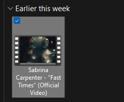
sabrinaacarpenters - isolate colour
zresources
aubrey-plaza - guide to channel mixer
tesb - how to colour tinted scenes
haknew
snug-gyu
rafael-silva - coloured background
completeresources
cal-kestis
scottstiles - colorize tool
aubrey-plaza - how to fix orange washing
floralovebot - how to fix whitewashing
mohanas - how to fix whitewashing
blueshelp - how to fix whitewashing
haldi-archived - how to fix whitewashing
dailyemeraudetoubia - how to fix whitewashing
meliorn - colourful gifs
bennydemarco - hue/saturation and selective colour layers
and there's probably more in my photoshop tutorial tag!
#photoshop tutorial#rph#rpc#honestly not a fan of a lot of the psds out there which redwash and orangewash people so these are mostly basic colouring tuts!
31 notes
·
View notes
Text
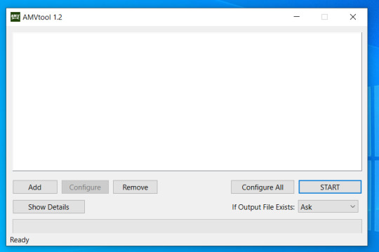
fast .mkv (to .mp4 / .mov / etc) conversion
are you sick and tired of wrangling with .mkv files when you want to make gifs? are you mad at all the online converters having a 1gb limit?
download amvpack from amv101.
little tutorial under the cut because some friends have reported a little confusion on what to download! (**note, as far as i can tell, this download will expire by the end of the year, 12/31/2023)
download the appropriate software for your operating system. the website offers windows & mac.
install the package as you usually will, continue through the screens. install which programs you want from the package. you will need AMVtool.
now you should have this application. open it.

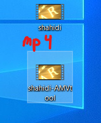
4. rename your .mkv file to something short & simple so that it converts easily. i usually choose to do the name of the person i'm giffing. open that file in amvtool by clicking add or dragging the file into the window.
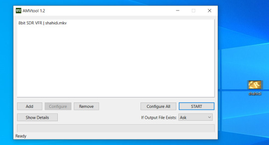
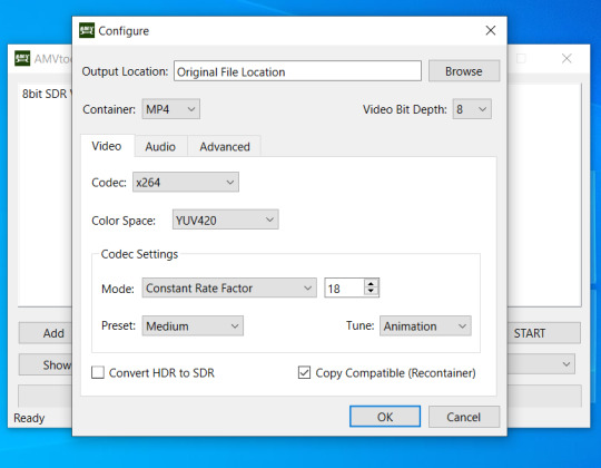
5. you'll want it to say 8bit sdr. for me, 10bit videos have never worked. idk i'm not a computer scientist. we're going to click on configure all now. (*note, you can do multiple .mkv files at once)

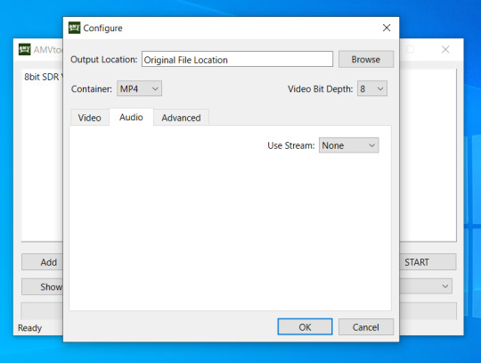
6. awesome, now you have this window. choose whatever output location you like. make sure you check copy compatible (recontainer). feel free to mess around with the other settings if you have the time. you can also convert video to .mov if you want. on the audio tab, i change use stream to none, as i don't actually watch what i'm giffing and find audio to take up needless space. click ok to save the settings and the window will close.
7. click start ! this usually takes a minute max for me, depending on how big my file is.
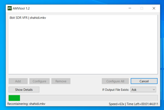
8. celebrate, because now it won't take ages to gif !

78 notes
·
View notes
Text
Roleplay 101 - An Indie RP Guide
I've been meaning to put together one of these for a while, but seeing roleplayers begin to migrate over from Twitter gave me the little push to finish. Roleplay 101 is my guide to getting started with indie roleplaying here on Tumblr, and covers pretty much everything -- Tumblr interface basics, blog setup and customization, finding partners, writing threads, cutting posts, standard etiquette, and more. It's split into multiple parts for ease of reading, and for easy updating as things on this site inevitably change.
If something in the guide isn't clear, or you think something should be added, feel free to send me an ask.
The guide can be found here!
184 notes
·
View notes
Text
PHOTOPEA TUTORIAL: RP ICONS/ICON BORDERS !
HOW I USE CLIPPING MASKS && RECTANGLE SELECT TO CREATE MY ICON BORDERS. this post will include framing the rp icon itself, the border around the icon && adding on optional block quotes—also, a bonus how-to for applying patterns to your block quotes and/or icon border; in case you're after some zesty editing !
pictured below is a simple, PRE-MADE icon that we will be attempting to recreate in this tutorial. all you need is a screencap && photopea ! as for the blockquote pattern, it is an optional design / example that i will provide later on in the tutorial ! this tutorial will involve rectangle select & clipping masks and i will cover how to do them both.

start a New Project, make sure the background is transparent. pick what size you'd like the overall border to be, not the icon itself.

you should start out with a transparent rectangle, as seen above. for this particular recreation, i've listed the width & height of my standard icon border sizes below. if you don't know, these sizes are determined by pixels.
W: 640 H: 107 i.e., W: 640 pixels H: 107 pixels.
next step: select Layer>New>Layer as seen highlighted below. this new layer is where your icon base will be/your clipping mask will go.

now that we've added a new layer for the icon base/mask to go, we're going to use rectangle select to set the size of our icon. right click where the yellow highlight(left bar) is pointing in the example below && drag your cursor to expand the "rectangle select" to whatever size icon you want. for this example(as seen below) i've chosen the size 80x80.

after you've set your desired icon size, you can now drag the selection(you should see a dotted border outlining your selection) to where you'd like your icon to be placed. i personally chose to place mine in the center—i did accidentally forget this step in the tutorial, so don't mind it if you see it move in the next two examples. though not an incredibly important detail, you can always move it after you fill it in !
once you have placed your base, select your brush tool && choose a color(highlighted in yellow, located on the left bar in the example below). you can use whatever color you'd like here, as long as it stands out to you—i usually choose red or green so that it can stand out from the background. once you've picked your color, you're going to color inside of the selection that you've made. don't be afraid to color outside of the lines...the brush will not exceed past what you've selected in advance with your rectangle tool !

once your base is colored in, you may now de-select your rectangle select tool(right click>deselect).
pictured below is an example of our current progress. as you can see i finally moved my icon to the center.

this colored shape will be your 'x marks the spot'—it is where your screencap(as a clipping mask) will be going once we finish the border of the icon.
speaking of which, now it's time to create our border ! add a new layer with the same process as before. Layer>New>Layer. name it whatever you'd like. i've simply labeled the new layer as "icon border" because it will be the layer the border goes on. make sure it is on a layer that is separate from the icon base.

in the "icon border" layer, repeat the rectangle select process outside of each side of your square/icon base. selecting one side at a time, be sure to fill it with the color of your desired border. i will be using a white border, which will be 3 pixels wide on each side. (example is of me expanding the select tool to the preferred pixel height/width outside of the base)

once you've finished creating a selection && filling each section, you can deselect && should be left with something like this:

this is optional, of course, but if you'd like you can also make an outer border/border edge. you can do this in a new layer or simply place it on the same layer as the white border. in the example icon at the top of the post, you can see that the icon i made has a gray outline outside of the white border. to do that, simply repeat the rectangle select option; and this time, only select 1 px width of space(or more, depending on how thick you want it/if your border is wider) on the outer edges of the white border. with you're new color(mine being gray as depicted) you can fill each of these edges. here's what we got going on so far !

now, to add your icon inside of the border! (it doesn't really matter if you do it before or after, just as long as you got your layers right!)

as you can see, i already added my icon to the base; you can do this before or after you've created your border && border edge. in the image above, the rectangle select you're seeing is an example of where the outer border/edge was filled in with gray. of course, to add your icon, file>open and place>choose your screencap. once your screencap is opened, right click it && once you're met with the drop down, left click the option that says "clipping mask." doing this will give you free reign to zoom in or out and move your icon around(to move it, edit>free transform && drag) all within the confines of the icon base you've created with your selection tool && brush.
our current result:

now... for optional blockquotes. make sure to start a new layer for your blockquote/s. once again, you're going to use the rectangle select tool; choose the width && height of your blockquote by dragging/expanding the tool with your cursor. i've made my blockquote 2 pixels wide because i prefer them thin—if you would choose wider blockquotes, just expand the selection.

once selected, fill that selection with the preferred color of your desired blockquotes. most people choose gray or colors relevant to their characters—i will be using red because i will be treating this as a clipping mask, so i can show you how to put a pattern into the blockquotes if you want something that stands out.

you can see ive put two blockquotes in place. you can choose to move them however you want them, or include both the blockquotes in one layer or seperate layers. i've personally separated mine for this example. (layers bq 1 + bq 2 on the side)
ADDING A PATTERN: do the same thing you did with your screencap...file>open and place>choose image. i will be using this abhorrent little pattern(free to use!) i created for the sake of this tutorial. and just like you did with placing your screencap, right click and select "clipping mask" on the dropdown. again, you can move it, zoom in and out however you please. just make sure the image is lined up with the blockquotes!

and here's what you should end up with, or something similar !

EXTRA / ADDING A PATTERN TO YOUR BORDER:
once you've gotten the hang of rectangle select/clipping masks, this part is self explanatory. basically, if you'd like to put a pattern inside your border (this will be the white border you created) you can repeat steps you took to add a pattern to your blockquote, this time placing your clipping mask over the layer with your border.

and that's pretty much the formula of all formulas for me personally—these tools come in hand for a lot of my editing !
#* MY TUTORIALS.#long post /#rp community#icon tutorial#rp icon tutorial#psd tutorial#roleplay help#roleplay resources#roleplay community#roleplay graphics#coloring psd#psds#icon psd#psd#roleplay psd#rp graphics#rp psd#rp resources#tutorial#editing tutorial#rpc tutorial#editing resources#psd coloring#icon border#icon border tutorial
272 notes
·
View notes
Note
Hello. I have a quick question and I hope that you can help me. I’m about to start making gif packs and I wanted to ask how do you put the source link in the post to link to the gif page? I’ve never done anything like gif packs before and would love all the help that I can get with them.
Please and thank you in advance!
Hi! The world of gif packs on Tumblr is not easy, so I totally understand! Welcome to the chaos! I've included a picture-heavy tutorial for this. It's under a cut because of that.
Get your text post set up as you normally would for to advertise you completed a gif pack. Everyone has a different format, but for the purpose of this tutorial, I'm not focusing on that. I'll just use a throwaway private post for this.

Once you get your post set-up, click the gear icon in the corner. That'll show you some advanced set-up.
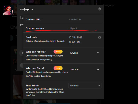
You're going to want to put the gif pack page link (or whatever you want to link - like I do my commissions info page sometimes or a redirect to a requesting resources or discord link) by putting it in the content source page. I usually add the "https://" before it just in case Tumblr wants to be wonky.
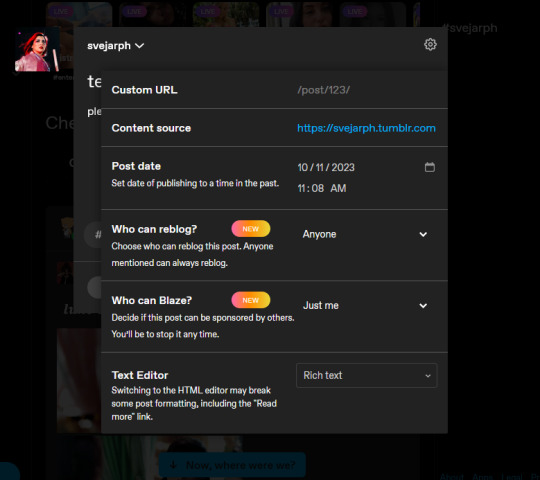
This is what it'll look like after you input something! Red means it isn't valid, and blue means it'll lead you somewhere when you click on the source link. I inputted a simple link, but you're going to need the entire URL in the space.
After this, you can click out of the advanced controls by clicking the gear icon again.
Like you would for any other post, post it!
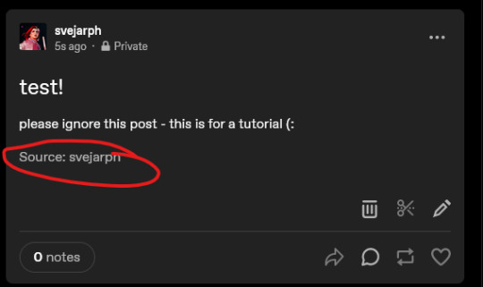
This should be your final product - a clickable link to the page you wanted people to go to!
Hopefully this helps. If you have any other questions, feel free to let me know! (:
23 notes
·
View notes
Note
hi dev! do you know of any good gif making tutorials for beginners?
Hi lovely sorry I'm so late getting to this. The one I learned from no longer exists but I would suggest taking a look at any of these. (I've linked the few I've reblogged and also @dear-indies tutorial tag where you can find tons of tutorials and hopefully find one you can follow! https://olivaraofrph.tumblr.com/post/673206801840390144/how-i-make-gifs-using-giphy-ezgif-tutorial https://nicolemaiines.tumblr.com/post/658075683609804800/how-to-make-gifs-via-ezgif-a-guide-by https://osvaldrps-archived.tumblr.com/post/651703649597308928/gif-making-for-lazy-ones-a-tutorial-by-osvaldrps https://dear-indies.tumblr.com/tagged/gif-tutorial Not what you asked for but hopefully also helpful! Please look around for sharpening/settings/etc you love. of course but here's some fave suggestions for you
27 notes
·
View notes
Text
COLORED TEXT MADE SUPER EASY

So, I promised a friend that I would make this tutorial. It shows you how to create colored custom text without having to keep going into HTML to do it. You will only need to do HTML a single time, and then after that, just going into your drafts and copying will give you the same effect! Like / Reblog / Comment if you find this helpful.

go to this website
write some words or even use the symbols you wish to use in your replies in certain colors. ● for example, ❝ ❞

Highlight the text

click what is circled in blue then pick your color

go to SOURCE and copy the html.

go to tumblr
click a new text post
click the little gear shift

go to the text editor section and select HTML editor
paste the HTML that you had copied from the roleplay formatted.
hit preview
save this to your dafts. Open your drafts back up

copy the text and move it to whatever response you are trying to use this color. You can then put your cursor at the end of the word. Hit the triangle keys on your keyboard that go left to right.

Once the word is highlighted like this you can then edit that section to say whatever you want it to say
go about your reply like normal!
Please be mindful that not everyone uses the same dashboard colors, and some can't read colored text. I use colored text minimally
34 notes
·
View notes
Note
This is probably so dumb and I'm sorry but how do you make your gifs? I use 4k Downloader to download videos then use clip champ to shorten the videos to 4 second clips then put the through ez gifs video to gif feature but it turns out so weird for me even when I download the video at high quality like I think 1080mps bit tje gifs always turn out weird on ez gif and photopea, I hope this was okay to ask I love your content
hi anon ! no question is dumb i asked myself the same things when i started making gifs.
that is an option, i know many friends that make their gifs on ezgifs, but i will suggest trying photoshop for that you can find amazing free versions on tumblr, you just have to look for them hehe
here you'll find a quick tutorial on how i make my gifs i hope it's helpful !
download the video using 4k downloader
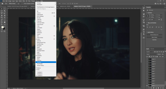
choose your video once you open photoshop. file > import > frames to layers

select the length of the gif (you will be able to trim it later so don't worry about it)
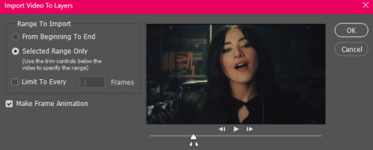
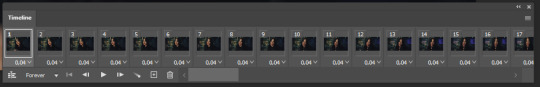
and then once once you have the video imported from frames to layers you'll open the timetable option to be able to trim your gif to the desiered length. i would suggest minimum 40 frames, maximum 120.
great ! now that you have your video trimmed we can start re-sizing it. for that, you'll go to the tool bar > crop tool and this is what you're going to see:
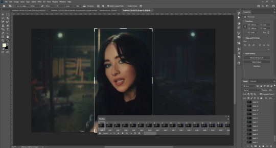

the key to a good gif i changing this commands you'll see here ! a gif icon should be 100x100 and a medium gif around 268x150. (obviously it's up to you !)
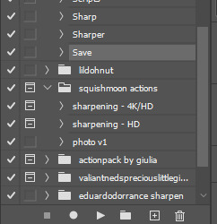
now you'll have your gif at the perfect size, it's time to apply some actions to sharpen it. play your action and you'll have your gif ready ! shoutout to all the creators you see listed here !
here you can add the psds and filters you want to make your gif look nice !
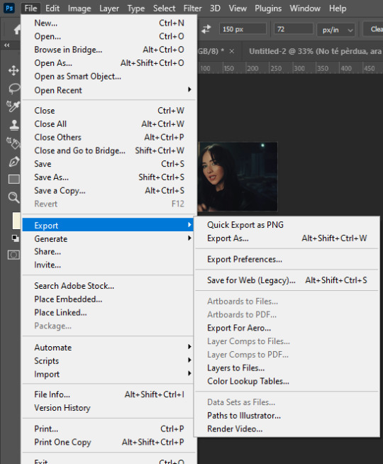
once your gif is sharpened and ready, you will have to save it ! for that, you'll have to go to file > export > save for web (legacy)
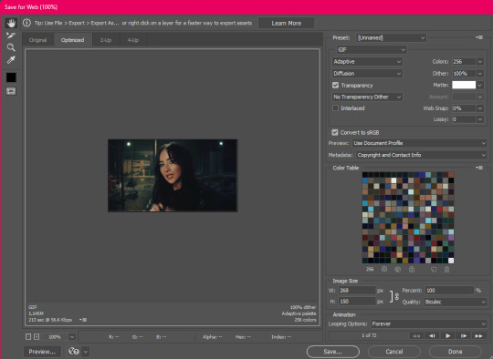
this window will open and you will have to set the different settings to get your gif ready. i use these :
you save it wherever you want and you'll have your gif ready !
30 notes
·
View notes
Note
Hi Cat! I was wondering if you had any recommendation for gif making tutorials? There's a plethora of faces I would absolutely love to use, but sadly they're often overlooked. I figured I might as well be part of the solution...! (or at least try terribly to be). Thanking you muchly.
usernare (google doc here! i don't see a source link so for ease)
pochunts
osvaldrps-archived
osvaldrps-archived
tinasresources
hqroleplaygifs
gwennifergifs
replaygifs - for gif icons but same idea.
Without photoshop:
noriseyebrow
nicolemaiines
lovelctters
benoitblanc
Hey anon! I have a general tag HERE but here are some tutorials for ease of access, feel free to drop tutorials in the comments everyone!
Also 👀 if anyone needs suggestions please check out my masterlist of people who are speaking up for Palestine or send me a message and I can list people from there!
7 notes
·
View notes
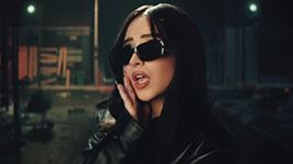
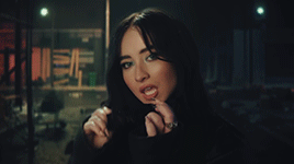
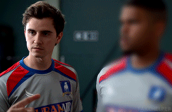
Photo
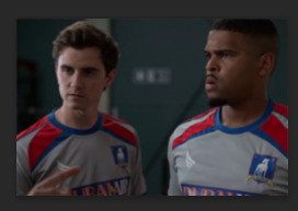
Why yes, yes I can.
Okay for this tutorial I’m going to be using @oliviaholt ‘s action that you can find here. It is truly a godsend.
Since the anon asked on how to blur, I’m going to assume you already know the basics of making a gif, right? Great! So I’ve already turned my frames into layers and I’m ready to sharpen using the action.
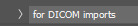
For this, I use the DICOM imports option, just select it and hit play.
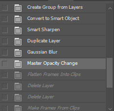
This will sharpen your gif as god (and oliviaholt) intended. Now here’s the petty part. You’re going to go into your history window (if it’s not already open, go to Window > History) and go back to the step that says Master Opacity Change.
This is the part of the sharpening action that duplicates the smart object that has been sharpened, then adds a gaussian blur and lowers the opacity to make it softer. If you don’t use an action (or use a different action) this is the step where we make our gif blurry on the person we don’t want to appear. So, duplicate the top layer (Group 1 Copy) and place it above.
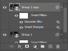

Set the layer at 100%

Now add a layer mask to the smart object (NOT the existing layer mask on the smart filters!!)
Erase the person that you want to be more visible (rip Kola I’m sorry) using the eraser tool on the layer mask using a soft brush.

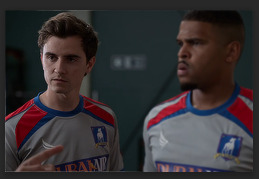

Use the video timeline to make sure that you erase more if the person moves around in the frame


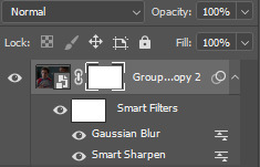
Now if you REALLY want that person blurred out, double click on the Gaussian Blur applied to this layer

And make the radius of the blur higher. You can make it as blurry as you want, but try to stick under 3.5


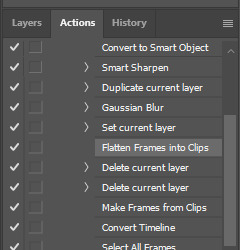
And now you have a blurred out gif! Almost. Now we need to finish the rest of the action. Open up your action panel and see where we left off. You’re going to want to click Flatten Frames into Clips and then hit play on the action.
If your timeline has a blank frame at the beginning or end, just delete it and save your gif as normal!
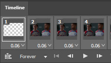
And there you go! A fully blurred out petty ass gif. (Again, I’m sorry Kola)
#gif tutorial#gif pack tutorial#blur tutorial#rpc#rph#mytutorial#fakecontent#special thank you to oliviaholt for the original action and for giving me the go ahead to post this!
54 notes
·
View notes