#ftr: i use blue as my outline
Text
some more francie doodles from my first day of work immersion lole

no colour version bc why not:
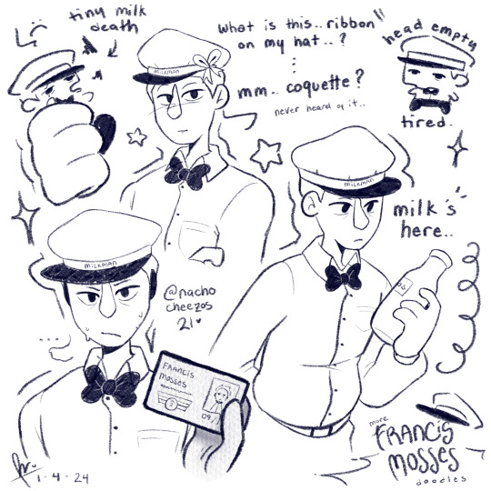
#my artcho#that's not my neighbor#francis mosses#francis mosses fanart#milkman#milkman fanart#procreate#art#artwork#artists on tumblr#my art#my artwork#doodle#digital doodle#doodles#ftr: i use blue as my outline
821 notes
·
View notes
Note
For the ask game gimme your top 3 US state license plates
Alright, so I'm going to work off of this list and dataset, with the following notes:
Sticking to ordinary plates - designs are fine, but to narrow this down, nothing you would need to pay an extra fee to access.
Maryland can fuck right off. 989? When even fucking Texas has less than half that number? You had that many special and unique plate designs that you couldn't help but list 989 of them? Fuck you, disqualified on principle.
The District of Columbia is also excluded since you said state, although ftr their best in my opinion is the standard "No Taxation Without Representation" default (points for including the slogan when they don't have official statehood)
So, in ascending order:
In third we have a design fairly typical of the standard across the industry, the California 'Sun' design (under the 'Passenger Vehicles' section, view the right on the top row). Not too much to say about this, because this shitpost has gone on way too long already and we have two more after this; but it's nice, it's understated, it looks kind of like thousands of other plate designs but with just enough pizazz to come off as moderately unique without leaning too far into it like that awful California cursive design 2 to the left. If you're looking for a plate with a white background, a tasteful decoration and some blue text, this is a fine example.
In second place, we have the Kentucky Standard Vehicle Plate. Again, not much to say about this because this is a ranking of license plate designs, but I'm a fan of the politely understated blue background fading into white as you go up, and the state outline to the left - almost a cloudy aesthetic, but without actually needing any clouds in the design. A little fancier than the California design featured, without becoming ostentatious.
Coming in the first, winner goes to the New Mexico Standard Centennial Plate, because just look at that thing. Wonderful color scheme, lively without looking cluttered or shoved together, the phrase 'Land of Enchantment' written at the bottom, which I like to imagine is pissing off Bob Iger somehow. Gorgeous.
3 notes
·
View notes
Last Seen Blogs

vibesforlee
it’s about the ✨vibes✨

poseysprostate
famous boy slime
suzdal
suzdal

izzarpoetry
IZZAR

bleuzaille15
bleuzaille 2 - bdsm et fétish divers.