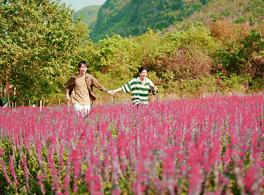
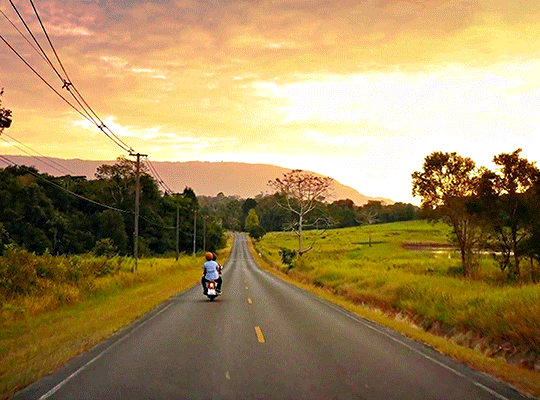
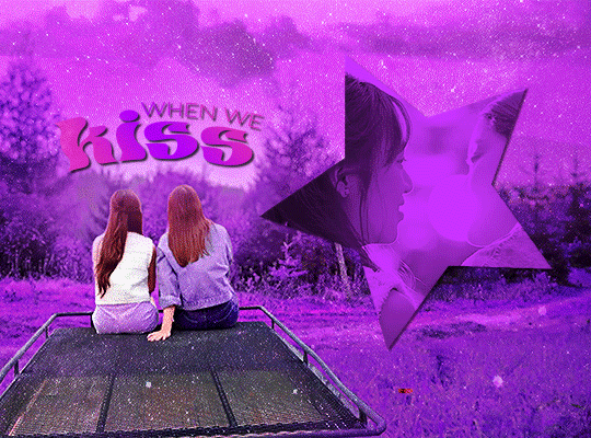
#gradient maps rule
Text
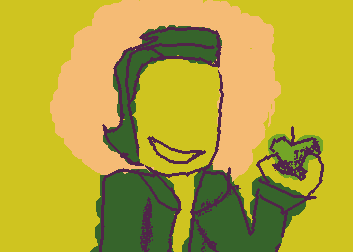
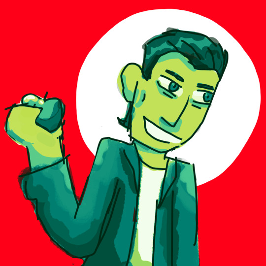
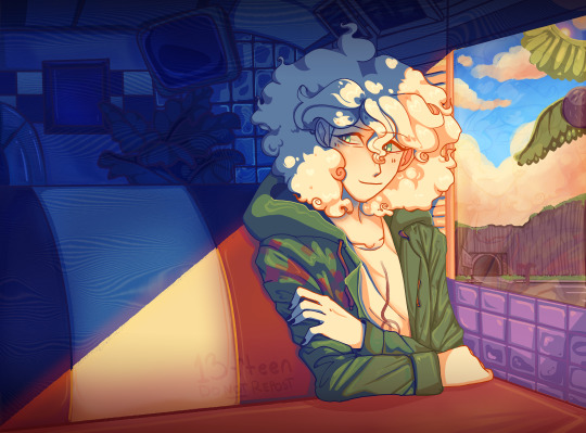
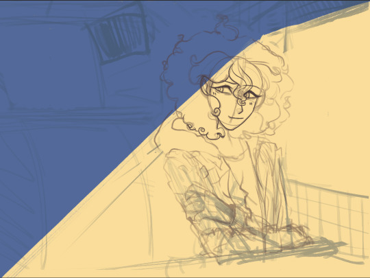
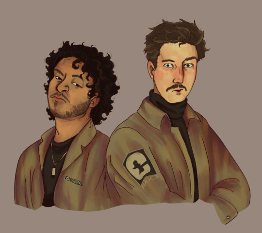
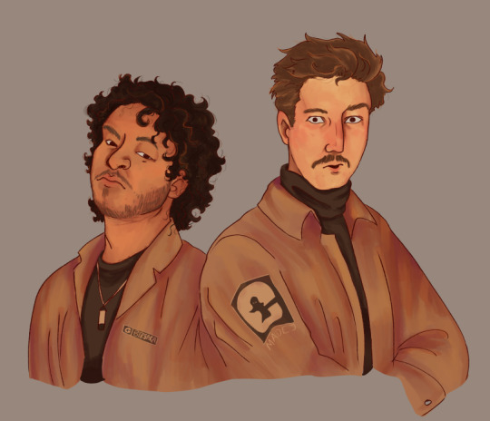
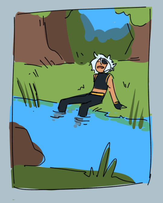
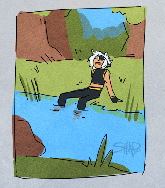
wilbur cross and wilbur cross but better qaulity and at an angle
#wilbur cross#hatchetfeild#gradient maps rule btw#first one was made in wiggly paint#haha “wiggly”#art
1 note
·
View note
Text
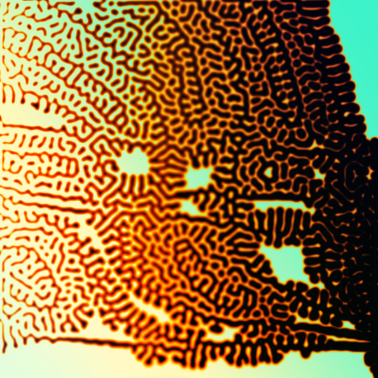
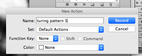
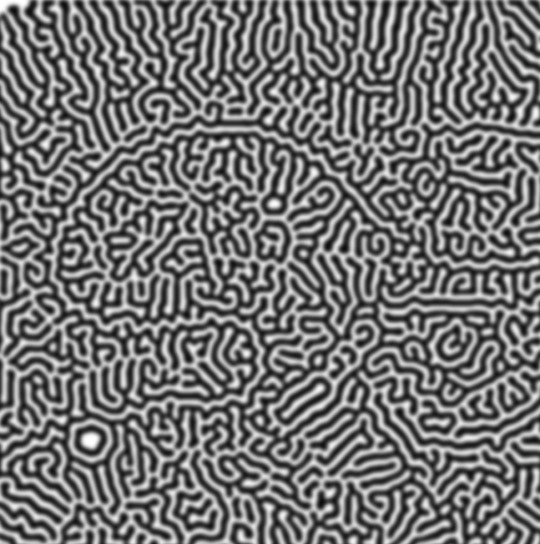
how to make cool blobby turing patterns in photoshop
i'll preface with i learned the basic loop from skimming a tutorial on youtube, but as someone who prefers written tutorials i'm sure many would appreciate one! also, the second part of this is some of the visual effects i figured out on my own using blending modes and stuff.
i'm using photoshop CS4 on a mac so some buttons and stuff might be in different places on windows and newer photoshop versions but all the actions are the same. my canvas is 1000x1000 pixels.
UPDATES (i'm hoping these'll show up whenever you open the readmore?)
it's possible to do something similar in krita using this plugin, made by the love @arcaedex
it's also possible to do this in photopea, a free browser alternative to photoshop! the results are pretty much identical.
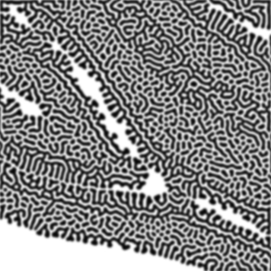
FIRST off you wanna get or make a black and white image of some kind. it has to be one layer. can be noise, a photo, a bunch of lines, whatever. here's mine, just some quick airbrush lines:

now find the actions tab. idk what it looks like in newer versions of photoshop but you probably won't need to dig!
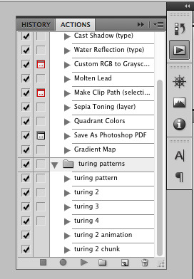
hit the little page thingy to make a new pattern. once you hit 'record', it'll record everything you do. the little square 'stop' icon will end it.
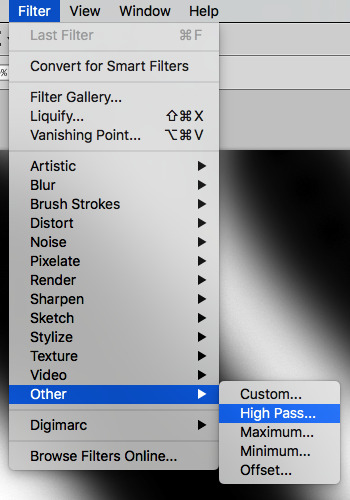
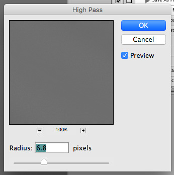
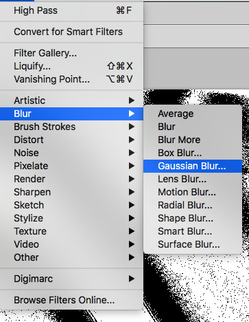
now you want to do a high pass filter. you can mess around with the radius to change the size of your squiggles, but the tutorial had it set to 6. experiment!
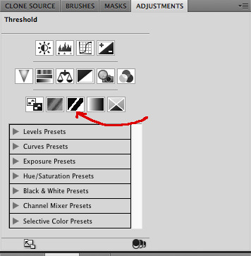
now add the 'threshold' adjustment layer. i use the adjustments tab but i think there's also a dropdown menu somewhere. keep it at the default, 128. merge it down. (control or command + E or you can right click it like some kind of weirdo)
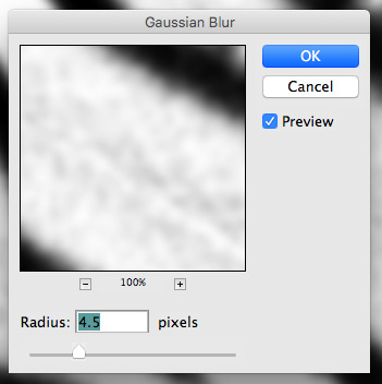
and finally, the gaussian blur! the radius of this affects the shape and size of your squiggles as well. i like to keep it around 4.5 but you can mess around with that too.
after that, hit 'stop' on the action you're recording, and then repeat it a bunch of times using the 'play' button, until you have something you like, like this:
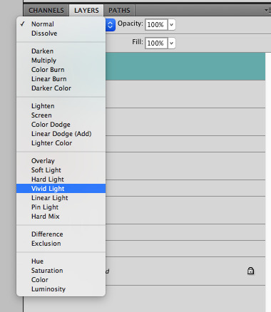
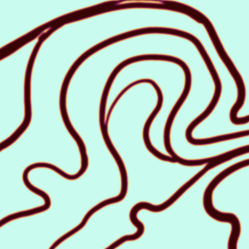
WOW!! that was fun!! and only a little tedious thanks to the power of macros. anyway, here's some fun layer blending stuff i like to do. it's with a different pattern cause i made this bit first.
anyway, using a black and white gradient (or a grey base that you do black and white airbrush on), make a layer with the vivid light. this will make the blobs look thicker or thinner.


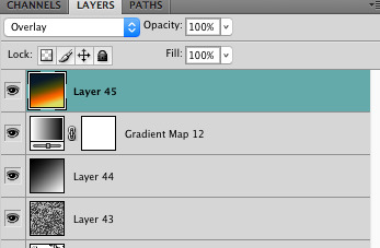
then, for cool colors, do a gradient map adjustment layer over that:

and finally, my best friend, the overlay layer. just using a gradient here bc i'm lazy, but feel free to experiment with brushes, colors, and blending modes!

NOW GO. MAKE COOL SHIT WITH THE POWER OF MATH. AND SEND IT TO ME
also these are not hard and fast rules PLEASE mess around with them to see what kind of weird shit you can make. here's a gif. as you can see i added some random airblush blobs in the middle of it, for fun.
924 notes
·
View notes
Text
Nagito Color Study | Please do not repost, reblogs are welcome though! Brushes & Techniques & a progress pic below the cut
Uhhhh okay, how to explain this one. I was rereading “Logically Lucky” by PinkSweetSmoke and some of the visuals in the earlier chapters really struck me. The way that they write this relationship is pretty dynamic, and I wanted to see if I could use colors to talk about how Hajime and Nagito feel for each other and what they’re going through emotionally? So this is fanart for that fic, directly inspired by that fic based on the established vista(s) and also the style of writing their relationship, but it doesn’t really make sense unless I say all of that lol? But it wouldn’t exist if not for that fic, so I’d feel weird not mentioning it.
Brushes used (Clip Studio, Free):
Main: “ラフペン” from gyuukotu’s “Fill Set (塗りセット)”, content ID 1695210
Fill: Default India Ink brush pen - the rough pen is a little unpredictable, so I used this to flat the image and make sure that there were no gaps
Cloud Flat: "荒筆" from gyuutoku's “Fill Set (塗りセット)”, content ID 1695210
Cloud Blender: I downloaded it from the internet instead of the app 2 years ago and cannot find, with certainty, where it came from, since I get rid of everything on my hard drive that's not art every year :( there are lots of good cloud blending brushes out there for free, though, and I typically use the gouache blender
Misc. Techniques:
Screen Distortion: I used CSP's free cloth texture clipped above the "blue" layers and then liquified it in places for the screen distortion effect
Gradient Mapping: I cannot overstate how helpful gradient maps were for minor color corrections, you guys PLEASE try them on a finished piece of your own if you haven't used them yet. Click Layers > New Correction Layer > Gradient Map and then choose from the premade gradients before adding your own so you can see how they worked. I used a few different ones clipped to specific areas w/ lowered opacity & hard/soft light settings where I felt like the color was falling flat and it was SO helpful at giving it just that little bit more depth.
Hearts: I've discovered that you can cheat at hair and clothing rendering by just making hearts. Try and see how many you can find lol
Color Theory in General: The whole point of this piece, after it stopped being fanart (lol rip), was to be a color study focusing on the contrast between shadow and light and what I could do within the blues & the yellows to make them appear as if they're actually different colors. In the blue section, everything is p much blue, nothing is any other color. In the sunny section, a lot of the stuff is warmer variations of the standard colors, since I wanted it to be more vibrant and didn't feel like I could achieve that if everything was shades of yellow and orange. That being said, I stuck as closely to that as possible. But ANYWAY, juxtaposing the two starkly different color profiles also helps the blues in the blue side read as colors that they aren't, which was part of why I did this study.
Sneaky sneaky: I just modified the diner a bit in order to get the colors I wanted, i.e closing the blinds bc I can. As an artist it's important to remember that YOU have full control over every single part of the piece, you just should ideally have a reason to create inaccuracies/ break rules or else it can end up being a bit messy and disorganized & details/ your vision can get lost.
Aaaand finally, the sketch from TWO AND A HALF MONTHS AGO:
#trusttheprocess 😭😭😭
#nagito komaeda#sdr2#color study#super danganronpa 2#nagito fanart#my art#october 2023#jesus I started in july#but I also like let it sit for a good 2 months after the mockup#so shhhh#fav#komaeda nagito#character study#fanart
69 notes
·
View notes
Note
hi hi! first off thank you so much for always serving looks. your art is phenomenal and your style feels like it belongs on the walls of a luxury fashion HQ.
stunning stunning stunning
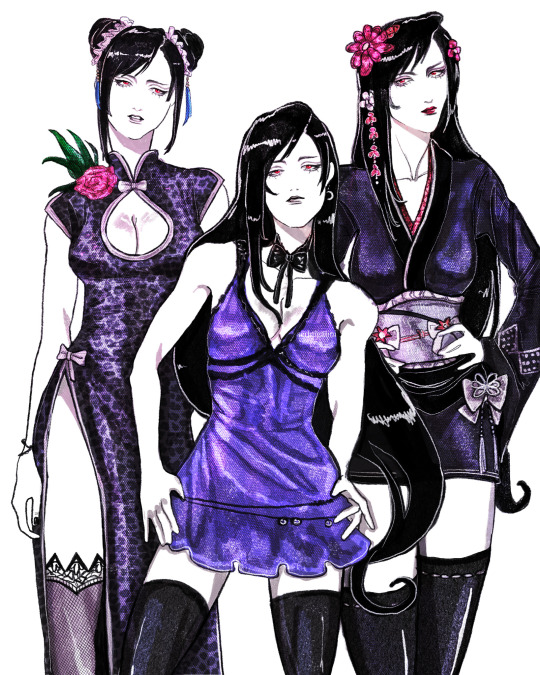
i was wondering if you ever get the time, would you mind (please) showing us any tips on how to achieve that rich variety of textures you have on so many of your fits? the one you did recently of the three Tifa fits, for example, has so many different textures represented. I wouldn't even know where to begin achieving that!
no pressure of course! if it's a trade secret then please do keep it. I'm just so impressed and curious and had to speak up
thanks so much, keep up the beautiful work x
Hello!
First off, thank you so much for your wonderful words! Working in the fashion industry is my dream so this means a whole lot to me.
I can totally share! I'll try my best to explain my process because it varies quite often, especially now that I switched from Photoshop and Procreate, but if I were to give my step by step, it's this:
sketch> lineart> color> shade> paint over> texture/grain/sharpen/contrast
The unique coloring I had a few drawings back came from working with an Adjustment Layer with a Gradient Map on Photoshop. But now since I use Procreate, my main trick is making the colors much darker than I want initially, and then putting a bunch of highlights with a Color Dodge layer with a textured brush.
Now, my main thing is that I never use blending brushes and my brushes (outside of color blocking) are always textured. Charcoal, pencil, grainy, grungy etc, that is what you're looking for. If you need something slightly softer, watercolor brushes that mimic real ones are ones I use as well, just not as often as the others.
My latest Tifa piece uses all official Procreate brushes that come with the app. The Rosette brush, which is under the Textures brush folder, and the Flicks brush under the Spraypaints folder. (Also Derwent, 6B pencil and Gloaming for sketching and lineart)
General rule of thumb with shine is that it can only get so light, so make sure your base is on the darker side.
Here is my effects folder. That's where I add highlights, mood and texture. I've also been enjoying the noise and sharpen feature on Procreate, and I apply them all on a grey overlay layer on top of all of my art. Also a bunch of color burn and overlay layers.
For reference, here is the art without the effect folder compared to the final art.

Hope this helps! ❤
23 notes
·
View notes
Text
beloveds @khaotunq, @pranink & @alexshenry tagged me to do:
every month of 2023! list your favorite/most popular gifset for each month.
i started making gifs in march this year, so january/february are off the table for this. it's funny that it hasn't even been a full year yet. it seems both somehow a lot longer and also like i remain some kind of photoshop baby at the same time. the images in this post will remain undescribed until i have some energy in my failing body, unfortunately
in any case:
march: midnight museum invades all 2 of my braincells. i download photoshop. the end is nigh
most popular: msp/eclipse pool parallel set
favorite: the bams i made for sof
(notes: it's hard to look back at these lmao. what is coloring and why don't i know her. why is everything so dark. who told me to use noise dithering and why did i ever think that was a good idea. anyway)
april: the eighth sense is airing! i meet many mutuals and friends. i figure out about the curves tool (thank god)
most popular: taehyung getting dunked on
(very deserved dunk; very bad set. the coloring of this scene was extremely questionable and i did nothing to fix it it looks so dull and gray. augh)
favorite: feet lining up / jihyun & jaewon on the beach

i really like this coloring actually. it's bright enough to actually see them, their skin doesn't look as weird, and i like the soft pink i made the beach. a win for baby photoshop user rowan
may: the purple is in full swing now
most popular: purple yok

first set to cross 1k! the purple is still very good but in hindsight there are things i now know i couldve done to help his skin. in any case. a banger. beloved
favorite: pink our skyy 2 hands set
[through tears] you're my space. also my first try at typography
june: i lose the will to gif some in the back half of this month, but i also learn to do a Lot of new things, like gradient maps & more complicated typography and transitions and such
most popular: puzzle piece hugs!
deserved! hard to gif and fun to look at
favorite: i think it might be the heartliming i made for vi now! but i still like khathadome from eden too.
july: i try giffing a few different shows. the only friends trailer comes out on the last day and i enter some kind of terrifying fugue state
most popular: sand and ray fighting / crying in the ofts trailer
do you guys remember the trailer 1080p? life was so good
favorite: nobody appreciates my ride enough
august: only friends airs, eclipse anniversary is concurrent, i lose my mind. i also learn to use the method of brightening that i still use & several other fundamental gif tricks
most popular: sandray car makeout

good for them! i start using significant grain on my ofts gifs from here on out and can never decide how i feel about that
favorite: orange/blue eclipse episode seven set

september: the madness continues
most popular: sand cooking for ray / special
ive giffed this scene three times and this is my least favorite coloring but what can you do. this is my third post to cross 1k
favorite: new rules set! i had mixed feelings when i posted it but it's really grown on me.
october: the madness is so much worse. only friends ends and i am left near-catatonic immediately, apparently. also, i learn to blend and use overlays and some other cool things. i join userdramas :'>
most popular: raysand afterglow. as it should be. cheek kissie
favorite: space girl!! show me the stars!!!
loved making this. purple and sparkly and gay. still super proud. that said other runner-up favorites in october are ray's o-face & the boyfriend shirt & akkaye's thumb thing collection
november: i am left cavernously empty after ofts ends and i fill the void with namtan
most popular: last twilight episode one porjai
she <3
favorite: gaipa userdramas set
again, i learned to use musescore for this set just so i could have those pretty notes. :')
december: i am punched in the face by seasonal depression. all is not well. i made just one gifset this month, but at least it was good? :')
and here we are today !! it was very fun to look over everything; thanks so much for playing and have a happy new year everyone
21 notes
·
View notes
Text
Dynamical Systems
When we talk about dynamical systems, we broadly refer to the way a particular system evolves under certain conditions. For example, if you have a particle and you give it some terrain to roll around on, what path will it follow? If you have an electron and subject it to a magnetic field, what trajectory would it follow? Or if you impart forces on a block of water, how would the shape of the boundary change?
These are all types of questions that can be answered by dynamical systems, and involve a significant depth of analysis to truly understand their mechanics. (But truthfully, I've only ever been in it for the pictures).
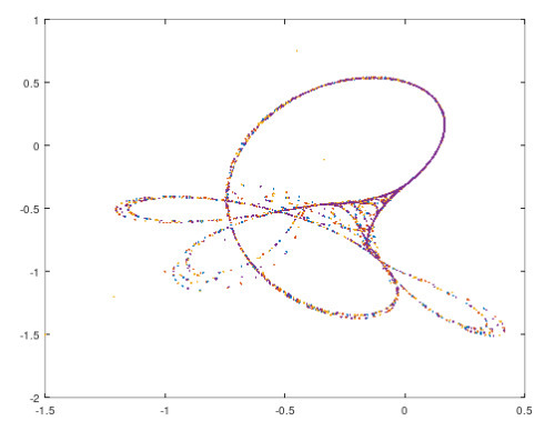
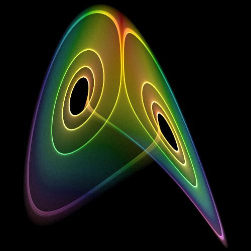
The Tinkerbell map The Lorenz Attractor
As usual, if anyone has any feedback or errata to point out, please do shoot me a message :). I'm still getting back into the groove of things with this so I might be missing out on stuff.
Some basic definitions
We have 2 different types of trajectories, discrete and continuous.
discrete time dynamics - this means that you have observations at discrete points in time. You take a snapshot at t=1, t=2, etc. Take the Tinkerbell map above for example. You start with a point, then apply some sort of rule, and you end up at the next point. Things happen in steps.
continuous time dynamics - this means that at each point, you prescribe a velocity (a speed and direction) in which a particle should move. So if a particle is located at (0,0) for example, in an arbitrarily short period of time, it would move in a particular direction. A good example of this is the Lorenz map, as shown in the right hand image.

The Tinkerbell Map - equations of motion

The Lorenz Map - equations of motion
NOTE: In the first case, we talk about where the next point explicitly, whereas in the second case, we talk about in how fast in a particular direction we will end up moving.
A brief discussion on derivatives
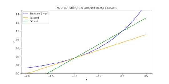
Here's a visual to explain - suppose that the blue line represents how far away you are from some particular location. The average velocity would be the slope of the green line. But the instantaneous velocity would be equal to the the slope of the yellow line.
The way we denote this derivative is as follows

The numerator describes the change in the y-values, the denominator describes the change in the x-values, and the ratio of this is the gradient (or the slope).
So in a nutshell, the average velocity represents a change in distance over a period of time, and instantaneous velocity represents a change in distance of an arbitrarily short period of time.
Where to from here?
From here, we'll introduce some broad notation around maps, orbits, and some terminology that underpin dynamical systems. If there's enough time, I'll also describe some other concepts regarding different types of orbits, and thereafter we'll get into some really cool stuff.
Anyway, that's it for now! Adios :)
19 notes
·
View notes
Note
your colors are all so warm, i love it! how do you do it? everytime i try to get warm colors, they turn out weird or not very saturated ;((
I always have several color combinations in my head, but I can give some advice that I adhere to
⭐️ If it’s difficult with a color palette, find ready-made ones (I really like coolors.co )
⭐️ In my art I use a limited number of colors (each color from the picture must be used more than once) (unfortunately it doesn't always work, but in most cases I follow this rule)
⭐️ If you still don't like it use a warm filter :D or if you work in procreate make a fill over your art and then use the "multiply" mode
⭐️ Umm.. ✨gradient maps✨


orig final
195 notes
·
View notes
Note
Do you have any coloring tips? I'm trying to get better at coloring but it's hard :/ everything looks so out of place and I lose motivation fast
Of course!
By no means am I an expert on this (I still forget to choose a light source 90% of the time) but here's a few things that I do when I'm colouring something digitally. Remember these are all individual to the way I make art so they may not all be applicable to yours and are simply me explaining how I do colours, not a tutorial for all colouring styles.
Buckle up folks, this one's a long one (sorry in advance!!)
Here goes nothing.
Losing motivation is totally normal and okay, take a break if you need it, maybe send it to some friends for some hyping up (art servers full of other artists are great for this!). Colours ain't gonna look perfect first time you try to do them, I never put down a colour that I like first time, it takes some messing around and asking friends for me to get them down.
So don't feel pressured to get them perfect in the beginning, that rarely happens!
Here's a mini explanation of how I do my colours, hope it will help a little :)
1) GET THOSE BASE COLOURS IN!!
It doesn't matter if they're not exactly what you're going for rn, go with roughly the colour you want and start there! Personally, I do big blotches of colour just to get something down on the page as this helps me want to actually finish it. Then you clean up those edges so they're all in their correct spaces.
I've found that working on a neutral mid-tine grey background helps you see the colours best at the start so all of my 'paper' starts off grey when working digitally.
Here's the example I'm going to be using (this is from the ghost files fanart I'm working on)

2) ADJUST THOSE COLOURS!!
So, now you've got those colours down, you can adjust them to be roughly how you want them to look. If you're unsure on what colours look best together, you can either take some time out, find some YouTube channels and learn a little about colour theory... OR you could grab some colour pallettes from online and have a play around with gradient maps or simply placing the colours in yourself. There's no shame in using resources like those, that's literally what they're there for.
I didn't need to do this on this drawing as I was happy with the colour selection. This is because I chose the background colour and simply adjusted the hue and saturation slightly until I got the colours I wanted. This is my general technique for choosing colours as my work tends to be fairly similarly coloured (browns, oranges, reds, yellows with hints of purple)
3) ✨SHADING✨
Right, well done! You've got your base colours in.
...but oh god, what now?? They look so flat and lifeless, what shall you do?!
This, my friend, is where shading comes in. It's both a way of telling the viewers where the light and shadows are, can change the mood of the drawing, can change what we feel about a character or it can just look real pretty but shading and lighting does all sorts of fun things to a drawing.
If your style is more simple and doesn't require shading/has minimal shading: apply this tip to any shading you do have and don't forget the importance of rim lighting in simpler styles.
For shading both skin and clothes, I use the original colour, shift it down into a darker shade and on the colour wheel I shift it down too (eg. shading green with blue, red with purple) sometimes you can shift that even further to create similar shading to the one above, where I shaded orange/brown with pinks/purple's.
The principle is the same with highlights but like,,, opposite. Shift everything up, shade browns with yellows, blues with greens, etc.
SIDENOTE ON HOW I COLOUR SKIN:
Okay so, these next two paragraphs are based entirely from what I've learnt during studies and aren't rules, just simply how I do it.
For lighter skin tones, I tend to start from one of the lightest colours and shade darker, like you would if you were working with something like watercolours. This allows you to build up shadows in areas of darkness. Once you've done the shadows, you can then go in and add highlights and lighter sections where necessary.
For darker skin tones, I tend to start at one of the darkest values, as dark skin tends to reflect light differently to light skin. Then I add lighter shades in sections that the light would reflect. You can add shadows too, I tend to add them if the drawing still feels flat after doing the highlights.
3) OVERLAY + MULTIPLY LAYERS ARE YOUR BEST FRIEND
These things are literally lifesavers for me, I love an overlay layer.
I can't really explain what they actually do so I'm not even gonna try, just play around with them. But using a purple/blue multiply layer and erasing where the light hits, that makes the illusion of full shading without the same effort of painting in the shades.
Overlay layers are 100% a 'fuck around and find out' resource, I tend to use red and pink overlay layers as my colours tend to be more desaturated and this helps with brightening them up. However they can also be used to change the genre/mood of the drawing, like this:
These two drawings are the exact same. There's no difference between them other than an overlay gradient map layer in green or sepia. (These gradient maps are built into clip studio paint, I'm not sure about other programs)
But the whole vibe is completely different. So yeah, fuck around with different colour schemes and overlay layers (the bi flag colours are a great choice for experimenting with overlays as the colours are naturally very harmonious so maybe start there.)
You can also try a noise later for a bit of texture, it's my go-to fix it for any drawing ngl
Uhhhhh, yeah. That was lengthier than I expected, hope it helps even in the slightest. As I said at the top, I am by no means an expert and am still figuring things out myself, so just fuck around and find out.
Bye now!
#artists on tumblr#art#artwork#digital artist#fanart#ghost files#art tutorial#colouring#art tips#deathian answers#digital painting#digital art#colour tutorial
21 notes
·
View notes
Note
your colors are alwasy SO GOOD.... do u have any advice for how u pick them
thank you! for advice, i have a few tips:
the first is to always keep in mind what color palette you are using. as you become more experienced this will likely become something you do subconsciously, but when i was starting out with drawing i would usually deliberately choose a color palette and reference that while coloring in my drawing.
i'll go into some basic color theory (ha ha) but feel free to skip this if you're already familiar with it.
there are many different types of palettes to choose from, but the most common ones are:
monochromatic
analogous
complementary
split complementary
triadic
square
tetradic
for example, the drawing i just posted follows a split complementary palette (which is favorite scheme btw)
i can explain this more in-depth if anyone want me to but for the sake of brevity i'll leave it at that. the only other thing that i think is important to note if you're following a color palette is that it's important to balance out the values of the colors that you are using (how light and dark they are) as well as use it as a guide but you don't have to strictly adhere to your pallete 100% if the time within your piece. for example, the my drawing uses MAINLY blue, green, and red-orange, but there is also some orange, yellow-orange, yellow-green, blue-green etc. in there as well
my second tip is to experiment! i hear the phrase "learn the rules before you break them" a lot when people are giving advice to beginner artists, which i don't always agree with because i think experimenting and finding out what you like and what you think works is very valuable (especially when you are drawing for fun and not professionally!) have fun with it, do the opposite of what people tell you to do just to see how it looks, etc. i remember getting the advice to always shade warm tones with a warmer tone and cool tones with a cooler tone (this is only a rule of thumb btw) and one day i started doing the opposite and found that it can look cool in certain circumstances
my third tip is to use references! i joke a lot about colorpicking from the most random images but i think that looking at other images and asking yourself "how is the artist/photographer using the colors to make it look this way? how do i recreate that?" and using that as a way to study their use of colors can be really helpful. i you find a drawing that has cool colors, try using those colors in your own drawings and see how they look!
the fourth tip is to play around with contrast. some drawings will look better with LOTS of contrast (where the darkest points are black and the brightest points are white), while others will look better with low contrast. stylistically, i prefer using low contrast. going back to the drawing above, there is no true #000000 or #ffffff used anywhere (except the white outline). i find that in certain situations this can help colors stand out. but like i said, it's more of a personal preference
the fifth tip is more for digital art, but it's to play around with blending layers, adjustment layers, and gradient maps if you don't like your colors but have no idea how to fix it. some programs don't have this feature but using blending layers/adjustment layers/gradient maps is sort of like using a filter to change the hue/value/saturation of your art in different ways
hope that helps! if there's anything i need to explain further please lmk!
40 notes
·
View notes
Note
Hi!! I’ve always absolutely adored your art, especially your use of colors, the general warm feeling all of your paintings have, and I was wondering how you picked your colors or if you had any tips on color usage?? *\(^o^)/*
If not that’s totally okay!! I mainly just wanted to say that I do really love seeing your art always, the way you draw has such a unique and nostalgic feeling to it.. it’s all so pretty!! ♡
thank you for the ask! TwT i don't think i'm the most qualified to give advice on this (<- colour theory knowledge still at a elementary level) but i will try to share what i know o7 just take it with a grain of salt~
to be honest, when i first started digital art i just colour picked from my favourite artists and built my own palette from there. it helped me a TON because once you experiment around and decide which colours you prefer to emphasis versus which ones you don't, it's a lot easier to find your own "style" than trying to understand all of colour theory from square one.
example from 2015:

nowadays though, i just use gradient maps and selective colour in PS a lot LOL

it's a very useful tool that lets me adjust the tones/mood of my piece! as you can see, my colours usually end up more cool/desaturated than i want so it's a super easy way to tweak them (takes me like two minutes) - and it's all thanks to computer magic ✨
the last tip i can think of is make sure your line art matches your colour style. for example, if you apply watercolours to thick, bold lines, it might make it look muddier than if you were to add to thinner, pencil-like lines. i'm sure all rules can be broken at some point but in general, if you try to study another artist's technique 1:1 and it still doesn't look the same, it's probably because of your lines.
and that's about it! i hope i was able to help you even a little. thank you again for being so kind <3 i still have a lot to learn myself!
8 notes
·
View notes
Note
HOW DO GOU EVEN MAKE YOUR ART LOOK LIKE SOFT COOKIES WITH LOTS OF CHOCOLATE CHIPS,,,, HOW??????¿??
(btw i left yir server becuaz i realized your server waz 16+,, but il be bac on my birthday!!! im turning 16 on january 19!!!((
(ty for respecting the rules and my boundaries! i generally keep all my socials 16+ for my own comfort and im glad you can understand <3)
but awa nonetheless thankyou for the compliments! for anyone curious about how i create the soft look in my art i think theres a few things that contribute to it;
- i rarely use fully opaque lineart, i draw all my lines using a transparency/pressue brush and i often use a thicker linestyle than others too, i think this helps lend itself to line weight and depth but also helps accentuate softer areas where the lines are really light and round!
- i use a soft-edged brush for shading, i turn the hardness down to pretty much 0% and paint soft shapes and gradients to map out the general lighting with blend modes
- i ALSO use a soft-edged brush for rendering-- after laying out the lights and darks i go in with a smaller but still soft brush to add details on a sepearate layer above the lineart, this can often result in me sometimes overlapping the lines a little and creating that fluffy look!
i think these things are maybe subtle but they help a lot to generally reduce hard edges in the piece and reduce line intensity- lineart is of course important to a piece but i dont treat it as the focus, its more of a guide to the edges and shadows more than anything, if that makes sense :3
#zilluask#art tips#maybe?#soft art#how to#art advice#im not sure how much this qualifies as advice but its an insight into my process atleast!!#if people are interested id be happy to do more in depth guides with visuals and stuff :3
16 notes
·
View notes
Note
woah your colors are very good- is there a process to them? they look so nice
Wah, thank you!!
For coloring, I generally think it's a little bit of having an eye for color -- i look at a lot of other artists' pieces and try to remember things they do that i like with color! And some of it is going to school for animation, where im trying to make things simple and cohesive.
My go-to is
pick colors for whatever I'm doing. This is sort of just...based on intuition. But two things i make sure to do(or try to) is if its a character, I try to limit them to 2 "main" colors and an accent, if needed. I try not to exceed that, personally, because with my art it tends to get too busy looking? But its not a hard rule for sure -- This little guy is blue and gold. The hair is a really light blue, and then the dark blue clothes, and some gold accenting to break things up.
Backgrounds i tend to just pick what feels right. But this background has blue, so I make sure its the same type of blue that is on the character.
Then, I have a set of layers that I overlay ontop. I have this saved as a material template in Clip paint and I just drag-drop. This is where all my color correcting happens, tbh.

adjust the brightness and contrast, if needed.
adjust the hue and saturation. I tend to make the picture a little warmer hue, and boost the saturation
I have two textures i overlay, and adjust he opacity per image. One is a paper texture, and the other one despite being named paper still, is jus a static noise texture.
a gradient i adjust colors on per image, but warmbright-to-cooldark is generally my rule of thumb
Then I'll add some glow from the lightsource as a glow or overlay layer, too. this is normally just a gradient and erasing bits
here that is with just it popped on, and then with my adjustments
Next I'll normally add a gradient map, and adjust the color balance to make sure everything looks kind of unified. Sometimes i do this and then delete both of them because i liked it before LOL. But this really helps give a mood, too.
I also change the lineart color. If I'm being lazy, I just make it all one dark, saturated color (in this case a dark saturated red) Now it looks like its hot a summery! Vs how cool coded the original picture colors were!

Thats my like....quick and dirty. Theres a lot of good tutorials on how to actually colorpick initially and everything, but tbh I dont really think about it a ton and I think a lot of it comes from having a large mental color library 😅
13 notes
·
View notes
Photo

✦ TURN ON/OFF THE NEWS ✦ character psd #14 by fakehelper
This PSD was created for @rey1x1 for the RPH Server Gift Exchange!! I hope this fits the bill for something a little scifi that can be used for both a character graphic or a promo! This is your first gift, and I hope you find it easy to use! If you have any questions, please let me know!
FEATURES:
FC Image is 362x180
Fonts used: Lato, Galactico, and Silkscreen
Symbols were created using Galactico font.
All Text is editable.
Coloring PSD used for the preview is just a simple gradient map, but has a layer mask to easily add in your own coloring.
Download this PSD here.
RULES:
Please like or reblog this post before downloading.
Do not claim as your own. Do NOT use parts of my PSD for your own.
If used within the RP community, credit on your page is not required, but appreciated.
If used outside of the RP community, credit is required.
If asked where you got the PSD, please refer them to this post.
#rphservergifts#cpsd#rph#character graphic psd#promo psd#idk i havent made one of these in a while idk the tags anymore lmao#psd: character#fakepsd#hope you like it riley!!!#fakecontent
65 notes
·
View notes
Note
Demon Realm Worldbuilding Lore! Pt. 1
I decided that the Indura need a natural predator.
Indura and like creatures eat demons, right? Therefore the Captial of the Demon Realm obviously has to be situated in one of the "safer" places in terms of local wildlife. I'm going to go with the interpretation that most of demon civilization is situated in the kind of "wasteland" biome we see in "Cursed By Light" because everything "beautiful" in the demon realm is, well, dangerous.
So, the demon capital is built a reasonable distance away from a biome affectionately nicknamed "the Fog" where the native plants are carnivorous and give off neurotoxins which when combined with the demon realm's miasma can induce hallucination. If you've seen my other Tumblr ramblings you know I'm obsessed with the idea of plants in fantasy settings and that maybe a land with no sun (7rats put several suns in the demon realm but apparently that's not canon??) is instead lit by its plants as a kind of uno reverse. Well, the carnivorous plants don't glow, don't want to attract attention, the whole point of the fog is that creatures don't notice them and are tricked into thinking this is a very pleasant place to spend time.
Here's the kicker though: the DK is a deadbeat god as we've established so I'm thinking he didn't bother much with the biomes and such of the demon realm, and thus they were left to be groomed and nourished by his subjects and other wild creatures, "Run wild" so to speak.
(This is a parallel to the biomes of the Celestial Realm which were carefully made and sculpted like a bonsai tree. A tidbit of Celestrial Realm Lore I have while I'm on the topic is that it has a natural color scheme of blue and orange (or gold depending how you interpret it), like Elizabeth's eyes. The natural colors of many native plants / animals match these, and unlike the demon realm everything seems to flow together visually, like one of those soft gradients. White is a prominent color for buildings and the such since it signifies something handcrafted / precious / irreplaceable (in an emotional sense) / holy to the goddesses. Sort of like their feathers.)
So, the Fog isn't a permanent fixture that's been there from the beginning like the mountains. They're just the centuries-old gardens of the creature using them as a nesting ground, and if you were to map them out from above, they're laid out in ancient geometric patterns. Some rare creatures live in spaces inside where there is no fog, where their populations are equally protected and threatened by the rest of the garden. "The glow of the normal plants/ trees will lead you to a safe space" basically. Though following the creatures will also do that . . . if they respect you.
In the demon language, the name of the creature translates to "The Synthetics".
A good reference to the nature of their garden natural habitat. Plus, their breath attack is the same hallucinatory mist from the fog. They learned this from the plants. It's possible certain groups have other skills inspired by them as well. As a rule, (smart) demons don't fight synthetics, so they're not exactly certain of that.
Appearance and mannerisms: They're much, much smaller than the indura, and have hawklike and antlike qualities. Dragonlike features with two sets of wings, six eyes, and three rows of teeth. They are very social creatures with varied hunting strategies depending on the location of their "garden" and specialization within their pack. In addition to the breath attack, they are armed with retractable stingers in their talons. Paralyzing toxins sounds most realistic to me - that seems like how you would beat a creature like an indura when you have agility and intelligence to work with instead of brute force.
Basically, these are the most dangerous creatures that WON'T eat demons. They regard demons how humans regard cats and are very aware that they live nearby.
In fact, a synthetic's first solo flight is usually to the Demon Capital. It's technically part of their nesting grounds and full of colorful friends that will watch over their young and let them eat out of their hands. A few every couple of decades go to live in the demon captial due to injury, illness, or serious deformity, since it is a much more suitable place for them to flourish. They wander the streets and are particularly drawn to the nurseries and the castle, where they go every morning to bring things to the castle staff in exchange for treats. They fly into the upper section of the castle through his firstborn son's window. The Captial is also a great vacation spot in the summer, or if the indura are tired of being picked off one by one and want to try another full-force attack. Much to the dismay of the DK, no one will chase them away from the capital permanently. They interfered in the soldiers' training sessions by trying to "play" with them again? "No big deal." Even Meliodas the Destroyer, who's technically powerful enough, will laugh if you ask him to do something about the synthetics. Though . . . maybe that's because he has a soft spot for animals. "Remember, don't repeat that. Don't want his father finding out."
Oh, one more thing. Synthetics are silent hunters. Meliodas had his soldiers learn stealth from them. So if one goes meep meep at you or whatever - it's not their natural sound. It's mimicking something. Probably one of its favorite carnivorous plants.
That's it for this species for now! I really like them. If you have anything you'd like to add on, go right ahead :D
I was thinking shimmering purple color like the miasma for their appearance, but I'm not sure.
(I also have this little scene in my head of Meliodas giving one of the deformed babies little glass eyes he picked up from the market. Then the synthetic goes “thank you!!” bc “speaking demon language isn't as hard as understanding and reproducing plant chemicals tbh”)
AHHH THIS IS SO AMAZING!! I LOVE DEMON LORE XD
You know what, based on the few scenes and flashbacks we have gotten that takes place in the Demon Realm I can totally see the demons living in the wastelands part of the realm. And honestly, I kinda really love the whole "everything beautiful is dangerous" concept for it. Plus, it makes the world feels so massive. To humans and the other races the demons are like The monsters, the worst thing, but then there's creatures like the Indura and Behemoth that poses threats even to demons, and, I don't know, it kinda "humanizes" the demons to me. They're not these monsters, they're "just" demons. Also, it also shows how the demons in the Demon Realm are like humans on Earth: they might rule the realm but it doesn't mean there aren't other creatures that can kill them.
OOH!! The Fog sounds so interesting! And beautiful. And terrifying. The idea of the plants giving the land its light is just ah I love that idea!! :D
Okay. The whole no sun thing is an interesting concept, but it also feels so weird to be, to be honest, because in Cursed by Light we see TWO moons. Both with very clear moonlight - but you can't have moonlight without a sun?? Or are these supposed to be "demon" moons with their own light??? This kinda bothers me actually...

Anyway! This is so interesting. I really like the way the demon and celestial realms are each other's opposite even regarding the biomes. Also love the color schemes. And maybe I'm biased because dark purple is one of my favorite colors, but I have a weak spot for that miasmatic(?) purple.
But yeah, thank you for sharing this!! :D I loved it! Especially the Synthetics; their looks, their mannerisms, their interactions with the demons. Also love the way everything feels connected: the Synthetics learning the breath attack from the plants, the demons learning stealth from them.
Your lore's amazing 💜
(Also yes, I love Meliodas having a soft spot for animals!)
#libra answers#hihopelessromantics#nanatsu no taizai#seven deadly sins#nnt demons#nnt demon realm#nnt celestial realm#nnt demon lore
14 notes
·
View notes
Text
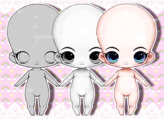
P2U Chibi Base - Pre-Shaded and Colored

🌸$2
🌸Fully shaded
🌸Separated layers for recoloring
🌸1335 x 1216 px
🌸3 mouths
🌸You will receive: A PSD file and a PNG with just the line art
Download Link and Rules under the cut.

🌸Ko-fi
🌸DeviantArt

🌸Credit me if used.
🌸Please show me the amazing art you make with it!
ALLOWED:
✅Adoptables
✅OCs
✅Fan Art
✅Editing the base
✅VTuber Assets/Art/Models
✅Commissions...
...but only if the customer is aware it's a base, and you must link to my page. Also, please alter the base at least a little bit. (Eyes, legs, ect.)
NOT ALLOWED:
❌Redistributing the files
❌Claiming my work as your own
❌Commercial Use (selling a product with this art included in it)
Tip: Gradient maps are recommended for recoloring. (Flatten the base, shadow, and highlight layers first.)
All purchases are appreciated! ╰(*´︶`*)╯♡
#p2u#p2u base#p2u lineart#bases#base#chibi base#adoptable base#adopt base#chibi adoptables#art resources#my art#kawaii#kawaii art#cute art#psd download#png#ko fi shop#oc reference#oc ref sheet#character reference#oc base#ko fi support#digital art#original character#small artist#small art business#psd files#assets#pngs
4 notes
·
View notes
Note
do you have any tips on how you draw the way you do (in your rendered abstract looking kind of style)? i'm like, totally enamored with that style. it makes me want to make art
ermm oh boy lemme see.
First tip: straight lines are your best friend. I use clipstudio so idk about other programs but I turn up the post-correction instead of holding shift and making a line but tbh the shift straight line should work (or just use an eraser)
Second tip: 100000 TEXTURES. Lay those layers on. If you had a chosen palette for the color be prepared to throw that away when you layer on a texture and find a prettier hue. Also download some wack ass brushes. Here's my main ones:
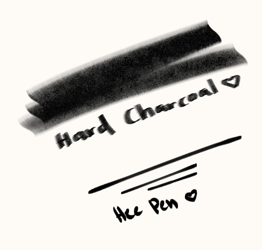
Use a big flat brush for the base area, erase until you get a general shape, then detail with a smaller brush
I know I had a separate post with my all my brushes, but I am always getting new ones, however, I will still link my most used here again
Hard charcoal pack
Hee pen (NOT HEE PEN 2 IT WANTS ME DEAD AND ALSO YOU)
Epic textures to use
Third tip: I know I said be prepared to throw away your chosen palette, but you should still have a main color. For example my Suns drawing had mostly yellows and reds, but I also used purple and blue as complementary colors, and if they didn't look good? Copy paste the layer and hit it with a gradient map + blending mode (pin light is a personal fav)
Fourth tip: 100000 blending modes. Put a texture, play with the blending mode. Multiply, color burn, pin light, overlay, whatfuckingever. If it looks good keep it and add even more
Fifth tip: go ham. I have no rules ever. It's pure luck that my art comes out consistent with my mad scientist method of drawing. If you find a epic brush, send it to me I want more and am never satiated
#wrathkafuffles#didnt mean for this to be so lengthy#i havent been able to do this artstyle as often recently just because ive been so busy#but ive had a moon wip collecting dust for a bit so i might tackle that finally#live laugh love
6 notes
·
View notes
Last Seen Blogs
tealeavesandpalmtrees
A little bit much for some-- not enough for others.
mxmaneater
Nemeses to Lovers
alexturntable
alexturntable

t0zu-kinoki
s/ang

diegohvindel
diegoHvindel