#howtowritecomics
Explore tagged Tumblr posts
Visit Tumblr Blog
Explore Tumblr blogs with no restrictions, modern design and the best experience.
Last Seen Tumblr Blogs


Fun Fact
Tumblr.com is the 103rd most visited website in the world.
Photo
Story writting tips: Antagonistic characters
We have already discussed the relevance of building an interesting and multifaceted protagonist, and now it’s time to talk about the other side of this coin: the antagonist. It’s imperative that you craft an antagonistic force with the same care and dedication as you did to your hero. In a similar way to our main character, the antagonist also typically goes through a drastic change at the climax of the story, though frequently this irreversible transformation it’s simply their death or destruction.
“A protagonist and their story cannot be more or less intellectually fascinating and emotionally convincing than the antagonistic forces that create them.” (Robert McKee, Story)
The antagonism of a story might reside in a typical villain character, but keep in mind that the antagonistic forces are essentially each and every power or influence that opposes the protagonist’s will and quest. The more complex and interesting are those forces, the more dimensional and creative the protagonist becomes. The conflict exists in order to change the herom challenging them at extraordinary levels so that we, as an emotionally engaged audience, can experience catharsis for their change, their success or failure in overcoming such adversities.
The antagonist is a key piece and should be treated with the proper attention. A flat and dull antagonist can be felt as an insult to the emotional and intellectual capability of your public. The antagonist character or the opposing forces should be woven seamlessly as part of your plot, integrated with your hero’s conflict and motivations, as well as with the theme of the story. What this means is that the struggle between the protagonist and antagonist is a reflection of the theme of the story, and of the moral or lesson you want to convey to your audience.
In a typical heroic tale, this is generally seem as justice, represented by our classic knight in shiny armor, against injustice or tyranny from and evil overlord. When both forces clash, the audience gets to experience this conflict and take their own lessons and reflections to their lives. The impact of this experience is proportional to how real and connected your story was to them, and the antagonistic forces are part of what makes a story feel real and compelling.
So, how do we match protagonist and antagonist into a single coherent theme? First of all, we must have a well structured theme and know what is your hero’s journey, so that we can properly oppose them with challenging forces. We’ve already talked about the four major points, or building blocks of a character: taking action, going through change, being a mirror or avatar to the audience and expressing a personal perspective of the world. Let’s review this concept focusing on the antagonist character.
The antagonist character must take action, generally the first act that goes against the protagonist’s will and desire. Frequently, the antagonist’s action leads to consequences that cause the hero to start their journey, often reluctantly, and thus revolting against the antagonist is the first movement towards the unfolding of the story.
This character also goes through transformations, sometimes emotional and sometimes quite literal, with many fiction stories leading to a physical transfiguration of the villain, whether into a terrifying dragon or the technological upgrade of their body in order to combat the hero. This is a typical climax of an epic story, but the antagonist can also go through many changes as the story progresses, such as the metamorphosis from a hero’s childhood best friend into their adversary in love and ultimately their foe in battle. Showing this change can also be very humanazing, and this is especially important for the next topic were going to discuss.
As much as the audience generally likes to see themselves in the hero, it’s very crucial that they can also have some fraction of this empathy for the villain of your story, even if it tastes bitter when they realise this. As we’ve already considered, the main conflict between the protagonist and antagonist should be something that can be translated to human experience, a conflict that might occur inside their lives. That moment in which your reader scratches their head and considers “Well, this guy actually has a point.” is when the conflict presented in your story reaches the real world and leads to an involving emotional and intellectual experience.
Which takes us to our last crucial point of a character, their world view. All of the previous actions and changes your villain goes through, all of their effort to oppose the protagonist must be true to their personal perspective. This is the main reason we generally get bored by villain that are simply “evil for the sake of evil”. Those kinds of characters lack a motivation that feels compelling and relatable, a sense of intelligence and emotion that builds up to the conclusion that such actions must be taken in order to express their point. It’s the thing that makes us reflect upon a good antagonist and realise we might not agree with them, but we understand their actions. Pure madness or a purely evil nature are tools available to build an antagonist, but they tend to leave the audience with a feeling of incompletion and distance.
This essential structure can be helpful to craft and refine an antagonist character along with your hero and always considering your theme. Like we said, the antagonism can come not only from a person, but also from the environment and situations around the characters.
Next week, we’ll be talking about these and other inciting events that move your story! Hope to see you there!
You might also like to read about How to build a character: Part I and Part II
If you don’t want to miss this, go ahead and subscribe to our newsletter!If you
enjoy this content and comic, please considerer supporting us at Patreon!
#howtowritecomics#creative writting#Writting Tips#writting blog#writters on tumblr#writting comics#writting stories#how to write stories#how to write
2 notes
·
View notes
Text

#paul kupperberg#writingcomics#writingcomicsguide#howtowritecomics#charlton comics#dc comics#comic books#writing#archie comics#charltonarrow#charltonneo#charlton neo#joe staton#steven butler
0 notes
Video
youtube
how to write comment in word document and change the color of comment https://youtu.be/GYpZMTq2KNU #howtowritecomment #writecommentinword #word2007 #msword2007 #windows10pro #msoffice2007 #colourchange #commentcolourchange #changecolourofcomment
0 notes
Photo

Had a wonderful time doing my first virtual version of my workshop, "How to Write Comic Books for Beginners" for @rhplibrary. All the participants were amazingly talented and super creative! .............. #howtowritecomics #unlockingthesecretsofcreatingcomicbooks #fun #creative #kids #yorkregion #howardwong #richmondhillpubliclibrary #rhpl #yrac #makingcomics #comicbooks https://instagr.am/p/CEFm3QwhqUG/
0 notes
Photo

Printing your comic, Part II: The printing process
Hello there, and welcome guys to part II of this article. On last week’s post we’ve talked about some printing vocabulary and some basic terms, and now we’re going to discuss some settings and common problems you want to check before you send your comic to the printing shop!
Page count:
Most comic creators plan for some time on their pages, set specific compositions to be shown in spread pages and even take the extra step of leaving a shocking plot twist to be revealed right after the flipping of a page. And because of that, here’s another relevant thing to consider if you plan on printing: page count. Take a look at a comic book close to you, and changes are it is a saddle stitch, as we’ve previously discussed. Because of that, each page actually corresponds to half the paper sheet in which it was printed, and the paper sheet is folded in the middle and attached to the spine by the staples. Considerer also that there’s a front and a back side of this sheet, which means each one sheet corresponds to four pages. Because of that, you want to make sure your final page count inside your book is a multiple of four. For example, if your comic has 35 pages, you’ll just need to add an empty (or not) page at the end of it and make it 36 pages long. If your comic is 37 pages, you’ll have to stretch it to 40, so might as well use those compulsory extra pages for some extra material, sketches and character bios!
Resolution settings:
Another very relevant thing to keep in mind is image resolution. Many artists create comic strips for the internet, both desktop and mobile, and sometimes the resolution for tis medias is lower than what you need for printing. Remember that the standard US comic size is way bigger than your cell phone screen, and this final file format should be measured in inches or centimeters, not in pixels. I’d in fact recommend creating pages with about 150% of the final format size just to be sure. Another important measurement of image quality is the DPI rage, which stands for “dots per inch”. This is the amount of dots that will be effectively printed per inch of paper in your final comic. You’ll need at least 300 DPI to ensure a good printing quality, though some print shops will recommend 450 DPI.
File format:
Now that you know your digital file size and proper resolution, let’s see what kind of digital format you should send to your printer. Remember we’ve talked about how any sort of printing process is actually a translation from light color to pigment color, so there will be a change in what you see on your screen to what you get on your printed comic, but we want to make the best of both. So here are some of the ost commonly known output format for images:
JPEG (or JPG): saving your files in this format keeps the file size quite small due to its efficient compression, but also because of that, you lose image quality. What this format does is it groups similar pixels together to save space, which may generate color bands in areas of your paintings. This conversion is also permanent, so the previous data from these compressed area is lost once you save the file.
PNG: The most commonly known advantage is the possibility of saving transparent backgrounds, which can be very handy. PNG files also go through compression, but without any quality loss, which means you can open and edit it as many times as you want without effectively losing data.
PDF: Most printers will suggest you to send your files in this format, and for a good reason. A PDF image is identical to its source in any way, and it’s the ideal file format for printing graphic design material, photographs and also your comic. Also, PDF allows you to save your entire comic within one single file, with all of the pages already in their proper place, and you can even add the printing marks we’ve previously talked about if necessary. Most painting and art softwares can export files in this format, but you can even use online conversion tools for this.
It’s also a good idea to add a note about vector images. Unlike the file formats above, which are all what we call raster graphics, a vector graphic image can have different file formats - and very different properties. To put it simply, a vector image is composed by a series of mathematical equations, it is a collection of points, lines and curves that can be put into numbers like geographical coordinates. But don’t worry: you don’t have to deal with any of the math to get acquainted with vector images!
Through the use of graphic tools, producing vector images can feel very familiar and intuitive. The most notorious quality of vectorized images is that they’re very reliable and can be expanded (or reduced) without any data loss. That’s a great solution for logos, so if you can get your own comic brand in vector image, this can come in hand when producing banners and other bigger products. Also, many people will use vector softwares and tools to create speech bubbles and lettering for their comics. That can make it easier to edit those elements later on, and it also makes it easier to control and create a standard visual identity for your comic. Since most of us will not effectively draw our comics in vector based software, this means speech bubbles and lettering will come as a later stage of the comic production.
So let’s just take a final look at these formats: JPEG, PNG the native PSD (Adobe) are raster graphic images. They are composed of pixels and cannot be enlarged beyond their original format without losing data. These are probably the output format of most of you artwork, so be sure to always produce your comic pages at large sizes and 300 DPI. Vector graphic images include the formats: SGV and EPS, along with the native AI (Adobe). Vector images are composed by curves and occupy less space. PDF is a bit of a wild card here: it can be both raster and vector, and it’s your exporting setup that will define this. PDF is great to maintain all of the data and image quality, and in my opinion is your best friend for printing purposes.
Printing process:
Now we know the proper terms and how to communicate with the print shop staff, and we also know what kind of file we need to export and send in order to get things properly printed. But what kind of printing process are we going to use? Let’s talk about the differences, advantages and disadvantages of the two main printing methods offered by print shops: offset and digital printing.
First of all, those two types of printing process are created in different machines, which different technologies, and as a consequence the color representation that comes out of them differs. Remember, any printing process is already a translation from the data on your computer screen, the language of light, to the language of pigment, so you’ll have to deal with slight changes during this transformation process.
The offset machine is generally a bigger, bulky engine with typically four sections, one for each printing color: cyan, magent, yellow and black. In order to print something, there’s a metal plate to apply each corresponding ink color to its place in the paper sheet, counting four metal plates per image. That means your image will be split into four colors and them those four images will be applied one on top of the other until the final figure is built. It’s a pretty fascinating process, and if your print shop allows you to take a look at the machines, it will be easier for you to understand what’s going on there.
Digital printing will also use four colors, but they’ll be applied using electrostatic rollers, which is another very fascinating thing to watch. This printing process uses toner instead of ink, and the peculiar thing about it that it’s not a liquid, but a very thin powder, which will adhere to the paper sheet according to the data on the programming of those electrostatic rollers. In this process, each color will take its turn as it is laid on paper, but there’s no need for creating the metal plates previously.
So now that you understand how both those machines work, there are some considerations regarding what process to use to print your comic. The most relevant for us comic creators one is the cost and benefit concerning the total amount of copies. As you can see, setting up an offset machine takes way more time, and it also consumes more time and needs more manutention. However, once the setup is made and the process starts, it’s way more efficient, and therefore the unit is cheaper in the long run. Digital printing takes way less time of preparation, and it is cheaper because of that at a smaller number of units. Digital printers will also have a faster turnaround time.
So, in a nutshell:
Offset printing: Good for 2.000+ units, takes more time to produce. The total investment will be big, but the unit cost will be lower, so it’s good for big press. (Tip: some printing shops will actually keep or allow you to keep the metal plates from your current run, so that if you choose to print again in the future, this stage is already executed. Ask your print shop about that!)
Digital printing: Good for anything from 1 to 2.000 copies, a short run print. As you get closer to the 2.000 copies mark, be sure to check out that limbo and see which process is better suited for your specific needs. Digital printing offers fast turnaround time and the initial cost is cheaper, though the unit will be more expensive.
That’s it for today’s article, guys! This time we’ve covered everything process-related that I saw as convenient to comic makers. If you still have any questions about the printing process itself, please let me know!
Next week, we’ll talk about the most common problems along the way, how to avoid some of them, and how to fix others after they've been identified!
You might also like to read: How to print your comic Part I and How to print your comic part III
If you don’t want to miss this, go ahead and subscribe to our newsletter!
If you enjoy this content and comic, please considerer supporting us at Patreon!
#howtowritecomics#how to write stories#how to make comics#how to print comics#making comics#creating comics#printing comics
2 notes
·
View notes
Photo
How to print your comic, Part III: What could go wrong?!
Today is the last day of the “Printing your comic” series, and after learning the proper vocabulary and better understanding how the printing process works, were gonna tackle the most common problems that will happen anyway. Yes, even if you communicate properly, even if you export the file correctly and if you’ve chosen the appropriate paper grammage. I’ve said before and I’ll say it again: printing is not exactly predictable and you’re probably going to have to deal with some unexpected adjustments to make. Let’s talk about the most common things we want to avoid or fix.
“My colors look dull and dreary on paper”
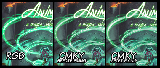
This is for anything related to color in printing: if you’re like most digital artists, you probably create your comic in RGB mode on your chosen drawing software. This is the standard setting and the most appropriate to work with on your computer screen, since it uses the light-color language.
This apparent desaturation of your painting happens because in fact light is brighter than pigment, very simply, and when we convert the art to CMYK, some of the vibrance might be lost. This happens especially when portraying conditions such as high contrast, bright lights and some particularly tricky colors such as blues and greens. In this case, color might simply break in generate ugly color bands instead of the smooth gradient transitions you’ve envisioned and executed on digital media.
A simple way you can fix this is to work normally on your RGB file, and after finishing it, save it in CMYK color mode to check it out. Things you’ll get to fix at this point are:
Color balance overall, using tools such as color curves (they will now appear as CMKY),
Avoid color bands, which happen because some colors don’t exist in CMKY the same way they exist in RGB
Anything to glowy or scenes that have lots of contrast might need to be toned down in order not to break your colors. Again, white in light is really, really bright, so it naturally looks very different on your computer screen, which is a light source.
“My colors looks too glaring and oversaturated”
This is not a very common problem, but it’s the other side of the coin from the topic above. Some colors might pop out more than you’ve expected and overtake the painting. For me, I’ve had the experience of getting a really loaded yellow, so everything close to this color would look lighter and brighter - as a consequence, some other colors would look dull and gray, since the proportion of colors was a little off balance now. Most cases, however, you’ve probably picked a very shiny paper, like a glossy photographic one. Changing to a matte finishing generally fixes this issue. So, for this cases:
Check the color balance as indicated above,
Choose a paper finishing that favours your colors.
“My blacks look gray.”
For this one we need again to remember the difference of color perception from screen to paper. If you are now looking at your CMKY final file on screen and have the impression that the blacks are gray, that’s totally normal. For your screen, “black” means no light at all in those pixels, but the “K” that is printing black ink has a different data to inform that. That’s why most softwares will give you two options: PDF-digital and PDF-printing for exporting your art.
Now, if your printed file comes out with blacks looking too gray, let’s talk about what probably happened. This typically will show in your speech lines, if you’re making comics, and the confusion happens when we switch color modes from one software to the other. Say you’re on your painting software (Photoshop, SAI, Corel Painter, etc), painting in RGB color mode. You export the file and don’t pay a lot of attention, and the page art is still in RGB, but you open in on a vector based (InDesign, Illustrator, CorelDRAW, etc) the add speech bubbles and character speeches, but these softwares generally work in CMKY. So the problem generally comes from picking two images that were generated in different color modes and merging them. When you export this mix in whichever final format, something is bound to break down.
If you’re working with more than one software, be sure they’re on the same color mode when you merge those images.
“My pages came in the wrong position/upside down in some of the units.”
That’s always a funny thing, and way more recurring than you’d expect. Unless you noticed this happens to all of your units (which would mean the file has the pages switched), that’s absolutely not your fault, but a very common mistake from the printing shop. Take a moment to think about just how many units you are printing, and how many pages you have in each one of them. Most the process of saddle stitching is automated, so the staff won’t actually check every page of every unit. This is your job, actually. Once you notice one or more of your units have this problem, just make a video of it indicating the issue, send it to your printer and explain the situation. Like I said, this is more recurring than you’d think, so they’ll probably very quickly print you new copies with very little questioning.
Always check your comics at the time of arrival. You can ask for corrected copies later on if one you your buyers notices it after the purchase, of course, but whenever you can, check before to have a chance of substituting them in advance.
Be communicative and register everything in video.
“My text font came out wrong.”
This can happen if you’ve sent the native file to the printer, like a .AI, .ID or .CDR. (Illustrator, Indesign and CorelDraw, respectively) and did not link or pack your font with it.You’re using a font that you’ve downloaded, it didn’t come embedded in your computer or software. When the printer staff opens your file to send it to the printing machine, their computer will not be able to read this font, and will therefore substitute it for a font they have available. Since this is an automated process, it won’t even be a similar one, and you might end up with Arial Black all over your comic.
Send your files in PDF, really, it is just the best format for this purpose (JPEG and PNG will also prevent this from happening, though).
If you need to send a native file, always remember “packing” your fonts. (That’s a very specific situation, so I won’t explain how to do it here, but if you need this, please feel free to contact me, ok?)
For all of those problems above, you can actually ask for a print test when you’re running a certain amount of units. For most print shops, they’ll either have a free or very low fee option of sending you a test copy to anything over 100 units. You get this copy before your actual print is run, so you get to check all of these things and talk to your staff ahead of time. It’s a great idea, always ask if this option is available and use it!
Here is a quick list of things to check before you send your file:
Be sure the number of pages in your file is a multiple of 4
Remember your cover counts as 4 pages (front, back, and the verse of each one)
300 to 450 DPI resolution
If needed, “pack” your fonts
Make the proper math to choose between offset and digital printing in advance
Always leave a bleed
Be aware of your safezone
Send your files in CMKY
Check paper size
Have sample prints whenever is possible
Always have a time buffer so that you can fix problems before a convention or event
Always, always, always be patient and communicate a lot!
That’s the end of our series on how to print your comic, guys! Thank you so much for questions and suggestions and for keeping track of this blog.
You might also like to read: How to print your comic Part I and How to print your comic part II
If you don’t want to miss this, go ahead and subscribe to our newsletter!If you
enjoy this content and comic, please considerer supporting us at Patreon!
#howto#howtowritecomics#how to write#writting tips#making comics#how to make comics#how to print comics#printing comics
1 note
·
View note
Text
My 45 years experience writing for DC, Marvel, Archie, Charlton Comics, etc., distilled into this, available from Amazon or direct from me, signed & personalized, here:

#paul kupperberg#writing#howtowritecomics#dc comics#marvel comics#archie comics#writingcomicsguide#howto#charlton comics#charltonneo#comic books#comicbookwriting
0 notes