#i did my best with the customisation options in-game. the in-game character looks similar to this but i did some tweaks in my design so
Text

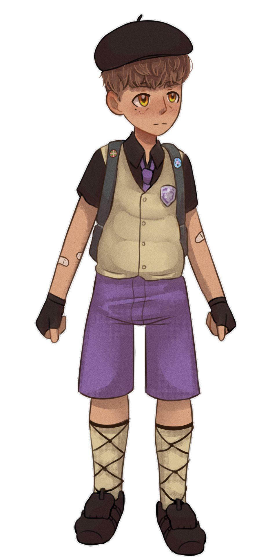
Drew my Pókemon trainer from Violet! They just moved to the south from the northern region :)
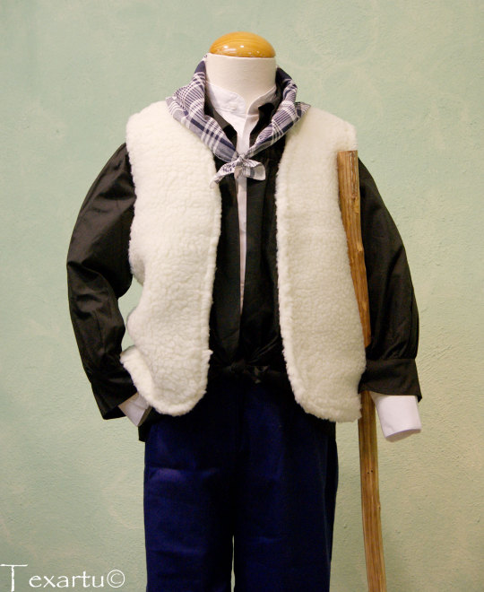
References for traditional Basque clothing that inspired the fit:

#pokemon violet#gen 9#pokemon scavio#pokemon trainer#pokemon OC#their name i subaru#like my sona#i did my best with the customisation options in-game. the in-game character looks similar to this but i did some tweaks in my design so#that the traditional clothes are well represented#Pokemon Scarlet and violet#pokemon escarlata y púrpura#pokemon purpura#traditional basque clothing#basque country#euskal herria#my art
6 notes
·
View notes
Note
serious question: what non bioware games would you recommend to someone who really prefers that kind of game? rpg with custom protagonist, cutscenes and choices, that is. i don't exclusively play bw games, but a lot of what i play is made by them because i don't really know any other games in a similar style. or did you also mean "play games of a different genre/style"?
i'm currently going through bg3 and i do enjoy it but i wasn't a big fan of dos2 for example simply because of a lack of cutscenes with your character.
i don't mean this in a "well i only like video games like that so i won't play anything else!!" way, i would genuinely like to hear your recommendations
i think the thing here is that all game studios have a niche, something that is core to nearly all the games they make - and that kind of cinematic experience is very much a Bioware thing
i know i sound like a broken record at this point but i highly HIGHLY recommend Pillars of Eternity. if you enjoy high fantasy rpgs like Dragon Age then I really do think Pillars of Eternity is worth looking at. It doesn't have the same cinematic cutscenes as Dragon Age or Mass Effect but it does have character customisation, class options, faction reputation, and in the second game (Deadfire), companion reputation and romances.
Other than that, I would also suggest Fallout. Fallout 4 is the most recent (I'm not counting fallout 76 lol) so I think that has the best to offer in terms of character creation (at least appearance wise) and cutscenes. My personal favourite is New Vegas - there's no romance or in-game cutscenes, but there's a lot of character customisation when it comes to how you want to play the game. You can customise how your pc looks of course but since it came out in 2010 its not exactly the best (though mods go along way)
if I can suggest another rpg that isn't High Fantasy (and is another obsidian game lol), there's also The Outer Worlds. it's on my to play list, there aren't any romances but there is character customisation and from what friends have told me it's a very well written and enjoyable game :)
like i 100% understand where you're coming from and i totally agree, i really do enjoy the more cinematic aspects of bioware games, they can add a lot to the experience! but having expanded out of mass effect and dragon age in the last year or so i've just realised that i also really enjoy games that react to my choices and have me and my pc deal with the consequences!! it makes for such interesting character and world building and this is why i think ive gotten so into fallout new vegas and pillars of eternity this year.
sorry for the wall of text - i hope you're enjoying bg3 and its giving you the things you were looking for :) im definitely enjoying it
13 notes
·
View notes
Text
Third and final post: what were my other thoughts?
Let’s talk about the game’s mechanics first.
I am overall very pleased with the battle gameplay. On the battlefield itself the gameplay is more-or-less unchanged from the past, but the character advancement and customisation system is significantly improved. Moving to a single overall character level and giving every character the ability to change classes at will is a much more fluid and elegant system than in the past, and the ability to choose the specific combat arts and abilities each character takes looks like it adds a lot of depth. It’s probably appropriate for the overall ‘teacher’ theme of the game that you have much more power to mould each character’s skills and talents, but I’d like to see it in other games as well. There’s an important balance to strike: on the one hand, characters should not be infinitely malleable, and should all have their personal strengths and weaknesses. On the other, so much of the fun of the game is in developing characters and watching them grow that it’s really good to be able to specialise them.
Speaking of battle gameplay, divine pulse is great. The Fire Emblem series has always struggled a bit with accessibility, and while casual mode definitely made the series easier, it also felt to me like missing the point. Casual mode is too easy, and by removing any risk of permanent death, it felt like it removed a lot of the game’s tension. Divine pulse is a much better way to make the gameplay a bit easier and less frustrating while still keeping the same feel as classic FE gameplay. It gives you just enough room to survive a lucky enemy crit, or a small misjudgement on your part, without totally removing the need to be careful. I approve. That said, I did feel that by late-game you probably had access to too many pulses and it removed the need to conserve them. With a dozen pulses, there isn’t much risk any more, whereas if it stayed capped around three to five, each individual pulse might have felt more precious.
(Apparently Mila’s Turnwheel in Shadows of Valentia actually did the mechanic first, and I totally forgot about it. Oh dear…)
Other gameplay innovations were more hit-and-miss, for me. Battalions were fine, but I don’t think I would have missed them if they weren’t there. They helped make the battlefield seem busier and more populated, but they don’t seem to have had a massive impact on the game. Similarly, monsters were mostly fine (Cindered Shadows boss notwithstanding), but again, I don’t think I’d mind very much if they didn’t come back. They rarely actually felt like the most dangerous enemies on the battlefield, and just required a slightly different strategy, and… well, maybe it’s just me, but it feels weird for FE to have boss monsters like that. I suppose arguably it’s been a tension in the series going all the way back to the original game? Marth was supposed to fight monstrous dragons, but his entire game was about enemy soldiers, and dragons didn’t stand out as the terrifying beasts they ought to have been. Still, I’m not sure I’m sold on them here.
When I started playing I complained that exploring the monastery was tedious. You can get into a routine later on, but for the most part, I did think it could have been streamlined more. Having lunch with students or going for special training or browsing the marketplace are all fun things to do, but a bit less sprinting all over the map to talk to everyone and return lost items would have been appreciated. The lost item mechanic in particular feels like busywork. A bit of exploring is nice, but only as long as it doesn’t get tedious. It might have been lovely to explore other locations as well – Enbarr, Fhirdiad, the army camp outside Gronder, etc. – but I can understand that the amount of work required would not be practical.
Speaking of tedium, though… I really could have done with a few more maps. Maybe this is my fault for constantly choosing battles, but I found myself replaying the same forest, plains, beach, or volcano map too many times for comfort.
I might also have liked for crests to be a bit more mechanically impactful, given their important to the world and the plot. I regularly forgot which of my units have crests, and what any of the crests do, since most of them have so little effect as to not matter. The only one I did usually remember was Felix’s Crest of Fraldarius, and that was mainly because it makes him do more damage and sometimes made him kill people I’d hoped to leave on one or two HP. I don’t think crests should have been overpowering, but a little more power would still have been nice. It should not have been so easy to forget that they exist.
Similarly, by the time I finished the game I realised that I had never used a Hero’s Relic, even once. I would like to say that this was a principled decision on my part, given that they turn people into monsters (and it looks like I was right about them being made from bone?), but it was mostly just the BUT-WHAT-IF-I-NEED-IT-LATER effect. They all have quite low durability, and while I understand that infinite durability, as with relics in previous games, was not an option due to breaking how combat arts work, it was still enough to discourage me from using them. Perhaps on a higher difficulty they would become necessary? I always feel a bit sad when for mechanical reasons I never let characters use their most iconic weapons.
Moving on from mechanics…
There is technically a shipping mechanic, with an S support for the protagonist, but it really felt like an afterthought to me. I don’t think the game would lose anything significant if you just removed all the S supports. Compared to a game like Awakening or Fates, where the second generation makes it mechanically important and the plot seems like it works best with a bit of romantic drama (f!Robin/Chrom and m!Robin/Lucina looking particularly intended), Three Houses is surprisingly chaste. I suppose picking a character to be your waifu might be part of the culture now, perhaps looking also at the growing influence of waifu gacha games, but for me it felt tacked on. I can imagine potentially rewriting the game to make romance a more important theme – perhaps talking about Jeralt and Sitri a bit more? – but to be honest I think that that would have been worse for the game overall.
In particular, it stands out to me as sitting a touch oddly alongside the teacher concept. One of the things that stands out to me about Byleth as a protagonist is the way that Byleth is in a superior position relative to the other units. You are a professor, in a position of authority, and you have more life experience. Your job is to teach and mentor these younger characters. This contrasts strongly with Robin, who I think was presented as the equal of the other Shepherds (your relationship with Chrom is that of comrade and friend), and with Corrin, who was presented as an inferior or junior (your siblings are older than you, and they start off with higher status). Because of that superior position, then, I found the game suggesting a feeling of responsibility towards them, and a feeling of pride in their accomplishments.
This might be a bizarre comparison, but in some ways a game that Three Houses reminded me of while playing was Princess Maker 2, a weird little DOS game from 1993 about raising a girl. The core loop of choosing activities to raise the stats of a character in your care, punctuated with occasional outings to fight monsters and get loot, felt quite similar. Similarly, the emotions that seemed to be evoked, to me, were emotions of care and pride: perhaps not paternal as such, since Byleth isn’t that old, but certainly the satisfaction that comes from nurturing a younger and less experienced person.
For the most part that actually worked, and I certainly applaud it for feeling less icky than Fates. If I compare tea parties to that weird Fates mechanic where you could invite characters to your room and touch their face, it is vastly less creepy. So I’m glad that the romance has been toned down.
And speaking of things that I’m glad aren’t prominent…
I’m deliberately burying this part in the middle of a long post. Tumblr is famously ruthless on issues like this, but fortunately I have a very low follower count and you’re all nice people. Basically, one of my worries going into the game was that Three Houses might be the ‘woke’ Fire Emblem game. I am glad to find that concern averted, at least so far. A person could perhaps make some pretty cringeworthy interpretations of Duscur to do with racial politics, but the game itself does not push you in that direction. Tumblr and AO3 love slash shipping, but as far as I can tell that remains as canonically unsupported as ever. Interestingly, while Three Houses has a small handful of same-sex romantic S supports and endings, as far as I can tell they’re all for Byleth and they’re all simply copy-pastes of the opposite-sex versions. It’s enough for me to genuinely wonder whether they’re in the original Japanese at all, or if they were added. I know translations of FE games have played around with character sexualities before, so it’s possible. At any rate, part of me was concerned that this might be the Dragon Age: Inquisition of Fire Emblem, and fortunately it isn’t. (I mean, I did actually enjoy Dragon Age: Inquisition, but at times it did get to be a bit much.) I’ll take this as a valuable lesson when it comes to not believing posts I see on Tumblr. You’d think I would have learned from previous games: popular fan interpretations of a character are often completely wrong. Three Houses seems for the most part to be a very traditional Fire Emblem game.
In terms of the overall series trajectory, I take Three Houses to be an overall positive sign. Awakening and Fates seemed to be taking the series in a direction that I didn’t care for as much, with heavy use of player avatar characters, much more fan service, and more trope-driven plots. Three Houses seems like a return to deeper worldbuilding and characterisation. The cast of characters overall has definitely been a high point: in Fates I sometimes struggled to build a team of characters that I felt truly fond of, but in Three Houses there were usually more characters I wanted to use than I had space for, and there were no recruitable characters that I truly disliked.
Really, the biggest disconnect between me and Three Houses, in the end, is the fact that Three Houses is built for replayability, and I don’t like replaying games very much. However, I don’t think I can in good faith call that a flaw or poor design: obviously there are a lot of people who love replayability, and considering that I got a good eighty hours of gameplay out of my first playthrough (DLC included) and enjoyed it, I’m not really in a position to complain.
So in the end, then, I think that while Three Houses is not my favourite Fire Emblem and does have some places where it could be improved, for the most part I think it’s quite a good outing and a significant improvement on the last few. It is not designed entirely to my tastes, but what is here is mostly good. Three Houses leaves me feeling much more optimistic for the future of the franchise than Fates did.
9 notes
·
View notes
Text
Quality of Life Wishlist for DA4
This will be a very long one but I have some Thoughts about little tiny things that I think are missing from Origins, DA2 and Inquisition that I hope Bioware thinks about when making DA4.
Make banter guaranteed to activate every 15 minutes or so, regardless of where you are, unless you are in combat or a conversation with an NPC.
Make armor look different depending on race/origin. My Dalish elf shouldn’t be forced to wear shoes just because the other three races would. Same goes for stronghold/home outfits/pyjamas - why you have to download a mod to let your elf wear the elf NPC clothes in Skyhold I’ll never know. They’re literally already in the game.
Let the MC respond to companion banter more, even if it’s the way Hawke does in DA2 where a dialog wheel doesn’t show, they just make a small comment.
Make it easier to increase inventory size, similar to buying backpacks in the first 2 games. Having to spend Inquisition perks to increase inventory size bugs me.
Better hair options! Even if all the “long” hair options have to be updos to minimize clipping, there is no reason to have fifteen different variations of “bald/shaved” and only one “long hair that’s been put into a braided bun” option. Give me LONG ponytails. Side braids down the front. Pig tails. Elaborate braided buns. Long hair that’s been pulled back from the face. Space buns. Anything.
Tintable weapons. Bothered me to no end when I would make a dragonbone weapon in Inquisition and it had to be that weird orange gold colour.
Let me swim but please do not make me fight anyone underwater. Every single time it happens in a game, any game, I want to vomit.
Make companions actually utilize the jump function. I don’t know how difficult this would be to program but I got real sick of companions getting stuck behind fences because they didn’t realize they could jump.
Let me make my own notes on the map. An example: adding a pin that says “saw a dragon here. come back later when higher level”. The original Neverwinter Nights game did this and I loved it.
Way to do some war table functions without having to return to a stronghold, similar to how the Descent DLC did. For example, I should be able to do every war table mission from Skyhold, but if a war table mission takes place around the Hinterlands I should be able to order it to be done from a table in Redcliffe.
A different quiver. Please. Even if it works the way it does in Skyrim where it matches the bow. I am So Bored of the same quiver that matches none of my armor.
Companions have their own personalised mounts that they summon when you get on yours, so they can ride with you and they can still banter. World of Warcraft does this with companions on the Broken Isles in the Legion expansion and I appreciate it. Imagine Blackwall having a black horse with Grey Warden insignia on the saddle. Vivienne’s horse being a beautiful white stallion with an elaborately braided mane.
Expanded tactics, similar to the first two games. I miss being able to tell Alistair “hey if someone attacks Barkspawn please immediately taunt them”.
Please consult someone who actually wears makeup on what shadow, liner and blush are meant to look like.
Let me save a preset in the character creator so if I want to replay my main I don’t have to take a million screenshots of my sliders then try my best to recreate them from an image. I should not have to install mods to do this.
Don’t make me travel to Kirkwall to change my hair. In both DA2 and Inquisition your character has a bedroom, why can they not just have a little mirror on top of their dresser to change hair and makeup? Fair enough if you want to change facial features, tattoos and scars, but hair and makeup? Come on.
Better eyebrows and lashes.
Please include ALL tattoo options from Origins, DA2 and Inquisition, ESPECIALLY if we’re bringing back the Warden, Hawke or the Inquisitor for any reason.
Let me give my elves cartilage piercings. Let me give everyone facial piercings.
More diverse body types, even if it’s similar to the way Bioware does it in SWTOR (you have petite, “average”, curvy and buff options - it’s not a lot, but it’s better than what we have). I really like the system that Guild Wars 2 has where you can pick a base body type from 10-15 options and also edit your height, but I know that might make things difficult to program for cutscenes.
Can I have some healing spells back? Even if it’s just one or two? Don’t love how if I’m out of potions in Inquisition all Solas can do is be like “here. have a barrier. hope you don’t die because my resurrect is on cooldown lol”
Find a balance between Inquisition’s “you only have 8 spells slots” and Origins and DA2′s “your action bar covers the whole bottom of your screen”. Maybe 12 spell slots?
If we must have a “squad goes to a party” level, please make the outfits pretty and race/origin appropriate and Do Not give everyone the same outfit. Better yet, upon entering the level, bring up a temporary character creator that’s like “here are a couple of outfit options, also do you want to change your hair and makeup for this mission specifically?”
Body scars and body tattoos, especially for Dalish elves. Let my vallaslin go down to my titties.
A more customisable HUD/UI. Let me make my quest tracker smaller! My action bars smaller! My companion portraits SMALLER! They take up so much space!
I really hope they bring back the companion armor system from Inquisition. I love how the basic armors look different depending on which companion you put them on and I hope they keep that in DA4.
Let me choose whether hats are visible for specific companions. I don’t want everyone wearing their helmets but Cole’s hat, Vivienne’s headpiece, the flower crown, the Qunari face paint and the mage hoods are Important and I like them and want to see them.
Capes? Can I have some capes? I’d like a cape.
#dragon age#dragon age 4 wishlist#dragon age origins#dragon age 2#dragon age inquisition#how do tags work#long post#trinity is rambling again#i have Opinions ... again#i typed this up with Inquisition unpaused in the background hoping it would help me get the Dorian and Bull romance going#but no#all that happened was solas and dorian bickered#no input from bull at all#thanks dude#uh#dragon age 4#is that everything i need to tag?#lmao
17 notes
·
View notes
Text
Harmonix’s Fuser bets on user creativity as the future of music gaming • Eurogamer.net
Where do you go after Guitar Hero and Rock Band? That’s a question the music genre has been trying to answer for about 10 years, with varying degrees of success. Some games have looked to VR to replace the physicality of performing on peripherals, yet the platform still remains out of reach for many thanks to cost and space requirements. Others have taken risks with unique spins on rhythm-action – often brilliant in their own right, but none have captured the mass market like the guitar games of the 2000s.
Does the answer lie in user-created content? That’s what Harmonix is betting on with its latest title, Fuser, a music-mixing game officially unveiled today. Part performance game, part creative tool, it’s a far cry from the days of rocking out with a peripheral in your living room – instead favouring a Coachella-influencer vibe as players mix current tracks together to satisfy crowd demands.
“A lot of our traditional games – whether it’s Rock Band or Dance Central, even some of the stuff we’ve done in VR like Audica – are very different in that those games are either a recreation of, or performance to, an existing song,” Harmonix exec Dan Walsh told me during a preview session. “Fuser is a music-mixing game where you are creating things as opposed to recreating things.”
youtube
Launching with over 100 tracks, players will be able to pick and choose from set song lists to develop a mix. The gameplay centres around a deck where you can play four different discs at once, with each song broken down into four components: drums, bass, lead instruments (such as guitar, synths and horns) and vocals. Players can mix these into any combination they want – even four voice parts at the same time, although this doesn’t sound the best.
Oh, and there’s no peripherals: just a regular release on PC, PS4, Xbox One and Switch sometime this autumn. That’s pretty close to when next-gen consoles launch, but Fuser will also be playable on PS5 and Xbox Series X thanks to their backwards compatibility support, “so you won’t be shut out or have to wait”, Walsh confirmed.
All it takes is a tap or drag-and-drop to add music tracks from the cards above to the deck below.
It’s an impressive bit of tech, with tracks automatically adapting to the key and tempo as they’re introduced. Both can also be adjusted by the player as part of the overall mix, such as switching between major and minor. Harmonix used a similar system for its 2017 card game DropMix, in which songs were divided into parts and then mixed together on a peripheral. Fuser expands on this by giving players more creative control, allowing them to change the texture by muting tracks, or adding in custom sounds via what looked like an in-game MIDI pad with six instrument options (something Harmonix plans on detailing at a later point).
youtube
So, that’s the mixing interface: how does this work as a game? Fuser is divided into three core gameplay modes: campaign, freestyle, and multiplayer. The latter is listed as two to four players in the press release, with the opportunity to “collaborate or compete with players from around the world” – but Harmonix is waiting until later on to reveal more details of how this works, too.
Freestyle gives players the opportunity to mess around, save mixes and upload them directly onto social channels. The campaign, meanwhile, is about 10-15 hours long, and follows the career of a DJ from “some level of success” to headline act.
Points are scored by fulfilling crowd requests, keeping the mix moving, and hitting mission goals such as keeping the track within set bpm parameters. You can get combos on crowd requests by dropping a track that satisfies two at once: for instance, Billie Eilish’s bad guy would fulfill a request for pop, and a request for 2010s music. If you introduce new tracks on a downbeat you get bonus points, while yellow lines on the time bar indicate “musically interesting” parts of loops which are particularly suitable for changes.
Players are able to fully customise the character, and perform in six different venues. To keep things varied, the campaign gives different narrative reasons for each mission: such as playing the second day of a festival when everyone is…. fragile, and wants something calm.
In the context of the release of Media Molecule’s Dreams this month, it’s interesting timing for Harmonix to announce Fuser – and it feels like part of a larger trend giving players the tools to create content within a game. I asked if Harmonix felt this was the future for the music genre, too.
Pushed to the periphery
Almost inevitably, the topic of peripherals came up when discussing music gaming – and it’s unsurprising why the industry has moved away from them.
“I will never speak ill of the Rock Band instruments – [they] really sell that full experience,” Walsh said. “But it’s also a lot of complication… you’ve got to figure out manufacturing, shipping timelines and inventory logistics, and selling people on them. Also getting retail to dedicate the space, and asking people upfront to make a much larger investment than a traditional game because they have to buy all the extra stuff.
“It’s nice to be able to have people either purchase it physically or digitally. You don’t have to worry about whether or not you have something that’s compatible with the last generation, and it’s going to work with your current generation. [It’s] much more straightforward.”
Not to mention all that plastic probably isn’t great for the environment.
“At the moment, yes, just because if you look back at when rock band and Guitar Hero came out, rock star culture and the rock star fantasy were very much of that time,” Walsh explained. “Late 90s, early 2000s, mid 2000s. People wanted to be on stage at Lollapalooza, they wanted to be shredding on the lead guitar out in front of thousands of people.
“Music culture has sort of shifted over the last 10-15 years to where DJ culture is influential, mashup culture is really influential. Festival culture is bigger than it’s ever been right now. So this game is sort of our attempt to reflect modern music culture in a way that’s still a game, but it’s also creatively fulfilling in a different way than Rock Bands or Dance Central or Guitar Hero.
“From a creative standpoint, you look at influencer culture as well where people just want to create and share things all the time. And this is sort of a reflection of that, Dreams is a good reflection of that. Mario Maker is another example, Minecraft of course – it’s like turning people loose into a sort of gamified playground with a lot of access to a lot of like tools and interesting and interesting things.”
The music-mixing aspect of Fuser is something Harmonix has been thinking about for a while: Walsh told me the studio “started experimenting” with games Fantasia and DropMix. “[With Fuser], it feels like we figured out the rest of it, the game wrapper around it that makes it still accessible,” Walsh said. Getting the balance between creative freedom and game rules was a challenge, so Harmonix tried to focus on “purposeful decisions that are also musical in a way you [can] score them.
“Figuring out that balance took a little while and some of our other experiments… I don’t think quite found the way to make your creative decisions ‘gaming'”, Walsh added.
Fuser is already launching with a significant number of tracks, but Harmonix hasn’t ruled out adding more post-launch. ‘Harmonix has a long tradition of supporting its titles with ongoing content and features,’ project director Daniel Sussman told me over email. ‘You can expect Fuser to be similar.’
Given Fuser’s focus on influencer-style sharing, I started to wonder how the music world’s strict licensing rules would work with publishing mixes to social media. How do the music rights work with that? Well, Harmonix doesn’t quite have the answer yet.
“It’s definitely complicated. For normal people, you’ll be able to share to your personal timeline,” Walsh explained. “When it comes to like influencers or YouTubers, things of that nature… that’s something that we’re still working through, both with licence holders as well as platforms. We know them both very well over the years. Obviously, when the game comes out it will include guidelines on how to do it.”
Is it more of a problem when people are monetising on top of the mixes they’ve produced?
“Monetisation does add a layer of complication… yeah, that is harder to navigate,” Walsh added. “Not necessarily impossible, but still something that we’re working through.”
Much to sphinx about.
I did manage to get a little hands-on time with Fuser for 10 minutes (and watched some gameplay expertly demoed by community manager Zoe Schneider) – and I was pretty bowled over by the mixing technology on display. It’s easy to use, packed with a good assortment of current hits and classics, and complex enough that players will be able to produce some unexpected mixes. Dropping new tracks on-beat was surprisingly satisfying in a different way to timing a Rock Band note, as hearing a great transition is rewarding to the ears. And there’s a certain novelty to hearing Smash Mouth and Migos inexplicably work together.
That said, I’m not yet entirely convinced by the core gameplay shown in the campaign, particularly the request system. In later levels these requests come in “pretty frequently”, Schneider told me – and while you can ignore them, the game encourages you to hit as many as possible to get a high score. This means the track is constantly shifting, and it often felt a little frantic and unnatural to my ear, as the music wasn’t given time to settle. The alternative, I suppose, is to dial back the amount of crowd requests: but then this risks making the gameplay slow.
The idea of responding to crowd requests also seems a little weird to me, as it suggests successful music artists only follow the demands of fans – and I’m not sure how many people actually want to live out a wedding DJ fantasy. And, unfortunately, the gameplay often looks quite static. It doesn’t have the drama of Rock Band – either on-screen, where rows of glowing blobs would hurtle towards you, or in the entertainment value of watching a friend perform on a peripheral in your living room. I wonder if this will impact the game’s ability to spread on social media platforms, as Harmonix would clearly like.
There are still so many unknowns surrounding Fuser it’s impossible to know how it’s going to pan out: we still know very little about multiplayer, precisely how the custom instrument tracks work, or what players will eventually make in freestyle mode. I really admire the focus on creative elements, along with the strength of the mixing system which makes the process accessible. Personally, I can see myself spending quite a few hours in freestyle mode tinkering with tracks. But is there enough of a game amongst the mixing tools to keep me hooked? We’ll see.
from EnterGamingXP https://entergamingxp.com/2020/02/harmonixs-fuser-bets-on-user-creativity-as-the-future-of-music-gaming-%e2%80%a2-eurogamer-net/?utm_source=rss&utm_medium=rss&utm_campaign=harmonixs-fuser-bets-on-user-creativity-as-the-future-of-music-gaming-%25e2%2580%25a2-eurogamer-net
0 notes
Text
Beyblade: Let it Rip!
Information
Beyblade: Let it Rip! was released in 2003 in Europe on the Playstation 1 and featured 8 characters from the original tv series accompanied by their signature Beyblades and Bit Beasts.
This game includes two battles modes, Tournament and Freeplay and a Customise screen to build Beyblades.
To start off a match, a power gauge is used to determine how much SP the Beyblade will start with, the higher the SP the harder it becomes to control. The aim of the match is to either knock the opponent out of the ring or be the last Beyblade spinning. There can be up to up to 4 rounds dependent on the medals earnt however 2 knock outs will win the match. Whilst in the ring LP points are stacked up to trigger a Bit Beasts’ Special Attack which cause HP damage to the opposing Beyblade and can be used in return to dodge the opponents’ Special Attack. There are 7 rounds in a Tournament and a Bey Part is won upon victory in the final. After each match there is an option for Kenny to fix your Beyblade and provide HP however the fix will reduce a stat of the Blade.
From completing each match, either winning or losing, Bey Points and Exp Points are earned, Bey Points are used within the shop to purchase Bey Parts and Exp Points rack up to add additional attributes to your overall Beyblade such as increased Attack, Defence and Endurance.
The game operates a stat system such as Attack, Defence, Endurance, HP, Mobility, Spin and Acceleration which can be upgraded with a combination of Bey Parts and Exp Points, some Bey Parts, mainly Blade Bases also include “Gimmicks” which add additional attributes within a match.
A side notes, to fully replace an entire Beyblade from scratch it can take up to 600 BP points which is the equitant of 60 won matches, an average match can last up to 4/5 minutes so overall, you’re looking at roughly 5 hours of game play.
Experience
I’ve had this game from childhood and never really understood the mechanics until I looked them up and planned of how to complete the Tournament. I found the best technique personally was to barely move the Beyblade and focus on timing the SP Attacks perfectly to stay spinning the longest, aiming to knock an opponent out often caused me to throw myself out of the ring! After playing a good hour as Kid Dragoon, I opted to use Knight Dranzer as I found it much easier to control, especially after applying the Sharp feature before a match (this Beyblade included a Gimmick Blade Base, “Spiral Change Base”). I found that overtime the odds stacked up in your favour, with the CPU missing the ring frequently, flying out the ring with one hit and spinning out. I would say however in the later rounds of the Tournament the CPU bombards you with constant Special Attacks which chip away at your HP overtime and eventually fly you out of the ring, despite Kenny’s quick fix after a match. After playing a few Tournaments and falling short each time I looked up a strategy for the best Bey Parts to aim for and started kitting out my Beyblade. As I’d played this game throughout my childhood I had over 300 BPs already which gave me a nice head start, with these points I was able to purchase an Attack Ring, Spin Gear and Blade Base but sadly I didn’t have enough to buy a Launcher and was stuck playing a few more matches to purchase a Reverse Launcher. With the new set up I ended up winning my first Tournament after a few tries, keeping watch of my Beyblades HP and getting lucky with the CPU, the last match of the Tournament was the easiest, with Tyson flying out the ring both times with SP at 10,000. As per the online guide I read, I then opted to get a further 200 BP points to purchase Dragoon and finish my Beyblade set up which honestly, was a complete waste of time. As I’d played matches with Knight Dranzer and gained Exp Points, the overall performance I found was much better and I would win every other Tournament dependent on the challengers (Tala was a pain to fight). Overall, I played roughly 3 hours to build my final Beyblade and found the experience quite enjoyable despite it being a luck based game in most cases. I do however, enjoy playing games which have a target, such as earning BP Points and soon grew tired of the game once the challenge had been completed, it’s not something I would pick up again and again.
My end set up was:
Bit Chip – Knight Dranzer – 0 BP
Attack Ring - Cross Griffon – 100 BP
Weight - Eight Balance – 0 BP
Spin Gear - L-Spin Gear with MB – 70 BP
Blade Base - SG Semi-Flat Base – 150 BP
Launcher - Reverse Launcher – 50 BP
Attack – 220
Defence – 250
Endurance – 220
HP – 250
Mobility – 70
Pros
It’s gimmicky but the game does allow you to play as the characters from the show and purchase all the individual parts from each Beyblade, as a collector as a kid it was fun to mismatch the Bey Parts and recognise the character’s signature Bit Beasts or Parts. From my gameplay I ended up with a mismatch of Draciel from winning Bey Parts in the Tournament and had the correct Blade Base which had the trait of increased Defence/Endurance similar to the Draciel Beyblade toy that had the little metal ball bearings.
The stats I found added a little twist and I think changed the gameplay completely, with Mobility being one the most important stats to balance to stop your Beyblade flying out of the ring. Definitely an enjoyable aspect to play around with.
Cons
The Menu screens and the constant speaking with Kenny was atrocious, being that there was a constant lag between pressing the button and it moving on. I specifically found this frustrating in the Customise screen, finding it almost impossible to leave the menu when trying to understand how the section operates.
The Customise screen, being that it allowed for one of my favourite features, was awful to operate. It didn’t give much guidance on how to build, how it links together and during the shop menu you were able to purchase parts but not know the stats you were purchasing until after! For me however, the most frustrating part was trying to quit, if a part or a name wasn’t assigned you could run into the potential of causing your Beyblade to be “unassigned”, meaning, you had to start from scratch. I feel they really could have made this easier as it’s quite vital to win.
The commentator, not necessarily a game changing issue, more that it was funny to see, the subtitles in most cases had nothing to do with the actual dialogue, I presume this would have been a translating problem but it was poor, “Great”, “Out of Stadium”, “A Big Hit” being the major ones (not too sure how they could go wrong).
Bit Beasts, I feel these could have been a lot better, they had a small animation and chipped away at the opponents HP and SP overtime and they did add some extra stats but I wish they had more use within a match. It would have been great to see either a Beyblade fly out the stadium or break apart when used against low HP, similarly to the tv series. This set up meant that the end matches in a Tournament consisted of the constant use of the Special Attack by the CPU and in turn the user until either SP or HP ran out, quite boring as the damage was roughly 20 HP and 200 SP.
Conclusion
Overall, I’d say as a collector of old nostalgic junk and a big fan of the old Beyblades, I’m happy to have a copy of the Playstation 1 game. I may put it on from time to time for nostalgia but as an enjoyable game to purchase, I wouldn’t recommend. If you could acquire a ROM for the game, I’d say definitely have a go, just to try and understand the mechanics within a match and build a Beyblade from scratch. I’d say learning how to play properly and then finding the easiest cheap tactics to win whilst saving to get a strong Beyblade was the best part of the game, once you win a Tournament more than once it’s pretty much done.
0 notes
Text
League of Legends: New Collections

Skills: Experience Design, Research, Project Management, Wire-framing, Prototypes, Product Design, UI Design, Interaction Design, Workshops, Stakeholder Management
Project Type: eCommerce, Loyalty, Rewards
The Challenge:
To design and develop web-based client features for League of Legends users to allow them to: see all of the items they own, easily acquire more and provide better context and understanding of these items.
League of Legends has 1000′s of items (skins, icons, wards, chroma and more) that the player can acquire, through purchase or other methods. There was no way for the user to see or interact with many of these items in a meaningful way, beyond equipping them in game. The team wanted to design and build a new web product which allowed users to be able to see all of the items they have collected.
We identified 3 main areas of contention for users:
1. Users can’t see all of the stuff they have collected
Users collect a lot of different things
New users have no idea where all this stuff is
Many of these things have no space to celebrate the effort the user has put into acquiring them which potentially devalues them for the user
2. Many don’t even know these things exist
New users have no way of easily finding out about these things
Not all users understand/know they can collect many of these things
Many users don’t know these things exist
3. Many don’t really care about this things as much as we would like
Many users don’t realise they can change or even what the point of changing these things is
Many users don’t realise they can even use these things
What we did

We not only created collection spaces to celebrate and motivate the user; but also facilitate and encourage increased purchasing and acquisition. They are highly customisable using filters to organise the data in ways that are most meaningful to the user. We also added motivational hooks to encourage the user to care more about these items in the forms of groupings organised by set, theme, rarity and more.
Research
I worked with the Insights (data analysis and research) team to identify all of the areas where you can acquire items and what items users could collect. We developed an idea of what items were being sold and given to users and how they were used and collected. The Insights team also sent out questionnaires to a random sample of worldwide users (from over @100 million players) to get an idea of sentiment around each item type we identified.
We found 4 main content types we felt we would provide a high level of impact on:
1. Icons
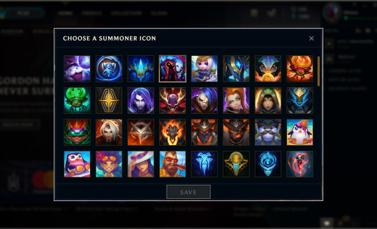
The existing Icon pop up. There is no way of organising, seeing the name of, or seeing (or acquiring) what you are missing.
Icons or Summoner Icons are images the player can use to change their profile picture. There are multiple ways of collecting these but, at this point, only one way of seeing what you have. Users had some of the following sentiments:
“I don’t know how I got many of these Icons”
“It is not easy to find the Icons I care about”
“There is little context on what Icons are or why I should care about them”
2. Wards

The existing Wards pop up, pre-match. There is no way of organising, seeing the name of, or seeing (or acquiring) what you are missing.
Wards are used during the game to provide vision in enemy territory. Users can choose which cosmetic “look” they would like, out of the ones they have acquired, before a match. Outside of this there is no where for the user to see what they have or have a sense of pride in them. Many users had similar sentiments to Wards as they did Icons:
“I don’t know how I got these Wards“
“I didn’t realise I had any Wards”
“There is no where to see which Wards I have”
“I don’t know which Wards I have“
“I didn’t know anything about Wards”
3. Chroma

The existing Chroma pop up, pre-match. There is no way of organising, seeing the name of, or seeing (or acquiring) what you are missing.
Chroma are cosmetic items which provide additional customisation to some Champion (character) Skins. Like Wards, at this point, there was no way of seeing what you owned prior to choosing one immediately before a match. The sentiment for Chroma was consistent with what we were finding for Icons and Wards:
“I don’t know which ones I have“
“I wasn’t aware Chroma existed”
“There is no way to see which Chroma I have“
4. Emotes

The existing Emotes screen. It already allows some filter and acquisition.
Emotes allow users to express themselves during a match. The user can equip several of these and choose the moment they want to use them. Unlike Icons, Chroma and Wards there was already a collection space for Emotes so any work we would do here would be more for consistency than adding a place to see them. Sentiment around Emotes was more around how to use them than knowing about them or their context.
“I don’t know how to use Emotes in game”
“I don’t understand why I would want to use them”
Ideation Workshops
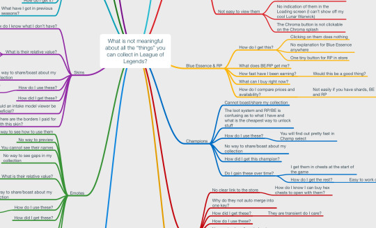
As part of some ideation and brainstorming workshops we generated a series of mindmaps to come up with a variety of ideas on how we could solve this problem.
While there was a strong desire for a collection space similar to the Skins Collection which already existed I wanted to ensure the team properly explored all the options and considered the users needs fully.
From these workshops it became apparent which areas had key similarities, which ones we could exclude and some possible methods of solving this problem.
Vision Statement

Once it became clear what was important for us to solve (and what wasn’t), what the users needs and what success looks like, I guided the team to create a vision statement (above). This helped us constantly asses features and the quality of what we were delivering.
Developed a Holistic View and Journey Maps
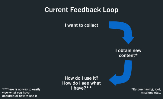
I then looked at the problem, the research, the workshop results and started to compile a holistic view of what the problem(s) were and how to solve them. I like to look at user patterns and behaviour loops as part of engagement so I broke down the current collection feedback loop for users to see where there were gaps, if any.

Seeing that the loop was quite ambiguous; I proposed that by not only adding collection spaces, but by also adding key motivational hooks into these spaces we would create a stronger feedback loop around collection. This would allow users to not only better see what they have collected but also better appreciate their collection, its worth to them, and seed in their head some ideas on what they may want to do next.
Designed Solutions in Wireframe
I wire-framed many different layouts and configurations until I settled on one I felt approached solving the users needs in the best manner and kept with the visual style of League of Legends.
Welcome Screen

I designed a welcome screen which would be displayed the first time a user arrived at any of the new collection screens. This would act as a jumping on point and give them a quick overview of what they could do here.
It was decided late in development not to implement this feature as we felt the feature wouldn’t need instruction or introduction in this manner.
Icons
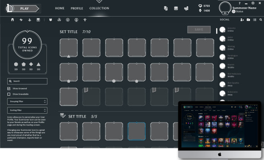
With Icons Collection (above) it was important to balance the size of the icons with the space. Too big and the interface would be frustrating to use, too small and while there would be more icons on display the beautiful artwork would be hard to see.
I wanted to also allow the user to set their current Summoner Icon from the collection as well as being able to organise and filter it in a manner which best showcased what they cared about.
Wards

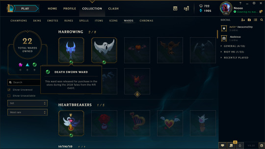
To keep consistency I overlaid my work with screenshots of the live Skins Collection views and worked towards matching the spacing and aesthetic.
With Wards Collection (above) we wanted to really find the right size of image to showcase the objects. Elsewhere they are displayed very small so the user never really gets a good idea of what they look like; we felt that we could make a big impact here by showing them at a good size.
We also needed to balance positioning of a rarity system (gems) and sale banners for the store, for all of the items (Icons, Wards and Chroma). The rarity and sale systems work towards providing motivational elements to encourage future acquisition. The rarity system provides context around an objects price and difficulty to obtain while the sale banners can be overlaid to indicate that an item has a reduction in price.
Chroma

In addition to Icons, Wards and Chroma I also mocked up an adjusted collection space for Emotes to bring it in line with the rest of the web interface. The team responsible for Emotes were working on adding a lot of new features so we decided not to implement this feature.
Tooltips
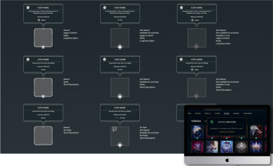
Each item not only can be clicked on to be purchased immediately; it can also display information when moused/hovered over. I mocked up each of the possible states for each item as there were a lot of combinations (aquired rare, not acquired rare and so on). It was important to make sure we had considered all of the possibilities before implementation as not only would changes prove costly; but we also needed to sanity check what we though the user would want to see.
Purchase Anywhere Widget (PAW)

The web interface has the ability to add Purchase Anywhere functionality to items. This was something recently added and had to be manually configured for each item type as it was rolled across the client.
As part of this work I looked at the possible methods of acquisition for the user and how we could best use the Purchase Anywhere Widget (PAW) to not only facilitate a smooth acquisition process for the user; but also ensure that they had all of the correct information to make an informed acquisition decision.
One thing I really wanted to avoid was users spending money and then regretting it because they could have acquired it cheaper through other methods in the game. As the user is paramount to League of Legends success making them satisfied in their decisions is likely to keep them more engaged and trusting of the brand over the long term.
Prototypes
As there were 1000s of items already in the store which we were going to be organising it was important to ensure we identified the correct things to prototype. The team felt that the main UX and UI work was well understood due to existing paradigms so we looked at another, more contentious issue to prototype.
Rarity, Filtering and Organisation

Rarity, Filtering and Organisation were identified as a large part of the users motivational loop. It was important that we correctly prototyped this to ensure we hit the right points for the user.
Rarity had NOT existed on any of these items before so it was important to not only add it to each item but also ensure the method we used was clear and understandable to the user.

We decided to:
Create an excel spreadsheet and harvest all of the information for every Icon, Ward and Chroma that existed in League of Legends
Group items, in excel, into multiple possible sets based on thematics, events, universes and matching skin lines.
Add rarity to every item and create a Rarity System so we could not only explain this both internally and externally; but also keep it consistent when future content is added.
This prototype allowed anyone on the team including stakeholders to experiment with how we should organise and filter each item. We could adjust rarity, grouping etc quickly and test out the changes. Team members and stakeholders could also make changes too.
This allowed us to arrive at a very quick solution to all of this and then allowed the engineers to export that data into a format they needed as a starting point for implementation.
Production
The product entered full production and was developed over @4-6 months. During this time I worked with the team to finesse, improve and modify the design as we came up against roadblocks; our Stakeholders feedback required addressing; or we learned more from using the product internally.
I worked closely with the team in Los Angeles as well as Hong Kong to ensure that we recorded all of the feedback and addressed it so that everyone had visibility and understanding on what decisions were being made and why.
Impact
The project launched as we completed each area, with the first being Icons Collection. All three collection spaces (Icons, Wards and Chroma) are now live and are used on a daily basis by a significant percentage of League of Legends @100 million active users each month.
The product has had significant positive feedback from users and has added a large amount of clarity, understanding and appreciation for a wealth of content and items not previously easily visible to the user.
Below are some images of the final product.
Icons


Wards


Chroma


Notes
League of Legends is one of, if not the, biggest online multiplayer games in the world by both popularity and revenue.
Public estimates put the monthly active users at @100 million.
0 notes
Text
The Ranking of Final Fantasy: Final Fantasy I
Well, this is it. This is where this whole thing started. 1987, Final Fantasy was released on the NES in Japan, followed a few years later in USA. It was revolutionary; the graphics were more impressive than anything else out on the NES at the time, provided a ton of customisation in party composition and magic options... and it's definitely not the version you want to play these days. It had bugs that meant that a few spells were useless (as in literally did nothing), and the limited screen space meant that names of things needed a bit of mental gymnastics to figure out what they meant (such as HRM for 'Harm' which deals damage to zombies, what?). The best versions of the game are basically any version other than the NES one; the Playstation 1 version of the game is closer to the original in terms of gameplay but adds an easy mode if you so wish, and the PSP/ mobile ports scrap the magic charge system for the more familiar MP system seen in most Final Fantasy games.
Luckily, the gameplay itself has aged a fair bit better than it's graphics and technical hiccups. If you've played pretty much any JRPG then this is where a lot of their inspiration came from. While not completely original, the game was originally designed to rival Dragon Quest at the time after all, the gameplay will be familiar to people who have even played the titles as late as Final Fantasy 10 and other turn based JRPGs. It's biggest technically impressive visual achievement was having both the enemy and the party characters on the screen at the same time during battles, even including fancy animations for spells and attacks! This was a big step up from other games in the genre at the time such as Dragon Quest and Phantasy Star. Influenced by RPG conventions of the time, the game is turn based; choosing an action for each character at the start of your turn, which then get executed in an order that is determined by speed stats (similar to how initiative works in tabletop RPGs). As such, higher levelled or faster characters will act first, such as a monk attacking before a warrior.
One of the key differences that made Final Fantasy stick out was that you could fully customise your 4 characters before you started. You choose their class from Warrior, Monk, Black Mage, White Mage, Thief, and Red Mage. The Red Mage is a class that is rather unique to the Final Fantasy series and one that is sadly not often seen either. Their gimmick is that they can use a broad selection of damaging black magic and curative/ deliberating white magic while also being decently armoured and able to use swords. They're often favoured by players of the original game over traditional casters due to an issue I'll touch on later in the review. In my playthrough I went with Warrior, Monk, Red Mage, and White Mage.
Battles most often happen in the random encounters on the world map or during dungeons, and they happen often. Most of the time, they're fine. You'll need to get through a lot of them to level up enough to take on the later dungeons of the game or to pad up your stats to make life a bit easier. Luckily levelling up in this game is rather significant in terms of stat gains and how much more powerful each level makes you feel. Not only do your characters do more damage, they sometimes will hit multiple times too when they get a high enough level leading to massive bursts of damage from faster characters.
Levels also increase the amount of magic charges that mages have. This is an interesting mechanic which is only found in the very early FF games, the last being the original version of FF3, but we'll get there eventually. What makes this system interesting is that each caster can only learn 3 spells from each level of spell. So, for example, I have a Red Mage character who can use both white and black magic. He can take one level 1 white magic spell (cure) and two level 1 black magic spells (fire and bolt). This leads to tactical decisions on what spells to bring on each character. There is an issue with this system though: the spell charge system. This means that you can only cast a limited number of each level of spell. So for example level 1 spells can be cast six times, level 2 four times, and so on. This is a double edged sword for the game because there's a fascinating system of being considerate of which spells you bring and buy, but also that you never want to use the spells apart from on bosses, otherwise they're just wasted on random enemies. Plus, you can't recharge the spells unless you rest in a cottage (an expensive healing item only usable on the world map) or if you rest at an inn. This also means that cure spells become terrible as it is way more efficient to just stack up loads of potion items and use them instead. These faults with the magic system make the classes of Black Mage and White Mage, two of the most iconic Final Fantasy classes, near useless due to their extremely low physical damage as the best way to get through the game is to rely on physical attacks (basically just spam the confirm button to use the 'attack' option) for every battle except bosses. This is what makes Red Mage so much more valuable due to their armour and use of swords. Granted, they don't get to make use of the highest possible tier white or black magic, but ultimately this isn't as big of as a loss as it sounds.
The music of the game is definitely a highlight of the experience, as it's mostly excellent all the way through. The battle theme is great, although you will hear it way too many times. Boss battle themes are great, and the town music is appropriately relaxing and serene. The main theme is excellent, it's so good in fact that they remix it in some way in to pretty much every Final Fantasy since, even in FFXV. In fact, I don't think there's a single bad track on this soundtrack. Nobuo Uematsu started his career with FF music very strongly and the music is even better in the remastered versions where the music is transformed from the midi sounds to something much more epic.
The story of the game is... hit and miss. When put in context for the time, it's very impressive in terms of its scope and the actual tale it tells. Taken out of that context, however, it leaves a lot to be desired. The actual plot is pretty bare bones in its broad strokes: restore the light to the crystals, go defeat the bad guy. The details obviously enhance this but the only really decent stuff doesn't reveal itself until the end, when the story takes a bit of a twist on the traditional fantasy story and even introduces some light sci-fi elements that become more prominent in later titles. The game does start with a bit of a twist on the traditional fantasy story where the main goal is to save the princess (for the NES era, this was often the whole plot and motivation of a game's story), however in Final Fantasy this is the first thing you do; you start the game, talk to the king who says his daughter has been kidnapped by Golbez, you go to the shrine, defeat him, and save the princess. Where most games of the time would end there, this one just begins, going so far as to give you a title card and introduction text scrawl. From there though, it's all boiler plate stuff which involves item exchanging and fetch quests for characters that can hardly be called that at all. None of the characters are memorable apart from Golbez, simply because he has an insane evil plan to take over the world by creating a time paradox in which he lives forever. Yeah, the story gets really crazy at the end. It's a rather fun reveal though and definitely unique enough to mostly forgive the eye-roll of a 'story' that makes up the bulk of the game.
Overall, this game has aged surprisingly well but is certainly not without its faults. Playing the remakes alleviate a fair few of these issues, such as the PSP/mobile version replacing magic charges with MP, but other faults I have with the game still persist. I don't think the series could have had a stronger start.
As this series goes on, this final paragraph will be a bit more in-depth as I discuss how I feel each game compares to the previous in the series, and why I chose the position I did. Until then, thanks for reading, I hope you enjoyed it and please look forward to my next review where I'll be commenting on my experience from the battlefields of Final Fantasy II!
Current Rankings
Final Fantasy I
0 notes
Text
Project Evaluation + Reflection – 1500 Words
For this project we have been assigned to groups of four and were given the freedom to create any game we desired in the span of six weeks. Without a structure to base our game from, we began researching into multiple genres that all of us would enjoy producing. From a process of elimination, we came across the decision to create a comedy, fantasy role playing game which everyone had high hopes for. David then proposed the idea to base the game from a comedy show, Blackadder, however with a little twist; the characters will be portrayed as animals instead of humans. With no other ideas or objections, we agreed on the suggestion.
Split into different roles, I was selected the role of environment artist. However, the prop artist of our team is frequently absent, therefore I switched into prop artist and the whole team evenly distributed the environment artist’s work. The reason I took the role of prop artist instead of sharing the work amongst each other was because that we required a lot of props in our game which is also the main priority in gameplay. By taking charge of the props, it will be completed on schedule. The environment assets are not as important, as its main role is to make the game aesthetically pleasing. This will enable us to be on top of the environment artist’s work if he does not complete the assignments on time. As a result it has been proven really effective as the only work we received from that individual was a barrel without texture.
During the first two weeks of the project I noticed that other projects have been interfering with the schedule we had planned which dragged me behind on the character modelling. It was really difficult to keep on track of the planner, this mostly due to the fact that stylising characters is complicated. I did not expect that creating my own version of characters would require so much thought and adjusting. And since most of my models revolved around characters, it took me a long time to complete them. Although the modelling was the biggest factor of difficulty, the UV and texturing was pretty straight forward and did not cause any problems. For the characters, I used mainly flat colours and hand painted some clothing and details using the brush tool on substance painter. I also left out the arms, legs and eyes as they will be animated in Unreal Engine for a more entertaining effect. After finishing ten character models I noticed that I was incredibly behind schedule and had to scrap the hedgehog and weasel characters. The other team members did not object with this as they were also behind therefore it was the best option to get everyone back on track as it also removes implementing the dialog and interactions for those characters.
Having fewer models to do, I slowly caught up to the plan and finished all of my character models by week 4 andallowed me to move on to the next stage; props and environment. Unlike the character modellng, the props or environment assets does not need to be stylised. They can be based off existing props and shapes from games. I found that making these assets were a lot simpler than animals from my own creation and was able to speed through them. However, the schedule was altered by removing a few models. This lead to me doing; a tree, platform, wall, crate, closed barrel, open barrel and title screen instead of the other in game assets. Reassigning these tasks allowed me to follow up on things that needed to be produced of the highest of priority to grant the game the necessary assets for gameplay.
Throughout the whole project, I have stumbled upon many difficulties and challenges. One of which was the character modelling. It has been the most time consuming models to create as well as texture. However, I have enjoyed creating them as it shows off my style and my artistic flare. Hand painting these textures was very different than just throwing a material onto substance painter. It enabled me to customise the animals with my unique ideas and getup. I am very proud with the results of the final models, especially the badger and boar. I believe that they turned out the most promising and were exactly how I pictured them to be like. If I were to improve the character models, I would most likely be changing the queen squirrel mainly because of the texturing rather than the model itself. It was unfortunate that we had to discard some of the potential characters in the game as a result in lack of time, but I do believe that it was the best option for our current position we was in. In future, I would pay more attention to time management as it has shown to be our major downfall for this project. Since we have implemented comedy in the game, I had fun with modelling some bizarre characters such as a genuine electronic mouse rather than the animal. Although it was a simple model to produce, I enjoyed the comedy aspect of the model and how it appears in the game.
Following the character assets I also took pleasure in constructing the prop assets. They were very straightforward to produce due to the simple shapes. For the barrels and crates, I inserted a wooden texture from substance painter and then edited it to remove the seams from the texture and decorated them to look stylised. For the crate I added a black outline around the edges so it looks stylised rather than realistic as this was our approach to the theme. Similar to the crates and barrel, I applied a concrete texture to the wall model, and stylised it by drawing outlines where the bricks would appear on the model. The end results were pretty pleasing and I did not have any problems other than a small stretch on the wall’s UV when wrapped; however, I could not find a solution but it didn’t affect the quality of the model therefore it was not a big crisis. One thing I would have liked to have done if I had the chance is to learn and add animations to the assets in addition to characters.
On the other hand, I included an animation for the title page. This consists of just over a hundred frames of the main character, the fox, strolling through the forest. The scenes were copied and pasted with the silhouette moving in frames across the screen. It is a start to animation and test piece given that I have no experience with animation whatsoever. Visually, it was aesthetically pleasing and comprehensible.
Overall, the project was a success. We have functioning gameplay and we stuck towards the planner. As a modeller for this project, not many problems occurred on my side. This was probably because of how simple the models were as they were not required to be very detailed. This meant that emission or transparency was rarely used. But in the final outcome, it has proven to be aesthetically pleasing and blended well into the game. If I were given the opportunity to improve it for another project, I would like to have focused more on the props rather than characters. I noticed that the characters were more high quality than the scenery and environment, which ever so slightly distorted the way the game blends. Therefore with an even quality of props and characters, it will merge cohesively in the game’s visuals.
0 notes
Text
Last year Wahoo caused a bit of an upset in the GPS world releasing the Wahoo Elemnt to go head to head with the lead products from Garmin and Polar. For 2017 Wahoo has released a smaller version of the Element – the Wahoo Elemnt Bolt, with a key selling feature that the unit has been tuned for aerodynamic performance, which is a pretty unique selling point
Wahoo Elemnt Bolt Review – An Aerodynamically focused GPS!
When Wahoo launched a fully fledged cycling GPS unit the very much when at the problem in their own way. Much the same way as they did with the original KICKR – looking at products already on the market, and building the product they as riders wanted themselves.
The major draw for the Wahoo Elemnt was the inclusion of top and side status lights, which give quickly glanceable information in a way that riders have not had before.
But the original Elemnt, isn’t the smallest of the GPS units on the market, so for 2017, Wahoo have produced a shrunken Elemnt – The Wahoo Elemnt Bolt. Essentially the larger Elemnt gubbins in a smaller, more slippery form factor – and that is something they have seriously focused on with the Bolt
DESIGN
The Wahoo Elemnt comes lovingly packaged as you would expect. The quality of the packaging feels much more akin to that of a high-end watch, or perfume, as is becoming the way with a lot of gadgets. On the full-size Wahoo Elemnt there are three mounts, as the Bolt has shrunk, so have the accessories with a stem/bar mount and the out front mount now only being included
Which I suppose is a good run down of what’s in the box. two mounts, charging cable, four industrial cable ties of the stem mount, dead tree manuals and an extra retaining screw
The original Elemnt, which while it is a great bit of kit, I think it would be difficult to be described as anything other than industrial. By comparison, the Wahoo Elemnt Bolt, partially due to the aerodynamics, and partially from a visual perspective is a much smoother, more visually pleasing design.
Whilst the original Elemnt looked rather, brick like, compared to its competitors
The new Wahoo Elemnt stacks up well the visual stakes departments against other GPS devices on the market, with the Garmin 820 probably the closest competitor
Looking around the Wahoo Elemnt Bolt, there is a quarter turn mount on the back…
Which looks surprisingly like a Garmin mount… But twisted by 90deg, and with just enough changes to the edges/wings as to avoid infringement. You could file the edges down slightly… But then the Wahoo Elemnt Bolt would sit at 90deg. Plus as well as voiding the warranty, it would pretty much ruin the aero profile that Wahoo have worked so hard on, which is evidenced when you put the Bolt onto the out front mountings
The out front mount really is what makes aero package on the Wahoo Elemnt Bolt
Conversely, if you are using a third party stem/mount or even the stem mounted fixing that aero sculpting is rendered void.
Realistically is this aero package designed for you and me? No, it is designed pro athletes and racers. This is confirmed by the presence of an “optional locking screw” that allows a team/rider to physically fix the Wahoo Bolt to a competitors bike for when putting their machine through the weigh in
Carrying on around the rest of the Wahoo Elemnt Bolt the charging micro USB port is hidden under a sky blue flap.
We have the power button on the top, which is also used to access the settings functions.
Up and down buttons, which are an improvement from the double rocker switch on the RIGHT of the unit on the original Elemnt. There are used to scroll through menus, and specifically, control the number of size of the data fields when you are out on a ride
Then at the bottom, three sizeable rubber buttons, changing depending on the mode. The middle button normally being the action/select button, with the LEFT a history/options button and the RIGHT next page/options button.
These buttons are a MASSIVE improvement from the original Elemnt, which was criticised on the button front. Now they have excellent responsiveness, nice and grippy, and just the right amount of travel and click so that you know they have been pressed.
The Screen
Speaking of design the screen is in the grand scheme of things a fairly straightforward affair, but you know what? It works, particularly when you are on a day light ride
Polar have in the past hit on this with the M430 watch and the M460 GPS. You don’t need a colourful display, what you need is readability.
Now the screen on the Bolt has been shrunk, which is something that the company can’t get away from, but the exceptionally intuitive approach to zooming in and out of the data on pages using the RIGHT sided buttons overcomes the screen real-estate issue with ease
With the original Elemnt, I found the back light a little bit lack lustre, which was quite evident in low light conditions
On the Wahoo Elemnt Bolt, the backlight has been improved, and whilst the screen still isn’t a bright as some units, but you do get a very uniform illumination right across the display, and that eases my OCD!
One of the game changers from the original Elemnt launch was the side and top mounted LEDs, however on the Wahoo Elemnt Bolt that has now been reduced to just the top lights.
Without question, the LED’s remain the Wahoo Elemnt Bolt crowning glory. I’m actually surprised someone hasn’t come up with this before!
Using these LED’s to give you an idea of your performance is one of the best ways of getting riding data I have seen – VERY glanceable! As far as I’ve concerned the use of LED’s in this way is the killer feature on the Wahoo Elemnt, and have a roll in both navigation and Strava segments.
Specification
Device weight – 60 grams
Screen: 56mm – Black and White
Battery: 15hrs – pretty accurate
Water resistance: IPX7 (waterproof to 5f )
Sensor compatibility:
The standard HRM, Speed, Cadence, and Power
Muscle Oxygen sensors: BSXInsight and Moxy Muscle Oxygen Sensors
Connectivity: Bluetooth 4.0, ANT+, WiFi
Other bits:
Shock proof
Text, Email and Phone alerts
Note this isn’t smart notifications,
Direct KICKR control
Turn By Turn navigation
Electronic Gear display:
Compatible with Shimano Dura Ace Di2, SRAM eTAP, FSA WE, and Campagnolo EPS, electronic shifting systems.
In some respects, I was a little surprised not to see a crash detection system built in, similar to the Garmin Edge 820, or the ICE Dot, however, I suppose the development of the Strava Beacon system has made that a less crucial feature for cycling GPS units now.
The system does have a Live Track portal using the Elemnt App,
Wahoo Elemnt Bolt User Manual
There is no downloadable PDF for the Wahoo Elemnt Bolt, but Wahoo does have a setup and FAQ website here
Wahoo Elemnt Bolt Companion App
Available for Apple or Google
The LED’s mentioned before, like the rest of the Wahoo Elemnt Bolt, are controlled/Setup from the Wahoo Elemnt App.
The app is paired to the phone by scanning the QR code displayed on the Bolt. This has to be one of the easiest ways of pairing a unit; I’m definitely very pro this approach moving to other companies and device. It is already used for trainer identification on Elite turbos
You can still use the Bolt without the app, adding sensors manually for example, but that is about it. Without the phone, you are not really going to be able to customise the Wahoo Elemnt at all.
You can customise the LED bar to displayed Speed, Power or HR averages. In addition, they will also provide other direct information about the ride, such as phone notifications, and directions.
Whilst the Wahoo Elemnt Bolt does carry over notifications from the bigger unit, they can be a little tricky to sort, I found it took several pairings to get the notifications to come over from my phone
But again, they are not smart, so you are limited to text, email and phone, but the Bolt can display special characters though 🙂
If you REALLY don’t want you sister sending you a million on one texts when she finds out that they will come through on your GPS, you can also yourself a little peace, without disrupting the connection, simply by using the do not disturb feature in the app
Using the Wahoo Elemnt Bolt
Once you have actually connected to the phone, you are able to add WiFi networks to the Elemnt so that it can download firmware updates, and your Strava segments on its own.
Basically, without a phone for setup, you lose all the fun stuff!
At this point – STEP AWAY FROM THE DEVICE. Wahoo is prodigious at tweaking and playing with their firmware, so it’s quite likely you’ll have a lot of updates to do.
Thankfully pairing your devices to the Elemnt Bolt is also very straight forward. Merely putting the Bolt near the device, search, and bingo up it comes
Once everything installed on the Wahoo Elemnt, you can tweak your data screens.
The order that you put things in on the phone is more than just their position, on the screen. You can position 9 data fields.
The lowest will be the first data point to drop off when you start to zoom in and similarly the top data field will be the one maintained.
Generally, Wahoo’s defaults, and the page/field system is deliciously simple – and well laid out, I didn’t really change many of the fields, but then common fields are common.
Connectivity
As we’ve already discussed the Bluetooth notifications work intermittently, but Wifi connectivity and the uploads of activities works without issue,
In terms of that, is also vital in order to transmit your ride up into the cloud so everyone can see it. The Wahoo Elemnt Bolt isn’t proud; it seems to connect to everyone rather than just themselves and Strava, which is a more common approach. Interestingly though Garmin has now been dropped from the list.
LiveTrack
Regarding further connectivity, you can share a ride with others, showing what you are doing at that particular time – but as mentioned there is no crash support
You share a link from the app, and your position is then broadcast from your phone during the ride
HOWEVER, this is exactly as it says, a live track. If you go to the same link at another point, it will not show you the data from that ride, but instead, exactly where you the device was last seen by GPS and communicated it’s position to Wahoo servers. The below picture was taken from the link I sent on the 29th of June but now shows my location on the 9th of August, as I’m wrapping up this review. So think about who you are sending your live track information to
Basically, you are better off using Strava Beacon!
Navigation/Ride with GP
On the above photo of “linked accounts”, you’ll see RideWithGPS – Wahoo currently doesn’t have an in-house mapping/navigation setup – even a year after launching the Elemnt, now the Bolt and a Mini on the way! Instead, Wahoo has opted to use routes download from either Strava or RideWithGPS
Let’s look at the RideWithGPS option
You have a huge pool of riders and routes, as the platform is device agnostic. However, it does mean without a phone and internet connection, you are not going to be loading any new routes.
To reiterate the HUGE pool of riders and route, there are 98,005 routes and rides within 50KM of my location in Warwick… now that is massive!
There is a RideWithGPS app of both iTunes and Android
Open the route, check it is one you want to try and sent it to Your Routes
Anything that is in your Routes section will then be copied to the Wahoo Elemnt Bolt when it next time you sync. On the Elemnt this had to be done over WiFi, but with the Wahoo Elemnt Bolt, you are free to use your data allowance too!
You also have the option to create your own routes if you want. But you are not going to be able to easily set up routes whilst on the fly. Things are much better if you Bolt is near a computer
Once you’ve sorted your route on the site, check that your route has uploaded to the device before you head off – which you can do by hitting the Route button from the Map page. This will show you, and allow you to select routes stored on the GPS
Select your route, hit the central button, and you are good to go!
Using Navigation
The route you have selected on the map is not particularly clear when you are on the start navigation screen
Perhaps highlighting the route name on the start screen might be a good start?
When you approach a turn, the Wahoo Elemnt Bolt chimes, and flashes the top lights for each direction instruction
There is also the option to view to cue sheet to tell you where to go if you prefer to see a list of your directions before you set off
It should be noted, if you leave the course and go off piste…, you are largely on your own, as the Wahoo Elemnt Bolt will just beep and flash the lights at the top of the unit. What it won’t do is direct you back on course. This is one major difference with the higher Garmin offerings and the Wahoo GPS so far.
You can both quickly plan a route on the Garmin 820/1000 units themselves, but they can also get you back on track if you wrong. Which I’d actually think is more of a selling feature of the majority of riders rather than an aero shell?
Although in fairness, the Bolt does have point to point navigation via the app, you still need your phone, where as the Garmin’s can do that simply from the device. When I’m out for a ride, I normally like to leave my phone alone, which is one of the reasons I like GPS devices with the smart notifications, so I can continue to ignore it when it rings!
When you stop for a break, and the all important coffee and cake, if you are using a route loaded to the Wahoo Elemnt Bolt, you can also view a little ride remaining summary, which is nice to plan how much cake you plan to take on!
Strava Live Segments
Frankly, the system using the LED features on the side of the Wahoo Elemnt Bolt works brilliantly. Plus the description on “let’s get started” in the Wahoo app really explains what is going on… apart from the fact all the pictures use the larger Elemnt, with the different LED arrangement
But it is one thing to show nice images of a function (on the wrong device), but that doesn’t actually give an indication of how well the Strava segments work in reality – rest assured, Wahoo have nailed the Strava Live Segments!
As you cycle round, you can see which of your starred segments you are closest to if you look on the Strava page
You will also get a pop up on your regular screen as you get close to a starred segment
As you cross the start line of a Strava Segment you get a big screen “GO!” and data fields so show your time, PR, and how far you are behind.
You can also change the page setup to show you the topography of your segment and where you are
At the end of a segment, you get a summary screen, if you want to pause, review and wipe the sweat off!!
Wahoo KICKR Integration
Obviously, with Wahoo’s break out product being the Wahoo KICKR, it makes sense that the Wahoo Elemnt Bolt retains the deep integration with their turbo trainer. This is one major advantage of having units designed to work together, connections and utility are just so simple.
You can perform all the admin functions for the KICKR directly from the sensor screen on the Bolt
From the KICKR screen directly, it is a case of press one button, and you can perform the calibration/spin down
With clear instructions on the screen for during the spin down – but to be fair, it is not really rocket science!
In order to connect the Wahoo KICKR to the Wahoo Elemnt Bolt so that you can USE the Bolt to control the KICKR, you must put the head unit into “indoor” mode, which is one press from the power button menu screen
Once connected, you have several options for using the Wahoo Elemnt Bolt with the KICKR trainer. Setting resistance level or percentage directly on the turbo, an ergo mode for if you are doing structured training, route simulation, which I find particularly useful if there is a course I’m looking to do, but it’s a long distance away and would like to try things out. Crucially we also have the option for third party apps to control the KICKR, such as Zwift, but to keep using the Wahoo Elemnt Bolt as a simple cycling head unit
Wahoo Elemnt Bolt Conclusion
Is the Wahoo Elemnt Bolt a game changer… possibly, and part of that comes simply down to price.
The Garmin 520 is priced at about £200, while the Garmin 820 sits at £260 – by comparison, the Wahoo Bolt is a VERY strong competitor for 820, and with a significant price saving. It would be a straight forward home run for the Wahoo Elemnt Bolt if the unit were able to do on device GPS routing,
Wahoo has come at the cycling GPS device from a different route, recognising that the most important thing, when you are doing 40kph down the road is not the highest pixel density colour screen, but glanceable information. The LEDs around the top of the Wahoo Elemnt Bolt still work brilliantly for communication, if on a slightly smaller scale.
Overall the Wahoo Elemnt Bolt is a great cycling GPS, and Wahoo are clearly trying to think differently and add real value to their GPS range, rather than just add spec sheet features, and on that point alone, other manufacturers should be very concerned!
Wahoo Elemnt Bolt GPS Review – An Aerodynamically focused GPS! Last year Wahoo caused a bit of an upset in the GPS world releasing the Wahoo Elemnt to go head to head with the lead products from Garmin and Polar.
0 notes
Text
Achievement from the comfort of your pyjamas
Horizon Zero Dawn is a “good game.”
Strap in, folks.
Horizon Zero Dawn is peak “video games.” It is all things to all people. It is an open-world, action-adventure-rpg with resource gathering, crafting and stealth mechanics.
If you were to send one game into space so that if an alien civilisation found it they would know what human beings thought video games were all about, then Horizon Zero Dawn would be it.
None of this is praise, by the way. Not really. If you asked me to give it a score I would say that the game gets seven points out of ten points. Or I would say that it gets three and a half stars out of five stars. Or I would say that it gets sixty-eight percent (because the number sixty-nine is a meme and should be avoided in these circumstances).
Let’s take a step back. Let’s talk about open world games in general.
Open world games are a genre of video game that are as popular as they are maligned. Like most genres (of any medium), it’s kind of hard to pin down key facets that a game has to have to be open world, but I’ll try- if instead of walking the circuitous ground level path to your objective, you awkwardly try to jump up steep hills, trying to catch a piece of geometry your character can stand on, there’s a good chance you’re playing an open world game.
OK, let’s take another step back. Video games are an interactive medium. the most popular games are about either sports or shooting people with weapons. Conflict, basically. Conflict is inherently the easiest thing to make a game about as you can lose, so it’s easy to give the player a lose-condition and therefore motivation.
There are other ways to motivate the player, of course. You can tell them that there are one-hundred of a thing and they have to find a lot of them, if not all of them. This is a pretty base motivation. You could put something really difficult in the game, something that takes study and mastery to succeed at. The problem with this is that it’s much harder to make a system like that than it is to put one-hundred of a thing in a space.
Open world games often rely a lot on finding lots of a thing. I don’t know how I can say this without being rude, but open world games are generally a time sink. Without a well crafted world that you want to see, there’s no more depth in finding one-hundred of a thing in a hedge maze, or block of flats. Moreover, the only difference between an open-world game like this, and a linear story based game (something like The Last Of Us, which is more similar than you’d think) is the extracurricular padding.
Experience points is another good one to motivate people. Start at level 1, kill an enemy, get 10 experience points. Get 100 experience points and you can get to level 2, and then you’ll be strong enough to fight the thing that gives you 12exp. Get to level 5 and you'll have enough points to learn a new skill! Pretty great, huh?
Crafting is good as well. There’s a very popular game called Minecraft that, as well as lots of mining, had lots of crafting. You get some wood and that makes sticks and planks, and with some sticks and planks you can make a shitty pickaxe that can get you a few stone. Some stone gets you a better pickaxe and then you can mine coal and turn enough stone into a furnace, put the coal in it and smelt copper, and so on. The player is enticed by a branching tree of options as they find more and more things, and they are encouraged to explore and forage to build up supplies of these items.
Horizon Zero Dawn has all of this, which is why people like it. Problem is, it never gets out of the kiddie end of the pool with it. It’s the base level amount of a system, and it’s obvious how shallow it is after an hour (that’s why I said “kiddie end of the pool” because that’s the shallow end. Please fund more of this writing on Patreon).
Crafting is just some of a thing to get more space to carry stuff. That’s it. Then you can stop crafting. Levelling up gives you 10 more hit points, and 1 skill point to spend on a skill tree that is basically useless beyond 5 incredible skills that make the game a cake-walk (Double arrows/triple arrows/sneak attack/better stealth/more resources). There’s no weapon customisation beyond some modifications, but there’s no strategy here, just find the best ones (purple, because fucking obviously) and slot them in.
The story is the usual “chosen-one” power fantasy that gets bonus points for at least being about a woman. Robots threaten the world, oh no. Try to stop them ok? Second act (hugely telegraphed) plot revelation, third act triumph, post credits sequel bait. Knocked that shit out in a weekend, mate. It doesn't successfully say anything or mean anything to anyone, despite trying very hard to send a message about the dangers of hubris, or trees being super. If anything, the takeaway message is that humanity is a collection of bumbling savages and should have been consigned to extinction at the first opportunity.
To be fair, games are about systems. At least, all the games people play, are about systems. Maybe, if you want a good story, then do something like read a book, you fucker. A good story in a game is hard to come by, mostly because it’s very difficult to mesh an interactive medium with linear story telling (and even harder to do non-linear story telling).
Systems and mechanics are what keep people hooked, and differentiate the medium. But a game where the systems and mechanics can ultimately be “solved” are boring. This is the best weapon combo, this is the best armour, these are the best mods for the best weapons and best armour.
There’s some good time to be had with the gameplay, as you learn the combat. You can scan enemies and see their components, and you have you actually learn how to fight things. They’re not simply big bubbles of hit points, with a red spot on them that does double damage. There’s fuel tanks you can rupture, or you can shoot off their weapons, or tie them down, or lure them into traps, or apply statuses. And that’s fun! it really is. At least three of the aforementioned three and a half stars I would give this game come from fighting things.
The combat is good because you have to learn how to be good at it. You have to have a plan and an approach. You can’t waltz in with you spear and start whacking shit as you will lose, and personally I think that’s great. Well, fighting the machines anyway. Fighting humans is a clumsy mess, as they are actually blobs of HP with a head that takes lots of damage.
The rest of the game makes me super sad though, because it’s full of all these gamer-contrivances. It’s full of real menial shit that is only in there because most gamers (at least the most vocal ones) are time-rich kids who need something to do. So give them exp to grind, give them a map full of shit to tick off a list, none of which does anything.
Give them main story quests, side story quests, AND THEN errand type quests. Make them walk to a place, start a quest, walk to another place to talk to a person, click the now mandatory button that highlights the things you need to interact with before going to a third place to kill some dudes, before finally going back to the first person who tells you “thanks” and then to fuck off as dispassionately as the whole affair started.
Make every ledge the player character can climb obvious so when you need to scale something vertically, you’re just doing a dot-to-dot that is impossible to fail. And then make other waist-high walls insurmountable because whoever was meant to come around and paint this edge in worn white paint didn’t get here yet.
The world is large but ultimately uninteresting. There’s no sense of place or sufficient landmarks to encourage you to learn where you’re going. You rely entirely on fast travel and the numerous on-screen arrows to get around, never once did I feel lost or small, I felt the opposite. I felt like the centre of the universe, I felt like the whole place was built just for me. Which, again, comes down to the bizarre decision to make climbable objects so obvious, it breaks my immersion, because “a creator” has clearly done something.
It makes me sad, genuinely sad, because this is a “good video game.” People like it because of these things, not in spite of them. They like it because they can sit down for 3 or 4 hours and they will feel like they've achieved something... All I see, for the most part, is the total waste of time that video games are. They are the illusion of progression and achievement. They are the chips of the cultural world; objectively better than nothing at all, but ultimately of no value. No amount of “Triple-Cooked” BS is going to stop them from just being chips (triple cooked = triple-A, support me on Patreon).
If this is the height of games, if this is a masterpiece, then we truly are doomed. We don’t need to strive for better, for more meaning in our games, what we need is a dozen shallow systems that a player can indulge themselves in between school, work and masturbation breaks. That’s what gets the big bucks after all, a psychological trick-room where you’re lauded for “achievement” from the comfort of your pyjamas. You did it! Who’s good player?! It’s you! Yes it is!
And I know, I am being hugely elitist, this is a personal attack on you and the thing you like, and that makes me reprehensible. Maybe I’m just doing this to be contrarian or to be noticed. If this game had gotten bad reviews, I’d say I loved it.
A lot of people put a lot of hard work into this game and I respect that. It frequently looks stunning and... well, I don’t want to delve into consumer advice as a deflection here. It’s fine. The game is fine. It’s a fine game. Did I feel tested or challenged, did I feel I had to improve myself to overcome? Rarely. Do I feel like I learned something, anything, about the world, myself, my fellow man, or even anything about “video games?” No.
7/10. 3.5 Stars. 68%.
0 notes
Text
New Post has been published on PC Invasion
New Post has been published on https://www.pcinvasion.com/ultimate-marvel-vs-capcom-3-pc-technical-review
Ultimate Marvel vs Capcom 3 PC Technical Review
Capcom are continuing with their mission to release somewhat older console games on the PC. BIFF! Generally speaking, most of these ports have been pretty good. WHACK! Ultimate Marvel vs Capcom 3 is very much in “definitely a port” territory, but it works quite nicely. KAPOW!
Marvel vs Capcom 3 (and, indeed, its Ultimate re-release) is a hyper-flashy, hyper-fast, hyper-everything fighting game that pits Marvel stalwarts like Wolverine and Iron Man against Capcom veterans like Ryu and Strider Hiryu. It uses a three-on-three tag-team format for its battles, allows for stupendously long combos, and is one of the silliest fighting games on the market. Don’t get me wrong: the skill cap is typically high, but it’s possibly the only fighting game to have one character smack another in the face with their own health bar (hello, Deadpool) or literally bury the opponent in paperwork (objection, Phoenix Wright).
Still, it’s quite accessible for newcomers. It has the traditional fighting game problem of having no real tutorial to carefully introduce players into the concepts that really matter – and really, even games that try to do this usually fail miserably – but it does have a Simple control system that lets newbies pull off impressive combos by just hitting buttons without resorting to button mashing. Nonetheless, I don’t think it ever tells you things like “tap the Assist button to call in an Assist, but hold it down to switch character” unless you experiment or delve into the manual.
I must say, while you can maybe complain about the textures (or handwave that as part of the art style), it looks rather good at high resolutions. It looks gorgeous in motion, too.
The short version is that it’s a bare-bones port with more than a few problems, but nonetheless, Ultimate Marvel vs Capcom 3‘s release on PC is still functional and its issues aren’t likely to dissuade anyone who really wants to play it.
First things first: the PC specifics. This is tremendously easy, because one of the sub-menus in the options is actually “PC settings”.
You can probably also see that the menus are very clearly upscaled.
Resolution aside, those are basically the maximum settings, and my i7-3820/16GB RAM/GTX 970 doesn’t struggle with it in the slightest. Resolution does go up to 4K, so if you have a monitor that can support it, Ultimate Marvel vs Capcom 3 is more than happy to use it. Framerate is capped at 60FPS, but – while I’d be curious as to how absurd this would look at 144FPS – 60 is just fine for something as hyperkinetic as this.
This is also where I began to wonder exactly how much attention had been paid to this PC re-release, mind you, because (on keyboard at least) the Texture Quality setting actually had reversed controls, with a left tap raising the quality and right lowering it. In fairness, this is an option you’re probably only ever going to adjust once, and I haven’t spotted similar issues elsewhere in the options. That doesn’t mean they don’t exist, mind.
For what it’s worth, here’s a look at the game on maximum and minimum visuals. Short version: its minimum is nicer than Street Fighter V ‘s minimum.
Maximum. Or, sorry: MAAAX!!!
Minimum.
Visuals aside, the other settings menus are largely what you’d expect: subtitles on/off, changing the voices of individual characters between English and Japanese, changing the various volume settings, and controls. We’ll get to controls in a sec, but I do want to highlight two more things: firstly, there doesn’t appear to be a way to disable voice chat for online play. This always annoys me because I don’t want to talk to people; I just want to punch them. which, now that I think about it, is my general outlook on life. I can at least set the voice chat volume to zero, but I’m assuming people can still hear me.
Secondly, one of the audio settings lets you swap the BGM and SFX between “Classic Sound” and “Dynamic Sound”, which actually has quite an impact. I can’t detail exactly the difference it makes, but Classic sounds a lot more arcade-y, with (I think) a bit of a filter on the announcer, while Dynamic changes things to sound more fancy and orchestral. A minor touch, but a nice one.
So, controls. Keyboard warriors are pretty well-catered for, with multiple presets. If you want to control with the arrow keys and use the left side of the keyboard for your attacks, you can; if you want to control with WASD and use the other side of the keyboard for attacks, you can. If you want to manually customise the controls, you can. Huzzah. For what it’s worth, I actually find Marvel vs Capcom 3 pretty playable with keyboard, but then I’m a crazy person. Some inputs are tricky, but I do like having every button I could possibly need right there instead of having to mess around with triggers and bumper buttons. Still, controller is the best way to go – at least until we get a keyboard with a built-in D-pad and analogue stick.
There are three different keyboard presets, although you can customise it however you like.
I’ve also tried it with two controllers, with… mixed results. My Steam Controller worked fine, with no issues whatsoever. My DualShock 4, on the other hand, had very confused button inputs. The bumpers were the triggers, the face buttons were swapped around (X was O, for instance) and the D-pad didn’t work at all. I suspect this is probably to do with the way Steam now tries to natively use the DS4 controller, but I don’t know for certain. I can say that, after firing up DS4Windows and running Ultimate Marvel vs Capcom 3 using that as my way of getting the gamepad working on the PC, it was once again flawless.
A quick note to say that I’ve seen a bunch of reports from people saying their controllers haven’t been working; some were talking about fightsticks, others were talking about Xbox 360/Xbox One controllers. I have no idea what’s causing this, or if it’s an issue that’ll impact everyone, or what. Unfortunately, I don’t have a 360 controller to test.
Finally, online play. This is another thing I can’t talk about in too much detail for a couple of reasons. For starters, it took me a few minutes of playing with the settings (anywhere in the world and same rank; anywhere in the world and different rank; ranked matches; player matches; lobbies…) to actually find a game, which put me against a German with a one-bar connection. He was hosting the lobby, so I expected it to be lagtacular. Instead, it was… basically perfect. I expect there to be more issues with the netcode than I’ve seen in the one game I managed to find because a sample size of one is not enough to actually judge anything, but I was pleasantly surprised. After I finally managed to find a game, anyway. Maybe it was super-laggy for him, but not for me? Hm.
One more issue: I can’t find a way to play Versus without two controllers. This may be because I’m stupid, but I can’t find a way to have one person on keyboard and one person on controller. This probably isn’t going to worry too many people, but it’s worth noting.
I, uh… I did mention it was really flashy, didn’t I?
Now, I’ve gone over a lot of negatives here. Controller issues (which I resolved), weird menu problems (which only appear to be on Texture Quality), no voice chat disable short of unplugging the microphone, limited graphic options. But I’d argue that these are actually pretty minimal.
Well, okay, the controller issues aren’t, and neither is the Versus mode if you’re buying this for keyboard-on-controller action. If you can’t play this with your controller and you don’t want to play it with the keyboard, the controller thing is a massive problem, but it’s also one I can’t really investigate any further short of buying an Xbox controller. This is the one thing I’d argue is a genuine sticking point, and you might need to investigate further to see if people get this issue resolved before you pick it up.
What I can say is that when those issues are out of the way, it’s still Ultimate Marvel vs Capcom 3, and you’re still having Morrigan impale Deadpool while Haggar and the Hulk have a wrestling match, in glorious 60FPS. Its comic book art style and flashy visual effects also mean that it looks really nice, even five years on from the original launch.
Wasn’t kidding about the whole “Deadpool can wrench off his own health bar and smack the opponent with it” thing, by the way.
In terms of single-player content you’ve got Training, Versus, Arcade Mode, and a Mission mode that tries to teach you combos for the character of your choice. There’s also the Heroes and Heralds mode, which – in single-player – has you earn and use cards to buff your characters, and take on increasingly difficult foes to protect or destroy the world. In multiplayer, it’s a territorial control thing with players on each side fighting for domination.
As this is Ultimate Marvel vs Capcom 3, it also comes with the DLC. You’ve got the alternate costumes and plenty of colours, you’ve got Jill Valentine and Shuma-Gorath, and – in a nice touch – you’ve also got the artbook. I’m a little disappointed the artbook and manual are both in the in-game Gallery rather than in separate high-quality PDFs, though.
I’d rather see this as a high-res image than as part of the game program. Does contain some nice sketches and some indications of characters that were dropped, though!
So yeah, for the price of £19.99, I’d say that Ultimate Marvel vs Capcom 3 is alright. As I said: it’s a barebones port and it’s got its issues, some of which are far more important and problematic than others. It’s also very easy to say “Oh, they did/didn’t do X, they’re lazy and it’s an awful port” and I probably couldn’t disagree. If you want a properly remastered version with mouse-enabled menus and netcode superior to Street Fighter V and 300 different graphical tweakables… well, that’s not this game. This is just UMvC3 running on PC, with keyboard support and some graphic options. It’s a port, and not a fantastic one at that. It just works.
But, while it’s not an amazing version tailored specifically for the PC, it’s still Marvel vs Capcom 3 on PC, and it still works just fine. Definitely a port, but I’m not sure how much that’ll bother the people who want to have Chun-Li slap Wolverine.
0 notes
Last Seen Blogs
abamyellow95
Untitled

corporatetaxinuae
Corporate Tax in UAE
nayokiy
nayokiy lox
laughingbrand
Lo//No

sorayathenpc
Howdy!