#i had this in my drafts i redrew it to look better
Photo

[ ID: a digital drawing of Newt, Hannibal, and Hermann. They are standing side by side, drawn from the shoulders up, with Newt on the left, Hannibal in the middle, and Hermann on the right. Newt is wearing a dopey grin on his face while Hermann looks a bit judging to the side. Both of them are thinking: "I am so normal." Hannibal looks deeply concerned and is thinking: "I need to get the fuck out of here." End ID]
The three of them together have a lot of comedic potential tbh.
#pacrim#pacific rim#hannibal chau#newt geiszler#hermann gottlieb#i had this in my drafts i redrew it to look better#i mean its still chibi but u know#the ghost scribbles
97 notes
·
View notes
Text
Exam season just passed.
This meant most students at the Akademiya were all in high spirits, the older students partying and drinking their stress away while the younger ones were going out with friends for good food and short trips around farther parts of Sumeru to enjoy their free time while they could. Then, there were some students who were still stuck in the House of Deana, leftover projects keeping them inside while the sun shone brightly in the sky, their friends all having the time of their lives. One of those students was a certain blond senior student from Kshahrewar, long hair tied in a cute little ponytail over his shoulder and worrying his poor lower lip as he redrew the lines on his draft paper, tilting his head from side to side as he questions the plausibility of his build.
When he hears giggles of students as they pass by, he feels frustration rise to his head, pulling on his bangs and falling forward into his papers, feathered pen held tightly as he groans to himself. Oh, he's so so tired. It's not like he was stressed out like the other students in the House of Deana-- his project wasn't that important, and barely counted toward his actual grade. It was work he took up because he was promised extra credit and first pick in this particular professor's classes next semester- the true reason for his self-lockdown- if he could draft out a build using some specific styles that the professor chose for him. It didn't seem hard at first, but doing last-minute calculations, he felt like it was missing the flair that came with all his builds, trying to figure out where he could add more or lessen to make it look less tacky, make it fit the criteria necessary while looking pleasant to the eyes. It is when he raises his head, he hears the chair next to him shift, the sound of a flipped page loud in his ears.
"Alhaitham, aren't you going to go enjoy the sun? You could have at least gone reading at a better spot." So Kaveh says, but the one who had approached had been him, plopping all his materials down on the table right next to his junior. He said a quick hello and had gotten right to work, having to rush this because it was due in three days and he wanted to get it done as quickly as possible so he could enjoy the weekend coming tomorrow. Technically he was done... But the perfectionist in him refused to stop there, doing calculations in another open notebook as he decides to lower the slope and layer them instead to make it less burdensome to climb, even if it didn't look as nice. Just then, a tall man with choppy brown hair walks by their table, and Kaveh perks up, eyes following her before he leans back in his chair, blinking slowly. Oh.

"Haitham, look. That man over there with a badge from Amurta walking towards section E-15." He leans sideways so he could whisper into the other's ear, ignoring completely the fact that the boy was reading- a feat most were too scared to attempt. It's not like it was a super important book; Kaveh saw the title and it didn't look like something Alhaitham would be super invested in anyways. He's totally fine disrupting him for this. "I heard that he's the proctor who set off that alarm during the test last Thursday. You heard it too, right? The loud beep throughout the whole Akademiya. Seriously, he almost made me crush my model with how surprised I was. Actually, a junior of mine jumped so hard she actually broke her staircase and cried so hard." He shakes his head, actually feeling so bad for the girl. "I wonder what he did to get the system going off-tangent and blaring alarms when all he needs to do is just stay still and make sure students don't cheat. Have you heard what he was doing at the test site? I heard he was given a slap on the wrist and excused, but no one knows the reason yet."
"Actually, wait... Weren't you at that test site?" //@hancfubuki
#hancfubuki#{v. それでも光は在るから}#{t. カーヴェ: 夢見る頃}#like I said I would *throws sparkles* I have brought us the students. But also because we talked about them being the most gossiping#aunties together I just had to include it somehow. Listen if they do it as adults they probably did it as students without a doubt#They were at the center of the most gossip worthy and boring place they probably see the weirdest things happen at school www
1 note
·
View note
Text
Progress Update: Silence to the Eyes
Well! The new year is upon us, and as you have probably noticed, the game is not done. I'm disappointed, but I can also confidently say that it's not all my fault given what a year I've had. Still, one of my New Year's resolutions is to finish this game before 2024, so I wanted to share some of my progress on this point.
Art
I've made a lot of art progress! with the caveat that it's been a lot of progress considering I've had serious wrist pain issues throughout the year. The character portraits are all sketched up, and by now most of them have been fully lined, colored and shaded.
I've also been working on the in-game illustrations, though these are all rough WIPs and I have several more to draw.
I have roughly worked on the misc art needed like interface (I redrew the text box finally dfgkdsfk) but it's not really done. And in terms of backgrounds, I'm not the one making them so I don't really have to worry about it.
Looking at all that, I don't know what percentage of the art I'm done with, but I do thing I've made enough progress that I can reasonably finish before 2024.
Writing
In terms of the main story, I have what I consider a rough draft written up across all chapters of the game, with most of the chapters being roughly complete. The last chapter has some holes in it, but it's also meant to be the shortest chapter. Taking into account filling the gaps and doing revisions, I'd say I'm 1/3 of the way done on it.
In terms of the "side quests" for each chapter, I've got most of them fleshed out in terms of how the details are meant to go, but few of them have actually been written into the game (and of the ones that have, they are not complete.) So I've got a ways to go on those...
Music
I have made next to no progress on the soundtrack for this game. But I'm not super broken up about that, since as I recall that was one of the last things I finished on the last game. There's a few WIPs for important tracks, and I've been compiling a list of the sound effects I'll require in the future--obtaining them is the easiest part.
So yeah, not a lot of progress, but I think that once I get around to this I will be able to get through it relatively fast.
Misc
I learned a couple coding things this year, so that's neat! Mainly how to do character callbacks, but still.
In the future, I'm hoping to learn a more efficient way to code in a working inventory as well. The one I have in the demo is just a series of imagemaps, which I'm not averse to doing if I can't find a better way, but it seems like it could get tedious and complicated very quickly.
-
So yesssss. It's been slower than I'd like, but there has been progress. And hopefully in 2023, I'll have more of a handle on things and make a ton more. Fingers crossed!
6 notes
·
View notes
Text
Feedback
We then looked back on our brief as 'clients' and viewed the results we had been given.

We then created some feedback that we thought would help the designers better improve their renditions of our character.

We then refined this into a final draft with the help of Toby and sent off the final rendition of our feedback to the designers.

Our group then got given our personal and overall feedback. We all looked over these and started making our changes.

I started my changes by removing the shadows and highlights on my tap shoes using the erase tool. I then roughly redrew the lines more to the preferred tap shoe shape, as explained in the brief. Once I had done the rough lines I used the erase tool to remove the excess of the shoe. I then made my rough outlines opaic and recreated my new outline using the pen tool. I then used the wand tool to select this new area and filled it in. I then repositioned my 'rough outlines layer over my other shoe and repeated the same steps to create the second shoe. I then created a new details layer for the shoes and started drawing some dots onto the shoe. I then added some sparkles back onto the shoes over the details layer. I also played around with adding some darker details later on after the sparkles but didn't like how these turned out so took them away.


I then saved out this version of the giraffe and opened a new Photoshop (ps) project file. I then cut up this version of the giraffe. While doing this I created layer masked and used a black fill on that mask to delete my selection I then on a second copy of the giraffe that I had duplicated I hit COMMAND + SHIFT + I to invert my selection and did a black fill on that layer mask to seperate the 2 parts of my drawing. I followed this by making the 2 layers opaic. Then did a rough sketch with all my new changes before starting my final lines.


0 notes
Text
Process update
Still working on the YOU’RE YOUR OWN PERSON PAGE, but I wanted to take a little break since I keep running into blocks. However, I think I did find some issues that I can now address. The following are using the characters Vinegar, from the Shantae series, along with Caesar and Doom, OC’s of a Shantae fan comic that, if you are a fan of the canon game, I would highly recommend checking out here.
Motivation is key to making art, as most of you know. But to some new artists, Motivation is only as important as Confidence; a source of imagination that can sometimes be as shaky and unstable as the San Andreas Fault. So it is vitally important that you do what you can to relieve yourself of as much unnecessary stress as possible.

MARKERS
Some programs, like Clip Studio Paint, come with posable 3D figures. Now, I hear you ask “Oh, so I just pose them and trace?” Well, that is one way to do it, but no. At least not for every block you hit, Maybe if the pose is dynamic and extremely difficult. But in this case, I’m simply using the figures as markers. This way I have a reference to their proportions and I don’t have to stress my brain trying to get their poses just right.

ROUGH DRAFT
Keep the idea LOOSE and Simplify the shapes, so I used a relatively thin pen. You want to make the pen thin enough so you don’t feel required to draw a perfect line, but thick enough so that you can see it with just one stroke. Using multiple strokes leads to fixation on a single part. And that is a HUGE no-no here.
The whole point of a rough draft is to play around and see what works and what doesn’t. Such as I did with Vinegar. It maybe hard to see but I moved her lower torso around a few times. Don’t worry if the bones look broken, the whole point of a rough draft is to play around with the idea. And what’s the point of playing if you can’t have fun!?
Don’t think of broken bones as a sin, just figure out how to snap them into place. (in terms of art, at least. If you recently have had a broken bone please go see a doctor).

Cleaning it up
On a separate layer, I drew over the rough draft. Now that I had the rough idea of the concept on paper, I felt more at ease since I didn’t have to partition a part of my brain to remember every single details. Here I used a slightly thicker pen. The rough draft used around a 0.3-0.5, here I think I bumped it up a bit to about 0.7.
I also realized the importance of knowing which eraser to use.
HARD ERASER: This is what you use when you have a solid grasp of what you want to happen. Like if you know how long the arm is going to be but need to rework the line. I used a Hard Eraser to wipe out a section of the arm (such as the biceps or the forearm) and simply redrew the lines quickly. Don’t worry if it doesn’t look perfect, just remember that the Inked version will always look better then the sketch.
SOFT ERASER: This is an old gem I had forgotten about. The soft eraser is best used if you only vaguely know what you’re going for but still need a bit of tinkering. It’ll knock back a much wider range, but still allow the previous lines to be visible. This is good. You want to be able to rework your idea with using the marks you have perviously made.
A good example would be around Vinegar’s BELT. You can see where the original belt was going to be, but I decided it should be a bit lower. The Soft eraser is good if you want to tinker with proportions or smaller details.

BREAKING UP THE INK LOAD
This is a super important concept I recent discovered. One thing that kills motivation and confidence is the staggering amount of work that is left. But it’s like my dad always said; “How do you eat an elephant? One bite at a time”. So, the concept here is to physically break down the work load by giving general thick outlines to the characters. You can see I also added a bit on young Caesar, this is because even though we are inking, There is always time to experiment and alter. Here I used a 40.0 pen.

Details
Once that’s done, I went back and used a smaller pen (around 20 and 10) to add stuff in like the eyes and ears. using different pens gives the image more room to breath. You may also notices Doom the cat looks a bit off. I did this one in a bit of a hurry so I didn’t really look up a reference. Welp! Live and learn!
On top of that, I discovered something really important, When working in a different sized canvas, make sure to adjust your tools accordingly. I usually work in comics so I have my pens smaller. But here I should have bumped my 40 pen up to 60 or so for the BREAKING UP outline. Aside from that, and the hour it took me To do this. I still call this a win.

FINISHED!
All that was left was to add some gray scale and solid inking. It may not be perfect, but this was a warm up, it’s not meant to be perfect. It’s meant to put you in a good mood and motivate you to draw. So I still call this a major success!
20 notes
·
View notes
Text
Mastermind!Danganronpa edits 2 explained!
This is the explanation for design choices in my 2nd batch of mastermind edits you can find right over here so I hope you all enjoy
7. Kokichi Ouma
Fun fact I actually started on this edit in the middle of Father’s Day which is kokichis birthday and I finished it early morning the next day, also I did the sketch in a car because I was coming home from a family members house right after I started it. Of course I like red buttons hehe so I have them to him, his outfit is mostly white so I changed his sleeves to be black and I made his pants to be red with those weird straps black. I love that I gave him face paint but it’s kinda hard to see the white part, I was going to color half his face black instead of white but I realized it could be taken as racist which I am not (ok when I say it like that I sound like I’m in denial but I swear I’m not) but of course red monokuma eye around the characters left eye hehe
8. Tenko Chabashira
Hers was actually the first edit that I actually redrew the whole sprite rather than putting stuff over it so you can tell my skill gets better after this one! I actually had originally thought up the headband first and I wanted to make the base red so I made the monokuma eye be pink which honestly is cuter and I made her hair ties be pink to match! I made her weird green hair thingys be black and white because monokuma also they are fun to color then I made her choker black. I decided to replace her cropped uniform shirt with a sports bra which is something women usually wear when they workout at the gym also hehe hoohoo it’s red with a nice black and white trim! I think adding a third layer to her skirt makes it looks puffier and cuter so I’m glad I did that hehe!
9. Kazuichi Soda
There is actually a cancelled draft of Kazuichi! The way I do these edits is by asking my buds over on Crackganronpa (a Dr discord server) who they want to see as a mastermind next, the owner requested Kazuichi but I didn’t want to do the method I did with Tenko because I felt it took way too long so I tried to do my color over method but it was too complicated due to his hair and I had spent around 2 hours just trying to color his hair white so I cancelled him and told them “I’m willing to continue on Kazuichi but if I do then I’m starting over” and they really wanted to see him so I redrew his sprite also so now you all have this Kazuichi! I liked the idea of him dying his hair again if he was a mastermind (because he canonically dyes his hair pink) and I liked coloring his hat black because it matched the white. I decided to color his jumpsuit red and give it pink accents but I colored his shirt last minute and if I was thinking I would have made it black, I had fun replacing the logo on his jumpsuit and making those buttons! I have 2 fun facts about that hammer he has there, it’s actually a large recolored version of the hammer I gave to Mastermind!Angie, the second fun fact is that I actually was listening to Sonias voice lines while doing the hammer. Adding onto that last fun fact when doing the lines for the face I was listening to Ibuki’s voice lines and was listening to Celeste’s voice lines while coloring the suit.
10. Chihiro Fujisaki
This one is truly where I have peaked in design (well for now, don’t know when I’ll strike genius again) so I’m very proud of this Chihiro and my Angie! I’ll start with saying that CHIHIRO IS NOT A TRANS GIRL THAT IS A FACT THEY LITTERALLY WERE BULLIED INTO BEING A GIRL so I gave him some super cool pants and it was fun drawing that belt! I took away his overcoat so you can see his dress shirt and I replaced the coat with a super cool cape!!!! It was fun to come up how the cape is layered the left side going over the right side with a part on top. This was a idea I loved so much and wanted to put on a edit (right under using that cape idea) which is the big Ol fairy flower hat! His design was lowkey based off fantasy things! I felt the design needed one more thing so I lightly airbrushed his face to give him a sickly and sort of pale look. This was also the edit that I started adding the fabric overlay on
11. Korekiyo Shinguji
Now this one! This is a doozy! Lots of little details here and there but first things first, if Korekiyo was a mastermind he would definitely have trinkets here and there from the dead students (also in these mastermind universes the person who is the mastermind in the game they are from dies instead of them) so feel free to guess what thing belongs to who! I believe Korekiyo would want to dress liek the original mastermind and it was fun to give him big pigtails like her, he is wearing a ripped sleeve from one of the dead students (won’t specify but it was hard to get it from under where it was from) and the tie is from another student instead like the one the original dr1 mastermind wore and the little buttons are from other students, the gloved hand is ripped as a little detail and I think that Korekiyo could definitely rocks a skirt! This is truly my husband heehee
12. Yasuhiro Hagakure
This edit came into my home and pissed on my clothes then shit in my sink I am not proud of this one at all just like Kaito (if the 18th mastermind sucks I think that makes it a pattern) so here’s why. I was going to do this like the others but I didn’t want to spend hours tracing the lines for his hair so I just added some bear ears and a monokuma eye over his left one. I changed the yellow from his shirt and pants string to be a nice red and I made the inside of his jacket use the pattern I originally made for Kaito! Yay recycling. Fun fact I was listening to a He///va B//s BLM charity stream (I censored I don’t want fans of the series to come across this in the tag due to how tumblr works and they might get spoiled) also the sprite I used actually was sweaty faced so I removed it to make him look smug. I also removed his stubble because if he was betraying his friends he definitely would wanna look nice for it. The pattern used for Kaito and Yasuhiro is downloadable in the previous explanation post for use!
#danganronpa#drthh#sdr2#drv3#kokichi ouma#tenko chabashira#kazuichi soda#chihiro fujisaki#korekiyo shinuji#yasuhiro hagakura
4 notes
·
View notes
Text
Week 8 - Digital Model Making
PRE-CLASS ACTIVITY: Andrew Simpson: Razor Handle
Models allow for a range of ideas to come to life in the three-dimensional environment and be tested and held by a user as it is intended for. Sketches alone can not provide this luxury in developing these ides. As through modelling you can persevere value of aspects and see how it works.
For Andrew and his team models played a essential role in informing elements of weight, grip, size, shape, form, ergonomics aesthetics and function of the razor blade handles. He states that he made about 100 quick models to check different elements and features of each handles. They looked at physical size and the users interactions with them in their hands. They really focused on materiality to persevere value by using different methods of modeling such as foam, 3D printing, etc. He continued to explain that different methods are selected according to what is being informed, example: 3D print allows to look at scale and form but has misinformation of grip and weight. Where as looking at weight a aluminium model would be made a tested while being held in water and in other suitable environments.
Low-fidelity refers to simple, cheaper and low-tech concepts where as high-fidelity models are highly functional, detailed, and interactive. Andrews explains that his personal process was less linear (low fidelity to high fidelity). Instead he created different models of different fidelity levels according to what is being investigated and what aspects are being tested.
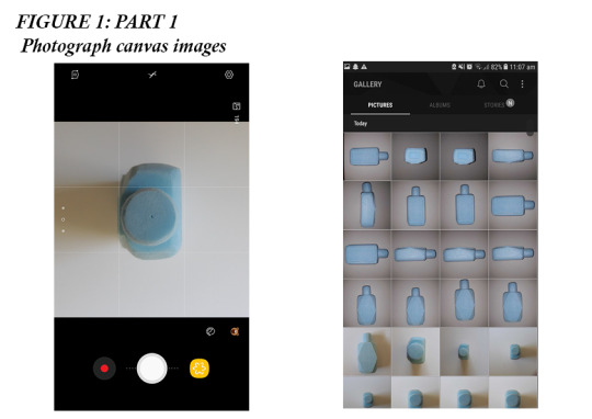
PART 1: Photography of canvas images
Figure 1: This process took a while. It was very hard for me to centre my model at first. I did not have a tripod to attach my photo to, nor did I have a proper DSLR camera. I used my phone and used the grid setting to line up each face the best I could. My model laid flat on some white foam core so that no other unnecessary background was used to confuse me during the digital modelling process. I also figured out that using the phone’s flash gave a nice even light to the sides so all edges could be easily seen.
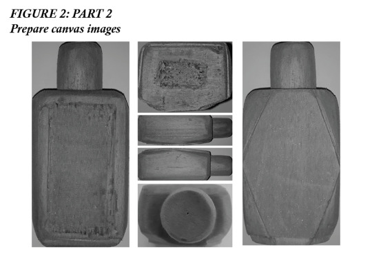
PART 2: Prepare canvas images
Figure 2: During this preparing stage I took my images into Photoshop. I cropped them and applied a black and white filter. In addition to this I played with the contrast of the colours to make sure the model each side and detail of the model was visible and clear to make it easy to work with in Fusion 360. I selected the blues in the adjustment section and made them darker.
PART 3: Model bottle using Fusion 360
Figure 1 & first half of video 1: I began by working from the photo of the model’s front face. I went into this task not really planning out my approach but this proved to be a mistake as I really struggled with creating the rounded and curved sides like I had with my blue foam model. Instead of using the easiest process and tools I experimented and played around using a variety of different methods.
I began by using the draft tool. This was ultimately unsuccessful as it did not edit the section I wanted to make sloped. To try to fix this issue I tried creating a new plane at an angle, but still not successful. Next, I used the fillet tool, but once I added the diamond face it was not what I pictured it to look like.
This stage took me an extremely long time so I resorted to have a break for a couple days and return back, starting from scratch and plan out on a piece of paper what would work best.

Figure 4 & second half of video 1: This was a much more successful approach. I remembered that Miles stated that having paper and pen with you while modelling helps you with planning the approach and taking note of dimensions, etc. This time I worked with the top view. This was a great approach as I was able to easily edit the sketch and just simply extract the form when I was happy.
Firstly I tried to use the sketching fillet tool. This created a result which was close to what I wanted but I fell a little short. Next, I created a circle sketch and extracted that. This created a curved front face which is not what I had in mind. Lastly, I used the arch/arc tool. This was a great tool as unlike the fillet tool I was able to change the length of the sides of the curve. The fillet tool is equal on both lengths of the curve.

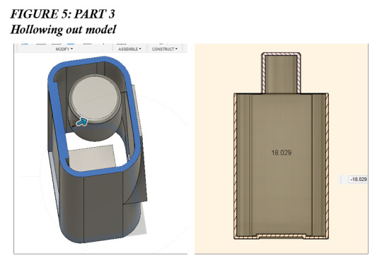
Figure 5: I also played around with the shell tool to hollow out the bottle. This video helped me to have a better understanding of how to use the shell tool with different forms and in different situations. https://www.youtube.com/watch?v=NNPPcCx2Jqc
I tried to look for a way to hollow out the bottle without deleting the top and bottom faces. Unfortunately, I was unable to find a way to do this. Instead, I redrew the faces and extracted them. I played around the sectional analysis tool to look inside.
Additionally, I used the fillet tool to create curved edges just as I had in my foam model. Creates a safer and more comfortable form to fit in a person’s hand. Great tool and really brings the model together very well.
Overall the tools made available in Fusion 360 allows for the creation of more accurate models. It allows for more detailed modification which is something that is very hard to achieve with foam modelling.
Video 1: A short timelapse of my design process and the issues I came to overcome.
Video 1: Time-lapse of Fusion model making
youtube
Figure 6: I was quite happy with my final digital model. Adding materials such as textured plastic and transparent plastics really brings the model together and I can really see how it may look like as a real product in the real environment. First making a physical model than creating a digital model I makes it easier to create the model as I knew how I should look like. If I were to go from sketching straight to Fusion it would be difficult to figure out how each component would work and overall would take a long time to complete.

If I was to do this again I would try and find more approached in creating the curved sides, possibly quicker or more efficient ways.
I felt a sense of achievement and pleasure when I was able to rotate around the bottle. I was able to see how a simple design which was created on paper has been transformed into a refined-looking digital model.
Creating a digital model in Fusion 360 I was able to work more accurately, I was able to re-try and fix my mistakes just by deleting and creating a new component. I was able to get a symmetrical design which was something I struggled to achieve with my foam model.
4 notes
·
View notes
Text
Simplicity Mock-up #2
Well, this was an interesting experiment. I completely redrew the seams of the original pattern to look more like various actual period stays I am using as references. Here is the result:


Not too shabby! There are some errors -it’s now too small in the waist, and I think I made the waistline a little too long, especially in front. Considering how drastically different this pattern is from the original, I guess it’s probably more accurate at this point to call this a self-drafted pattern than an altered commercial pattern. The thing that concerns me the most is the silhouette from the front. It still isn’t conical enough. What I’m really striving for is this:

The torso here is extremely triangular, a shape I find very flattering. I want to get as close to this shape as possible given my peculiar proportions(and I ought to be able to get a decently conical shape. My waist is naturally quite compressible in corsets.) it’s troubling me considerably as to how to get the silhouette of the inspiration stays. The stays are already too big around the bust/too small around the waist. So the obvious way to make the stays more conical(make them bigger at the bust and taper them down to a smaller waist) won’t work.
I notice that the front of the mock-up seems to be bowing inward where the inspiration stays seem to be more straight. I’m wondering if the key to getting a more conical shape is more in the boning than in the pattern itself. Perhaps I need a wide steel in the center front to keep it nice and flat. Perhaps the horizontal boning is also crucial. My mock-up doesn’t have any horizontal boning across the top. Another problem I’m having is that even though the mock-up stays are doing a great job pushing up my breasts, they also seem to be pushing a lot of fat into my armpit region in front. It’s all covered up by the short I’m wearing(an important reason why I usually prefer to try on corset mockups with nothing on underneath), but there’s a large amount of fat pushed up to the neckline of the stays just in front of my armpits. I had a similar problem with the 1876 corset I made. The solution was to give them more space in the armpit. To keep the overall bust measure the same, you widen the bustline at the side seam(under the armpit), and compensate by narrowing the bustline in the front and/or back. The one thing I don’t wanna do however is make these 18th century stays narrower at the front bustline. One of the most prominent features of the style I am trying to imitate is how extremely wide the neckline e is in front.
Anyway I’m re-drafting this pattern again. I’m not entirely sure how to fix the problems, but for starters I’m making the waist bigger, and shortening the waistline a bit. I’m also making the front piece wider so it wraps around to the side more. We’ll see how it goes. If it makes the problems worse, then I’ll at least know what not to do. Then I can do the opposite and it should help correct the problem. This is certainly helping me get a better grasp of how 18th century stays fit on the body.
10 notes
·
View notes
Text
Fashion Illustration Workshop
This workshop was conducted to help our group in our fashion illustration drawings and to create a template for us to use when we design the outfits for our collection.

The first step in the process was to find an image to base the template on. I chose an image of the model Denise Bidot. I chose this particular model as she is a plus-size, curvy model and her body type and size fits with our brand. As our brand is a plus-size brand, the template needs to illustrate this so it is integral that it matches with the ethos of our brand. The image I chose highlighted all the curves of her body and did not have any garments covering the outline of her body. This made it easier to base the template on as I was able to see the full shape of her body.

For draft one of my template, I simply drew around the model and added some simple lines on the body to display where the joints of her body is. I was content with the general shape of the body but wanted to smooth out some edges and add a little more detailing into the bust area. The facial features and the hair that I drew were something that I needed to improve on. The hair does not blend into the face very well and seems too cut of very abruptly with the hairline that I drew. The facial features were slightly off center and were not in proportion with the rest of her face, so this is something that I would change in the next draft. I drew different variations of the face and hair around the page to trial which hair I liked better and could possibly put onto one of the future drafts.

The second draft was a lot cleaner than the first. The proportions and detailing of the body worked a lot better together and clearly illustrated the curviness of the model’s body. I changed the left arm of the template to bend and for the hand to rest on the hip. I thought that this looked better than the hand being down by her side as it adds some shaping to the flow of the template and makes the template slightly more interesting to look at. I added the detailing to the bust area that I stated was missing from the previous draft, as well as cleaning up the detailing around the thighs and on the knees. I changed the facial shape slightly as I thought tat the original face shape looked too thin for the body of the model. By widening the jaw and cheeks slightly, it ensured that body features worked together. I added some detailing to the hair but did not like the outcome. There was too much soft detailing on the hair, which is not needed in a template. In the next draft, I wanted to try one of the hairstyles that I drew around the previous draft to test if it works better with the template. The lines of the template are also quite sketchy, so in the next draft the lines should be more defined and confident.

In my third draft, I kept the body the same as the previous draft. The only alteration was with the left hand of the template where I cleaned up the drawing of the fingers on the hip. The lines of this template are also a lot cleaner and more defined, which is what I wanted to accomplish in this draft. However, when I redrew the face, the jaw became slightly too wide and too square, so this is something that I needed to rectify in my next draft. I trailed one of the other hairstyles on the template and thought that it did not work as well as the previous hairstyle, so I decided to return to the previous hairstyle in the next draft. Another thing I need to add on the next draft would be the shoes on the models feet, as they were bare on this draft.

As I stated with the previous draft, the body shape is exactly how I wanted it to be so I did not add any alterations and kept the drawing of this section clean and precise. I rectified the jaw and changed it from being square and angular to round and soft. The facial features of this draft is something that I was happy with and needed to define in the next draft. For the hair, I decided to revert back to the bun that was in the first drafts, but decided to change it slightly. I added curtain bangs to the front of the hair to frame the face so that the hair and the face come together better. I added simple line detailing onto the hair but made sure to keep it direct and not as soft as the previous bun I had drawn. I trialed two different shoes next to the feet before adding the shoes on the template. I decided to add the lace-up detailing on the shoe as I thought it was flattering on the shape of the model as well as it being a more unique shoe to use on a template. In the next template drawing, I would have to define the outlining of the shoes for it to have the same confident lines as the body shape.

My final draft of my template included all of the altercations that I made throughout the drafts. All of the lines of the drawing are clean and precise with no sketchy edges. I defined the shoes on the model as well as the hair and the facial features. One way to improve this model would be to draw better facial features. Drawing facial features is something I will have to practice outside of drawing fashion illustrations to ensure that I am able to draw them correctly and nicely onto the templates.
0 notes
Note
I just wanted to let you know that I am so unbelievably emotionally attached to your comic from ABoT where Mob and Reigen meet. I adore the lighting and how the comic gradually becomes saturated with color. The emotional moment when Mob grabs onto Reigen and the stunned joy on his face blows me away every time. I just love everything about the comic. At this point if you redrew that comic like you did the Mogami scene, you may just destroy my heart. Just saying because I can't imagine it (1/2)
(2/2) any more astounding and lovely than it already is. I'll never get my breath back. Thank you for the beautiful work, Joey, and I look forward to all for your future art pieces!!
ahhh gosh thank you so much ;v; indeed a lot of heart went into it and i’m blushu
Funny enough though, the current comic is already a redraw ^^ Way back in January-ish, I had a whole other version fully drafted, which I took a solid look at and went: y’know what. i can do this better.
And so I did ! It went from 9 pages to 13, and basically every page is radically different from the page that preceded it. You even have Reigen without his Honker.
You can see the old drafts here!
#tsukithewolf#joey babbles#there are things i still like a lot in the old version#the shot of mob kneeling in front of reigen#'yup vamoose'#reigen's expression following 'he's dead now'#where his tie says UM#also i tend to put clothes straight in the ink phase#unless it's clothes that are hard for me to draw#WHICH at the time#was suits
70 notes
·
View notes
Last Seen Blogs