#i usually colourpick but i didnt this time
Text
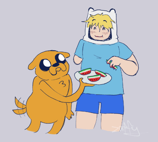
from the river to the sea
#adventure time#finn mertens#finn the human#jake the dog#palestine#watermelon#free palestine#i dont wanna tag too much stuff for palestine cause imagine youre looking for useful info and you just get boy and dog eating snacks#but its meant to be a homage/solidarity drawing#finn would be pro palestine he is a hero#he wouldnt stand for genocide#also i uhhh didnt use colour refs for finn and jake i just bullshitted#i usually colourpick but i didnt this time#ALSO I FORGOT HIS BACKPACK BUT idk pretend he just doesnt feel like wearing it
40 notes
·
View notes
Note
i love ur art sm!! ur such an inspiration 💌💌how do you choose your palettes? the colors you use have always catched my eye
thank you so much!!!
For the colours, I don't know what to suggest if you do traditional art as I'm not very skilled in that but if you're a fellow digital artist I can try!!
pretty long post coming up, btw I do need to preface I'm just a student and not a professional, so take this all with a grain of salt especially if i get technical at all
TL;DR (too long didnt read): i use a green and or orange multiply layer, i try to give everything a dark green-orange undertone, focus on how certain colours look when next to each other and how they can appear completely different
also also its late and im tired so i apologise for any mistakes
i usually start by doing colours that generally match the character im drawing, then i just kinda go wild with altering them, ive learnt to pick them on my own through practice but a lot of the time and starting out i simply mess around with "blending modes". It'd be difficult to explain all of them and they may differ from software to software but my favourite one is "Multiply" (which should be on most softwares, hopefully!)
now, what you do with these depends on what sort of vibe youre going for, I like warm colours, I don't really know how to describe my art, but I like it to be saturated yet dark.. if that makes any sense lmao
gonna use this random doodle of emma to explain what i mean. on my phone rn so its not,, very good but itll do haha

so, i started by getting roughly similar colours to what she has. colourpicking from official art is always an option too, if youre drawing an oc then just figure out the general "local colour" (flat colours unaffected by lighting) you want the character to have and put them down, my art switches from being desaturated and saturated a lot depending on the vibe im goung for, for the more saturated art I'm gonna add a clipping layer of this solid bright yellowy green olivey colour in this example (the colour you use changes the atmosphere of it a lot, i usually use green or orange because i really like the look it gives, i love dark and warm tones)

clipping is a feature a lot of art softwares should have, for this im using ibis paint x, i usually use clip studio paint, others will have it and blending modes too, it lets you create a new layer and "clip" it to the one below, anything you draw on the clipped layer will only show up on space that has been drawn on the layer below (but you can hide/delete anything on this layer and it won't effect the original layer!)
next im gonna use the multiply feature,
"keeps only the darker colors of the blend layer and makes light colors less opaque. The resulting color is always darker, except for where it's pure white" (taken from a website called sketch) dunno how much the specifics of its affects change between different softwares, but the way I view it is always "makes base colours darker, and adds a tint of whatever colour you selected"

the result from doing that is this! this gives a sorta green tone, you can play with the opacity to change the intensity. this is a really simple trick to get cool looking colours, and the more I've used it and paid attention to what specific colours i get from doing it. for these saturated pieces ive noticed that depending on how much I tinted the piece any colours that would for example be white (like the hair frederick has in this drawing) is actually straight up yellow/orange


i have some art thats a little less saturated/a bit darker than this though, but its a pretty similar process! you can see the white of their shirts are actually again a dark desaturated yellow/orange, now you may notice it looks a little green at first, that is another thing to keep in mind


colours can trick your eyes a lot! and you can use this to your advantage very well, I'm not well versed enough in colour theory to explain the exact specifics on how this happens, but basically depending on the colours surrounding it, certain colours can appear completely different
another example is normans waistcoat in this drawing, you probably see that and think "thats blue" but nope, somehow, its actually a very very desaturated yellow! grey can appear as blue a lot ive noticed

if we isolated that grey/yellow colour you can see it is in fact grey, but it looks blue in the whole drawing!
whilst obviously theres nothing wrong with making a drawing of a character where things like blue actually are blue or a white/grey is actually white/grey, in the style of art I do i personally enjoy limiting the amount of colours used and using certain tricks to make it look like theres more variation in hues than there actually is, i like how cohesive it makes the artwork look :)
heres another example of what multiply can do with a few different colours, its best to learn to colour without it, i see multiply (and other blending modes! theres a lot of them) like training wheels, its not cheating to use them, its just a little boost to help you start out, and you can go a lot further in developing your understanding of colour if you try and learn to colour without it :D

#thank you for asking!#ive wanted to write smth like this for a while#art#art tips#color theory#kinda#tbh im bs'ing a lot of this#digital art
7 notes
·
View notes
Last Seen Blogs
ghostydude2
✨❤️🩹Ghostly❤️🩹✨
ghostydude2
✨❤️🩹Ghostly❤️🩹✨

deej6969
Untitled

jenrhaelim-blog1
The Days After Sunday

python-course-in-udaipur
Untitled