#instead of analyzing the mfb style
Explore tagged Tumblr posts
Visit Tumblr Blog
Explore Tumblr blogs with no restrictions, modern design and the best experience.
Last Seen Tumblr Blogs


Fun Fact
Tumblr has 411 employees.
Text
am trying to draw bennett as a beyblade character but dude LOOK at him he's already practically there

#drawing is not my strong suit and i am REALLY bad at adapting styles#so i was like whatever to place like the present to learn#and then i remembered i have finals and i should be studying for that#instead of analyzing the mfb style#if i had money i'd commission someone but also lowkey i wouldn't bc im a neurotic control freak and it must be to my vision#(my own version will also not be to my vision because i don't have the skill to pull it off but#at the very least no one else will be on the receiving end of my frustration)#going back into my writing hidey hole i guess LOL#genshin impact#beyblade#beyblade metal fight#bennett genshin impact
14 notes
·
View notes
Text
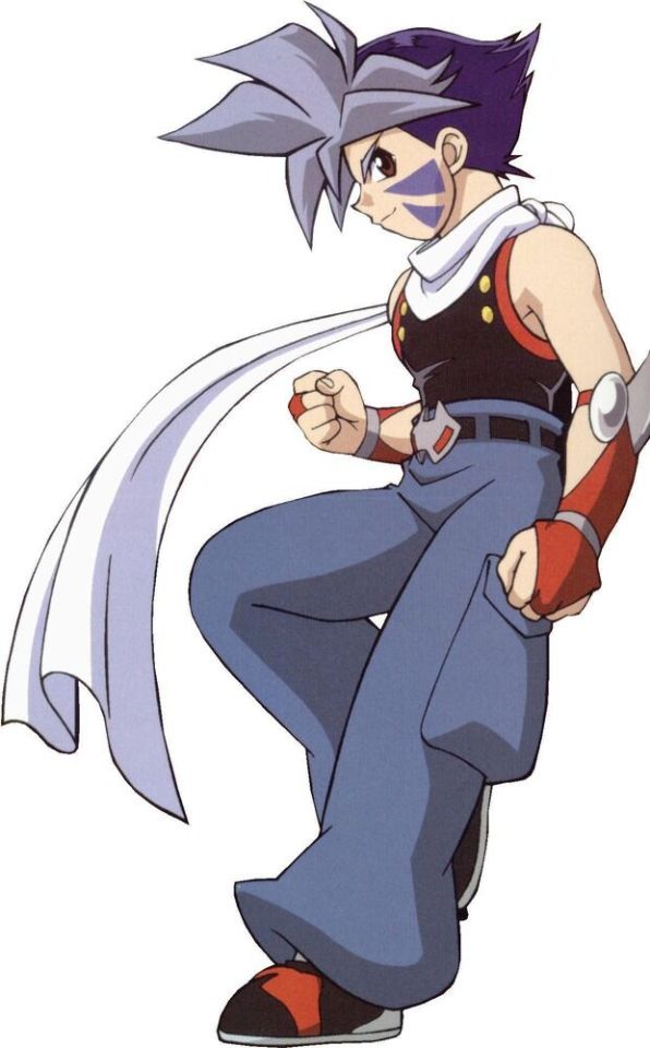
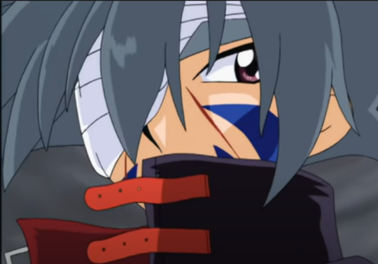
Character design analysis: Kai Hiwatari
I’m starting this thing where I analyze character Beyblade designs and how they changed over the seasons. I’m starting with an original series character because Burst is ongoing and characters can return in future seasons (I will do also mfb since it ended)

We start with his season 1 design. From a fashion standpoint, it makes no sense. In the context of Beyblade, it fits right in. Beyblade takes suspension of disbelief and tells you to either roll with it, or just laugh at the ridiculousness of it. Kai’s design is arguably the strangest of the main cast (possibly second to Ray, but that’s debatable)
Working our way from the top down, he has 2 hair colors, bluish grey at the front and dark blue at the back. It’s styled in what I can only describe as half the quintessential shonen hair. The front is improbably spiky and is pretty long. But look at the back
It’s long, but it’s not spiky in the slightest save for it coming together at the back into something which probably has a name, I just don’t know it. Kai manages to give off “rebel” vibes, for lack of a better term, while also looking stylish. That hairstyle needs a lot of effort to keep
Moving on to his facepaint. It’s 4 blue traingles. They change slightly each season but here it looks like someone drew a triangle on a flat surface and it didn’t translate perfectly to the curved surface of a human face. The 2 top triangles are bigger and point horizontally. The bottom 2 are smaller and point diagonally. I don’t know why they were included in Kai’s design to be honest. If they wanted to give him something that made him stand out they could’ve just used the gloves or scarf. Having both plus the facepaint feels a little overblown but again, Beyblade doesn’t half ass anything
Down to his scarf. It’s most iconic appearances were in G-Revolution. Here only one end sticks out, instead of 2 like in G-Rev. It also shows no sign of being weighted. I’ll get more into it when I get to his V-Force and G-Rev designs
That sleeveless top looks terrible. It looks uncofortable and it’s a crime againts fashion. It’s also not something particularly notable about Kai. Really it’s just there so we can see his muscular arms
Speaking of his arms, look at his gloves. My favorite part of his original design, he never uses them after this season. They are implied to be weighted, but are definitely not as heavy as his scarf on G-Rev (more on that later). I love them, and they work with Kai, but Dranzer has minimal red (even though the bit-beast is all red. Go figure). They probably got rid of them because it didn’t match the aesthetic of his bey
His belt buckle looks kinda cool, but it’s not that remarkable
His pants are unreasonably baggy. I get that you’re a beyblade thief but no need to be able to carry 70+ pounds of plastic. Other than that, nothing notable
His shoes feel like a last minute addition as well. I can’t tell what they were going for, and they aren’t good, but you don’t notice that unless you specifically pay attention to his shoes (which are never the focus of any shot)

Kai in V-Force keeps the hairstyle (some slight changes but that’s due to the new animation studio)
His facepaint now consists of 4 traingles all pointing diagonally, instead of 2 poitning horizontally. Again, probably just the studio change
His scarf is gone but looks like he’s wearing a turtleneck? What? This decision genuinely baffled me. The scarf may have had its best moments in G-Rev, but it was still iconic in 2000. Almost as much as his gloves and you wouldn’t remo- oh wait
His top now has these things that go around his arm. I don’t know what they are called but I’m sure others pull off the look better than Kai does here. They kinda look like wings but giving characters wing designs would be executed better in G-Rev
The rest of his top is tight, but better than in season 1 (again, not a major part of his design)
He replaced his solid gloves for arm warmers. I would make fun of this if not for the fact that I want those arm warmers for myself. The red gloves looked better on Kai but those arm warmers would look better on me
He changed his belt buckle, but it’s not too different
Baggy pants now have these weird red parts. I don’t know how they attach
His shoes look normal now
The lack of scarf and weighted gloves is obvious. This means Kai was not wearing weights in V-Force (unless those pants are carrying rocks). Kai also seemed weaker in battles during V-Force and he was much thinner. I don’t know if this was intentional but in-universe it’s likely the consequences of the Russian arc from season 1
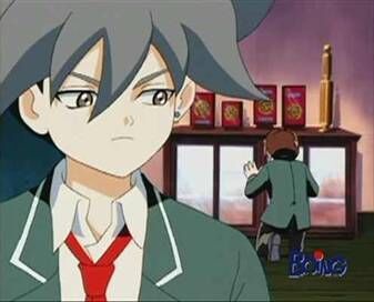
This doesn’t seem like much other than Kai in formal attire since he’s not training nor battling, but I still found some things in it
First the tie. It’s not very tidy. Considering Kai’s design implied he cares about his appearance this seems strange. But considering his mental state at the beginning of V-Force it’s not surprising
Second, and most importantly, he wears a single earring on his left ear. He doesn’t wear any earrings in his regular design, no matter the season. This implies that Kai only wears an earring when he’s presenting formally. Why?
Also is that eyeliner?

Kai in G-Revolution is more similar to himself in season 1 than in V-Force. His hair is longer but still kept in the same style
He has eyeliner. I don’t know why but I kinda like it
Look at his facepaint. The triangles are slightly crooked. I guess they were meant to look like bird claws a bit. It’s not bad, just strange when you’re used to straight triangles
His scarf now has both ends sticking out. It’s also weighted. Considering it cracked concrete by being cropped when Kai had his arm extended horizontally, I need someone to do math and tell me how heavy that scarf is.
He has a shirt and a jacket instead of that top he used before. Finally Kai gets sleeves. It’s a cool jacket that looks badass without looking like he was trying too hard
He wears normal (or at least normal in-universe) fingerless gloves.
His belt buckle looks like someone overlayed his season 1 and V-Force buckles into one. Small detail, but considering it’s the final season, it’s nice
Kai wearing kinda baggy pants instead of super baggy pants. I never though I’d see the day
His shoes would be normal if not for the fact that they have these red belts (are they belts?) holding the pants to them. Like all of Kai’s shoes, it’s a minor part of his design that doesn’t really stand out
Overall, Kai’s G-Revolution design is very toned down compared to previous ones. Except for the scarf not being in V-Force, the more iconic parts of it stayed consistent (hair and facepaint). He’s also buff as hell in G-Rev
Kai at the end of the series can be seen wearing this. I couldn’t get a full-body picture but he’s wearing a long coat (reminds me of the Matrix). It’s probably to hide all his wounds. Not much can be said about it other than it looks cool
45 notes
·
View notes