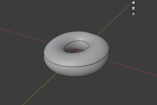
#is the donut tutorial series by blenderguru!
Explore tagged Tumblr posts
Visit Tumblr Blog
Explore Tumblr blogs with no restrictions, modern design and the best experience.
Last Seen Tumblr Blogs


Fun Fact
In 2020, 27% of US Tumblr users had an annual household income of over $100,000.
Text
I promise I won't paywall the clothes I make !!!!
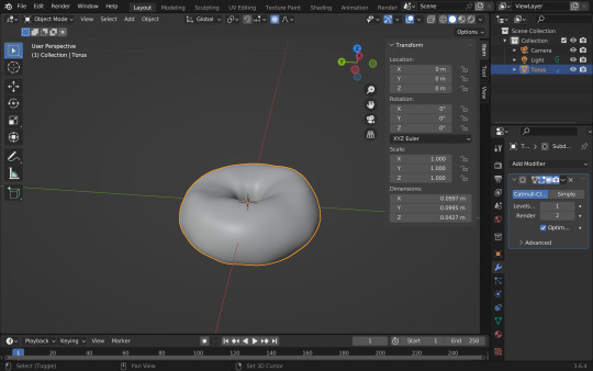
#ok for context#blender is a 3d modelling program#its free go get it LMFAOOO#but one of the first tutorials anyone does to learn blender (or the rite of passage#is the donut tutorial series by blenderguru!#what I remember struggling with a few years ago was the uv map stuff#I don't know if I was just rushing to learn or if I've just gotten smarter or maybe blender's gotten easier to use LMFAOO but#its not that bad this time around???#I don't wanna jinx it#BUT EEEE if I learn this stuff??? ill finally be able to make all these things on my Pinterest board
2 notes
·
View notes
Text
I always plan on chiming in on these topics, then I write a mammoth post and am afraid to post it because maybe everyone will skip it. But I will post this one and if you feel up to it, please read it, you might get valuable info out of this.
On Reducing Polygons: I absolutely agree that optimization is key and we could do a much better job with it. The methods of removing stray vertices should be standard practice and I always wonder why people do not do that in their workflows. Removing doubles on everything is not always a good idea, especially on clothing, but it might be different for objects. Still, I see a lot of disconnected faces on meshes that should be connected and not just a bunch of single faces next to each other. These kinds of pointless doubles and unnecessary split edges should definitely be removed too.
What I am doing to help I'm working on a tutorial right now showing another method you can use to reduce polys that gives you more control and better quality than decimate 💪. You can get to lower poly counts without so much quality loss too, but it requires some manual work, not just the push of a button, but it is super worth it! Keep your eye out for that one.
On conversions/learning/creating meshes: Tbh, even 7k is still madness for a clutter object, it shouldn't be above 1k. Even 1k is still high compared to EA's clutter meshes! We have lost perspective if we keep judging against insanely high polys and think that a 6k clutter object is low-poly. Nope, that is still insane in Sims standards (no matter the iteration) and you should not be using that either in your games if you care about game performance. Clutter objects made by EA are mostly under 500 vertices in the Sims 3, so if our goal is to have meshes that have only minimal impact on game performance, we need to seriously cut down on those vertices and polygons. We have to remember that a lot of vertices are also added with sims, and especially CC hairs are extremely too high. Most EA hairs for Sims 3 are only between 5-7k polys. When have you ever downloaded a CC hair that only had 5k? Granted, most of these hairs look pretty jagged and we got very used to the smoother high-poly ones that have at least double the polygons. but if keep those in our games, then we should pay even more attention to keeping the rest of our CC as low as possible to counteract that. It's about balance, how many high poly objects are actually rendered at once. The best tip would be to use high poly meshes sparingly, and for that, we also need low poly CC to balance out those high hitters we do not want to live without, and we need transparency from creators on their polygon counts. On conversions and learning how to mesh: I think a lot of people think converting is super easy and they do not have to learn much to do so. But actually, if you want to do quality work, you have to put in the work, read up on tutorials, and learn how to actually use the meshing tools, even if you do not create your own meshes. You still need to know how you would do them to make proper conversions and fix broken meshes along the way. It's definitely easier to become a creator first and then a converter, because you get a good grip on the basics first, learn what a standard mesh looks like, and learn best practices for the game you are creating for. You learn what needs fixing and then you can focus on how to fix and convert meshes that are structurally entirely different from your target game. It also helps to know what kinds of issues you guys are struggling with, so I can work on addressing them and make tutorials that are actually tailored to your needs. Also, if you have a problem, google, watch tutorials, ask people in the creator's discord, or people like me who have an open ear for those questions.
To get started in Blender, I recommend Blenderguru's Donut Series for Blender 3 and 4. Those teachers on YouTube know their stuff inside out and will give you valuable tips that you won't find in a Sims tutorial. You also learn how to make renders, do a simple animation, and light your mesh too, which are things you do not necessarily need for making meshes for the Sims, but are good to know for creating renders or fancy snapshots of your WIPs or something like that and helps understand what 3d tools can do and can be used for. The lighting tips you'll learn can also help you set up lights in your Sims game to make your creations stand out more. Google search some important techniques and practices like good topology/topology best practices, Uvmapping game assets, baking maps in Blender. If you want to create your own textures by generating, not drawing or copy-pasting them, you can look into sculpting tutorials and retopology, but that is a bit more advanced. You do not always have to start with a Sims tutorial either, in fact, I would highly recommend starting with a general meshing tutorial that covers the basics on modeling (for games), UV mapping and baking textures before focusing on sim specifics.
I get that a lot of tutorials out there use older Blender versions. But please do not shy away from using the newest Blender versions. Anything you can do in an older blender version you can also do in the newer one, and you can google how to do X in the new version and will find answers, you do not need to keep using a version just because you read a tutorial that used that one! Focus on tutorials that use at least Blender 2.8 or higher with the new UI, they will be much more translatable to the current versions. If you are searching for pure Blender tutorials, prefer the newest ones you can find that use the current Blender generation, and learn to use the most recent version of Blender. Update Blender regularly too. It is easier to keep up with new features that could make your meshing life easier if you go with the flow! You can export use older Blender versions along with new ones and keep old Blender Installs parallel to your new ones (they do not get automatically removed, just create several shortcuts to older versions if you want to keep using them), but Blender has come such a long way and has become so much easier and more intuitive to use. And there are tons of helpful plugins too, but Blender itself has become so good that you don't need to have them at all. Take the leap! CC creators that actually make great high-quality, low-poly stuff also learned that from somewhere else and practiced until they got it right. You gotta do the work, and it's fun to actually make progress and understand what you're doing! I cannot do the learning for you, but I can provide you with more of my knowledge to help you along the way. The most important thing is not to just blindly follow tutorials but to really understand what you are doing and why. My personal projects and goals I am building my first Blender plugin at the moment. I'm so excited about that because I can't actually code in Python, but I am getting the hang of directing Bing's AI to do my bidding and the addon is actually working so far! Hopefully, it will do everything that I want it to do by the end and I can share it with you🤞 This year, my goal is to create more tutorials. This will be the year of tutorials or something like that (let's see how long the New Year's motivation actually lasts). It's been on my mind for so long and I just can't bear to watch people blindly stumbling through their meshing adventures around me without doing something to help them out! And I also want to tackle the big topic of polygon counts this year and how we can better judge what is suitable for our games and what isn't. It's a big topic with a lot to cover, but if it works out the way I envision it, it will be the ultimate guide🤞It's been in my head for a long time, just getting stuff done in a streamlined manner is hard with mental health problems ND traits, and you may know this already from me, stuff takes me a lot of time to get done, but I am doing what I can to make everything as good as I can so when I do deliver you're in for a treat! If I was more organized and streamlined and my fears wouldn't hold me back, I would have created a YouTube channel and a Twitch channel by now so we could hang out and I make video tutorials for y'all 😫 but I hope I can overcome some of them and realize some of my more ambitious goals this year despite my fears!
Thanks for reading this huge wall of text, you're the best! I hope you found it a valuable use of your time.
Hello guys! First of all happy new year ! Hope you had a great time out there :) 🎆
Today I'm writing this to explain why decimation of Sims 4 meshes is paramount while converting stuff. You know me, I don't like to make statements as english isn't my first language and I find it difficult sometimes to actually write things down - even in italian I struggle sometimes lol. BUT I think this would be useful to all the cc converters and creators out there. So please, take this as an advice, for the sake of our oldie and beloved Sims 3.
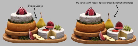
Little backstory: I was casually browsing tumblr the other day and stumbled across a beautiful food set converted from Sims 4 - which I immediately saw was high quality. Just for curiosity I downloaded it, checked the polycount of a random object (if you're new here it's the total number of polygons found in a three-dimensional model) and it had way too many polys: 28k vertices - 34k faces + 4096x4096 textures.
Sims 3 is quite an old game now. Every player had experienced lag and glitches at some point so it's very, very important to make the stuff you create/convert from other games suitable for it! Here comes to the rescue a super useful tool in blender called decimation. It basically "allows you to reduce the vertex/face count of a mesh with minimal shape changes", as said on blender website. In just 2 minutes and with not so much effort I was able to reduce those polygons down to 8,4k vertices - 7,4k faces. Do you see any difference? I don't honestly.
Optimization is the key. Converting from sims 4 is not just taking the mesh and textures and putting them all in Sims 3. I wish it was tho!
You're free to put whatever you want in your game but you have to think about the game performance as well. There are people who still play the game and as an ex player I got really upset when I had laggy gaming sessions.
Having said that, here's a tut about blender and the decimation tool, done by @simaddix and which I think covers every important aspect of that useful tool.
If you read this all, thank you! Now I can go back to convert new stuff :D
-Marta
263 notes
·
View notes
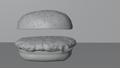
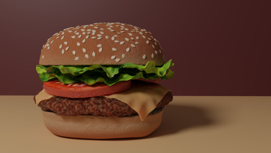
Photo
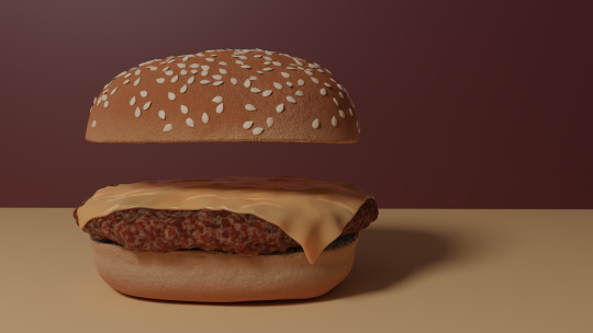
Burger On The Grill
Part 5: Building a Burger--Melted Cheese
After completing the donut tutorial by BlenderGuru, I was challenged to create something similar by myself, so I chose to make a burger. Last time, I grilled up a patty. Now, how about some cheese?
Modeling
Modeling the Cheese by Sanctus – Blender Procedural
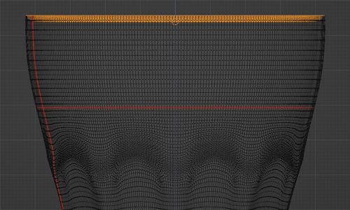
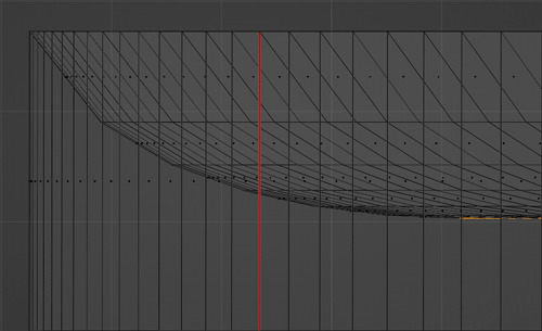
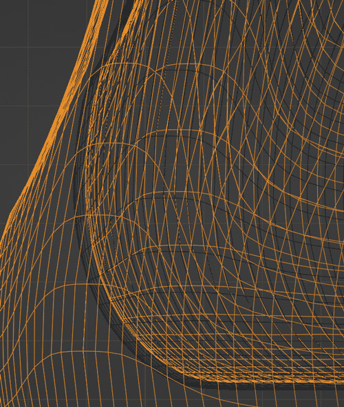
Cheese can be draped over the patty with the use of cloth dynamics.
Blender doesn't handle very small simulations particularly well due to floating-point errors, so I have been working on a burger that is sized up by a factor of 50. I will correct the scale to reflect real-world values at the end of the project.
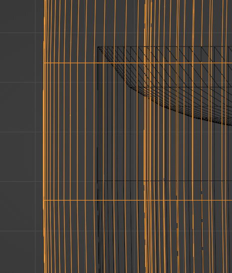
I created a plane and positioned it above the patty. I subdivided that plane a good number of times to provide the necessary detail.
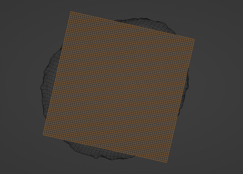
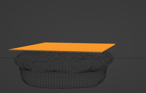
I set the patty as a collision object and added a cloth modifier to the plane. I chose the rubber preset for the cloth modifier. I played the timeline and froze on a frame I liked.
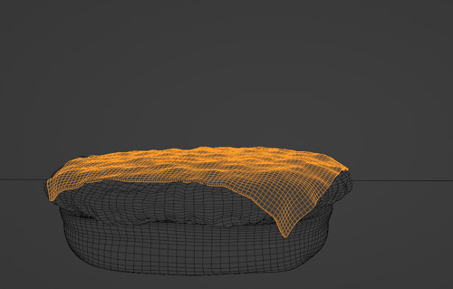
I added a solidify modifier to give the cheese some thickness. Then, I applied the cloth modifier so I would not lose the shape.
It looks pretty good as clay, but I like my burger with some color.
Time for textures!
Texturing
Texturing the Cheese by Default Cube
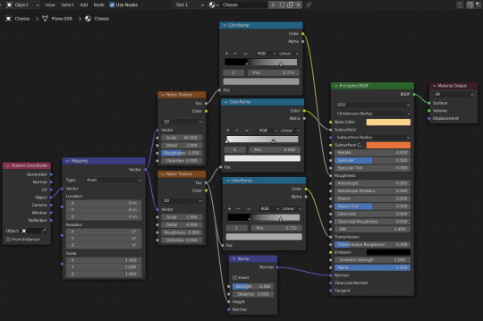
I started simple with a yellow color for the diffuse, an orange color for the subsurface scattering and numeric values for the subsurface and roughness. Then, I made things complicated by adding noise textures for the subsurface, roughness, transmission and normal.
The subsurface determines how much light enters into the volume of the cheese before it is reflected out.
Roughness determines how shiny the surface is.
Transmission determines how much you can see through the cheese to the meat below; you can see through more in the melty places.
Normal adds more distortion and detail to the surface without altering the geometry.
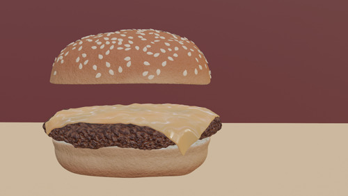
Here is the textured cheese in Eevee.
For more details, see Cheese Texture node layout at the top of post.
Follow me to keep watch for the next part!
Review the previous part.
See overview for links to all parts of this tutorial series!
See more of my work: Check out my archive.
Join me on my journey: Follow me on tumblr.
Support my creative profession: Buy me a coffee on KoFi.
#blender#tutorial#burger#cheese#3d art#art process#blender guru#food art#cheeseburger#melted#cloth simulation#texturing#materials#3d artist#art#digital art#3d render#blender3d#blendercommunity#blender tutorial
15 notes
·
View notes
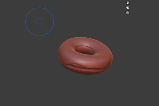
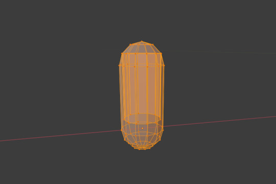
Photo
My first attempt with blender, following along #blenderguru ´s donut tutorial series!
1 note
·
View note
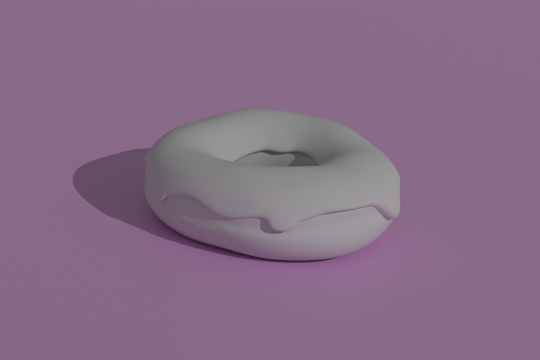
Text
I wanted to start learning Blender, so here's the result of me following the donut tutorial series by BlenderGuru on YouTube!
0 notes
Text
Week #1: Donut (Level 1)
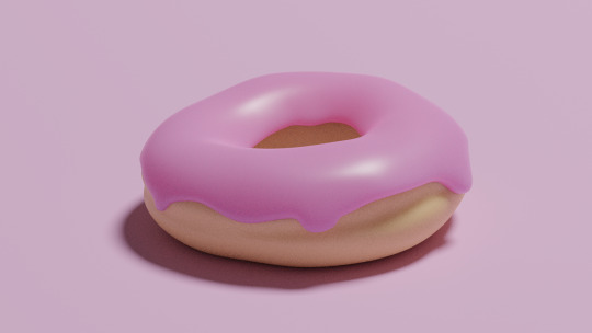
The Blender Donut tutorial by Blender Guru is a series that I started during quarantine, but abandoned after I got stuck on the icing. I decided to start my Blender-learning passion project with this series, as he teaches very basic yet important tools.
The donut and icing were very simple to do. Because donuts are not perfectly torus shaped, we did some grabbing of vertices to create a slightly deformed ring.
I made the icing a bit thicker, because the one above is paper thin :(
This was where I got stuck last time- at creating the realistic icing. I couldn’t figure out how to dribble the icing, but I finally figured it out this time. So, after creating some dripping effects, it was time to sculpt! I’ve used Maya before for basic box modeling but this was my first time actually sculpting in the 3d space. I added an indent around the middle of the donut, just like real ones have. I’m pretty happy with how it turned out!
After sculpting, I did my first render, and even though the icing looks a bit wonky, I’m happy with how it (slightly) resembles a donut!
I was going to stop here and do the rest of the tutorials for the next few weeks, but I decided to keep working because Blender is pretty fun- or at least the basics are...
So, the next step is adding materials. This part was pretty easy because I just needed to pick two colors for the bread and icing.
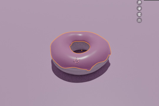
I used pink for the classic strawberry donut (my favorite) and decreased the roughness to make it a bit reflective. BlenderGuru also made us do something that made the icing absorb the light, because real icing isn’t completely a solid that deflects light.
After adding materials to the bread, the first level of this tutorial was finished and I was ready to render my simple donut.
:D level 1 complete, and I’m really happy with how it turned out :)
Now for the sprinkles: we used a UV sphere, extruded the top half, and flattened the top and bottom to create a sprinkle-like shape.
We used particle properties to add the single sprinkle all over the icing without having to duplicate each one. I made it a bit thicker as well.
To add different colors to the sprinkles, we adjusted some node properties. This reminded me a lot of blueprints in Unreal that I did for MoCap last semester.
I chose my sprinkle colors, and will pick up where I left off for next week’s output post. Hopefully, I will finish the donut and be ready to animate it for 9/28.
0 notes
Text
Statement of Intent/Timeplan
SECTION ONE – Your Final Major Project (guide 150 words)
What is the title of your Project? What will you work towards producing and what is your proposed end point? Explain how this relates to your work and ideas from the Pathway Stage and how it extends your knowledge, understanding and creative ability.
As I have explained in my introduction, being in lockdown for so long has admittedly been a struggle, and it’s had a much bigger impact on my creativity and self-motivation than I had anticipated. I came into lockdown thinking art would be a welcome distraction, when it’s turned out to be the complete opposite. I had no interest in doing any of the things I had proposed to do at home, resenting my ideas even before they had properly taken off. For quite a few weeks, I didn’t do much in the way of art.
This was until I decided to download Blender, a free, yet surprisingly high-quality, piece of CAD software. The last time I used any CAD software was back when I completed my GCSEs, where I created virtual models of my product designs. Although I distinctly remember taking to and enjoying the process, it’s an area I haven’t delved further into since. After seeing some examples of artworks made using Blender, I was (for the first time in a long while) eager to give it a go, and thus have begun following a beginners tutorial series on YouTube, with the aim of developing an understanding of the software, meaning I can go on to create 3D illustrations and animations.
I therefore plan to document the progress of my 3D modelling skills throughout this FMP, whilst also developing an idea of how I may utilise the software to create striking visual accompaniments to the music of experimental rock band Mr Bungle. These may come in the form of stand-alone illustrations, posters, short animated gifs, publication advertisements, record covers, or any other area where artwork is needed to promote the band.
SECTION TWO – Influences, Research, Sources and Ideas (guide 150 words)
What are the influences, starting points and contextual references and why are they relevant to your ideas? Indicate the subject areas you intend to research and the likely sources of information including any museums, specific locations, performances, etc you plan to visit. However you should not make extensive lists in this section. Instead you should compile an accurate bibliography correctly acknowledging all references including texts, periodicals, websites and video/DVD’s etc. Enter your bibliography in the APPENDIX.
The initial starting point for this project came out of wanting to learn more in the way of 3D modelling. To do this, I will be using online resources such as www.blenderartists.org, as well as YouTube, where there are some brilliant in depth tutorials, such as the one I am currently working on, a donut modelling tutorial by CGI professional Andrew Price, aka BlenderGuru. This particular series, which is around 5 hours 30 mins long, has been incredibly helpful, introducing me to so many techniques, tools and processes, covering modelling, sculpting, colouring, texturing, lighting, rendering, and even animating. I aim to go more in-depth on some areas of Blender during this project, such as sculpting, depending on which process is most suitable to realise my designs.
As well as using online resources to help me learn Blender, I will also be referencing both 3D artists and poster artists to inspire the concepts and designs for my own illustrations. These may range from illustrators who create 3D graphics, such as Mirko Càmia, to 2D artists working predominantly within the music industry.
I intend for my artworks to be made to accompany music in some form, the band I have chosen being Mr Bungle, an experimental rock/metal outfit fronted by Mike Patton (most well known for his work with Faith No More). I have chosen to use Mr Bungle for a number of reasons, the first being that I am a big fan of their music. Furthermore, the band doesn’t already have a strong visual identity, meaning there is more scope to incorporate my own ideas stylistically. Other reasons, including how the band’s musical style has influenced my ideas, also play a role in my decision to use Mr Bungle, which I will explain in more detail in my blog.
SECTION THREE – Techniques, Processes and Timescale (guide 150 words)
Refer to any techniques and processes you intend to use. Describe the range of media and materials relevant to your project and how you may use them to explore and develop your ideas. Include aspects of studio practice, workshop procedures or the use of particular equipment and software etc. Provide an indicative timescale for your project and indicate the manner in which you intend to divide your time in order to investigate, develop, produce and evaluate your project appropriately. This should be a meaningful plan to you and should be personalised to your project. You may wish to write your plan as a daily or weekly schedule in which case enter your timescale in the APPENDIX.
Most of my work will be completed using Blender, as one of my aims with this project is to develop my 3D modelling skills. However, within Blender, I will also have to use textures from other sources, such as Poliigon (a 3D texture and model website). To develop my initial concepts for illustrations, I will use Adobe Photoshop or Illustrator to create 2D sketches and mock-ups.
Within Blender, I aim to use multiple techniques, including sculpting (for more organic forms), modelling, texturing, as well as composing and lighting. I will also be able to create some small, repeating animations using 3D elements that I have developed.
Although the current Covid-19 situation and lockdown prevent the possibility of me printing physical copies (at least at the moment), I intend to get some of the finished pieces printed for display purposes, such as in my portfolio, even if this is after the FMP deadline. I plan on getting these done professionally at a printers, meaning I can retain the high amount of detail, and correct colouring, in the print form of the artworks.
SECTION FOUR – Method of Evaluation (guide 50 words)
How will you critically review and analyse your work and determine if it is successful? How will you identify directions for ongoing development? Do you have a method to record the critical response to your ideas? How do you propose to assess the success of your Final Major Project and what will be your methods of evaluation?
My work will be deemed successful if, during the course of the project, I am able to become much more familiar and comfortable with using Blender for 3D modelling. Furthermore, I hope that my outcomes, although retaining their own unique style, will tie into the music and image of Mr Bungle. Due to the circumstances in which this FMP will be created, I may not be able to create a refined final piece, however, the success of the project can be largely judged on the progress of my Blender skills, and how I am able to utilise these to fashion my own outcomes. Even if I cannot create a refined final piece/s, I hope to at least provide evidence of what I plan on doing for ongoing development, both to better my knowledge of 3D techniques, and further explore my ideas in more depth.
0 notes
Photo
Burger On The Grill
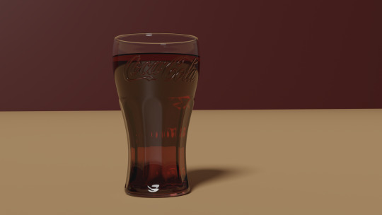
Part 10: Pouring a Drink--Solid Glass
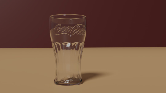
After completing the donut tutorial by BlenderGuru, I was challenged to create something similar by myself, so I made a burger. I will make that burger into a meal with a soda and fries. Last time, we modeled the contour of the iconic Coca Cola glass. Now we will finish off the glass and add the logo.
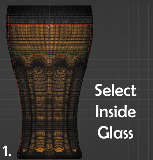
Solidify
Apply all your modifiers so far. Select the lowest edge loop and add a face to the bottom of the glass. It does not matter that this polygon is an ngon because at this point, we are not going to be subdividing the glass any further.
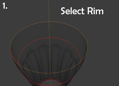
Select the inside of the glass up to the rim and delete the extra faces. Select the Rim of the glass and invert the selection. Create a Vertex Group from this selection called NotRim. Apply a Solidify Modifier with 0.001m thickness and choose NotRim as the Vertex Group.
Select extra geometry added by the solidify modifier and delete faces. Scale the inside of the glass on the X and Y axes to line up with the rim of the glass. Select and bridge the edge loops.
Check the face orientation and flip any red faces. Select all and merge by distance to eliminate any extra vertices.
We now have a solid glass to work with. Scale the glass down to match real world dimensions.
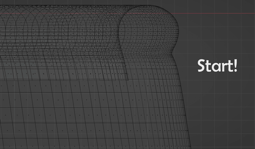
Add Logo
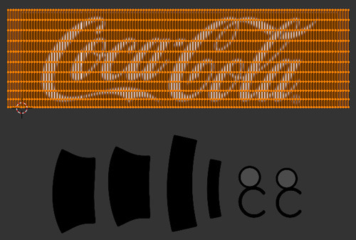
To create the image for the logo, grab a high resolution PNG with transparency from the internet. I found this image:

Select the logo and fill with white. Set it on a black background. Blur to soften the edges. This greyscale image can be used in Blender as a displacement map.

To add the decal, we will need to create a UV map. Mark seams and unwrap, creating an island around the area you plan to place the logo.
Link the logo image to the UV space. Stretch the logo island to span the entire space on top of the logo. Any other islands can be placed off to the side of the UV map. We do not need them.
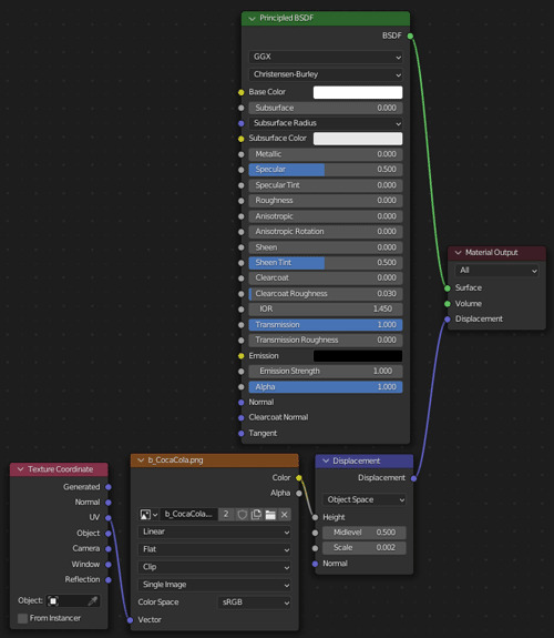
To set up the glass material, add a Principled BSDF Shader and set Roughness to 0 and Transmission to 1. Or simply use a Glass Shader instead.
You will also need a Texture Coordinate node, an Image Texture node and a Displacement node. Load your logo into the Image Texture node and connect the sockets as shown in the image below. Adjust the scale of the displacement to your liking.
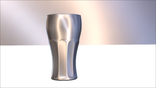
There you have it, an empty glass!
Follow me to keep watch for the next part! We will be adding some liquid to the glass.
Review the previous part.
See overview for links to all parts of this tutorial series!
See more of my work: Check out my archive.
Join me on my journey: Follow me on tumblr.
Support my creative profession: Buy me a coffee on KoFi.
#blender#tutorial#soda#glass#drinking#coca cola#logo#texturing#3d art#art process#blender guru#food art#3d artist#art#digital art#3d render#blender3d#blendercommunity#blendertutorial
3 notes
·
View notes
Photo
Burger On The Grill
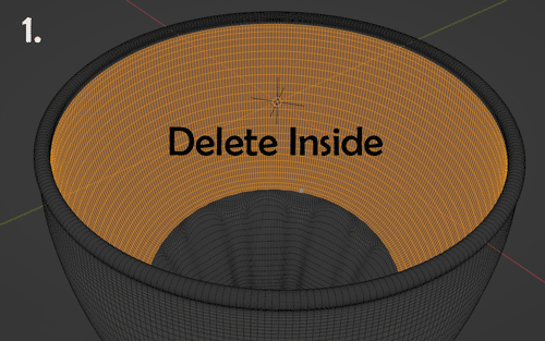
Part 9: Pouring a Drink--Cutting Curves
After completing the donut tutorial by BlenderGuru, I was challenged to create something similar by myself, so I made a burger. Now, I will make that burger into a meal with a soda and fries.
Last time, we started modeling the iconic Coca Cola glass and created a simple contour. Now, let's add some indentations.
Cutting Object
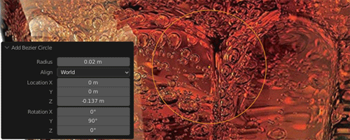
To create the cutting objects, I started by adding a Bezier Circle and resizing it to fit the curvature at the top of the indentations. I set the resolution preview to 3 and converted the curve into a mesh.
I separated the bottom half from the top half, moved the bottom half to the bottom of the glass, and then joined the two halves back together. I added edges between the two sets of points and subdivided these edges by 10.
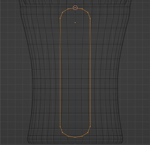
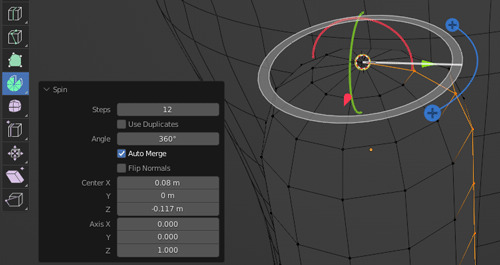
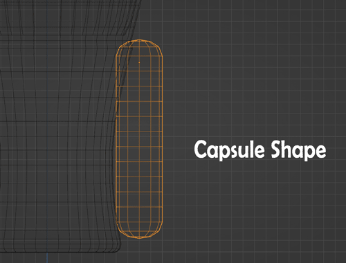
To get the capsule shape from the edge, I deleted the left half of it and used the spin tool.
I resized on the X axis to make it thin. Then, to get the cutting object to match the curvature of the glass, I added a Bezier Curve and adjusted it to match the contour of the portion of the glass my cutting object would be against. I added a Curve Modifier to my cutting object and referenced this Bezier Curve.
Boolean
I set up a Boolean Modifier to subtract the cutting object from the glass and checked the shape of the indentation created. To control the shape of the cutout, I adjusted the shape of the cutting object.
Once I was happy with the shape of the cutout, I added an Array Modifier to the cutting object and finalized the boolean operation.
Clean Up
Because boolean operations leave you with terrible topology and shading issues, I used a ShrinkWrap Modifier to transfer the curvature created by the boolean operation to a new glass with uniform, high subdivision.
To be honest, if you do not mind high polycount and excessive render times, you could stop here with the indentations, but I wanted to try out my hand at retopology, so on we go!
Retopology
To lower the polycount and get proper topology, I isolated a section of the low poly glass before the boolean operation.
Next, I created a guide for my indentations. I added a Bezier Circle and set the resolution to 2 so that it would roughly match the resolution of the glass behind it. I converted the Bezier Circle into a mesh, extended it as before and subdivided the sides by 6.
I planned out the topology on paper first. Then, I added loop cuts and dragged vertices around to obtain proper flow.
Of course, with all that moving about, I had lost the curvature of the indentations, but that was easily retrieved.
I applied an Array Modifier, subdivided by 2 levels and added a ShrinkWrap Modifier targeting the highly subdivided glass from earlier.
Finally! We have good curvature and topology for the indentations. Who knew that one detail would be so complicated?
Here is a overview of our journey so far with the glass:
Follow me to keep watch for the next part! I will be finishing off the glass and adding the classic logo.
Review the previous part.
See overview for links to all parts of this tutorial series!
See more of my work: Check out my archive.
Join me on my journey: Follow me on tumblr.
Support my creative profession: Buy me a coffee on KoFi.
#blender#tutorial#soda#glass#drinking#coca cola#boolean#retopology#3d art#art process#blender guru#food art#3d artist#art#digital art#3d render#blender3d#blendercommunity#blendertutorial
2 notes
·
View notes
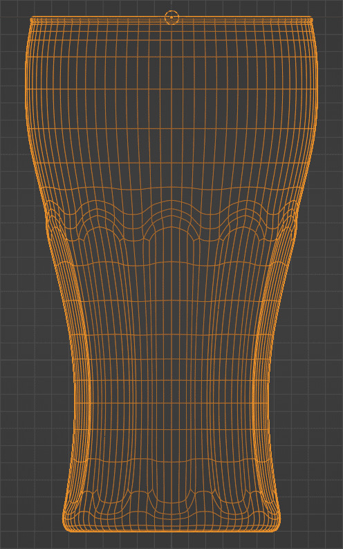
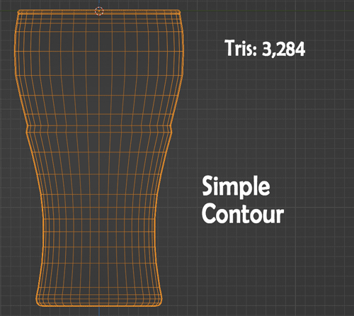
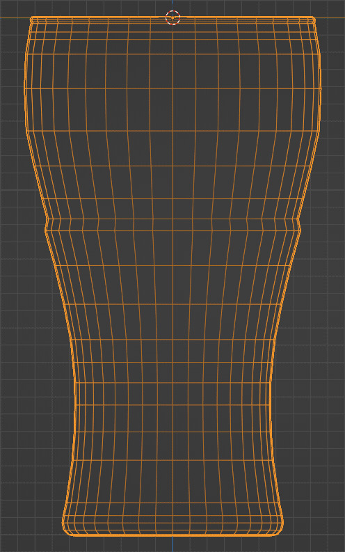
Photo
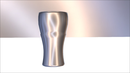
Burger On The Grill
Part 8: Pouring a Drink--Simple Contour
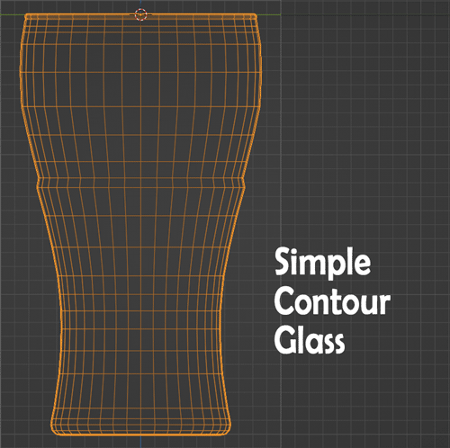
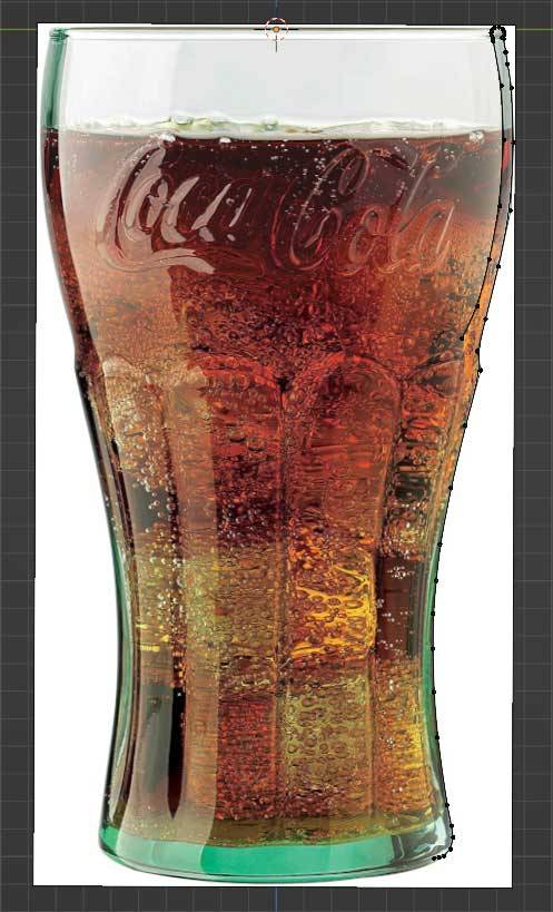
After completing the donut tutorial by BlenderGuru, I was challenged to create something similar by myself, so I made a burger. Now, I will make that burger into a meal with a soda and fries. Let's start by modeling the iconic Coca Cola glass.
Modeling From Reference
My first step is always to study my reference.
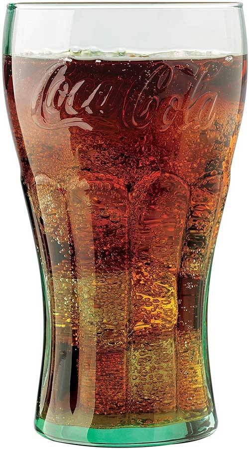
From this image, I could see that I would need 10 indentations in my glass. I created a circle with 10 sides to see how I might add my reference image as a plane facing one of the sides and axes straight on.
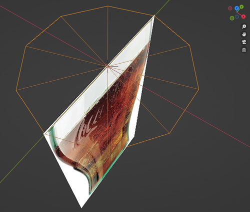
Following the reference, I put down vertices to define the contour of the glass.
Then, I used the spin tool to duplicate the edge 360 degrees around the Z axis. I chose to divide the circumference into 40 steps, 4 for each indentation.
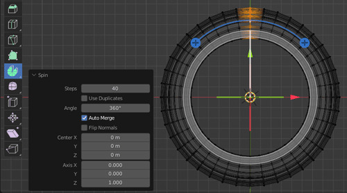
I turned on Face Orientation to check my normals and ended up flipping some of them.
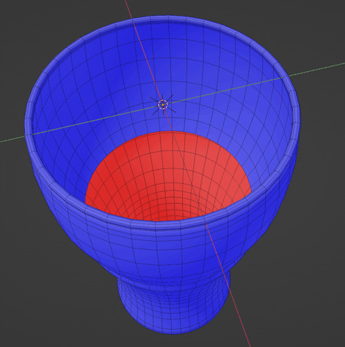
Here is our glass so far, a simple contour.
Follow me to keep watch for the next part! I will be fashioning a cutting object to make those complex indentations around the glass.
Review the previous part.
See overview for links to all parts of this tutorial series!
See more of my work: Check out my archive.
Join me on my journey: Follow me on tumblr.
Support my creative profession: Buy me a coffee on KoFi.
#blender#tutorial#soda#glass#tableware#drinking#coca cola#cocacola#3d art#art process#blender guru#food art#3d artist#art#digital art#3d render#blender3d#blendercommunity#blendertutorial
2 notes
·
View notes
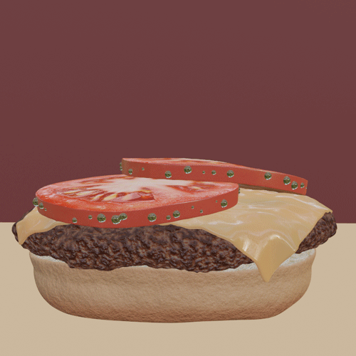
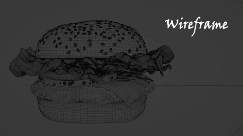
Photo
Burger On The Grill
Part 7: Building a Burger--Frilly Lettuce
After completing the donut tutorial by BlenderGuru, I was challenged to create something similar by myself, so I chose to make a burger. Last time, I sliced some tomatoes. Now, let's add the lettuce.
Modeling From Reference: Method 1
I tried two approaches to meshing the lettuce. The first follows the method I used for the orchid.
I added an image as a plane to use as reference. I created a new plane object and positioned it over the reference image, working from top view.
I extruded this plane along the stems of the lettuce, added points and filled planes, following the natural flow of the lettuce in the image.
Once I had this flat geometry, I went to the UV Editor, still in top view, and used Project from View to create the UVs over the lettuce reference.
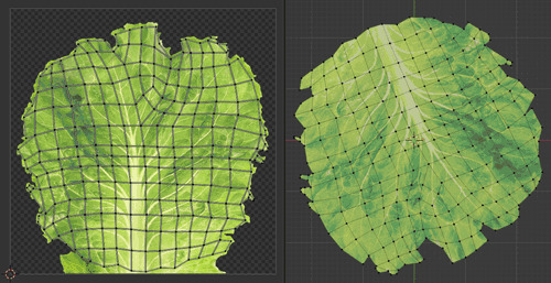
Modeling From Reference: Method 2
The second method is faster and allows for more detail at the edges.
Modeling Lettuce by Default Cube
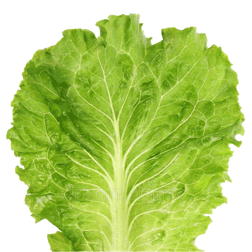
In Photoshop, I cropped my reference image and used selection methods to eliminate the white background. I saved the image as a PNG with transparency enabled.
I added this image into Blender as a plane and subdivided the plane by 4 levels. I hooked the Alpha of the image into the Alpha of the Principled BDSF shader so that the transparent parts were hidden.

A couple of settings needed to be adjusted because I was using transparency.
To get rid of clipping in Eevee:
Materials → Viewport Display → Settings → Blender Mod → Alpha Clip
To get rid of black artifacts in Cycles:
Render Properties → Light Paths → Max Bounces → Transparency → 20
I now have a flat leaf of lettuce. But how do I get this leaf to frill?
Displacement
Using Photoshop, I saved a desaturated version of the reference with transparency. This image will be the key to transforming my lettuce.

Back in Blender, I added a Displace Modifier and set the desaturated reference as the controlling texture. I added a Subdivision Surface Modifier with 5 levels so that I could add a second Displace Modifier with the same texture to provide smaller detail. I finished off by adding a Smooth Modifier and increasing the Repeat.
Here is the Lettuce Creation Process:

Positioning
Because I needed this lettuce leaf to fit in my burger, I used Proportional Editing to lift or lower certain points on the mesh until I got something that was less deep.
Fitting the lettuce on the burger was the most tedious part. I duplicated my leaf until I had 3 leaves to rotate and position on top of each other.
In some places the lettuce looked as if it were floating. In other places, the leaves would clip through each other or the tomatoes or the bun.
I wish I knew of a tool that would just smoosh them down together and save me from all the fiddling.
Instead, I placed one leaf down at a time.
I added a Cloth Modifier to the first leaf of lettuce to mitigate the floating issue and added Collision Modifiers to the tomatoes. I checked Self Collisions and increased the Collision Quality to 3.
Dragging the Cloth Modifier just above the Smooth Modifier produced good results. To reduce clipping into the collision objects below, I flipped the normals of each leaf to face upwards.
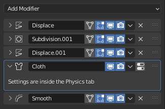
I applied the modifier stack at a frame I liked, fixed any remaining issues with Proportional Editing, and added a Collision Modifier. Then, I repeated the process on the next leaf.
On the last leaf, I added a Shrinkwrap Modifier to eliminate clipping into the top bun.
And there you have it! The burger is done!
Follow me to keep watch for the next part! I will be making this into a burger meal with a soda and fries.
Review the previous part.
See overview for links to all parts of this tutorial series!
See more of my work: Check out my archive.
Join me on my journey: Follow me on tumblr.
Support my creative profession: Buy me a coffee on KoFi.
#blender#tutorial#burger#lettuce#3d art#art process#blender guru#food art#leafs#greens#veggies#cloth simulation#3d artist#art#digital art#cheeseburger#3d render#blender3d#blendercommunity#blendertutorial
2 notes
·
View notes
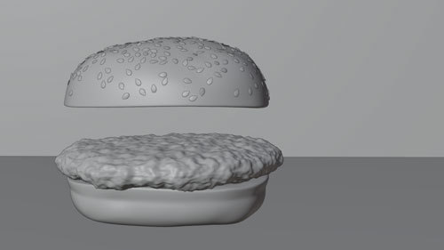
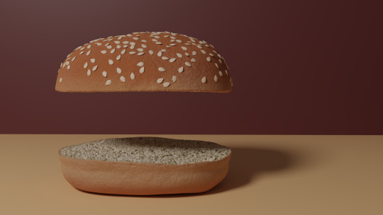
Photo


Burger On The Grill
Part 4: Building a Burger--Perfect Patty
After completing the donut tutorial by BlenderGuru, I was challenged to create something similar by myself, so I chose to make a burger. Last time, I formed some shapely buns. But what is a burger without meat?
Modeling
I meshed by first attempt at a burger patty by starting with a cylinder and following reference photos. I ended up with a shape I liked, but the topology was not distributed evenly enough for the Displace modifier I planned to use next.
My next step involved retopology. I started with a torus this time, chose just enough major segments to match my shape and limited the minor segments to 6. I deleted all vertices in the inner loop of the torus and used Grid Fill on the top and bottom to close the inner hole.
The proportional editing tool allowed me to deform the torus to roughly match my first shape. Then, I sized up the torus so that it just contained that first shape, subdivided the whole thing by two, and added a Shrink Wrap modifier to match the outline of the first shape perfectly.
Later, this Shrink Wrap modifier would causing my render to be completely black and empty. Applying the modifier before rendering corrected this issue.
Modeling the Patty by Sanctus – Blender Procedural
My next step involved making the patty lumpy. I subdivided the patty by two again, and then added a Displace modifier with a Cloud texture. Fiddling with the Size of the texture and the Strength of the modifier got me something I liked. Lowering the Midlevel eliminated the strange horizontal distortion around the perimeter of the patty.
Yes, look at that yummy clay! It was really coming along nicely.
But what about texturing?
Texturing
My first attempt used an image texture for everything from diffuse color to bump, but since the image lacked the quality I wanted, I eventually turned to procedural methods.
Texturing the Patty by Sanctus – Blender Procedural
To get the oily effect on the surface of the meat, I played around with two methods. The first was to allow a noise texture to influence the roughness in the Principled shader as in the tutorial by Default Cube.
The second, which I preferred in the end, began by adding a Glossy shader. I set the noise texture to influence the bump of this Glossy shader. A Mix shader was used to combined the Glossy and Principled shaders, and a Layer Weight node plugged into the Fac of the Mix Shader allowed control over the gloss based on which normals were facing the camera.
Here is a screenshot of the burger in Eevee. You can barely see it, but I went to the effort of adding grill lines to the patty.
Adding Grill Lines to the Texture by Default Cube
To sear in the grill lines, I added an Image Texture node, created a new image named "Grill Lines" and selected this node with Node Wrangler to see only its effect on the patty. I marked a seam on the underside of the patty in a circle and unwrapped the UVs. With Texture Paint, I used the Stroke with method Line and held down Alt as I clicked to drag a line across the top of the patty. After doing this to the top and bottom, 5 on each side, I saved the "Grill Lines" image.

A MixRGB node on Add combined the Grill Lines Image Texture with the Noise Texture before feeding the result into the Color Ramp.
See Meat Texture node layout at the top of post.
Follow me to keep watch for the next part!
Review the previous part.
See overview for links to all parts of this tutorial series!
See more of my work: Check out my archive.
Join me on my journey: Follow me on tumblr.
Support my creative profession: Buy me a coffee on KoFi.
#blender#tutorial#burger#patty#3d art#art process#blender guru#food art#meat#beef#grilled#texturing#materials#3d artist#art#digital art#3d render#blender3d#blendercommunity#blendertutorial
3 notes
·
View notes
Photo
Burger On The Grill
Part 11: Pouring a Drink--Adding Liquid
After completing the donut tutorial by BlenderGuru, I was challenged to create something similar by myself, so I made a burger. I will make that burger into a meal with a soda and fries. Last time, we finished off our soda glass. Now we will add some coke-colored liquid.
Modeling
How to Make a Beer by BlenderGuru
Select the bottom inside of the glass and Ctrl + to add to selection until the inside of the glass is selected up to where you want the top of the liquid to rest. Shift D to Duplicate, Esc to cancel the Move operation, and P to Separate the selection into its own object.
Select the top edge loop and make a face with F. Inset (I) and drag the size of the new circle in towards the center. Add 20 loop cuts (Ctrl R scroll) around this central circle, trying to make the grid as square as possible near the edge. Poke the central face.
Add 2 loop cuts (Ctrl R scroll) to each of the two outside loops. Select from the central circle up until these subdivided loops. Turn on Proportional Editing (O) and set the Falloff type to Sphere. Move (G) the selection down to create the effect of surface tension.
To get an idea of the scale of that surface tension effect, here are some still images.
To eliminate the strange artifacts that appear between the liquid and glass when rendering, we need to size up the liquid so that it is larger than the inside of the glass and smaller than the outside of the glass.
Set the 3D Cursor to the central point of the top face. Select all the liquid. Size (S) on the Z axis (Z) and drag the liquid a little below the bottom of the inside of the glass.
Next, size (S) on XY axes (Shift Z) and drag the liquid halfway between the inside and outside of the glass, keeping an eye on the bottom sides of the glass.
Since the bottom is a little bulbous, a bit of adjustment is needed. Set the Proportional Editing Falloff type to Smooth. Select the top of the liquid.
Viewing the glass from the side (Num1), size (S) on XY axes (Shift Z) and scroll to expand the range to the point where the liquid is closest to the glass. Drag the top of the liquid halfway between the inside and outside of the glass.
There should now be a smooth taper between the liquid at the top of the glass and at that bulbous point at the bottom.
Check the Face Orientation of the normals for the liquid object and Recalculate Outside.
Select the edge loop at the top of the liquid and Mark Sharp. Then add an Edge Split Modifier and uncheck Angle. Now, the part that we marked sharp will have its normals split, providing a subtle improvement to the appearance of the liquid level line on the glass.
Texturing
Time to add a material to the liquid object!
On the Principled BSDF Shader, set Roughness to 0 and Transmission to 1. Add a Volume Absorption Shader. Set the Density to 60 and the Color to a burnt orange.
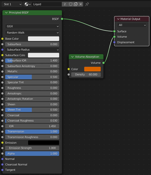
So, now you have something that looks a bit like... tea.
Follow me to keep watch for the next part! We will be adding some foam to the top of that liquid.
Review the previous part.
See overview for links to all parts of this tutorial series!
See more of my work: Check out my archive.
Join me on my journey: Follow me on tumblr.
Support my creative profession: Buy me a coffee on KoFi.
#blender#tutorial#soda#beer#tea#liquid#coca cola#surface tension#3d art#art process#blender guru#food art#3d artist#art#digital art#3d render#blender3d#blendercommunity#blendertutorial
1 note
·
View note
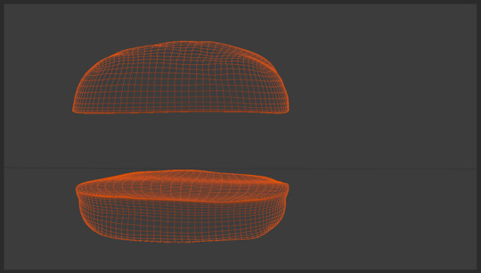
Photo
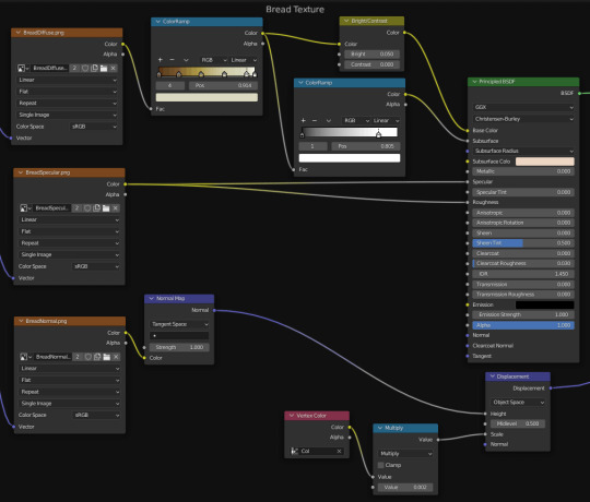
Burger On The Grill
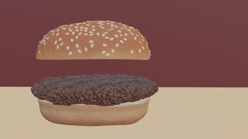
Part 3: Building a Burger -- Shapely Buns
After completing the donut tutorial by BlenderGuru, I was challenged to create something similar by myself, so I chose to make a burger.
Modeling
I started with a UV sphere. To get rid of the shading distortion at the center point, I deleted several rings and filled it with a mesh as in the image below.
After using several reference photos to distort the sphere, I had a lumpy bun for my burger.
But what about the sesame seeds?
Adding Seeds
After modeling a single sesame seed from a reference image, there were two approaches I tried to apply seeds to the bun.
The first method used the particle system to distribute points on the bun and instance a seed on each point. This is the method I used for my donut sprinkles. Overlapping is an issue with this method, and there was no easy way to deal with it.
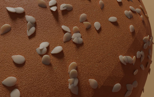
Months after I completed my burger, the second method became a possibility, so I tried again using geometry nodes.
Blender 3.0 Beginner Geometry Nodes Tutorial (Donut part 9) by BlenderGuru
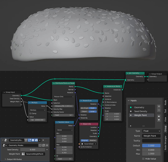
For the extra rotation that allows some seeds to stick out of the bun, see the Random Value node. I have non-zero values for the Max X and Y values as well as for the Z.
Texturing
Texturing was the next challenge. There are two distinct textures on a bun: the crust and the soft inner bread.
How do you go about separating these two textures when they are on the same object?
There are several ways.
The first I tried was to select polygons and assign different materials, but this leaves you with very uniform results, not the best look for an organic object.
The second way was suggested by DefaultCube in this tutorial and basically involves drawing a gradient on the bun to divide the two materials, but with an uneven cut in my very lumpy bun, a horizontal line could not give me the results I wanted.
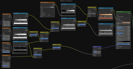
So I looked into a third way and separated my textures with vertex color paint.
Mixing Materials With Vertex Color by Hola Mundo!
I colored sections in Vertex Paint Mode and added a Vertex Color Node to control the separation of both the shaders and the displacement.
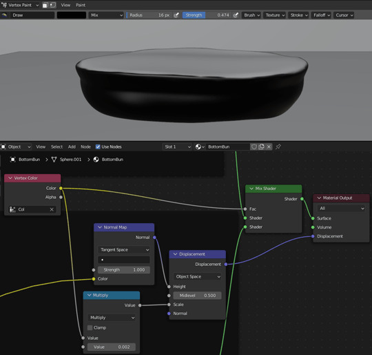
Notice that the Vertex Color node connects to the Fac socket of the Mix Shader to control the separation of the shaders.
Vertex Color also connects to a Value socket of a Multiply Node which then connects to the Scale node socket of the Displacement Node. This Multiply node thus controls the area where the displacement is applied and, by the second value, the scale of that displacement.
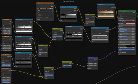
For the crust, I applied texture painting to the bun so that the top and bottom had more browning than the middle. A couple of noise textures produced bubbles. A voronoi texture produced cracks. Subsurface scattering softened my bun from hard plastic into an organic material. Another noise texture provided bumps.
See Top Crust Texture and Bottom Crust Texture node layouts at the top of post.
For the bread, I messed around with procedural textures for while and came up with something that resembled vomit... before turning to BlenderGuru once again.
How to Make Realistic Bread by BlenderGuru
I turned a reference image into diffuse, specular and normal maps with the help of Photoshop and the Nvidia NormalMapFilter plugin.
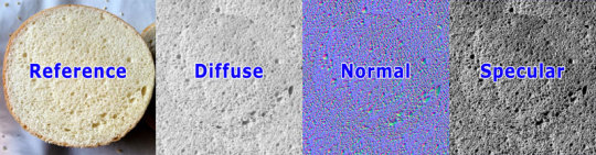
I sampled colors from reference images and used ColorRamp nodes to recolor the grayscale diffuse images and procedural textures. Otherwise, selecting colors, especially for the subsurface scattering, was a lot of trial and error.
See Bread Texture node layout at the top of post.
Follow me to keep watch for the next part!
Review the previous part.
See overview for links to all parts of this tutorial series!
See more of my work: Check out my archive.
Join me on my journey: Follow me on tumblr.
Support my creative profession: Buy me a coffee on KoFi.
#blender#tutorial#burger#bun#3d art#art process#blender guru#food art#bread#seeds#crust#texturing#materials#3d artist#art#digital art#3d render#blender3d#blendercommunity#blendertutorial
1 note
·
View note