#it is even more painful to see as a ux designer because WHO ASKED FOR THIS WHO WANTED IT???? WHERE'S MY AGENCY AND CONTROL I CAN'T REMOVE
Text
Oh FUCK OFF
FUCK OFF
#it is ENRAGING#HOW DO THEY FIND OUT WHAT WE WANT AND GOVE THE EXACT OPPOSITE#THIS MAKES ME WANNA GO COMMIT ARSON#AND THERE'S NO WAY TO REMOVE IT#WHATSAPP#FUCKIN SHIT#it is even more painful to see as a ux designer because WHO ASKED FOR THIS WHO WANTED IT???? WHERE'S MY AGENCY AND CONTROL I CAN'T REMOVE#THIS SHIT
0 notes
Text
5 Actionable Steps to Develop a Successful Software Startup from Scratch
Entrepreneurs allured with the vision of creating a lucrative and successful business. They seek out unique and powerful business models, strategies to mark their footprints in the software landscape. Every innovator looks forward to delivering a productive and bankable product or service. In return contributing to the rapid growth of Software startup all across the globe every year.
Did you know?
According to Global Entrepreneurship Monitor’s (GEM) massive statistical research, 137,000 startups are introduced in the market every day with estimated 120,000 startups eliminated each year.
If you follow the statistics, a tech startup’s success rate is one-fourth of what its failure rate is.
I would say, don’t believe the statistics!
If you are passionate enough for your software startup, just understand what it takes to outlive the chances of falling flat. This article will lay light on all the highs and lows, positives and negatives, strategies, and techniques to establish a successful software startup from scratch.
So, let’s begin!
How to build a successful software startup from scratch?
Consider these 5 steps to form an effective trade in this growing industry:
Step 1- Market research
For a software startup to generate profits, you’ll require a market that is prepared for the idea and technology, software that solves the pain points of the clients, and appropriate pricing that the market can afford. A large number of startups fail because of a poor product/service-market fit, hence, making informed choices that get along with the market requirements is very crucial.
Specialists claim that market research is one of the first vital steps while developing a startup.
What if you don’t undergo market research?
Many entrepreneurs are confident enough that they are going to deliver the right services to the market, but fail because of a poor market design strategy.
I am not saying don’t be confident, but follow the crucial steps!
Being confident is the key, but only if you are unlocking the right door. If the market is wrong, your product cannot win hearts and give you conversions.
What are market research types?
While market research has different types, based on the type of business you are targeting. Here are a few market research types-
Primary or secondary market research
While primary research is collecting information yourself from various sources. Analyzing current sales volumes, metrics, and customers, secondary market research includes collecting data prepared by third parties like reports and study analysis from other entities from the same niche market.
Online and offline research
A blend of both, online and offline research, delivers the most accurate market analysis. Online research gives out information in free and fast whereas offline research provides more in-depth results and access to information sources.
You can also take the help of Surveys, Interviews, Focus groups, and social media according to your budget and time, to ask the audiences what they think of the product/services.
Read Also: 12 Key Considerations Before Setting Up an eCommerce Startup
Step2- Proof of Concept
Although everyone is convinced with their idea and its problem-solving features, creating a proof of concept to analyze and test your idea and see if it can be followed in the real-world is important. Another benefit of proof of concept is, it will help you gather stakeholders’ trust that’ll convince them to invest in your idea. The process of “proof of concept” follows these steps-
1. Demonstrate the Requirement
It’s very important that the software you are investing your energy in, is actually on the customer’s needy list. It’ll be all for nothing if you aren’t sure that the audience needs the software.
2. Outline Pain Points and Gather feedback
Do some brainstorming to map out the pain points and determine how your software stacks up to relieve those pain points. When you are ready with a list of solutions, put those solutions in front of the stakeholders and potential users to know what they think and how they react. They might suggest an additional feature that makes your product/services more valuable.
3. Solution Prototyping
Your following step is to make a model that wraps your solutions into a simple item that you just can utilize to test with those you met already. This model ought to have the anticipated highlight set and UI/UX.
Once the model is built, test it together with your interviewees for extra input. Record their utilization of the item to track how instinctive the interface truly is, and discover it in case you ignore any critical usefulness.
4. Minimum Viable Product Creation
An MVP is a fully functional solution that is different from prototyping. It incorporates the most important highlights that are basic for tackling the essential torment focuses you distinguished. It ought to work on the user’s side rather like the ultimate item.
5. Roadmap Construction
From all of the data you’ve assembled in each of the past steps, make a guide that depicts what you’ve learned and diagrams a prescribed step-by-step handle for building the item. Think of this guide as a set of diagrams for developing a building. With this guide as a direct, everybody will be kept on the same page through item improvement and will have a clear picture of what the conclusion objective is.
Read Also: 5 mistakes a start-up makes when building an MVP
Step 3. Getting Associates and Partners
It is not possible to overestimate the value of collaborators, investors, teammates, co-founders of partners, remote developers, and the likes of a start-up company. You will need the support of others for the staggering success of a start-up venture. You can go easily alone, but together you can go faster.
Forging alliances and collaborations that can help you make the most of your new company or start-up project is important. You might need to find a technical co-founder who can handle the software team and work with them. An entrepreneurship experience can be an emotional rollercoaster trip, but you don’t just want a technical co-founder to be chosen randomly. Do not begin by inviting unknown individuals to be your co-founder of the methodology. Take the time to consider others, recognize them and first make sure the two sides feel happy.
Starting a new startup venture is challenging. Maintaining enough cash in your budget to keep your doors open is no easy feat, from ordering equipment and loading up on inventory to handling payroll and renting an office. But there is one way by which you can accept this challenge with confidence, getting an active investor!
An active investor is knowledgeable of the organization and can be actively engaged in most processes, particularly in areas of the company that includes sales and profitability.
According to the NSBA Economic Report, 27% of small businesses are unable to access adequate funding.
Hence, it is almost difficult to expand your small company without good finance behind you!
Step 4.Offering Easy Entry to Customers
Initially, it’s incredibly difficult to get traction. Most individuals are not chomping at the bit to spend time studying and saving money on new technologies to incorporate it. Create a blueprint on how you can get the first consumers on board. Consider a free offering for trial users, free updates, or a discount cost. For users who put friends aboard, you may even create rewards.
Another way to reduce the entry barrier for a SaaS product is to ensure that you deliver a selection of subscription levels that can cover the needs of all customer classes without asking them to pay for features that they do not require.
You should have a customer success team that monitors the customer’s usage levels, gives them quality notifications and satisfaction reviews. Among other items, invites them to customer-advisory board meetings. The client-success team should also be educated and willing to market.
Read Also: Which is Cheaper: In-House Team or Remote Developers
Step 5. Constant Software Testing and Analysis
The universe travels swiftly. Technology moves, behavioral habits of people change, new variables affect the desires of consumers. Thinking that the product has landed, you can’t afford to get complacent. Still pushing for improvement, keeping an eye on evolving trends. How the product has to react and change as a result. What you don’t calculate, you can’t adjust, so build a daily routine.
If you analyze key metrics, you will know what: features do not resonate with users anymore, new features users require, and features the app needs to keep up with the ecosystems of users. This insight will also help you strengthen your content. You will understand, what is most important to consumers and how they interpret the benefit they get from your product specifically.
Hence, it is necessary to identify tests continuously (whenever possible with A/B testing) and, after making adjustments, track the successful progress.
Read Also: Boost Your Start-Up Cybersecurity with These Powerful Tips
Final Thoughts
There is a lot of stuff you should know if you want to create a software start-up from scratch. Let’s be frank, there is no right road to success for start-ups. Everything I can do is provide you with advice as to what you need. If you aren’t sure about getting started, consult a trusted mobile app development company in India. They will understand your software startup requirement and make sure that you don’t leave any gaps behind.
#startups#entreprenuership#entrepreneurs#successful#software startups#softwarestartupsfromscratch#Developasuccessfulstartups
2 notes
·
View notes
Text
After 5 App Design
After Five Cleaning – Introduction
After Five cleaning is a cleaning company whom do cleaning services for inside houses. They offer various types of different services and are available via their website. They needed an app designed that would allow them to add and edit the questionnaire that they would send their users to fill out when they want to request their services. This project differed in a sense from the websites and game UI that I normally designed. This was something considerably smaller, but because of that this also mean there was far less room for error. Simply put, I needed to throw a jab, but only a jab. This mean I can practice this to the maximum
After Five Cleaning – Mobile first design (Identifying the needs)
The first thing that was to be noted, that it was a questionnaire. This sounds pretty simple, but because of the application (to book appointments), and the fact that the app was actually very in depth, this needed to be laid out visually, in a way that made booking as smooth as possible. The one problem that I can easily encounter, is that with all of the questions that are required, is that it can get overwhelming. Imagine sitting for an hour, just answering monotonous questions, it may be necessary, but it isn’t exactly a good experience. Normally in UX design, you would want to identify the common pain points that someone using an app or a site would experience, but this sadly couldn’t be the case here, as there wasn’t any real previous reference to go off of. This presented a unique challenge for me, and meant that instead of simply “improving” off of what had already been done, I needed to effectively “shoot in the dark” (as at this stage I am still quite inexperienced)
After Five Cleaning – Wireframe layout
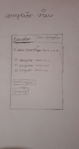

So, the first thing I did was pull out my pen and paper and got to drawing. I wanted to design something that can take advantage of the one key advantage mobiles have. Hand gestures, make things that would require scrolling on a computer or doing certain actions (such as closing or changing page) incredibly swift and easy. This is one of the main draws. My first worry, was making the app be a chore to scroll down, as you added more and more questions. The Sketch was just a good idea of what to do before the colour scheme was to be decided
After Five Cleaning – Colour Scheme
This was the likely the easiest part of the entire project. Because the company colours was green/white for their website, they wanted this to be used with the app to keep it consistent. This was perfectly fine by me, my work load was reduced. For me the only real choices that needed to be made was where the colour was to be placed. Green, especially dark racing green, can be a very overwhelming colour when used too often, whereas white, can be very “boring” when done
After Five Cleaning – Mobile Version V1
The sketch for the mobile version was quite a ways different from what the final product ended up becoming. If you’ve seen my portfolio at coroflot. You can immediately see that the sketch you’re looking at looks a lot more “phone” like, for lack of a better word. What I mean by this is that I have designed the interface to be able to take advantage phone specific features (in this case, swiping). This was where I learned about user testing. Once I designed the application (I could quickly mock it up with colours, as these had effectively been decided for me) I immediately received the following question;
“what would I do if I wanted to edit a question I already submitted”
And right there the design fell apart. Effectively, I had no real answer for this. So, immediately it was back to the drawing board.
After Five Cleaning – Mobile Version V2
So, it was effectively. Back to the drawing board. For the next one, I looked towards different inspirations for the layout of the mobile version of the app. This time instead of trying to design what I “think” would work, I instead wanted to go and see what similar apps there was on the market place that was currently being used.
Survey Monkey

The app layout of this was pretty solid, it was easy to use familiar, and it actually reminded me quite a bit of google forms. The only problem was. One of the key requirements was that each question was to have “sub questions”, as due to the layout of the question, there also needed to be sub questions related to it, to them determine what sort of equipment would be used (e.g. if you have a room with windows, how many windows?). So this presented a different problem. This effectively meant that I needed a way to “group” a question for ease of use for the employees. The reason for this was that the cost, hours and equipment they would visit the house with, was determined by what answers were given.
Google Forms
This is partly what the first version was based on, as this is software that I use often, So I decided to take another look at the layout and analyse it once again to see where I went wrong. As you can see, the similarities between that two, is that there is a “panel”. This is where the idea to have employee’s “swipe” left and right came from (this is a desktop screenshot). The problem that I encountered here (again) was simple
How does one keep track of all of the questions they have added? And how do you make this straight forward to view and modify?
Tree List Layout
This was something I actually found upon by accident. The tree list layout is when you have a parent and child relationship layout. The parent is the main object on the screen, and the child are the things that are related to it. This sort of structure is used often in the programming space, as someone who has done computer science in the past, I am very used to using it conceptually whilst doing object oriented programming
As a result. I decided to try out this layout for an interface. Instead of making question a “question”, it becomes an “Object”, the sub questions merely become the “child” of the “parent”, this isn’t UX related per say, but this is programming related. This effectively describes how the programmer would need to implement this method, which is important because I was actually working side by side with a programmer as I was implementing the interface (he was the one that asked the question) This line of thinking, resulted in the following sketch
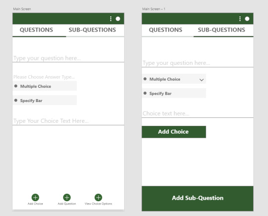
Low Fidelity Sketch

High Fidelity Sketch

This is the result of the sketch. The idea was to have one main menu which allowed you to add “parents” (questions) which automatically gave you answers (the child). This structure would then be delved upon via the sub-questions. Which lets you do the same thing (add a sub question). The one problem that could still be present with a view like this is overwhelming amounts of information, or having to constantly scroll through layers upon layers of information (especially when the questionnaire gets large) To somewhat resolve this, I put in a collapse all or expand all button, something which is fairly common when working with folders in applications.
Things to improve upon
One of the key things that I actually missed out, was a search button. As it stands, even with everything “collapsed” there would still be a fairly large amount of questions to look through. This can easily be cut through if the user can manually search the question itself that they are looking for. The thing to remember is that the main user base will have upward of thirty to forty questions at a time, each with their own sub questions. I also intend to make the each “object” numbered. Where you can see the “type your question here” section, should have a “1.” annotation, to let the user know. I consider this a mere quality of life change, but an important one nonetheless
But even with that particular problem, the UX of the app, is something that is
1 note
·
View note
Text
Top 10 soft skills that a UX leader must possess
How do I explain what I do at a party? The short version is that I say I humanize technology. Fred BeecherA UX design project is never black or white it comes with a lot of ambiguity and challenges at different phases in the design process.
These challenges can only be tackled if a designer has certain soft skills to back ones technical knowledge. The good news is, most of these skills can be developed and refined with practice and self-motivation.Here are the top 10 soft-skills that a UX leader must strive towards developing-1. Excellent Communication SkillsDesign, unlike art, is not just a representation of the designers own self or personal ideas. One cannot just get to work as soon as a brief is provided and then submit the design files once the work is done without any communication in between these phases.A UX Designer has to be vocal right from the beginning Ask relevant questions to understand the design brief betterCommunicate with users while conducting user researchCoordinate with other departments like the developers and product managers to execute the project successfullyPresent your design ideas articulatelyConduct user tests to understand the pain-points of users while using the productIf you expect it to be a desk job, that doesnt require much communication, then I am afraid, that is very far from the reality of what a design process entails.2. Passion or hunger for excellenceThere are three responses to a piece of design yes, no, and WOW!
Wow is the one to aim for. Milton GlaserAnd getting to that Wow moment takes a considerable amount of time and effort. An innate passion for solving problems is a big plus in the field of UX.You have to be the kind of person that thinks design can change the world. Only that level of enthusiasm will keep you going in the seemingly never-ending Create-Iterate-Test cycles involved in Product design.A UX Designer will have test out multiple solutions to come up with the Winner For example a landing page that gives you high conversions or sales.And that leads us to our next soft skill patience. 3. PatiencePatience is a virtue in any field, but in design, even more so!Conducting multiple user tests, tweaking the product, constantly communicating with other teams, awaiting feedback from users until you come up with the perfect solution all need a tremendous amount of patience.You will, at all times, be thinking about ways to make a product better.
And that requires constantly analyzing test results, and keeping an open mind about the fact that there is no such thing as a perfect product. Even the best of the products in the market need to be repeatedly modified to make them better and relevant to the changing times.4. Curiosity or an inquisitive mindThe field of User experience is always evolving. New concepts, ideas are always hitting the market. In order to keep up with these changes and incorporating them into your Design process, you need to have a sense of curiosity, and a hunger to keep learning.Only a curious mind can constantly ask insightful questions to stakeholders, and engage in a more in-depth manner with users to understand various problems that crop up in the product design.5.
Being a Team playerProduct Design can never be a one-man show. It involves collaboration between multiple stakeholders designers, developers, product owners, marketing team and the users. You will have to engage with each one of these stakeholders at various points of the design process.For this, you will have to be a collaborator who engages in respectful, insightful discussions with various teams. Need to code your product a certain way? Talk to the developer.
Require feedback on how your product is making life easier for your users? Engage your user through Users tests.And these discussions will happen on a daily basis, during the design process, and one needs to be a collaborator to keep up. 6. FlexibilityA great UX Leader is someone who can adapt to changing times. This involves keeping up with the ever-evolving technology trends, new design tools, changing user behavior and repeated iterations to the product based on analyzing user data.Every Design project brings with it, new challenges. No two design processes can ever be identical.The industry the product is based in, the user demographics, users interests, needs, aspirations and pain points are all factors that affect the design process.
The UX designer has to be flexible enough to adapt to these changes. 7. Open-MindednessWhat differentiates a UX Designer from a Marketer or an Artist is that they cannot be added to the left brain or right brain club. It has to be a combination of the two creativity accompanied by rationality.Unlike an artist, a designer cannot only think about self-fulfillment, or unlike a Marketer cannot only make decisions based on numbers. There has to be a middle ground one that involves a lot of ambiguity.This is because UX, at the end of the day, is human-centered and designing for humans cannot be an approach where everything can be predicted beforehand. This requires open-mindedness to try out new ideas and perspectives. 8. AssertivenessThis quality is essential for most leadership roles.
Assertiveness and standing up for oneself is something everyone could benefit from.With respect to UX Designers, assertiveness becomes all the more important because of the sheer number of people you are dealing with Product owners, development teams, marketers, etc. Imagine the amount of feedback and ideas that will be thrown at you to consider.The UX person is like the advocate of the users and their needs. For a great product to be designed, a Designer has to be heard. And to be heard, they need to have a voice and be assertive.9. HumilityHumility is a highly underrated virtue for a UX Designer.It is very easy to fall in love with the product that you designed. Its not always easy to welcome criticism.
In such instances, humility is key.Being a human-centered discipline, it is important that a Designer doesnt come across as pushy during User tests. Humility makes users more comfortable to open up and point out problem areas in the product design. And this is vital in improving your product.10. EmpathyIn todays times, when the focus is shifting from Intelligent quotient(IQ) to Emotional quotient (EQ) of digital products, empathy has become a key skill for a UX designer, up there on the list with technical skills.To create a product that makes the life of your user easier, you need to first, step into their shoes and think and feel like them. Simply put, empathy allows a designer to understand target users better.
And that is the foundation upon which your the design process should be based on.Here is a bonus skill that is a personal favorite 11. StorytellingEvery great design begins with an even better story. Lorinda MamoGreat User experiences tell great stories. It is an essential part of the design process especially at the stage when you are creating User personas. The more detailed these character sketches and their back-stories are, the better.Detailed narratives provide that much needed human touch to an otherwise technology-driven field.Stories help document the needs, motivations and key pain-points or potential design flaws, and make you better equipped to design a solution keeping users at the center of the design process. ConclusionThe key to being an effective UX Designer is not only about how skilled you are at Adobe XD, Balsamic or Sketch.Its about how you interact with various stakeholders, how involved and keen you are at trying out new ideas and concepts, how you react to feedback and how much of a human touch you can bring to an otherwise technical product design process.These qualities will be instrumental in defining your position as a UX Leader among a multitude of designers crowding the market. As designers, can you think of any other soft-skills that have been instrumental in your growth?
Please enlighten our design community by commenting below or discuss with me over Twitter.Designfully yours,Surya Ravindran Pillai
For more information please see our site at zhubao. Don't be hesitate to contact us!
0 notes
Text
The 'Ethics' You Didn't Know Existed in Design
New Post has been published on http://tiptopreview.com/the-ethics-you-didnt-know-existed-in-design/
The 'Ethics' You Didn't Know Existed in Design
Just the other day, I was Googling something in a rush and came across a blog post that I thought would give me all the information I needed.
But, when I clicked on the page and tried to start reading the post, the entire screen went dark and a giant “Subscribe to our email” CTA popped up — completely interrupting my experience.
I looked around for a “No thanks” button or an “X”, but I almost couldn’t find one. Just before I went to click the back arrow, I noticed a very faint, tiny “X” that was nearly the same color as the CTA background. It was obvious that this site’s designers wanted to trick visitors into signing up for an email list before reading their content.
Not only did this CTA almost backfire by causing me to bounce off the site, but it also made me judge the brand’s morals.
Although some business people might not think a code of ethics matters in design, it does.
In this post, I’ll explain what design ethics is, what guidelines ethical designers might use, and a few tips for avoiding questionable design ethics.

What is Design Ethics?
Using design ethics, often referred to as ethical design, involves producing graphics, web pages websites, and visual aspects of technological products that are not misleading, valuable, and helpful to customers. It also involves considering aspects like user experience, inclusion, audience pain points, and accessibility when producing, reviewing, or adjusting designs.
Why are ethics in design important?
One of the best places to highlight your brand’s mission, as well as its ethical values, is in your marketing and designs. After all, these are the areas of your company that prospects and customers might see most.
While ethics, inclusivity, and accessibility are not necessarily always top of mind for some busy marketers or designers,, it’s incredibly important to review any public-facing projects from an ethical perspective.
Today, more than ever, consumers are paying attention to the moral standards of brands. Research shows 62% of consumers are attracted to brands that have strong, authentic ethical values.
When companies are considered ethical, consumers trust them, feel like the brand cares about their experience, and identify with the company. On the other hand, when brands use tactics that feel unethical, consumers lose trust in the brand which could lead to less brand loyalty or purchases.
Ultimately, every aspect of your brand’s design contributes to the message you’re putting out. If you want to create content and that demonstrates your company’s values, you should regularly review your brand’s design ethics.
Ethics in Graphic Design
When creating marketing content like landing pages, web experiences, or other visuals, ethical graphic designers consider a handful of guidelines. Here are just a few:
1. Designs should not be misleading.
You should aim for your designs to engage people and nurture them towards converting. Your designs shouldn’t mislead, pressure, or coerce audiences into doing or thinking something.
In the intro, I noted a website I visited that tried to pressure me into signing up for email before I was even able to read their content. This just one of many sneaky dark pattern design techniques.
While it’s not uncommon or unethical to create colorful or embellished designs that draw attention away from an “X” or opt-out button, dark pattern designs happen when designers make an obvious and conscious effort to trick visitors into doing something, such as giving out personal information.
For example, making the “X” nearly invisible and darkening content behind a pop-up ad so visitors think they need to convert or subscribe to email list to see content is a dark pattern technique. You might also see similar techniques in spammy emails where the unsubscribe link is hidden or made illegibly small so you can’t easily find it.
While it’s understandable that you want to get as many people as possible on a promotional email list, tricking visitors into subscribing for something is not the answer.
Why? If the contact didn’t want to get signed up for the email, they might complain about the sneaky design, mark the email as spam, and unsubscribe immediately. If they aren’t annoyed to the point of unsubscribing, they might not engage with the email because they weren’t expecting it or were never interested in promotional content in the first place. This, in turn, could negatively impact email performance and future deliverability.
Ultimately, sneaking consent from visitors isn’t likely to create major engagement or brand loyalty. So, if you must use a similar tactic or an automatically checked box in your design, make sure the text is large enough so visitors can see it and easily uncheck the box if they aren’t interested in your offering.
2. Designs shouldn’t hurt the user experience.
We’ve all been on a website where an ad or full-page CTA blocked the content we wanted to see. Sometimes, this gets so annoying, it causes us to leave websites entirely.
When we bounce off a website with too many pop-ups or design glitches, the site not only loses visitors and credibility, but it also loses SEO strength.
Designers should make sure they’re creating experiences that nurture an audience member into doing something rather than force-feeding them an offer or advertisement. To do this, they should be asking themselves, “How can I design valuable online experiences that help visitors rather than shamelessly selling products to them?”
At HubSpot, we encourage companies to nurture leads rather than using unethical or desperate marketing tactics to trick them into signing up for something. Our natural lead nurturing approach can be seen right on our blog.
Each HubSpot blog post includes unintrusive CTAs at the bottom of the page, as well as a slide-in CTA that appears when the reader has scrolled passed a certain point in the post. Here’s what the bottom of a post looks like:

Not only do these CTAs fit smoothly within our blog design (and don’t cover up the content), but they also relate to the content we’re posting. This way, the reader gets a taste of our expertise in our blog content. Then, they can choose to dive deeper into our offers.
With unintrusive CTAs like this, we primarily send offerings to contacts that want them most, are likely to download more free resources, and might turn into qualified leads later on.
3. Messaging, disclaimers, and policies are clear and legible.
In the design below, another example of dark pattern design, the disclaimer, “Your subscription will renew automatically. You can cancel at any time,” is so small you might not notice it.
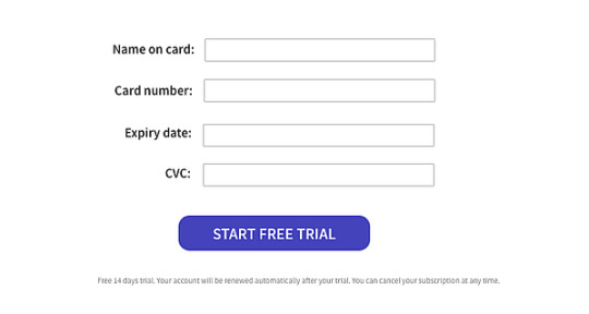
Image Source
Because of this, visitors might give credit card information not realizing that they’ll be charged without being asked at the end of their free trial. Ultimately, when someone’s card is surprisingly charged for a service they didn’t want because they didn’t see this message, they might get annoyed with the brand, unsubscribe, and potentially complain about the small text.
On the other hand, if your text is legible and understandable, you might only receive the customers that understand free-trial policies, are serious about your service, and won’t rush to complain if they forget to cancel their subscription before the credit card charge.
4. Use proper representation and embrace inclusion, whenever possible.
Ethical designers always ask, “Does this design accurately represent groups of people discussed?”
Between 2011 and 2015, Access Icon embraced inclusive design ethics when they revamped the International Symbol of Access — often seen on accessible parking spots or wheelchair-accessible bathrooms — to better represent people with disabilities.
While the original symbol showed a simple stick figure sitting in a static wheelchair, the new symbol shows a person’s arms moving with their body tilted forward as if they’re actively moving or speeding in their wheelchair.
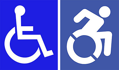
Image Source
The new design came after a 2011 Boston-based street campaign, where Access Icon members placed a moving body over the static body on accessibility signs.

Image Source
Although Access Icon did not intend to replace or criticize the original symbol, created in the 1950s, the organization wanted the new version to create an “occasion for asking questions about disability and the built environment, in the largest sense. Who has access—physically, yes, but moreover, to education, to meaningful citizenship, to political rights?”
Between 2012 and 2015, state governments, cities, major companies, and local businesses around the world adopted the symbol.
By refining this design, the group aimed to accurately represent people with disabilities as mobile, energetic, and empowered, rather than as static, less mobile figures. Ultimately, they realized the original design wrongly depicted those with disabilities and created a new design that solved for it.
Ethics in the Design of Technology
Design ethics doesn’t just stop with imagery or website UX. Tech products, software, and other tools also need ethical designers to create smooth, pleasant, and trustworthy experiences for customers. While technical or product designers think about the ethical guidelines noted above, there are a few additional standards they might follow:
1. Designs should be accessible.
In recent years, accessibility has been a major topic in the world of tech and product design. Although you might not realize it, people with varying accessibility needs might be using your product. And, when your product is accessible to more people, more people can use it and buy it.
One recent example of an accessible technology design was Microsoft’s Xbox Adaptive Controller.
After learning that children with physical disabilities, such as missing limbs, were having trouble playing Xbox video games with the console’s controllers, Microsoft developed an adaptive touchpad controller, which enabled people with multiple types of disabilities to play games with their friends.
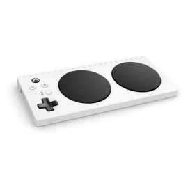
Image Source
Aside from two circular touchpads, which replace small controller buttons, the Xbox Adaptive Controller features large programmable buttons and can connect to external switches, buttons, mounts, or joysticks that make gaming more accessible for users.
The process of designing the controller was highlighted in a Super Bowl ad called, “We All Win,” which you can watch below:
youtube
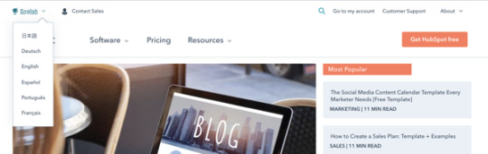
On a smaller scale, accessible technological design could also involve including accessibility tools and symbols within your software interface or web page.
For example, some brands might offer an accessibility icon at the bottom of their website where you can click to adjust settings for a smoother experience if you have a disability. Or, to make their site or UX accessible to people in other countries, websites, like HubSpot’s offer an icon and menu that allow you to toggle between languages:
2. Designs should promote safety and security.
In 2020, many people are thinking about data security as many are buying smart devices and software for workspaces and their homes. With many devices listening to our voices, logging our lifestyle habits, and even recording health data, some worry that this information could be sold, stolen, or used unethically later on.
Because of data concerns, many tech firms are emphasizing security in their overall product design.
For example, when smart home devices with virtual assistants initially hit store shelves, consumers panicked when they learned that some devices, such as Amazon’s Echo, would surreptitiously record them.
To make consumers feel more secure with Echo devices in their homes, Amazon designed each device with a very visible mute button on them. When the button is pressed, the Echo’s light ring and the button turn orange to visibly show people that the device has deactivated recording.

Image Source
While this button might make Echo owners feel secure at home, it might also ease the nerves of prospects who see it in product shots or Echo ads before purchasing it.
3. Consider or respond to unexpected ethical dilemmas.
If you’re helping to design a new piece of technology, you should consider all of the potential ethical dilemmas it could create and create a design that could either solve for them or ease your audience’s concerns.
In 2018, Netflix was forced to address a design strategy on its platform when a recommendation algorithm was panned across the web.
The algorithm in question, which Netflix called, “Artwork Personalization,” aimed to show users show thumbnails based on the design traits of thumbnails they’d previously clicked. While it sounded like an interesting personalization experiment, consumers quickly argued that this personalization was racially targeting users.
Specifically, some users noted seeing primarily content recommendations with white people in thumbnails while some BIPOC users saw mostly thumbnails that showed people of color. While Netflix denied that the algorithm targeted users by race, the news went viral.
In this scenario, had Netflix designers and developers researched their design tweaks or audited it from an ethical perspective, they might have been able to tweak the algorithm before launch.
How to Promote Design Ethics
If this post has inspired you to develop a new ethical standard for your designs, here are a few next steps you can take.
Audit Your Past Designs
Even if your designs have been successful in the past, it’s still good to re-audit them to ensure that they continue to promote design ethics. For example, you can look at your website or product’s design to ensure that they’re accessible, easy to comprehend, and inclusive to all potential web visitors.
Review Your Current Projects.
Whether you’re working on a product, website, graphic, or software-related design, reviewing it from a design ethics perspective might lead to a successful launch with fewer risks of complaints or concerns from the public.
Pivot if Needed
Sometimes a design tactic you once embraced is now considered out of date. For example, a design symbol that used to be culturally acceptable or valuable might now be seen as a misrepresentation or offensive. When you notice things like this changing, it’s smart to adjust or modernize your design tactics.
Want to learn more about design and ethics? Check out this post for additional information on dark-pattern design or this post on ethics in modern marketing.
Source link
0 notes
Text
5 Ways to Conduct Better User Experience Research
To survive in today’s app market, enterprises must invest in websites, apps, and services rooted in exceptional user experience. Creating that experience involves practicing design thinking and begins by establishing an extensive understanding of your target users’ lives and unmet needs.
The best way to go about gaining that understanding is simply by conducting user experience research. Unfortunately, for many companies, especially those on a limited development budget, pushing out a working product may be a higher priority than conducting user research. However, that can prove to be a fatal mistake. Not taking the time to do at least some user research to inform your product’s design may have a crippling, detrimental effect on your product’s success.
In this article, we will go over various low-cost, simple user experience research methods and discuss ways to use this research to improve the user experience for a successful customer-centered mobile app.

hbspt.cta.load(1789978, '09471573-02ea-493d-b02f-a614c5c1d7d8', {});
Why Is UX Research So Important?
A mobile app’s UX influences how users perceive the product. Users search for apps that provide value, are easy to use, and help them fulfill a goal. The UX ultimately determines if a user will return to your app or delete it altogether, possibly giving it a poor review. According to UX Designer Nick Babich, “The best products do two things well: features and details. Features are what draw people to your product. Details are what keep them there.”
The startling truth is that 25 percent of users stop using an app just after one use. Why? Although there are many reasons, the most prominent one is not finding the immediate value in the app. User experience research not only helps UX designers to better understand the likes and dislikes of their audience but also helps them either validate or invalidate initial product ideas to guide the development of the product. If done correctly, user experience research will reveal different mindsets, motivations, pain points, and behaviors of a targeted user group. These key factors ultimately decide if a product will be successful or not.
Types of Research You Can Conduct
Numerous methodologies have proven to be effective in producing quality results. Often the methods used are split into two categories: qualitative and quantitative.
Qualitative — observational findings, emotions, and human behaviors.
Quantitative — metrics and actual data.
Each type of data will help you gain insights that will help you throughout the development process. For example, the qualitative data you gather will help identify new opportunities and trends. Quantitative research provides businesses with numerical and statistical information, which can be hugely influential in convincing stakeholders to buy in and invest in a project or concept.
Here are some examples of the data you might collect:
Qualitative — During the user testing, some participants had to re-read the first paragraph on the landing page before they understood the message.
Quantitative — The average time spent on the checkout page is 17.3 seconds.
Below are some common user experience research methods:
Usability Testing
Use this methodology when you have a product or a prototype ready, and you need to test it with users. Before you launch it, it’s good to get constructive feedback from your users/potential users and see if they are stuck somewhere or don’t understand something.
A/B Testing
Use this research method to analyze what options are most popular amongst your target audience. You can give your users two interfaces to try out, for example, and depending upon their preference; you can choose to move forward with the one they connect with most.
Survey/Questionnaire
Preliminary surveys and questionnaires are straightforward and provide a critical channel for collecting data from potential users. By answering a set of questions, businesses can learn their target audience values, expectations, pain points, etc. This research method is cost-effective and can return large amounts of data. Furthermore, researchers can even ask why users decided to use a competitor’s app and gain insight into how they found it and what motivated them to continue to use that particular product.
Behavioral Analysis
Behavioral analysis is essential to understanding user traffic patterns. Often, behavior analysis is conducted alongside a survey to develop a clearer picture of why users are interacting the way they are. It is conducted by installing software on a participant’s device that will track how they navigate an app and how they use it.
Competitive Analysis
This research method is not only easy to conduct but is cost-effective and can provide great insights from a potential user base. For this research method, businesses need to identify their competitors and evaluate their mobile products for strengths and weaknesses to determine what prospective users think when using a competitor’s product. To do this, a researcher can provide users with their competitor’s app and gather data on how they interact with it.
Observational/Field Studies
A lab study places a user and a prototype of a mobile app in an environment where interactions between the two are observed. To gather meaningful information, this environment needs to resemble real-life situations to replicate how a user would actually use the product in their daily lives, and further evaluate whether the user can use the product as it is designed. Lab studies also allow researchers to interact with the subject and ask questions to gain further insights.
Journal/Diary
This research method involves having a user write down when, how, why, and other observations each time they use the app. This helps businesses and developers answer; when do users use our app? And in what contexts do they use our apps? This type of research also provides businesses with honest feedback that can reveal areas for improvement.
hbspt.cta.load(1789978, '09471573-02ea-493d-b02f-a614c5c1d7d8', {});
5 Ways to conduct better user experience research
Ensure research insights are actionable
Understand the actionable part of your research:
Does your team have a budget to take action? If the answer is no, your role might be to make a case for why more budget is necessary.
Are there core features that your target customers must have?
Are you timing the studies, so your research results have maximum impact?
Start your process with finding needs and gaps vs. selling solutions. In this age of information overload, too many meetings and cluttered inboxes, lead with ways for your audience to empathize, prioritize, and take action.
Good research should narrow the gap to the customer
There are ways to make the process of learning from research more personal: you can add a mix of real stories along with data, invite as many cross-discipline team members to be involved (while being practical about their time), and avoid the dreaded information dump at the end of a process by giving bite-sized updates.
Good presentation design matters. The presentation design shouldn’t overwhelm the information. Instead, incorporate the right image, visual or video clip rather than using a page full of text. Smaller chunks of data can make findings more palatable. It’s easy to get derailed by subjective opinions during share-outs (ex. I hate this shade of blue, I liked the old way better, etc.). Focus discussion around the customer, the hypothesis, and how well a proposed solution ultimately adds value to the customer.
Anticipate that things will go wrong
First, determine the right questions — what can feasibly be answered or can’t be answered with research and given method. Second, remember to over-recruit participants, assuming there will be no-shows, and that some people might just not be a good fit for the study even with a careful screener. Be wary of scope creep from too many stakeholders.
With any live session, there may be issues with call quality, connection, or video. Try to have a backup for prototypes, such as a simple slideshow presentation. Make sure to pilot the sessions as it’s easy to miss things once you’ve begun feeling comfortable with the content.
Moderate with the audience in mind
Ramp up your question difficulty, to help someone get adjusted to the conversation.
The experience of sharing feedback on a product is not always natural. You have to speak your thoughts aloud to a stranger (who might be rapidly taking notes), sometimes over the internet. Your role as a researcher is to set expectations for how the session will go and make the person on the other side feel comfortable as they can be given the situation.
Note the contradictions between behavior and what people say. People enjoy helping others and are generally agreeable by nature. They will try to answer the question you ask and give you the answers you want (even if the question is poorly constructed).
Track the core questions
Grouping questions under themes can help as you may be able to solve multiple problems in fewer actions. Note whether you’re trying to understand “why” (qualitative) vs. “how many, how much, how often” (quantitative) questions. There’s a bias toward generalizing big data because the numbers involved can feel impressive and fail-proof— surveying 500 people may appear to be a great thing as opposed to just doing interviews with five subject matter experts. Yet without understanding the “why” behind actions, observing, and listening for needs beyond what is obvious, big data can become a crutch for speculating that we already know what we’re looking for. It’s ok to end up with more questions, as long as they are better questions.
Final Takeaways
Consumers don’t want to jump from product to product, but instead find a brand that is designed to please them. Businesses that place value and importance on this will be the ones to see repeat visits, and eventually, new customers. User experience research is just one way to ensure you always keep their end-user top-of-mind when designing a mobile product. By employing the methods and tips listed above, you will be giving yourself the best chance to understand what your users like and don’t like truly. In an oversaturated market, that can be the difference between repeat usage or someone deleting your product.
hbspt.cta.load(1789978, '09471573-02ea-493d-b02f-a614c5c1d7d8', {});
5 Ways to Conduct Better User Experience Research published first on https://gpshandyorten.tumblr.com/
0 notes
Text
Networking: What you can gain from it and what it’ll do for your career

At the start of 2020 I had a plan, that was to complete a post grad with George Brown College in Strategic Relationship Marketing, earn a co-op position with a good company and I’d be on my way to a great career in Marketing. I was anxious but also excited, it was going to be a big year! But then COVID-19 happened and shut down most of the world, school went online, companies started hiring less, my excitement started to fade, and the anxiety took over.
In the second semester, we had the privilege of taking a course on networking, titled Marketing Seminar Series, where weekly we got to listen to the experiences of marketing professionals from a variety of companies and in a variety of roles. These speakers taught us the importance of networking, encouraged us to reach out to them and gave us valuable lessons on getting ourselves started in our careers. These talks helped me gain that excitement back, I learned a lot of valuable things that could help me get my co-op position and things that got me thinking outside the box.
First, I heard from past George Brown students, about what it’s like to transition from one career to another. Coming from a background in Kinesiology, going into marketing was a big decision; hearing about other experiences, seeing their excitement when talking about their jobs in marketing, made me feel confident in my decision. I knew that in a few months, I’d be just like these past students, using my newly acquired marketing, learning new things and pursuing the next step in my career.
A few weeks later, I heard from Kareem Perez, he’s been in marketing for a little longer. From taking his first role in digital marketing, to starting his own company and helping others expand, he’s done a lot. Kareem’s story resonated with me because his overall theme was to push yourself outside your comfort zone, which is something I always try to do. His ability to learn new skills, in order to advance his career, like when he landed his first job with the Search Engine People, inspired me to learn new skills that I’m passionate about.
Near the end of the course, we heard from a even more experienced gentleman, Brian Walsh. Brian had made a transition from a civil engineer to a marketer, focusing on the customer journey. This was super impactful for me because of my interest in UX/UI design. During his presentation he shared a story with us of someone who was on a quest, to improve the experience of a little girl getting a MRI scan by mapping out the user journey, locating the pain points, empathizing with her emotions and overall, creating a better experience. This made me start thinking about how powerful it is, to be able to modify people’s experiences with different products, in person or online, to create a more enjoyable and meaningful experience.
Most importantly, I learned how impactful networking with people in places you want to be in can be. Richard Nathans spoke to this, how the best advice he received was from his grandmother, who told him to simply reach out to someone you’d like to work for, interview them over some coffee, then ask if they can connect you to anyone else. By sharing your thoughts with these people, they can help guide you, and also it builds a network of people who know your passion and skills, who can vouch for you in the job market. This was a super important strategy I’ve begun to implement after hearing how it helped Richard at the start of his career.
Following this course, I’ve begun to network with in UX/UI Designers in the tech industry. I landed a co-op position as a UX/UI Designer with Mosaic, helping small/medium businesses adapt to the times by amping up their digital presence. I also networked with individuals who are working on cool projects, I volunteered my skills to help a podcast called “Medicine in Motion” out of U of T improve their website and content layout. This has helped me gain more confidence in my skills and prepare me for a career in UI/UX.
During this semester, I also attended Collision from home. This experience connected me with so many individuals in similar positions as me, people trying to change career paths, or individuals just beginning a new journey. Here I got to hear from others about the struggles they faced changing careers, how uncomfortable it was at the beginning but eventually they settled in and are happier than ever. This experience gave me a lot of hope and excitement when I move into this next chapter of my career.
Through this experience, I learned how important it is to challenge yourself, face your fears and take things one step at a time. I’m an introvert and reaching out to people randomly is not something I feel comfortable doing, but it’s important for meeting new contacts that can teach you things and help you down the road. I’ve learned the importance of trying new things, facing fears and challenging myself in order to grow into a more capable person. Being a UI/UX Designer was something I always dreamed of but didn’t think it was attainable, after taking this course and a few additional ones online, I was able to land a position and I couldn’t be more thrilled! At the same time, I’m very nervous, I know it’ll be a challenging position, I have a lot to learn but I’m confident that I can do it.
0 notes
Text
The Art of Persuasion: How to Handle Clients With Mad Ideas

We’ve all been there. It’s 4pm on a Friday afternoon, you’re already in your “weekend outfit” (underwear and hoody combo) and you get an email. It’s Client X: Hey, erm, I’ve just had a couple of thoughts, can we talk?
Wearily, you reach for the phone.
Sure enough, the “couple of thoughts” become a rambling monologue on the virtues of asymmetric grid layout, mouse-controllable content and parallax scrolling (“that shouldn’t be too hard, right?”) which lasts for 90 minutes. They basically want this, on their budget of $1200.
If that wasn’t bad enough, of course you also know that what they’re asking for — even if you could deliver it on time and in budget — will make no sense at all to their users.
Don’t panic, here’s what you can do.
1. Make a Connection
Believe it or not, from a certain angle, there’s probably method to their madness. By discovering it, you’ll not only unlock ways to solve the problem, but develop your working relationship in a positive direction too.
Have you ever wondered why Client X wants their app to auto-play “We are the Champions” every time it loads? Maybe they’re trying to send a positive message about their company or looking for a lighthearted feel. Have they seen something similar that actually works? Are they trying to express their personality through the work they’re asking you to do?
In his book Nonviolent Communication, psychologist Marshall Rosenberg argues we can find resolution to any conflict by addressing the needs that underlie it, and urges us to start by acknowledging the other person’s reality.
Here’s how it works: don’t argue. At least not yet. Let them talk. Ask questions. Acknowledge what they’re saying. Listen. At the same time, try to build up a picture of what’s important to them at the emotional level. When you do talk, reflect back what you’ve understood. You’ll probably find the situation calms right down.
Maybe this seems time consuming. It is. But then again, so are those rambling “wouldn’t it be great if we…” phone-calls. You may as well put them to some use…
2. Sell Your Vision
From another perspective, in trying to persuade someone out of their mad idea, you’re really trying to sell them your own. As such, the psychology of selling has a lot to offer you, if that’s your cup of tea. Just remember: Your ability to sell is only as good as your understanding of the client. If you try to use a one-size-fits-all approach, it will sound naff. Invest time and effort in understanding what they really want, then find ways to link your sane ideas to it.
Be honest. Don’t try to sell something that isn’t going to satisfy. Most people will see through it, and the ones that don’t will leave the interaction feeling bitter.
Appeal to Emotion
Client X isn’t going to change their mind because of logical arguments. They’ve made their decision on a whim, a feeling. You can only really address it at the same level. Maybe they want people to respect their business: If so, use words and examples that evoke respect for your preferred idea: “Have you seen the Armani website? They’ve used more of a symmetric grid and it looks pretty strong don’t you think?”.
Pain, Problem, Solution
As any good salesperson will tell you, Client X’s unhinged desire for parallax scrolling arises first and foremost from pain, as in: “Jeez, this design is boring!”. They formulate this as a problem: “There’s not enough movement”. A (naive) solution follows: “We need more animation”.
You can use your understanding of the deeper need (more movement) to highlight the advantages of something simpler: “Yeah I see your point. We can also look at the colors and typefaces. Do any of these look more dynamic?”
Offer Choices
Sometimes, clients are challenging because they “want to be involved”. You can help them scratch that itch by offering choices, like the example above.
Tell a Story
Story is the difference between the value of my autograph, and the value of Neil Armstrong’s. You can dramatically increase the appeal of your vision by finding preferred brands that use it, or examples of work which went really well because of, say, grid layout.
3. Full Charm Offensive
Although you might feel like throwing your phone (or possibly them) out of the window, by giving Client X short shrift, you’ll probably dent their ego and leave them plotting ways to get revenge.
The more you nourish and protect your relationship with clients, the more they’ll respect and respond to you, and the easier your life will be. Here are some suggestions:
Put Your Effort in Early
By getting it right at the briefing stage, when the train-smash moment arrives, you can steer it towards a reasonable outcome.
Don’t be a Prima Donna
The days of the genius designer toiling away in secret are over: Clients want to be involved in the creative process and probably have a right to be. Co-creation in the planning stage will give the client ownership, and a warm feeling about you for letting them experience it. Once they’ve seen how complex the work is, they’ll probably be less inclined to chuck it, or haggle over the price as well.
Compromise
If the client insists on something that really won’t work, and won’t listen to your carefully crafted vision, you know what? That’s on them. You don’t need to fight it. If it involves extra work that wasn’t in your brief then say so, explain, and suggest alternatives. Work with the client. Find ways to identify what their real needs are, and work towards those. Keep track of decisions that are made, and who made them in case of blowback.
Over Deliver
Use your knowledge of the underlying (often unconscious) desires of the client to completely wow them. Go the extra mile in areas which will likely have big impact, even if these aren’t core priorities from a pure design perspective. Try to understand the client’s expectations and exceed them in any way you can.
Be Confident, not Abrasive
In most situations with clients, you genuinely are the expert. Share stories about your experiences in a lighthearted way, explain why you think that something will or won’t work. Smile, relax. Don’t be like Sheldon.
4. Be a Proper Professional
Painful as it may be, challenging clients, like plagues of fire-breathing locusts, are an unfortunate part of life as a web designer. Get prepared up front.
Nail the Brief
As well as specifying the finished product, do yourself a favor by going beyond it: discuss brand strategy. Get the client talking about their target market, and where this project fits into their global vision. Use mood-boards, even a design principles framework, to nail down hard evidence of what you’ve both agreed are the priorities. This will be important later on!
Establish a Point of Contact
Find out who will be the decision maker(s), and who will be communicating with you. Then you know who to contact when the project starts to drift towards fantasy land. If you’ve ever found yourself on a call to client X’s great Aunt Lilly who “went to design school once” and “knows all about UX”, you haven’t done this right!
Be Organised
If you’re not using a project or client management tool, you’re probably making it hard for yourself to keep track of things. With challenging clients, you’ll often need to quickly find that email where “he literally said the exact opposite of what he’s saying he said”, even if just for your own sanity.
Be Firm
Be flexible, but set limits. Use the evidence you’ve collected to make your points. Negotiate a budget increase if the work is out of spec, or politely say no if you need to. Give reasons and alternatives.
The Real Secret: Know Your Customer
It’s a cliché, but an important one: The better you understand the mad behaviour you’re seeing, the better you can influence it.
The fact is, everyone, even Client X, is coming from somewhere. Sure they’ve got a bit lost, but at the end of the day, just like you, they’re trying to reach their goals.
If you can bring yourself to find out where they’re coming from and where they’re going, you might be able to help. At the very least, you’ll keep your phone, and also yourself, the right side of the window.
Featured image via Unsplash.
Source
from Webdesigner Depot https://ift.tt/2tax4O5
from Blogger https://ift.tt/35aSGqV
0 notes
Text
Customer Centricity - The Management Fad We Can Hop On
Customer Centricity - The Management Fad We Can Hop On
https://ift.tt/2MIGZlL

Customer Centricity – The Management Fad We Can Hop On
If your executive team isn’t talking already about Customer Centricity, they will be soon. It’s the latest in management fads to make the rounds.
Customer Centricity is exactly what it sounds like: using customer insights to steer every decision made in your business. Its proponents promise organizations will see great benefits, increasing profits and cementing market leadership. This is why it’s become a popular topic in the top business magazines and at executive leadership events.
Proponents claim that organizations who invest in Customer Centricity are 60% more profitable, double the return on shareholder equity, and double their pre-tax returns on assets, sales growth, and market share, when compared to their less customer-centric counterparts. Who wouldn’t want that for their organization?
The latest in a long line of management strategies.
Packaged management strategies, such as Customer Centricity, fall in and out of favor like the latest weight-loss diet. These strategies appeal mostly to executives who seek to explain why other organizations are seeing great success while their own organization struggles. They desire a package of proven strategies they can rally their troops around, hoping to see a dramatic improvement in meeting their customer’s needs.
Customer Centricity is currently the latest in a long line of pre-packaged management strategies. Its predecessors include Design Thinking, Jobs to be Done, Customer Experience Transformation, Digital Transformation, Six Sigma, ISO 9000, and Total Quality Management. Customer Centricity is also the management strategy that’s the most compatible to what we’re trying to do with our organization’s user experience initiatives.
In recent years, several of the pre-packaged management strategies have inched our organizations closer to focusing on delivering great user experiences. Until Customer Centricity, they haven’t quite gotten there.
Starting back in 2014, Forrester Research promoted their strategy of transforming marketing departments to be Customer Experience focused. While it helped the pre-sales efforts pay more attention to customers, it wasn’t easy to integrate with post-sales product delivery work.
In 2016, Harvard Business School professor Clayton Christensen popularized Jobs to be Done. By asking “what job is our customer hiring us for?”, Jobs to be Done forced organizations to pay more attention to their customers than they ever had before. However, neither Clayton nor the consultants selling Jobs to be Done made any acknowledgment of the research necessary to discover the customer’s jobs. Without the research, most organizations struggled to scale the strategy.
In 2017, IDEO’s David Kelley started popularizing Design Thinking. This has caught on with many executive teams and organizations have made big investments in team training. Yet, there’s very little to show for it, primarily because the strategy doesn’t go beyond the initial idea generation phase. Its high-level approach doesn’t help with the low-level details necessary to deliver a great product or service.
Customer Centricity aligns with UX design maturity.
Unlike its pre-packaged management strategy predecessors, Customer Centricity’s core philosophy is to empower every individual in the organization to focus directly on the customer. It aligns directly with how UX design leaders work to improve the UX design maturity of their organization.
The ultimate goal of UX design leaders is to transform every team to become UX-design infused. Not only are there UX designers involved in every major initiative, but every member of each team needs to have the expertise to make smart design decisions.
When the executive leadership employs a customer-centric approach, they’re guiding the organization to become more design mature. As UX design leaders, we can use this to our advantage in a way we never could with previous pre-package management strategies.
Mapping our work to Customer Centricity.
A solid introduction to Customer Centricity is Denise Lee Yohn’s excellent Harvard Business Review article, 6 Ways to Build A Customer-Centric Culture. In her article, Denise lays out six specific actions organizations must undertake to become truly customer-centric. We can map our UX design leadership work directly into these strategies.
Operationalize customer empathy.
Denise tells executives they need to go beyond lip service about customer needs and make sure every employee is fully aware of where the pain points are for customers. Only when employees understand what customers need can they start to deliver products and services that meet those needs.
When UX teams surface and communicate their knowledge of the customer experience, they inform the entire organization. Customer journey maps, service blueprints, and other tools that promote the user’s experience provide deep insights into what it’s like for a customer today.
Hire for customer orientation.
Denise recommends every employee, including all new hires, make the customer and their needs a priority. Customer-centric organizations ensure their hiring process delivers new employees who are aligned to customer-centric thinking.
Making customer needs a priority when hiring will get the right people into the organization. However, they’ll still need to learn what the rest of the organization already knows about the customers. UX teams speed onboarding by providing UX training materials and workshops to introduce every new employee to the users and their needs.
Democratize customer insights.
Denise correctly points out that every employee must understand the most important insights we’ve learned about our customers and what they need. Not only must they understand where the customer’s experience needs improvement, but it’s also important that everyone understand how we plan to address it.
A UX Experience Vision is a powerful tool for showing what a better experience looks like. It tells the story of what it’s like to be a customer in the near future (such as five years from now). This communicates to everyone where we’re trying to go based on the insights we’ve identified. As the UX team crafts and shares that vision throughout the organization, everyone can understand what work is left to be done and how they can contribute to it.
Facilitate direct interaction with customers.
In Denise’s article, she emphasizes every employee must see how their work directly affects the customer’s user experience, even those who work in back-office functions that don’t normally interact with customers. Reading reports or watching the occasional highlight video of a frustrated user don’t communicate this well. Instead, we need employees to observe the customer directly interact with our organization’s products and services.
UX teams already have a tool for this: increasing exposure hours. There’s no better way to learn what makes the user experience frustrating than to see it first hand, while it’s happening.
This isn’t just for using an app or a website. Our customers become frustrated by our customer service and sales processes too. We need to expose every co-worker to the entire life journey of our customers.
Link employee culture to customer outcomes.
Denise also recommends metrics be put into place to ensure people see how their behavior and work leads to achieving the goals in the customer’s experience. Teams need to measure both customer-facing interactions and back-office operations.
The UX team is perfectly positioned to come up with the right measures. By identifying and studying the desired outcomes in the customer’s experience, teams can identify the best measures to track. By going beyond the numbers and studying the behaviors that lead to the metrics, the team delivers new insights for further improvements.
Tie compensation to the customer.
This is Denise’s strongest action. An update to the organization’s compensation model sends the bold message that this isn’t just a passing fad.
Knowing Customer Centricity is coming, design leaders should identify critical UX measures to use as the basis for organization incentive programs. This puts the UX effort at the center of the Customer Centricity initiative. It will make everyone in the organization solidly aware of the customer’s experience, while putting the UX leadership in the position of guiding the organization to the next level.
Making UX the core of a Customer Centricity initiative.
Customer Centricity is a management fad that’s worth hitching our wagon to. Like its predecessors, it’s defined vaguely enough that there’s much play in the nitty-gritty details of how the organization puts it into action.
That opens the door for attentive UX leadership to use their team’s skills and expertise to drive the initiative from within. Under the Customer Centricity flag will be an organizational machine made up of great UX practices and strategies. The UX leadership can then drive the entire organization, with the strong support of the executives who have “discovered” this new management strategy, to deliver better-designed products and services.
Customer Centricity opens the door for UX leaders to promote and spread critical UX strategies. The trick, of course, is having the right strategies already ready and in action.
At our 2-day intensive Creating a UX Strategy Playbook workshop, you’ll identify the right strategies for your organization. I’ll work directly with you and your leadership peers to craft an action plan that will move the needle on the most important initiatives in your organization.
We offer this workshop in cities all over the world. Visit our website at Playbook.UIE.com for more details.
Published here on June 4, 2019.
About the Author
Jared M. Spool is a co-founder of Center Centre and the founder of UIE. In 2016, with Dr. Leslie Jensen-Inman, he opened Center Centre, a new design school in Chattanooga, TN to create the next generation of industry-ready UX Designers. They created a revolutionary approach to vocational training, infusing Jared’s decades of UX experience with Leslie’s mastery of experience-based learning methodologies.
https://ift.tt/2uvLlUn
via UX Articles by UIE
August 7, 2019 at 07:50PM
0 notes
Text
What is Cognitive Computing?

Most probably anyone who is even remotely aware of the nature of contemporary Data Science landscape will recognize the truth of the following two statements: (a) Data Wrangling is necessary with almost every new project, and (b) Data Wrangling is difficult and tedious. Following all the investment and enthusiasm that you have put in your education until now (that long, challenging but painful road to becoming a Data Scientist…), could it be possible that data cleaning, formatting, fusing, and restructuring is taking as much as 80% of your working hours? Wasn’t it all meant to be about statistical modeling, graphs, and applied artificial intelligence? Of all those beautiful R and Python packages that you have studied, is it true that {dplyr}, {tidyr}, and pandas are your best friends at the end of the day? No. You did not sign up for this job.
This blog, from a Data Scientist, to a Data Scientist; it might help rediscover the initial beauty that you thought will be always be inherent to the landscape. I want to ask the following: why is Data Wrangling so difficult and time consuming? With all the automation that we write to let our computers do the job by themselves, what is specifically difficult in Data Wrangling operations that prevents us from automating them too? Here’s a working example: say, we have a number of tables in some RDBS, a lot of data distributed across them, and we want to build a discrete choice model (say, a multinomial logistic regression) on these data. However, not all data in our database are useful. Moreover, not all data make sense to build such a model from. Imagine that we have some transactional, timestamped data there: well, not a millisecond resolution will be exactly what we’re looking for, but most probably something like day, week, or month of transaction could play a role of a predictor (strsplit()… enjoy). We need the data from the last two years, so select … where 2015, 2016, 2017. Assume we are mixing categorical and continuous predictors: for example, a primary key (ID int NOT NULL AUTO_INCREMENT) would do well as a categorical predictor? Not really. This is easy: tell R not to select the keys. Good. Consumer age and gender would do if and when available, right. Wait, what’s this: “… the column contains any of the following: 0, 2, 6, 7, referring to type of most frequent item type purchase made before automatic user re-registration in 2012; not in use since…” - no, no, we don’t want this... You know the drill.
Why is automatic data wrangling so difficult?
Can’t we expect from our super-smart algorithms to infer automatically this type of common knowledge and expectations among data analysts upon being given a command of a type: build me a multinomial regression model from Y as criterion and select all meaningful data as predictors; iterate model selection until best model is selected? It turns out that what is solved by mere project specification and some bare intuition in your mind – before it starts taking long hours of coding - presents a rather difficult riddle when posed as computational, algorithmic problem. Why is that so?
Let’s assume that we want to solve the problem by imposing a set of formal constraints upon the eligible data types that can enter the model. In R, continuous predictors would fall under the double type, however, sometimes integer needs to be treated as continuous in regression; character, factor, and integer would do as categorical predictors; in a discrete model, the dependent is always categorical. This is extremely easy to automate, but it would help only for the datasets where the variable semantics are all set; in other words, having the problem of letting the algorithm decide what variables do and what do not make sense as predictors is what is really makes the automation of Data Wrangling difficult. Obviously, we would need to build a semantic model, a structured knowledge repository that would be addressed by our automation of Data Wrangling in order to inspect all variable names and descriptions and see which of them match some predefined schema: the schema that defines what is allowable and what not in building a particular statistical model. Our task would then be to define the binding of all columns from our SQL tables to a set of abstract variables from our semantic model to perform the appropriate selection, and then easily build a statistical model in the desired programming language. We can probably solve this kind of Data Wrangling automation for a more or less wide class of Data Science projects; but can we solve the general case that would do for any given relational database and a wide class of statistical models? We are now well aware of the scope of the problem: its solution would almost be a true artificial intelligence. That fact is what takes up to 80% of your daily work routine.
The meaning of cognitive computing
I was motivated to write-up this short summary of the Data Wrangling automation problem a long time ago, maybe because my background as a cognitive psychologist makes me think about similar problems in the cognitive ergonomics of computer programming more often then it sparks the imagination of my colleagues with a background in software engineering and similar. But the motivation for this very blog post came as a consequence of reading some recent discussions on how to define cognitive computing properly. What is cognitive computing? On one hand, we are being told that it is essentially programming computers to perform cognitive operations in a way similar to what the natural minds do. But, at least half of the typical Data Scientist’s toolkit comes from there: people with background in cognitive sciences would be able to list a dozen of fundamental research areas that have spawned mathematical models used by Data Scientist nowadays, but that were initially developed in order to understand the workings of the human mind. On the other hand, sometimes the explanation of what cognitive computing is seems to be tightly related to the aspects of UX/UI design: cognitive computing means computers being able to react adaptively to our natural language or motor inputs and manage their outputs so to much our original intentions. I guess the automation of Data Wrangling as I have discussed it falls close to this second connotation. I have sometimes encountered that cognitive computing is not the same as AI because the former is of a probabilistic nature while the later is not, which is really true only if you put an equality sign between AI and the old classic AI research program based on the idea of rule-guided behavior (cognitive psychologists have started writing about the “probabilistic turn” in the study of human cognition more than ten years ago, not to mention the study of probabilistic causal networks that has it roots back in the 80s). The whole contemporary discourse of cognitive computing is obviously motivated by some recent developments that have created the need to redefine the meaning of the term, but the redefinition in itself seems to be taking too much time and struggle with fine-grained distinctions from similar terms; it seems to be so edgy that even rumors on cognitive computing being just another marketing hype started appearing.
A view from the perspective of cognitive ergonomics
Well, one take home message is that cognitive computing is certainly not a marketing hype in itself; as I have tried to illustrate above on the example of Data Wrangling automation problem, the problems it may address are real and many would benefit from their solution. A realistic research and development program (semantic modeling + you-name-it-probabilistic-learning-approach) is available to address a more or less wide classes of typical problems of the similar type, and the application of such programs is well under way. The most likely source of too much uncertainty in the discussion on what computing is and what it is not is probably the natural relation of this term to the possibility of obtaining general solutions for wide classes of problems similar to my illustration. Then, we should maybe start making a distinction between cognitive computing in a general and a narrow sense: the former addressing the typical fundamental questions of AI research (irrespective of whether the specific approach under discussion is deterministic or probabilistic), and the later reserved for cognitive applications that solve a constrained class of problems that prevent the user to interact with the computer in cognitively ergonomic way.
Another, final remark, to keep us in line with the nature of problem as exemplified in the beginning of this post. In a similar way that we have tried to discover why Data Wrangling is difficult, we could ask and try to understand why coding in general is hard. Every cognitive psychologist can testify that the human mind does not exhibit too much of a preference for abstraction. In our everyday lives, we rarely organize our thinking around general categories and abstract concepts. In our natural, intuitive mental operations, we look for a glass of water, we desire a conversation with a close friend, we like to have a bite of an apple; we are not chaining large numbers of formal inferences leading from the abstract goal of “being fine”, across many categories that define all that is encompassed by that general state, in order to reach to particulars like “a glass of water”, “a friend nearby”, or “an apple”. Quite contrary, these – so called “basic level categories” - seem to be readily accessible to our minds, and immediately active when a particular goal needs to be met and a particular action performed. But digital computers work exactly the other way around: on the very deep level of their operation, they derive everything by accessing the more general properties and then inferring the particular results. You can thus think of indexing in SQL as a rudimentary step in cognitive engineering: it organizes a data structure in such a way to be able meet the most probable intentions of the user who need to fetch the data from it. You can also think of developing a general semantic model for Data Wrangling in the same way: it needs to adaptively engineer a data structure in a way that matches the intended statistical modeling. From this perspective, cognitive computing can be understood as really spanning across its general and narrow senses: connecting the (a) need to develop adaptive computing that reflects the semantic understanding of (narrowed down) human needs with (b) the (general) algorithmic means of accomplishing that goal (by mimicking the operations of the human mind that it needs to adapt to).
Goran S. Milovanović, PhD
Data Science Consultant, SmartCat
5 notes
·
View notes
Text
Simple & Boring
Simplicity is a funny adjective in web design and development. I'm sure it's a quoted goal for just about every project ever done. Nobody walks into a kickoff meeting like, "Hey team, design something complicated for me. Oh, and make sure the implementation is convoluted as well. Over-engineer that sucker, would ya?"
Of course they want simple. Everybody wants simple. We want simple designs (because simple means our customers will understand it and like it). And we want simplicity in development. Nobody dreams of going to work to spend all day wrapping their head around a complex system to fix one bug.
Still, there is plenty to talk about when it comes to simplicity. It would be very hard to argue that web development has gotten simpler over the years. As such, the word has lately been on the tongues of many web designers and developers. Let's take a meandering waltz through what other people have to say about simplicity.
Bridget Stewart recalls a frustrating battle against over-engineering in "A Simpler Web: I Concur." After being hired as an expert in UI implementation and given the task of getting a video to play on a click...
I looked under the hood and got lost in all the looping functions and the variables and couldn't figure out what the code was supposed to do. I couldn't find any HTML <video> being referenced. I couldn't see where a link or a button might be generated. I was lost.
I asked him to explain what the functions were doing so I could help figure out what could be the cause, because the browser can play video without much prodding. Instead of successfully getting me to understand what he had built, he argued with me about whether or not it was even possible to do. I tried, at first calmly, to explain to him I had done it many times before in my previous job, so I was absolutely certain it could be done. As he continued to refuse my explanation, things got heated. When I was done yelling at him (not the most professional way to conduct myself, I know), I returned to my work area and fired up a branch of the repo to implement it. 20 minutes later, I had it working.
It sounds like the main problem here is that the dude was a territorial dingus, but also his complicated approach literally stood in the way of getting work done.
Simplicity on the web often times means letting the browser do things for us. How many times have you seen a complex re-engineering of a select menu not be as usable or accessible as a <select>?
Jemery Wagner writes in Make it Boring:
Eminently usable designs and architectures result when simplicity is the default. It's why unadorned HTML works. It beautifully solves the problem of presenting documents to the screen that we don't even consider all the careful thought that went into the user agent stylesheets that provide its utterly boring presentation. We can take a lesson from this, especially during a time when more websites are consumed as web apps, and make them more resilient by adhering to semantics and native web technologies.
My guess is the rise of static site generators — and sites that find a way to get as much server-rendered as possible — is a symptom of the industry yearning for that brand of resilience.
Do less, as they say. Lyza Danger Gardner found a lot of value in this in her own job:
... we need to try to do as little as possible when we build the future web.
This isn’t a rationalization for laziness or shirking responsibility—those characteristics are arguably not ones you’d find in successful web devs. Nor it is a suggestion that we build bland, homogeneous sites and apps that sacrifice all nuance or spark to the Greater Good of total compatibility.
Instead it is an appeal for simplicity and elegance: putting commonality first, approaching differentiation carefully, and advocating for consistency in the creation and application of web standards.
Christopher T. Miller writes in "A Simpler Web":
Should we find our way to something simpler, something more accessible?
I think we can. By simplifying our sites we achieve greater reach, better performance, and more reliable conveying of the information which is at the core of any website. I think we are seeing this in the uptick of passionate conversations around user experience, but it cannot stop with the UX team. Developers need to take ownership for the complexity they add to the Web.
It's good to remember that the complexity we layer onto building websites is opt-in. We often do it for good reason, but it's possible not to. Garrett Dimon:
You can build a robust, reliable, and fully responsive web application today using only semantic HTML on the front-end. No images. No CSS. No JavaScript. It’s entirely possible. It will work in every modern browser. It will be straightforward to maintain. It may not fit the standard definition of beauty as far as web experiences go, but it will work. In many cases, it will be more usable and accessible than those built with modern front-end frameworks.
That’s not to say that this is the best approach, but it’s a good reminder that the web works by default without all of our additional layers. When we add those additional layers, things break. Or, if we neglect good markup and CSS to begin with, we start out with something that’s already broken and then spend time trying to make it work again.
We assume that complex problems always require complex solutions. We try to solve complexity by inventing tools and technologies to address a problem; but in the process, we create another layer of complexity that, in turn, causes its own set of issues.
— Max Böck, "On Simplicity"
Perhaps the worst reason to choose a complex solution is that it's new, and the newness makes it feel like choosing it makes you on top of technology and doing your job well. Old and boring may just what you need to do your job well.
Dan McKinley writes:
“Boring” should not be conflated with “bad.” There is technology out there that is both boring and bad. You should not use any of that. But there are many choices of technology that are boring and good, or at least good enough. MySQL is boring. Postgres is boring. PHP is boring. Python is boring. Memcached is boring. Squid is boring. Cron is boring.
The nice thing about boringness (so constrained) is that the capabilities of these things are well understood. But more importantly, their failure modes are well understood.
Rachel Andrew wrote that choosing established technology for the CMS she builds was a no-brainer because it's what her customers had.
You're going to hear less about old and boring technology. If you're consuming a healthy diet of tech news, you probably won't read many blog posts about old and boring technology. It's too bad really, I, for one, would enjoy that. But I get it, publications need to have fresh writing and writers are less excited about topics that have been well-trod over decades.
As David DeSandro says, "New tech gets chatter". When there is little to say, you just don't say it.
You don't hear about TextMate because TextMate is old. What would I tweet? Still using TextMate. Still good.
While we hear more about new tech, it's old tech that is more well known, including what it's bad at. If newer tech, perhaps more complicated tech, is needed because it solves a known pain point, that's great, but when it doesn't...
You are perfectly okay to stick with what works for you. The more you use something, the clearer its pain points become. Try new technologies when you're ready to address those pain points. Don't feel obligated to change your workflow because of chatter. New tech gets chatter, but that doesn't make it any better.
Adam Silver says that a boring developer is full of questions:
"Will debugging code be more difficult?", "Might performance degrade?" and "Will I be slowed down due to compile times?"
Dan Kim is also proud of being boring:
I have a confession to make — I’m not a rock star programmer. Nor am I a hacker. I don’t know ninjutsu. Nobody has ever called me a wizard.
Still, I take pride in the fact that I’m a good, solid programmer.
Complexity isn't an enemy. Complexity is valuable. If what we work on had no complexity, it would worth far less, as there would be nothing slowing down the competition. Our job is complexity. Or rather, our job is managing the level of complexity so it's valuable while still manageable.
Santi Metz has a great article digging into various aspects of this, part of which is about considering how much complicated code needs to change:
We abhor complication, but if the code never changes, it's not costing us money.
Your CMS might be extremely complicated under the hood, but if you never touch that, who cares. But if your CMS limits what you're able to do, and you spend a lot of time fighting it, that complexity matters a lot.
It's satisfying to read Sandi's analysis that it's possible to predict where code breaks, and those points are defined by complexity. "Outlier classes" (parts of a code base that cause the most problems) can be identified without even seeing the code base:
I'm not familiar with the source code for these apps, but sight unseen I feel confident making a few predictions about the outlying classes. I suspect that they:
are larger than most other classes,
are laden with conditionals, and
represent core concepts in the domain
I feel seen.

Boring is in it for the long haul.
Cap Watkins writes in "The Boring Designer":
The boring designer is trusted and valued because people know they’re in it for the product and the user. The boring designer asks questions and leans on others’ experience and expertise, creating even more trust over time. They rarely assume they know the answer.
The boring designer is capable of being one of the best leaders a team can have.
So be great. Be boring.
Be boring!
The post Simple & Boring appeared first on CSS-Tricks.
😉SiliconWebX | 🌐CSS-Tricks
0 notes
Photo

How User Research Turned a Good App into a Great One
Firstly, the backstory. In 2013 the popular Cook app was launched, and it’s great to reflect on the journey it’s been through.
I love to cook. This is probably not surprising for someone who created a cooking app. As a child, some of my earliest memories are of sitting on the kitchen bench watching my mother cook amazing food for all manner of social events, and getting to help stir or participate in other small ways was a highlight for me.
I really think food holds many memories. The smell of food, or the type of dish you’re eating, can take you back in time — in much the same way music has the ability to trigger memories of different times in your life, reminding you of people and places from your past.
It was the memories of the past that led me to think of a digital recipe book being a good idea for an app.
I was chatting with my mother one day and asked her where my grandmother’s baked custard recipe was. She responded, “Oh, I don’t know. I don’t think she ever wrote it down. She just did it from memory.”
I was horrified. It was a simple recipe. But at the time I asked the question, my grandmother had been dead for ten years. That meant the recipes I recalled from my past — simple though they were — had now been lost with her. My grandmother isn’t any different from many home cooks who have an array of recipes they cook so often they know how to do them from memory, and so never write them down.
Recipes can represent your heritage in many ways. My grandmother’s was a simple recipe, and I could probably easily recreate it from a web search. But this particular recipe held special memories of baked dinners and times spent with my grandmother. Because she didn’t write it down, it was lost now — never to be recovered.
So Cook was first imagined as a way to preserve the heritage of family recipes — helping to overcome the loss of handwritten recipes over time, assisting to preserve recipes from generations of family cooks. By digitizing the old world of index cards, tatty old recipe books, or other random means, my hope was to enable family recipes to be captured and shared with future generations. Digital meant that recipes could be handed down more easily and not lost to a time gone by.
The Opportunity to Do Something Knocks
Like many people who have a killer idea for an app, I did nothing with this idea for ages. I was just another person that imagined a “great idea” for an app and bored people with that idea at dinner parties.
Then, in 2011, SitePoint approached me to write a book on UX.
SitePoint is a publication mainly aimed toward the developer community, so they suggested that a case study would be useful in bringing the value of UX to life for their readers in a more tangible way.
UX has often been viewed with skepticism in terms of tangible, measurable benefit. In those days, it was still kind of new to consider “the user” of a product as you developed it — as crazy as that sounds. So I discussed with my editor Simon the idea for the app, and that we could incorporate the story of it into the UX book.
We imagined that each chapter could talk about the key methods to follow, and that the app would be the living and breathing example of how we put the methods to work in order to bring the app idea to life. In this sense, Cook became the case study for taking a “human-centered design” approach to product design.
So, by writing the book we were able to mature the idea of a recipe app a bit further, taking an educational approach.
The UX Rules of Product Development
Whenever creating a product, you should ask yourself three simple questions:
What problem needs solving?
Who are you solving it for?
How are you going to measure success?
What Problem Needs Solving?
Quite often this gets answered as a product is imagined, and Cook was no different. I was a passionate home cook that thought there was potentially was a gap in the market, based on a pain I had encountered. Although it’s wise to never think you are your users, this is the way many ideas start. And this thought spurred on the idea for a digital recipe book. Exploration of that idea comes next.
As part of the process of exploration, we needed to scan the landscape. What else was out there? Were we the only ones with this idea? How could we be inspired by the competing and complimentary offerings that existed? Had someone else beaten us to it?
This task proved to be a scary one, as we discovered the cooking app landscape was littered with famous celebrity chefs. Jamie and Nigella were everywhere. I was a passionate home chef, but I was no MasterChef. Eeep! However, regardless of the talent in the space, the design gap still remained. There was no app we could find that presented people with a stupidly simple means of creating recipes and storing them digitally. There were many complex ones that were hard to use. And therefore, not only was there a gap, but there was an area that we could easily differentiate — simply by being easy to use.
Who Are We Solving It For?
The problem we were solving for was, to my mind, home cooks. Passionate, average, everyday cooks, the type of people that had their own recipe scrapbook full of favorite recipes from times past. Collected from family and friends over the years.
This focus is why we initially named the app “Family Favorites”. It said what we intended — but it was a bit lame in selling the dream from a marketing perspective, and also tended to pigeonhole the target audience in a way we didn’t want. That is, it seemed to say “families only”.
We knew we had work to do on the name and on giving it a broader appeal. Nevertheless, the placeholder name held for a while as we got on with the business of researching and creating the app. We’d think about the name later.
Measuring Success
Obviously, the easiest measure of success was going to be people downloading it and using it. Actually, creating recipes within the app was going to be the main measure of success at this stage. This measure would change over time as the design and concept evolved, but, at a basic level, if you’re downloading an app and using it, it’s a good basic success metric.
We agonized over whether to charge for the app or not, and we eventually decided we needed eyeballs in the early days. So the app would be free, so that there was no barrier to people downloading it.
What Taking a “UX” Approach Means in Practice
We ate our own dog food and followed a “human-centered design approach” (HCD), or “UX” approach. This approach is more commonly understood and accepted nowadays as a beneficial approach to product development. But what does it mean in practice?
HCD, UX, even service design (SD), are all very similar in their philosophy: that is, to design by putting the human at the center of your design process — considering their needs upfront and throughout the product development process, being prototype-driven (that is, experimental), and iterative (that is, changing your mind and updating the design, based on what you learn from exploration and validation with people). It’s stupidly simple. We did all these things developing Cook. It works.
I’ve often told the story of how I recruited people to take part in some concept exploration research before we started designing the app. I did this across a weekend — the only time I could fit it in around work. I told participants I was going to come over to their house, and I wanted them to prepare and cook for me one of their favorite recipe dishes of all time.
Everyone I tell this story to laughs and says the same thing. “Nice one! You just wanted to be fed!”
Without doubt, it was one of the most enjoyable sessions I’ve ever run, and I certainly loved the many and varied outputs. But that was part of the real trick — to ensure they didn’t really know what I was exploring.
From a process perspective, I sent them a homework activity to complete before I got there, so we could talk about it. The homework task was to create a poster that combined words and images to show how they feel about cooking (this helped prime them to the topic). They knew I was going to arrive and chat to them while they prepared the dish, but they didn’t really know what it was I was researching beyond that.
As they prepared the food, I asked them questions about the dish they’d chosen, and watched to see if they used a recipe, and where they had the recipe as a reference. (Was it in a recipe scrap book? Was it in a book? Index cards? From memory? Other?)
I intentionally didn’t talk about storage or recipe management too much. That part I observed. I talked to them mainly about their love of cooking, how they came to find this recipe and how it ended up being a family favorite. I talked about how they came across new ideas for cooking dishes and where they kept things stored. But we didn’t ever talk about whether they thought a “digital recipe app” was a good idea or not.
The trick to good research is to explore around the edges of what you’re looking at, and not let the people you’re talking to necessarily know what you’re actually researching.
You gain real insights from observing people’s true habits and behaviors, rather than by asking direct questions about their habits — which just puts people in a position of making up an answer if they don’t know why they do what they do. Most of the time we don’t know why we do things. We just do them automatically. It’s a habit we’ve formed for some reason, and it serves a particular purpose for us. Exploring the purpose around what we do, and why, is the job of a design researcher.
This comes to another thing about design research: we explore the way users work and live in a more contextual manner, and from that we gain inspiration for design. People often forget the little details of routine, so going into their environment helps us make connections that they might not think to articulate. Design research is intended to explore the design gaps and facilitate a better understanding for how users’ needs can be met — so that we can design better solutions for them.
One of the central tenets of HCD is to go to the extremes. Don’t just engage with people you think you’re creating the product for. Go to the edges and get inspiration from the types of users who might never want to buy your product. The anti-users and the experts often give you the best hints for how your product can differentiate itself and appeal to a broader market.
The people I recruited to participate included passionate home cooks, people who couldn’t cook, people who hated cooking, and professional chefs.
What I Learned that Changed My Thinking
The idea we went into research to create was quite different from what we came out with. We went into concept research absolutely sure we had an opportunity to create a digital recipe cookbook that people could store their recipes within. The ability to be digital meant cherished recipes would never be lost, and you could keep adding to your digital cookbook indefinitely.
What we missed with this perspective, however, was the gap for sharing and swapping recipes. And we also totally underestimated people’s voyeuristic, idle curiosity about what other people cook and eat from day to day.
It’s funny. I’m a passionate home cook. But I was so focused on what I thought the product needed to be that I totally overlooked many things that user research helped me open my eyes to and refocus on. In this sense, my own bias about the product made me overlook critical product features that would help make the app really special.
This points to a few things about research.
As a human, you have a lot of biases and self-fulfilling tendencies when creating a product you’ve been personally invested in. You really need to watch that. It’s part of being human, and hard to control. Being aware of it and testing your assumptions with real people other than you is critical.
As a design researcher, you have to be open to changing your mind about what you think you know to be true. This is product design, not art. The purpose of design is to ensure it’s as good as it possibly can be for the eventual end users. You need to accept that your initial wonderful idea might not have it all covered. You need to change your mind, and your design approach, based on what you learn. Otherwise, you’re just creating art.
This self-reflective moment is essential for design researchers. Your humble attitude to being open to new ideas, and changing your design accordingly, is not only essential, it’s critical to your success.
The Critical Aha Moments
People who love to cook often are friends with other people who love to cook. Swapping and sharing recipes is something they do. But as we learned, it’s a difficult and messy process.
This was the first aha moment. When we unpacked the research, we realized we needed to make Cook more than just a digital recipe book. We needed to facilitate sharing. It needed to be a social network for recipe sharing — enabling you to connect with friends and family and access each other’s recipes.
Another aha moment was discovering that people were fascinated by what other people cooked and ate. Not the exotic or highly skilled cheffy stuff, but the everyday meals that were quick and easy were interesting to people. Ultimately, they wanted inspiration for their everyday. But it had to be quick and simple — things that didn’t take too long. They were curious about what other people were doing in the kitchen on week nights, when they were pushed for time and were preparing for the week ahead.
Another critical aha moment was that people’s voyeuristic food tendencies weren’t limited to the banality of the local day-to-day. They were interested in the day-to-day food from other cultures. We discovered that many people attend cooking courses and buy recipe books from countries they visit. And while they’re interested in the exotic and higher-brow stuff, they’re also interested in the day-to-day. This opened our eyes to the prospect of a global recipe sharing network, which would facilitate users seeing what everyday cooks in other countries cooked regularly.
This led to two things: we launched the app globally, rather than just in Australia, and we partly focused recipe browsing on where recipes were submitted from. So one of the main navigation features was the “world books”, which allowed you to see what the everyday cooks in the UK, or USA, or Singapore were cooking.
This may seem like a little thing, but to me this really was one of the coolest features of Cook. Yes, people in the USA have an inordinate amount of Oreo Cookie recipes to share, and people in Italy have an amazing stash of pasta dishes.
Another aha moment was considering how to assist users to “fill up” their recipe book without having to actually write out recipes. People who had recipe scrap books had been adding to them for years — and still they might not have had many recipes within them. This was a concern for us. For Cook to be successful, you needed to be able to have it all, and it needed to be super simple.
We knew that searching the Web was a common way to find recipes. So the need to search the Web for recipes and add them to your book was clear, but another way to help build out your book was to be able to add recipes you found within Cook, from across the global selection. This helped to save the things you loved as your own, and also helped to fill out your book quickly and easily.
These things may not appear to be much. But they were a fundamentally different way to design and build out the app. And we were able to then do these things because we did this research up-front, before we had started to build or lay down foundations that were going to be hard (or impossible) to change. We were letting what we’d learned reshape our thoughts of the Cook app, which was a great position to be in.
Where We Are Now
Cook launched in 2013, a year after the launch of the book Killer UX Design, and I’m pleased to say we’re still rated one of the top 20 best apps for the food and drink category.
We’ve had 1.5 million downloads to date, and there have been 800 thousand recipes shared through the app worldwide.
Cook is featured on iPads in the Apple store around the world. In fact, I’ll never forget going into the Apple store in NYC and seeing Cook on the iPads on display. Wow! What a thrill that was.
The app has many dedicated users who love and cherish their digital cookbook. I don’t think I could have dreamed of a happier ending.
Like all start-ups, we always managed Cook on the side of our day jobs. And it’s the same right now. We’ve never received any funding and have been keeping the dream alive through our dedicated community of Cooks, who create and share content via the app daily.
We never did change the charging model, so to date, Cook has brought us lots of grateful moments, but no money. As we mentioned, we decided to remove all barriers for download and therefore not to charge for the app. To this day the app is free — an expensive decision, but the right one at that time.
The funniest thing about apps is that you ask someone to go to a different bank ATM and pay $3 to extract money and no one batts an eyelid. You ask someone to pay $3 for an app and they’re up in arms! And so not charging for Cook is something we’re going to reconsider.
It’s certainly hard sometimes for people who use Cook to understand that there are only about two people overseeing that app. So right now I’m looking for funding to keep Cook going into the future — a true labor of love.
Working with Cook has been a design experience of a lifetime, and one that totally validates the HCD approach we set out to prove.
The post How User Research Turned a Good App into a Great One appeared first on SitePoint.
by Jodie Moule via SitePoint https://ift.tt/2CaCbzp
0 notes
Text
Every thing You Have to Know About Touchdown Web page Design
New Post has been published on http://tiptopreview.com/everything-you-need-to-know-about-landing-page-design/
Every thing You Have to Know About Touchdown Web page Design

Whoever stated “You never have a second chance to make a great first impression,” makes a legitimate level. You solely get one alternative to have your first interplay with one other individual … and the very last thing you need is for that first interplay to be a nasty one. In any case, people are identified to remember negative experiences more vividly than positive ones.
Nice first impressions matter when assembly somebody, going to a brand new place, and even visiting an internet site.
In a world the place just about each enterprise has an internet site, making a constructive first impression when your target market members click on in your web site by way of the search engine outcomes web page (SERP) is vital. That’s as a result of your touchdown web page is your web site’s “destination page”, or the first web page that guests land on once they open your web site.
Additionally, to actually put the strain on, you solely have about 7 seconds to make that nice first impression together with your web site earlier than the typical customer decides whether or not or not they’re going to remain or bounce elsewhere.
So, how do you make sure that the primary interplay your target market has together with your web site is a constructive one?
The reply: Nice touchdown web page design.

Touchdown Web page Design
Touchdown web page design is the method of making an attractive web site web page to your target market and web site guests. It ought to encourage them to transform from leads into subscribers or clients. Efficient touchdown web page design is on-brand, consists of your services or products and firm data, and incorporates related provides and calls-to-action (CTAs).
Responsive Design
You might have additionally heard about responsive design, or responsive web design, before.
A web page with responsive design is automatically viewable via any device — meaning, web pages change as needed to fit any screen or device (i.e. desktop, laptop, tablet, or smartphone).

Source
Since so many extra individuals search the Web from totally different gadgets and areas, responsive design is important to make sure guests and clients have a pleasing expertise in your web site.
Though it’s really useful that your whole web site is responsive, it’s vital to have responsive touchdown web page design — once more, that is the primary web page each customer interacts with and sees once they open your web site, so excellent consumer expertise (UX) is essential.
Net pages with out responsive design could make for a irritating expertise for guests — they’ll be coping with photographs and textual content that don’t match their display. This may doubtlessly trigger guests to desert your web site utterly and even go to a competitor’s web site as an alternative.
Be aware: Relying on the landing page design software you select to work with (we’ll cowl some choices shortly), responsive design is perhaps an computerized function for you. On this case, you gained’t have to fret about responsive design — once you design your touchdown web page, it’ll already be responsive.
Along with having a responsive design, there are a lot of different elements of creating and designing a landing page that impact your ability to convert visitors into customers and enhance UX. So, let’s review some of the most common and important steps for you to take into consideration while designing your landing page.
How to Design a Landing Page
Identify your target audience and their needs.
Ensure the landing page has a specific purpose.
Choose a landing page design software.
Write enticing landing page headers.
Make the landing page beautiful and helpful.
Publish and test the landing page design.
1. Identify your target audience and their needs.
No matter which part of your business you’re working on, you should be thinking about who your target audience is and how you can resolve their pain points — and designing your landing page is no exception to this rule of thumb.
While planning your landing page design, think about what your target audience expects and needs to see when they open your site. Ask yourself the following questions to help you with this:
What questions does the landing page immediately need to answer for your audience?
How can you brand your landing page so your audience knows they’re in the correct place?
What attention-grabbing headline, relevant content, and CTA can you include on your landing page to efficiently and effectively meet the needs of your audience?
How can you ensure your landing page is unique in comparison to those of your competitors?
How can you prove the value that your company, products, and services provide to your audience?
If you need additional help thinking about who your target audience is, try creating buyer personas for your business.
2. Make sure the touchdown web page has a selected function.
On your touchdown web page design to achieve success, it wants a transparent function. When guests come to your touchdown web page, they need to instantly know why the web page exists.
For instance, you should use touchdown web page design to obviously outline the aim of your web page within the following methods:
Improve conversions by sharing related CTAs
Improve model consciousness by together with an e mail publication sign-up type
Increase gross sales by displaying your top-selling product
Develop better curiosity in your services or products by incorporating details about how they resolve your guests’ ache factors
And not using a outlined touchdown web page function, your guests could really feel confused about what to do as soon as they’ve landed on the web page or unsure about whether or not or not they’re in the precise place. This may increasingly trigger them to lose curiosity and abandon your web page solely. So, use your design to make sure your touchdown web page has a transparent function.
three. Select a touchdown web page design software program.
There are dozens of software program choices made that can assist you build and design a landing page. The secret is discovering one which works for you. Overview the 5 software program choices we advocate beneath and the assorted options they every provide beneath.
four. Write attractive main web page headers.
The aim of a header is to catch your guests’ consideration and/or make them need to do one thing — that means, headers needs to be attractive, impactful, and action-oriented.
That is most certainly one of many very first (if not the first) issues your web site guests may have examine your organization. Because of this, your touchdown web page headers must also complement the tone and duplicate all over the place else in your web site (and your meta description).
While you use attractive and value-driven vocabulary in your touchdown web page headers, you guarantee your guests know they’re going to get one thing worthwhile out of changing and spending time in your web site.
For instance, have a look at HubSpot’s Buyer Persona Generator landing page. The headline says, “Make My Persona … A Buyer Persona Generator From HubSpot.” Because of the header, guests know the place they’re and what they’ll get out of visiting the touchdown web page.

Source
Guests are then robotically directed to the second a part of the touchdown web page which additionally consists of attractive and value-driven language.

Source
The design consists of two CTAs guests can click on primarily based on their wants and pursuits. The headers on this touchdown web page are helpful, related, eye-catching, and on-brand
5. Make the touchdown web page stunning and useful.
We’ve talked loads in regards to the reality your touchdown web page is the very first thing your web site guests are going to see once they open your web site. So, along with compelling headers and language, you additionally need your web page to be stunning and useful.
Make your touchdown web page stunning by:
Incorporating constant, on-brand colours and fonts
Protecting your web page organized
Remembering much less is extra whereas designing
Together with aesthetically-pleasing visuals (photographs and/or movies)
Designing apparent and thrilling CTAs
Make your touchdown web page useful by:
Incorporating content material that pertains to your target market’s wants and challenges
Designing CTAs that present guests with worth
Together with data that tells guests why they need to convert
Ensuring guests know how to transform
Making certain guests have easy accessibility to your contact data
6. Publish and check your touchdown web page design.
As soon as your design set, it’s time to publish and check it amongst your viewers members. After your touchdown web page is revealed, you’ll be able to A/B check totally different design components (e.g. colours, CTA buttons, phrases, font, and so forth.) to see which choices result in the very best variety of conversions.
This manner, you’ll be able to guarantee your touchdown web page meets your viewers’s wants whereas additionally guaranteeing you’re getting the most effective outcomes that can affect what you are promoting’s backside line.
Along with holding these touchdown web page design steps in thoughts, think about these touchdown web page finest practices as nicely. You’ll discover a few of these finest practices are additionally straight tied to the precise steps we’ve simply reviewed above.
Touchdown Web page Design Greatest Practices
Determine your target market and their wants.
Write a compelling and useful headline.
Embrace distinctive and fascinating visuals.
Preserve it easy.
Ensure it has a responsive design.
Preserve it on-brand.
Optimize it with CTAs.
Add your contact data.
Embrace dwell chat on the touchdown web page.
Use A/B testing to find out which design works finest.
Whereas we evaluate the next finest practices, we’ll be referencing the next annotated picture of HubSpot’s landing page:

1. Keep in mind your viewers all through the design course of.
As we reviewed above, the primary a part of designing your touchdown web page is figuring out your target market — Keep in mind to maintain them in thoughts all through the design course of. This manner you’ll create a design and incorporate content material that resonates together with your viewers. By doing so, you’ll have a bigger likelihood of accelerating conversions amongst web site guests.
2. Write a compelling and useful headline.
Add a compelling headline to your touchdown web page to instantly seize your guests’ consideration. An excellent touchdown web page headline needs to be eye-catching and useful.
For instance, HubSpot’s landing page says, “There’s a better way to grow.” This headline will get guests within the mindset of HubSpot being one thing they want to enhance and broaden their enterprise.
Moreover, “grow better” is a saying HubSpot makes use of all through all marketing supplies. It’s one thing the corporate works to do day by day — to assist different companies develop higher. This makes the headline on-brand too (which is one other finest observe we’ll speak extra about momentarily).
three. Embrace distinctive and fascinating visuals.
Embrace participating visible content material in your touchdown web page. Whether or not it’s a photograph, video, or animation, you need your touchdown web page design to someway pique the curiosity of your guests.
The HubSpot touchdown web page’s visible content material is exclusive to the corporate — the animated design and colours are on-brand. Additionally they don’t take consideration away from the written content material on the web page.
four. Preserve it easy.
Though you need to embody a headline, written content material, CTA, and visible content material in your touchdown web page, that doesn’t imply you need your design to be too busy. In truth, you need the other.
Keep in mind: Much less is extra with regards to the design of your touchdown web page (and your whole web site for that matter). This retains issues clear, organized, and easy to grasp and navigate to your guests.
As you’ll be able to see on HubSpot’s touchdown web page, though the visible takes up quite a lot of the web page, the headline, written content material, and CTA are organized in a simplistic and aesthetically-pleasing approach.
The navigation on the prime of the web page is minimalist and the dwell chat on the underside proper can collapse to make the touchdown web page seem even cleaner for guests.
5. Ensure it has a responsive design.
Keep in mind, the probabilities of your web site guests, leads, and clients visiting your web site by way of a cell system or pill is excessive. So, guarantee your touchdown web page has a responsive design that robotically modifications format primarily based on the system it’s being seen on.
For instance, right here’s what HubSpot’s touchdown web page seems like by way of my iPhone. As you’ll be able to see, all the content material is similar and it consists of the identical CTA and visuals, but it surely’s organized and formatted in a approach that matches my display.

Source
6. Preserve it on-brand.
When a customer involves your touchdown web page, they need to robotically comprehend it belongs to what you are promoting. Model your touchdown web page in a approach that enhances the remainder of your marketing content material, emblem, and colours. Your guests ought to have the ability to instantly know your touchdown web page belongs to what you are promoting because of the branding you incorporate.
HubSpot’s touchdown web page does this nicely — it adheres to the necessities present in HubSpot’s Brand Guidelines. The HubSpot emblem lives on the prime of the touchdown web page.
7. Optimize your touchdown web page with CTAs.
Your touchdown web page ought to embody at the least one related CTA, positioned above the fold (that means, guests don’t need to scroll to get to the shape as a result of it’s in view as quickly they hit the web page), so guests can come to your touchdown web page and convert inside seconds. This CTA is perhaps used to be taught extra about your services or products, buy your product, join a particular provide, or subscribe to your e mail publication.
HubSpot’s CTA button is among the most evident options on the touchdown web page. The CTA button clearly states what guests get out of changing. Because the CTA button has the phrase “free” in it, it turns into much more attractive … who doesn’t love free? Lastly, it’s positioned above the fold of the web page, so it’s seen to everybody the second they open it.
eight. Add your contact data.
Your guests could come on to your web site in search of your contact data or decide they need to contact you for help or help after spending a while in your web page.
To keep away from losing their time and inflicting them any pointless frustration whereas making an attempt to find your contact data, place these particulars in your touchdown web page. This retains the method of contacting you as easy and easy as attainable to your guests.
HubSpot has contact data listed underneath the navigation bar on the prime of the touchdown web page. It is a nice choice when you’re trying to hold your touchdown web page as minimalist as attainable.
9. Embrace dwell chat on the touchdown web page.
If attainable, embody a dwell chat perform in your touchdown web page. This manner, guests can get the fast help they need and wish from the second they open your web page.
HubSpot’s touchdown web page has a dwell chat function for straightforward entry to fast help. The placement of the collapsible chat field retains the web page wanting organized.
When you’ve designed your touchdown web page, don’t really feel locked in — that is an iterative course of. For example, be at liberty to check your designs amongst your target market to find out which colours, CTA buttons, headlines, visuals, and written content material resonate with them finest (and end in essentially the most conversions).
To do that, you might A/B check designs. After reviewing your outcomes, you may know which design works finest to your target market and will increase conversions — persist with that design till you will have a brand new and improved design to share, your product line modifications, or your branding is up to date — then, begin this course of once more.
Subsequent, let’s check out the software program choices it’s a must to get your touchdown web page up and operating so you’ll be able to start changing extra guests into clients.
Touchdown Web page Design Software program
There are a lot of touchdown web page design software program choices to select from, all of which may also help you design your whole web site (not simply your touchdown web page). The next 5 choices simplify the design course of and don’t require you to have any earlier internet or design expertise.
1. HubSpot Free Landing Page Builder
HubSpot’s free touchdown web page builder helps you create a number of touchdown web page designs at no cost. The software program features a free built-in library of responsive touchdown web page templates and an on-page editor for including photographs and duplicate.
While you improve to a paid plan, you may also create personalised CTAs, content material, and varieties for guests that can assist you increase conversions. HubSpot additionally offers you with the power to check and analyze the efficiency of your touchdown web page design so you can also make enhancements.
2. Instapage
Instapage lets you design and publish customized post-click landing pages with quite a lot of template choices. The web page builder is straightforward to make use of and provides the power to A/B check totally different designs to find out which works finest to your viewers. The software program additionally helps you optimize your touchdown web page with dynamic textual content alternative so you’ll be able to automate the opt-in content material in your web page.
three. Unbounce
Unbounce has a touchdown web page creator with over 100 templates to select from so your design enhances your model and content material. Templates are organized by enterprise kind and embody choices for SaaS firms, companies, and ecommerce companies. Unbounce touchdown pages are responsive and utterly customizable.
four. Mailchimp
Mailchimp lets you design your touchdown web page in minutes, due to their drag-and-drop web page builder. It’s also possible to arrange your different web site content material to populate your touchdown web page, additional simplifying the design course of. Add customized CTAs to entice your target market to transform or enroll. And, when you need assistance personalizing your touchdown web page, evaluate and reference the number of tutorial movies Mailchimp offers customers.
5. Leadpages
Leadpages is a touchdown web page design software program with a drag-and-drop builder that makes it straightforward to customise your touchdown web page to fit your model, and you’ll A/B check your designs with the software program to effectively decide which choice converts essentially the most guests.
As you start serious about your touchdown web page design and dealing by the small print we’ve supplied on this information, you might really feel as if you want extra design inspiration. If so, try our weblog publish on nice touchdown web page design.
Download dozens of free landing page examples to inspire your business’s design.
Start Designing Your Touchdown Web page
Your touchdown web page is the very first thing any customer who involves your web site sees and experiences. That’s why nice touchdown web page design is so necessary — it’s each customer’s first impression of your web site … and probably their first impression of what you are promoting as an entire.
An excellent touchdown web page has the facility that can assist you generate extra leads, shut extra offers, improve your web site’s consumer expertise, impress guests, and guarantee your web site has an expert, on-brand really feel. Work by these touchdown web page design steps and finest practices above to make sure your touchdown web page precisely represents what you are promoting and makes your leads need to grow to be clients.
Editor’s word: This publish was initially revealed in August, 2017 and has been up to date for comprehensiveness.

Source link
0 notes
Text
Research (Digital Bridge)
Week 1
Whether it’s building a new playground or developing a mobile app for pet groomers, there are multiple ways to satisfy a project brief. However, in order to design a product that successfully delivers business value, it is critical to first clearly define the design problem.
Ask your clients these three key questions at the start of every project:
What is the business objective?
What is the context of product use?
What are the user goals?
What is the business goal?
This is the most critical question that some design teams still don’t ask stakeholders.
Understanding business objectives help your design because it allows you to drill for more specific information. Follow-up questions can unlock a wealth of insights that influence the design approach:
How do you know this is an issue?
Who is affected by the issue?
When and how often does this occur?
What benchmarks do you have and what change do you expect?
Imagine that your client aims to reduce tech support calls for an e-commerce site.
If customers struggle to complete purchases, drilling into root causes might reveal that logging into an account is a major hindrance, or that the website refuses to validate shipping addresses. Interviews with tech support teams can also reveal pain points that customers are experiencing.

Understanding business goals also helps the design team focus and refine work through iterative user testing before full product launch.
For instance, if time on task is expected to decrease by 15% following an interface-lift, that’s a clear target to test against with prototypes.

What is the context of use for this product?
Answers to questions using where, why, when, how often, and so on, describe context of product use and elucidate multiple design decisions.
At a macro level, context informs what technology should convey the design. At a micro level, context places restraints on interactions and the visual treatment of the interface.
Imagine a food manufacturer who wants his quality control technicians to enter production data (such as oil temperature) on a kiosk-based laptop on the factory floor. On the surface, this is a simple problem. But would this be a wise technology choice if the technicians have to enter multiple production values every five to ten minutes? A tablet that the user can carry would be a better choice given the context of use, but if the client doesn’t volunteer such information, how could the design team know to make this recommendation?
What do users expect?
Business and user goals can be very different. Successful design finds common ground to satisfy them both.
Business stakeholders are often biased or completely naive about their users, making it all the more important to conduct research directly with the intended audience. Understand not only what users need to do, but also what motivates them and what attitudes they have toward their tasks.
When business and user objectives are mapped out, designers should create user flows that support desirable user behavior while satisfying user needs and aligning with their attitudes.
For instance, Amazon prompts shoppers with additional products while at the same time offering hassle-free one-click ordering. Similarly, TurboTax has helped its success by using clean and playful design that supports users during a task they likely find tedious, unpleasant, or even anxiety-inducing.

(14 February 2019)
Summary: Do you need numerical data about your product’s user experience, but you aren’t sure where to start? The first step is choosing the right tool. Check out this list of the most popular types of quantitative methods.


Going into a new office can always be daunting and difficult to adapt however I was introduced warmly into the team, I then was able to stand in a meeting that was a company overview talking through the different company goals and the different teams working on different products and projects. It was quite insightful to see how the company is growing and is needing an organisation and structure to keep the company streamlined and in full open communication.
I then sat with Ashleigh and Tina to discuss the placements outcomes and goals for my project deliverables.
I then presented them with my time plan and other project deliverables. I will then get this signed off and share the google drive with both Tina and Ashleigh.
For the first week, Tina wanted me to start off researching into different research methods and user research techniques. On this blog post, I will be putting in different aspects of research I will find throughout my research time.
https://usabilityhour.com/improving-user-experience/

Intro to User Research:
It’s well understood that user research is what makes for the best user experiences but what are the right user research techniques for mobile apps? While, there is no doubt that any classic UX researchtechnique may be turned to mobile app user research – there are some techniques which have already been demonstrated to show proven value. Mastering these will help you develop better mobile apps that more closely mirror your users’ expectations.
Mobile is the fastest growing way of accessing the internet in the world. Mobile apps constitute the majority of activity on the smartphone platform. This presents huge opportunities for the mobile app developer but in order to get the user experience right; it also presents a big demand for high-quality user research.
The global app market is now worth more than $100 billion. That’s a significant chunk of change and to secure some of that market will require great user experiences from mobile apps. Mobile user research is the key weapon in the UX designer’s armoury to conquer some of that market.

When to do research
The first thing to know is that there is never a bad time to do research. While there are many models and complicated diagrams to describe how products get built, essentially, you’re always in one of three core phases: conceptualising something brand new, in the middle of designing and/or building something, or assessing something that’s already been built.
There’s plenty to learn in each of those phases. If you’re just starting out, you need to focus on understanding your potential users and their context and needs so that you can understand your best opportunities to serve them. In other words, you’re trying to figure out what problems to solve and for whom. This is often called generative or formative research.

Research goals:
Consider things like:
the stage of the project you’re in
what information you already know about your users, their context, and needs
what your business goals are
what solutions already exist or have been proposed
or where you think there are existing issues.
Where to do research:
It’s often ideal to be able to perform research in the context of how a person normally would use your product, so you can see how your product fits into their life and observe things that might affect their usage, like interruptions or specific conditions.
For instance, if you’re working on a traffic prediction application, it might be really important to have people test the app while on their commute at rush hour rather than sitting in a lab in the middle of the day. I recently did some work for employees of a cruise line, and there would have been no way to know how the app really behaved until we were out at sea with satellite internet and rolling waves!
After determining your research goal, it’s time to start looking at the kind of information you need to answer your questions.
Quantitative data
Quantitative data measures specific counts collected, like how many times a link was clicked or what percentage of people completed a step. Quantitative data is unambiguous in that you can’t argue what is measured. However, you need to understand the context to interpret the results.

Quantitative data helps us understand questions like: how much, how many and how often?
For instance, you could measure how frequently an item is purchased. The number of sales is unchangeable and unambiguous, but whether 100 sales is good or bad depends on a lot of things. Quantitative research helps us understand what’s happening and questions like: how much, how many, how often. It tends to need a large sample size so that you can feel confident about your results.
Common UX research methods that can provide quantitative data are:
- Surveys
- a/b testing
- multivariate tests
- click tests
- eye tracking studies
- card sorts.
Qualitative data
Qualitative data is basically every other sort of information that you can collect but not necessarily measure. These pieces of information tend to provide descriptions and contexts, and are often used to describe why things are happening.
Qualitative data needs to be interpreted by the researcher and the team and doesn’t have a precise, indisputable outcome. For instance, you might hear people talk about valuing certain traits and note that as a key takeaway, but you can’t numerically measure or compare different participant’s values. You don’t need to include nearly as many sessions or participants in a qualitative study.
Common UX research methods that can provide qualitative data are usability tests, interviews, diary studies, focus groups, and participatory design sessions.
Persona development:

0 notes
Text
10 Things Only Shitty Designers Do
The more experienced I get, the less I seem to matter in the design process. More importantly, I am not alone. Senior designers experience that shift over time and it makes certain behavior by other designers more transparent. Know this: if you are a junior designer, or if you haven't spent time learning your craft, we see right through your bullshit.
There is probably a version of this list for any profession, because the more you do something, the less amazing it feels to do it, and the more amazing it feels to do it well.
Each of the things below will make you feel more important, more persuasive, or more senior, but by doing them you actually achieve the opposite effect in the eyes of everybody else.
If you want to look like you don't know what you're doing, here are some tips:
****
1) Ask for a long job title.
Young designers want all the fancy words on their business card (and they are excited about having a business card). They prefer UX/UI Interaction & Delight Designer instead of just Designer.
But think about it: a Designer could be designing cars or chairs or wireframes or hobbit costumes. You ONLY design UX/UI interaction, apparently. Sounds pretty narrow to me. When you add more words to your job title, you are reducing your responsibility, not increasing it.
Nobody gives a shit about your job title. Pick something simple and focus on your work.
2) "I worked on this for so long, it’s awesome!”
Would you say that you did a great job in high school because it took you 5 years to finish? Would you say that you had an amazing visit to the toilet because you needed 45 minutes to push it out?
Time isn’t always an indicator of quality.
It’s totally ok to take your time! Work on things. Improve them. Learn stuff. Practice! It’s a good thing. Skills take time to build, and it’s always good to build more.
But remember that the person you’re bragging to might be able to make the same thing better and faster than you can. Instead, just say you're proud of what you have done, and ask for feedback to make it better. You can always make your work better.
3) Call yourself an expert.
There is a 99% chance that someone sucks if they introduce themselves as an expert. The job title of “UX Expert” makes me nauseous. And yes, it exists.
None of the best people I know call themselves an expert. And ironically, the reason is something you can only understand when you are really an expert: the amount of knowledge needed to be an “expert” compared to the average person is not that much information.
Einstein didn’t walk around telling everybody that he was a "physics expert", because all the people he respected were also physics experts. Compared to them, he was normal. He just worked on hard things, like real experts do. If you spend all your time with non-designers, you’ll seem like a design genius. But if you are in a room full of design experts, do you want to talk about how much expertise you all have, or do you want to talk about something hard, that none of you really understand yet?
Other people should call you an expert. Just do what you do, well enough to deserve it.
4) Argue over little details.
Caring about details is a good thing. Arguing about small details that won't really change the big picture is a waste of time.
I was once asked which traits set a senior UX designer apart from a junior designer. My answer is here. The short answer: junior designers can’t really see the big picture, so they obsess over the details. If small things seem really important to you and you can’t connect them to a brand thing, or a strategy thing, or a psychology thing, or a scalability thing, then you probably don’t understand how those details fit into the master plan.
They are just your favorites.
Personal favorites are boring when you see the big picture. Master craftspeople understand details as part of the whole. When you see design as a system, your random favorite details might seem out of place, so they lose their “magic”. In a good way. You will also understand that there are 4 or 5 ways to do everything, and all of them might achieve your goal. Instead of arguing, ask questions about the different options that exist, so you learn the ups and downs of each one.
5) Feel validated by famous clients.
Every few years I will end up in a conversation about design awards or designing for famous brands. It is true that famous clients only work with good agencies, so in that sense it’s ok to have those brands on your LinkedIn profile or whatever. Some agencies only want to hire people that have worked at that level before. That’s not what I am talking about here.
I’m talking about designers who think everything they do is good, because they worked with a famous brand. That’s bullshit.
Feeling talented because your clients are successful is like feeling important because your parents are rich. You’re drinking someone else’s Kool-Aid.
I worked at an agency with a hallway that was just for displaying awards. We literally had conversations about where to put new plaques and trophies because the walls were “full”.
Lots of our projects won something, because we had big budgets and skilled people. I couldn’t even tell you how many times my work (as part of talented teams) has won awards, or been a “Top 10 something something”. That agency worked with Swedish House Mafia, created real lightning (Nikola Tesla style), and spent three days throwing flower petals in the air to get a really great photo of a cocktail, which was designed by a professional cocktail stylist. And that was for one client.
So when a young designer thinks they are hot shit because they did a 3 month internship at Spotify, it doesn’t go well. It is very possible to do shitty work or be a shitty designer while working for a great client/company with a big budget. It happens every day.
On the other hand, if you re-designed a website for a company I have never heard of, and you can prove that your design sold twice as much as the old site, I will be listening carefully, and I will have questions.
6) Force your ideas into the project. Repeatedly.
Ok, so here’s the scenario. You have this great idea, and you present it to the team. The team shuts down your idea because it is unrealistic, technically. You fight for a bit and then let it go. But you don’t understand why it is technically unrealistic.
A week later, the conversation is about the same topic, and you see it as an opportunity to mention your idea again. Maybe they will like it more now that they have had time to consider it. Nope. Still unrealistic, but slightly more annoying this time.
A week later it happens again. Now it’s worse than annoying. Now they’re realizing that you have no idea why they’re not doing it, and you’re not trying to understand, because your main goal is to get one of your ideas into the design.
Everybody knows what you’re trying to do, and it doesn’t look smarter the fourth time.
7) Ignore the brand, the business, and the paperwork.
When you start designing, it takes a few years just to start designing nice things. There is nothing wrong with that, and it’s normal. There is honor in being a beginner. But part of being a good designer is understanding why you’re designing something, who you’re designing it for, and what your designs are supposed to solve.
Always look for ways to design the right thing, for the right audience, in the most effective way. And understand that you will probably have to create boring documentation for your wireframes, name and organize your layers just to make the developer's life easier, follow brand guidelines that could look better if you broke a few rules, and create presentations that ignore your best work, just to make it understandable for people who don't have your skills. It will be boring sometimes. It will be painful sometimes. You will feel unmotivated sometimes.
And you’re not a professional designer unless you do it anyway.
8) Say you have “a lot of experience” when you don’t.
This one is hilarious to me. Every time someone tells me they have “a lot of experience” with something because they worked on it for a year, the interview is over.
Remember that you might be talking to someone who has been designing since you were 8, so relative to that, you don’t have a lot of experience with anything. Instead, talk about what you have spent your time on and what you want to learn in your next project/job. It will give the other person an idea of what you know and what you will need help with. And there is nothing wrong with that! It's not bad advice for senior designers either!
9) Treat trends as rules.
This one is a little more subtle, but it’s important. When you don’t have a lot of experience, it means that current trends have existed during a major part of your career. If you don’t realize that — and trust me, senior designers always realize that — then it means you haven’t spent any time learning about other styles of design.
Did you know that flat, geometric design featuring Helvetica used to be called “Swiss Design” like, 70 years ago? Did you know that art and design tend to happen in cycles, so one trend is like a reaction to the trends before it? Did you know that UI “rules” like Apple’s iOS guidelines and Material Design are something that every mature brand has? (And it's alot more than colors and logo downloads.)
Would it concern you to know that VR interfaces will probably go through a skeuomorphic phase first, and then change into something else? So next time you see an Android app that "isn't doing Material Design right", take a moment to realize that you might be the one without all the information.
10) Get defensive when you're not perfect.
One of my favorite quotes is: “A beginner gets excited when they know the answer. A master gets excited when they don’t.” It’s very true.
The other side of this is also true: a beginner feels insecure when they don’t know the answer and a master doesn’t feel much at all when they do. A master has seen a lot of shit, so it’s not interesting to understand normal things. They want to learn more about the parts they don’t understand. They want to experiment. It’s interesting to be wrong!
Senior designers expect junior designers to make some mistakes.
So when you miss something, or when your design loses the A/B test, or when your idea doesn’t work, relax! Learn something from it! Get more information. And when you don’t know stuff, just say that! When you’re experimenting for a client, tell them why you’re experimenting, and what the possible results are. And try again!
****
Most of things on this list are simply a matter of ego over results. Instead of acting like it is an achievement to be a designer, start achieving things with design. If you focus your time, effort, and energy on making your work good, instead of making yourself look good, everything else will fall into place. Over a whole career, that’s the difference between great designers and everybody else.
16 notes
·
View notes
Link
What is UX writing?
The definition
User experience (UX) writing refers to the words you see or hear in a product when you’re using it. For the most part, these words are unobtrusive, and you might not even notice them. Many UX writers believe “good” UX writing merges so seamlessly with the design, the person using the product doesn’t even realize they’re reading.
The goal
The main goal of UX writing is to provide the “user” of a product or piece of software with a positive and easy experience.
UX writers generally try to make their writing clear, concise, and consistent.
As Kathryn Strauss, Senior UX Writer at Weebly, puts it: “You don’t have to say everything.” She adds, “Talk about value to users. Invite users to act.”
According to Mike Strickland, Content Design Director at Charter Communications, “The best design is invisible. If your product exists to help someone do something, then there should be as few barriers as possible between them and what they need to do. This means a UI that is clear, unobtrusive, and as simple as the context allows, to (or approaching) the point where your user barely notices the interface.”
Ryan Bigge, Senior Content Strategist at Shopify, says, “There’s much more granularity and nuance in UX writing than I first realized. I’m now very mindful of plain language, the discrete elements of a successful error message, and the pitfalls of nomenclature.”
Where the words live
UX writing is the copy you’ll see in a user interface: onboarding flows, modals, settings, forms, menus, error messages, empty states, notifications, and tooltips. It might also include landing pages and product-related emails. For many teams, it also refers to the words in conversational and voice interfaces.
Who writes the words
Since UX writing focuses on the words, many (but not all!) UX writers have “word nerd” backgrounds in writing, editing, publishing, linguistics, or similar fields.
Depending on the size of the writing team at a company, UX writers also sometimes work on editorial strategy, style guides, marketing copy, training materials, help center content, or other projects related to content strategy.
But it’s important to remember that UX writing and content strategy both have their own sets of required skills and best practices. Marketing copy, training materials, and help center content are not UX writing.
What is content strategy?
The definition
Content strategy refers to creating and managing any “content” published on or from your website or app. It can also mean content related to your product. It might also refer to the words you see or hear in-product. Content strategy almost always takes SEO (search engine optimization) into account when creating a messaging plan.
The goal
The main goal of content strategy is to plan, map, manage, create, and publish a defined set of messages to achieve a particular outcome or set of outcomes.
Leaf Tyler Pell, Principal Content Strategist at Wealthfront, describes it this way: “Distilled to its essence, content strategy is about determining what to say and how to say it in order to achieve one or more goals.”
“Content strategy often aligns closely with brand and marketing strategy,” says Eileen Reyes, Senior Product Marketing Manager at Dropbox. “This implies a different understanding of the user or target audience that includes their emotions, needs, and wants. … Content strategy has to think about the user a bit more broadly.”
Drew Pearce, Content Strategist on the Brand Marketing team at Dropbox, explains it this way: “Content strategy involves and includes user experience, but doesn’t always live in the product and isn’t always about the product.” Content strategy takes into account “both the nature of the content and the distribution of it across multiple channels outside of the product.”
Where the content lives
Like UX writing, “content” might be landing pages and product-related emails, like transactional and onboarding emails. But it also might include marketing emails, blog posts, white papers, sales documentation, marketing or training videos, chatbots, podcasts, help center articles, FAQ, slide decks, and social media.
Even more broadly, “content” might be pictures, photos, illustrations, graphs, charts, diagrams, infographics, spreadsheets, or anything else that helps you communicate with your audience.
And where UX writing emphasizes where and how words are placed in the product, content strategy has a different aim.
According to Ryan McFadden, Content Strategist on the Customer Experience team at Dropbox, “Content strategy thinks about how to get content in front of customers or prospects. What are the channels available to us, which has the best open-rate, and click-through-rate (CTR).”
Who creates the content
Content strategists don’t necessarily create the content they’re strategizing — although many do, too. Sometimes the content is created in-house, and sometimes it’s created by vendors, freelancers, and other creative production houses or agencies, like for video and music.
Because content strategy focuses on planning, mapping, and managing a wide variety of content that isn’t always words, content strategists tend to have backgrounds in areas like journalism, marketing, library science, information architecture, teaching, or technical writing.
To make sure their language is consistent, many content strategists also manage content style guides. They might also create editorial calendars and conduct competitor audits.
How are they similar?
They both see the big picture
UX writing and content strategy both need to take into account a broad view of the entire experience with their product, no matter if the “product” is software/SaaS, ecommerce/retail, or a media site.
Leaf explains, “Once I’m armed with good context, I tend to identify opportunities to improve the current user journey given the user’s objectives and the company’s value prop. So instead of just filling in the blank, I take a step back and engage content strategy principles to suggest that the narrative arc of the experience is flawed and needs to be re-examined.”
Adds Ryan Bigge, “Regardless of job title, it’s very difficult to enact meaning improvements if content isn’t involved early and often. That’s still a primary concern — intervening at the right stage of the project, and co-designing solutions with the entire UX team.”
They both use words to help people learn about and use your product
A content marketing strategy or brand storytelling strategy starts before a person has even shown any interest in your product. The words used in those strategies help to draw people to your product. Once a person shows interest in or starts to use your product, UX writing helps them have the best experience with it.
They both work cross-functionally
UX writers and content strategists both work closely with many different teams. For UX writers, that usually means working with product designers, design researchers, product managers, engineers, QA teams, and data scientists to learn about people’s problems and define the best course of action for their projects.
As Mike explains, “Our content design team is an integral part of the broader experience design team, contributing equally to the UX of our products with our UX and UI designer peers.”
For content strategists, cross-functional collaboration usually means working with teams in marketing, communication, SEO, and legal to create and clarify messaging across the board.
Examples of critical questions a UX writer might ask:
Do we have any research on this portion of the user experience so far? If so, what does it tell us about the user’s goals and intentions?
What are the steps someone would take to arrive at this modal (error message, button, screen, whatever)? Leaf adds, “To figure out the best words to write in [this space], I need to understand who the user is, what the user journey looks like, why they ended up looking at [this space], and where they’re going from here.”
Can we make this shorter?
Is this modal (error message, button, screen, whatever) written in our company’s voice?
Is this button (link, modal, step in the process) necessary, or can we adjust the design to simplify the steps?
Dropbox UX writer John Saito adds, “How do we deal with all the different edge cases?”
Examples of critical questions a content strategist might ask:
Who are we trying to reach? Eileen adds, “What are their pain points that our company/brand/service can solve?”
What are the KPIs (key performance indicators) for this project?
Who are our strongest competitors in this area?
Why are we going with this particular brand messaging instead of this other one? Ryan McFadden asks, “How does that content fit within the broader messaging or branding framework for your company or a specific campaign?”
Where do we rank for these keywords right now?
What kind of content is going to resonate with this audience? Drew says, “Beyond the messaging itself, we ask whether it’s best conveyed via blog post, video, podcast, email, eBook, or landing page.”
They’re similar, but different!
So, it turns out my half-baked definition wasn’t completely off.
As Leaf puts it, “UX writing is a subset of content strategy — it is content strategy within the confines of the product itself.”
Or in Mike’s words, “You can have content strategy without UX writing, but you can’t (or shouldn’t) have UX writing without content strategy.”
As time moves forward, titles and roles will change, grow, and adapt to newer circumstances. How UX writing and content strategy will be defined in five or ten years remains to be seen.
For now, I hope that helps clear things up. However, it’s possible this post has just raised more questions, so feel free to respond here or send me a message so we can keep the conversation flowing.
0 notes
Last Seen Blogs